11 Inspirational Designer Portfolios For 2019
Original Source: http://feedproxy.google.com/~r/1stwebdesigner/~3/CwkL30labtI/
For web and graphic designers, it’s important to nail that portfolio, instantly convincing anyone who visits that you’re the one for the job. With the new year rolling around, it might just be time for a fresh redesign.
There are so many amazing portfolios out there to draw inspiration from. If you’d like to explore and learn from the work of your fellow designers, you’re going to love this list. These are the portfolios that get it right!
We Ain’t Plastic
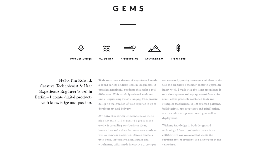
We Ain’t Plastic definitely leaves its mark. Its subtle effects, animations and images all come together to create a website that was obviously crafted with love. It also gets right to the point, careful not to overload you with too much information.
Melanie Daveid
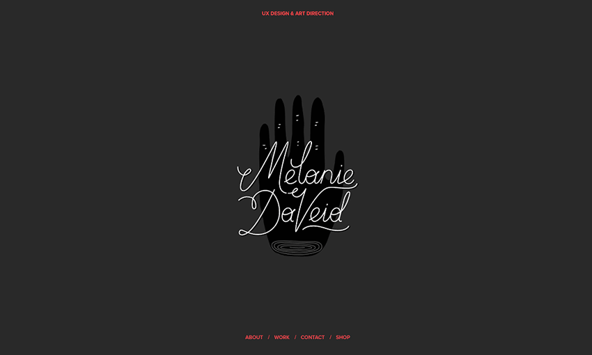
This beautiful one-page portfolio proves that simple-but-strong design is often the best way to go. The perfectly elegant animations are the most memorable part of this website, alongside the dynamic layout.
Steve Mengin
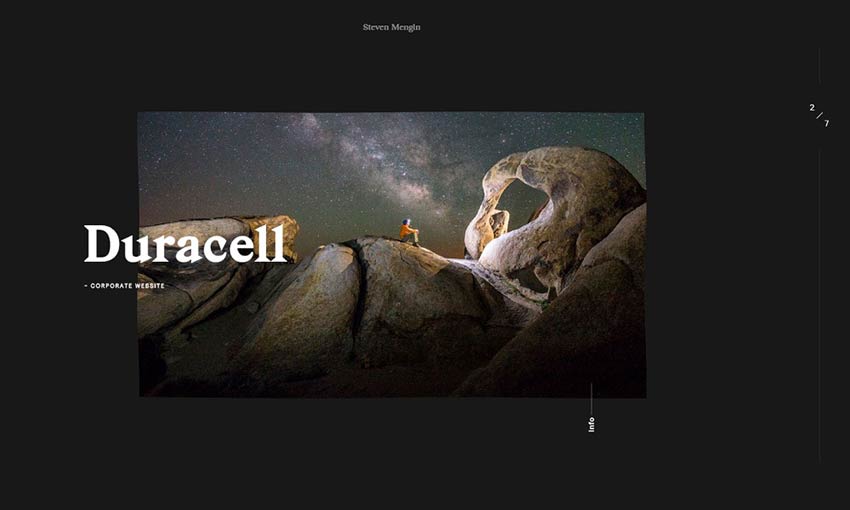
Stylish and well put together, navigating this portfolio is no less than delightful. Every animation looks great, and though many navigation elements are fairly unique, getting around is very intuitive thanks to fantastic UI design.
Gal Shir
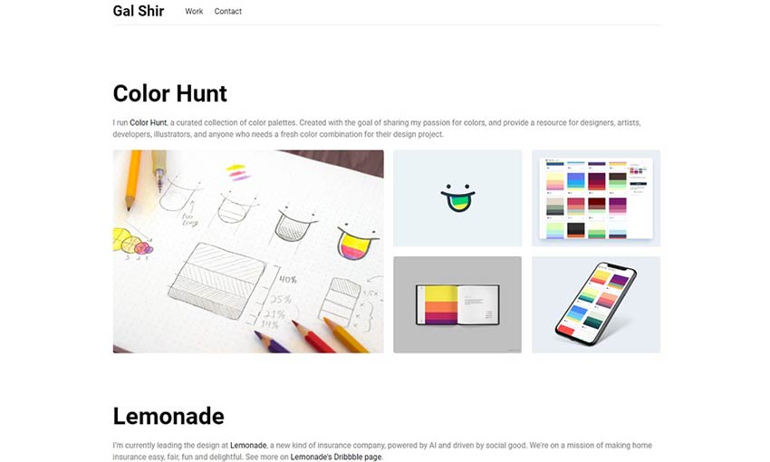
Fun animations and colorful images quickly bring this site to life. You won’t be able to stop scrolling, stopping to see each animated image. And a pretty parallax effect brings the site to a satisfying end.
Portfolio of Nathan Riley
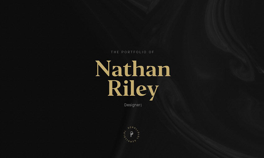
This dark, modern website is filled with all sorts of fun little details, animations and browser interactions. Discovering them all is a joy. You know this is a designer who loves his job. Click to see the projects and you’ll get some interesting behind-the-scenes info on design choices, too!
Jack Jeznach
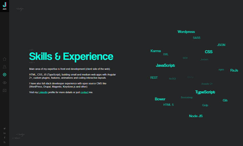
Everything about this website indicates excellency at both style and skill. There’s so much attention to detail that it’s astounding. As you navigate the well laid-out portfolio you’ll be constantly driven to keep exploring and learning more about the developer.
Weightshift
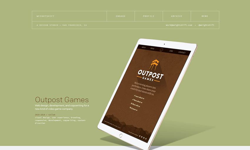
What’s better than a collection of case studies so nicely presented? Scroll through the clean, brightly colored website and check out the examples to see a short demonstration of the company’s past work!
Timothy Achumba

This portfolio uses a pleasant block-based layout that’s easy to navigate on any device. Images are the focal point, taking up a majority of the screen. What text there is tells you exactly what you need to know.
Friends
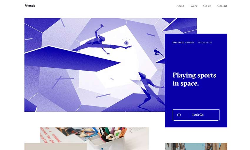
Here’s one reminiscent of a business card: Sophisticated, beautiful and simply but carefully designed. There are plenty of case studies to learn more about the company and its methods. Nothing is better than understanding your designer’s goals and processes.
Baptiste Ringot
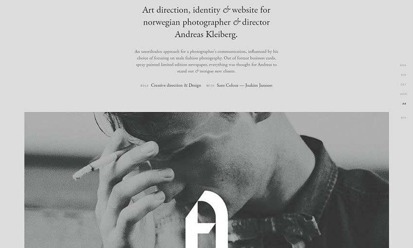
This is a portfolio made with readability and ease of navigation in mind. There’s a lot of content and past work, but text is frequently broken up by interesting images of past design projects. It’s simple to navigate the sections. And the slight change of background color as you scroll is a nice touch.
Youandigraphics
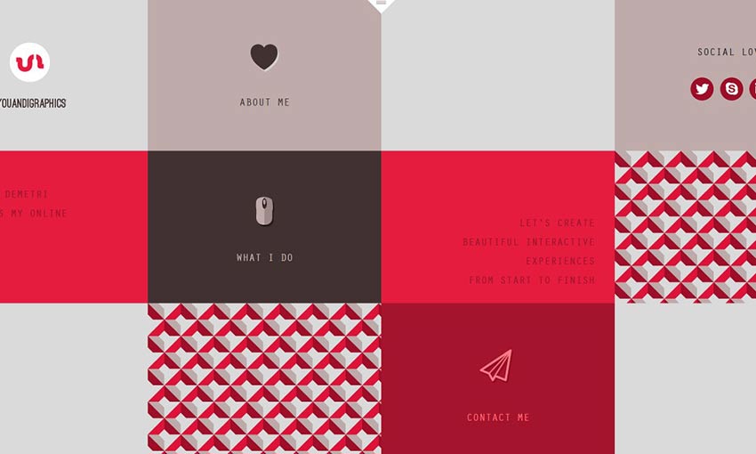
A beautiful palette, unique layout, and cute art and animations certainly make this a standout website. Looking at this portfolio, you know the designer truly has an artist’s eye.
Amazing Portfolios by Designers
There’s nothing more inspiring than a skilled web designer’s portfolio. Experts and innovators are always pushing the limits of what a website should be capable of, with portfolios that skillfully display their mastery in design.
Which portfolio was your favorite? There’re just too many awesome ones to choose from!

Leave a Reply
Want to join the discussion?Feel free to contribute!