How to pick the perfect colour palette every time
Original Source: http://feedproxy.google.com/~r/CreativeBloq/~3/YE0lZ2Ep6Ho/how-to-pick-the-perfect-colour-palette-every-time
In the 1980s, colour psychologist Angela Wright revolutionised colour theory by identifying links between patterns of colour and patterns of human behaviour. She found that all colours can be classified into one of four tonal groups, and that mathematical relationships underpin the shades and tones within each group. In other words, Wright proved objective colour harmony.
She went on to develop the Colour Affects System, which identifies links between the four colour groups and four basic personality types, based on original research involving Aristotle, Newton and German writer Johann Wolfgang von Goethe.
If harnessed correctly, designers can use the Colour Affects System to control the message of their colour palettes and, crucially, kill subjective debate around colour in client meetings with evidence to back up their decisions. Here's how it works…
Colour Affects System: the basics
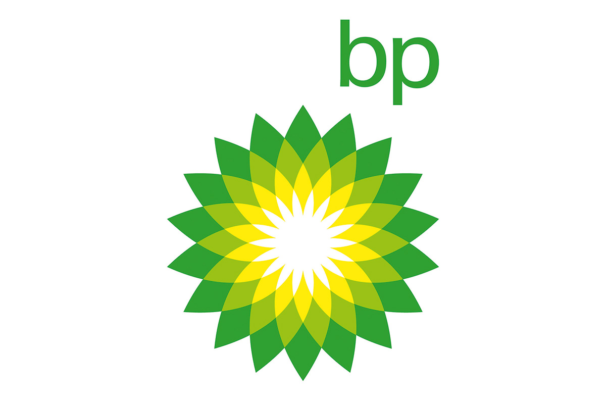
BP uses group 1 colours: clear, delicate and warm
Every shade, tone or tint on the colour spectrum can be classified into one of four colour groups, based on how warm or cool it is. All colours within each group correlate mathematically and naturally harmonise, while colours combined from different families don't.
There are also four basic personality types – ranging between extrovert and introvert – and each type has a natural affinity with one colour group. Universally, everyone will find a palette chosen with colours from the same group harmonious, but they'll find a palette drawn from their personality type's corresponding colour group even more attractive.
You'll find a breakdown of the different colour groups on the next page.

Bedding firm Dreams uses elegant and timeless group 2 colours
Colour in harmony
"Music and colour work in much the same way," explains Wright, who developed the Colour Affects System from her earlier research, The Wright Theory. She's provided colour palettes for clients ranging from Shell International Petroleum Company and Procter & Gamble to BT, Unilever, and more.
"One musical note has its own properties, but it doesn't do much until you put it with other notes. There are no wrong notes, and there are no wrong colours, either. It's how you use them. If you put them together in harmony, they produce a positive response. But it only takes one bum note to throw the whole thing out."
Currently, Wright is working on a digital version of the Colour Affects System, which will be launching at the end of this year. The software enables users to select their starting colour – the dominant logo colour, for instance – and then classifies it into one of the four groups, removing all colours from the other three groups. Users are left with a huge, harmonious selection from which to then develop a brand's colour palette.

McDonald’s corporate colours are mainly group 3: intense and fiery
"You pick the subsequent colours for your branding scheme in the same way as you do now," Wright explains. "You've got a large framework – there are millions of colours to choose from – except there are no bum notes, because there are mathematical correlations that underpin each colour," she adds.
How effective is the Colour Affects System?
A few years ago, Wright was asked by a mail order company to adjust the colours of a leaflet selling an opera CD. "The in-house design team had created a leaflet and they wanted me to tweak the colours into harmony," she recalls. "The ones they'd used were okay – quite familiar – but they're weren't right, either psychologically or harmoniously."

Texaco uses a group 4 palette, suggesting efficiency, sophistication and excellence
Wright adapted the colours so that the chosen palette came from the same tonal family. "They sent out two identical mail shots, and they sold 560,000 more CDs with the tweaked leaflet than the original," she says.
"And all I did was tweak the harmony after it had been designed – I didn't specify the colours used in the first place." It seems the right colours do sell.
Next page: the four colour groups revealed
Group 1: Type 1 personality
Group 1 colours are often used for fun brands
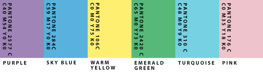
Group 1 colours are clear, delicate and warm, and contain yellow, but no black. Examples include soft cream, turquoise and cobalt. "They're lively, sharp, fresh, clean and youthful – all about new beginnings," says Wright.
"It's very common to use them in the branding of things like children's toys, PR, sales, sport, and fun sectors of anything." However, if misused, these colours can be perceived as frivolous and immature.
Personalities that reflect these colours are "externally motivated and eternally youthful". Light on their feet, these people love to dance and are clever, but don't like being bogged down with academic debate.
Group 2: Type 2 personality
Group 2 colours reflect understated elegance and timelessness, but are seen as recessive
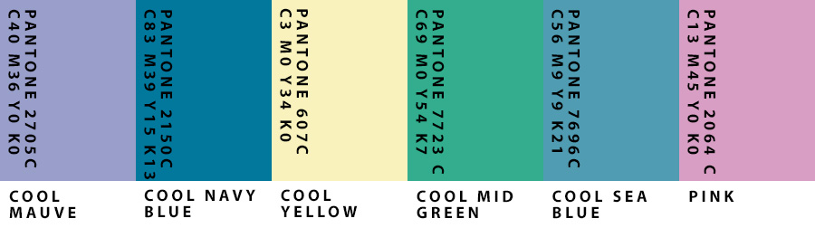
Group 2 colours are cool (they contain blue), mid range (most contain grey) and delicate, but not necessarily light – for example raspberry, maroon or sage green. Characteristics include understated elegance and timelessness.
"The personalities are cool, calm and collected," says Wright. "They're internally motivated, but very sensitive to how others are feeling. They don't want to be at the forefront of anything, but they'll be the power behind the throw. In branding terms, these colours are rarely – if ever – used, because they're very recessive," she explains.
Group 3: Type 3 personality
The Group 3 palette features quite flamboyant and unusual colours
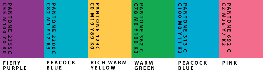
Group 3 colours are warmer than group 1 (they contain more yellow-based hues), are intense and fiery, and contain black. Examples include olive green, burnt orange and aubergine. "They're quite flamboyant and unusual; you don't get many primaries in there," says Wright. "And the personalities are strong. Like type 1, they're externally motivated – but they're fiery, even if it isn't immediately apparent."
Friendly, traditional and reliable, these tones are popular in branding and work for well-established companies. However, they can convey bossiness or appear old-fashioned if they are misused.
Group 4: Type 4 personality
Group 4 suggests efficiency, sophistication and excellence, but also expense and unfriendliness
Group 4 colours contain blue and are cold rather than cool. They're pure and either very light, very dark or very intense. "The personalities are the same – very clear; everything's black and white," says Wright, adding that type 4 personalities are internally motivated, often very efficient and don't suffer fools.
Containing black, white, magenta, lemon and indigo, this group's characteristics include efficiency, sophistication and excellence – but misused, the colours can be seen as unfriendly, materialistic and expensive.
This article originally appeared in Computer Arts, the world's leading graphic design magazine. Subscribe here.
Related articles:
21 outstanding uses of colour in branding5 unusual uses of colour in logo designThe designer's guide to using colour in branding


Leave a Reply
Want to join the discussion?Feel free to contribute!