How to Build React 16 Web Apps with the Sencha Grid

Original Source: https://www.sitepoint.com/how-to-build-react-16-web-apps-with-the-sencha-grid/

React 16 is the first version of React built on top of React’s new core architecture, codenamed “Fiber”. React 16 is designed from the ground up to support asynchronous rendering, which allows processing large component trees without blocking the main execution thread. It supports a number of key features such as catching exceptions using error boundaries, returning multiple components from render, reduced file size and support for MIT license.

If you’re developing a data-driven web application with React 16, chances are you’ll use a grid or spreadsheet-like interface at some point to display data for your users. Depending on the context, your users may expect the grid in your application to be capable of:

Scrolling with a fixed header
Sorting by clicking on a column header
Showing and hiding specific columns
Paging, grouping, and summarization
Editing data in cells
Exporting to Excel
Drilling down/row expansion

A grid can be one of the trickiest and most complex UI components to build in React because many of the necessary features require both significant React expertise, as well as the willingness and ability to dig down into the DOM. Fortunately, the ExtReact Grid provides all of these capabilities and more.

In this article, we’re going to create an example using the Sencha ExtReact Grid that shows information about Stocks and equities companies. If you want to code a grid using an HTML table or another third-party component, you might have to do something like handle clicking on a column header to sort, or clicking on a divider between a column header to resize, or maybe sliding a pager and doing a fetch for the next page of data. With ExtReact Grid, these functionalities are built in. Want to try it yourself? Get started with a 30-day free trial of ExtReact today — sign up here.

Let’s get started with building an application using ExtReact Grid.

Getting Started with ExtReact App Generation

To get started on developing a React application with ExtReact components, please follow the steps below:

Make sure you have a Node environment set up

First, make sure you have Node 8.11+ and NPM 6+ set up on your system. You can download the latest Node version from the Node web site. If you’ve already installed Node, you can easily check the node and npm versions by using these commands:

node -v
npm -v

Get your login credentials for the ExtReact npm repo

ExtReact npm packages are hosted on Sencha’s private npm repo. You log in to that repo once to get access to all ExtReact packages. To get login credentials, go to the ExtReact 30-Day Free Trial page and fill out the form. We’ll send you an email with login details as well as some links to resources such as the docs and sample projects.

Login to ExtReact npm repo and get ExtReact app generator

The next step is to log in to Sencha’s private npm repo, which hosts the ExtReact packages. Use your npm login (provided in the email) to associate the repo with the @sencha scope, and enter the credentials when prompted:

npm login — registry=http://npm.sencha.com — scope=@sencha

The next step is to install ExtReact generator package.

npm install -g @sencha/ext-react-gen

Create your first React App

Run the Yeoman generator to create your first ExtReact app:

ext-react-gen app your-app-name-here -i

The generator will ask you to name your app, name the npm package, and select a theme. The default Material theme (based on Google’s Material design guidelines) is a good choice as a starting theme. Select “Generate an Empty App”. The generator will also prompt you to create a new directory for your project. The generator will then download and create your sample application, including relevant dependencies.

Run your React App

In the generator output, you will find steps to run your application. It’s as simple as changing to your new application directory and running the application using:

npm start

This will fire up the app, your empty React app will just show up with the title of the app. The main component (e.g. StocksGrid) in the application has one container at the root, which is marked as full screen, layout is set to fit, which means it will stretch its child to fill it.

See the code up to this step on GitHub.

Adding a Grid to the application

Add Stocks Data

We’ll be adding an example data set, called stocks.json to the application. It’s a fairly large data set, around 10,000 rows in json, and each row represents a company or ticker symbol — so we have the name of the company, ticker symbol, sector, industries they are in, and an array of ticks which are the last 5 sales of that stock. This is the data we’re going to display in our grid. In a real-world application, all of this data would be returned on the back-end. We’re going to load it statically for this sample application rather than go through all of the mechanics of how to build a back-end rest API. But it’s going to be loaded in the exact same way you would fetch from a real back-end.

Creating a Basic Grid

In the StockGrid component render method, we’re going to return a grid with columns.

To put columns in our grid, we use a column component, and it takes a data index that is the same as the name field of the stocks data. It takes a text prop that is the column header text, and then we can also give the column a width, like a fixed width or a flex or a combination of flex and minimum or maximum as well. We’ll add column components for company name, symbol, ticks, sector, and industry. Create a new StocksGrid class with Grid as shown below:

<Grid >
<Column dataIndex=”name” text=”Name” width={300} />
<Column dataIndex=”symbol” text=”Symbol” />
<Column dataIndex=”ticks” text=”Trend” />
<Column dataIndex=”sector” text=”Sector” width={200} />
<Column dataIndex=”industry” text=”Industry” width={350} />
</Grid>

Now, add StockGrid to Class App as shown below:

export default class App extends Component {
render() {
return (
<ExtReact>
<StocksGrid />
</ExtReact>
)
}
}

See the code up to this step on GitHub.You will be able to see the web application with empty Grid on npm start.

Binding Stock Data with Grid

A grid in ExtReact is a data table that pulls in and renders data from an Ext Data Store. In ExtReact, our store implementation is a data structure that allows you to sort and filter data for a grid or components (like lists or charts).

We can now start by loading the stocks data and creating a store. Again, grids always grab their data from the store, and some of the interactions with grid will trigger events on the store, like reloading or sorting or paging. So to do that, we’ll create our store here.

The Ext data store is different from the flux store. What makes the grid and the store a little different from the standard React approach is that the two are tightly integrated. Typically, you can pass data directly to a store, or a store can pull data on its own from a back-end using a proxy. With ExtReact Grid, you get interactive functionality like filtering, sorting, paging, grouping, and summarization without having to actually code it.

For this example, we’re passing the data directly to the store from the Stocks data file. You can also create a store with a proxy config — having a proxy allows us to do all sorts of great things like remote paging, filtering, and sorting. We set autoload to true, so it automatically loads the grid. The data isn’t particularly sorted by any criteria, so we’re going to have it sort on the client-side by specifying the name property.

this.store = new Ext.data.Store({
data: stocks,
autoLoad: true,
sorters: [{
property: ‘name’
}],
listeners: {
update: this.onRecordUpdated
}
})

In the Grid, assign the store config to the store that was created.

<Grid store={this.store}>

</Grid>

Now, we have a grid with all the data as shown below:

Basic Grid with data

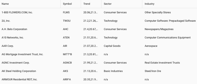
With this simple code, you get a lot of features for free — such as sorting — which allows you to click on any column header and it automatically sorts (see the symbol column in the example below).

In this case, the sorting is done on the client side. But if we implemented a real back-end API, we could configure the proxy to do remote sorting on the back-end and use an “order by clause” in the database to do a sort.

You also get resizable columns for free. So even though we set a width on these columns, if the user wants to see something or close something, he can do that by dragging the column from side to side.

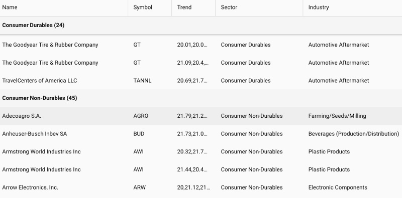
You also get a nice grouping feature too. So if we wanted to group by industry, we could say group by this field, and it will group all of the data by the value of industry, and it will give you a pinned header as you scroll down for each of the groupings.

Grouping by Industry

You’ll notice that this data is rendering pretty quickly for 10,000 records. The reason it renders so quickly is because it’s using what we call buffered rendering. So despite the fact that this table looks full, and you can scroll down and it keeps going and going, on initial loading it only renders a little bit more than what you’re actually seeing in terms of the “view port height.”

The post How to Build React 16 Web Apps with the Sencha Grid appeared first on SitePoint.

3 App and Website Prototyping Tools You Should Check out Today

Original Source: https://www.sitepoint.com/3-app-and-website-prototyping-tools-you-should-check-out-today/

This article was created in partnership with BAWMedia. Thank you for supporting the partners who make SitePoint possible. Prototyping tools are one of the best means of design communication. They are popular among interactive software system designers, developers, and project managers. Prototyping tools have proved to be key to successful design and development. Same goes […]

The post 3 App and Website Prototyping Tools You Should Check out Today appeared first on SitePoint.

Use Your Web Dev Skills to Build a Desktop App with Electron

Original Source: https://www.sitepoint.com/use-your-web-dev-skills-to-build-a-desktop-app-with-electron/

This article was originally published on the Okta developer blog. Thank you for supporting the partners who make SitePoint possible. Electron is a framework for building cross-platform desktop applications with web technologies like JavaScript, HTML, and CSS. It was created for GitHub’s Atom editor and has achieved widespread adoption since. Electron powers several apps that […]

The post Use Your Web Dev Skills to Build a Desktop App with Electron appeared first on SitePoint.

Adobe reveals exciting new Illustrator update

Original Source: http://feedproxy.google.com/~r/CreativeBloq/~3/5a2k7pY-Dq8/adobe-announces-exciting-illustrator-toolbar-update

Adobe has been releasing teasers of the most exciting changes you'll find in the upcoming release of Illustrator CC, and here's one we're particularly excited about: soon designers will be able to customise their toolbars. 

60 amazing Illustrator tutorials

With over 80 tools on offer, finding the ones you want hasn't always been easy. And let's face it, your most-used tools often differ from project to project. Thankfully, there's a clever new way to manage your tools coming your way in the next major Illustrator update. 

Adobe has created a new tools menu, accessible from the bottom of the Illustrator toolbar, in which all available tools are grouped logically by function. Designers will be able to drag and drop the tools they need into their main toolbar, and the ones they don't out of the main toolbar and into the complete menu. See it in action in the short video below.

Users will also be able to create different custom toolbars for different projects. It's a fairly simple update that promises to have a big impact on workflow, making Illustrator much more user-friendly. You can read more on the Adobe Blog.

Read more:

Create sets of product icons in IllustratorThe illustrator hotlist 2018How to create repeat patterns in Illustrator

Should You Choose a Dark or Light Color Scheme?

Original Source: http://feedproxy.google.com/~r/1stwebdesigner/~3/MaTZqfGYXxc/

With many websites and apps making the switch to black and gray UI, you might be wondering: Which is really better? Light design is the safe choice, while dark is trendy. But when done wrong, the results can decimate your conversions.

Both of these styles have their pros and cons – so when is the right time to use them? What sort of websites require bright tones, and which work best in black? Learn the answer before you implement an unbefitting color scheme into your website!

Dark Design

Need something with style? Dark web design is the choice of gaming and technology companies, visual content-heavy sites and those after something a little more atmospheric.

While a dark UI is much harder to pull off, the results are worth it when used correctly. These tones are suited to recreational sites used at night, and ones that aim to emphasize visual or video content. Think of lightboxes; dark website colors create the same effect!

In addition, a dark interface is much better on the eyes long-term. While unsuitable for reading short articles, as black on white is more legible, it’s perfect when you’re working with a lot of text or images for hours on end.

If you decide to go with dark, make sure to pick a muted palette and sparingly use bright colors for emphasis.

Pros:

Enhances long-term readability – great for coding, heavy reading and sites meant to be used for hours
Stylish and trendy
Creates a dramatic or mysterious atmosphere
Can be used to emphasize content or de-emphasize both empty “white space” and cluttered UI

Cons:

Short-term, light text on a dark background strains the eyes; not suitable for blogs or news sites
Hard to master
Does not look good with bright palettes
Unpopular with older computer users

Bison Studio dark web design

Light Design

Light interfaces are known for creating a minimalistic, elegant and universally pleasant atmosphere. However, its oversaturation in web design has led to the inverse being considered more attractive. Still, if you’re not willing to take a risk, white is probably the best idea.

If you run a website made up of articles, such as a blog or news site, use light UI; the text is more legible. These sites are also generally visited during the day. Low light levels are what make dark colors better. This is why so many gaming apps use it. Typically, their visitors are playing at night. But when the sun is out, a white background can make text a lot easier to read.

Pros:

More common and a safer choice
Less eye strain while reading; necessary for news sites, blogs, etc.
Enhances color, making it pop

Cons:

Can be seen as boring or overdone
Long-term browsing can cause eye strain
Does not look good with muted colors

Copper light web design

How to Choose Your UI Color Scheme

Now that you know the pros and cons of each, which to choose?

One of the biggest factors should be the branding and overall tone of your website. If you’re after an edgy, modern look, black might be just what you need. If you want to use many bright, cheerful colors, you should certainly go with white.

Dark design is great for websites that will be used long-term and ideally involve little reading. For example, a workflow app that will be used throughout the day. If you need to highlight one part of the UI, such as if you’re creating an art app, a darker palette will work well here too.

A light look, on the other hand, is suitable for any situation. You can go wrong if you choose a bright color scheme. There are other, more subtle ways to make your website stand out. It won’t be quite as striking as greeting visitors with a gray background. But light design is certainly no crutch.

If you can’t commit, why not try both? Night mode toggles give users the choice regarding how to browse. If you’re struggling to pick a design and stick with it, leaving it up to users is the best option.

Now that you know when the best time is to use dark or light web design, which are you going to choose?


Growing a Business Is About the Customer, Not the Product

Original Source: https://www.sitepoint.com/business-growth-customer-product/

Gary Tramer is the co-founder of successful sales engine enterprises SearchWords and LeadChat, and most recently PoweredLocal, a wireless marketing and data analysis automation system. As an expert in sales, lead generation and conversion maximization, Gary is the perfect person to talk to about how businesses create and grow customer bases.

You Should Never Build a Product Before You Sell It

The first thing most people think about when launching a new enterprise is what they’ll be selling, but what they should really be focusing on is who they’ll be selling to. Although your product is important, no matter how good it is, if people aren’t interest in buying it, then your business is likely going to struggle.

When Gary Tramer first became an entrepreneur, the term “start-up” hadn’t even been popularized yet. All he had to rely on for launching a business were past models, all of which told him that a business plan and a well-developed product were the ways to achieve success.

But after spending over $200,000 on development and none on marketing, all Gary and his business partner had achieved was an amazing product that nobody has ever used. The lesson learned was painful but important: never build something before you sell it.

But that doesn’t mean you should give up either.

The hardest part of starting a new business is figuring out why people should care and, more importantly, why they would want to spend their money on it.

Using his personal experience as a door-to-door salesperson, Gary began his first successful enterprise, SearchWords, by signing clients up to SEO packages before he had even created an operating team — testing the product’s viability long before it ever existed.

After three months he had gained over 600 clients that had paid upfront, and three years later that client base had grown to over 6000.

But Gary and his partners soon had a “mass realization” that trying to sell something that directly competed with giant companies like Google probably wasn’t going to work in the long run.

They decided to dig a little deeper, and discovered that one of the main operating issues for SearchWords was converting website visits into actual purchases. And after building a solid client base first, they created a second successful business (LeadChat) out of fixing that problem for people.

Then they did it again by identifying a problem with the LeadChat model — but this time for an ecommerce business.

People asked us “What’s the secret to making ecommerce work?”, and the secret was that Facebook allowed us to target people quite uniquely … We also had an email database that we were growing [so] that we could re-market to people, and we knew everyone visiting the website by using web cookies.

This experience taught Gary Tramer something fundamental about what a successful business looks like. You need customers, but you also need to know them – and collecting data is the best way to achieve that.

The post Growing a Business Is About the Customer, Not the Product appeared first on SitePoint.

10 Best Wireframe Tools That Web Designers Should Consider

Original Source: http://feedproxy.google.com/~r/Designrfix/~3/pIE_Haw4Wtc/10-best-wireframe-tools-that-web-designers-should-consider

A wireframe tool is a website designer’s best friend while working on developing a visually-appealing website. For the unfamiliar readers, a wireframe tool, also identified as wireframe software, is a program that enables the designers (and even web design novices) to produce mockup elements and page structures with a drag-and-drop system. The end product that […]

The post 10 Best Wireframe Tools That Web Designers Should Consider appeared first on designrfix.com.

Visual Studio Live Share Can Do That?

Original Source: https://www.smashingmagazine.com/2018/09/visual-studio-live/

Visual Studio Live Share Can Do That?

Visual Studio Live Share Can Do That?

Burke Holland

2018-09-19T13:30:17+02:00
2018-09-19T16:36:17+00:00

A few months ago, Microsoft released its free Visual Studio (VS) Live Share service. VS Live Share is Google Docs level collaboration for code. Multiple developers can collaborate on the same file at the same time without ever leaving their own editor.

After the release of Live Share, I realized that many of us have resigned ourselves to being isolated in our code and we’re not even aware that there are better ways to work with a service like VS Live Share. This is partly because we are stuck in old habits and partly because we just aren’t aware of what all VS Live Share can do. That last part I can help with!

In this article, we’ll go over the features and best practices for VS Live Share that make developer collaboration as easy as being an “Anonymous Hippo.”

list of anonymous animals in Google Docs

Google Docs has an interesting way of handling anonymous participants (Large preview)

Share Your Code

Live Share comes as an extension for both Visual Studio and Visual Studio Code (VS Code). In this article, we’re going to focus on VS Code.

vs code live share extension readme page

(Large preview)

You can also install it via the VS Live Share Extension Pack, which includes the following extensions, all of which we are going to cover in this article…

VS Live Share
VS Live Share Audio
Slack Chat extension

Front-end is messy and complicated these days. That’s why we publish articles, printed books and webinars with useful techniques to improve your work. Even better: Smashing Membership with a growing selection of front-end & UX goodies. So you get your work done, better and faster.

Explore Smashing Membership ↬

Smashing Cat, just preparing to do some magic stuff.

Once the extension is installed, you will need to log in to the VS Live Share service. You can do that by opening the Command Palette Ctrl/Cmd + Shift + P and select “Sign In With Browser”. If you don’t log in and you try and start a new sharing session, you will be prompted to log in at that time.

vs code command palette showing option to sign in with browser

Use the VS Code Command Palette to start a new Live Share session (Large preview)

There are several ways to kick off a VS Live Share session. You can do it from the Command Palette, you can click that “Share” button in the bottom toolbar, or you can use the VS Live Share explorer view in the Sidebar.

vs code with boxes drawn around the different parts of the UI that can be used to start a live share session

There are a myriad of ways to start a new VS Live Share session (Large preview)

A link is copied to your clipboard. You can then send that link to others, and they can join your Live Share session — provided they are using VS Code as well. Which, aren’t we all?

Now you can collaborate just like you were working on a regular old Word document:

The other person can not only see your code, but they can edit it, save it, execute it and even debug it. For you, they show up as a cursor with a name on it. You show up in their editor the same way.

The VS Live Share Explorer

The VS Live Share explorer shows up as a new icon in the Action Bar — which is that bar of icons on the far right of my screen (the far left of yours for default Action Bar placement). This is a sort of “ground zero” for everything VS Live Share. From here, you can start sessions, end them, share terminals, servers, and see who is connected.

vs live share viewlet

The VS Live Share Explorer is a heads-up view of all things Live Share (Large preview)

It’s a good idea to bind a keyboard shortcut to this VS Live Share Explorer view so that you can quickly toggle between that and your files. You can do this by pressing Ctrl/Cmd + K (or Ctrl/Cmd + S) and then searching for “Show Live Share”. I bound mine to Ctrl/Cmd + L, which doesn’t seem to be bound to anything else. I find this shortcut to be intuitive (L for Live Share) and easy to hit on the keyboard.

the keyboard binding screen in vs code with a binding created for the vs live share viewlet

You can create a binding for the VS Live Share Explorer viewlet (Large preview)

Share Code Read-Only

When you start a new sharing session, you will be notified thusly and asked if you would like to share your workspace read-only. If you select read-only, people will be able to see your code and follow your movements, but they will not be able to interact.

vs code notification prompting user to choose read-only sharing

Sharing sessions are read-write by default, but you can make them read-only (Large preview)

This mode is useful when you are sharing with someone that you don’t necessarily trust — maybe a vendor, partner or an estranged ex.

It’s also particularly useful for instructors. Note that at the time of this writing, VS Live Share is locked to 5 concurrent users. Since you probably are going to want more than that in read-only mode, especially if you’re teaching a group, you can up the limit to 30 by adding the following line to your User Settings file: Ctrl/Cmd + ,.

“liveshare.features”: “experimental”

Change The Default Join Behavior

Anyone with the link can join your Live Share session. When they join, you’ll see a pop-up letting you know. Likewise, when they disconnect, you get notified. This is the default behavior for VS Live Share.

vs code notification with the name of the person who has joined the live share session

VS Code will alert you whenever someone joins your session (Large preview)

It’s a good idea to change this so that you have to manually approve someone before they can join your session. This is to protect you in the case where you go to lunch and forget to disconnect your session. Your co-workers can’t log back in, change one letter in your database connection string and then laugh while you spend the next four hours trying to figure out how your life has gone so horribly wrong.

To enable this, add the following line to your User Settings file Ctrl/Cmd + ,.

“liveshare.guestApprovalRequired”: true

Now you’ll be prompted when someone wants to join. If you block someone, they are blocked for the duration of the session. If they try to join again, you won’t be notified and they will be unceremoniously rejected by VS Live Share.

Go and enjoy your lunch. Your computer is safe.

Focus Followers

By default, anyone who joins your Live Share session is “following” you. That means that their editor will load up whatever file you are in and scroll whenever you scroll. Even if you switch files, participants will see exactly what you see.

The second that a person makes changes to a file, they are no longer following you. So if you are both working on a file together, and then you go to a different file, they won’t automatically go with you. That can lead to a lot of confusion with you talking about code in the file you’re in while the other person is looking at something entirely different.

Besides just telling each other where you are (which works, btw), there is a handy command called “Focus Participants” that is in the Command Palette Ctrl/Cmd + Shift + P.

vs code command palette showing live share focus command

Access the “focus” command from the VS Code Command Palette (Large preview)

You can also access it as an icon in the VS Live Share Explorer view.

vs code live share explorer focus icon

Send a follow request by clicking the follow icon in the VS Live Share Explorer viewlet (Large preview)

This will focus your participants on the next thing you click on or scroll to. By default, VS Live Share focus requests are accepted implicitly. If you don’t want people to be able to focus you, you can add the following line to your User Settings file.

“liveshare.focusBehavior”: “prompt”

Also note that you can follow participants. If you click on their name in the VS Live Share Explorer view, you will begin to follow them.

Because following is turned off as soon as the other person begins editing code, it can be tough to know exactly when people are following you and when they aren’t. One place you can look is in the VS Live Share Explorer view. It will tell you the file that a person is in, but not whether or not they are following you.

A good practice is to just remember that focus is always changing so people may or may not see what you see at any given time.

Debug As A Team

Participants can share any debug sessions that you run. If you start a debug session, they will get the exact same experience that you do. If it breaks on your side, it breaks on theirs, and they get the full debug view into all of your code.

They can step in, out, over, add watches, evaluate in the Debug Console; any debugging that you can do, they can do too, and they can control it.

Debugging can also be launched by participants. Be default, though, VS Code does not allow your debugger to be started remotely. To enable this, add the following line to your User Settings file Ctrl/Cmd + ,:

“liveshare.allowGuestDebugControl”: true

Share Your Terminal

A lot of the work we do as developers isn’t in our code; it’s in the terminal. Some days it seems like I spend about as much time on my terminal as I do in my editor. This means that if you have an error on your terminal or need to type some command, it would be nice if your participants in VS Live Share can see your terminal in addition to your code.

VS Code has an integrated terminal, and you can share it with VS Live Share.

vs code command palette with share terminal selected

Access the “Share Terminal” command from the VS Code Command Palette (Large preview)

When you do this, you have the opportunity to share your terminal as read-only, or as read-write.

vs code prompting to share terminal as read-only or read-write

Always share your terminal read-only unless you absolutely have to share it with write access (Large preview)

By default, you should be sharing your terminal as read-only. When you share your terminal read-write, the user can execute arbitrary commands directly on your terminal. Let that sink in for a moment. That’s heavy.

It goes without saying that having remote write access to someone’s terminal comes with a lot of trust and responsibility. You should only ever share your terminal read-write with people that you trust implicitly. Estranged ex’s are probably off the table.

Sharing your terminal read-only safely allows the person on the other end of the line to see what you are typing and your terminal output in real time, but restricts them from typing anything into that terminal.

Should you find yourself in a scenario where it would be quicker for the other person to just get at your terminal instead of trying to walk you through some wacky command with a ton of flags, you can share your terminal read-write. In this mode, the other person has full remote access to your terminal. Choose your friends wisely.

Share Your localhost

In the video above, the terminal command ends with a link to a site running on http://localhost:8080. With VS Live Share, you can share that localhost so that the other person can access it just like it was their own localhost.

If you are running a shared debug session, when the participant hits that localhost URL on their end, it will break for both of you if a breakpoint is hit. Even better, you can share any TCP process. That means that you can share something like a database or a Redis cache. For instance, you could share your local Mongo DB server. Seriously! This means no more changing config files or trying to get a shared database up. Just share the port for your local Mongo DB instance.

Share The Right Files The Right Way

Sometimes you don’t want collaborators to see certain files. There are likely private keys and passwords in your project that are not checked into source control and not suitable for public viewing. In this case, you would want to hide those files from anyone participating in your Live Share session.

By default, VS Live Share will hide any file that is specified in your .gitignore. If there is a file that you want to hide, just add it to your .gitignore. Note though, that this only hides the file in the project view. If you are in a shared debugging session and you step into a file that is in the .gitignore, it is still loaded up in the editor and your collaborators will be able to see it.

You can get more fine-grained control over how you share files by creating a .vsls.json file.

For instance, if you wanted to make sure that any files that are in the .gitignore are never visible, even during debugging, you can set the gitignore property to exclude.

{
“$schema”: “http://json.schemastore.org/vsls”,
“gitignore”:”exclude”
}

Likewise, you could show everything in your .gitignore and control file visibilty directly from the .vsls.json file. To do that, set the gitignore to none and then use the excludeFiles and hideFiles properties. Remember — exclude means never visible, and hide means “not visible in the file explorer.”

{
“$schema”: “http://json.schemastore.org/vsls”,
“gitignore”:”none”,
“excludeFiles”:[
“*.env”
],
“hideFiles”: [
“dist”
]
}

Sharing And Extensions

Part of the appeal of VS Code to a lot of developers is the massive extensions marketplace. Most people will have more than a few installed. It’s important to understand how extensions will work, or not work, in the context of VS Live Share.

VS Live Share will synchronize anything that is specific to the context of the project you are sharing. For instance, if you have the Vetur extension installed because you are working with a Vue project, it will be shared across to any participants — regardless of whether or not they have it installed as well. The same is true for other context-specific things, like linters, formatters, debuggers, and language services.

VS Live Share does not synchronize extensions that are user specific. These would be things like themes, icons, keyboard bindings, and so on. As a general rule of thumb, VS Live Share shares your context, not your screen. You can consult the official docs article on this subject for a more in-depth explanation of what extensions you can expect to be shared.

Communicate While You Collaborate

One of the first things people do on their inaugural VS Live Share experience is to try to communicate by typing in code comments. This seems like the write (get it?) thing to do, but not really how VS Live Share was designed to be used.

VS Live Share is not meant to replace your chat client of choice. You likely already have a preferred chat mechanism, and VS Live Share assumes that you will continue to use that.

If you’re already using Slack, there is a VS Code extension called Slack Chat. This extension is still a tad early in its development, but it looks quite promising. It puts VS Code in split mode and embeds Slack on the right-hand side. Even better, you can start a Live Share session directly from the Slack chat.

vs code slack chat extension

The Slack Chat extension puts Slack inside of your editor (Large preview)

Another tool that looks quite interesting is called CodeStream.

CodeStream

While VS Live Share looks to improve collaboration from the editor, CodeStream is aiming to solve that same problem from a chat perspective.

The CodeStream extension allows you to chat directly within VS Code and those chats become part of your code history. You can highlight a chunk of code to discuss and it goes directly into the chat so there is context for your comments. These comments are then saved as part of your Git repo. They also show up in your code as little comment icons, and these comments will show up no matter which branch you are on.

When it comes to VS Live Share, CodeStream offers a complimentary set of features. You can start new sessions directly from the chat pane, as well as by clicking on an avatar. New sessions automatically create a corresponding chat channel that you can persist with the code, or dispose of when you are done.

If chatting isn’t enough to get the job done, and you need to collaborate like it’s 1999, help is just a phone call away.

VS Live Share Audio

While VS Live Share isn’t trying to reinvent chat, it does re-invent your telephone. Kind of.

With the VS Live Share Audio extension, you can call someone directly and do voice chat from within VS Code.

vs code command palette showing start audio call option

Make audio calls from VS Code using the VS Live Share Audio extension (Large preview)

The other person will then get a prompt to join your call.

vs code notification asking if you would like to join the audio call

VS Code will ask you if you want to join an audio call that is in process (Large preview)

You will see a speaker icon in the bottom status bar when you are connected to a call. You can click on that speaker to change your audio device, mute yourself, or disconnect from the call.

vs code options showing options like mute and disconnect for live share audio extension

You have full control over audio settings when in a VS Live Share Audio call (Large preview)

The last tip I’ll give you is probably the most important, and it’s not a fancy feature or obscure setting you didn’t know existed.

Change Your Muscle Memory

We’ve got years of learned behavior when it comes to getting help or sharing our code. The state of developer collaboration tools has been so bad for so long that we are conditioned to paste code into Slack, start an awkward Skype calls that consist mostly of “tell me when you can see my screen”, or crowd around a monitor and point excessively, i.e. stock photo style.

a group of people pointing at a computer screen

(Large preview)

The most important thing you can do to get the most out of VS Live Share is to actually use VS Live Share. And it will have to be a “conscious” effort.

Your brain is good at patterns. You are constantly recognizing and classifying the world around you based on patterns you have identified, and you are so good at it, you don’t even realize you are doing it. You then develop default responses to these patterns. You form instincts. This is why you will default to the old ways of collaboration without even thinking about what you are doing. Before you know it you will be on a Skype call with someone sharing your screen — even if you have Live Share installed.

I’ve written a lot about VS Code and people will ask me from time to time how they can get more productive with their editor. I always say the same thing: the next time you reach for the mouse to do something, stop. Can you do that something with the keyboard instead? You probably can. Look up the shortcut and then make yourself use it. At first it’s going to be slower, but if you are willing to deliberately adopt a different behavior, you will be astonished at how fast your brain will default to the more productive way of doing something.

The same goes for Live Share. You will be on a call sharing your screen when it occurs to you that you could be using Live Share. At that moment, stop; click that “Share” button in the bottom of VS Code.

Yes, the person on the other end may not have the extension installed. Yes, it may take a moment to set it up. But if you work on establishing this behavior now, the next time you go to do this, it will “just work” and it won’t be long before you don’t even have to think about it, and at that point, you will finally have achieved that “Anonymous Hippo” level of collaboration.

More Resources

VS Live Share Extension Pack
VS Code Live Share Docs
Extensions and Ecosystem Support
Getting Started With VS Live Share

Smashing Editorial
(rb, ra, il)

20 Freshest Web Designs, September 2018

Original Source: https://www.webdesignerdepot.com/2018/09/20-freshest-web-designs-september-2018/

Welcome to our roundup of the best websites launched (or relaunched with major updates) in the last four weeks. September marks the beginning of Fall in the northern hemisphere, and reflecting that change, we’re seeing fewer light, airy, minimal designs, and more rich, warm, comforting designs.

There’s been a flood of new design agency sites, and a ton of new season fashion sites launched this month—we’ve included the best. You’ll also find some great photography and lots for lovers of typography. Enjoy!

Critical Mass

Critical Mass is one of those design agencies you’d just love to work for. Their new site is a homage to themselves, telling a success story from their roots in Calgary, to 11 different offices around the world, with some exceptional work along the way.

Genesis

Genesis is a London eatery specializing in organic, healthy food. Their site is ever so slightly bizarre. Entirely black and white, with mystic-inspired illustrations, the site definitely makes me want to eat there, at least once.

Libratone

With bold color blocking, an unconventional grid, and one of the more interesting slideshows you’ll see, Libratone’s site is walking the walk by exuding confidence, sophistication, and a sense of freedom. A great site the perfectly encapsulates its brand identity.

Marc Jacobs

Marc Jacobs is one of the world’s most productive fashion labels, selling a dizzying array of products through this site. Despite the vast range of goods, there’s still time for careful details if you look, check out the animated bag for example.

Tao Tajima

Filmmaker Tao Tajima’s site features fullscreen clips of his work. What makes this site stand out is the liquid-style transition that segues between projects as you scroll. The way the video flexes is a magical effect perfectly in keeping with Tajima’s work.

GT Zirkon

Following the fashion for typefaces to get their own websites, GT Zirkon is a fantastic deep-dive into the design features of this sans-serif typeface. Entirely black and white, the animated noodle details continue to grow, creating a unique sense of time.

Porter & Pals

Feeding our dogs a healthy diet is super important to all owners. Porter & Pals wants you to trust them with your pooch’s diet, they’re different, and they want you to know it. Not convinced? Just keep refreshing the homepage for some hilarious pictures.

Alberta Ferretti

At first glance, Alberta Ferretti’s site looks much the same as any other minimal, grid-based fashion site. Where this site stands out is the playful use of the grid to create unexpected shapes and counter-intuitive alignment.

DAD

Dad is a design agency based in the Netherlands. Scroll through its colorful site and the work scrolls vertically, while the background type scrolls horizontally. Somehow, it works. If they don’t win a D&AD award there really is no poetry in the world.

Hourly App

Hourly is yet another time-tracking app for iOS, so far, so dull. But what sets Hourly apart is the 80s style typography and color palette. The bold choice is reflected in the app’s site, and delivers an impactful, and ultimately individual design.

Studio.Build

Studio.Build is a creative digital and branding agency that believes in big statements made simply. The site features a slideshow of selected work to scroll through, but click-through to the full portfolio for some exceptional design work.

Siri

Apple’s brand new site for its flagship AI product is predictably Apple-like, with a whole ton of mysterious black, gigantic sized type, and some lovely subtle gradients. Rarely does color-coding sections feel so exclusive.

Fred Perry

Fred Perry’s site is a perfect demonstration of how to do parallax right. Used to highlight the size of the product range, and the free shipping options, rather than simply to add interest, it’s an engaging effect on this site.

Sudtipos

Some type foundries focus on black and white to pull us in. Sudtipos have gone in completely the other direction, draping their site in colors inspired by their native Argentina. It’s a fitting approach for a colorful design collective.

The Wing

The Wing is a co-working space with a difference: it’s women-only. With its roots in community activism in the 19th and 20th centuries, The Wing has four spaces in NY and DC, and has plans for six more. It’s a site targeting women, with none of the clichés.

Swallowtail Tea

Swallowtail Tea’s art direction features heavy use of Photoshop’s noise filter, giving the site a nostalgic feel—plus the added benefit of much smaller image files, delivering a faster, more pleasant browsing experience.

Foster Type

Fittingly for a site showcasing type and lettering design, the online portfolio of Dave Foster features some exceptionally well-set type. For lovers of detailed design, it’s a pleasure to browse through and admire.

The Disconnect

The Disconnect is a unique approach to publishing on the web, they want you to disconnect in order to view the content. Just browse over and then turn off your wi-fi. Only on its second issue, it’s great, distraction-free journalism.

The Floral Society

Who doesn’t love flowers? The Floral Society sells high-quality products for amateur florists. From a Christmas wreath workshop, to DIY wedding flowers. It’s a delightful site put together on Squarespace, proving that anyone really can design a website.

The D. E. Shaw Group

A superlative example of an animation that transforms as you scroll, the D. E. Shaw Group’s site is a modern, abstract depiction of investment banking. As a way to illustrate a non-tangible product, it’s difficult to beat.

Add Realistic Chalk and Sketch Lettering Effects with Sketch’it – only $5!

Source

p img {display:inline-block; margin-right:10px;}
.alignleft {float:left;}
p.showcase {clear:both;}
body#browserfriendly p, body#podcast p, div#emailbody p{margin:0;}

Loving & Hating the Hamburger Icon

Original Source: https://www.webdesignerdepot.com/2018/09/loving-hating-the-hamburger-icon/

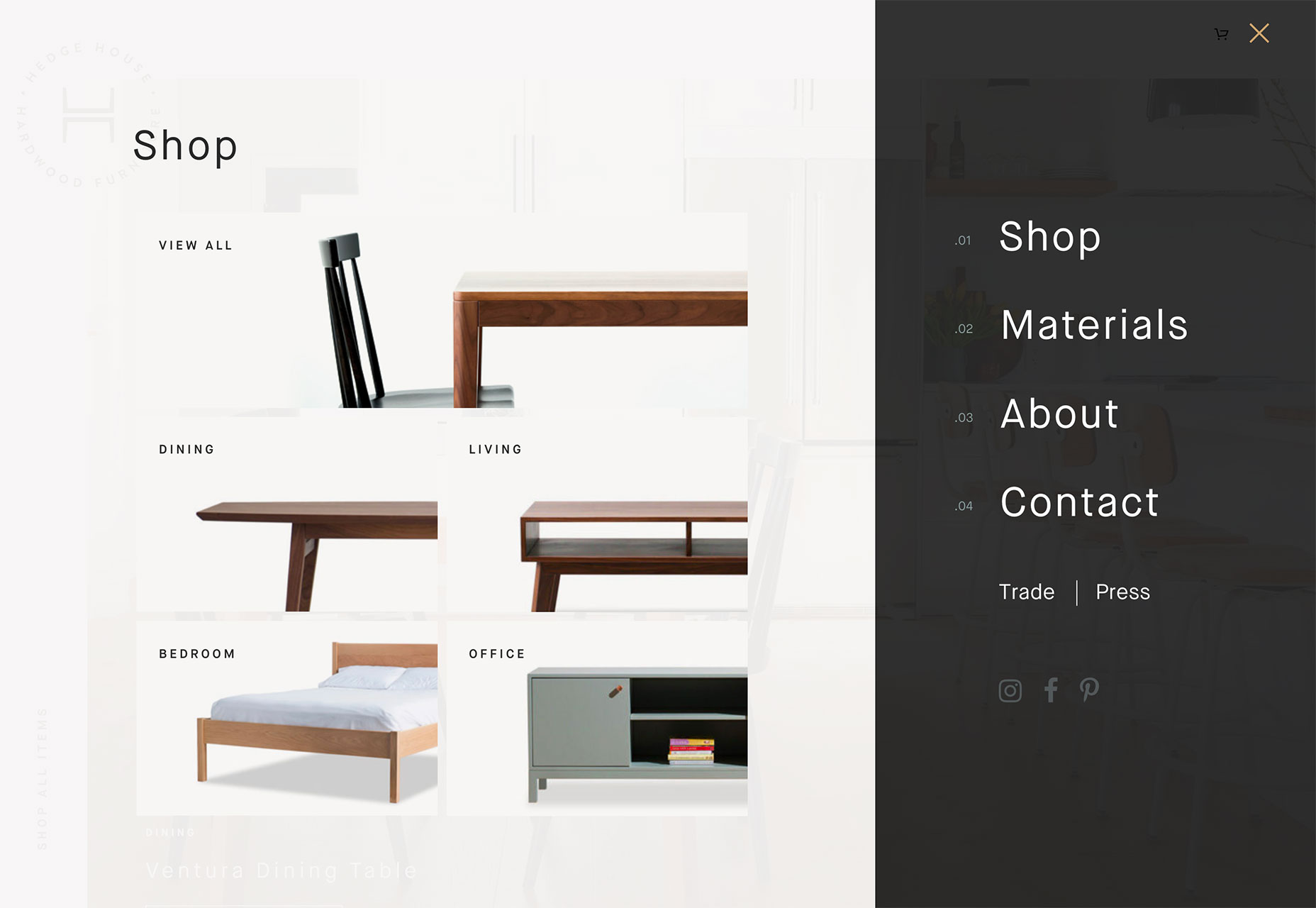
I love the hamburger menu. I hate the hamburger menu.

I am constantly contradicting myself about this tiny website element; whether I think it works beautifully…or just makes a mess.

And I’m not alone. While this icon has exploded in popularity, there’s still significant debate as to whether it is the right choice for tucking navigation menus into websites. It’s a debate I have with myself (and team) every time we approach a new project as well.

Because while I love the simplicity of the hamburger menu and the clean canvas it provides, there are some lurking usability issues that just keep nagging me. That’s why I have a distinct love-hate relationship with the hamburger menu.

Love: Clean Design Canvas

The extra space provided by using a hamburger menu icon can create a cleaner, sleeker, more modern feel to the design. I love the look of a minimal design without clutter and layers of elements piled on top of each other.

This design element can encourage your team to actually think about and make certain content and usability decisions as well. Because the hamburger icon doesn’t contain the space to expand to those all-encompassing mega menus that were popular for a while, you have to determine what’s important enough to be a part of the main navigation. And this is an important discussion to have.

Having a limited amount of space for navigation can help the team focus on website goals and what users are doing and what you want them to do. (Gotta love that!)

Hate: Challenging for Some Users

That tiny little icon with three stacked lines still isn’t wholly familiar to some users. If you manage or are building a website with a distinctly older audience or one that’s not so mobile savvy, a hamburger icon can be confusing.

This segment might not ever click or tap the icon, leading to abandonment of the website.

While this tool tends to work well with more “techie” audiences, it’s not for every user group. If the primary users of your website are on desktop devices, it’s worth reconsidering.

Love: Acceptance as a Mobile User Pattern

It’s fun to watch something happen before your eyes. When the first few websites started using hamburger icons, many of us thought it would never catch on.

The opposite has been true.

On mobile devices, use of the hamburger icon to signal hidden navigation is generally accepted. Most mobile users understand what it is and how it works.

This user pattern also solved a problem with mobile navigation – those tiny little words were difficult to tap. With pop- or slide-out navigation from the hamburger icon, designers are leaving more space around each element and even designing individual navigation links to have the look of buttons, making the style highly usable.

Hate: There’s a Tendency to “Overstuff” Them

Because navigation from a hamburger icon looks and feels like its own page, there’s this tendency to overstuff it with information.

This drives me crazy! I don’t want to scroll in your navigation page. Pick a few important navigation elements, show them to users and move on. Don’t overstuff the navigation because you don’t want to make content and goal decisions.

Every website should have a few pages that are a priority for users to find and visit. Those should be in navigation that opens from the hamburger menu.

Love: Easy and Direct Access to Key Links

Elements in hamburger navigation provide direct access to content.

According to the Nielsen Norman Group, direct access allows users to click or tap right to a “preferred item, instead of forcing users to go through your content in serial order.” The alternative is sequential access, where users have to see multiple elements before getting to the one they want (think carousels for navigation or multi-level mega menus).

Direct access is important because it makes it quick and easy for users to get where they want in the website architecture. Fewer clicks to access information is a good thing.

I know what you are thinking: I already recommended that menus be streamlined to the most important information, so how is this quicker and easier for all users?

Simple: Include search in your navigation if you can’t highlight everything you need to. If users don’t see exactly what they are looking for, there’s a way to find it.

Hate: Lack of Immediate Information

One of the things I hate about hamburger menus is that they can hide some of the context of a website. A good navigation menu provides cues about the content of a website right away with keywords and information at the top of the screen.

It’s not always the case – especially if the design is well planned – but often these cues are missing when navigation is tucked inside a hamburger.

It’s important that the design doesn’t lose this context with that information written into the visible copy on pages.

Love: Extra Real Estate on the Hamburger Screen

The pop- or slide-out nature of the hamburger icon navigation screen gives designers an extra space and bit of real estate to be creative.

Take advantage of that space to do something that will delight users. I absolutely love clicking that icon and getting something special that contributes to my overall user experience.

Use that space to provide extra information, re-emphasize an important fact or create a delightful interaction.

Hate: It Takes Multiple Clicks to Discover New Things

Is your attention span as short as mine? If I have to click all over the place to find things on a website, I tend to just check out.

Sometimes a hamburger icon can lead to “multiple click/tap fatigue.” Navigation elements are hidden. You have to click to find them. What you are looking for isn’t there. You have to click somewhere else to search. You have to click into and out of the navigation.

All of this clicking can get tedious – even if it does happen in a matter of seconds. (And the average attention span isn’t getting any longer.)

Wrapping Up

So what’s the verdict? Do I love or hate the hamburger menu icon?

It’s both. I’ll continue to love and hate it until a better solution comes along. How do you feel about it?

Add Realistic Chalk and Sketch Lettering Effects with Sketch’it – only $5!

Source

p img {display:inline-block; margin-right:10px;}
.alignleft {float:left;}
p.showcase {clear:both;}
body#browserfriendly p, body#podcast p, div#emailbody p{margin:0;}