Original Source: https://www.smashingmagazine.com/2018/10/headless-wordpress-decoupled/
Headless WordPress: The Ups And Downs Of Creating A Decoupled WordPress
Headless WordPress: The Ups And Downs Of Creating A Decoupled WordPress
Denis Žoljom
2018-10-26T13:45:46+02:00
2018-10-26T13:48:35+00:00
WordPress came a long way from its start as a simple blog writing tool. A long 15 years later it became the number one CMS choice for developers and non-developers alike. WordPress now powers roughly 30% of the top 10 million sites on the web.
Ever since REST API was bundled in the WordPress core, developers can experiment and use it in a decoupled way, i.e. writing the front-end part by using JavaScript frameworks or libraries. At Infinum, we were (and still are) using WordPress in a ‘classic’ way: PHP for the frontend as well as the backend. After a while, we wanted to give the decoupled approach a go. In this article, I’ll share an overview of what it was that we wanted to achieve and what we encountered while trying to implement our goals.
There are several types of projects that can benefit from this approach. For example, simple presentational sites or sites that use WordPress as a backend are the main candidates for the decoupled approach.
In recent years, the industry thankfully started paying more attention to performance. However, being an easy-to-use inclusive and versatile piece of software, WordPress comes with a plethora of options that are not necessarily utilized in each and every project. As a result, website performance can suffer.
Recommended reading: How To Use Heatmaps To Track Clicks On Your WordPress Website
If long website response times keep you up at night, this is a how-to for you. I will cover the basics of creating a decoupled WordPress and some lessons learned, including:
The meaning of a “decoupled WordPress”
Working with the default WordPress REST API
Improving performance with the decoupled JSON approach
Security concerns
Web forms are such an important part of the web, but we design them poorly all the time. The brand new Form Design Patterns book is our new practical guide for people who design, prototype and build all sorts of forms for digital services, products and websites. The eBook is free for Smashing Members.
Check the table of contents ↬

So, What Exactly Is A Decoupled WordPress?
When it comes down to how WordPress is programmed, one thing is certain: it doesn’t follow the Model-View-Controller (MVC) design pattern that many developers are familiar with. Because of its history and for being sort of a fork of an old blogging platform called “b2” (more details here), it’s largely written in a procedural way (using function-based code). WordPress core developers used a system of hooks which allowed other developers to modify or extend certain functionalities.
It’s an all-in-one system that is equipped with a working admin interface; it manages database connection, and has a bunch of useful APIs exposed that handle user authentication, routing, and more.
But thanks to the REST API, you can separate the WordPress backend as a sort of model and controller bundled together that handle data manipulation and database interaction, and use REST API Controller to interact with a separate view layer using various API endpoints. In addition to MVC separation, we can (for security reasons or speed improvements) place the JS App on a separate server like in the schema below:
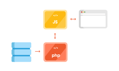
Decoupled WordPress diagram. (Large preview)
Advantages Of Using The Decoupled Approach
One thing why you may want to use this approach for is to ensure a separation of concerns. The frontend and the backend are interacting via endpoints; each can be on its separate server which can be optimized specifically for each respective task, i.e. separately running a PHP app and running a Node.js app.
By separating your frontend from the backend, it’s easier to redesign it in the future, without changing the CMS. Also, front-end developers only need to care about what to do with the data the backend provides them. This lets them get creative and use modern libraries like ReactJS, Vue or Angular to deliver highly dynamic web apps. For example, it’s easier to build a progressive web app when using the aforementioned libraries.
Another advantage is reflected in the website security. Exploiting the website through the backend becomes more difficult since it’s largely hidden from the public.
Recommended reading: WordPress Security As A Process
Shortcomings Of Using The Decoupled Approach
First, having a decoupled WordPress means maintaining two separate instances:
WordPress for the backend;
A separate front-end app, including timely security updates.
Second, some of the front-end libraries do have a steeper learning curve. It will either take a lot of time to learn a new language (if you are only accustomed to HTML and CSS for templating), or will require bringing additional JavaScript experts to the project.
Third, by separating the frontend, you are losing the power of the WYSIWYG editor, and the ‘Live Preview’ button in WordPress doesn’t work either.
Working With WordPress REST API
Before we delve deeper in the code, a couple more things about WordPress REST API. The full power of the REST API in WordPress came with version 4.7 on December 6th, 2016.
What WordPress REST API allows you to do is to interact with your WordPress installation remotely by sending and receiving JSON objects.
Setting Up A Project
Since it comes bundled with latest WordPress installation, we will be working on the Twenty Seventeen theme. I’m working on Varying Vagrant Vagrants, and have set up a test site with an URL http://dev.wordpress.test/. This URL will be used throughout the article. We’ll also import posts from the wordpress.org Theme Review Teams repository so that we have some test data to work with. But first, we will get familiar working with default endpoints, and then we’ll create our own custom endpoint.
Access The Default REST Endpoint
As already mentioned, WordPress comes with several built-in endpoints that you can examine by going to the /wp-json/ route:
http://dev.wordpress.test/wp-json/
Either by putting this URL directly in your browser, or adding it in the postman app, you’ll get out a JSON response from WordPress REST API that looks something like this:
{
“name”: “Test dev site”,
“description”: “Just another WordPress site”,
“url”: “http://dev.wordpress.test”,
“home”: “http://dev.wordpress.test”,
“gmt_offset”: “0”,
“timezone_string”: “”,
“namespaces”: [
“oembed/1.0”,
“wp/v2”
],
“authentication”: [],
“routes”: {
“/”: {
“namespace”: “”,
“methods”: [
“GET”
],
“endpoints”: [
{
“methods”: [
“GET”
],
“args”: {
“context”: {
“required”: false,
“default”: “view”
}
}
}
],
“_links”: {
“self”: “http://dev.wordpress.test/wp-json/”
}
},
“/oembed/1.0”: {
“namespace”: “oembed/1.0”,
“methods”: [
“GET”
],
“endpoints”: [
{
“methods”: [
“GET”
],
“args”: {
“namespace”: {
“required”: false,
“default”: “oembed/1.0”
},
“context”: {
“required”: false,
“default”: “view”
}
}
}
],
“_links”: {
“self”: “http://dev.wordpress.test/wp-json/oembed/1.0”
}
},
…
“wp/v2”: {
…
So in order to get all of the posts in our site by using REST, we would need to go to http://dev.wordpress.test/wp-json/wp/v2/posts. Notice that the wp/v2/ marks the reserved core endpoints like posts, pages, media, taxonomies, categories, and so on.
So, how do we add a custom endpoint?
Create A Custom REST Endpoint
Let’s say we want to add a new endpoint or additional field to the existing endpoint. There are several ways we can do that. First, one can be done automatically when creating a custom post type. For instance, we want to create a documentation endpoint. Let’s create a small test plugin. Create a test-documentation folder in the wp-content/plugins folder, and add documentation.php file that looks like this:
<?php
/**
* Test plugin
*
* @since 1.0.0
* @package test_plugin
*
* @wordpress-plugin
* Plugin Name: Test Documentation Plugin
* Plugin URI:
* Description: The test plugin that adds rest functionality
* Version: 1.0.0
* Author: Infinum
* Author URI: https://infinum.co/
* License: GPL-2.0+
* License URI: http://www.gnu.org/licenses/gpl-2.0.txt
* Text Domain: test-plugin
*/
namespace Test_Plugin;
// If this file is called directly, abort.
if ( ! defined( ‘WPINC’ ) ) {
die;
}
/**
* Class that holds all the necessary functionality for the
* documentation custom post type
*
* @since 1.0.0
*/
class Documentation {
/**
* The custom post type slug
*
* @var string
*
* @since 1.0.0
*/
const PLUGIN_NAME = ‘documentation-plugin’;
/**
* The custom post type slug
*
* @var string
*
* @since 1.0.0
*/
const POST_TYPE_SLUG = ‘documentation’;
/**
* The custom taxonomy type slug
*
* @var string
*
* @since 1.0.0
*/
const TAXONOMY_SLUG = ‘documentation-category’;
/**
* Register custom post type
*
* @since 1.0.0
*/
public function register_post_type() {
$args = array(
‘label’ => esc_html( ‘Documentation’, ‘test-plugin’ ),
‘public’ => true,
‘menu_position’ => 47,
‘menu_icon’ => ‘dashicons-book’,
‘supports’ => array( ‘title’, ‘editor’, ‘revisions’, ‘thumbnail’ ),
‘has_archive’ => false,
‘show_in_rest’ => true,
‘publicly_queryable’ => false,
);
register_post_type( self::POST_TYPE_SLUG, $args );
}
/**
* Register custom tag taxonomy
*
* @since 1.0.0
*/
public function register_taxonomy() {
$args = array(
‘hierarchical’ => false,
‘label’ => esc_html( ‘Documentation tags’, ‘test-plugin’ ),
‘show_ui’ => true,
‘show_admin_column’ => true,
‘update_count_callback’ => ‘_update_post_term_count’,
‘show_in_rest’ => true,
‘query_var’ => true,
);
register_taxonomy( self::TAXONOMY_SLUG, [ self::POST_TYPE_SLUG ], $args );
}
}
$documentation = new Documentation();
add_action( ‘init’, [ $documentation, ‘register_post_type’ ] );
add_action( ‘init’, [ $documentation, ‘register_taxonomy’ ] );
By registering the new post type and taxonomy, and setting the show_in_rest argument to true, WordPress automatically created a REST route in the /wp/v2/namespace. You now have http://dev.wordpress.test/wp-json/wp/v2/documentation and http://dev.wordpress.test/wp-json/wp/v2/documentation-category endpoints available. If we add a post in our newly created documentation custom post going to http://dev.wordpress.test/?post_type=documentation, it will give us a response that looks like this:
[
{
“id”: 4,
“date”: “2018-06-11T19:48:51”,
“date_gmt”: “2018-06-11T19:48:51”,
“guid”: {
“rendered”: “http://dev.wordpress.test/?post_type=documentation&p=4”
},
“modified”: “2018-06-11T19:48:51”,
“modified_gmt”: “2018-06-11T19:48:51”,
“slug”: “test-documentation”,
“status”: “publish”,
“type”: “documentation”,
“link”: “http://dev.wordpress.test/documentation/test-documentation/”,
“title”: {
“rendered”: “Test documentation”
},
“content”: {
“rendered”: “
This is some documentation content
n”,
“protected”: false
},
“featured_media”: 0,
“template”: “”,
“documentation-category”: [
2
],
“_links”: {
“self”: [
{
“href”: “http://dev.wordpress.test/wp-json/wp/v2/documentation/4”
}
],
“collection”: [
{
“href”: “http://dev.wordpress.test/wp-json/wp/v2/documentation”
}
],
“about”: [
{
“href”: “http://dev.wordpress.test/wp-json/wp/v2/types/documentation”
}
],
“version-history”: [
{
“href”: “http://dev.wordpress.test/wp-json/wp/v2/documentation/4/revisions”
}
],
“wp:attachment”: [
{
“href”: “http://dev.wordpress.test/wp-json/wp/v2/media?parent=4”
}
],
“wp:term”: [
{
“taxonomy”: “documentation-category”,
“embeddable”: true,
“href”: “http://dev.wordpress.test/wp-json/wp/v2/documentation-category?post=4”
}
],
“curies”: [
{
“name”: “wp”,
“href”: “https://api.w.org/{rel}”,
“templated”: true
}
]
}
}
]
This is a great starting point for our single-page application. Another way we can add a custom endpoint is by hooking to the rest_api_init hook and creating an endpoint ourselves. Let’s add a custom-documentation route that is a bit different than the one we registered. Still working in the same plugin, we can add:
/**
* Create a custom endpoint
*
* @since 1.0.0
*/
public function create_custom_documentation_endpoint() {
register_rest_route(
self::PLUGIN_NAME . ‘/v1’, ‘/custom-documentation’,
array(
‘methods’ => ‘GET’,
‘callback’ => [ $this, ‘get_custom_documentation’ ],
)
);
}
/**
* Create a callback for the custom documentation endpoint
*
* @return string JSON that indicates success/failure of the update,
* or JSON that indicates an error occurred.
* @since 1.0.0
*/
public function get_custom_documentation() {
/* Some permission checks can be added here. */
// Return only documentation name and tag name.
$doc_args = array(
‘post_type’ => self::POST_TYPE_SLUG,
‘post_status’ => ‘publish’,
‘perm’ => ‘readable’
);
$query = new WP_Query( $doc_args );
$response = [];
$counter = 0;
// The Loop
if ( $query->have_posts() ) {
while ( $query->have_posts() ) {
$query->the_post();
$post_id = get_the_ID();
$post_tags = get_the_terms( $post_id, self::TAXONOMY_SLUG );
$response[ $counter ][‘title’] = get_the_title();
foreach ( $post_tags as $tags_key => $tags_value ) {
$response[ $counter ][‘tags’][] = $tags_value->name;
}
$counter++;
}
} else {
$response = esc_html__( ‘There are no posts.’, ‘documentation-plugin’ );
}
/* Restore original Post Data */
wp_reset_postdata();
return rest_ensure_response( $response );
}
And hook the create_custom_documentation_endpoint() method to the rest_api_init hook, like so:
add_action( ‘rest_api_init’, [ $documentation, ‘create_custom_documentation_endpoint’ ] );
This will add a custom route in the http://dev.wordpress.test/wp-json/documentation-plugin/v1/custom-documentation with the callback returning the response for that route.
[{
“title”: “Another test documentation”,
“tags”: [“Another tag”]
}, {
“title”: “Test documentation”,
“tags”: [“REST API”, “test tag”]
}]
There are a lot of other things you can do with REST API (you can find more details in the REST API handbook).
Work Around Long Response Times When Using The Default REST API
For anyone who has tried to build a decoupled WordPress site, this is not a new thing — REST API is slow.
My team and I first encountered the strange WordPress-lagging REST API on a client site (not decoupled), where we used the custom endpoints to get the list of locations on a Google map, alongside other meta information created using the Advanced Custom Fields Pro plugin. It turned out that the time the first byte (TTFB) — which is used as an indication of the responsiveness of a web server or other network resource — took more than 3 seconds.
After a bit of investigating, we realized the default REST API calls were actually really slow, especially when we “burdened” the site with additional plugins. So, we did a small test. We installed a couple of popular plugins and encountered some interesting results. The postman app gave the load time of 1.97s for 41.9KB of response size. Chrome’s load time was 1.25s (TTFB was 1.25s, content was downloaded in 3.96ms). Just to retrieve a simple list of posts. No taxonomy, no user data, no additional meta fields.
Why did this happen?
It turns out that accessing REST API on the default WordPress will load the entire WordPress core to serve the endpoints, even though it’s not used. Also, the more plugins you add, the worse things get. The default REST controller WP_REST_Controller is a really big class that does a lot more than necessary when building a simple web page. It handles routes registering, permission checks, creating and deleting items, and so on.
There are two common workarounds for this issue:
Intercept the loading of the plugins, and prevent loading them all when you need to serve a simple REST response;
Load only the bare minimum of WordPress and store the data in a transient, from which we then fetch the data using a custom page.
Improving Performance With The Decoupled JSON Approach
When you are working with simple presentation sites, you don’t need all the functionality REST API offers you. Of course, this is where good planning is crucial. You really don’t want to build your site without REST API, and then say in a years time that you’d like to connect to your site, or maybe create a mobile app that needs to use REST API functionality. Do you?
For that reason, we utilized two WordPress features that can help you out when serving simple JSON data out:
Transients API for caching,
Loading the minimum necessary WordPress using SHORTINIT constant.
Creating A Simple Decoupled Pages Endpoint
Let’s create a small plugin that will demonstrate the effect that we’re talking about. First, add a wp-config-simple.php file in your json-transient plugin that looks like this:
<?php
/**
* Create simple wp configuration for the routes
*
* @since 1.0.0
* @package json-transient
*/
define( ‘SHORTINIT’, true );
$parse_uri = explode( ‘wp-content’, $_SERVER[‘SCRIPT_FILENAME’] );
require_once filter_var( $parse_uri[0] . ‘wp-load.php’, FILTER_SANITIZE_STRING );
The define( ‘SHORTINIT’, true ); will prevent the majority of WordPress core files to be loaded, as can be seen in the wp-settings.php file.
We still may need some of the WordPress functionality, so we can require the file (like wp-load.php) manually. Since wp-load.php sits in the root of our WordPress installation, we will fetch it by getting the path of our file using $_SERVER[‘SCRIPT_FILENAME’], and then exploding that string by wp-content string. This will return an array with two values:
The root of our installation;
The rest of the file path (which is of no interest to us).
Keep in mind that we’re using the default installation of WordPress, and not a modified one, like for example in the Bedrock boilerplate, which splits the WordPress in a different file organization.
Lastly, we require the wp-load.php file, with a little bit of sanitization, for security.
In our init.php file, we’ll add the following:
<?php
/**
* Test plugin
*
* @since 1.0.0
* @package json-transient
*
* @wordpress-plugin
* Plugin Name: Json Transient
* Plugin URI:
* Description: Proof of concept for caching api like calls
* Version: 1.0.0
* Author: Infinum
* Author URI: https://infinum.co/
* License: GPL-2.0+
* License URI: http://www.gnu.org/licenses/gpl-2.0.txt
* Text Domain: json-transient
*/
namespace Json_Transient;
// If this file is called directly, abort.
if ( ! defined( ‘WPINC’ ) ) {
die;
}
class Init {
/**
* Get the array of allowed types to do operations on.
*
* @return array
*
* @since 1.0.0
*/
public function get_allowed_post_types() {
return array( ‘post’, ‘page’ );
}
/**
* Check if post type is allowed to be save in transient.
*
* @param string $post_type Get post type.
* @return boolean
*
* @since 1.0.0
*/
public function is_post_type_allowed_to_save( $post_type = null ) {
if( ! $post_type ) {
return false;
}
$allowed_types = $this->get_allowed_post_types();
if ( in_array( $post_type, $allowed_types, true ) ) {
return true;
}
return false;
}
/**
* Get Page cache name for transient by post slug and type.
*
* @param string $post_slug Page Slug to save.
* @param string $post_type Page Type to save.
* @return string
*
* @since 1.0.0
*/
public function get_page_cache_name_by_slug( $post_slug = null, $post_type = null ) {
if( ! $post_slug || ! $post_type ) {
return false;
}
$post_slug = str_replace( ‘__trashed’, ”, $post_slug );
return ‘jt_data_’ . $post_type . ‘_’ . $post_slug;
}
/**
* Get full post data by post slug and type.
*
* @param string $post_slug Page Slug to do Query by.
* @param string $post_type Page Type to do Query by.
* @return array
*
* @since 1.0.0
*/
public function get_page_data_by_slug( $post_slug = null, $post_type = null ) {
if( ! $post_slug || ! $post_type ) {
return false;
}
$page_output = ”;
$args = array(
‘name’ => $post_slug,
‘post_type’ => $post_type,
‘posts_per_page’ => 1,
‘no_found_rows’ => true
);
$the_query = new WP_Query( $args );
if ( $the_query->have_posts() ) {
while ( $the_query->have_posts() ) {
$the_query->the_post();
$page_output = $the_query->post;
}
wp_reset_postdata();
}
return $page_output;
}
/**
* Return Page in JSON format
*
* @param string $post_slug Page Slug.
* @param string $post_type Page Type.
* @return json
*
* @since 1.0.0
*/
public function get_json_page( $post_slug = null, $post_type = null ) {
if( ! $post_slug || ! $post_type ) {
return false;
}
return wp_json_encode( $this->get_page_data_by_slug( $post_slug, $post_type ) );
}
/**
* Update Page to transient for caching on action hooks save_post.
*
* @param int $post_id Saved Post ID provided by action hook.
*
* @since 1.0.0
*/
public function update_page_transient( $post_id ) {
$post_status = get_post_status( $post_id );
$post = get_post( $post_id );
$post_slug = $post->post_name;
$post_type = $post->post_type;
$cache_name = $this->get_page_cache_name_by_slug( $post_slug, $post_type );
if( ! $cache_name ) {
return false;
}
if( $post_status === ‘auto-draft’ || $post_status === ‘inherit’ ) {
return false;
} else if( $post_status === ‘trash’ ) {
delete_transient( $cache_name );
} else {
if( $this->is_post_type_allowed_to_save( $post_type ) ) {
$cache = $this->get_json_page( $post_slug, $post_type );
set_transient( $cache_name, $cache, 0 );
}
}
}
}
$init = new Init();
add_action( ‘save_post’, [ $init, ‘update_page_transient’ ] );
The helper methods in the above code will enable us to do some caching:
get_allowed_post_types()
This method lets post types know that we want to enable showing in our custom ‘endpoint’. You can extend this, and the plugin we’ve actually made this method filterable so that you can just use a filter to add additional items.
is_post_type_allowed_to_save()
This method simply checks to see if the post type we’re trying to fetch the data from is in the allowed array specified by the previous method.
get_page_cache_name_by_slug()
This method will return the name of the transient that the data will be fetched from.
get_page_data_by_slug()
This method is the method that will perform the WP_Query on the post via its slug and post type and return the contents of the post array that we’ll convert with the JSON using the get_json_page() method.
update_page_transient()
This will be run on the save_post hook and will overwrite the transient in the database with the JSON data of our post. This last method is known as the “key caching method”.
Let’s explain transients in more depth.
Transients API
Transients API is used to store data in the options table of your WordPress database for a specific period of time. It’s a persisted object cache, meaning that you are storing some object, for example, results of big and slow queries or full pages that can be persisted across page loads. It is similar to regular WordPress Object Cache, but unlike WP_Cache, transients will persist data across page loads, where WP_Cache (storing the data in memory) will only hold the data for the duration of a request.
It’s a key-value store, meaning that we can easily and quickly fetch the desired data, similar to what in-memory caching systems like Memcached or Redis do. The difference is that you’d usually need to install those separately on the server (which can be an issue on shared servers), whereas transients are built in with WordPress.
As noted on its Codex page — transients are inherently sped up by caching plugins. Since they can store transients in memory instead of a database. The general rule is that you shouldn’t assume that transient is always present in the database — which is why it’s a good practice to check for its existence before fetching it
$transient_name = get_transient( ‘transient_name’ );
if ( $transient_name === false ) {
set_transient( ‘transient_name’, $transient_data, $transient_expiry );
}
You can use it without expiration (like we are doing), and that’s why we implemented a sort of ‘cache-busting’ on post save. In addition to all the great functionality they provide, they can hold up to 4GB of data in it, but we don’t recommend storing anything that big in a single database field.
Recommended reading: Be Watchful: PHP And WordPress Functions That Can Make Your Site Insecure
Final Endpoint: Testing And Verification
The last piece of the puzzle that we need is an ‘endpoint’. I’m using the term endpoint here, even though it’s not an endpoint since we are directly calling a specific file to fetch our results. So we can create a test.php file that looks like this:
get_page_cache_name_by_slug( $post_slug, $post_type ) );
// Return error on false.
if ( $cache === false ) {
wp_send_json( ‘Error, the page does not exist or it is not cached correctly. Please try rebuilding cache and try again!’ );
}
// Decode json for output.
wp_send_json( json_decode( $cache ) );
If we go to http://dev.wordpress.test/wp-content/plugins/json-transient/test.php, we’ll see this message:
Error, page slug or type is missing!
So, we’ll need to specify the post type and post slug. When we now go to http://dev.wordpress.test/wp-content/plugins/json-transient/test.php?slug=hello-world&type=post we’ll see:
Error, the page does not exist or it is not cached correctly. Please try rebuilding cache and try again!
Oh, wait! We need to re-save our pages and posts first. So when you’re starting out, this can be easy. But if you already have 100+ pages or posts, this can be a challenging task. This is why we implemented a way to clear the transients in the Decoupled JSON Content plugin, and rebuild them in a batch.
But go ahead and re-save the Hello World post and then open the link again. What you should now have is something that looks like this:
{
“ID”: 1,
“post_author”: “1”,
“post_date”: “2018-06-26 18:28:57”,
“post_date_gmt”: “2018-06-26 18:28:57”,
“post_content”: “Welcome to WordPress. This is your first post. Edit or delete it, then start writing!”,
“post_title”: “Hello world!”,
“post_excerpt”: “”,
“post_status”: “publish”,
“comment_status”: “open”,
“ping_status”: “open”,
“post_password”: “”,
“post_name”: “hello-world”,
“to_ping”: “”,
“pinged”: “”,
“post_modified”: “2018-06-30 08:34:52”,
“post_modified_gmt”: “2018-06-30 08:34:52”,
“post_content_filtered”: “”,
“post_parent”: 0,
“guid”: “http://dev.wordpress.test/?p=1”,
“menu_order”: 0,
“post_type”: “post”,
“post_mime_type”: “”,
“comment_count”: “1”,
“filter”: “raw”
}
And that’s it. The plugin we made has some more extra functionality that you can use, but in a nutshell, this is how you can fetch the JSON data from your WordPress that is way faster than using REST API.
Before And After: Improved Response Time
We conducted testing in Chrome, where we could see the total response time and the TTFB separately. We tested response times ten times in a row: first without plugins and then with the plugins added. Also, we tested the response for a list of posts and for a single post.
The results of the test are illustrated in the tables below:
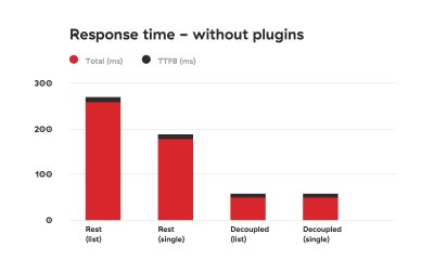
Comparison graph depicting response times of using WordPress REST API vs using the decoupled approach without added plugins. The decoupled approach is 2 to 3 times faster. (Large preview)

Comparison graph depicting response times of using WordPress REST API vs using the decoupled approach with added plugins. The decoupled approach is up to 8 times faster. (Large preview)
As you can see, the difference is drastic.
Security Concerns
There are some caveats that you’ll need to take a good look at. First of all, we are manually loading WordPress core files, which in the WordPress world is a big no-no. Why? Well, besides the fact that manually fetching core files can be tricky (especially if you’re using nonstandard installations such as Bedrock), it could pose some security concerns.
If you decide to use the method described in this article, be sure you know how to fortify your server security.
First, add HTML headers like in the test.php file:
header( ‘Access-Control-Allow-Origin: your-front-end-app.url’ );
header( ‘Content-Type: application/json’ );
The first header is a way to bypass CORS security measure so that only your front-end app can fetch the contents when going to the specified file.
Second, disable directory traversal of your app. You can do this by modifying nginx settings, or add Options -Indexes to your .htaccess file if you’re on an Apache server.
Adding a token check to the response is also a good measure that can prevent unwanted access. We are actually working on a way to modify our Decoupled JSON plugin so that we can include these security measures by default.
A check for an Authorization header sent by the frontend app could look like this:
if ( ! isset( $_SERVER[‘HTTP_AUTHORIZATION’] ) ) {
return;
}
$auth_header = $_SERVER[‘HTTP_AUTHORIZATION’];
Then you can check if the specific token (a secret that is only shared by the front- and back-end apps) is provided and correct.
Conclusion
REST API is great because it can be used to create fully-fledged apps — creating, retrieving, updating and deleting the data. The downside of using it is its speed.
Obviously, creating an app is different than creating a classic website. You probably won’t need all the plugins we installed. But if you just need the data for presentational purposes, caching data and serving it in a custom file seems like the perfect solution at the moment, when working with decoupled sites.
You may be thinking that creating a custom plugin to speed up the website response time is an overkill, but we live in a world in which every second counts. Everyone knows that if a website is slow, users will abandon it. There are many studies that demonstrate the connection between website performance and conversion rates. But if you still need convincing, Google penalizes slow websites.
The method explained in this article solves the speed issue that the WordPress REST API encounters and will give you an extra boost when working on a decoupled WordPress project. As we are on our never-ending quest to squeeze out that last millisecond out of every request and response, we plan to optimize the plugin even more. In the meantime, please share your ideas on speeding up decoupled WordPress!

(md, ra, yk, il)


