How to Build a WordPress Theme from Scratch: Final Steps

Original Source: https://www.sitepoint.com/build-wordpress-theme-from-scratch-final/

In this article, we’ll complete our foray into building a WordPress theme from scratch, focusing on refining our templates, adding meta information, post thumbnails, sidebars, user-friendly controls and more.

This is the third, and last part of the WordPress series on building a WordPress theme. Part 1 introduced WordPress theming, and in part 2 we built a basic theme. We utilized the Clean Blog template by StartBootstrap to add style to our WordPress theme. The code we’ve written so far is available on GitHub.

We have added single.php, page.php, archive.php and index.php templates so far, but we left the task of finalizing it for this part of the task. We introduced functions.php — a file that WordPress uses to automatically include functionalities particular to our theme, and we added functions to it. We added a dynamic header function to our header.php, and we separated that functionality into our functions.php. Ideally, this should be organized into a separate file — possibly in an inc folder inside our theme — to keep things clean.

In part 2, we also introduced partials — footer.php and header.php.

Refining the Templates

In the previous article, we separated our <body> tag — the opening one — into header.php, and we added <?php body_class(); ?> to it. This adds some semantic classes to the body that tell us whether we are on a page, post, whether we’re logged in, or not, and so on — enabling us to style different elements of our website depending on pages visited, and other things.

If we visit the home page and open the browser console to inspect these classes, we’ll see that we lack the current template information among these classes:

Inspecting classes in the browser console

To be able to change the things WordPress displays, we need to know what file is being used. In our case, index.php is used as a default fallback template. This infographic shows the hierarchy of templates used. It can come very handy when overriding or creating themes.

In the previous article, we started refining the archive.php loop, adding meta information and post thumbnails to outputed articles. We’ll separate that loop into a separate file, include it in archive.php and index.php, and finish refining it.

Firstly, we’ll replace the content in both files between while and endwhile with a single line that requests the partial file, so index.php will look something like this:

<?php
/**
* @package Botega_Scratch_Theme
*/

get_header(); ?>

<?php
if ( have_posts() ) : while ( have_posts() ): the_post();

get_template_part( ‘partials/content’, get_post_type() );

endwhile;
endif;
?>

<?php get_footer(); ?>

Once we’ve done that, we’ll place the content we have replaced in archive.php into the partials/content.php file:

<div <?php post_class( ‘post-preview’ ); ?> id=”post-<?php the_ID(); ?>”>

<header class=”entry-header”>
<?php
if ( is_singular() ) :
the_title( ‘<h1 class=”entry-title”>’, ‘</h1>’ );
else :
the_title( ‘<h2 class=”entry-title”><a href=”‘ . esc_url( get_permalink() ) . ‘” rel=”bookmark”>’, ‘</a></h2>’ );
endif;

if ( ‘post’ === get_post_type() ) :
?>
<div class=”entry-meta”>
<?php
bsimple_posted_on();
bsimple_posted_by();
?>
</div><!– .entry-meta –>
<?php endif; ?>
</header><!– .entry-header –>

<a class=”post-thumbnail” href=”<?php the_permalink(); ?>” aria-hidden=”true” tabindex=”-1″>
<?php
the_post_thumbnail( ‘post-thumbnail’, array(

) );
?>
</a>

<?php the_excerpt(); ?>

</div>

Once we upload these changes to the server, we’ll see that our front page now, in each post in the post list, has meta information — date and author links:

Our front page now has date and author links

This means that our partial works.

Posts Thumbnails

We can see that none of our fake posts have any images in general, and no featured images specifically. If we go to the WordPress dashboard and try to add the featured image to our post/page, we’ll see that there’s no file upload field in the rightmost sidebar. (For those unfamiliar with WordPress, more about this feature can be read here.)

Post thumbnails aren’t enabled by default in WordPress themes. It’s a feature that needs to be turned on specifically in new themes. Most themes have it enabled.

To do this, we include add_theme_support( ‘post-thumbnails’ ); line to our functions.php.

Now thumbnails are enabled.

Now we can empty our WordPress installation of all the content by using the wp-cli command wp site empty –allow-root (or we can do it manually from the WordPress dashboard), and repopulate it with FakerPress. It should fill posts and pages with featured images it grabs from the Internet. (We’ll need to recreate the Top Menu like before, and assign pages and posts to it.)

One tip: if we’re building themes for sale, or generally themes that will be released to a wider audience, we may want to use theme unit test data provided by Automattic, as it may provide content for testing a wider scope of cases and theme details.

We can specify image sizes to FakerPress, but it will in all likelihood still result in a messy look.

When we build a theme, one of the techniques used to achieve a polished, standardized look is to specify thumbnail sizes. These are standard sizes WordPress will resize all uploaded image to fit. We’ll use the WordPress add_image_size() function to add several image sizes that our theme will use:

add_image_size( ‘list-thumb-1’, 730, 400, true);
add_image_size( ‘small-list-thumb-1’, 400, 200, true);
add_image_size( ‘small-list-thumb-2’, 300, 200, true);
add_image_size( ‘small-list-thumb-3’, 220, 140, true);

Then we’ll output any of the formatted images by using the_post_thumbnail() in our content.php:

<a class=”post-thumbnail” href=”<?php the_permalink(); ?>” aria-hidden=”true” tabindex=”-1″>
<?php
the_post_thumbnail( ‘small-list-thumb-1’);
?>
</a>

To achieve a nicely formatted excerpt in our archive or blog list, we’ll increase font size, but to do this, we’ll reduce the number of words outputted by the_excerpt():

# functions.php
function custom_excerpt_length( $length ) {
return 40;
}
add_filter( ‘excerpt_length’, ‘custom_excerpt_length’, 999 );

To be able to float image (thumbnail we just mentioned) and excerpt, we add the following to the parent element selector in our css:

.home .post-preview.post {
overflow: hidden;
}

(We don’t cover here the smaller styling adjustments that aren’t crucial to the theme itself.)

Now, we can increase our font size, and have the excerpt float around the image, by floating the image (along with the a parent element):

The excerpt floats around the image

We’ll also use post_thumbnails later, on single posts/pages.

Theme Sidebars

Theme Sidebars are widgetized areas in the theme. They need to be registered in the WordPress system so that we can place different widgets to these areas. Once we do that, we print — or output — these widgets in our template files.

We’ll register a number of sidebars in our theme, which can be seen in the GitHub repository of the theme. We do this by adding the following code to our functions.php:

// Register custom sidebars
function sidebar_register() {

$args = array(
‘name’ => __( ‘home_header’, ‘bsimple’ ),
‘description’ => __( ‘home_header’, ‘bsimple’ ),
‘id’ => ‘h_h’,
‘class’ => ‘home_header’,
‘before_widget’ => ‘ <div class=”dyn-sidebar side sidebar”>’,
‘after_widget’ => ‘</div>’,
‘before_title’ => ‘<h2 class=”widgettitle”>’,
‘after_title’ => ‘</h2>’,
);
register_sidebar($args);

$args = array(
‘name’ => __( ‘archive_sidebar_1’, ‘bsimple’ ),
‘description’ => __( ‘Archive Sidebar no 1’, ‘bsimple’ ),
‘id’ => ‘a_s_1’,
‘class’ => ‘archive_sidebar_1’,
‘before_widget’ => ‘ <div class=”dyn-sidebar side sidebar”>’,
‘after_widget’ => ‘</div>’,
‘before_title’ => ‘<h2 class=”widgettitle”>’,
‘after_title’ => ‘</h2>’,
);
register_sidebar($args);

$args = array(
‘name’ => __( ‘bottom_center_sidebar’, ‘bsimple’ ),
‘description’ => __( ‘Bottom Center Sidebar’, ‘bsimple’ ),
‘id’ => ‘b_c_s’,
‘class’ => ‘bottom_center_sidebar’,
‘before_widget’ => ‘<div id=”bottom-center-sidebar”>’,
‘after_widget’ => ‘</div>’,
‘before_title’ => ‘<h2 class=”widgettitle”>’,
‘after_title’ => ‘</h2>’,
);
register_sidebar($args);

}
add_action( ‘widgets_init’, ‘sidebar_register’ );

Here, we show how to register two sidebars. Further details on the register_sidebar() function can be found at wordpress.org.

We register eleven sidebars, but we don’t need to output all of these in all page templates or website locations. If they’re outputed in the currently customized page, they’re accessible in the Customizer under widgets:

The various sidebars

Here’s an example of actual output of the sidebar or widget area in the footer.php — which means it can be displayed globally:

<?php if ( is_active_sidebar( ‘b_c_s’ ) ) : ?>
<div class=”row b_c_s”><div class=”col-lg-8 mx-auto top-widget col-md-10 “>
<?php get_sidebar( ‘BottomCenterSidebar’ ); ?>
</div></div>
<?php endif; ?>

Here we use a sidebar ID we used in the register_sidebar function for the bottom_center_sidebar above.

We also conditioned the width of the central content container on the home page dependent on whether there are sidebars with active widgets ( is_active_sidebar()):

# index.php
<div class=”row”>
<?php if ( (is_home() && is_active_sidebar( ‘h_s_1’ )) || (is_archive() && is_active_sidebar( ‘archive_sidebar_1’ )) ) { ?>
<div class=”col-lg-7 col-md-9″>
<?php } else { ?>
<div class=”col-lg-12 col-md-10 mx-auto”>
<?php } ?>

<?php
if ( have_posts() ) : while ( have_posts() ): the_post();
get_template_part( ‘partials/content’, get_post_type() );
endwhile;
endif;
?>

</div>

<?php if ( (is_home() && is_active_sidebar( ‘h_s_1’ )) || (is_archive() && is_active_sidebar( ‘archive_sidebar_1’ )) ) { ?>
<div class=”col-lg-4 offset-lg-1 col-md-10 col-sm-12 arch- sidebar-side-cont”>

<?php }

if ( is_home() ) :
get_sidebar( ‘HomeSidebar1’ );
elseif ( is_archive() ) :
get_sidebar( ‘ArchiveSidebar1’ );
endif;
?>

<?php if ( (is_home() && is_active_sidebar( ‘h_s_1’ )) || (is_archive() && is_active_sidebar( ‘archive_sidebar_1’ )) ) { ?>
</div>
<?php } ?>

</div>

We output Bootstrap classes dependent on these conditions, making sure the theme won’t look empty if we omit setting up widgets for pages such as home.

After we fill these widget areas with widgets and images, this is what we get:

The result of filling the widget areas

Theme is shaping up nicely. Readers will, of course, adapt the styling to their liking.

The post How to Build a WordPress Theme from Scratch: Final Steps appeared first on SitePoint.

Magnificent Hand Lettering by Emilee Rudd

Original Source: http://feedproxy.google.com/~r/abduzeedo/~3/4F-pu0V_T5s/magnificent-hand-lettering-emilee-rudd

Magnificent Hand Lettering by Emilee Rudd

Magnificent Hand Lettering by Emilee Rudd

GisMullr
Nov 20, 2018

I’m slightly obsessed with hand lettering. I simply love when I stumble upon any branding, print, signage, mural, etc. showcasing a beautiful lettering work. The talent involved in creating beautiful things using only your free hand, creativity and skills never ceases to impress me. From packages on a supermarket shelf to restaurant chalkboard menus or street signs, I’m always delighted to see a good old hand-drawn piece. And this is why I’m always looking for artworks with that particular style. While browsing the hashtag hand lettering on Instagram I stumbled upon Emilee Rudd, a designer from Sacramento, CA. And so happy to have found this amazing talent. Her work simply stood out and caught my attention right away. Her style, the colors she uses, the lightness of her work are simply stunning. Upon browsing her Instagram you’ll find hand lettering for all sorts of things. And all of them are stunning. From menus to magazines covers, from coffee cups to quotes, Emilee showcases pieces that will certainly get you hooked into lettering too.

Since my own handwriting isn’t so great I feel like lettering is a little bit intimidating. The process of drawing letters and transforming words and sentences into beautiful artworks is fascinating. So I actually love to see artists creating these beautiful free handpieces. With that in mind, I’m delighted to share the videos Emilee has of her creative process. She makes the hand lettering creation process seem so effortless. Take a look at her artworks and videos we have here today. We have videos from her sketchbook and from a project she did for a client. Maybe after seeing her work, you’ll be inspired to give hand lettering another chance. Enjoy!

About: Emilee Rudd is an award-winning multidisciplinary creative who believes that inspiration lies on the confluence of art and design. She utilizes a professional background of various mediums and techniques to develop a unique creative solution to every client’s needs. With a passion for historical reference and experimental methodology, she enjoys a wide range of creative challenges to tackle. She loves nothing more than to work with a client to achieve a personalized and impactful solution to their brand or project’s needs.

Magnificent Hand Lettering by Emilee Rudd

Magnificent Hand Lettering by Emilee Rudd

Magnificent Hand Lettering by Emilee Rudd

Magnificent Hand Lettering by Emilee Rudd

Magnificent Hand Lettering by Emilee Rudd

Magnificent Hand Lettering by Emilee Rudd

Magnificent Hand Lettering by Emilee Rudd

Magnificent Hand Lettering by Emilee Rudd

Magnificent Hand Lettering by Emilee Rudd

Magnificent Hand Lettering by Emilee Rudd

Magnificent Hand Lettering by Emilee Rudd

Magnificent Hand Lettering by Emilee Rudd

Magnificent Hand Lettering by Emilee Rudd

Videos

Emilee Rudd Inktober 2018 from Emilee Rudd on Vimeo.

Emilee Rudd Sketchbook from Emilee Rudd on Vimeo.

More links:
emileerudd.com
Instagram
Drunk on Lettering podcast – Episode 83 Emilee Rudd

hand lettering
illustration


30+ Examples of Brand Identity Design Done Right

Original Source: https://www.hongkiat.com/blog/identity-branding-design-part-2/

Identity branding is an intergral part of business. After all, you have make sure that you can market yourself properly. It’s not always easy trying to come up with a design that suits your…

Visit hongkiat.com for full content.

Implications Of Thinking In Blocks Instead Of Blobs

Original Source: https://www.smashingmagazine.com/2018/11/implications-blocks-blobs/

Implications Of Thinking In Blocks Instead Of Blobs

Implications Of Thinking In Blocks Instead Of Blobs

Leonardo Losoviz

2018-11-20T13:00:59+01:00
2018-11-20T16:58:08+00:00

Gutenberg is a JavaScript-based editor (more specifically, it is a React-based editor), which will soon transform the experience of creating content for WordPress and (on an upcoming stage when Gutenberg is transformed into a site builder) the experience of creating WordPress sites.

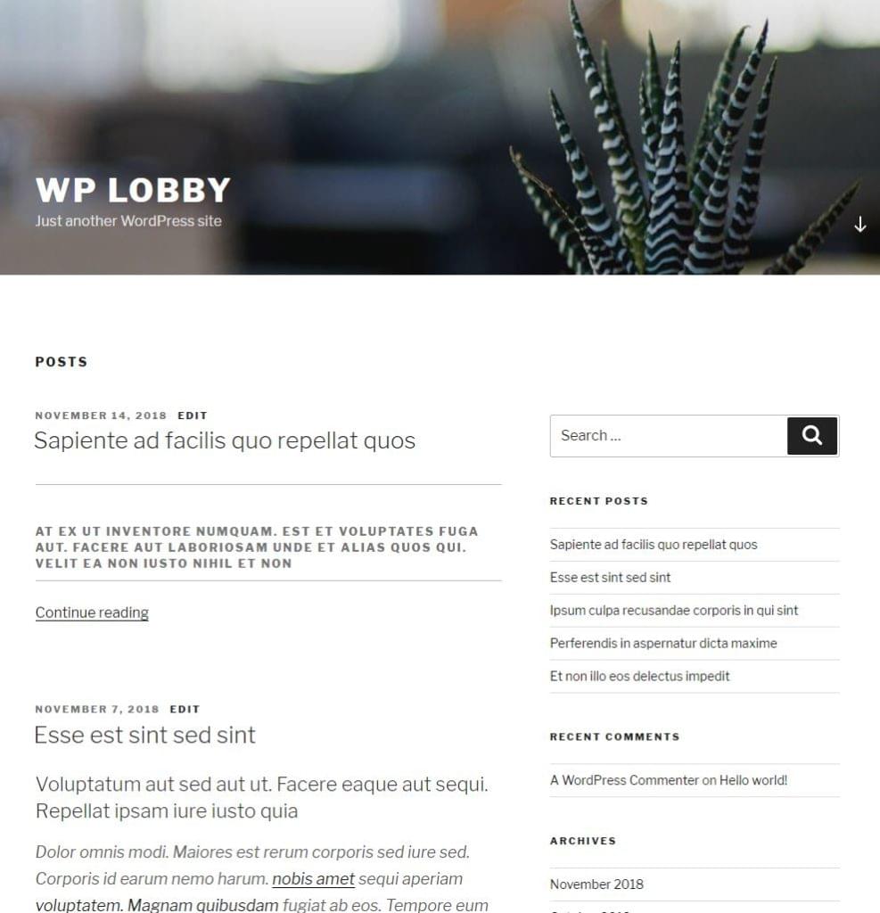
Gutenberg, the site builder, will demand a different way of thinking how to lay the foundations of a website. In what we can already call the “old” model, WordPress sites are created by giving structure through templates (header.php, index.php, sidebar.php, footer.php), and fetching the content on the page from a single blob of HTML code. In the new model, the page has (React) components placed all over the page, each of them controlling their own logic, loading their own data, and self-rendering.

To appreciate the upcoming change visually, WordPress is moving from this:

The page contains templates with HTML code

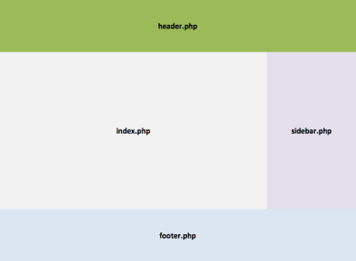
Currently pages are built through PHP templates. (Large preview)

…to this:

The page contains autonomous components

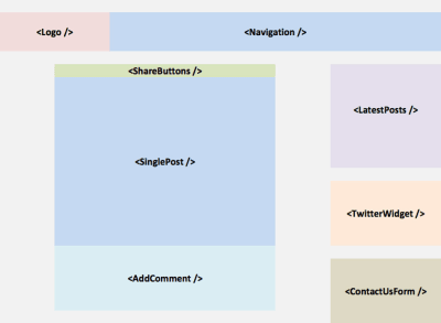
In the near future, pages will be built by placing self-rendering components in them. (Large preview)

I believe that switching from blobs of HTML code to components for building sites is nothing short of a paradigm shift. Gutenberg’s impact is much more than a switch from PHP to JavaScript: there are things that could be done in the past which will possibly not make sense anymore. Likewise, a new world of possibilities opens up, such as rich and powerful user interactions. Web developers will not go from creating their sites in one language to creating their sites in another language because the site will not be the same anymore; it will be a completely different site that will be built.

Recommended reading: The Complete Anatomy Of The Gutenberg WordPress Editor

Web forms are such an important part of the web, but we design them poorly all the time. The brand-new “Form Design Patterns” book is our new practical guide for people who design, prototype and build all sorts of forms for digital services, products and websites. The eBook is free for Smashing Members.

Check the table of contents ↬

Form Design Patterns — a practical guide for anyone who needs to design and code web forms

Gutenberg has not been fully embraced by the WordPress community yet, for many reasons. For one, the new architecture is based on a plethora of tools and technologies (React, NPM, Webpack, Redux, and so on) which is much more difficult to learn and master than the old PHP-based one. And while it may be worth learning a new stack that delivers new functionalities, not every mom&pop site needs these new, shiny features.

After all, it is no coincidence that 30% of all sites across the globe are WordPress sites: most of these are really simple sites such as blogs, not dynamic social networks like Facebook. For another, WordPress inclusivity means that anyone could build a simple website — even people without coding experience, such as designers, content marketers, and bloggers.

But the complexity of the new architecture will leave many people out (I don’t even want to think about debugging my site in minified JavaScript code). And for another, once Gutenberg goes live, Facebook-backed React will be added to as many as 30% of all websites in the world — overnight. Many folks are uncomfortable with giving so much power to any sort of JavaScript library, while many others are mistrustful of Facebook. To alleviate this concern, Gutenberg abstracts React to also enable coding in other frameworks or libraries; however, in practice, React will undoubtedly be the predominant JavaScript library.

And yet, the prospect of being offered a new world of possibilities is sweet indeed. In my case, I am excited. However, my excitement is not about the technology (React) or about the implementation (Gutenberg), but about the concept, which is to create sites using components as the building unit. In the future, the implementation may switch to another platform, such as Vue, but the concept will remain.

Foreseeing what new features we will be able to implement is not always easy. It takes time to adapt to a new paradigm, and we tend to use new tools the old way until it dawns upon us how to use the new tools to accomplish new objectives. Even PDF files (which are a representation of print, the predominant technology before the web was born) are still a common sight on the web, neglecting the advantages that the web has over print.

“Imitating paper on a computer screen is like tearing the wings off a 747 and using it as a bus on the highway.”

— Ted Nelson

In this article, I will analyze several implications of building sites through a component-based architecture (as the concept) and through Gutenberg (as the implementation), including what new functionalities it can deliver, how much better it can integrate with current website development trends, and what it means to the future of WordPress.

Extended Versatility And Availability Of Content

A very important side effect of treating all content as blocks is that it allows to target chunks of HTML individually and use them for different outputs. Whereas content inserted in the HTML blob is accessible only through the webpage, as chunks it can be accessed through an API, and its metadata is readily available. Take media elements — such as videos, audio or images. As a standalone block, the video can be played in an app, the audio can be played as a podcast, and the images can be attached to the email when sending a digest — all of this without having to parse the HTML code.

Likewise, content from blocks can be adapted for different mediums: from the tiniest screen to the biggest ones, touchscreen or desktop, commanded by voice or by touch, 2D/AR/VR, or who knows what the future might bring. For instance, an audio block allows the audio to be played on an Apple Watch, commanded by voice through the In-car system or an AWS Echo, or as a floating item in our virtual world when using a VR headset. Blocks can also make it easier to set-up a single source of truth for content to be published in different outputs, such as a responsive website, AMP, mobile app, email, or any other, as was done by NPR through their Create Once, Publish Everywhere (COPE) approach.

Note: For more info on these topics, I suggest watching Karen McGrane’s Content in a Zombie Apocalypse talk.

Blocks can improve the user experience too. If browsing the site through 3G, blocks can self-render in a slow-connection mode to display low-quality images and skip loading videos. Or it can enhance the layout, such as offering to show an image gallery with one click at any point of the webpage, and not just at the place where it was embedded in the article.

These experiences can be attained by separating content from form, which implies that the presentation and the meaning of the content are decoupled, and only the meaning is saved on the database, making presentation data secondary and saving it on another place. Semantic HTML is an expression of this concept: we should always use <em> which implies meaning, instead of <i> which is a form of presentation (to make the character be displayed in italics), because then this content will be available to other mediums, such as voice (Alexa can’t read in italics, but she can add emphasis to the sentence).

Obtaining a thorough separation of content from form is very difficult since presentation code will often be added inside the block, through HTML markup (adding class “pull-right” already implies presentation). However, architecting the site using blocks already helps attain some level of separation at the layout level. In addition, blocks created to do just one thing, and do it very well, can make use of proper semantic HTML, have a good separation of concerns in its own architecture concerning HTML, JS, and CSS (so that porting them to other platforms may require only a minimum effort,) and be accessible, at least at the component-level.

Note: A general rule of thumb: The more inclusive a component is, the more prepared it is for mediums yet to be invented.

Unfortunately, Gutenberg was not designed with this purpose in mind, so blocks contain plenty of HTML markup for presentation too. For instance, an image block from an external image has, as its meaning, only the URL for the image, the alt description, and the caption (and possibly also the width and height); after creating an image block, the following chunk of code was saved in the DB (class aligncenter is for presentation, and the markup <div class="wp-block-image" /> would be completely redundant if storing only meaning):

<!– wp:image {“align”:”center”} –>
<div class=”wp-block-image”>
<figure class=”aligncenter”>
<img src=”https://cldup.com/cXyG__fTLN.jpg” alt=”Beautiful landscape”/>
<figcaption>If your theme supports it, you’ll see the “wide” button on
the image toolbar. Give it a try.</figcaption>
</figure>
</div>
<!– /wp:image –>

In addition, blocks are saved inside the post’s content (which is a big HTML blob) instead of each having an entry of its own in the database. Reusable blocks (also called global blocks) do have their own entry though, which makes me fear that developers may convert standard blocks to reusable blocks just for a quick hack to access them straight in the DB.

Similarly, I am worried that, if not properly designed, blocks can even cause havoc in our sites. For instance, unaware developers may ignore the rule of least power, using JavaScript not just for functionality but also for CSS and markup. In addition, Gutenberg’s server-side rendering (SSR) functionality is not isomorphic (i.e. it does not allow a single codebase to produce the output for both client and server-side code), hence dynamic blocks must implement the function to generate the HTML code also as PHP as to offer progressive enhancement (without which the site is unaccessible while being initially loaded).

In summary, blocks are a step in the right direction towards making WordPress content available on any format and for any medium, but they are not a definitive solution, so much work still needs to be done.

Performance

Performance matters. Faster sites lead to happier users, which leads to better conversion rates. The team at Etsy, for instance, shelves new features, as cool as they may be, if these make their site loading time go over a critical threshold (I recommend watching Allison McKnight’s talk on Building Performance for the Long Term and slides), while the team at Twitter re-architected their site several years ago to support server-side rendering in order to show content as soon as possible, and continually implements plenty of small changes that add up to deliver a fast user experience.

JavaScript being so attractive to developers, they experience no constraint on their use of it, which is a real problem: JavaScript is very expensive concerning performance, and it should be used very carefully.

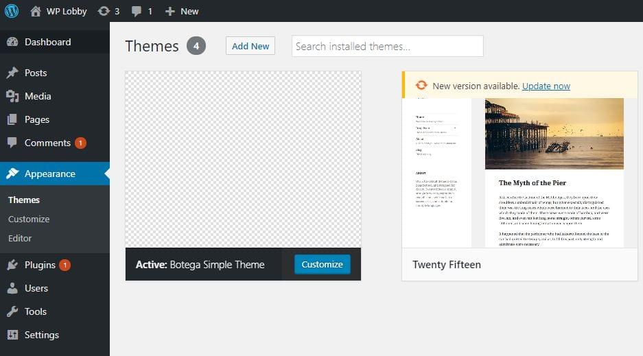
As it stands now, Gutenberg is far from optimal: whereas creating a post with the old editor (for which we need to install the Classic Editor) requires loading around 1.4 MB of JavaScript, Gutenberg loads around 3.5 MB of JavaScript, just for its basic experience (that is, without installing any additional block):

At least 3.5 MB of scripts are required for loading Gutenberg

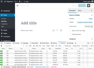
Loading scripts for Gutenberg. (Large preview)

That means that, as it stands now, 3.5 MB is the baseline, and loading size will only increase from there as the site admin installs more blocks. As was seen in a recent article on Smashing Magazine, creating a testimonials block required 150KB of minified JavaScript. How many blocks will a standard site require? How many MB of JavaScript will the average site need to download?

The implications are several: for one, a heavy site is out of reach to the next billion users, who have access mainly on slow connections, and who buy data plans which represent a significant chunk of their wage. For them, every MB of data makes a difference: sending Whatsapp messages is affordable, downloading several MBs of scripts just to load one site is not.

It is true that the user of the website will not need to interact with Gutenberg, since Gutenberg is simply for building the site, not for using it: Gutenberg is a back-end editor, not a front-end editor (and it may never be — at least as part of WordPress core). However, content creators will be penalized, and they are already a sizable target. In addition (as I argued earlier), users may end up being penalized too through dynamic blocks, which may create their markup through client-side JavaScript instead of server-side PHP.

There is also the issue of bloat from duplicated functionality added by 3rd party plugins. In the old days, a WordPress site may have loaded several versions of jQuery, which was relatively easy to fix. Nowadays, there is a huge array of open source libraries to choose from for implementing a needed functionality (drag and drop, calendars, multi-select components, carousels, etc.,) so more likely than not a site with dozens of 3rd party blocks will have the same functionality implemented by different libraries, creating unnecessary bloat. In addition, there is a bit of bloat added to Gutenberg itself: because blocks are registered in the frontend, unregistering an already-registered block is done by loading an additional script. In my opinion, this is one of the biggest challenges for the Gutenberg contributors: to put in place a streamlined process that allows anyone (not just developers experienced with Webpack) to remove undesired libraries and package only the minimal set of resources needed for the application.

Finally, I mention again that Gutenberg supports server-side rendering, but because it may not be easy to maintain, developers may be tempted to not rely on it. In this case, there is the cost of additional roundtrips needed to get the data from the REST endpoints, just to render the layout, during which time the user will be waiting.

In my opinion, performance will be one of the major challenges for Gutenberg, the one that could make or break in terms of widespread adoption, and there is still plenty of work that should be done, mainly targeting the next stage when Gutenberg becomes a site builder.

Web Standards

As mentioned earlier, Gutenberg abstracts React to provide a framework-agnostic approach to building blocks which, if implemented properly, can avoid WordPress being locked to React. The WordPress community is cautious when merging any JavaScript framework into WordPress core, in great part because Backbone.js, not long after being added to WordPress core, saw a sharp decline in popularity, and other than powering the Media Manager not many features were accomplished with it. Even if React is the most popular JavaScript library right now, there is no reason to believe that this will always be the case (as jQuery’s unraveling can attest), and WordPress must be prepared for when that day finally arrives (which, given the fast pace of technology, may happen sooner than expected).

The best way to avoid being locked to any library is through web standards and, more specifically in this case, the implementation of blocks through web components. Web components are strongly encapsulated components which operate with the browser APIs, so they don’t require any JavaScript library to work with. However, they can be implemented through any client-side JavaScript framework.

Even though React doesn’t provide a seamless integration with web components yet, it eventually (or rather hopefully) will. As it is explained in React’s documentation, web components and React components can work alongside:

“React and Web Components are built to solve different problems. Web Components provide strong encapsulation for reusable components, while React provides a declarative library that keeps the DOM in sync with your data. The two goals are complementary. As a developer, you are free to use React in your Web Components, or to use Web Components in React, or both.”

As of today, prospects of this situation taking place are not looking very promising: I haven’t been able to find any tutorial for building blocks with web components. I believe the community should focus some effort towards this cause, encouraging developers to start building blocks using web components, and the sooner the better, since Gutenberg forces us to learn new technologies anyway, right now. It is an opportunity to establish a strong foundation with web standards, from the very beginning.

Interoperability Between Sites, Homogenization Of Sites

A block is a smaller entity than a theme or a plugin, so eventually blocks will be accessible on their own, and acquired through newly created block markets. Most likely there will initially be a Cambrian explosion of blocks as many players in the ecosystem rush to be the first to market their solutions, leading on the medium and long-term towards consolidation of the most successful ones.

Once the dust has settled, a few blocks will stand out and become the winners, obtaining most of the market on their specific categories. If/when that happens will be a cause of both concern and jubilation: concern about a new wave of homogenization of the web taking place (as it happened with Bootstrap), as sites using the same components may end up with the same look and feel, an jubilation about an increased interoperability between sites from relying on the same components and the same APIs, which can open the gates to new opportunities.

I am particularly excited about expanding interoperability between sites. It is an area that could, in the long term, undo kingdoms such as Facebook’s: instead of relying on a monopolistic gateway for sharing information, sites with different communities can easily share data among themselves, directly. This is not a new concept: the IndieWeb movement has long been working towards enabling anyone to own their own data on their own servers, by having websites talk to each other through microformats. For instance, their Webmention web standard allows two sites to have a conversation, in which each comment and response is stored in both of them, and Micro.blog offers a Twitter-of-sorts but based on the open web, in which the posts on the user’s timeline are gathered from RSS and JSON feeds from subscribed sites. These endeavors are wonderful, but still very small in impact, since there is some level of tech-savviness required to be part of them. Gutenberg’s component-based architecture can potentially produce a much broader impact: Popular blocks can enable scores of WordPress sites to talk to each other, eventually allowing up to 30% of all sites on the web to be part of a decentralized, loosely-coupled network.

This area will need plenty of work though, before being viable. I do not think the default REST endpoints are the best communication interface since they were not conceived for this purpose (the folks from micro.blog have proposed a better solution through their JSON interface, which is based on the RSS specification). In addition, REST is itself being made obsolete by GraphQL, so I wouldn’t place high hopes on it for the long term. I am also involved in finding a better way, for which I am currently working on a different type of API, which can retrieve all the required data in only one request, and supports extensibility through a component-based architecture.

I also expect integration with cloud services to be more prominent, since providers can release their own blocks to interact with their own services. Because a component is a standalone unit, just by drag-and-dropping the block into the page already does all the work from the user’s perspective, making it very easy to build powerful websites with little or no knowledge. For instance, an image storage provider like Cloudinary could release a block that automatically crops the image according to the viewport of the device, or requests the image as WebP if supported, or other use cases.

In summary, consolidation of the block market may bring homogenization of the way in how it looks and feels, which would be a regrettable event and should be avoided, and powerful capabilities concerning interoperability and data-sharing between sites and integration with cloud services.

Integration With Pattern Libraries

A pattern library is a collection of user interface design elements, each of them often composed by snippets of HTML, JS, and CSS. A block is an autonomous component, often made up of bits of HTML, JS, and CSS. So blocks are evidently well-suited to be documented/built with pattern libraries. Having blocks ship their pattern libraries would be a great deal since it could enable teams not to start implementing the site’s pattern library only at the site level, but as an aggregation and refinement of the mini-pattern libraries from all the required blocks.

I believe something similar to the streamlining process for producing bloatless JavaScript packages that I mentioned earlier happens in this case, but concerning UI/UX/Documentation. It would be both a challenge and an opportunity for Gutenberg contributors to put in place a process that makes it easy for block developers to create pattern libraries for their blocks which, when aggregated all together, can result in a coherent pattern library for the site. Well implemented, such feature could drive down the costs of building sites from a documentation/maintenance perspective.

What Will Become Of WordPress?

Gutenberg will certainly make websites more attractive, even though at the cost of a required level of expertise that not everyone will be able to handle. In the longer term, this may lead to higher quality, lower quantity. Coming from the WordPress maxim of “Democratizing Publishing,” this may become a problem.

I am enthusiastic about Gutenberg, but more as the concept of a component-based architecture, than the React-based implementation. In general terms, I do agree with what Matt Mullenweg said during WordCamp Europe 2018 to justify Gutenberg:

“The foundation of WordPress that is now served us well for fifteen years will not last for the next fifteen.”

However, I also believe that the WordPress of fifteen years into the future may end up being completely different than the one we know today. I wonder if WordPress will end up primarily being the client-based editor, and not much more: the initiative to integrate Gutenberg into Drupal, with the aim of making Gutenberg become the editor of the open web, will officialize WordPress as a headless CMS operating through REST endpoints. This is a good development by itself, but it will make WordPress the back-end dispensable: if any other back-end platform provides better features, there is no reason to stick to the WordPress back-end anymore. After all, client-side Gutenberg will be able to work with any of them, while the simplicity of creating a site with WordPress will be lost, leveling the playing field with all other platforms.

In particular, I would not be surprised if developers feel that maintaining two codebases (one in JavaScript and one in PHP) for rendering dynamic blocks is too taxing, and decide to shift towards platforms which support isomorphic server-side rendering. If this scenario actually happens, would Matt decide to shift the WordPress backend to Node.js?

It is mainly because of this issue that I dare to say that the WordPress from 15 years from now may be a very different entity than what it is nowadays. Who knows what will happen?

Conclusion

By making components the new unit for building sites, the introduction of Gutenberg will be transformational to WordPress. And as with any paradigm shift, there will be winners and losers. Different stakeholders will consider Gutenberg a positive or negative development depending on their own situation: while the quality of a website will go up, the price of building such a site from hiring developers who can handle its complexity will also go up, making it less affordable and less popular.

These are exciting times, but also pivotal times. From now on, WordPress may slowly start being a different entity from what we are used to, and we may eventually need to think about what WordPress is, and what it represents, all over again.

Smashing Editorial
(rb, ra, yk, il)

How to Build a WordPress Theme from Scratch: the Basics

Original Source: https://www.sitepoint.com/build-wordpress-theme-from-scratch-basics/

In this tutorial, we’ll explore WordPress theme file structure in depth, and learn how to create a basic WordPress theme from scratch.

In the first part of this series, we introduced WordPress theming, and the fundamental terminology relating to WordPress theme development. We covered templates, partials, template hierarchy, WordPress post types, the style.css stylesheet, WordPress filter and action hooks, WordPress loop, conditional tags, and we briefly took a look at a typical simple WordPress theme file structure.

Creating the Bare Minimum Theme

The first thing we’ll do is install a plugin that will enable us to batch create WordPress posts and other content. This way, we’ll be able to quickly populate our development website without losing too much time. One plugin that serves this purpose is FakerPress by Gustavo Bordoni, available in the WordPress plugin repository.

We quickly install and activate the plugin via WP-CLI.

Now, when we log in to the admin dashboard, we’ll see that FakerPress is installed, and we can create all sorts of content in batch, including any custom post types we have.

FakerPress is installed

Now, using this plugin, we’ll create some fake content. This is the result, using the default TwentySeventeen WordPress theme:

The TwentySeventeen theme with placeholder content

Now, we quickly dive in and set up a bare minimum theme that consists of the catch-all index.php file, and style.css, which we need for the WordPress templating system to recognize the theme:

/*
Theme Name: Botega Simple Theme
Theme URI: https://botega.co.uk
Author: Tonino Jankov
Author URI: https://botega.co.uk
Description: Basic WordPress theme for Sitepoint theme building tutorial
Text Domain: bsimple
Version: 1.0.0
License: GNU General Public License v2 or later
*/

This is the style.css, which consists only of meta CSS comments for now. These comments are required.

This is the index.php file. It will catch all the requests for now:

<?php
/**
*
* @package Botega_Scratch_Theme
*/
?>

<!DOCTYPE html>
<html <?php language_attributes(); ?>>
<head>
<title><?php bloginfo(‘name’); ?></title>
<link rel=”stylesheet” href=”<?php bloginfo(‘stylesheet_url’); ?>”>
<?php wp_head(); ?>
</head>
<body>

<header>
<h1><?php bloginfo(‘name’); ?></h1>
<h3><?php bloginfo(‘description’); ?></h3>
</header>

<?php
if ( have_posts() ) :
/* Start the Loop */
while ( have_posts() ) :
the_post();
endwhile;
endif;
?>

</body>

We now upload and activate the minimal theme we have. I activate it using WP-CLI:

The theme is now visible to WordPress, and is active:

The theme is now activated

We haven’t provided a screenshot, so the display in the backend is basic.

If we visit our website now in the browser, this is what we’ll see:

The current home page

Obviously, we have work to do.

If we view the source code of the home page, we’ll see that the wp_head() function has outputted a lot of default WordPress tags in the <head>, like CSS, JavaScript, link and meta tags.

The bloginfo() function is used to output website information.

Our home page is empty, because we aren’t outputting anything inside the Loop — a pattern that WordPress uses in all of its templates to output content.

The Codex page about the Loop goes deep into details about it. A typical structure for the loop — which is based on PHP while control structure — looks like this:

<?php
if ( have_posts() ) {
while ( have_posts() ) {
the_post();
//
// Post Content here
//
} // end while
} // end if
?>

We need to fill that while loop with content — or with content-outputting WordPress tags.

If we change our loop, by adding the_title(), the_excerpt(), and we add HTML markup and the_ID(), to look like this:

<?php
if ( have_posts() ) : while ( have_posts() ): the_post(); ?>

<div id=”post-<?php the_ID(); ?>”>
<h2><?php the_title(); ?></h2>
<div class=”post-excerpt”><?php the_excerpt(); ?></div>
</div>

<?php endwhile;
endif;
?>

We’ll now get a list of posts on our home page, with no style applied:

Unstyled output

WordPress shows A blog page — an archive page for all the blog posts — by default.

If we now visit single post URL — something like http://my-website.com/2018/11/14/sapiente-ad-facilis-quo-repellat-quos/ — we’ll see something like this:

Our current single post layout

Our loop, albeit very crude, actually works.

The post How to Build a WordPress Theme from Scratch: the Basics appeared first on SitePoint.

The best Apple Black Friday deals in 2018

Original Source: http://feedproxy.google.com/~r/CreativeBloq/~3/9jkhng0vyTo/apple-black-friday-and-cyber-monday-deals

It's that time of year already. Black Friday and Cyber Monday 2018 are just a few short days away now, and many deals have now been leaked or are live, which is great for those looking to nab a Black Friday bargain. For those looking more specifically for an Apple Black Friday deal, the news is mixed. While some retailers have announced discounts on products such as the iPhone 8 and iPhone X, Apple Watch Series 3, MacBook Air and iPad Mini 4 – more on that below – others have been quiet on the Apple Black Friday front.

What does this mean for those looking to snag an Apple Black Friday 2018 discount? Should you wait for the big day before you grab a bargain or act now while the iron's – or the deal's – hot? Read on to find out. 

Black Friday deals: Quick links
The best Microsoft Black Friday dealsThe best Adobe Black Friday dealsWacom Black Friday: the best dealsThe best Amazon Black Friday deals
Does Apple give Black Friday discounts?

From Apple itself, Black Friday discounts don't usually come in the form of money off products, so you're unlikely to get a cheap Apple laptop directly from the Apple Store. Instead, in 2017, the tech giant offered money off further Apple spending, with gift cards given on purchases made over Black Friday. 

Last year, if you bought a MacBook or an iMac, you got the maximum gift card of £120/$150, if you bought smaller Apple products, such as a Apple Watch Series 1 or iPhone SE, you got a £20/$25 gift card. We expect Apple to offer a similar deal this year, and while this could be a great way to save if you're an Apple super-fan, there are plenty of other ways to grab yourself an Apple Black Friday discount that may be more satisfying for your bargain-hunting instincts and your purse strings. 

Also note that the newest products didn't come with any gift cards, so if you're after the latest iPad Pro 2018, MacBook Air or Mac mini, you're unlikely to get any money off from Apple – or much off from anyone at all, if we're honest. 

However, Apple's latest product announcements do mean you could be more likely than ever to get a good deal on older Apple products.

Apple Black Friday and Cyber Monday: the best deals

While we expect the Apple Black Friday sale in 2018 to look similar to last year, with gift cards offered for some products, such as the MacBook (2017) and iPhone 8 (but not the latest ones like the iPhone XS), other retailers such as Amazon, Target, Currys, Costco, Sam's Club and John Lewis are likely to slash their Apple prices over Black Friday and Cyber Monday. Some of them have already announced they'll be doing so, and some have even started offering early Black Friday deals. Here's more on what we know so far.

Apple Watch Black Friday US deals

Since the Apple Watch 4 landed we've been seeing discounts on the older Apple Watch models, such as the Watch Series 3, and we expect to see prices drop even further this Black Friday. Keep an eye on the prices of the Watch you're interested in. If you see a price increase over the next few weeks, it's likely that price will then drop down on Black Friday. So be vigilant! 

Below is the best deal we're seeing on the Apple Watch Series 3, with more deals expected soon. Note that all deals are available while stocks last so get in there quick.

Apple Watch Black Friday UK deals
Apple AirPods Black Friday

Despite the rumours, at Apple's latest launch event in New York, there was no announcement of an AirPod update, leaving it uncertain whether they'll get a makeover before the end of the year. That is good news, however, for those coveting the original AirPods, as we are more likely to see discounts on them this Black Friday and Cyber Monday. 

In the US, we've only seen one Apple Airpods Black Friday deal so far and it was an early one from Sam's Club, which had various discounts on 10 November. There was $30 off Apple Airpods, and that's about the best we expect you'll be able to see. Keep checking back here as we'll post more deals when they become live.

In the UK, there aren't really any Black Friday Apple Airpod deals worth shouting about yet. In the meantime, here's today's best deals on Airpods.

Apple 4K TV Black Friday

If you'd like to turn your TV into a smart device with gorgeous imagery and Dolby Vision support, then the Apple 4K TV is the way to go. If you don't need all of that, but just want your TV to become 'smart', then older generation models such as the Apple TV 3rd generation may suit you better, and these are the ones most likely to be discounted over Black Friday. We have yet to hear any announcements about discounts on Apple 4K TVs on Black Friday, but here are the best deals right now.

Apple iPad Black Friday US deals

Those who are after an iPad are in luck. Following the recent announcement of the new iPad Pro 2018, which comes with either an 11-inch or a 12.9-inch screen, and the updated Apple Pencil, it's likely that older iPads will be on sale over Black Friday and Cyber Monday. 

Last year we saw discounts on even the newest iPads, including the iPad 9.7-inch 32GB, which was down to around £300 from £339, and the iPad Pro 10.5, which had £50 off on Amazon. We aren't so optimistic as to expect an Apple Black Friday sale on the latest range of iPads, but we can dream… 

This year, we expect the older models to have their prices slashed further, and we're already seeing some fantastic US deals on a range of Apple iPads: we've listed our favourites below. 

Apple iPad Black Friday UK deals

If you're not sure whether you want the very latest Apple iPad product, or just want to check what all the fuss is about, then see our review of the new new iPad Pro 2018 here. Also check out our post on Black Friday iPad deals for more info.

Apple MacBook Black Friday

Apple's latest event included the news that the MacBook Air is receiving a welcome update, with a Retina display seemingly aimed at creative pros, and even the MacBook Pro got a refresh with the announcement of new AMD graphics options. What does the mean for Apple Black Friday deals in 2018? It's unlikely to be good news in terms of price if you're after the very latest tech, but if you're happy to get an earlier MacBook model, you should see some discounts. 

Apple MacBook Black Friday US deals
Apple MacBook Black Friday UK deals

Last year, John Lewis offered between £50 and £200 off selected MacBooks and iMacs, and we're already seeing some MacBooks on offer this year. Get them while they're still available.

To get the best deal, It's worth tracking the price of the model you're interested in from now on, so you'll know when you're getting an Apple Black Friday discount that's truly worth it. See our post on Black Friday and Cyber Monday MacBook deals this year for more info and deals.

iPhone X Black Friday

In 2017, there were discounts on the iPhone X over Black Friday even though it had only just been released, so this year, we expect big discounts on this smartphone. Seeing as the iPhone X is also being discontinued due to the arrival of the new iPhone XS Max, iPhone XS and iPhone XR, that means retailers will be wanting to shift their stock. 

iPhone X Black Friday US deals

As predicted, we're already seeing deals on the iPhone X and iPhone XR, although Target is following Apple's lead and offering gift cards instead of money off. 

iPhone X Black Friday UK deals
Where to find the best Apple Black Friday and Cyber Monday deals

As we said previously, the Apple Store isn't usually the best place to grab a bargain in the Apple Black Friday sale. Keep an eye on retailers such as Currys, Amazon, Target, Best Buy, Walmart and John Lewis, and don't forget to check back here, as we'll be curating the best deals as they come in.

How to get the best Apple Black Friday and Cyber Monday deals

To get the best deal possible, it's best to have a product and a price in mind. This will keep you from being overwhelmed by the options and becoming unable to make a decision (or making the wrong decision). 

Once you've decided on the product you're after, you can start tracking its price on various retailers – or even simpler, bookmark this page and keep checking it. You could also set up a Google Alert for the prices you're after. Here are some more tips here on how to make the most of Black Friday.

3 Apple products to look out for on Black Friday

Not sure what to go for after looking at all of Apple's great products? Our money is on the best discounts being on the MacBook Pro 15-inch, Apple Watch 3 and the iPad Pro 12.9.

And you may also find now's a good time to pick up an older MacBook Air.

Apple Store on Black Friday 2018: opening hours

Will you have to queue up round the block to get the best Apple Black Friday deals? This seems unlikely, because as far as we know, most Apple Stores will operate their usual opening hours across this period. You can check your local Apple Store opening times here.

As mentioned, however, the Apple Store may not be the best place to bag yourself Apple Black Friday deals, so you may be better off going to another retailer or shopping online. Don't forget that we'll be reporting on deals as they come in, so you can keep checking this page to bag yourself an Apple Black Friday bargain.

Read more:

Microsoft Black Friday: what to expectAmazon Black Friday and Cyber Monday: what to expectAdobe Black Friday: the deals we expect to see

3D Typography by Jonathan Ortiz

Original Source: http://feedproxy.google.com/~r/abduzeedo/~3/PS7Zzjfd5zw/3d-typography-jonathan-ortiz

3D Typography by Jonathan Ortiz

3D Typography by Jonathan Ortiz

abduzeedo
Nov 19, 2018

Jonathan Ortiz shared a beautiful collection of calligraphy and typography compositions. They are super colorful and stylish. There are some clever ideas on some of them, like a anagram style animation. One of my favorite pieces is the Pinterest one, it has a bit of a paintbrush feel but with a lot of depth. It feels that is was done in 3D. Actually most of the work that Jonathan shared takes a advantage of the clever use of shadows to add depth and movement. Super cool!

For more information about Jonathan make sure to check out his Behance profile at https://www.behance.net/joins

3D Typography


Typography


Collective #468

Original Source: http://feedproxy.google.com/~r/tympanus/~3/tUbRJxmfgp4/

C468_WOTW

Inspirational Website of the Week: Mathieu Lévesque

A portfolio with nice typographic effects and interesting details. Our pick this week.

Get inspired

C468_NW

This content is sponsored via Syndicate Ads
Northwestern’s Online MS in Information Design & Strategy

Build skills to translate data into compelling visuals and narratives and learn how research and analytics can drive communication strategies and tactics.

Find out more

C468_dev

Web.dev (beta)

A new site by the Chrome Developers team that aims to help developers learn and apply the web’s modern capabilities to their own sites and apps.

Check it out

C468_

Web High Level Shading Language

WebKit introduces a new graphics shading language for the Web inspired by HLSL. Follow the interesting discussion on HN about this.

Read it

C468_squoosh

Squoosh

This great web app by Google lets you optimize images and reduce their size dramatically by editing the advanced options of various image compressors.

Check it out

C468_spinning

A Brief History of Flickering Spinners

An interesting article by Mikael Ainalem on the troublesome case of too quickly ending loading animations.

Read it

C468_cashe

Inlining or Caching? Both Please!

Scott Jehl explores caching inlined files and shows a proof of concept.

Check it out

C468_vis

VisBug

Make any webpage feel like an artboard with this browser extension by Google. Watch the video.

Check it out

C468_turtletoy

Turtletoy

Turtletoy allows you to create generative art using a minimalistic JavaScript Turtle graphics API. By Reinder Nijhoff

Check it out

C468_tabindex

Why using ‘tabindex’ values greater than “0” is bad

Karl Groves lists the reasons why defining a number for tabindex should be avoided.

Read it

C468_devconcept

Developer page concept (digital design)

Dulov Evgeniy’s delightful developer page concept.

Check it out

C468_surma

State of Houdini — Director’s Cut (aka. Honest Edition)

The uncensored version of a great Chrome Dev Summit 2018 talk by Surma.

Watch it

C468_json

Why Facebook’s api starts with a for loop

A very interesting article by Antony Garand on the JSON hijacking vulnerability.

Read it

C468_font

Free Font: Wanderlust

A unique looking slab serif font designed by Jan Henkel.

Check it out

C468_heros

Head: Free header starter kit (Sketch)

A nice set of hero starter templates by Stefano Peschiera.

Get it

C468_jelly

#codevember 7/2018

A lovely jellyfish demo by Noel Delgado.

Check it out

C468_WritableFilesAPI

The Writable Files API: Simplifying local file access

Pete LePage explains what the idea of the Writable Files API is and what you could do with it.

Read it

C468_emojious

Emojious Free Icons

More than a hundred free icons from the adorable Emojious icon set.

Get it

C468_icons8

Icons 8 Beta

An update of the useful icon web app with thousands of free icons.

Check it out

C468_firstinputdelay

What is First Input Delay?

Ire Aderinokun’s summary on the First Input Delay (FID) metric.

Read it

C468_1111

The 1.1.1.1 App

Private internet by Cloudflare now as a mobile app.

Check it out

C468_trees

My journey had lasted seven hours

Gerard Ferrandez created this demo of randomly and recursively generated trees.

Check it out

C468_pageflip

From Our Blog
Page Flip Layout

A template with a two-sided, magazine-like layout and a flat page flip animation. The layout is powered by CSS Grid.

Check it out

Collective #468 was written by Pedro Botelho and published on Codrops.

Motion Design for SEAT Arona Global Launch

Original Source: http://feedproxy.google.com/~r/abduzeedo/~3/AEhGnGL3n0U/motion-design-seat-arona-global-launch

Motion Design for SEAT Arona Global Launch

Motion Design for SEAT Arona Global Launch

abduzeedo
Nov 16, 2018

Marco Salemi and Romina Giarrizzo shared a super stylish motion design project titled SEAT – Arona Global Launch. It features a lot of elements that made graphic design really awesome to me. I am talking about simple elements, textures and typography. There’s definitely a 90’s feeling too if you pay close attention. Some spray textures and style alongside with a lot of black and white. So enough said, check out below and I hope you get as inspired as I got.

Graphic and Motion Design

Credits

Work done for NERDO
Graphic Designer: Romina Giarrizzo, Marco Salemi
Motion Designer: Marco Salemi

motion design


Easy UX Tactics to Improve Your Content Strategy

Original Source: http://feedproxy.google.com/~r/Designrfix/~3/DMuxUfs3X3Q/easy-ux-tactics-to-improve-your-content-strategy

Content without context is meaningless. In a similar manner, your site’s content strategy becomes obsolete if your site’s User Experience is not on point. This is so because if your website isn’t capable enough of keeping the visitors looped, how will it be able to deliver them the content.   Content can only be delivered […]

The post Easy UX Tactics to Improve Your Content Strategy appeared first on designrfix.com.