Original Source: https://www.smashingmagazine.com/2019/07/desktop-wallpaper-calendars-august-2019/
Adventures In August (2019 Wallpapers Edition)
Adventures In August (2019 Wallpapers Edition)
Cosima Mielke
2019-07-31T11:50:06+02:00
2019-07-31T11:36:46+00:00
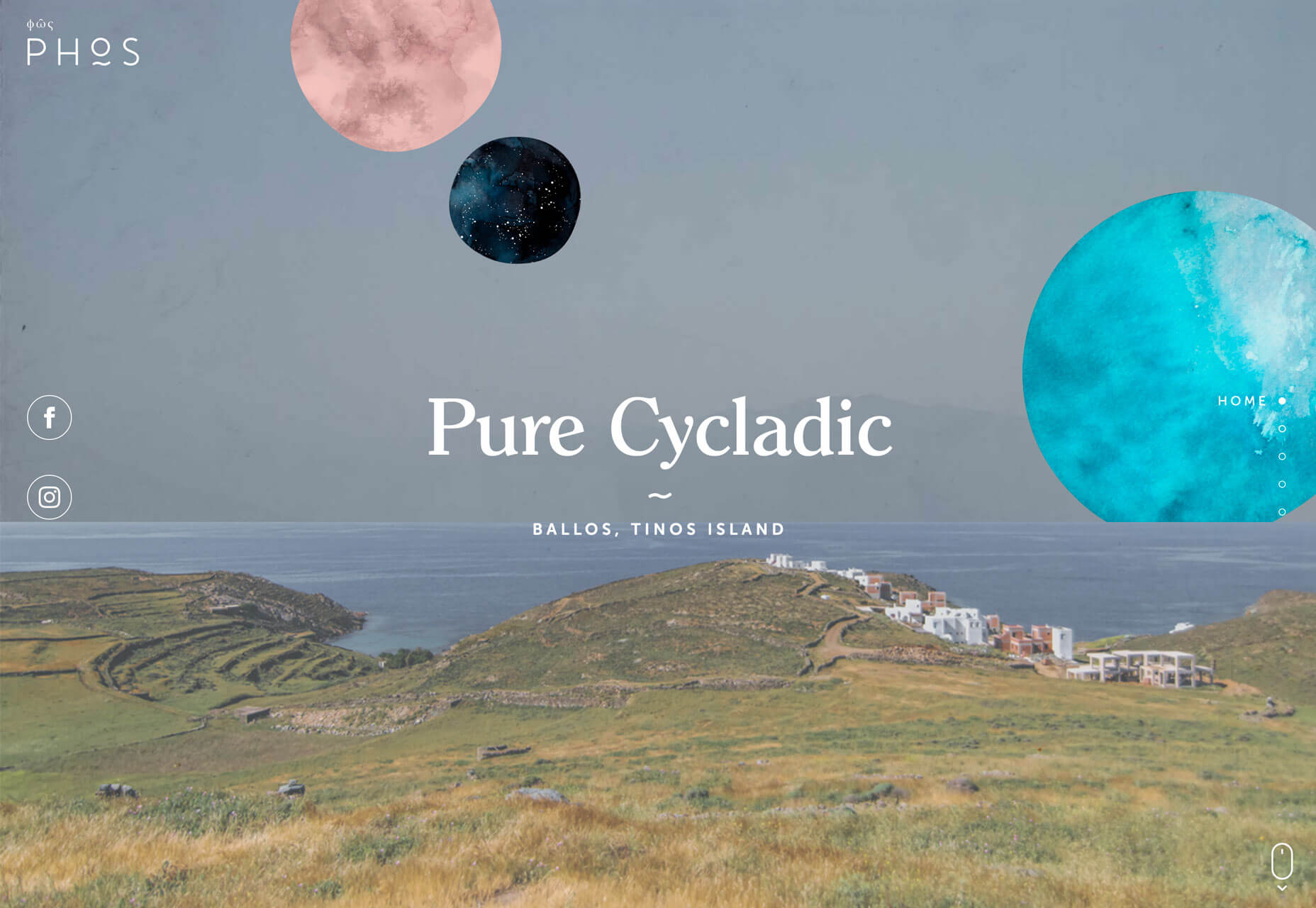
Everybody loves a beautiful wallpaper to freshen up their desktops and home screens, right? So to cater for new and unique artworks on a regular basis, we embarked on our monthly wallpapers adventure nine years ago, and since then, artists and designers from all across the globe have accepted the challenge and submitted their designs to it. It wasn’t any different this time around, of course.
This post features wallpapers created for August 2019. Each of them comes in versions with and without a calendar and can be downloaded for free. A big thank-you to everyone who got their creative juices flowing and submitted their designs!
At the end of this month’s collection, you’ll also find some “oldies but goodies” that we rediscovered way down in our wallpapers archives and that are just too good to gather dust. So, which one is your favorite this month?
Please note that:
All images can be clicked on and lead to the preview of the wallpaper,
We respect and carefully consider the ideas and motivation behind each and every artist’s work. This is why we give all artists the full freedom to explore their creativity and express emotions and experience through their works. This is also why the themes of the wallpapers weren’t anyhow influenced by us but rather designed from scratch by the artists themselves.
Submit your wallpaper
We are always looking for creative designers and artists to be featured in our wallpapers posts. So if you have an idea for a September wallpaper, please don’t hesitate to submit your design. We’d love to see what you’ll come up with. Join in! →
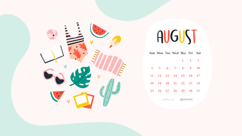
Colorful Summer
“‘Always keep mint on your windowsill in August, to ensure that the buzzing flies will stay outside where they belong. Don’t think summer is over, even when roses droop and turn brown and the stars shift position in the sky. Never presume August is a safe or reliable time of the year.’ (Alice Hoffman)” — Designed by Lívi from Hungary.
preview
with calendar: 800×480, 1024×768, 1280×720, 1280×1024, 1400×1050, 1680×1050, 1680×1200, 1920×1200, 2560×1440, 3475×4633
without calendar: 800×480, 1024×768, 1280×720, 1280×1024, 1400×1050, 1680×1050, 1680×1200, 1920×1200, 2560×1440, 3475×4633
Smoky Mountain Bigfoot Conference
“Headed towards Smoky Mountain Bigfoot Conference this summer? Oh, they say it’s gonna be a big one! Get yourself out there well-prepared, armed with patience and ready to have loads of fun with fellow Bigfoot researchers. Looking forward to those campsite nights under the starry sky, with electrifying energy of expectations filling up the air? Lucky you!” — Designed by Pop Art Studio from Serbia.

preview
with calendar: 320×480, 640×480, 800×480, 800×600, 1024×768, 1024×1024, 1152×864, 1280×720, 1280×800, 1280×960, 1280×1024, 1366×768, 1400×1050, 1440×900, 1600×1200, 1680×1050, 1680×1200, 1920×1080, 1920×1200, 1920×1440, 2560×1440
without calendar: 320×480, 640×480, 800×480, 800×600, 1024×768, 1024×1024, 1152×864, 1280×720, 1280×800, 1280×960, 1280×1024, 1366×768, 1400×1050, 1440×900, 1600×1200, 1680×1050, 1680×1200, 1920×1080, 1920×1200, 1920×1440, 2560×1440
Magic Forest
Designed by IQUADART from Belarus.

preview
with calendar: 640×480, 800×600, 1024×768, 1280×720, 1280×800, 1366×768, 1440×900, 1680×1050, 1920×1080, 1920×1200, 2560×1440
without calendar: 320×480, 640×480, 800×600, 1024×768, 1280×720, 1280×800, 1366×768, 1440×900, 1680×1050, 1920×1080, 1920×1200, 2560×1440
Friends Are Forever
“Friends are forever! No matter what, when, where you are, they are with you. A day spent with friends is always a day well spent.” — Designed by Sweans Technologies from London.

preview
with calendar: 320×480, 640×480, 800×480, 800×600, 1024×768, 1024×1024, 1152×864, 1280×720, 1280×800, 1280×960, 1280×1024, 1366×768, 1400×1050, 1440×900, 1600×1200, 1680×1200, 1920×1080, 1920×1200, 2560×1440
without calendar: 320×480, 640×480, 800×480, 800×600, 1024×768, 1024×1024, 1152×864, 1280×720, 1280×800, 1280×960, 1280×1024, 1366×768, 1400×1050, 1440×900, 1600×1200, 1680×1200, 1920×1080, 1920×1200, 2560×1440
El Pollo Pepe
“Summer is beach and swimming pool, but it means countryside, too. We enjoy those summer afternoons with our friend ‘El pollo Pepe’. Happy summer!” — Designed by Veronica Valenzuela from Spain.

preview
with calendar: 640×480, 800×480, 1024×768, 1280×720, 1280×800, 1440×900, 1600×1200, 1920×1080, 1920×1440, 2560×1440
without calendar: 640×480, 800×480, 1024×768, 1280×720, 1280×800, 1440×900, 1600×1200, 1920×1080, 1920×1440, 2560×1440
Summertime Magic
“Inspired by the magic of summer nights.” — Designed by Bekah Richards from Washington, DC.
preview
with calendar: 1280×800, 1440×900, 1600×1200, 1920×1080, 1920×1440, 2560×1440
without calendar: 1280×800, 1440×900, 1600×1200, 1920×1080, 1920×1440, 2560×1440
Life Is A Beach
“Life is like a beach, it is full of waves (read: ups and downs). But we got to learn to enjoy it the best we can!” — Designed by Emily van Hemert from the Netherlands.

preview
with calendar: 1600×1200, 1920×1080, 2560×1440
without calendar: 1600×1200, 1920×1080, 2560×1440
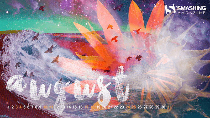
Crimson Sunset
“I was checking out a manga which centers around karuta, a game using cards with verses from a set of 100 Japanese Poems. One poem in the manga (which is not among those 100, ironically) caught my interest and since August instills some kind of autumn feel in it, I thought it suited this poem really well. By the way, I did this in HTML and CSS.” — Designed by Nguyen Tuong Van from Singapore.

preview
with calendar: 640×480, 1024×768, 1280×800
without calendar: 640×480, 1024×768, 1280×800
Oldies But Goodies
So many beautiful, unique, and inspiring wallpapers have emerged as a part of our wallpapers challenge in the past years. Deep in our archives we rediscovered some of these almost forgotten treasures. Here’s a small selection of August favorites. (Please note that these designs don’t come with a calendar.)
Purple Haze
“Meet Lucy: she lives in California, loves summer and sunbathing at the beach. This is our Jimi Hendrix Experience tribute. Have a lovely summer!” — Designed by PopArt Web Design from Serbia.

preview
without calendar: 320×480, 640×480, 800×480, 800×600, 1024×768, 1024×1024, 1152×864, 1280×720, 1280×800, 1280×960, 1280×1024, 1366×768, 1400×1050, 1440×900, 1600×1200, 1680×1050, 1680×1200, 1920×1080, 1920×1200, 1920×1440, 2560×1440
Coffee Break Time
Designed by Ricardo Gimenes from Sweden.

preview
without calendar: 320×480, 640×480, 800×480, 800×600, 1024×768, 1024×1024, 1152×864, 1280×720, 1280×800, 1280×960, 1280×1024, 1366×768, 1400×1050, 1440×900, 1600×1200, 1680×1050, 1680×1200, 1920×1080, 1920×1200, 1920×1440, 2560×1440
Chill Out
“Summer is in full swing and Chicago is feeling the heat! Take some time to chill out!” — Designed by Denise Johnson from Chicago.

preview
without calendar: 1024×768, 1280×800, 1280×1024, 1440×900, 1600×1200, 1920×1200
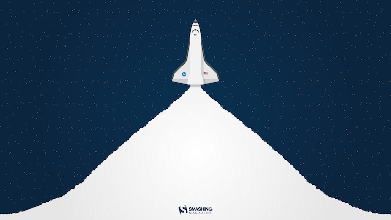
Launch
“The warm, clear summer nights make me notice the stars more — that’s what inspired this space-themed design!” — Designed by James Mitchell from the United Kingdom.
preview
without calendar: 1280×720, 1280×800, 1366×768, 1440×900, 1680×1050, 1920×1080, 1920×1200, 2560×1440, 2880×1800
I Love Summer
“I love the summer nights and the sounds of the sea, the crickets, the music of some nice party.” — Designed by Maria Karapaunova from Bulgaria.

preview
without calendar: 320×480, 640×480, 800×480, 800×600, 1024×768, 1024×1024, 1152×864, 1280×720, 1280×800, 1280×960, 1280×1024, 1366×768, 1440×900, 1440×1050, 1600×1200, 1680×1050, 1680×1200, 1920×1080, 1920×1200, 1920×1440, 2560×1440
Melon Day
“Melon Day (second Sunday in August) is an annual national holiday in Turkmenistan devoted to festivities to celebrate the country’s muskmelon. Another reason for me to create this wallpaper is that melons are just awesome!” — Designed by Melissa Bogemans from Belgium.

preview
without calendar: 320×480, 640×480, 800×480, 800×600, 1024×768, 1024×1024, 1152×864, 1280×720, 1280×800, 1280×960, 1280×1024, 1400×1050, 1440×900, 1600×1200, 1680×1050, 1680×1200, 1920×1080, 1920×1200, 1920×1440, 2560×1440
Are You Ready For The Adventure?
Designed by UrbanUI from India.

preview
without calendar: 320×480, 640×480, 800×480, 800×600, 1024×768, 1024×1024, 1152×864, 1280×720, 1280×800, 1280×960, 1280×1024, 1366×768, 1440×900, 1440×1050, 1600×1200, 1680×1050, 1680×1200, 1920×1080, 1920×1440
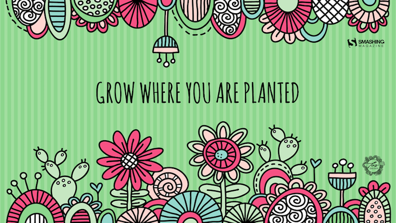
Grow Where You Are Planted
“Every experience is a building block on your own life journey, so try to make the most of where you are in life and get the most out of each day.” — Designed by Tazi Design from Australia.
preview
without calendar: 320×480, 640×480, 800×600, 1024×768, 1152×864, 1280×720, 1280×960, 1600×1200, 1920×1080, 1920×1440, 2560×1440
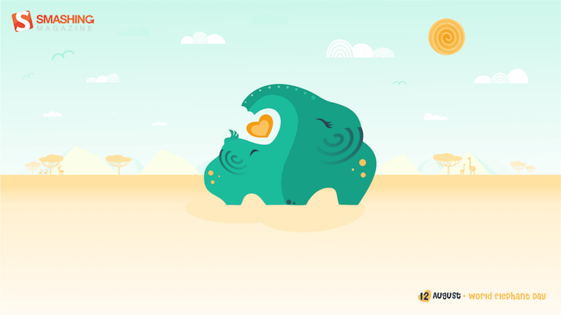
Elephant Time
“August is very notable for me. It is the month of two great events: World Elephant Day and the birthday of my son (both are on August 12th — what a coincidence!). So I want to share my double joy with you! Remember, elephants are great animals (in all meanings), but they still need your care.” — Designed by Anna K. from Minsk, Belarus.
preview
without calendar: 320×480, 640×480, 720×1280, 750×1334, 800×480, 800×600, 1024×768, 1024×1024, 1080×1920, 1152×864, 1280×720, 1280×800, 1280×960, 1280×1024, 1366×768, 1400×1050, 1440×900, 1600×1200, 1680×1050, 1680×1200, 1920×1080, 1920×1200, 1920×1440, 2560×1440
Shark Night
“I imagine that I am lying on the beach on a warm summer night looking up at the sky, just thinking and letting my imagination take me away.” — Designed by Maggie Green from the United States.

preview
without calendar: 320×480, 640×480, 800×480, 800×600, 1024×768, 1024×1024, 1152×864, 1280×720, 1280×800, 1280×960, 1280×1024, 1366×768, 1440×900, 1440×1050, 1600×1200, 1680×1050, 1680×1200, 1920×1080, 1920×1200, 1920×1440, 2560×1440
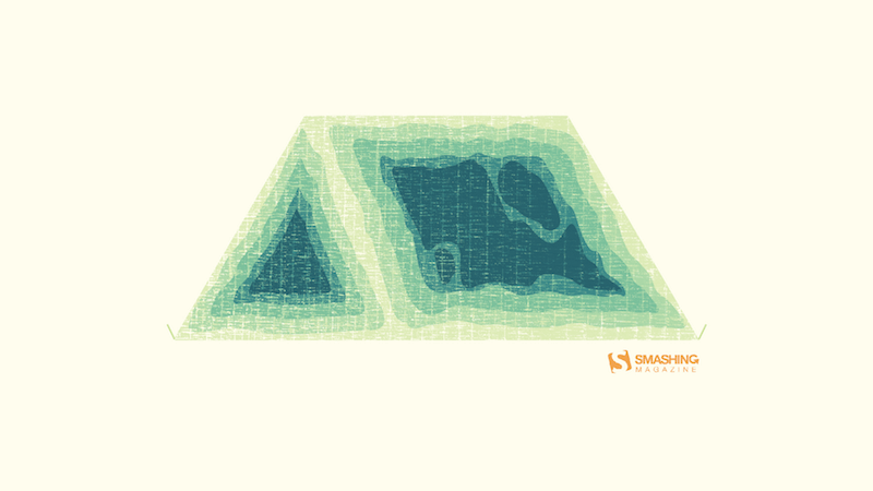
Camping Time
“I was inspired by the aesthetics of topography and chose to go with a camping theme for the month of August.” — Designed by Nicola Sznajder from Vancouver, B.C., Canada.
preview
without calendar: 320×480, 640×480, 800×480, 800×600, 1024×768, 1024×1024, 1152×864, 1280×720, 1280×800, 1280×960, 1280×1024, 1400×1050, 1440×900, 1600×1200, 1680×1050, 1680×1200, 1920×1080, 1920×1200, 1920×1440, 2560×1440
Dessert First
Designed by Elise Vanoorbeek from Belgium.

preview
without calendar: 320×480, 640×480, 800×480, 800×600, 1024×764, 1024×1024, 1152×864, 1280×720, 1280×800, 1280×960, 1280×1024, 1366×768, 1400×1050, 1440×900, 1600×1200, 1680×1050, 1680×1200, 1920×1080, 1920×1200, 1920×1440, 2560×1440
Fireflies
“For this piece, I was inspired by what the end of summer meant to me as a child. I remember running around barefoot in the warm grass and catching fireflies late into the night. I wanted this to be a little reminder to everyone of the simpler times.” — Designed by Rosemary Ivosevich from Philadelphia, PA.

preview
without calendar: 800×600, 1020×768, 1152×864, 1280×720, 1280×800, 1280×960, 1280×1024, 1400×1050, 1440×900, 1600×1200, 1680×1050, 1920×1080, 1920×1200, 1920×1440, 2560×1440
Autumn Is Just Around the Corner
“August is the month that brings to mind the passage of summer season and the arrival of autumn. The entire landscape around us gets a new look, and each of us remains nostalgic due to the passage of summer.” — Designed by Tattoo Temptation from the United Kingdom.
preview
without calendar: 320×480, 1024×768, 1024×1024, 1280×1024, 1440×900, 1680×1050, 1920×1080, 1920×1200, 2560×1440, 1366×768
Let It Bee
“In the summer, I always see a lot of buzzy animals, including bees. And because of the relaxing nature of summer, I thought ‘Let it bee!’” — Designed by Pieter Van der Elst from Belgium.

preview
without calendar: 800×1280, 1280×800, 1280×1024, 1600×1200, 1920×1080, 1920×1200, 2560×1440
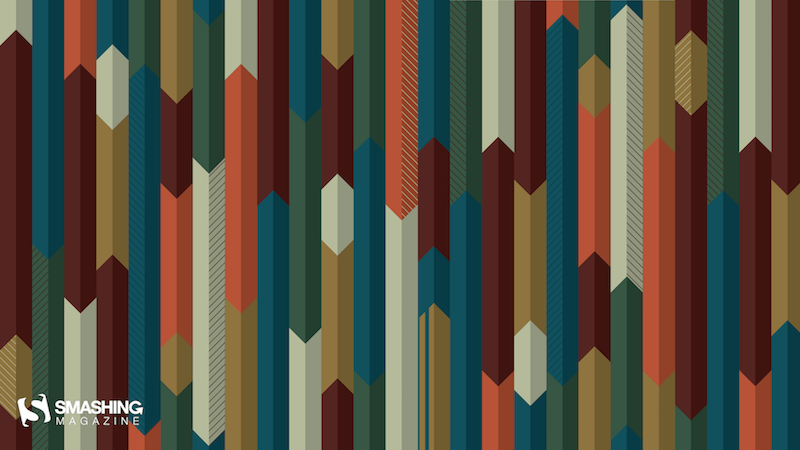
Directional Colors
“I have created and recreated this image in my head many times over and finally decided to create an actual copy. The ‘arrows’ have been big lately as my life has shot off into the design field. And the colors, well, they’re just awesome.” — Designed by Tatyana Voronin from the United States.
preview
without calendar: 320×480, 640×480, 800×480, 800×600, 1024×768, 1024×1024, 1152×864, 1280×720, 1280×800, 1280×960, 1280×1024, 1400×1050, 1440×900, 1600×1200, 1680×1050, 1680×1200, 1920×1080, 1920×1200, 1920×1440, 2560×1440
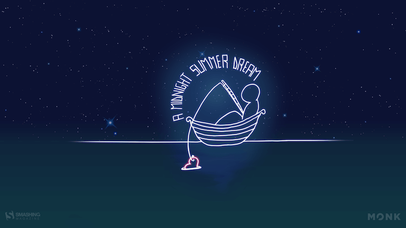
A Midnight Summer Dream
“It’s not Shakespeare, it’s Monk, staring at the stars in a warm summer midnight. Just relax…” — Designed by Monk Software from Italy.
preview
without calendar: 320×480, 640×960, 1024×768, 1280×800, 1280×1024, 1920×1080, 2560×1440
Handwritten August
“I love typograhy handwritten style.” — Designed by Chalermkiat Oncharoen from Thailand.

preview
without calendar: 320×480, 640×480, 800×480, 800×600, 1024×768, 1024×1024, 1152×864, 1280×720, 1280×800, 1280×960, 1280×1024, 1400×1050, 1440×900, 1600×1200, 1680×1050, 1680×1200, 1920×1080, 1920×1200, 1920×1440, 2560×1440
The Ocean Is Waiting
“In August, make sure you swim a lot. Be cautious though.” — Designed by Igor Izhik from Canada.

preview
without calendar: 640×480, 800×480, 800×600, 1024×768, 1024×1024, 1152×864, 1280×720, 1280×800, 1280×960, 1280×1024, 1400×1050, 1440×900, 1600×1200, 1680×1050, 1680×1200, 1920×1080, 1920×1200, 1920×1440, 2560×1440
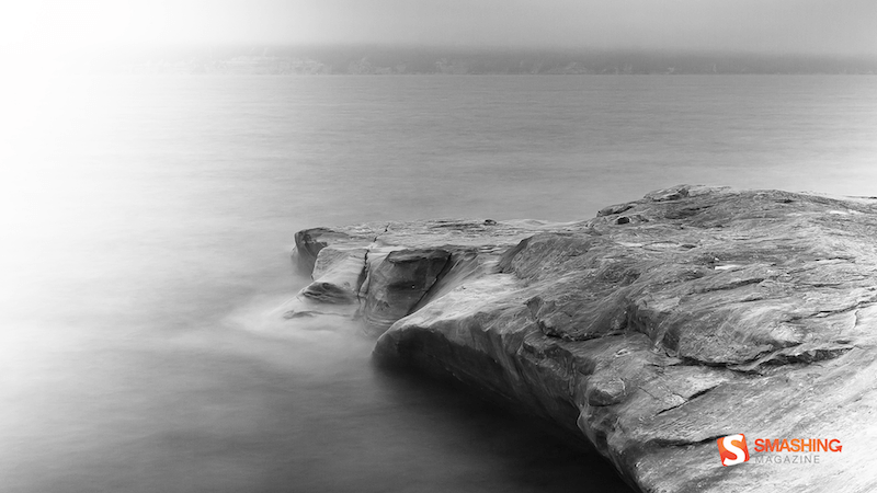
Solidarity
“Black and white landscape/waterscape photo.” — Designed by Jeremy Mullens from the United States.
preview
without calendar: 1024×768, 1280×1024, 1680×1050, 1920×1200, 2560×1440
No Drama Llama
“Llamas are showing up everywhere around us, so why not on our desktops too?” — Designed by Melissa Bogemans from Belgium.

preview
without calendar: 320×480, 640×480, 800×480, 800×600, 1024×768, 1024×1024, 1152×864, 1280×720, 1280×800, 1280×960, 1280×1024, 1400×1050, 1440×900, 1600×1200, 1680×1050, 1680×1200, 1920×1200, 1920×1440, 2560×1440
Childhood Memories
Designed by Francesco Paratici from Australia.

preview
without calendar: 320×480, 1024×768, 1024×1024, 1280×800, 1280×1024, 1366×768, 1440×900, 1680×1050, 1920×1080, 1920×1200, 2560×1440
Join In Next Month!
Thank you to all designers for their participation. Join in next month!

(il)


 Each of the design trends we are spotting this month have to deal with over-the-top techniques. It’s interesting because these big effects don’t always pop on the radar of what’s trending, but these concepts almost begged to be featured with a large number of projects showcasing these design elements.

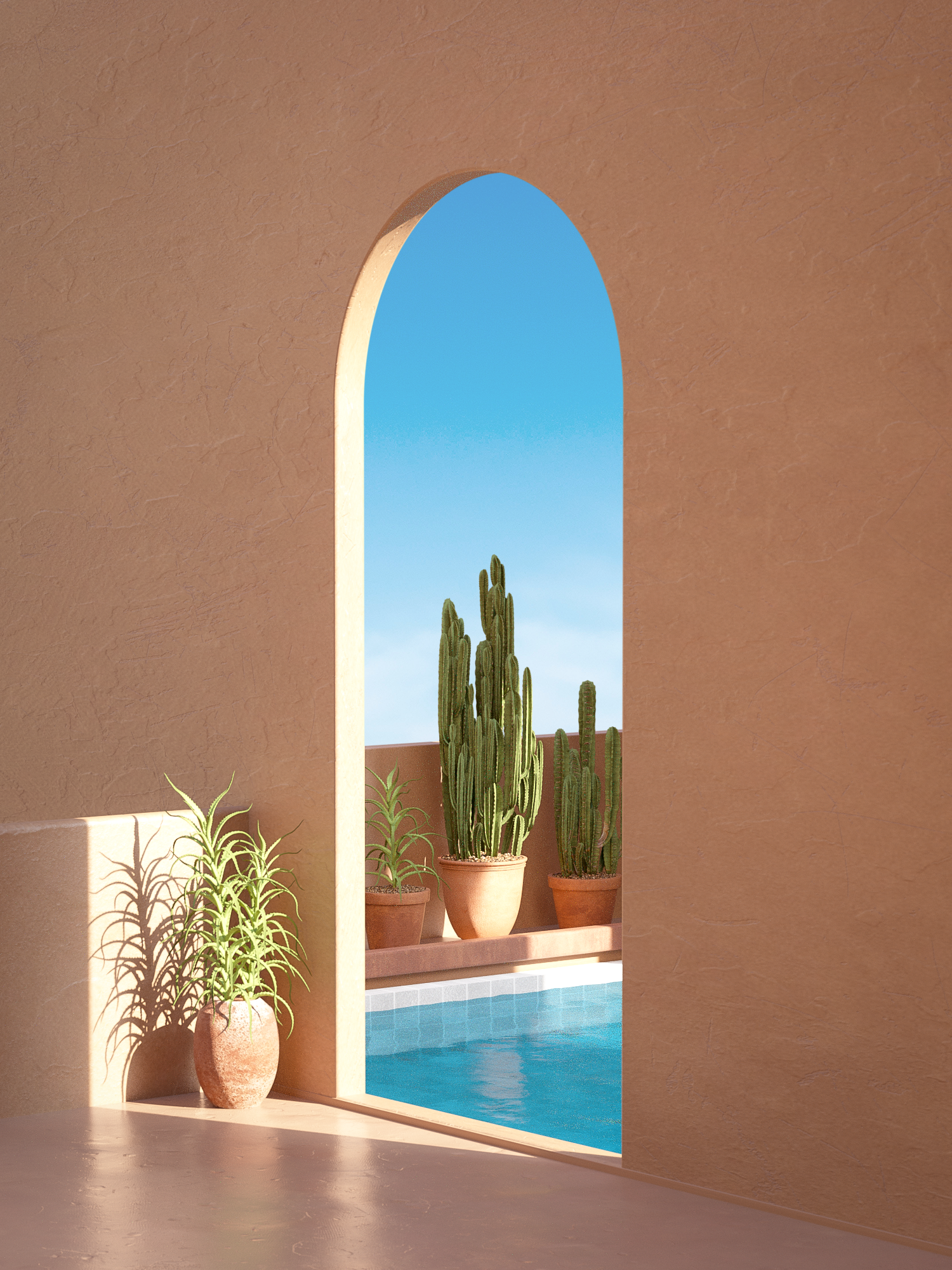
 Work by Simon Kämpfer
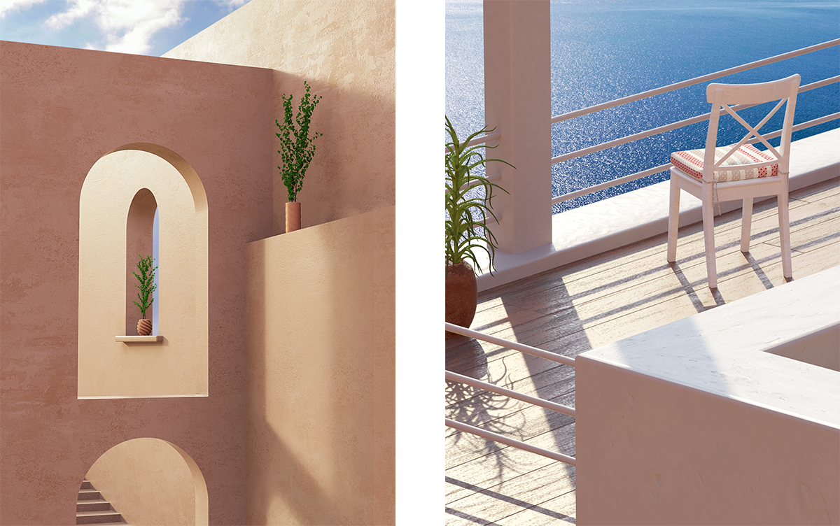
