The best laptops for graphic design in 2020

Original Source: http://feedproxy.google.com/~r/CreativeBloq/~3/XUGlijVuFik/best-laptops-for-graphic-design

Welcome to our pick of the best laptops for graphic design that you can buy in 2020. On this page you'll find a range of laptops that are ideal for digital creatives, as well as key buying advice that will make purchasing the best laptop for graphic design for your needs as simple and easy as possible.

We've carefully curated this list of the best laptops for graphic design so that you can buy any one of the devices on this list safe in the knowledge that you're getting a brilliant laptop that can help you with your graphic design work – no matter what your specialism is, what your priorities are, or how much want to spend, we've got a recommendation for you here

Every device in our best laptops for graphic design buying guide has been hand-picked by us, so you can buy with confidence. Our dedicated tool will also pull in the best prices from the reputable retailers in your region, to help you make sure you don't get ripped off. 

With all the options out there, it's understandable if you feel unsure of where to start. If that's the case, scroll to the bottom of this article and you'll find handy pointers on what to look for when choosing a laptop for graphic design.

Get Adobe Creative Cloud now
What's the best laptop for graphic design right now?

Short on time? Here's a quick rundown of our top five right now.

Apple MacBook Pro 16-inch (2019)Microsoft Surface Book 2Lenovo ThinkPad P1Dell Precision 3540MacBook Pro (2019)

As you can see, we think the best laptop for graphic design is the Apple MacBook Pro 16-inch. Apple has once again made a superb laptop for graphic design, and while it is expensive, it's one of the most powerful laptops money can buy right now – as well as one of the most stylishly designed as well.

However, we understand your budget might not stretch to that high end option. If so, then the Microsoft Surface Book 2 (at number 2) is a great alternative. Aside from being an excellent all-round laptop, it also doubles up as a ridiculously good tablet. And as a bonus, there are some great deals around on the versions that have less impressive specs.

Prefer working on a desktop PC or Mac? Then take a look at our pick of the best computers for graphic design. And if battery life has you worried, then you may want to check our list of the best power banks available.

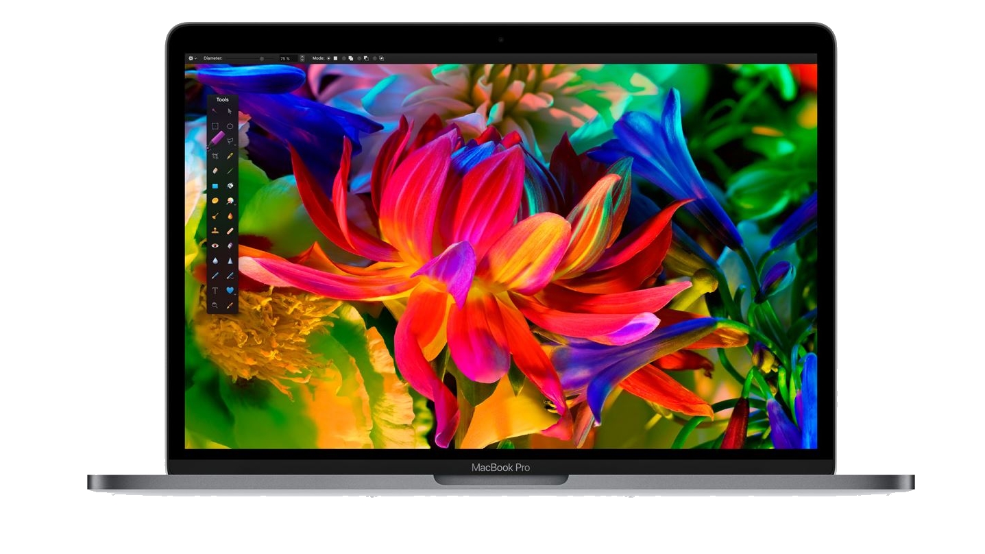
Apple's range of MacBook Pro laptops have always been beloved by creatives and graphic designers – in fact, you'll find the (slightly) smaller 15-inch MacBook Pro is also included lower down in our list of best laptops for graphic design. However, towards the end of 2019, Apple really pulled it out of the bag when it released its brand-new 16-inch MacBook Pro.

This new model brings everything we've come to love from the MacBook Pro, including a gorgeous thin and light design coupled with powerful hardware, and somehow made it even better. You get a larger screen with a higher resolution, making it ideal for graphic design where image quality is of the utmost importance.

Apple has also updated the hardware within the new MacBook, so there's some seriously powerful components in there, including professional graphics cards from AMD – again, essential for graphic design. This is, without a doubt, the best MacBook for content creators, designers and other creative professionals. With amazing (and loud) speakers and a much, much better keyboard to boot.

Also read: MacBook Pro 16-inch review

Microsoft's Surface Book 2 is an incredible 2-in-1 laptop – even in its lowest spec option. If you're a designer who draws as well, this is the best laptop for graphic design you can get. It’s fast and immensely powerful, thanks to Intel’s quad-core Coffee Lake Core i7-8650 processor and 16GB of RAM. And it boasts an impressive battery life, plus a stunning, crisp display with superb colour accuracy. 

It’s also incredibly versatile: use it as a graphics, video or photo-editing workstation on the go, or as a sketchbook. Just detach the screen and use it as a tablet with the Surface Pen (which doesn't come included, our one gripe) or buy the innovative Surface Dial  and have an intuitive way of controlling your creative tools. Even better, flip the screen around, reattach it and you can use it to draw at a more natural angle. 

Too expensive? If you can cope with less screen real estate, the 13-inch Surface Book 2 is significantly cheaper, with a similar core specification and only slightly less impressive overall performance. For even cheaper, Microsoft's original 13-inch Surface Book remains a ridiculously accomplished laptop, with a smaller price tag. But if you've got the cash, the Surface Book 2 is an utterly fantastic laptop for graphic designers.

Also read: Microsoft Surface Book 2 review

Best laptop for graphic design: Lenovo ThinkPad P1

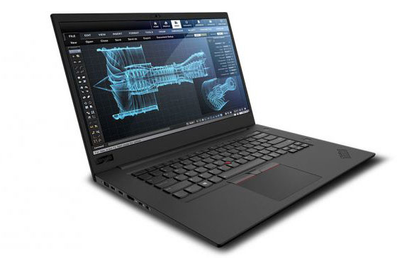
The Lenovo ThinkPad P1 is one of the most powerful Windows laptops around, and is aimed squarely at high-level content creators. It gives you the option of an Intel Xeon processor and a professional-grade Nvidia Quadro P2000 graphics, up to 64GB of memory and has all the ports you could need (two USB 3, two USB-C Thunderbolt 3, an HDMI 2.0, DisplayPort and SD card reader). This machine sports a slick design, with a slim chassis and a 4K display with 100% AdobeRGB coverage. The screen alone makes it a joy for creative work, but with all the performance it offers too, the ThinkPad P1 is a seriously good laptop for graphic designers.

Best laptops for graphic design: Dell Precision 3540

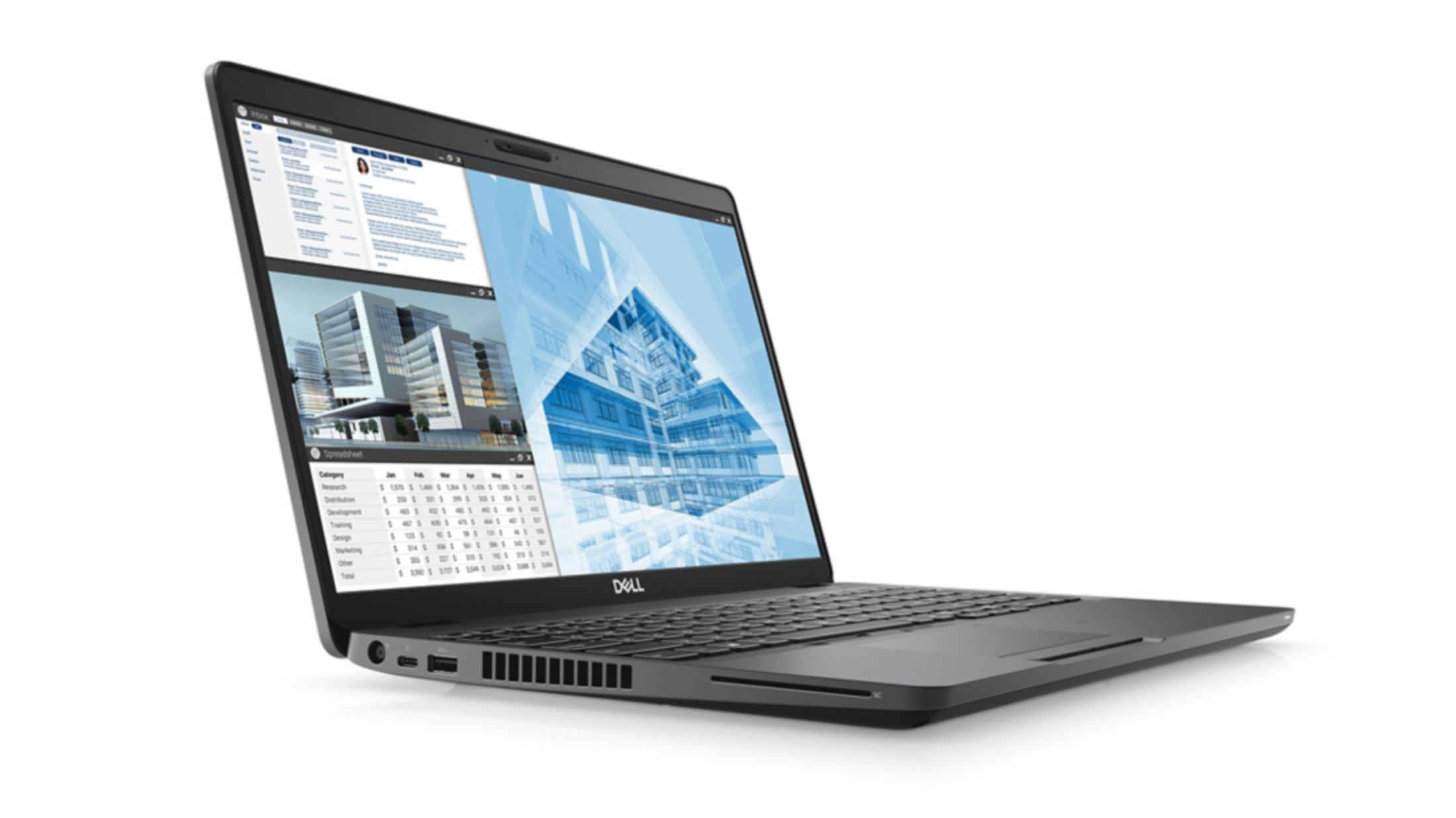
Dell’s new 15.6-inch Precision 3540 has a specification that can handle even the most advanced features in tools such as Photoshop and Lightroom. It has an Intel Core i5 quad-core processor with a 1080P display and an entry-level discrete AMD Radeon Pro WX 2100 2GB graphics card, which will help with 3D and anything that uses OpenCL. A 256GB fast M.2 SSD, 8GB of system memory and support for Thunderbolt 3 round off a package that’s priced incredibly well as an entry-level computer for visual design.

MacBook Pro 2019

Apple is on great form with its 15-inch MacBook Pro 2019. If you need sheer power – and have the cash – this is one of the best graphic design laptops you can get. The new Macbook Pro offers a substantial upgrade over previous versions. Aimed at creative professionals, this is the most powerful MacBook device ever created, with more RAM, a choice of six and eight-core Intel processors, and better discrete graphics cards. It also comes with blisteringly fast SSDs and a quieter keyboard. This makes this year's model an incredible device and easily one of the best laptops for graphic design in 2019.

However, it's not all good news. On the downside, there are just four USB-C ports and one headphone jack port, so you’ll need an adapter if you want to plug in an Ethernet cable or legacy hardware. And while the screen is absolutely gorgeous, 4K would have been nice. Nevertheless, the Apple MacBook (2019) gives you the CPU and memory horsepower to make mincemeat of large files and complex tasks – and it absolutely looks the part too. 

It's also worth noting that the 15-inch model, while still available to buy, has been replaced by the larger 16-inch model (which is our pick for the best laptop for graphic design).

However, this does mean you could find some great deals for the 15-inch model.

Best laptop for graphic design: Huawei MateBook X Pro

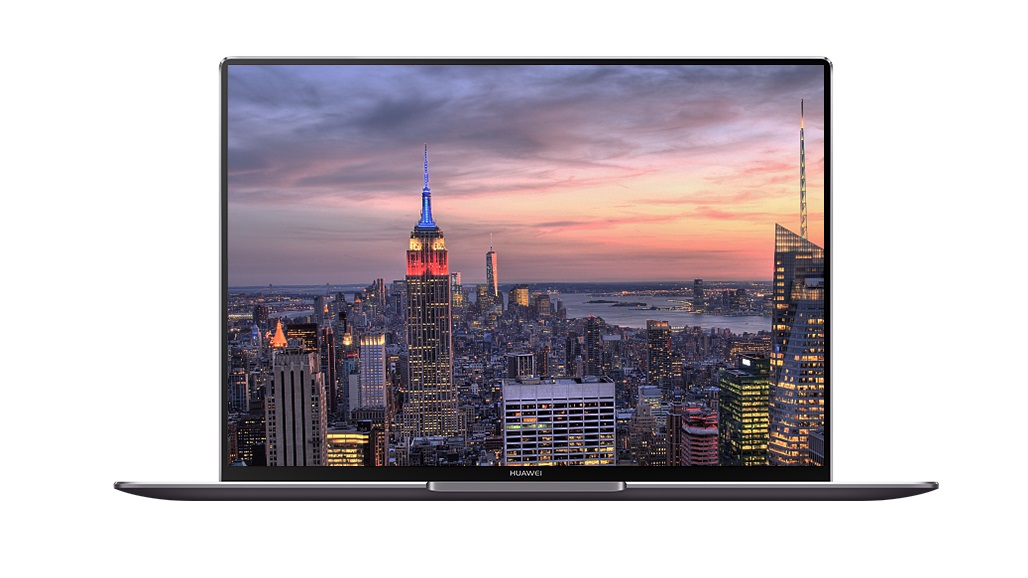
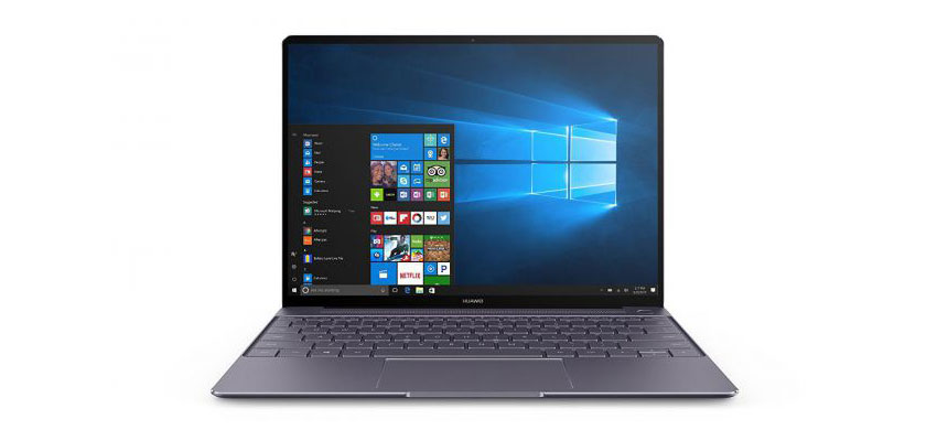
Huawei may not be the first name that springs to mind when considering the best laptops for graphic design, but with the Huawei MateBook X Pro, the Chinese company has proved it has what it takes to go toe-to-toe with the biggest names in the laptop market. This is a gorgeously designed laptop with a stunning screen (albeit with a rather odd aspect ratio), and it comes packed with cutting edge components that allows it to perform brilliantly, and a battery life that runs rings around many of its rivals. It has a design and performance that rivals the mighty MacBook Pro. Also, it runs Windows 10, so you can install all the digital art apps you're used to using.

 Read: Our sister site TechRadar’s Huawei MateBook X Pro review

Best laptops for graphic design: HP ZBook Studio G4 DreamColor

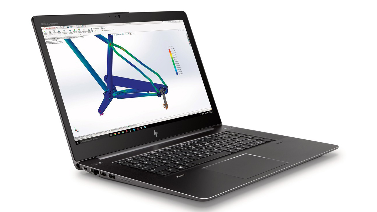
If you’re looking for all-out power, check out the rip-roaring HP ZBook Studio G4. The top-end model isn’t cheap, but it packs incredible specs including a 15.6-inch 4K DreamColor display that can easily be colour calibrated, a blazing-fast Core Intel Xeon CPU, 32GB RAM, a 512GB SSD and NVIDIA Quadro M1200 dedicated graphics with 4GB VRAM. If you like to connect up your favourite peripherals and monitors, then there’s also a healthy range of ports – it features a Gigabit Ethernet port, HDMI port, a legacy VGA connector, SD card reader, one USB 3.0 port, and two USB Type-C (Thunderbolt 3) ports. Oh, and let's not forget the Bang & Olufsen speakers in case you want to crank up the tunes while you work. 

At just over 2kg (4.6lbs), it won’t break your back carrying it around, and it’s pretty thin at 18mm. If you're worried about security, then you'll be glad of the built-in fingerprint reader and the optional (and extremely fast) HP Z Turbo NVMe PCIe SED (self-encrypting drive) SSDs.

Best laptops for graphic design: Dell XPS 15

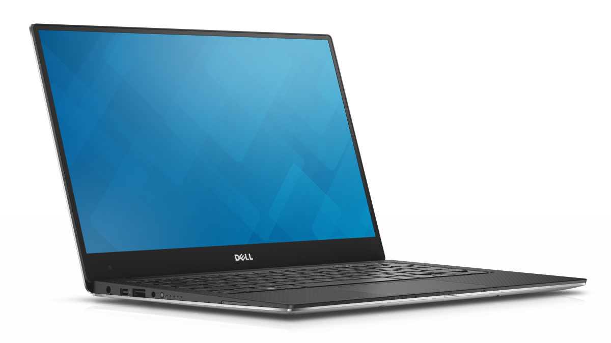
The Dell XPS 15 is a truly stunning laptop – and now that the 2017 version has been replaced by the Dell XPS 15 (2018), it's much more affordable, too. For your money, you get the virtually borderless InfinityEdge display at Full HD resolution, a Core i5 CPU, 8GB RAM and a 1TB HD and 32GB SSD. Spec it up a little (or a lot, actually) and you can have a 4K display with multi-touch, turning it – with the help of the Dell stylus – into a portable sketchbook. 15.6-inches of UHD definition (3,840 x 2,160) equals a lot of pixels, making for some incredibly sharp images. 

Depending on the complexity of the projects you'll be working on, you can pump the Intel HD Graphics 630 GPU up to an impressive Nvidia GeForce GTX 1050. We can't imagine what you could possibly be designing that the latter wouldn't be able to handle. If you don’t need a 15-incher, look to the XPS 13, which is perhaps the perfect blend of power and portability.

Best laptops for graphic design: Huawei MateBook 13

If you aren’t willing or able to fork out the high sums demanded by the most high-end laptops, but you don’t want to compromise on performance, the Huawei MateBook 13 is made for you. Huawei has sensibly built a mid-range MacBook clone that delivers the goods when it comes to processing, so is perfect for students and anyone on a budget. That means ultra-responsive Photoshop performance that can be used for any demanding graphics task you throw at it. With a bright 1440p screen, portable design and Nvidia graphics, it’s not much of a compromise in other areas either. 

Best laptops for graphic design: Apple MacBook Air (2018)

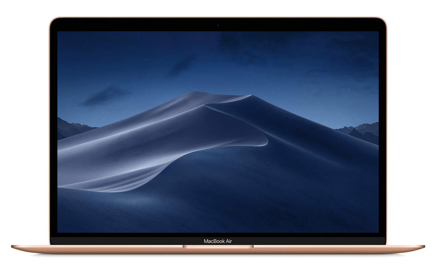
After a much-needed refresh, the MacBook Air (2019) has had a few choice updates that make it a real winner for graphic design work. Although it’s not quite the powerhouse the MacBook Pro is (or some high-end Windows laptops), it now has a bright Retina display, which is a great upgrade over the dated screen in the old Air and better for working with graphic design software. The processor is much faster and will cope with Photoshop, Illustrator, and so on with ease. But Apple has sensibly ensured the Air is as portable as ever, with a seriously lightweight design that makes it a great choice for graphics work on the go.

The 2019 model of the MacBook Air doesn't bring a huge amount of upgrades over the 2018 model, but if you've been eyeing up the MacBook Air for a while now, getting the latest version means you've got a bit more future-proofing built-in.

Best laptops for graphic design: HP ZBook X2

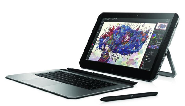
Created specifically with creatives in mind, the HP ZBook X2 packs a serious amount of power, and with it a pretty hefty price tag. But if money is no issue and you're contemplating abandoning a desktop or laptop as a primary creative tool, the HP ZBook X2 deserves a look. It boasts some seriously impressive designer-focused specs, including a stunning 10-bit, 100% Adobe RGB, 4K multi-touch UHD dreamcolour display and extra ports to keep you well connected. 

It also comes pre-installed with Adobe's Creative Cloud desktop application for easy access, and sports a fully detachable Bluetooth keyboard so you can switch from laptop to tablet whenever inspiration strikes. That's all backed up with the power of an Intel Core i7 processor, 32GB RAM – double that of its Microsoft rival – and NVIDIA Quadro graphics. 

However, power requires more juice, so battery life on the ZBook2 is shorter than some of the other laptops featured in this list. It's also heavier than some of its competition, which isn't ideal when you're on the go. That said, while the X2 doesn't come cheap, it's still a serious option for designers looking to liberate themselves from a desktop without compromising on apps and performance. 

Best laptops for graphic design: Microsoft Surface Laptop 2

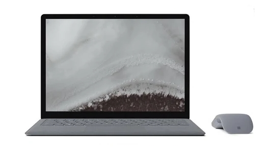
The Surface Laptop 2 is Microsoft's follow up to its popular original laptop, and once again the company has created a very good laptop for graphic design students. Microsoft has boosted the hardware of the Surface Laptop 2, making it an even better proposition for people looking for the best laptop for graphic design for their needs. As with its predecessor, even the lowest-end model is powerful enough to run Photoshop and Illustrator on a daily basis, and the fact you can use the optional Surface Pen to draw directly on screen makes it even more appealing. It no longer comes with Windows 10 S Mode as default either, instead you get the full Windows 10 experience, which means you can install Creative Cloud apps and other programs easily.

Read:  Our sister site TechRadar’s Surface Laptop 2 review

best laptops for graphic design: LG Gram 17"

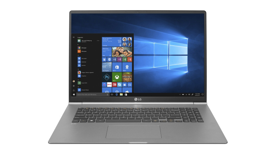
The LG Gram 17 is a high-spec silver laptop built from a strong and light alloy. 17-inch laptops that are actually capable of serious design work are usually too big, heavy and bulky to be considered portable – but LG has well and truly bucked this trend with this machine. It weighs an impressive 1.34kg, which is comparable to many 13-inch models, and it measures just 1.7cm at its thinnest point, again impressive for a 17-inch laptop. Expect all the performance you’ll need for heavy duty Photoshop edits and effects, all the while looking sumptuous on its 2560×1600 WXGA IPS screen that has 99% sRGB colour coverage. At time of publish, it wasn't yet available in the UK. 

Read more: LG Gram 17 review

Laptops for graphic design: What to look for

So how do you pick the best laptop for your graphic design work? Clearly you'll be guided by what you can afford, which is why we have the best options for all budgets here. But there are a few other things to consider too. 

One is power versus portability: you need something that’s thin and light enough to throw in your backpack, but also powerful enough to run your suite of creative tools. You also need to decide whether macOS or Windows is right for you. The former used to be the staple of creative professionals, but it really doesn’t matter what platform you use these days. 

Whatever your preferences, each of the machines here will give you all the power and performance you need to hit the ground running with your latest, greatest project. 

Related articles:

The best 4K monitors for designers and artistsBest laptops for PhotoshopThe best laptop cooling pads

3 Lessons UX Designers Can Take From Netflix

Original Source: https://www.webdesignerdepot.com/2020/02/3-lessons-ux-designers-can-take-from-netflix/

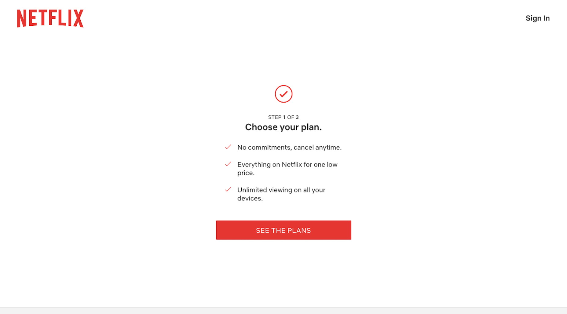
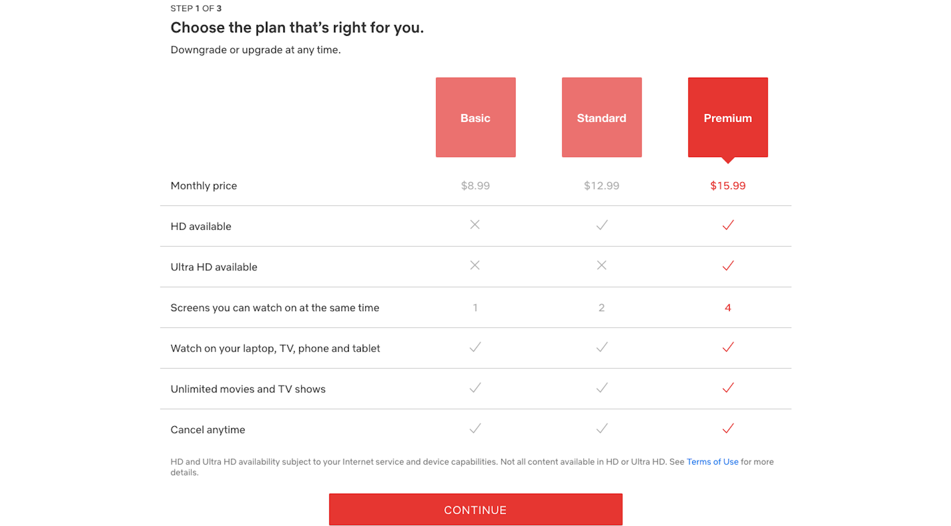
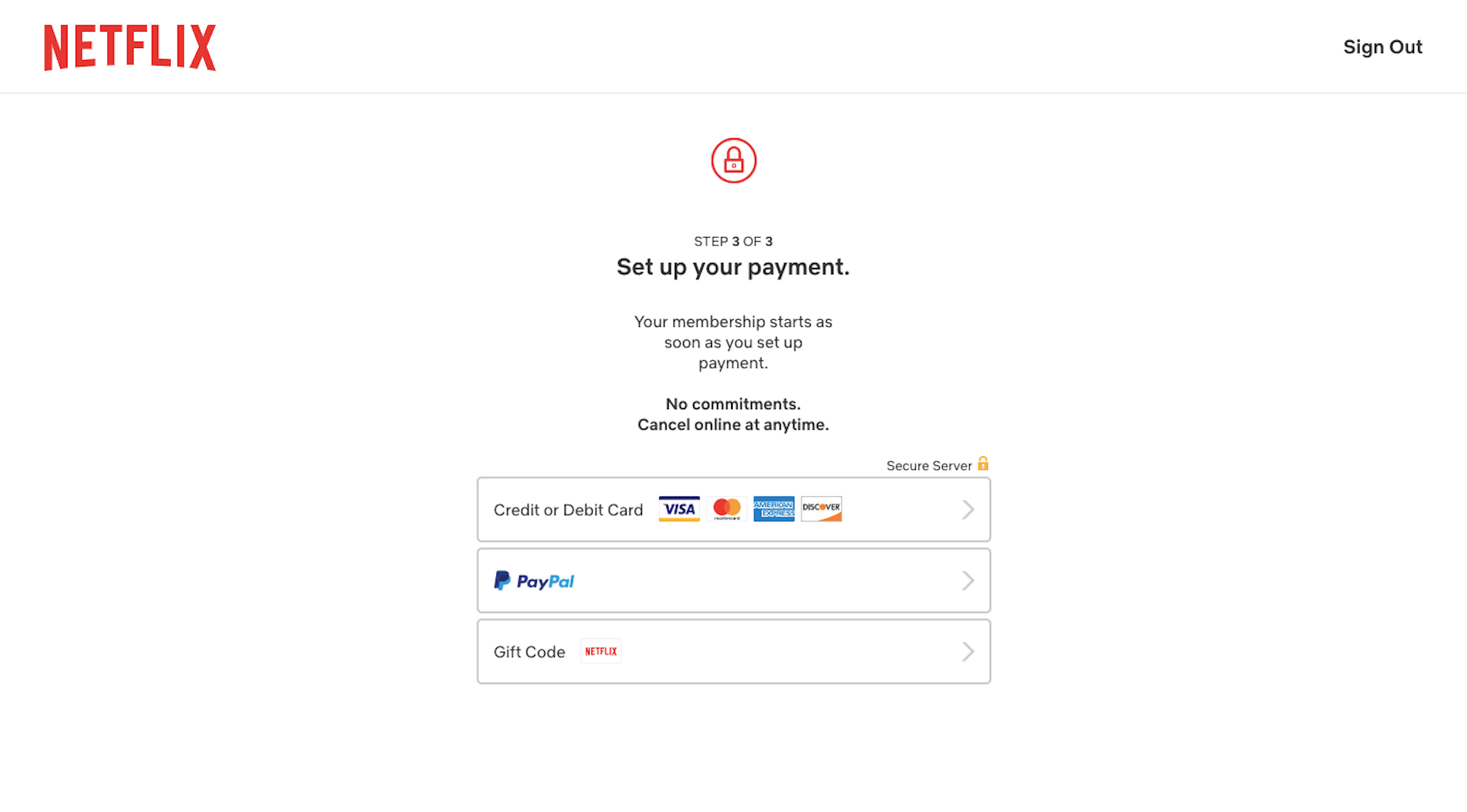
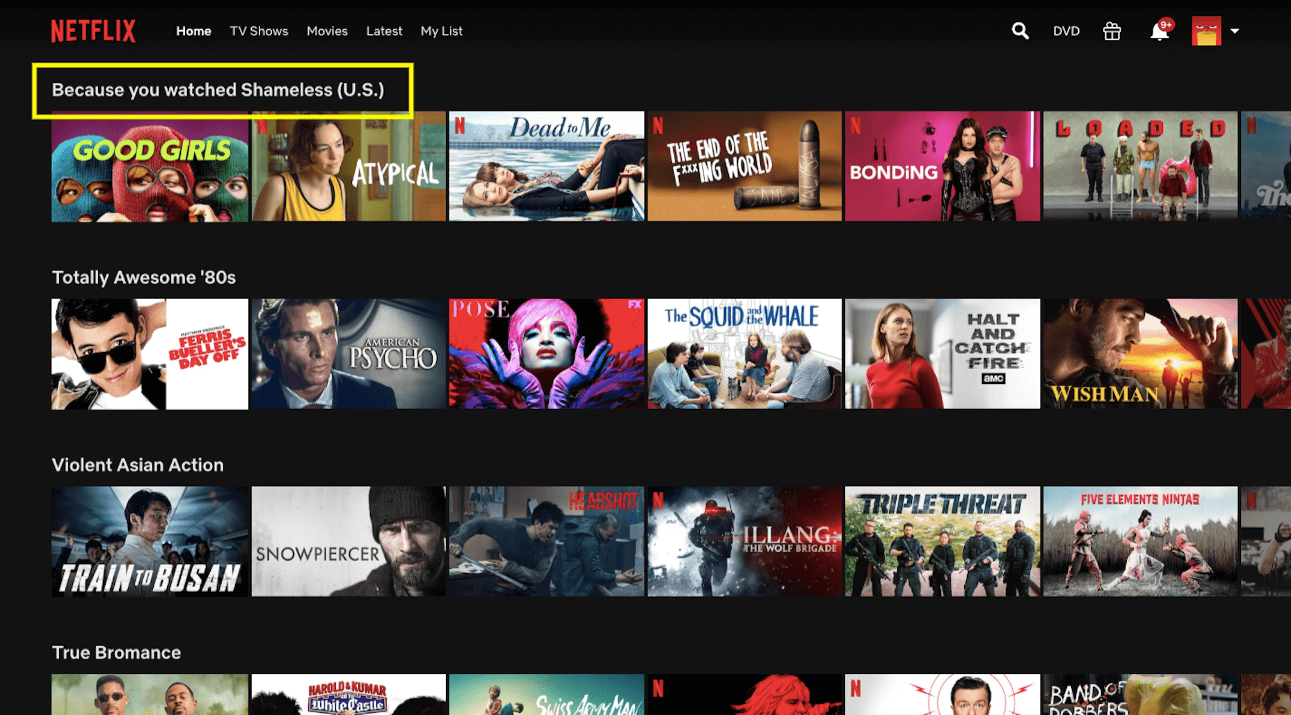
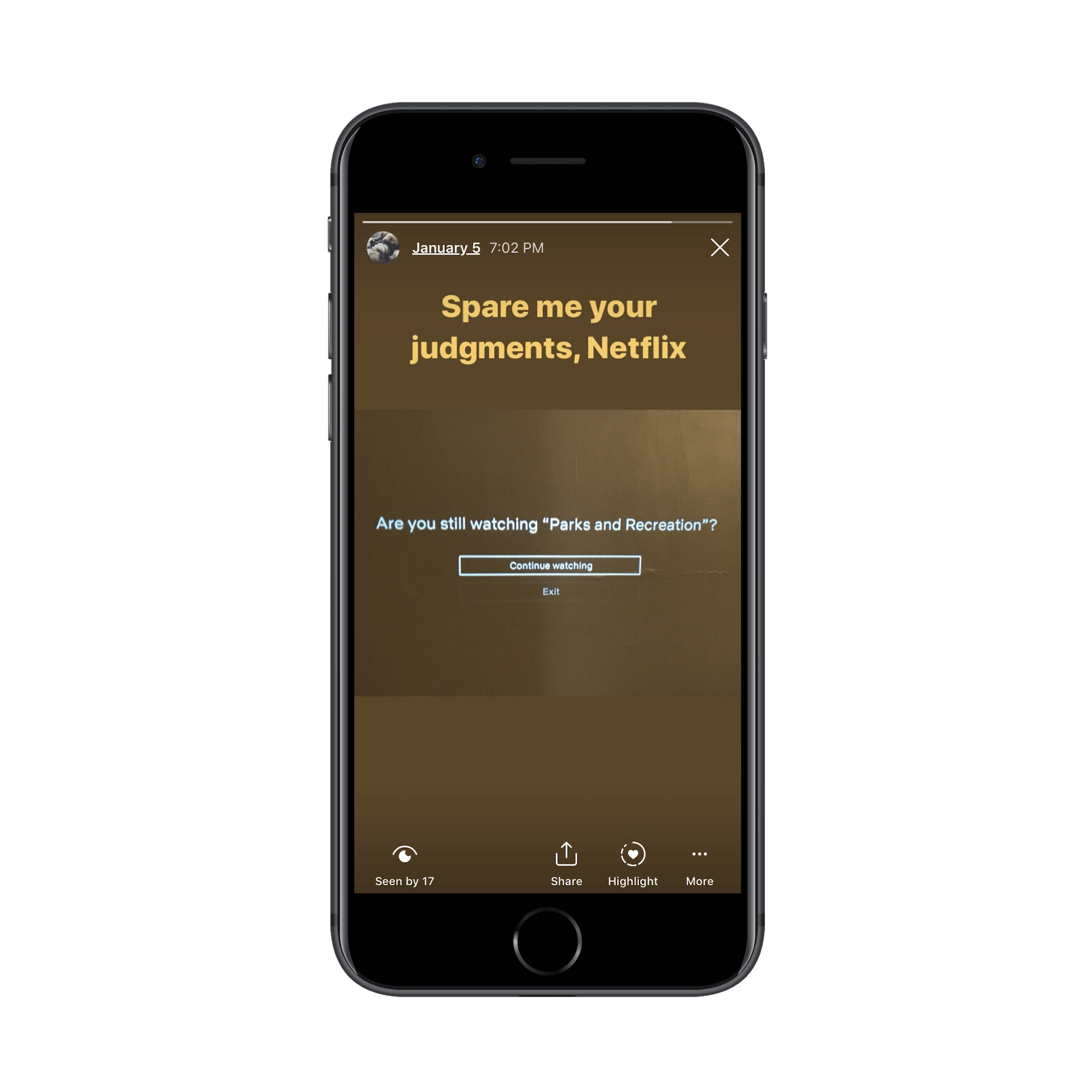
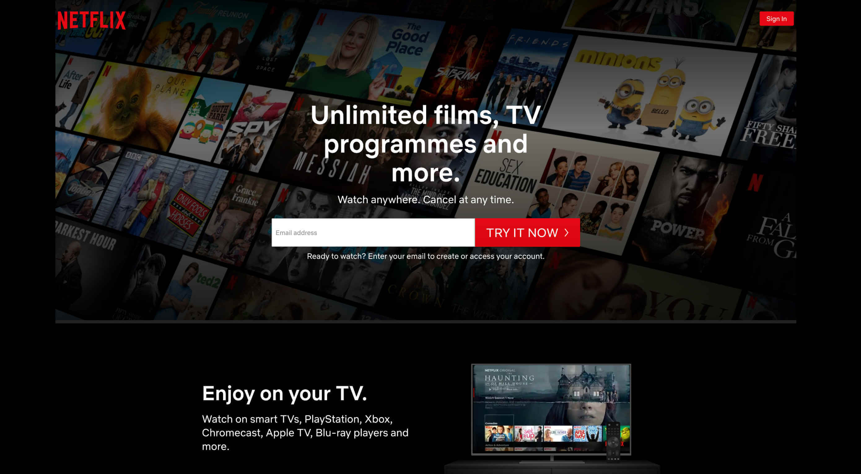
If we look at this from a design perspective, there’s definitely something about the way the user experiences are designed that makes them more attractive than other movie or TV viewing options. Especially Netflix.

Today, I want to put the spotlight on Netflix and give you 3 lessons you can take away from the platform’s design and features.

1. Make Onboarding Painless

Obviously, Netflix is a household name, so it doesn’t need to mince words on its website.

While you won’t be able to get away with a navigation-less website, what you can do to emulate the Netflix UX is to deliver just as brief and benefits-driven of a message above-the-fold.

Unlimited movies, TV shows, and more. Watch anywhere. Cancel anytime.

It perfectly sums up what users get while also taking the risk and fear out of it with “Cancel anytime.” Can you do the same? Totally.

While you’re at it, build a shortcut to the conversion point (e.g. newsletter subscription, SaaS purchase, schedule an appointment, etc.) in the same banner. Most of your visitors will need some time to educate themselves, but this will at least shorten the signup process for those who are ready to take action.

When that happens, make sure your conversion funnel is streamlined, too.

In the first step of Netflix’s signup process, it lets customers know how many steps there are while reiterating the benefits. The interface is distraction-free and easy to follow.

Next, users see plan options. Again, the UI is simple and easy to follow. The table comparing the features and value of each plan is a nice touch, too.

The final step is just as minimally designed. With a clean and clear interface, and a benefits-driven message, there’s no reason a user should have any problems getting through this process nor should they have any doubts along the way.

2. Use Your Data to Create a More Personal UX

Every year, it seems like we have a new law that sends web designers and business owners scrambling to strengthen their website privacy and security policies. And while it might feel like we’re losing control over all that big data we’ve gained access to in recent years, that’s not really the case.

What’s happening is that consumers want businesses to more carefully protect their data. Plain and simple.

There’s nothing in these laws that’s telling us to stop collecting user data. If that happened, I think consumers would be just as outraged. Personalization is one of those things consumers actually look for in the user experience — and the better a website can deliver on it, the more loyal they’ll be as customers.

As far as being responsible with user data, that’s up to you and your clients to manage. As for using the data you’re given, Netflix has shown us a number of ways to use only the most necessary data points to create a very personal experience.

First, you need to start collecting data that’ll help you refine the experience. Netflix empowers customers to help with this here:

With each movie or show’s page, users can:

Add it to their personal viewing list;
Rate it with a thumbs up or thumbs down.

Netflix uses this information to provide helpful recommendations throughout the platform.

The first spot it does this is here:

When customers are rooting around for a new movie or show to watch, this percentage should give them a clue as to how much they’ll like or dislike it. This, in turn, encourages them to rate more programs so that Netflix’s ranking algorithm can become more attuned to their preferences.

The second spot Netflix provides personalized recommendations is the main page. It actually uses this page in a couple of ways to deliver custom suggestions to users.

The first is with “Because You Watched” categories:

If a user spends enough time with a particular product, service, or content on your site, there’s a good chance they’ll like similar ones. So, this is a great way to build those suggestions into the UX.

The other way Netflix uses this page to deliver a personalized experience is through its categories. Note the categories I was shown above:

Totally Awesome 80’s;
Violent Asian Action;
True Bromance.

I have a history of watching movies and shows in these highly specific categories, so it’s pretty awesome to see these aggregated lists ready to go for me. If you can deliver a tailor-made list of recommendations, you’ll find it much easier to keep customers engaged with your product.

3. A/B Test All New Features

I’ve been a Netflix customer since 2007, so I’ve seen it go through a ton of changes over the years. WebDesigner Depot has, too:

From branding to layouts, and pricing to features, Netflix always seems to be switching things up. But here’s the thing: Netflix always implements changes that are meant to enhance the user experience. And when they don’t? It simply rolls the platform back to the way its customers preferred it.

One of the first times I remember this happening was with Max, Netflix’s talking bot:

This wasn’t a feature that was shoved onto users. It would sit in its dedicated space, waiting to be interacted with. Max would then welcome you back and ask what you’re in the mood to watch. You could pick a genre or you could let the bot provide recommendations based on how you rate other movies.

In all honesty, I was on the fence about Max. It was entertaining and I loved finding hidden gems through it. However, there were too many nights where I’d use Max hoping to find the perfect movie… only to abandon it and find something on my own.

That’s why it was no surprise when Max quietly slipped away. I have a feeling other users were just as ambivalent about it as I was.

There are a number of lessons, UX or otherwise, you can take away from this:

Be careful of trying the latest AI fads, they’re just too costly to invest in without hard data that proves that’s what your users want;
Give a new feature enough time to build up steam and provide you with reliable metrics — I remember Max being available for about six months, that’s more than enough time to gather user feedback and decide if a feature is worth keeping or not;
Personalization is great, but not necessarily if it’s at the expense of your customers’ time, sometimes the simpler feature is better.

Max isn’t the only example of Netflix playing around with its features. Do any of you recognize this?

This appears when the opening credits and theme song play at the start of a TV show. There’s really not a lot of value in sitting through this every time, and I’m willing to bet that Netflix saw that most of its users were manually fast-forwarding through them when it decided to try out this feature.

Here’s another recent feature that I think has some staying power:

While streaming services are responsible for the epidemic of binge-watching, it’s not necessarily in their best interest to allow customers to do so. Think of this “Are you still watching?” wake-up call as a form of ethical design.

This feature has been around for over a year, and it’s still going strong.

Bottom line? It’s really important to research your users when you’re in the process of building a website. However, there’s nothing more valuable than real user input from a live website.

Whether you plan to roll out a new feature or simply want to test the validity of one that exists, don’t run on assumptions. Use the new data coming in every day to further improve your design and features.

Invaluable Lessons UX Designers Can Take from Netflix

Although Netflix’s market share is slowly being chipped away at by the competition, it continues to reign supreme when it comes to streaming video services. I don’t see that changing anytime in the future either, considering how how long it’s demonstrated its willingness to innovate alongside evolving consumer needs.

And that’s really the key point I want to make in this post. While I could’ve pointed out its dramatic color palette or use of a responsive layout, we already are familiar with these concepts. The most important UX lessons we should be taking away from Netflix are the ones here.

Source

p img {display:inline-block; margin-right:10px;}
.alignleft {float:left;}
p.showcase {clear:both;}
body#browserfriendly p, body#podcast p, div#emailbody p{margin:0;}

Art terms: The ultimate artist's glossary

Original Source: http://feedproxy.google.com/~r/CreativeBloq/~3/w2Cbds3wNUo/art-terms

Art terms are a fundamental part of creating art because they summarise complicated concepts succinctly. And given that art terms are used by course instructors and educational books across the board, it’s a good idea to get yourself familiar with them if you want to further your skills.

To help you learn the lingo, we’ve compiled this handy art terms glossary which makes important concepts easy to understand. These expressions are designed to be of practical assistance to creators, so if you feel like you’ve plateaued or you need to brush up on the basics of drawing and painting, there’s a good chance they can help you out of a creative rut. For more guidance, see our how to draw tutorials.

For mind boggling art with a name that you might need to look up, check out our guide to the best trompe l'oeil from around the globe. And if you want to put your newly learned knowledge to the test, see our best art books.

For now though, here's our A-Z guide to the most important art terms.

Abrasion

A process whereby paint is removed to reveal layers beneath the surface. Usually done via friction or scratches. Can be accidental or deliberate.

Accelerated perspective

A deliberate exaggeration of perspective. It is often used to make a shallow surface appear deeper than it actually is.

Acrylic paint

A type of paint where the pigment is suspended in an acrylic polymer emulsion. Acrylics are a popular medium with artists thanks to their fast drying time, bold colours and flexibility when mixed with water. Get the most out of them with our acrylic painting tips.

Ambient light

Light that is already present in a scene. This can include either natural or artificial light.

Axis lines

A straight line, either implied of visible, that runs through an object in its dominant direction. An axis helps to give structure to an object or composition.

Background

An area of a painting that appears to be furthest from the viewer. Objects in the middle ground and foreground appear closer, as if they are placed on top.

Balance

The arrangement of elements in a piece of art that creates a sense of visual equilibrium.

Binder

A paint substance which holds together the pigment and ensures that it sticks to surfaces. A binder also gives the paint a uniform consistency.

Blending

Blending is a painting technique where the transition between colours and shades appears smooth or gradual.

Blocking in

Painting process where the artist roughly establishes the composition and structure of the subject. It’s a popular technique with portrait artists.

Body colour

An opaque paint that can completely obliterate an underlying colour.

Brushwork

The way in which an artist applies paint to a support with a brush. Used to refer to the characteristics of the artist in question.

Canvas

A closely woven cloth that acts as a support for paintings. Get started with them with our beginner's guide to canvas painting.

Chiaroscuro

From the Italian for ‘light-dark’. Used to refer to a strong contrast between light and dark in drawings and paintings. Often used to create a sense of volume. See our guide to using chiaroscuro effectively.

Cityscape

An image where urban scenery and buildings are the main focus.

Closed composition

A piece of art where everything sits comfortably inside the borders of the image. 

Collage

From the French verb coller, meaning ‘to glue’. Used to refer to the technique and resulting piece of art where materials are fixed to a supporting surface with glue or another substance. Here’s what to consider when creating a collage.

Colour

The perceived hue of an object or substance. Also used to refer to a dye, pigment, or paint that imparts a hue. Become a master of colours work with our guide to colour theory.

Colour wheel

A circular diagram of the spectrum of colours. Useful for artists because it shows how the relationships between primary, secondary and tertiary colours.

Combine

A painting that works various objects into the surface material.

Complementary colours

A pair of colours which cancel each other out when mixed together. They are situated opposite one another on the colour wheel.

Composition

The arrangement of visual elements as distinct from the subject in a piece of art. It means ‘putting together’ and can be used in visual arts as well as music, writing and photography.

Contour

From the French for ‘outline’, this refers to the technique where an artist draws a line that defines a form or edge. As its word origin suggests, it creates an outline of the subject.

Convergence

Refers to linear perspective in a drawing or painting. It’s the phenomena whereby all parallel lines converge together as they run along to a point at a person’s eye level.

Cross-hatching

A mark-making process where lines that run in different directions are layered on top of each other to provide the illusion of shade.

Depth

The apparent distance from the foreground to background, or near to far, in a work of art.

Diptych

A piece of art, usually a painting, made on two panels that are traditionally attached by a hinge.

Doodle

A loose, fun drawing that often has little regard for accuracy. Usually completed while the artist’s attention is elsewhere. Check out some of our favourite examples of doodle art.

Elevation

A drawing of the front, side and rear of a structure. Usually used in architecture and scale drawings.

Figure drawing

The depiction of the human body in art. Master how to draw the human body with this guide to figure drawing.

Focal point

The area of a piece of art that is designed to draw the viewer’s attention.

Foreground

Visual elements in a drawing or painting that are positioned nearest to the viewer in terms of depth. These elements appear on top of the middle ground and background.

Foreshortening

A technique used in perspective drawing to create the illusion that an object, usually parts of the human body, recede strongly into the distance or background.

Frottage

A technique where textures are obtained by rubbing pencils, chalk or charcoal over a granular or relieflike surface.

Geometric

A piece of art made out of geometric shapes.

Gesture

A quick drawing that captures the most basic elements of the subject.

Gouache

A water-soluble paint that appears opaque on the support. Dries quickly and can be reactivated when mixed with water. This guide teaches you how to paint with gouache.

Hardboard

A uniform and stable surface for painting. It doesn’t have a grain which makes it easier to prime.

Hard-edge

A painting technique where the transitions between colours are abrupt. The opposite of blending.

Horizon line

A horizontal line that runs across a page or canvas that represents the viewer’s eye-level, or to represent where the sky meets the ground.

Hue

The actual colour of something. Often referred to as a colour, but hue is more technically correct.

Illusion

When a piece of art tricks the eye into perceiving a particular effect. For some amazing examples, check out our collection of the best trompe l’oeil art.

Impasto

A painting technique where paints are laid down on the support in very thick layers. Often, brush marks or palette strokes are still visible.

Landscape

A piece of art that focuses on natural scenery such as mountains, forests and coasts.

Line drawing

A fundamental type of mark making made up of a stroke of a pencil, pen or a brush. Consists of straight or curved lines. Used to represent shape and form.

Linear perspective

A technique where the illusion of depth is created on a flat surface.

Medium

The materials that are used to create a piece of art.

Middle ground

The central elements of a painting in terms of depth. Sandwiched between the foreground and background.

Mixed media

A piece of art made up of multiple mediums.

Monochrome

A painting created using only one colour or hue.

Negative space

The empty space between objects and structures in a piece of art. Can be used by artists to more accurately define the form of the subject. See how these brilliant examples of negative space make an impact.

Oil paint

A paint where the pigment is held in a drying oil binder. Oil paint is usually slow to dry. See our oil painting techniques.

Paint

Coloured substance which is spread over a support with tools including a brush and palette. Made up of pigment and binder. Get the most out of paints by choosing the right brush.

Palette

A surface on which an artist mixes colours.

Palette knife

A blunt plastic or metal blade which is used to mix colours and spread them on a support. 

Pastel

Solid art medium in the shape of a stick. Made up of pure powdered pigments and binder. Supplied in soft, pan and hard varieties. Artists can choose from oil and water-soluble pastels. This guide shows you how to get started with pastel art.

Perspective

A technique for creating the illusion of three dimensions on a two dimensional surface. A crucial method to master for drawing realistic pictures. Start learning perspective basics with this guide to one point perspective.

Pigment 

The colouring component of art mediums such as paint and pastels, as opposed to the binding agent.

Plane

A flat surface within a painting, picture or sculpture. Also used to refer to the flat surface on which a picture is created.

Portrait

A piece of art where the facial features of the subject are the focus. Also used to refer to a vertical orientation, as opposed to a landscape picture. These simple steps show you how to draw a face.

Pose

The position of the subject in a piece of art. Often in reference to the stance of a human model.

Profile

A side view of a subject, usually the human head.

Proportion

The harmonious relationship of parts to each other or to the whole.

Representation

The visual interpretation of a subject.

Scale

The ratio between the size of the subject and its artistic representation.

Sfumato

From the Italian for ‘smoke’. A painting technique that softens the transition between two colours and tones in such a way that they appear to melt into one another.

Shade

In colour theory, shade is a pure colour with black added (and not white or grey).

Sketch

A rough or unfinished drawing or painting of a subject. Usually completed to aid the creation of a more thorough study. Make your mark with these sketching tips.

Soft edge

When the boundaries of a subject in a painting appear to fade into the background. The opposite of a hard edge.

Still life

An artistic study, either a drawing or painting, of either natural or man-made objects, or both. This guide shows you how to paint expressive still life images.

Stylised

The representation of a subject that conforms to the rules of a certain style, as opposed to a natural depiction.

Subject

The primary focus of a piece of art, such as a building, human or object.

Tempera

A paint in which the pigment is held in a water-soluble binder. Also used to refer to a painting completed in this medium.

Tint

When white is introduced to a colour to make it appear brighter. The opposite of shade.

Tone

The intensity and strength of colours in a piece of art.

Triptych

A painting completed on three separate panels, or three paintings on different supports that are thematically linked.

Value

The relative lightness or darkness of colour. The highest value will be white, and the lowest value will be black.

Vantage point

The position of the viewer in relation to the subject they are representing.

Vanishing point

A point of disappearance in perspective drawings. At this point, receding parallel lines appear to converge.

Volume

The representation of mass in a piece of art.

Watercolour

Art medium where the pigment is held in a water-soluble solution. Also used to refer to pictures completed with these substances. See our piece on watercolour techniques.

Read more:

The best art easelsThe best Baby Yoda memes, rankedHow to clean paintbrushes: The ultimate guide

5 Ways Website Design Can Affect SEO

Original Source: http://feedproxy.google.com/~r/Designrfix/~3/eudGeAq6ia0/5-ways-website-design-can-affect-seo

Search Engine Optimization campaigns are essential to make a business more successful. Even though you may have a great idea to attract more people through different marketing strategies, your website’s design might be standing in the way. Having a great design might look attractive, but you need to rank higher to leave a long-lasting impression. […]

The post 5 Ways Website Design Can Affect SEO appeared first on designrfix.com.

20+ Apps and Tools to Customize Your Facebook Pages

Original Source: https://www.hongkiat.com/blog/apps-tools-to-customize-facebook-pages/

Facebook Pages is the social giant’s offering for businesses and celebrities to create a corporate, public profile. It’s an industry-proven platform to connect with customers and fans,…

Visit hongkiat.com for full content.

The Best Printing Services For Your Freelance Business and Clients

Original Source: http://feedproxy.google.com/~r/1stwebdesigner/~3/spEVhpIQlBA/

Whether you are a freelance web designer, developer or any other type of business, you will need printing services to promote, publicize, and communicate your brand. Business cards, stationery, stickers, brochures, and flyers are just some of the items businesses need printed, and when you’re looking for printing services it can be difficult to find a place that provides creative and unique solutions. Until now. In this post we’ll look at a printing company that will help your business of any size stand out from the rest.

Print Peppermint is a diverse team of creative professionals that provide refreshingly creative print services and more, including logo design, business card design, T-shirt design, and many more graphic design services in-house. They can design what you need printed for you, or you can use one of their several online tools to do it yourself. Pricing is affordable and both their products and customer service receives outstanding reviews.

What Makes Print Peppermint’s Printing Services Stand Out?

For starters, they are a business run by creative professionals (like you). They understand what creatives need and want to help them represent and promote their business in a way that is unique. They hand-proof every single order, no matter how large or small. And they support their products with a 100% money-back quality guarantee.

Want to kick your business cards up a notch? How about die cut, spot UV, square, plastic, foil, embossed, or letterpress business cards? Print Peppermint printing services include all of these options and more. Check out some examples below.

Business Cards - Printing Services by Print Peppermint

How about sending your clients stickers of your logo in a thank you card so they can help build your brand awareness by letting it be seen on their laptop, bike, phone, or car bumper? Print Peppermint can print the stickers and custom greeting cards to help you accomplish this, with stickers in many shapes and sizes printed on durable weather-resistant vinyl.

Stickers - Printing Services by Print Peppermint

Eco-Friendly Printing Services

Unlike most print companies, Print Peppermint prides themselves on choosing green alternatives. They use environmentally responsible papers, inks, and coatings, and recycle waste materials. Utilizing soy-ink, which also allows for brighter, more vibrant colors than petroleum-based ink, they endeavor to make their process as efficient as possible.

Edge foiling - Printing Services by Print Peppermint

Exceptionally High Quality Paper and Materials

Print Peppermint only uses premium, high-quality paper that is durable, writable and scratch resistant, and everything is offset printed at an incredible 500 lines per inch screen depth. This means your printing services needs will be the absolute best you can find anywhere. You can choose from 100% Cotton, Soft-Touch, Triplex Layered, Clear-Frosted Plastic, Onyx Black Suede, Recycled Kraft and many more standard offerings, or they can custom order any other kind of stock you may desire.

High End Business Cards - Printing Services by Print Peppermint

Great Printing Services, Great Design Services, Great Company!

So when you are looking to get printing done for your business, or if your clients ask for recommendations of where they can fulfill their printing needs, we at 1stWebDesigner.com strongly encourage you to give Print Peppermint a try. We know you won’t be disappointed, and more importantly, your brand will stand out in the crowd.

Want to learn more about Print Peppermint? Be sure to check out their website, read their blog, and learn what they have to say about graphic design and photography.


Crafting a Cutout Collage Layout with CSS Grid and Clip-path

Original Source: http://feedproxy.google.com/~r/tympanus/~3/oFk0vTMSyRI/

Disclaimer: This event is fake, it’s made up. I got the name from a generator, I recommend not going. But if you do, don’t you dare @ me! ?

In this article, I’ll show you how to create an accessible and responsive layout using semantic HTML and modern CSS. As a bonus, we’ll add some spice with a little bit of JavaScript to make the design feel more alive. We’ll be covering the following:

Accessible and semantic HTML Responsive design Flexbox CSS Grid Clip-path

As a bonus, we’ll look at how to bring the layout to live by adding a subtle parallax scroll effect.

The inspiration for the design comes from this poster and the cubist-style portraits by Brno Del Zou.

You can skip to the sections that most interest you, or follow along on our journey of building the entire layout. This article is for developers of all experience levels. So, if I’m covering something you already know, you can simply skip ahead, no hard feelings.

Getting Started

For following along visually, have a look at the Figma file here, that lays out the desktop, tablet, and mobile designs.

Note that I’ll be using rems for units instead of pixels. In case a user zooms in, it’ll keep the design and fonts scalable. Our root pixel size is 16px, so the formula for wanting to know how many rems a pixel value would be is to divide the pixel size by 16. So, if we wanted to convert 20px into rems, we’d calculate 20 / 16 = 1.25rem. 

First, let’s build out the basic layout that involves a <header> that contains a <nav> element and adjacent to the header, we have a <main> element which houses the heading and main component (the magazine cutout). 

Here’s the HTML structure:

<body class=”site”>
<header class=”site__header”>
<p>When: <span class=”block”>May 10-12</span></p>
<p>Where: <span class=”block”>UCL London</span></p>
<nav class=”site__nav”>
<ul class=”site__nav-list”>
<li><a class=”site__nav-link” href=”/”>Tickets</a></li>
<li><a class=”site__nav-link” href=”/”>About</a></li>
<li><a class=”site__nav-link” href=”/”>Contact</a></li>
</ul>
</nav>
</header>

<main class=”main”>
<div class=”container”>
<h1 class=”heading”>
heading here
</h1>

<div>Main Component here</div>
</div>
</main>
</body>

Body

Let’s cover the body element’s styles which have a background radial gradient:

.site {
background: radial-gradient(50% 50% at 50% 50%, rgba(123, 131, 126, 0.9) 0%, rgba(54, 75, 73, 0.9) 100%), #364b49;
color: #FFF;
height: 100%;
min-height: 120vh; // we’re adding an extra 20vh here for scrolling purposes we’ll use later
}

This line is the gradient: background: radial-gradient(50% 50% at 50% 50%, rgba(123, 131, 126, 0.9) 0%, rgba(54, 75, 73, 0.9) 100%), #898989;. If you’re unfamiliar with background gradients, the first argument 50% 50% indicates the width and height of the inner shape and at 50% 50% refers to the x and y position of the container. Next, the rgba value is the color with a .1 value of transparency and the color starts from the middle of the circle (0%). The next rgba value indicates the last color which starts at the very end (100%). Finally, the last value of #364b49is the background color that shows beneath the gradient since we’re using a little bit of the transparency in the alpha channel for the two gradient values. And just like that, we have an ambient radial-gradient! Neat!

Next, we place a min-height on the body to span at least 120% of the viewport. This allows the gradient to cover the entire screen, but don’t stare too closely at it… it can read your thoughts.

Navigation

Next, let’s cover the <nav> and its styles:

<header class=”site__header”>
<p>When: <span class=”block”>May 10-12</span></p>
<p>Where: <span class=”block”>UCL London</span></p>
<nav class=”site__nav”>
<ul class=”site__nav-list”>
<li><a class=”site__nav-link” href=”/tickets”>Tickets</a></li>
<li><a class=”site__nav-link” href=”/about”>About</a></li>
<li><a class=”site__nav-link” href=”/contact”>Contact</a</li>
</ul>
</nav>
</header>

We’re using the <header> element here since it contains a group of information about the site which makes up important conference details and the navigation to all of the links. In the case that a screen reader is reading it, it’s concise and accessible to the user. 

Ok, let’s talk about the styles now. What’s required of this component is the following:

Spread elements across the height of the viewport
Align items at their top
Fix it to the window
Display the text on its side

CSS that requires equal spacing and can align at the top or center is a perfect use case for Flexbox. We don’t have to do too much in order to get that. 

For the parent element .site__header and the .site__nav-list, we’ll add this flex style:

.site__header,
.site__nav-list {
display: flex;
}

What this does is lay out the direct children of the elements to situate beside each other and align at the top of the elements.

For the direct children of .site__header, we want them to grow to fill the available space by adding the following:

.site__header > * {
flex: 1 1 auto;
}

The flex property is a shorthand property for flex children. The three values stand for flex-grow, flex-shrink, and flex-basis. These values indicate to grow to the available space and be able to shrink/get smaller if need be, and auto is the default value which tells the browser to look at the element’s width or height property rather than specifying a particular width value like a percentage. 

Finally for the .site__nav-list, we’ll add justify-content: space-between so the elements spread out equally among the available space.

.site__nav-list {
justify-content: space-between;
}

Alright, now let’s finish the header by turning it on its side and fixing it to the window!

.site__header {
height: 100%;
padding: 1.25rem 0;
position: fixed;
right: 1.25rem;
top: 0;
writing-mode: vertical-rl;
}

In order for the text to turn 90 degrees, we give the writing-mode property the value of vertical-rl. The writing-mode property determines if lines of text are horizontal, vertical, and what direction the blocks should be laid out.

Next, we fix the position of the header which means the element stays at a specific point relative to the window as one scrolls, so the user always sees it and never scrolls away from it. It’s best practice to put at least one Y or X value for fixed and absolute positioned elements. We have our Y value of top: 0, and the X value of right: 1.25rem to move it to the top and right of the window. Then we want to have some padding on both ends so the text doesn’t hit the sides of the window by adding `1.25rem` which is equal to 20px.

Note: since we’re dealing with a different writing mode, we have a padding-top and bottom instead of padding-left/right as the element now behaves as a vertical element. And to get the header to span the entire height of the body, we add 100% to the height property.

See the Pen Magazine Cutout Basic Layout – 1 by Bri Camp Gomez (@brianacamp) on CodePen.light

Main Component

What we have so far is a responsive foundation of a fixed navigation and background. Great job for making it all this way, dear reader. Now let’s cover the <h1> and the grid cutout section.

Our HTML looks as follows:

<main class=”main”>
<div class=”container”>
<h1 class=”heading”>
<mark>2020</mark>
<br />
<mark>Golden Makers</mark>
<br />
<mark>Awards &amp; Ceremony</mark>
</h1>
<div>Magazine cutout</div>
</div>
</main>

For the <main> element we have the following styles:

.main {
padding: 5rem 0;
display: flex;
justify-content: center; // centers content horizontally
align-items: center; // centers content vertically
min-height: 100vh; // make content at least as tall as the viewport
width: 100%;
}

.container {
position: relative;
}

Heading

If we look at the desktop, tablet, and mobile designs we notice that the heading is on top of the cutout component for desktop and tablet indicating it’s out of the document flow, and on mobile, it’s back in the normal document flow. We’ll implement this via the position property and a media query. Since we’re going to absolutely position the heading, we need to add position: relative to its parent element so the heading position value is relative to the .container vs the window. 

To implement this layout we’ll leave it a static positioned element (which means it’s in the normal document flow), and then absolutely position it on screens larger than 40rem (640px) and above. We position it 6rem (92px) from the top of the <main> element and to be exactly on the left edge as we’ll need that for tablet and mobile screens.

.heading {
font-size: 1.5rem;
text-transform: uppercase;
margin-bottom: 2rem;

@media screen and (min-width: 40rem) {
font-size: 2rem;
left: 0;
position: absolute;
top: 6rem;
z-index: 10; // to be on top of grid
}
}

We also slightly change font sizes to be 1.5rem on mobile and 2rem on larger screens:

For the heading, we’re using the <mark> HTML element for the highlight styles instead of a <span> since it’s a little more semantic. It’s how we get the background color to show beneath the text.

mark {
color: #FFF;
background-color: #000;
line-height: 1.35;
padding: .375rem;
}

See the Pen Magazine Cutout Basic Layout – 2 by Bri Camp Gomez (@brianacamp) on CodePen.light

Magazine Cutout

Now it’s time for the magazine cutout. Since there’s a lot of images overlapping each other, we’re going to use CSS Grid. Wahoo, let’s get started!

Alright, let’s take a look at how we can best implement this via a grid. 

This image shows us the grid and clip-path outlines of the images so we can easily see what’s happening here with the different layers. The design allows us to divide the grid into 12 equal columns. Perfect! This image will be our rough guide for where to put each item in the grid. 

Let’s set up the starting HTML structure:

<div class=”grid-container” aria-hidden=”true”>
<div class=”grid” aria-hidden=”true”>
<div class=”grid__item”>
<img src=”” alt=””>
</div>
</div>
</div>

We have a parent div that’ll contain the grid and its styles with an aria-hidden=“true” attribute which tells screenreaders to not add this element and its children to the Accessibility Tree or in other words, skip over this element because it’s purely for decoration. If you’d like to learn more about when to use aria-hidden=“true” or role=“presentation”, I encourage reading this wonderful article explaining the differences and when to use what. 

For the grid styles we’ll add:

.grid-container {
margin: 0 auto; // centers itself horizontally
padding: 0 10%;
max-width: 65rem; // restricts the grid from getting too big
}

.grid {
display: grid;
grid-template-columns: repeat(12, 1fr);
grid-template-rows: repeat(12, 1fr);
position: relative;
}

In order for the grid to act like a grid, we define the display property as, well, grid. Next, we want to be explicit about how many columns and rows we want for this grid since we’ll be laying out the images at a particular column and row value.

This line: grid-template-columns: repeat(12, 1fr) means to make 12 equal columns with the available space of 1fr. fr is a flexible unit that indicates the fraction of the available space in the grid. To learn more, I’d recommend reading this article and this article to see different fr unit use cases.

The same goes for grid-template-rows; we’ll want 12 equally spaced rows. This allows the images to scale beautifully and keep their positions in the grid once the browser is resized. Lastly, we add position: relative for the ability to overlap images which we’ll be covering soon.

Let’s look at the assets needed for this: 

Since we’re dealing with images, we’ll want them to act as a block-level element and take up the entire space of the container. So we’ll add this to all of our images:

img {
display: block;
width: 100%;
}

Next, we add the .grid__item children elements with their specific classes and placements.  I will write about a couple of them so you can see the thinking behind them.

<div class=”grid__item grid__item–bg”>
<img src=”https://s3-us-west-2.amazonaws.com/s.cdpn.io/110238/codrops-portrait.jpg”>
</div>

.grid__item–bg {
grid-column: 2 / span 9;
z-index: 0;
grid-row: 1 / -1;
}

For each .grid__item element, we have 3 very important properties that we’ll use to place the element where we want in the grid and where in the z-stack we want it to reside.

The grid-column property is a shorthand that takes the grid-column-start and grid-column-end property values separated by a “/“.  Let’s take grid-column: 2 / span 9. This rule says to start at the second grid-line and span 9 columns. I recommend using Firefox’s dev tools when you’re working with grid so you can easily see the grid lines. The grid-row property acts very similarly to grid-column; it’s a shorthand property that combines grid-row-start and grid-row-end. This line grid-row: 1 / -1 says start at grid-row 1, and stretch all the way to the end which is -1. It’s the same as saying grid-row: 1 / span 12. Last we have the z-index property to be at the very bottom or background of the grid which is what we get with the value of  0.

Another grid__item is a half portrait:

<div class=”grid__item grid__item–portrait-half”>
<img src=”https://s3-us-west-2.amazonaws.com/s.cdpn.io/110238/codrops-portrait-half.jpg” alt=””>
</div>

We do very close to what we did with the background but shift it to the right of the grid:

.grid__item–portrait-half {
grid-column: 6 / span 6;
z-index: 1;
grid-row: 1 / -1;
}

We start at grid-line 6 and span 6 columns, make it stretch the entire height of the grid with the grid-row property, and with a higher z-index than the background, so it sits right on top of the background. 

Since there are a total of 10 grid elements I won’t list them all out here but here’s a demo so you can see what I did for each and every one of them:

See the Pen Magazine Cutout – Sans Clip Path – 3 by Bri Camp Gomez (@brianacamp) on CodePen.light

Clip-path

Now we want to add the clip-paths to make the cutout shapes appear on the images. Cool cool, but what’s a clip-path?

I’m glad you asked! A clip-path is a clipping area that determines what part of an element can be seen. What’s inside of the area is shown, while what’s outside of the area is hidden. Clip-paths can take several values, but we’re going to use the polygon shape for the most part.  

The anatomy of a clip-path property value is this:

clip-path: polygon(x1 y1, x2 y2, x3 y3);

You can add more than 3 x/y values, which we’ll be doing for our images. Since it can be complicated to write out clip-path values by hand, I find it necessary to use clip-path tools that make clip-path shapes. I like to use Clippy and Firefox’s dev tools to create the clip-paths because they both make it incredibly easy to get the exact shapes you want and give you the values for it. So nice!

In order to make this shape:

It consists of these values: the first point value (the white dots in the above photo) indicates 5% from the left and 10% from the top, then the second point is 27% from the left and 3% from the top, and so on and so forth for all of the points.

.grid__item–portrait-half {
clip-path: polygon(5% 10%, 27% 3%, 94% 25%, 84% 98%, 39% 98%, 11% 98%, 4% 66%, 4% 34%);
}

I apply different clip-paths to each element to make each image look cutout and unique. I highly recommend experimenting with the different points, it’s loads of fun!

See the Pen Magazine Cutout – With Clip Path – 4 by Bri Camp Gomez (@brianacamp) on CodePen.light

And there you have it, a responsive, accessible layout that employs modern CSS and semantic HTML.  You’re probably thinking, cool, but how can we spice this up a bit? In the next section, we’ll make the image’s layers come alive!  

Bonus: Interactivity and Animation

To get this spice party started there are a two things we could do:

1. Add some fun little parallax

2. Animate the clip-path on hover with the transition property

I recommend doing one instead of both. As much as I love animation, there’s a fine line between a little spice and completely over the top psychopathic. 

We’re going to cover the first option, a little bit of parallax, since the overlapping images call for it, in my opinion! If you wanted to see an example of an animated clip-path, check out the demo in the reference section at the bottom of this article.

Adding animation comes with great responsibility. We need to be mindful of users that have vestibular disorders who might get dizzy when seeing parallax. After we implement the parallax we’ll cover how to remove it if the user has their “Prefers Reduced Motion” Preference turned on via their operating system.

This section will cover a basic implementation of the very small parallax library called rellax.js. We only need one line of JavaScript to make it happen, which is great!

Depending on your project, you can import the library via npm/yarn or add the minified file itself in your project. We’re going to go with the latter by way of their CDN. So, before the end of the closing body tag we’ll add:

<script src=”https://cdnjs.cloudflare.com/ajax/libs/rellax/1.10.0/rellax.min.js”></script>

In our JavaScript file, all we need to do to instantiate the Rellax object in the following line:

const rellax = new Rellax(‘.js-rellax’);

There are many options you can also pass in via JavaScript but for our purposes, we only need this line. We’ll handle the different scrolling speeds in the HTML.

In order for Rellax to know what elements should be used for parallax we need to add the class js-rellax to them. I like to prepend js to classes that are only used in JavaScript so it’s easy to tell if it’s tied to JavaScript, i.e. if you remove that class from the HTML, something will likely break!

We’ll add the class to the all of the elements in the .grid so it’s easy to control what we want. Next, Rellax has a handy data attribute called data-rellax-speed which handles the scrolling speed of the element. If you don’t specify the speed, it’ll fall back to its default speed of -2. It’s recommended to use the values of -10 through 10. -10 is the slowest while 10 is the fastest. In order to add a speed, we add this line to each element with a different value, for example: data-rellax-speed=”3″. I encourage you to play around with different speeds, I find it a ton of fun!

Here’s the final output:

See the Pen Magazine Cutout – With Animation – 5 by Bri Camp Gomez (@brianacamp) on CodePen.light

Animations and Accessibility

For users who have vestibular (or inner ear) disorders, where they can get dizzy by seeing animations they can tell their operating systems to reduce motion in their system preferences. Wonderfully, there’s a media query that captures that information and is called prefers-reduced-motion and takes the values of no-preference and reduce. Read more about where the browsers look for various operating systems here: prefers-reduced-motion on MDN

Since we’re not animating anything via CSS and only JS, we’ll detect the media query via JavaScript and kill the parallax animations if the media query is set to reduce.

To turn off the animations for users who prefer reduced motion we’ll add these two lines of code:

// grabs the media query
const motionMediaQuery = window.matchMedia(‘(prefers-reduced-motion: reduce)’);

// if there is a prefers-reduced-motion media query set to reduce, destroy animations
if (motionMediaQuery.matches) rellax.destroy();

Read more about the topic here: Move Ya! Or maybe, don’t, if the user prefers-reduced-motion!

See the Pen Final Magazine Cutout – With Accessible Animation – 6 by Bri Camp Gomez (@brianacamp) on CodePen.light

If you made it this far, you get 5 gold stars! This was a full tutorial that builds from a Figma file, is responsive, uses modern CSS, semantic HTML, and accessible animations. I hope you enjoyed it!

Resources & Credits

Image from UnsplashRellax Clippy – CSS clip-path makerMove Ya! Or maybe, don’t, if the user prefers-reduced-motion!prefers-reduced-motion on MDN

Crafting a Cutout Collage Layout with CSS Grid and Clip-path was written by Briana Camp and published on Codrops.

Apple has plans for a foldable iPhone that might actually work

Original Source: http://feedproxy.google.com/~r/CreativeBloq/~3/5CJiXPiKAgo/apple-foldable-iphone

It seems that for every smartphone manufacturer, the dream is to produce a foldable phone, and a new patent application from Apple has revealed that it's on the case, and also looking to address the problems inherent in foldable tech.

These problems immediately became evident when Samsung rushed out its Galaxy Fold in April last year. The $1,980 device looked good on paper and had the potential to become one of the best smartphones, but it quickly became apparent that its display couldn't cope with the physical stress of repeatedly being opened and closed. Bulges appeared along the hinge and in many cases the Galaxy Fold broke completely.

iPhone 11 Pro review

Samsung Galaxy Fold

The Galaxy Fold wasn’t particularly well executed

Folding displays are a huge challenge for the tech industry, and a look through Apple's new patent application, discovered by AppleInsider, shows that while it's developing a folding iPhone, it's also trying to do it in a way that won't result in broken phones and angry customers. 

So rather than have the screen simply fold along a central hinge – which creates stress and ultimately results in a dead display – it's pursuing a carefully engineered solution where the central folding section bends in a much more gentle arc, and in which the many delicate components are supported by an arrangement of extending flaps, stiffening plates and tiny little gear and rack structures.

There's something quite wonderfully old-school about Apple's approach. We're all used to phones having no moving parts whatsoever, but what Apple's proposing in this patent filing is quite the opposite. Whatever device comes out the other end of this process is going to be packed with moving parts, all dedicated to ensuring that the folding screen works perfectly without breaking after a couple of days, and frankly we love it.

Foldable iPhone patent

Apple’s taking a mechanical approach to a folding display

Don't go getting too excited just yet, though. As we all know, Apple files a lot of patent applications, and not all of the technology described in them sees the light of day. We can confidently predict that it's not going to launch an iPhone 12 with a folding screen this year.

In fact, given the intricate mechanical direction Apple's outlining here, it's possible it may never launch at all. While it all looks amazing in theory, when it comes to the practicalities of actually assembling and mass-producing a foldable iPhone along these lines, it could all prove to be prohibitively expensive. We're excited to see where this all goes, but don't hold your breath; take a look through Apple's patent application and judge for yourself whether it's actually doable.

In the meantime, you can also check out the best flip phones available right now.

Related articles:

An iPhone with no ports. What's that about?iPhone 12: Surprising design decision revealedFleshy iPhone skin is the stuff of nightmares

Fresh Resources for Web Designers and Developers (February 2020)

Original Source: https://www.hongkiat.com/blog/fresh-resources-for-web-designers-and-developers-february-2020/

It’s the time again for us to share resources with our fellow web developers. In this round of the series, we’ve put together a handful of interesting desktop applications such as one to…

Visit hongkiat.com for full content.

3 Essential Design Trends, February 2020

Original Source: https://www.webdesignerdepot.com/2020/02/3-essential-design-trends-february-2020/

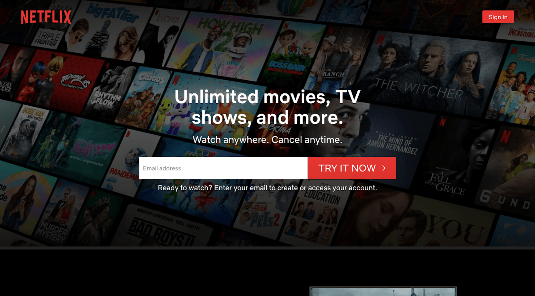
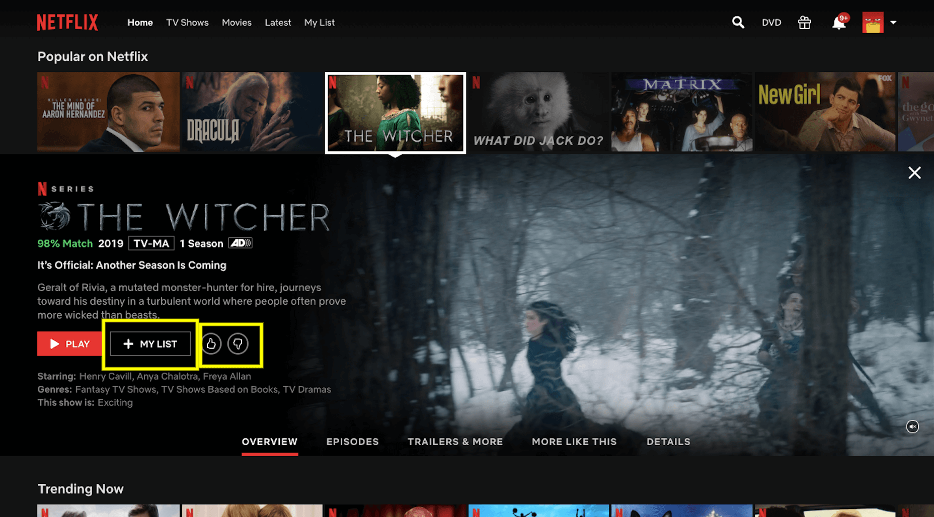
Designers are embracing big, bold concepts with oversized elements, bright color, and even a little rule-breaking. (The best part? Most of these trends seem to overlap somewhat.) Here’s what’s trending in design this month.

Homepage Headline Heroes

Homepage hero areas are shifting again from website entryways with plenty of text, CTAs, and options for users, to simple displays with big headlines (and maybe not much else).

Use of oversized headlines and text elements make it clear from the start what a website or design is about, but doesn’t provide a lot of opportunity for users to explore without scrolling. And that might be okay. Thanks to mobile dominance, users have become accustomed to the scroll. It may even be shifting to the preferred method of digesting content. (Even more than clicks or taps.)

Scroll is fast and allows users to glance at content and information with little delay or interaction.

Each of the website examples below are designed for just that:

Whiteboard opens with a large headline that encompasses their vision statement and nothing else. On scroll you get access to projects and a deeper dive into information about the brand.

Self-Evident Poems doesn’t actually scroll but moves into prompts for usability. It’s rooted in the same homepage headline hero area that’s designed to draw you into the content.

Illume has additional content below the scroll beneath a giant headline in the hero area. What this design does differently is that it does include some imagery, although it is still secondary to the text because of typography size.

Peachy Tones

Beat the Winter blues with a dose of Spring color! Peachy tones seem to be everywhere.

While this trend might be an evolution from other bright colors such as pinks and oranges that have been popular, it has a lot of practical application. Use it as a dominant color such as Grain & Mortar, and Monokai, or to create an accent like Kevin van der Wijst’s portfolio.

Peachy tones provide plenty of options and can be more pinkish or push toward orange. The color can be highly saturated or fairly pale. The nice thing about peachy tones is that they aren’t that overpowering, and work equally well as background or foreground color. Peach can get a little tricky when used for typographic elements, depending on the font style and contrasting elements.

Larger swaths of peach tend to stand up against other elements better than tiny ones. Note that even as an accent in the featured portfolio below, peach tones encompass a significant portion of the canvas. (You might also want to click through and play with that design, which also includes cool liquid animation. You can even make the peach area take up most of the screen.)

Outline Fonts

This trend is exploding in use from small projects to big brands. Outline fonts are a big deal. It’s one of those trends that you would shake your head at and say “no way” if you didn’t see it in action … and used so well.

Outline fonts can be a challenge. They create an effect that’s almost the opposite of the oversized typography in another trend mentioned here. But they do create an eye-catching effect that draws you into the words on screen.

Outline fonts are almost always paired with the same font filled. It creates and yin and yang effect that can help keep users reading longer and engaging with content. The contrast between and outline and filled font also put specific emphasis on the bolder element in the lettering pair.

The trick to making it work is not to get too crazy with the design and design outline fonts so that there’s plenty of contrast for the letters to remain readable.

Fitlab is the busiest of the examples of this trend with multiple use of outline fonts and even a quick-moving video roll. Put it all together and the emphasis is on “personal” training. It works.

Chilly Source uses an outline font for its brand name so that you get another intro to it without too much brand in your face. (The name is mentioned three time on the homepage.)

Vitesse Trucking uses outline text to tell you what they do throughout the design. Text is information but also serves as an art element with movement in the parallax-style scrolling design. Outline type elements mirror smaller filled words and even include some layering and overlays to keep the eyes moving. It’s an interesting use of this trend in an industry where you might not expect it.

Conclusion

I’ll be the first to admit, you probably won’t find me designing with a lot of peachy coloring. While it works for these projects, it’s not a favorite of mine.

On the flip side, I adore all the outline font options. It’s funky and provides depth to text elements that we haven’t seen a lot of. How about you? What design trends can you see yourself using in the coming months?

Source

p img {display:inline-block; margin-right:10px;}
.alignleft {float:left;}
p.showcase {clear:both;}
body#browserfriendly p, body#podcast p, div#emailbody p{margin:0;}