Implementing Skeleton Screens In React

Original Source: https://www.smashingmagazine.com/2020/04/skeleton-screens-react/

Implementing Skeleton Screens In React

Implementing Skeleton Screens In React

Blessing Krofegha

2020-04-20T10:00:00+00:00
2020-04-20T16:34:50+00:00

Spinners and loaders have traditionally been the way to tell users that content is going to take a while to load. While this approach is great, it’s quickly becoming obsolete in modern development. Skeleton screens are becoming the perfect replacement for traditional loaders because they focus on progress rather than wait times, hence reducing loading-time frustration.

In this article, we won’t be going through the basics of CSS React or JavaScript syntax, so you don’t have to be an expert in either of these languages to follow along.

The difference between a loader and a skeleton screen UI
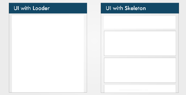
The difference between a loader and a skeleton screen UI (Large preview)

UI and UX experts teach us that, while users wait for content to load on a page, we should keep them engaged.

The idea behind using spinners to engage users before content loads is great; however, the result can be less than ideal because most users will get bored staring at a dummy animated spinner like it’s a clock. Luke Wroblewski elaborates on this.

Skeleton screens offer a better user experience by reducing loading-time frustration. By focusing on progress instead of wait times, it create the illusion for users that information will be incrementally displayed on the screen. Bill Chung in his research confirms this.

What Is a Skeleton Screen?

A skeleton screen is a version of the UI that doesn’t contain actual content; instead, it mimics the page’s layout by showing its elements in a shape similar to the actual content as it is loading and becoming available (i.e. when network latency allows).

A skeleton screen is essentially a wireframe of the page, with placeholder boxes for text and images.

What’s Unique About a Skeleton Screen?

A skeleton UI resembles the page’s actual UI, so users will understand how quickly the web or mobile app will load even before the content has shown up. Here are a couple of reasons why you might want to consider using skeleton screens in your next project:

mimicking a page’s layout is easier with a skeleton screen,
contents loads progressively (not all at once).

Skeleton screens are also referred to as:

ghost elements,
content placeholders,
content loaders.

Blockchain.com, YouTube, Facebook, Medium, and other big tech companies display skeleton screens while their content loads to boost the UX.

Blockchain.com

Blockchain.com skeleton screen UI

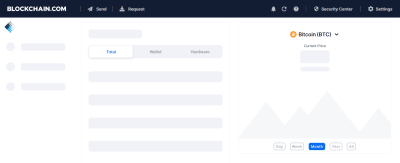
Blockchain.com’s partially loaded state (notice how a skeleton is used in the graph analytics) (Large preview)

Medium

Medium skeleton screen UI

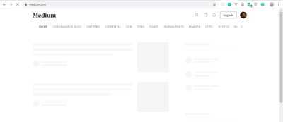
Medium’s skeleton UI (Large preview)

LinkedIn

LinkedIn skeleton screen UI

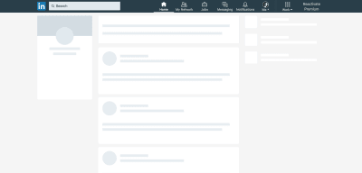
LinkedIn’s home feed loading state in 2018 (Large preview)

Types of Skeleton Screens

There are different kinds of skeleton screens. The major ones are text placeholders and image (or color) placeholders.

Most developers prefer to use text placeholders as the skeleton UI on their pages because they’re easy to build, and the developer doesn’t require any details about the substance of the actual content; instead the skeleton mimics the UI.

Color placeholders are harder to build because they require details about the content.

Some popular packages make implementing skeleton screens in web apps easier. Let’s take a closer look at both of them:

React Placeholder
React Loading Skeleton

We’ll look at the pros and cons of each package, before considering which to use for our application.

React Placeholder

Pros

Placeholder components are used to create a custom skeleton UI.
Pulse animation (i.e. motion effect on an element) is supported.
It comes with a component-based API.

Cons

Skeleton components are maintained separately, so updating styles of a component possibly requires updating the skeleton component as well.
The learning curve is not linear because there are multiple components for different needs.

The following is an example of a skeleton component using the react-placeholder package:

import { TextBlock, RectShape } from ‘react-placeholder/lib/placeholders’;
import ReactPlaceholder from ‘react-placeholder’;

const GhostPlaceholder = () => (
<div className=’my-placeholder’>
<RectShape color=’gray’ style={{width: 25, height: 70}} />
<TextBlock rows={6} color=’blue’/>
</div>
);
<ReactPlaceholder ready={ready} customPlaceholder={<GhostPlaceholder />}>
<MyComponent />
</ReactPlaceholder>

Importing TextBlock and RectShape from react-placeholder/lib/placeholder and ReactPlaceholder from react-placeholder, we’ve created a functional component named GhostPlaceholder. GhostPlaceholder has a div, and inside the div we’ve used the RectShape component, which describes the dimensions of a rectangle, passes the value of any color, and defines the rectangle’s styles.

Next, we used the TextBlock component to set the values for the rows and color. The TextBlock component defines the number of rows and color of text.

We pass MyComponent as a child of the ReactPlaceholder component, which receives ready and the GhostPlaceholder component as values for its ready and customPlaceholder props.

The MyComponent will load when the skeleton screen UI is shown.

To learn more, check the documentation.

React Loading Skeleton

Pros

It is API-based, and it has one component with props for all customization.
It can be used as a separate skeleton component and also inside any component directly, so it’s flexible.
It supports theming and Pulse animation.

Cons

It’s easy to implement for a simple skeleton UI, but complicated for more complex skeletons.
Having a separate skeleton component will make it harder to maintain when the UI and styles change.

The following is an example of React Loading Skeleton:

import Skeleton, { SkeletonTheme } from “react-loading-skeleton”;

const SkeletonComponent = () => (
<SkeletonTheme color=”#202020″ highlightColor=”#444″>
<section>
<Skeleton height={50} width={50} />
</section>
</SkeletonTheme>
);

We’ve imported Skeleton and SkeletonTheme from the react-loading-skeleton library, then created a functional component that renders the SkeletonTheme component, with color and hightlightColor as properties.

The SkeletonTheme component is used for theming (for example, adding color effects to the skeleton UI).

Finally, inside the section, we define the Skeleton component, with height and width properties and their appropriate values passed in.

Building a YouTube-Like Skeleton Screen UI

Let’s create a YouTube-like skeleton screen, using React Loading Skeleton, to show how a skeleton UI works.

Set Up React

The easiest way to set up React is to use Create React App, which is “an officially supported way to create single-page React applications. It offers a modern build setup with no configuration.”

We’ll use it to bootstrap the application that we’ll be building. From your terminal, run the command below:

npx create-react-app skeleton-screens && cd skeleton-screens

Once the installation has completed, start the React server by running npm start:

React app - Scaffold React app

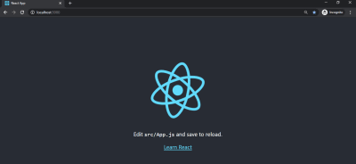
React welcome page (Large preview)

Create the YouTube UI Without a Skeleton Screen

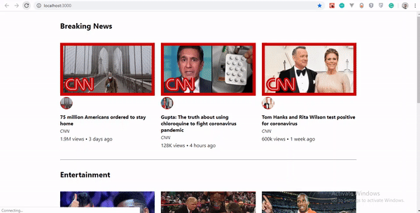
First, let’s input YouTube dummy data. Real endpoints would normally be used instead of dummy data, but in this tutorial we will use dummy data.

Create a file in your src/ folder, and name it data.js, add the following code to it.

const dummyData= [
{
section: “Recommended”,
channel: “CNN”,
items: [
{
id: “fDObf2AeAP4”,
image: “https://img.youtube.com/vi/fDObf2AeAP4/maxresdefault.jpg”,
title: “75 million Americans ordered to stay home”,
views: “1.9M views”,
published: “3 days agos”
},
{
id: “3AzIgAa0Cm8”,
image: “https://img.youtube.com/vi/3AzIgAa0Cm8/maxresdefault.jpg”,
title: “Gupta: The truth about using chloroquine to fight coronavirus pandemic”,
views: “128K views”,
published: “4 hours ago”
},
{
id: “92B37aXykYw”,
image: “https://img.youtube.com/vi/92B37aXykYw/maxresdefault.jpg”,
title: “Willie Jones STUNS Simon Cowell In Pitch Perfect Performance of ‘Your Man’!”,
views: “2.47 million views”,
published: “1 month ago”
},
{
id: “J6rVaFzOEP8”,
image: “https://img.youtube.com/vi/J6rVaFzOEP8/maxresdefault.jpg”,
title: “Guide To Becoming A Self-Taught Software Developer”,
views: “104K views”,
published: “17 days ago”
},
{
id: “Wbk8ZrfU3EM”,
image: “https://img.youtube.com/vi/Wbk8ZrfU3EM/maxresdefault.jpg”,
title: “Tom Hanks and Rita Wilson test positive for coronavirus”,
views: “600k views”,
published: “1 week ago”
},
{
id: “ikHpFgKJax8”,
image: “https://img.youtube.com/vi/ikHpFgKJax8/maxresdefault.jpg”,
title: “Faces Of Africa- The Jerry Rawlings story”,
views: “2.3 million views”,
published: “2014”
}
]
},
{
section: “Breaking News”,
channel: “CGTN America”,
items: [
{
id: “tRLDPy1A8pI”,
image: “https://img.youtube.com/vi/tRLDPy1A8pI/maxresdefault.jpg”,
title: “Is Trump blaming China for COVID-19? You decide.”,
views: “876k views”,
published: “9 days ago”
},
{
id: “2ulH1R9hlG8”,
image: “https://img.youtube.com/vi/2ulH1R9hlG8/maxresdefault.jpg”,
title: “Journalist still goes to office during pandemic, see her daily routine”,
views: “873 views”,
published: “3 hours ago”
},
{
id: “_TkfQ9MaIgU”,
image: “https://img.youtube.com/vi/_TkfQ9MaIgU/maxresdefault.jpg”,
title: “How are small businesses going to survive the economic downturn of the COVID-19 era?”,
views: “283 views”,
published: “4 day ago”
}
]
}
];
export default dummyData;

To replicate YouTube’s format, we’ve created dummy data that has an array of objects, with properties such as ID, image, title, number of views, and publication date.

Next, let’s create our YouTube UI. We will have three components:

Card
Holds the details of the video’s thumbnail, title, number of views, publication date, and channel.

CardList
Returns all cards in a row.

App
Mounts our dummyData object, loads the skeleton UI for two seconds, and returns the CardList component.

Inside your src folder, create a folder and name it components. Inside the components folder, create a Card.js file, add the following code to it:

import React from “react”;
const Card = ({ item, channel }) => {
return (
<li className=”card”>
<a
href={`https://www.youtube.com/watch?v=${item.id}`}
target=”_blank”
rel=”noopener noreferrer”
className=”card-link”
>
<img src={item.image} alt={item.title} className=”card-image” />
<img src={item.image} alt={item.title} className=”channel-image” />
<h4 className=”card-title”>{item.title}</h4>
<p className=”card-channel”>
<i>{channel}</i>
</p>
<div className=”card-metrics”>
{item.views} • {item.published}
</div>
</a>
</li>
);
};
export default Card;

We created a Card component. Inside it, we imported React from react, and we deconstructed the item and channel props so that they can be used across the Card component. Each Card item component that displays one video will show the thumbnail, number of views, publication date, and title.

CardList Component

Inside the components folder, create a CardList.js file and add the following code to it:

import React from “react”;
import Card from “./Card”;
const CardList = ({ list }) => {
return (
<ul className=”list”>
{list.items.map((item, index) => {
return <Card key={index} item={item} channel={list.channel} />;
})}
</ul>
);
};
export default CardList;

In this component, we’ve imported the Card component that we created. The card accepts the item and channel props, which we get by mapping through the list.items. We then export this component as CardList, because we’ll be making use of it in our App component.

Note: The items array that is mapped in this component is the array of objects in our dummyData.

App Component

Inside the app.js file in the src/ directory, delete the code that is there and add the following to it.

import React, { useState, useEffect } from “react”;
import “./App.css”;
import dummyData from “./data”;
import CardList from “./components/CardList”;

const App = () => {
const [videos, setVideos] = useState([]);
const [loading, setLoading] = useState(false);

useEffect(() => {
setLoading(true);
const timer = setTimeout(() => {
setVideos(dummyData);
setLoading(false);
}, 5000);
return () => clearTimeout(timer);
}, []);
return (
<div className=”App”>
{
videos.map((list, index) => {
return (
<section key={index}>
<h2 className=”section-title”>{list.section}</h2>
<CardList list={list} />
<hr />
</section>
);
})}
</div>
);
};
export default App;

In this component, we’ve imported the useState and useEffect hooks alongside React and the other files that we’ve created and that will be needed in the App component.

Because our data is dummy data, we need to mock it up like the API data by loading the content after a two-second timeout, using the JavaScript setTimeout method.

Next, in the App component, we create a video state, and set the state to an empty array using useState.

To load our dummy data, we’ll use the useEffect hook. In our hook, we create a variable timer that holds the setTimeout() function. Inside the function, we set our video state to our dummyData object, and we ensure that the data loads after two seconds, and, lastly, we cancel the timer while unmounting.

Finally, we map through our video state and return the section element that contains the list-section and the CardList component with its list props.

Adding CSS

Until now, we’ve used a lot of classes without actual CSS. Inside the src folder, delete everything in App.css and replace it with the following code;

.App {
max-width: 960px;
margin: 0 auto;
font-size: 16px;
}
.list {
display: flex;
justify-content: space-between;
flex-wrap: wrap;
list-style: none;
padding: 0;
}
.section-title {
margin-top: 30px;
}
.card {
width: calc(33% – 10px);
margin: 20px 0;
}
.card-link {
color: inherit;
text-decoration: none;
}
.card-image {
width: 100%;
}
.channel-image {
border-radius: 100%;
padding: 0, 10px, 0, 0;
width: 40px;
height: 40px;
}
.card-title {
margin-top: 10px;
margin-bottom: 0;
}
.card-channel {
margin-top: 5px;
margin-bottom: 5px;
font-size: 14px;
}
/* Tablets */
@media (max-width: 1000px) {
.App {
max-width: 600px;
}
.card {
width: calc(50% – 22px);
}
}
/* Mobiles */
@media (max-width: 640px) {
.App {
max-width: 100%;
padding: 0 15px;
}
.card {
width: 100%;
}
}

Let’s see what our YouTube UI looks like without the skeleton screen. You can see that when the page loads, a white screen appears for two seconds, and then the data loads promptly.

YouTube-like UI without skeleton screen
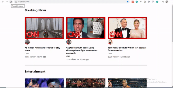
YouTube-Like UI without skeleton screen (Large preview)

Using React Loading Skeleton

Unlike other libraries in which you would meticulously craft a skeleton screen to match the font sizes, line heights and margins of your content, the Skeleton component is designed to be used directly in your components, in place of the content that is loading.

Let’s go over a few reasons why we’ve chosen React Loading Skeleton over others.

Theming

React Loading Skeleton supports theming. Thus, you can easily change the colors of all skeleton components by using SkeletonTheme and pass values to the color props.

Below is an example showing how it works:

import Skeleton, { SkeletonTheme } from “react-loading-skeleton”;

<SkeletonTheme color=”grey” highlightColor=”#444″>
<p>
<Skeleton height={250} width={300} count={1} />
</p>

</SkeletonTheme>
<SkeletonTheme color=”#990″ highlightColor=”#550″>
<p>
<Skeleton height={250} width={300} count={1} />
</p>

</SkeletonTheme>

Theming effect in actionTheming effect in action (Large preview)

Duration

In addition to the height, width, and color props, we can also specify a duration prop.

<Skeleton duration={2} />

The duration defaults to 1.2. This determines how long it takes to do one cycle of the skeleton animation.

To learn more, check out the documentation.

Implementing Skeleton Screen UI

Now, we’ll install react-loading-skeleton. Run the following command in your terminal to install the package:

npm install react-loading-skeleton

Skeleton Component

Let’s create a skeleton component for our video data. Inside our components folder, create a SkeletonCard.js file, and add the following code:

import React from “react”;
import Skeleton from “react-loading-skeleton”;
const SkeletonCard = () => {
return (
<section>
<h2 className=”section-title”>
<Skeleton height={30} width={300} />
</h2>

<ul className=”list”>
{Array(9)
.fill()
.map((item, index) => (
<li className=”card” key={index}>
<Skeleton height={180} />
<h4 className=”card-title”>
<Skeleton circle={true} height={50} width={50} />  
<Skeleton height={36} width={`80%`} />
</h4>
<p className=”card-channel”>
<Skeleton width={`60%`} />
</p>
<div className=”card-metrics”>
<Skeleton width={`90%`} />
</div>
</li>
))}
</ul>
</section>
);
};
export default SkeletonCard;

We’ve created an unordered list. Inside it, we’ve used the Array.fill() method. Because we have nine items of dummy data, we’ve used the Array.fill() method to loop through the length of our items object and filled it with no index value, hence making our array empty. See the Array.fill documentation to learn how it works.

Next, we mapped through our empty array to return a list containing the skeleton properties, and we specified the value of each of the skeleton properties.

Here, height connotes the length of a skeleton rectangle, and width refers to the breadth, while circle creates the rounded part of the skeleton UI.

React Loading Skeleton comes with default Pulse animation, which makes it handy. You could create Pulse animation to suit your project, but if you ask me, I would stick with the default.

Finally, the complete source code is available.

We now have a fully functional skeleton screen UI. Our example shows the skeleton for five seconds before showing the content.

Let’s see our result thus far:

YouTube-like UI plus skeleton screen UIOur YouTube-like skeleton UI (Large preview)

Conclusion

Skeleton screens tremendously improve the user experience by avoiding the frustration of facing an entirely blank screen and giving the user an impression of what content will look like before it loads.

If you aren’t comfortable with any of the packages we’ve looked at, you can create your own skeleton UI by making rectangles and circles that mimic the page’s layout.

Please do share your feedback and experience with in the comments section below. I’d love to see what you come up with!

The supporting repo for this article is available on Github.

References

“Everything You Need to Know About Skeleton Screens”, Bill Chung, UX Collective
“Skeleton Loading Pages With React”, Anthony Panagi, Octopus Wealth
“Skeleton Screens With React And React Native”, Chris Dolphin, Alligator.io
“Implementing Skeleton Loading In React ”, Adrian Bece, DEV

Smashing Editorial
(ks, il, al)

5 Best Interactive Learning Websites for Students

Original Source: http://feedproxy.google.com/~r/Designrfix/~3/ft6rEmfxDj8/5-best-interactive-learning-websites-for-students

Photo credit: jeshoots In the 21st century, using technology is a necessity in almost every setting. Technological devices and resources empower people to be more effective at their work and students – to be more successful in their studies. It’s important to embrace the innovation the world of technology has to offer to ensure greater […]

The post 5 Best Interactive Learning Websites for Students appeared first on designrfix.com.

40 Unusually Creative Mugs, Cups & Glasses

Original Source: https://www.hongkiat.com/blog/unusual-mugs-cups-and-glasses/

Nothing wakes me up better than a good cuppa in the morning. To some of us, cups, mugs, glasses; they are just something to hold our beverages; what matters is what we pour into them. To others, it…

Visit hongkiat.com for full content.

The Simpson’s new look is the best thing you’ll see all day

Original Source: http://feedproxy.google.com/~r/CreativeBloq/~3/NTAfR9v71h4/the-simpsons-new-look

Fans of America's most dysfunctional family, The Simpsons, will be familiar with the couch gag that kicks off every episode. From alien invasions to time travel, the famous sofa has been subject to extreme transformations over the course of the animation series. But this quarantine-themed offering, which sees the family fly off on an action-packed adventure around Springfield, is one of the most topical. 

Don't worry, no lockdown rules have been flouted here, the fast-paced jaunt takes place within the futuristic world of virtual reality, and the offbeat, abstract animation style deployed totally reflects that. This is Springfield as you've never seen it before. We just hope Homer is using one of the best VR headsets for 2020.

Want to dive into The Simpsons? Try Disney Plus free for seven days.

The Simpsons: Homer

Bart’s line writing punishment doesn’t seem so bad here

The sequence (below) supercharges the usual events of the opening credits, adding an extreme sport edge to everything the family does. Think Homer skydiving, Bart snowboarding and Marge surfing. Lisa gets to dive in the deep sea, and Maggie's tricycle skills are out of this world. Everything that happens is super-familiar, but not quite as you know it. 

It's the animation style that makes the piece so invigorating. The usual warm colours and soft lines are gone, replaced by a much edgier design. The colour palette is vibrant yet limited, while the abstract lines and graphic textures rough things up and emphasise that 'extreme' edge. Plus, the quick and often glitchy transitions offer pure adrenalin surges. 

We're all way too acquainted with our sofas at the moment, which this animation reflects perfectly. With a hard-hitting soundtrack, the sequence is fast, free and dreamlike, smashing that slight feeling of claustrophobia that's settled over the world and opening up new possibilities. We've recommended spicing things up with Google's AR app, but this takes it to another level that we'd love to try out.

Read more:

11 top animation tools for digital artists24 cool CSS animation examples to recreateHow to make an animated video: Expert advice

Collective #602

Original Source: http://feedproxy.google.com/~r/tympanus/~3/2fZSg2-o7zo/

Inspirational Website of the Week: CUSP

A superb elegant look with very interesting distortion effects. Our pick this week.

Get inspired

Our Sponsor
Start your own freelance business by becoming a Divi expert

Learn how to develop websites with the most popular WordPress theme in the world and secure your success as a freelancer.

Start learning now

Building dark mode on Stack Overflow

Aaron Shekey talks about the work that went into the new dark mode option of Stack Overflow.

Read it

Kontrapunkt Type

Step inside a virtual experience of the solo exhibition ‘Kontrapunkt Type’, presented by design agency Kontrapunkt, DNP and Ginza Graphic Gallery in Tokyo.

Check it out

Watched Box

Heydon Pickering made this declarative container queries solution.

Check it out

Writing an Emulator in JavaScript (and Interfacing with Multiple UIs)

A great guide by Tania Rascia where she shares her journey of writing a Chip-8 interpreter.

Read it

Image Compare Viewer

Compare before and after images, for grading, CGI and other retouching comparisons.

Check it out

Image Techniques On The Web

Ahmad Shadeed’s guide to including images in HTML covering various techniques.

Read it

Stacks

A set of layout components for building React Native views blazingly fast.

Check it out

How && and || Operators Really Work in JavaScript

An in-depth post that explains in examples how exactly && and || operators work in JavaScript.

Read it

Practice time!

Practice your ukulele with this project by Monica Dinculescu.

Check it out

Generative Data Visualization

The third part of a series where Shirley Wu show how to create custom data visualizations using SVG, Vue, and D3.js.

Check it out

Bubble Tape Text

A super cool unrolling scroll effect by Matthew Rayfield.

Check it out

Prog Arp II

An arpeggiator instrument by Jake Albaugh.

Check it out

Creating Morphing Animations with CSS clip-path

Learn how to implement morphing, a technique for transforming one appearance into another, using CSS in this tutorial by Mikael Ainalem.

Read it

How Google Ruined the Internet

Google has become a card catalog that is constantly being reordered by
an angry, misinformed mob.

Read it

Updates to Form Controls and Focus

Microsoft Edge and Google Chrome spent the last year collaborating to retheme and improve the functionality of the built-in form controls on Chromium browsers.

Read it

Meanderer

A JavaScript micro-library for responsive CSS motion paths. Made by Jhey Tompkins.

Check it out

Bongo Cat Codes #2 – Jamming

A lovely animation by Caroline Artz.

Check it out

3D Photography using Context-aware Layered Depth Inpainting

A novel method for converting a single RGB-D input image into a 3D photo.

Check it out

Making a responsive CSS grid layout with just 3 properties

Learn how to pull off a simple responsive template based on CSS Grid.

Read it

Why you should stop using Google Analytics on your website

Here’s a look at why you should remove Google Analytics from your website and help create a more open, independent web that’s more friendly to the visitors.

Read it

From Our Blog
Interactive WebGL Hover Effects

A simple tutorial on how to achieve an interactive mouseover/hover effect on images in some easy steps.

Check it out

Collective #602 was written by Pedro Botelho and published on Codrops.

Burger King's banned ads are a whopper of a mistake

Original Source: http://feedproxy.google.com/~r/CreativeBloq/~3/WelJ8ssy2qs/banned-whopper-ads

Burger King has been forced to stop showing adverts for its new Rebel Whopper burger after the Advertising Standards Authority (ASA) deemed them misleading. Launched in January to coincide with Veganuary (in which people attempt to eat only vegan food for the whole month), the ads proclaimed the new burger to be the chain's "first plant-based burger”. 

However, while the Rebel Whopper may not contain any beef, it soon came to light that it is cooked on the same grill as its meat counterpart. Twitter users spotted the smallprint on the ad, with many taking the fast food giant to task. In reply to countless disgruntled tweets, Burger King claimed this was to preserve the Whopper's "signature flame-grilled taste" – something we doubt is as important to vegetarians as the thing being, you know, vegetarian.

It's safe to say these won't be making our list of the best poster designs any time soon. As well as describing the product as "100% WHOPPER – NO BEEF", the advertising (above) contained a logo proclaiming, "powered by the vegetarian butcher" (which, er, doesn't scream 'not suitable for vegetarians' to us). 

 "So it’s an absolute waste of time then?" Said one Twitter user on learning that the burger is cooked on the same grill as the original Whopper. "What’s the point in bringing out plant based foods that aren’t suitable for even vegetarians?" 

The ASA had beef with several elements of the ads "The presence of the “Vegetarian Butcher” logo, the green colour palette and the timing of the ad and product release to coincide with Veganuary" all contributed to the impression that the product is suitable for vegetarians, claimed the ruling. 

Burger King

Not suitable for vegetarians

Burger King argued that "the small print at the bottom of the ads stated that the Rebel Whopper may not be suitable for vegans or vegetarians as it was cooked alongside other meat products", but this wasn't enough for the ASA. “We concluded that the ads were misleading,” it said. “The ads must not appear again in their current form.” 

Burger King isn't the only fast food chain to have social media trouble lately. McDonald's recently apologised and deleted a 'socially-distanced' version of its logo after a backlash from those who saw it as an opportunistic response to the coronavirus pandemic. At least Burger King has had more success with its ads elsewhere. We were impressed with its recent campaign featuring a mouldy whopper in a clever swipe at McDonald's. It's ironic that, advertising-wise, the chain's mouldy burger left a better taste than its "plant-based" one.

Related articles:

McDonald's posters go viral for all the wrong reasonsThe optical illusion you probably won't want to work outBurger King trolls parliament in cheeky campaign

Thunder is 80s Graphic Design Awesomeness

Original Source: http://feedproxy.google.com/~r/abduzeedo/~3/uUml15yLrc8/thunder-80s-graphic-design-awesomeness

Thunder is 80s Graphic Design Awesomeness

abduzeedoApr 15, 2020

In this time of sorrow and stress there’s nothing better than a boost of pure 80s graphic design inspiration. A lightning of energy directed straight to our hearts to lift us up. Perhaps even get me out of my lazy state and make me open Photoshop and try to recreate that effect. I am talking about the artwork that João Marques designed and shared  for “Thunder”, a long-awaited track from KURA released for free on July 2019. 

The artwork was heavily inspired by old rock and metal vinyl sleeves due to the song’s sampling of AC/DC’s “Thunderstruck”. – Joao Marques

Graphic Design


New Dune logo revealed (and don’t worry, they fixed it)

Original Source: http://feedproxy.google.com/~r/CreativeBloq/~3/fivk5uwmT2g/dune-logo-revealed

The brand new logo for Warner Bros.' new reboot of Frank Herbert's Dune has been released, and it closely matches the controversial title treatment that leaked back in January – with one key difference. Along with the first image from the movie (featuring Timothée Chalamet as Paul Atreides), the new logo first appeared on the film's official Twitter page last night.

The logo uses the four U-shapes in different orientations that we first saw in photographs from a French convention at the start of the year. Back then, the design proved contentious, with many concerned that the leaked logo appeared to read 'DUNC' rather than 'DUNE'. However, that widely-shared concept (below) was in fact a fan rendering based on photographs from the convention, and was missing an all-important lens flare inside the 'E'. Thankfully, said lens flare is present and correct in the new, official logo. Phew.

Looking for ideas? Check out our guide to finding logo design inspiration.

Directed by Denis Villeneuve, Dune is slated for release on 18 December this year. According to its official synopsis, film "tells the story of Paul Atreides, a brilliant and gifted young man born into a great destiny beyond his understanding, who must travel to the most dangerous planet in the universe to ensure the future of his family and his people." An all-star cast features, alongside Chalamet, Zendaya, Oscar Isaac and more.

You can read all about the original leaked logo drama (and enjoy a brilliant pasta-based take on it) here. We're excited to see how Villeneuve makes his stamp on the sci-fi franchise, and, most of all, we're relieved to know that this December, we won't be queueing up to watch 'Dunc'.

Related articles: 

Is this the new Cadbury logo?Iconic logos reimagined for the age of coronavirusThe 10 best logos of all time

Interactive WebGL Hover Effects

Original Source: http://feedproxy.google.com/~r/tympanus/~3/W_A-q9lF8Xc/

I love WebGL, and in this article I will explain one of the cool effects you can make if you master shaders. The effect I want to recreate is originally from Jesper Landberg’s website. He’s a really cool dude, make sure to check out his stuff:

So let’s get to business! Let’s start with this simple HTML:

<div class=”item”>
<img src=”img.jpg” class=”js-image” alt=””>
<h2>Some title</h2>
<p>Lorem ipsum.</p>
</div>
<script src=”app.js”></script>

Couldn’t be any easier! Let’s style it a bit to look prettier:

All the animations will happen in a Canvas element. So now we need to add a bit of JavaScript. I’m using Parcel here, as it’s quite simple to get started with. I’ll use Three.js for the WebGL part.

So let’s add some JavaScript and start with a basic Three.js setup from the official documentation:

import * as THREE from “three”;

var scene = new THREE.Scene();
var camera = new THREE.PerspectiveCamera( 75, window.innerWidth/window.innerHeight, 0.1, 1000 );

var renderer = new THREE.WebGLRenderer();
renderer.setSize( window.innerWidth, window.innerHeight );
document.body.appendChild( renderer.domElement );

camera.position.z = 5;

var animate = function () {
requestAnimationFrame( animate );

cube.rotation.x += 0.01;
cube.rotation.y += 0.01;

renderer.render( scene, camera );
};

animate();

Let’s style the Canvas element:

body { margin: 0; }

canvas {
display: block;
position: fixed;
z-index: -1; // put it to background
left: 0; // position it to fill the whole screen
top: 0; // position it to fill the whole screen
}

Once you have all this in place, you can just run it with `parcel index.html`. Now, you wouldn’t see much, its an empty 3D scene so far. Let’s leave the HTML for a moment, and concentrate on the 3D scene for now.

Let’s create a simple PlaneBufferGeometry object with an image on it. Just like this:

let TEXTURE = new TextureLoader().load(‘supaAmazingImage.jpg’);
let mesh = new Mesh(
new PlaneBufferGeometry(),
new MeshBasicMaterial({map: TEXTURE})
)

And now we’ll see the following:

Obviously we are not there yet, we need that color trail following our mouse. And of course, we need shaders for that. If you are interested in shaders, you’ve probably come across some tutorials on how to displace images, like displacing on hover or liquid distortion effects.

But we have a problem: we can only use shaders on (and inside) that image from the example above. But the effect is not constrained to any image borders, but rather, it’s fluid, covering more area, like the whole screen.

Postprocessing to the rescue

It turns out that the output of the Three.js renderer is just another image. We can make use of that and apply the shader displacement on that output!

Here is the missing part of the code:

// set up post processing
let composer = new EffectComposer(renderer);
let renderPass = new RenderPass(scene, camera);
// rendering our scene with an image
composer.addPass(renderPass);

// our custom shader pass for the whole screen, to displace previous render
let customPass = new ShaderPass({vertexShader,fragmentShader});
// making sure we are rendering it.
customPass.renderToScreen = true;
composer.addPass(customPass);

// actually render scene with our shader pass
composer.render()
// instead of previous
// renderer.render(scene, camera);

There are a bunch of things happening here, but it’s pretty straightforward: you apply your shader to the whole screen.

So let’s do that final shader with the effect:

// get small circle around mouse, with distances to it
float c = circle(uv, mouse, 0.0, 0.2);
// get texture 3 times, each time with a different offset, depending on mouse speed:
float r = texture2D(tDiffuse, uv.xy += (mouseVelocity * .5)).x;
float g = texture2D(tDiffuse, uv.xy += (mouseVelocity * .525)).y;
float b = texture2D(tDiffuse, uv.xy += (mouseVelocity * .55)).z;
// combine it all to final output
color = vec4(r, g, b, 1.);

You can see the result of this in the first demo.

Applying the effect to several images

A screen has its size, and so do images in 3D. So what we need to do now is to calculate some kind of relation of those two.

Just like I did in my previous article, we can make a plane with a width of 1, and fit it exactly to the screen width. So practically, we have WidthOfPlane=ScreenSize.

For our Three.js scene, this means that if want an image with a width of 100px on the screen, we will make a Three.js object with width of 100*(WidthOfPlane/ScreenSize). That’s it! With this kind of math we can also set some margins and positions easily.

When the page loads, I will loop through all the images, get their dimensions, and add them to my 3D world:

let images = […document.querySelectorAll(‘.js-image’)];
images.forEach(image=>{
// and we have the width, height and left, top position of the image now!
let dimensions = image.getBoundingClientRect();
// hide original image
image.style.visibility = hidden;
// add 3D object to your scene, according to its HTML brother dimensions
createMesh(dimensions);
})

Now it’s quite straightforward to make this HTML-3D hybrid.

Another thing that I added here is mouseVelocity. I used it to change the radius of the effect. The faster the mouse moves, the bigger the radius.

To make it scrollable, we would just need to move the whole scene, the same amount that the screen was scrolled. Using that same formula I mentioned before: NumberOfPixels*(WidthOfPlane/ScreenSize).

Sometimes it’s even easier to make WidthOfPlane equal to ScreenSize. That way, you end up with exactly the same numbers in both worlds!

Exploring different effects

With different shaders you can come up with any kind of effect with this approach. So I decided to play a little bit with the parameters.

Instead of separating the image in three color layers, we could simply displace it depending on the distance to the mouse:

vec2 newUV = mix(uv, mouse, circle);
color = texture2D(tDiffuse,newUV);

And for the last effect I used some randomness, to get a pixelated effect around the mouse cursor.

In this last demo you can switch between effects to see some modifications you can make. With the “zoom” effect, I just use a displacement, but in the last one, I also randomize the pixels, which looks kinda cool to me!

I’d be happy to see your ideas for this animation. What kind of effect would you do with this technique?

Interactive WebGL Hover Effects was written by Yuriy Artyukh and published on Codrops.

How to Set Up Basic jQuery Form Validation in Two Minutes

Original Source: https://www.sitepoint.com/basic-jquery-form-validation-tutorial/?utm_source=rss

How to Set Up Basic jQuery Form Validation in Two Minutes

This tutorial shows you how to set up a basic form validation with jQuery, demonstrated by a registration form.

We’re going to use the jQuery Validation Plugin to validate our form. The basic principle of this plugin is to specify validation rules and error messages for HTML elements in JavaScript.

<!–

Here’s a live demo of what we’re going to build:

CodePen LINK GOES HERE

–>

Step 1: Include jQuery

First, we need to include the jQuery library. The jQuery validation plugin has been tested up to jQuery version 3.1.1, but the demo in this article works perfectly with version 3.4.1, which is the latest one.

You can use any of the following download options:

Download it from jquery.com
Download it using Bower: $ bower install jquery
Download it using npm or Yarn: $ npm install jquery or yarn add jquery
Use a CDN: https://ajax.googleapis.com/ajax/libs/jquery/3.4.1/jquery.min.js

Create a new HTML file named index.html and include jQuery before the closing </body> tag:

<!– Change the “src” attribute according to your installation path –>
<script src=”vendor/jquery/dist/jquery.min.js”></script>

If you’d like to use Bower or npm but aren’t familiar with them, you might be interested in these two articles:

Package Management for the Browser with Bower
A Beginner’s Guide to npm — the Node Package Manager

Step 2: Include the jQuery Validation Plugin

Choose between:

Download it from the plugin’s github repo
Download it using Bower: $ bower install jquery-validation
Download it using npm: npm i jquery-validation
NuGet: Install-Package jQuery.Validation
Use a CDN: https://cdnjs.cloudflare.com/ajax/libs/jquery-validate/1.19.1/jquery.validate.min.js

Include the plugin after jQuery:

<!– Change the “src” attribute according to your installation path –>
<script src=”vendor/jquery-validation/dist/jquery.validate.min.js”></script>

The post How to Set Up Basic jQuery Form Validation in Two Minutes appeared first on SitePoint.