How To Feel More Energized Even When You’re Stuck At A Desk All Day

Original Source: https://www.smashingmagazine.com/2020/05/more-energized-stuck-at-desk-all-day/

How To Feel More Energized Even When You’re Stuck At A Desk All Day

How To Feel More Energized Even When You’re Stuck At A Desk All Day

Suzanne Scacca

2020-05-26T12:00:00+00:00
2020-05-26T16:46:45+00:00

Let me tell you a little story.

I used to work for a translation agency. It was my job to copy-and-paste translations from one document into another and then to review the writing for errors. I worked between 10 and 12 hours every day, usually taking lunch at my desk (if I remembered to do so) and physically repeated the same thing over and over: mousing back and forth between my two giant computer screens and staring at too-small type.

Two years later, I found myself in physical therapy because I’d worn away the tissue beneath my right shoulder cap and had developed tennis elbow. Despite the months of therapy to repair my arm, I primarily use my left arm to work today. And although it feels a heck of a lot better than trying to power through the pain that happens when working with my right…

It makes me much slower than I used to be…

Which can lead to longer hours in front of the computer…

And I experience higher levels of stress, frustration and fatigue as a result.

I feel like if you’ve had a desk job for long enough, you have a similar story to tell. Maybe yours isn’t due to bad posture or technique. Maybe it has to do with the fact that you forget to eat lunch most days and don’t remember what it’s like to be outside when the sun is at its brightest. Or you move from your desk to the couch to the bed and back again, never giving your body or mind the physical activity it needs to stay energized.

Rather than let this be our collective fate because of the nature of our work, let’s try and change the narrative. Today, we’re going to look at some things you can do to feel more alert and energized even if you’re stuck at your desk for most of the day.

Fix Your Desk Setup and Alignment

Even if it feels more comfortable to work from your couch or bed or to slouch down in your work chair, the long-term benefits of not sitting properly will haunt you. Trust me.

I don’t know how old most of you are, but you may or may not have had to go through typing classes in school as I did. We didn’t just learn to type in them. We learned the right posture for sitting before a computer. This graphic from wikiHow sums it up:

wikiHow graphic - right and wrong postures working at desk

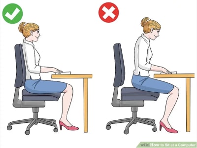
An illustration that depicts the right and wrong posture when sitting at a desk. (Image source: wikiHow) (Large preview)

Basically, you want to aim for the following:

Body folded at 90-degree angles,
Back straight against the chair,
Feet flat on the floor,
Arms bent at the elbows,
Fingers hover above the keyboard or mouse without bending or resting the wrists,
Eyes level with the computer screen.

This is a good place to start, regardless if you sit in a chair, on a stool or a stability ball. That said, it’s not the only thing you can do to fix your body at your workstation.

Another thing to think about is using a standing desk.

According to Dr. Edward R. Laskowski and the Mayo Clinic, sitting can be really bad for your health. People who sit for long periods of time are more prone to increased blood pressure, high cholesterol, diabetes, obesity, and cancer.

Even if you switch to a standing desk for just a few hours a day, you can increase the number of calories burned and stave off some of those health issues. In a study conducted back in 2011, researchers found additional health benefits when using a standing desk:

“The Take-a-Stand Project reduced time spent sitting by 224% (66 minutes per day), reduced upper back and neck pain by 54% and improved mood states.”

You don’t need to go investing in a standing desk to make this change. They can be expensive, especially when you already have a setup you’re comfortable with. However, what you can do is invest in a riser.

Desk modified to be standing

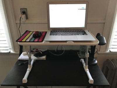
A modified desk turns into a standing desk with an adjustable riser. (Image source: Suzanne Scacca) (Large preview)

Not only can I adjust the height of the riser, but I can tilt it, too. This is useful not just for turning my desk into a standing desk setup, but I can take this with me when I work in hotels to make sure I’m always maintaining proper alignment.

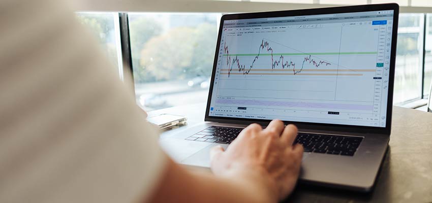
Use Time-Blocking To Schedule Your Day

Usually when people recommend the Pomodoro Technique — developed by Francesco Cirillo — they’re going to tell you to break your day into 25-minute intervals. That’s not really what the goal of this time management method is though.

The reason you break your workday into blocks is because it’s easier to focus when you have a clear and reasonable end-time in sight. It’s also useful for structuring your day.

For someone like a salesperson who has to get on call after call with leads or to sit in an endless string of meetings, half-hour blocks make a whole lot of sense. That’s naturally how their day breaks apart. Web designers would benefit from much longer blocks. Here’s why:

A study from the University of California and Humboldt University looked at what happens after work is disrupted. These were their findings and interpretations:

“When people are constantly interrupted, they develop a model of working faster (and writing less) to compensate for the time they know they will lose by being interrupted. Yet working faster with interruptions has its cost: people in the interrupted conditions experienced a higher workload, more stress, higher frustration, more time pressure and effort. So interrupted work may be done faster, but at a price.”

You have to be careful about managing the “cost” of taking a break. 25-minute blocks are just too costly for a web designer. I’d recommend looking at how your tasks naturally break apart.

Would prototyping a landing page take an hour or two? How about research and planning? Take a close look at the tasks you commonly perform and how long they take, on average, to complete.

I’d also look at where you naturally start to “fail” and lose focus. It’s the same thing that happens in workouts — when you reach your breaking point, your body just gives up. Unfortunately, some people try to push through it when it’s the brain screaming, “Stop!”

Another thing to look at is where your peak energy hours are. We all have them. For me, it’s between 2 PM and 5 PM every day. I always schedule my hardest projects then.

Use those as benchmarks for your blocks. On top of creating blocks and breaks throughout the workday, also be sure to set dedicated hours and limits for yourself. It’s a lot harder to get fatigued if you know you only have to put in a specific number of hours of work that day.

As for building this out, use a tool that makes it easy to set recurring breaks and stick to the same schedule every day. It could be as simple as using your Google Calendar:

Google Calendar time-blocking example

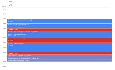
An example of how a web designer might schedule their work and breaks in blocks. (Image source: Google Calendar) (Large preview)

Whatever you choose, make sure you can slot in each task by time and color-code tasks based on things like client, priority, type, design stage, etc.

Get Outside During The Workday

Okay, so let’s talk about what you should be doing with your scheduled breaks.

Unless there’s a dangerous storm outside, you should make an effort to get outside at least once a day. There are a ton of health benefits associated with sunlight, including an increase in vitamin D and serotonin.

Vitamin D is useful as it helps increase our immune systems and fight off disease. If you’ve ever tried to work while battling a cold or the flu, you know how difficult that can be — especially when your bed is just a matter of steps away.

Serotonin is also useful for work. Serotonin is what gives us the energy and good mood to power through longer days. Melatonin, on the other hand, is what puts us soundly to sleep at night. If we don’t get the right balance of it — which can happen if you’re stuck inside with artificial lighting all day — you could end up with sleepless nights and exhausting days.

Walking around India Point Park in Providence, Rhode Island

Despite the extra coverings, I was enjoying the boost of sunshine on my lunch break as I walked around the Providence waterfront. (Image source: Suzanne Scacca) (Large preview)

According to Russel J. Reiter, a melatonin researcher:

“The light we get from being outside on a summer day can be a thousand times brighter than we’re ever likely to experience indoors. For this reason, it’s important that people who work indoors get outside periodically and moreover that we all try to sleep in total darkness. This can have a major impact on melatonin rhythms and can result in improvements in mood, energy and sleep quality.”

But it’s not just sunlight and fresh air that help with energy and productivity. Exercise is important, too. And what better way to fit in fitness than when you’re already outside and on a break from work?

For some people, taking a long walk is their preferred mode of outdoor exercise. It’s also a great option if you’re a dog owner and want to give them a big dose of exercise at the same time.

Ann Green, a fitness studio owner, yoga teacher and heptathlon world athlete, explains the benefits of walking:

“There are many reasons to walk for exercise. Walking improves fitness, cardiac health, alleviates depression and fatigue, improves mood, creates less stress on joints and reduces pain, can prevent weight gain, reduce the risk for cancer and chronic disease, improve endurance, circulation and posture and the list goes on.”

If you want something a little more exhilarating without breaking a major sweat in the middle of the workday, why not take an electric bike out?

There are many great things about this option. For starters, because e-bikes (like the ones you get from Rad Power Bikes) take some of the work out of pedaling for you, you can ride for a lot longer and go further.

Researchers at the University of Colorado conducted a study with 20 volunteers to see what would happen when they traded their car for an e-bike when commuting to work. Their objective was to ride for at least 40 minutes, three times a week, for a full month.

They found that electric bikes had improved their:

Cardiovascular health,
Aerobic capacity,
Blood sugar control.

Rad Power Bikes - grocery run GIFRad Power Bikes e-bikes aren’t just healthier for you, they’re healthier for the environment. (Image source: Rad Power Bikes)

Another reason an e-bike is an attractive option is because you can use it for a variety of purposes.

You can use it for commuting, if you have an office you work out of. You can use it for general exercise whenever you feel like it. You can also use it to get more done during your breaks. If you ever feel stressed out about when you’re going to have time to pick up groceries, for instance, an e-bike would be a great way to knock out your exercise and chores all at once.

Bottom line:

You’re carving time out of your workday to get away from your computer and give your brain and body a rest so it can recharge. Don’t waste it by putting yourself in front of another screen. If you can get outside, not only will you improve your overall health, but you’ll give yourself an instant boost of energy and mood, too.

Wrapping Up

Just because working indoors, at a desk, in front of a computer screen has been known to cause issues, that doesn’t mean you can’t take steps to lessen or remove those negative side effects from your workday.

Focus and energy are both very important in your line of work. By making just a few small adjustments, you can ensure that both remain high while you’re desk-side.

Smashing Editorial
(ra, il)

Create an iOS app for your product without coding

Original Source: http://feedproxy.google.com/~r/Designrfix/~3/HqFB_i1V9dA/create-an-ios-app-for-your-product-without-coding

A few years ago, building an app for your product would’ve meant relentless research to find the right software development company, hefty down payments, months spent in specification and wireframes, and another lifetime till you finally got the ready app in your hand. This process would be so overwhelming for businesses that in a majority […]

The post Create an iOS app for your product without coding appeared first on designrfix.com.

How to Hack, Redesign, & Customize the Django Admin with Bootstrap

Original Source: https://www.sitepoint.com/how-to-hack-redesign-customize-the-django-admin-with-bootstrap/?utm_source=rss

Hacking the Django Admin with Bootstrap

The Django administration site is great — fully-featured, easy to use, secure by design, rock solid … and somewhat ugly, which can be something of a downside when you want to integrate it with the look and feel of the rest of your website. Let’s sort that out.

If It Ain’t Broke …

The default Django adminThe default Django admin. (Source)

Say you’ve just prototyped a web app with Django and Vue.js. For a wide array of cases, using Django’s admin for back office purposes as is, and even handling it over to your client after appropriately setting permissions, is just fine. After all, it works perfectly well and it can be heavily customized with the built-in tools to cover many situations.

So again, why bother?

Reasons to Hack the Look and Feel of the Admin

However, there are a number of valid reasons to take integration a step further:

Branding: there’s nothing wrong in wanting the name and colors of your company instead of “Django administration” (and for the record, this is in compliance with Django’s BSD license).
Seamless integration between main site and admin: you might want to be able to transition between back office functionality while navigating the site, and vice versa, by having a common navigation bar.
Prettifying: while the admin looks okay, and it has even implemented responsive web design principles ever since v2 (it works well on both, mobile and desktop), there’s a lot a well-crafted style sheet can do to make it look better.
Bypass functionality: you might also just want to create custom dropdown menus for the admin, displaying the options that you actually use and hiding from the user interface what you don’t really need, which could make for a better user experience.

A Practical Example

For this example, and not to repeat ourselves, we’ll resume the simple publishing web application we started for the Prototyping a Web App with Django and Vue.js article.

In a nutshell:

a Django app with two models:
Article with fields name author (linked), content and slug
Author: with fields name and slug
A single view called frontend that queries all registries in both models.
A single template called template.
Implementation of Vue.js with Vue Router and Vuex for a reactive scalable interface.

We won’t particularly care for the Vue.js integration in this installment, and we won’t modify it here.

The Basic Template

Source

Django templates are very versatile and powerful, and can either be created at the app level (a component of the Django site) or at the site level, and can even override the templates that come with Django (which is what we’ll do here).

Bootstrap logoSource

We created a basic template that links to Bootstrap‘s JavaScript and style sheet, and also its companion tools, jQuery and Popper.

Here’s the base template we’re using for the main site, not at all different from what we would normally use for any other Django site:

<!doctype html>
<html lang=”en”>
<head>
<!– Required meta tags –>
<meta charset=”utf-8″>
<meta name=”viewport” content=”width=device-width, initial-scale=1, shrink-to-fit=no”>

<!– Bootstrap CSS –>
<link rel=”stylesheet” href=”https://stackpath.bootstrapcdn.com/bootstrap/4.4.1/css/bootstrap.min.css” integrity=”sha384-Vkoo8x4CGsO3+Hhxv8T/Q5PaXtkKtu6ug5TOeNV6gBiFeWPGFN9MuhOf23Q9Ifjh” crossorigin=”anonymous”>

<title>Django and Vue.js</title>
</head>
<body class=”bg-light”>
<div class=”bg-white container”>
<h1>Prototyping a Web App with Django and Vue.js</h1>

<!– Content –>
</div>

<!– Vue.js –>
<script src=”https://unpkg.com/vue”></script>
<script src=”https://unpkg.com/vue-router”></script>

<!– jQuery first, then Popper.js, then Bootstrap JS –>
<script src=”https://code.jquery.com/jquery-3.4.1.slim.min.js” integrity=”sha384-J6qa4849blE2+poT4WnyKhv5vZF5SrPo0iEjwBvKU7imGFAV0wwj1yYfoRSJoZ+n” crossorigin=”anonymous”></script>
<script src=”https://cdn.jsdelivr.net/npm/popper.js@1.16.0/dist/umd/popper.min.js” integrity=”sha384-Q6E9RHvbIyZFJoft+2mJbHaEWldlvI9IOYy5n3zV9zzTtmI3UksdQRVvoxMfooAo” crossorigin=”anonymous”></script>
<script src=”https://stackpath.bootstrapcdn.com/bootstrap/4.4.1/js/bootstrap.min.js” integrity=”sha384-wfSDF2E50Y2D1uUdj0O3uMBJnjuUD4Ih7YwaYd1iqfktj0Uod8GCExl3Og8ifwB6″ crossorigin=”anonymous”></script>
</body>
</html>

Next, we’ll integrate this into the admin, and add a shared navigation bar across both ends — the main site and the back office!

Integrating the Main UI Template with the Admin

As mentioned, we can override templates, including those of the admin. However, because of Django’s design, and unsurprisingly, the main site and the back office are two different systems, each with its own templates, style sheets, and contrib packages. So even if they will be almost identical, we’ll need to maintain two different templates — one for the main UI, and one for the admin.

Enabling a Directory for Templates in General

First, we need to tell Django where we’ll store the hacked admin template in the base directory.

Se we’ll need to edit myproject/settings.py. firstly, find the TEMPLATES constant and this DIRS key:

‘DIRS’: [],

Change that code to this:

‘DIRS’: [os.path.join(BASE_DIR, ‘templates’)],

Wrapping the Admin Template (admin/base Hack)

If we just wanted to do cosmetic changes, like passing a custom style sheet to the admin, or removing/replacing its header, we could get along with that by just editing the admin/base_site template and skipping this current step altogether. However, if we want to go all the way and “wrap” the admin section as if it was contained within our main site, with the possibility to have a common header and footer, then keep reading.

We’ll need to copy Django’s admin/base.html to our templates directory in templates/admin/base.html, so that we can place our wrappers.

We’ll edit the code around the container section, so that it goes from this:

<!– Container –>
<div id=”container”>
(…)
</div>
<!– END Container –>

to this:

{% block bodyheader %}{% endblock %}

<!– Container –>
<div id=”container”>
(…)
</div>
<!– END Container –>

{% block bodyfooter %}{% endblock %}

And that’s all! We simply created bodyheader and bodyfooter block tags, so that we could inject the code that will wrap the admin on the next step.

Coding a Custom Admin Template (admin/base_site Hack)

Then, we’ll code the actual template in templates/admin/base_site.html (we’ll need to create the directories on the root of our project):

{% extends “admin/base_site.html” %}

{% block title %}Django with Bootstrap | Admin site{% endblock %}

{% block branding %}{% endblock %}
{% block breadcrumbs %}{% endblock %}

{% block bodyclass %}bg-light{% endblock %}

{% block extrastyle %}
<link rel=”stylesheet” href=”https://stackpath.bootstrapcdn.com/bootstrap/4.4.1/css/bootstrap.min.css” integrity=”sha384-Vkoo8x4CGsO3+Hhxv8T/Q5PaXtkKtu6ug5TOeNV6gBiFeWPGFN9MuhOf23Q9Ifjh” crossorigin=”anonymous”>
<style>
#header, .breadcrumbs { display: none; }

/* Bootstrap issues with admin */
* { box-sizing: unset; }
div.module caption { caption-side: top !important; }
.collapse { display: block !important; }
</style>
{% endblock %}

{% block bodyheader %}
<div class=”bg-white container”>

<div class=”jumbotron”>
<h1 class=”display-4″>Hacking the Django Admin with Bootstrap</h1>
<p class=”lead”>
The <a ref=”https://docs.djangoproject.com/en/dev/ref/contrib/admin/”>Django administration site</a> is great—full-featured, easy to use, secure by design, rock solid… and somewhat ugly, which can be something of a downside when you want to integrate it with the look-and-feel of the rest of the website. Let’s sort that out.
</p>
</div>
{% endblock %}

{% block bodyfooter %}
</div>

<!– jQuery first, then Popper.js, then Bootstrap JS –>
<script src=”https://code.jquery.com/jquery-3.4.1.slim.min.js” integrity=”sha384-J6qa4849blE2+poT4WnyKhv5vZF5SrPo0iEjwBvKU7imGFAV0wwj1yYfoRSJoZ+n” crossorigin=”anonymous”></script>
<script src=”https://cdn.jsdelivr.net/npm/popper.js@1.16.0/dist/umd/popper.min.js” integrity=”sha384-Q6E9RHvbIyZFJoft+2mJbHaEWldlvI9IOYy5n3zV9zzTtmI3UksdQRVvoxMfooAo” crossorigin=”anonymous”></script>
<script src=”https://stackpath.bootstrapcdn.com/bootstrap/4.4.1/js/bootstrap.min.js” integrity=”sha384-wfSDF2E50Y2D1uUdj0O3uMBJnjuUD4Ih7YwaYd1iqfktj0Uod8GCExl3Og8ifwB6″ crossorigin=”anonymous”></script>
{% endblock %}

Breakdown

Let’s try to explain what we’re doing here:

We tell the template engine that we are “extending” the admin/base_site.html template, to effectively override some of its definitions.
We make use of the title block to customize a title for the admin page being browsed.
We empty the content of branding and breadcrumbs blocks, as we don’t really need them.
We use the bodyclass block to set Bootstrap’s bg-light, as we did in the frontend template.
We use the extrastyle block to embed Bootstrap, and some CSS code.
a. Okay, #header, .breadcrumbs { display: none; } is something of a restatement of number 3; but it’s useful to know you can disable the branding and breadcrumbs sections both ways.
b. There can be some issues when overlapping Bootstrap with Django’s CSS in the admin, so these are some fixes.
Use the bodyheader and bodyfooter blocks to wrap the admin content.

Now that we have access to the admin template, we could further its style sheet, or just leave it at that with a shared style with the main UI.

Caveats

We’re maintaining two different templates (main UI and admin) to do essentially the same presentation. Admittedly, this isn’t ideal, as we’re explicitly breaking one of the maxims of software development: don’t repeat yourself (DRY).

As we commented, this is because the Django admin has been designed to be detached from the main UI. And there’s nothing wrong with that, just as there isn’t anything wrong with thinking out of the box. But yes, that forces us to use two templates with nearly the same content.

Actually, in principle we could design a template pattern that included that navbar and other common elements from the main UI and the admin, and reuse them from that single source; but at this point, and for the purpose of this article, that approach would be a little overkill. Anyway, I’ll leave the idea planted for you. ?

Continue reading
How to Hack, Redesign, & Customize the Django Admin with Bootstrap
on SitePoint.

50 Cool 3D Street Art & Murals, Vol. 4

Original Source: https://www.hongkiat.com/blog/amazing-3d-mural-art/

Creativity can be expressed in many different forms, and one of the most powerful form of public art is the street art. However, nowadays, street artists are working in certain unconventional forms…

Visit hongkiat.com for full content.

19 JS Libraries/Plugins for Typography

Original Source: https://www.webdesignerdepot.com/2020/05/19-js-libraries-plugins-for-typography/

Typography is an integral part of website design. The typography and fonts you use play a huge role in multiple aspects of a website design. It affects factors such as readability, user experience, and even the perceived length of an article or page. It is very important that web designers get it right with typography to adequately convey the purpose of the website and its content. 

As with almost every part of web design, there are several tools available to help make you more effective. Typography is no different. 

In this article, we would be looking at 20 JS Libraries/Plugins for typography to help you create awesome web pages. Some of these tools even deal with the dreaded stuff like widows and orphans. 

1. FlowType.js

FlowType is a responsive jquery plugin that helps you to automatically resize font size based on a specific element’s width. For website typography to be readable, there should be approximately 45 to 75 characters per line. For most screens with only CSS media queries, this can be difficult to achieve. Flowtype adjusts your font size to ensure that there is a perfect character count per line no matter the kind of screen or browser the reader is using.

2. Blast.js

Blast.js allows you to do: typographic animation, juxtaposition, styling, search, and analysis. The tool allows you to separate text to enable typographic manipulation. It has character, word, sentence, and element delimiters built-in. Blast also matches phrases and custom regular expressions. 

3. Textillate.js

Textillate.js is a simple plugin for creating CSS3 text animations. The plugin combines different libraries to help apply CSS3 animations to any text. To make use of it, all you need to do is add textillate.js and its dependencies to your project. 

4. Widowtamer.js

Widowtamer.js is a JavaScript plugin that would automatically fix typography widows on your web pages. The plugin is designed to work with only responsive sites. 

5. jQuery WidowFix

JQuery WidowFix is a jQuery plugin to help you fix widows. It fixes them by adding a nonbreaking space between the last two words. The tool is lightweight and easy to use. 

6. Slab Text

Slab Text is a jQuery plugin to help you create big, bold headlines. You can also resize your viewport width so that regardless of the viewport size, the combinations of words within your headline will remain on the same line.

7. Kerning.js

Kerning.js is a simple jQuery script that allows you to scale your web type with real CSS rules automatically. It comes with no dependencies so when you add it to your web page and add some CSS rules, your page will be automatically beautified. 

8. Lettering.js

Lettering.js is a jQuery plugin for radical web typography. The plugin offers you complete down-to-the-letter control. Some of the things that can easily be done with Lettering.js are Kerning Type, Editorial Design, and Manageable Code.

9. React Text Gradient

React Text Gradient is a cool plugin that allows you to add text gradients to your site. It’s a React component that creates text gradients with CSS. The component will detect if a website background-clip is available and would then apply the gradient over the text. 

10. Typed.js

Typed.js is a JavaScript library that types out sentences in a browser, deletes them, and moves on to the next string. The tool is pretty easy to use and you can create an unlimited number of strings. The library is great for storytelling. 

11. FitText

FitText is a jQuery plugin used for inflating web type. The plugin automatically scales text so that it fills the width of a parent element. The plugin ensures that the layout of the page is not broken no matter the kind of browser you are using. 

12. TypeButter

TypeButter is optical kerning for the web. This plugin allows you to create beautifully designed texts. Typebutter also allows you to Kern your headlines and removes spaces between characters that make text hard to read. All you need to do is install the plugin and your fonts would lose unnecessary spacing. 

13. Font-To-Width

Font-To-Width is a script that allows texts to fit within their containers. Instead of scaling the font size to make text fit, Font-To-Width chooses a width or width variant and then allows for letter and word adjustments as needed. Note that this script is made for headlines or short pieces of text. It is not meant for multi-line body of text. It also works best in browsers that support subpixel spacing like Chrome. Browsers that round spaces to integer values will show rounding errors. 

14. Font Flex

Font Flex is a jQuery plugin for dynamic font sizes. The plugin makes your text flexible and adaptable to any screen. The lightweight jQuery extension is intended for use with responsive or adaptive CSS layouts. 

15. TextTailor.js

TextTailor.js is a jQuery plugin that allows text to fill the height of the parent element or truncate it when it doesn’t fit. It works perfectly with posts that have images and fixed fonts. 

16. Type Rendering Mix

With Type Rendering Mix, you can decrease the font-weight for browsers that use Core Text to render text. It also allows you to disable web fonts when no anti-aliasing is applied. You can also disable web fonts if they render badly with some text rasterizers. 

17. Textualizer

Textualizer is a jQuery plugin that transitions through blurbs of text while animating each character. When the text is transitioning, any character that is common to the next blurb is left on the screen and moved into its new position. Some of the effects it has are slideLeft, slideTop, fadeIn, and random. 

18. Jumble

Jumble is a jQuery plugin that adds colors to your headlines and also animates them. You can set parameters for the color shuffle based on brightness and saturation hue. You are also provided with a good range of colors you can jumble from. 

19. Arctext.js

Arctext.js is a jQuery plugin that allows you to curve text using CSS3 & jQuery. You can curve text up to a radius of 300, change the direction of the text, create non-rotated letters, and set or animate text. The plugin will calculate the right rotation of each letter and distribute it across the arc of the set radius.

Exploring Typography With Different JS Libraries/Plugins

As a web developer, you need to have an arsenal of tools to be efficient and get the best out of your web designs. 

Relying on just your skills might make web typography difficult to circumvent. When you use the JS libraries/plugins for typography, you have control over the look, feel, and function of your text. You can easily tackle widows and orphans, add special effects, and create a friendly UX.

Source

p img {display:inline-block; margin-right:10px;}
.alignleft {float:left;}
p.showcase {clear:both;}
body#browserfriendly p, body#podcast p, div#emailbody p{margin:0;}

Brutalist Branding for Tallinn Music Week of 2019

Original Source: http://feedproxy.google.com/~r/abduzeedo/~3/sjcF5KTcm0M/brutalist-branding-tallinn-music-week-2019

Brutalist Branding for Tallinn Music Week of 2019

abduzeedo05.21.20

AKU shared a fresh branding project on their Behance page. It’s the visual identity for the Tallinn Music Week of 2019. I don’t know much about the project or the event but I like how brutalist it is. The folks over at AKU used some primitive objects and animations to create this striking look. It might not please everyone but nothing really does. That’s why we wanted to feature here on abdz.

Branding


How to Determine a Target Market for Your Web Design Business

Original Source: http://feedproxy.google.com/~r/1stwebdesigner/~3/3ufHwbBjD2s/

One of the best parts of running a web design business is that you have the ultimate say in what it will be. You can work with who you want and charge whatever fee you think is reasonable. You can’t find that level of control just anywhere.

This is one of the great freedoms of being a freelancer or part of a small agency. You get to forge your own path. But, how do you determine which way to go?

Some designers will be happy to dabble in a little bit of everything. That means working on different types of projects and perhaps a wide range of budgets.

But others will undoubtedly want to focus in on a particular niche. This can be a bit more difficult to determine – and it’s our subject for today.

Let’s look at some items to consider when deciding where you want your web design business to go.

The Freelance Designer Toolbox

Unlimited Downloads: 500,000+ Web Templates, Icon Sets, Themes & Design Assets
All starting at only $16.50 per month


DOWNLOAD NOW

Your Tools of Choice

Before you think about clientele, it’s important to consider the tools you want to use in your web design business. This decision is a pretty big one, as it can determine your project workflow and the types of functionality you can offer.

There are any number of established paths here. For example, you might be interested in working with self-hosted content management systems (CMS) such as WordPress or Drupal. Then there are also SaaS products like Shopify, Wix or Squarespace. Alternatively, maybe your sole focus is on progressive web applications that use React or some other popular framework.

Of course, choosing one doesn’t mean you have to push the rest aside. But it is worth mentioning that the more of these types of tools you work with, the more things you have to learn.

To become really well-versed in a platform means that you’ll have to spend time with it, discovering all the different intricacies. There are only so many hours in the day to do that, so finding focus here is vital.

If you have previous experience and happen to like a particular tool, maybe the decision has already been made?

A display of tools - web design business

Projects in the Right Price Range

Like it or not, money is a major consideration of any web design business. If you’re a full-time freelancer, you’ll at least want to make enough to cover the bills. Or, maybe you envision yourself with a beach house and a Ferrari. Either way, it requires careful thought and planning.

When first starting out, it’s tempting to take on projects in just about any price range. It makes sense, as you need both money and some beautiful websites to fill out your portfolio. However, it’s not a practice that will sustain your business for the long term.

Over time, you’ll start to see how each project helps or hinders your finances. Some low-end projects will undoubtedly end up costing you if you spend too much time on them.

The ultimate goal is to figure out how much time you can afford to spend on a project at a given price. Then, set a baseline.

For example, you might determine that $2,000 is a good starting point for pricing, provided you spend no more than 20 hours on the project. From there, the price would increase as the amount of estimated time goes up. As an aside, it’s never a bad idea to estimate more time than you think you’ll need – unexpected issues always pop up.

It’s also worth thinking about how many new projects per year you’ll need to book in order to reach your income goals. If you find that it would take 10 new clients a year, maybe that’s reasonable for you. If the answer is more like 20 new clients, well, you may want to rethink your pricing.

In the simplest terms: Is it better to have one $5,000 project or five $1,000 projects? Continually taking on smaller gigs means you have to hustle that much more to earn a living.

These numbers are just examples. In the end, you have to figure out what works best for your business.

Person working at a laptop computer - web design business

Client and Project Types

The final consideration in our guide is figuring out the type of clients and projects you want to work with. These can be lumped together or not at all, depending on your personal preference.

Targeting by Industry or Size

If you’re a designer with inside knowledge of a specific industry, that may give you an edge over the competition. Having worked in the medical industry, for example, could lend itself to building websites exclusively for doctors and hospitals.

The advantage here is that you can become known within that industry and develop a great reputation. Word of mouth can be highly-effective when you have proven yourself and can boast a list of happy clients.

On the other hand, not every designer wants their focus to be quite that narrow. In that case, you may look more towards businesses that can spend within your pricing range. This offers up a variety of different types of clients, which can save you from the boredom associated with doing the same projects over and over.

Targeting by Functionality

Then there are the types of projects you’re looking to book. Again, this can be as broad or narrow as you like. It also ties in with the tools you’ve chosen to work with. If, for example, you know that you want to use WordPress, maybe your preference is to work solely on WooCommerce shops.

Much like targeting an industry, this strategy helps to position your business as an expert in whatever project type you specialize in. Building up your portfolio with successful eCommerce projects, for example, can be a huge advantage in gaining lucrative new clients.

You might also find that working within a specific industry points you in this direction. These clients may have similar needs in terms of functionality – something you can use to bolster the types of services you have to offer.

People in a business meeting.

Defining Your Ideal Client

Understanding the tools, budget range and type of clients/projects you want to work with will provide a great foundation for knowing your market. From there, you can learn to spot the ideal clients who can help your business thrive.

Still, knowing how you want to work and who you want to work with is only half the battle. It still takes patience and effort to get your name out there. But persistence pays off.

Here’s hoping that your journey leads you to where you want to go.


Building Brand Trust with Transparency: What Web Designers Can Do

Original Source: https://www.webdesignerdepot.com/2020/05/building-brand-trust-with-transparency-what-web-designers-can-do/

The web has made it all too easy for consumers to look up anything and everything they’re interested in or have questions about. “Pet stores near me.” “Best web hosting 2020.” “Tom Brady net worth.”

And it’s with this easy access to data that consumers have grown pickier about who they do business with. Because if they can get answers to all the other questions in their lives, why can’t they find out everything there is to know about a company they intend to buy from?

As such, we’re going to see more companies lean more towards honest and straightforward approaches than they have in previous years… And that means web designers need to be ready to help clients communicate that transparency through their websites.

What Web Designers Can Do to Help Brands Build Trust

Transparency and trust go hand-in-hand in the minds of consumers. A report from SproutSocial provides additional insight into why it’s so important to them.

Although the report focuses on transparency in social media, at its core it’s looking at how brand transparency translates into consumer trust.

Here is one of the key takeaways:

When brands are honest with consumers about things like their internal workings, pricing, values, and so on, their customers become more loyal. And, not only that, they become active advocates for the brand.

As for what your visitors and prospects consider as “transparency”, here are the most common things they look for:

We can use this information to better present information on clients’ websites. Here’s how:

1. Be Clear About the Solution First Thing

53% of consumers define brand transparency as clarity. And what better way to be clear than to address their pain and provide your solution right away?

In fact, you could take a page out of RE/MAX’s book and take all other distractions out of the way:

There is no navigation for the RE/MAX website save for the customer portal link. While you might not be able to get away with that exact design choice on your website, you could tuck your navigation under a hamburger menu to make sure the main thing in view is the call-to-action.

By removing other options from view, and painting a very strong argument for why your solution works (e.g. “Each year, our agents help hundreds of thousands of families buy or sell a home”), there’s no reason for visitors to get right to it. You’ve created the shortest, easiest, and clearest pathway to their pain relief.

2. Openly Display Customer and Client Reviews

One of the problems with displaying testimonials on a website is that the clients’ words are filtered through the company before they reach prospective clients’ eyes. In addition, brands obviously only want to share the most flattering of reviews, which can lead to some deception (whether intentional or not).

More than anything, consumers want brands to be open (59% of those surveyed defined transparency as openness). So, we need to do away with these overly flattering portraits of brands and start being more honest with prospects.

For service-based businesses, the solution is simple:

Encourage clients to leave reviews on the company’s Google or Facebook business page. You can put a link to those pages on the website so visitors see that honest reviews are welcome.
Use a reviews widget to display your online reviews — the good and the bad — on your website.

For ecommerce businesses, this is a little easier to implement as product reviews are commonplace. So long as there’s no manipulation of the data and visitors are able to see true reviews, there’s not much else to do than to configure a product reviews and ratings system like the one Olay has:

When you include reviews on your website, make sure a ratings sorting feature is included. That way, if customers want to see what all the bad reviews are saying, they can quickly get to them.

3. Maintain Integrity When It Comes to Data Collection

Privacy has been a major concern for consumers for years. But companies (and their web developers) found a solution amidst the release of GDPR: the cookie consent bar.

The only problem is that the cookies consent request was everywhere. And as tends to happen with consumers, banner blindness has led to more and more visitors ignoring those requests and clicking “OK” or “Allow” simply to get them out of the way.

Blind acceptance of a website’s privacy policies is not good for the brand nor the consumer. So, what some websites do now to appeal to the 23% of people who consider integrity the most important part of transparency is this:

Use just-in-time privacy notices that display only when visitors are about to share their information.
Include a “Do Not Sell My Personal Data” link at the bottom of websites as Tide does.

With the passing of the California Consumer Privacy Act, these statements enable California residents to indicate which tracking cookies they want to enable:

There are some cookie consent tools that provided for this level of user control, but not all — which is why this CCPA statement is a big step in the right direction.

4. Be 100% Honest About Pricing and Other Fees

It’s not always easy for consumers to decide what they’re going to spend their money on, what with the variety of options and distractions suggesting it might be better spent elsewhere. So, when your website provides pricing that seems too good to be true, don’t be surprised when they abandon the purchase when they discover it really is.

With 49% of consumers equating transparency with honesty, you can expect unexplained discrepancies between the ticket price and the price at checkout to cause issues for your brand.

When designing product-related pages on an ecommerce site, consider the best way to inform your shoppers without compromising the on-page experience.

Ticketmaster, for instance, does an amazing job of this.

For starters, this pop-up is what visitors see before they ever get a chance to look at ticket prices for upcoming NFL playoff games:

It’s just one way the website prepares them for any surprises.

Another way the site handles this well is with this well-placed reference to ticket fees:

The word “Fees” is a hyperlink that takes customers to the FAQs — one of many places they can go on the site for pricing-related questions:

Then there’s this accordion dropdown before checkout that details the fees that bring the total from $360 to $424:

This way, Ticketmaster customers are 100% prepared for what they’re about to find when they pull out their credit card to pay.

If your website has a high cart abandonment rate, there’s a good chance the issue has to do with the final costs. So, if your website hasn’t gently reminded them along the way of what they’ll pay, it’s time to build in more of that along the journey.

Transparency and Trust: Making the Connection for Your Clients

It’s understandable why consumers want to give their money to trustworthy brands. There are just too many options out there today. Why should a purchase ever require a deep-dive analysis into every company, every option, every product or service? By finding brands they can trust, their lives become much easier.

As a web designer, you have an important role to play in bringing prospective customers or clients to that conclusion.


Featured image via Unsplash.

Source

p img {display:inline-block; margin-right:10px;}
.alignleft {float:left;}
p.showcase {clear:both;}
body#browserfriendly p, body#podcast p, div#emailbody p{margin:0;}

12 Tips To Boost Your Business Using Instagram

Original Source: http://feedproxy.google.com/~r/Designrfix/~3/WyDr-rOgfbQ/12-tips-to-boost-your-business-using-instagram

Instagram has quickly become one of the most popular platforms in social media. It has gained over 1 billion monthly users which is very impressive. Having that many active users in one place also makes it a good place for marketing and increasing your business. Social media platforms are amazing places to connect with people. […]

The post 12 Tips To Boost Your Business Using Instagram appeared first on designrfix.com.

20 Minimal HTML Templates for Business Websites

Original Source: http://feedproxy.google.com/~r/1stwebdesigner/~3/I74DPI7gSEk/

When creating a business website, it’s vital to have a design and layout that serves your content well. But this can feel like a monumental task if you don’t have design skills yourself. That’s why minimal HTML templates are so useful, of course. They save you time, and for just a small upfront investment, you can get a fantastic-looking site that suits your company for years to come.

Today, we’ve compiled twenty minimal HTML templates for creating effective business websites. The minimal design is key here: it means your content stands out and won’t be lost in a sea of clutter.

UNLIMITED DOWNLOADS: Email, admin, landing page & website templates

Starting at only $16.50 per month!

DOWNLOAD NOW

Ocularus

Example of Ocularus

The Ocularus HTML template is easy on the eyes, mostly because there isn’t a whole lot to look at. And that’s a good thing. Its minimal design allows your content to shine.

Blossom

Example of Blossom

Another option is the Blossom template. This one offers a simple layout that you can use to create any type of company website you can imagine. Add images, add text with ease here.

Sora

Example of Sora

The Sora template is aimed at photographers and but could be used for any type of business with a graphical focus.

Krome

Example of Krome

Krome is a fantastic template that is suitable for portfolios, agency websites, and more. It uses a grid-based layout for showcasing images in an eye-catching way.

Leto

Example of Leto

Leto is another minimal template that can be used for portfolios. Its grid-based design makes it easy to display graphics and images succinctly.

Minel

Example of Minel

The Minel template could be customized for a wide range of businesses. It offers an interesting menu layout, call-to-action buttons, and compelling graphics.

Opium

Example of Opium

Opium is another HTML template that uses a minimal design to great effect. Enjoy the grid layout, and timeline page option to make for a unique “about us” page, and that’s just for starters.

Minimalize

Example of Minimalize

Minimalize is a lovely-to-look at HTML template that utilizes the one-page motif to create an engaging scrolling experience for your visitors.

Vinero

Example of Vinero

Vinero is another minimal theme, this time using a monochromatic color scheme, a grid-based layout, and an overall clean look that complements your content well.

Pisend

Example of Pisend

Another option is the Pisend HTML template. This one offers a minimal design, this time for blogs. It comes with 10 demos, too, so you can opt for one and get started with inserting your content immediately.

Origin

Example of Origin

If you’re looking for a portfolio HTML template, this minimal option is a good fit. Origin offers large text, large images, and easily identifiable call-to-action buttons that leave your visitors guided through an intuitive browsing experience.

Pekko

Example of Pekko

Pekko is another HTML template that is sure to catch the eye. Its monochrome design allows you to feature your best work front and center with zero distractions getting in the way.

Jestem

Example of Jestem

Jestem is a lovely minimal HTML template that can be used in a wide variety of ways from website to vCard to online resume. It’s easy to set up for presenting your contact info, at the very least.

T-ONE

Example of T-ONE

T-ONE offers a minimal design that gives you plenty of opportunity to showcase full-width images, compelling overlaid text, graphics, and CTAs.

Omnia

Example of Omnia

Omnia is a minimal HTML template that prioritizes whitespace above all else. And to dramatic effect, I might add. Customize with your own photography and you’ll be impressed with the results.

Laboq

Example of Laboq

Another option is the Laboq template. This one could be customized to support a grid-based portfolio or even an online store.

Aether

Example of Aether

Or you may wish to consider Aether. This minimal HTML template is multipurpose and can be used for any type of site. However, it does have a penchant for agency and portfolio company websites.

Mimilism

Example of Mimilism

Mimilism offers a cohesive, grid-based design that makes it easy to display your best work or examples of your service in an appealing way. Customize, add buttons, and flavor text however you see fit. The fact remains, this template provides flexibility for creating the look you want.

Nubia

Example of Nubia

The Nubia HTML template really embraces minimalism in an eye-catching way. It has all the hallmarks: whitespace, grid-based layout, and a simple color scheme. But it presents content in such an appealing way that it looks like your site could be a magazine.

Keepsake

Example of Keepsake

Last on our list is the Keepsake template. This one offers a minimal design with a grid layout that could serve a blog, portfolio, or service agency site well.

Set Up a Minimal HTML Template for Your Business

Now that you have twenty minimal HTML templates to choose from, you can hopefully get started with setting up your own business website quickly. So many of these offer demos as well, so you can import that data, add your own images and content and get rolling with launching your new site in a matter of hours. Which is pretty great if you ask us.