Innovative Branding for CCO's Special Coffees

Original Source: https://abduzeedo.com/innovative-branding-ccos-special-coffees

Innovative Branding for CCO’s Special Coffees
Innovative Branding for CCO's Special Coffees

abduzeedo1113—23

Explore the unique branding and visual identity designed by Junior Ferpazzi for CCO’s Special Coffees, reflecting expertise and creativity.

In the realm of branding and visual identity, the recent work of Junior Ferpazzi for CCO – Ca. Comerk Special Coffees stands as a remarkable example. The campaign, initiated by Carolina Comerk, a founder and coffee specialist, revolves around a monthly introduction of novel coffee flavors, each accompanied by distinct packaging designs that celebrate the essence of the product.

The inaugural design for CCO’s campaign is a tribute to the fundamental stages of coffee production. Utilizing wireframes as the primary graphic element, this design choice symbolically represents the ‘root’ of every seed project, a nod to the origin story of each coffee variety. This approach not only enhances the visual appeal but also deepens the connection between the product and its origins.

Further elevating the design is the moodboard’s sunny atmosphere, intentionally crafted to embody a sense of positivity and freshness. This element aims to evoke the pleasant experience of enjoying a meticulously crafted coffee. The bright and airy mood of the packaging mirrors the uplifting effect of a good coffee, creating a harmonious visual and sensory experience.

Ferpazzi’s design philosophy for CCO’s campaign effectively marries functionality with aesthetics. The packaging serves not just as a container but as a storytelling medium, offering consumers a glimpse into the journey of each coffee variety from its roots to the cup. This holistic approach to branding and visual identity is reflective of an understanding that good design goes beyond mere appearance; it creates an experience, a narrative that resonates with the audience.

In summary, the branding and visual identity crafted for CCO by Junior Ferpazzi are exemplary in their ability to capture the essence of the product while also engaging the consumer on a deeper, more experiential level. It’s a testament to the power of thoughtful design in elevating a brand and creating a lasting impression in the competitive world of specialty coffees.

Branding and visual identity artifacts 

Branding Packaging Design brand identity Logo Design visual identity Logotype brandBranding Packaging Design brand identity Logo Design visual identity Logotype brandBranding Packaging Design brand identity Logo Design visual identity Logotype brandBranding Packaging Design brand identity Logo Design visual identity Logotype brandBranding Packaging Design brand identity Logo Design visual identity Logotype brandBranding Packaging Design brand identity Logo Design visual identity Logotype brandBranding Packaging Design brand identity Logo Design visual identity Logotype brandBranding Packaging Design brand identity Logo Design visual identity Logotype brandBranding Packaging Design brand identity Logo Design visual identity Logotype brandBranding Packaging Design brand identity Logo Design visual identity Logotype brandBranding Packaging Design brand identity Logo Design visual identity Logotype brandBranding Packaging Design brand identity Logo Design visual identity Logotype brandBranding Packaging Design brand identity Logo Design visual identity Logotype brandBranding Packaging Design brand identity Logo Design visual identity Logotype brand

For more information make sure to check Junior Ferpazzi Behance profile. 

50+ Useful WordPress Keyboard Shortcuts for Windows and Mac

Original Source: https://www.hongkiat.com/blog/wordpress-keyboard-shortcuts/

Understanding computer keyboard shortcuts can drastically elevate your productivity. In a similar vein, if you’re acquainted with specific WordPress keyboard shortcuts, your workflow can become notably smoother. This is particularly beneficial for individuals who prefer not to toggle between the keyboard and mouse. Hence, for such users, these shortcuts can be invaluable.

WordPress offers an abundance of shortcuts for tasks like editing content, performing specific actions, or even simple navigation. In this article, we’ll delve into a detailed list of nearly all the WordPress keyboard shortcuts to enhance your efficiency.

Basic Navigation

Navigation in WordPress is akin to browsing through any other website. The essential keys you need for this are Tab, Arrow, Enter, and Backspace. Below, we elaborate on each of these keys and their functions.

Tab

By pressing the Tab key, you can move to the subsequent clickable link or option on the page, starting from the top. By pressing it successively, you can navigate from one option to another. If you need to navigate backward, simply hold Shift and press Tab.

Arrow Keys

Utilizing the arrow keys – ←, →, ↑, and ↓ – will enable you to scroll through the content of the post.

Enter/Return

To confirm a dialog box or access a specific option, all you need to do is press the Enter key.

Backspace

The Backspace key lets you navigate back to the preceding page. For forward navigation, hold the Shift key and press Backspace.

Post Editing

Here’s where the excitement truly kicks in. Mastering the post editor shortcuts can significantly streamline the process of editing and formatting your content. Below is a comprehensive list of shortcuts for content management, editing, and formatting – all the tools you’ll require to craft content on WordPress efficiently.

Content Management

Action
Windows Shortcut
Mac Shortcut

Highlight content per character
Shift + ← / →
Shift + ← / →

Highlight content per word
Ctrl + Shift + ← / →
Option + Shift + ← / →

Highlight above/below line
Shift + ↑ / ↓
Shift + ↑ / ↓

Select all content
Ctrl + A
Cmd + A

Paste content without formatting
Ctrl + Shift + V
Cmd + Shift + V

Content Formatting

Action
Windows
Mac

Strikethrough text
Shift + Alt + D
Shift + Option + D

Insert link
Ctrl + K
Command + K

Remove link
Shift + Alt + S
Shift + Option + S

Apply heading 1
Shift + Alt + 1
Shift + Option + 1

Apply heading 2
Shift + Alt + 2
Shift + Option + 2

Apply heading 3
Shift + Alt + 3
Shift + Option + 3

Apply heading 4
Shift + Alt + 4
Shift + Option + 4

Apply heading 5
Shift + Alt + 5
Shift + Option + 5

Apply heading 6
Shift + Alt + 6
Shift + Option + 6

Apply paragraph formatting
Shift + Alt + 7
Shift + Option + 7

Start bullet list
Shift + Alt + U
Shift + Option + U

Start numbered list
Shift + Alt + O
Shift + Option + O

Blockquote
Shift + Alt + Q
Shift + Option + Q

Apply code formatting
Shift + Alt + X
Shift + Option + X

Apply Address formatting
Shift + Alt + 9
Shift + Option + 9

Align center
Shift + Alt + C
Shift + Option + C

Align right
Shift + Alt + R
Shift + Option + R

Align left
Shift + Alt + L
Shift + Option + L

Justify
Shift + Alt + J
Shift + Option + J

Add media
Shift + Alt + M
Shift + Option + M

Toggle toolbar
Shift + Alt + Z
Shift + Option + Z

Insert Page Break tag
Shift + Alt + P
Shift + Option + P

Insert Read More tag
Shift + Alt + T
Shift + Option + T

Enable/disable Distraction free mode
Shift + Alt + W
Shift + Option + W

Open help
Shift + Alt + H
Shift + Option + H

Comments

WordPress provides specialized shortcuts for the comment moderation section to facilitate easier comment management. However, it’s imperative to first enable these keyboard shortcuts for comment moderation prior to utilizing them. Let’s walk through the process:

Begin by navigating to your WordPress user profile. Once there, select the option titled “Enable keyboard shortcuts for comment moderation”. Activating this option will make all the shortcuts mentioned below functional. It’s essential to note that each user must individually enable these shortcuts for them to work.

Enabling keyboard shortcuts for comment moderation in WordPressEnabling keyboard shortcuts for comment moderation in WordPress
Comment Navigation

The keys J and K are all you’ll require to seamlessly navigate through comments.

By pressing J, you can scroll downwards through the comments. If none are highlighted, it will select the topmost comment. Conversely, K allows you to move upwards.

Moreover, upon reaching the last comment, pressing J will take you to the next page of comments, whereas K brings you back to the previous page.

Comment Actions

The following shortcuts, which only require a single key press, become operational when a comment or multiple comments are highlighted:

Action
Windows and Mac

Approve comment
A

Mark as spam
S

Move to trash
D

Undo recent action
Z

Unapprove comment
U

Reply to comment
R

Enable quick edit
Q

Open comment editing screen
E

Apply Actions in Bulk

WordPress comes with a set of shortcuts designed specifically for executing bulk actions in the comments section. The following table provides a comprehensive list of these shortcuts:

Action
Windows and Mac Shortcut

Select all comments
Shift + X

Approve all selected comments
Shift + A

Trash selected comments
Shift + T

Permanently delete selected comments
Shift + D

Mark selected comments as spam
Shift + S

Unapprove selected comments
Shift + U

Restore select comments
Shift + Z

Ending Thoughts

Utilizing these keyboard shortcuts can significantly enhance your productivity when managing your WordPress website. Personally, I seldom resort to using the mouse during the editing process, and, despite a brief lag in highlighting content, I’ve encountered no issues.

If you’re acquainted with other handy WordPress keyboard shortcuts or WordPress tips and tricks, we’d love to hear from you in the comments.

The post 50+ Useful WordPress Keyboard Shortcuts for Windows and Mac appeared first on Hongkiat.

Creating Accessible UI Animations

Original Source: https://smashingmagazine.com/2023/11/creating-accessible-ui-animations/

Ever since I started practicing user interface design, I’ve always believed that animations are an added bonus for enhancing user experiences. After all, who hasn’t been captivated by interfaces created for state-of-the-art devices with their impressive effects, flips, parallax, glitter, and the like? It truly creates an enjoyable and immersive experience, don’t you think?

Mercado Libre is the leading e-commerce and fintech platform in Latin America, and we leverage animations to guide users through our products and provide real-time feedback. Plus, the animations add a touch of fun by creating an engaging interface that invites users to interact with our products.

Well-applied and controlled animations are capable of reducing cognitive load and delivering information progressively — even for complex flows that can sometimes become tedious — thereby improving the overall user experience. Yet, when we talk about caring for creating value for our users, are we truly considering all of them?

After delving deeper into the topic of animations and seeking guidance from our Digital Accessibility team, my team and I have come to realize that animations may not always be a pleasant experience for everyone. For many, animations can generate uncomfortable experiences, especially when used excessively. For certain other individuals, including those with attention disorders, animations can pose an additional challenge by hindering their ability to focus on the content. Furthermore, for those afflicted by more severe conditions, such as those related to balance, any form of motion can trigger physical discomfort manifested as nausea, dizziness, and headaches.

These reactions, known as vestibular disorders, are a result of damage, injury, or illnesses in the inner ear, which is responsible for processing all sensory information related to balance control and eye movements.

In more extreme cases, individuals with photosensitive epilepsy may experience seizures in response to certain types of visual stimuli. If you’d like to learn more about motion sensitivity, the following links are a nice place to start:

“Designing Safer Web Animation For Motion Sensitivity,” Val Head
“Accessibility for Vestibular Disorders,” Facundo Corradini
“Animation for Attention and Comprehension,” Aurora Harley
Animation and motion (web.dev)

How is it possible to strike a balance between motion sensitivities and our goal of using animation to enhance the user interface? That is what our team wanted to figure out, and I thought I’d share how we approached the challenge. So, in this article, we will explore how my team tackles UI animations that are inclusive and considerate of all users.

We Started With Research And Analysis

When we realized that some of our animations might cause annoyance or discomfort to users, we were faced with our first challenge: Should we keep the animations or remove them altogether? If we remove them, how will we provide feedback to our users? And how will not having animations impact how users understand our products?

We tackled this in several steps:

We organized collaborative sessions with our Digital Accessibility team to gain insights.
We conducted in-depth research on the topic to learn from the experiences and lessons of other teams that have faced similar challenges.

Note: If you’re unfamiliar with the Mercado Libre Accessibility Team’s work, I encourage you to read about some of the things they do over at the Mercado Libre blog.

We walked away with two specific lessons to keep in mind as we considered more accessible UI animations.

Lesson 1: Animation ≠ Motion

During our research, we discovered an important distinction: Animation is not the same as motion. While all moving elements are animations, not every animated element necessarily involves a motion as far as a change in position.

The Web Content Accessibility Guidelines (WCAG) include three criteria related to motion in interfaces:

Pause, stop, and hide
According to Success Criterion 2.2.2 (Level AA), we ought to allow users to pause, stop, or hide any content that moves, flashes, or scrolls, as well as those that start or update automatically or that last longer than five seconds and is presented in parallel with other content.
Moving or flashing elements
Success Criterion 2.3 includes guidelines for avoiding seizures and negative physical reactions, including 2.3.1 (Level A) and 2.3.2 (Level AAA) for avoiding intermittent animations that flash more than three times per second as they could trigger seizures.
Animation from interactions
Success Criterion 2.3.3 specifies that users should be able to interact with the UI without solely relying on animations. In other words, the user should be able to stop any type of movement unless the animation is essential for functionality or conveying information.

These are principles that we knew we could lean on while figuring out the best approach for using animations in our work.

Lesson 2: Rely On Reduced Motion Preferences

Our Digital Accessibility team made sure we are aware of the prefers-reduced-motion media query and how it can be used to prevent or limit motion. MacOS, for example, provides a “Reduce motion” setting in the System Settings.

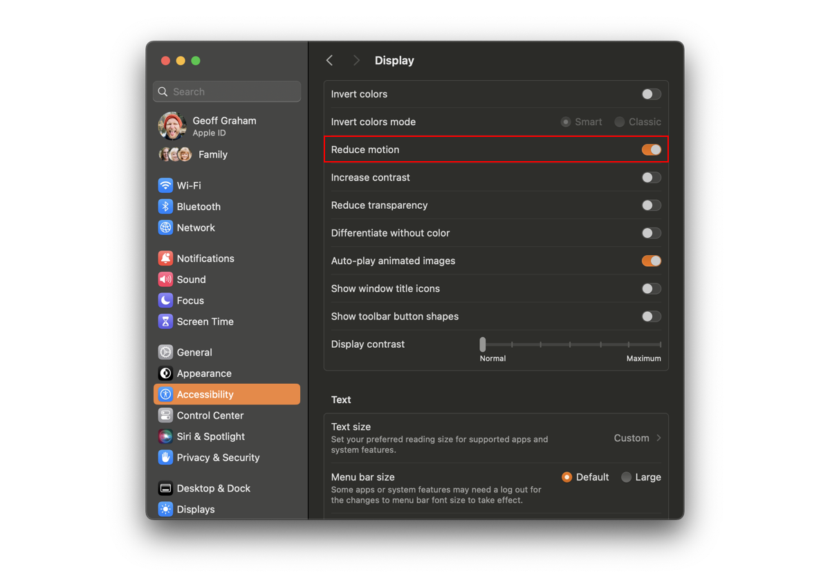
As long as that setting is enabled and the browser supports it, we can use prefers-reduced-motion to configure animations in a way that respects that preference.

:root {
–animation-duration: 250ms;
}

@media screen and (prefers-reduced-motion: reduce), (update: slow) {
/* Increase duration to slow animation when a user requests a reduced animation experience */
.animated {
–animation-duration: 0 !important;
}
}

Eric Bailey is quick to remind us that reduced motion is not the same as no motion. There are cases where removing animation will prevent the user’s understanding of the content it supports. In these cases, it may be more effective to slow things down rather than remove them completely.

:root {
–animation-duration: 250ms;
}

@media screen and (prefers-reduced-motion: reduce), (update: slow) {
/* Increase duration to slow animation when reduced animation is preferred */
* {
–animation-duration: 6000ms !important;
}
}

Armed with a better understanding that animation doesn’t always mean changing positions and that we have a way to respect a user’s motion preferences, we felt empowered to move to the next phase of our work.

We Defined An Action Plan

When faced with the challenge of integrating reduced motion preferences without significantly impacting our product development and UX teams, we posed a crucial question to ourselves: How can we effectively achieve this without compromising the quality of our products?

We are well aware that implementing broad changes to a design system is not an easy task, as it subsequently affects all Mercado Libre products. It requires strategic and careful planning. That said, we also embrace a mindset of beta and continuous improvement. After all, how can you improve a product daily without facing new challenges and seeking innovative solutions?

With this perspective in mind, we devised an action plan with clear criteria and actionable steps. Our goal is to seamlessly integrate reduced motion preferences into our products and contribute to the well-being of all our users.

Taking into account the criteria established by the WCAG and the distinction between animation and motion, we classified animations into three distinct groups:

Animations that do not apply to the criteria;
Non-essential animations that can be removed;
Essential animations that can be adapted.

Let me walk you through those in more detail.

1. Animations That Do Not Meet The Criteria

We identified animations that do not involve any type of motion and, therefore, do not require any adjustments as they did not pose any triggers for users with vestibular disorders or reduced motion preferences.

Animations in this first group include:

Objects that instantly appear and disappear without transitions;
Elements that transition color or opacity, such as changes in state.

A button that changes color on hover is an example of an animation included in this group.

Button changing color on mouse hover. (Large preview)

As long as we are not applying some sort of radical change on a hover effect like this — and the colors provide enough contrast for the button label to be legible — we can safely assume that it is not subject to accessibility guidelines.

2. Unessential Animations That Can Be Removed

Next, we categorized animations with motions that were unessential for the interface and contrasted them with those that did add context or help navigate the user. We consider unessential animations to be those that are not crucial for understanding the content or state of the interface and that could cause discomfort or distress to some individuals.

This is how we defined animations that are included in this second group:

Animated objects that take up more than one-third of the screen or move across a significant distance;
Elements with autoplay or automatic updates;
Parallax effects, multidirectional movements, or movements along the Z-axis, such as changes in perspective;
Content with flashes or looping animations;
Elements with vortex, scaling, zooming, or blurring effects;
Animated illustrations, such as morphing SVG shapes.

These are the animations we decided to completely remove when a user has enabled reduced motion preferences since they do not affect the delivery of the content, opting instead for a more accessible and comfortable experience.

Some of this is subjective and takes judgment. There were a few articles and resources that helped us define the scope for this group of animations, and if you’re curious, you can refer to them in the following links:

“How to Make Motion Design Accessible,” Alik Brundrett
“Designing With Reduced Motion For Motion Sensitivities,” Val Head
“Responsive Design for Motion,” James Craig

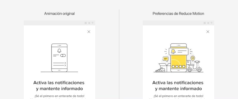
For objects that take up more than one-third of the screen or move position across a significant distance, we opted for instant transitions over smooth ones to minimize unnecessary movements. This way, we ensure that crucial information is conveyed to users without causing any discomfort yet still provide an engaging experience in either case.

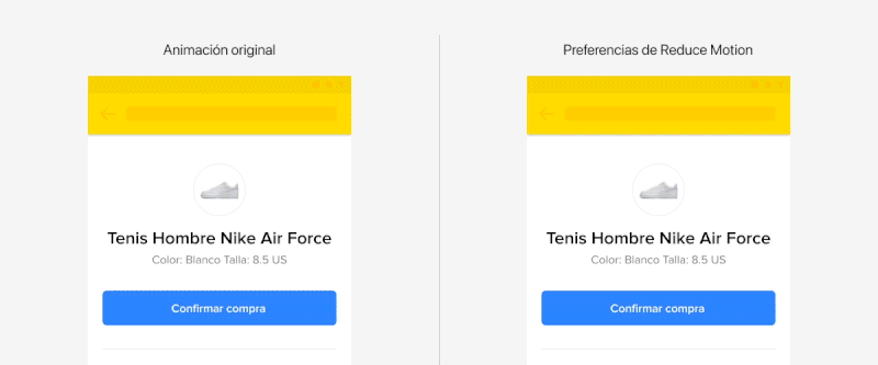
Comparing a feedback screen with animations that take up more than one-third of the screen versus the same screen with instant animations. (Large preview)

Other examples of animations we completely remove include elements that autoplay, auto-update, or loop infinitely. This might be a video or, more likely, a carousel that transitions between panels. Whatever the case, the purpose of removing movement from animations that are “on” by default is that it helps us conform to WCAG Success Criterion 2.2.2 (Level AA) because we give the user absolute control to decide when a transition occurs, such as navigating between carousel panels.

Additionally, we decided to eliminate the horizontal sliding effect from each transition, opting instead for instantaneous changes that do not contribute to additional movement, further preventing the possibility of triggering vestibular disorders.

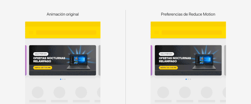
Comparing an auto-playing carousel with another carousel that incorporates instant changes instead of smooth transitions. (Large preview)

Along these same lines, we decided that parallax effects and any multidirectional movements that involve scaling, zooming, blurring, and vortex effects are also included in this second group of animations that ought to be replaced with instant transitions.

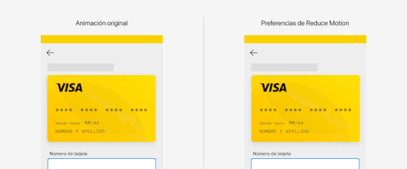
Comparing a card flip animation with smooth transitions with one that transitions instantly. (Large preview)

The last type of animation that falls in this category is animated illustrations. Rather than allowing them to change shape as they normally would, we merely display a static version. This way, the image still provides context for users to understand the content without the need for additional movement.

Comparing an animated illustration with the same illustration without motion. (Large preview)

3. Essential Animations That Can Be Adapted

The third and final category of animations includes ones that are absolutely essential to use and understand the user interface. This could potentially be the trickiest of them all because there’s a delicate balance to strike between essential animation and maintaining an accessible experience.

That is why we opted to provide alternative animations when the user prefers reduced motion. In many of these cases, it’s merely a matter of adjusting or reducing the animation so that users are still able to understand what is happening on the screen at all times, but without the intensity of the default configuration.

The best way we’ve found to do this is by adjusting the animation in a way that makes it more subtle. For example, adjusting the animation’s duration so that it plays longer and slower is one way to meet the challenge.

The loading indicator in our design system is a perfect case study. Is this animation absolutely necessary? It is, without a doubt, as it gives the user feedback on the interface’s activity. If it were to stop without the interface rendering updates, then the user might interpret it as a page error.

Rather than completely removing the animation, we picked it apart to identify what aspects could pose issues:

It could rotate considerably fast.
It constantly changes scale.
It runs in an infinite loop until it vanishes.

The loading indicator. (Large preview)

Considering the animation’s importance in this context, we proposed an adaptation of it that meets these requirements:

Reduce the rotation speed.
Eliminate the scaling effect.
Set the maximum duration to five seconds.

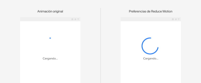
Comparing the loading indicator with and without reduced motion preferences enabled. (Large preview)

The bottom line:

Animation can be necessary and still mindful of reduced motion preferences at the same time.

This is the third and final category we defined to help us guide our decisions when incorporating animation in the user interface, and with this guidance, we were able to tackle the third and final phase of our work.

We Expanded It Across All Our Products

After gaining a clear understanding of the necessary steps in our execution strategy, we decided to begin integrating the reduced motion preferences we defined in our design system across all our product interfaces. Anyone who manages or maintains a design system knows the challenges that come with it, particularly when it comes to implementing changes organically without placing additional burden on our product teams.

Our approach was rooted in education.

Initially, we focused on documenting the design system, creating a centralized and easily accessible resource that offered comprehensive information on accessibility for animations. Our focus was on educating and fostering empathy among all our teams regarding the significance of reduced motion preferences. We delved into the criteria related to motion, how to achieve it, and, most importantly, explaining how our users benefit from it.

We also addressed technical aspects, such as when the design system automatically adapts to these preferences and when the onus shifts to the product teams to tailor their experiences while proposing and implementing animations in their projects. Subsequently, we initiated a training and awareness campaign, commencing with a series of company-wide presentations and the creation of accessibility articles like the one you’re reading now!

Conclusion

Our design system is the ideal platform to apply global features and promote a culture of teamwork and consistency in experiences, especially when it comes to accessibility. Don’t you agree?

We are now actively working to ensure that whenever our products detect the default motion settings on our users’ devices, they automatically adapt to their needs, thus providing enhanced value in their experiences.

How about you? Are you adding value to the user experience of your interfaces with accessible animation? If so, what principles or best practices are you using to guide your decisions, and how is it working for you? Please share in the comments so we can compare notes.

React Router v6: A Beginner’s Guide

Original Source: https://www.sitepoint.com/react-router-complete-guide/?utm_source=rss

React Router v6: A Beginner's Guide

Learn how to navigate through a React application with multiple views with React Router, the de facto standard routing library for React.

Continue reading
React Router v6: A Beginner’s Guide
on SitePoint.

Understanding React Error Boundary

Original Source: https://www.sitepoint.com/understanding-react-error-boundary/?utm_source=rss

Understanding React Error Boundary

React Error Boundary is a crucial concept to understand. This article introduces error boundaries and how to effectively implement them.

Continue reading
Understanding React Error Boundary
on SitePoint.

How to Mass Rename Files in macOS

Original Source: https://www.hongkiat.com/blog/mass-rename-files-macos/

Renaming a single file in macOS is straightforward, but when it comes to bulk renaming multiple files, whether it’s 10 or 100, you certainly don’t want to do it one by one. Hidden within macOS is a feature that allows you to do just that, and it’s quite simple.

mass rename files in macOSmass rename files in macOS

In this article, I’m going to demonstrate how this feature works and explore the extent of its capabilities in terms of bulk renaming files.

First, navigate to the folder containing all the files you wish to rename. If they are scattered across different locations, it’s best to consolidate them into one folder.

Select all the files (Command + A), right-click, and then choose “Rename.”

Selecting all files for renaming in macOSSelecting all files for renaming in macOS

This is where the real action begins.

If you want to disregard their current filenames and sequentially number them, for example: image-1.png, image-2.png, image-3.png, etc., adjust the following settings:

Custom Format: image-
Start Numbers At: 1

Sequential mass renaming settingsSequential mass renaming settings

Here’s the results:

Result of sequential mass renamingResult of sequential mass renaming

If you wish to retain the existing filename but add the text “(done)” in front of all the files, do the following:

Under the “Format” dropdown, change it to “Add Text.“
With “Add Text” and “Before Name” selected, type in “(done).”
Click “Rename.”

Adding text before filenamesAdding text before filenames

Here’s what you’ll get:

Result of adding text before filenamesResult of adding text before filenames

This feature also allows you to bulk find and replace certain text in all filenames. For instance, if we want to remove all instances of “copy” from the filenames, here’s what we do:

Select “Replace Text” from the dropdown.
In “Find,” insert “copy“
In “Replace with” leave it blank.

Find and replace text in filenamesFind and replace text in filenames

And voilà, all instances of “copy” in the filenames are removed.

Result of find and replace in filenamesResult of find and replace in filenames

One important note: before you confirm the mass renaming of your files, take a look at the “Example” that shows you how the output will look. However, even if you make a mistake and realize it after the mass renaming, you can still hit Command + Z to mass undo all changes.

Preview of mass renaming resultPreview of mass renaming result

The post How to Mass Rename Files in macOS appeared first on Hongkiat.

Answering Common Questions About Interpreting Page Speed Reports

Original Source: https://smashingmagazine.com/2023/10/answering-questions-interpreting-page-speed-reports/

This article is a sponsored by DebugBear

Running a performance check on your site isn’t too terribly difficult. It may even be something you do regularly with Lighthouse in Chrome DevTools, where testing is freely available and produces a very attractive-looking report.

Lighthouse is only one performance auditing tool out of many. The convenience of having it tucked into Chrome DevTools is what makes it an easy go-to for many developers.

But do you know how Lighthouse calculates performance metrics like First Contentful Paint (FCP), Total Blocking Time (TBT), and Cumulative Layout Shift (CLS)? There’s a handy calculator linked up in the report summary that lets you adjust performance values to see how they impact the overall score. Still, there’s nothing in there to tell us about the data Lighthouse is using to evaluate metrics. The linked-up explainer provides more details, from how scores are weighted to why scores may fluctuate between test runs.

Why do we need Lighthouse at all when Google also offers similar reports in PageSpeed Insights (PSI)? The truth is that the two tools were fairly distinct until PSI was updated in 2018 to use Lighthouse reporting.

Did you notice that the Performance score in Lighthouse is different from that PSI screenshot? How can one report result in a near-perfect score while the other appears to find more reasons to lower the score? Shouldn’t they be the same if both reports rely on the same underlying tooling to generate scores?

That’s what this article is about. Different tools make different assumptions using different data, whether we are talking about Lighthouse, PageSpeed Insights, or commercial services like DebugBear. That’s what accounts for different results. But there are more specific reasons for the divergence.

Let’s dig into those by answering a set of common questions that pop up during performance audits.

What Does It Mean When PageSpeed Insights Says It Uses “Real-User Experience Data”?

This is a great question because it provides a lot of context for why it’s possible to get varying results from different performance auditing tools. In fact, when we say “real user data,” we’re really referring to two different types of data. And when discussing the two types of data, we’re actually talking about what is called real-user monitoring, or RUM for short.

Type 1: Chrome User Experience Report (CrUX)

What PSI means by “real-user experience data” is that it evaluates the performance data used to measure the core web vitals from your tests against the core web vitals data of actual real-life users. That real-life data is pulled from the Chrome User Experience (CrUX) report, a set of anonymized data collected from Chrome users — at least those who have consented to share data.

CrUX data is important because it is how web core vitals are measured, which, in turn, are a ranking factor for Google’s search results. Google focuses on the 75th percentile of users in the CrUX data when reporting core web vitals metrics. This way, the data represents a vast majority of users while minimizing the possibility of outlier experiences.

But it comes with caveats. For example, the data is pretty slow to update, refreshing every 28 days, meaning it is not the same as real-time monitoring. At the same time, if you plan on using the data yourself, you may find yourself limited to reporting within that floating 28-day range unless you make use of the CrUX History API or BigQuery to produce historical results you can measure against. CrUX is what fuels PSI and Google Search Console, but it is also available in other tools you may already use.

Barry Pollard, a web performance developer advocate for Chrome, wrote an excellent primer on the CrUX Report for Smashing Magazine.

Type 2: Full Real-User Monitoring (RUM)

If CrUX offers one flavor of real-user data, then we can consider “full real-user data” to be another flavor that provides even more in the way individual experiences, such as specific network requests made by the page. This data is distinct from CrUX because it’s collected directly by the website owner by installing an analytics snippet on their website.

Unlike CrUX data, full RUM pulls data from other users using other browsers in addition to Chrome and does so on a continual basis. That means there’s no waiting 28 days for a fresh set of data to see the impact of any changes made to a site.

You can see how you might wind up with different results in performance tests simply by the type of real-user monitoring (RUM) that is in use. Both types are useful, but

You might find that CrUX-based results are excellent for more of a current high-level view of performance than they are an accurate reflection of the users on your site because of that 28-day waiting period, which is where full RUM shines with more immediate results and a greater depth of information.

Does Lighthouse Use RUM Data, Too?

It does not! It uses synthetic data, or what we commonly call lab data. And, just like RUM, we can explain the concept of lab data by breaking it up into two different types.

Type 1: Observed Data

Observed data is performance as the browser sees it. So, instead monitoring real information collected from real users, observed data is more like defining the test conditions ourselves. For example, we could add throttling to the test environment to enforce an artificial condition where the test opens the page on a slower connection. You might think of it like racing a car in virtual reality, where the conditions are decided in advance, rather than racing on a live track where conditions may vary.

Type 2: Simulated Data

While we called that last type of data “observed data,” that is not an official industry term or anything. It’s more of a necessary label to help distinguish it from simulated data, which describes how Lighthouse (and many other tools that include Lighthouse in its feature set, such as PSI) applies throttling to a test environment and the results it produces.

The reason for the distinction is that there are different ways to throttle a network for testing. Simulated throttling starts by collecting data on a fast internet connection, then estimates how quickly the page would have loaded on a different connection. The result is a much faster test than it would be to apply throttling before collecting information. Lighthouse can often grab the results and calculate its estimates faster than the time it would take to gather the information and parse it on an artificially slower connection.

Simulated And Observed Data In Lighthouse

Simulated data is the data that Lighthouse uses by default for performance reporting. It’s also what PageSpeed Insights uses since it is powered by Lighthouse under the hood, although PageSpeed Insights also relies on real-user experience data from the CrUX report.

However, it is also possible to collect observed data with Lighthouse. This data is more reliable since it doesn’t depend on an incomplete simulation of Chrome internals and the network stack. The accuracy of observed data depends on how the test environment is set up. If throttling is applied at the operating system level, then the metrics match what a real user with those network conditions would experience. DevTools throttling is easier to set up, but doesn’t accurately reflect how server connections work on the network.

Limitations Of Lab Data

Lab data is fundamentally limited by the fact that it only looks at a single experience in a pre-defined environment. This environment often doesn’t even match the average real user on the website, who may have a faster network connection or a slower CPU. Continuous real-user monitoring can actually tell you how users are experiencing your website and whether it’s fast enough.

So why use lab data at all?

The biggest advantage of lab data is that it produces much more in-depth data than real user monitoring.

Google CrUX data only reports metric values with no debug data telling you how to improve your metrics. In contrast, lab reports contain a lot of analysis and recommendations on how to improve your page speed.

Why Is My Lighthouse LCP Score Worse Than The Real User Data?

It’s a little easier to explain different scores now that we’re familiar with the different types of data used by performance auditing tools. We now know that Google reports on the 75th percentile of real users when reporting web core vitals, which includes LCP.

“By using the 75th percentile, we know that most visits to the site (3 of 4) experienced the target level of performance or better. Additionally, the 75th percentile value is less likely to be affected by outliers. Returning to our example, for a site with 100 visits, 25 of those visits would need to report large outlier samples for the value at the 75th percentile to be affected by outliers. While 25 of 100 samples being outliers is possible, it is much less likely than for the 95th percentile case.”

— Brian McQuade

On the flip side, simulated data from Lighthouse neither reports on real users nor accounts for outlier experiences in the same way that CrUX does. So, if we were to set heavy throttling on the CPU or network of a test environment in Lighthouse, we’re actually embracing outlier experiences that CrUX might otherwise toss out. Because Lighthouse applies heavy throttling by default, the result is that we get a worse LCP score in Lighthouse than we do PSI simply because Lighthouse’s data effectively looks at a slow outlier experience.

Why Is My Lighthouse CLS Score Better Than The Real User Data?

Just so we’re on the same page, Cumulative Layout Shift (CLS) measures the “visible stability” of a page layout. If you’ve ever visited a page, scrolled down it a bit before the page has fully loaded, and then noticed that your place on the page shifts when the page load is complete, then you know exactly what CLS is and how it feels.

The nuance here has to do with page interactions. We know that real users are capable of interacting with a page even before it has fully loaded. This is a big deal when measuring CLS because layout shifts often occur lower on the page after a user has scrolled down the page. CrUX data is ideal here because it’s based on real users who would do such a thing and bear the worst effects of CLS.

Lighthouse’s simulated data, meanwhile, does no such thing. It waits patiently for the full page load and never interacts with parts of the page. It doesn’t scroll, click, tap, hover, or interact in any way.

This is why you’re more likely to receive a lower CLS score in a PSI report than you’d get in Lighthouse. It’s not that PSI likes you less, but that the real users in its report are a better reflection of how users interact with a page and are more likely to experience CLS than simulated lab data.

Why Is Interaction to Next Paint Missing In My Lighthouse Report?

This is another case where it’s helpful to know the different types of data used in different tools and how that data interacts — or not — with the page. That’s because the Interaction to Next Paint (INP) metric is all about interactions. It’s right there in the name!

The fact that Lighthouse’s simulated lab data does not interact with the page is a dealbreaker for an INP report. INP is a measure of the latency for all interactions on a given page, where the highest latency — or close to it — informs the final score. For example, if a user clicks on an accordion panel and it takes longer for the content in the panel to render than any other interaction on the page, that is what gets used to evaluate INP.

So, when INP becomes an official core web vitals metric in March 2024, and you notice that it’s not showing up in your Lighthouse report, you’ll know exactly why it isn’t there.

Note: It is possible to script user flows with Lighthouse, including in DevTools. But that probably goes too deep for this article.

Why Is My Time To First Byte Score Worse For Real Users?

The Time to First Byte (TTFB) is what immediately comes to mind for many of us when thinking about page speed performance. We’re talking about the time between establishing a server connection and receiving the first byte of data to render a page.

TTFB identifies how fast or slow a web server is to respond to requests. What makes it special in the context of core web vitals — even though it is not considered a core web vital itself — is that it precedes all other metrics. The web server needs to establish a connection in order to receive the first byte of data and render everything else that core web vitals metrics measure. TTFB is essentially an indication of how fast users can navigate, and core web vitals can’t happen without it.

You might already see where this is going. When we start talking about server connections, there are going to be differences between the way that RUM data observes the TTFB versus how lab data approaches it. As a result, we’re bound to get different scores based on which performance tools we’re using and in which environment they are. As such, TTFB is more of a “rough guide,” as Jeremy Wagner and Barry Pollard explain:

“Websites vary in how they deliver content. A low TTFB is crucial for getting markup out to the client as soon as possible. However, if a website delivers the initial markup quickly, but that markup then requires JavaScript to populate it with meaningful content […], then achieving the lowest possible TTFB is especially important so that the client-rendering of markup can occur sooner. […] This is why the TTFB thresholds are a “rough guide” and will need to be weighed against how your site delivers its core content.”

— Jeremy Wagner and Barry Pollard

So, if your TTFB score comes in higher when using a tool that relies on RUM data than the score you receive from Lighthouse’s lab data, it’s probably because of caches being hit when testing a particular page. Or perhaps the real user is coming in from a shortened URL that redirects them before connecting to the server. It’s even possible that a real user is connecting from a place that is really far from your web server, which takes a little extra time, particularly if you’re not using a CDN or running edge functions. It really depends on both the user and how you serve data.

Why Do Different Tools Report Different Core Web Vitals? What Values Are Correct?

This article has already introduced some of the nuances involved when collecting web vitals data. Different tools and data sources often report different metric values. So which ones can you trust?

When working with lab data, I suggest preferring observed data over simulated data. But you’ll see differences even between tools that all deliver high-quality data. That’s because no two tests are the same, with different test locations, CPU speeds, or Chrome versions. There’s no one right value. Instead, you can use the lab data to identify optimizations and see how your website changes over time when tested in a consistent environment.

Ultimately, what you want to look at is how real users experience your website. From an SEO standpoint, the 28-day Google CrUX data is the gold standard. However, it won’t be accurate if you’ve rolled out performance improvements over the last few weeks. Google also doesn’t report CrUX data for some high-traffic pages because the visitors may not be logged in to their Google profile.

Installing a custom RUM solution on your website can solve that issue, but the numbers won’t match CrUX exactly. That’s because visitors using browsers other than Chrome are now included, as are users with Chrome analytics reporting disabled.

Finally, while Google focuses on the fastest 75% of experiences, that doesn’t mean the 75th percentile is the correct number to look at. Even with good core web vitals, 25% of visitors may still have a slow experience on your website.

Wrapping Up

This has been a close look at how different performance tools audit and report on performance metrics, such as core web vitals. Different tools rely on different types of data that are capable of producing different results when measuring different performance metrics.

So, if you find yourself with a CLS score in Lighthouse that is far lower than what you get in PSI or DebugBear, go with the Lighthouse report because it makes you look better to the big boss. Just kidding! That difference is a big clue that the data between the two tools is uneven, and you can use that information to help diagnose and fix performance issues.

Are you looking for a tool to track lab data, Google CrUX data, and full real-user monitoring data? DebugBear helps you keep track of all three types of data in one place and optimize your page speed where it counts.

Progressive Web Apps (PWAs): Unlocking The Future of Mobile-First Web Development

Original Source: https://www.webdesignerdepot.com/progressive-web-apps/

There are over 5.4 billion mobile users today, meaning that over 68% of the population tap into an online business via their smartphone devices.

CPG vs FMCG: The Similarities and Differences

Original Source: https://ecommerce-platforms.com/articles/cpg-vs-fmcg

cpg vs fmcg

Retail has its own jargon in the same way other sectors do. Two such acronyms you might have come across include CPG and FMCG. 

In a nutshell, the former stands for consumer packaged goods, while the latter refers to fast-moving consumer goods. 

For clarity, here’s a quick definition of both CPG and FMCG:

What is CPG?

Consumers buy CPG goods often and tend to use them soon after purchase; as a result, their demand is pretty high. 

It’s also worth noting that CPG prices are usually low, but sales volumes are high, so lots of sales can generate a healthy profit.

What is FMCG?

Fast-moving consumer goods sell quickly, have a short shelf life, and are purchased frequently. Like CPG, they’re also sold at a low cost and can sometimes (confusingly) be referred to as CPG and sometimes called FMCPG (fast-moving consumer packaged goods). 

In summary:

Both CPGs and FMCGs have the following in common:

Low cost

Bought frequently

Require little customer engagement

Used quickly

Sold in high volumes

Distributed widely

Have low-profit margins

Have a high inventory turnover

In this article

What are CPG and FMCG?

Types of CPG 

Types of FMCG

CPG vs FMCG: The Main Differences

CPG vs FMCG: The Similarities

CPG vs FMCG: Brand Strategy 

CPG vs FMCG: Marketing Approaches

CPG vs FMCG: Advertising

CPG vs FMCG: My Final Thoughts

Toggle

What are CPG and FMCG?

These terms are often used interchangeably, and products sometimes fall into both categories.

There are, however, some key differences, and we’ll look in more detail lower down. 

But, for now, the best way to think about CPG and FMCG is that although they’re incredibly similar, FMCG is kind of a subset of CPG, and goods that fall within it just happen to be consumed and sold faster than CPG. 

Go to the top

Types of CPG 

Here are a few examples of different CPG types:

Beauty, toiletries, and personal care: cosmetics, makeup, skincare, haircare, deodorant, shower gel, toothpaste, soap, etc. 

Child and baby products: toys, diapers, baby food, formula milk, etc. 

Food and drink: packaged food (like potato chips), drinks, and other digestible goods

Household products: cleaning products and tools, small appliances, storage containers, detergents, and so on. 

Medicines: over-the-counter pharmaceutical remedies like painkillers, vitamins, supplements, and so on.

Pet products: pet food, pet toys, snacks, and so on for domestic animals. 

Go to the top

Types of FMCG

Types of FMCG include:

Beauty and personal hygiene: toothpaste, shaving cream, razors, soap, body wash, and other items used daily by most consumers. 

Cleaning products: goods that sell fast and are used daily or often, such as dishwasher tablets, washing-up liquid, laundry detergents and fabric softeners, and house cleaning products. 

Drinks: that are bought by many consumers and consumed more than once a day, like tea, coffee, and soft drinks

Over-the-counter medicines: pain killers, antacids, and other remedies for day-to-day ailments.

Confectionery: items bought and eaten daily, such as chocolates, sweets, and chewing gum

Pet products: pet food

Paper goods: goods that are used quickly and regularly, like paper towels, toilet paper, and napkins

Go to the top

CPG vs FMCG: The Main Differences

CPG products tend to be of occasional use and are sometimes durable goods; e.g., a bottle of shampoo won’t need to be used or replaced daily. 

In contrast, FMCG products are often part of daily life, so they sell faster and in greater volume. A sometimes cited example is milk vs cat litter. The former is easier to sell in larger volumes than the latter.

Another difference is that CPG businesses tend to invest money into brand development and aim for long-term customer loyalty. Conversely, FMCG businesses focus more on driving fast sales from a larger market. For example, in brick-and-mortar stores, FMCG products tend to be placed close to high consumer footfall areas to attract impulse buyers. For example, at checkouts and aisle ends. 

In short, CPG and FMCG brands take slightly different approaches to marketing to their target demographics (see below).

Go to the top

CPG vs FMCG: The Similarities

Both can have a short shelf life. 

Both can vie for shelf space in physical stores.

Both are in high demand, low cost, and sold in high volumes.

Both tend to have mass market appeal and rely on hefty advertising and marketing campaigns to drive sales, customer loyalty, and brand awareness. 

Manufacturers of CPG and FMCG compete in a populated marketplace.

Larger FMCG and CPG companies often manage a range of brands that offer the same type of products that cater to different market segments, e.g., P&G with Olay skincare and SK-II luxury skincare.  

Go to the top

CPG vs FMCG: Brand Strategy 

Given the competitive marketplace in which CPG and FMCG reside, companies in this arena need a strong brand strategy to increase sales and nurture brand loyalty. 

Part of any CPG and FMCG brand strategy must include market research and consumer product testing. 

However, marketing approaches will vary depending on what the products and target demographics are. 

Put simply, market research and consumer insights are essential (I.e., gathering data on consumer behaviors, preferences, and buying habits and keeping abreast of CPG and FMCG trends). 

Go to the top

CPG vs FMCG: Marketing Approaches

It’s not an exact science, and you’ll find that in some instances, how CPG and FMCG brands market themselves is similar or the same. However, there are a few nuanced differences. 

For example, CPG marketing involves targeted campaigns aimed at particular consumer groups. Campaigns such as these often use a mix of traditional and more contemporary advertising methods. For example, print, TV, and radio in combination with digital channels, AI, email marketing, and social media. 

For instance, Nestle, PepsiCo, and Mars are apparently using an AI platform called Tastewise to help them with product ideas and market research reports. 

Some CPG businesses use influencers to engage with consumers and grow brand awareness. For example, the Grounded Food Co. uses TikTok influencers. 

As for FMCG marketing, this is often aimed at a broader target demographic, so mass marketing is the order of the day. This usually includes large-scale advertising and promotional campaigns, including various media channels like TV, online advertising, billboard ads, etc.

An example of mass marketing by an FMCG brand is McDonald’s. The brand frequently uses a mix of TV, billboards, and social media to promote its fast food. 

In addition, FMCG brands might also harness sponsorships to increase sales and build brand awareness. For example, Heineken beer sponsorship with the Formula One World Championship and Coca-Cola with the International Olympic Committee. 

Go to the top

CPG vs FMCG: Advertising

As above, it isn’t an exact science. Still, broadly speaking, both CPG and FMCG use advertising to raise brand awareness and boost sales. 

Where CPG brands are concerned, they tend to focus on their products’ unique properties and benefits. For example, beauty products that promote anti-aging. 

CPG brands may also focus on specific demographics. For example, a brand might focus its attention on moms, like Target did when it created a range of sensory-friendly kids’ clothes. 

In contrast, FMCG brands might be more likely to use bigger and broader marketing tactics with mass appeal. Creative campaigns like this often focus on inciting humor and emotion to grab the attention of their customers. 

For example, the McDonald’s Raise Your Arches campaign turned the brand’s iconic arches into a pair of eyebrows in recognition of the universal appeal of grabbing a burger. 

FMCG ads might also include celebrity endorsements to broaden a product’s appeal, such as the Starbucks and Taylor Swift partnership.

Go to the top

CPG vs FMCG: My Final Thoughts

You’ve made it to the end of my take on CPG vs FMCG! Hopefully, you now have a better understanding of what CPG and FMCG are and their similarities and differences. 

While CPG and FMCG are both non-durable products, the critical difference is that products that fall into the latter category sell faster.

What’s also clear is that the two terms are often interchangeable. However, there are a few differences, particularly in how brands market and sell such products.  

Navigating the retail industry can be challenging, so staying on top of its nuances is essential if you’re a seller who wants to penetrate a particular market. 

That’s all from me! Are you planning on selling CPG and/or FMCG? Let us know in the comments below. 

The post CPG vs FMCG: The Similarities and Differences appeared first on Ecommerce Platforms.

15 Best New Fonts, October 2023

Original Source: https://www.webdesignerdepot.com/best-fonts-october-2023/

We’re entering the final quarter of 2023, and even in the pre-holiday lull, there are still plenty of fonts to get excited about. In this month’s edition of our roundup of the best new fonts for designers, there are lots of revivals, some excellent options for logo designers, and some creative twists on letterforms. Enjoy!