Adobe Creative Cloud discount: All your favourite creative apps for less
Original Source: http://feedproxy.google.com/~r/CreativeBloq/~3/kr2s2pnzcZk/adobe-deals
Today’s best CC deals.
Original Source: http://feedproxy.google.com/~r/CreativeBloq/~3/kr2s2pnzcZk/adobe-deals
Today’s best CC deals.
Original Source: http://feedproxy.google.com/~r/tympanus/~3/ujRA7ZrOBI4/

Inspirational Website of the Week: Pam
Clarity and beauty combined with wonderful colors. Our pick this week.
Get inspired

The Component Gallery
Designed to be a reference for anyone building component-based user interfaces, The Component Gallery is an up-to-date repository of interface components based on examples from the world of design systems.
Check it out

Our Sponsor
10% Discount: One License. Complete Access. Unlimited Websites. Unlimited Users.
Join 767,154 customers and get access to Divi, Extra, Bloom, Monarch and more. Power your entire team and build unlimited websites. The ultimate WordPress toolkit awaits.
Check it out

Accessible Text Labels For All
Sara Soueidan writes on improving eCommerce experiences for screen reader users without breaking them for speech-input users. Also, watch her great talk Applied Accessibility.
Check it out

How to Improve CSS Performance
Learn the most common speed issues caused by CSS and how to avoid them. By Milica Mihajlija.
Read it

Building a Settings component
A foundational overview of how to build a settings component of sliders and checkboxes. By
Adam Argyle.
Read it

A Complete Guide To Accessible Front-End Components
In this part of the Smashing Magazine series on useful tools and techniques for designers and devs, Vitaly Friedman looks into reliable accessible components: from tabs and tables to toggles and tooltips.
Read it

Garet Font
A beautiful presentation for the Garet font family. A modern geometric sans serif font with two free weights.
Check it out

SVG Explained in 100 Seconds
A super-cool video explaining SVG and how it differs from other image formats.
Watch it

Cryptocurrency 3D Illustrations
A free cryptocurrency royalty-free 3D illustration pack from Iconscout.
Check it out

The End of AMP
Dwayne Lafleur shares some interesting news and insights about the failure of Accelerated Mobile Pages (AMP).
Read it

Animating Underlines
Michelle Barker shares some fantastic tips about underline styles and animations.
Read it

Handling Text Over Images in CSS
Learn how to handle text over images in CSS by taking accessibility in mind. By Ahmad Shadeed.
Read it

Image Fragmentation Effect With CSS Masks and Custom Properties
Temani Afif explains how to code a creative image fragmentation effect with CSS magic.
Check it out

Why skip-links are important for accessibility
Learn why skip-links play an important role in making a website accessible for everybody and how you can implement them consistently.
Read it

Good, Better, Best: Untangling The Complex World Of Accessible Patterns
Carie Fisher helps with the question on how we know which patterns are good, better, best when it comes to accessibility.
Read it

Baserow
A Self hosted open source online database built with Django and Nuxt for creating your own database without technical experience.
Check it out

Clone Wars
100+ open-source clones of popular sites. The list contains source code, demo links, tech stack, and Github stars count.
Check it out

Building Dark Mode
Robin Rendle gives great insight into how Dark Mode was pulled off at Sentry.
Read it

Taming Blend Modes: `difference` and `exclusion`
Ana Tudor takes a close look at the ‘difference’ and ‘exclusion’ blend modes and shows some use cases.
Read it

Sorted CSS Colors
A fantastic tool that sorts CSS colors by their hue, saturation and lightness. By Mustafa Enes.
Check it out

Now THAT’S What I Call Service Worker!
A great article about the power of the Service Worker API and how to get the best out of it practically. By Jeremy Wagner.
Read it

Making the slowest ‘fast’ page
Can you make a webpage which gets 100 score in Lighthouse and passes all the Core Web Vitals and still feels slow? Barry Pollard gives it a try.
Read it

Transition.css
In case you didn’t know about it yet: Drop-in CSS transitions with clip-path.
Check it out

Scrollycoding (Preview)
Watch this new way to write code walkthroughs for blogs or docs. By Rodrigo Pombo.
Watch it

security.txt
A proposed standard which allows websites to define security policies.
Check it out

Photo Tear
A really awesome photo gallery by Steve Gardner.
Check it out

Progress Nav with IntersectionObserver
Bramus shares Anders Grimsrud’s solution of a progress nav with IntersectionObserver based on Hakim El Hattab’s previous creation.
Check it out

Focalboard
An open source alternative to Trello, Asana, and Notion. It helps define, organize, track and manage work across individuals and teams. Currently in early-access beta.
Check it out

From Our Blog
Distributed Letters Animation Layout
A distributed letters animation in the context of a triple panel layout with hover effect.
Check it out
The post Collective #654 appeared first on Codrops.
Original Source: http://feedproxy.google.com/~r/CreativeBloq/~3/WPgACeLxt_0/12-best-web-hosting-services
Discover the best web hosting services.
Original Source: https://smashingmagazine.com/2021/03/eleventy-static-site-generator/
But first — let’s quickly review what is meant by a “static site” and then what a generator provides. A static site is composed of static content — as in, the HTML, CSS, assets, and all content are already compiled together before pushing to a website host. This is different from a dynamic site that compiles those things from querying a database at run time (like WordPress) or that pulls content from APIs client-side (like JavaScript frameworks without server-side rendering).
A static site generator is an environment and build processor to compile your content into static HTML. They usually offer helpers to provide flexibility in writing your content (like supporting Markdown) and include methods for templating. So instead of writing HTML pages one by one and having to copy and paste the repeated parts, a generator will support breaking those things into components via a certain templating language. Then the generator’s build process will bring everything together and output the final HTML that can be uploaded to a web host to be served as your website. Depending on the web host you use, this build process can even be done by the host.
There are many static site generators available. You may have heard of or even used ones like Jekyll, Hugo, Gatsby, Next and Nuxt. A comprehensive list is provided by Jamstack.org.
What Makes Eleventy Different From Other Static Site Generators?
Eleventy is exceptionally fast both during builds and in the browser. This is largely thanks to not requiring the loading of a client-side JavaScript bundle in order to serve content (compared to something like Gatsby). Server-side rendering isn’t even a concern here, since the filesystem page creation defaults to static HTML.
What really makes Eleventy unique is the ability to select from and intermix up to ten different templating languages:

Intermixing languages can happen in the same file, or between layouts. For example, I often write my main content with Markdown that feeds into a Nunjucks layout. In some projects, I’ve found it useful to be able to loop over some data using Nunjucks while in the Markdown file. This ability to combine languages is very powerful, and allows you to design a write-and-build workflow that works best for you and your project.
Eleventy includes a –serve flag that uses BrowserSync to enable serving the site locally and with hot-reload upon file changes. This is a great convenience, and is good to keep in mind if you’re not looking for a static site generator but perhaps an upgrade from build tools like Gulp.
As part of being zero-config, all your site files could live in the root of your project. To alter the input and output directories, you can create an Eleventy config, which is expected to be a root file called .eleventy.js. Here’s a quick snippet showing how to make this modification:
module.exports = function (eleventyConfig) {
return {
dir: {
// default: [site root]
input: “src”,
// default: _site
output: “public”,
},
};
};
As noted earlier, the default behavior is filesystem page creation which is generally of great benefit especially for rapidly getting started. This is easily overrideable by assigning a custom permalink and that can be done per file, for an entire directory, or dynamically for a set of data. Permalinks also offer another superpower which we’ll explore in a bit!
Uniquely, during the build, you can prepare content, data, and transforms on that content and data by using JavaScript and leveraging filters and shortcodes (we’ll talk about those later). Again, this all happens without adding a JavaScript bundle client-side, while still enabling the use of JavaScript as a templating language.
Important Note: You can successfully use Eleventy with no or low JavaScript knowledge.
Unlike other SSGs like Gatsby, or environments like WordPress, most Eleventy sites do not require any plugins. There are some plugins available, but they are not necessary for essential functionality.
When building with Eleventy, you can add on features as you need them. In fact, you could just use HTML and never work with any of the other templating languages. Eleventy is only as complex as your project requires!
Understanding Essential Eleventy Concepts
Let’s go over a few bits of terminology and concepts that will help you be successful in creating your Eleventy projects.
Layouts And Templates
You may think of these terms as interchangeable, but in Eleventy’s context, they do have contextual meanings:
Template is the generic term for all content files.
Layouts are special templates that wrap other content.
For example, template refers to all your Markdown files, whereas a layout might be a Nunjucks file that contains the HTML5 boilerplate and a slot for the template content. We’ll learn how to make this work in the section on getting started.
Filters And Shortcodes
These are additional ways to modify content output, and create reusable template parts. They are available for use with Nunjucks, Liquid, Handlebars, and JavaScript templating. Filters and shortcodes are defined within .eleventy.js.
Beyond variables and operators available in your templating language of choice, Eleventy has unified the concept of filters across the previously listed languages. Filters transform content in some way specific to the content type. For example, you may create a filter intended for strings to uppercase them. Or you might have a filter intended to be used on arrays to alter what is returned, like picking a random item. Some filters are provided by Eleventy, a few of which we’ll use in the getting started tutorial.
Shortcodes allow creating reusable template parts and are able to accept arguments. They can be either standalone or paired, meaning they wrap content with a start and end tag.
One of my favorite shortcodes is to render the current year — meaning no more out of date copyright years in your footer! Here’s how to create a year shortcode:
eleventyConfig.addShortcode(“year”, () => ${new Date().getFullYear()});
To use it in a Nunjucks or Liquid template looks like this: {% year %}.
You can review the Eleventy docs for examples of paired shortcodes.
Collections
Collections are groups of related content, and are typically created within frontmatter by defining tags. Tag syntax options include single strings, single-line arrays — [“tagA”, “tagB”] — for multiples, or YAML-style lists to assign multiple tags. For example, I can create a “pages” collection by adding the following frontmatter to all content I want to be included in that collection:
—
tags: pages
—
Once you have defined a collection, you can access it via your templating language of choice within the global collections object. To access our “pages” collection would look like collections.pages. This returns an array of that collection’s data, and so you can perform array operations like looping over it such as to produce a list of links or article teaser cards. You can even suppress normal file output and use only collections to manage data display, which is useful for managing single-page site content.
Custom Data
So far we’ve talked about creating content as files, but Eleventy also makes it very easy to maintain different data sources. This is called “custom data” and lives as JavaScript module exports or JSON files in the _data directory.
Custom data can be used to:
Define a basic JSON array.
Return the results of a fetch operation.
Retrieve and re-format content from a headless CMS.
Eleventy makes all data from within _data available under a variable matching the filename. For example, if I create posts.json then I can access that in my templates as posts. Using Nunjucks, here’s an example of looping over the posts data:
{% for post in posts %}
{{ post.title }}
{% endfor %}
Pagination And Creating Pages From Data
In Eleventy terms, pagination refers to iterating over a data set and defining a template for the output of that data “chunk”. This is done with a dedicated file that defines the pagination within frontmatter. The file also includes setting up your intended output for the data, meaning it becomes its own template as well. We can define a layout to send the content to and also add tags to create a collection for ease of reference and flexibility for the output.
Note: If you use custom data to retrieve content from a CMS, then pagination is the Eleventy method you’re looking for to turn that data into pages dynamically.
Here’s an example of referencing our posts custom data which we’ll assume we’re retrieving via a fetch from a headless CMS. Importantly, the size is set to 1, which means each “pagination chunk” should produce one single page of output. We then use the alias to create a reference to the current item in the pagination loop, and then use that reference in the permalink definition and the template body.
The file that defines the pagination can live wherever you’d like within your input directory. My organizational preference is to create a generate directory, and then name it the same as the collection it will be creating. Consider the following to be src/generate/posts.njk:
—
pagination:
data: posts
size: 1
alias: post
addAllPagesToCollections: true
permalink: “/{{ post.title | slug }}/”
tags: posts
layout: post
templateEngineOverride: njk, md
—
{{ post.body | safe }}
In this case, the permalink is assigning the page to be output directly off of the site root. You could change this to add a prefix such as /posts/{{ post.title | slug }}, for example.
Additionally, if you want all of the generated pages to be available in the collection created by the tags, you must set addAllPagesToCollections to true to include more than the first item.
Lastly, if your content is coming in as Markdown instead of pre-compiled HTML, you’ll need to use the templateEngineOverride. In the example snippet, I’ve set it to njk, md which means the template content will need to be processed both as Nunjucks in order to convert the variable, and then Markdown to compile the contents returned in the variable.
If you’re wondering what safe means, we’re going to learn that next!
How To Get Started With Eleventy
Alright, so you’re ready to get going with your first Eleventy project! This brief tutorial will help you get a starting structure in place to continue building from. We’ll use the concepts we’ve already learned about and add a few new ideas, too.
The first important note here is that Eleventy is a scoped package, so here’s the install command:
npm install @11ty/eleventy
Next, a handy convenience I like to do is add the following scripts into my package.json:
“scripts”: {
“start”: “eleventy –serve”,
“build”: “eleventy”
}
As mentioned previously, the –serve flag will enable a local server via BrowserSync.
My preference is to update the input/output directories as we already looked at, so now it’s time to create some content within src or the input directory of your choosing.
In order to prepare our project to be more flexible and scalable from the start, I would suggest creating at least one layout that contains the HTML5 boilerplate. Layouts need to be defined within a directly called _includes, which is one of a handful of expected directories.
A convention that you’ll often find among starters is to call this layout base. I have a preference for making it a Nunjucks file.
Here’s a sample base.njk:
<!DOCTYPE html>
<html lang=”en”>
<head>
<meta charset=”UTF-8″>
<meta name=”viewport” content=”width=device-width, initial-scale=1.0″>
<title>{{ title }}</title>
</head>
<body>
<header>
<h1>{{ title }}</h1>
</header>
<main>
{{ content | safe }}
</main>
</body>
</html>
The double curly braces are Nunjucks syntax for variables. Here, we’ve prepared for an incoming title variable that will shortly be supplied via front matter. The content variable is provided by Eleventy and marks the slot where all incoming non-front matter content should go. Importantly, this is used in conjunction with the provided safe filter which prevents compiled HTML from being escaped versus rendered.
Now it’s time to create our site index, which we’ll add as index.md:
—
title: Hello Smashing Readers!
layout: base.njk
—
Thanks for reading — hope you’re excited to try Eleventy!
Notice that in the front matter we added our title, and also defined the layout.
At this point, we can run our project with the script we added: npm start. This will trigger BrowserSync to setup localhost:8080 (if it’s available) but you will need to manually open it in the browser. Check out this quick tip if you’d like it to open the browser automatically.
The last critical step is to add a stylesheet. Currently, CSS isn’t recognized as an automatically included filetype so we’ll have one extra config step after we create our stylesheet.
You can add a CSS file wherever you’d like in your input directory, such as css/style.css. Then, open .eleventy.js (or create it in the project root if you didn’t do the input/output customization) and add the following :
module.exports = function (eleventyConfig) {
eleventyConfig.addPassthroughCopy(“./src/css/”);
eleventyConfig.addWatchTarget(“./src/css/”);
// – input/output customization if using –
};
First, we add the css directory as a “passthrough copy” which means Eleventy should include it in the push to the output directory. Then we also add it as a “watch target” so that as we make changes to our styles while running our start command, Eleventy will trigger a rebuild to update our local site.
Lastly, we need to remember to add the link to our stylesheet within our base layout:
<link rel=”stylesheet” href=”{{ ‘/css/style.css’ | url }}” />
When we define the stylesheet’s location, we pass it through Eleventy’s url filter which will adjust the relative file path as needed upon build.
Next, let’s create a “pages” post type to explore using collections and layouts a bit more. To do this, add the directory of pages and create one or two Markdown files, including a title front-matter key but not a layout.
We’re going to use a slightly different method to define the layout this time — a data directory file. This file is generally formatted as JSON and enables us to add data that should be applied to all files within a directory, which prevents having to duplicate it across files. The file needs to be named the same as the directory it will be used for, so create the file pages.json and add the following content:
{
“layout”: “page.njk”,
“tags”: “pages”
}
We’ve also gone ahead and defined tags in order to create the “pages” collection. But the layout we defined doesn’t actually exist yet, so create _includes/page.njk and add the following:
—
layout: base.njk
—
<article>
{{ content | safe }}
</article>
Here we’re using the Eleventy concept of layout chaining to be able to re-use our base template but also add a unique element for our page layout, which is the <article>. This means that all of the content of our pages will use both the page layout and base layouts.
Layout chaining reduces duplication by allowing re-use of boilerplates and base site layout structures.
Now that we’ve created content for the pages content type and defined it as the “pages” collection via the tags, let’s see how we can access that collection. Here, we’ll use Nunjucks to loop over the collection and output a list of links to each page. This loop will be added within our index.md file.
{% for post in collections.post -%}
– [{{ post.data.title }}]({{ post.url }})
{% endfor %}
We’ve done something unique though which is that the inside of the loop actually switches back to Markdown to render the links. This is not a required way to handle this scenario, but it can be very handy! Sometimes, depending on complexity, this may not work. The real reason is that the Markdown renderer defaults to Liquid templating language, so if you’re using Nunjucks features beyond basic loops, you will have to let Eleventy know how to process the file.
In the earlier section on pagination, we actually already looked at the solution for this. And that is to make use of the templateEngineOverride to indicate that the file should be processed as both Nunjucks and Markdown. The following full solution should be placed in the template’s front matter: templateEngineOverride: njk, md.
At this point, you’ve created a basic multi-page site! If you have need of using external data, jump back up to the section on pagination.
Other Ways To Start An Eleventy Project
Whereas some other static site generators and environments like WordPress have the concept of “themes”, Eleventy uses the term “starter”. There is a growing collection to choose from, and many can be found in the listing within the Eleventy docs.
My preference is to use Sass with my Eleventy projects, and I have a Sass starter available if you’d like to see how to add that into your build process. Others may choose to add in Gulp if they are used to that build pipeline for assets and processing.
I’ve also created a minimal starter that includes the features discussed in this article and shares similarities with the tutorial result. It also has a small example of fetching external data, and shows how to add in a partial to display site navigation based on a collection.
Expanding On The Basics
Once you’ve experimented with creating your first site with some basic content and maybe some custom data, it’s helpful to know additional ways to work with that content. Here is a brief overview of some other concepts to be aware of.
Altering File Output Type With Permalinks
I mentioned earlier that permalinks have a superpower. And that is that you can use them to output non-HTML file types.
Two useful examples are creating an RSS feed and a sitemap, both of which happen to typically be XML files. What’s really powerful is that you can continue to use the templating language of your choice to help generate those files, so you can loop over page data with Nunjucks to keep your RSS feed fresh, for example.
Customizing Collections
Sometimes using tags to create collections may not be sufficient. Or, you may want to create filtered variations of an existing collection. We can alter or create collections by using a series of provided functions. These will live in the .eleventy.js config file.
In this example, we’re using the addCollection function to filter items in an existing collection. The new collection will be based on the existence of customKey within front matter. This key is returned off of the data object which is attached to all generated Eleventy content.
eleventyConfig.addCollection(“specialCollection”, function (collection) {
return collection.getAll().filter((post) => post.data.customKey);
});
You can review other ways to create, modify, and use collections in the Eleventy docs.
Working With The Data Cascade
Eleventy has a more full concept of how data is compiled for a template called the data cascade which we only just began exploring in this guide. You will get the most out of Eleventy if you review how that works, starting in the docs. Ben Myers also has an excellent guide to understanding the data cascade.
Recommended Eleventy Plugins
In the intro, I briefly mentioned there were plugins available, but that they aren’t always needed. However, there are a few I tend to use on most projects, which include:
@11ty/eleventy-plugin-rss
If you would like to have an RSS feed, this official plugin provides some filters to help you to generate the feed. The linked repo includes a sample feed, which you may also find in use within some starters.
@11ty/eleventy-plugin-syntaxhighlight
Instead of loading Prism as a script for code highlighting, this plugin allows that processing to be applied as part of the Eleventy build process. This means code blocks are transformed to include the classes for applying a Prism theme ahead of time, so you will only need to add a Prism CSS theme of your choice.
@11tyrocks/eleventy-plugin-social-images
A feature I sought out early in my Eleventy exploration was the ability to generate social media share images. This led me to create a plugin that uses Puppeteer behind the scenes to take the snapshot. The plugin comes with prebuilt templates as well as config options to define your own template file.
I would also recommend becoming familiar with the rest of the official Eleventy plugins as they address other common needs including navigation and image handling.
Deciding If Eleventy Is Right For Your Project
Eleventy, like most static sites, is best for content that doesn’t typically need to be served dynamically or on-demand. This is not to say all of the site has to be static, or that there are not ways to make content dynamic. You may still load JavaScript to enable dynamic content like fetching from APIs or creating interactive widgets. You can also use services like IFTTT or Zapier to facilitate rebuilding your site if your host supports build webhooks and you have parts that you want to refresh on a schedule.
Thanks to custom data and pagination, we saw it was easy to include external data as from a headless CMS or any other API. So although it will be served statically, you still have a lot of flexibility in where you pull content and how you manage it.
My favorite thing about Eleventy is that it doesn’t impose many opinions on how I should structure my site, beyond the few expected directories we talked about for _includes and _data (and you can update the naming convention of those, too). This can also be helpful if you are looking to migrate a site and being able to potentially move some existing file structure as well. However, if you prefer a more opinionated architecture, you might seek a different option.
I also enjoy how I can mold Eleventy to fit my mental model for a given project by leveraging multiple templating languages as well as filters, shortcodes, and layouts. Starters also help give a boost so that you can focus on what’s really important: your content. And the high performance of purely static output is also a great benefit.
If you do need a bit more in your build process, you can add other familiar tools like Webpack, Gulp, or Parcel. You may be able to find a starter that already includes those things. Keep in mind you can also leverage Node scripts which are already inherent to the Eleventy build process.
Eleventy is very capable of handling large amounts of page generation. It has been used for some large and complex sites such as Google’s web.dev and Netlify’s marketing site. I’ve also used Eleventy for some unconventional purposes, like email and web component generators, along with some others which are described in this overview.
Additional Resources
I hope this guide has both peaked your interest and prepared you to begin using Eleventy! It included a lot of points that I found a bit tricky to uncover when I was creating my first project with it. Since I first found Eleventy in April 2020, I’ve built over 20 Eleventy projects counting starters, plugins, side projects, and course materials. Many of those can be found on my site 11ty.Rocks which also has tutorials and tips. Eleventy is something I really enjoy discussing, so feel free to reach out on Twitter!
The following are more resources for helping you on your journey to learn and get the most out of Eleventy:
Andy Bell offers a very comprehensive paid course — “Learn Eleventy From Scratch”.
Tatiana Mac’s tutorial series, starting with “Beginners Guide to Eleventy”, provides thorough explanations that assume no previous experience with static site generators.
Bryan Robinson offers a YouTube course for converting a free HTML theme into an Eleventy site.
Finally, I want to note that the Eleventy community is small but active! If you ever have difficulty finding some information, you can tweet your question to the official @eleven_ty account. Eleventy’s creator, Zach Leatherman, is quick to answer or RT questions to help get you back on your way!
Original Source: http://feedproxy.google.com/~r/1stwebdesigner/~3/MA3oEw5EE48/
…
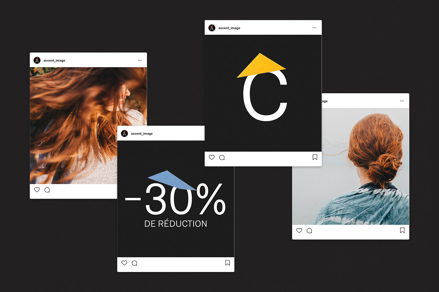
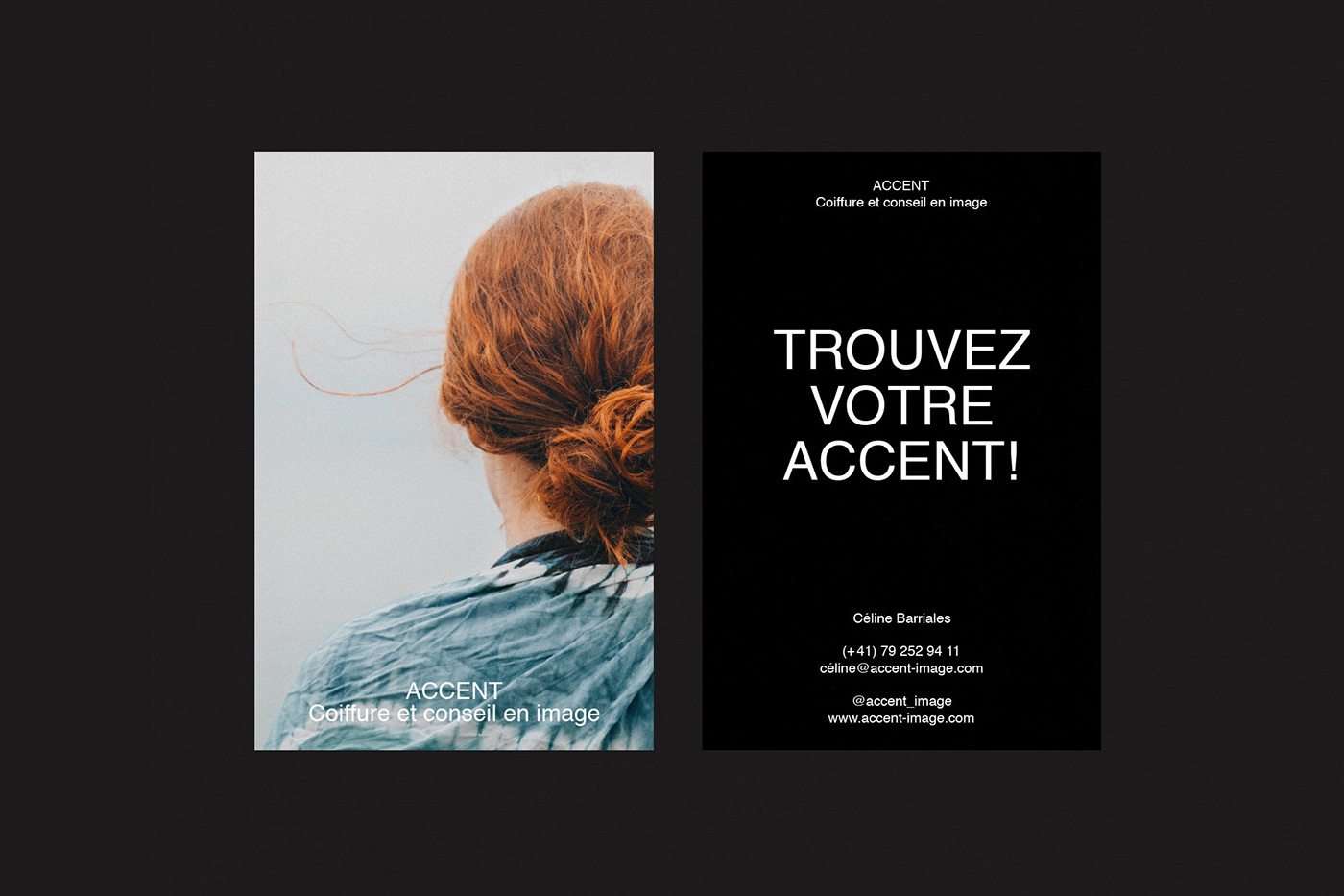
Original Source: http://feedproxy.google.com/~r/abduzeedo/~3/nO3fufIPokc/accent-branding-and-visual-identity
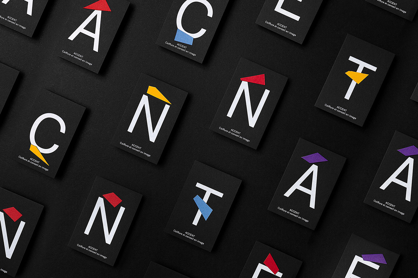
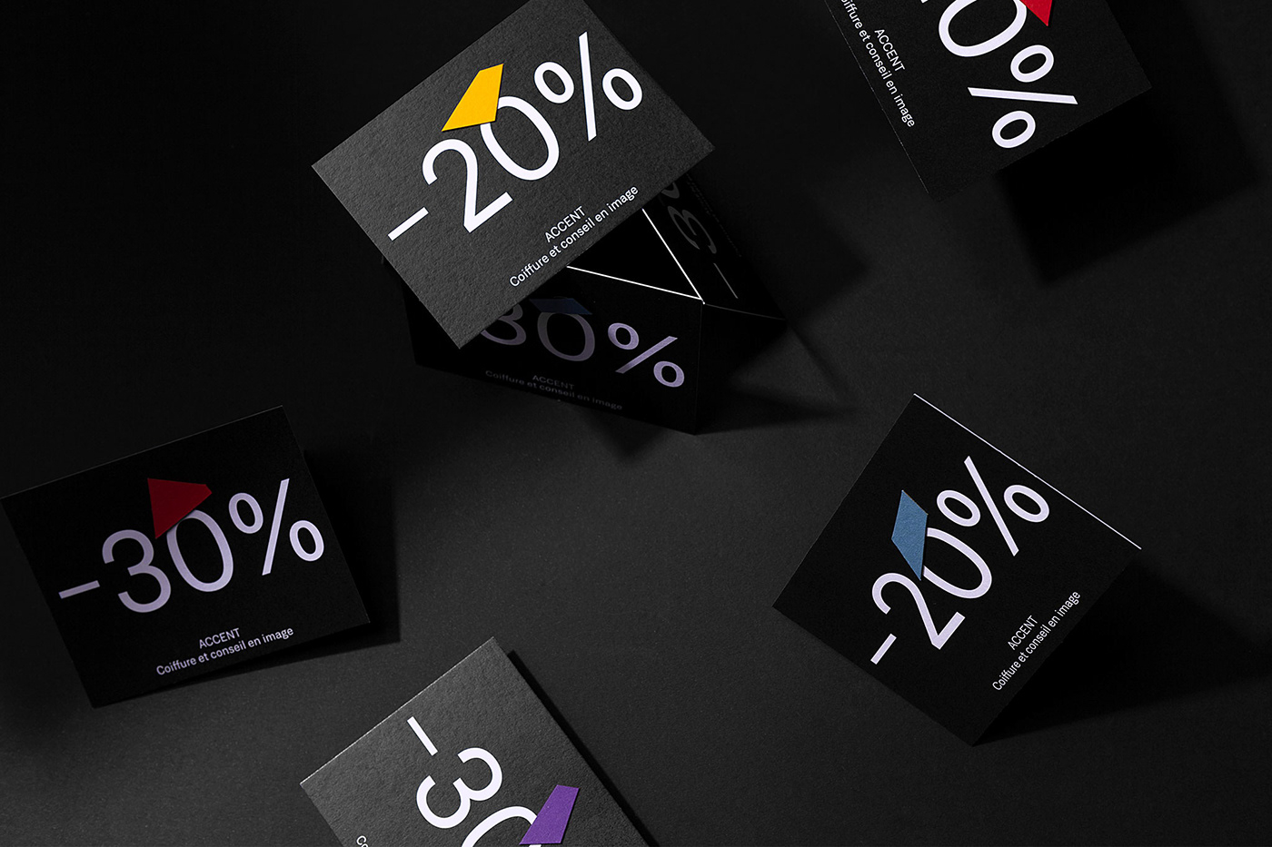
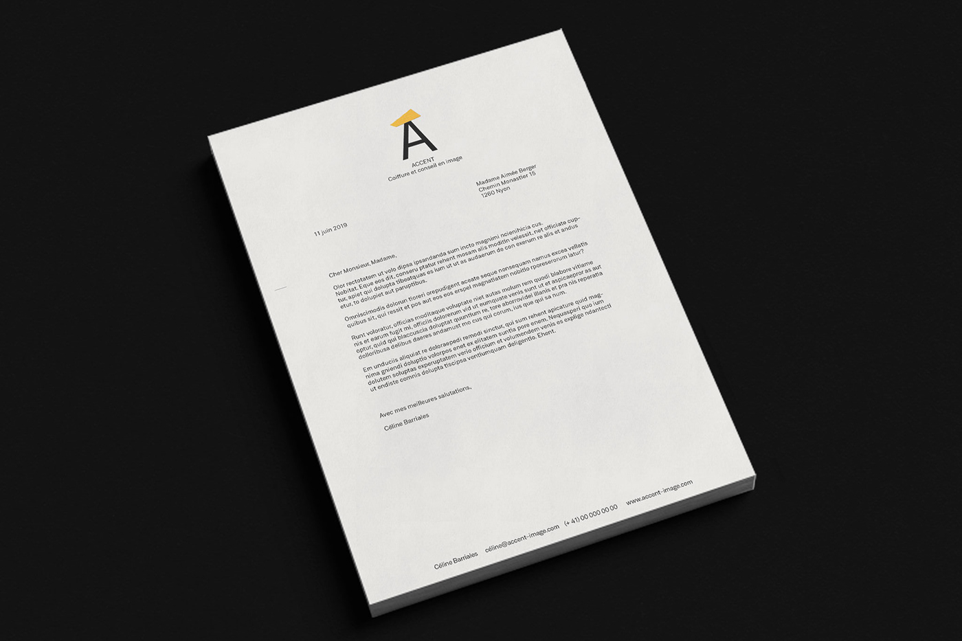
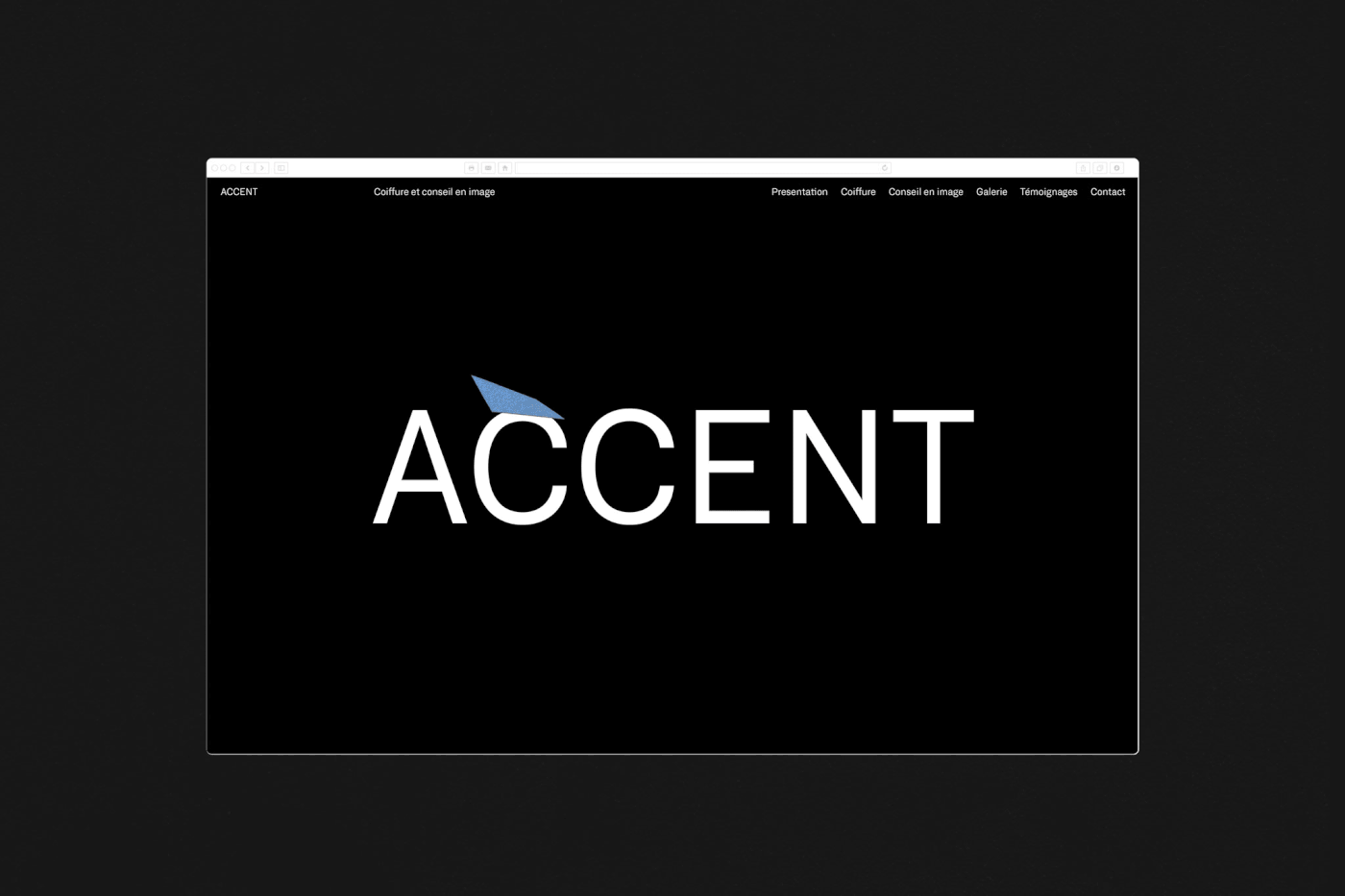
ACCENT Branding and Visual Identity

abduzeedo03.18.21
VELKRO shared a branding and visual identity project for Accent, a new brand created in 2019 that specializes in image services, such as hair styling and image coaching. It focuses on providing accurate, individualised advice and making every client feel like one-of-a-kind.
We imagined a concept that highlights and champions individuality. As every client is unique, we sought to ensure that this (corporate) identity reflected that. We decided to play with the concept of personalised and cut accents by hand, making every piece of each application as unique as any customer. An identity with a strong retro personality, sober, professional and colorful at the same time.
Credits
Photography Cassandra Stuyt
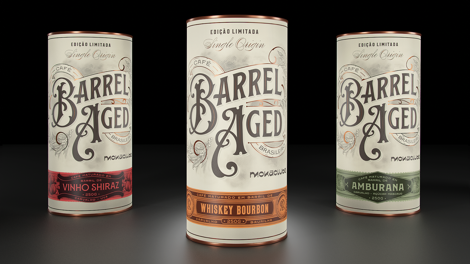
Original Source: http://feedproxy.google.com/~r/abduzeedo/~3/2Hj70QW7RnM/moka-clube-barrel-aged-rocket-fuel
Moka Clube – Barrel Aged Rocket Fuel

abduzeedo03.18.21
Diego Carneiro shared a branding and packaging design project called Moka Clube – Barrel that hits home for this coffee-loving Brazilian. This, my friends, is real coffee. Twice Brazilian, it is the most unique marriage of coffee + liquor we’ve come across. These are coffees aged in wooden barrels where excellent whiskeys, wines, rum and, of course, cachaça rested before, because nothing is more Brazilian than good coffee and cachaça. The product within the package brings a different point of view, not only being a prize winner amongst heavy hitters, it’s different processes of production always deliver that well deserved happy hour feel.
The packaging with handmade letterings and illustrations, tells the history of coffee in Brazil
At the forefront of farm to table, Moka Club is the first subscription service for specialty coffees in Brazil. In 2012 when special coffee was only exported, Moka Club was born as a manifest: Brazilian coffee for Brazilians, with the purpose of distributing the best coffee in the world within the national territory. Rich in different terroirs, Brazil stands out for the wide range of possible flavors for the coffee beans it produces. This abundance is due to the unique natural capacity that the country has in the soil, this land of immense fruitfulness and cultivation makes the job of hunting the best coffees even more exciting and not monotonous, making the endless search for different flavor profiles our great challenge.
The packaging with handmade letterings and illustrations, tells the history of coffee in Brazil, has an older language and reference in the Victorian period, rich in ornaments and details. It’s like discovering a special package that had been forgotten for decades in your grandmother’s attic. That’s it, this coffee is a time machine itself, it is a coffee unlike any other coffee you’ve ever tasted, it’s an experience. Opening this can is like stimulating your senses, from contact to aroma and finally the taste…and to enjoy in moderation of course!
Original Source: https://www.hongkiat.com/blog/better-screenshots-android/
In this post, I’m going to show you one of the best alternatives out there when it comes to taking screenshots more efficiently and faster using an Android device, using an the app –…
Visit hongkiat.com for full content.
Original Source: https://www.hongkiat.com/blog/stop-facebook-getting-phone-contacts/
When you first install Facebook Messenger, the app asks if you’d like to sync it with your phone’s contacts as a feature of convenience. However, once you activate this feature, it stays…
Visit hongkiat.com for full content.
Original Source: https://www.webdesignerdepot.com/2021/03/getting-started-with-inclusive-web-design/
 A key part of designing successful websites for clients is making sure that as many end-users as possible can access and enjoy that site.
So, what if you discovered that around 1 billion people couldn’t enjoy your designs? Even if those people manage to click on a link and visit the website that you create, they might not be able to understand what’s being sold or navigate to the checkout page.
According to statistics from the World Bank, there are 1 billion people with disabilities worldwide. That’s 15% of the total population of the globe.
Despite this, many designers fail to consider customers with differing abilities when creating an engaging app or website. Unless your client explicitly tells you that they’re supporting customers with disabilities, you might even not think about those users at all.
Learning how to embrace the concept of inclusive web design means that you deliver better results to your clients; the more customers your clients can reach, the more praise and positive reviews your designs will get.
So, how do you introduce accessibility in your design choices?
What Is Website Accessibility?
In broad terms, inclusivity refers to activities or behaviors that empower marginalized people in society. Designing for inclusivity means making your content more accessible to anyone dealing with a mental or physical issue that may make it harder for them to use a traditional site.
Ultimately, accessibility is one of the main goals of an inclusive design strategy. When you make websites or applications more accessible, you tweak aspects of your UI and code to make the site as approachable and usable as possible to people with certain limitations.
According to the Web Accessibility Initiative, many modern sites and web tools are designed without the needs of those with disabilities in mind. This creates accessibility barriers that make websites almost impossible for some people to use.
Here are just some of the different types of disability that can affect the way end-users interact with a website or app:
Cognitive issues: Affecting understanding and making it harder to navigate sites;
Auditory issues: Preventing customers from listening to videos and audio content;
Neurological issues: Making certain terms and actions more difficult on your site;
Physical issues: Making it hard to swipe or tap certain tools;
Speech problems: A common issue with voice UI designs;
Visual issues: Preventing a positive experience on highly visual sites.
Web accessibility can also be about making life easier for people who encounter problems in particular situations. For instance, those with muscular problems might have a harder time using buttons and links on a small screen.
So, how do you make your designs more accessible?
Know Your Audience
There’s more to inclusive web design than making your fonts a little bigger and hoping for the best. To deliver a truly accessible experience, you need to know the people and groups that your client is targeting. Spending some time going through your customer’s user personas and asking them questions about those with a disability can help you make informed decisions.
For instance, the Microsoft Inclusive Design toolkit asks designers to recognize exclusion, examining the parts of their website that might be inaccessible, and learn from diversity.
Before designing anything, ask yourself whether you can:
Address any unique needs, like sight issues or hearing problems;
Replace traditional solutions with something more unique. For instance, rather than relying on colors to highlight a portion of text, could you use font-weight instead? This might be ideal for someone with color blindness;
Create something that appeals to both customers with and without disabilities.
Design a Clean and Clear Layout
Any website design should be focused on clarity first.
Whether you’re designing for inclusivity or not, the aim should be to deliver as much of a simple and straightforward experience as possible, avoiding any web design sins along the way.
For instance, no-one likes a messy design full of unreasonable navigational signs. You need a site full of understandable links, buttons that are easy to click on any screen, and large fonts that are easy to read.
Whenever you’re creating a new element for a website or app, ask yourself how you can make life easier for customers from all backgrounds. For instance, Parramatta park uses excellent contrast, clear fonts, and ideal element sizing to ensure that its website feels as easy to use as possible for customers.
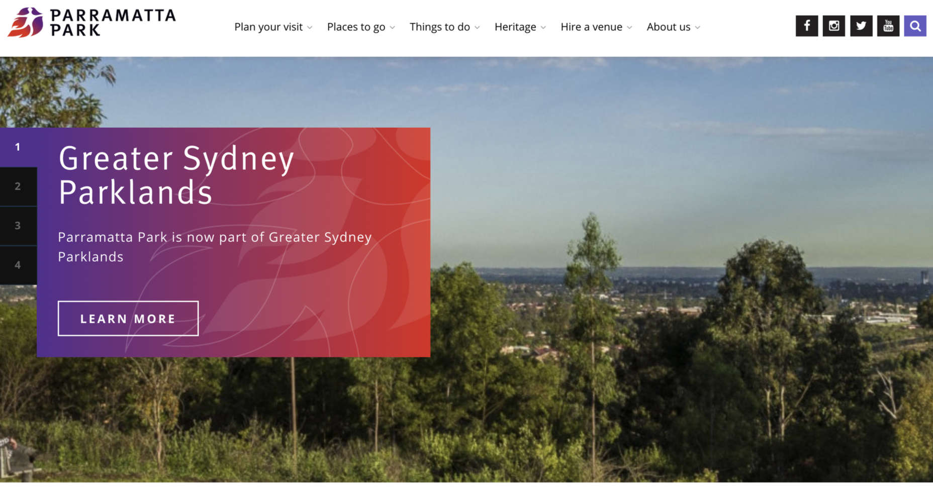
Notice how the buttons are clear and easy to press. The colors are bright and engaging on any screen, and the navigation is simple to follow too. Remember, when you’re designing an inclusive prototype:
Test navigation options and ensure they’re easy to use;
Don’t overcrowd the screen, remember that less is more when reducing cognitive load;
Make sure that your design remains easy to use on any screen.
Simplify Language
The visual elements on an inclusive website need to be as simple and easy to understand as possible. However, it’s important not to forget about the way that you handle the written word too.
Using simple terms instead of complex industry jargon can make a massive difference to those with reading issues. There’s also typography to think about, from the color and contrast of your words against your chosen background to the font’s clarity.
Remember, suboptimal design with both imagery and language affects those without disabilities too. Following basic rules for simplicity delivers a better experience for anyone that visits your site.
Make sure you:
Underline, bold, or re-size links for visual contrast;
Enforce proper line spacing with around 1.5x the font size;
Enable consistent paragraph spacing;
Use simple language to reduce cognitive load;
Describe abbreviations when using them;
Use clearly-worded headings to structure content logically;
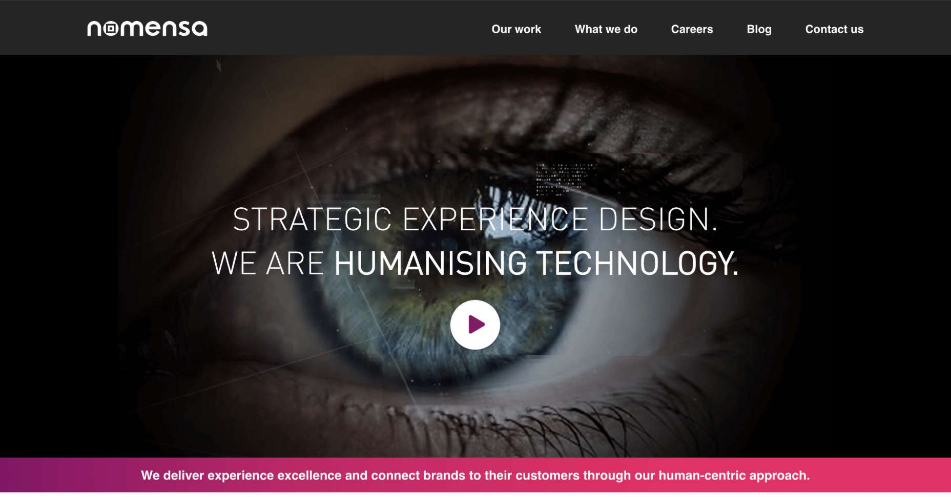
Look at the design choices for text on the Nomensa website, for instance. Plenty of white space makes content easier to read. Simple words are understandable and engaging. Even the font choice mimics the logo while offering readability.
Optimize Web Design Colors
Inclusive web design trends will come and go. However, color and contrast will always be essential to your decisions.
By making sure that your design elements meet the minimum color contrast ratios defined by the WCAG means that you’re supporting readability for visually-impaired users and improving experiences for customers that aren’t visually impaired as well.
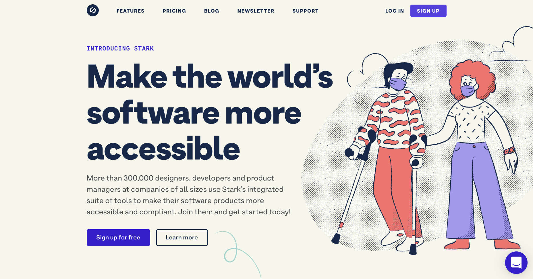
For designers who need extra help in this area, tools like Stark help measure color contrast. This tool also offers a range of other tools intended to support accessibility too.
Remember, the minimum ratio you need to access will depend on the element that you’re designing. The WCAG recommends the following guidelines:
3:1 ratio for graphical objects (charts);
3:1 ratio for focus, active states, and hover;
3:1 ratio for clickable items and form components.
While you’re working on your color contrast strategies with apps like Stark, make sure that you consider the needs of users with color blindness too. 4.5% of the world doesn’t see color the same way as everyone else. If you’re finding it difficult to achieve the right contrast while sticking to your customer’s brand guidelines, try underlining and bolding elements too.
Consider Video and Audio Elements
Finally, these days, more companies are opting to embed video and audio content into their sites. These visual and auditory tools can offer useful information about a brand and what it does. However, you could struggle to deliver vital information to some customers through video and audio alone.
Captions for video content could be essential for those with hearing loss. You may need to think about adding transcripts to pre-recorded videos that people with hearing impairments can access. These transcripts and captions are also helpful for anyone who doesn’t have access to audio on smartphones or computers.
Transcripts can also help those with visual impairments by giving a text-to-speech tool something to describe to your user. That way, everyone gains useful information. Look at this captioned video from the University of Washington, for instance. It ensures that everyone can understand what’s going on in the content. If you add transcripts to your website pages for clients, you could also help them benefit from improved SEO too. Transcripts deliver more keyword-ranking opportunities than videos and podcasts on their own.
Design for Accessibility First
For designers to excel at delivering truly inclusive UI environments, they need to become as good at creating websites for people with disabilities as they are at creating interfaces for people like themselves. As designers, we try to be as inclusive as possible, but it’s easy to get caught up thinking about making a website easier to use for us.
If you can step into the shoes of someone that isn’t like you, and think about uncommon needs first, then you may find that you deliver a stronger, more engaging experience for every user.
For instance, rather than designing a website for someone with the same visual needs as you, then thinking about making tweaks for those with color blindness or vision issues, think about the needs of those with disabilities first.
You can learn more about putting uncommon needs first by checking out Vasilis Van Gemert’s blog post on the “Method of Crisis.”
Accessibility is Good for Business
Inclusive web design, or designing for accessibility, is all about maximizing the potential audience that your clients can earn. Whatever situation end-users find themselves in, you should ensure that you’re taking advantage of inclusive design.
If you can prove to your clients that you can deliver for all customers’ needs, you can unlock a much larger audience and many more opportunities.
Source
p img {display:inline-block; margin-right:10px;}
.alignleft {float:left;}
p.showcase {clear:both;}
body#browserfriendly p, body#podcast p, div#emailbody p{margin:0;}
The post Getting Started With Inclusive Web Design first appeared on Webdesigner Depot.