Safiro Font: Mastery in Font Design & Typography

Original Source: https://abduzeedo.com/safiro-font-mastery-font-design-typography

Safiro Font: Mastery in Font Design & Typography

abduzeedo0206—24

Explore the elegance of Safiro font, a masterpiece in font design and typography, perfect for branding, editorial, and web design. Discover its unique neogrotesque style.

In the ever-evolving world of design, the Safiro font emerges as a standout example of how typography can profoundly influence branding and visual identity. Created by the renowned type foundry atipo®, Safiro is not just a font; it’s a testament to the power of design when art meets precision.

This sans-serif family is a brilliant showcase of the neogrotesque style, grounded in rationalist principles yet reimagined through a modern lens. The creators have masterfully balanced the proportions of each letter, achieving an exquisite blend of technical accuracy and aesthetic grace. This balance gives Safiro a distinctive personality, setting it apart in the realm of font design.

One of Safiro’s most compelling features is its stroke contrast, which adds depth and character without overwhelming the design. This subtlety ensures that the font retains its elegance across various applications, from the digital screen to the printed page. It’s this versatility that makes Safiro an excellent choice for a wide range of projects, including logo creation, branding efforts, editorial layouts, packaging designs, and web interfaces.

The Safiro family is impressively comprehensive, offering eight weights that range from Regular to Bold. This spectrum of weight options, coupled with true italics, provides designers with unparalleled flexibility. Whether crafting a minimalist logo or a dynamic web page, Safiro adapts effortlessly, underscoring the content with its unique charm.

In a world where brands strive to stand out, Safiro offers a foundation for creating identities that resonate. Its unique blend of elegance and functionality makes it a precious tool in a designer’s arsenal. As we explore the possibilities Safiro brings to the table, it’s clear that this font is not just about creating words on a page; it’s about crafting experiences that engage and inspire.

In conclusion, Safiro is more than a font; it’s a milestone in font design and typography, demonstrating how thoughtful design can elevate communication in any medium. Its contribution to the visual language of our time will undoubtedly be cherished by designers and brands looking to make a lasting impression.

Font and typography artifacts

Artifact from the Safiro Font: Mastery in Font Design & Typography article on AbduzeedoArtifact from the Safiro Font: Mastery in Font Design & Typography article on AbduzeedoArtifact from the Safiro Font: Mastery in Font Design & Typography article on AbduzeedoArtifact from the Safiro Font: Mastery in Font Design & Typography article on AbduzeedoArtifact from the Safiro Font: Mastery in Font Design & Typography article on AbduzeedoArtifact from the Safiro Font: Mastery in Font Design & Typography article on AbduzeedoArtifact from the Safiro Font: Mastery in Font Design & Typography article on AbduzeedoArtifact from the Safiro Font: Mastery in Font Design & Typography article on AbduzeedoArtifact from the Safiro Font: Mastery in Font Design & Typography article on AbduzeedoArtifact from the Safiro Font: Mastery in Font Design & Typography article on AbduzeedoArtifact from the Safiro Font: Mastery in Font Design & Typography article on AbduzeedoArtifact from the Safiro Font: Mastery in Font Design & Typography article on AbduzeedoArtifact from the Safiro Font: Mastery in Font Design & Typography article on AbduzeedoArtifact from the Safiro Font: Mastery in Font Design & Typography article on Abduzeedo

For more information make sure to check out ATIPOFOUNDRY.COM

Exciting New Tools for Designers, February 2024

Original Source: https://www.webdesignerdepot.com/tools-for-designers-february-2024/

2024 is well underway and shaping up to be an interesting year. So, to help you keep your focus on working hard and getting stuff done, we’ve collected another bunch of helpful bits and pieces from across the web.

On-Scroll Animation Ideas for Sticky Sections

Original Source: https://tympanus.net/codrops/2024/01/31/on-scroll-animation-ideas-for-sticky-sections/

Some ideas of how sticky sections can be animated while exiting the viewport.

8 Ways to Fix the “Sorry PowerPoint Can’t Read 0” Error

Original Source: https://www.hongkiat.com/blog/sorry-powerpoint-cant-read-0/

If you’ve ever encountered the “Sorry, PowerPoint can’t read” error while trying to open a PPT file on your Mac, you know how stressful it can be, especially if you’re gearing up for an important presentation.

Don’t worry, though; in this article, we will delve into the causes of this issue and offer eight practical solutions to resolve it. Plus, we’ll share handy tips to prevent this problem in the future. Let’s dive in!

Troubleshooting PowerPoint on MacTroubleshooting PowerPoint on Mac

“My PPT is showing a repair message and an error like, ‘Sorry, PowerPoint can’t read 0.’ I created a PPT on my MacBook Air, transferred it to a USB, made some edits, and then replaced the file. Since then, I’m getting this error. I’m not sure if the problem is with my laptop or with Microsoft. What should I do?” – A Question from Reddit

Understanding the “Sorry PowerPoint Can’t Read 0” Error

The “Sorry, PowerPoint can’t read 0 Mac” error indicates that PowerPoint is unable to open or process the presentation file. The 0 in the error message might point to a missing or invalid element in the file’s structure.

Here’s a look at why this error might occur on your Mac:

A widespread issue with PowerPoint affecting multiple files could stem from an improper installation of the software.

The file might be inaccessible due to permission or security settings.
Your PPT file could be corrupted, possibly due to an unexpected crash or an error during saving.
The file is outdated or saved in a format that’s not standard.
You might be attempting to open the file with a version of PowerPoint that’s not compatible with it.
Complex features like advanced animations or unusual fonts might cause issues if they’re not supported by your PowerPoint version.

Easy Steps to Resolve “Sorry PowerPoint Can’t Read 0” on Mac

Often, the “Sorry, PowerPoint can’t read 0” error is caused by a damaged or corrupted PPT file. A quick solution is using a third-party tool like 4DDiG File Repair.

This tool simplifies the repair process to just three clicks and works on videos, audio, images, and documents, including PPT files. You also get to preview the fixed files before saving them. Here are the key features of this tool:

Repairs inaccessible or corrupted files across various formats like PowerPoint, Word, Excel, and Outlook.
Effectively fixes PPT files that won’t open, boasting a high success rate.
Batch repairs multiple PowerPoint files of different formats simultaneously.
Supports Office 365 and older PowerPoint versions from 2007 onwards.
Works on both Windows and macOS.
User-friendly interface, suitable even for those not tech-savvy.

To begin, download and install the repair tool on your Mac. Follow these steps to fix the “Sorry PowerPoint Can’t Read” error due to corrupted PPT files:

Choose “File Repair” and click “Add File(s)” to upload the damaged PPT files, or drag and drop them into the tool.
Adding Files to Repair ToolAdding Files to Repair Tool
Hit “Start Repair.” The tool will begin scanning and repairing the corruption in your presentations.
Starting Repair ProcessStarting Repair Process
Once the scan is complete, click “View Results” to review the repaired PPT files. Choose “Export” to save them in a desired location.
Exporting Repaired FilesExporting Repaired Files

Alternative Methods to Resolve “Sorry PowerPoint Can’t Read 0” Error

Besides using 4DDiG File Repair, there are several free alternatives to fix the “Sorry, PowerPoint can’t read” error without spending money. Let’s explore seven of the most effective ones:

Method 1: Change the Presentation Format

Incompatibility between your presentation format and the PowerPoint version can lead to the “Sorry, PowerPoint can’t read 0 Mac” error. Changing the file format of your PPT can solve this issue.

Here’s what you can do:

Open the problematic presentation in a version of PowerPoint that’s compatible with it.
Go to “File” and then choose “Save As.”
Saving Presentation in New FormatSaving Presentation in New Format
From the “File Format” dropdown menu, select the appropriate format. Use PowerPoint 97-2003 for .ppt files, and PowerPoint 2007 or later for .pptx files.
Selecting File FormatSelecting File Format
Give a new name and choose a location for the PPT file, then click “Save.”

Method 2: Update PowerPoint Regularly

Using an outdated version of PowerPoint can cause the “Sorry, PowerPoint can’t read 0” error due to potential bugs and glitches. Updating the app can often resolve this. Here’s how:

Launch PowerPoint or any other Office application, click on “Help” in the top menu, and select “Check for Updates.”
Checking for PowerPoint UpdatesChecking for PowerPoint Updates
If there’s an update available, click on the “Update” button to download and install the latest version.
Updating PowerPointUpdating PowerPoint

Method 3: Start PowerPoint in Safe Mode

Add-ins or extensions might conflict with PowerPoint, causing the “Sorry, PowerPoint can’t read 0 Mac” error. Running PowerPoint in Safe Mode disables these add-ins, helping to identify the culprit.

Follow these steps:

For M1 Mac users, “Shut Down“; for Intel Mac users, “Restart” and hold down the Power button.
M1 users should select “Macintosh HD” and choose “Continue in Safe Mode“; Intel users should press Shift after restarting, then open the PowerPoint file.
Booting Mac in Safe ModeBooting Mac in Safe Mode

Check if the “Sorry, PowerPoint can’t read 0” error persists in Safe Mode. If it doesn’t, an add-in is likely the issue. You can then disable the problematic add-in.

Method 4: Create a New User Account on Mac

The “Sorry, PowerPoint can’t read 0” error may be due to a corrupted user profile. Creating a new user account can provide a fresh start without any corruption or errors.

Here’s how to create a new user account on Mac:

Click the Apple logo, navigate to “System Preferences,” and select “Users & Groups.”
Accessing Users & GroupsAccessing Users & Groups
Click the padlock icon, enter your Mac password, and click “Unlock.”
Unlocking System PreferencesUnlocking System Preferences
Press the “+” button to add a new user, fill in the account details, set a password, and select “Create User.”
Creating New UserCreating New User
Select the new user profile and tick the option for “Allow user to administer the computer.”
Setting Admin RightsSetting Admin Rights
Log out from the current account (via the Apple logo), and log in with the new account. Then, try running PowerPoint.
Switching User AccountsSwitching User Accounts

Method 5: Open PPT in OneDrive

If you’re unsure whether the “Sorry, PowerPoint can’t read 0” error is due to the file or the app, try uploading the problematic PPT to OneDrive. Open it there to see if you can access its content.

This approach can help you determine the root of the problem.

Opening PPT in OneDriveOpening PPT in OneDrive
Method 6: Use Version History in OneDrive

To tackle the “Sorry, PowerPoint can’t read” error, consider restoring your PPT file from Version History. This is effective especially when dealing with files on OneDrive.

Here’s how to do it:

Navigate to “Finder,” right-click on the PPT file, and select “Version History.” You might find several versions of your file here.
Accessing Version HistoryAccessing Version History
Choose the version you want by clicking on the three dots next to it, then select “Restore” (or “Download“).
Restoring Previous VersionRestoring Previous Version

Method 7: Reinstall PowerPoint

A faulty PowerPoint installation or corrupted Office files can lead to the “Sorry, PowerPoint can’t read” error on Mac. This usually happens when vital files or components are missing or damaged.

To fix this, uninstall and then reinstall MS Office. Here’s how:

Go to “Launchpad,” find PowerPoint, and hold it until you see a cross icon on the app.
Uninstalling PowerPointUninstalling PowerPoint
Click “Delete” to uninstall PowerPoint, then visit the App Store to reinstall it.
Reinstalling PowerPointReinstalling PowerPoint

Tips to Prevent Future PowerPoint Issues

After resolving the “Sorry, PowerPoint can’t Read 0” error, follow these tips to avoid similar problems in the future:

Authentic Installation – Ensure you install MS PowerPoint from a reputable source to guarantee its authenticity.
Protect Your Mac – Use a trusted anti-malware tool and perform regular scans to safeguard your Mac from security threats.
Regular Updates – Consistently update both MS Office and your Mac’s operating system for improved security and compatibility.
Safe Add-ins – Avoid untrusted PowerPoint add-ins. Stick to those that are compatible and have a good reputation.
Careful File Transfer – Handle your PowerPoint files with care. Ensure safe transfers and avoid abrupt shutdowns during file movement.

Conclusion

In this article, we’ve examined the “Sorry, PowerPoint can’t read 0” error, its causes, and provided eight effective fixes. For issues related to file corruption, 4DDiG File Repair is a dependable solution.

This versatile tool not only repairs PowerPoint files in formats like .ppt, .pptx, and .potm but also fixes videos, audios, archives, and images. It’s an all-in-one solution for repairing various file types.

The post 8 Ways to Fix the “Sorry PowerPoint Can’t Read 0” Error appeared first on Hongkiat.

15 Best New Fonts, January 2024

Original Source: https://www.webdesignerdepot.com/best-fonts-january-2024/

It’s January, and what better time to revisit our typography and freshen up our designs for 2024.

MuFo: Branding and Visual Identity for Photography Museum

Original Source: https://abduzeedo.com/mufo-branding-and-visual-identity-photography-museum

MuFo: Branding and Visual Identity for Photography Museum

abduzeedo0129—24

Explore the innovative branding and visual identity of Krakow’s MuFo, the only museum in Poland dedicated to photography. Uncover how MuFo’s unique design sets it apart.

In the heart of Krakow, the Museum of Photography, now rebranded as MuFo, stands as a beacon of cultural and visual innovation. This transformation is not just a change of name, but a complete overhaul of its visual identity, symbolizing the museum’s new direction and broader offerings.

MuFo, derived from the words Museum and Fotografia (Photography in Polish), exemplifies simplicity and memorability in branding. This concise, easily pronounceable name transcends language barriers, positioning the museum as an accessible cultural hub, not just in Poland but internationally.

The museum’s logo is a testament to thoughtful design. Focusing on universal concepts like vision, observation, and the photographic lens, it converges into a symbol resembling an eye. This emblem is not merely a static image; it represents the dynamic nature of photography and the museum’s role as a site of observation and discovery.

But MuFo’s visual identity extends beyond its logo. It is a comprehensive expression of the museum’s character. The identity is versatile, with variable layouts and forms that adapt to different contexts. This flexibility is crucial in a world where digital and urban spaces are saturated with information and imagery. MuFo’s use of a vivid color palette further enhances its visibility, ensuring that its communication is clear and impactful in a diverse urban landscape.

MuFo is more than a museum; it’s a cultural epicenter, a hub for exchanging ideas, and a showcase of rich photographic collections. Its design and branding reflect this status, making it a standout entity in Poland and a significant landmark on the cultural map of Europe.

The redesign of MuFo is a clear indication of the museum embracing the 21st century, where design goes hand in hand with functionality and cultural significance. It’s a place that captures the eye and the imagination at first glance, inviting visitors to explore the depths of photography and its impact on society. This project is a striking example of how visual identity can revitalize an institution, making it a beacon of cultural and artistic innovation.

Branding and visual identity artifacts

Artifact from the MuFo: Branding and Visual Identity for Photography Museum article on Abduzeedo

Artifact from the MuFo: Branding and Visual Identity for Photography Museum article on AbduzeedoArtifact from the MuFo: Branding and Visual Identity for Photography Museum article on Abduzeedo

Artifact from the MuFo: Branding and Visual Identity for Photography Museum article on Abduzeedo

Artifact from the MuFo: Branding and Visual Identity for Photography Museum article on AbduzeedoArtifact from the MuFo: Branding and Visual Identity for Photography Museum article on Abduzeedo

Artifact from the MuFo: Branding and Visual Identity for Photography Museum article on AbduzeedoArtifact from the MuFo: Branding and Visual Identity for Photography Museum article on Abduzeedo

Artifact from the MuFo: Branding and Visual Identity for Photography Museum article on Abduzeedo

Artifact from the MuFo: Branding and Visual Identity for Photography Museum article on Abduzeedo

Artifact from the MuFo: Branding and Visual Identity for Photography Museum article on Abduzeedo

For more information make sure to check out podpunkt.pl /​​​​​​​ superskrypt.pl ​​​​​​​

The Feature Trap: Why Feature Centricity Is Harming Your Product

Original Source: https://smashingmagazine.com/2024/01/feature-centricity-harming-product/

Most product teams think in terms of features. Features are easy to brainstorm and write requirement docs for, and they fit nicely into our backlogs and ticketing systems. In short, thinking in terms of features makes it easy to manage the complex task of product delivery.

However, we know that the best products are more than the sum of their parts, and sometimes, the space between the features is as important as the features themselves. So, what can we do to improve the process?

The vast majority of product teams are organized around delivering features — new pieces of functionality that extend the capabilities of the product. These features will often arise from conversations the company is having with prospective buyers:

“What features are important to you?”
“What features are missing from your current solution?”
“What features would we need to add in order to make you consider switching from your existing provider to us?” and so on.

The company will then compile a list of the most popular feature requests and will ask the product team to deliver them.

For most companies, this is what customer centricity looks like; asking customers to tell them what they want — and then building those features into the product in the hope they’ll buy — becomes of key importance. This is based on the fundamental belief that people buy products primarily for the features so we assemble our roadmaps accordingly.

We see this sort of thinking with physical products all the time. For instance, take a look at the following Amazon listing for one of the top-rated TV sets from last year. It’s like they hurled up the entire product roadmap directly onto the listing!

Now, of course, if you’re a hardcore gamer with very specific requirements, you might absolutely be looking for a TV with “VRR, ALLM, and eARC as specified in HDMI2.1, plus G-Sync, FreeSync, Game Optimizer, and HGiG.” But for me? I don’t have a clue what any of those things mean, and I don’t really care. Instead, I’ll go to a review site where they explain what the product actually feels like to use in everyday life. The reviewers will explain how good the unboxing experience is. How sturdy the build is. How easy it is to set up. They’ll explain that the OS is really well put together and easy to navigate, the picture quality is probably the best on the market, and the sound, while benefiting from the addition of a quality sound bar, is very clear and understandable. In short, they’ll be describing the user experience.

The ironic thing is that when I talk to most founders, product managers, and engineers about how they choose a TV, they’ll say exactly the same thing. And yet, for some reason, we struggle to take that personal experience and apply it to our own users!

Tip: As a fun little trick, next time you find yourself arguing about features over experience, ask people to get out their phones. I bet that the vast majority of folks in the room will have an iPhone, despite Samsung and Google phones generally having better cameras, more storage, better screens, and so on. The reason why iPhones have risen in dominance (if we ignore the obvious platform lock-in) is because, despite perhaps not having the best feature set on the market, they feel so nice to use.

Seeing Things From The Users’ Perspective

While feature-centric thinking is completely understandable, it misses a whole class of problems. The features in and of themselves might look good on paper and work great in practice, but do they mesh together to form a convincing whole? Or is the full experience a bit of a mess?

All the annoying bumps, barriers, and inconsistencies that start accruing around each new feature, if left unsolved, can limit the amount of value users can extract from the product. And if you don’t effectively identify and remove these barriers in a deliberate and structured way, any additional functionality will simply add to the problem.

If users are already struggling to extract value from existing features, how do you expect them to extract any additional value you might be adding to the product?

“As a product manager, it’s natural to want to offer as many features as possible to your customers. After all, you want to provide value, right? But what happens when you offer too many features? Your product becomes bloated, convoluted, and difficult to use.”
— “Are Too Many Features Hurting Your Product?”

These barriers and inconsistencies are usually the result of people not thinking through the user experience. And I don’t mean user experience in some abstract way. I mean literally walking through the product step-by-step as though you’d never seen it before — sometimes described as having a “beginner’s mind” mdash; and considering the following questions:

Is it clear what value this product delivers and how I can get that value?
If I were a new user, would the way the product is named and structured make sense to me?
Can I easily build up a mental model of where everything is and how the product works?
Do I know what to do next?
How is this going to fit into my existing workflow?
What’s getting in my way and slowing me down?

While approaching things with a beginner’s mind sounds easy, it’s actually a surprisingly hard mindset for people to adopt — letting go of everything they know (or think they know) about their product, market, and users. Instead, their position as a superuser tends to cloud their judgment: believing that because something is obvious to them (something that they have created and have been working on for the past two years), it will be obvious to a new user who has spent less than five minutes with the product. This is where usability testing (a UX research method that evaluates whether users are able to use a digital product efficiently and effectively) should normally “enter the stage.”

The issue with trying to approach things with a beginner’s mind is also often exacerbated by “motivated reasoning,” the idea that we view things through the lens of what we want to be true, rather than what is true. To this end, you’re much more likely to discount feedback from other people if that feedback is going to result in some negative outcome, like having to spend extra time and money redesigning a user flow when you’d rather be shipping that cool new feature you came up with last week.

I see this play out in usability testing sessions all the time. The first subject comes in and struggles to grasp a core concept, and the team rolls their eyes at the incompetence of the user. The next person comes in and has the same experience, causing the team to ask where you found all these stupid users. However, as the third, fourth, and fifth person comes through and experiences the same challenge, “lightbulbs” slowly start forming over the team members’ heads:

“Maybe this isn’t the users’ fault after all? Maybe we’ve assumed a level of knowledge or motivation that isn’t there; maybe it’s the language we’ve used to describe the feature, or maybe there’s something in the way the interface has been designed that is causing this confusion?”

These kinds of insights can cause teams to fundamentally pivot their thinking. But this can also create a huge amount of discomfort and cognitive dissonance — realizing that your view of the world might not be entirely accurate. As such, there’s a strong motivation for people to avoid these sorts of realizations, which is why we often put so little effort (unfortunately) into understanding how our users perceive and use the things we create.

Developing a beginner’s mind takes time and practice. It’s something that most people can cultivate, and it’s actually something I find designers are especially good at — stepping into other people’s shoes, unclouded by their own beliefs and biases. This is what designers mean when they talk about using empathy.

Towards A Two-Tier Process (Conclusion)

We obviously still need to have “feature teams.” Folks who can understand and deliver the new capabilities our users request (and our business partners demand). While I’d like to see more thought and validation when it comes to feature selection and creation, it’s often quicker to add new features to see if they get used than to try and use research to give a definitive answer.

As an example, I’m working with one founder at the moment who has been going around houses with their product team for months about whether a feature would work. He eventually convinced them to give it a try — it took four days to push out the change, and they got the feedback they needed almost instantly.

However, as well as having teams focused on delivering new user value, we also need teams who are focused on helping unlock and maximize existing user value. These teams need to concentrate on outcomes over outputs; so, less deliver X capability in Y sprints than deliver X improvement by Y date. To do this, these teams need to have a high level of agency. This means taking them out of the typical feature factory mindset.

The teams focusing on helping unlock and maximize existing user value need to be a little more cross-disciplinary than your traditional feature team. They’re essentially developing interventions rather than new capabilities — coming up with a hypothesis and running experiments rather than adding bells and whistles. “How can we improve the onboarding experience to increase activation and reduce churn?” Or, “How can we improve messaging throughout the product so people have a better understanding of how it works and increase our North Star metric as a result?”

There’s nothing radical about focusing on outcomes over outputs. In fact, this way of thinking is at the heart of both the Lean Startup movement and the Product Led Growth. The problem is that while this is seen as received wisdom, very few companies actually put it into practice (although if you ask them, most founders believe that this is exactly what they do).

Put simply, you can’t expect teams to work independently to deliver “outcomes” if you fill their their calendar with output work.

So this two-tier system is really a hack, allowing you to keep sales, marketing, and your CEO (and your CEO’s partner) happy by delivering a constant stream of new features while spinning up a separate team who can remove themselves from the drum-beat of feature delivery and focus on the outcomes instead.

Further Reading

“Why Too Many Features Can Ruin a Digital Product Before It Begins” (Komodo Digital)
Digital products are living, ever-evolving things. So, why do so many companies force feature after feature into projects without any real justification? Let’s talk about feature addiction and how to avoid it.
“Are Too Many Features Hurting Your Product?” (FAQPrime)
As a product manager, it’s natural to want to offer as many features as possible to your customers. After all, you want to provide value, right? But what happens when you offer too many features? Your product becomes bloated, convoluted, and difficult to use. Let’s take a closer look at what feature bloat is, why it’s a problem, and how you can avoid it.
“Twelve Signs You’re Working in a Feature Factory,” John Cutler
The author started using the term Feature Factory when a software developer friend complained that he was “just sitting in the factory, cranking out features, and sending them down the line.” This article was written in 2016 and still holds its ground today. In 2019 there appeared a newer version of it (“Twelve signs You’re Working in a Feature Factory — Three Years Later”).
“What Is The Agile Methodology?,” (Atlassian)
The Agile methodology is a project management approach that involves breaking the project into phases and emphasizes continuous collaboration and improvement. Teams follow a cycle of planning, executing, and evaluating.
“Problem Statement vs Hypothesis — Which ­­Is More Important?,” Sadie Neve
When it comes to experimentation and conversion rate optimization (CRO), we often see people relying too much on their instincts. But in reality, nothing in experimentation is certain until tested. This means experimentation should be approached like a scientific experiment that follows three core steps: identify a problem, form a hypothesis, and test that hypothesis.
“The Build Trap,” Melissa Perri (Produx Labs)
The “move fast and break things” mantra seems to have taken the startup world by storm since Facebook made it their motto a few years ago. But there is a serious flaw with this phrase, and it’s that most companies see this as an excuse to stop analyzing what they intend to build and why they should build it — those companies get stuck in what I call “The Build Trap.”
“What Is Product-led Growth?” (PLG Collective)
We are in the middle of a massive shift in the way people use and buy software. It’s been well over a decade since Salesforce brought software to the cloud. Apple put digital experiences in people’s pockets back in 2009 with the first iPhone. And in the years since the market has been flooded with consumer and B2B products that promise to meet just about every need under the sun.
The Lean Startup
The Lean Startup isn’t just about how to create a more successful entrepreneurial business. It’s about what we can learn from those businesses to improve virtually everything we do.
“Usability Testing — The Complete Guide,” Daria Krasovskaya and Marek Strba
Usability testing is the ultimate method of uncovering any type of issue related to a system’s ease of use, and it truly is a must for any modern website or app owner.
“The Value of Great UX,” Jared Spool
How can we show that a great user experience produces immense value for the organization? We can think of experience as a spectrum, from extreme frustration to delight. In his article, Jared will walk you through how our work as designers is able to transform our users’ experiences from being frustrated to being delighted.
“Improving The Double Diamond Design Process,” Andy Budd (Smashing Magazine)
The so-called “Double Diamond” is a great way of visualizing an ideal design process, but it’s just not the way most companies deliver new projects or services. The article proposes a new “Double Diamond” idea that better aligns with the way work actually gets done and highlights the place where design has the most leverage.
“Are We Moving Towards a Post-Agile Age?,” Andy Budd
Agile has been the dominant development methodology in our industry for a while now. While some teams are just getting to grips with Agile, others have extended it to the point that it’s no longer recognizable as Agile; in fact, many of the most progressive design and development teams are Agile only in name. What they are actually practicing is something new, different, and innately more interesting — something I’ve been calling Post-Agile thinking.

Why React Icons May Be the Only Icon Library You Need

Original Source: https://www.sitepoint.com/react-icons-library/?utm_source=rss

Why React Icons May Be the Only Icon Library You Need

Learn how to use React Icons and other React-ready icon libraries to easily add ready-made SVG icons to your React projects.

Continue reading
Why React Icons May Be the Only Icon Library You Need
on SitePoint.

A Simple Guide To Retrieval Augmented Generation Language Models

Original Source: https://smashingmagazine.com/2024/01/guide-retrieval-augmented-generation-language-models/

Suppose you ask some AI-based chat app a reasonably simple, straightforward question. Let’s say that app is ChatGPT, and the question you ask is right in its wheelhouse, like, “What is Langchain?” That’s really a softball question, isn’t it? ChatGPT is powered by the same sort of underlying technology, so it ought to ace this answer.

So, you type and eagerly watch the app spit out conversational strings of characters in real-time. But the answer is less than satisfying.

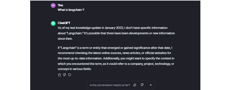
In fact, ask ChatGPT — or any other app powered by language models — any question about anything recent, and you’re bound to get some sort of response along the lines of, “As of my last knowledge update…” It’s like ChatGPT fell asleep Rumplestiltskin-style back in January 2022 and still hasn’t woken up. You know how people say, “You’d have to be living under a rock not to know that”? Well, ChatGPT took up residence beneath a giant chunk of granite two years ago.

While many language models are trained on massive datasets, data is still data, and data becomes stale. You might think of it like Googling “CSS animation,” and the top result is a Smashing Magazine article from 2011. It might still be relevant, but it also might not. The only difference is that we can skim right past those instances in search results while ChatGPT gives us some meandering, unconfident answers we’re stuck with.

There’s also the fact that language models are only as “smart” as the data used to train them. There are many techniques to improve language model’s performance, but what if language models could access real-world facts and data outside their training sets without extensive retraining? In other words, what if we could supplement the model’s existing training with accurate, timely data?

This is exactly what Retrieval Augmented Generation (RAG) does, and the concept is straightforward: let language models fetch relevant knowledge. This could include recent news, research, new statistics, or any new data, really. With RAG, a large language model (LLM) is able to retrieve “fresh” information for more high-quality responses and fewer hallucinations.

But what exactly does RAG make available, and where does it fit in a language chain? We’re going to learn about that and more in this article.

Understanding Semantic Search

Unlike keyword search, which relies on exact word-for-word matching, semantic search interprets a query’s “true meaning” and intent — it goes beyond merely matching keywords to produce more results that bear a relationship to the original query.

For example, a semantic search querying “best budget laptops” would understand that the user is looking for “affordable” laptops without querying for that exact term. The search recognizes the contextual relationships between words.

This works because of text embeddings or mathematical representations of meaning that capture nuances. It’s an interesting process of feeding a query through an embedded model that, in turn, converts the query into a set of numeric vectors that can be used for matching and making associations.

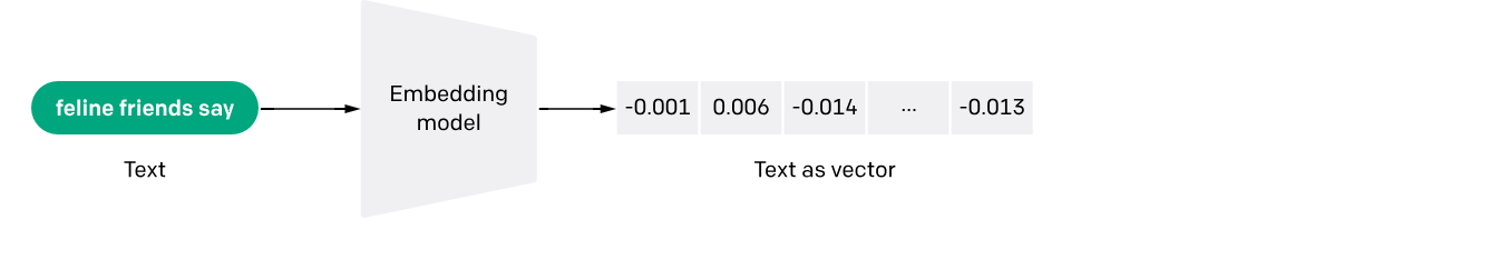
The vectors represent meanings, and there are benefits that come with it, allowing semantic search to perform a number of useful functions, like scrubbing irrelevant words from a query, indexing information for efficiency, and ranking results based on a variety of factors such as relevance.

Special databases optimized for speed and scale are a strict necessity when working with language models because you could be searching through billions of documents. With a semantic search implementation that includes test embedding, storing and querying high-dimensional embedding data is much more efficient, producing quick and efficient evaluations on queries against document vectors across large datasets.

That’s the context we need to start discussing and digging into RAG.

Retrieval Augmented Generation

Retrieval Augmented Generation (RAG) is based on research produced by the Meta team to advance the natural language processing capabilities of large language models. Meta’s research proposed combining retriever and generator components to make language models more intelligent and accurate for generating text in a human voice and tone, which is also commonly referred to as natural language processing (NLP).

At its core, RAG seamlessly integrates retrieval-based models that fetch external information and generative model skills in producing natural language. RAG models outperform standard language models on knowledge-intensive tasks like answering questions by augmenting them with retrieved information; this also enables more well-informed responses.

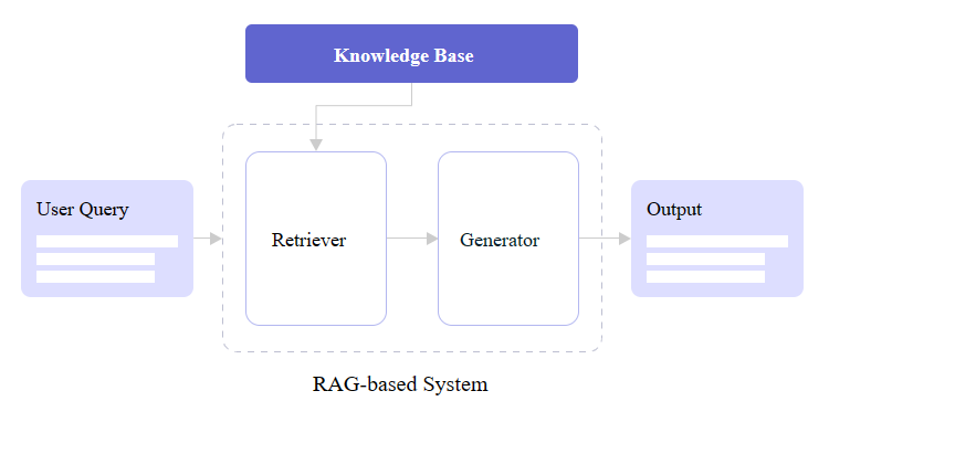
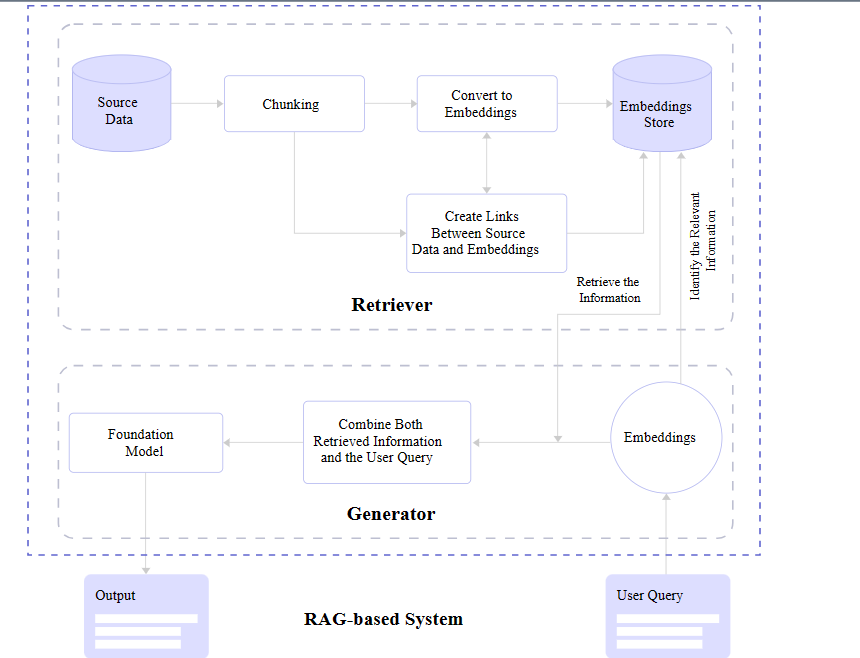
You may notice in the figure above that there are two core RAG components: a retriever and a generator. Let’s zoom in and look at how each one contributes to a RAG architecture.

Retriever

We already covered it briefly, but a retriever module is responsible for finding the most relevant information from a dataset in response to queries and makes that possible with the vectors produced by text embedding. In short, it receives the query and retrieves what it evaluates to be the most accurate information based on a store of semantic search vectors.

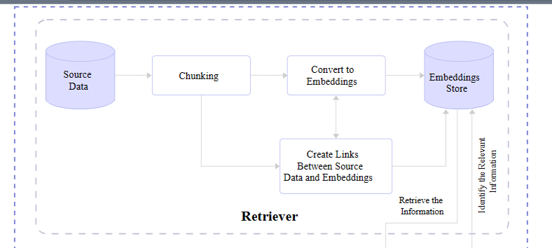
Retrievers are models in and of themselves. But unlike language models, retrievers are not in the business of “training” or machine learning. They are more of an enhancement or an add-on that provides additional context for understanding and features for fetching that information efficiently.

That means there are available options out there for different retrievers. You may not be surprised that OpenAI offers one, given their ubiquity. There’s another one provided by Cohere as well as a slew of smaller options you can find in the Hugging Face community.

Generator

After the retriever finds relevant information, it needs to be passed back to the application and displayed to the user. Or what’s needed is a generator capable of converting the retrieved data into human-readable content.

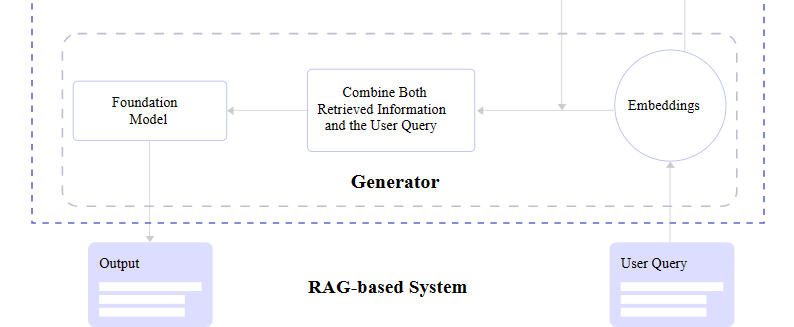
What’s happening behind the scenes is the generator accepts the embeddings it receives from the retriever, mashes them together with the original query, and passes through the trained language model for an NLP pass on the way to becoming generated text.

The entire tail end of that process involving the language model and NLP is a process in its own right and is something I have explained in greater detail in another Smashing Magazine article if you are curious about what happens between the generator and final text output.

RAG Full View

Pulling everything together, a complete RAG flow goes like this:

A query is made.
The query is passed to the RAG model.
The RAG model encodes the query into text embeddings that are compared to a dataset of information.
The RAG’s retriever decides the most relevant information with its semantic search abilities and converts it into vector embeddings.
The RAG’s retriever sends the parsed embeddings to the generator.
The generator accepts the embeddings and combines them with the original query.
The generator passes its work off to the language model to produce natural-sounding content presented to the user.

LLM Hallucinations And Knowledge Limitations

We opened this article up by describing “hallucinations” in LLMs’ incorrect responses or something along the lines of “I don’t know, but here’s what I do know.” The LLM will “make stuff up” because it simply doesn’t have updated information to respond with.

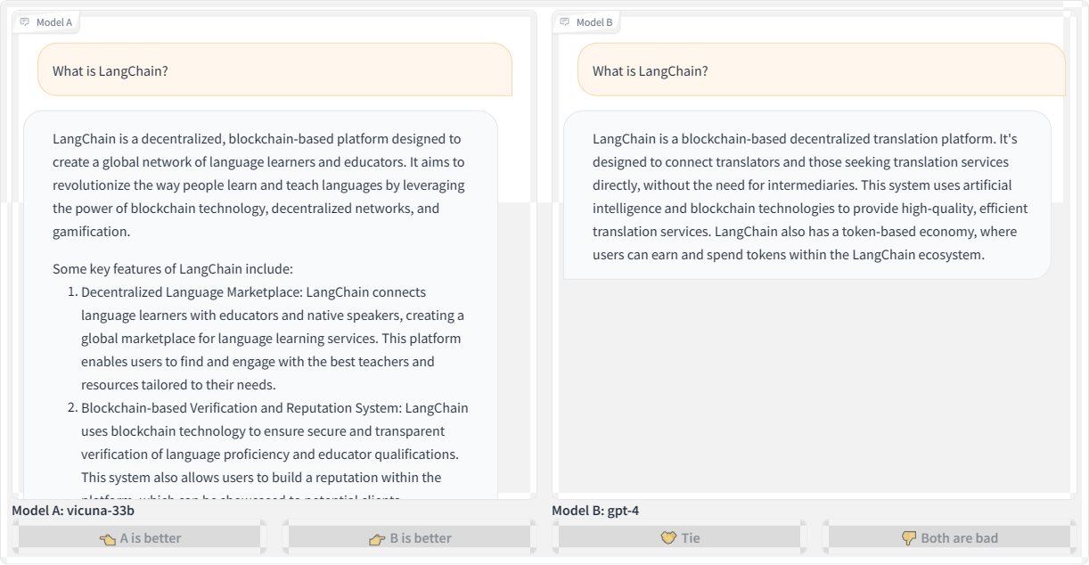
Let’s revisit the first query we used to kick off this article — “What is LangChain?” — and compare responses from the Vicuna and GPT-4 language models:

Here’s the transcription for the second query using OpenAI’s GPT-4 for posterity:

“LangChain is a blockchain-based decentralized translation platform. It’s designed to connect translators and those seeking translation services directly without the need for intermediaries. This system uses artificial intelligence and blockchain technologies to provide high-quality, efficient translation services. LangChain also has a token-based economy, where users can earn and spend tokens within the LangChain ecosystem.”

Both Vicuna and GPT-4 refer to LangChain as a blockchain platform. Blockchain is a technology that stores data in a decentralized manner using chained blocks, so the models’ responses sound plausible given the “chain” in the name. However, LangChain is not actually a blockchain-based technology.

This is a prime example demonstrating how LLMs will fabricate responses that may seem believable at first glance but are incorrect. LLMs are designed to predict the next “plausible” tokens in a sequence, whether those are words, subwords, or characters. They don’t inherently understand the full meaning of the text. Even the most advanced models struggle to avoid made-up responses, especially for niche topics they lack knowledge about.

Let’s look at another example by querying: “What is the most preferred framework used by developers for building applications leveraging large language models?”

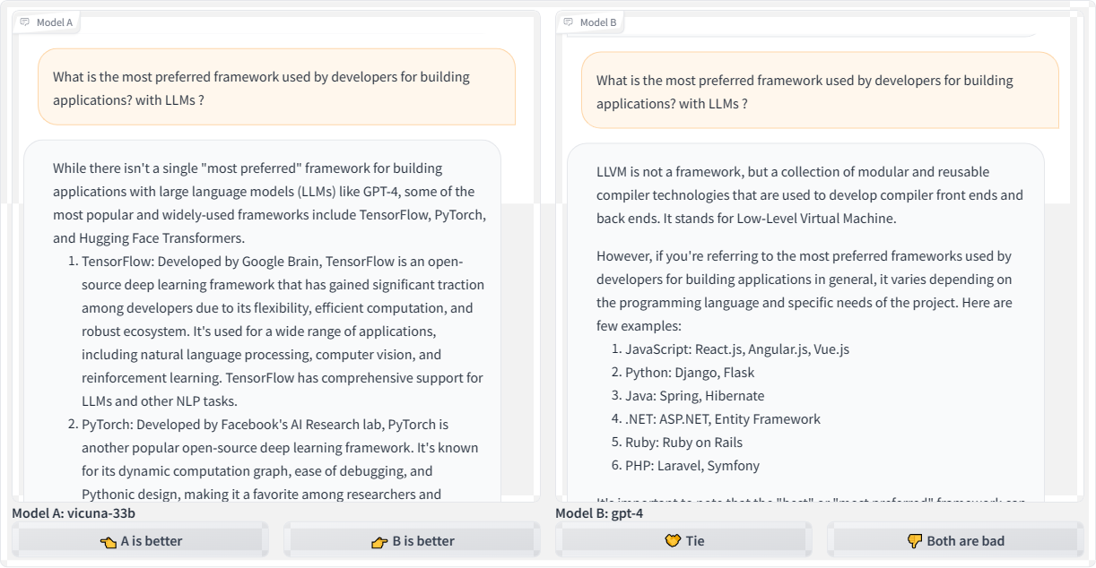
While Vicuna offers a couple of reasonable starting points for answering the question, the frameworks it refers to have limitations for efficiency and scalability in production-level applications that use LLMs. That could quite possibly send a developer down a bad path. And as bad as that is, look at the GPT-4 response that changes topics completely by focusing on LLVM, which has nothing to do with LLMs.

What if we refine the question, but this time querying different language models? This time, we’re asking: “What is the go-to framework developed for developers to seamlessly integrate large language models into their applications, focusing on ease of use and enhanced capabilities?”

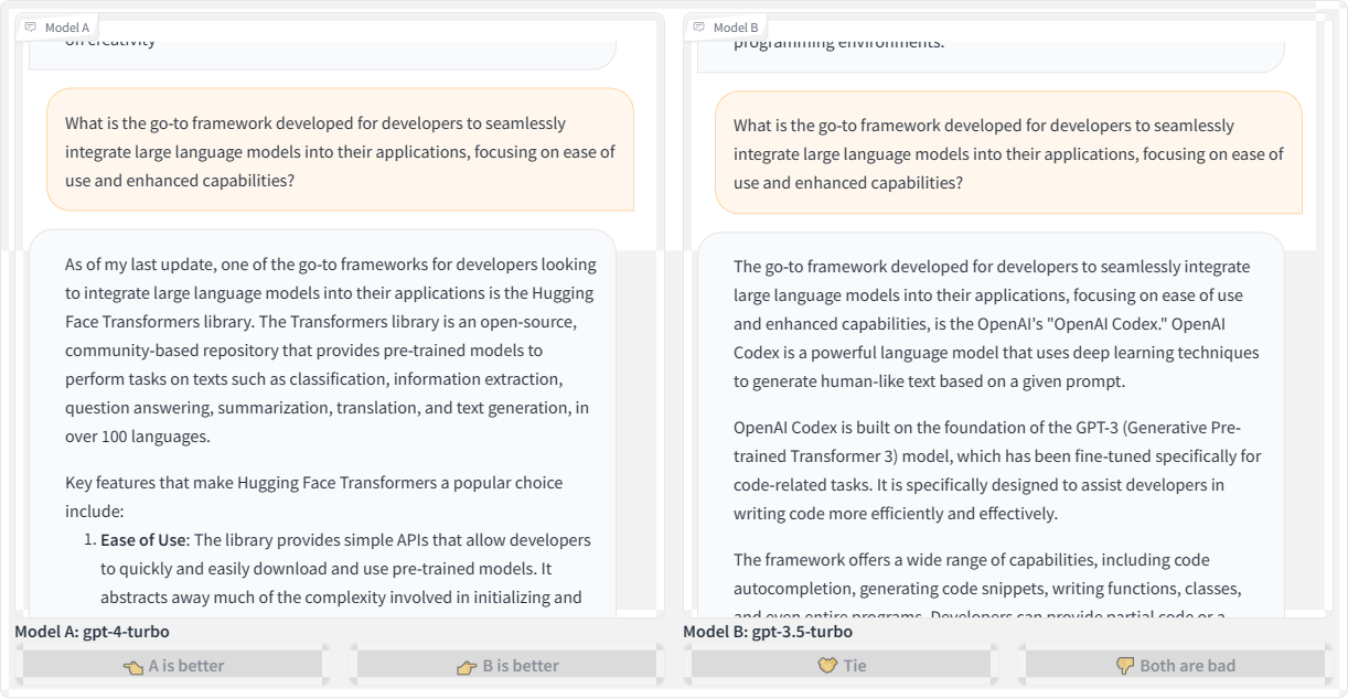
Honestly, I was expecting the responses to refer to some current framework, like LangChain. However, the GPT-4 Turbo model suggests the “Hugging Face” transformer library, which I believe is a great place to experiment with AI development but is not a framework. If anything, it’s a place where you could conceivably find tiny frameworks to play with.

Meanwhile, the GPT-3.5 Turbo model produces a much more confusing response, talking about OpenAI Codex as a framework, then as a language model. Which one is it?

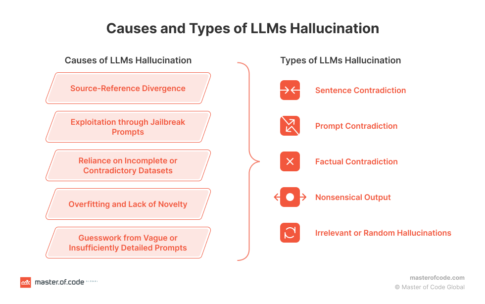
We could continue producing examples of LLM hallucinations and inaccurate responses and have fun with the results all day. We could also spend a lot of time identifying and diagnosing what causes hallucinations. But we’re here to talk about RAG and how to use it to prevent hallucinations from happening in the first place. The Master of Code Global blog has an excellent primer on the causes and types of LLM hallucinations with lots of useful context if you are interested in diving deeper into the diagnoses.

Integrating RAG With Language Models

OK, so we know that LLMs sometimes “hallucinate” answers. We know that hallucinations are often the result of outdated information. We also know that there is this thing called Retrieval Augmented Generation that supplements LLMs with updated information.

But how do we connect RAG and LLMs together?

Now that you have a good understanding of RAG and its benefits, we can dive into how to implement it yourself. This section will provide hands-on examples to show you how to code RAG systems and feed new data into your LLM.

But before jumping right into the code, you’ll need to get a few key things set up:

Hugging Face
We’ll use this library in two ways. First, to choose an embedding model from the model hub that we can use to encode our texts, and second, to get an access token so we can download the Llama-2 model. Sign up for a free Hugging Face in preparation for the work we’ll cover in this article.
Llama-2
Meta’s powerful LLM will be our generator model. Request access via Meta’s website so we can integrate Llama-2 into our RAG implementation.
LlamaIndex
We’ll use this framework to load our data and feed it into Llama-2.
Chroma
We’ll use this embedding database for fast vector similarity search and retrieval. This is actually where we can store our index.

With the key tools in place, we can walk through examples for each phase: ingesting data, encoding text, indexing vectors, and so on.

Install The Libraries

We need to install the RAG libraries we identified, which we can do by running the following commands in a new project folder:

# Install essential libraries for our project
!pip install llama-index transformers accelerate bitsandbytes –quiet
!pip install chromadb sentence-transformers pydantic==1.10.11 –quiet

Next, we need to import specific modules from those libraries. There are quite a few that we want, like ChromaVectorStore and HuggingFaceEmbedding for vector indexing and embeddings capabilities, storageContext and chromadb to provide database and storage functionalities, and even more for computations, displaying outputs, loading language models, and so on. This can go in a file named app.py at the root level of your project.

## app.py

## Import necessary libraries
from llama_index import VectorStoreIndex, download_loader, ServiceContext
from llama_index.vector_stores import ChromaVectorStore
from llama_index.storage.storage_context import StorageContext
from llama_index.embeddings import HuggingFaceEmbedding
from llama_index.response.notebook_utils import display_response
import torch
from transformers import BitsAndBytesConfig
from llama_index.prompts import PromptTemplate
from llama_index.llms import HuggingFaceLLM
from IPython.display import Markdown, display
import chromadb
from pathlib import Path
import logging
import sys

Provide Additional Context To The Model

The data we will leverage for our language model is a research paper titled “Enhancing LLM Intelligence with ARM-RAG: Auxiliary Rationale Memory for Retrieval Augmented Generation” (PDF) that covers an advanced retrieval augmentation generation approach to improve problem-solving performance.

We will use the download_loader() module we imported earlier from llama_index to download the PDF file:

PDFReader = download_loader(“PDFReader”)
loader = PDFReader()
documents = loader.load_data(file=Path(‘/content/ARM-RAG.pdf’))

Even though this demonstration uses a PDF file as a data source for the model, that is just one way to supply the model with data. For example, there is Arxiv Papers Loader as well as other loaders available in the LlamaIndex Hub. But for this tutorial, we’ll stick with loading from a PDF. That said, I encourage you to try other ingestion methods for practice!

Now, we need to download Llama-2, our open-source text generation model from Meta. If you haven’t already, please set up an account with Meta and have your access token available with read permissions, as this will allow us to download Llama-2 from Hugging Face.

# huggingface api token for downloading llama2
hf_token = “YOUR Access Token”

To fit Llama-2 into constrained memory, like in Google Colab, we’ll configure 4-bit quantization to load the model at a lower precision.

quantization_config = BitsAndBytesConfig(
load_in_4bit=True,
bnb_4bit_compute_dtype=torch.float16,
bnb_4bit_quant_type=”nf4″,
bnb_4bit_use_double_quant=True,
)

Google Colab is where I typically do most of my language model experiments. We’re shrinking the language model down with that last snippet so it’s not too large for Colab to support.

Next, we need to initialize HuggingFaceLLM to set up our model for generating text on the fly:

llm = HuggingFaceLLM(
model_name=”meta-llama/Llama-2-7b-chat-hf”,
tokenizer_name=”meta-llama/Llama-2-7b-chat-hf”,
query_wrapper_prompt=PromptTemplate(“<s> [INST] {query_str} [/INST] “),
context_window=3900,
model_kwargs={“token”: hf_token, “quantization_config”: quantization_config},
tokenizer_kwargs={“token”: hf_token},
device_map=”auto”,
)

Note that what’s happening here is that we’ve defined our model (Llama-2), but a specific subset of it is designed for a chat UI (Llama-2-Chat). Even though this is what we are using for this article, you can also pick from other text generation models in the Hugging Face hub, such as Neural-chat from Intel.

Compare Outputs

OK, so we have the model loaded and configured. Let’s try it out by asking it questions that it could reasonably answer using the content we provided via the ARM-RAG PDF file to see how the model responds without any context. The following code is for displaying the text output without the PDF providing data to the model for comparison sake:

from IPython.display import HTML, display

# Assuming resp contains the response
resp = llm.complete(“What is ARM-RAG?”)

# Using HTML with inline CSS for styling (gray color, smaller font size)
html_text = f'<p style=”color: #1f77b4; font-size: 14px;”><b>{resp}</b></p>’

Let’s see the response:

display(HTML(html_text))

ARM-RAG (ARM Register-Allocating Generator) is a register allocation algorithm used in compiler design. nobody knows who invented it, but it was first described in a 1995 paper by Mark H. T. Kim and Andrew Y. Chen. The ARM-RAG algorithm is a register-allocating generator, meaning it is a heuristic algorithm that takes a program as input and generates a register allocation plan for it. The goal of the algorithm is to assign registers to variables in a way that minimizes the number of spills (i.e., loads or stores to/from memory) while satisfying all the memory access constraints of the program. The ARM-RAG algorithm works by first partitioning the program into a set of basic blocks, and then iteratively allocating registers to variables within each basic block. The algorithm uses a cost function to evaluate the quality of each allocation, and it selects the allocation with the lowest cost. The cost function takes into account factors such as the distance between the variable and the current register, the distance between the variable and the next allocation, and the number of spills that would be required to allocate the variable. ARM-RAG

Obviously, without any context from the PDF file, the model generates a hallucinated response that describes some unrelated algorithm. To fix this, we need to provide relevant passages from the paper to ground Llama-2’s responses. We’ll encode the document into embeddings and index them for retrieval; then, when we query, we can feed LLama-2 relevant retrieved passages to steer it toward accurate, on-topic responses based on the contents of the PDF file.

First, we need to create a client to interact with our ChromaDB database and a new collection that will hold our vector index.

# create client and a new collection
chroma_client = chromadb.EphemeralClient()
chroma_collection = chroma_client.create_collection(“firstcollection”)

Then we need to set up the HuggingFaceEmbedding class with the specified model name for embedding the text into vectors:

# Load the embedding model
embed_model = HuggingFaceEmbedding(model_name=”BAAI/bge-base-en-v1.5″)

This initializes HuggingFaceEmbedding, passing the name of the pre-trained model we want to use, BAAI/bge-base-en-v1.5. There are other options, of course.

Now, we can set up the vector store and use it to index the embedded document vectors:

# set up ChromaVectorStore and load in data
vector_store = ChromaVectorStore(chroma_collection=chroma_collection)
storage_context = StorageContext.from_defaults(vector_store=vector_store)
service_context = ServiceContext.from_defaults(llm=llm, embed_model=embed_model)
index = VectorStoreIndex.from_documents(
documents, storage_context=storage_context, service_context=service_context
)

This creates a ChromaVectorStore connected to our collection, defines the storage and service contexts, and generates a VectorStoreIndex from the loaded documents using the embedding model. The index is what allows us to quickly find relevant passages for a given query to augment the quality of the model’s response.

We should also establish a way for the model to summarize the data rather than spitting everything out at once. A SummaryIndex offers efficient summarization and retrieval of information:

summary_index = SummaryIndex.from_documents(documents, service_context=service_context)

Earlier, the model hallucinated when we queried it without the added context from the PDF file. Now, let’s ask the same question, this time querying our indexed data:

#Define your query
query=”what is ARM-RAG?”

from llama_index.embeddings.base import similarity
query_engine =index.as_query_engine(response_mode=”compact”)
response = query_engine.query(query)
from IPython.display import HTML, display

# Using HTML with inline CSS for styling (blue color)
html_text = f'<p style=”color: #1f77b4; font-size: 14px;”><b>{response}</b></p>’
display(HTML(html_text))

Here’s the output:

Final Response: Based on the context information provided, ARM-RAG is a system that utilizes Neural Information Retrieval to archive reasoning chains derived from solving grade-school math problems. It is an Auxiliary Rationale Memory for Retrieval Augmented Generation, which aims to enhance the problem-solving capabilities of Large Language Models (LLMs). The system surpasses the performance of a baseline system that relies solely on LLMs, demonstrating the potential of ARM-RAG to improve problem-solving capabilities.

Correct! This response is way better than the one we saw earlier — no hallucinations here.

Since we’re using the chat subset of the Llama-2 model, we could have a back-and-forth conversation with the model about the content of the PDF file with follow-up questions. That’s because the indexed data supports NLP.

chat_engine = index.as_chat_engine(chat_mode=”condense_question”, verbose=True)
response = chat_engine.chat(“give me real world examples of apps/system i can build leveraging ARM-RAG?”)
print(response)

This is the resulting output:

Querying with: What are some real-world examples of apps or systems that can be built leveraging the ARM-RAG framework, which was discussed in our previous conversation?
Based on the context information provided, the ARM-RAG framework can be applied to various real-world examples, including but not limited to:

1. Education: ARM-RAG can be used to develop educational apps that can help students learn and understand complex concepts by generating explanations and examples that can aid in their understanding.

2. Tutoring: ARM-RAG can be applied to tutoring systems that can provide personalized explanations and examples to students, helping them grasp difficult concepts more quickly and effectively.

3. Customer Service: ARM-RAG can be utilized in chatbots or virtual assistants to provide customers with detailed explanations and examples of products or services, enabling them to make informed decisions.

4. Research: ARM-RAG can be used in research environments to generate explanations and examples of complex scientific concepts, enabling researchers to communicate their findings more effectively to a broader audience.

5. Content Creation: ARM-RAG can be applied to content creation systems that can generate explanations and examples of complex topics, such as news articles, blog posts, or social media content, making them more engaging and easier

Try asking more questions! Now that the model has additional context to augment its existing dataset, we can have a more productive — and natural — interaction.

Additional RAG Tooling Options

The whole point of this article is to explain the concept of RAG and demonstrate how it can be used to enhance a language model with accurate and updated data.

Chroma and LlamaIndex were the main components of the demonstrated RAG approach, but there are other tools for integrating RAG with language models. I’ve prepared a table that outlines some popular options you might consider trying with your own experiments and projects.

RAG
Type of System
Capabilities
Integrations
Documentation / Repo

Weaviate
Vector Database
Vector & Generative search
LlamaIndex, LangChain, Hugging Face, Cohere, OpenAI, etc.
DocumentationGitHub

Pinecone
Vector Database
Vector search, NER-Powered search, Long-term memory
OpenAI, LangChain, Cohere, Databricks
DocumentationGitHub

txtai
Embeddings Database
Semantic graph & search, Conversational search
Hugging face models
DocumentationGitHub

Qdrant
Vector Database
Similarity image search, Semantic search, Recommendations
LangChain, LlamaIndex, DocArray, Haystack, txtai, FiftyOne, Cohere, Jina Embeddings, OpenAI
DocumentationGitHub

Haystack
Framework
QA, Table QA, Document search, Evaluation
Elasticsearch, Pinecone, Qdrant, Weaviate, vLLM, Cohere
DocumentationGitHub

Ragchain
Framework
Reranking, OCR loaders
Hugging Face, OpenAI, Chroma, Pinecone
DocumentationGitHub

metal
Vector Database
Clustering, Semantic search, QA
LangChain, LlamaIndex
DocumentationGitHub

Conclusion

In this article, we examined examples of language models producing “hallucinated” responses to queries as well as possible causes of those hallucinations. At the end of the day, a language model’s responses are only as good as the data it provided, and as we’ve seen, even the most widely used models consist of outdated information. And rather than admit defeat, the language model spits out confident guesses that could be misconstrued as accurate information.

Retrieval Augmented Generation is one possible cure for hallucinations.

By embedding text vectors pulled from additional sources of data, a language model’s existing dataset is augmented with not only new information but the ability to query it more effectively with a semantic search that helps the model more broadly interpret the meaning of a query.

We did this by registering a PDF file with the model that contains content the model could use when it receives a query on a particular subject, in this case, “Enhancing LLM Intelligence with ARM-RAG: Auxiliary Rationale Memory for Retrieval Augmented Generation.”

This, of course, was a rather simple and contrived example. I wanted to focus on the concept of RAG more than its capabilities and stuck with a single source of new context around a single, specific subject so that we could easily compare the model’s responses before and after implementing RAG.

That said, there are some good next steps you could take to level up your understanding:

Consider using high-quality data and embedding models for better RAG performance.
Evaluate the model you use by checking Vectara’s hallucination leaderboard and consider using their model instead. The quality of the model is essential, and referencing the leaderboard can help you avoid models known to hallucinate more often than others.
Try refining your retriever and generator to improve results.

My previous articles on LLM concepts and summarizing chat conversations are also available to help provide even more context about the components we worked with in this article and how they are used to produce high-quality responses.

References

LlamaIndex documentation
ChromaDB documentation
Metas Llama-2 access
ARM-RAG research paper

CSS Blurry Shimmer Effect

Original Source: https://smashingmagazine.com/2024/01/css-blurry-shimmer-effect/

Imagine box-shadow but for a blur effect, where the backdrop of an element is blurred around that element, gradually decreasing the blur’s strength. I came up with the idea while trying to improve the contrast of a popup over a dark area where a box-shadow for the popup won’t make much sense, design-wise. I then thought, well, what other ways might create a good contrast effect? And so suddenly, the idea of a gradual blur effect around the object came to me.

See the Pen Faded Outer Box Backdrop Blur [forked] by Yair Even Or.

It would be awesome if we had a box-blur property or perhaps some sort of blur keyword we could set on box-shadow the way we do for inset shadows. Unfortunately, CSS has no such property. But because CSS is awesome and flexible, we can still get the effect by combining a few CSS features and hack it through.

What I’m going to show you from here on out is the thought process I took to create the effect. Sometimes, I find it easier to know what’s coming up rather than meandering through a narrative of twists and turns. So, for those of you who are like me and want to jump straight into the process, this was my approach.

Start With The Markup

The effect is approached in a way that it is applied to the ::before pseudo-element of some element, say some popup/dialog/popover/tooltip. Those are the common “targets” for this sort of effect. I think using a pseudo-element is a good approach here because it means we could technically scope the styles to the pseudo-element and re-purpose the effect on other elements without any HTML changes.

<!– This is literally it for this demo –>
<div></div>

You can give the element a class, whatever dimensions you like, insert content and other child elements within it, or use a completely different element. The HTML isn’t the main ingredient for the secret sauce we’re making.

Position The Pseudo-Element

We want the ::before pseudo-element to occupy the entire area of the <div> element we’re using for this specific demo. Not only do we want it to cover the entire area, but even overflow it because that establishes the visible area, which holds the blur effect, so it will extend outwards.

::before {
content: ”;

/* Make sure the parent element is at least relatively positioned to contain the pseudo-element. */
position: absolute;

/* The blur size should be anything below 0 so it will extend to the outside. */
inset: -100px;

/* This layer is positioned between the parent element and page background. */
/* Make sure this value is one below the z-index of the parent element. */
z-index: -1;
}

The code comments spell out the key pieces. An empty string has to be set for the content property so the ::before will be rendered, then we take it out of the document flow by giving it absolute positioning. This allows us to inset the element’s position and is ultimately setting the blur effect directions as we would on the box-shadow property — only we’re using inset to control its size. We want a negative inset value, where the effect extends further the lower the value gets.

Until now, we’ve set the foundation for the effect. There’s nothing really to see just yet. Now, the fun begins!

Masking With Transparent Gradients

Gradients are technically images — generated by the browser — which can be used as CSS masks to hide parts of an element to create various shapes. You may have seen a few related Smashing Magazine articles where CSS masking has been showcased, such as this one by Temani Afif.

Transparency is the key thing when it comes to masking with gradients. Transparency allows us to gradually hide portions of an element in a way that creates the illusion of fading in or out.

That’s perfect in this case because we want the effect to be stronger, closer to the object, and fade in intensity as it gets further away.

We’ll use two gradients: one that goes horizontally and another that goes vertically. I chose this route because it mimics a rough rectangle shape that fades out towards the edges.

As I said, transparency is key. Both gradients start transparent, then transition to black until just before the end, where they go back to transparent to fade things out. Remember, these gradients are masks rather than background images, so they are declared on the mask property, which controls which pixels should be rendered and their opacity.

mask:
linear-gradient(to top, transparent 0%, black 25% 75%, transparent 100%),
linear-gradient(to left, transparent 0%, black 25% 75%, transparent 100%);

See the Pen Basic Gradient Mask [forked] by Yair Even Or.

The vertical gradient (to top) creates a fade from transparent at the bottom to black in the middle, then back to transparent at the top.
The horizontal gradient (to left) produces a fade from transparent on the right to black in the middle, then back to transparent on the left.

This dual-gradient approach positions the black regions, so they merge, creating the rough baseline of a rectangular shape that will be refined in the next step. The mask property is best declared as first prefixed and then un-prefixed to cover more browsers’ support:

-webkit-mask:
linear-gradient(to top, transparent 0%, black 25% 75%, transparent 100%),
linear-gradient(to left, transparent 0%, black 25% 75%, transparent 100%);
mask:
linear-gradient(to top, transparent 0%, black 25% 75%, transparent 100%),
linear-gradient(to left, transparent 0%, black 25% 75%, transparent 100%);

Refining Using The mask-composite Property

The mask-composite property is part of the CSS Masking Module and enables pixel-wise control over the blending of masked content, allowing for intricate compositions.

The source-in value of this property is very useful for the effect we are after because it tells the browser to only retain the overlapping areas of the mask, so only pixels that contain both (mentioned above) gradients will get rendered. This locks in a rectangle shape, which can then be applied on any DOM element that has none-to-moderately curved corners (border-radius).

Gradually Blurring The Backdrop

Now that we have a mask to work with, all we need to do is use it. The backdrop-filter CSS property can blur anything that is rendered “behind” an element using the blur() function:

::before {
/* etc. */

backdrop-filter: blur(10px);
}

The larger the value, the more intense the blur. I’m using 10px arbitrarily. In fact, we can variablize this stuff later to make the implementation even more flexible and easily configurable.

But wait! As it turns out, Safari requires a vendor-prefixed version of backdrop-filter to get it working there:

::before {
/* etc. */

-webkit-backdrop-filter: blur(10px); /* Required for Safari */
backdrop-filter: blur(10px);
}

Note: It’s preferred to declare prefixed properties before the unprefixed variant so they serve as a fallback for browsers that don’t (yet) support them or their implementation is different.

A Touch of Synergistic Shadow

I think adding a slight semi-opaque black box-shadow that covers the blur area gives the effect a little extra depth. The only thing is that you’ll want to add it to the element itself rather than it’s ::before pseudo:

div {
box-shadow: 0 0 40px #00000099;
}

That’s totally optional, though.

Bringing Everything Together

Here’s how the CSS comes out when we combine everything together.

/* This can be set on the ::before pseudo of the element it is applied to. */
::before {
content: ”;

/* This layer is positioned between some element and its background. */
position: absolute;

/* This should not affect the contents of the container. */
z-index: -1;

/* The blur size should be anything below 0 so it will extend to the outside. */
inset: -100px;

/* The blur effect */
-webkit-backdrop-filter: blur(10px); /* Required for safari */
backdrop-filter: blur(10px);

/* A mask fades the blur effect, so it gets weaker. */
/* towards the edges, further from the container box. */
/* (The fill color is irrelevant, so “red” is used as it’s the shortest color name.) */
mask:
linear-gradient(
to top,
transparent 0%,
red 100px calc(100% – 100px),
transparent 100%),
linear-gradient(
to left,
transparent 0%,
red 100px calc(100% – 100px),
transparent 100%);

/* This merges the masks above so only the overlapping pixels are rendered. */
/* This creates the illusion of a fade-out mask. */
mask-composite: intersect;
-webkit-mask-composite: source-in; /* Required for Safari */
}

The Final Demo, One More Time

See the Pen Faded Outer Box Backdrop Blur [forked] by Yair Even Or.

I’ve also prepared a simplified version with minimal code and no CSS variables that’s easier to read and re-purpose.