Understanding React useEffect

Original Source: https://www.sitepoint.com/understanding-react-useeffect/?utm_source=rss

This article provides a comprehensive understanding of the powerful useEffect hook, its usage, and best practices.

Continue reading
Understanding React useEffect
on SitePoint.

How Accessibility Standards Can Empower Better Chart Visual Design

Original Source: https://smashingmagazine.com/2024/02/accessibility-standards-empower-better-chart-visual-design/

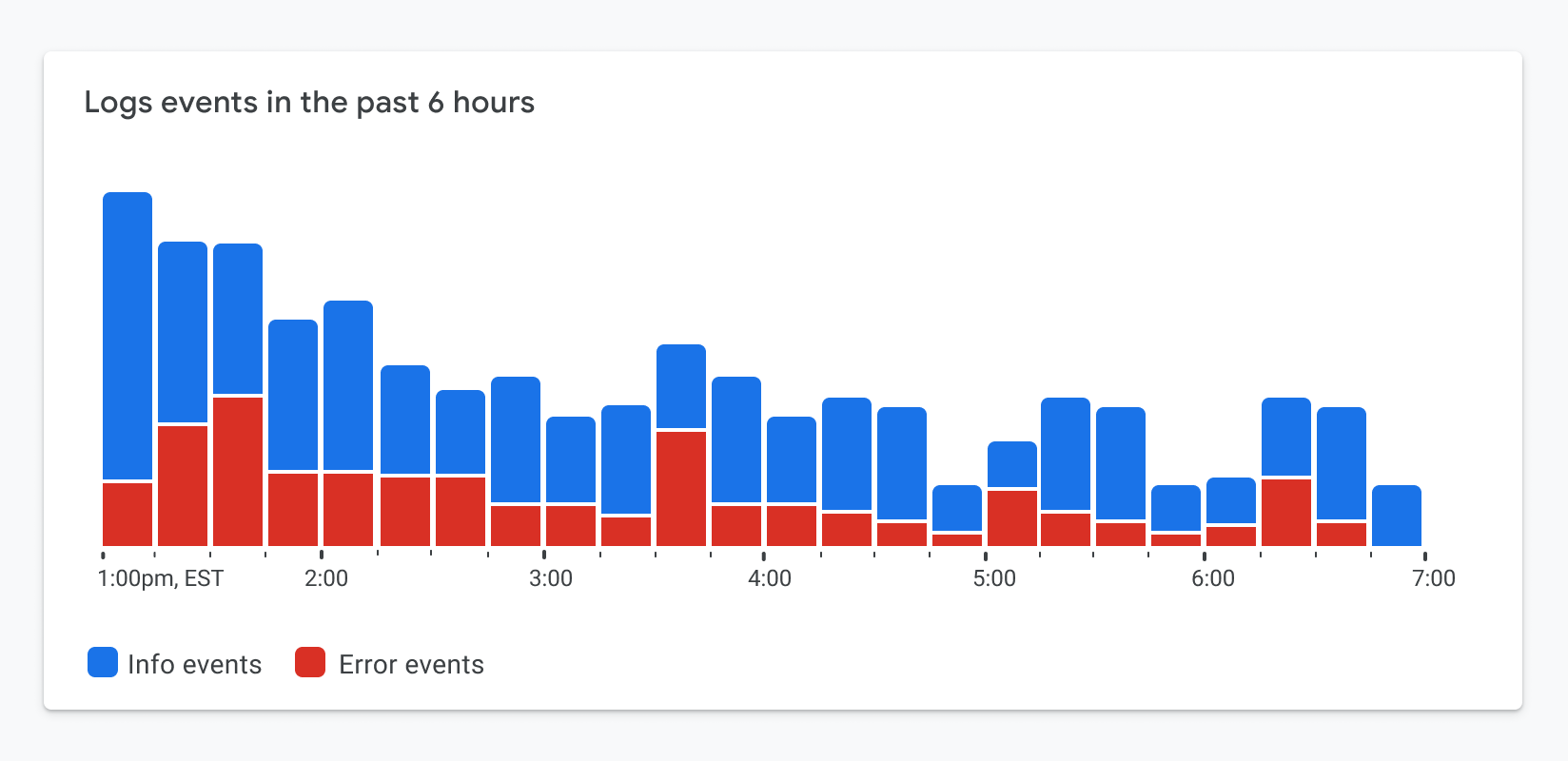
Data visualizations are graphics that leverage our visual system and innate capabilities to gather, accumulate, and process information in our environment, as shown in the animation in Figure 1.0.

Figure 1.0. An animation demonstrating our preattentive processing capability. Based on a lecture by Dr. Stephen Franconeri. (Large preview)

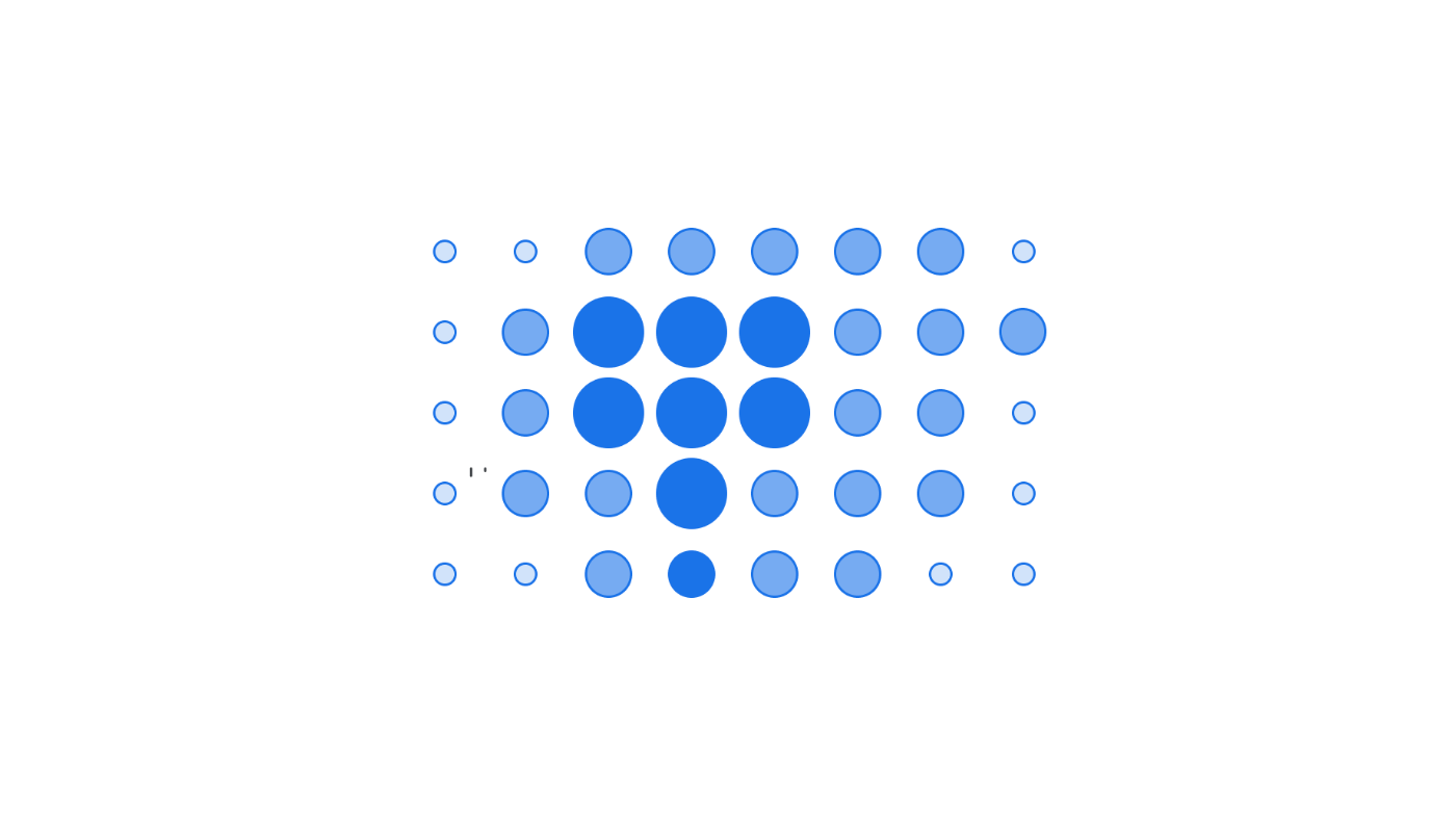
As a result, we’re able to quickly spot trends, patterns, and outliers in all the images we see. Can you spot the visual patterns in Figure 1.1?

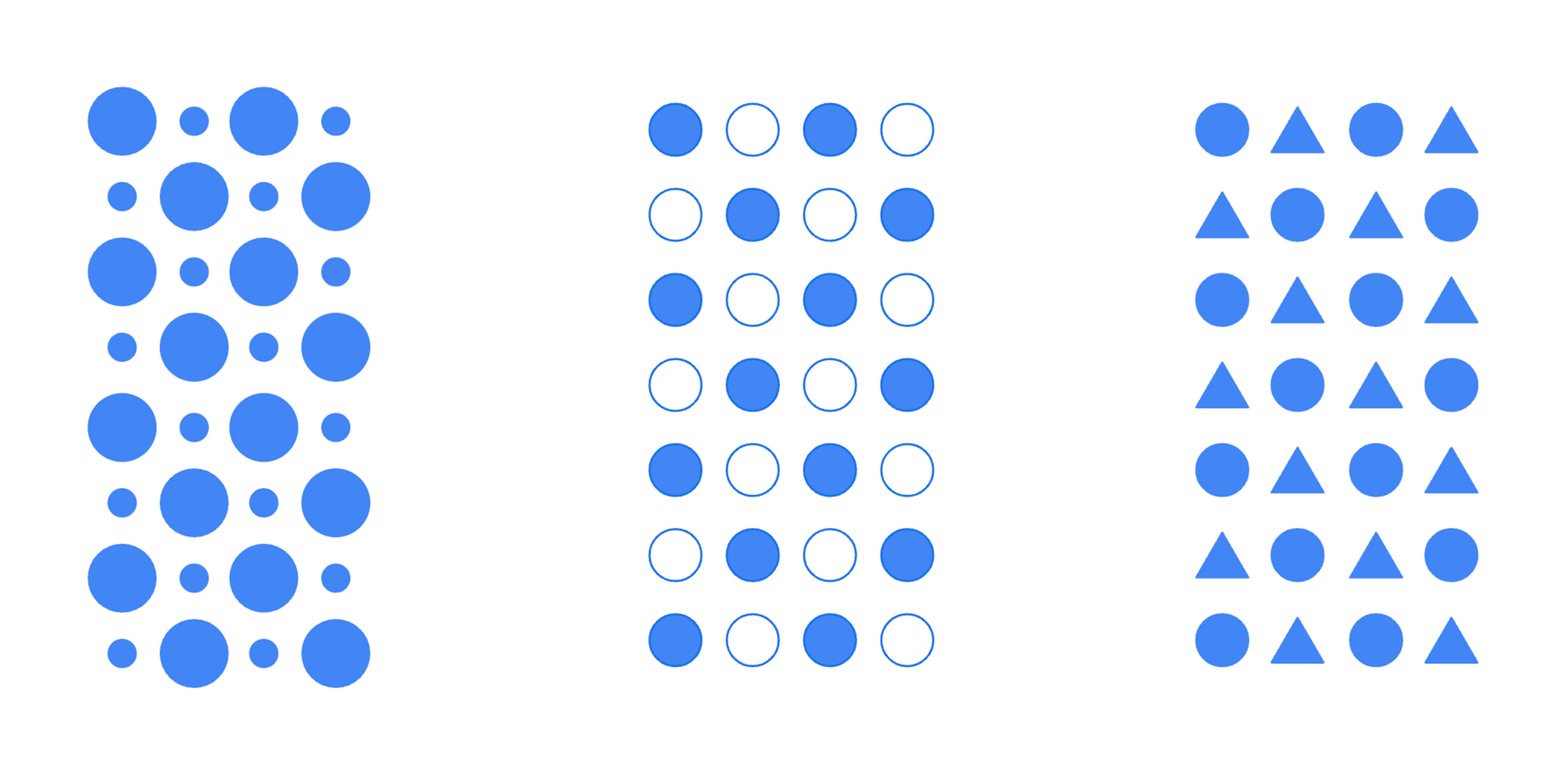
In this example, there are patterns defined by the size of the shapes, the use of fills and borders, and the use of different types of shapes. These characteristics, or visual encodings, are the building blocks of visualizations. Good visualizations provide a glanceable view of a large data set we otherwise wouldn’t be able to comprehend.

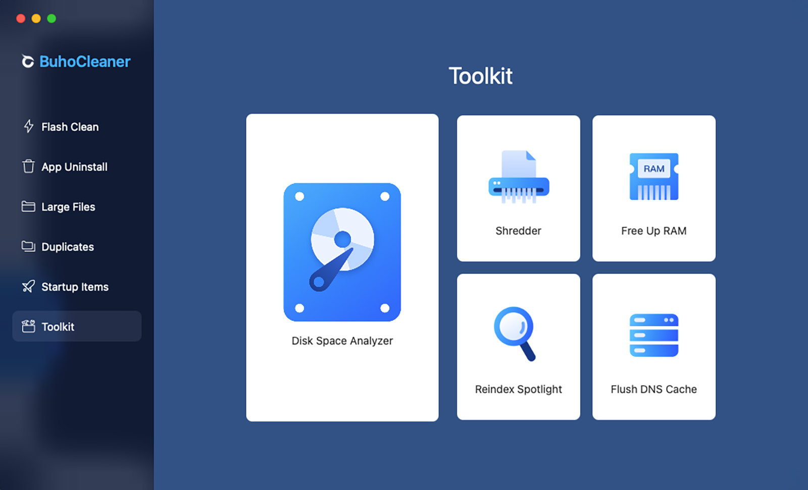
Accessibility Challenges With Data Visualizations

Visualizations typically serve a wide array of use cases and can be quite complex. A lot of care goes into choosing the right encodings to represent each metric. Designers and engineers will use colors to draw attention to more important metrics or information and highlight outliers. Oftentimes, as these design decisions are made, considerations for people with vision disabilities are missed.

Vision disabilities affect hundreds of millions of people worldwide. For example, about 300 million people have color-deficient vision, and it’s a condition that affects 1 in 12 men.1

1 Colour Blind Awareness (2023)

Most people with these conditions don’t use assistive technology when viewing the data. Because of this, the visual design of the chart needs to meet them where they are.

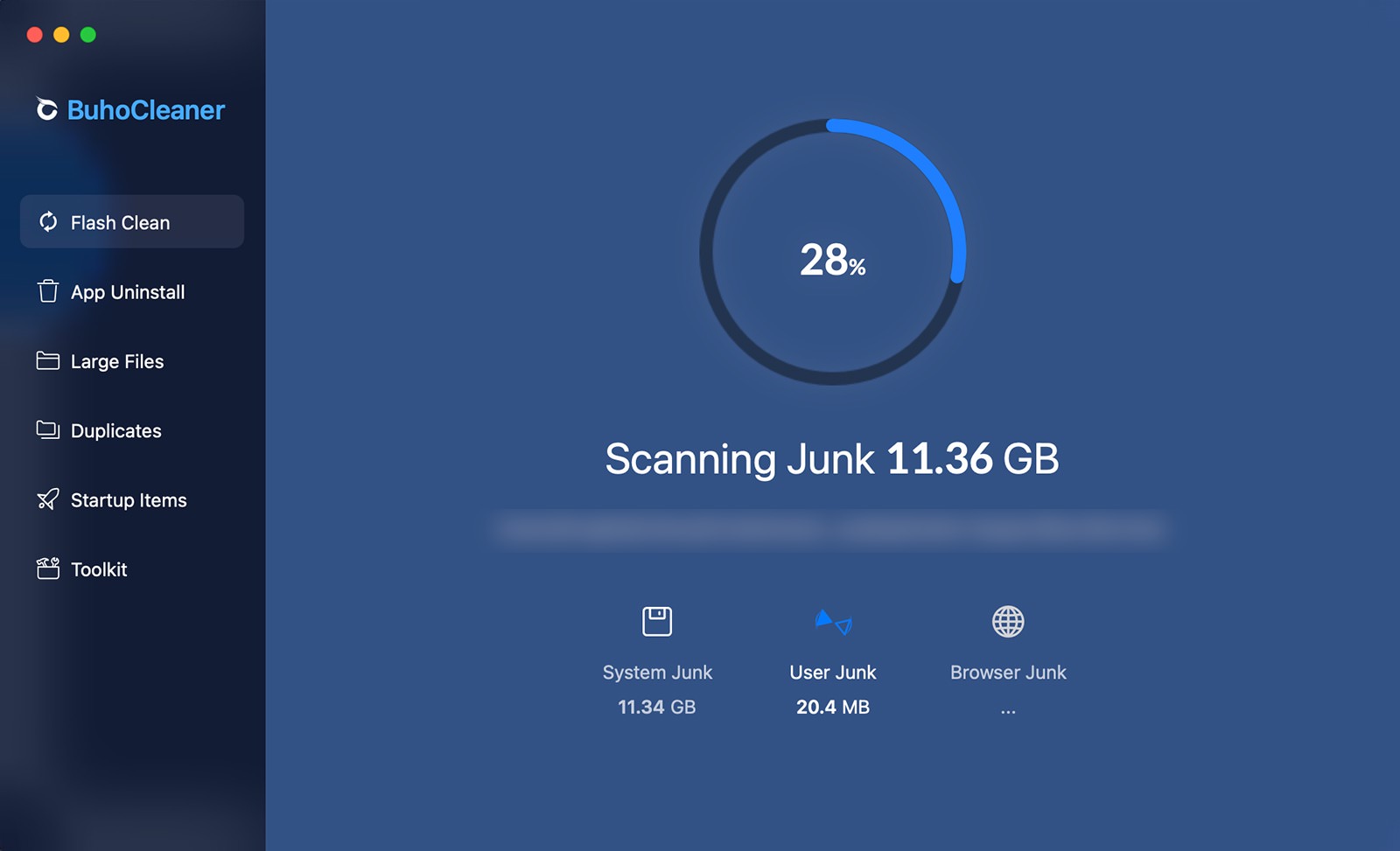
Figure 1.2 is an example of a donut chart. At first glance, it might seem like the categorical color palette matches the theme of digital wellbeing. It’s calm, it’s cool, and it may even invoke a feeling of wellbeing.

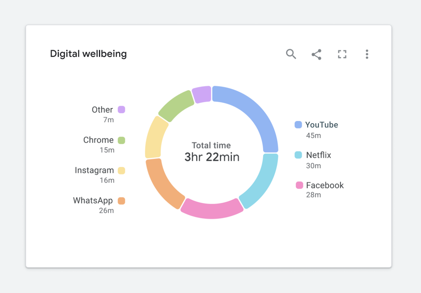
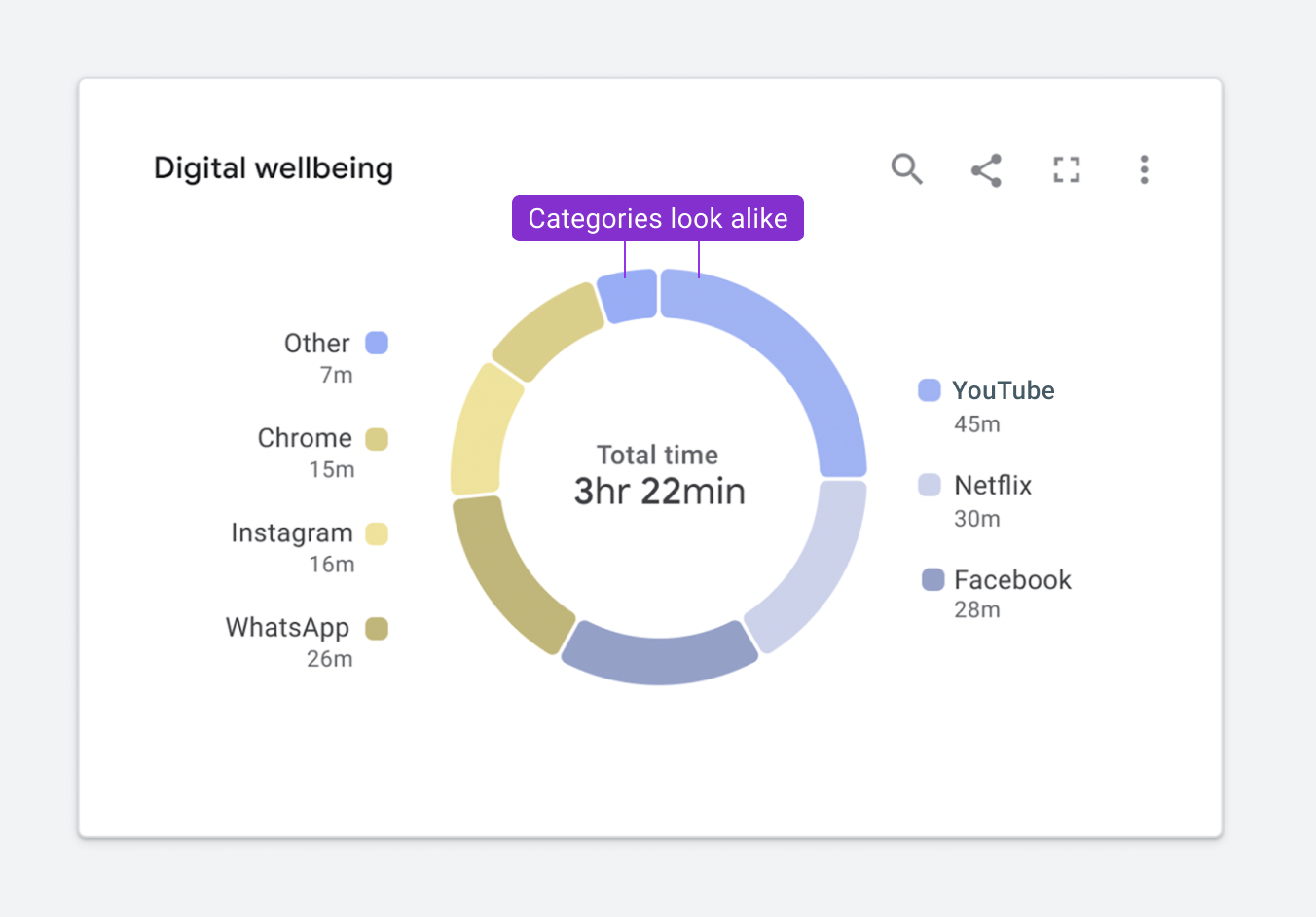
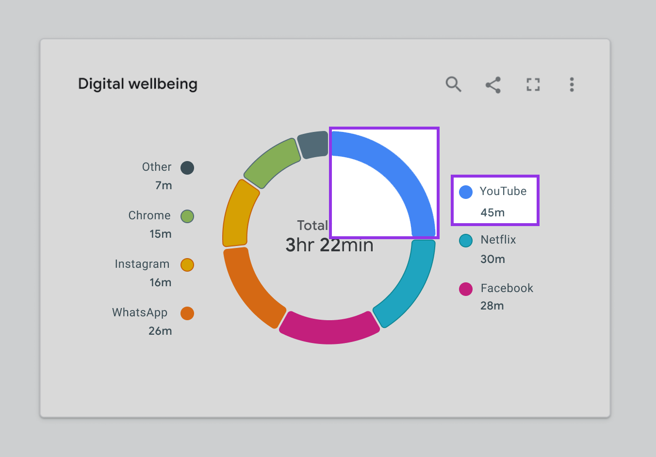
Figure 1.3 highlights how this same chart will appear to someone with a protanopia condition. You’ll notice that it is slightly less readable because the Other and YouTube categories appearing at the top of the donut are indistinguishable from one another.

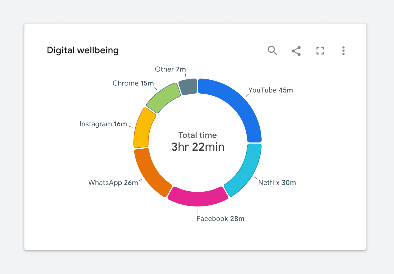
For someone with achromatopsia, the chart will appear as it does in Figure 1.4

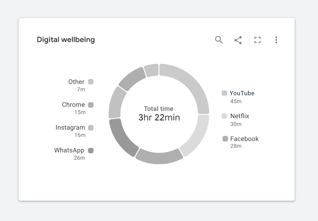
In this case, I’d argue that the chart isn’t really telling us anything. It’s nearly impossible to read, and swapping it out for a data table would be arguably more useful. At this point, you might be wondering how to fix this. Where should you start?

Start With Web Standards

Web standards can help us improve our design. In this case, Web Content Accessibility Guidelines (WCAG) will provide the most comprehensive set of requirements to start with. Guidelines call for two considerations. First, all colors must achieve the proper contrast ratio with their neighboring elements. Second, visualizations need to use something other than color to convey meaning. This can be accomplished by including a second encoding or adding text, images, icons, or patterns. While this article focuses on achieving WCAG 2.1 standards, the same concepts can be used to achieve WCAG 2.2 standards.

Web Standards Challenges

Meeting the web standards is trickier than it might first seem. Let’s dive into a few examples showing how difficult it is to ensure data will be understood at a glance while meeting the standards.

Challenge 1: Color Contrast

According to the WCAG 2.1 (level AA) standards, graphics such as chart elements (lines, bars, areas, nodes, edges, links, and so on) should all achieve a minimum 3:1 contrast ratio with their neighboring elements. Neighboring elements may include other chart elements, interaction states, and the chart’s background. Incidentally, if you’re not sure your colors are achieving the correct minimum ratio, you can check your palette here. Additionally, all text elements should achieve a minimum 4.5:1 contrast ratio with their background. Figure 1.5 depicts a sample categorical color palette that follows the recommended standards.

This is quite a bold palette. When applying a compliant palette to a chart, it might look like the example in Figure 1.6.

While this example meets the color contrast requirements, there’s a tradeoff. The chart’s focal point is now lost. The red segments at the bottom of each stacked bar represent the most important metrics illustrated in this chart. They represent errors or a count of items that need your attention. Since the chart features bold colors, all of which are equally competing for our attention, it’s now more difficult to see the items that matter most.

Challenge 2: Dual Encodings, Or Conveying Meaning Without Color

To minimize reliance on color to convey meaning, WCAG 2.1 (level A) standards also call for the use of something other than color to convey meaning. This may be a pattern, texture, icon, text overlay, or an entirely different visual encoding.

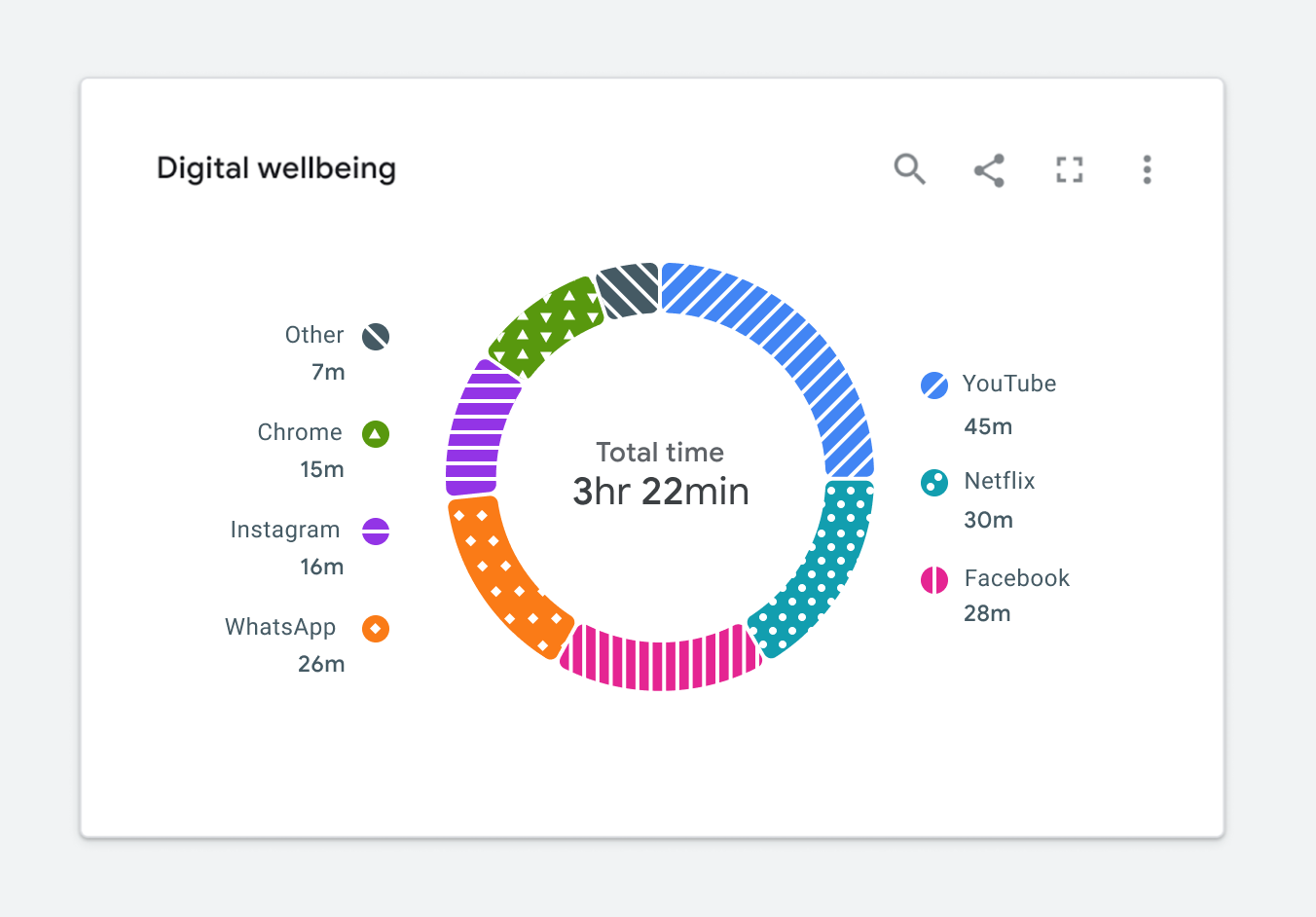
It’s easy to throw a pattern on top of a categorical fill color and call it a day, as illustrated in Figure 1.7. But is the chart still readable? Is it glanceable? In this case, the segments appear to run into one another. In his book, The Visual Display of Quantitative Information, Edward Tufte describes the importance of minimizing chartjunk or unnecessary visual design elements that limit one’s ability to read the chart. This begs the question, do the WCAG standards encourage us to add unnecessary chartjunk to the visualization?

Following the standards verbatim can lead us down the path of creating a really noisy visualization.

Let The Standards Empower vs Constrain Design

Over the past several years, my working group at Google has learned that it’s easier to meet the WCAG visual design requirements when they’re considered at the beginning of the design process instead of trying to update existing charts to meet the standard. The latter approach leads to charts with unnecessary chart junk, just like the one previously depicted in Figure 1.7, and minimized usability. Considering accessibility first will enable you to create a visualization that’s not only accessible but useful. We’re calling this our accessibility-first approach to chart design. Now, let’s see some examples.

Solving For Color Contrast

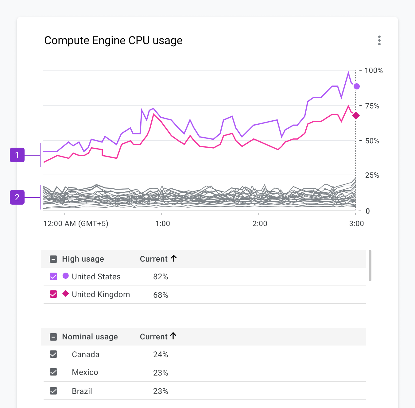
Let’s revisit the color contrast requirement via the example in Figure 1.8. In this case, the most important metric is represented by the red segments appearing at the bottom of each bar in the series. The red color represents a count of items in a failing state. Since both colors in this palette compete for our attention, it’s difficult to focus on the metric that matters most. The chart is no longer glanceable.

Focus On Essential Elements Only

By stretching the standards a bit, we can balance a11y and glanceability a lot better. Only the visual elements essential for interpreting the visualization need to achieve the color contrast requirement. In the case of Figure 1.8, we can use borders that achieve the required contrast ratio while using lighter fills to the point of focus. In Figure 1.9, you’ll notice your attention now shifts down to the metrics that matter most.

Figure 1.9. ✅ DO: Consider using a combination of outlines and fills to meet contrast requirements while maintaining a focal point. (Large preview)

Dark Themes For The Win

Most designers I know love a good dark theme like the one used in Figure 2.0. It looks nice, and dark themes often result in visually stunning charts.

More importantly, a dark theme offers an accessibility advantage. When building on top of a dark background, we can use a wider array of color shades that will still achieve the minimum required contrast ratio.

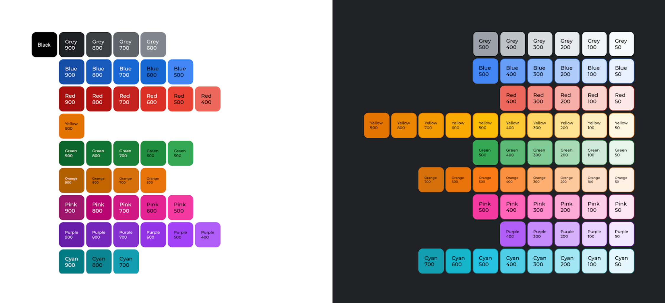
According to an audit conducted by Google’s Data Accessibility Working Group, the 61 shades of the Google Material palette from 2018 achieved the minimum 3:1 contrast ratio when placed on a dark background. This is depicted in Figure 2.1. Only 40 shades of Google Material colors achieved the same contrast ratio when placed on a white background. The 50% increase in available shades when moving from a light background to a dark background makes a huge difference. Having access to more shades enables us to draw focus to items that matter most.

With this in mind, let’s revisit the earlier donut chart example in Figure 2.2. For now, let’s keep the white background, as it’s a core part of Google’s brand.

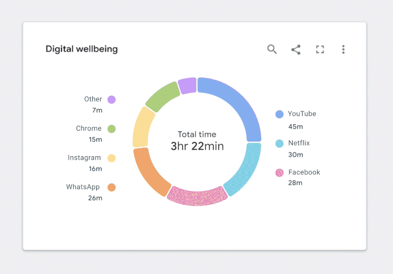
Figure 2.2. ✅ DO: Use a combination of fills and borders that achieve the minimum contrast ratios to improve the readability of your chart. (Large preview)

While this is a great first step, there’s still more work to do. Let’s take a closer look.

Solving For Dual Encodings And Minimizing Chartjunk

As shown in Figure 2.3, color is our only way of connecting segments in the donut to the corresponding categories in the legend. Despite our best efforts to follow color contrast standards, the chart can still be difficult to read for people with certain vision disabilities. We need a dual encoding, or something other than color, to convey meaning.

How might we do this without adding noise or reducing the chart’s readability or glanceability? Let’s start with the text.

Integrating Text And Icons

Adding text to a visualization is a great way to solve the dual encoding problem. Let’s use our donut chart as an example. If we move the legend labels into the graph, as illustrated in Figure 2.4, we can visually connect them to their corresponding segments. As a result, there is no longer a need for a legend, and the labels become the second encoding.

Let’s look at a few other ways to provide a dual encoding while maximizing readability. This will prevent us from running in the direction of applying unnecessary chart junk like the example previously highlighted in Figure 1.7.

Depending on the situation, shape of the data, or the available screen real estate, we may not have the luxury of overlaying text on top of a visualization. In cases like in Figure 2.5, it’s still okay to use iconography. For example, if we’re dealing with a very limited number of categories, the added iconography can still act as a dual encoding.

Some charts can have upwards of hundreds of categories, which makes it difficult to add iconography or text. In these cases, we must revisit the purpose of the chart and decide if we need to differentiate categories. Perhaps color, along with a dual encoding, can be used to highlight other aspects of the data. The example in Figure 2.6 shows a line chart with hundreds of categories.

We did a few things with color to convey meaning here:

Bright colors are used to depict outliers within the data set.
A neutral gray color is applied to all nominal categories.

In this scenario, we can once again use a very limited set of shapes for differentiating specific categories.

The Benefits Of Small Multiples And Sparklines

There are still times when it’s important to differentiate between all categories depicted in a visualization. For example, the tangled mess of a chart is depicted in Figure 2.7.

In this case, a more accessible solution would include breaking the charts into their own mini charts or sparklines, as depicted in Figure 2.8. This solution is arguably better for everyone because it makes it easier to see the individual trend for each category. It’s more accessible because we’ve completely removed the reliance on color and appended text to each of the mincharts, which is better for the screen reader experience.

Reserve Fills For Items That Need Your Attention

Earlier, we examined using a combination of fills and outlines to achieve color contrast requirements. Red and green are commonly used to convey status. For someone who is red/green colorblind, this can be very problematic. As an alternative, the status icons in Figure 2.9 reserve fills for the items that need your attention. We co-designed this solution with some help from customers who are colorblind. It’s arguably more scannable for people who are fully sighted, too.

Embracing Relevant Metaphors

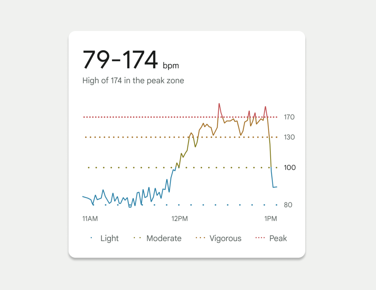
In 2022, we launched a redesigned Fitbit mobile app for the masses. One of my favorite visualizations from this launch is a chart showing your heart rate throughout the day. As depicted in Figure 3.0, this chart shows when your heart rate crosses into different zones. Dotted lines were used to depict each of these zone thresholds. We used the spacing between the dots as our dual encoding, which invokes a feeling of a “visual” heartbeat. Threshold lines with closely spaced dots imply a higher heart rate.

Continuing the theme of using fun, relevant metaphors, we even based our threshold spacing on the Fibonacci Sequence. This enabled us to represent each threshold with a noticeably different visual treatment. For this example, we knew we were on the right track as these accessibility considerations tested well with people who have color-deficient vision.

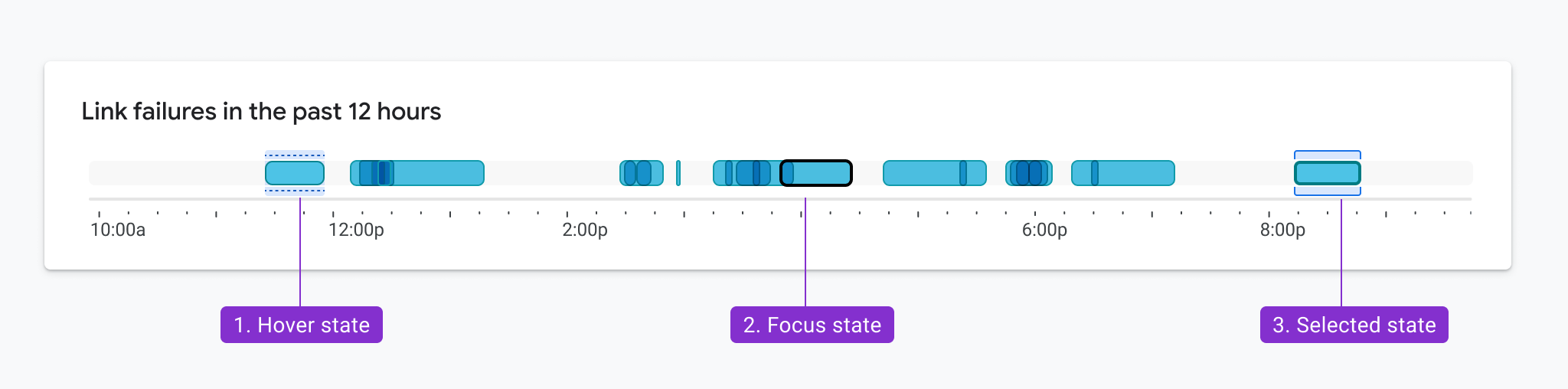
Accessible Interaction States

Color contrast and encodings also need to be considered when showing interactions like mouse hover, selection, and keyboard focus, like the examples in Figure 3.1. The same rules apply here. In this example, the hover, focus, and clicked state of each bar is delineated by elements that appear above and below the bar. As a result, these elements only need to achieve a 3:1 contrast ratio with the white background and not the bars themselves. Not only did this pattern test well in multiple usability studies, but it was also designed so that the states could overlap. For example, the hover state and selected state can appear simultaneously and still meet accessibility requirements.

Finding Your Inspiration

For some more challenging projects, we’ve taken inspiration from unexpected areas.

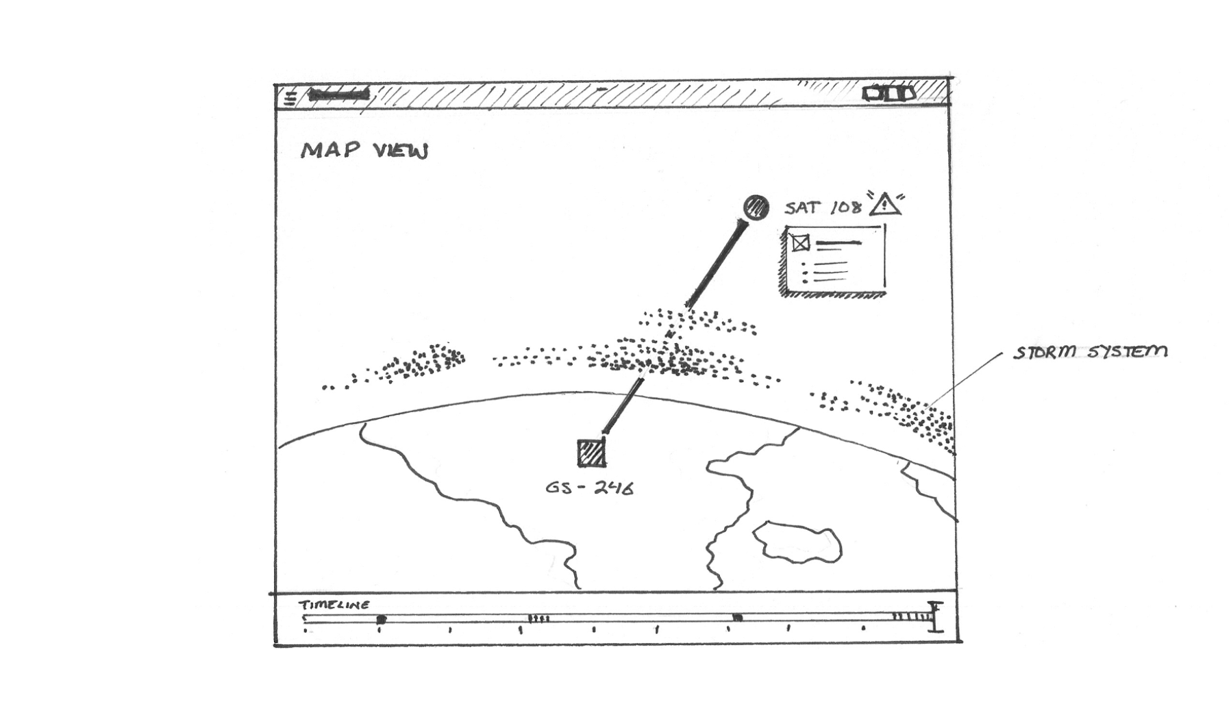
For example, we looked to nature (Figure 3.2) to help us consider methods for visualizing the effects of cloud moisture on an LTE network, as sketched in Figure 3.3.

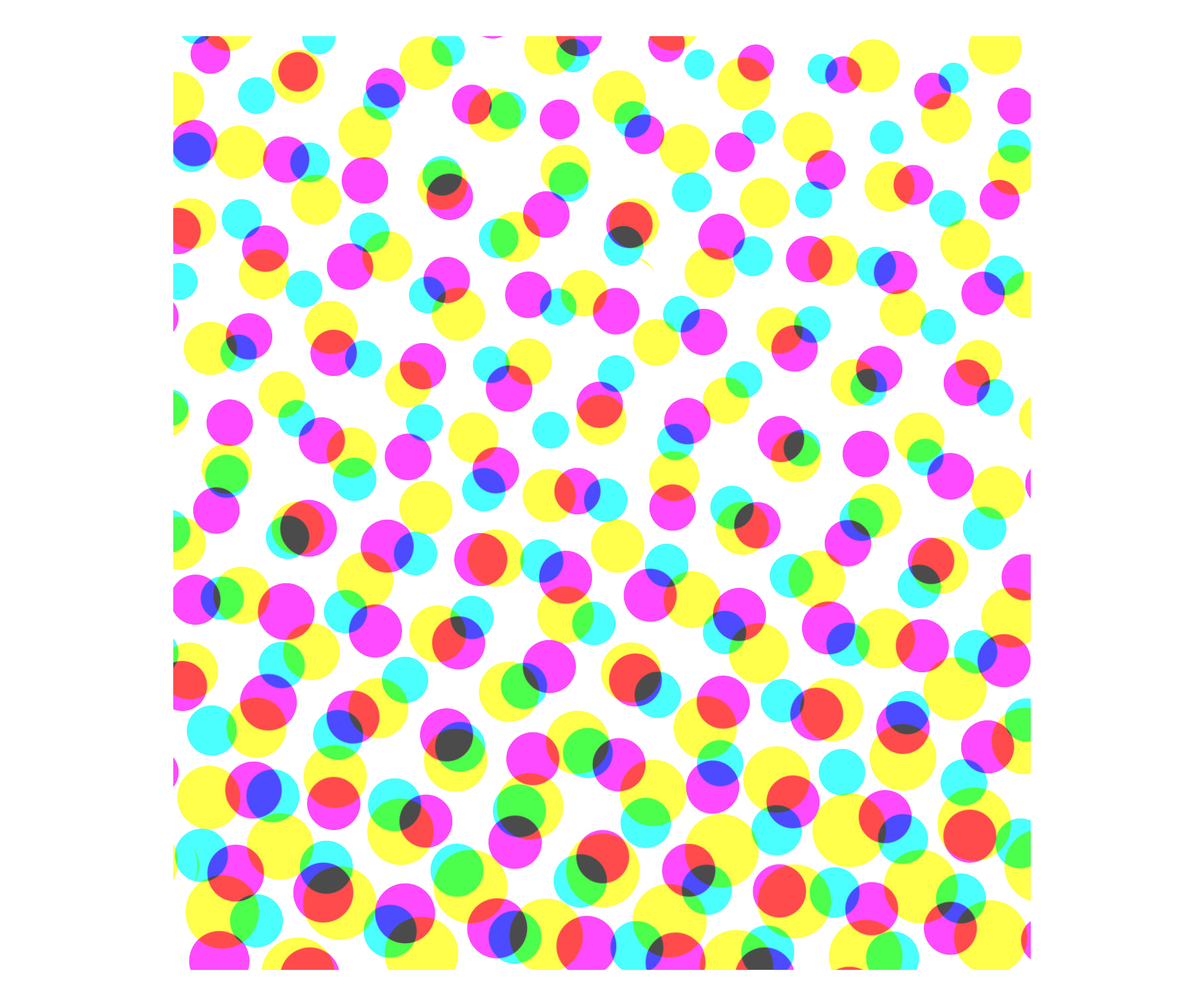
We’ve taken inspiration from halftone printing processes (Figure 3.4) to think about how we might reimagine a heatmap with a dual encoding, as depicted in Figure 3.5.

We’ve also taken inspiration from architecture and how people move through buildings (Figure 3.6) to consider methods for showing the scope and flow of data into a donut chart as depicted in Figure 3.7.

Figure 3.7. Applying inspiration from architecture and a building’s flow. (Large preview)

In this case, the animated inner ring highlights the scope of the donut chart when it’s empty and indicates that it will fill up to 100%. Animation is a great technique, but it presents other accessibility challenges and should either time out or have a stop control.

In some cases, we were even inspired to explore new versions of existing visualization types, like the one depicted in Figure 3.8. This case study highlights a step-by-step guide to how we landed on this example.

Getting People On Board With Accessibility

One key lesson is that it’s important to get colleagues on board with accessibility as soon as possible. Your compliant designs may not look quite as pretty as your non-compliant designs and may be open to criticism.

So, how can you get your colleagues on board? For starters, evangelism is key. Provide examples like the ones included here, which can help your colleagues build empathy for people with vision disabilities. Find moments to share the work with your company’s leadership team, spreading awareness. Team meetings, design critiques, AMA sessions, organization forums, and all-hands are a good start. Oftentimes, colleagues may not fully understand how accessibility requirements apply to charting or how their visualizations are used by people with disabilities.

While share-outs are a great start, communication is one way. We found that it’s easier to build momentum when you invite others to participate in the design process. Invite them into brainstorming meetings, design reviews, codesign sessions, and the problem space to help them appreciate how difficult these challenges are. Enlist their help, too.

By engaging with colleagues, we were able to pinpoint our champions within the group or those people who were so passionate about the topic they were willing to spend extra time building demos, prototypes, design specs, and research repositories. For example, at Google, we were able to publish our Top Tips for Data Accessibility on the Material Design blog.

Aside from good citizenship and building a grassroots start, there are ways to get the business on board. Pointing to regulations like Section 508 in America and the European Accessibility Act are other good ways to encourage your business to dive deeper into your product’s accessibility. It’s also an effective mechanism for getting funding and ensuring accessibility is on your product’s roadmap. Once you’ve made the business case and you’ve identified the accessibility champions on your team, it’s time to start designing.

Conclusion

Accessibility is more than compliance. Accessibility considerations can and will benefit everyone, so it’s important not to shove them into a special menu or mode or forget about them until the end of the design process. When you consider accessibility from the start, the WCAG standards also suddenly seem a lot less constraining than when you try to retrofit existing charts for accessibility.

The examples here were built over the course of 3 years, and they’re based on valuable lessons learned along the way. My hope is that you can use the tested designs in this article to get a head start. And by taking an accessibility-first approach, you’ll end up with overall better data visualizations — ones that fully take into account how all people gather, accumulate, and process information.

Resources

To get started thinking about data accessibility, check out some of these resources:

Getting started

Google’s Top Tips for Data Accessibility
Color and contrast
A comprehensive guide for exploring and learning about the theory, science, and perception of color and contrast.
Introduction to accessible contrast and color for data visualization
A series of Observable notebooks on using contrast and patterns to distinguish marks in accessible data visualizations.

ACM

Color blind accessibility manifesto

Contrast checking tool

Contrast-Ratio.com

WCAG requirements

Guidelines for text contrast contrast
Guidelines for graphic color contrast

Material design best practices and specs

Accessibility with Material 3
“Google’s Six Principles for Designing Any Chart,” Manuel Lima
Data Visualization in Material Design

We’re incredibly proud of our colleagues who contributed to the research and examples featured in this article. This includes Andrew Carter, Ben Wong, Chris Calo, Gerard Rocha, Ian Hill, Jenifer Kozenski Devins, Jennifer Reilly, Kai Chang, Lisa Kaggen, Mags Sosa, Nicholas Cottrell, Rebecca Plotnick, Roshini Kumar, Sierra Seeborn, and Tyler Williamson. Without everyone’s contributions, we wouldn’t have been able to advance our knowledge of accessible chart visual design.

Iconic Go.Compare mascot gets a playful rebrand

Original Source: https://www.creativebloq.com/news/go-compare-rebrand

Love him or hate him, Gio’s here to stay.

Milaq Branding & Visual Identity Design Insights

Original Source: https://abduzeedo.com/milaq-branding-visual-identity-design-insights

Milaq Branding & Visual Identity Design Insights

abduzeedo0214—24

Discover how Milaq’s visual identity and branding, crafted by Iliass Sabouny, sets new standards in the ride-hailing industry, emphasizing innovation, reliability, and user focus.

In the competitive landscape of ride-hailing services, standing out requires more than just efficient logistics; it demands a compelling brand identity that resonates with users on a deeper level. This is precisely where the Milaq brand, through the creative genius of Iliass Sabouny, shines brightly, showcasing a masterclass in branding and visual identity.

Milaq’s journey began with a clear mission: to transcend traditional transportation services and offer a seamless, enjoyable experience to its users. Sabouny’s approach to crafting the visual identity for Milaq was rooted in this mission, focusing on innovation, reliability, and customer-centricity. The result is a branding strategy that not only captures the essence of Milaq but also sets it apart in the ride-hailing market.

The logo design, a cornerstone of any branding effort, speaks volumes about Milaq’s ethos. It’s more than a symbol; it’s a promise of quality and a beacon of innovation. Sabouny’s work meticulously bridges the gap between visual appeal and functional design, ensuring the logo encapsulates the forward-thinking vision of Milaq.

The color palette, typography, and imagery chosen for Milaq’s branding further reinforce the brand’s core values. Each element is carefully selected to evoke a sense of reliability and trustworthiness, while also appealing to the modern, tech-savvy consumer. The integration of these design elements creates a cohesive visual narrative that enhances the user’s journey from the moment they engage with the brand.

Sabouny’s design for Milaq is a testament to the power of thoughtful branding. It not only achieves a distinctive look and feel for the brand but also aligns with its strategic objectives, ensuring that every touchpoint with customers reinforces Milaq’s mission. This project exemplifies how effective visual identity and branding can elevate a company within its industry, making it a case study worth exploring for anyone interested in the intersection of design and business strategy.

For designers and brands alike, Milaq’s branding journey offers valuable insights into creating a visual identity that resonates with users and stands the test of time. It underscores the importance of aligning design with a brand’s core values and mission, ensuring that every element of the visual identity contributes to a singular, compelling narrative.

Branding and visual identity artifacts

brand identity branding  Brand Design Advertising  visual identity Logo Design logo Logotype ride hailing ridebrand identity branding  Brand Design Advertising  visual identity Logo Design logo Logotype ride hailing ride

brand identity branding  Brand Design Advertising  visual identity Logo Design logo Logotype ride hailing ride

brand identity branding  Brand Design Advertising  visual identity Logo Design logo Logotype ride hailing ride

brand identity branding  Brand Design Advertising  visual identity Logo Design logo Logotype ride hailing ride

brand identity branding  Brand Design Advertising  visual identity Logo Design logo Logotype ride hailing ride

brand identity branding  Brand Design Advertising  visual identity Logo Design logo Logotype ride hailing ride

brand identity branding  Brand Design Advertising  visual identity Logo Design logo Logotype ride hailing ride


brand identity branding  Brand Design Advertising  visual identity Logo Design logo Logotype ride hailing ride

brand identity branding  Brand Design Advertising  visual identity Logo Design logo Logotype ride hailing ride

brand identity branding  Brand Design Advertising  visual identity Logo Design logo Logotype ride hailing ride


brand identity branding  Brand Design Advertising  visual identity Logo Design logo Logotype ride hailing ride

brand identity branding  Brand Design Advertising  visual identity Logo Design logo Logotype ride hailing ride

brand identity branding  Brand Design Advertising  visual identity Logo Design logo Logotype ride hailing ride

For more information make sure to check out Iliass Sabouny on Behance. 

BuhoCleaner for Mac Just Got Better (Review)

Original Source: https://www.hongkiat.com/blog/buhocleaner-for-mac/

Over time, your Mac gets filled with stuff you don’t need anymore: old files, duplicate photos, and apps you forgot you had. Just like a cluttered closet makes it hard to find what you want, a cluttered Mac will eventually slow down everything you do on your Mac. That’s where a Mac cleaner app, like BuhoCleaner, comes in handy.

Think of it as a personal helper to tidy up your Mac, getting rid of all the stuff you don’t need and making it run faster and smoother.

BuhoCleaner Interface on Mac

BuhoCleaner doesn’t just clean up; it also helps organize everything. It finds apps you don’t use and removes them safely, ensuring they don’t leave any mess behind. It also helps protect your privacy by clearing out your browsing history and cookies, keeping your online activities just for you.

BuhoCleaner Features:

With the latest update, BuhoCleaner is made to work perfectly with the latest macOS Sonoma and runs great whether you have a newer Mac or an older one. In this post, we’re going to explore the capabilities of this Mac cleaning app.

Cleaning Mac in one click

Flash Clean is a handy tool that helps you locate and remove unnecessary files from your Mac. Just hit the “Scan” button, and it will perform an in-depth search of your file system.

One-Click Clean Feature

It carefully sifts through both user and system caches, along with user log files, to identify and get rid of all that unwanted clutter. By doing so, it helps free up valuable disk space.

Junk Files Detected Screenshot

However, it’s important to remember that you’ll need to grant the app full disk access so it can thoroughly explore your file system.

Finding and Deleting Duplicate Files

The “Duplicates” feature in BuhoCleaner assist Mac users in effectively finding and removing duplicate files and folders from their system. Its goal is to make the cleanup of unnecessary copies straightforward, thereby freeing up essential disk space and enhancing the performance of the computer. By focusing on duplicates, it enables users to keep their file system well-organized and efficient.

Duplicates feature
Uninstall Mac apps easily

Uninstalling apps on a Mac is as simple as dragging the app file to the trash. However, this method often leaves behind remnants—bits of the app stored in various places like your documents folder.

The “App Uninstall” feature takes the hassle out of cleaning up your Mac. It offers a straightforward and user-friendly interface that displays all the apps you’ve installed. With just a few clicks, you can identify and remove the ones you no longer use, including those pesky leftover files that hide in other folders or areas of your system.

App Uninstall Interface
Identify and delete large files

The “Large Files” feature is like a magnifying glass for your computer. It helps you spot the big, space-hogging files hidden in your file system. When you click “Scan,” BuhoCleaner brings these bulky files into view.

It organizes them by size and the last date you accessed them, allowing you to decide what to do next. You can bulk delete them or preview each one before deciding whether to delete it.

Large Files Finder
Inspect Mac’s startup items

Startup items are essentially apps or components that automatically launch every time you turn on your Mac or log into your account. They’re quite convenient, saving you the hassle of manually opening them each time. However, having too many can slow down your Mac.

BuhoCleaner’s Startup Item Management feature is designed to help you find and manage these items. It provides a list of all the apps that spring to life when your Mac starts. More importantly, it lets you to decide which ones to keep and which to remove, ensuring a smoother, faster startup.

Startup Items Management
Deep scan Mac’s file system

The “Disk Space Analyzer” feature, found within the Toolkit option, performs an in-depth scan of your entire system. It then presents a visual representation of how your disk space is being used, helping you decide which files and folders are taking up too much space and whether you should remove them.

Disk Space Analyzer Overview

This feature is similar to the previously mentioned “Flash Clean,” but it goes further, reaching into every nook and cranny of your Mac. To allow the app to create a complete map of your storage, you’ll need to grant it full access to your disk.

Shreddering sensitive files

The “Shredder” feature, also found under the Toolkit option, allows users to permanently delete files or folders they no longer need while addressing security and privacy concerns. It securely overwrites the space previously occupied by the deleted file, making it nearly impossible for anyone or any software tool to retrieve or recover it, even if they know where to look.

File Shredder Feature

This feature is particularly useful when handling sensitive information such as personal details, confidential business documents, or anything you wouldn’t want to fall into the wrong hands.

BuhoCleaner’s Prices:

You can try the fully functional BuhoCleaner for FREE. The only limitation of the free version is how many files you can delete automatically. The trial version allows you to automatically delete the first 3GB of junk files for free. After reaching the 3GB limit, you can manually delete the remaining files.

BuhoCleaner Pricing Plans

They offer a couple of competitively priced plans that unlock this limitation, as follows:

Single Plan – (1 Mac/Lifetime) Regular Price $29.99 -> 2024 New Year Sale $19.99 -> Additional Discount $14.99 (Coupon Code: HONKIA23SG)
Family Plan – (3 Macs/Lifetime) Regular Price $45.99 – 2024 New Year Sale $29.99 -> Additional Discount $22.49 (Coupon Code: HONKIA23SG)
Business Plan – (10 Macs/Lifetime) Regular Price $71.99 -> 2024 New Year Sale $49.99 -> Additional Discount $37.49 (Coupon Code: HONKIA23SG)

All plans come with lifetime free upgrades!

Download BuhoCleaner

Final Thoughts

In this post, I’m sharing just a few features of the app that I particularly like, but keep in mind, these are merely a few of the features the app offers. The app has much more to offer than what’s mentioned here.

You can download Buhcleaner for free and give it a try, or you can unlock all its features with a one-time payment of $19.99. Plus, you can get an additional 20% off by using this promotional code: HONKIA23SG.

The post BuhoCleaner for Mac Just Got Better (Review) appeared first on Hongkiat.

AI can "Enhance your creativity rather than hinder it," says technical artist Vishal Ranga

Original Source: https://www.creativebloq.com/features/nvidia-rtx-4070-vishal-ranga

Is there a place for AI in 3D art and game development?

10 Deepfake Tools to Have Fun With

Original Source: https://www.hongkiat.com/blog/deep-fake-tools/

Are you ready to unleash your inner digital artist and blur the lines between reality and imagination? Our latest blog post, “10 Deepfake Tools to Have Fun With,” serves as your ultimate guide to the fascinating world of AI-driven creativity. With these tools, you can swap faces, animate photos, or even create lifelike videos with ease.

Designed for both novices and seasoned pros, this selection promises to spark your creativity and expand your digital horizons. As we dig into each tool, let’s embrace the innovative spirit of AI while adhering to ethical guidelines. Prepare to explore how deepfake technology can transform your content creation process, making it more engaging and fun than ever before.

Deepfakes Web
Deepfakes WebDeepfakes Web

Deepfakes Web is an online tool that enables the creation of deepfake videos through advanced AI technology. This platform allows for face swapping in videos, with the outcome’s quality largely dependent on the input video and the effectiveness of AI training. Users have the advantage of reusing their AI models for enhancing or creating new deepfakes, saving time and effort.

The website stresses ethical use, encouraging users to review its content policy and terms of use carefully. It’s designed for those interested in the creative and responsible application of AI in video creation.

DeepFaceLab
DeepFaceLabDeepFaceLab

DeepFaceLab is used to create deepfake videos, blending the lines between reality and digital fabrication. It utilizes cutting-edge machine learning to enable face swapping in videos, offering users the ability to produce content that’s astonishingly lifelike. Suitable for entertainment, education, or research, DeepFaceLab provides a robust set of tools for exploring the potential of deepfakes.

It supports a range of manipulations from basic face swaps to intricate alterations, accommodating users at all skill levels. While it highlights the advancements in AI, it also underscores the importance of ethical considerations in its application.

DeepBrain
DeepBrainDeepBrain

DeepBrain AI introduces a transformative approach to video production with its leading AI Video Generator. This tool is essential for anyone aiming to craft high-quality videos with efficiency. Featuring lifelike AI avatars, seamless text-to-speech, and robust text-to-video functions, it’s tailored for speeding up video creation across various projects. Ideal for training materials, newsletters, or captivating marketing videos, DeepBrain AI streamlines the entire process.

The video creation journey is simplified into three steps: generating a voiceover in over 80 languages, choosing from an array of AI avatars or designing a custom one, and enhancing the video with graphics and music. It’s an invaluable resource for businesses and individual creators seeking to expand their video output without the extensive costs associated with traditional methods. Starting is easy and doesn’t require a credit card, making it accessible for all to leverage AI in video production.

Deepswap.ai
Deepswap.ai

Deepswap.ai is an innovative online platform that simplifies the creation of deepfake videos and images. It enables users to effortlessly swap faces in multimedia content, delivering impressively realistic results. The tool is recognized for its rapid processing capabilities, eliminating the frustration of waiting.

With the promise of high-quality outcomes and the freedom to experiment with any combination of videos and faces, Deepswap.ai empowers users to explore the potential of deepfake technology with ease and creativity.

Synthesia.io
Synthesia.ioSynthesia.io

Synthesia.io transforms text into high-quality videos in minutes, leveraging AI to offer a seamless video creation experience. With the ability to generate AI avatars and voiceovers in over 120 languages, it’s an ideal tool for a wide range of applications, from e-learning to customer support.

This tool enables users to easily convert articles into engaging videos, enhancing the viewer’s experience while saving time and resources. Customize your content with various avatars, languages, and even your own voice, making each video uniquely tailored to your audience.

Hoodem.com
Hoodem.comHoodem.com

Hoodem offers a straightforward platform for creating high-definition deepfake videos quickly and ethically. By simply uploading a video and choosing a face to superimpose, users can produce realistic deepfakes for various purposes. Hoodem prioritizes ethical standards, ensuring user privacy and adherence to data protection laws.

The tool is designed for short videos, up to 2 minutes, focusing on quality and ease of use. Hoodem empowers users to explore advanced video editing through deep learning, promoting responsible creation within a secure environment.

Akool Deepfake
Akool DeepfakeAkool Deepfake

Akool’s face swap app is a user-friendly tool that lets anyone, from beginners to tech novices, easily create professional-looking face swap videos and creative marketing content. It’s designed to be straightforward, with most new users able to produce their first high-quality image or video in under 10 minutes.

For those more experienced, it can take even less than two minutes. This app opens up a world of business and creative possibilities, allowing users to generate AI-powered photos and videos quickly. It’s all about unleashing creativity without the need for a steep learning curve.

Unboring by Reface.ai
Unboring by Reface.aiUnboring by Reface.ai

Meet Unboring, the go-to online tool that turns your videos and photos into animated, cartoon-style creations with just a few clicks! Whether you’re looking to transform yourself into a cartoon for cosplay, make your pets look even cuter, or simply add a fun twist to your videos, Unboring has got you covered.

With its user-friendly interface, you don’t need any professional editing skills to create amazing results. Plus, it’s incredibly fast, offering a wide variety of styles that are regularly updated. From face swapping to making your photos sing and dance, Unboring promises hilariously entertaining results without the hassle.

Swapper by icons8
Swapper by icons8Swapper by icons8

Ever stumbled upon those quirky videos where faces are swapped, making it look like someone else is in the scene? That’s exactly what the Face Swapper app by Icons8 does.

It’s a clever little tool that uses artificial intelligence to detect faces in photos and swap them with others. You can either upload your own photos or pick from their gallery to create these amusing or sometimes uncanny deepfake videos. Whether it’s for a laugh, a project, or just to see what you’d look like in a movie scene, Face Swapper makes it surprisingly easy to step into someone else’s shoes, visually at least!

AnyoneSwap
AnyoneSwapAnyoneSwap

Anyoneswap is a nifty online tool designed to make face-swapping in photos a breeze. Gone are the days of spending hours trying to edit your face into another photo. With just a click, Anyoneswap lets you replace the face in any photo with yours.

It’s all about quick, hassle-free editing, making it perfect for creating fun images in no time.

Final Thoughts

And just like that, we’ve zipped through the wild world of deepfake tech, uncovering tools that practically turn us into wizards of the digital age. It’s been a blast seeing all the ways we can tweak reality, have a laugh, or even wow our friends with some seriously cool tricks.

But hey, let’s not forget to play it cool and keep things on the up-and-up. Using these tools means wearing the big ethical hat – making sure our fun doesn’t tread on anyone’s toes. So, get creative, and remember: with great power (or great tools) comes great responsibility.

Here’s to creating amazing stuff, responsibly!

The post 10 Deepfake Tools to Have Fun With appeared first on Hongkiat.

Understanding 404 and Other Common HTTP Errors

Original Source: https://www.hongkiat.com/blog/common-http-errors/

Have you ever encountered a puzzling “404 Not Found” message or other HTTP errors while browsing the web and wondered what they actually mean? Understanding HTTP status codes is not just a curiosity – it’s a necessity for website owners and tech enthusiasts alike. In this comprehensive guide, we’ll dive deep into the world of HTTP errors, from the well-known 404 to the more obscure 500 series.

Our aim is to demystify these error messages, explain their causes, and provide practical solutions for both web users and website administrators. Whether you’re looking to enhance your website’s user experience, improve its SEO, or simply satisfy your tech curiosity, this guide has got you covered. Let’s explore the fascinating world behind these error codes and learn how to effectively manage them for a smoother web experience.

Decoding Status Codes

Every error page online is associated with an HTTP status code from the server. These codes are three-digit numbers, with the first digit defining the code’s category:

1XX status codes are informational
2XX signals successful operations
3XX denotes redirections

These first three categories don’t lead to HTML error pages. In these cases, the client knows the next steps and proceeds without issue. The more noticeable codes are the 4XX and 5XX types:

4XX codes point to client-side errors
5XXs indicate server-side issues

HTML error pages appear in these scenarios because the client is unsure of how to proceed. Let’s delve into what occurs behind the scenes during these errors and how to handle them.

Client-Side Errors (4XX)
400 – Bad Request

When a server can’t understand a request from the client, a 400 Bad Request error appears. This often occurs when the browser’s data doesn’t follow the HTTP protocol rules, leading to a request with malformed syntax.

400 Bad Request Error Page400 Bad Request Error Page

A 400 error typically suggests an issue on the client side, like a compromised operating system, unstable internet connection, browser errors, or cache issues. It’s wise to troubleshoot your device first—try opening the webpage in a different browser, clear the cache, or check for security updates. Consistent 400 errors across various sites might signal the need for a thorough security check of your PC or Mac.

401 – Authorization Required

A 401 Authorization Required code appears when accessing a password-protected webpage. Initially, you’ll see a popup for login credentials rather than a direct error message.

401 Authorization Required Page401 Authorization Required Page

If you have the right credentials, you can access the site. If not, you’ll be redirected to the Authorization Required error page. For website owners, you can implement this protection through your cPanel account.

Setting Password Protection in cPanelSetting Password Protection in cPanel

To add password protection, go to the “Password Protect Directories” option in the “Security” section of cPanel. This is an effective way to secure areas like the wp-admin folder in WordPress sites.

403 – Forbidden

The 403 Forbidden error occurs when the server refuses a client’s request without an explanation. It’s not due to malformed requests or authorization issues.

Common causes include restrictions set by website owners against browsing the site’s file directory or certain files not being permitted for web viewing.

403 Forbidden Error Page403 Forbidden Error Page

Setting up a 403 error can enhance your website’s security by concealing its directory structure or sensitive files. Many web hosts offer this protection by default. To add it manually, access the Advanced section in cPanel and select Index Manager.

Configuring Index Manager in cPanelConfiguring Index Manager in cPanel

Here, you can control how visitors interact with specific directories on your site. Choosing No Indexing will result in a 403 error for anyone trying to access that directory.

404 – Not Found

The 404 error is the most recognizable HTTP status code. It’s displayed by the browser when the server can’t find the requested location. This can happen if a visitor mistypes the URL, or the site’s permalink structure has changed, leaving old links pointing to non-existent pages. Sometimes, 404s occur on top-level URLs, often due to a recent server move where the DNS still points to the old location. These issues generally resolve themselves quickly.

404 Not Found Error Page404 Not Found Error Page

Despite some SEO experts suggesting otherwise, Google states that “404 errors don’t impact your site’s ranking in Google, and you can safely ignore them.” However, it’s still beneficial to minimize 404s as they can increase your site’s bounce rate. A common solution is to use 301 redirects for permanently removed pages and 302 redirects for temporarily unavailable ones.

Read also:

Creative Error 404 Pages – Part I
Creative Error 404 Pages – Part II

408 – Request Time-Out

A 408 Request Time-Out error occurs when a client’s request takes too long, leading the server to time out and close the connection. This happens if the server doesn’t receive a complete request within its waiting timeframe. Persistent 408 errors could be due to heavy loads on the server or the client’s system.

408 Request Time-Out Page408 Request Time-Out Page

Occasionally, both the client and server are functioning correctly, but temporary internet surges can delay message delivery. Like with 404s, many websites customize their 408 error pages. Typically, a simple page refresh using the F5 button can resolve a 408 error.

410 – Gone

The 410 Gone error is similar to the 404 but with a key difference. While both indicate the server can’t find the requested file, the 410 error explicitly signifies a permanent condition. It tells the client that the resource was deliberately made unavailable and that any incoming links should be removed. Unlike the 404, which leaves room for uncertainty about the file’s permanence, a 410 error is a definitive statement.

410 Gone Error Page410 Gone Error Page

For those managing servers, it’s important to know how Google crawlers differentiate between 404s and 410s. In this video, Matt Cutts from Google discusses this distinction. Properly differentiating between 404 and 410 errors can improve your site’s standing with Google.

Server Errors (5XX)
500 – Internal Server Error

The 500 Internal Server Error is a common server-side error that arises from an unexpected issue preventing the server from fulfilling a request. As a catch-all error, it’s used when other specific 5XX server-side errors don’t apply.

500 Internal Server Error Page500 Internal Server Error Page

Even though the issue is server-related, you can try actions like reloading the page, clearing your browser’s cache, or deleting cookies and restarting the browser to resolve it. If the problem persists, inform the webmaster. If you encounter this error on your own site, check for a permission error, a corrupt .htaccess file, or a low memory limit. WordPress users should also consider a problematic third-party plugin and deactivate plugins one at a time to identify the issue.

502 – Bad Gateway

The 502 error occurs due to communication issues between two servers. It happens when the client connects to a server acting as a gateway or proxy, which then tries to access an upstream server for additional services. An example is an Apache server accessed by a proxy server, or a large ISP’s name server accessed by a local name server.

Encountering a Bad Gateway error means the server received an invalid response from an upstream server.

502 Bad Gateway Error Page502 Bad Gateway Error Page

This error typically indicates a disagreement in data exchange protocols between servers rather than an outright failure of the upstream server. Contact your hosting provider if you see a 502 error on your site.

503 – Service Temporarily Unavailable

The 503 Service Temporarily Unavailable error appears during server overloads or maintenance periods, indicating the server is currently unavailable but the condition is temporary.

503 Service Temporarily Unavailable Page503 Service Temporarily Unavailable Page

Website owners should be knowledgeable about the 503 status to manage scheduled maintenance properly, as improper handling can affect the site’s search engine ranking. For guidance, refer to tutorials on Yoast’s SEO blog or moz.com.

Learn how to handle this at Yoast and Moz.

504 – Gateway Time-Out

The 504 Gateway Time-Out error is another server-server communication issue, similar to the 502 error. It occurs when a lower-level server doesn’t receive a timely response from an upstream server it’s trying to access.

This time-out issue, akin to the 408 Request Time-Out error between client and server, usually signals slow communication between the two servers or the possibility that the upstream server is down.

504 Gateway Time-Out Error Page504 Gateway Time-Out Error Page

As 504 errors involve network issues beyond typical user control, addressing them requires access to the network’s backend. In many cases, simply refreshing the page after a few minutes can resolve the issue, assuming the service providers are actively working on the problem.

Wrapping Up

In conclusion, understanding HTTP status codes is more than a technical necessity; it’s an essential part of creating a seamless online experience for both website owners and visitors. From the common 404 Not Found to the more complex 500 Internal Server Error, each code offers valuable insights into the health and functionality of a website. By effectively recognizing and addressing these errors, website administrators can significantly enhance site performance, improve user satisfaction, and maintain optimal SEO rankings.

Remember, each error code is an opportunity to troubleshoot, improve, and evolve your website. Armed with the knowledge from this guide, you’re now better equipped to handle these challenges and ensure that your site remains accessible, efficient, and user-friendly. Let’s embrace these codes not as hurdles, but as stepping stones towards a more robust and resilient web presence.

The post Understanding 404 and Other Common HTTP Errors appeared first on Hongkiat.

Building Interactive Data Visualizations with D3.js and React

Original Source: https://www.sitepoint.com/d3-js-react-interactive-data-visualizations/?utm_source=rss

Building Interactive Data Visualizations with D3.js and React

Learn how to integrate React and D3.js to create responsive data visualizations (bar, pie, chloropeth), handle data loading, and manipulate elements.

Continue reading
Building Interactive Data Visualizations with D3.js and React
on SitePoint.