Building a WebGL Carousel with React Three Fiber and GSAP

Original Source: https://tympanus.net/codrops/2023/04/27/building-a-webgl-carousel-with-react-three-fiber-and-gsap/

Learn how to create an interactive 3D carousel using WebGL, React Three Fiber, and GSAP with this step-by-step tutorial.

How to Get Started with Amazon’s Simple Notification Service

Original Source: https://www.sitepoint.com/amazon-sns-introduction/?utm_source=rss

How to Get Started with Amazon's Simple Notification Service

Learn about Amazon SNS, a cloud-based messaging service for sending notifications to endpoints including email, SMS, and mobile push.

Continue reading
How to Get Started with Amazon’s Simple Notification Service
on SitePoint.

What’s New in Node.js 20

Original Source: https://www.sitepoint.com/node-js-20-new/?utm_source=rss

What's New in Node.js 20

Node.js 20 was released in April 2023. Learn about the new options available to developers with the world’s most-used JavaScript runtime.

Continue reading
What’s New in Node.js 20
on SitePoint.

Case Study: Studiogusto

Original Source: https://tympanus.net/codrops/2023/04/25/case-study-studiogusto/

Get a glimpse of the creative and innovative techniques used by Studiogusto, a dynamic agency, in designing their new website to better reflect their values and showcase their expertise.

The Importance of Color Contrast in Web Design

Original Source: https://1stwebdesigner.com/the-importance-of-color-contrast-in-web-design/

One of the most important aspects of web design is color contrast, which refers to the difference in brightness and/or color between two elements on a page. In this article, we’ll explore why color contrast is important for accessibility, and provide some code examples to help you improve the color contrast on your own website.

Your Designer Toolbox
Unlimited Downloads: 500,000+ Web Templates, Icon Sets, Themes & Design Assets
DOWNLOAD NOW
Why is color contrast important for accessibility?

Color contrast is important for accessibility because it allows users with visual impairments to easily distinguish between different elements on a page. For example, a user with color blindness may have difficulty differentiating between text and background colors that are too similar. Similarly, a user with low vision may struggle to read text that is too small or doesn’t have enough contrast with its background.

To ensure that your website is accessible to all users, it’s important to consider the contrast between all elements on your page, including text, graphics, and backgrounds. The Web Content Accessibility Guidelines (WCAG) provide specific guidelines for color contrast ratios that must be met in order to ensure accessibility for all users.

What are the WCAG color contrast guidelines?

The WCAG provides specific guidelines for color contrast ratios based on the size and weight of the text being displayed. The guidelines are divided into two levels: Level AA and Level AAA. Level AA is the minimum standard for web accessibility, while Level AAA provides a higher level of accessibility for users with more severe visual impairments.

For Level AA compliance, the WCAG requires a contrast ratio of at least 4.5:1 for normal text and 3:1 for large text (18pt or 14pt bold). For Level AAA compliance, the contrast ratio must be at least 7:1 for normal text and 4.5:1 for large text.

To calculate the contrast ratio between two colors, you can use a tool such as the Contrast Checker from WebAIM. Simply enter the hex codes for your foreground and background colors, and the tool will calculate the contrast ratio for you.

Code examples for improving color contrast

Here are some code examples to help you improve the color contrast on your own website:

Increase text contrast

To increase the contrast between your text and background, you can adjust the color of your text or background. For example, if you have white text on a light gray background, you could darken the background or lighten the text to improve the contrast.

/* Before */
body {
background-color: #f2f2f2;
}
h1 {
color: #ffffff;
}

/* After */
body {
background-color: #d6d6d6;
}
h1 {
color: #ffffff;
}

Add text shadows

Another way to improve text contrast is to add a text shadow. This can help the text stand out from its background, especially if the background is a pattern or image that makes it difficult to read text.

/* Before */
h2 {
color: #ffffff;
background-image: url("background.jpg");
}

/* After */
h2 {
color: #ffffff;
text-shadow: 1px 1px #000000;
background-image: url("background.jpg");
}

Use a color contrast checker

To ensure that your website meets the WCAG guidelines, you can use a color contrast checker. There are many free online tools available, such as the Contrast Checker from WebAIM or the Contrast Checker from Acart Communications.

/* Before */
body {
background-color: #ffffff;
color: #dddddd;
}

/* After */
body {
background-color: #ffffff;
color: #333333;
}

Avoid color combinations that are difficult to read

Certain color combinations can be difficult to read, especially for users with color vision deficiencies. For example, red and green are often difficult to distinguish for users with protanopia (a type of color blindness). To ensure that your website is accessible to all users, it’s important to avoid using color combinations that may be difficult to read.

/* Before */
a {
color: #ff0000;
background-color: #00ff00;
}

/* After */
a {
color: #000000;
background-color: #ffffff;
}

Provide alternative text for images

Images can also impact color contrast on a page. If an image contains text, it’s important to ensure that the text has enough contrast with its background. Additionally, if an image cannot be displayed for any reason, it’s important to provide alternative text that describes the image.

/* Before */
<img src="image.jpg">

/* After */
<img src="image.jpg" alt="A blue sky with white clouds">

Conclusion

Color contrast is an important aspect of web design that can have a significant impact on the accessibility of your website. By following the WCAG guidelines and implementing some of the code examples provided in this article, you can ensure that your website is accessible to all users, regardless of their visual abilities. Remember that accessibility is not only important for users with disabilities, but it also benefits all users, including those who may be using a mobile device or browsing in a noisy environment. By prioritizing accessibility in your web design, you can create a better experience for all users.

Understanding Python Date and Time, with Examples

Original Source: https://www.sitepoint.com/python-date-time/?utm_source=rss

Understanding Python Date and Time, with Examples

Learn how to use date and time in Python, with real-life examples of working with date and time using the Python datetime and time modules.

Continue reading
Understanding Python Date and Time, with Examples
on SitePoint.

Brand identity and logo design with unique approach to street food

Original Source: https://abduzeedo.com/brand-identity-and-logo-design-unique-approach-street-food

Brand identity and logo design with unique approach to street food

abduzeedo0419—23

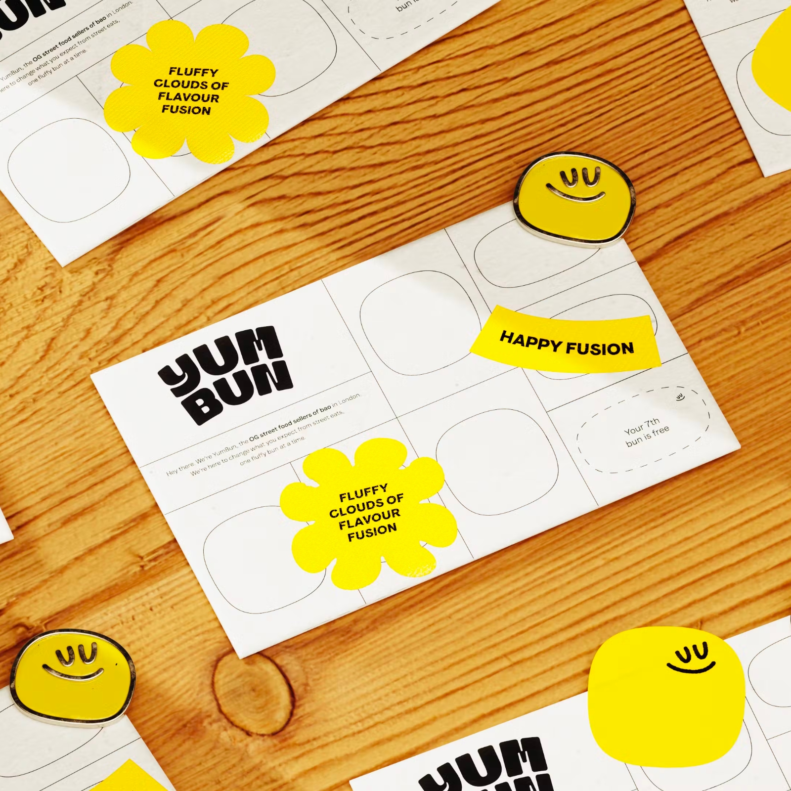
YumBun, the creator of the first-ever streetside bao in London, partnered with How(&How) to rework their strategy, brand identity, logo design, and create a new visual identity and tone-of-voice to stand out in the crowded market of copycats. The branding agency developed a brand idea called ‘Bounce and Rise’ to reflect YumBun’s playful energy and standard-raising culture.

The new logo design, typography formats, and messaging created by How & How Studio reflect YumBun’s unique approach to street food, which takes it back to its original meaning by experimenting with different flavors and textures. By emphasizing maximum taste with minimum impact, YumBun’s conscious mindset is reflected in their branding strategy.

The How(&How): We cooked up a new brand strategy, visual and verbal identity and web design and build with lashings of progressive optimism. Our brand idea, ‘Bounce & Rise’, spoke to Yum Bun’s bouncy baos, playful energy but also standard-raising culture. We served it all up in an expressive, responsive website—complete with a library of new photography—filled with Yum Bun’s signature fusion of Japanese craft and belly-rubbing warmth.

London’s food truck industry is filled with stands promising world cuisine, but YumBun’s innovative, playful, and conscious approach to street food sets them apart. The work done by How & How Studio has highlighted YumBun’s fusion of Japanese craft and belly-rubbing warmth, making their brand identity a great example of how a brand can stand out in a crowded market.

As featured in The Brand Identity, YumBun’s new branding is sure to draw in customers looking for something new, exciting, and socially responsible.

Brand identity and logo design artifacts

Brand identity and logo design artifactsBrand identity and logo design artifactsBrand identity and logo design artifactsBrand identity and logo design artifactsBrand identity and logo design artifactsBrand identity and logo design artifactsBrand identity and logo design artifactsBrand identity and logo design artifactsBrand identity and logo design artifactsBrand identity and logo design artifactsBrand identity and logo design artifactsBrand identity and logo design artifacts


For more information make sure to check out How(&How) studio website.

20 YEARS FORWARD & BACK Semi Permanent unique approach to design

Original Source: https://abduzeedo.com/20-years-forward-back-semi-permanent-unique-approach-design

20 YEARS FORWARD & BACK Semi Permanent unique approach to design

abduzeedo0418—23

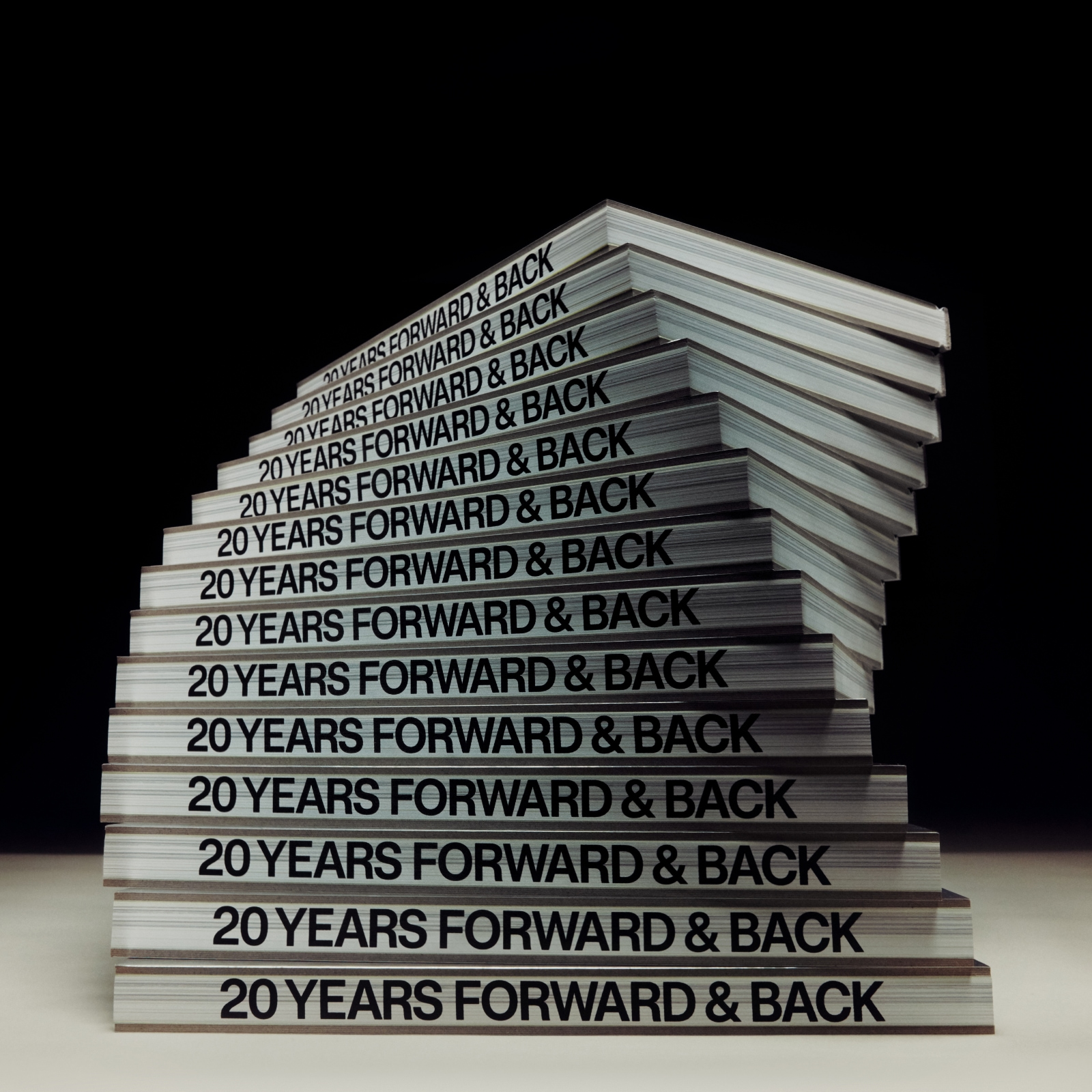
Semi Permanent, the creative platform that has been a staple of the design world for the past two decades, has released its first major published work, a book titled 20 YEARS FORWARD & BACK. This non-linear time capsule explores the last twenty years of creativity, showcasing significant projects from the past, as well as new ideas that will guide us into the future. The book features contributions from a wide range of creatives, including filmmaker Roman Coppola, industrial designer Sabine Marcelis, architect Bjarke Ingels, and artist CJ Hendry, among others.

One of the standout features of the book is the unique approach to creative process showcased in each body of work. In some cases, the book provides a moment of pause and reflection, as in the case of fashion designer Bünyamin Aydin, who uses personal photography to draw a line between what his eye sees on his travels and how it manifests in his seasonal collections. In other cases, the book serves to demonstrate the power of creativity to affect change, as in the extensive conversation about the ‘New Spaces of Justice’ project.

Semi Permanent book details & editorial designSemi Permanent book details & editorial designSemi Permanent book details & editorial designSemi Permanent book details & editorial designSemi Permanent book details & editorial designSemi Permanent book details & editorial design

As an object, the book design is playful and teched-out, employing a semi-reflective cover, a full front-cover index, custom fonts, and flush pages edges that create a hefty box-like feel. An architectural approach to content presents information in increasing granularity, starting with contributions from monumental creative forces and moving into a fully cataloged archive of Semi Permanent works. This book-as-object approach is its own time-capsule, a future-proofed resource, and thus exists within its purpose.

Overall, 20 Years Forward & Back is a celebration of the past twenty years of Semi Permanent, while also marking a new chapter for the platform as it launches its Brand Studio to the world. As Murray Bell, the Founder and Executive Creative Director of Semi Permanent, explains:

“The book is a new iteration of Semi Permanent fostering creativity in all its disciplines at a global scale.”

The book is available globally from the Semi Permanent Shop and at Semi Permanent festivals taking place in Singapore, Sydney, and Wellington.

Semi Permanent book details & editorial design 

Semi Permanent book details & editorial designSemi Permanent book details & editorial designSemi Permanent book details & editorial designSemi Permanent book details & editorial designSemi Permanent book details & editorial designSemi Permanent book details & editorial designSemi Permanent book details & editorial designSemi Permanent book details & editorial designSemi Permanent book details & editorial designSemi Permanent book details & editorial designSemi Permanent book details & editorial designSemi Permanent book details & editorial design

For more information make sure to check out Semi Permanent studio website and shop.

Basketball Court Street Art in Torino, Italy

Original Source: https://abduzeedo.com/basketball-court-street-art-torino-italy

Basketball Court Street Art in Torino, Italy

AoiroStudio0417—23

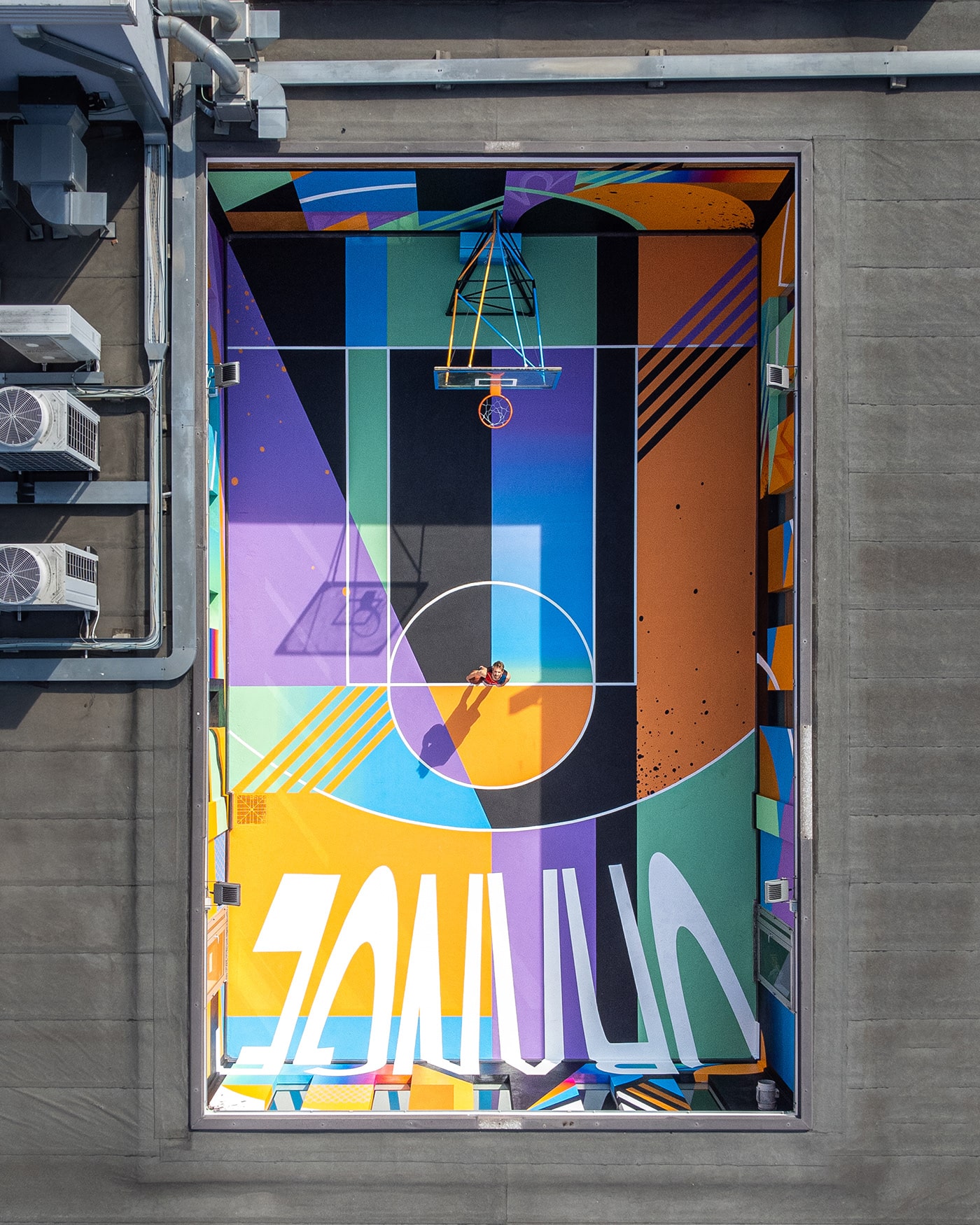
TRULY DESIGN is a talented street art crew based in Torino, Italy, known for their unique and captivating street art projects. The team recently completed a new project that has caught the attention of art enthusiasts and basketball fans alike. The project involved transforming a basketball court into a work of art based on the theme of Orange County. The TRULY DESIGN team began the project by first preparing the surface of the court, cleaning and priming it for the artwork that was to come. Using vibrant colors and intricate details, the team transformed the court into a stunning work of art that pays homage to Orange County, California. The court features iconic imagery associated with the area, such as palm trees, surfboards, and beach scenes. The design also includes a basketball with wings, symbolizing the freedom and excitement of the sport. TRULY DESIGN’s use of color and attention to detail is truly impressive, creating a work of art that not only enhances the visual appeal of the basketball court but also reflects the spirit.

Illustration & Street Art

abstract basket basketball court geometric Graffiti modern art painting   streetart urban art

abstract basket basketball court geometric Graffiti modern art painting   streetart urban art

abstract basket basketball court geometric Graffiti modern art painting   streetart urban art

abstract basket basketball court geometric Graffiti modern art painting   streetart urban art

Truly Design is a street art crew based in Torino, Italy. You can follow more of their works via the shared links below.

Personal Site
Behance
Instagram

The work showcased is all reserved by Truly Design

What Happened to the Shopify Debut Theme? (Updated for 2023)

Original Source: https://ecommerce-platforms.com/articles/shopify-debut-theme

The Shopify Debut theme was once one of the most popular free themes available to store owners on the Shopify platform. However, as of 2023, the option has disappeared completely from the Shopify theme marketplace, leaving many new store owners wondering what happened.

While there are still a variety of themes to choose from on the Shopify marketplace at the time of writing (11 free and 114 paid), the Debut theme is no longer accessible.

Here’s everything you need to know about what happened to this Shopify template, and an insight into the alternatives you can explore.

What Happened to the Shopify Debut Theme?

In November 2022, Shopify announced a handful of themes for their online store builder were being “sunset”, or removed from the marketplace. The Debut free theme was among a list of 9 available themes in total removed from Shopify.

The decision to abandon these themes was made when Shopify updated its ecommerce builder to Shopify Online Store 2.0. Eleven new themes were introduced into the “free” category on the theme marketplace, to replace all of the old-fashioned non-OS 2.0 solutions.

While some existing Shopify merchants may still have access to the old themes, new merchants will only be able to choose from the updated list of themes, compatible with Online Store 2.0.

Although the Debut theme was popular in its time, it lacked the functionality offered by the updated Shopify ecommerce builder. The new themes introduced today include drag-and-drop sections and blocks which allow users to create custom pages throughout their store faster, and more effectively than before. All of these themes have been tested to meet Shopify’s highest performance standards, ensuring a quick and streamlined experience for buyers.

Free Alternatives to the Debut Theme

The good news for Shopify website owners, is there are still various free themes to choose from, each with its own distinctive aesthetic and features. All of these new themes are updated to support the Online Store 2.0 experience, and come with free updates to access throughout the life of your store.

Options include:

Ride: A dynamic theme designed for the sporting world, this product comes with quick view features, a mega menu, and sticky headers. The sleek and innovative theme has a flexible layout to help you showcase your products, and includes advanced customization options, a range of product discovery and merchandising features. There’s also support for both editorial content and visual storytelling, with convenient image and text blocks.

Refresh: Bold and eye-catching, this clean and modern Shopify theme is easy to use, with a fantastic, contemporary design. Users can take advantage of assertive headings, minimalist color palettes, and tools designed to emphasize product details. You can share testimonials, quality information, specialist certifications and more with adaptive section layouts.

Sense: Fresh and energizing, the Sense theme is perfect for health and beauty brands, with soft gradients and curved elements that guide customers through your store. You can leverage comprehensive product descriptions, videos, and testimonials, and access a range of advanced customization options to highlight the unique components of your products without having to experiment with any coding or programming.

Craft: Featuring a sleek and sophisticated design, the Craft theme is subtle and refined, with elegant typography and generous spacing to draw focus to your products and content. The product is designed to highlight storytelling, allowing companies to pull attention to their brand with sections and templates intended for rich narratives.

Taste: Great for food and beverage merchants, Taste is a great theme for bold branding, with a spacious design featuring bold headlines, thin strokes, and industrial fonts. You can leverage a high-contrast color palette on understated backgrounds, with product sections with larger product cards, bespoke FAQs, and product highlights.

Studio: Well-suited to the needs of artists and creative professionals, Studio is an authentic and compelling theme, with stylish typography and colorful accents to frame collections and products. You can take advantage of collection-based navigations, featured collections for galleries, new arrival sections, artist profiles, and creator filters. This theme looks amazing on smartphones and smaller devices too.

Origin: Blending traditional and modern elements, the Origin theme comes with a host of great features, including a stock counter to inspire purchases, and a neutral color palette paired with fun and quirky typography. You can also share valuable stories with your buyers using structured layouts that encourage the use of vivid and engaging text.

Crave: An eye-catching theme built to connect with shoppers on the move, this vibrant and playful Shopify template leverages bold colors and distinct shadows to capture the attention of your customers. The mobile optimized layouts come with dynamic checkout options to encourage selling, as well as a range of fantastic customization features.

Publisher: Ideal for those in the media landscape, the progressive design of the Publisher theme includes subtle gradients, contemporary typography, and specialist immersive product cards with dark product imagery. You can also take advantage of minimalist navigation, to help ensure your brand remains a priority. Adding contextual links to products and categories throughout the page is quick and simple.

Colorblock: Confident and colorful, the Colorblock Shopify theme combines atypical typography with customizable blocks of color to amplify products with a trendy feel. Ideal for companies with large catalogs, the theme allows companies to highlight collections of any size with expanded menu navigation and a range of advanced filtering capabilities.

Choosing an Alternative to the Debut Theme

Although the popular Debut theme might not be an option for Shopify vendors anymore, there are still some great alternatives out there if you’re looking for a free design. All of the new Shopify themes are faster than ever, and extremely easy to customize without coding expertise.

Remember, if you can’t find a solution you love in the free collection from Shopify, you can also check out some of the premium themes too. While these alternative options do come with an additional price to pay, they also feature a wider range of features and functionality to experiment with, so they could be a great option for growing brands.

Further reading 📚

The 31 Best Shopify Themes for 2023

Best Free Shopify Themes for a Sleek, Affordable Design in 2023

Shopify Themes “Sections” – All You Need to Know

Delori Theme Review: Will This Be Your Next Shopify Theme?

Envy Shopify Theme Review for 2023

The post What Happened to the Shopify Debut Theme? (Updated for 2023) appeared first on Ecommerce Platforms.