Frank And Oak's locally Made Wool Suiting Campaign Illustrations

Original Source: http://feedproxy.google.com/~r/abduzeedo/~3/0TUo-4XXNOE/frank-and-oaks-locally-made-wool-suiting-campaign-illustrations

Frank And Oak’s locally Made Wool Suiting Campaign Illustrations

Frank And Oak's locally Made Wool Suiting Campaign Illustrations

AoiroStudio
Jan 30, 2018

Ever since the last feature of Amanda Mocci on ABDZ, she has been crafting her work so beautifully. It can be seen in Fast Company, books and in her personal exploration where I feel she is shining the most. There is so much depth and the contrast is being shown to a whole new level. For the new, Amanda Mocci is an art director and artist based in Montreal, QC. We are sharing a series of illustrations she shared for Frank And Oak, a very popular Men’s Clothing & Women’s Styles. They were promoting their locally Made Wool suits for Men and as you can see. It’s just amazing!

New illustrations created for Frank And Oak’s locally made wool suiting campaign. It was so much fun to work on these! Many thanks to the awesome team at Frank And Oak

More Links
Learn more about Amanda Mocci at amandamocci.com
Follow Amanda on Facebook
Follow Amanda on Instagram
Previous Feature on ABDZ
Illustration
Frank And Oak's locally Made Wool Suiting Campaign IllustrationsFrank And Oak's locally Made Wool Suiting Campaign IllustrationsFrank And Oak's locally Made Wool Suiting Campaign IllustrationsFrank And Oak's locally Made Wool Suiting Campaign IllustrationsFrank And Oak's locally Made Wool Suiting Campaign Illustrations


amanda mocci
illustration
frank and oak


Collective #386

Original Source: http://feedproxy.google.com/~r/tympanus/~3/-wg4i-3RBfM/

C386_Freshbooks

Our Sponsor
Invoice Software That Saves You Time

FreshBooks makes small business invoicing and billing so simple, you’ll be amazed at the time you have to focus on doing what you love and how much faster you get paid.

Try It Free

C386_intersectionobs

Now You See Me: How To Defer, Lazy-Load And Act With IntersectionObserver

A great article by Denys Mishunov, where he explains how to work with IntersectionObserver.

Read it

C386_genartwork

Tips to improve your generative artwork

Tyler Hobbs offers some valuable advice to help improve your generative artwork.

Read it

C386_pulse

2018.makemepulse.com

Some awesome little games made by the team of Makemepulse.

Check it out

C386_font

Free Font: Geizer

Inspired by horror fiction and heavy metal, Matt Cole Wilson created this awesome font.

Get it

C386_courseroot

Courseroot

A database of online courses categorized after price, difficulty, certificate quality, and more.

Check it out

C386_uxai

The UX of AI

An article about Google Clips and what it means in practice to take a human-centered approach to designing an AI-powered product.

Read it

C386_left

Left

An open source, distraction-less writing tool with auto-complete, a synonyms dictionary, writing statistics, markup-based navigation and a speed-reader.

Check it out

C386_iOS

iOS 11 UI Kit for iPhone X (Sketch)

Design+Code made this fantastic iOS 11 UI Kit for Sketch.

Get it

C386_win10

Digital Design is Never Done

Ruediger Kinast writes about how the Microsoft design team made the Windows 10 mail and calendar apps more fluent.

Read it

C386_detection

Building a real-time smile detection app with deeplearn.js and the web Shape Detection API

The first article in a series explaining how to perform face detection in the browser using deeplearn.js and the web Shape Detection API. By Jozef Maxted.

Read it

C386_fabric

Audiofabric

A fabric-like 3D audio visualization made by Taylor Baldwin.

Check it out

C386_hacker101

Hacker101

The Hacker101 video lessons aim to teach many useful things about web security.

Check it out

C386_ecommerce

Fusion E-commerce UI Kit (PSD, Sketch)

A lovely minimal e-commerce UI Kit by GateUi.

Get it

C386_greenlet2

Greenlet

With Greenlet you can move an async function into its own thread. By Jason Miller.

Check it out

C386_chess

The King vs. Pawn Game of UI Design

Erik Kennedy compares UI design to chess and shows how to use the analogy to improve your skills.

Read it

C386_jsappsecure

Building Secure JavaScript Applications

Gergely Nemeth goes through the most frequently asked questions on how to make a JavaScript application more secure.

Read it

C386_naturefont

Free Font: Nature

Zamara Reyes designed this interesting display font.

Get it

C386_webpack

Webpack Demos

A collection of simple and clear Webpack demos to get you started. By Ruan YiFeng.

Check it out

C386_keyboard

Moving efficiently in the CLI

An excellent diagram in a flashcard format for keyboard shortcuts in the command line.

Check it out

C386_webworkers

How JavaScript works: The building blocks of Web Workers + 5 cases when you should use them

The 7th article in a series that explores JavaScript and its building components. By Alexander Zlatkov.

Read it

C386_isometric

React Isometric Grids

Hung-Wei Wu made this React version of our Isometric Grids.

Check it out

C386_scalability

Awesome Scalability, Availability, and Stability Back-end Design Patterns

A curated list of selected readings to illustrate scalability, availability, and stability design patterns in back-end development.

Check it out

C386_topography

From Our Blog
Gradient Topography Animation

An organic SVG shape layer animation based on Diana Hlevnjak’s work “Gradient Topography”. Powered by anime.js.

Check it out

Collective #386 was written by Pedro Botelho and published on Codrops.

3 Essential Design Trends, February 2018

Original Source: https://www.webdesignerdepot.com/2018/01/3-essential-design-trends-february-2018/

Sometimes design trends are tough to see, even when you are looking for them. This month is no exception with trends that include use of circles in design, split screen layouts, and dark backgrounds with light text.

These elements might seem like common design tools but when used in similar ways across the board, distinct trends start to emerge.

Here’s what’s trending in design this month:

1. Circles

The implied meanings and associations of circles in design can have a lot to do with their usage. Circles imply a sense of completeness and harmony. They are used to represent love, energy and power. (It’s somewhat surprising that more designers don’t use circles regularly.)

While the most common uses of circles recently has been in the form of buttons or calls to action thanks to Google’s Material Design, circles are taking on stronger design roles.

The thing that can be difficult about circles is the canvas and shape of websites—either distinctly horizontal (desktop screens) or vertical (mobile screens). So the design has to use circles in space so that the shape doesn’t get lost in the responsive format. Each of the examples below do a good job or maintaining the circular flow without losing the shape as the canvas shifts.

KymberleeJay uses a big pink circle to bring attention to the main copy on the screen. The eye moves directly from the woman’s face to the strong round shape.

Buddha Pizza implies a circle with text and ingredients surrounding a slice. Part of what makes the circle appear is the idea that a pizza is often round. Even with the triangular image in the middle of the screen, the circle is obvious.

Hotel Poispois uses floating circles to create visual interest, but they also serve as giant buttons that take users to different parts of the website.

2. Split Screens

Split screen designs are one of those trends that grows in popularity and then disappears, but it always seems to circle back. The latest iteration of the trend includes both super bold split screens and more subtle pairings.

The great thing about split screen designs is that they work with the responsive format beautifully. You get double content on desktop and stacked content on mobile screens. Regardless of device, the user doesn’t feel like he or she missed out on anything by changing device type.

Split screen design also provides a solution for having dual pieces of content with almost equal importance. You can showcase multiple elements and offer two distinct courses of action (and associated calls to action) on the screen at one time.

This concept puts users in control of the design, allowing them to feel like there is a choice in how to interact with the content.

Taco Bill’s website is a prime example of this. The design immediately poses a question to users: Do you want to order food to go or do you want a reservation to eat in. The split screen design does more than just make the design easier to use, it actually shows users that they have multiple options visually.

Nikos Pandazaras takes another approach with the photography portfolio website design. The site showcases two vertical photos side by side with the navigation in the middle. It’s a different approach for a portfolio style design but effective in that users get to see more images immediately. The split screen style implies that both images carry equal weight and one is no more important than the other.

D’Aucy uses a more subtle split screen aesthetic. One side includes an image on a textured background paired with the same color background without any texture and a headline. The design is a good way to help draw the eye across the screen so that all the content is viewed.

3. Dark Backgrounds, White Text

Dark backgrounds and white text are a classic combination. But this trend is emerging with a twist—there’s video or animation in the dark background.

Whether the movement is subtle, such as Top Estates, or fast and furious, such as Bullying and Behavior, the action in the background is what helps draw users even. The lack of color adds an element of mystery and makes the scene a little more enticing.

White type adds to the starkness of the design. While it is easy to read—that’s a good thing—the text isn’t overwhelming the design. These projects are a bit more stark by nature. The driving visual element is movement in the dark space of the background. All of the designs below feature looping animations that help create a feel for the projects.

The darker the background with these designs, the more mystery they create. Darker backgrounds also increase readability because of the amount of contrast with white text. The speed of animations can create a sense of calm or frenzy.

It’s pretty spectacular how much information can come from what at first glance looks like such simple designs.

Conclusion

The nice thing about this collection of trends is that they are all things you can implement in almost any design project. Use of circles, split screens and dark backgrounds aren’t limited to a certain style of design. You can use these ideas to freshen us a site that’s feeling a little stale or incorporate them into a new project.

As with any trend, think about the content and context before you get started. Does the visual plan help you achieve your overall goal with the design?

All-In-One Resume & CV Builder by MotoCMS – only $24!

Source

p img {display:inline-block; margin-right:10px;}
.alignleft {float:left;}
p.showcase {clear:both;}
body#browserfriendly p, body#podcast p, div#emailbody p{margin:0;}

How Dark UX Patterns Target The Most Vulnerable

Original Source: https://www.webdesignerdepot.com/2018/01/how-dark-ux-patterns-target-the-most-vulnerable/

A dark user experience pattern is loosely defined as a way to trick users into performing certain actions. These actions always benefit the company employing these techniques, and often leave user out of pocket in at least one way. Sometimes this is monetary; other times it’s at the cost of privacy, time, or even user rights.

Some of the most common dark patterns include disguising advertisements, sneaking additional items into a user’s basket, making it difficult to cancel a subscription, and tricking users to share information they did not intend to. The list goes on, and it’s becoming a more prominent issue.

There’s a line between clever marketing and trickery

As larger sites like Amazon and Facebook employ various dark user experience patterns, other competitors and websites follow on, pushing them to become the norm. There’s a line between clever marketing and trickery. These practices fall within the latter, and are solely focused on profiting from the user in shameful ways.

Just to examine how widely employed these techniques are, consider the following examples.

The first is from Amazon. It’s just one of a number of screens they show to users who are not currently Amazon Prime members. The primary call-to-action is front and center. Rather than it being a ‘Next’ or ‘Continue’ button as the user would expect, it instead charges £7.99 to your card immediately. The option to continue is instead hidden with a text link that blends in with  both the footer and the confusing text copy.

For the most vulnerable, such as elderly, those less proficient with the language used, or users with a disability, these types of practices can provide a great deal of confusion and distress.

Even as a designer who is aware of these tricks, it’s still incredibly easy to fall victim to them. Not to mention, they are an annoyance and create a distrust between company and consumer.

As long as practices like this are legal and continue to convert at such high rates, companies will continue to employ them

In a perfect world, Amazon would outline the benefits in a simple to read format with the primary call-to-action allowing the user to skip and continue. In reality, they hide the details in small print: print too small to read for just over 5% of the world’s population. They present the information in an oddly structured format with a confusing variety of bold text weights, different colors, and so much text it deters the user from reading through it all. As long as practices like this are legal and continue to convert at such high rates, companies will continue to employ them.

While Amazon targets the pockets of vulnerable consumers, Facebook is more interested in the user sharing as much information about themselves as possible—even if they are not intending to do so. While Facebook have made progress on privacy issues compared to earlier versions, they continue to use subtle but persuasive and confusing design techniques, and copy like below.

Despite going through every privacy setting and selecting ‘Only Me’, sections which contain very personal and detailed information are still defaulted to be shared publicly. Not only is this an issue with privacy, but also with security. The ease at which hackers can subsequently obtain information to answer the likes of security questions is astonishing. The dropdown is subtle and demands nowhere near as much attention as the primary call-to-action. Similar modals also use microcopy to trick users. Consider this example:

At first glance, nothing seems too untoward. At a closer look, it becomes clear that Facebook is pushing users into sharing their bio to the News Feed. It’s doing this by implying that by clicking ‘Cancel’, you are cancelling changes made to your bio. In reality, ‘Cancel’ means ‘No’. Again, it’s the type of practice that can trick even the most privacy-conscious. For the rest of users, it’s an example of just how far Facebook will push the limits if it means users will share more, interact more, and ultimately have a positive impact on their advertising revenue figures.

In the product and web design industries, aesthetics, sales techniques, and profits are all often placed above accessibility and the well-being of users. Shopify, LinkedIn, Instagram, CloudFlare, and GoDaddy are just a few names who go to such measures to impact their bottom line.

aesthetics, sales techniques, and profits are all often placed above accessibility and the well-being of users.

It might just be making an email unsubscribe link smaller to blend in. Or making it impossible to close your account. Or something even more subtle like making you submit your name, email and full address before giving a shipping cost estimation. But it’s these dark patterns that impact the usability and accessibility of the web in really quite severe ways.

For most of us, it’s simply an annoyance. For the people who are most vulnerable, it can make things near impossible to use or understand. They may not be able to find that hidden unsubscribe link. They may not notice that something has been added to their basket during checkout. And they may become entirely disillusioned and confused with privacy settings, disguised ads and friend spam.

it’s the responsibility of everyone within product and marketing teams to ensure [dark patterns are] safeguarded against

The web has become a place where you have to be extremely conscious and learned of areas like security, privacy, and trickery—even by the biggest reputable companies in the world. For everyone, this quite simply isn’t possible. And these patterns don’t even begin to touch upon larger issues with accessibility such as readability and color practices.

Designers and teams need to be aware of their responsibility not just to clients, employers, and shareholders, but to everyday users too. Accessibility issues and dark patterns hit the vulnerable the hardest, and it’s the responsibility of everyone within product and marketing teams to ensure this is safeguarded against.

Until better laws and regulations are introduced to protect against this, it’s the duty of teams to design responsibly and garner a balance between profit maximizing and providing the optimum usability and accessibility for all users.

All-In-One Resume & CV Builder by MotoCMS – only $24!

Source

p img {display:inline-block; margin-right:10px;}
.alignleft {float:left;}
p.showcase {clear:both;}
body#browserfriendly p, body#podcast p, div#emailbody p{margin:0;}

Get Things Done More Efficiently than Ever with monday.com

Original Source: http://feedproxy.google.com/~r/1stwebdesigner/~3/c5tUA1hhILs/

Designers know that communication and organization are essential to making a project successful. Otherwise, it’s just too easy to suffer from setbacks and misunderstandings. Working as a team means knowing who’s responsible for handling tasks, keeping tabs on progress and being mindful of deadlines. But even if you’re working on your own, you still need a way to stay on top of your to-do list.

Thankfully, there is a solution. monday.com turns task management and collaboration into a visual experience. Its unique combination of a user-friendly UI and powerful functionality make it a must-have tool. They have helped companies of all sizes get things done more efficiently – and they can help you do the same. Let’s find out how:

Keep Track of Everything (and Everyone)

When it comes to project work, there are so many things we need to stay on top of. Trying to do so with email or traditional meetings ends up causing more problems than they solve. There’s got to be a better way.

monday.com (formerly known as dapulse) is here to save the day with everything you need. Use it to communicate with team members, manage and assign tasks, share progress, files and more. They have a strong set of core features to help you achieve your goals, including:

The Ultimate Board

Use boards to keep track of every aspect of your projects. You can set up multiple boards to provide anything from a high-level view of what your team is working on to a task list for a single person.

Boards are designed to be intuitive and user-friendly. From color-coded task statuses to a simple drag-and-drop method for moving things around – there’s no steep learning curve to adjust to. Things simply work.

And, you’ll love the fact that you can tag each task and easily search for every related item in the system. This makes it incredibly painless to find what you’re looking for.

monday.com Board

Communicate with Ease

With monday.com, you’ll find that communicating with team members and clients is both easy and enjoyable. Participants are kept in the loop with new message notifications on their desktop or mobile devices in real-time. That means you’ll spend less time in pointless meetings and more time knocking tasks off your list.

You can also share files directly from your device or supported third-party cloud services. Plus, this forum provides a great place to share new ideas, feedback or ask a quick question. And, because everything is all in one place, you won’t have to dig through huge archives to go back and reference something. Try doing that with email.

As a bonus, you can cheer on team members by sharing .gifs and giving them a thumbs-up. A little bit of encouragement can go a long way!

Visualize it All

Seeing your projects in a visual manner can really open your eyes to the bigger picture. With monday.com’s Timeline feature, you’ll see a listing of team members, which projects they’re assigned to and respective dates. It’s all there in an attractive and interactive chart.

The Timeline lets you easily find out which team members are super-busy, along with those who might have time for a new task assignment. Because it provides such a great view of what’s happening, you’ll be better able to stay on top of project deadlines. Task management has never looked so good.

monday.com Timeline

Real Results from Real People

Reading about how monday.com’s features make life easier is great. But when you see the real-life results others have had, it’s all the more impressive. You’ll find that monday.com has been utilized by companies ranging from solo entrepreneurs all the way up to large corporations.

It’s not often that a tool can be successfully used by such a wide variety of clients. This speaks to monday.com’s flexibility in adapting to the different needs of its users. The system can be easily customized to your specific requirements – no matter how simple or complex.

And it’s a great fit for every industry. Your first thought might be of a hot tech company – and it does do wonders there. But it’s also been an indispensible tool for schools, fitness gurus and even a small bike company.

Both pop culture and nature aficionados will be thrilled to know that monday.com also helped out a team from Discovery Channel to plan the ever-popular “Shark Week”:

Take Task Management to the Next Level for Free with monday.com

Implementing a strong task management tool can transform the way you work. You’ll have a better understanding of your projects – right down to the smallest details. Team members will stay on the same page and be aware of their own responsibilities. This results in projects that get done more quickly and with fewer hiccups. monday.com provides you with a highly-visual and easy-to-use platform that brings everything and everyone together.

The best part is that you can start using monday.com for free. Experience this revolutionary tool for yourself and see how much it can streamline your workflow.


Offboarding In The Online World

Original Source: https://www.smashingmagazine.com/2018/01/customer-offboarding/

By now, we’ve all heard about onboarding — the beginning of a relationship between a company and a user — but what about offboarding? Both go hand in hand as being two of the most important interactions you can have with a user, but offboarding gets much less publicity and sometimes is even altogether ignored. So, what exactly is it, and why is it so important?
Offboarding is usually described as the interaction between a company and their customer at the end of the customer journey.

Website Design Inspiration from the World of Cryptocurrency

Original Source: https://inspiredm.com/website-design-inspiration-world-cryptocurrency/

Inspired Magazine
Inspired Magazine – creativity & inspiration daily

Bitcoin is the cryptocurrency that everyone knows about, but there is far more to understand and learn about if you plan on getting into the cryptocurrency world. Some argue that you’d be a fool to put any money into cryptocurrency, but others argue the exact opposite. Regardless of your views on the topic, all sorts of websites are popping up about it–from blogs to exchanges, and wallets to eCommerce stores for hardware.

So, we’re going to outline some of our favorite web design inspiration from the world of cryptocurrency. Many of them have modern designs, but you’ll notice a merging of typical tech and finance-based designs.

1. Bitcoin-price.com

2. Earn

3. Cryptominded

4. Blockstack

5. CoinFalcon

6. Revolut

7. TokenDaily

8. Crypto Weekly

9. Crypto Trappin

10. CoinsHub

11. Coinscanner

12. Peerkey

13. SwipeStox

14. Coin Tax Guide

15. CobinHood

16. CoinDemo

17. TradingView

18. Guardian Circle

19. Ledger Wallet

20. Cryptagon

There you have it! If you have any questions about this website design inspiration from the crypto world, let us know in the comments.

header image courtesy of  Sofy Dubinska

This post Website Design Inspiration from the World of Cryptocurrency was written by Inspired Mag Team and first appearedon Inspired Magazine.

Be Watchful: PHP And WordPress Functions That Can Make Your Site Insecure

Original Source: https://www.smashingmagazine.com/2018/01/php-wordpress-functions-site-insecure/

Security of a WordPress (or any) website is a multi-faceted problem. The most important step anyone can take to make sure that a site is secure is to keep in mind that no single process or method is sufficient to ensure nothing bad happens. But there are things you can do to help. One of them is to be on the watch, in the code you write and the code from others you deploy, for functions that can have negative consequences.

Test Your Command Line Knowledge with the CMD Challenge

Original Source: https://www.hongkiat.com/blog/cmd-challenge-webapp/

We’ve discussed the importance of learning the command line and it’s more important now than ever before. But, it’s also a difficult subject to breach, with a steep learning curve….

Visit hongkiat.com for full content.

WordPress Themes in 2018 – More Popular than Ever

Original Source: http://feedproxy.google.com/~r/1stwebdesigner/~3/DqWmwrVbL6g/

If you’ve come this far without using WordPress, this might be a good time to make a switch. The reasons are many. WordPress is a free open source content management system that’s highly flexible, and easy to use. It also has the backing of a large community of users.

There is a nearly endless supply of plugins and themes available to you. Thus, there’s virtually no limitation on the types of websites you can build. The demo content of most of the available themes, like those described here, can be imported.

You will just need to select a theme. Afterward, you can be assured that the layout and structure of your website’s theme will match that of the demo.

Consider using one or more of these world-class WP themes! They will definitely help you to create your own world-class websites in 2018.

Hestia

Hestia

Hestia is a single-page design theme that adheres to Google’s Material Design principles. This makes it possible for web designers and website owners to adapt Hestia to virtually any niche, website purpose, or screen size in perfect harmony. Hestia is especially suited for creative agencies and startups, as well as small shops and businesses.

You can easily build a shop in Hestia with WooCommerce. It is compatible with most of the popular plugins, including bbPress, Photo Gallery, Travel Map, Yoast SEO, WP Super cache, and Flat Parallax Slider, to name a few.

Built-in SEO Optimization ensures your website or shop will be correctly indexed, so it can be found by the major search engines. Your content has something to do with this of course, but it is helpful when the theme itself is created with SEO in mind.

Hestia is free. Premium versions are available, but it would be more than worth your while to give the free version a try. It may in fact be all you are likely to need.

Enfold

Enfold

Enfold is a ThemeForest best-rated top seller, and as such is well known in WordPress web design circles. Especially noteworthy is Enfold’s large variety of demos. These demos not only contain images you are apt to find uses for, but include a license to use them.

You’ll find demos representing niches large and small, travel niches, and demos suited for everything from blogging to weddings, to construction, to consulting.

Enfold is extremely easy to work with. The demos can be installed with one click, page-building is easy, and no coding is necessary on your part. Once you start Enfold, you’ll soon discover how much time you can save during your web-building adventures, and should you hit a little bump in the road, youll also discover that great support can take on a whole new meaning.

Porto – Ultimate WordPress + Ecommerce Theme

Porto - Ultimate WordPress + Ecommerce Theme

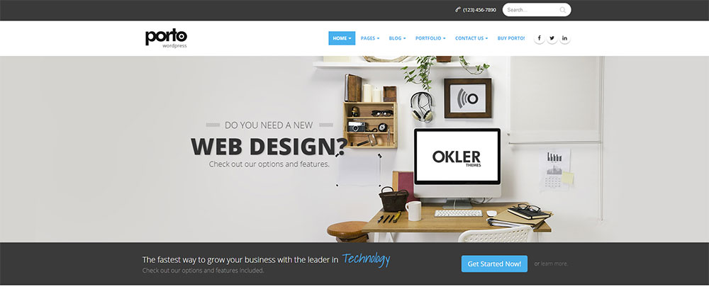
Porto has been around for several years, during which it has enjoyed increasing popularity; and for good reason. For many, Porto has been seen as simply being a better choice for new website design. Its authors have kept abreast of the latest trends in web design, and best practices in coding; resulting in a best solution for you.

Porto is highly optimized, it’s super-fast, and it’s compatible with tons of WP plugins. There are plenty of demos to choose from, ranging from classic website demos, to one pagers, and shop demos. The best way to see what Porto offers, is to visit the website and view the Main Demo, of which there are 18 variations.

You’ll like what you see, plus you’ll come away understanding why Porto’s (happy) customers are presently 53,000+ strong.

TheGem – Creative Multi-Purpose High-Performance WordPress Theme

TheGem - Creative Multi-Purpose High-Performance WordPress Theme

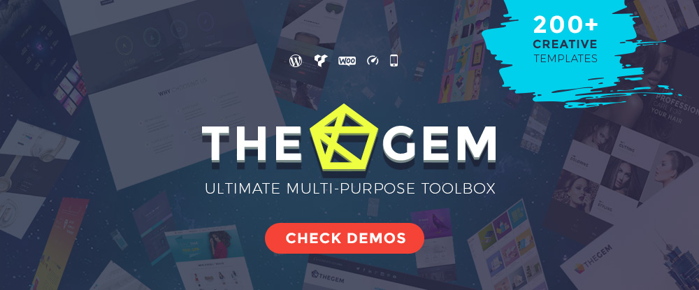
TheGem is a versatile, responsive, high-performance WordPress theme with a modern creative design to suit a multitude of creative uses for building websites. It’s a top-seller on ThemeForest, it has a 5-star rating, and with more than 14,000 sales the past year alone, it’s a best-selling WordPress creative theme. Since TheGem has too many awesome features to list here, visit their website and see them for yourself. You’ll be impressed.

Houzez – Highly Customizable Real Estate WordPress Theme

Houzez - Highly Customizable Real Estate WordPress Theme

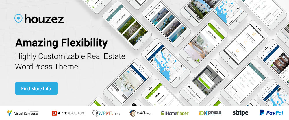
Building a website that has all the features and functionality a real estate agency requires, would normally be a daunting task. Not so with Houzez. Everything is there to begin with, and all you need to do is tweak things to the liking of your client. It doesn’t get much easier than this.

Uncode – Creative Multiuse WordPress Theme

Uncode - Creative Multiuse WordPress Theme

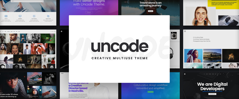
Characteristics of the starting theme are often reflected in the final product; one reason why Uncode, a pixel-perfect theme featuring awesome attention to details and performance, should serve you well. Uncode’s massive options, and advanced grid and adaptive images systems, make you the master. If you like “smooth and sleek”, you’ll surely like what this WP theme has to offer.

The Core

The Core

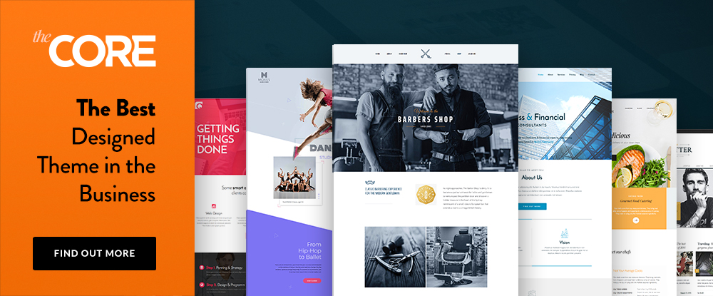
The Core is a premium, multi-purpose WordPress theme that is well-equipped to take on virtually any task you might demand of it. With its 20+ premade websites, visual page builder, and an awesome assortment of premade layouts, The Core lays claim to having the best WP theme design in the business. Purchase hosting from one of The Core’s partners, and you get the theme, theme installation, and a demo import for free.

Grimag – AD & AdSense Optimized Magazine WordPress Theme

Grimag - AD & AdSense Optimized Magazine WordPress Theme

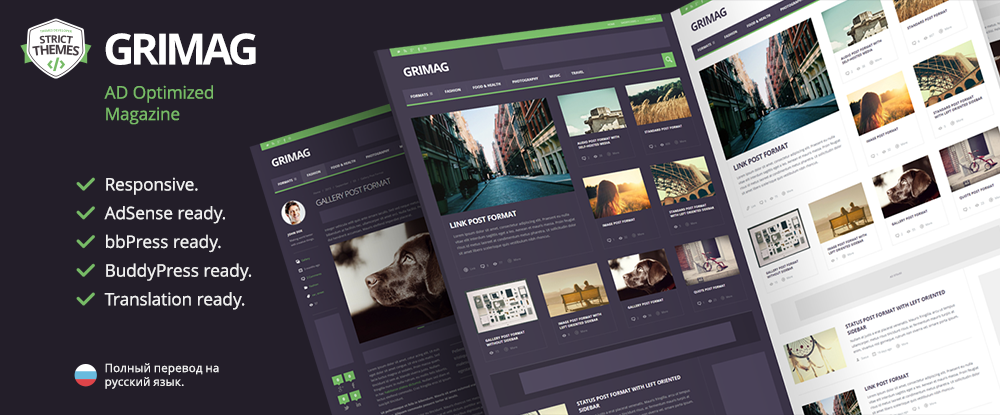
If you’re an AdSense user, or have contemplated using AdSense in your marketing campaigns, Grimag, the AD optimized Magazine WordPress Theme, is right for you. In addition to being AdSense ready, Grimag is bbPress, BuddyPress, and Translation ready. This powerful publishing solution is an ideal solution for anyone looking to get the greatest monetization results from their online publishing efforts.

MOVEDO – We DO MOVE Your World

MOVEDO - We DO MOVE Your World

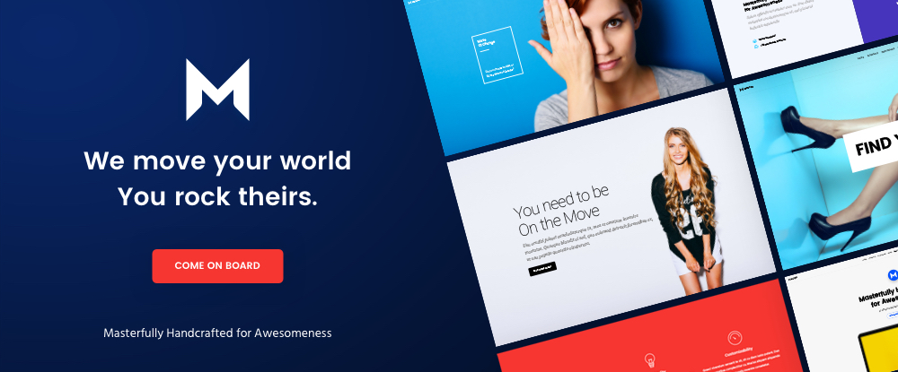
This top-rated premium multipurpose WordPress theme will take you places in web design you’ve never been before, and you may not wish to return. MOVEDO was crafted with awesomeness in mind, with features such as motion dynamics in columns, super-crispy moldable typography, and the ability to manipulate header elements until they appear “just so”. You can create wild and wonderful websites, and thoroughly enjoy yourself while doing so.

Anariel – A WordPress Fashion Blog Theme

Anariel - A WordPress Fashion Blog Theme

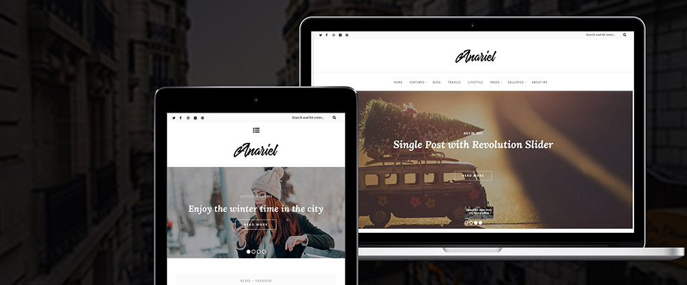
This modern, classy WP Fashion theme is just the thing for a fashion blogger who prefers a minimalist design approach, and who wants to create a modern blog with plenty of options. Anariel is responsive, and comes with 6 pre-defined demos you can install with a single click. If you’re a fashion designer, you absolutely should have a theme that specifically fits your need for a fashion blog. Anariel does precisely that.

Real Homes – Real Estate WordPress Theme

Real Homes - Real Estate WordPress Theme

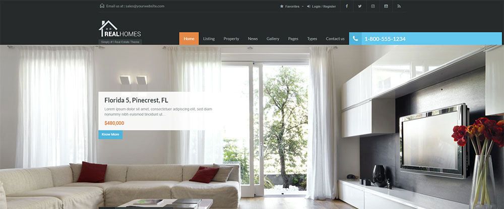
Real Homes is a handcrafted WordPress theme for real estate websites with more than 4.7 out of 5 rating from 950+ real buyers. Its popularity (15,500+ buyers), together with its many features make it well worth considering, but if you dig deeper, you’ll find that what purchasers and users really like, is its flexibility.

You can present listings and properties in so many different ways; including comparisons. Real Homes can also be used by those interested in or charged with property management.

Leadinjection

Leadinjection

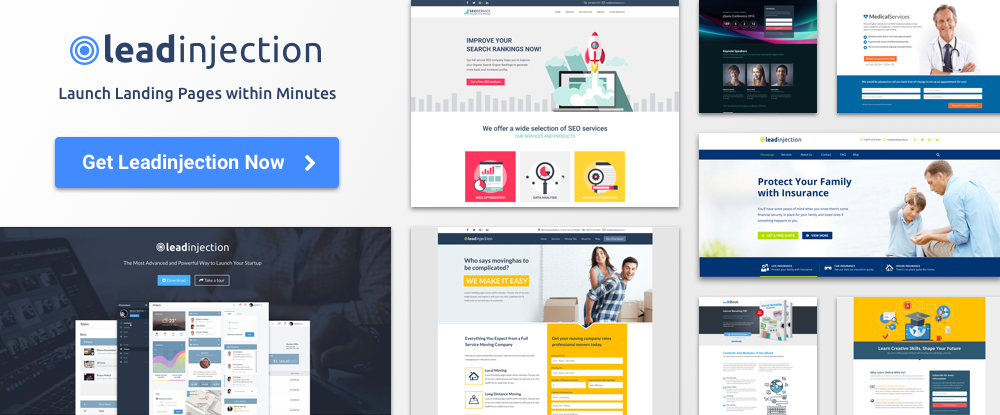
Leadinjection is a WordPress landing page theme that is ideal for marketers, business owners, affiliates, and other professionals who have a need to launch landing pages within minutes. Leadinjection is easy to install and customize. A favorite feature is the Lead Modal Popup, a lead capture form popup that appears on your website per your specification, can’t be blocked, and draws attention to itself, providing you with a genuine marketing advantage.

Conclusion

There’s more than a little variety to choose from in this listing of top WP themes for 2018. We have no doubt you have discovered this by now.

What is a beauty of a listing like this? It includes many multi-purpose themes for a wide variety of different web-building projects. However, that is not it.

There are also those more specialized themes. They address itches you’ve been longing to scratch but haven’t found the means to do it with.