Slice Revealer

Original Source: http://feedproxy.google.com/~r/tympanus/~3/yVRTj97z9lc/

Today we’d like to share a simple reveal animation with you that is mainly inspired by Zhenya Rynzhuk’s transition experiments and Gil Huybrecht’s “Boardathon” Dribbble shot.

SliceReveal

The idea is to cover and uncover an image with slices to either hide or show it. The slices can be vertical or horizontal and can come from different directions. Playing with the number of slices, delays and colors, creates a plethora of possible looks for this effect.

We are using anime.js for the animations and in the third demo we are making use of the Intersection Observer API for triggering the effects on scroll.

The demo is kindly sponsored by Be Theme: 300+ pre-built websites with a 1 click installation.

If you would like to sponsor one of our demos, find out more here.

Attention: Modern CSS properties in use, so please view in a modern browser.

SliceRevealer

We hope you enjoy this effect and find it useful!

References and Credits

Images by Unsplash.com
anime.js by Julian Garnier
imagesLoaded by Dave DeSandro

Slice Revealer was written by Mary Lou and published on Codrops.

The Art of Building Better Websites

Original Source: https://inspiredm.com/art-building-better-websites/

Inspired Magazine
Inspired Magazine – creativity & inspiration daily

Creating websites has become almost a commonplace skill these days, and there’s such an overabundance of sites out there competing against yours that anything you can do to stand out from the crowd is going to be a huge help.

What can we do to get our sites noticed, admired, and paid attention to? It requires a certain adjustment of the way we think about site design. In this short article, we’ll take a look at some of the key things that are necessary to creating better websites.

Content must take priority

As designers we’re always going to be really keen to create amazing designs. Of course this doesn’t apply to those who merely call themselves designers, because they do not allow their very souls to weep onto the page, enshrining a moment of inspiration eternally in electronic glory.

What site owners want, of course, is for people to read their content, engage with it, and perhaps even buy something because of it. Pretty pictures are wonderful to have, but not if they’re getting in the way of the user being able to experience the content.

As this is the case, what we might regard as “stylistic enhancements” must certainly take a backseat to the main presentation. If you need to drop something, it should always be the stylistic element.

image courtesy of Studio–JQ

Responsive design is essential (except when it’s not)

Responsive design is so important these days because of the massive numbers of people using their phones for web browsing, and the fact that most phone browsers still do a lousy job of rendering web pages.

There are a few notable exceptions, but they are very rare. Such exceptions would be when something needs to be displayed on the page in order for the content to make sense, and where it needs to be of a set size. Some things simply wouldn’t work if scaled down too much.

Cases like this need to be handled carefully. How you would do it is to use a special responsive column that is displayed only when a screen size is detected which is too small to display the content, with a message instructing the user to view the content on a larger monitor.

This will generally be something you should avoid doing, but in exceptional circumstances it is acceptable as long as it is handled with tact.

illustration courtesy of sarika

Important content needs to be obvious

While it should be obvious, so frequently it doesn’t seem to be. Design should not make important things subtle. It must make what is important stand out and be seen by the viewer first, and yet so many designers try to be “creative” and subdue those important items.

Do not make this mistake. Users may not stay on the site for long, so getting the brand in front of their eyes is crucial. Even if they leave quickly, you’ve at least made an impression. Later when they encounter the brand, they’ll recognize it as familiar, and will be more likely to purchase from a familiar (i.e. “trusted”) brand.

What happens is a kind of cognitive self-trickery, where the conscious mind says “If I have heard of this, it must be good.” This is why companies are willing to spend millions of dollars just to get their logo on a sign at a sports event.

What else is important though? Well, the answer to that question depends on the kind of site you’re building. What you need to do is think about what you would be looking for if you were to visit this site. It’s usually very different to what a corporate honcho will say they want to show. The things people are going to be looking for are the important things to include and feature prominently.

Stylistic elements should blend in easily

Your design embellishments should make the viewer astonished in a good way. They should bring delight rather than annoyance. Quite often designers get carried away and add things to a page to generate the “wow factor” without making sure these things don’t have the potential to be annoying.

You also need to make sure that such embellishments degrade gracefully. When they can’t be displayed properly, they shouldn’t be displayed at all, and it should appear as though they never had been there.

gif courtesy of Tigran Manukyan

Layers to the rescue

You can add these embellishments through the use of layers. People creating responsive designs seem to have forgotten they have a 3D stack to work with, and as a result they’re missing the true potential of responsive design.

An example of how this works… Imagine you have a site where you have a layout with multiple breakpoints. The conventional way of thinking would have you putting everything on one layer, which will lead to crowding on smaller displays, forcing you to drop things, or (as is usually the case), exhibit a hideous design.

Those last two words should never go together when you’re talking about something you created. The good thing is that you actually can avoid the situation through the use of layers.

By stacking stylistic elements on a separate layer, you can hide or show them at your leisure, independently of the content layer, and both layers are fully responsive.

Suppose the user is viewing the site on a monitor with a resolution of 2560 x 1440. Our lower content layer spans the full width of the screen, but we can set margins on it that would place the content inside a decorative border that could be any size we want.

Placing that decorative border on the upper layer without margins, we can just set the width to be equal to the size of the margins on the lower layer.

As the user steps down through different screen breakpoints, the two layers can continue to work together like this, and the upper layer can even display entirely different borders for each breakpoint. Until on the final breakpoint we dismiss the upper layer entirely, just by setting it to be hidden.

The potential here is obvious. Do you have a large number of annoying link ads in the right column? You can hide them from users with small screens, and furthermore you can add them back on demand using jQuery.

Finally a way to properly separate content from design

This is the way web pages are supposed to work. By storing your “extras” on a completely separate layer, you get even greater separation of content from design, because that upper layer can be messed around with at any time without affecting the lower layer, and vice-versa.

Have fun experimenting with the freedom this opens up to you, so you can play around with all kinds of creative ideas while the content itself remains unaffected.

It is exactly the same concept as using virtual machines for sandboxing. No matter what you do, you can’t affect the page content because it is isolated from the decorative layer.

header image courtesy of Matt Carlson

This post The Art of Building Better Websites was written by Inspired Mag Team and first appearedon Inspired Magazine.

How to model concept art in Cinema 4D

Original Source: http://feedproxy.google.com/~r/CreativeBloq/~3/aUDU02nf-CE/model-concept-art-in-cinema-4d

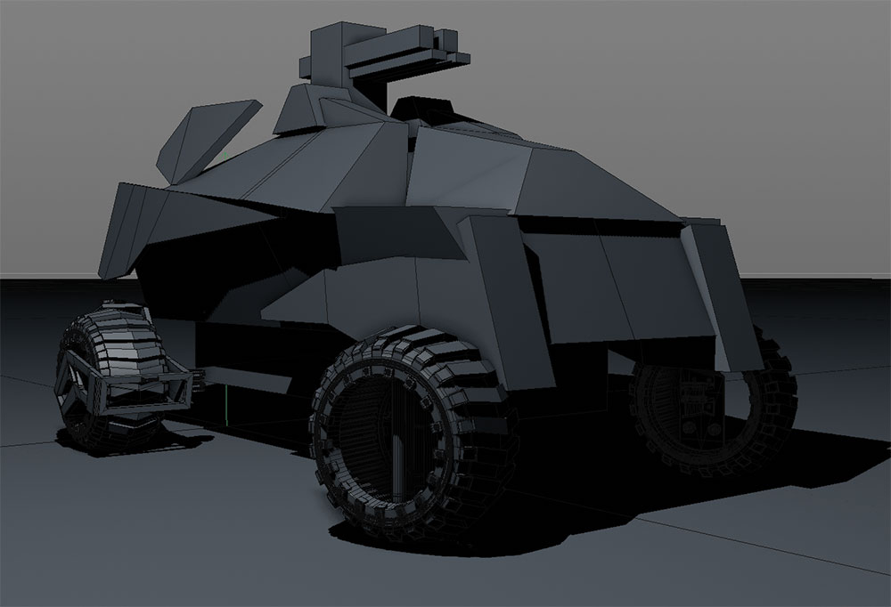
In 2015 the art director of UK-based Lucid Games, Chris Davie, contacted me to help them design 10 independent vehicles for a 4×4 ground-based combat game to be published on PlayStation 4. 

The best 3D modelling software 2018

After I made a proof of concept for them, they gave me the go-ahead on nine other cars. In this Cinema 4D tutorial, I'll show you my general approach on one of the vehicles.

01. Make a simple sketch

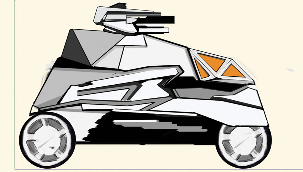
Making a rough sketch will help you get your proportions right

Before starting to work in 3D, I first make a simple sketch of my idea in Photoshop. This is a good way to begin, as it's nice to have the size and some proportions ready before we start modelling. I suggest that you try to put a good amount of time into this initial step, rather than just starting completely from scratch in 3D.

02. Set up your scene

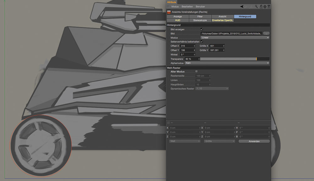
Working in real-world sizes will make the rendering stage easier

Once I set up the background with my sketch I can go ahead and scale everything to the correct sizes. It's best to work with real-world sizes as this comes in handy when rendering later. 

An easy way to do this is to think of, as an example, how large the wheels should be in real life. Just take a circle spline object and type in the required size (that you considered before). In the viewport preferences you can manually scale up the background image to the preferred size – referring to the circle spline as a reference.

03. Block out geometry

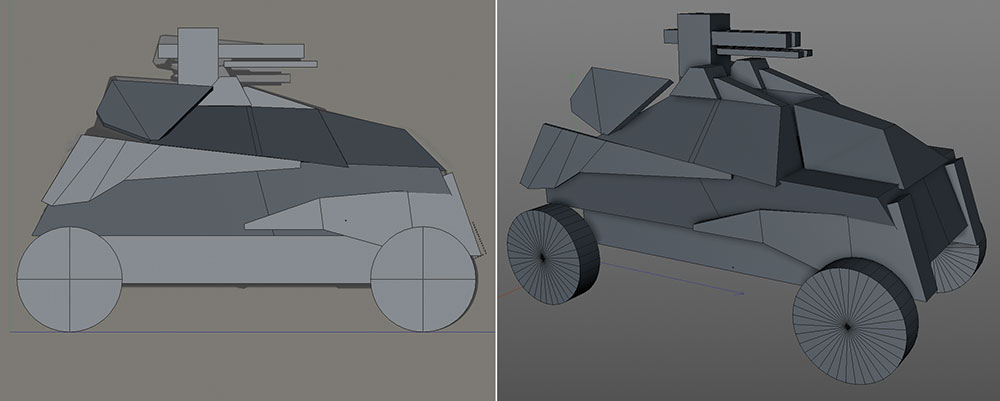
Block out your geometry using whatever method works best for you

As we now have our scene set up nicely, we can go ahead and block everything out. It's basically like laying everything out for the first time in 3D. There's no need for any special techniques here; just do it the way you are most comfortable with. You even can use primitives and stack everything together as you like.

04. Activate shadows

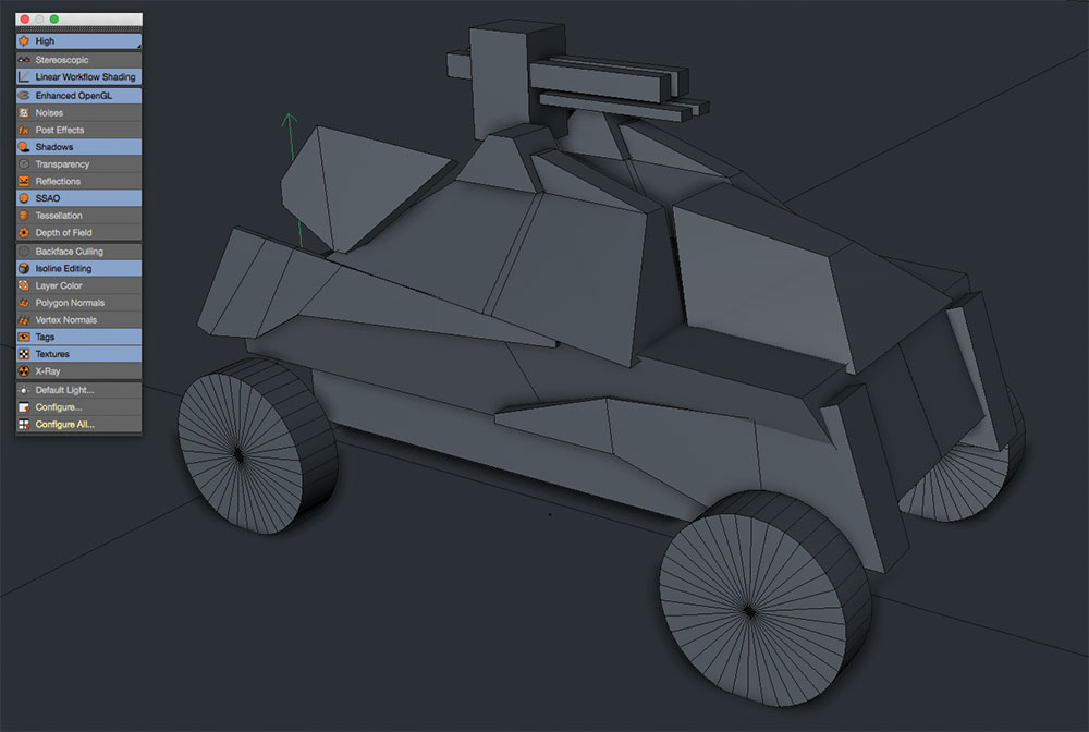
Turn on shadows in your viewport for a better idea of how your model’s progressing

A nice little helper when fiddling out a design is activating visible shadow in your OpenGL viewport. Just use a simple light and activate Shadows in the light source as well as in your viewport. Position it so that the light source casts a nice shadow. It's fast, effective and without rendering you can get some good results in the very first stage of modelling and design.

05. Placeholder objects

Use placeholders for any elements you’d rather work on later

If you are set with your blocked-out design and everything is approved by yourself or by your client you can go ahead with detailing. I leave out the wheels at this stage because I normally do them towards the end. At this stage you can use placeholder wheels from other projects if you like, or just use dummy objects or primitives for this.

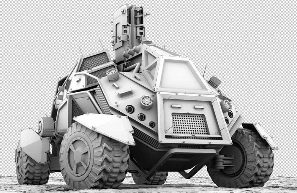
06. Model the cockpit

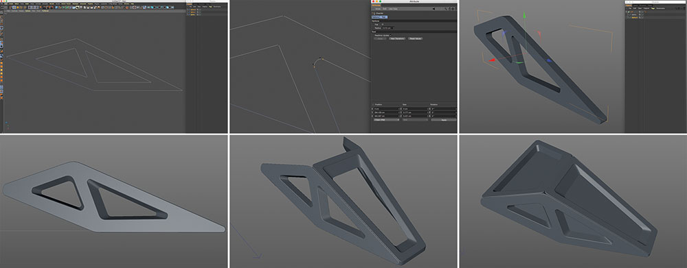
Follow these tips for building a cockpit

Using the reference drawing, I start to create the cockpit. The method described below works best for me, but there may be other alternatives that may be better suited for your way of working, or that may result in cleaner meshes – but as this is just for a design I am satisfied with the result.

The first step is drawing a spline with the shape of the side cockpit. Then draw in the window shapes and merge everything down to one spline object. Next, select the edge points and chamfer them on at a point. When you have done this, duplicate the spline object and put the two splines into a Loft NURBS object. Move one of the splines away from the first spline object to gain thickness. Now you can use Fillet Cap in the attributes of the Loft object.

To make your model look more interesting, you can scale down the window shapes of the second spline object. Simply select the spline points (you must be in point mode) and scale them down a bit.

Next put this side of the cockpit into a symmetry object and you're ready to go for the top section. Repeat these same steps with the top and position it correctly over the sides.

As for the windows, just use simple planes that you place inside the windows. They don't need to be cubic objects as we don't want to make them translucent in the end.

When we're done with this, group everything that belongs to the cockpit together into one Null Object and name it correctly.
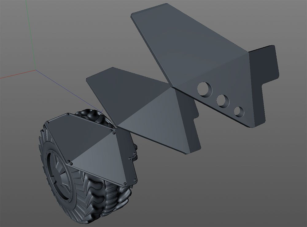
07. Main body parts

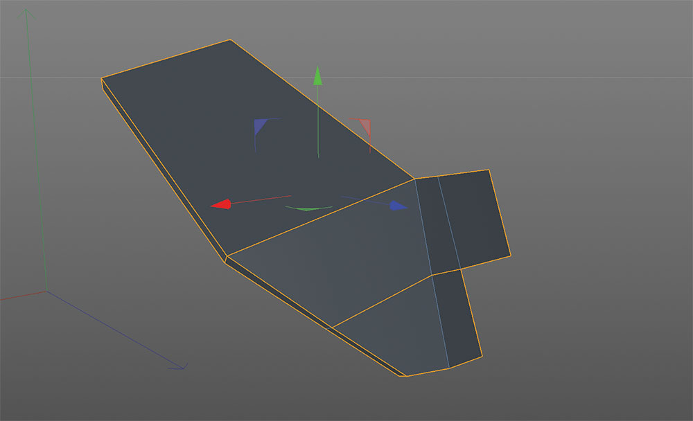
Make sure you keep your blockout and sketch to use as reference

Now we are heading over to the main body, focusing first on the front fender objects, where the lights will be positioned too. Always keep the blockout and the sketch as a reference.

Drop in a primitive object (cube) and make it relatively flat so that it corresponds with the blockout object. Use the cut tool to make cuts at the position where you want to 'bend' the cube. Select the points and 'bend' down the cubic shape following your blockout template. Make sure to angle the points at the front and where you cut it down a little bit.

Use some polyextrudes to make the fender look more appealing. Bevel the corners of the cube and than afterwards bevel the surrounding edge from the top and bottom surface.
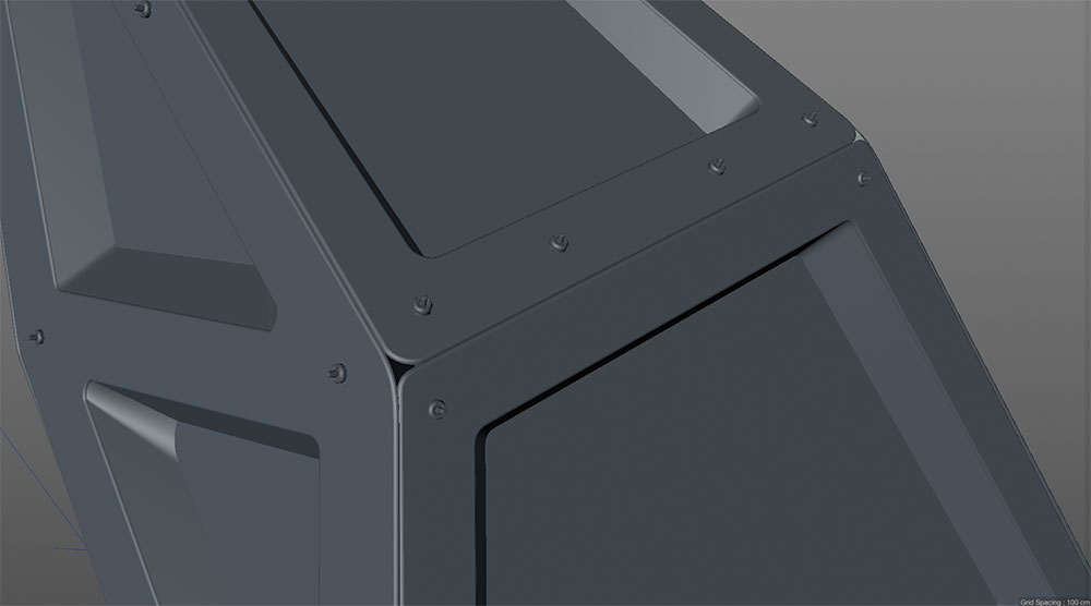
08. Detailing

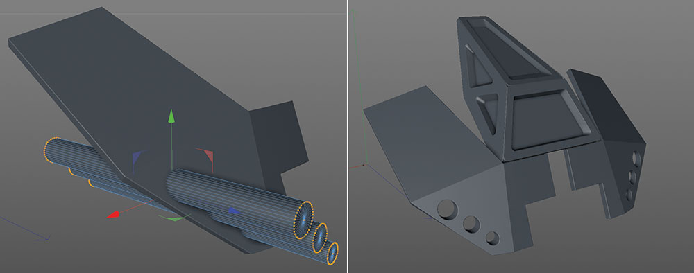
Use booleans to cut out the headlamp holes

For the holes where the front lights will sit in, I simply used booleans. Just position the negative objects and subtract them with the object. Check 'Create single object' and 'Select intersections'. After converting the boolean with the 'c' hotkey you can double-click the new edge selection icon which appears in the object manager. You can now use this selection to bevel the edge.

Again, group everything together within a null and use a symmetry. Then, simply follow the same technique as described above for the other parts.

09. Model small props

Make your model more interesting by adding assorted props

To make the surface a bit more striking I made a small amount of props which I placed at some significant and interesting points. These are mostly cylindrical objects, on which I used some polyextrudes and bevels.

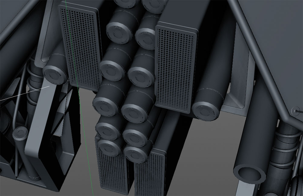
10. Suspension system

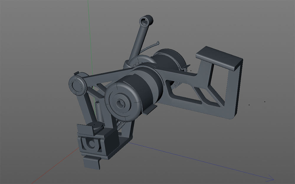
Work out a basic suspension system, then jazz it up a bit

Keeping in mind that the vehicle will be fully movable, I had to figure out a basic suspension system for the wheels.

Therefore, I first made some basic beams out of a cube object. To give it more visual interest I modelled in some holes, in order to make it appear more technical and also lightweight. I used Inner Extrude and the Bridge tool, which works really well in Cinema 4D.

Afterwards I added some more extra details like springs and cables, which can be easily done with Sweep NURBS.

11. Wheel design attempt 1

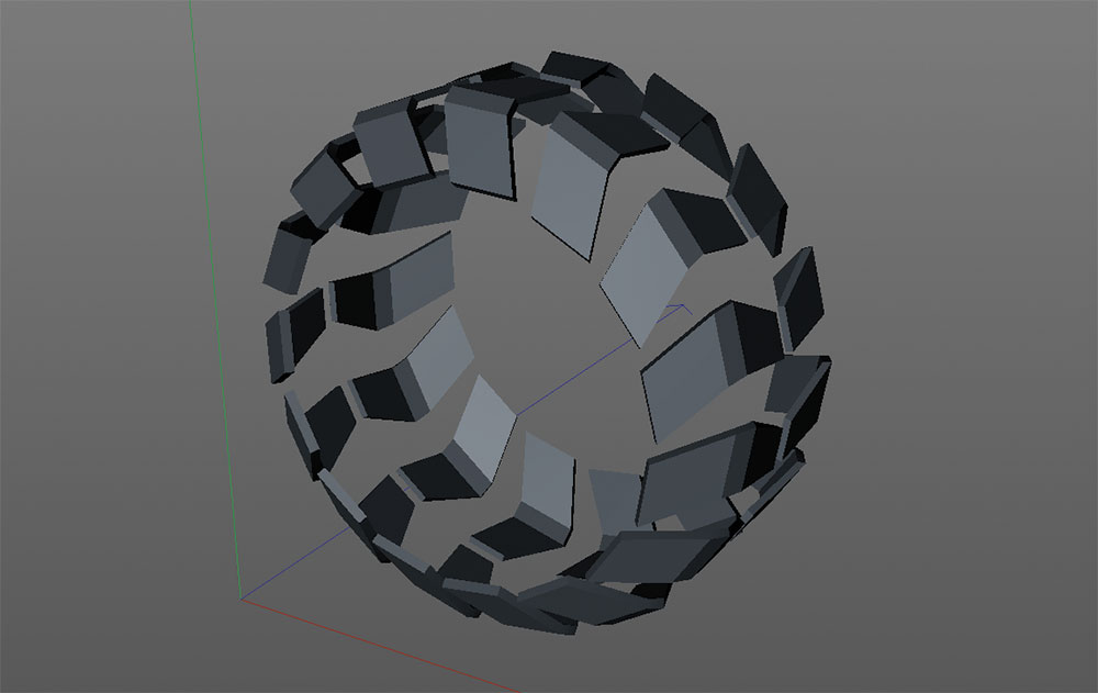
You want your wheels to look good whether they’re spinning or noit

For the wheels I was aiming for a high-tech pattern. I was also keeping in mind that the wheels will spin when driving, so I had to make a pattern that looks appealing while the wheels are spinning.

As I had to do one wheel design for each vehicle (ten in total) I knew this would be a bit challenging. As I had done some wheels before for other designs, there were two different approaches for modelling the wheels.

The first approach is simply building up one piece of the overall pattern and cloning it with a cloner object or an array – this is a very sleek and fast method.

12. Wheel design attempt 2

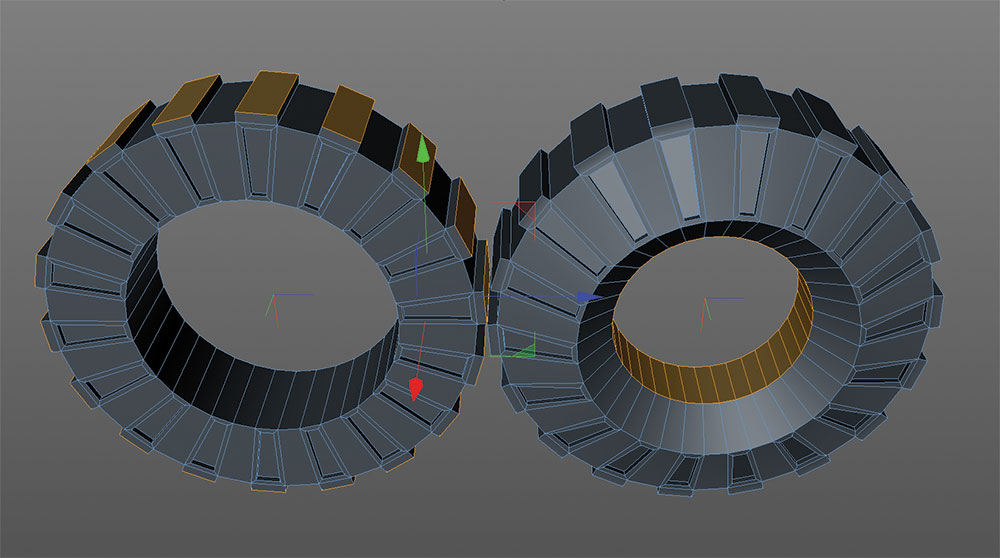
Try cutting your wheels from a cylindrical object

The other technique is utilising a cylindrical object and using the sections with the help of Inner Extrude and Extrude to make something like a pattern. You can split up poly selections and use them as new additional pattern objects, for example. 

Alternatively you can use HyperNURBS to smooth everything down. If you do so, you need to set some additional cuts with the knife (Loop Cut), otherwise it will be too rounded.

13. Add interest by filling up the body

Spend extra time on building the bits players will see the most of

As the viewer will see the vehicle from the rear during most of the game, I had to fill in some extra details in order to make it look interesting. As I had done some stuff before, I made use of some of the geometry and just filled in the additional elements.

14. Save time and re-use parts

Always recycle useful parts if you can

Be aware that, even within the existing model you are creating, you can make use of some of the parts again. For example, I used some of the front fenders as mudguards for the wheels.

15. Simple studio setup

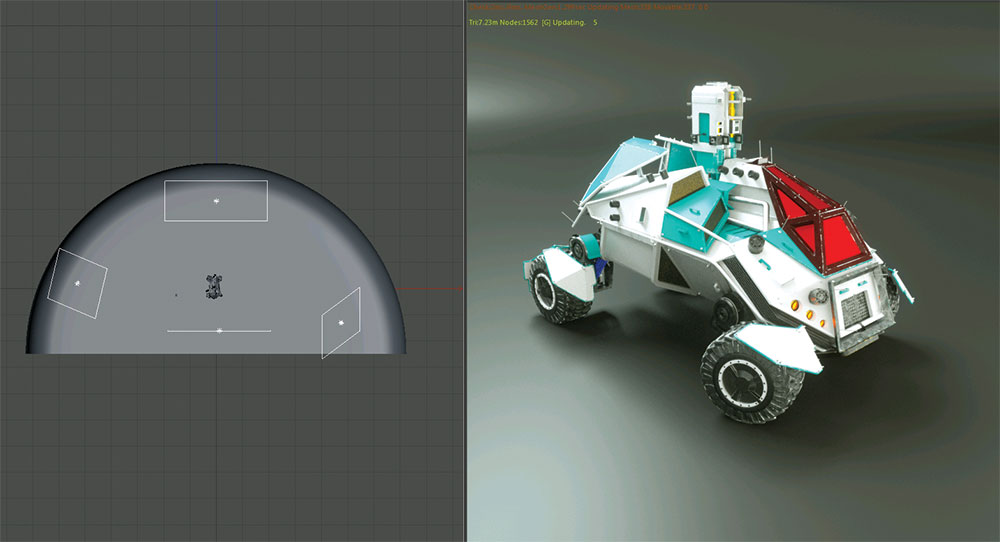
It’s not hard to create a basic studio setup for shooting your model

I decided to use two light setups and settings for the final look. For the studio setup I created a standard studio background.

There are many ways to create this. For example, you can draw a spline and rotate it 180 degrees within a Lathe NURBS object. I placed some area lights around the object and used an HDRI to lighten everything a bit. This also gives you some extra nice reflections, instead of merely having the reflections of the area lights.

16. Outdoor scene setup

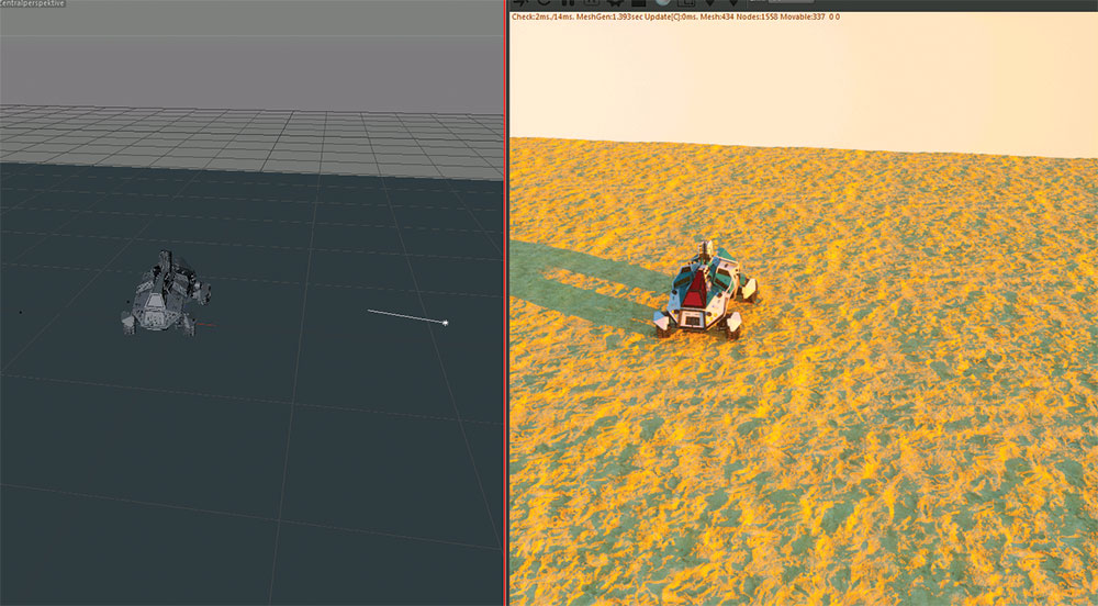
An outdoor setup is another way to show off your work to best effect

For the other light setup I thought of creating an outside scenery in the desert. Nothing complicated as I had to be fast in this job. I used a simple Octane Daylight object. I added a ground plane and used some real displacement shaders. This gives you really nice results that look fantastic even in close-ups.

17. Add emotional images

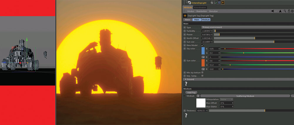
Play with background imagery and focus to bring the shot to life

To add some emotion to the scene I played a bit with the sun size and added some volume fog. In combination with long focal length (100-500mm, like a real-world tele) you can get a very pleasant effect.

Be sure to play around with the f-stop as well, but don't exaggerate it. It can look like a miniature if you use the wrong f-stop values!

18. Octane Dirt node

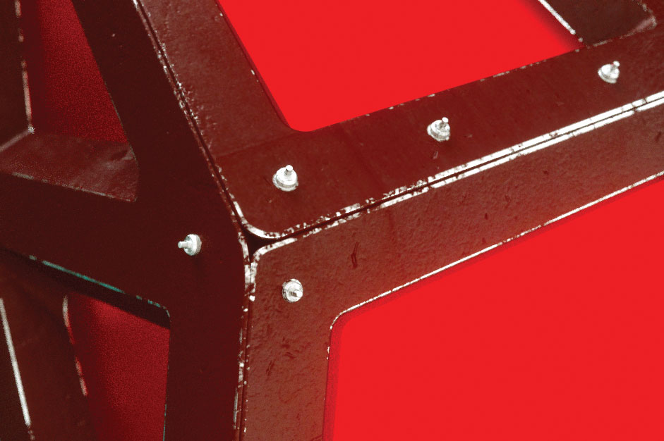
Create a weathering effect using inverse ambient occlusion

Since I did not do any UV Maps, I used inverse ambient occlusion to create a weathering effect on the edges of some parts. This is fully procedural and works great in Octane with the Dirt node.

You can also combine some noises or a grunge texture to break the used edge up a bit more.

19. V-ray Dirt

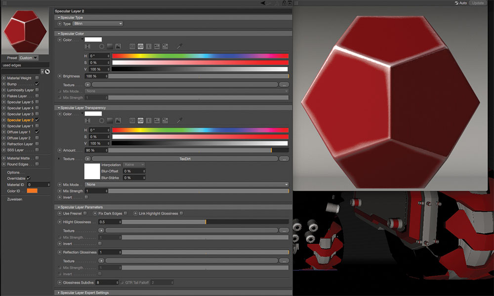
VRayDirt is another great way to make your model look lived-in

This also works the same way within V-Ray (or any other renderer), although sadly there is no node tree (yet) for setting up shaders like in Octane, but you can get almost the same results. Just use the V-Ray PowerShader and VRayDirt, be sure to check inverse ambient occlusion and you are ready to go.

Like in Octane you can add shaders or textures to bring it a bit more to life.

20. Render settings

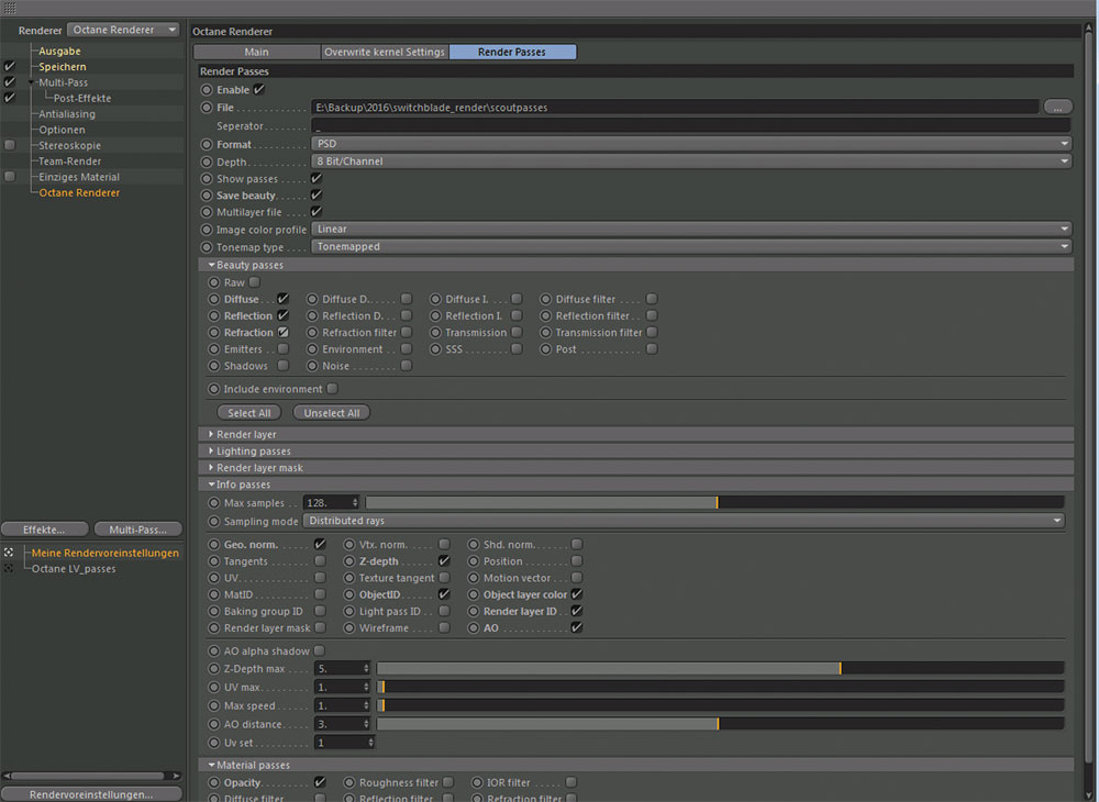
Octane’s default path tracing settings should do the job most of the time

For rendering in Octane I used the default path tracing settings – this works for me most of the time.

For post-production I made use of the Octane render layer settings. Be sure to double-check everything you would like to have for your post work, and you're ready to render.

21. Post-production decals

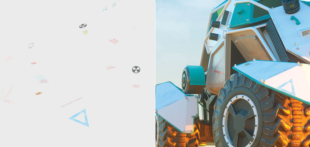
Rather than adding decals to the actual model, fake them in Photoshop

A fast way to apply decals to your render, as long as you have one perspective, is by applying them in Photoshop. It's much faster than dropping them on your model in your 3D app, as you don't have to create a material, alpha, spec map and so on.

So if you have one single shot, this is a real time saver. Just find some decals you like on Google and drag them on your model.

Try out some fill methods and choose the one which looks best. Use the Transform tool in Photoshop to adjust the decals to the correct perspective of the model. You can use some geometry parts as guides for the transform.

Once you have placed it, you can used a grunge brush to make some imperfections. You can also use the layer transparency. 

22. Post-production general

Don’t overdo things with your ambient occlusion map

If you are set with your decals, you can do some adjustments with the help of the material id pass. Normally I just do some levels adjustments on a few parts.

Sometimes an ambient occlusion map can come in handy. But don't exaggerate this either – just use a small amount of transparency on this layer and multiply it. 

This article was originally published in issue 230 of 3D World, the world's best-selling magazine for CG artists – packed with expert tutorials, inspiration and reviews. Buy issue 230 here or subscribe to 3D World here.

Related articles:

How to break into movie concept artTips for drawing anime-style vehiclesConcept design tips for artists

Muse + Mettā Kombucha Brand Identity by Kati Forner

Original Source: http://feedproxy.google.com/~r/abduzeedo/~3/toTaLm6ldbE/muse-metta-kombucha-brand-identity-kati-forner

Muse + Mettā Kombucha Brand Identity by Kati Forner

muse and metta

ibby
Feb 06, 2018

It’s no secret we’re big fans of the work coming from Kati Forner Design having showcased some past work of hers here on Abduzeedo. Of late we’re swooning over the most recent work for Kombucha brand Muse + Mettā founded by Trent Brokie . Most definitely the most beautiful Kombucha bottle we ever did see, I can picture myself enjoying the Wild Blueberry and Lavender steep and then repurposing this gorgeous bottle as a home decor piece. The concept behind the work goes something like this: The color of each flavor complements the ingredient profile highlighting Muse + Mettā Kombucha’s identity as more than just a beverage but a culture of health, art, and possibility. While you’re here, be sure to check Muse + Mettā’s Instagram page for a visual schooling on how to launch a product on this social platform in the most beautiful way.  

We believe food can feed us both physically and creatively. Brewed with fruits, flowers and herbs from around the world coupled with a passion for modern design and wellness to create a truly sensory experience


branding
packaging
graphic design
kombucha


Top Tools Every SEO Should Be Using in 2018

Original Source: https://www.hongkiat.com/blog/top-seo-tools-2018/

As an SEO consultant, you need a particular set of tools to know exactly where your competitors rank in top search engines, how to look for effective keywords and track new opportunities as they…

Visit hongkiat.com for full content.

The Perfect Office – Ticwatch S&E Android Wear, Google Home Mini Outlet Mount and more

Original Source: http://feedproxy.google.com/~r/abduzeedo/~3/-bbnd_SNrDY/perfect-office-ticwatch-se-android-wear-google-home-mini-outlet-mount-and-more

The Perfect Office – Ticwatch S&E Android Wear, Google Home Mini Outlet Mount and more

The Perfect Office - Ticwatch S&E Android Wear, Google Home Mini Outlet Mount and more

AoiroStudio
Feb 06, 2018

We are continuing our comeback of the Perfect Office series, we are hearing your feedback. A roundup of cool gadgets and tech for your perfect office; not necessarily for designers explicitly but for all tech-savvy nerds out there. This is an open concept! if you have any suggestions, please let us know! For this week, we have the new Ticwatch S&E who is the best affordable Android watch you can buy on the market right now. We have also the cool idea of a Mini Google Home Mini Outlet Mount that somehow can be down-right useful.

More Links
For more, check out gadgetflow.com
Follow my tweets @aoirostudio
Follow my pictures on Instagram
Curated from GadgetFlow
Ticwatch S&E Android Wear Smartwatches

The Perfect Office - Ticwatch S&E Android Wear, Google Home Mini Outlet Mount and more

Do more right from your wrist with the Ticwatch S&E Android Wear Smartwatches. Using the latest version of Android Wear, this wearable fits in impeccably with your active lifestyle. Both Ticwatch S and the Ticwatch E feature an advanced fitness assistant. There’s an integrated heart rate monitor but it also counts your steps and adds GPS to your workouts for efficient and accurate tracking.

WideWheel Comfortable E-Scooter

The Perfect Office - Ticwatch S&E Android Wear, Google Home Mini Outlet Mount and more

Enjoy the most relaxing ride with the WideWheel Comfortable E-Scooter. This electric vehicle features ultra-wide wheels to keep your journey as smooth as possible. Thanks to the ultra-wide tires and dual suspension, you will experience the ultimate electric scooter ride.

This Mini Google Home Mini Outlet Mount

The Perfect Office - Ticwatch S&E Android Wear, Google Home Mini Outlet Mount and more

Place your Google Home Mini wherever you like with the This Mini Google Home Mini Outlet Mount. With the This Mini Outlet Mount, you can easily keep your Mini out of the way without having to find somewhere to rest it

TBoring Company Handheld Flamethrower

The Perfect Office - Ticwatch S&E Android Wear, Google Home Mini Outlet Mount and more

Turn things up a notch with the Boring Company Handheld Flamethrower. Looking like a water gun, this nifty little device is the real deal. The Flamethrower is complete with everything you need to produce a stunningly vibrant flame. In fact, it can produce flames up multiple feet in length.

Mink Camper Icelandic Mini Trailer

The Perfect Office - Ticwatch S&E Android Wear, Google Home Mini Outlet Mount and more

Enjoy the Northern Lights while camping in style with the Mink Camper Icelandic Mini Trailer. Featuring a tough Webasto heater and thermostat, the Mink Camper will keep you warm during your time in Iceland. It also features skylight and large side windows so you can get the most of our your surroundings. The Icelandic Mini Trailer comes with a queen size mattress and Scandinavian linens to provide comfortable rest whenever you need it.

iPhone 8 Leather Case by Mujjo

The Perfect Office - Ticwatch S&E Android Wear, Google Home Mini Outlet Mount and more

If you wish to make your iPhone 8 experience stand out, this iPhone 8 Leather Case by Mujjo is what you must go for. This phone case uplifts your overall iPhone 8 experience and makes it look one of a kind.

Merge VR 6DoF Blaster Game Controller

The Perfect Office - Ticwatch S&E Android Wear, Google Home Mini Outlet Mount and more

Blast your enemies into oblivion and scratch your itchy trigger finger with the immersive Merge VR 6DoF Blaster Game Controller. This Nerf-style device lets you play mixed reality smartphone games like a real Navy SEAL. You simply clip your phone into the gun, and then watch the screen to spot your foe.

Fujifilm X-A5 Mirrorless Digital Camera

The Perfect Office - Ticwatch S&E Android Wear, Google Home Mini Outlet Mount and more

Effortlessly capture beautiful images with the Fujifilm X-A5 Mirrorless Digital Camera. Featuring a 24.2-megapixel APS-C Bayer sensor, the Fujifilm X-A5 camera comes with numerous features to enhance your photography. Additionally, the camera provides a 180-degree tilting touchscreen so you can always take a great selfie. It can also shoot up to 450 images on a single charge.

perfect office
gadget
gadgets
tech


Solo movie posters are a typographic treat

Original Source: http://feedproxy.google.com/~r/CreativeBloq/~3/bJMDZEOwjNY/solo-movie-posters-are-a-typographic-treat

There's not long to wait now until cinema goers get to return to a galaxy far, far away with Solo: A Star Wars Story. A recently launched trailer (below) follows hot on the heels of a teaser trailer that premiered during the Super Bowl, along with four new poster designs.

Whereas the last Star Wars spin-off movie, Rogue One, went for a more serious and gritty tone, judging by the looks of the promotional material released so far, Solo looks like it will be more of a lighthearted and humorous romp.

Accompanying these trailers are the vibrant teaser posters, which put bold typography at the centre of their design. Masking the visuals of the characters inside the lettering makes use of a trend we've seen before with typography in motion graphics, and its inclusion here sets an extravagant tone for the film.

We're also really enjoying the blend of old and new design elements. A flaking paper background is a striking contrast to the painted images in the sci-fi fonts.

Scroll through the set of four Solo teaser posters by clicking left to right in the gallery below.

It's important to remember that these aren't the theatrical posters for Solo: A Star Wars Story. Instead, they're a nice bit of extra promotional material that also contain a tidbit of exclusive information by revealing the name of Emilia Clarke's character.

The saturated colours also call to mind the poster of another recent fantasy cinematic epic, Thor: Ragnarok. We're pleased that the posters for Solo take a strong yet simple approach in terms of composition, though, instead of the cluttered photo montages that left us asking if we were in the middle of a movie poster design crisis.

As for the official theatrical poster, we probably won't have to wait long to see that either given that Solo: A Star Wars story is scheduled for release on Memorial Day (28 May 2018).

Related articles:

4 classic movie poster designs making a comeback10 best movie posters from the 1990sAre these vintage concept movie posters better than the originals?

New Trend is Visual Design and Motion Design for the Web?

Original Source: http://feedproxy.google.com/~r/abduzeedo/~3/qkpGD2afp8Q/new-trend-visual-design-and-motion-design-web-0

New Trend is Visual Design and Motion Design for the Web?
abduzeedo
Feb 05, 2018

I love browsing through sites like Behance and Dribbble for visual design inspiration. It’s amazing to see how much the field has evolved. We can see highly editorial designs that look more and more like beautiful magazine pages. I know that most of these designs are just static mocks beautifully animated, but the important thing is that with today’s technology there are many ways to translate all of these well-crafted visual design work to real products. Apple has shown us that, then other follows like Google, Microsoft and many others.

For this post I’d like to share a few designs from Adam Zielonko, a designer based in Gdynia, Poland. He has a quite solid portfolio but what I liked about these screens were the sort of pattern of solid blocks of color and transitions. It seems like a new trend coming up, so let’s wait and see. Below you can see what I am talking about. Also make sure to check out Adam’s work at https://dribbble.com/adamzielonko/click?type=site

Visual Design

High r2 dribbble.com adamzielonko 06 03Love is a form of prejudiceButelki z benzyna i kamienie14 01 2018You are so cool

visual design
UI/UX


Gradient Topography Animation

Original Source: http://feedproxy.google.com/~r/tympanus/~3/2XtrRdDppS0/

Today we’d like to share a shape layer animation with you. The inspiration for this effect comes from the fantastic work by Diana Hlevnjak (Polar Vector) “Gradient Topography”. We use anime.js for the animations and Charming for the letter effects.

GradientTopographyAnimation_Featured

After seeing the artwork, we thought it would be awesome to animate these kind of gradient layers of an organic shape in an interesting way. For this we’ve created a little layout that has several shapes spread on the page and when a menu item is clicked, the associated shape group will expand to full screen and some content is shown.

The demo is kindly sponsored by monday.com: The perfect project management tool for designers. If you would like to sponsor one of our demos, find out more here.

Attention: We’re using CSS variables, grid and flexbox for the demos, so please view this with a modern browser.

The organic shapes consist of path layers where each one has the same gradient but a decreasing fill opacity. This creates an interesting look and when animated, fills the entire screen with the semi transparent layers until it’s fully opaque after the last layer enlarges. The other shapes scale down.

Have a look at some screenshots:

GradientTopographyAnimation_01

GradientTopographyAnimation_02

GradientTopographyAnimation_03

We hope you enjoy this little effect and find it useful!

References and Credits

Based on the artwork “Gradient Topography” by Diana Hlevnjak
Anime.js by Julian Garnier
Charming by Yuan Qing

Gradient Topography Animation was written by Mary Lou and published on Codrops.

Why Employee Advocacy Must Be Part of Your Social Media Marketing Plan

Original Source: http://feedproxy.google.com/~r/1stwebdesigner/~3/NKiyn4kWX5g/

In the competitive business world, new companies have plenty of disadvantages. One of the biggest is shaky consumer trust; no one wants to give money to a group that has no reviews or well-known entities to vouch for them.

There are plenty of solutions to this problem, one of the most potent being social media marketing. Employee advocacy is one newer form of this solution. People are more likely to trust non-celebrity endorsements, especially from peers, so getting employees to talk about your business can be very helpful.

But how does it work? And how can you implement this lucrative technique effectively? An employee advocacy plan is easy to put in place but difficult to master, so it’s important to gather all the info you can from the start.

What Is Employee Advocacy?

When your employees reblog or retweet your posts, endorse you on social media, or discuss your business with others online, that is employee advocacy in our modern world. It also encompasses when employees share content published by the employer or when they share content published by others that’s also about the employer.

In short, it is when the workers publicly support the company from their personal profiles, rather than celebrities, branded profiles or managers doing so.

It’s no news that the internet has empowered and changed the way businesses approach marketing, though rarely do they turn to employees for help. Which is a shame, because this practice increases customer trust and website traffic.

How Do You Use It?

While some companies have informal programs to encourage social media support, this approach is more difficult to track if not less effective. You can keep an eye on employees’ accounts, but it’s difficult to track the influence, user engagement, and overall success of many workers.

Luckily, there are “mini social media” platforms with the aim of employee advocacy, such as LinkedIn Elevate, Smarp, Sociabble, or Dynamic Signal, which provide many useful features and analytics. Link tracking allows you to see whose posts get the most clicks, what content is the most popular, and so forth. Employees can even compete on leaderboards or earn points to spend on prizes.

These platforms make it easier to publish articles since everything is managed in one convenient location, which is key if you want to take your company’s employee advocacy program seriously. And this way, once the content is published, employees can quickly and easily share across multiple social media platforms. That’s a lot easier than having to send out daily memos reminding employees to post to Twitter or Facebook.

Lastly, this sort of tool provides an easy way for both employers and employees to communicate, collaborate, and stay up to date. Email may not quite be outdated yet, but being able to place relevant information right in the app, rather than mass-emailing a large team, is certainly more convenient.

Using an employee advocacy tool is an all-around better option than skipping it altogether.

Why Do You Need it?

If you wished to, you could create a few Twitter accounts for the leaders of your company, set up some bots to tweet out links to anything you post on your blog, log out forever, and call it a day. This certainly wouldn’t be anything out of the ordinary.

However, most users can spot a strictly automated account a mile away and won’t be very impressed with your company. Fans may subscribe to you just to be notified when there’s a new blog post, but there will be nothing in the way of audience engagement. New prospects who visit your social media accounts may be turned away by the obviously automated content.

However, an interesting feed with a human touch and lots of user interaction is something that people will appreciate. You may be too busy to stay active on social media, but your employees might not be.

Consumers are less likely to trust CEOs nowadays, so the spotlight turns to the average person. Not to mention, average folks may have their own network of friends and peers their content can reach. A long reach is the key to brand success.

It’s fairly clear: this is a profitable marketing tool that produces more natural and appealing content. The internet has wised up to clickbait and automated accounts, so it’s now necessary to put a bit more effort in. And when it comes to social influence, employees are the ones who have the public’s trust.

Encouraging Advocacy

Now that you know what employee advocacy is and why you need it, how do you get employees motivated? If the program provides no reward incentives or positive effect on their career, they won’t waste their time. You’ll have to give some encouragement.

Firstly, forcing employees to speak about your brand on social media is not the way to go. Morale goes down the drain quickly when you make people do something they’re not interested in. Instead, get them interested! Offer incentives to get them excited. Implement a rewards system, or use a leaderboard to challenge competitive workers.

And instead of giving huge paragraphs of intricate rules, regulations, and expectations, set short and clear guidelines and allow the workers to take control, producing and sharing content that they enjoy. Consumers know when an employee loves what they do, and you’ll earn the trust of them both.

The important thing: don’t dictate their every move. Rules are important, but don’t overdo it. It may seem risky to give someone free reign over your company’s image, but the rewards are far greater. This employee-first doctrine creates content that sounds more real, and less like it was written by an SEO bot or produced in a factory.

Perhaps you could even allow them to create their own content. Talented authors, artists, and image/video editors could prove to be a huge asset if you can discover them. And who can say no to extra career opportunities?

Produce Relevant Content

When your staff has nothing to share, what will they talk about? If you’re not already in full social media mode, then it’s time to get started. Get on Twitter, write on Facebook, and start creating blog posts.

Besides drawing extra attention to your company, it’s both effective repostable material and opens up avenues for discussion by your employees. Don’t forget to have some fun, though! If your company hosts a party, get everyone together for a picture. Content like that provides a breath of fresh air and gives consumers a look into the company atmosphere.

In short: Everything you post on social media should either be insightful, memorable, or fun. Engaging articles with snappy titles, relevant but interesting images, or quick videos are all appropriate. After all, most people on Twitter wants to watch a 20-minute video about the stock market or read a 10,000 word digest on tax returns. Sticking to this general idea will benefit both your social media popularity and your employee advocacy plan.

Improve Your Marketing Strategy With an Advocacy App

The definite way to implement this marketing plan is by using a networking platform. There are many apps out there that can connect your company online, but it’s best to choose one that’s designed around employee advocacy.

Apps like these cover the features most business connection apps provide, while also giving you access to relevant analytics. This information will let you know what content to target and how interested consumers are in your brand. Without this valuable intel, you’ll have to rely on follower and like counts to gauge effectiveness — which can often be unreliable.

Start small. Loop in the best of your employees, the ones who seem eager and willing to try new things. Run contests and set goals for them to meet. If you find success, you can roll it out to willing workers, and continue until you have a stable platform.

And in time, you’ll have a successful program that’s both boosted your visitors and given your employees chances to further their skills and careers. If nothing else, it’s worth trying! The risks are minimal, but the benefits are immense.