Original Source: http://feedproxy.google.com/~r/CreativeBloq/~3/vVj1XPqFvx0/free-ebooks-designers-7133700
There's always been a healthy market for commercial graphic design books, illustration books and student books written by experts, and this isn't likely to change any time soon. Sometimes there's just no substitute for splashing your cash and getting high quality content in return.
That said, there's a growing movement towards free and 'freemium' content on the web. And the quality of the content is often on a par with the books you'd part with cash for.
Clearly nobody can afford to print and distribute free physical books (with the exception of the excellent World Book Night movement). But in this age of tablets, smartphones and laptops the electronic book offers a fantastic, and very cheap, way to spread this content.
So with all that in mind, what content can you get for free in the field of design? A quick search on your favourite search engine will reveal hundreds of offerings, making it difficult to sift the wheat from the chaff. But we've saved you the trouble, so here goes…
01. The Shape of Design
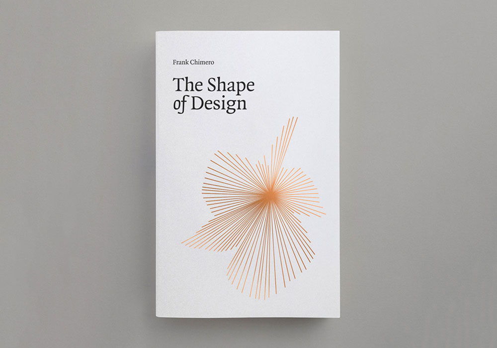
Frank Chimero’s book will inspire you to look at what you do in a whole new light
Starting life as a talk in 2010, Frank Chimero's self-published The Shape of Design was an early design community Kickstarter success, getting funded on its first day, and has since become essential foundational reading, not just in design education but in other creative practices, too.
Focusing on the mindset of making rather than tools and methods, it asks: what are the opportunities, problems and possibilities of the creative practice? And once the work is done, what happens when it is released into the world?
02. The DesignBetter.co library
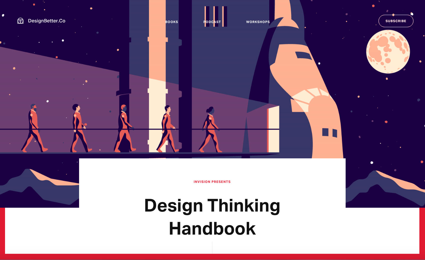
These three books cover product design, design thinking and design leadership
Why settle for just one free ebook when you can have three? The DesignBetter.co library from InVision aims to help you build a strong design practice.
This collection of definitive books, written by Aarron Walter and Eli Woolery, explores how the best companies approach product design, design thinking, design leadership and more.
03. Practical Responsive Typography
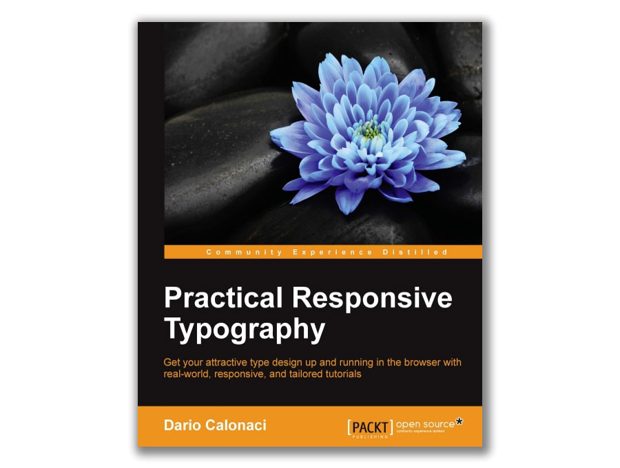
Nail your web typography with this free in-depth volume
Getting your typography right is a key part of having a great-looking website that helps you stand out from the crowd, communicate with clarity, and cultivate a distinctive identity. The best way to learn is to roll up your sleeves and just get on with it, and this book by Dario Calonaci enables you to do just that.
Practical Responsive Typography will take you from the basics of scaling and optimising screen spaces, through to using a range of different web fonts and customising typography designs to suit your identity, and while it'll normally cost you over £20, it's free for Creative Bloq readers.
04. 50 Must Read Tips From Designers, To Designers
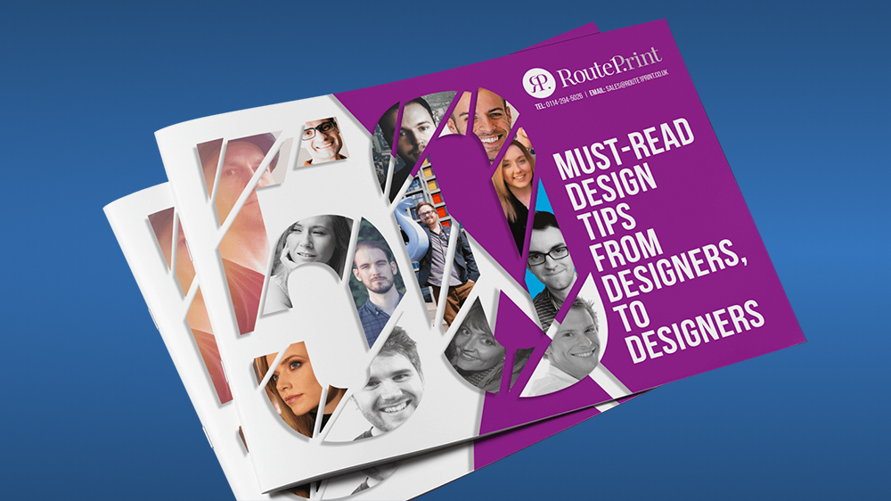
Experienced designers share their tips
As the title suggests, this free ebook from Route One Print brings together key pieces of advice from experienced graphic designers – including Jacob Cass (aka Just Creative) and Brent Galloway – to make your life easier. "From client management to typography, brand identity to finding alternative textures in Photoshop, this ebook offers practical tips for designers and showcases new ways to think about design," says the blurb.
It also promises to reveal which fonts the designers never use. Is it Comic Sans? Helvetica? We guess you'll have to download it to find out. Route 1 offers a whole range of ebooks for designers in fact, including The Freelancer’s Bible (below) and The Design Comedy: How to deal with the 9 stages of client hell.
05. Brand House Book
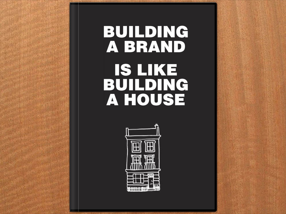
The Brand House Book breaks branding down into six manageable stages
If you're having problems getting to grips with the world of branding, this free ebook by Roger Lindeback can help you out by taking away all the jargon and relating it to everyday experience.
In the Brand House Book, Lindeback aims to make branding tangible by comparing it to building a house, breaking it down into six manageable stages – dreaming, planning, starting work, designing, building and finally getting the details right – with a branding summary at the end of each stage, setting out all the important issues to think through in your brand building process.
06. The Practical Interaction Design Bundle
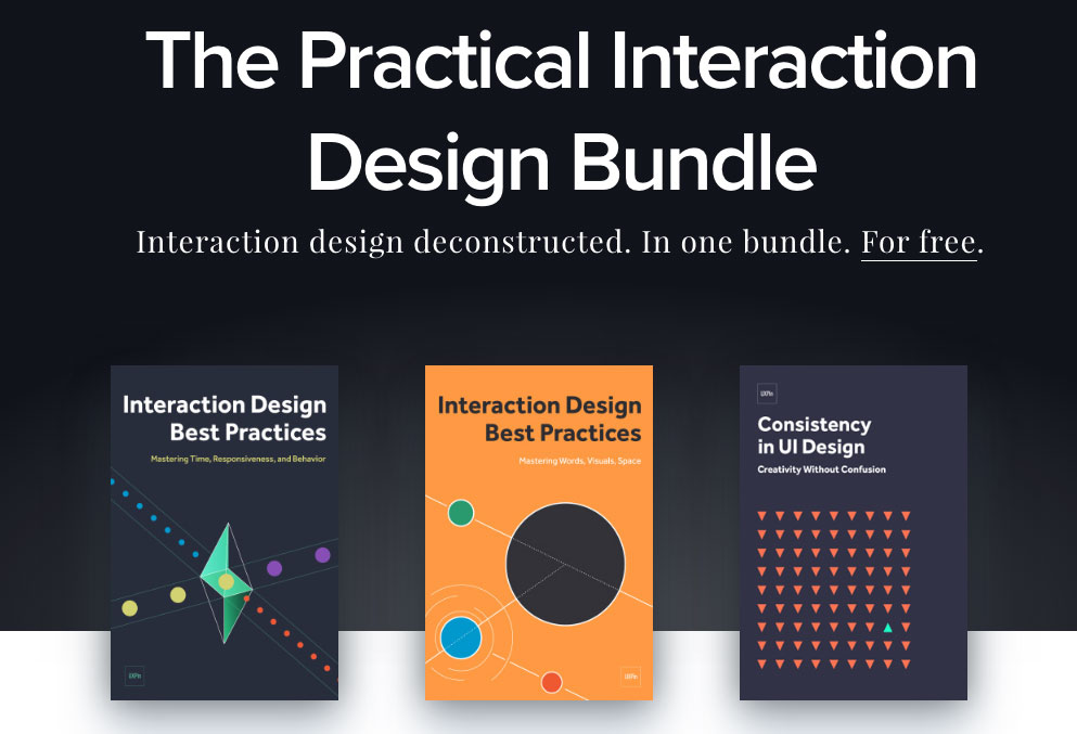
Get three helpings of interaction design advice for the price of none
Not one but three free ebooks in one handy bundle, The Practical Interaction Design Bundle consists of three free volumes from UXPin, comprising over 250 pages of design best practices and with over 60 examples of the best UX design.
Volumes 1 and 2 of Interaction Design Best Practices will take you through techniques, theories and best practices relating to the tangibles of interaction design – words, visuals and space – while volume 2 tackles the intangibles: time, responsiveness and behaviour.
Topping off the bundle is Consistency in UI Design, covering how and when to maintain consistency in your design, and when to break it to draw attention to elements without suffering the drawbacks.
07. An Introduction to Adobe Photoshop
What’s a Photoshop? This book will tell you
If you're after a beginner-friendly guide to getting started with Photoshop, this free ebook by Steve Bark will explain the fundamentals for you, from panels and tools to layers and basic printing.
If it's just a little too basic for you, never fear; there's also an intermediate guide available that covers more advanced subjects such as vector tools, smart objects and clipping masks.
08. The Building Blocks of Visual Hierarchy
Learn to create accessible, intuitive layouts
If you're designing for the web and want your layouts and interfaces to be accessible and visually intuitive, this free ebook from UXPin is an invaluable resource.
It explains how size, colours, space, layout, and style affect visual understanding, provides tips for designing clear visual hierarchies, and includes 18 examples of great sites including MailChimp and RelateIQ.
09. The Freelancer's Bible
From marketing to tax, plan out your freelance career with this book
Whether you're already freelance or thinking of making the jump, this ebook from Route One Print is full of useful freelance advice, with tips on how to market your business, find your USP, licence your work, manage client relationships, complete tax returns and much more.
10. Flat Design & Colors
Love flat design but don’t know where to start? Download this freebie
The free ebook Flat Design & Colors by UXPin dives deep into the most powerful techniques for creating highly usable yet visually interesting web designs.
The design team compiled advice from experts and illustrated their points using examples from 40 companies such as Google, Squarespace, and others.
11. Houdini Foundations
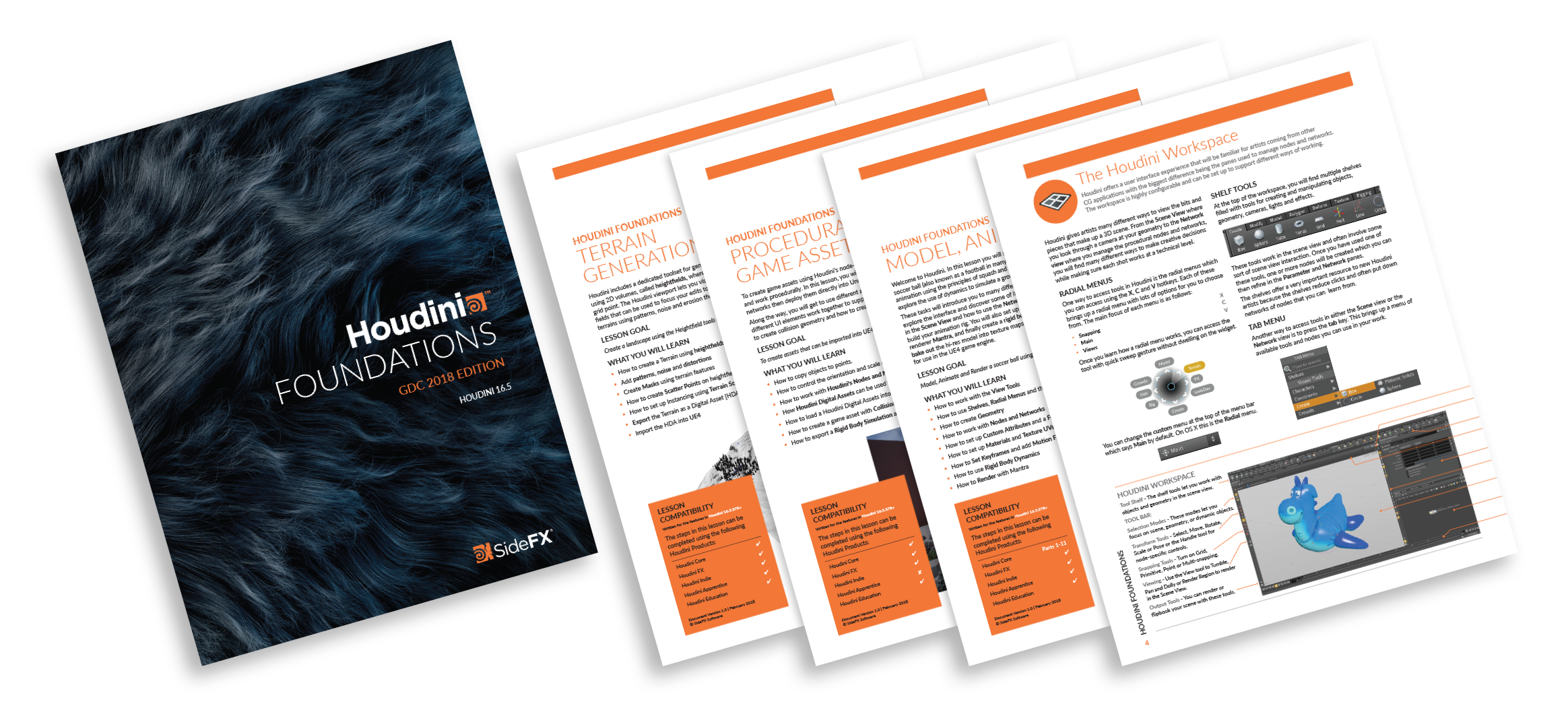
Add that extra dimension to your designs with this free ebook on Houdini
If you're looking to add a touch of 3D art to your designs, this free ebook on Houdini will help get you started. Learn all about the tools and techniques you will use as a Houdini artists then run through three lessons that teach you how to build simple projects from scratch.
12. The Future of Product Design
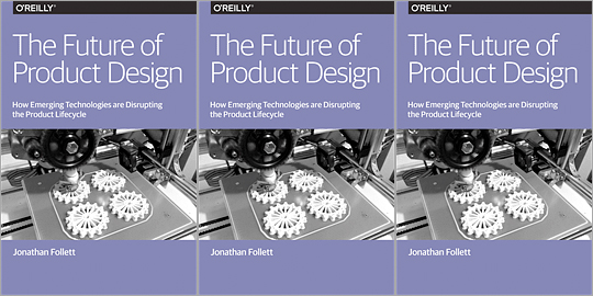
Learn the ins-and-outs of product design with this immersive ebook
In this report, Jonathan Follett from Invo examines from a designer's perspective the ways emerging technologies are affecting the product lifecycle, and explores various options for companies looking at new ways of approaching product design and development.
Even if you're not specifically in the business of product design, this freebie is an eye-opener.
13. Everything There is to Know About Logo Design
This handbook to logo design gives you a quick and thorough introduction
Whether you're new to logo design or just want to swat up on some tips and tricks, the Everything There is to Know About Logo Design ebook is a great little guide to get you going.
In this 25-page guide, you’ll learn the basics of what a logo is, rules for creating a logo and other things to consider, such as colours and typography.
14. Design's Iron Fist
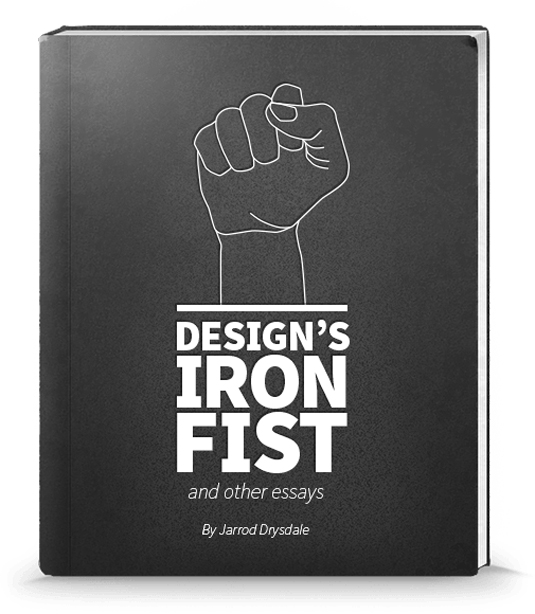
This free ebook will help you get the best out of yourself
Jarrod Drysdale is a designer writer who focuses his articles on getting the best out of your work. This is a sort of continuation of his previous book Bootstrapping Design (now discontinued), in which he collects all of his previous essays into one, free ebook.
Topics such as 'Think like a designer' and 'Get out of a creative rut' are just some of the titles on offer in this selection.
15. Pixel Perfect Precision Handbook
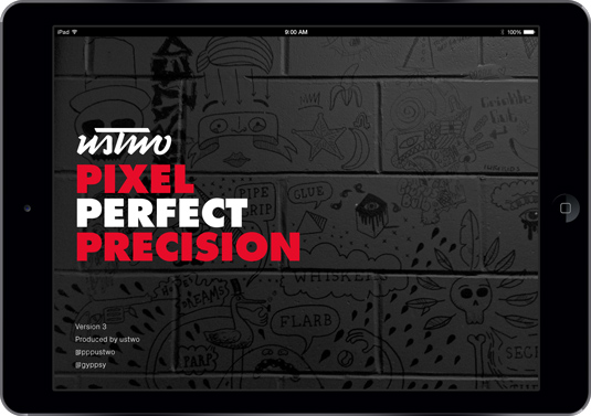
The Pixel Perfect Precision ebook has had an important update
The Pixel Perfect Precision (PPP) Handbook from leading digital design agency ustwo has come a long way since it was first released. What started as a 108-page simple guide to best practice with pixels and Photoshop has grown into handbook number 3 – a whopping 214-page designer bible.
16. The Creative Aid Handbook
The Creative Aid book aims to be a mini resource for your creative projects
Created by Kooroo Kooroo, The Creative Aid is a free book jam packed full of inspiration and available to download today.
Co-founders Nicole Smith and Richard Tapp explain the concept: "It's a mini resource for your creative projects and food for your creative thoughts. We’ve included our own valuable references and resources we know and trust as a means to help you get your projects done.
"We want to give you the creative push from a direction you may not have thought of, be it informative, inspirational, or simply entertaining."
17. The Vignelli Canon
Learn from one of the greats of design, Massimo Vignelli
Iconic designer Massimo Vignelli didn't just like to create good design: he was also passionate about sharing its principles, rules and criteria so others could do the same.
His landmark book The Vignelli Canon uses numerous examples to convey applications in practice from product design via signaletics and graphic design to corporate design. And best of all, in 2009 he made it available for free as a PDF.
18. Type Classification eBook
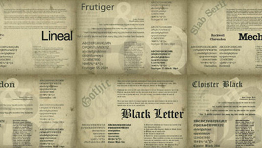
Grasp the fundamentals of type selection
This excellent 27-page ebook details the 10 key classifications for typography, providing the basic understanding you'll need to gain a grasp of the fundamentals of type selection. The book covers a brief history for each of the classifications, as well as the core characteristics of the style.
19. Creative Suite Printing Guide
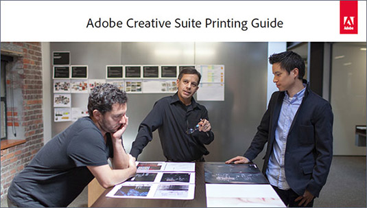
Wave goodbye to bad printing by following this guide
This handy book from Adobe provides all the information you'll need to get the best-quality results possible when printing from Adobe Photoshop, Illustrator, InDesign and Acrobat.
Over the course of 149 pages the different tools and options within each package are broken down, illustrating how to produce files for print that will provide accurate colour reproduction, pixel-perfect transparency matting and sharp lines.
20. Breaking the Time Barrier
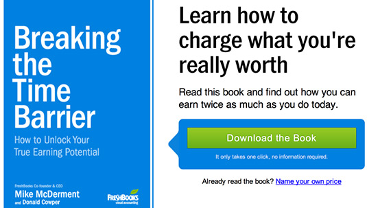
Time is money, and this helpful tome won’t take up too much of it
This ebook tells a parable, using a semi-fictional scenario to illustrate the importance of pricing your work at the right level. The book itself will take an hour or two to read, and really focuses only one core message, but it’s a valuable lesson for designers starting out in business for themselves.
21. Graphic Design for Non-profit Organizations
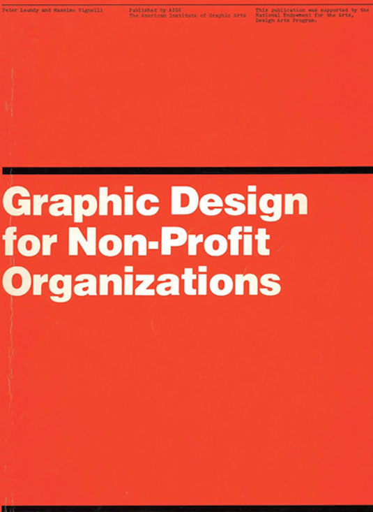
Graphic Design for Non-profit Organisations
The book focuses mainly on design and best practices for non-profit organizations, but the content is a great resource in general and the teachings can be applied pretty much anywhere.
22. The Design Funnel
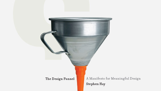
Learn to turn client input into something that’s actually useful
Another manifesto from the ChangeThis.com website, this offering from author Stephen Hay provides a methodology for converting client input (which may often be extremely vague!) into a meaningful design approach. As with Hugh MacLeod's book, this free PDF offers a personal insight into the process, demonstrating its value.
Related articles:
5 must-read books for design studentsHow to design a book in InDesign9 indie mags you should read


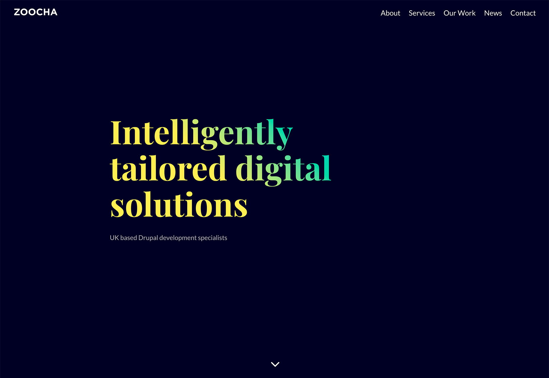
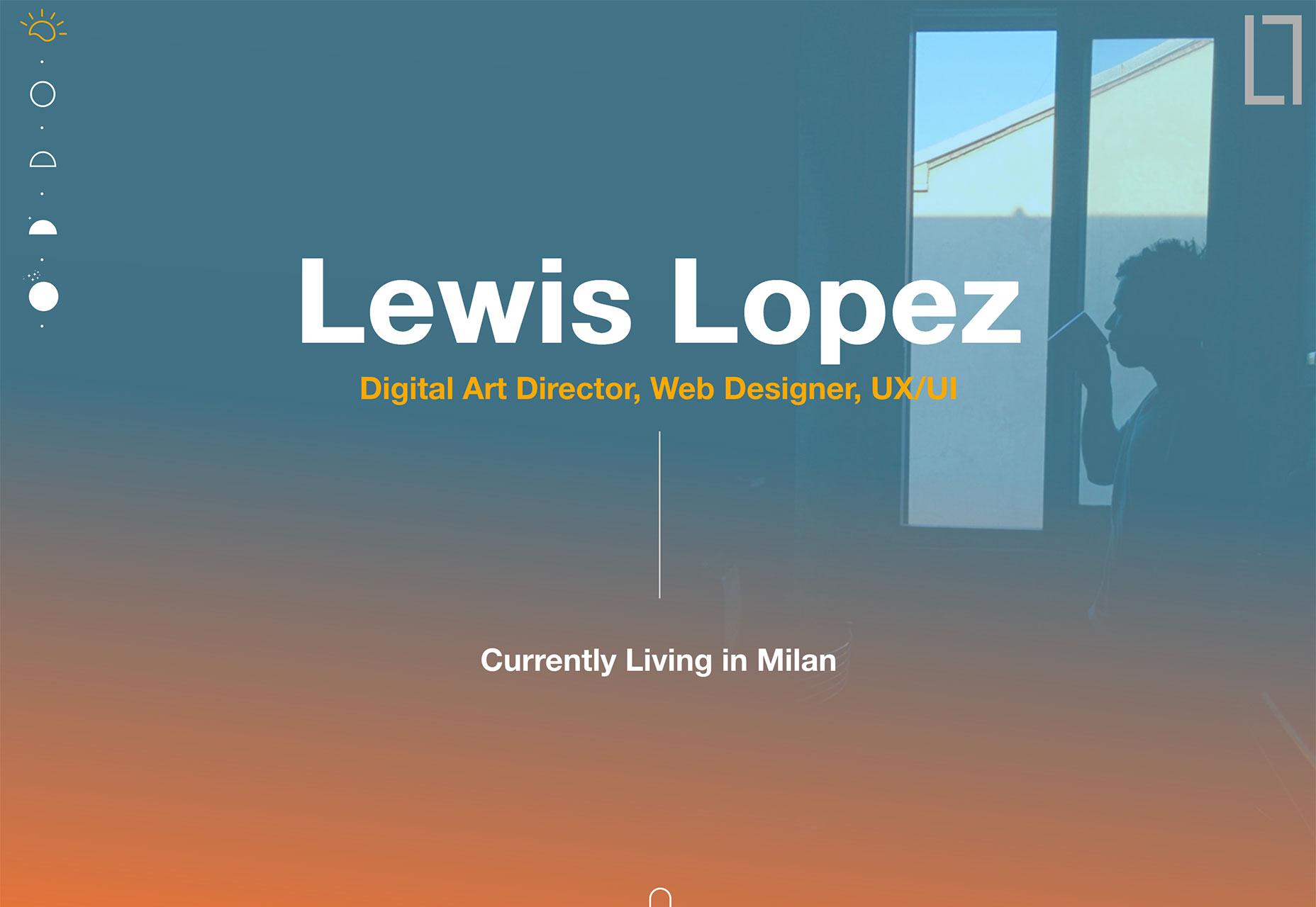
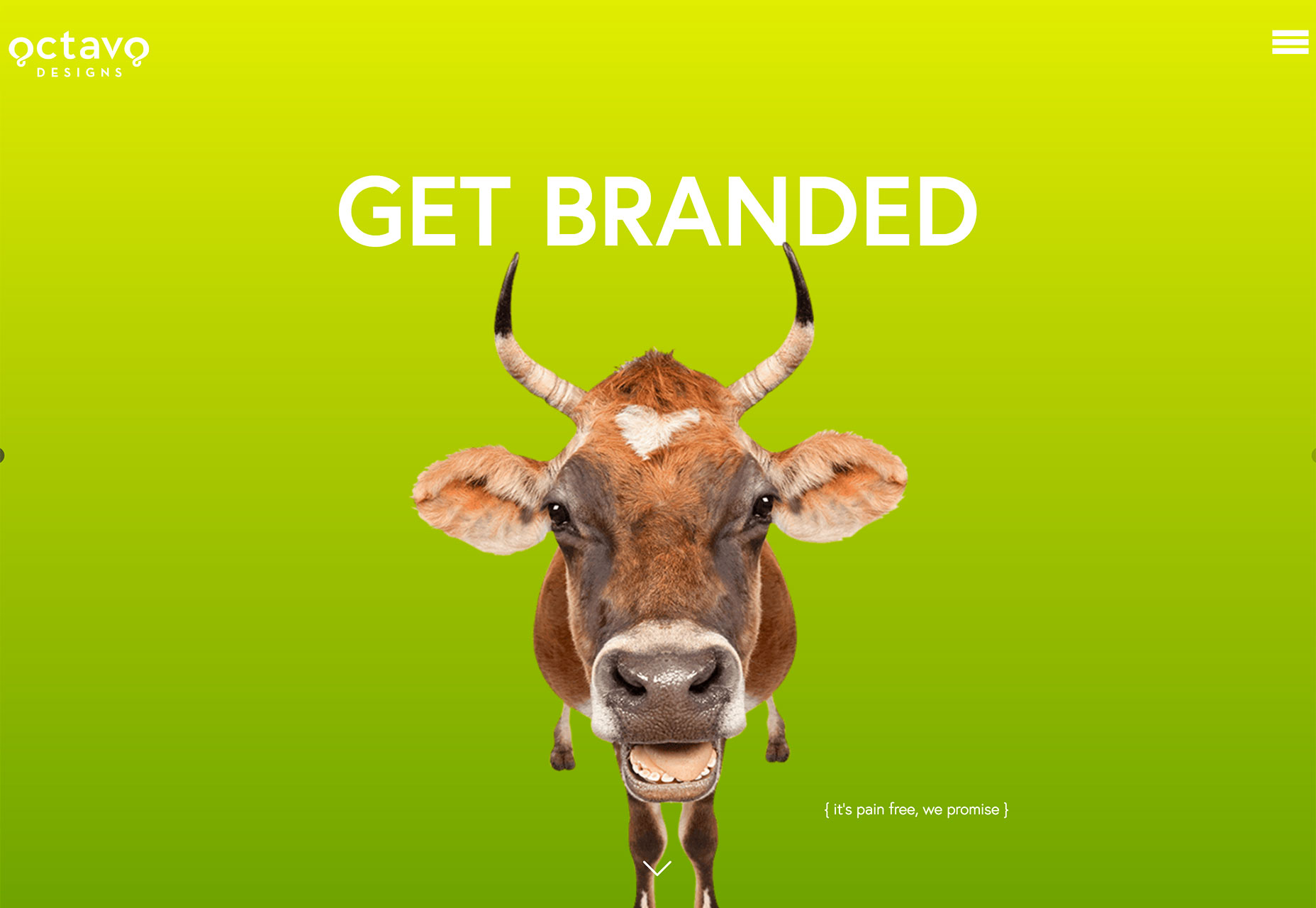
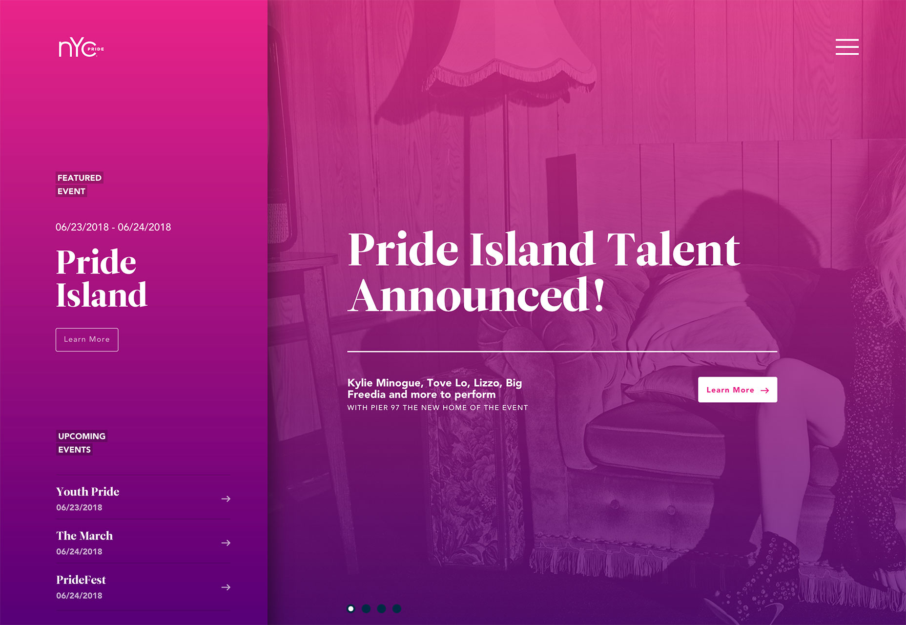
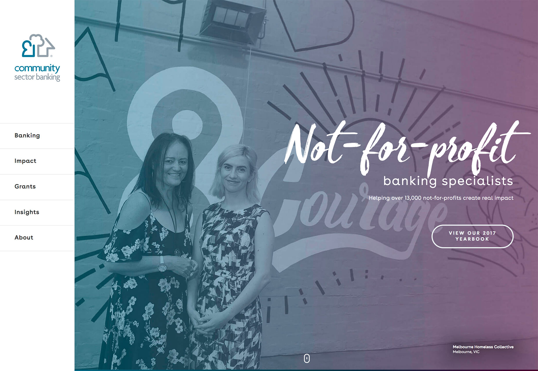
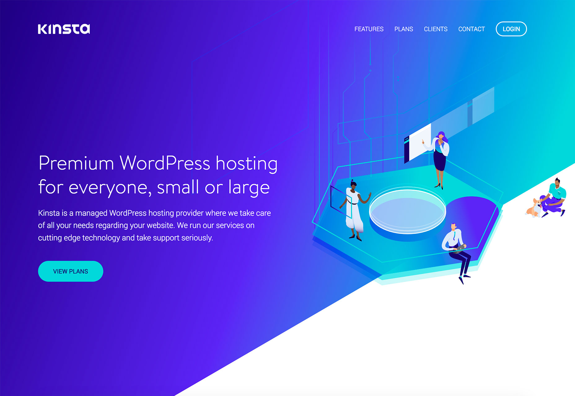
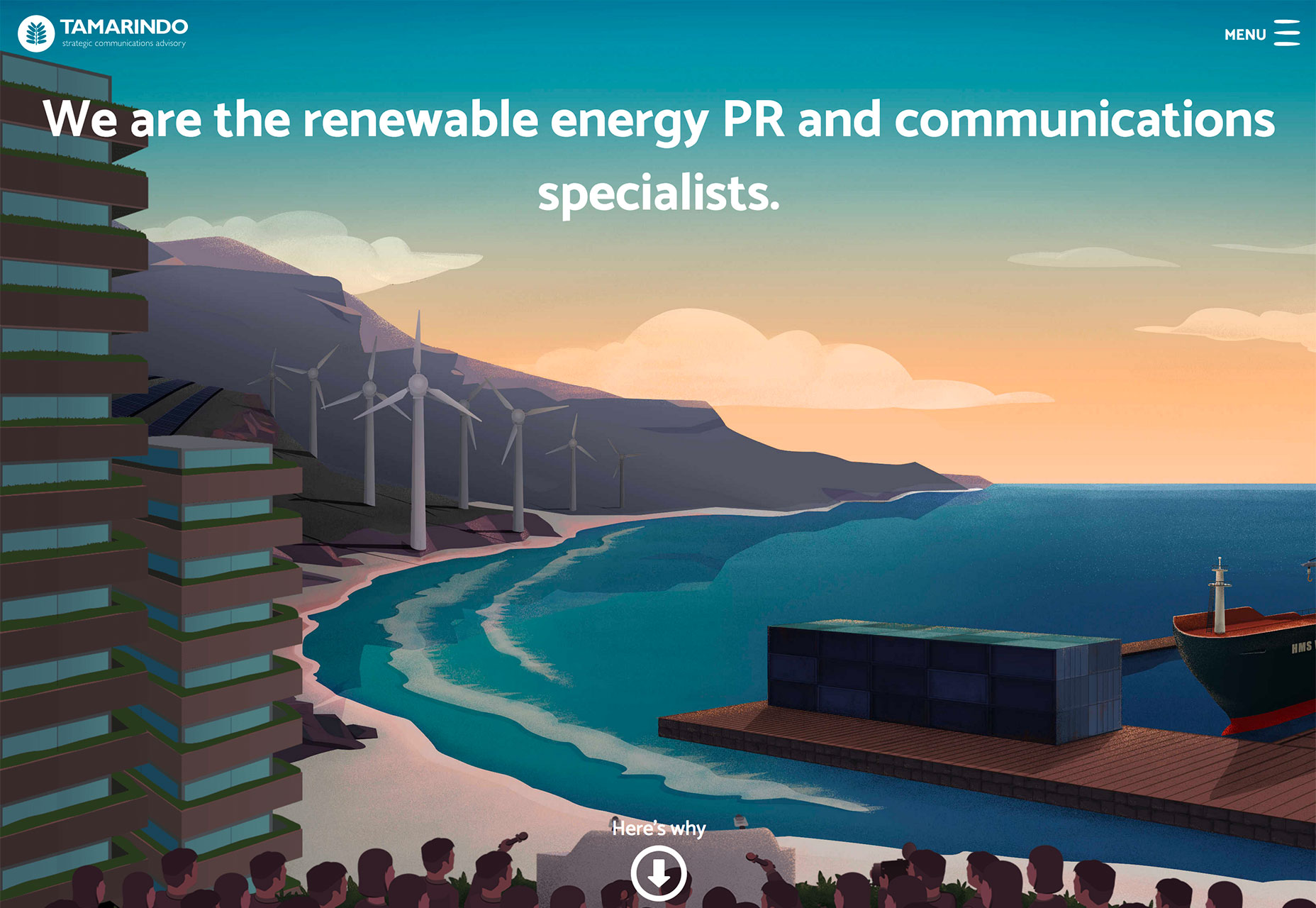
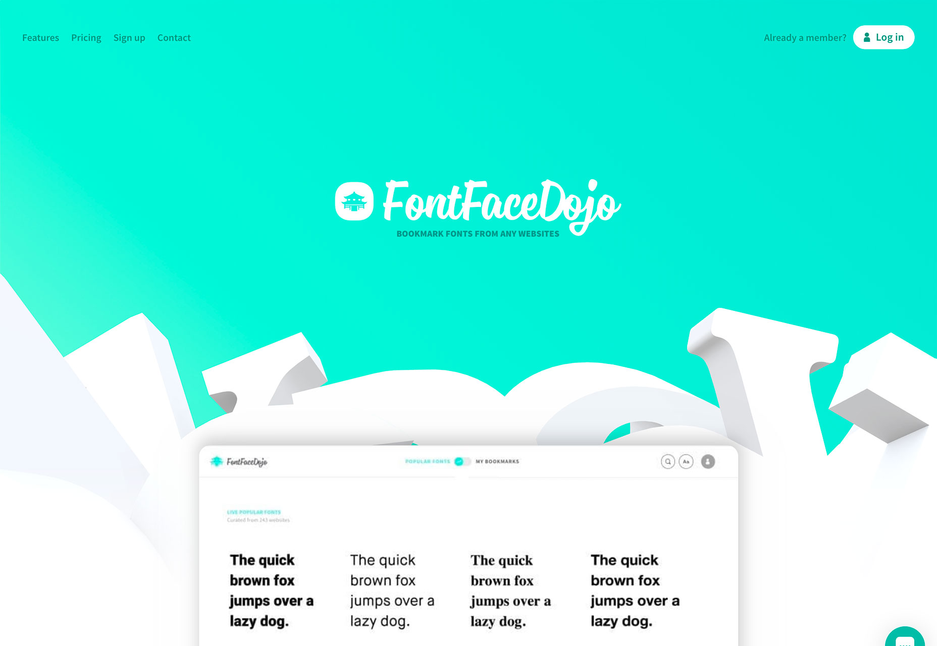
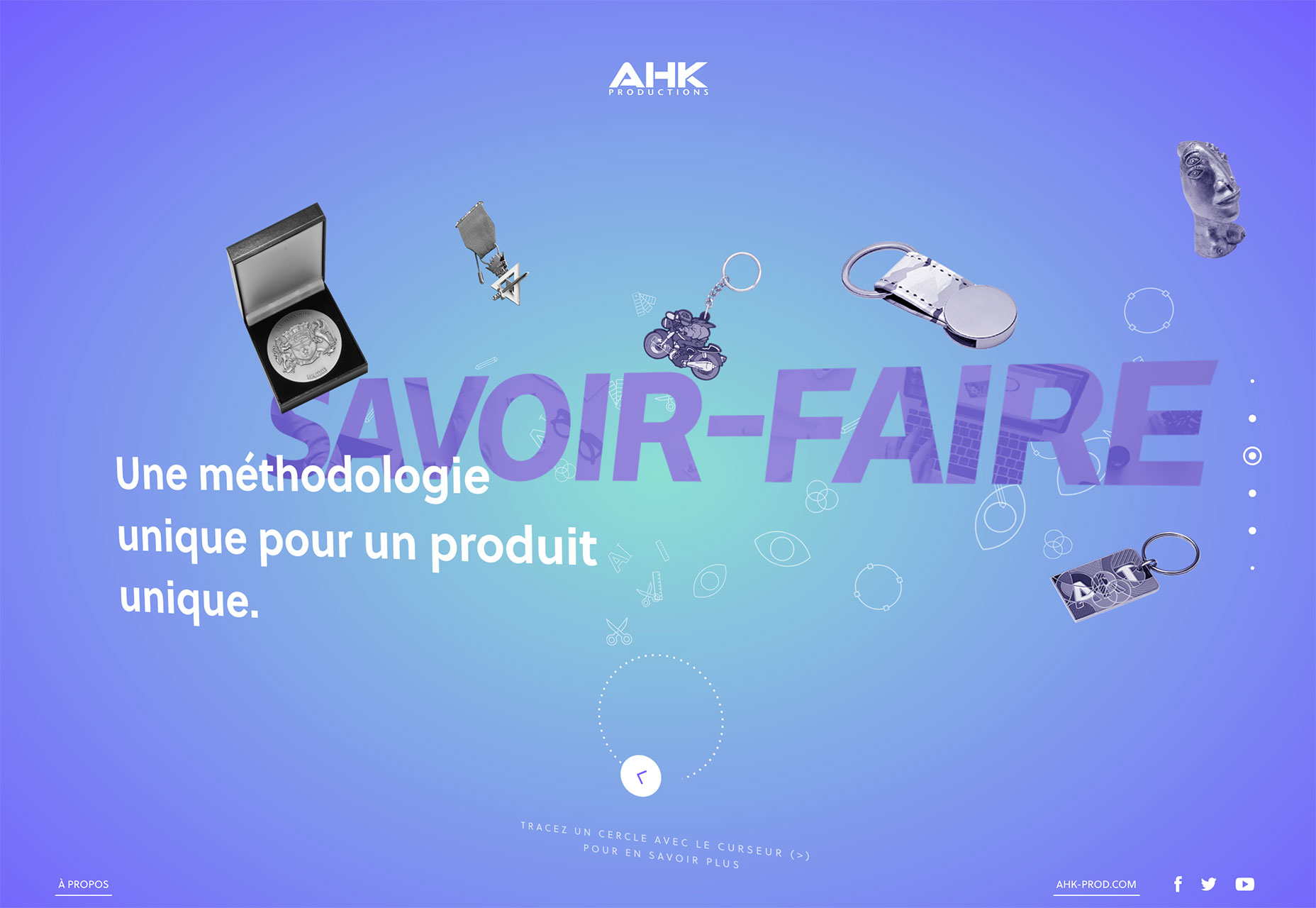
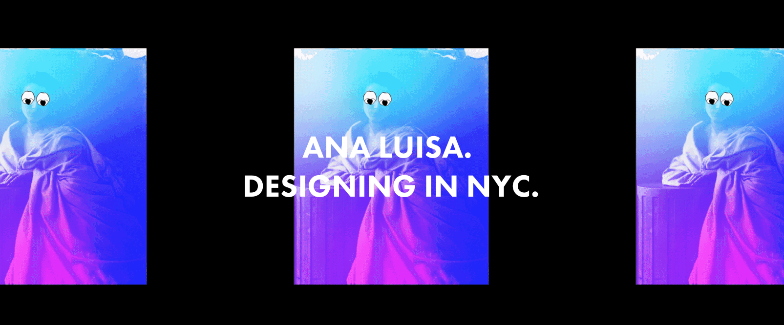
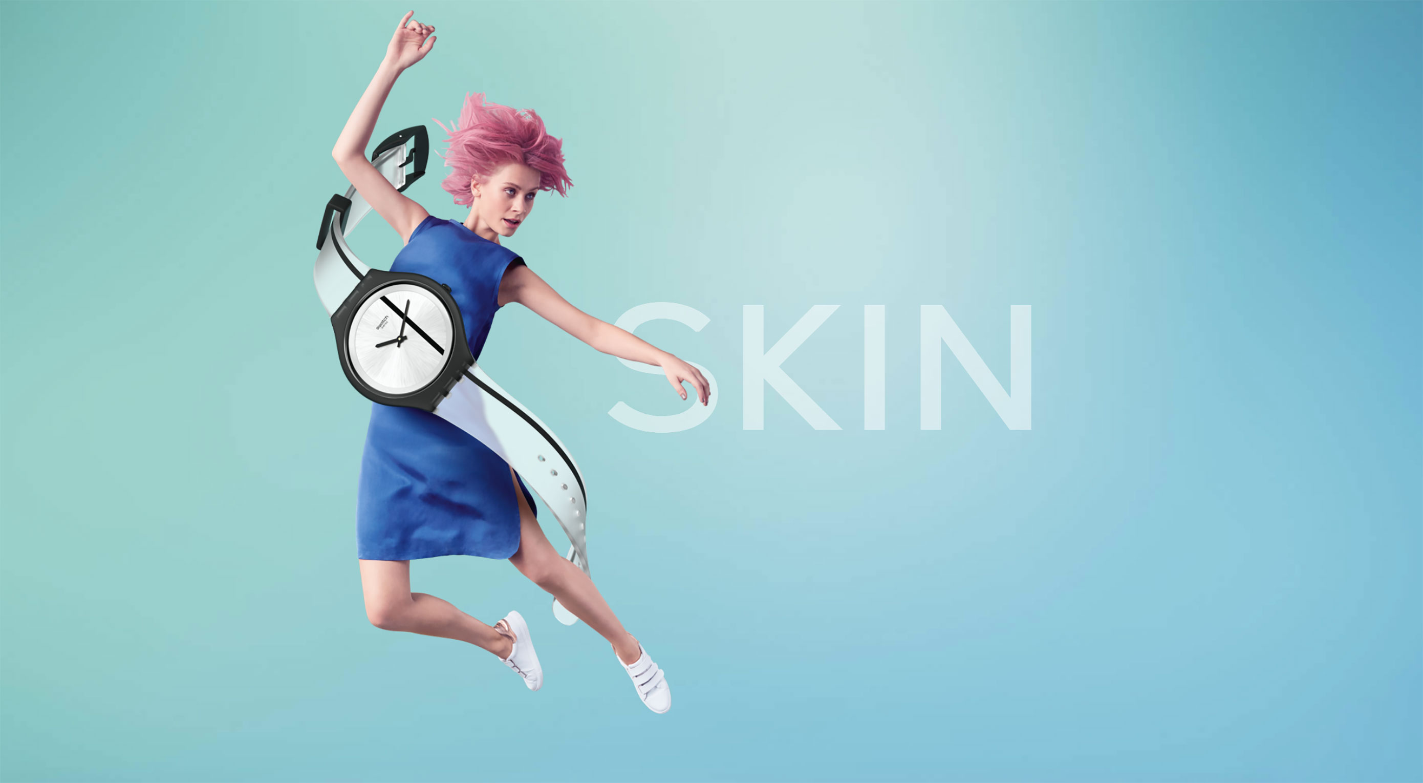 After years of flat, material and completely minimal styles, the gradient has made a comeback. Everywhere you look, designers are using color fades to add visual interest, create user engagement and just design something that’s worth looking at.
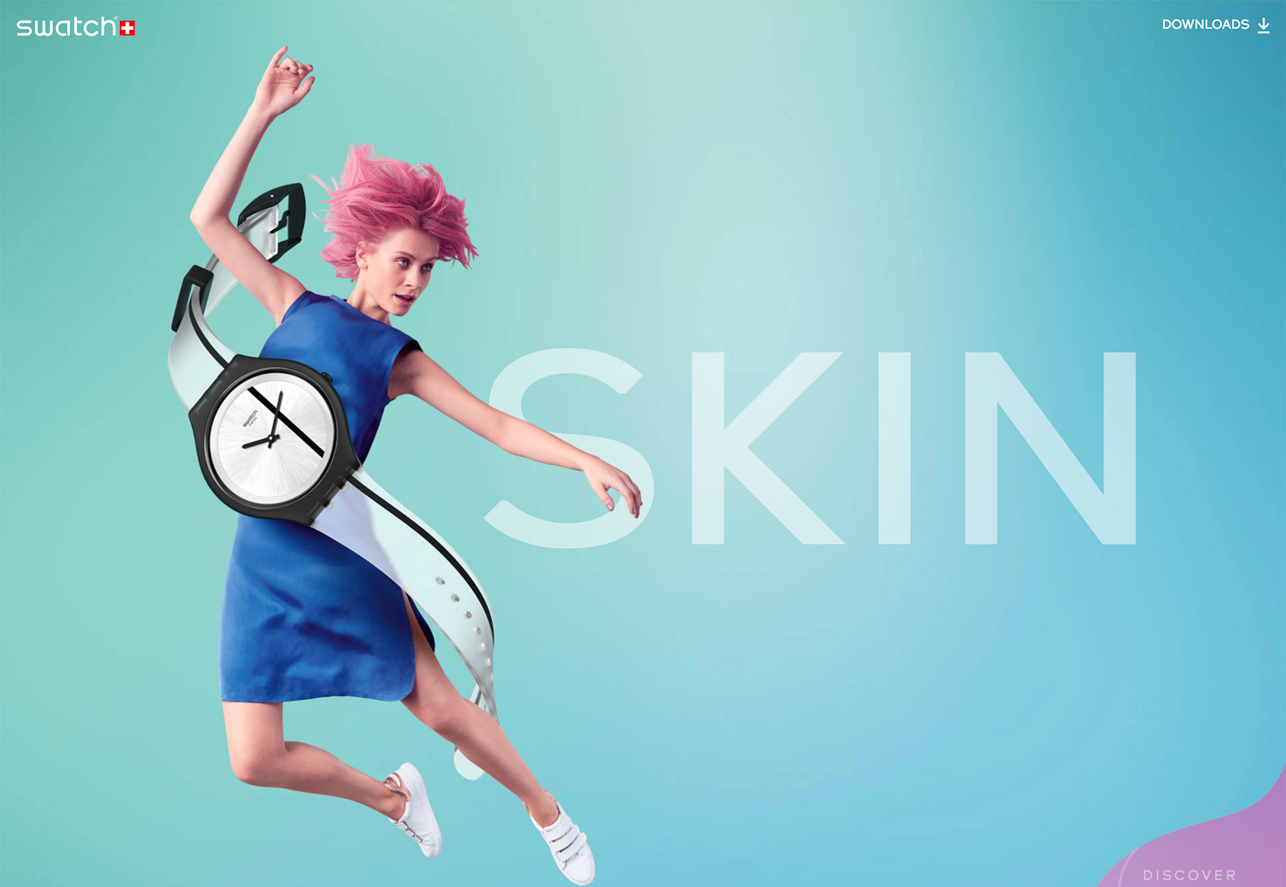


