Original Source: https://www.smashingmagazine.com/2018/07/desktop-wallpaper-calendars-august-2018/
Sunshine All Day Every Day (August 2018 Wallpapers Edition)
Sunshine All Day Every Day (August 2018 Wallpapers Edition)
Cosima Mielke
2018-07-31T13:11:56+02:00
2018-07-31T15:32:00+00:00
Everybody loves a beautiful wallpaper to freshen up their desktops. So to cater for new and unique artworks on a regular basis, we embarked on our monthly wallpapers adventure nine years ago, and since then, countless artists and designers from all over the world have accepted the challenge and submitted their designs to it. It wasn’t any different this time around, of course.
This post features wallpapers created for August 2018. Each of them comes in versions with and without a calendar and can be downloaded for free. A big thank-you to everyone who participated!
Finally, as a little bonus, we also collected some “oldies but goodies” from previous August editions in this collection. Please note, that they only come in a non-calendar version. Which one will make it to your desktop this month?
Please note that:
All images can be clicked on and lead to the preview of the wallpaper,
We respect and carefully consider the ideas and motivation behind each and every artist’s work. This is why we give all artists the full freedom to explore their creativity and express emotions and experience throughout their works. This is also why the themes of the wallpapers weren’t anyhow influenced by us, but rather designed from scratch by the artists themselves.
Submit your wallpaper
We are always looking for creative designers and artists to be featured in our wallpapers posts. So if you have an idea for a wallpaper, please don’t hesitate to submit your design. We’d love to see what you’ll come up with. Join in! →
Meet Smashing Book 6 with everything from design systems and accessible single-page apps to CSS Custom Properties, Grid, Service Workers, performance, AR/VR and responsive art direction. New frontiers in front-end and UX with Marcy Sutton, Harry Roberts, Laura Elizabeth and many others.
Table of Contents →
Purple Haze
“Meet Lucy: she lives in California, loves summer and sunbathing at the beach. This is our Jimi Hendrix Experience tribute. Have a lovely summer!” — Designed by PopArt Web Design from Serbia.

preview
with calendar: 320×480, 640×480, 800×480, 800×600, 1024×768, 1024×1024, 1152×864, 1280×720, 1280×800, 1280×960, 1280×1024, 1366×768, 1400×1050, 1440×900, 1600×1200, 1680×1050, 1680×1200, 1920×1080, 1920×1200, 1920×1440, 2560×1440
without calendar: 320×480, 640×480, 800×480, 800×600, 1024×768, 1024×1024, 1152×864, 1280×720, 1280×800, 1280×960, 1280×1024, 1366×768, 1400×1050, 1440×900, 1600×1200, 1680×1050, 1680×1200, 1920×1080, 1920×1200, 1920×1440, 2560×1440
Coffee Break Time
Designed by Ricardo Gimenes from Sweden.

preview
with calendar: 320×480, 640×480, 800×480, 800×600, 1024×768, 1024×1024, 1152×864, 1280×720, 1280×800, 1280×960, 1280×1024, 1366×768, 1400×1050, 1440×900, 1600×1200, 1680×1050, 1680×1200, 1920×1080, 1920×1200, 1920×1440, 2560×1440
without calendar: 320×480, 640×480, 800×480, 800×600, 1024×768, 1024×1024, 1152×864, 1280×720, 1280×800, 1280×960, 1280×1024, 1366×768, 1400×1050, 1440×900, 1600×1200, 1680×1050, 1680×1200, 1920×1080, 1920×1200, 1920×1440, 2560×1440
A Midsummer Night’s Dream
“Inspired by William Shakespeare.” — Designed by Sofie Lee from South Korea.

preview
with calendar: 800×480, 1024×768, 1280×720, 1280×800, 1600×1200, 1680×1050, 1680×1200, 1920×1080, 2560×1440
without calendar: 800×480, 1024×768, 1280×720, 1280×800, 1600×1200, 1680×1050, 1680×1200, 1920×1080, 2560×1440
This August, Be The Best!
“Here is the August monthly calendar to remind you of your as well as your team’s success in the previous months. Congratulations, you guys deserved all the success that came your way. Hope you continue this success this month and in the coming months.” — Designed by Webandcrafts from India.

preview
with calendar: 320×480, 640×480, 800×480, 800×600, 1024×768, 1024×1024, 1152×864, 1280×720, 1280×800, 1280×960, 1280×1024, 1366×768, 1400×1050, 1440×900, 1600×1200, 1680×1050, 1680×1200, 1920×1200, 1920×1440, 2560×1440
without calendar: 320×480, 640×480, 800×480, 800×600, 1024×768, 1024×1024, 1152×864, 1280×720, 1280×800, 1280×960, 1280×1024, 1366×768, 1400×1050, 1440×900, 1600×1200, 1680×1050, 1680×1200, 1920×1200, 1920×1440, 2560×1440
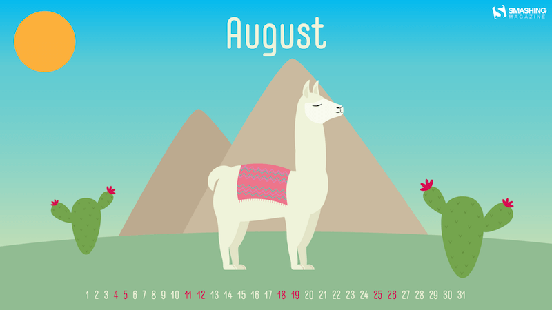
No Drama LLama
“Llamas are showing up everywhere around us, so why not on our desktops too?” — Designed by Melissa Bogemans from Belgium.
preview
with calendar: 320×480, 640×480, 800×480, 800×600, 1024×768, 1024×1024, 1152×864, 1280×720, 1280×800, 1280×960, 1280×1024, 1400×1050, 1440×900, 1600×1200, 1680×1050, 1680×1200, 1920×1200, 1920×1440, 2560×1440
without calendar: 320×480, 640×480, 800×480, 800×600, 1024×768, 1024×1024, 1152×864, 1280×720, 1280×800, 1280×960, 1280×1024, 1400×1050, 1440×900, 1600×1200, 1680×1050, 1680×1200, 1920×1200, 1920×1440, 2560×1440
The Colors Of Life
“The countenance of the clown is a reflection of our own feelings and emotions of life in the most colorful way portrayed with a deeper and stronger expression whether it is a happy clown or a sad clown. The actions of the clown signify your uninhibited nature — the faces of life in its crudest form — larger, louder, and in an undiluted way.” — Designed by Acowebs from India.

preview
with calendar: 320×480, 640×480, 800×480, 800×600, 1024×768, 1024×1024, 1152×864, 1280×800, 1280×960, 1280×1024, 1366×768, 1440×900, 1680×1050, 1680×1200, 1920×1080, 1920×1200, 1920×1440, 2560×1440
without calendar: 320×480, 640×480, 800×480, 800×600, 1024×768, 1024×1024, 1152×864, 1280×800, 1280×960, 1280×1024, 1366×768, 1440×900, 1680×1050, 1680×1200, 1920×1080, 1920×1200, 1920×1440, 2560×1440
Hello August
“August brings me to summer, and summer brings me to fruit. In the hot weather there is nothing better than a fresh piece of fruit.” — Designed by Bram Wieringa from Belgium.

preview
with calendar: 800×600, 1280×1024, 1440×900, 1680×1050, 1920×1080, 1920×1200, 2560×1440
without calendar: 800×600, 1280×1024, 1440×900, 1680×1050, 1920×1080, 1920×1200, 2560×1440
Exploring Thoughts
“Thoughts, planning, daydreams are simply what minds do. It’s following the human impulse to explore the unexplored, question what doesn’t ring true, dig beneath the surface of what you think you know to formulate your own reality, and embrace the inherent ‘now’ of life. The main character here has been created blending texture and composition. Thoughts will never have an end.” — Designed by Sweans from London.

preview
with calendar: 320×480, 800×480, 800×600, 1024×768, 1024×1024, 1152×864, 1280×720, 1280×800, 1280×960, 1280×1024, 1366×768, 1400×1050, 1440×900, 1600×1200, 1680×1050, 1680×1200, 1920×1080, 1920×1200, 1920×1440, 2560×1440
without calendar: 320×480, 800×480, 800×600, 1024×768, 1024×1024, 1152×864, 1280×720, 1280×800, 1280×960, 1280×1024, 1366×768, 1400×1050, 1440×900, 1600×1200, 1680×1050, 1680×1200, 1920×1080, 1920×1200, 1920×1440, 2560×1440
Chilling At The Beach
“In August it’s Relaxation Day on the 15th so that’s why I decided to make a wallpaper in which I showcase my perspective of relaxing. It’s a wallpaper where you’re just chilling at the beach with a nice cocktail and just looking at the sea and looking how the waves move. That is what I find relaxing! I might even dip my feet in the water and go for a swim if I’m feeling adventurous!” — Designed by Senne Mommens from Belgium.

preview
with calendar: 1280×720, 1280×800, 1920×1080, 2560×1440
without calendar: 1280×720, 1280×800, 1920×1080, 2560×1440
Let Peace Reign
“The freedom and independence sprouts from unbiased and educated individuals that build the nation for peace, prosperity and happiness to reign in the country for healthy growth.” — Designed by Admission Zone from India.

preview
with calendar: 320×480, 640×480, 800×600, 1024×768, 1024×1024, 1152×864, 1280×720, 1280×800, 1280×960, 1280×1024, 1366×768, 1400×1050, 1440×900, 1600×1200, 1680×1050, 1920×1080, 1920×1200, 1920×1440, 2560×1440
without calendar: 320×480, 640×480, 800×600, 1024×768, 1024×1024, 1152×864, 1280×720, 1280×800, 1280×960, 1280×1024, 1366×768, 1400×1050, 1440×900, 1600×1200, 1680×1050, 1920×1080, 1920×1200, 1920×1440, 2560×1440
On The Ricefields Of Batad
“Somebody once told me that I should make the most out of vacation. So there I was, carefully walking on a stone ridge in the ricefields of Batad. This place is hidden high up in the mountains. Also August is harvesting season.” — Designed by Miguel Lammens from Belgium.

preview
with calendar: 1680×1200, 1920×1080, 1920×1200, 1920×1440, 2560×1440
without calendar: 1680×1200, 1920×1080, 1920×1200, 1920×1440, 2560×1440
Fantasy
Designed by Ilse van den Boogaart from The Netherlands.

preview
with calendar: 1280×1024, 1366×768, 1400×1050, 1440×900, 1600×1200, 1680×1050, 1680×1200, 1920×1080, 1920×1200, 1920×1440, 2560×1440
without calendar: 1280×1024, 1366×768, 1400×1050, 1440×900, 1600×1200, 1680×1050, 1680×1200, 1920×1080, 1920×1200, 1920×1440, 2560×1440
Oldies But Goodies
The past nine years have brought forth lots of inspiring wallpapers, and, well, it’d be a pity to let them gather dust somewhere down in the archives. That’s why we once again dug out some goodies from past August editions that are bound to make a great fit on your desktop still today. Please note that these wallpapers, thus, don’t come with a calendar.
Happiness Happens In August
“Many people find August one of the happiest months of the year because of holidays. You can spend days sunbathing, swimming, birdwatching, listening to their joyful chirping, and indulging in sheer summer bliss. August 8th is also known as the Happiness Happens Day, so make it worthwhile.” — Designed by PopArt Studio from Serbia.

preview
without calendar: 320×480, 640×480, 800×480, 800×600, 1024×768, 1024×1024, 1152×864, 1280×720, 1280×800, 1280×960, 1280×1024, 1366×768, 1400×1050, 1440×900, 1600×1200, 1680×1050, 1680×1200, 1920×1080, 1920×1200, 1920×1440, 2560×1440
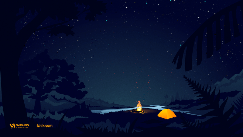
Psst, It’s Camping Time…
“August is one of my favorite months, when the nights are long and deep and crackling fire makes you think of many things at once and nothing at all at the same time. It’s about these heat and cold which allow you to touch the eternity for a few moments.” — Designed by Igor Izhik from Canada.
preview
without calendar: 1024×768, 1024×1024, 1280×720, 1280×800, 1280×960, 1280×1024, 1400×1050, 1440×900, 1600×1200, 1680×1050, 1680×1200, 1920×1080, 1920×1200, 1920×1440, 2560×1440
Bee Happy!
“August means that fall is just around the corner, so I designed this wallpaper to remind everyone to ‘bee happy’ even though summer is almost over. Sweeter things are ahead!” — Designed by Emily Haines from the United States.

preview
without calendar: 640×480, 800×600, 1280×720, 1280×800, 1280×960, 1366×768, 1400×1050, 1440×900, 1600×1200, 1680×1050, 1680×1200, 1920×1080, 1920×1200, 1920×1440, 2560×1440
Hello Again
“In Melbourne it is the last month of quite a cool winter so we are looking forward to some warmer days to come.” — Designed by Tazi from Australia.

preview
without calendar: 320×480, 640×480, 800×600, 1024×768, 1152×864, 1280×720, 1280×960, 1600×1200, 1920×1080, 1920×1440, 2560×1440
A Bloom Of Jellyfish
“I love going to aquariums – the colours, patterns and array of blue hues attract the nature lover in me while still appeasing my design eye. One of the highlights is always the jellyfish tanks. They usually have some kind of light show in them, which makes the jellyfish fade from an intense magenta to a deep purple – and it literally tickles me pink. On a recent trip to uShaka Marine World, we discovered that the collective noun for jellyfish is a bloom and, well, it was love-at-first-collective-noun all over again. I’ve used some intense colours to warm up your desktop and hopefully transport you into the depths of your own aquarium.” — Designed by Wonderland Collective from South Africa.

preview
without calendar: 320×480, 800×600, 1024×768, 1280×960, 1680×1050, 1920×1200, 2560×1440
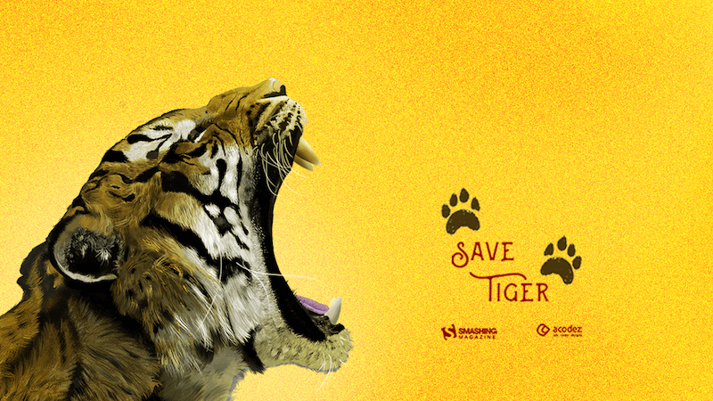
Let Us Save The Tigers
“Let us take a pledge to save these endangered species and create a world that is safe for them to live and perish just like all creatures.” — Designed by Acodez IT Solutions from India.
preview
without calendar: 320×480, 640×480, 800×480, 800×600, 1024×768, 1024×1024, 1152×864, 1280×720, 1280×800, 1280×960, 1280×1024, 1366×768, 1400×1050, 1440×900, 1600×1200, 1680×1050, 1680×1200, 1920×1080, 1920×1200, 1920×1440, 2560×1440
Shades
“It’s sunny outside (at least in the Northern Hemisphere!), so don’t forget your shades!” — Designed by James Mitchell from the United Kingdom.

preview
without calendar: 1280×720, 1280×800, 1366×768, 1440×900, 1680×1050, 1920×1080, 1920×1200, 2560×1440, 2880×1800
Ahoy
Designed by Webshift 2.0 from South Africa.

preview
without calendar: 1366×768, 1440×900, 1680×1050, 1920×1080, 1920×1200, 2560×1440
About Everything
“I know what you’ll do this August. 🙂 Because August is about holiday. It’s about exploring, hiking, biking, swimming, partying, feeling and laughing. August is about making awesome memories and enjoying the summer. August is about everything. An amazing August to all of you!” — Designed by Ioana Bitin from Bucharest, Romania.

preview
without calendar: 320×480, 800×480, 800×600, 1024×768, 1280×960, 1280×1024, 1440×900, 1600×1200, 1680×1050, 1920×1080, 1920×1200, 1920×1440, 2560×1440
Shrimp Party
“A nice summer shrimp party!” — Designed by Pedro Rolo from Portugal.

preview
without calendar: 320×480, 800×600, 1280×800, 1440×900, 1600×1200, 1920×1080, 2560×1440
The Ocean Is Waiting
“In August, make sure you swim a lot. Be cautious though.” — Designed by Igor Izhik from Canada.

preview
without calendar: 640×480, 800×480, 800×600, 1024×768, 1024×1024, 1152×864, 1280×720, 1280×800, 1280×960, 1280×1024, 1400×1050, 1440×900, 1600×1200, 1680×1050, 1680×1200, 1920×1080, 1920×1200, 1920×1440, 2560×1440
Oh La La… Paris Night
“I like the Paris night! All is very bright!” — Designed by Verónica Valenzuela from Spain.

preview
without calendar: 800×480, 1024×768, 1152×864, 1280×800, 1280×960, 1440×900, 1680×1200, 1920×1080, 2560×1440
World Alpinism Day
“International Day of Alpinism and Climbing.” Designed by cheloveche.ru from Russia.

preview
without calendar: 1024×768, 1280×800, 1280×1024, 1440×900, 1680×1050, 1920×1200
Estonian Summer Sun
“This is a moment from Southern Estonia that shows amazing summer nights.” Designed by Erkki Pung / Sviiter from Estonia.

preview
without calendar: 320×480, 1024×1024, 1280×800, 1440×900, 1920×1200
Aunt Toula At The Beach
“A memory from my childhood summer vacations.” — Designed by Poppie Papanastasiou from Greece.
preview
without calendar: 320×480, 640×480, 800×480, 800×600, 1024×768, 1024×1024, 1152×864, 1280×720, 1280×800, 1280×960, 1280×1024, 1366×768, 1400×1050, 1440×900, 1600×1200, 1680×1050, 1680×1200, 1920×1080, 1920×1200, 1920×1440, 2560×1440
Flowing Creativity
Designed by Creacill, Carole Meyer from Luxembourg.

preview
without calendar: 320×480, 1024×768, 1024×1024, 1280×800, 1280×1024, 1680×1050, 1920×1080, 1920×1200, 2560×1440, 2880×1800, 1366×768
Searching for Higgs Boson
Designed by Vlad Gerasimov from Russia.

preview
without calendar: 800×600, 960×600, 1024×768, 1152×864, 1229×768, 1280×800, 1280×960, 1280×1024, 1400×1050, 1440×900, 1440×900, 1440×960, 1600×1200, 1600×1200, 1680×1050, 1728×1080, 1920×1200, 1920×1440, 2304×1440, 2560×1600
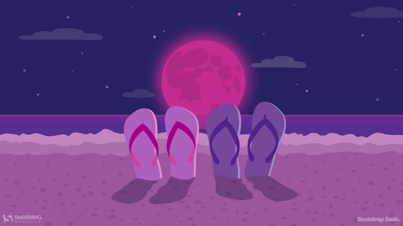
Unforgettable Summer Night
Designed by BootstrapDash from India.
preview
without calendar: 320×480, 640×480, 800×480, 800×600, 1024×768, 1024×1024, 1152×864, 1280×720, 1280×800, 1280×960, 1280×1024, 1366×768, 1440×900, 1440×1050, 1600×1200, 1680×1050, 1680×1200, 1920×1080, 1920×1200, 1920×1440, 2560×1440
Join In Next Month!
Thank you to all designers for their participation. Join in next month!


 Every week users submit a lot of interesting stuff on our sister site Webdesigner News, highlighting great content from around the web that can be of interest to web designers.