Original Source: https://www.webdesignerdepot.com/2018/07/8-secrets-of-the-perfect-link/
 A few weeks ago a frustrated face appeared around the corner of my desk. “Sorry mate, you don’t do any printing do you?”
“Well yeah, sometimes,” I said.
I have a dedicated desk in a co-working space, we share a printer, and it was this shared printer that was frustrating the face in question: “I’ve been trying for hours to get this bloody thing printed, I’m absolutely desperate, I can’t find the right driver anywhere…”
“I think you just log into the dashboard and download it,” I said. “I think that’s what I did, hold on let me try,” I said, firing up the office dashboard. “You go to printer instructions…”
“Yep, I did that.”
“…and then you click…”
“Oh God!” he wailed. “It’s a link isn’t it.”
Here are the instructions that he’d been struggling with:
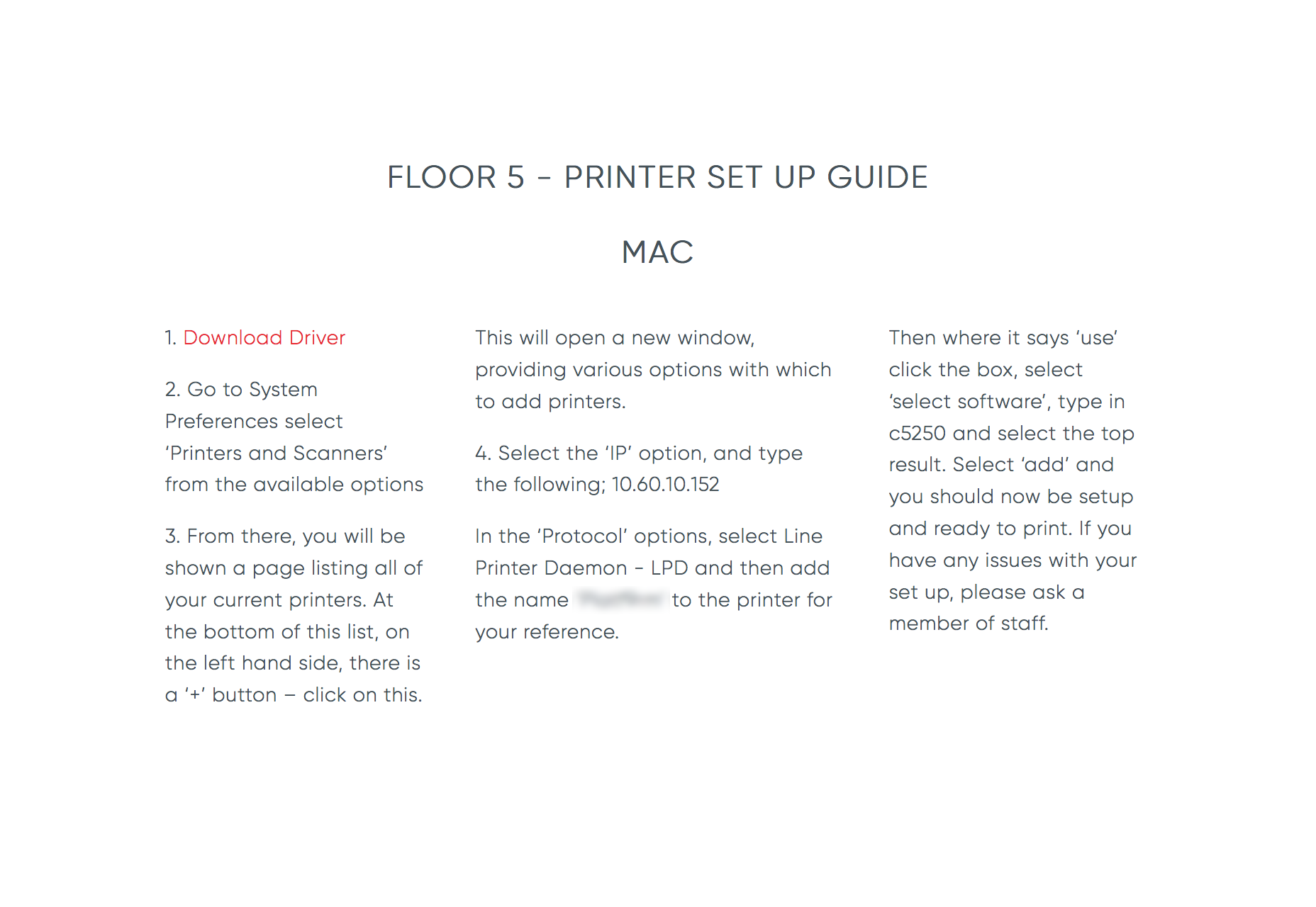
An intelligent, professional person, had spent two hours searching for the right driver for a Canon printer, never realizing that the “Download Driver” instruction was a link.
As he slunk back to his workspace, it seemed impolite to enquire as to whether or not he’s color blind, but I’d put good money on it; if he is, that link probably appears mid-grey, blending in with the rest of the text.
Links are arguably the most important element in any document. Without them, the web is just a collection of files stored on the Internet. The perfect link is simple, honest, and usable. Here’s how to design it.
1. A Good Link is Not a Button
…and a good button is not a link.
We frequently misunderstand the role of links on the web. A link describes the relationship between two pieces of data, providing context, and often providing meaning.
Buttons perform actions, links form contextual relationships
A link does not perform an action. The printer driver link above should not be a link, it should be a button; buttons don’t link data, they perform an action.
It’s entirely true that the vast majority of GUIs allow you to tap or click a link in order to access the linked data, but that is simply a shortcut. The primary role of the link is to establish a connection between pieces of data.
Buttons perform actions, links form contextual relationships.
2. A Good Link Clarifies its Purpose
Central to the problem of how a link should be used, is the fact that the anchor element is flexible enough to be used in a number of ways without breaking. A mailto: link for example should not be a link (it’s an action, not a connection between pieces of data) that has escaped deprecation by being really very useful.
We have a whole hierarchy of headings—including the relatively useless <h5></h5> and <h6></h6>—but we have a single anchor element. In an ideal world we’d have multiple anchor elements to give semantic meaning to links, perhaps a <ae></ae> element for external links (data on a different domain) and a <ai></ai> for internal links (data on the same domain). At present the nearest we can get to giving links semantic meaning is using absolute paths for external links and relative paths for internal links.
We can of course apply different styles to different classes of anchor using CSS. It makes sense that to clarify purpose, internal links should be styled in-keeping with the site’s brand, but that external links should be distinct in some way.
In Tim Berners-Lee’s 1997 thoughts on the nature of UI, he states that:
the interface to a universal space should have a certain universal consistency
Certainly users’ understanding of how to use the web has developed since those words were written, but the essential point holds true; users prefer a UI that reflects their wider experience. While there is an argument to say that internal links should be in-keeping with a site’s brand to clarify what they link to, there is an equally valid argument that adhering to the default styles—blue, underlined, system fonts—for external links, not only simplifies an interface, but clarifies that the data being linked to is outwith the current site’s domain.
Whether inconsistency of links causes more confusion than it relieves should be addressed on a case-by-case basis. But in cases where internal links and external links are styled the same, in the interests of usability, it’s the familiar blue, underlined, system font approach that best serves the user.
3. A Good Link is Visited
Thanks to William Gibson-esque metaphors, we have a tendency to conceptualize surfing the web as traveling to different locations. Links are viewed as a gateway to somewhere else, when in fact they are a gateway to somewhen else. Take a look at your browser history. It’s not a map of locations, but a chronological record of events. Links are points in the timeline of our data consumption.
visited links are the low-hanging fruit of UI design
As important as links to future data, are links to past data: visited links. Visited links are important because it is visited links that contextualize our data consumption and highlight (by their elimination) that data that we have yet to consume.
Visited links can be a little crude—ideally a link would be compared against a user’s browser history to determine not just if the document had been visited, but if the document had been updated since the user’s last visit. Despite this, visited links are the low-hanging fruit of UI design—easily styled as a slightly desaturated, less urgent version of an active link—and provide invaluable information to the user about their experience.
4a. A Good Link is Always Blue
The principle formalized by psychology as the Mere Exposure Effect teaches us that the more familiar something is, the more appealing it is.
The default color of a hyperlink in a browser, is blue. Hyperlinks appear to have been established as blue by sheer chance (presumably someone somewhere’s personal preference). The fortuitous decision benefits usability because almost no one has a blue sight deficiency; unlike red and green, we can nearly all see blue.
Whether a learned behavior, or an inherently more usable color, blue links are clicked more.
(Because of this deep association, no text should ever be blue unless it’s a link.)
4b. A Good Link is Rarely Blue
Blue is the most popular color across the board. Blue is also the most common color in UI design, especially among technology and news sites.
The omnipresence of blue raises a challenge for designers: if the primary brand color is blue, should the links in the document also be blue, or does the use of blue in the general design obfuscate the location of links?
Whenever designing with a lot of blue, I’ve found users prefer complementary colors for links; orange, or green for example. However, with the proven effectiveness of blue links, it’s worth edging towards the blue end of the spectrum: reds should edge towards purple, greens towards turquoise.
5. A Good Link is Underlined
The argument for underlining is that, as with the printer driver example, underlining reinforces the color indicator; if a person is color blind, they can still see the underline.
The argument against underlining is that it interrupts the flow of text. Google removed underlined links years ago with no apparent downside—at least not enough of a downside to cause them to reverse the decision. But then Google’s links are blue, the linkiest of all link colors, and less of a problem for the color blind.
If underlining text is genuinely too disruptive, there are two simple alternatives: you can either style a pseudo-underline by applying a dashed or dotted bottom-border to the link which will be visually less impactful, or you can highlight in a different way, such as applying a background color to the link.
(As with the avoidance of blue text, never underline text that isn’t a link; users will conclude that your link is broken long before they realize you made a poor design decision.)
6. A Good Link Stands Out
Links should be identifiable at a glance. Interaction is inconsistent across devices, and relying on scrubbing the page to uncover links is a recipe for user frustration.
Links should be identifiable at a glance
Eye-tracking research suggests that users scan through links, just after titles, to identify the parts of the page most interesting to them. This ability is even more important for screen reader users, who can’t visually scan a page for relevant content, but can (and do) scan through links to identify interesting content.
When treated as bullet points, links describe not only the data that they link to, but the content in which they sit. You wouldn’t link to information on perfume from a paragraph on mountain bikes, so it’s common sense that if there’s a link to mountain bikes, then the paragraph in which it resides will also be about mountain bikes.
7. A Good Link Uses Good Microcopy
If possible, keep links at the end of sentences, or the end of blocks of text; this limits the interruption to the thought process, and creates a less disjointed experience. However, never employ the “more information…” approach.
Running a search on Google for “click here” returns 5,090,000,000 results. A similar search for “read more” returns 17,090,000,000 results. What a waste.
Beyond the evident SEO failures of “read more”, “find out more”, “click here” etc. poorly written links give the impression that the current content is abdicating its authority. You are in effect saying, “this information is shallow, there’s better information elsewhere.”
If a link is designed well enough, it is clear at a glance that it’s a link, and “click here” style instructions are superfluous.
8. A Good Link Facilitates Good UX
It’s essential that links can be easily triggered, regardless of the delivery device; mobile sites need large enough hit areas, speech readers need distinct microcopy.
A link must always keep its promise
Links should follow the reasoned approach of the majority of use-cases. That means that internal links open in the same window, and external links open in a new tab. There are exceptions, a link to a privacy policy for example is an internal link but should be opened in a new tab. Whenever making this choice, ask yourself if the user is likely to need the back button. If so, use a new tab so it can be easily closed returning the user to the previous information.
No link should ever surprise a user, and that includes the type of content you’re linking to. If you’re linking to content that is NSFW, or behind a firewall, consider using the :before or :after pseudo elements to insert an icon next to the link, warning the user of what’s coming.
A link must always keep its promise. That means that when a user clicks, taps, selects, or otherwise triggers a link, they get exactly what they were expecting. And that includes ensuring that links are never, ever broken.
Add Realistic Chalk and Sketch Lettering Effects with Sketch’it – only $5!

Source
p img {display:inline-block; margin-right:10px;}
.alignleft {float:left;}
p.showcase {clear:both;}
body#browserfriendly p, body#podcast p, div#emailbody p{margin:0;}

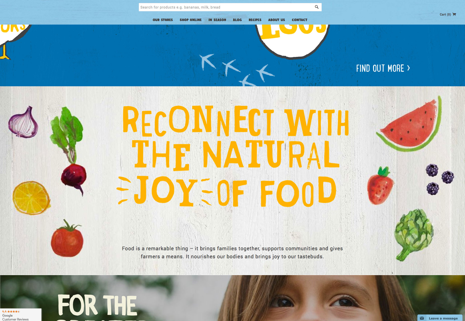
 Every week users submit a lot of interesting stuff on our sister site Webdesigner News, highlighting great content from around the web that can be of interest to web designers.
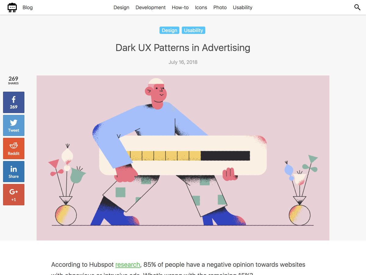
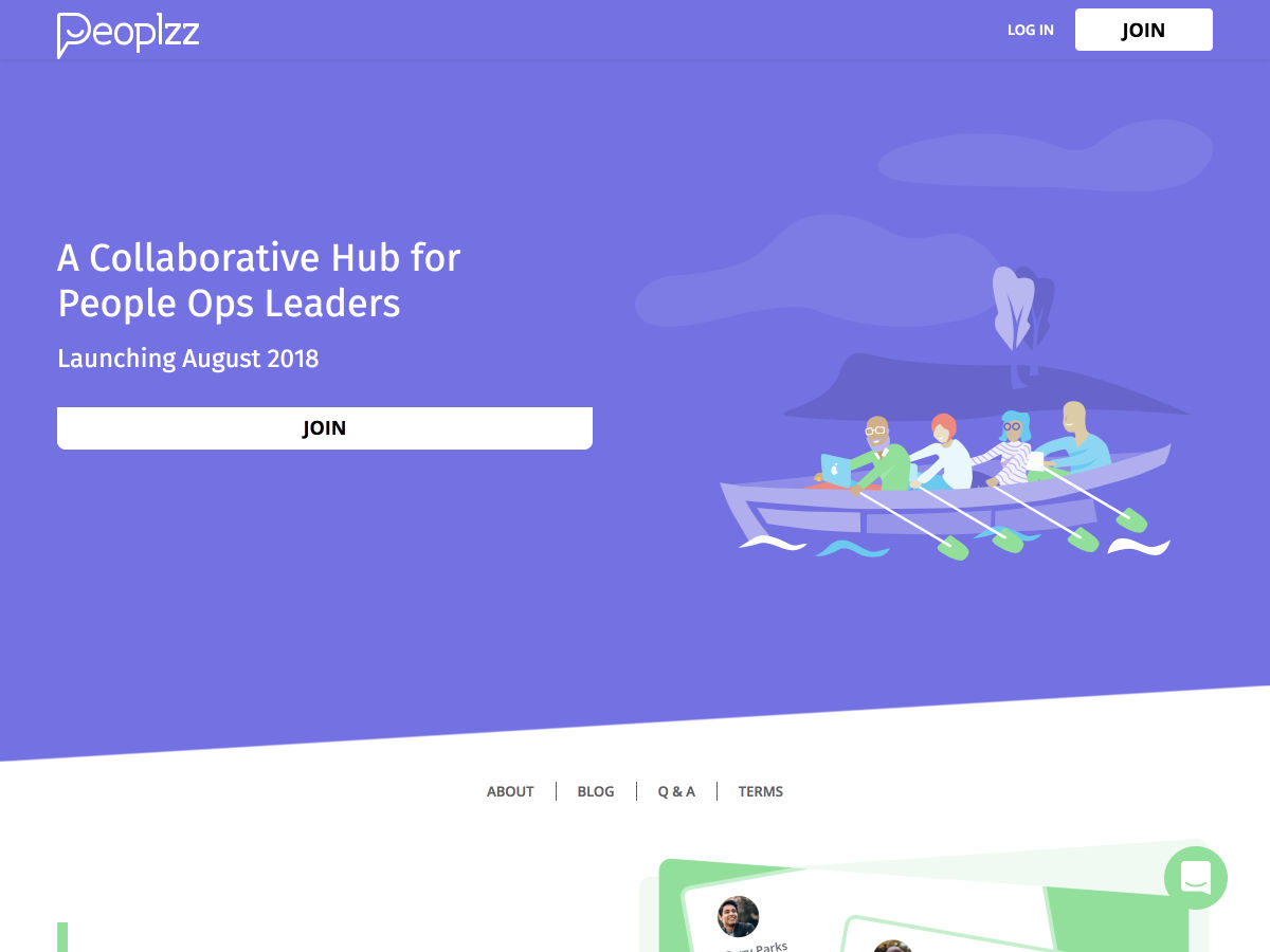
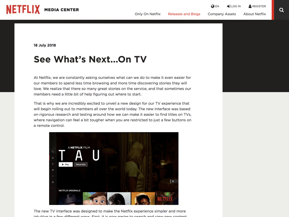
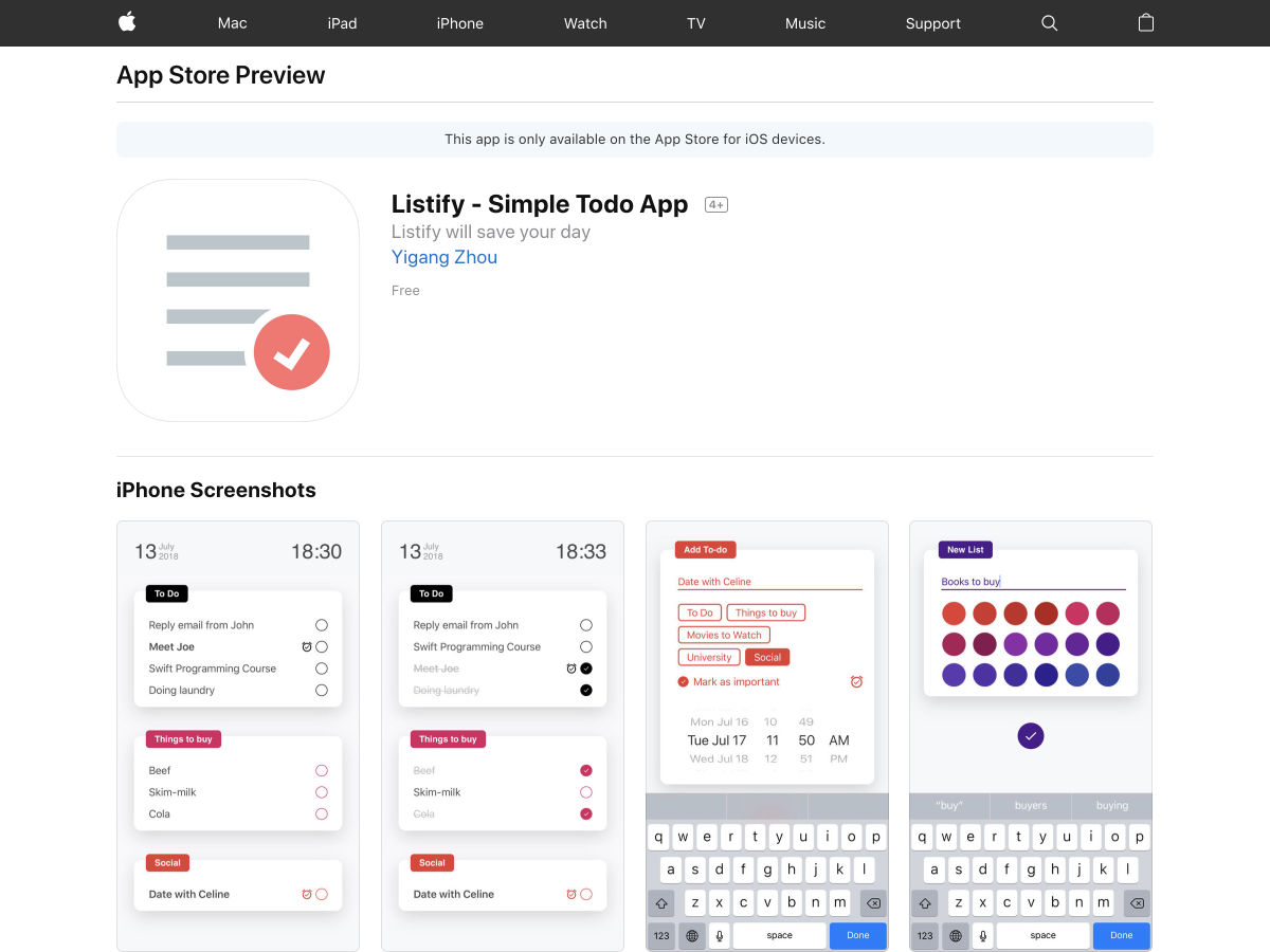
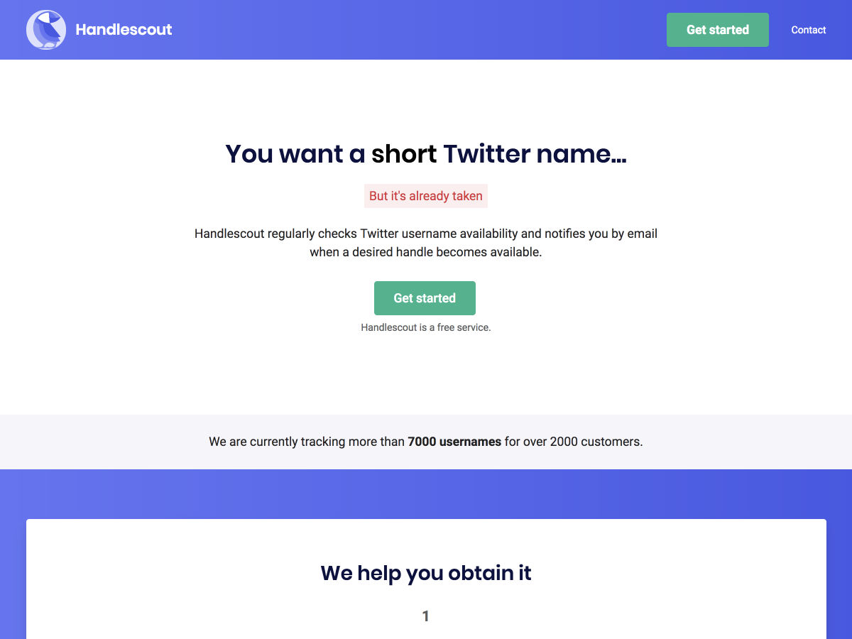
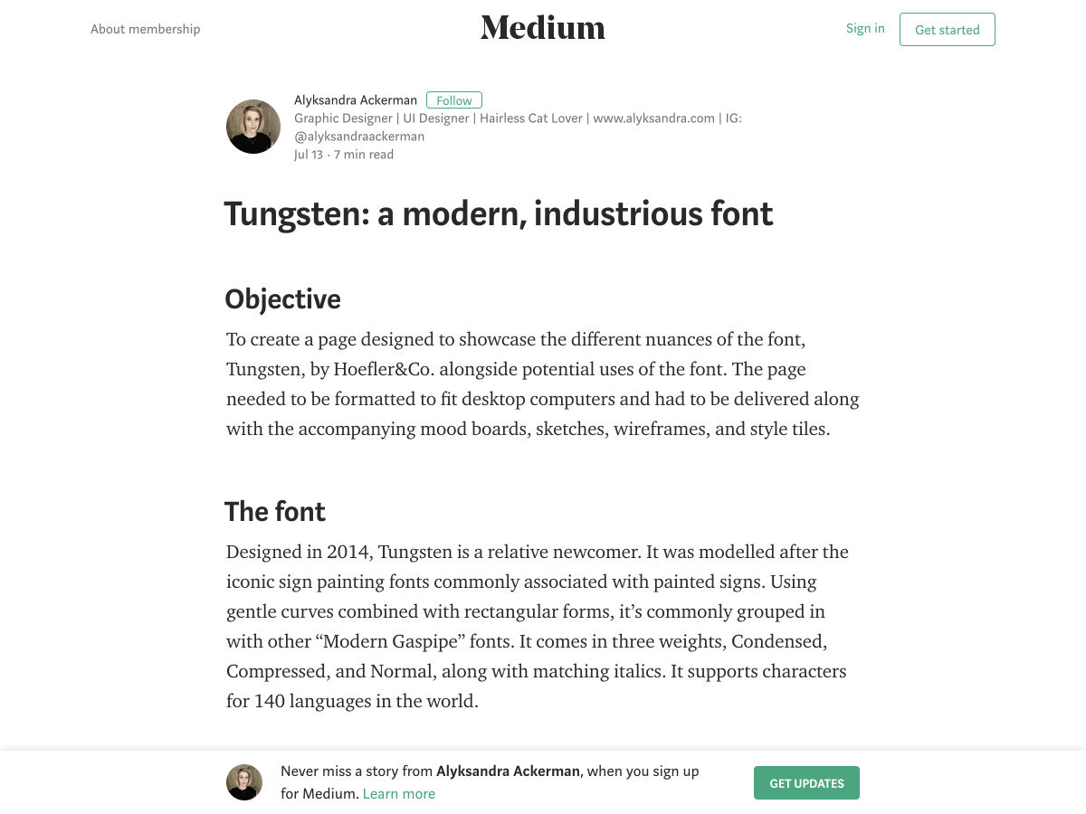
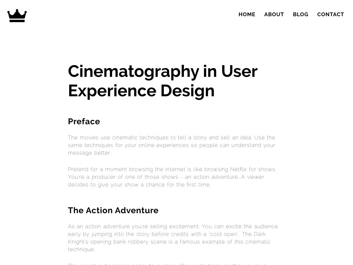
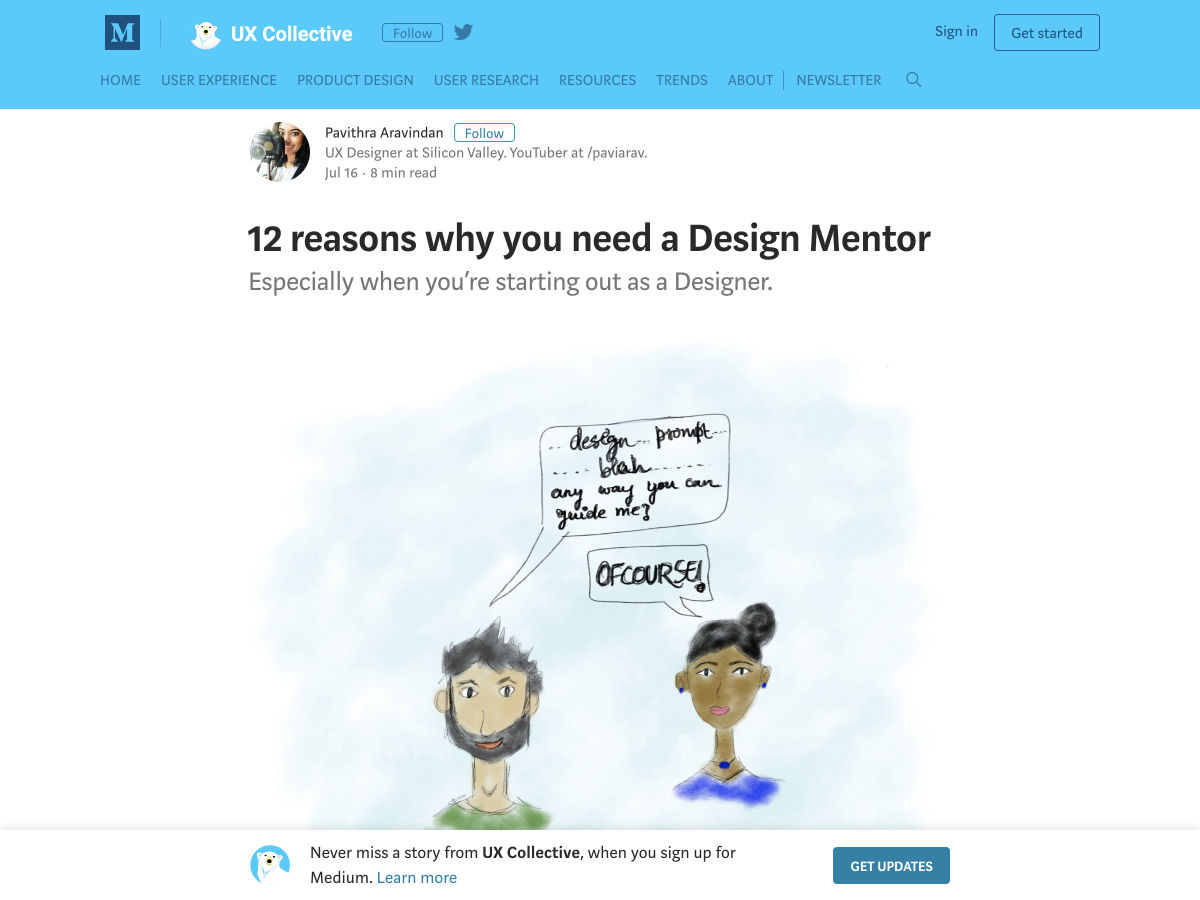
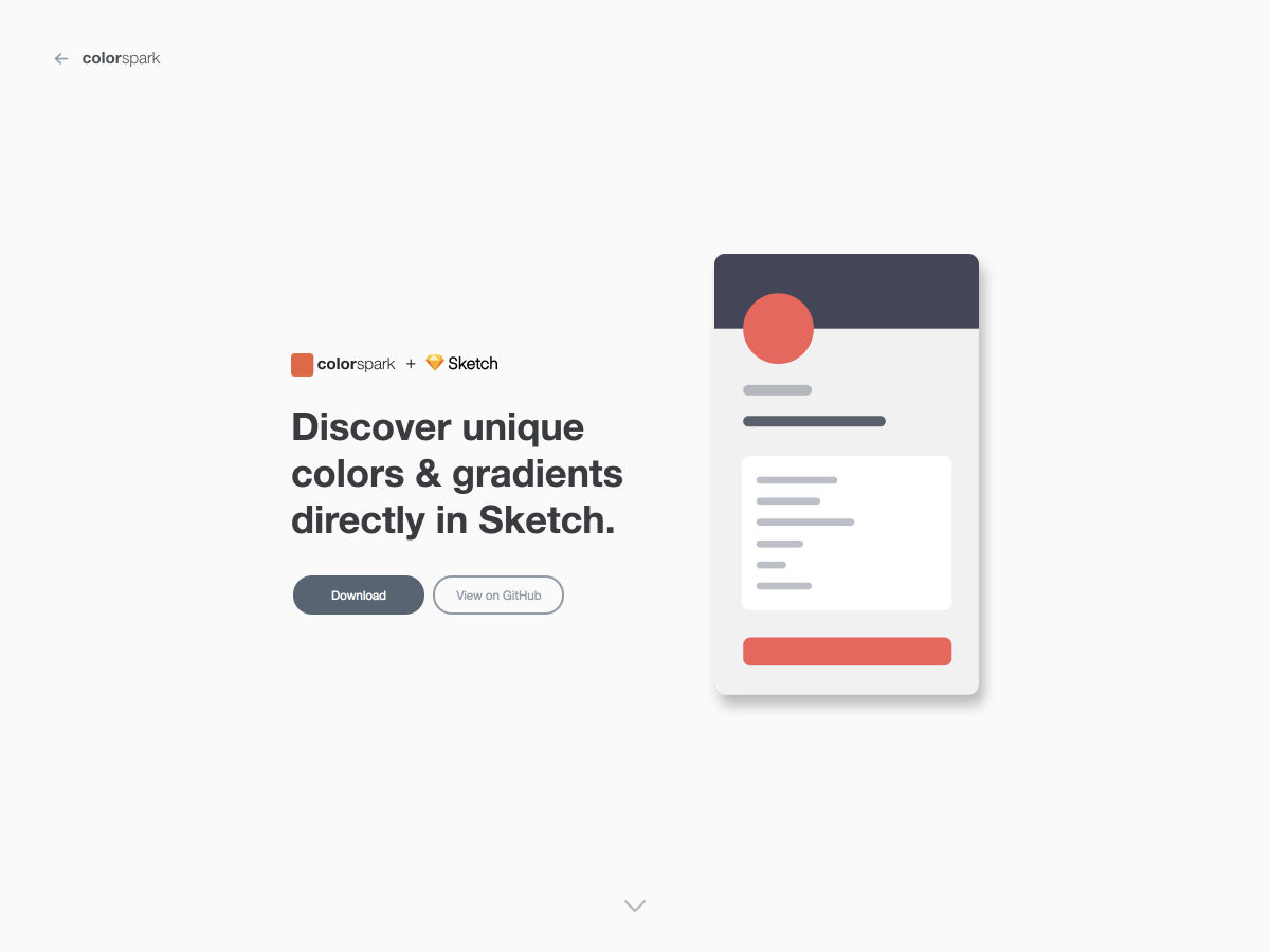
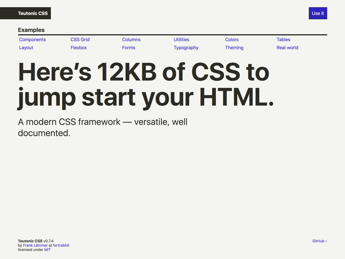
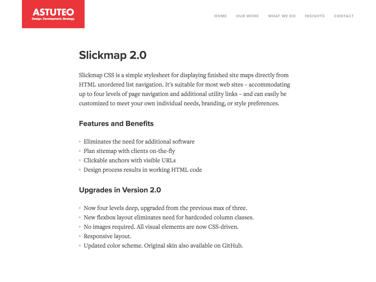
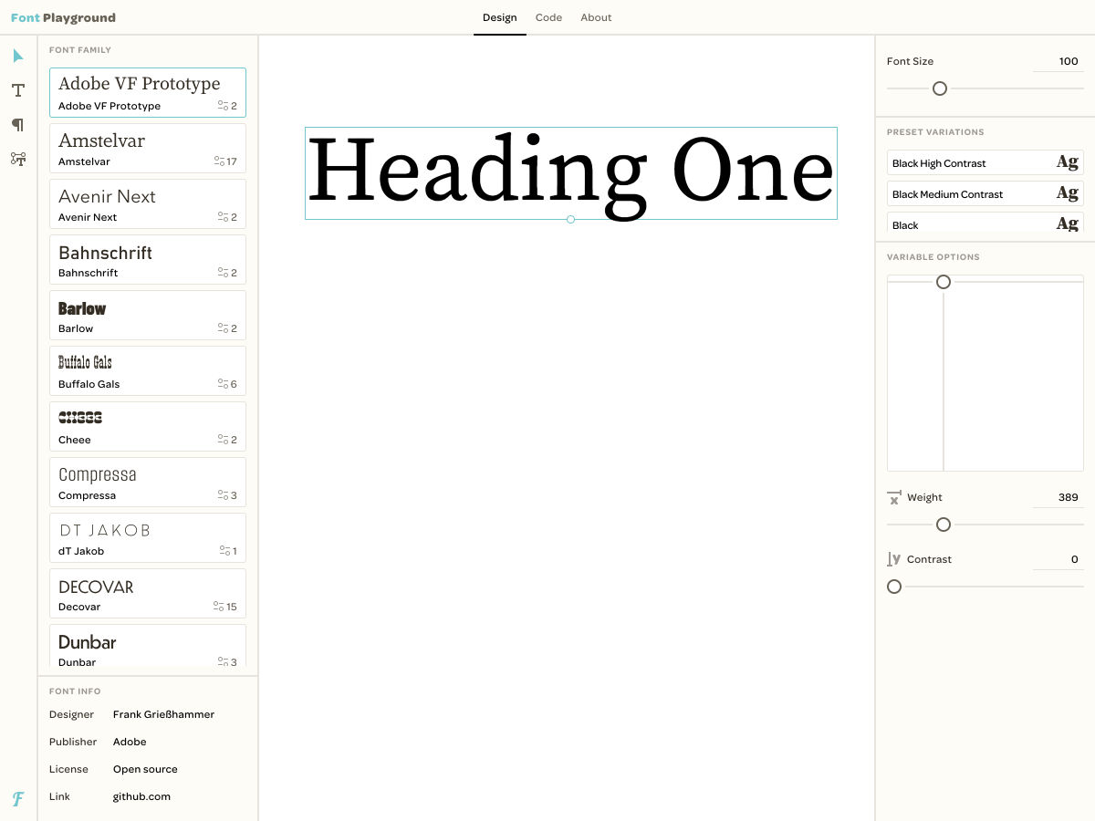

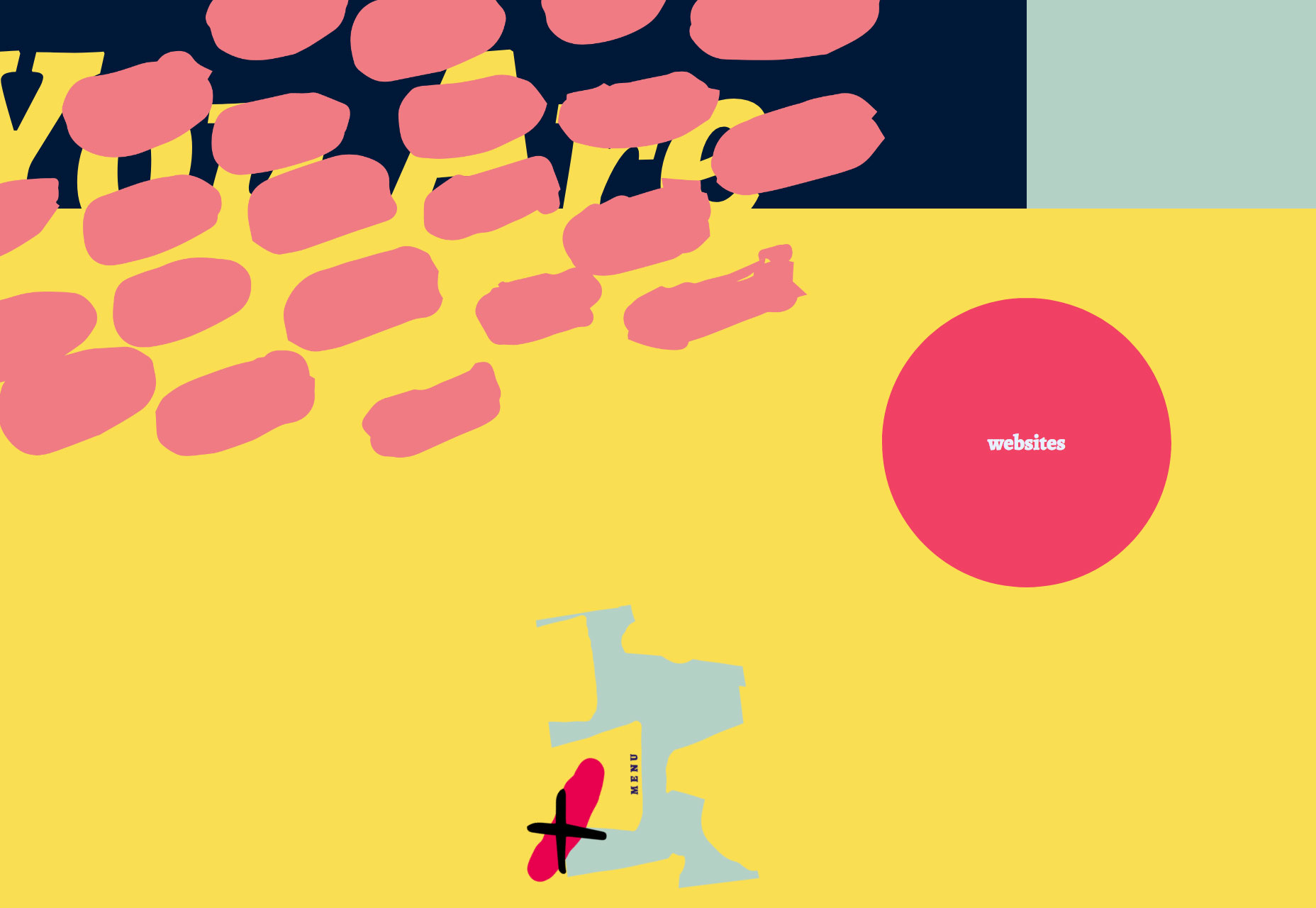
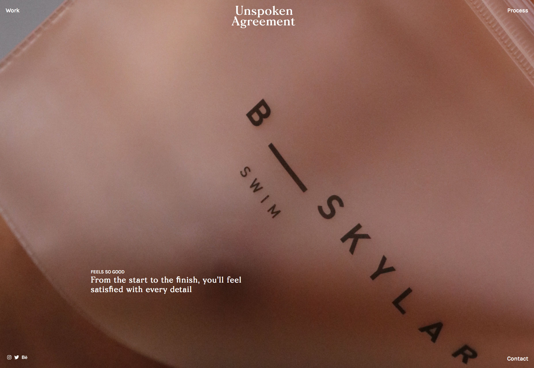
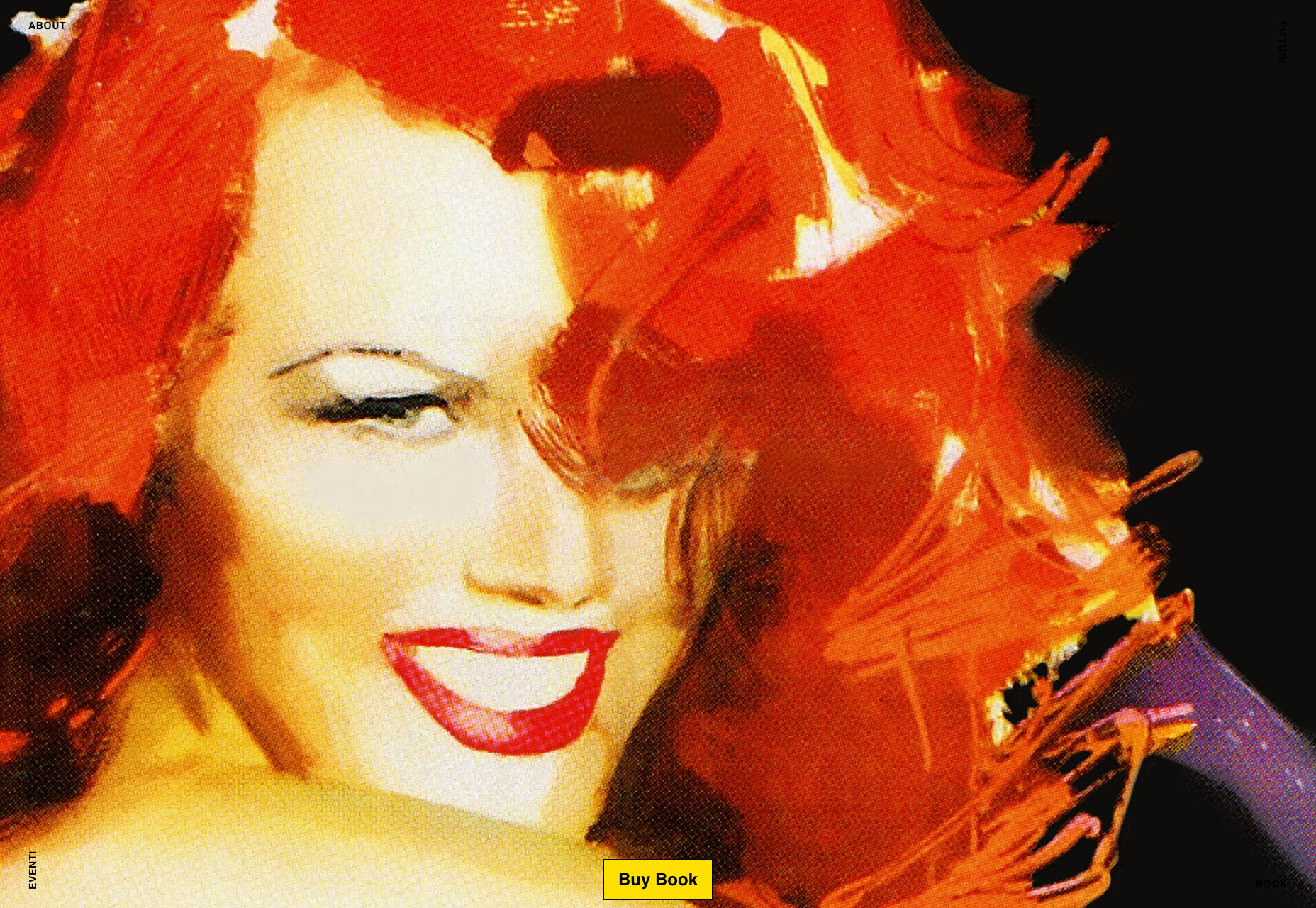
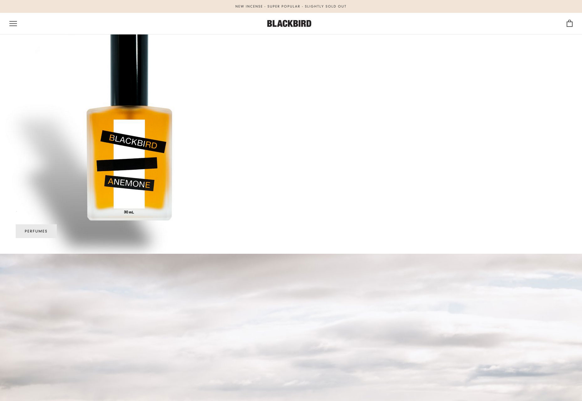
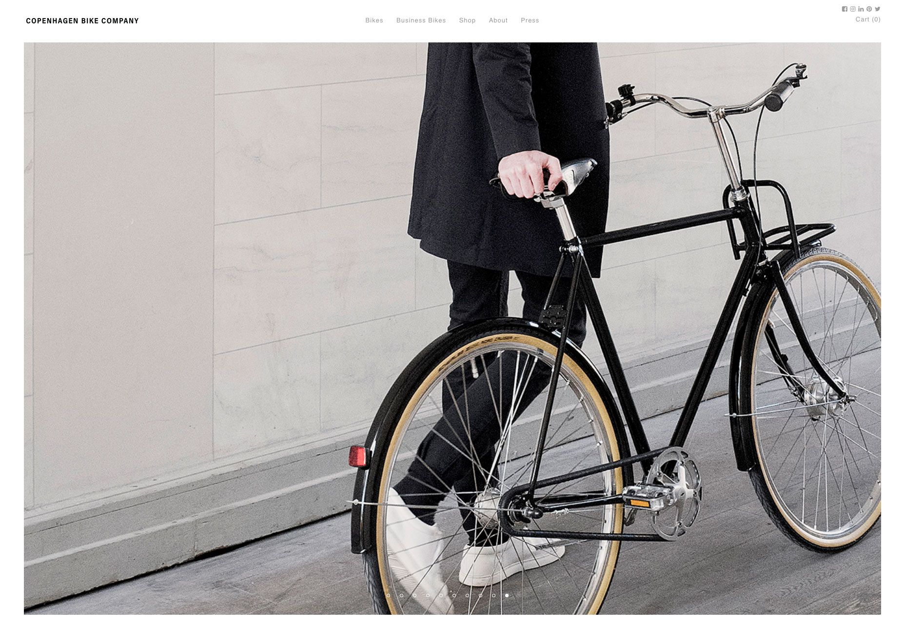
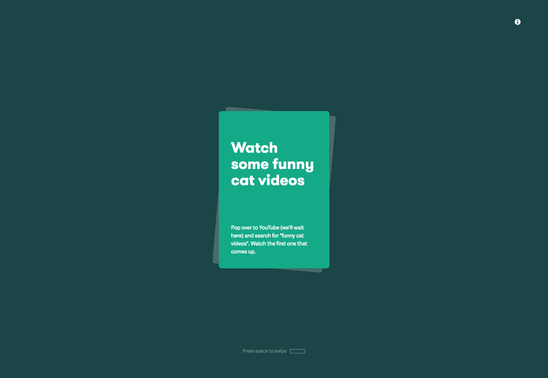
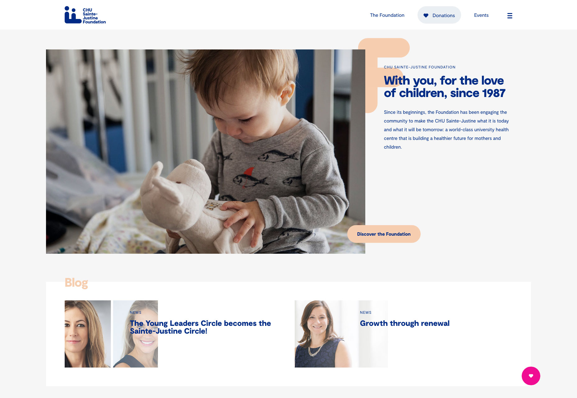
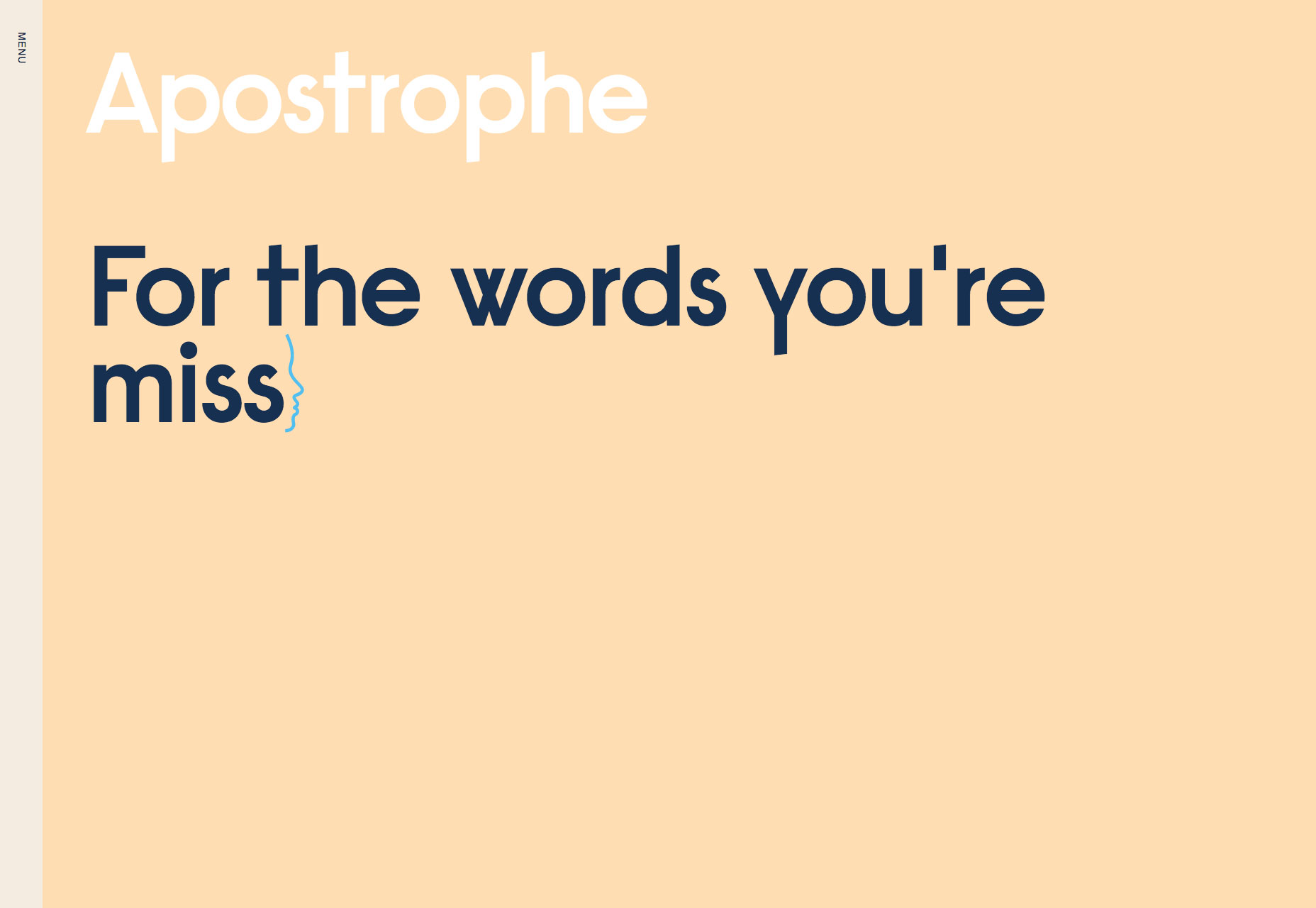
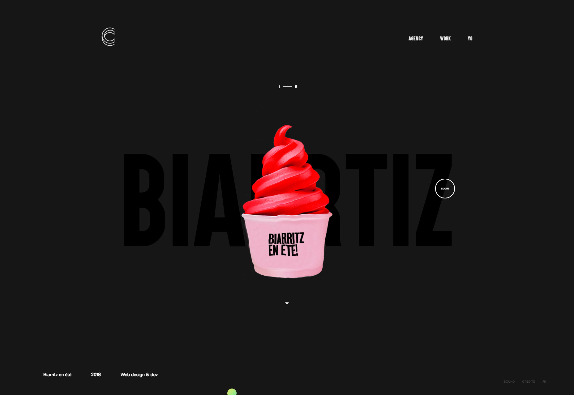
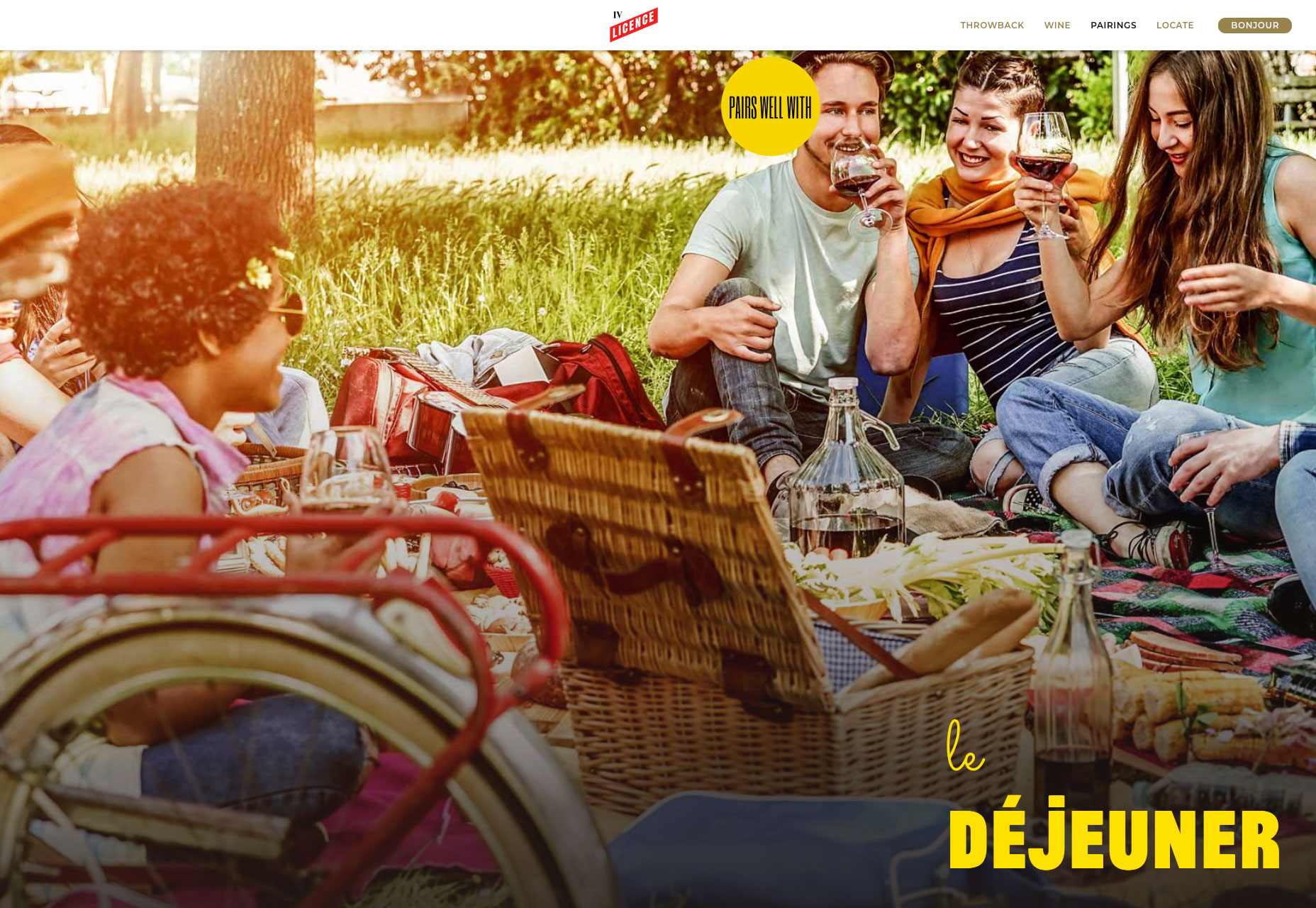
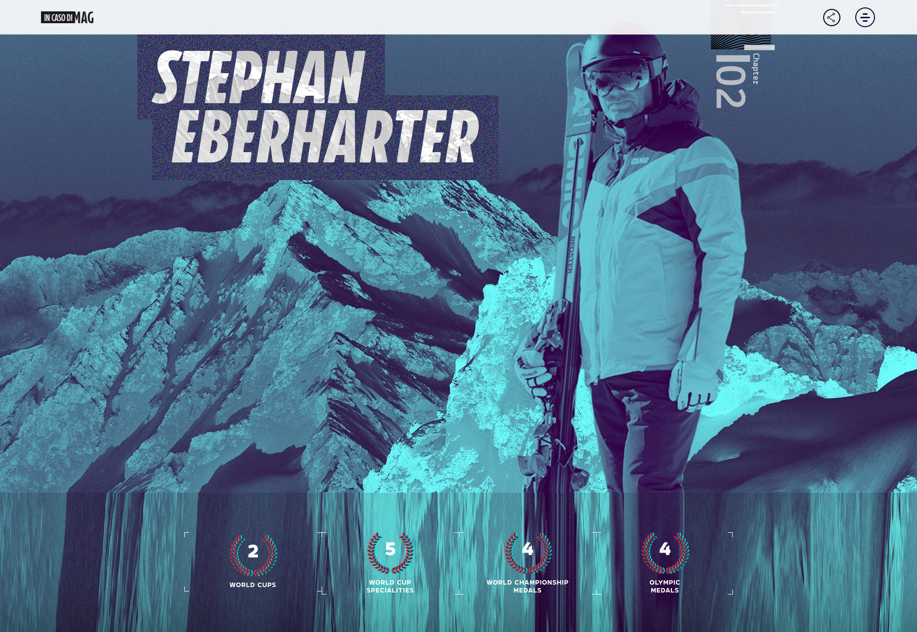
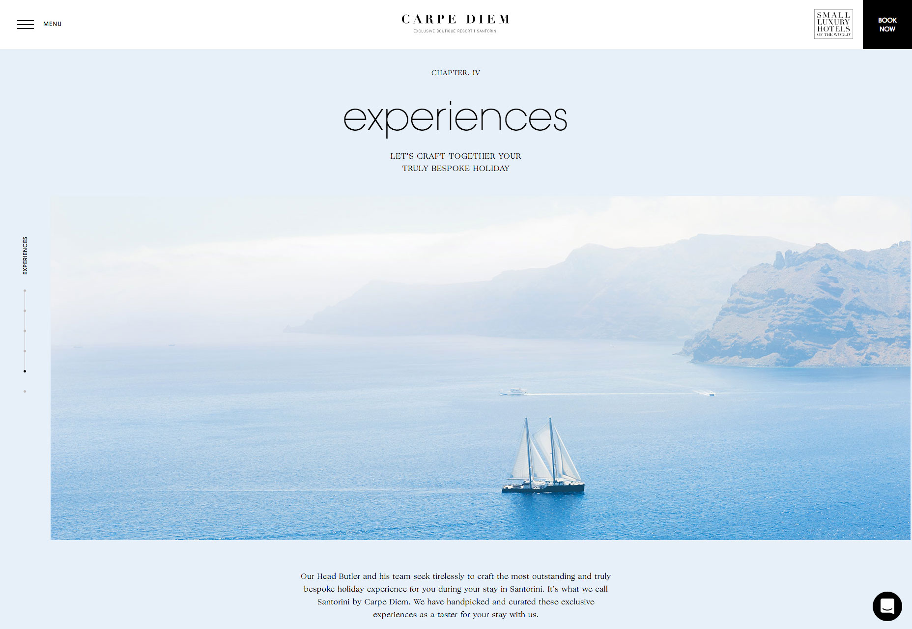
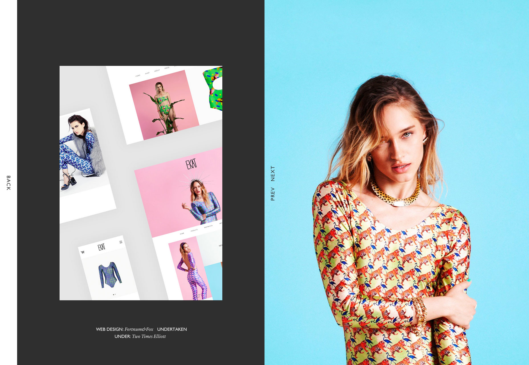
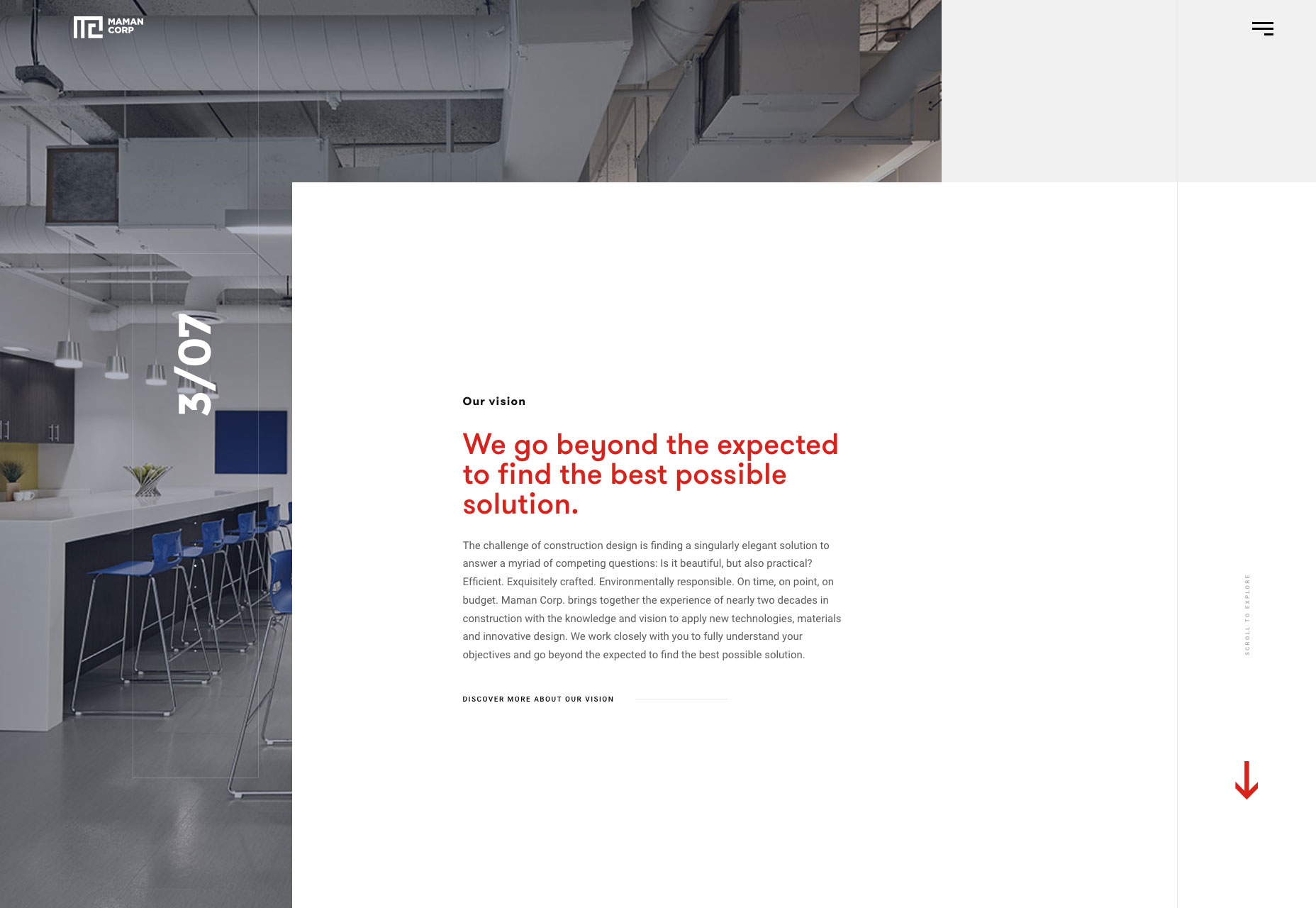
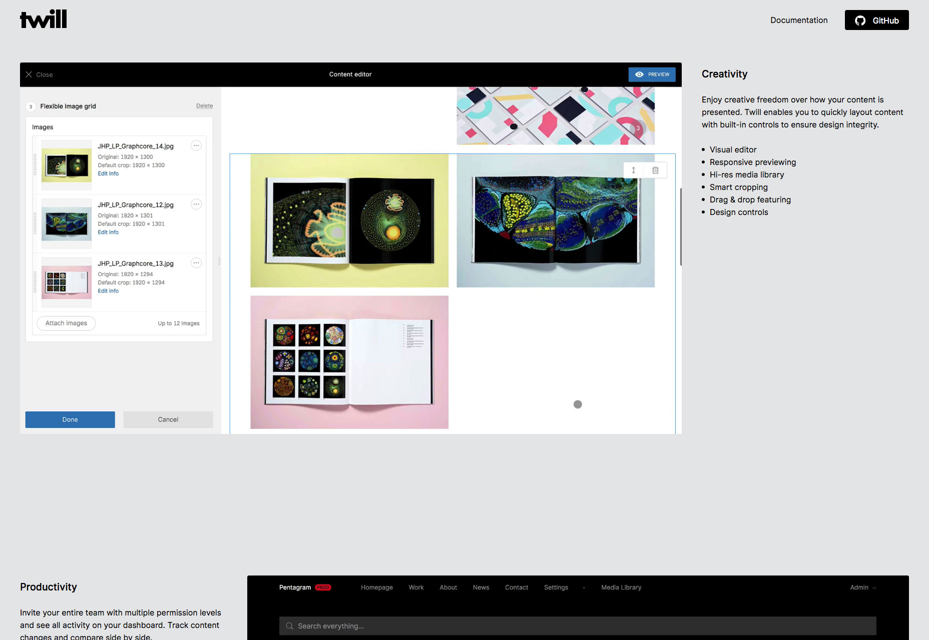
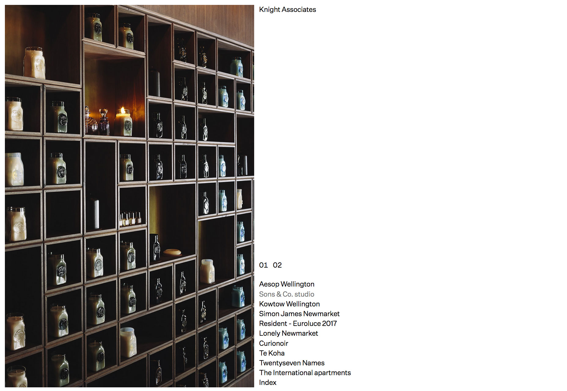
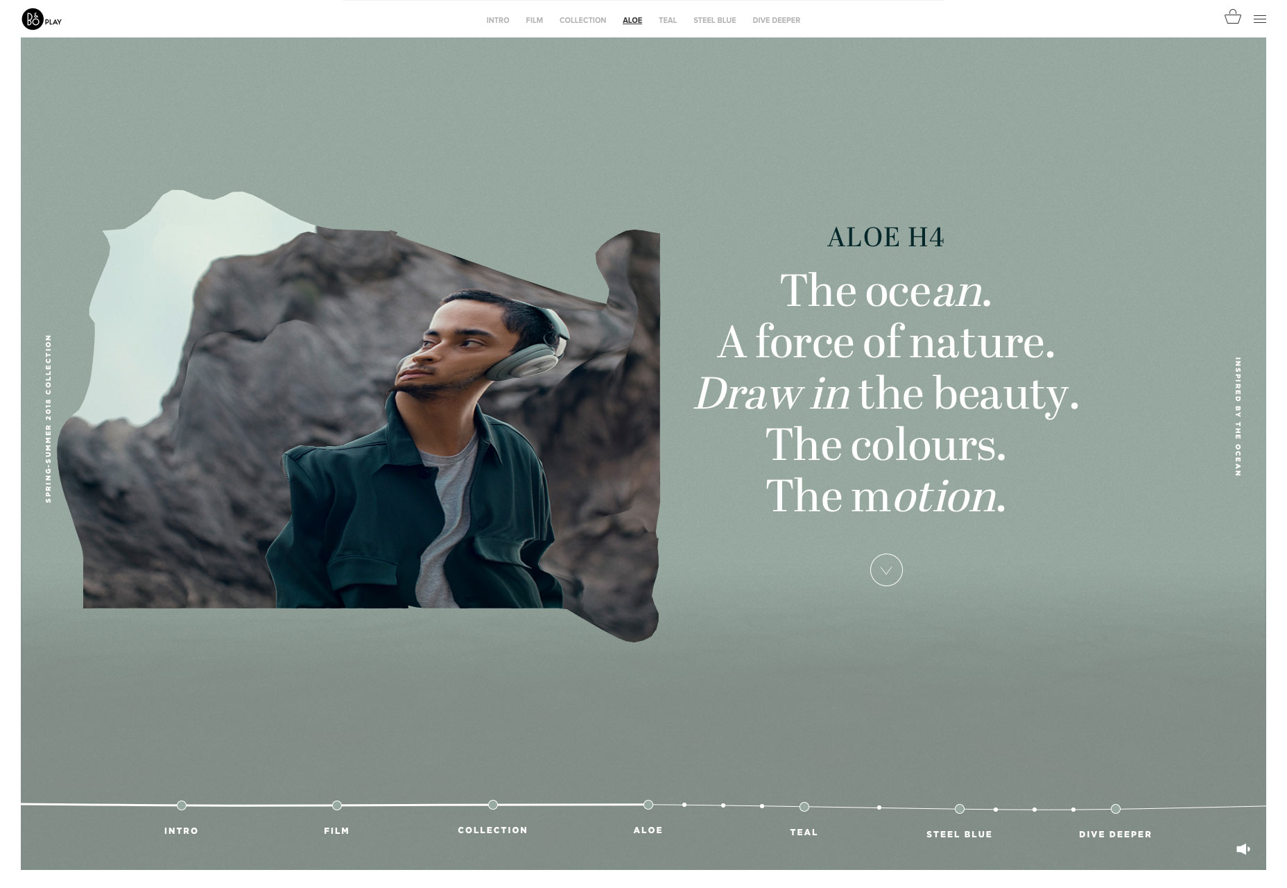
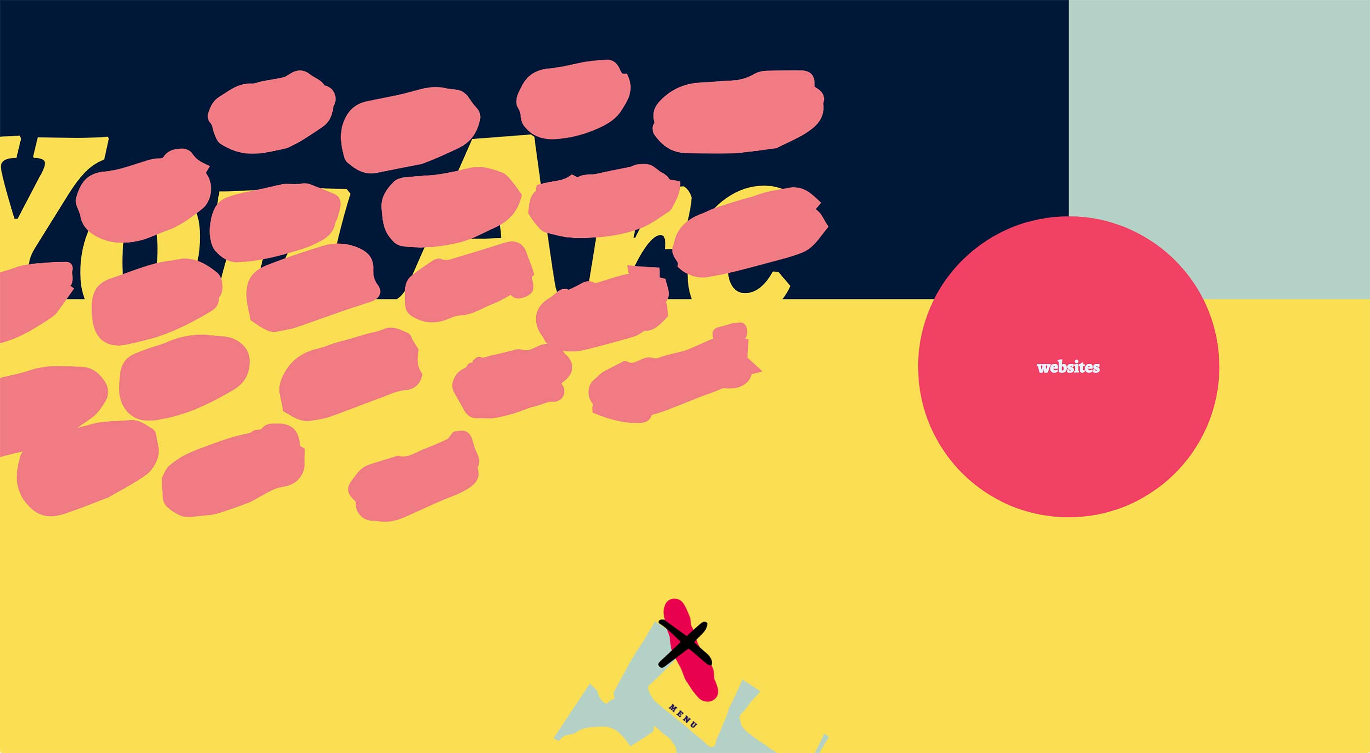 Welcome to our roundup of the best websites launched (or significantly updated) this month. July is a strange time to launch a site with the Summer slowdown in full effect, but these intrepid entrepreneurs have done so. We’ve got examples of great ecommerce, a couple of agency sites that we couldn’t resist, and lots of incredible art direction.