Original Source: https://www.smashingmagazine.com/2018/07/flat-vector-illustration-affinity-designer/
How To Create A Flat Vector Illustration In Affinity Designer
How To Create A Flat Vector Illustration In Affinity Designer
Isabel Aracama
2018-07-11T20:00:02+02:00
2018-07-12T11:08:58+00:00
(This is a sponsored post.) If you are in the design world, chances are that you’ve already heard about Affinity Designer, a vector graphics editor for Apple’s macOS and Microsoft Windows.
It was July 2015 when Serif Europe launched the amazing software that many designers and illustrators like me are using now as their main tool for professional work. Unlike some other packages, its price is really affordable, there’s no subscription model and, as mentioned already, it’s available for both Macs and PCs.
In this article, I would like to walk you through just some of its very user-friendly main tools and features as an introduction to the software and to show you how we can create a nice flat vector illustration of a Volkswagen Beetle. The illustration will scale up to whatever resolution and size needed because no bitmaps will be used.
Note: As of today, July 11, Affinity Designer is also available for the iPad. Although the iPad app’s features and functionality almost completely match the desktop version of Affinity Designer, it relies much more on using the touch screen (and the Apple Pencil) and because of that, you may expect to find some differences in the workflows.
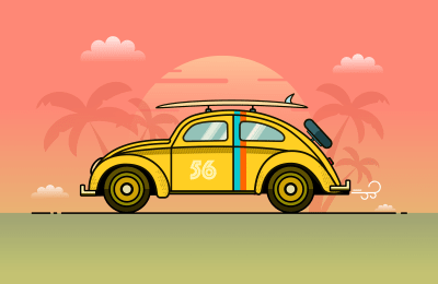
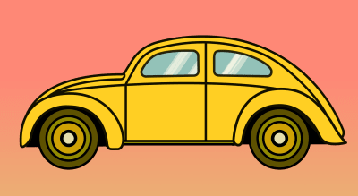
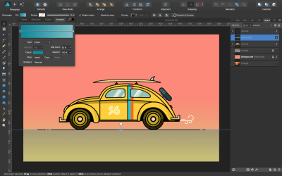
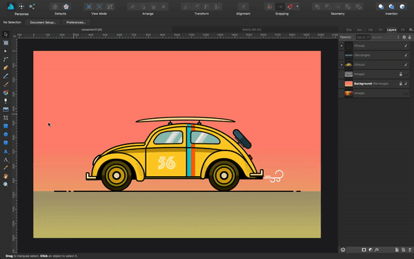
Final image that we’ll be creating in this tutorial. (View large version)
I will also explain some of the decisions I take and methods I follow as I work. You know the old saying, “All roads lead to Rome”? In this case, many roads will take us where we’d like to get to, but some are better than others.
We will see how to work with the Pen tool to trace the main car outline, how to break curves and segments, how to convert objects into curves, and how to use the wonderful Corner tool. We will also, among other things, learn how to use the Gradient tool, what is a “Smart copy”, how to import a color palette from an image that we can use as a reference for our artwork, how to use masks, and how to create a halftone pattern. Of course, along the way, you will also learn some helpful keyboard shortcuts and commands.
Note: Affinity Designer has three work environments, referred to as “personas”. By default, Affinity Designer is set to the draw persona. To switch from the draw persona to the pixel persona or to the export persona, you have to click on one of the three icons located in the top-left corner of the main window. You can start working in the draw persona and switch to the pixel persona at any time, when you need to combine vectors and bitmaps.
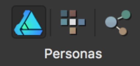 The three work environments: draw persona (leftmost icon), bitmap persona (middle icon) and export persona (rightmost icon). (View large version)
Introduction: The Flat Design Era
In recent years, we’ve seen the rise of “flat design”, in contrast to what is known as skeuomorphic representation in design.
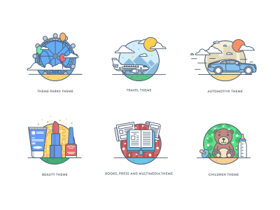
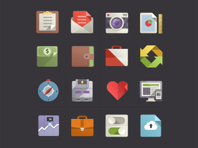
To put it simply, flat design gets rid of the metaphors that skeuomorphic design uses to communicate with users, and we’ve seen these metaphors in design, especially in user interface design, for years. Apple had some of the best examples of skeuomorphism in its early iOS and app designs, and today it is widely used in many industries, such as music software and video games. With Microsoft’s (with Metro) and later Google’s material design and Apple’s iOS 7, mobile apps, user interfaces and most systems and OS’ have moved away from skeuomorphism, using it or elements of it as mere enhancements to a new design language (including gradients and shadows). As you can imagine, illustrations on these systems were also affected by the new design currents, and illustrators and designers started creating artwork that would be consistent with the new times and needs. A whole new world of flat icons, flat infographics and flat illustrations opened in front of our eyes.
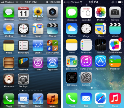
iPhone’s home screen (iOS 6 versus iOS 7). (View large version)
(Image source) (View large version)
(Image source) (View large version)
(Image source) (View large version)

(Image source) (View large version)
Let’s Draw A Flat Illustration!
I am providing here the source file for this work, so you can use it to explore it and to better follow along as we design it. If you do not yet have a copy of Affinity Designer, you can download a trial.
1. Canvas Settings
Open Affinity Designer, and create a new document by clicking Cmd + N (Mac) or Ctrl + N (Windows). Alternatively, you can go to “Menu” → “File” → “New”. Be sure not to check the “Create Artboard” box.
Set the type to “Web”, which will automatically set the field DPI to 72. It should be understood now as PPI, but we won’t dive into the details here. If you want to learn more on the topic, check the following two resources:
“
It’s PPI not DPI,” Forums, Affinity
“PPI vs. DPI: What’s the Difference?,” Alex Bigman, 99designs
Also, remember that you can change this setting at any time. The vectors’ quality won’t be affected by scaling them.
Set the size to 2000 × 1300 pixels, and click “OK”.
Our white canvas is now set, but before we start, I’d suggest you first save this file and give it a name. So, go to “File” → “Save”, and name it “Beetle”.
2. Importing A Color Palette From An Image
One of the things I use a lot in Affinity Designer is its ability to import the colors contained in an image and creating a palette from them.
Let’s see how this is done.
For the illustration I want to draw, I thought of warm colors, like in a sunset, so I searched Google with this query: “warm colors yellows oranges reds palette”. From all the images it found, I chose one that I liked and copied it into Affinity Designer in my recently created canvas. (You can copy and paste the image to the canvas directly from the browser.)
If the Swatches panel isn’t open yet, use menu “View” → “Studio” → “Swatches”. Click the menu in the top-right corner of the panel, and select the option “Create Palette From Document”, and then click on “As Document Palette”. Click “OK” and you’ll see the colors contained in the image form a new palette in the Swatches panel. The default name for it will be “Palette” if you still haven’t saved your file with a name. In case you have, the name of this palette will be the same as your document, but if you want to rename it, simply go to the menu on the right in the Swatches panel again and select the option “Rename Palette”.
I will call it “Beetle Palette”.
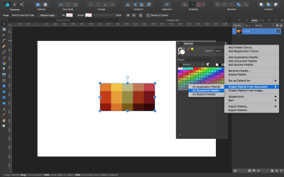
Creating a palette from an image. (View large version)
We can now get rid of that reference image, or simply hide it in the Layers panel. We will be using this palette as a guide to create our artwork with harmonious colors.
Interface: Before we continue, I will present a quick overview of the main sections of the user interface in Affinity Designer, and the names of some of the most used tools.
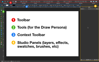
Main areas of the UI in Affinity Designer when using the draw persona. (View large version)
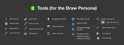
Tools for the (default) draw persona in Affinity Designer. (View large version)
3. Creating The Background With The Gradient Tool
The next thing is to create a background. For this, go to the tools displayed on the left side, and select the Rectangle tool. Drag it along the canvas, making sure to give it an initial random fill color so that you can see it. The fill color chip is located in the top toolbar.
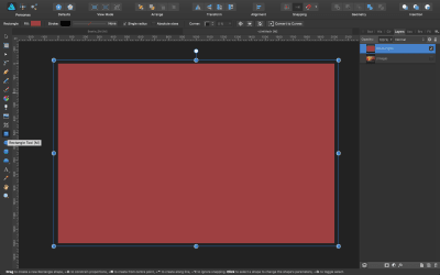
Click the Rectangle tool and drag it along the canvas. Fill it with a random color. (View large version)
Next, select the Fill tool (the color wheel icon, or press G on the keyboard), and in the top Context toolbar, select the type: “Linear”.
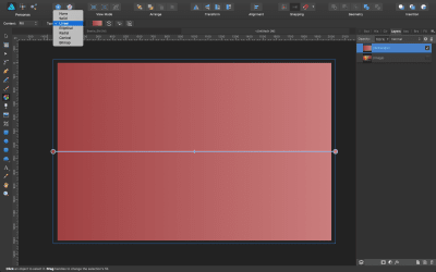
Select “Linear” from the Fill tool’s contextual menu. (View large version)
We have several options here: “None” removes the fill color, “Solid” applies one solid color, and all of the rest are different types of gradients.
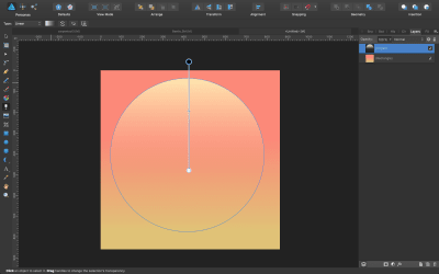
To straighten the gradient and make it vertical, place your cursor over one of the ends and pull. When you are near the vertical line, press Shift: This will make it perfectly vertical and perpendicular to the base of the canvas.
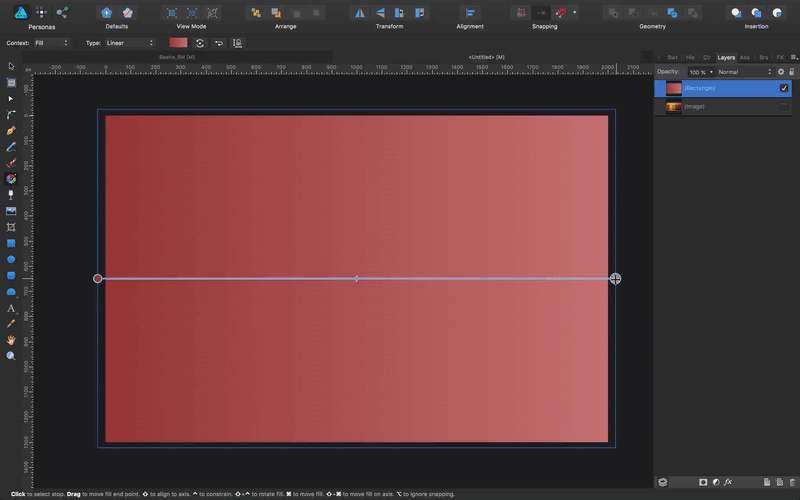 To straighten a linear gradient, pull from one end, and then press the Shift key to make it perfectly vertical. (View large version)
Next, in the Context toolbar, click on the color chip, and you’ll see a dialog that corresponds exactly with the gradient we just applied. Click now on the color chip, and an additional dialog will open.
In the combo, click on the “Color” tab, and then select “RGB Hex Sliders”; in the field marked with a #, input the value: FE8876. Press “OK”. You’ll see now how the gradient has been updated to the new color. Repeat this action with the other color stop in the gradient dialog, and input this value: E1C372.
You should now have something like this:

Setting gradient colors (View large version)
Let’s go to the Layers panel and rename the layer to “Background”. Double-click on it to rename it, and then lock it (by clicking on the little lock icon in the top-right corner).
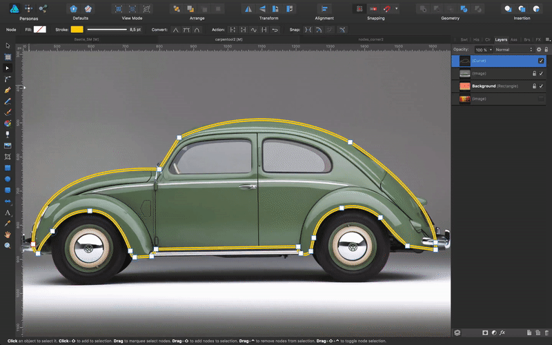
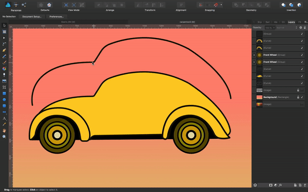
4. Drawing The Car Outline With The Pen Tool
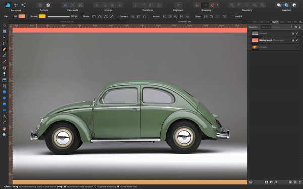
The next thing we need to do is look for an image that will serve as our reference to draw the outline of the car. I searched Google for “Volkswagen Beetle side view”. From the images I found, I selected one of a green Beetle and copied and pasted it into my document. (Remember to lock the layer with the reference image, so that it doesn’t move accidentally.)
Next, in the side toolbar, select the Pen tool (or press P), zoom in a bit so that you can work more comfortably, and start tracing a segment, following the outline of the car in the picture. Give the stroke an 8-pixel width in the Stroke panel.
Note: You won’t need to create a layer, because the segments you trace will be automatically placed on top of the image.
The Pen tool is one of the most daunting tools for beginners, and it is obviously one of the most important tools to learn in vector graphics. While practice is needed to reach perfection, it is also a matter of understanding some simple actions that will help you use the tool better. Let’s dive into the details!
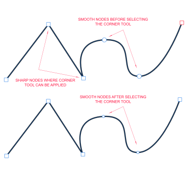
As you trace with the Pen tool in Affinity Designer, you will see two types of nodes: squared nodes appear first, and as you pull the handles, they will turn into rounded nodes.
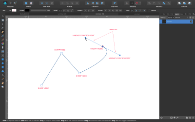
Sharp, smooth nodes and handles on a path segment (View large version)
Affinity Designer comes with several pen modes, but we will only be using the default one, called “Pen Mode”, and as we trace the car, we will get rid of one of the handles by clicking Alt in such a way that the next section of the segment to be traced will be independent of the previous one, even if connected to it.
Here’s how to proceed. Select the Pen tool, click once, move some distance away, click a second time (a straight line will be created between nodes 1 and 2), drag the second node (this will create a curve), Alt-click the node to remove the second control handle, then proceed with node 3, and so on.
An alternative way would be to select the Pen tool, click once, move some distance away, click a second time (a straight line will be created between nodes 1 and 2), drag the second node (this will create a curve), then, without moving the mouse, Alt-click the second handle’s point to remove this handle, then proceed with node 3, and so on.
 Trace the outline of the car and get rid of the handles we don’t need by Alt-clicking. (View large version)
Note: Don’ be afraid to trace segments that are not perfect. With time, you’ll get a better grip of the Pen tool. For now, it’s not very important that each node and line looks as we want it to look in the end. In fact, Affinity Designer makes it really easy to amend segments and nodes, so tracing a rough line to start is just fine. For more insight on how to easily use the Pen tool (for beginners), check out Isabel Aracama’s video tutorial.
5. Resculpting Segments And Using The Corner Tool
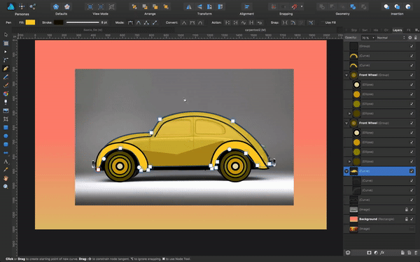
What we need now is to make all of those rough lines look smooth and curvy. First, we will pull the straight segments to smoothen them, and then we will improve them using the Corner tool.
Click the Node tool in the side toolbar, or select it by pressing A on your keyboard. Now, start pulling segments to follow the lines of your reference picture. You can also use the handles to help make the line take the shape you need by moving and pulling them accordingly. Just do it in such a way that it all fits the reference image, but don’t bother much if it’s not yet perfect. With the Node tool (A), you can both select and move nodes, but you can also click and drag the curves themselves to change them.
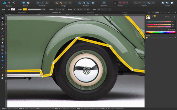 Resculpt and correct segments with the Node tool (A). (View large version)
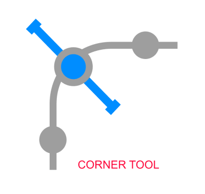
Once all of the segments are where we need them, we are going to smoothen their corners using the Corner tool (shortcut: C). This is one of my favorite tools in Affinity Designer. The live Corner tool allows you to adjust your nodes and segments to perfection. Select it by pressing C, or select it from the Tools sidebar. The method is pretty simple: Pass the corner tool over the sharp nodes (squared nodes) that you want to smoothen. If you need to, switch back to the Node tool (A) to adjust a section of a segment by pulling it or its handles. (Smooth nodes (rounded nodes) don’t allow for more softening, and they will display a smaller circle the moment you select the Corner tool.)
View large version
View large version
 Use the Corner tool on sharp nodes to smoothen the lines. (View large version)
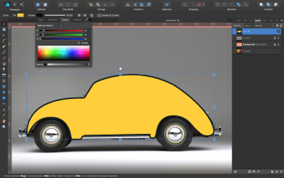
Once our corners and segments look good, we’ll want to fill the shape and change the color of the stroke. Select the closed curve line that we just created for the car, click on the fill color chip, and in the HEX color field input FFCF23. Click on the stroke color chip beside it and input 131000.
This is what you should have after applying the fill color and stroke color. (View large version)
Create now a shape with the Pen tool, and fill it with black (000000). Place it behind the car’s bodywork (the yellow shape). The exact shape of the new object that you will create does not really matter, except that its bottom side needs to be straight, as in the image below. Place it behind the main bodywork (the yellow shape) via either the Layers panel or through the menu “Arrange” → “Back One”.
Black shape behind the car bodywork (View large version)
6. Creating The Wheels Using Smart Copy
We need to put the wheels in place next. In the Tools, pick the Ellipse tool, and drag over the canvas, creating a circle the same size as the wheel in the reference picture. Click Shift as you drag to make the circle proportionate. Additionally, holding Ctrl (Windows) or Cmd (Mac), you can create a perfect circle from the center out.
Note: If you need to, hide the layers created thus far to see better, or simply reduce their opacity temporarily. You can change the opacity by selecting any shape and pressing a number on the keyboard, from 1 to 9, where 1 will apply a 10% opacity and 9 a 90% opacity value. To reset the opacity to 100%, press 0 (zero).
Choose a random color that contrasts with the rest. I like to do so initially just so that I can see the shapes well contrasted and differentiated. When I am happy with them, I apply the final color. Set the opacity to 50% (click 5 on the keyboard) to be able to see through as you draw it.
Zoom into your wheel shape. Press Z to select the Zoom tool, and drag over the shape while holding Alt key, or double-click on the thumbnail corresponding to it in the Layers panel. (It doesn’t need to be previously selected, although this will help you to visually locate it in the Layers panel.)
We will now learn how to use Smart copy, and we will paste some concentric circles.
Select the circle and press Cmd + J (Mac) or Ctrl + J (Windows). A new circle will be placed on top of the original one. Select it. This command is found under “Edit” → “Duplicate”, and it’s also known as Smart copy or Smart duplicate.
Click Shift + Cmd (Mac) or Shift + Ctrl (Windows), and drag in to transform it into a smaller concentrical circle. Repeat three times, reducing a bit more in size each time, to fit your reference. Smart duplicating a shape by pressing Shift + Cmd (Mac) or Shift + Ctrl (Windows) will make the shape transform in a relative way. This will happen from your third smart-duplicated shape onwards.
 Smart copy via Cmd + J or Ctrl + J. (View large version)
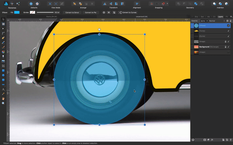
So, we have our concentric circles for the wheel, and now we have to change the colors. Go to the Swatches panel, and in the previously created palette, choose colors that work well with the yellow that we have applied to the car’s bodywork. You can select a color and modify it slightly to adapt to what you think works best. We need to apply fill and stroke colors. Remember to give the stroke the same width as the rest of the car (8 pixels) except for the innermost circle, where we will apply a stroke of 11.5 pixels. Also, remember to put back to 100% the opacity of each concentric circle.
I chose these colors, from the outer to inner circles: 5D5100, 918A00, CFA204, E5DEAB.
Now we want to select and group all of them together. Select them all and press Cmd + G (Mac) or Ctrl + G (Windows). Name the new group “Front Wheel” in the Layers panel. Duplicate this group and, while pressing Shift, select it and drag along the canvas until it overlaps with the back wheel. Name the layer accordingly.
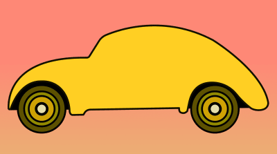
The car should look similar to this now. (View large version)
7. Breaking Curves And Clipping Masks To Draw The Inner Lines Of The Car’s Bodywork
To keep working, either hide all layers or bring down the opacity so that they don’t get in your way. We need to trace the front and back fenders. We have to do the same as what we did for the main bodywork. Pick the Pen tool and trace an outline over it.
Once it is traced, modify it by using the handles, nodes and Corner tool. I also modified the black shape behind the car a bit, so that it shows a bit more in the lower part of the body work.
Fenders added to the car. (View large version)
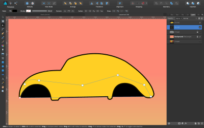
Now we want to trace some of the inner lines that define the car. For this, we will duplicate the main yellow shape, remove its fill color and place it onto our illustration in the canvas.
Press A on the keyboard, and click on any of the bottom nodes of the segment. In the top Context toolbar, click on “Action” → “Break Curve”. You will see now that the selected node has turned into a red-outlined squared node. Click on it and pull anywhere. As you can see, the segment is now open. Click the Delete or Backspace key (Windows) or the Delete key (Mac), and do the same with all of the bottom nodes, leaving just the leftmost and rightmost ones, and also being very careful that what is left of the top section of the segment is not deformed at all.
 (View large version)
I use this method for one main reason: Duplicating an existing line allows for a more consistent look and for more harmonious lines.
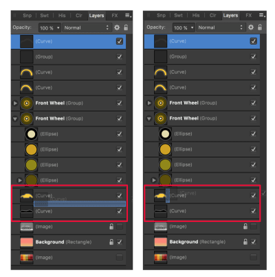
Select now the newly opened curve, and make it smaller in such a way that it fits into the main yellow shape when you place them on top of one another. In the Layers panel, drag this curve into the yellow shape layer to create a clipping mask. The reason for creating a clipping mask is simple: We want an object inside another object so that they do not overlap (i.e. both objects are visible), but one nested inside the other. Not doing so would result in some bits of the nested object being visible, which is not what we want; we need perfect, clean-cut lines.
Note: Clipping masks are not to be mistaken for masks. You will know you’re clipping and not masking because of the thumbnail (masks show a crop-like icon when applied) and because when you are about to clip, a blue stripe is displayed horizontally, a bit more than halfway across the layer. Masks, on the other hand, display a small vertical blue stripe beside the thumbnail.
Clipping versus masking in Affinity Designer (View large version)
 Clipping mask once it is applied (View large version)
Now that we have applied our clipping mask to insert the newly created segment inside the main shape of the car, I’ve broken some nodes and moved some others around a bit in order to place them exactly how I want. I’ve stretched the width a bit, and separated the front from the rest of the segment using exactly the same methods we’ve already seen. Then, I applied a bit more Corner tool to soften whatever I felt needed to be softened. Finally, with the Pen tool, I added some extra nodes and segments to create the rest of the inner lines that define the car.
Note: In order to select an object in a mask, a clipping mask or a group when not selecting the object directly in the Layers panel, you have to double-click until you select the object, or hold Ctrl (Windows) or Cmd (Mac) and click.
 Adding extra lines to a segment (View large version)
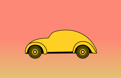
After some amendments and tweaking using the mentioned methods, our car looks like this:
How the car looks after a little tweaking of the segments and nodes (View large version)
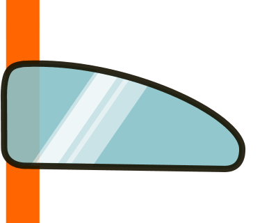
8. Drawing The Windows Using Some Primitive Shapes
In the side Toolbar, select the Rounded Rectangle tool. Drag on the canvas to create a shape. The size of the shape should fit in the car’s bodywork and look proportionate. No matter how you create it, you will be able to resize it later, so don’t worry much.
Note: When you create a shape with strokes and resize it, be sure to check “Scale with object” in the Stroke panel if you want the stroke to scale in proportion with the object. I recommend that you visually compare the difference between having this option checked and unchecked when you need to resize an object with a stroke.
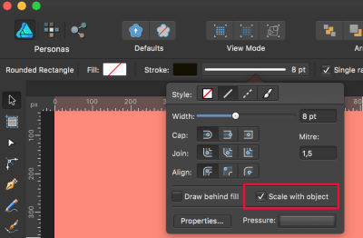
Make sure this is checked if you plan to resize your artwork, so that it scales the strokes accordingly. (View large version)
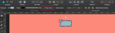
Once you have placed your rounded rectangle on the canvas, fill it with a blue-ish colour. I’ve used #93BBC1. Next, select it with the Node tool (press A). You will now see a little orange circle in the top-left corner. If you pull outwards or inwards, you’ll see how the angle in that corner changes. In the top Context toolbar, you can uncheck “Single radius”, and apply the angle you want to each corner of the rectangle individually. Uncheck it, and pull inwards on the tiny orange circle in the top-left corner. If you pull, you will be able to round it to a certain percentage, but you can also input the desired value in the input field for it, or even use the slider it comes with (it will show whether you’ve clicked on the little chevron). Let’s apply a value of 100%.
View large version
How the rounded rectangle primitive shape looks in default mode and how it changes when we uncheck the single radius box. Now we can manipulate the corners individually. (View large version)
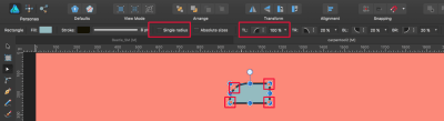
Primitive shapes are not so flexible in terms of vector manipulation (compared to curves and lines), so, in order to apply further changes to such a shape (beyond fill, stroke, corners, width and height), we will need to convert it to curves.
Note: Once you convert a primitive shape into curves, there is no way to go back, and there will be no option to manipulate the shape through the little orange stops. If you need further tweaking, you will need to do it with the Corner tool.
Select the rectangle with the Node tool (A), and in the top Context toolbar, click the button “Convert to Curves”. The bounding box will disappear, and all of the nodes forming the shape will be shown. Also, note how in the Layers panel, the name of the object changes from “Rounded Rectangle” to “Curve”.
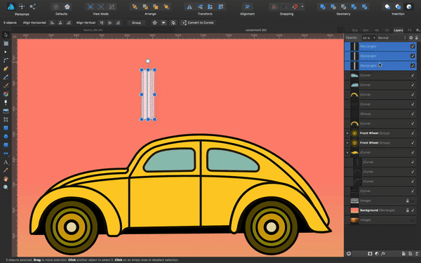
Now you need to manipulate the shape in order to create an object that looks like a car window. Look at the reference picture to get a better idea of how it should look. Also, tweak the rest of the drawn lines in the car, so that it all fits together nicely. Don’t worry if the shapes don’t look perfect (yet). Getting them right is a matter of practice! Using the Pen tool, help yourself with the Alt and Shift keys and observe how differently the segment nodes behave. After you have created the front window, go ahead and create the back one, following the same method.
We also need to create the reflections of the window, which we’ll do by drawing three rectangles, filling them with white color, overlapping them with a bit of offset from one another, and setting the opacity to 50%.
Place the cursor over the top bounding-box white circle, and when it turns into a curved arrow with two ends, move it to give the rectangles an angle. Create a clipping mask, dragging it over the window shape in the Layers panel as we saw before. You can also do this by following the following alternative methods:
Under the menu “Layer” → “Insertion” → “Insert Inside” the selected window object.
With the keyboard shortcut Ctrl + X (Windows) and Cmd + X (Mac), select your window object → “Edit” → “Paste Inside” (Ctrl/Cmd + Alt + V).
Repeat this for the back window. To add visual interest, you can duplicate the reflections and slightly change the rectangles’ opacities and widths.
 Create the reflections on the windows, and clip them inside. (View large version)
9. Adding Visual Interest: Halftone Pattern, Shadows And Reflections
Before we start with the shadows and reflections, we need to add an extra piece onto the car so that all of the elements look well integrated. Let’s create the piece that sits below the doors. It is a simple rectangle. Place it on the corresponding layer order, so that it looks like the picture below, and keep inserting all of the pieces together so that it looks compact. I will also move a bit the front fender to make the front shorter.
The car, once the final bodywork pieces have been placed and tweaks made. We’re getting there! (View large version)
Now let’s create the halftone pattern.
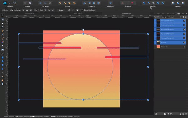
Grab the Pen tool (P) and trace a line on your canvas. In the Stroke panel (you can also do this in the Pen tool’s Context toolbar section for the stroke, at the top), set the size to something like 7 pixels. We can easily change this value later if needed. Select the “Dash” line style, and the rest of the dialog settings should be as follows:
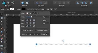
Settings for the first part of creating the halftone pattern. (View large version)
Now, duplicate this line, and place the new one below with a bit of an offset to the left.

View large version
Group both lines, duplicate this group with a Smart copy, and create something like this:
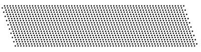
Smart copy the first two lines, and create the whole pattern. (View large version)
When you drag a selection in Affinity Designer, only objects that are completely within the selection area will be selected. If you want to select all objects without having to drag over all of them completely, you have the following options:
Mac: Holding the ⌃ (Ctrl) key will allow you to select all objects touching the selection marquee as you draw it.
Windows: Click and hold the left mouse button, start dragging a selection, and then click and hold the right mouse button as well. As you are holding both buttons, all objects touching the selection marquee will be selected.
Alternatively, you can make this behavior a global preference. On Mac, go to “Affinity Designer” → “Preferences” → “Tools”, and check “Select object when intersects with selection marquee”. On Windows, go to “Edit” → “Preferences” → “Tools”, and check “Select object when intersects with selection marquee”.
To make the illustration more interesting, we are going to vary the beginning and end of some of the lines a bit. To do this, we select the Node tool (A), and move the nodes a bit inwards.
It should now look like this:
View large version
To apply the pattern to our design, make sure everything is grouped, copy and paste it into our car artwork, reduce its opacity to 30%, and also reduce the size (making sure “Scale with object” is checked in the Stroke panel). We will then create a clipping mask. It is important to keep consistency in the angle, color and size of this pattern throughout the illustration.
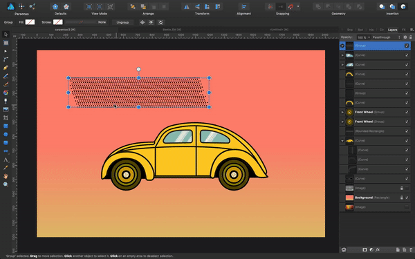 Applying the halftone mask (View large version)
Now, apply the halftone pattern to the back fender and to the car’s side; make sure to create a placeholder for it first, be it the fender itself or a new shape. Make some tweaks if you need to adapt the pattern to your drawing in a harmonious way. You can change the overall size, the dots’ size, the transparency, the angle and so on, but try to be consistent when applying these changes to the pattern bits.
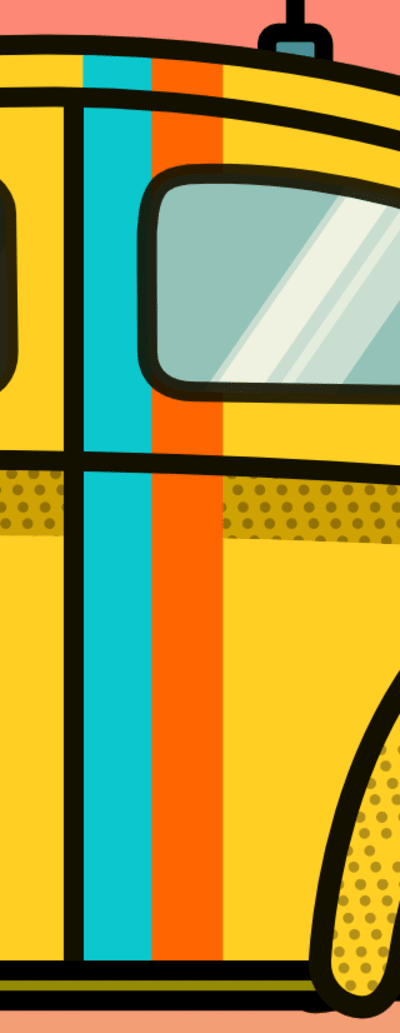
For the shadow below the windows, I drew a curve to be the placeholder, and applied the color #CFA204 so that it looks darker.
10. Creating The Remaining Elements Of The Car
Now, it’s all about creating the rest of the elements that make up the car: the bumpers, the back wheel and the surf board, plus the design stickers.
The front and back lights
For the front light, switch to the Segment tool and draw the shape. Then we need to rotate it a bit and place it somewhere below the car’s main bodywork. The same can be done for the back light but using the Rectangle tool. The colors are #FFDA9D for the front light and #FF0031 for the back light.
 Creating the front light (View large version)
Surfboard
To create the surfboard, we will use the Ellipse tool and draw a long ellipse. Convert it to curves and pull up the lower segment, adjusting a bit the handles to give it the ideal shape.
 Creating the surf board (View large version)
Now, just create two small rounded rectangles, with a little extra line on top for the board’s rack. Place them in a layer behind the car’s main body shape.
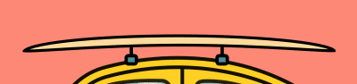
Board rack pieces (View large version)
With the Pen tool, add the rudder. Its color is #B2E3EF. And for the stroke, use a 6-pixel width and set the color to #131000.
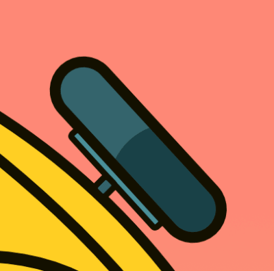
Spare wheel
Now let’s create the the spare wheel! Switch to the Rounded Rectangle tool. Drag over the canvas to draw a shape. Color it #34646C, and make the stroke #131000 and 8 pixels in size. The size of the spare wheel should fit the proportions of your car and should have the same diameter as the other wheels, or perhaps just a bit smaller. Pull the orange dots totally inwards, and give it a 45-degree angle. For the rack that holds the wheel, create a small piece with the Rectangle tool, and give it the same 45-degree angle, color it #4A8F99, and make the stroke #131000 and 4.5 pixels in size. Create the last piece that rests over the car in the same way, with a color of #34646C, and a stroke that is #131000 and 4.5 pixels in size.
Lastly, let’s create a shadow inside the wheel to add some more interest. For this, we’ll create a clipping mask and insert an ellipse shape with a color of #194147, without a stroke.
Note: We may want to create the same shadow effect for the car wheels. Use the Rectangle tool and a color of #312A00, create a clipping mask, and insert it in the wheel shape, placing it halfway.
Three simple shapes to draw the spare wheel and its rack (View large version)
Bumpers
For the bumpers, we will apply the boolean operation “add” to two basic shapes and then clip-mask a shadow, just as we did for the wheels.
Boolean operations are displayed in the section of icons labeled “Geometry” (Mac) and “Operations” (Windows). (Yes, the label names are inconsistent, but the Affinity team will likely update them in the near future, and one of the labels will become the default for both operating systems.) If you don’t see them in the upper toolbar, go to “View” → “Customize Toolbar”, and drag and drop them into the toolbar.
Important: If you want the operation to be non-destructive, hold the Alt key while clicking on the “Add” icon (to combine the two basic shapes).
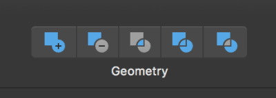
Boolean operations: Add, Subtract, Intersect, Divide, Combine. (View large version)
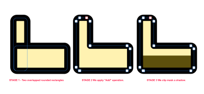
Applying the (destructive) Add operation to create a single shape from two shapes. (View large version)
Note: If you try to paste the “shadow” object inside the bumper, it will only work if the bumper is one whole object (a destructive operation). So, if you used Alt + “Add”, this will not work now. However, you can still work around this by converting the Compound shape (the result of a non-destructive operation that is a group of two objects) to one Curve (one whole vector object). You just need to click on the Compound shape, then in the menu go to “Layer” → “Convert to Curves” (or use the key combination Ctrl + Enter).
Back window
We are still missing the back window, which we will create with the Pen tool, and the decoration for the car. For the two colored stripes, we need the Square tool and then clip-mask these two rectangles into the main bodywork. The size is 30 × 380 pixels, and the colors are #0AC8CE and #FF6500. Clip them by making sure you’ve put them on the right layer, so that the dark lines we drew before are above them.
Number 56
For the number “56” decoration, use the Artistic Text tool (“T”), and type in “56”. Choose a nice font that matches the style of the illustration, or try the one I’ve used.
The color for the text object is #FFF3AD.
(I added an extra squared shape behind the back fender, which will look like the end of the exhaust pipe. The color is #000000.)
Color strips
Now that we’ve done this, check the color stripes and the window they overlap with. As you can see (and because we put some transparency in the window glass), the orange stripe is visible through it. Let’s use some Boolean power again to fix this.
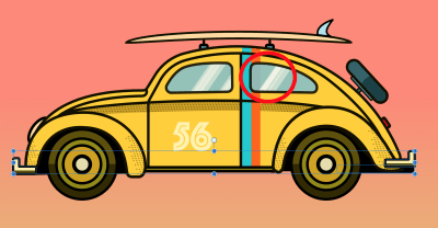
Bumpers and exhauster added. Check out the overlapped window and the orange stripe! (View large version)
Duplicate the window object. Select both the window object (the one you just duplicated) and the orange stripe in the Layers panel. Apply a “subtract” operation.
Stage 1, before the subtract operation. (View large version)

Stage 2, once the subtract operation is applied. (View large version)
Now, the orange stripe has the perfect shape, fitting the window in such a way that they don’t overlap.
Stripe and window with subtraction operation applied. (View large version)
Smoke
To create the smoke from the exhaust, draw a circle with a white stroke, 5.5 pixels in size and no fill. Transform it to curves and break one of its points. From the bottom node, trace a straight line with the Pen tool.
Duplicate this “broken” circle, and resize to smaller circles, and flip and place them so that they look like this:
Creating the exhaust smoke (View large version)
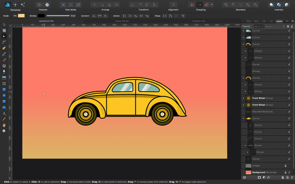
Note: Now that the car is finished, group all of its layers together. It will be much easier to keep working if you do so!
11. Creating The Ground And The Background Elements.
Ground
Let’s trace a simple line for the ground, and add two bits breaking it in order to create visual interest and suggest a bit of movement. We also want to add an extra piece to create the ground. For this, we will use the Rectangle tool and draw a rectangle with a gradient color of #008799 for the left stop and #81BEC7 for the right stop. Give it 30% opacity.
Gradient for the ground piece and the grouped car layers for a clean view in the Layers panel. (View large version)
Clouds
For the clouds, select the Cloud tool from the list of (primitive) vector shapes. Draw a cloud by holding Shift to keep the proportions. Make it white. Transform it into curves, and with the Node tool (A) select the bottom nodes and delete them. Sub-select the bottom-left and bottom-right nodes (after deleting all of the others), and then in the Context toolbar, select “Convert to Sharp” in the Convert section. This will make your bottom segment straight. Apply some transparency with the Transparency tool (Y), and duplicate this cloud. Place the clouds in your drawing, spread apart as you wish and in different sizes.
My clouds have 12 bubbles and an inner radius of 82%. You can do the same or change these values to your liking.
 Creating the clouds with the Cloud tool and the Transparency tool (View large version)
Palm trees
To create the palm trees, use the Crescent tool from the list of primitive shapes on the left. Give it a gradient color, with a left stop of #F05942 and a right stop of #D15846.
Drag to draw the crescent shape. Move its center of rotation to the bottom of the bounding box, and give it a -60-degree angle.
The center of rotation can be made visible in the Contextual toolbar section for the Move (and Node) tool. It looks like a little crosshair icon. When you click on it, the crosshair for moving the rotation center of an object will show. Duplicate it, either via Cmd + C and Cmd + V (Mac) or Ctrl + C and Ctrl + V (Windows), or by clicking and then Alt + dragging on the object, and move the angle of the new crescent to -96 degrees. Make it a bit smaller. Copy the two shapes and flip them horizontally.
I also created and extra crescent.
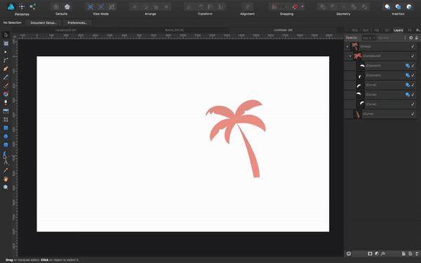 Create the palm leaves (View large version)
To create the indentations on the leaves, transform the object to curves, add a node with the Node tool, and pull inwards. To make the vortex sharp, use “Convert” → “Sharp”.
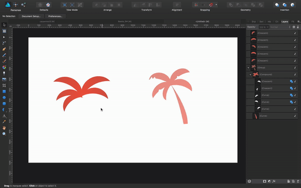 Creating the leaves’ indentations (View large version)
Create the trunk of the palm tree with the Pen tool, group all of the shapes together, and apply an “add” boolean. This way, all of the shapes will transform into just one. Apply a 60% opacity to it.
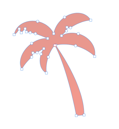
The palm tree once the Add boolean operation has been applied (View large version)
Duplicate the tree shape several times, changing the sizes and tweaking to make the trees slightly different from one another. (Making them exactly the same would result in a less interesting image.)
The last thing we need to make is the sun.
The sun
For this, simply draw an ellipse and apply a color of #FFFFBA to it. Apply a transparency with the Transparency tool (Y), where the bottom is transparent and gets opaque at the top.
Transparency applied to the sun shape (View large version)
Now we will add some detail by overlapping several rounded rectangles over the sun circle and subtracting them (click Alt for a non-destructive action, if you prefer).
 Applying a subtract operation (View large version)
Place your sun in the scene, and we are done!
12. A Note On The Stacking Order (And Naming Of Layers)
While you work, and as the number of objects (layers) grows, which will also make your illustration more and more complex, keep in mind the stacking order of your layers. The sooner you start naming the layers and placing them in the right order, the better. Also, lock those layers that you’re done with (especially for things such as the background), so that they don’t get in the way as you work.
In this illustration, the order of elements from bottom to top is:
background,
ground,
sun,
clouds,
palm trees,
car.
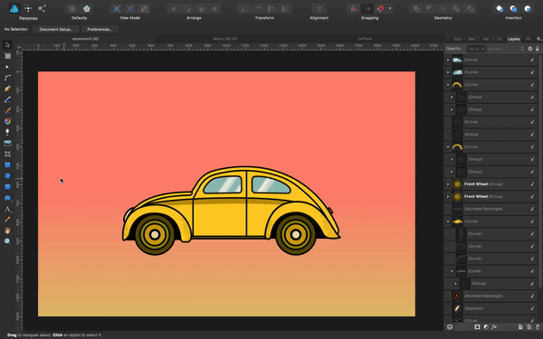
Conclusion
I hope you could follow all of the steps with no major problems and now better understand some of Affinity Designer’s main tools and actions. (Of course, if you have some questions or need help, leave a comment below!)
These tools will allow you to create not only flat illustrations, but many other kinds of artwork as well. The tools, actions and procedures we’ve used here are some of the most useful and common that designers and illustrators use daily (including me), be it for simple illustration projects or much more complex ones.
However, even my most complex illustrations usually need the same tools that we’ve seen in action in this tutorial! It’s mainly a matter of understanding how much you can get out of each tool.
Remember the few important tips, such as locking the layers that could get in your way (or using half-transparency), stacking the layers in the right order, and naming them, so that even the most complex of illustrations are easy to organize and work with. Practice often, and try to organize things so that your workflow improves — this will lead to better artwork and better time management as well.
Also, to learn more about how to create this type of illustration, check out the video tutorial that I posted on my YouTube channel.

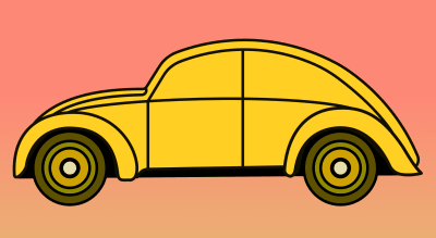
The completed Volkswagen Beetle illustration. (View large version)

(mb, ms, ra, yk, al, il)
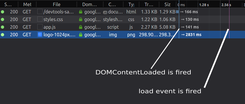
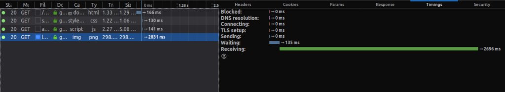
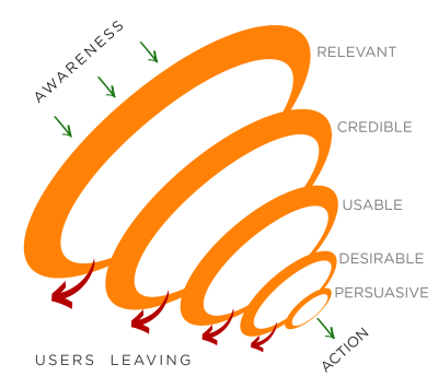
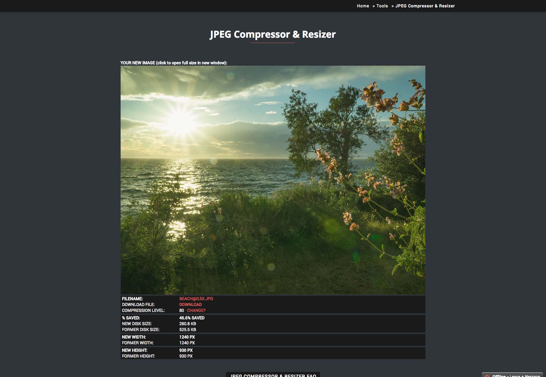
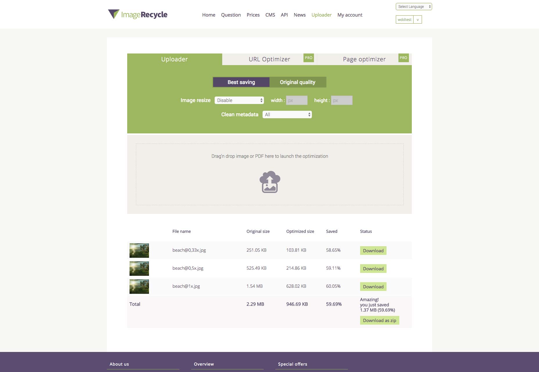
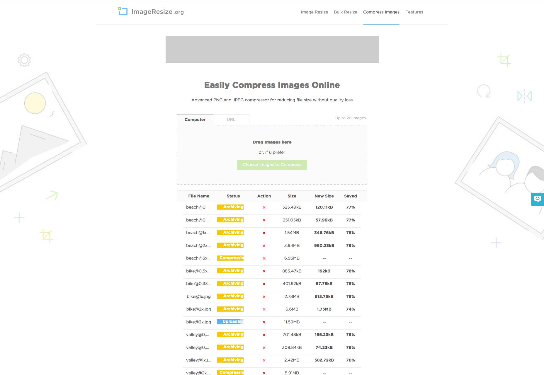
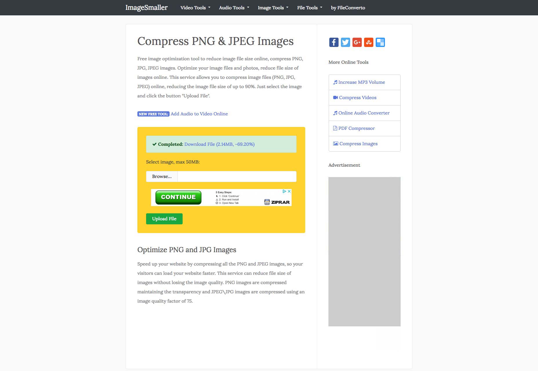
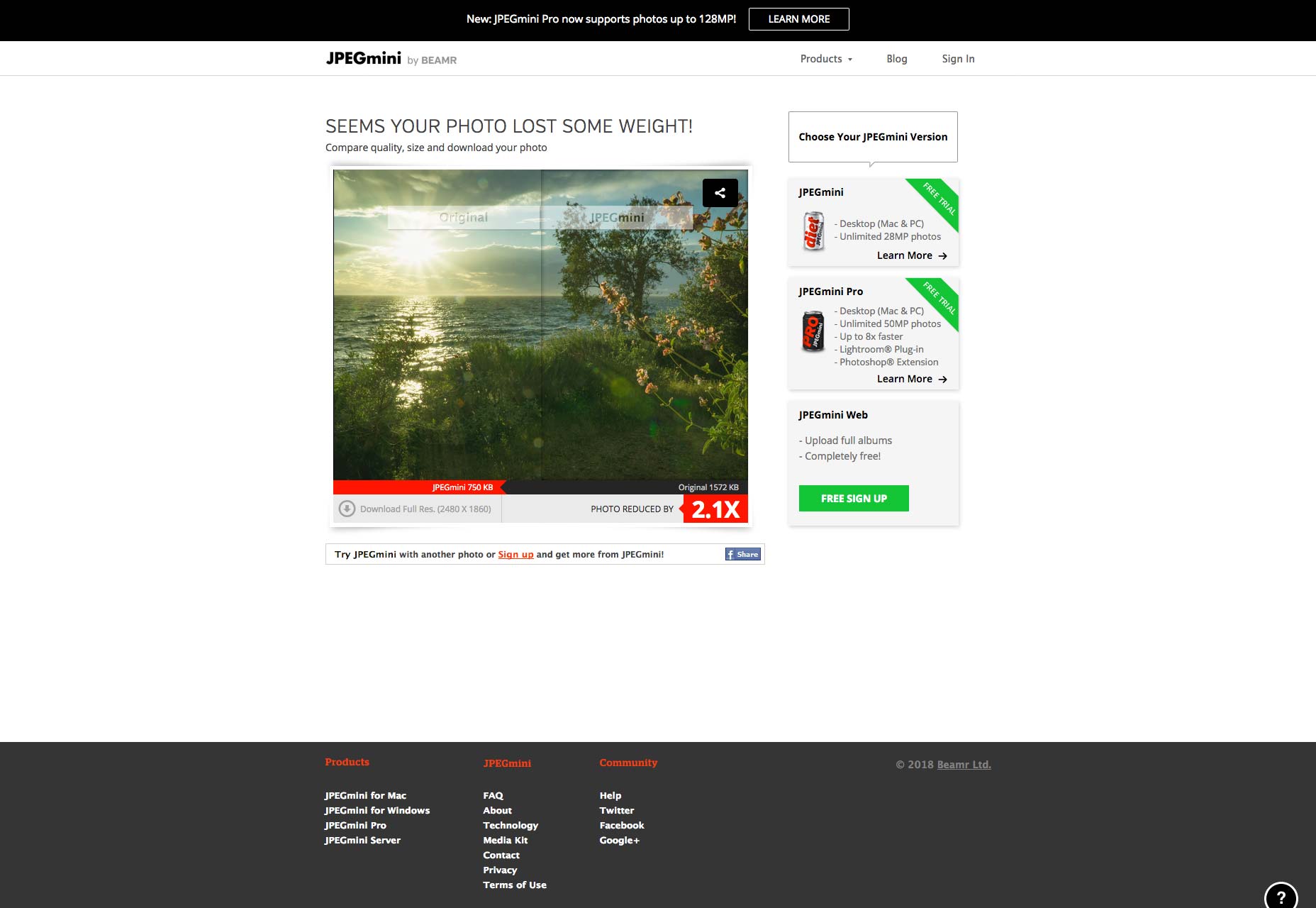
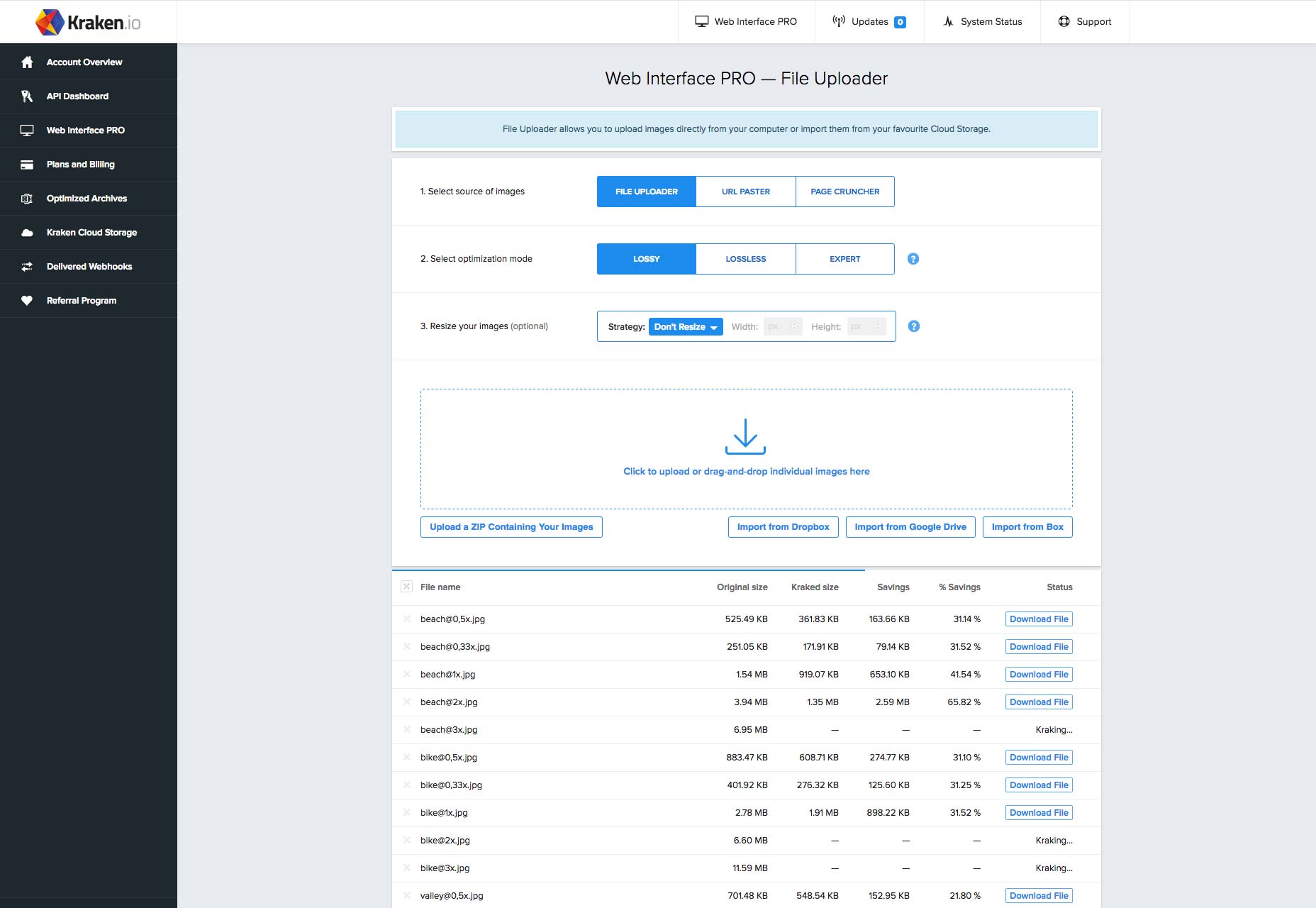
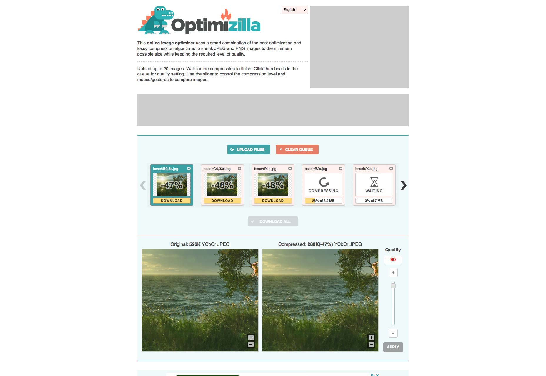
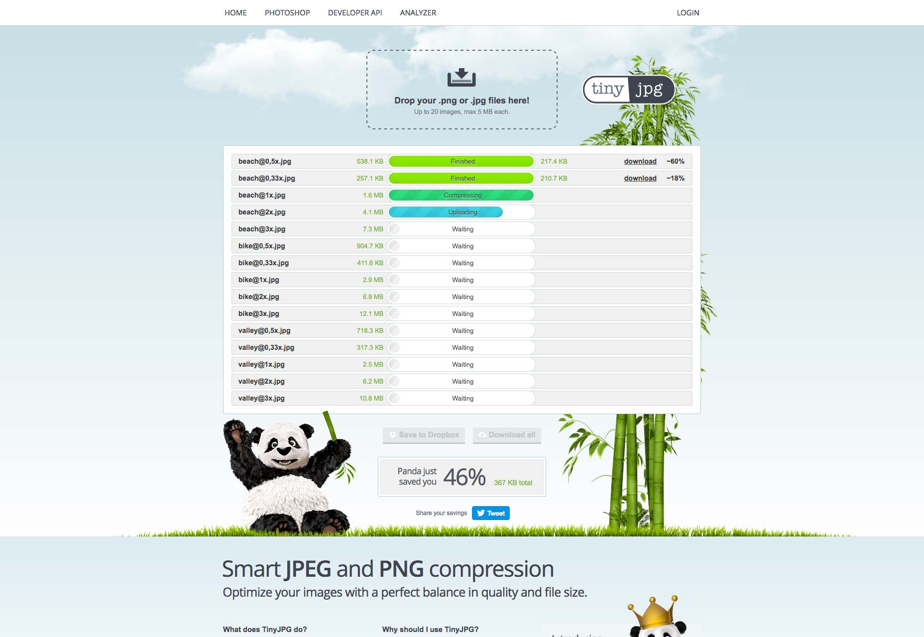
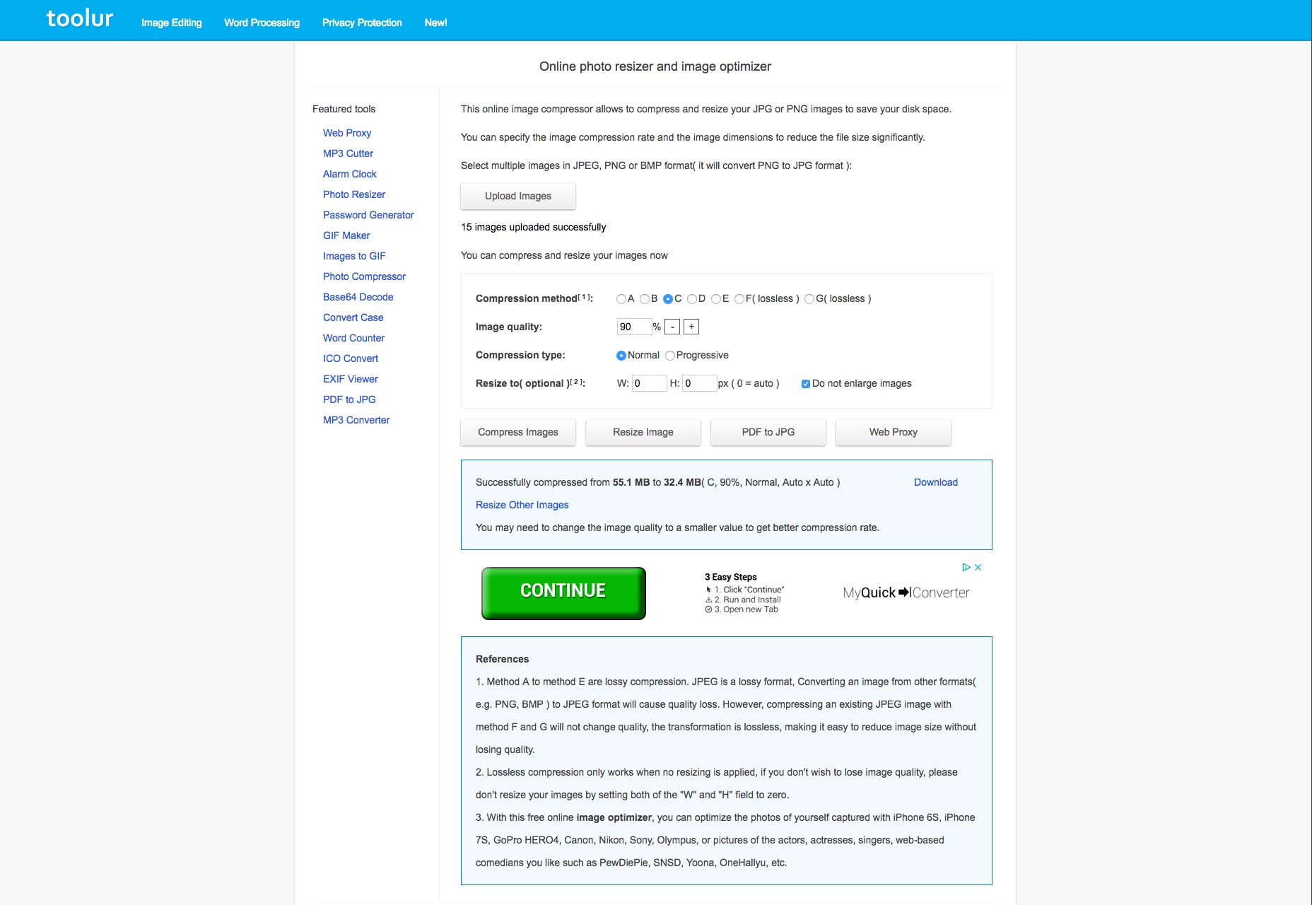
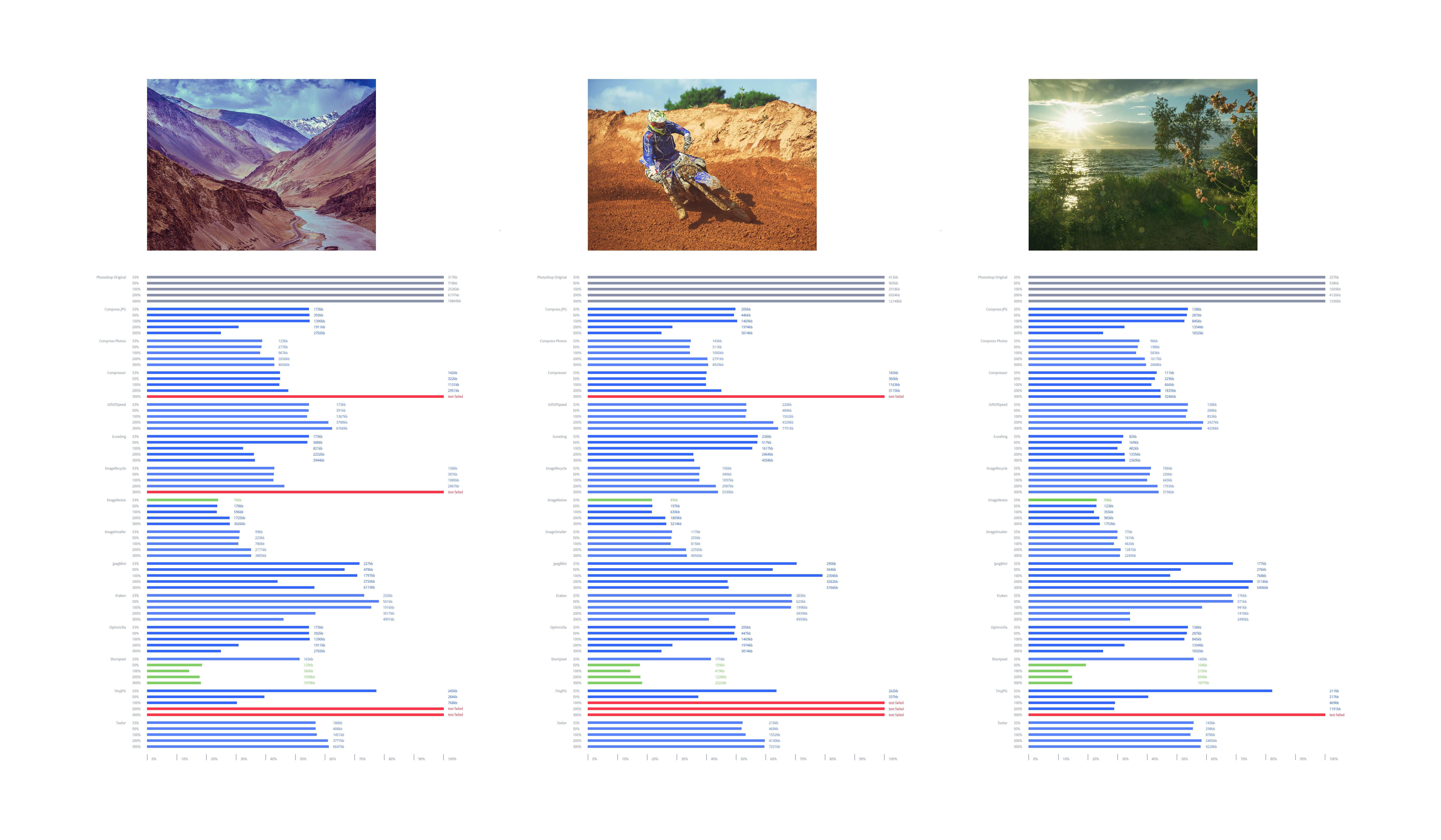
 It’s no real secret that the size of web pages is increasing. We’re adding more and more assets, slowing down sites, and ruining user experience.


 Hello again, Readers. It’s time to stop playing those games you got on the Steam Summer Sale for a minute, ‘cause it’s July now—I know, it caught me off guard, too.
 , kids. If you find an idea you like and want to adapt to your own site, remember to implement it responsibly.
 Rod Sterling in the Twilight Zone TV series.


 LoveBits: Code poetry project in JavaScript (Large preview)