Digital artist Justin Maller becomes CCO at DeviantArt

Original Source: http://feedproxy.google.com/~r/CreativeBloq/~3/LATKadAJDbs/digital-artist-justin-maller-becomes-cco-at-deviantart

Top digital illustrator Justin Maller has recently become chief creative officer of art community DeviantArt. This new role doesn't just mean a return to his roots – Maller started his art career at DeviantArt –  but also involves a geographical uprooting, as he's moved from New York to Los Angeles. 

Read on to discover why this new role appealed, and how Maller plans to balance it around other projects.

How did you new role come about?

I’ve been a part of the DeviantArt community since 2001 – it’s where I got my start as an artist. I was actually one of the earliest volunteer staff members, picking daily features and whatnot. I’ve maintained a great relationship with the site and its admins over the years, particularly with Angelo, the CEO. He broached the idea of me taking the role prior to us going on a trip last year, and after a few long conversations, I started to see the fit. 

What will your new role involve?

I’ll be working with the in-house and Tel Aviv studios, as well as across product and marketing to develop new tools for the community and then share them with the broader world. I’ll also be working on offering more to artists, and ensuring that everything is done with artistic credibility. There’ll be a lot of strategy development that goes in to all that, of course.

I think the biggest challenge is going to be executing all of this across such long timelines when I'm used to operating in a very nimble and immediate environment.

Justin Maller’s apparel illustration for Jordan/Nike

How will you balance your new job with other projects? 

I’ll take some jobs here and there to maintain my standing as a working artist and the relationships I’ve developed, but it will be a much smaller part of my day to day. I hope to make a great deal more personal work, and DeviantArt is very encouraging about that!

How do you think you'll adjust to life in LA?

I'll miss the hell out of NYC. The friends I made there are like family to me. Leaving them and the life I built in NYC over eight years is really hard. But I’ve done it before, moving from Melbourne, so I’m sure I’ll adjust again. I don't think it'll affect any projects, hopefully I'll just be able to relax more in the open space and free my mind to make some cool new stuff.

Is it important to be open with your fans?

To an extent, yeah. I don’t bring a lot of personal stuff to my social media. However I think people got used to seeing a certain volume of production of art, and due to personal circumstances I was way below my usual levels in 2017. I posted on Twitter that I've been having some personal issues because I wanted to have a little bit of frank discourse and remind everyone that I am still a human being, and their Goku wallpaper might have to wait.

Any tips for keeping on top of projects?

Flail frantically at them in a frenetic and disorganised fashion until you’re exhausted. Then take a nap.

This article is featured in issue 279 of Computer Arts, the world's best-selling design magazine. Buy issue 279 now or subscribe.

Related articles:

How to start your digital art journey5 ways to improve your digital art skillsDeviantArt gets bought by Wix

Best Websites for GMAT Test Prep

Original Source: http://feedproxy.google.com/~r/Designrfix/~3/-bu_2tG4czw/best-websites-for-gmat-test-prep

The GMAT test is an essential prerequisite for many MBA students to enroll in their chosen institution. The exam is made up of four distinct sections focusing on literacy and numeracy questions. Earning the perfect scores in the test requires an intensive study and preparation. Of course, due to the importance of this exam, there […]

The post Best Websites for GMAT Test Prep appeared first on designrfix.com.

30 Best Free Screen Capture Tools and Plugins

Original Source: https://www.hongkiat.com/blog/screen-capture-tools-40-free-tools-and-techniques/

Collection of the best free tools and plugins that offer multiple features to capture, edit, save and share screenshots on both macOS and Windows.

The post 30 Best Free Screen Capture Tools and…

Visit hongkiat.com for full content.

Introduction to FuseBox — a Faster, Simpler webpack Alternative

Original Source: https://www.sitepoint.com/fusebox-faster-webpack-alternative/

webpack has arguably become the de facto JavaScript module bundler, but it has a reputation for being confusing and difficult to learn. In this article, I want to present a faster, simpler webpack alternative — FuseBox.

In today’s rapidly evolving front-end landscape, it’s vital to have a solid grasp of the JavaScript module system. Modules can help organize your code, make it more maintainable and increase its reusability. Unfortunately, browser support for ES modules isn’t quite there yet, so you’ll invariably need a module bundler to stitch them together into a single file which can be delivered to the browser.

FuseBox is a next generation ecosystem of tools that provides for all of the requirements of the development lifecycle. It enables developers to bundle any file format, it’s a module loader, a transpiler, a task runner and much more.

In this article, we’re going to use FuseBox to walk you through the common tasks involved in developing a JavaScript application. These are as follows:

bundling: define an entry point and a bundle name
transpiling: write in TypeScript and target ES5
module loading: combine your modules into one single file
handling other assets: use a FuseBox plugin to compile Sass
hot module reloading (HMR): see your project automatically update to reflect your changes
task running: an introduction to Sparky, FuseBox’s built-in task runner
unit testing: an introduction to FuseBox’s built-in test runner
targeting production: produce a minified, uglified bundle for deployment.

Once you’ve finished reading, you’ll be able to drop FuseBox into your next project and benefit from its speed, simplicity and flexibility.

Bundling — a Basic Example

Disclaimer: I’m one of the core contributors to the project.

Projects are becoming larger — that’s a fact. If we were to include all the files required by the page one by one, this would make things considerably slower, as the browser would have to make a bunch of blocking HTTP requests. Bundling solves this issue and reduces the number of files requested and FuseBox makes this process as easy as possible.

To start bundling, we need to teach FuseBox about what we want. FuseBox doesn’t require much in the way of configuration to bundle heavy projects. In fact, ten lines of configuration are usually enough for most use cases. However, before we start getting into some real-world examples, let’s create something simple.

First, create a new folder. Then, from your command line, navigate to it and enter the following: npm init -y. This will initialize your project. Then type npm install fuse-box -D, which will install FuseBox as a development dependency.

Next create a folder called src which is where all your code will go. Also, create an index.js file in your src folder and add the following content into it:

console.log(‘Hello world’);

Next, create a fuse.js file in the root of your project. This file will contain all your FuseBox configuration.

At this point, our folder structure should look something like this:

MyProject
├── node_modules
├── src
│ └── index.js
├── fuse.js
└── package.json

Add the code below to fuse.js:

const { FuseBox } = require(“fuse-box”);

const fuse = FuseBox.init({
homeDir: “src”,
output: “dist/$name.js”
});

fuse.bundle(“app”)
.instructions(“> index.js”);

fuse.run();

Let’s break this code down section by section.

First, we require FuseBox. Then we initialize a new instance of FuseBox with the init method. This is also called the Producer in FuseBox terms. It’s where we define global configuration for all bundles.

The homeDir option points FuseBox to the home directory of our files. This is because FuseBox creates a virtual file structure that mimics the physical one. The output option tells FuseBox where our output bundle should reside. Notice the $name.js: this is a placeholder that will be replaced with the name you provide to your bundle.

The command fuse.bundle(“app”) is where we tell FuseBox about our bundle. We’re telling FuseBox to create a bundle with the name app.js that will reside in the dist folder in your project. The end file will be project/dist/app.js.

The instructions(‘>index.js’) part is where we tell FuseBox what we want to bundle. The symbol > is what we call an arithmetic instruction: it’s the language FuseBox uses to learn what files need to be bundled.

The command fuse.run() tells FuseBox to start the bundling process.

Now from your command line enter node fuse.js — and that’s it, you’re done! FuseBox will now start its bundling magic and create the bundle at dist/app.js.

The full example is available here.

Transpiling TypeScript and ES6

What we’ve done so far is nice, but this is not how many modern JavaScript projects are developed. Applications today are developed using ES6, which is the sixth major release of the ECMAScript language specification. ES6 is great: it enables new language features like classes, arrow functions and much more. The problem, though, is that it’s not fully supported by all browser or Node.js versions yet. So we need to transpile our code into a more common supported version of JavaScript, ES5.

There are two major tools to achieve this: Typescript and Babel. FuseBox supports both. In fact, FuseBox is built with Typescript, thus supporting it natively.

To get started with FuseBox and Typescript, do the following:

create a new project
using the command line, navigate to the root of this project and do npm init -y
create a src folder
inside src folder, add index.ts
create fuse.js in the root of the project
install FuseBox and TypeScript as dependencies: npm install fuse-box typescript -D.

In index.ts, add the following:

const name: string = “FuseBox”;
console.log(name);

You may be wondering what :string means. It’s an example of Typescript’s type system, telling the compiler that the variable name is of type string. To learn more about Typescript, check the official site.

Add the following to fuse.js:

const { FuseBox } = require(“fuse-box”);

const fuse = FuseBox.init({
homeDir: “src”,
output: “dist/$name.js”
});

fuse.bundle(“app”)
.instructions(“> index.ts”);

fuse.run();

Notice that things are still the same as before, the only difference being that we use the .ts file format instead of .js in instructions(‘>index.ts’). Now that the prerequisites are in place, from your command line enter node fuse.js and FuseBox will start bundling.

The full example is available here.

Note: When using ES6 syntax, FuseBox will automatically detect the module type and transpile the code seamlessly. No need for Babel. FuseBox rocks!

Continue reading %Introduction to FuseBox — a Faster, Simpler webpack Alternative%

Create storyboards for web animations

Original Source: http://feedproxy.google.com/~r/CreativeBloq/~3/hOKWrWNW5FU/create-storyboards-your-animations-21619177

Storyboarding began when Disney made its first feature-length animated film, Snow White and the Seven Dwarfs. Walt Disney Studios needed a way to coordinate many teams in order to tackle the massive undertaking.

Storyboarding was a simple idea: dissect the story into its component scenes, illustrate them roughly on paper or cards, pin those cards on large cork boards, then distribute those boards to the teams every morning. The story department could steer the project, and the production artists would never be able to wander too far down any dead ends.

It brought what we now call agile development to studio animation. Since Snow White, they've become a production staple of film, interaction design and game design. 

Now, with animation entering the toolsets of web designers and developers everywhere, it seems that storyboards might become the web industry's new best friend, too.

Alice in Videoland by Rachel Nabors. Storyboards help map out sequences of animation

Storyboards for the web

When it comes to animating user interfaces on a project, communication between designers and developers tends to break down if they aren't working side by side. In companies where animation deliverables are 'thrown over the fence' to developers, sometimes designs are handed down as animated GIFs or videos with little else to guide the developers when recreating them.

Storyboards can help designers and developers communicate this very visual topic using its lowest common denominators: words and pictures. They require very little training to make and read, and you can create and edit them without the need for specialised software.

Storyboards are great for sketching out quick UI animation ideas during a team meeting and gathering immediate feedback. For rapid prototyping teams, wireframes can be a great way to document the patterns used, so successful patterns can be applied consistently as the project continues. And as design artefacts, they fit perfectly with style guides and design systems for documenting reusable animation patterns.

Create storyboards for your animations

Storyboarding keeps projects on track
Collaborative storyboards

On their own, wireframes can help break down communication barriers between developers and designers by giving them a common, collaborative medium. But they are even more powerful when coupled with video and prototypes.

Often motion designers create and polish animations in a program that's not designed for web development, like After Effects or Keynote. Indeed, it makes sense to experiment with animations using visual tools. But alone, video is a poor deliverable for developers. A developer might spend hours trying to recreate a subtle bounce effect that could have taken seconds if they had only known the easing value used by the designer in their animation program.

Delivering storyboards alongside videos lets developers know exactly what steps to follow to recreate an animation. This is less intimidating than having to make many inferences (which might also frustrate their coworkers). The difference between a cubic and quintic curve is nigh-on impossible for a harried developer to spot in a 500 millisecond GIF. But for a sharp-eyed designer, the difference in production is glaring.

The storyboarding process

Modern storyboards at the office are quite a bit smaller than the large cork boards of the 1930s – they look more like a comic book page than a billboard. Just like a comic page, each panel illustrates and details a different snapshot in time. Underneath each panel is text detailing what's happening, how and why.

In web design, each of those panels could contain a screenshot, a wireframe, even a sketched micro-interaction, supported by notes expanding on what interactions trigger the animations, and over what period of time they occur.

Storyboards can be as macro or as micro, as polished or as rough, as you please. Do what makes sense for you and your team. I have created storyboards with index cards, Photoshop, and even Keynote. It's important to pick tools that everyone on your team can use and read, even if often that ends up being pencils and paper!

For UI animation, storyboarding should start alongside wireframing; right after user research and information architecture. If your workflow is more vigorous, you might start storyboarding alongside design. As long as you're thinking about animation early, you will be in good shape.

Colour-coded storyboards

Create storyboards for your animations

Two panels illustrate cause and effect. Words and illustrations are colour-coded to draw strong relationships

In addition to the black and grey of wireframing, storyboarding benefits from reserving two special colours to indicate action and animation. I use blue and orange respectively, partly because they are discernible for people with various kinds of colour blindness. Blue subconsciously registers as an actionable 'link' colour, and orange is very active and stands out. Use these colours to indicate what user interactions cause which things to animate.

Get those digits

A picture is worth a thousand words, but in animation the right numbers can be worth even more. Be sure to include the duration of each part of the animation. Even adverbs like 'quickly' or 'slowly' will help paint a mental picture for those who need to implement the animations.

Spell out what properties are being changed: from colour and opacity to width or height. Use descriptive words like 'fade', 'shrink', 'slide', 'expand'. Phrases like 'pop, bounce and swoosh' have more subjective values, often affecting more than one property. Does a 'pop' involve expansion and contraction as well as a rise and fall? Save these words for naming your animation patterns once they emerge.

Stipulate the animation's exact easing. This value is supremely helpful to the people implementing the storyboard later on.

Number each panel

Numbering a storyboard's panels is a best practice sometimes discarded by cinema, but invaluable in web design. Starting from 1, they tell readers which way the action flows. Storyboards could come in vertical or horizontal layouts, and numbers quickly reinforce which mental model everyone should be using. Numbered panels allow quick feedback (for example, 'What about instead of panel 16, we use a nice fade?'), and let you index what animations and interactions happen and reference them accordingly.

Additionally, numerical panels let you add branching logic to your interactions or show several alternatives. For example, you could group several options for the fourth panel under 4a, 4b, 4c.

Use your words

When adding notes to your storyboard, always detail why the animation is happening. Be sure you can justify the animation with sound reason. You may have to defend the animation to others, and if you can't explain why it's important to yourself, perhaps it's unnecessary for your users.

In my A List Apart post, Animation at Work, I list six different ways you can use animation to underscore relationships and hierarchy. Can you use two of these words to explain your animation?

Storyboard checklist

Each panel (or pair of panels for complex interactions) of your storyboard should demonstrate the following:

What event or user interaction causes which things to animateHow said things animateWhy the animation improves the interaction

Often this breaks down into two panels:

A clear indication of the trigger for the animations ('When the user clicks the button…')A description of the changes that follow ('…the button fades away to reveal…')

Colour-code your words, too, with interaction words (like 'click', 'hover' and 'focus') being underlined or written in your designated interaction colour, and descriptive works ('shrink', 'bounce', 'fade') using your animation colour.

Bringing storyboards to work

The most common challenge we face when bringing animation to our projects is building a strong rapport with the people who design or code them. The second most common challenge is not standardising those animations we do implement. Both of these lead to inconsistent animation that gives our creations a sloppy, half-finished feel.

Storyboards address both of these challenges: communication and documentation. As such, they are powerful not just for their technical depth, but also for their ability to bring people closer together on a project. This is the spirit in which we must embrace storyboards: not as a tool to dictate but as a conversation to join.

This article was originally published in issue 276 of net magazine.

Related articles:

The 5 best visual regression testing toolsInterview: Lara Hogan18 top CSS animation examples

The best new tech of 2018

Original Source: http://feedproxy.google.com/~r/CreativeBloq/~3/PEnAxPghu4I/the-best-new-tech-of-2018

With so much consumer tech released throughout the year, it can be difficult to spot the hardware products that offer creatives in particular something to get excited about.

Thankfully, more technology companies than ever are eager to please designers, illustrators and digital artists of all types with their inspirational wares.

So whether you're just looking to upgrade your workstation with a useful bit of kit, or fancy taking your creativity in a new direction entirely, keep reading to find out what's currently got our attention on the market.

Apple's latest 9.7-inch iPad may not be the company's thinnest or fastest ever tablet, but at £319 it's surely the most affordable. The sixth-generation iPad has the same 9.7-inch Retina display as last year's model, but its higher-resolution touch sensor presents a significant bonus – it now supports the Apple Pencil, just like the £619 iPad Pro. Digital illustration on an iOS device just got a whole lot cheaper.

Also read: The best iPad deals

The higher-res your creative assets, the longer your file transfers take, which is why OWC have released this super-fast, silent-running external storage solution. The company reckons its new ThunderBlade SSD is the fastest external drive on the market, thanks to reported 2,800MB/s read and 2,450MB/s write speeds. Two thunderbolt ports at the rear mean up to six of the drives can be daisy-chained when plugged into the mains. They're currently not cheap though, starting at $1,200 for the 1TB model.

US: Buy OWC ThunderBlade v4 SSD for $1,199UK: Buy OWC ThunderBlade v4 SSD for £810.51

Also read: 8 best external hard drives and SSDs for Mac and PC users

Taking cues from Microsoft's Surface Studio, Logitech's advanced wireless CRAFT keyboard incorporates a creative input dial into its layout for controlling configurable, app-specific functions. 

The Crown, as it's called, is touch sensitive, so you can tap or turn it to adjust various settings depending on the application you're using. With custom profiles for all Adobe's Creative Cloud apps – including Photoshop CC, Illustrator, Premiere Pro, and InDesign, it's ready to go out of the box.

The CRAFT can pair with up to three devices over Bluetooth, and also features backlighting that detects hand movement and automatically adjusts illumination based on lighting conditions.

Also read: The best keyboards for creatives

In response to criticism that it was failing to cater to creative professionals, Apple launched perhaps the fastest Mac ever in December with the slick-looking space grey iMac Pro. 

The iMac Pro can be configured with a mammoth 18-core Intel Xeon processor. To put that power in perspective, consider that a 10-core iMac Pro is almost twice as fast as a high-end 5K iMac and up to 45 percent faster than a 'trash can' 2013 Mac Pro. 

Hidden behind that beautiful 5K display is up to 4TB of SSD storage, up to 128GB of ECC RAM, and 16GB AMD Radeon Pro Vega 64 graphics. With four Thunderbolt 3 ports, the iMac Pro can power two external 5K displays or four 4K displays at 60Hz simultaneously. There's also a 10 Gigabit Ethernet port, an SD card slot, four USB-A 3.0 ports, and a 3.5mm headphone jack lined up on the rear. 

Also read: The best computers for designers 2018

Looking to marry a monitor or two to a brand new Apple Mac? Then consider one of StarTech's freshly launched bus-powered Thunderbolt 3 Mini Docking Stations with additional Ethernet and USB connectivity. 

The dual HDMI dock supports two HDMI monitors running in 4K resolution, whereas the DisplayPort version can power two 4K DisplayPort monitors or one 5K monitor. Best of all, there's no need for a separate power cord because the included Thunderbolt 3 cable supplies all the charge your monitors need. 

US: Buy the StarTech Mini Thunderbolt 3 Dock for $123.99UK: Buy the StarTech Mini Thunderbolt 3 Dock for £144.50

The Surface Pro 4 was introduced back in October 2015 and has been superseded by the Surface Pro, which offers support for the Surface Dial right out of the box. Microsoft has long promised the earlier tablet PC would eventually support the Surface Dial. That was almost a year ago, so this update is definitely worth shouting about. For £76, now SP4 owners can finally dial into the onscreen creative action, controlling radial menus and selecting functions more intuitively.

Typical mobile workstations focus on offering powerful internal components capable of running demanding creative applications, but that all too often leads to an inelegant exterior. Not so with Dell's Precision 5520, which manages to pack the power of a workstation-class machine into a sleek space-age chassis with a luxurious feel.

Apart from its solid-looking Full HD 15.6-inch display, the 5520 is powered by an Intel Xeon processor and includes two USB 3.0 ports, a single USB-C port with Thunderbolt 3, an SD card reader, and an HDMI connection around the side.

Wacom refreshed its Intuos tablet line in 2017 with an updated version of the Intuos Pro, available in two highly portable medium and large sizes. Both tablet sizes feature eight customisable ExpressKeys and offer over 8,000 levels of pressure, 5,080 lines of resolution, 60 levels of pen tilt, 200 points per second reporting, USB and Bluetooth connectivity, and a multi-function touch ring. 

Wacom has also reworked the pen to make it more comfortable to use. It now sports a slightly less tapered design and side buttons that sit flush with the body.

Also read: The best graphics tablets for 2018

Apple's Cinema Display didn't get a look in last year and instead Apple surprised users by partnering with LG to come up with this UltraFine 5K monitor. While the first units unfortunately had a glitch, LG has since fixed the issue, allowing this display to sneak into our 2018 recommended list.

USB-C Thunderbolt 3 provides performance connectivity, while the display outshines even Apple's Retina MacBook screens, thanks to its native 5,120 x 2,880 resolution (don't worry – it downscales just fine). Fonts and icons look pristine on its exceedingly wide aspect, making this UltraFine display a multitasker's dream.

Upload your digital artwork to this reversible-ink pen-wielding robot and it will reproduce it on a vertical surface in minutes. Now, robot-powered art isn't new, but Scribit is designed with ease of use in mind. It requires just two nails and a power outlet, and its suspending cables can be installed in under five minutes, while the integrated motors allow the device to move, draw, erase, and re-draw content on pretty much any flat surface, whether it's made of glass, plaster, or whiteboard.

Scribit's crowd-funding campaign will start on 5 June.

As well as the high price, Apple's 2017 refresh of its flagship notebook retained the same remarkably slim chassis and controversial Touch Bar, but brought in much-anticipated seventh-generation Kaby Lake processors and improved graphics under the hood.

The 2880 x 1800 resolution Retina display looks as impressive as we've come to expect from Apple, which also decided to bump the speed of the onboard memory to 2,133MHz, up from 1,866MHz last year (although it still tops out at 16GB RAM). Add to that a new Radeon Pro 560 GPU with 4GB of GDDR5 memory and integrated Intel HD Graphics 630, and creative pros should be good to go.

Early in 2017, Wacom and Microsoft put their heads together and came up with the Bamboo Ink, a smart stylus for Windows Ink Workspace that lets idea-makers capture notes, sketch ideas or mark documents across most Windows 10 platforms.

Designed to provide a customised, natural writing and sketching experience, the Bamboo Ink comes with three nibs – soft, medium and firm – allowing sketchers and scribblers to switch up the feel. The pen can also be used to navigate windows in Edge browser, write in text boxes, and plenty more besides.

The impressive two-in-one Surface Book 2 sits at the top of Microsoft’s hardware line up. Two models are available: 13-inch and 15-inch, although the 15-inch likely won’t be available in the UK or Australia until 2018.

With Core i7 and i5 processors, both models are more powerful, thinner and lighter versions of the original Surface Book – our laptop of 2017. The smaller 13.5-inch PixelSense LCD touch display is stunning, with bright, accurate colours – and its compromise on power means it can have a fanless design, so it runs practically silently.

Both models boast brilliant battery life and the docking mechanism is significantly more stable, too. An updated stylus with quadruple the pressure sensitivity of the last pen is also available, just be aware it's $100 extra.

Need a recap? Here's all the best tech for 2018 – and the best prices…

Related articles:

The best video editing laptopsThe best monitor calibrators for designers 2018The 6 best smartphones for designers in 2018

Measuring Websites With Mobile-First Optimization Tools

Original Source: https://www.smashingmagazine.com/2018/04/mobile-first-optimization-tools/

Measuring Websites With Mobile-First Optimization Tools

Measuring Websites With Mobile-First Optimization Tools

Jon Raasch

2018-04-26T13:40:03+02:00
2018-04-26T11:46:15+00:00

Performance on mobile can be particularly challenging: underpowered devices, slow networks, and poor connections are some of those challenges. With more and more users migrating to mobile, the rewards for mobile optimization are great. Most workflows have already adopted mobile-first design and development strategies, and it’s time to apply a similar mindset to performance.

In this article, we’ll take a look at studies linking page speed to real-world metrics, and discuss the specific ways mobile performance impacts your site. Then we’ll explore benchmarking tools you can use to measure your website’s mobile performance. Finally, we’ll work with tools to help identify and remove the code debt that bloats and weighs down your site.

Responsive Configurators

How would you design a responsive car configurator? How would you deal with accessibility, navigation, real-time previews, interaction and performance? Let’s figure it out. Read article →

Why Performance Matters

The benefits of performance optimization are well-documented. In short, performance matters because users prefer faster websites. But it’s more than a qualitative assumption about user experience. There are a variety of studies that directly link reduced load times to increased conversion and revenue, such as the now decade-old Amazon study that showed each 100ms of latency led to a 1% drop in sales.

Page Speed, Bounce Rate & Conversion

In the data world, poor performance leads to an increased bounce rate. And in the mobile world that bounce rate may occur sooner than you think. A recent study shows that 53% of mobile users abandon a site that takes more than 3 seconds to load.

That means if your site loads in 3.5 seconds, over half of your potential users are leaving (and most likely visiting a competitor). That may be tough to swallow, but it is as much a problem as it is an opportunity. If you can get your site to load more quickly, you are potentially doubling your conversion. And if your conversion is even indirectly linked to profits, you’re doubling your revenue.

Nope, we can’t do any magic tricks, but we have articles, books and webinars featuring techniques we all can use to improve our work. Smashing Members get a seasoned selection of magic front-end tricks — e.g. live designing sessions and perf audits, too. Just sayin’! 😉

Explore Smashing Wizardry →

Smashing Cat, just preparing to do some magic stuff.

SEO And Social Media

Beyond reduced conversion, slow load times create secondary effects that diminish your inbound traffic. Search engines already use page speed in their ranking algorithms, bubbling faster sites to the top. Additionally, Google is specifically factoring mobile speed for mobile searches as of July 2018.

Social media outlets have begun factoring page speed in their algorithms as well. In August 2017, Facebook announced that it would roll out specific changes to the newsfeed algorithm for mobile devices. These changes include page speed as a factor, which means that slow websites will see a decline in Facebook impressions, and in turn a decline in visitors from that source.

Search engines and social media companies aren’t punishing slow websites on a whim, they’ve made a calculated decision to improve the experience for their users. If two websites have effectively the same content, wouldn’t you rather visit one that loads faster?

Many websites depend on search engines and social media for a large portion of their traffic. The slowest of these will have an exacerbated problem, with a reduced number of visitors coming to their site, and over half of those visitors subsequently abandoning.

If the prognosis sounds alarming, that’s because it is! But the good news is that there are a few concrete steps you can take to improve your page speeds. Even the slowest sites can get “sub three seconds” with a good strategy and some work.

Profiling And Benchmarking Tools

Before you begin optimizing, it’s a good idea to take a snapshot of your website’s performance. With profiling, you can determine how much progress you will need to make. Later, you can compare against this benchmark to quantify the speed improvements you make.

There are a number of tools that assess a website’s performance. But before you get started, it’s important to understand that no tool provides a perfect measurement of client-side performance. Devices, connection speeds, and web browsers all impact performance, and it is impossible to analyze all combinations. Additionally, any tool that runs on your personal device can only approximate the experience on a different device or connection.

In one sense, whichever tool you use can provide meaningful insights. As long as you use the same tool before and after, the comparison of each should provide a decent snapshot of performance changes. But certain tools are better than others.

In this section, we’ll walk through two tools that provide a profile of how well your website performs in a mobile environment.

Note: If can be difficult to benchmark an entire site, so I recommend that you choose one or two of your most important pages for benchmarking.

Lighthouse

Lighthouse audit tab

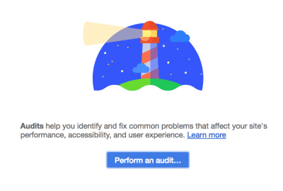
Lighthouse in the Google’s Web Developer Tools. (Large preview)

One of the more useful tools for profiling mobile performance is Google’s Lighthouse. It’s a nice starting point for optimization since it not only analyzes page performance but also provides insights into specific performance issues. Additionally, Lighthouse provides high-level suggestions for speed improvements.

Lighthouse is available in the Audits tab of the Chrome Developer Tools. To get started, open the page you want to optimize in Chrome Dev Tools and perform an audit. I typically perform all the audits, but for our purposes, you only need to check the ‘Performance’ checkbox:

Lighthouse audit selection

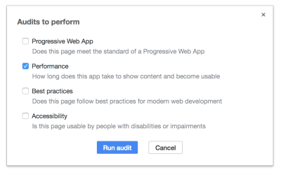
All the audits are useful, but we’ll only need the Performance audit. (Large preview)

Lighthouse focuses on mobile, so when you run the audit, Lighthouse will pop your page into the inspector’s responsive viewer and throttle the connection to simulate a mobile experience.

Lighthouse Reports

When the audit finishes, you’ll see an overall performance score, a timeline view of how the page rendered over time, as well as a variety of metrics:

Lighthouse performance audit results

In the performance audit, pay attention to the first meaningful paint. (Large preview)

It’s a lot of information, but one report to emphasize is the first meaningful paint, since that directly influences user bounce rates. You may notice that the tool doesn’t even list the total load time, and that’s because it rarely matters for user experience.

Mobile users expect a first view of the page very quickly, and it may be some time before they scroll to the lower content. In the timeline above, the first paint occurs quickly at 1.3s, then a full above-the-fold content paint occurs at 3.9s. The user can now engage with the above-the-fold content, and anything below-the-fold can take a few seconds longer to load.

Lighthouse’s first meaningful paint is a great metric for benchmarking, but also take a look at the opportunities section. This list helps to identify the key problem areas of your site. Keep these recommendations on your radar, since they may provide your biggest improvements.

Lighthouse Caveats

While Lighthouse provides great insights, it is important to bear in mind that it only simulates a mobile experience. The device is simulated in Chrome, and a mobile connection is simulated with throttling. Actual experiences will vary.

Additionally, you may notice that if you run the audit multiple times, you will get different reports. That’s again because it is simulating the experience, and variances in your device, connection, and the server will impact the results. That said, you can still use Lighthouse for benchmarking, but it is important that you run it several times. It is more relevant as a range of values than a single report.

WebPageTest

In order to get an idea of how quickly your page loads in an actual mobile device, use WebPageTest. One of the nice things about WebPageTest is that it tests on a variety of real devices. Additionally, it will perform the test a number of times and take the average to provide a more accurate benchmark.

To get started, navigate to WebPageTest.org, enter the URL for the page you want to test and then select the mobile device you’d like to use for testing. Also, open up the advanced settings and change the connection speed. I like testing at Fast 3G, because even when users are connected to LTE the connection speed is rarely LTE (#sad):

WebPageTest advanced settings form

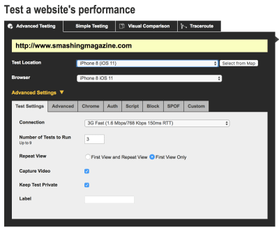
WebPageTest provides actual mobile devices for profiling. (Large preview)

After submitting the test (and waiting for any queue), you’ll get a report on the speed of the page:

WebPageTest profiling results

In WebPageTest’s results, pay attention to the start render and first byte. (Large preview)

The summary view consists of a short list of metrics and links to timelines. Again, the value of the start render is more important than the load time. The first byte is useful for analyzing the server response speed. You can also dig into the more in-depth reports for additional insights.

Benchmarking

Now that you’ve profiled your page in Lighthouse and WebPageTest, it’s time to record the values. These benchmarks will provide a useful comparison as you optimize your page. If the metrics improve, your changes are worthwhile. If they stay static (or worse decline), you’ll need to rethink your strategy.

Lighthouse results are simulated which makes it less useful for benchmarking and more useful for in-depth reports and optimization suggestions. However, Lighthouse’s performance score and first meaningful paint are nice benchmarks so run it a few times and take the median for each.

WebPageTest’s values are more reliable for benchmarking since it tests on real devices, so these will be your primary benchmarks. Record the value for the first byte, start to render, and overall load time.

Bloat Reduction

Now that you’ve assessed the performance of your site, let’s take a look at a tool that can help reduce the size of your files. This tool can identify extra, unnecessary pieces of code that bloat your files and cause resources to be larger than they should.

In a perfect world, users would only download the code that they actually need. But the production and maintenance process can lead to unused artifacts in the codebase. Even the most diligent developers can forget to remove pieces of old CSS and JavaScript while making changes. Over time these bits of dead code accumulate and become unnecessary bloat.

Additionally, certain resources are intended to be cached and then used throughout multiple pages, such as a site-wide stylesheet. Site-wide resources often make sense, but how can you tell when a stylesheet is mostly underused?

The Coverage Tab

Fortunately, Chrome Developer Tools has a tool that helps assess the bloat in files: The Coverage tab. The Coverage tab analyzes code coverage as you navigate your site. It provides an interface that shows how much code in a given CSS or JS file is actually being used.

To access the Coverage tab, open up Chrome Developer Tools, and click on the three dots in the top right. Navigate to More Tools > Coverage.

Access the Coverage tab by clicking on More tools and then Coverage

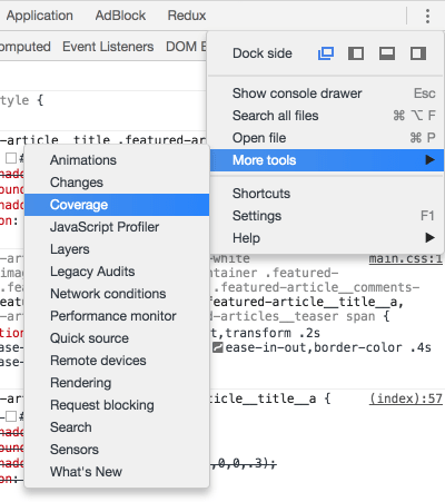
The Coverage tab is a bit hidden in the web developer tools console. (Large preview)

Next, start instrumenting coverage by clicking the reload button on the right. That will reload the page and begin the code coverage analysis. It brings up a report similar to this:

The Coverage report identifies unused code

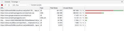
An example of a Coverage report. (Large preview)

Here, pay attention to the unused bytes:

The coverage report UI shows a breakdown of used and unused bytes

The unused bytes are represented by red lines. (Large preview)

This UI shows the amount of code that is currently unused, colored red. In this particular page, the first file shown is 73% bloat. You may see significant bloat at first, but it only represents the current render. Change your screen size and you should see the CSS coverage go up as media queries get applied. Open any interactive elements like modals and toggles, and it should go up further.

Once you’ve activated every view, you will have an idea of how much code you are actually using. Next, you can dig into the report further to find out just which pieces of code are unused, simply click on one of the resources and look in the main window:

Detail view of a file in the Coverage report, showing which pieces of code aren’t being used

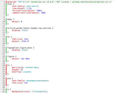
Click on a file in the Coverage report to see the specific portions of unused code. (Large preview)

In this CSS file, look at the highlights to the left of each ruleset; green indicates used code and red indicates bloat. If you are building a single page app or using specialized resources for this particular page, you may be inclined to go in and remove this garbage. But don’t be too hasty. You should definitely remove dead code, but be careful to make sure that you haven’t missed a breakpoint or interactive element.

Next Steps

In this article, we’ve shown the quantitative benefits of optimizing page speed. I hope you’re convinced, and that you have the tools you need to convince others. We’ve also set a minimum goal for mobile page speed: sub three seconds.

To hit this goal, it’s important that you prioritize the highest impact optimizations first. There are a lot of resources online that can help define this roadmap, such as this checklist. Lighthouse can also be a great tool for identifying specific issues in your codebase, so I encourage you to tackle those bottlenecks first. Sometimes the smallest optimizations can have the biggest impact.

Smashing Editorial
(da, lf, ra, yk, il)

How to start a blog: 11 pro tips

Original Source: http://feedproxy.google.com/~r/CreativeBloq/~3/pdQQv7U8JIY/how-to-start-a-blog-1131726

So you've decided to start your own blog. Maybe you want to share your expert drawing tips or drum up a bit of interest in your design portfolio, but before you rush into anything, consider this: the web (and in particular the blogosphere) is a crowded place.

Why your business should be blogging

There are plenty of blogs out there, all clamouring for people's attention, so you'll need to stand out from the crowd if you want to stand a chance of being noticed, and you'll need to stick with it; there's nothing quite so off-putting as a blog that was last updated in 2015.

Your blog needs to be attractive, creative and clever, and it needs to speak to your readers. It needs to tell them why you're different, what you're offering, and why they should take the time to read on. Ready to get started? Here are 11 tips that will get you going and help you take your offering from interesting to inspirational… 

01. Choose a blogging platform

You’re spoiled for choice when it comes to platforms, and most are free

There are several blogging platforms out there, from Blogger and WordPress to Tumblr, Squarespace and Ghost. Or if you're feeling bold and know your code, you can create your blog from scratch. Which platform you choose will very much depend on what you're most comfortable using, how involved you want to be with the creation process, and what you plan to put on it.

The good news is that most of these are either free blog platforms or offer a trial session so you can give it a whirl and see if it suits you.

02. Get a good domain name

How to start a blog - domain

Most platforms make it easy to buy a custom URL for your blog

Most blogging platforms will set you up on a subdomain by default, but if you want to be taken seriously then you should really buy your own domain name. You'll want something short, memorable and above all easy to spell, and take care when it comes to the top level domain. There are all manner of fancy TLDs available these days such as .blog or .agency, but there's a lot to be said for the classics; if you can get the domain you want with a good old-fashioned .com then go for it.

03. Decide on the blog's content

How to start a blog - content

Sort out your content plan or you’ll be heading for yet another abandoned blog of shame

You want to learn how to start a blog, but do you know what you want a blog for in the first place? Blogging for the sake of blogging is pointless – you'll soon get bored and your carefully crafted site will soon be home to nothing but tumbleweed.

Sometimes it is a good idea to grab a notepad and pen before you even start. Jot down the types of blog posts you'd like to publish so you always have a reference point you can come back to if the ideas seem to have dried up.

Only then should you move on – you know how to start a blog, now it's time to design and populate it…

04. Keep your blog design simple

Free WordPress themes such as InterStellar offer simple design

When creating a design blog, it can be tempting to go crazy. After all, you want your blog to stand out and for people to remember you. How harmful can a rainbow of colours and a plethora of fonts be? The answer is: Very.

Keep your blog design simple. Stick to no more than three colours, and three fonts. With fonts; you need a heading, subheading and body copy font. Your main text font can then be enhanced by different weights or attributes, but keep these to a minimum.

05. Use contrasting colours

The design of The Fox is Black is based on a simple black and fluoro yellow colour scheme

Don't go crazy, and keep to a simple colour scheme. Contrasting colours can work well in the right design. It's a good rule of thumb that your blog features a main primary colour, a shade of grey, and a colour for your call-to-action.

06. Embrace white space

How to start a blog - white space

The Entyce site isn’t afraid to make use of white space

When finding inspiration before you create a design blog, don't be afraid of white space – it can really enhance your design and keep it looking professional.

Don't be afraid to leave some parts of the design empty where it warrants it. You should also use white space as borders to help highlight key parts of the blog. Remember, sometimes less really is more.

07. Keep your design goal-driven

How to start a blog - goal driven

Web design resource Treehouse uses its blog to promote its courses

If the purpose of your blog is to get conversions – whether that's sales, signups, or enquires – then everything else comes second. This means you should create a design blog that is designed with three things in mind:

Topic: What is your blog about?Value proposition: What makes it unique?Audience: Who is your main target audience?

To get conversions, your design blog needs a strong call-to-action in its design, be that headlines, prominent buttons, or even arrows. A goal-driven design will help your blog convert, and keep visitors coming back time and time again.

08. Follow conventions

Superdream makes its posts easy to navigate

It can be easy to forget about the important features of a blog when getting creative with the design. Whatever your blog ends up looking like, make sure you keep the main conventions of a blog in place. 

These include:

SidebarsHeadersSubscription optionsAuthor attributionSearch bars

These all make your design blog easy to navigate, which is a highly important feature. Keeping these elements in place will make your content easy to find, and keep your visitors on the blog for longer. Together, all this adds up to a goal-driven design.

09. Experiment

For Print Only uses bold graphics and grids

Although for the most part it's important to follow conventions, that doesn't mean you shouldn't break the rules from time to time!

Try a few new elements, and experiment with colours, fonts, and placement. By mixing things up, you create a visually exciting experience for your audience. Just make sure that your readers can always find your posts, and exactly what they're looking for.

10. Make it responsive

How to start a blog - Responsive

Test your design with a tool like Google’s Resizer

Nowadays, responsive web design is a prerequisite for any respectable design blog. Work closely with a designer and developer to help produce a design that is both eye-catching and functional.

11. Promote it!

How to start a blog - Social

WIth a tool such as Hootsuite you can easily do most of your social shizzle in one go

There is no point in knowing how to start a blog without learning how to promote it too… This is where social media comes into its own. Create Facebook and Twitter pages for your blog, or use existing accounts to shout about it. If you are involving a lot of images in your blog, why not set up Pinterest and Instagram accounts, too?

Most modern blogging platforms such as Squarespace provide integration for everything from Twitter and Instagram to Tumblr and Dribbble, so you can spread the message quickly and effectively.

Related articles:

The 14 best free blogging platforms12 must-have code testing toolsThe 34 best free WordPress themes

Particle Effects for Buttons

Original Source: http://feedproxy.google.com/~r/tympanus/~3/FCCHhng3mvw/

Today we’d like to share a little effect library with you that can be used to create bursting particle effects. The idea is to desintegrate an element into particles and making it disappear (and vice versa). This effect looks really interesting on buttons, so we’ve created a little collection that showcases a bunch of different styles for the effect.

The inspiration for this idea came from Cuberto’s Hyperloop interface shot, Route Selection UI.

particleeffects_featured

The demo is kindly sponsored by Segment: One API, 200+ tools, no more integrations.
If you would like to sponsor one of our demos, find out more here.

The animations are powered by anime.js. Here’s an example of how you can use it:

<!– Normal HTML element to disintegrate –>
<button class=”button”>Button</button>

<script src=”anime.min.js”></script>
<script src=”dist/particles.min.js”></script>
<script>
// Initialize a new instance of Particles to disintegrate/integrate the button
var particles = new Particles(‘.button’);

// Disintegrate the button into particles
particles.disintegrate();

// particles.integrate(); // would do the opposite
</script>

The following options are available:

Name
Type
Default
Description

canvasPadding

Integer

150

Padding for the generated canvas that will be positioned right behind the target element. A canvasPadding = 0 will cause the canvas and the target element to have the same dimensions.

duration

Integer

1000

Duration (ms) to perform the animations of target element and particles.

easing

String or Function

easeInOutCubic

Easing function to perform the animation of target element. It will be passed directly to anime.js.

type

String

circle

Type of particle. Could be any of the following values: circle, rectangle, triangle

style

String

fill

Style of particle. Could be any of the following values: fill, stroke.

direction

String

left

Direction to start disintegrating the element. Could be any of the following values: left, right top, bottom. The opposite direction will be used to perform the integrate operation.

size

Float or Function

Random from 1 to 4

Size (px) for particles.

speed

Float or Function

Random from -2 to 2

Pixels per frame that a particle will be moved. It could be a function to set it randomly per particle (as default value).

color

String

Target’s background-color

Color used to fill the particles.

particlesAmount
Coefficient

Float

3

A coefficient to calculate the amount of particles to animate. A particlesAmountCoefficient = 0 will result in 0 particles, while bigger values will increase the amount of particles.

oscillation
Coefficient

Float

20

A coefficient to calculate the oscilation of particles while animating. A oscilationCoefficient = 0 will result in no oscilation (straight movements), while bigger values will increase the oscilation, resulting in
a kind of randomness.

begin

Function

undefined

Execute a function at the beginning of the animation.

complete

Function

undefined

Execute a function at the end of the animation.

We hope you enjoy this and find it useful!

References and Credits

anime.js

Particle Effects for Buttons was written by Luis Manuel and published on Codrops.

Deploy Fault Tolerant, Load Balanced Web Apps on Alibaba Cloud

Original Source: https://www.sitepoint.com/deploy-fault-tolerant-load-balanced-web-apps-on-alibaba-cloud/

This article was originally published on Alibaba Cloud. Thank you for supporting the partners who make SitePoint possible.

High Availability (HA), Fault Tolerance (FT), and Horizontal Scale Friendly (HSF) are equally important to functionality for web applications to run and succeed today. Existing or new web applications should be designed and provisioned with such underlying architecture. Fortunately, you can easily and promptly deploy the aforementioned architecture in the Cloud era today (compared to the on-premises bare-metal machine era)!

However, this flexibility comes with a caveat – how do you choose the right cloud provider? We are spoiled for choice and it can be really challenging (and hectic!) when evaluating and choosing the right one.

This post is intended to discuss and provide a walkthrough on deploying web applications on Alibaba Cloud from the ground up, including HA, FT, and HSF. Throughout this post, I will briefly introduce several services and tools provided in Alibaba Cloud. Yes, briefly! If you wish to learn more about particular services or tools, please visit the Documentation Center. In addition, this post will highlight the concerns and considerations when deploying such services.

WordPress is used as the demo web application that would be deployed on Alibaba Cloud in this post. The same deploying principle shall apply to many other web applications. This post is not intended to discuss on WordPress configuration at all. It shall not (and not able to) serves as reference for WordPress configuration. There are tons and tons of good resources out there regarding best practices on WordPress administrative.

1. High-level Architecture

Like many other web applications, the demo web application consists of an application layer (WordPress) and a database layer (MySQL).

Goal: Ultimately, we want an always-on web application (WordPress)!

In order to achieve such a “simple” goal, the demo web application must be deployed with the following minimum requirements:

A single main site.
A minimum of two physically separate WordPress instances on each site for redundancy and load balancing purposes.
Auto-spawning the other WordPress instance when the existing instance stops or experiences a failure.
The database instance (MySQL) must also be running in redundancy mode. It should automatically failover to the active standby instance when necessary.
Centralized dataspace. Shared resources must be accessible and available to all running WordPress instances. For example, a document uploaded by a user via WordPress should be synced across all running WordPress instances.

Fortunately, Alibaba Cloud provides a list of services and tools for us to fulfil these requirements. In this post specifically, we’ll utilize Cloud DNS (DNS), Auto Scaling Group (ASG), Server Load Balancer (SLB), Elastic Compute Service (ECS), Relational Database System (RDS), Object Storage Service (OSS), and Object Storage File System (OSSFS) tools to achieve our goal. The high-level architecture diagram for the deployed WordPress would be as following:

2. Deployment Procedures

We’ll briefly introduce the components shown in Figure 1.0 before diving into each individual configuration. As stated earlier, you would have to refer to other sources such as Alibaba Cloud online documentation for detailed explanation. The following table summarizes the description and usage of such components according to our deployment context:

Table 1: Cloud Components in Demo Deployments

Site / Region
Geographical area of the data center
1. Site for deployments

Zone
Physically isolated data center within a region
2. Used for redundancy purpose for Database

Cloud DNS
Domain name resolution and management service
3. Purchase new Domain Name4. Route traffic to WordPress instance

VPC (Virtual Private Cloud)
Virtual isolated network built for private usage
5. To group and separate resources6. To setup security control7. Assign network IP range

VRouter
Virtual routing table
8. To configure network route for provisioned resources

VSwitch
Segment virtual networks into subnets
9. To separate resources into group within specify Zone via subnet

Server Load Balancer
Distribute traffic to instances according to configured profile
10. To load balance (round robin) request among provisioned WordPress instances

Auto Scaling Group
Automatically adjust computing resources based on scaling configuration
11. Serves as watchdog to maintain the defined healthy running WordPress instances

Elastics Computing Service (WordPress instance)
Compute and process unit provided by Alibaba Cloud
12. To install and run WordPress. This is the application layer of demo deployment

Relational Database Service (MySQL)
On-demand managed database service
13. The DB for WordPress application

Object Storage Service
High availability and fault tolerance object storage
14. Centralized storage for files/objects uploaded by user via WordPress application

The workflow below describes the general steps involved in deploying a web application on Alibaba Cloud.

2.1. Identify Service Region

It’s important to decide on the region where an application should be deployed. The general considerations shall include the following:

Cost: The mother of all considerations. Yes, the cost may vary according region.
Service availability in the region? It’s not uncommon that some regions provide additional services that aren’t available in another region — you have to test to find out!
Main target users’ geographical location. It’s definitely better for user experience if the application is physically closer to the customer, resulting in shorter latency.
Rules & Regulations. Is it legally OK for the application to be hosted in the selected region?
Number of Availability Zonez. Occasionally, we need to improve application availability by deploying redundant applications in a different zone. Since I’m based in Southeast Asia, I will be looking at the Singapore and Kuala Lumpur data centers. At the time of writing, “Asia Pacific SE 3 (Kuala Lumpur)” has only a single zone while “Asia Pacific SE 1 (Singapore)” has dual zones.

After consideration, we’ve decided “Asia Pacific SE 1 (Singapore)” will be the main region for our demo deployment.`

2.2. Plan for Network Configuration
I. VPC

We have to consider the number of nodes that might potentially be running in the deployment. Each running node is subject to one private IP, and we don’t want to end up running out of private IPs for nodes in the future!

There are three type of CIDR blocks allowed by Alibaba Cloud for a VPC: 10.0.0.0/8, 172.16.0.0/12, 192.168.0.0/16. According to Alibaba Cloud documentation, the first & last three IPs of CIDR block would be reserved by system usage, and hence the maximum number of private IPs for each CIDR block are:

10.0.0.0/8 = 16777212 (16777216 – 4)
172.16.0.0/12 1048572 (1048576 – 4)
192.168.0.0/16 = 65532 (65536 – 4)

You may also wonder, why don’t we just use the biggest CIDR block allowed to avoid potentially running out of private IP in future? The following might help you to reconsider that thought:

Bigger CIDR block may increase the complexity when dealing with IP-related configuration, such as subnet creation, route configuration, security group configuration, and etc.
If the above is not a valid show-stopper for you, then consider this: “VPC peering (interconnect)” with other VPCs doesn’t allow overlapping CIDR block. In other words, it’s not possible to peer with other VPC once you using 10.0.0.0/8 as CIDR block!

After consideration, we’ll use “192.168.0.0/16” for our demo deployment as there will only be a few running nodes within the VPC.

II. Subnet

In Alibaba Cloud, VSwitch could be used to further segment the VPC CIDR block into a subnet with a smaller CIDR block. The general consideration for segmenting subnets includes the following:

Logical grouping of instances according to functionality. E.g. grouping the application in one group and RDS in another group for easier maintainability. For example, disabling a group of instances by deleting VSwitch attached to the group.
Simplify security group profile configuration. Security rules based on the subnet CIDR block level rather than the individual instance’s IP are cleaner.
Enable Auto-scaling and Server Load Balancer monitoring and actions on a specific subnet.
Redundancy on resources. It’s possible to seamlessly failover to a different subnet that’s based in a different zone when the existing subnet’s zone encounters failure.

After consideration, we’re grouping WordPress in one subnet (192.168.1.0/24) and the RDS instance in another subnet (192.168.2.0/24).

2.3. Configure Firewall (Security Group)

Network access at the instance level could be limited via Security Group in Alibaba Cloud. The Security Group Rule configuration could be very granular, up to the per-protocol, per-port, per-client IP level. Hence, to avoid unauthorized access to the instance, we need to consider the following:

Always comply with least privilege practice. Restrict access to the required client only.
Intranet or/and internet connectivity. You can use Security Group to create a “private subnet” (no internet usage) by only allowing access for inbound intranet. In addition, a NAT gateway could be used to allow the instance in the private network to access outbound internet services.

Since we are running WordPress on Linux instances, we would at least allow an inbound rule for Port 80 (HTTP) and 22 (SSH) in Security Group. Besides that, all outbound traffic would be allowed since there’s no specific requirement on that.

2.4. Configure the Application Layer

This could be the trickiest and most uncertain decision we have to make when deploying web applications. As stated earlier, this post will not discuss an application’s capacity requirements and hence, choosing a proper instance type is out of scope of this post. Anyhow, the following considerations may assist in deciding on an instance type generally:

Always start with the Pay-As-You-Go model if you have no idea on the instance type performance nor the actual capacity requirement. This pricing model allows you to experiment with different instance types freely without a lock-in period.
You have to understand the nature of the to-be deployed application’s constraint. Is the application CPU-bound or IO-bound? You have to answer that in order to determine a proper instance type with the best cost efficiency.
Deploy with one step down instance whenever possible. If an application’s capacity requirement could be satisfied with a ‘X’ instance of a instance family type Y, it might be better if we deploy the application with two one step down instances (e.g. X/2) from the same family type for the same amount of workload. This will increase the availability of the application. For example, we can still process 50% of the workload if any the X/2 instance goes down compared with 100% downtime if the X instance is down. Of course, this approach is subject to the design and usage of the application.
Decide on other usage parameters e.g. network type, network bandwidth, operating system image, and etc. accordingly.

Since this is a demo deployment without any real production usage, we’ll go for the lowest (cheapest) ECS instance configuration. For example: General Type n1: 1-core, 1GB, Ubuntu 16.04 OS, Ultra Cloud Disk 40GB, and 1Mbps network bandwidth.

2.5. Configure the Database Layer

Generally, we have to decide between using self-managed DB instances (self-install DB at ECS instance) like what we usually do for on-premises solutions, or using fully managed RDS DB services like ApsaraDB. Again, it’s out of this post’s scope in comparing or benchmarking the two variants of database services. These guidelines may assist in choosing database variants generally:

Do you have available resources for managing and operating database instances? The management and operational tasks may include backing up data files, OS/DB patching, access control on the host machine, etc. If the answer is no, then maybe a fully managed RDS DB is preferable.
Do you need a dedicated database instance? If your database is small and the workload is minimal and able to co-exist with the application (e.g. in the development environment), perhaps the self-managed variant is preferable due to cost efficiency.
Do you need access to the underlying host for the database instance? For example, if you need to perform specific OS/DB configuration for performance-tuning purposes, then the self-managed variant shall be employed.
Does the fully-managed database service provide the DB type that you required? If no, then the answer is straightforward, go for a self-managed DB variant.
If you are concerned about possible cloud vendor lock-in, then you might want to avoid the fully-managed variant as some RDS implementations could be cloud vendor specific.

Since there is neither manpower to maintain the demo database nor any specify DB configuration, we’ll deploy the demo DB with ApsaraDB RDS – MySQL. In addition, this variant allows us to make a redundancy (active standby) database easily (with just a click!).

2.6. Identify Centralized Storage

Eventually, there could be multiple concurrent WordPress applications running on physically separate ECS instances. Each instance might generate and store certain files/image/media resulting from users’ operations. Obviously, objects that are generated by any instance would have to be synchronized across all other running application instances. One of the approaches to achieve this mentioned synchronization is through centralized storage. Objects generated shall be synchronzied to centralized storage and followed by synchronization between centralized objects and other running instances. Additionally, the centralized storage must always be available and any failure of any instance shouldn’t impact the availability and durability of centralized storage.

Alibaba Cloud provides a couple of fully managed services which could serve as centralized storage:

Object Storage Service for objects: It’s ideal as centralized object storage due to the guaranteed high availability (99.9%), scalability, and fully-managed nature. Specifically to this demo deployment, each running WordPress instance shall sync with a dedicated common Object Storage Service’s bucket. By employing such a syncing mechanism, all the running WordPress instances would have an identical set of created objects.
ApsaraDB Redis for application state: Sharing state (e.g. shared value, parameter) among running instances is possible via fully-managed ApsaraDB Redis.

A dedicated bucket in Object Storage Service would be created and used to store objects created as a result of user operations. All running WordPress instances shall sync with the relevant bucket for the list of created objects.

2.7. Plan for HA, FT, and HSF

To achieve HA, FT, and HSF in Alibaba Cloud, a web application shall be fundamentally designed as stateless and horizontally scalable. Any dependent application’s state or data shall be decoupled from the web application and migrated to centralized storage as discussed in the earlier section.

Services listed below could be employed for deploying a HA, FT, and HSF web application:

Cloud DNS: It’s possible to configure ‘A’ record types for instances hosted in different regions. It’s really useful during failover scenarios whereby an ‘A’ record of a standby instance could be enabled with one click, resulting in network traffic diversion to the standby instance.
Auto Scaling: It can be used to auto-spawn instances in a desired Zone when running instances go down or become unhealthy.
Server Load Balancer: This service would provide a health check on configured instances and report their status to the Auto Scaling service for further action. Besides that, this service would also load balance workload among running instances.
ApsaraDB RDS: RDS MySQL provides the multi-zone availability feature with just a click. It will really ease the effort required to provide HA and FT for the database.

The demo deployment will utilize DNS to route traffic to WordPress instances, Auto Scaling to ensure a minimum of two running instances in each region, and Server Load Balancer to provide a health check as well as to load balance workload. Last but not least, the Multi-Zone availability feature on RDS MySQL is enabled to provide HA and FT for the database.

2.8. Testing and Run

To test the HA and FT behavior, we may stop a running ECS manually and observe the action triggers by the auto-scaling service. If the auto-scaling has been configured properly, a new instance would be spawned automatically. Besides that, we may also manually turn off the RDS DB instance to observe the Multi-Zone redundancy failover happening. The best thing is that these actions are automatically handled by the respective services without any manual intervention. Shown below is our deployed WordPress:

Continue reading %Deploy Fault Tolerant, Load Balanced Web Apps on Alibaba Cloud%