8 Ways to Emotionally Reward Your Users

Original Source: https://www.webdesignerdepot.com/2018/04/8-ways-to-emotionally-reward-your-users/

As sometimes happens, I was thinking the other day. In this case, I was doing my thinking after finishing a long video game: Far Cry 5. It occurred to me that video game creators are the masters of emotional payoff, when everything goes right. The world of that game is in itself rewarding and fun to run around in.

It’s actually enough fun, that I’m more than willing to ignore how the game’s story was an unrewarding, steaming pile of sadness. They made this digital faux-Montana delightful enough that I don’t want to leave. At least I intend to have a few more gaming sessions there, in any case.

That’s actually kind of impressive, when you think about it. The experience has enough emotional payoff to keep me around when I absolutely despised the central narrative. Imagine if a website (Facebook) could (Twitter) do (LinkedIn?) that (Amazon). Well they can, and they do. It’s actually not great, sometimes. But hey, you can use these powers for good.

Anyway, my point is that people want payoff for the effort they put into things, and that includes the websites they browse. You might think receiving the product or service you’re selling is the payoff, and it certainly can be. But you can build emotional rewards into just about any aspect of a website or app.

Here then, are some examples of emotional rewards that can keep people coming back:

1. Connection

Well this is the big and obvious one; it’s the entire foundation for “Web 2.0”. (Remember when everyone and their dog was writing about that? Good times.) People want to connect with other people, or failing that, fuzzy animals. You can do both on just about any site with social features, these days.

The popularity of tools designed to help us engage other human beings is staggering when compared to pretty much anything else on the Internet. And now, we can connect with people who share our interests no matter the distance. For better or worse, this is our world now.

2. Popularity & Recognition

After connection, popularity is often regarded as the second best thing. Many of the same platforms that offer a chance to connect also offer us a chance to get “Internet famous”. Offering people the chance to feel recognized isn’t just an emotional reward, it’s a business model. Again, for better or worse, this is our world, now.

3. Competition

Lastly for the social section of this article, we have competition. It’s human nature: we like kicking both metaphorical and physical butt. Offering your users a friendly way to compete with each other can drive all kinds of interaction. Just be warned: social competition often turns into a simple popularity contest, and those aren’t always great for an online community.

social competition often turns into a simple popularity contest, and those aren’t always great for an online community

4. Progress

There’s a programmer’s joke that goes something like, “Programmers love video games so much because they offer a fictional world where people give you a task, and then you complete the task, and no one changes the spec.”

In a world where life itself often feels like a Sisyphean endeavor, the feeling of making progress in any way is not to be under-valued. The mere existence of progress bars as a UI element has probably saved many a device from being smashed out of frustration.

5. Achievement

Closely related to progress is achievement: the emotion you get when you actually finish something. A sense of achievement can come from completing just about any task in this hectic day and age, with so many distractions all around. Still, the emotion is made stronger by the recognition of one’s achievements.

Even offering a quick “Hurray, you did it” after completing something annoying like a long form is a nice touch. It lets your users know that you recognize the time and effort they put into their interaction with your site, and that they could have just as easily spent that time and effort elsewhere.

6. Exclusivity

Another thing people like is having things that other people don’t have. That actually doesn’t have to be as awful as it sounds.

After all, all kinds of products come with collector’s editions, exclusive branded merchandise, and so on. Exclusive rewards are, at their best, a way of showing appreciation for the people who invest the most in you, and your product. Showing appreciation in this way can score you some life-long fans.

7. Discovery

Discovery is a tricky one. There is definitely a sense of delight in discovering new and hidden (or semi-hidden) things; but as web designers, we usually want stuff to be pretty obvious. In other words, you don’t want people to have to “discover” the “buy” button. Discovery is usually implemented with things like Easter eggs in the design, semi-obscure cultural references in the copy, and other small touches.

8. Surprises

Last, but not least, who doesn’t love a pleasant surprise? You might think this is the same as “Discovery”, but no. The surprises I’m talking about here are things you don’t have to go looking for. They’re big, they’re noticeable, and they leave users feeling like they just got something extra for free.

People love getting random extra stuff for free, be it a pixel-art “badge” on their favorite streaming site, temporary access to “premium” features on an app they use every day, a free delivery from their shopping app, or what-have-you. As the artists formerly known as Blink 182 once put it:

She left me roses by the stairs
Surprises let me know she cares

And really, that’s what rewarding your users emotionally should be about: letting them know you care, and appreciate their business. I appreciate you. You’re fantastic. I lov… ahem. It’s nice to have you around.

Add Realistic Chalk and Sketch Lettering Effects with Sketch’it – only $5!

Source

p img {display:inline-block; margin-right:10px;}
.alignleft {float:left;}
p.showcase {clear:both;}
body#browserfriendly p, body#podcast p, div#emailbody p{margin:0;}

Collective #409

Original Source: http://feedproxy.google.com/~r/tympanus/~3/UQbZ2BRa6GM/

C409_hotjar

This content is sponsored via Syndicate Ads
Truly understand your site visitors’ behavior

Hotjar is a quick and easy way to truly understand your visitors and identify opportunities for improvement and growth.

Try it for free

C409_cards

Cards and Composability in Design Systems

An excellent article by Nathan Curtis on structure, content, style and behavior of composed components.

Read it

C409_reactpatterns

React in patterns

A free book about common design patterns used while developing with React. By Krasimir Tsonev.

Check it out

C409_gifvideo

Replace Animated GIFs with Video

Jeremy Wagner shows how to replace large animated GIFs with lighter videos.

Read it

C409_pico

pico.js

A compact face-detection library in JavaScript with real-time detection capabilities.

Check it out

C409_slugify

Slugify

Convert a string into a slug. Useful for URLs, filenames, and IDs. By Sindre Sorhus.

Check it out

C409_sketch

Sketchize

With Sketchize you can print sketch sheets for designing apps for mobile, tablet and desktop devices.

Check it out

C409_opera

The Origins of Opera and the Future of Programming

Jessica Kerr’s fascinating keynote for Mob Programming Conference where she uncovers why great teams make great people.

Read it

C409_githublearn

GitHub Learning Lab

GitHub Learning Lab takes you through a series of fun and practical projects for building your skills.

Check it out

C409_previewwiki

How we designed page previews for Wikipedia?- and what could be done with them in the future

Read all about the new desktop page previews for Wikipedia’s readers.

Read it

C409_themevs

Syntax Theme

A free minimalist theme for Atom and Visual Studio Code inspired by Framer’s code editor.

Check it out

C409_vscandothat

VS Code can do that?!

Some very useful and interesting things you can do in Visual Studio Code.

Check it out

C409_manhattan

All the Buildings in Manhattan

An interactive 3D visualization of the all the buildings in Manhattan.

Check it out

C409_layers

Layers and how to force them

Read about some gotchas of will-change in this article by Surma.

Read it

C409_permit

Permit

An unopinionated authentication library for building Node.js APIs. By Ian Storm Taylor.

Check it out

C409_serverless

Lessons Learned – A Year Of Going “Fully Serverless” In Production

Tal Bereznitskey shares his insights on going fully serverless at Torii.

Read it

C409_reactnike

Nike React

A fantastic three.js powered campaign site for Nike where you can create your own Nike React runner. Made by the folks of DPDK.

Check it out

C409_marker

Free Font: Lazy Marker

A relaxed marker typeface designed by Luz Mariana Torres.

Get it

C409_conversion

What You Need To Know To Increase Mobile Checkout Conversions

Suzanne Scacca gives advice on how to improve checkout conversions for mobile sites.

Read it

C409_mdtall

Free Font: MD Tall

A great slim display font designed by Mariano Diez.

Get it

C409_soundeffects

BBC Sound Effects

The BBC offers more than 16,000 sound effects for free usage in personal, educational or research work.

Check it out

C409_password

From Our Blog
Password Strength Visualization

Visual feedback for password strength on an image based on Colibro’s sign up form.

Check it out

Collective #409 was written by Pedro Botelho and published on Codrops.

Freebie: 100 Awesome Photos from Moni’s Photo

Original Source: https://inspiredm.com/freebie-100-awesome-photos-from-monis-photo/

Moni is a young artist who loves photography. On Moni’s Photo you can download all the photos for free and use them for your personal and commercial projects.  Moni’s Photo covers various topics from business and technology to nature, animals and more.

All photos are licensed under the Creative Commons Zero (CCO) license which means you can copy, modify, distribute and use them for free, including commercial purposes.

Download the best 100 photos beneath the previews.

Get the free photo pack from here.

The post Freebie: 100 Awesome Photos from Moni’s Photo appeared first on Inspired Magazine.

Recognizing and Avoiding Common Web Design Mistakes

Original Source: http://feedproxy.google.com/~r/1stwebdesigner/~3/t0ySkwadXN4/

When you design your own website, several unexpected hurdles start to emerge. You might have trouble working with custom code, or maybe your site isn’t getting the number of visitors you need. Sometimes you start to realize that the design doesn’t look all that modern, or maybe the site speed isn’t up to your standards.

More often than not, you encounter these problems after committing one of the more common web design mistakes. These are so common that even experienced web designers make them. But it’s a good idea to address these issues ASAP, so you can fix them and make your site more appealing.

So, what are the most common web design mistakes? Let’s take a look:

Making the Site Too Confusing and Cluttered

Modern, minimalist sites are all the rage today – but it’s not just a fad. There was once a time when more was considered better, where you would build a website with eye-catching flash animations and cover each page with images and text. Fortunately, we’ve learned that people are more interested in finding information fast online. They’re not interested in sifting through a confusing homepage or waiting to watch an animation or video before moving forward.

The bottom line is that your menu should have as few tabs on it as possible. It should be easy to find, and you should consider finding some beta testers to see how quickly they can move through your site. This way, you can also get feedback from real people before launching.

Making the Site Too Confusing and Cluttered

Utilizing a Poor Call-to-Action (Or None at All)

With those beta testers, you’ll quickly find out whether or not users are converting – and how fast. For instance, you might instantly realize that you don’t have a call-to-action header and button on the homepage. In that case, your users have nowhere to go. Even if you do have a call-to-action, it’s essential to constantly A/B test things like text, button colors, sizes and placement. This will give you an an idea of how people react to the CTA. Heatmaps are excellent tools for this as well.

Utilizing a Poor Call-to-Action (Or None at All)

Favoring Design Over Speed

It might sound strange to think about speed as being more important than design, but you’re not going to get many visitors to a beautiful website if it runs too slowly. Hosting has quite a bit to do with the speed of your site, so find a hosting company that can handle your traffic. In addition, you’ll want to utilize plugins, extensions and themes that are well-coded and lightweight. There’s nothing worse than choosing a theme and realizing that it’s conflicting with your site’s code or forcing your site to run slowly.

Favoring Design Over Speed

Ignoring the Needs of Mobile Devices

Since so many people use mobile devices to browse and shop online, many experts feel that a mobile-version of your site is almost more important than the regular desktop version. This means that your finished website needs a mobile version that automatically loads when a smaller device is detected. This not only makes your users happier when on phones and tablets, but Google will notice the mobile version and potentially improve your search rankings. If you’re working from a theme, make sure you test out the mobile version before buying. Most developers claim they have responsive designs, but that doesn’t mean they look or work well.

Ignoring the Needs of Mobile Devices

Filling Pages with Too Much Text

Text is great for headlines and for giving your users (as well as search engines) valuable information. However, you’re better off trying to get your message across with a combination of media and text. Think about how the experience would be more pleasant with a small paragraph paired with a video, followed by some pictures. Compare this with a homepage that consists of three or four paragraphs in a row, and it’s clear which one works best.

Filling Pages with Too Much Text

Rules to Live (And Design) By

Some rules are meant to be broken. But, most of the time, you can bet that if you avoid these mistakes you’ll be well on your way to a quality web design. If you have any questions, or would like to mention any other common web design mistakes, let us know in the comments below.


Editorial Design: Centuro Cultural Jardín Japonés

Original Source: http://feedproxy.google.com/~r/abduzeedo/~3/a0lP6ywyQ60/editorial-design-centuro-cultural-jardin-japones

Editorial Design: Centuro Cultural Jardín Japonés

Editorial Design: Centuro Cultural Jardín Japonés

AoiroStudio
Apr 23, 2018

Let’s kick it off with a beautiful branding & editorial design by Angello Torres who is a graphic designer from Buenos Aires, Argentina. Ver Para Oír / Jardín Japonés translated to See To Hear / Japanese Garden and I simply love this project. The mixture of the culture, colours and you just gotta love that font Avant Garde who has been my go-to font for years. Check it out, this project is beautifully shown in execution and presentation.

Seeing To hear is a festival carried out within the cultural framework offered by the Japanese Garden, in which the senses of sight and hearing merge crossing each other generating new forms of perception, carried out from different sound activities and visuals. “hear colors, perceive sounds and observe silence”

More Links
Learn more about Angello Torres
Editorial Design & Branding
Editorial Design: Centuro Cultural Jardín JaponésEditorial Design: Centuro Cultural Jardín JaponésEditorial Design: Centuro Cultural Jardín JaponésEditorial Design: Centuro Cultural Jardín JaponésEditorial Design: Centuro Cultural Jardín JaponésEditorial Design: Centuro Cultural Jardín JaponésEditorial Design: Centuro Cultural Jardín JaponésEditorial Design: Centuro Cultural Jardín JaponésEditorial Design: Centuro Cultural Jardín JaponésEditorial Design: Centuro Cultural Jardín JaponésEditorial Design: Centuro Cultural Jardín JaponésEditorial Design: Centuro Cultural Jardín JaponésEditorial Design: Centuro Cultural Jardín JaponésEditorial Design: Centuro Cultural Jardín JaponésEditorial Design: Centuro Cultural Jardín JaponésEditorial Design: Centuro Cultural Jardín JaponésEditorial Design: Centuro Cultural Jardín JaponésEditorial Design: Centuro Cultural Jardín JaponésEditorial Design: Centuro Cultural Jardín JaponésEditorial Design: Centuro Cultural Jardín Japonés

editorial design
graphic design


A Beginner’s Guide to Video SEO

Original Source: https://www.webdesignerdepot.com/2018/04/a-beginners-guide-to-video-seo/

The popularity of video content has increased dramatically over the last few years and it’s easy to see why; videos are engaging for all age groups which also makes them an important marketing tool.
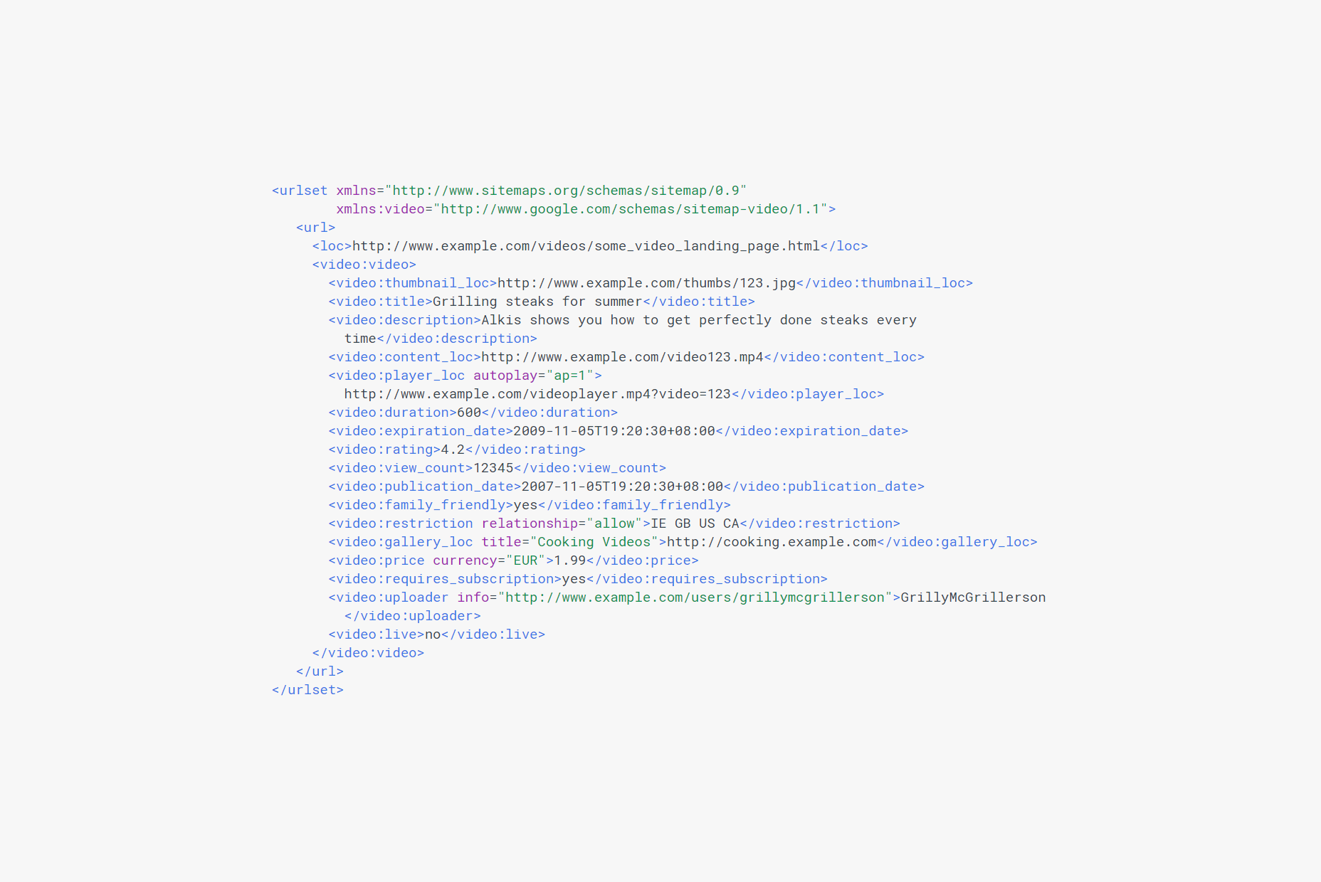
Businesses have developed dedicated video marketing strategies which generate more leads and boost sales. Video content is also being used by these same businesses to build a better brand experience and stand out from rest of the competition.

And while it’s entirely possible to create high-quality video content and share it through platforms like YouTube, there’s no guarantee that your video will get noticed by the masses. Why? There’s an enormous amount of video content being uploaded to the Internet every day.

In this post, we’ll step through five ways you can optimize your videos for search engines. By the time you’re done reading through this post, you’ll have a clear understanding of how you can implement video SEO techniques to improve your search rankings and reach a bigger audience.

Before we begin, let’s quickly take a look at the basics of video SEO and why it’s important.

What You Need to Know About Video SEO

The fact of the matter is that most consumers search the web when making purchase decisions. So, if you want to take advantage of video marketing, your videos should be optimized for search engines. Video Search Engine Optimization (video SEO) techniques are used by successful video content creators to improve their search engine rankings and increase visibility in search engine results pages.

Nowadays, it’s pretty common to see people consuming video content on their phones at sports events, walking around campus, doing chores around the house, and during their daily commute. Why is that so?

According to Cisco:

Every second, a million minutes of video content will cross the network by 2021.
Globally, IP video traffic will be 82 percent of all consumer Internet traffic by 2021, up from 73 percent in 2016.
It would take an individual more than 5 million years to watch the amount of video that will cross global IP networks each month in 2021.

Think about it for a minute. That is an estimate of enormous proportions. You might be thinking What has this got to do with video SEO? Well, SEO itself is just one important component of digital marketing. The other crucial element is converting your video content traffic into paying customers. Videos can be the perfect tool to help you do just that.

If you want to take advantage of video marketing, your videos have to be optimized for search. Here is how you can drive more traffic to your video content and make your video search results more visible while generating quality leads.

5 Ways You Can Optimize Videos for Search Engines

Over the years, there has been a considerable increase in the usage and popularity of video. They help explain complex topics in a simple way and they play an integral role in increasing conversion rates. Your decision to adopt video as your go-to digital marketing tool is going pay you serious dividends—assuming you optimize your video content for search.

It’s pretty easy to see that video is gaining momentum. Let’s step through some of the different ways you can use video SEO to stay ahead of your competition.

1. Search for Video SEO Keywords

You’ve probably noticed that Google has been displaying more and more videos in search results—a huge chunk of it coming from, to no one’s surprise, YouTube. Video publishing sites like YouTube and Vimeo are huge sources of traffic that receive higher click-through rates than plain text results.

Keywords are responsible for search results displayed on two of the largest search engines on internet—Google and YouTube. For this reason, if you want your video to be successful, you’ll have to use keywords. But how do you find keywords?

If, for instance, you’re in the web design niche, you could start out by running Google searches on terms like web design tutorials or web design tips and tricks.

Now that you have a good keyword to start out with, the next step is to check its search volume. We recommend using the Google Keyword Planner for this. Keywords that get anywhere from 1,000 to 10,000 monthly searches and have low to medium competition are generally good to use.

2. Optimize Metadata: Tags, Filenames, and Descriptions

Tags are keywords assigned to videos. Think of them as the set of words that sum up what your video’s content is about. For those of you who don’t already know, tags, filenames, and descriptions play an integral role in video SEO.

Since you already have a keyword picked out, go ahead and use that in your video’s tags. This is the tag that you want to focus on and optimize your video for. Remember, you can (and should) use more than one tag as long as it’s relevant to your video’s content.

YouTube gives you 5,000 characters worth of description text that you can use to describe what your video is about. And if you’re not using those 5,000 characters to gain some SEO advantage then you’re missing out. Best practices indicate that you should use your keyword (the same one you used as your primary tag) a few times in your video’s description.

Finally, make sure you save your video with your primary keyword as its filename because there are a number of third-party tools on the web that crawl through and factor in video filenames even if Google and YouTube don’t. So, instead of saving the original video file as vid1.mp4 or youtube-vid.mp4, use your primary keyword in its filename. For example, we’d save the video as web-design-tips-and-tricks.mp4.

3. Add a Video Transcript

Video transcripts are a complete textual representation of the content spoken in the video. Metadata and video tags do not offer as much detail of your video’s content to search engines as transcriptions do. Search engine bots crawl text and use it for indexing. So, a video transcript helps search engines better understand the video’s content and improve its ranking.

Follow these steps to transcribe your own video files on YouTube:

Your transcription file should be saved as a plain text file i.e. .txt.
Using special characters can disrupt speech recognition matching and readability of the transcript.
A double line break should be used to signal long pause or new sentence.
Add >> at the start of the new line to identify speakers or change of speaker.
Insert a link to your website in the audio transcript at the end of the video.

Taking this DIY approach to transcribing your video content will help you deliver more value to your viewership by improving their user experience and it’ll give you the opportunity to use the primary keyword you’re targeting for, a few more times.

4. Publish One Video to One Page

Give each video its own dedicated page on your website instead of publishing multiple videos to a single page. Google gives preference to the first video it finds on a web page and ignores any other video content it finds on the same page. To work your way around Google’s video ranking preference, organize your web pages in a way so that there’s a single video on a page (or post).

You might also be tempted to publish the same video to different web pages on your site to increase its visibility; for instance, if your video is about web design tips and tricks then you might want to publish it in a blog post that you wrote about web designs tips, and you might also want to show it to visitors who land on your Projects page to showcase your ability; this is a strict no-no.

What this does is that it creates internal competition on your website for each instance of the video that you’ve published. Think of it this way, when someone searches for web design tips and tricks on Google, Google’s algorithm has to decide which page to display in its search results. And if all of your videos views are split among three different web pages, your chances of showing up in the search results will be pretty low. However, if you had published it on a single page, and that page was racking up all the views, comments, and impressions, then you’d have a better chance of showing up in search results.

5. Create a Video Sitemap

Video sitemaps provide search engines with metadata about video content on a website and are an extension to your website’s existing sitemap.

You can use the sitemap to tell search engines about the category, title, description, length, and target audience for each video you embed on your website. In addition to this, you can also use it to give search engines more information about your video e.g. play page URL, expiration date, restrictions, and platform.

If your web page has a video on it then it’s sitemap may look something like this:

Conclusion

Video content is gaining momentum.

There are a number of different ways that you can use video SEO tips to increase your video’s visibility, improve its ranking, and show up in search engine results pages. We showed you some of the ways you can get started with video SEO on your own website and, hopefully, you’re in a good position to take things further.

Add Realistic Chalk and Sketch Lettering Effects with Sketch’it – only $5!

Source

p img {display:inline-block; margin-right:10px;}
.alignleft {float:left;}
p.showcase {clear:both;}
body#browserfriendly p, body#podcast p, div#emailbody p{margin:0;}

Fresh Resource for Web Developers – April 2018

Original Source: https://www.hongkiat.com/blog/designers-developers-monthly-04-2018/

A monthly dose of new and highly useful resources for web designers and developers.

The post Fresh Resource for Web Developers – April 2018 appeared first on Hongkiat.

Visit hongkiat.com for full content.

A Guide To The State Of Print Stylesheets In 2018

Original Source: https://www.smashingmagazine.com/2018/05/print-stylesheets-in-2018/

A Guide To The State Of Print Stylesheets In 2018

A Guide To The State Of Print Stylesheets In 2018

Rachel Andrew

2018-05-01T14:00:19+02:00
2018-05-01T15:51:08+00:00

Today, I’d like to return to a subject that has already been covered in Smashing Magazine in the past — the topic of the print stylesheet. In this case, I am talking about printing pages directly from the browser. It’s an experience that can lead to frustration with enormous images (and even advertising) being printed out. Just sometimes, however, it adds a little bit of delight when a nicely optimized page comes out of the printer using a minimum of ink and paper and ensuring that everything is easy to read.

This article will explore how we can best create that second experience. We will take a look at how we should include print styles in our web pages, and look at the specifications that really come into their own once printing. We’ll find out about the state of browser support, and how to best test our print styles. I’ll then give you some pointers as to what to do when a print stylesheet isn’t enough for your printing needs.

Key Places For Print Support

If you still have not implemented any print styles on your site, there are a few key places where a solid print experience will be helpful to your users. For example, many users will want to print a transaction confirmation page after making a purchase or booking even if you will send details via email.

Any information that your visitor might want to use when away from their computer is also a good candidate for a print stylesheet. The most common thing that I print are recipes. I could load them up on my iPad but it is often more convenient to simply print the recipe to pop onto the fridge door while I cook. Other such examples might be directions or travel information. When traveling abroad and not always having access to data these printouts can be invaluable.

Nope, we can’t do any magic tricks, but we have articles, books and webinars featuring techniques we all can use to improve our work. Smashing Members get a seasoned selection of magic front-end tricks — e.g. live designing sessions and perf audits, too. Just sayin’! 😉

Explore Smashing Wizardry →

Smashing Cat, just preparing to do some magic stuff.

Reference materials of any sort are also often printed. For many people, being able to make notes on paper copies is the way they best learn. Again, it means the information is accessible in an offline format. It is easy for us to wonder why people want to print web pages, however, our job is often to make content accessible — in the best format for our visitors. If that best format is printed to paper, then who are we to argue?

Why Would This Page Be Printed?

A good question to ask when deciding on the content to include or hide in the print stylesheet is, “Why is the user printing this page?” Well, maybe there’s a recipe they’d like to follow while cooking in the kitchen or take along with them when shopping to buy ingredients. Or they’d like to print out a confirmation page after purchasing a ticket as proof of booking. Or perhaps they’d like a receipt or invoice to be printed (or printed to PDF) in order to store it in the accounts either as paper or electronically.

Considering the use of the printed document can help you to produce a print version of your content that is most useful in the context in which the user is in when referring to that print-out.

Workflow

Once we have decided to include print styles in our CSS, we need to add them to our workflow to ensure that when we make changes to the layout we also include those changes in the print version.

Adding Print Styles To A Page

To enable a “print stylesheet” what we are doing is telling the browser what these CSS rules are for when the document is printed. One method of doing this is to link an additional stylesheet by using the <link> element.

<link media=”print” href=”print.css”>

This method does keep your print styles separate from everything else which you might consider to be tidier, however, that has downsides.

The linked stylesheet creates an additional request to the server. In addition, that nice, neat separation of print styles from other styles can have a downside. While you may take care to update the separate styles before going live, the stylesheet may find itself suffering due to being out of sight and therefore out of mind — ultimately becoming useless as features are added to the site but not reflected in the print styles.

The alternate method for including print styles is to use @media in the same way that you includes CSS for certain breakpoints in your responsive design. This method keeps all of the CSS together for a feature. Styles for narrow to wide breakpoints, and styles for print. Alongside Feature Queries with @supports, this encourages a way of development that ensures that all of the CSS for a design feature is kept and maintained together.

@media print {

}

Overwriting Screen CSS Or Creating Separate Rules

Much of the time you are likely to find that the CSS you use for the screen display works for print with a few small adjustments. Therefore you only need to write CSS for print, for changes to that basic CSS. You might overwrite a font size, or family, yet leave other elements in the CSS alone.

If you really want to have completely separate styles for print and start with a blank slate then you will need to wrap the rest of your site styles in a Media Query with the screen keyword.

@media screen {

}

On that note, if you are using Media Queries for your Responsive Design, then you may have written them for screen.

@media screen and (min-width: 500px) {

}

If you want these styles to be used when printing, then you should remove the screen keyword. In practice, however, I often find that if I work “mobile first” the single column mobile layout is a really good starting point for my print layout. By having the media queries that bring in the more complex layouts for screen only, I have far less overwriting of styles to do for print.

Add Your Print Styles To Your Pattern Libraries And Style Guides

To help ensure that your print styles are seen as an integral part of the site design, add them to your style guide or pattern library for the site if you have one. That way there is always a reminder that the print styles exist, and that any new pattern created will need to have an equivalent print version. In this way, you are giving the print styles visibility as a first-class citizen of your design system.

Basics Of CSS For Print

When it comes to creating the CSS for print, there are three things you are likely to find yourself doing. You will want to hide, and not display content which is irrelevant when printed. You may also want to add content to make a print version more useful. You might also want to adjust fonts or other elements of your page to optimize them for print. Let’s take a look at these techniques.

Hiding Content

In CSS the method to hide content and also prevent generation of boxes is to use the display property with a value of none.

.box {
display: none;
}

Using display: none will collapse the element and all of its child elements. Therefore, if you have an image gallery marked up as a list, all you would need to do to hide this when printed is to set display: none on the ul.

Things that you might want to hide are images which would be unnecessary when printed, navigation, advertising panels and areas of the page which display links to related content and so on. Referring back to why a user might print the page can help you to decide what to remove.

Inserting Content

There might be some content that makes sense to display when the page is printed. You could have some content set to display: none in a screen stylesheet and show it in your print stylesheet. Additionally, however, you can use CSS to expose content not normally output to the screen. A good example of this would be the URL of a link in the document. In your screen document, a link would normally show the link text which can then be clicked to visit that new page or external website. When printed links cannot be followed, however, it might be useful if the reader could see the URL in case they wished to visit the link at a later time.

We achieve this by using CSS Generated Content. Generated Content gives you a way to insert content into your document via CSS. When printing, this becomes very useful.

You can insert a simple text string into your document. The next example targets the element with a class of wrapper and inserts before it the string, “Please see www.mysite.com for the latest version of this information.”

.wrapper::after {
content: “Please see www.mysite.com for the latest version of this information.”;
}

You can insert things that already exist in the document however, an example would be the content of the link href. We add Generated Content after each instance of a with an attribute of href and the content we insert is the value of the href attribute – which will be the link.

a[href]:after {
content: ” (” attr(href) “)”;
}

You could use the newer CSS :not selector to exclude internal links if you wished.

a[href^=”http”]:not([href*=”example.com”]):after {
content: ” (” attr(href) “)”;
}

There are some other useful tips like this in the article, “I Totally Forgot About Print Stylesheets”, written by Manuel Matuzovic.

Advanced Print Styling

If your printed version fits neatly onto one page then you should be able to create a print stylesheet relatively simply by using the techniques of the last section. However, once you have something which prints onto multiple pages (and particularly if it contains elements such as tables or figures), you may find that items break onto new pages in a suboptimal manner. You may also want to control things about the page itself, e.g. changing the margin size.

CSS does have a way to do these things, however, as we will see, browser support is patchy.

Paged Media

The CSS Paged Media Specification opens with the following description of its role.

“This CSS module specifies how pages are generated and laid out to hold fragmented content in a paged presentation. It adds functionality for controlling page margins, page size and orientation, and headers and footers, and extends generated content to enable page numbering and running headers/footers.”

The screen is continuous media; if there is more content, we scroll to see it. There is no concept of it being broken up into individual pages. As soon as we are printing we output to a fixed size page, described in the specification as paged media. The Paged Media specification doesn’t deal with how content is fragmented between pages, we will get to that later. Instead, it looks at the features of the pages themselves.

We need a way to target an individual page, and we do this by using the @page rule. This is used much like a regular selector, in that we target @page and then write CSS to be used by the page. A simple example would be to change the margin on all of the pages created when you print your document.

@page {
margin: 20px;
}

You can target specific pages with :left and :right spread pseudo-class selectors. The first page can be targeted with the :first pseudo-class selector and blank pages caused by page breaks can be selected with :blank. For example, to set a top margin only on the first page:

@page :first {
margin-top: 250pt;
}

To set a larger margin on the right side of a left-hand page and the left side of a right-hand page:

@page :left {
margin-right: 200pt;
}

@page :right {
margin-left: 200pt;
}

The specification defines being able to insert content into the margins created, however, no browser appears to support this feature. I describe this in my article about creating stylesheets for use with print-specific user agents, Designing For Print With CSS.

Is your pattern library up to date today? Alla Kholmatova has just finished a fully fledged book on Design Systems and how to get them right. With common traps, gotchas and the lessons she learned. Hardcover, eBook. Just sayin’.

Table of Contents →

CSS Fragmentation

Where the Paged Media module deals with the page boxes themselves, the CSS Fragmentation Module details how content breaks between fragmentainers. A fragmentainer (or fragment container) is a container which contains a portion of a fragmented flow. This is a flow which, when it gets to a point where it would overflow, breaks into a new container.

The contexts in which you will encounter fragmentation currently are in paged media, therefore when printing, and also when using Multiple-column layout and your content breaks between column boxes. The Fragmentation specification defines various rules for breaking, CSS properties that give you some control over how content breaks into new fragments, in these contexts. It also defines how content breaks in the CSS Regions specification, although this isn’t something usable cross-browser right now.

And, speaking of browsers, fragmentation is a bit of a mess in terms of support at the moment. The browser compatibility tables for each property on MDN seem to be accurate as to support, however testing use of these properties carefully will be required.

Older Properties From CSS2

In addition to the break-* properties from CSS Fragmentation Level 3, we have page-break-* properties which came from CSS2. In spec terms, these have been superseded by the newer break-* properties, as these are more generic and can be used in the different contexts breaking happens. There isn’t much difference between a page and a multicol break. However, in terms of browser support, there is better browser support for the older properties. This means you may well need to use those at the current time to control breaking. Browsers that implement the newer properties are to alias the older ones rather than drop them.

In the examples that follow, I shall show both the new property and the old one where it exists.

break-before & break-after

These properties deal with breaks between boxes, and accept the following values, with the initial value being auto. The final four values do not apply to paged media, instead being for multicol and regions.

auto
avoid
avoid-page
page
left
right
recto
verso
avoid-column
column
avoid-region
region

The older properties of page-break-before and page-break-after accept a smaller range of values.

auto
always
avoid
left
right
inherit

To always cause a page break before an h2 element, you would use the following:

h2 {
break-before: page;
}

To avoid a paragraph being detached from the heading immediately preceding it:

h2, h3 {
break-after: avoid-page;
}

The older page-break-* property to always cause a page break before an h2:

h2 {
page-break-before: always;
}

To avoid a paragraph being detached from the heading immediately preceding it:

h2, h3{
page-break-after: avoid;
}

On MDN find information and usage examples for the properties:

break-before
break-after
page-break-before
page-break-after

break-inside

This property controls breaks inside boxes and accepts the values:

auto
avoid
avoid-page
avoid-column
avoid-region

As with the previous two properties, there is an aliased page-break-inside from CSS2, which accepts the values:

auto
avoid
inherit

For example, perhaps you have a figure or a table and you don’t want a half of it to end up on one page and the other half on another page.

figure {
break-inside: avoid;
}

And when using the older property:

figure {
page-break-inside: avoid;
}

On MDN:

break-inside
page-break-inside

Orphans And Widows

The Fragmentation specification also defines the properties orphans and widows. The orphans property defines how many lines can be left at the bottom of the first page when content such as a paragraph is broken between two pages. The widows property defines how many lines may be left at the top of the second page.

Therefore, in order to prevent ending up with a single line at the end of a page and a single line at the top the next page, you can use the following:

p {
orphans: 2;
widows: 2;
}

The widows and orphans properties are well supported (the missing browser implementation being Firefox).

On MDN:

widows
orphans

box-decoration-break

The final property defined in the Fragmentation module is box-decoration-break. This property deals with whether borders, margins, and padding break or wrap the content. The values it accepts are:

slice
clone

For example, if my content area has a 10-pixel grey border and I print the content, then the default way that this will print is that the border will continue onto each page, however, it will only wrap at the end of the content. So we get a break before going to the next page and continuing.

The border does not wrap each page and so breaks between pages

The border does not wrap each page and so breaks between pages

If I use box-decoration-break: clone, the border and any padding and margin will complete on each page, thus giving each page a grey border.

The border wraps each individual page

The border wraps each individual page

Currently, this only works for Paged Media in Firefox, and you can find out more about box-decoration-break on MDN.

Browser Support

As already mentioned, browser support is patchy for Paged Media and Fragmentation. Where Fragmentation is concerned, an additional issue is that breaking has to be specified and implemented for each layout method. If you were hoping to use Flexbox or CSS Grid in print stylesheets, you will probably be disappointed. You can check out the Chrome bugs for Flexbox and for Grid.

The best suggestion I can give right now is to keep your print stylesheets reasonably simple. Add fragmentation properties — including both the old page-break-* properties as well as the new properties. However, accept that these may well not work in all browsers. And, if you find lack of browser support frustrating, raise these issues with browsers or vote for already raised issues. Fragmentation, in particular, should be treated as a suggestion rather than a command, even where it is supported. It would be possible to be so specific about where and when you want things to break that it is almost impossible to lay out the pages. You should assume that sometimes you may get suboptimal breaking.

Testing Print Stylesheets

Testing print stylesheets can be something of a bore, typically requiring using print preview or printing to a PDF repeatedly. However, browser DevTools have made this a little easier for us. Both Chrome and Firefox have a way to view the print styles only.

Firefox

Open the Developer Toolbar then type media emulate print at the prompt.

Typing media emulate print

Emulating print styles in Firefox

Chrome

Open DevTools, click on the three dots icon and then select “More Tools” and “Rendering”. You can then select print under Emulate CSS Media.

Chrome DevTools emulate print media

Emulating print styles in Chrome

This will only be helpful in testing changes to the CSS layout, hidden or generated content. It can’t help you with fragmentation — you will need to print or print to PDF for that. However, it will save you a few round trips to the printer and can help you check as you develop new parts of the site that you are still hiding and showing the correct things.

What To Do When A Print Stylesheet Isn’t Enough

In an ideal world, browsers would have implemented more of the Paged Media specification when printing direct from the browser, and fragmentation would be more thoroughly implemented in a consistent way. It is certainly worth raising the bugs that you find when printing from the browser with the browsers concerned. If we don’t request these things are fixed, they will remain low priority to be fixed.

If you do need to have a high level of print support and want to use CSS, then currently you would need to use a print-specific User Agent, such as Prince. I detail how you can use CSS to format books when outputting to Prince in my article “Designing For Print With CSS.”

Prince is also available to install on your server in order to generate nicely printed documents using CSS on the web, however, it comes at a high price. An alternative is a server like DocRaptor who offer an API on top of the Prince rendering engine.

There are open-source HTML- and CSS-to-PDF generators such as wkhtmltopdf, but most use browser rendering engines to create the print output and therefore have the same limitations as browsers when it comes to implementing the Paged Media and Fragmentation specifications. An exception is WeasyPrint which seems to have its own implementation and supports slightly different features, although is not in any way as full-featured as something like Prince.

You will find more information about user agents for print on the print-css.rocks site.

Other Resources

Due to the fact that printing from CSS has really moved on very little in the past few years, many older resources on Smashing Magazine and elsewhere are still valid. Some additional tips and tricks can be found in the following resources. If you have discovered a useful print workflow or technical tip, then add it to the comments below.

“I Totally Forgot About Print Stylesheets,” Manuel Matuzovic, UX Collective
“Print Stylesheet Approaches: Blacklist vs Whitelist,” Chris Coyier, CSS-Tricks
“The Perfect Print Stylesheet,” Andreas Hecht, Noupe
“How To Set Up A Print Stylesheet,” Christian Krammer, Smashing Magazine
“5 Powerful Tips And Tricks For Print Style Sheets,” Dudley Storey, Smashing Magazine

Smashing Editorial
(il)

Collective #411

Original Source: http://feedproxy.google.com/~r/tympanus/~3/Y0gejRI-Sic/

C411_HelloSign

This content is sponsored via Syndicate Ads
HelloSign API: Everything IT requires and Developers love

HelloSign API’s robust SDK, amazing support, detailed documentation, and super clean dashboard is sure to make your entire team happy. Try it free today!

Check it out

C411_webpack

Webpack 4 configurator

Create a personalized and optimized webpack.config.js with this useful configurator.

Check it out

C411_grid

cssgr.id

An interactive CSS grid boilerplate code generator made by Dan Netherton. Read more about it in this article.

Check it out

C411_critter

Login Critter

An animated avatar that responds to text field interactions.

Check it out

C411_MorphPlay

Morph Play Button To Video Player #GSAP #ExpoScaleEase

A fantastic morphing player button demo by Maciej Leszczyński.

Check it out

C411_unavatar

Unavatar

A micro service for getting a user avatar across multiple social services by providing a username, email or domain as input.

Check it out

C411_lifefaker

Lifefaker

A brilliant satirical campaign that highlights how social media can affect your mental health. Read more about it in this article.

Check it out

C411_var

CSS environment variables

Serg Hospodarets’ tweet on how CSS environment variables are getting standardized.

Check it out

C411_figma

Introducing: Figma to React

Karl Jiang shows how Figma’s web API can be used to convert designs into React code.

Read it

C411_figurine

Figurine

Message printing with stylish, random fonts. By Arsham Shirvani.

Check it out

C411_font

Free Font: Aloja

A beautiful handwritten font designed by Ieva Mezule.

Get it

C411_heartbeat

Heartbeat Function

Matt DesLauriers shares a function that results into a ‘beating heart’ type of effect.

Check it out

C411_halftone

Halftone video effect

Louis Hoebregts created this awesome demo with a halftone effect for video input.

Check it out

C411_sort

Ivy

A visualization of various sorting algorithms with “async” powered animations. By Aaron Bird.

Check it out

C411_control

The Illusion of Control in Web Design

Aaron Gustafson on the fragility of websites and how we can’t control everything.

Read it

C411_vscode

VS Code Extensions for Happier JavaScript Coding

A summary of great Visual Studio Code extensions for higher productivity. By Alek Shnayder.

Check it out

C411_loadasset

load-asset

A simple Promise-based asset loader with cross browser support.

Check it out

C411_circripples

Circular Ripples

A WebGL and Web Audio experiment with generative music using a Markov chain. Check out more experiments by Tim Pulver.

Check it out

C411_contents

More accessible markup with display: contents

Hidde de Vries writes about how we can achieve accessible markup and beautiful layout with display: contents.

Read it

C411_dom

A Reusable Way To Present Fresh DOM

Adam Argyle shares a reusable keyframe animation in CSS that transitions your node from whatever, to ‘in’.

Check it out

C411_inspector

Web Inspector Styles Sidebar Improvements

Read about the latest design refresh of the Web Inspector in Safari.

Read it

C411_particlesbutton

From Our Blog
Particle Effects for Buttons

A little library that can be used for bursting particles effects. The idea is to disintegrate an element into particles and make it disappear (or vice versa).

Check it out

Collective #411 was written by Pedro Botelho and published on Codrops.

Super Elegant Business Card Designs Printed by MOO

Original Source: http://feedproxy.google.com/~r/abduzeedo/~3/eg2qPoY0QI8/84676

Super Elegant Business Card Designs Printed by MOO

Super Elegant Business Card Designs Printed by MOO

abduzeedo
May 01, 2018

You probably have noticed that we are fans of minimalist brand identity and design work. We believe in the saying “if I had more time I would have written a shorter letter” applies really well to design. Not only design but pretty much everything could be summarized to its core. Business cards have been a major tool for networking and still play a huge role. It’s also awesome to see how designers translate the brand into such a small format and yet transmit the same message.

For this post I would like to share some awesome business cards and brand identity composition examples designed by MOO customers and printed by MOO. I have been a fan and a client of MOO, have printed all my wedding material with them. It’s awesome to see how much they have grown, and the quality of the print material they deliver is second to none. Here are some examples of how MOO customers have utilized their printing services.

We love great design and believe it can work wonders for every business. That’s why we make it simple to create beautiful, expertly crafted business stationery and promotional materials that’ll help you start conversations, open doors and strengthen relationships.  – MOO

Brand Identity and Business Card Designs

A post shared by moo.com (@moo) on Oct 18, 2017 at 1:04am PDT

A post shared by moo.com (@moo) on Nov 21, 2017 at 1:22am PST

A post shared by moo.com (@moo) on Dec 12, 2017 at 1:02am PST

A post shared by moo.com (@moo) on Jan 23, 2018 at 1:09am PST

A post shared by moo.com (@moo) on Feb 27, 2018 at 1:06am PST

A post shared by moo.com (@moo) on Feb 7, 2018 at 1:10am PST

A post shared by moo.com (@moo) on Feb 6, 2018 at 1:02am PST

A post shared by LAUREN ELFORD (@lauren_elford) on Apr 25, 2018 at 12:33pm PDT

A post shared by Dana Kun (@chez_boheme) on Apr 13, 2018 at 12:51am PDT

A post shared by Triin Maripuu (@triinmaripuu_) on Apr 18, 2018 at 2:57am PDT

A post shared by Michelle Knight (@michelle.k.knight) on Apr 17, 2018 at 6:22pm PDT

brand identity
sponsored post