How We Helped This FinTech Startup Become a Niche Leader

Original Source: https://www.sitepoint.com/how-we-helped-this-fintech-startup-become-a-niche-leader/

This article was created by our content partner, BAW Media. Thank you for supporting the partners who make SitePoint possible.

Here at TMS, we see promising companies with amazing ideas and huge potential on a daily basis. Unfortunately, they often get stuck on technicalities and SOS emails just keep flowing in our direction.

However, that is actually a good thing. If we can help them reach their full potential and get to their goal, it is a win-win situation.

Some of the startups we have seen truly have ideas that could change our world for the better. So rather than seeing them struggle, we are here to help them in any way we can.

And that brings us to the common problem that numerous startups get stuck on; the technical implementation of their SaaS or other web applications. So let's talk a bit more about the TMS solution.

Here Comes the Challenge

It is one thing to talk about it in theory, but things often work out quite differently in practice. To best describe how exactly we help startups deal with their app development, let's take a look at a case study.

Four years ago, we were contacted by a British FinTech company who came to us with a great idea that included a very complex web app development.

From custom design to multiple user roles and complex user flows, we knew this would be a complicated project.

In addition to that, they needed constant maintenance and support since they already had some disappointing experiences in the past. They had to give up several unfinished apps that simply weren't up to their standard and they ended up losing a lot of money.

The TMS Solution

To get things off to a good start, we had to understand what went wrong with their project before they decided to reach us.

We listened carefully to what they had to say to identify the problems that were the root cause of the issues they faced in the past. It appeared that the previous contractors skipped through a lot of basic steps and went straight to development without the proper planning, wireframing, and estimating processes.

It sounded like a good offer; a low hourly rate and less working hours. Unfortunately, it turned out to cost the FinTech startup a lot more down the road.

We explained that we would take an entirely different approach; a systemized, step-by-step process with every developer focusing on their part while having a good grasp on the whole picture, instead of working on multiple components of the project at the same time and feeling no ownership on the delivery.

Since we had a lot of experience with app building, especially with the apps we created for our own company (mostly SaaS), we felt pretty confident about our capabilities to deliver the best product possible.

For us, this project felt like an exciting challenge but was still right up our alley.

Dealing with the Challenges

We have done this numerous times before but the bottom line is that every app is different.

With this one, we were new to the business domain of capital raising, we weren't familiar at all with the FCA classifications and legal regulations etc.

An additional challenge on top of that was trying to untangle the work of the previous development team. We were warned about the confusing UX and the bugs that would appear at the worst moments, especially on demos.

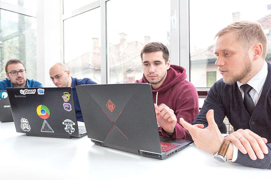
So our first step was to build a proper team led by a Tech Lead and a Product Owner. This would allow us to create the ideal team structure, a good project architecture, and a suitable project delivery strategy.

Forming a reliable team initially takes more time than just engaging a group of random developers – but it always pays off! Not only are the productivity and quality better, but it also results in lower costs over a 12-18 months range.

With every project, the team is formed differently according to the specific project needs and requirements. It sometimes requires just a project manager, a QA engineer, and 2 intermediate full-stack developers. Sometimes, we need additional UI/UX designers, security engineers, front-end engineers etc.

Unique Solution: Introducing our Full-App-Lifecycle Approach

Once the team was formed, we were ready to get started with our own customized approach – the Full-App-Lifecycle approach.

It is based on a simple fact:

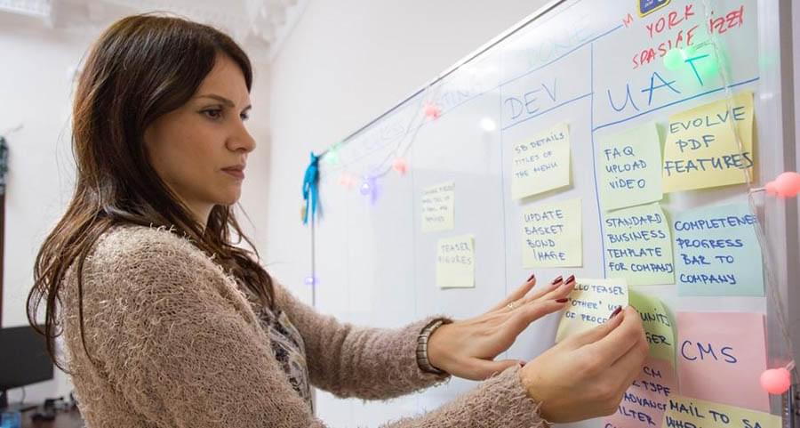
Errors are much easier to avoid if the team of developers understands the big picture of the application instead of just focusing on small tasks. From the initial pitch to the final round of feedback, it is important to start every project with a core assessment and a proper analysis.

We always talk with the business' marketing and development team and get answers to the basic questions first: What problem are we solving with this product? Who are the target customers? Who are the competitors? What risks are we facing? What are the budget and the timeline?

All of these questions and more have to be covered in a good analysis, along with Impact Mapping and Story Mapping sessions. At that point, we are able to suggest the best development strategy and product rollout plan.

We need to stay flexible throughout the process to be able to adapt to changes, but we always start with the clear vision on the team structure, software architecture, project phases, features priority, and other little details that we keep in mind.

“TMS worked well with our team, and acted on behalf of our business in various situations. This helped us create a world-class team and grow internationally together.”

The FinTech App Development

The best way to start a cooperation is by establishing each other's trust. With the FinTech startup, we knew that it would take some time to earn their trust after their previous experiences.

They agreed to our approach and we decided to start with just 2 developers working on their project in cooperation with the project manager provided by the FinTech startup. Once we were off to a good start, we added other key members to get the prototype done on a tight deadline.

We had a demo ready for them to show to their clients in less than 3 months. At that point, we were ready to start building a fully featured application.

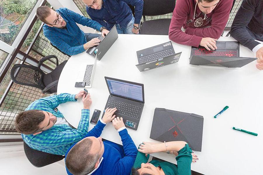
We gradually added more team members including the QA and QA Automation engineers, front-end developers, full-stack developers of different seniority, and more. Then we divided the team into smaller sub-teams, each with their own project manager.

The app was growing together with our team and we knew we were on the right track. All the way, we participated in the overall product development and our clients know that they can count on our full support even today.

Here are some of the most important results that we brought for our client:

After months of working with us, they fully freed up their time to work on scaling their business and only joining us for Agile sprint reviews.
Geography of usage expanded from the UK to the rest of Europe, while other markets are "on the waiting list".
Client range grew from small startups looking for small investments to large companies that need serious investment deals.
The mature product managed to attract several millions of dollars of investments.

On our side, the product development team dedicated to this project grew from 2 to 25 people and keeps growing.

Why Our Approach Worked

Our Full-App-Lifecycle approach has proven itself quite successful and the main reasons for that are careful planning and management. These were implemented in our every move throughout the process.

When a team is tailored according to a specific product and when every team member works on their specific task, all of them eventually see the product as their own. Not only it helps improving productivity and quality, but it also switches the employees' focus from the fee to the product itself.

In addition to that, the integration with the client's team and industry, the ongoing analysis, and in-depth planning also help increase the quality as well as the delivery pace.

It is important to add that our team is always encouraged to try all the new technologies and follow the latest development trends, to participate in conferences, and to keep up with the industry's highest standards.

The success we achieved with the FinTech project isn't a one-time success story but an example that shows exactly how our approach works.

We are looking for long-term partnerships rather than quick on and off projects and we are happy to join in later phases as well. The point for us is to build teams dedicated to the product and evolve together with it over time.

Conclusion

If you have recognized any of the mentioned problems as your own including the struggle to find a reliable development company, feel free to reach out to us and we will be happy to help you find the right solution.

We have a lot of experience in the field which can be easily proven by the projects that we have successfully completed so far, the 20.000+ paying customers of our own developed products, several millions of end users, and an average annual growth rate of 50% since 2014.

The post How We Helped This FinTech Startup Become a Niche Leader appeared first on SitePoint.

Getting Started in Site Hosting

Original Source: https://inspiredm.com/getting-started-in-site-hosting/

Every website designer and developer should consider site hosting. There are many advantages to be gained from doing so. If you’ve been ignoring this possibility because you think the task is too time consuming and technical, this article will explain why it’s actually very easy and quick, provided you go about it in the right way.

1. The basics

It’s still possible to simply by a server, connect it to a router, connect to the Internet and start hosting your site right from your own office. This gives you some small advantages, but a lot of disadvantages compared to the alternative. The advantages include having direct access to the hardware, plus having full control and responsibility. The disadvantages are too numerous to list.

Most companies and individuals offering hosting services are reselling services from gigantic server farms. It’s possible that they can be resellers of resellers, and the chain could stretch back quite a long way before you get to the actual hardware provider.

Becoming a reseller yourself is easy. Simply find a hosting company you’re comfortable with and purchase a reseller account from them. If you know in advance that you’re going to be hosting a lot of sites a dedicated server will be the way to go, but for most people the best choice will be a virtual private server (VPS).

That name is confusing because it implies that you don’t really have a private space, but actually you do. You get your own dedicated partition, isolated from all the other resellers in every way. The operating system and all the hardware can be configured any way you want without affecting other reseller accounts.

What you’ll be selling to your customers is not VPS but shared hosting, meaning they don’t have the same degree of control and isolation that you have, but only as much as you award to them.

The hosting market is so competitive right now, and so large, that it’s very difficult to make money just from selling hosting. You will most likely be adding value through the other services you provide.

2. Choosing the operating system

You may be offered a choice between a Windows server and a Linux server. Unless you have an absolute, non-negotiable need for a Windows server, you’re better off choosing Linux. This will be much less expensive, more flexible, more secure, and easier to administrate.

This is why nearly every site on the Internet is hosted on Linux. A very small number are hosted on Windows, and an even smaller number are hosted on anything else.

3. WHM – for creating and managing accounts

 Each “account” on your server is actually a domain space. This is all the term “account” means in this context. The owners of each individual site you set up on the server as accounts will define their own user accounts, which in this case will actually mean users, or individual people (not domain spaces). A domain space is any space that can be accessed through the successful resolution of a DNS entry.

If you have chosen a Linux server, the tool you will use for this purpose is called Web Host Manager (WHM). You don’t have to use WHM, because there are other ways to achieve the same ends, but why make things difficult for yourself when there is a really simple way to get everything done?


It is important to understand the difference between WHM and cPanel. WHM is used at the server administrator level to create and manage user accounts, but does not give access to individual features within each account (such as setting up email accounts for the domain).

cPanel is used at both an administrative and user level. You have one top level cPanel account from which you can micro-manage all the features of any domain space on the server. The individual site owners, if you grant them the keys to the kingdom, can also manage their own domain space.

4. Security and server configuration settings not covered

Due to the high level of risk involved in making changes to your configuration and security settings, and the massive amount of explanation that would be required to ensure you don’t create a problem for yourself, we’re not going to cover any of that stuff. If you have a need to make those kinds of changes, you already know enough not to need our help anyway.

5. Setting up hosting packages

Before you can create any new accounts, you’ll need hosting packages defined. These packages are feature sets that allow you to decide what features and resources are available for the domains on your server. This also allows you to upgrade and downgrade accounts according to need.

It is generally best practice to not allocate more features and resources than an individual domain space needs. If you find that a site’s needs change in the future, you can silently upgrade it in the background.

You set up packages by selecting Packages in the left menu, and then selecting Add a Package from the main panel.


It’s all very easy to understand. You give your package a name, and then set the limits you want for each resource. Most of the items can be left on the default unlimited setting, but the items you will definitely want to restrict are Disk Quota and Monthly Bandwidth. Because the settings are in MB, to get nice round numbers in GB you’ll need to set your values in multiples of 1024. In the example below, disk quota is set to 5 GB, and bandwidth is set to 10 GB.

 For some reason the number of add-on domains and parked domains defaults to a limit of 0, and there is no logical reason why you’d want to prevent add-on and parked domains from being created, so you should consider raising the limit or even setting it to unlimited.

CGI access is enabled by default, but the need for it in the present time is quite rare, and CGI is a favorite access point for many types of malware. If you don’t develop CGI software, or otherwise have a known need for it, you may wish to disable it.

When all the settings for your package are correct, click the Add button to save them.

6. Add an account

Once you have one or more packages defined, you are then able to add accounts. Most of the time, especially if you’re successful, this will be the only other WHM task you need to perform other than creating packages.

To access this feature, select Account Functions in the left menu and then select Create a New Account from the main panel.

This screen has seven sections. The first section shows you your reseller account limits and how much you’ve already used.


The next section shows you how many sites you can still create based on which package type you select. 


The next section will be where you actually enter the information about the domain account you are creating. The domain you create here does not have to be already registered, and it’s important to understand that this process does not actually register a domain, which is a separate step.


There are five fields to complete, and a password strength indicator. There’s an option to use a password generator, but you should not use it because you’ll get a weak password that the system incorrectly identifies as strong. Instead, you should manually create a strong password that you could never forget, and which also follows all the rules of using numbers, letters, mixed cases, and special characters (because if you don’t follow all the rules, the password may be identified as weak, even if it is strong).

The username field will be created for you based on the domain name. You may want to change it for security reasons or because there would be a conflict with another username already in use.

The final field is the email field, which is the email address where administrative emails connected with the account should be sent. This should be an email address under your direct control. Below is an example of all the fields completed.

 In the next section, you simply select a package from the drop-down box. After you have selected a package, the background of the field will turn green, a green check mark icon will appear, and if you hover your mouse over the magnifying glass icon, you will see the details of the selected package so you can be sure it is correct.

 The next section allows you to configure cPanel settings. CGI Access should only be enabled for accounts where CGI is necessary (it’s usually not necessary). Change the locale from English to another one if necessary. Usually you will want to leave the Apache SpamAssassin setting enabled. You would normally only disable this if you knew it would create a problem.

 The next section is for the DNS settings. You won’t normally want to change these settings from the default settings unless you have a special reason.

 The next section is for mail routing settings. You won’t normally change these from the default selection unless you have a reason.

 Click the blue Create button to create the account. You’ll see instant confirmation on the screen, and also receive an email to the account you nominated at section 3.

7. Other things you can do with accounts


Adding accounts is really all you’ll normally need to use WHM for. There could be a few special situations that come up, so for those situations, here are the possible things you can do:

Force Password Change. If you have some special reason to force your users to change their passwords, this is the option that allows you to do it. It’s not really recommended to do this unless there is a pressing need.
Manage Account Suspension. If you ever need to suspend or unsuspend an account, this is where you do it from.
Password Modification. If you want to change the password for a site yourself (that is, you don’t want to leave it up to the client to choose a password) this is where you do it. You’ll normally use this action after a suspected security breach has occurred.
Skeleton Directory. Not as exciting as it sounds. This simply allows you to specify a default index page and directory structure for the newly created accounts. You can’t actually change anything here, it is just notifying you of where to look on your server for the skeleton directory template so you can manually make changes there if you want.
Terminate Accounts. If you are sure that an account is no longer required, you can remove all traces of it by using this feature. It’s only necessary to activate it once you start running out of room to create new accounts. Otherwise suspension is effective enough, along with not renewing the domain.
Upgrade/Downgrade an Account. All accounts can be upgraded or downgraded. You select the domain to be upgraded or downgraded, and then click the Modify button.
Web Template Editor. This is only for creating default pages to be shown when an account has been deleted, moved, or suspended; or where the site has a connection problem.

9. Everything else in WHM

All the other things you can do are advanced features that you will only need to concern yourself with if you encounter the kind of circumstances that would require you to. When that happens, it is best to consult the official documentation for guidance on those advanced topics.

10. Perform all your lower level administrative tasks in cPanel

For the even more basic and site-specific stuff like setting up email accounts, creating databases, installing software, and setting add-on or parked domains, you will use cPanel. All of these features are also self-explanatory.

header image courtesy of Alaina Johnson

The post Getting Started in Site Hosting appeared first on Inspired Magazine.

In Review: Adobe Max from a First Timer

Original Source: http://feedproxy.google.com/~r/abduzeedo/~3/grfTNtZwdxE/review-adobe-max-first-timer

In Review: Adobe Max from a First Timer

In Review: Adobe Max from a First Timer

abduzeedo
Oct 22, 2018

This year I had the opportunity to attend to Adobe MAX. I have always wanted to go and finally, I got the chance. MAX is Adobe’s annual get-together where they share news about products, introduce new features for their flagship software like Photoshop, Illustrator, After Effects and this year I would add XD as part of that. Those four days in LA were quite inspiring and I would love to share some thoughts about the event and the product announcements.

Adobe MAX is huge. I have been to big events like E3, Google IO, and small events as well. The MAX is definitely one of the big ones. The main keynote illustrated that quite well. There were 15 thousand people watching it there. The most amazing thing is that they were all creative people be it artists, designers or illustrators so the energy was inspiring and reinvigorating. I felt like going back to design school. There was this excitement in the air and every new feature announced was received with shouts of happiness and applause.

Image result for adobe max 2018Speaking of announcements. I got the chance to see first hand what Adobe is bringing to XD and it’s quite impressive, but I will get back to that later. Let me talk about Photoshop. It got some neat new tricks, like unlimited undos via keyboard shortcut (finally), amazing new mask detection with their AI Sensei, double-click to edit texts and live preview of blend modes. The last one would have been a huge time saver for me 10 years ago when I was writing Photoshop tutorials but hey, better late than never.

All other tools got significant updates, most of them focused on streamlining the creative process, trying to automate tasks that take time and allow designers to pay attention and spend their time on what matters most, communicating the message through creative design solutions. So we could see a lot of Sensei helping with intelligent cropping, color adjustments, tracking and many more. There was also, the introduction of Photoshop for the iPad. I feel it might be a bigger deal for Apple than for designers, even though most designers have an iPad. In addition, they announced another iPad app, Project Gemini. That one, at least the demo, blew me away. 


– Project Gemini

For me, probably the biggest announcement was that Typekit now is called Adobe Fonts. In addition to the name change, they included their entire library for Creative Cloud subscribers. Yeah, you heard it right, you can now use their 15,000 fonts on your personal and professional projects. For those like me that grew up collecting fonts from foundries like FF, P22, T26, Emigre, House Industries, Monotype and many others, this news is simply incredible. I can finally use Ms. Eaves without worrying about anything.

Now back to XD. Adobe spent a lot of time promoting this tool. It’s an industry that they are not leading at the moment, which is quite ironic if you think that pretty much every UI designer I knew six years ago used to use Adobe Fireworks. Adobe killed Fireworks and tools like Sketch and Framer got their chance to succeed, which they did. Now Adobe is trying to reconquer what they owned in the past.

You should not get spooked by rejection – Albert Watson

XD is adding great features and their team is willing to listen to the users. This version they introduced some very useful new features like Auto-animate, Responsive Design, Plug-ins and Voice Prototyping. The last one is truly unique, they are the only one doing it. I have been spending some time playing with it and I have to say. I might switch, just because I am a Creative Cloud subscriber and I like the idea of using the same family of apps. In addition, the new features are worthwhile. Auto-animate is pretty much like using Keynote with Magic Move. It’s very easy to use and performs quite well. The resizing feature is, indeed quite magic. You don’t have to set constraints, XD just tries to figure out what should scale or not. Voice is very simple, yet quite useful. XD gives you a trigger input which is voice. It then gives you a voice system for feedback. For those designing for assistant software, this feature is a time saver.

Besides Adobe announcements, there was the exhibit with a lot of awesome people promoting their products. It was awesome to see people showcasing their new software with experts answering questions in addition to illustrators, print companies and foundries promoting their products. As I mentioned before there was this incredible energy in the air.

At the end of the four days in LA and seeing so many inspiring things I felt that my creative batteries were fully recharged and the only thing I wanted to do is to open XD and design the new version of Abduzeedo. I cannot forget to mention the people I had the pleasure to meet there, including some fantastic Brazilian designers working for great companies like Skyscanner, Target, Work&Co, and Adobe.


– Photographer, Albert Watson, discusses his path in creating iconic photos at Adobe MAX

I have to be honest, I was a bit skeptical about Adobe MAX and I was proved completely wrong. As Barry Schwartz said in his book The Paradox of Choice. The secret of happiness is low expectations. That was totally true for me. I didn’t expect much and I was totally blown away and I thank Adobe for that, for bringing back the eye of the tiger that I had forgotten I had. I can safely say I’m so looking forward to booking my trip for next year’s Adobe MAX.

For more information and full list of announcements visit: https://theblog.adobe.com/

adobe


10 Fantastic Landing Page Themes & Templates

Original Source: http://feedproxy.google.com/~r/1stwebdesigner/~3/sF4hf-LDBGo/

A landing page is one of the most crucial components to a successful website. It makes a first impression with users and states your case for sticking around. In the age of short attention spans, you’d better put forth the effort to engage people.

In general, a well-designed landing page will feature:

A Compelling Call-To-Action (CTA)
Clear Content and Purpose
Visually Appealing Images
Attractive, Easy-To-Read Typography

While that may sound simple enough, it’s not always so easy to achieve. The good news is that you don’t necessarily have to start your next landing page project from scratch. There are a plethora of themes and templates that will provide you with a tremendous head start.

Here are 10 landing page themes and templates you can use to grab (and keep) a visitor’s attention:

All the Landing Page Templates You Could Ask For


2M+ items from the worlds largest marketplace for Landing Page Templates, Themes & Design Assets. All of it can be found at Envato Market.

DOWNLOAD NOW

Appexo App Landing Page

Appexo App Landing Page is a clean, colorful and bold HTML 5 template to showcase your product or service. Based on Twitter Bootstrap 3.x and an 1170px grid layout, the template is also fully responsive. You’ll find six demo pages, smooth scrolling, animations, attractive pricing tables, a slideshow and carousel included.

Appexo App Landing Page

Pixel

Pixel is a beautiful and simple HTML 5 landing page template based on Bootstrap 3.x. It features attention-grabbing video backgrounds that can be sourced via HTML 5 video or YouTube.

The typography here also stands out as it is used to great effect. There are sections for everything you need, including pricing tables, blog posts and testimonials. Also included is a working AJAX contact form.

Pixel

Olli

Olli is a HTML 5 template that will place all eyes squarely on your product. Choose from four slightly different home page layouts and six color schemes. It’s colorful and built to take advantage of strong product photography.

A working order form is included to help drive sales. This Bootstrap 3.x template also includes parallax scrolling, three different product card layouts and integration with popular font and icon packages.

Olli

Minimal

Minimal is a HTML landing page template that is perfect for situations where you don’t need to publish a lot of content – at least not yet.  It’s really meant to serve as an attractive pre-launch or “coming soon” page.

However, it’s anything but bland. Inside, you’ll find the ability to utilize a full-width background image or video slider, along with a text-based slider. You can create something that looks exciting and helps to build anticipation for your upcoming launch.

Minimal

Holo

Holo is aimed at businesses that prefer a highly-functional single-page web presence. This HTML 5/Bootstrap template features powerful animated scrolling effects and lots of assorted jQuery goodies like progress bars, parallax scrolling and a filterable portfolio.

Both a light and dark template is included, along with the ability to easily customize colors. There’s also an AJAX contact form, clean pricing tables and a semi-transparent carousel.

Holo

Inbound

Inbound is a WordPress landing page theme that aims for versatility. Using the included page builder, you’ll be able to create just about any layout you’d like.

Also included is a banner system that enables you to add call-to-action areas to any part of your site. The theme includes 30+ custom widgets for things like pricing tables, Google Maps and image galleries.

Inbound

One

One is a WordPress theme based on Bootstrap 3.x. It comes with three design variations and includes integration with MailChimp to make collecting email addresses a cinch.

The look is quite clean with gorgeous typography and slick AJAX animations. Inside you’ll find a copy of Visual Composer to help with page layout, mega menus, a selection of custom Shortcodes and lots of popular page content sections to get you started.

One

Leadx

Leadx is a WordPress theme featuring seven demo layouts that span a variety of potential uses. Visual Composer and Slider Revolution are included for easy content and layout creation.

The theme is also compatible with top plugins like Gravity Forms and WooCommerce. Overall, the look is very modern and includes parallax scrolling, progress bars and attractive mega menus. There are also several ways to customize things on a per-page basis.

Leadx

Eventry

Eventry is a WordPress theme with a focus on event landing pages. Frankly, the landing page format is perfect for use with conferences and other corporate events. The theme sports four home page variations, along with 10 color schemes to help you get just the right look.

Other features include a countdown timer (perfect for creating pre-event hype), a handy responsive event schedule, a pre-registration form and the ability to get directions to the conference via Google Maps. It’s a beautiful and bold theme with lots of goodies tailored for event management.

Eventry

Conversi

Conversi is all about making those cold, hard conversions. The design of this WordPress theme makes great use of color to draw attention to important content. Included are copies of Visual Composer and Slider Revolution.

Beyond that, you’ll find lots of options to customize the CSS, colors, fonts and more. Other features include pricing tables, an image lightbox and a carousel. The theme is based on Bootstrap and provides two custom page layouts, along with six custom headers.

Conversi

A Smooth Landing

When it comes to landing pages, it’s never a bad idea to go with the tried and true. And that’s where the templates and themes above really shine. They provide you with the tools you need to create an effective page that will accomplish your goals.


Apple Watch Series 4 Screen Resolutions

Original Source: https://www.hongkiat.com/blog/apple-watch-series-4-screen-resolutions/

Apple just launched its series 4 watches that, like its predecessors, come in two different sizes. However, unlike series 1, 2 and 3 which come in 38mm and 42mm sizes, the series 4 comes in 40mm and…

Visit hongkiat.com for full content.

10 Creative Website Navigation Designs

Original Source: http://feedproxy.google.com/~r/1stwebdesigner/~3/7kht-mTDQ-M/

While most websites use similar navigation structures and placements, there are small proportions that break free of the traditional layouts. These websites often do so to present a unique design, while also to experiment with alternate and often improved solutions. Every website is different, and the one-size-fits-all approach can often be outdated – particularly for websites which are more visual or do not follow a traditional template-like structure.

In this article, we’ll take a look at ten of the most creative website navigation designs around in 2018.

Your Web Designer Toolbox
Unlimited Downloads: 500,000+ Web Templates, Icon Sets, Themes & Design Assets


DOWNLOAD NOW

No Questions Asked

No Questions Asked

Opting to position their stacked navigation on the left, No Questions Asked’s website leaves the header section as clean as possible and introduces a slide-deck type layout.

Inflatable Regatta

Inflatable Regatta

The Inflatable Regatta website uses a full-width navigation with large, bold text links. It’s a simple solution which is easy to use, but one that is rarely implemented across the web design industry.

The Scenery

The Scenery

The Scenery uses the uppermost tier to position their logo and a primary CTA in the form of a contact button. The page navigation is positioned within the container and below this section. It makes for a neat and accessible navigation placement which is more closely tied to the content.

Stine Goya

Stine Goya

Stine Goya is another site to use the left-aligned vertical stack navigation. It opens up the header, allowing a large logotype, hero background, and inclusion of cart/checkout icons.

HelloSign

HelloSign

HelloSign’s blog uses a two-tier navigation design. The top tier includes search, categories and subscribe. The second tier allows for some quick-access topics. This makes it really easy for a user to filter results with little effort.

South Australia

South Australia

South Australia’s navigation is comprehensive in terms of content. There are over 30 individual items, which is why they have positioned them behind a menu link. The full-screen design is easy to use due to its spaciousness and separation of categories through color and a well-structured layout.

Bobby

Bobby

Bobby’s portfolio website splits the hero section into two halves. The left side includes six items: three navigation items at the top, and three link items at the bottom. Each is spread as far apart as possible for optimum visual separation and aesthetic effect.

Wade Jeffree

Wade Jeffree

Wade Jeffree has done away with a traditional navigation layout, instead opting for two emphatic links positioned at the foot of the main screen. They are clear and still manage to draw attention through their bold weight and underline decoration.

Newlyn

Newlyn

One of the most simple and effective navigations is by Newlyn. The hamburger icon expands to reveal a full-screen list of items. It’s incredibly spacious and in-keeping with the remainder of the website design.

Logistics Solutions

Logistics Solutions

Logistics Solutions implements some neat animation and transitional effects to expand the circular hamburger icon. It results in this eye-catching orange bubble which encompasses primary navigation items as well as company information, social links and contact details.


The Best Designers Are Taoists (Sort Of)

Original Source: https://www.webdesignerdepot.com/2018/10/the-best-designers-are-taoists-sort-of/

Okay, for the love of any God you prefer, read this bit before you start writing comments…please? I’ve been studying up on philosophical Taoism lately because someone very near and dear to me is a (philosophical) Taoist, and I wanted to understand her better. What I’ve found is that web and UX designers have, by studying the data, come to a lot of the same conclusions as ancient Eastern philosophers.

While the lessons in this article may not be new to most of you, I thought it would be interesting to see how the principles of good design match up with Lao Tzu’s1 principles for good living. The world’s top designers are not, to my knowledge, actual Taoists. Neither am I evangelizing for Taoism. For one, I do not consider myself to be a Taoist, and secondly, evangelism as we know it is largely anathema to the ones I’ve met.

Thirdly, the practitioners of philosophical Taoism I’ve met will get a little annoyed if you call it a religion. Philosophical Taoism is just that: a philosophy, and many people adopt the philosophy alongside any religion they might already have.2

But without getting further into that3, here’s what I’ve found.

1. Don’t Struggle

“Struggle” as a concept, is unavoidable. We struggle so we can eat. But Taoist philosophy says that we should not struggle more than we have to. Take a lioness, for example: she may struggle to hunt down enough food for her cubs and her pride, but she does not struggle to be a lion. That part is instinctual, and she revels in it.

We humans, and designers/developers in particular, are very good at overcomplicating things for ourselves. We struggle not just to design and improve at our jobs, but we often struggle in ways that simply aren’t necessary. If you need examples, I’m just going to refer you back to Zeldman’s article: The Cult of the Complex. Smart designers keep it simple.

Another way good designers embrace this principle is in our love of workarounds and adaptability. While Bruce Lee himself was apparently non-religious, that whole “be like water, my friend” speech is actually one of the most important metaphors in the Tao te Ching. Water doesn’t struggle against obstacles, it goes around them. Nowadays, that sort of adaptability is basically a requirement for getting hired onto any studio or team that know what they’re doing.

2. Don’t Meddle

The Tao te Ching was, like many early self help books—I’m kidding—intended to be read by people in positions of leadership. Much of the advice is geared toward teaching local leaders—referred to in the book as “sages”—how to lead people, and more importantly, how not to. Most of the verses regarding this topic advise the sage against meddling too much in the affairs of their people.

Good designers would advise the same. Give your users a clear and easy path to the end goal, and then let them do their thing. Attempting to meddle with the way people browse will usually just annoy the hell out of them. Think of scroll jacking, modal pop-ups, the old pop-ups, obscure and unnecessarily creative navigation, and that sort of thing.

3. Be Slow to Judge

I know, Jesus said that, too. But the Tao te Ching takes the concept a bit further in suggesting that we should refrain from calling anything, anyone, or any circumstance good or bad until things have truly had a chance to play out. That is, don’t pass judgement until all the data is in4.

Designers these days are increasingly coming to rely on this same principle to inform their work. It’s one thing to “feel” like a big blue button would be better than a small green one, or vice versa. It’s another to know without a doubt that one is working better than another. While A/B testing is not always the best way to make design decisions, the importance of actually following the data to its conclusion cannot be understated.

4. Show, Don’t Tell

Taoists might make good designers, but they’re terrible marketers. I’m kidding again. It’s just that the Taoists I’ve encountered so far place far more importance on showing, rather than telling. Evangelism, as I’ve said, is not something they do. They believe that the only way to truly convince another to follow the Tao is to do it themselves, and let others observe the benefits.

Design is inherently visual, so this comes rather naturally to most of us. Good designers embrace this principle at every level with marketing, tutorials, or app walkthroughs, and of course, with the actual images in our content. After all, seeing is believing. A picture is worth a blah blah blah. We know this one.

5. Do No Harm

Correlating with that “Don’t Struggle” bit, philosophical Taoism encourages people to be themselves, to live how they want, and do what they feel is right, with just one very important caveat: don’t hurt anybody else. Violence is a last resort for self defense, and infringing on the freedom of others is anathema.

What we designers have discovered is that bad designers—the ones using dark patterns, trying to abuse SEO, and injecting two hundred trackers and a Bitcoin miner through ads—make the Internet worse for everyone. As the ecosystem of the Internet tries to defend itself, the bad actors find their gains are short-lived, sites find themselves struggling to make any kind of ad revenue, and the reputation of the whole industry is tarnished.

6. Contribute With no Expectation of Reward

Conversely, Taoism teaches that when we do good, we should do it without expectation of thanks, or reward. People who do this are often (though I’d say not always) given that recognition, and greater access to the community’s resources. Meanwhile, people that do good for recognition are usually found out, and fade into obscurity.

We’ve found this out in our community: the names we recognize in the design world are most often those of people who made our lives as designers easier. The people who wrote tutorials, ran educational podcasts, made videos, and did it all for free. Eventually, many of them did get recognition, and money, and invaluable contacts in the industry, but they had to put in a lot of thankless work first. People like me are design writers. They are design heroes.


1 Lao Tzu is the reputed author of the original Tao te Ching: a collection of 81 verses that outline principles for good living and leadership.

2 There is a branch of Taoism that is steeped in a fair amount of mysticism and incense which makes it look, sound, and smell like religion, but even these practitioners may tell you it’s not one. And then there’s another branch that is rather religious, with various gods and so on. There are lots of branches, and it gets complicated.

3 Wikipedia is your friend. Heck, I started my study with Dudeism, a form of Taoism that uses the movie The Big Lebowski as the source of all its symbolism.

4 There is a famous Taoist parable which illustrates this type of indifference and its utility: A farmer has only one horse. When the horse runs away his neighbors say “What bad luck!” The farmer merely says, “Is it?” Days later, the horse returns and brings with it a beautiful wild stallion. His neighbors say “What good luck!” The farmer replies, “Is it?” Enchanted by the new horse, the farmer’s son tries to ride it, but is thrown and badly injured. The neighbors say “What bad luck!” To which the farmer shrugs, “Is it?” Not long afterwards the country is under threat and every able young man is conscripted into the military, but the son cannot go because of his injuries. “What good luck!” the neighbors say. The farmer again only says, “Is it?”

– Benjamin, Oliver. The Tao Te Ching: Annotated Edition (pp. 75-76). Abide University Press. Kindle Edition.


Featured image via DepositPhotos.

Add Realistic Chalk and Sketch Lettering Effects with Sketch’it – only $5!

Source

p img {display:inline-block; margin-right:10px;}
.alignleft {float:left;}
p.showcase {clear:both;}
body#browserfriendly p, body#podcast p, div#emailbody p{margin:0;}

How to Deploy to Alibaba Cloud ECS with Mina

Original Source: https://www.sitepoint.com/how-to-deploy-to-alibaba-cloud-ecs-with-mina/

This article was created in partnership with Alibaba Cloud. Thank you for supporting the partners who make SitePoint possible.

Do you have a tip for making the most out of Alibaba Cloud Services? If so, tell us about it in our SitePoint Community.

Mina is a fast deployer and server automation tool, with advanced features and powerful extensibility. Learn how Mina can make your deployment process better, how to install it, how to extend it with plugins, and run through your first automated workflow. Then learn how to use Mina to migrate databases and websites, and set up even more advanced workflows with tools like WP CLI. We’ll be using Alibaba Cloud ECS for this tutorial.

To learn more about Mina, check out our article here.

The post How to Deploy to Alibaba Cloud ECS with Mina appeared first on SitePoint.

CSS Border-Radius Can Do That?

Original Source: https://www.webdesignerdepot.com/2018/10/css-border-radius-can-do-that/

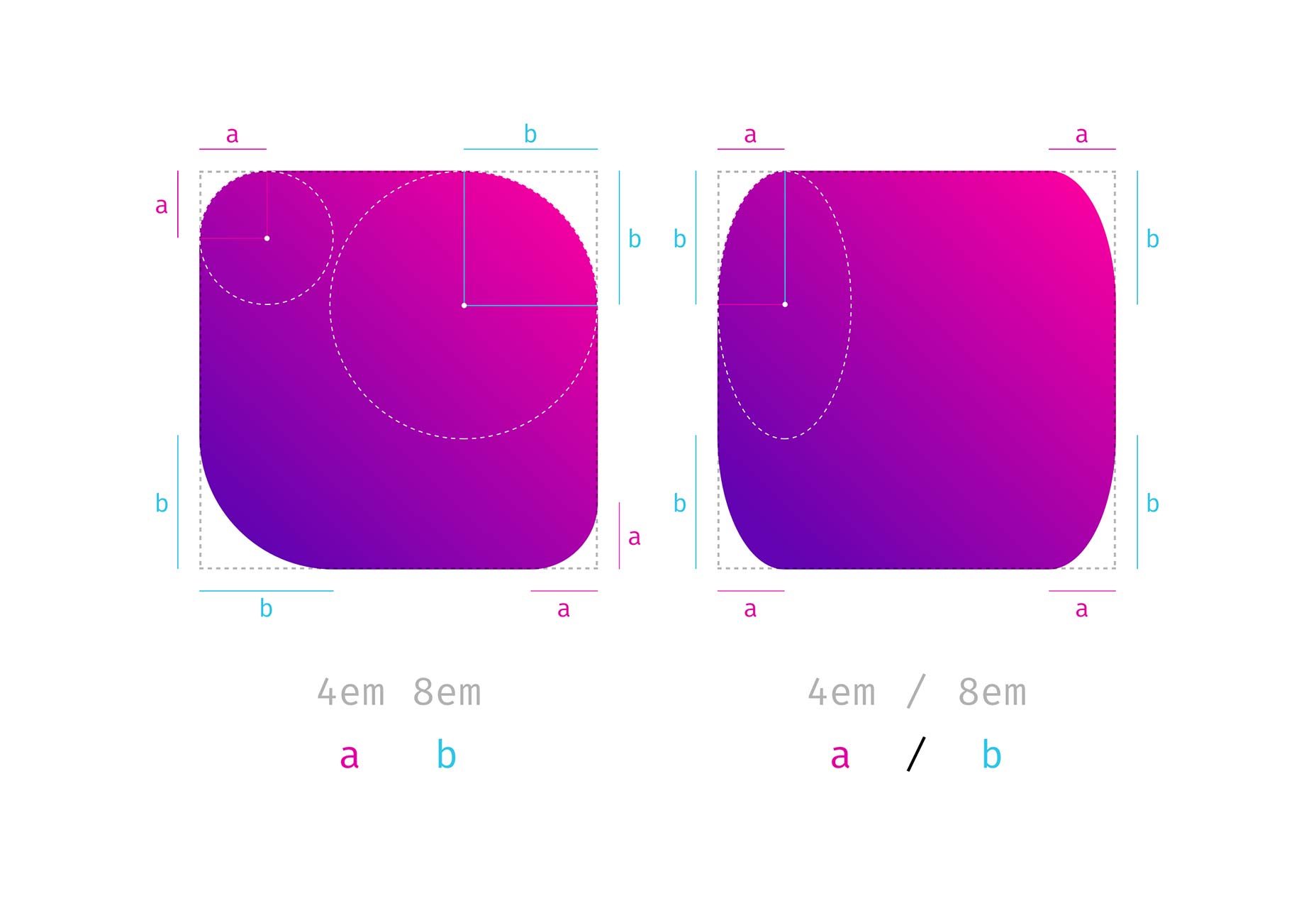
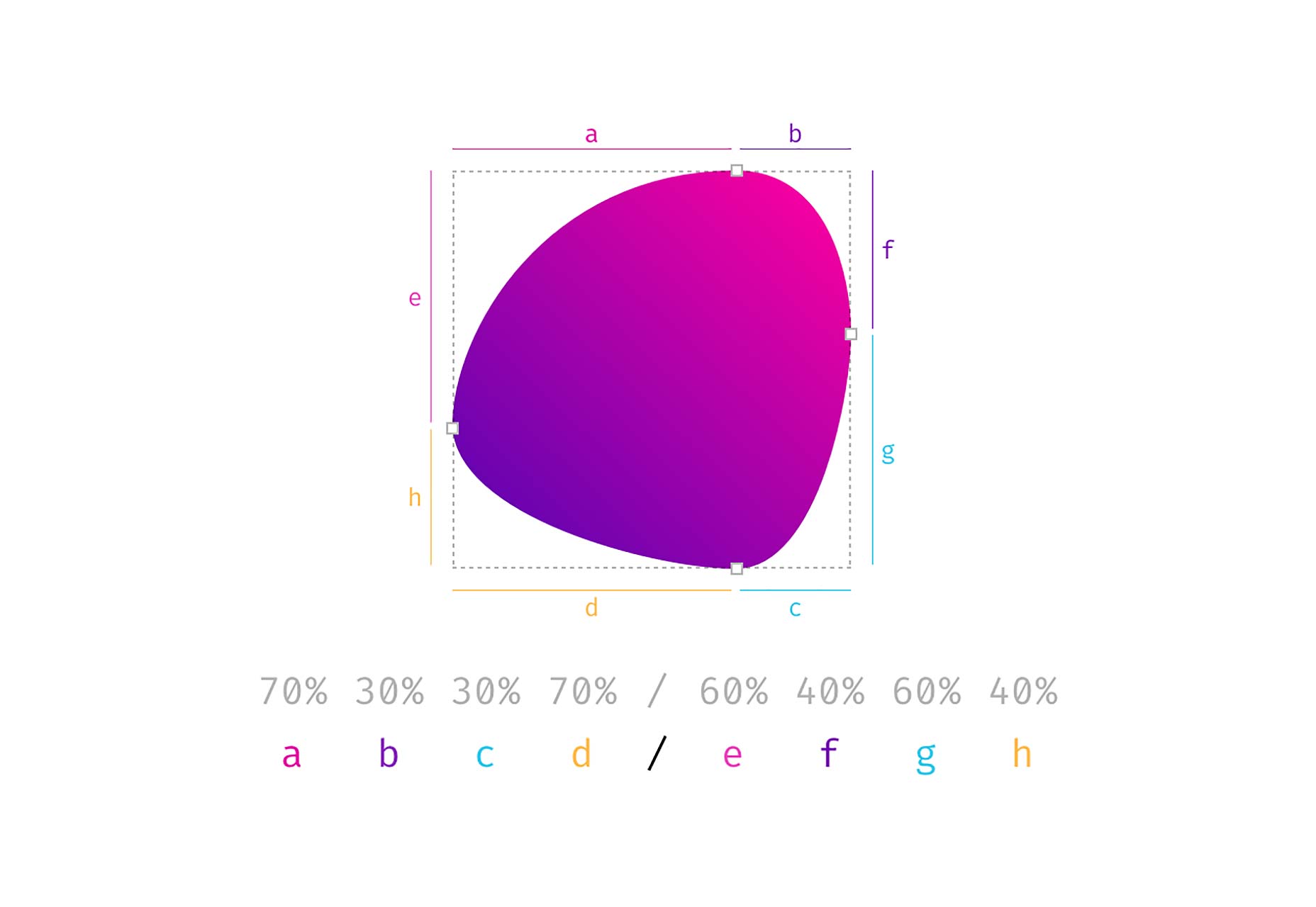
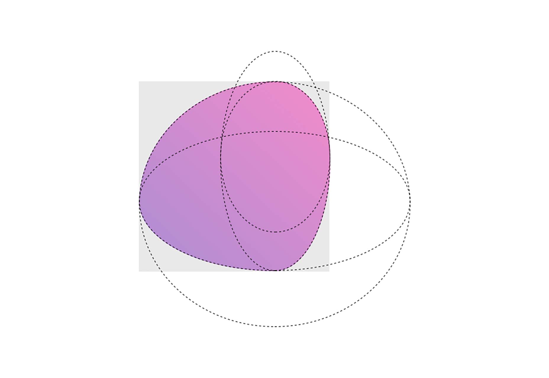
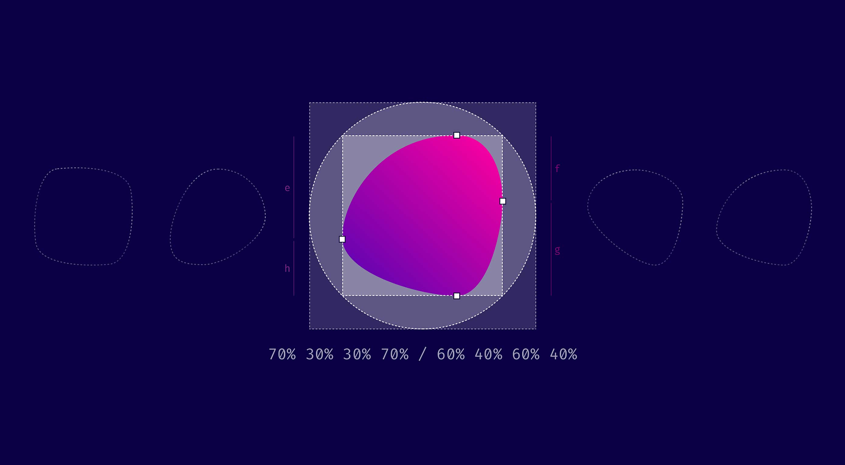
TL/DR: When you use eight values specifying border-radius in CSS, you can create organic looking shapes. WOW. No time to read it all ? — we made a visual tool for you. Find it here.

During this year’s Frontend Conference Zurich Rachel Andrew talked about Unlocking the Power of CSS Grid Layout. At the end of her talk, she mentioned something about an old CSS property that got stuck in my head:

The Image is set round just by using the well-supported border-radius. Don’t forget that old CSS still exists and is useful. You don’t need to use something fancy for every effect.

 — Rachel Andrew

Shortly after I heard this talk, I thought that you certainly could create more than just circles and started to dig deeper into what can be done using border-radius.

Mastering Border-Radius
Single Value

Let’s start with the basics. Hopefully this will not bore you. You are probably familiar with CSS, and you also know border-radius. It has been around for some years now, mostly used with a single value like this: border-radius: 1em and was maybe one of the most discussed/loved CSS3 features back in 2010 when css3please.com was your best friend.

Whenever you only use a single value, all corners are rounded by this value:

As you can see in the example above, next to fixed length values like px, rem or em you can also use percentages. Those are mostly used to create a circle by setting border-radius to 50%. The percentage value is based on the width and height of the given element. So when you use it on a rectangle, you will no longer have symmetrical corners. Here’s an example showing the difference between border-radius: 110px and border-radius: 30% applied to a rectangle.

Notice that the corners on the right side are not symmetrical and keep that in mind. We’ll come back to this later.

Four Different Values

When you use more than one value, you start setting values for each corner, beginning in the top left corner and then moving clockwise. Again you can also use percentages, and you could also mix percentages with fixed-length values.

Eight Values Separated by a Slash (This is Where it Gets Interesting)

I think most of you have already done everything I explained above. Now we get to the exciting part. What happens, if you separate values with a slash and specify up to eight values? Let’s see, what the spec says about that:

If values are given before and after the slash, then the values before the slash set the horizontal radius and the values after the slash set the vertical radius. If there is no slash, then the values set both radii equally.

— W3C

So, values before the slash are responsible for horizontal distances whereas values after the slash define the vertical lengths. But what does that mean? Remember percentage values on rectangular shapes? We had different absolute values for vertical and horizontal distances and asymmetrically rounded corners, and that is precisely what you get when you use the slash syntax.

So when you compare border-radius: 4em 8em to border-radius: 4em / 8em the results are quite different.

The symmetrical corners on the left form quarter of a circle, whereas the asymmetrical corners on the right are part of an ellipsis.

The shapes that you get with this look a little odd, to be honest. But remember the circles you create with border-radius: 50%. You get a circle because both values defining one side add up to 100% (50% + 50% = 100%) and there is no straight line left, that reminds you of the original square. If you apply the same logic to the full eight value border-radius syntax, you can create a shape that looks a little like a plectrum or an organic cell:

In the end it is four overlapping ellipses that build the final shape. Easy ha!

Don’t Panic…We Made a Visual Generator for You

It took me some time to get used to this syntax. Somehow it is not that intuitive. To make things a little easier for you, we built a little tool, that helps you create your very own organic shape.

Do(n’t) Cross The Streams

Now that you know about the 8 values in total, you might feel a little sad, because our border-radius-tool doesn’t give you the option to set each value separately…Sit tight, here is the 8-POINT-FULL-CONTROL version.

If you’re old enough, you might remember this quote from the 1984 Ghostbusters movie:

“Don’t Cross The Streams.” — “Why?” — “It would be bad.”

There is something similar going on here: If you cross the handles on one side, the shape behaves…let’s say unpredictably. But see for yourself, after all, it’s not going to end up in total protonic reversal or something, but don’t say, that I didn’t warn you.

PS. Many Thanks to simurai. Back in 2010, he created some CSS3 BonBon Buttons. Even though they look a little outdated, it is the only place I ever encountered and learned about the slash syntax.

See This Cool Feature in Action

Photos by gratisography.com

See the Pen border-radius by Nils (@enbee81) on CodePen.


This article was originally published on Medium, reposted with the author’s permission.

Add Realistic Chalk and Sketch Lettering Effects with Sketch’it – only $5!

Source

p img {display:inline-block; margin-right:10px;}
.alignleft {float:left;}
p.showcase {clear:both;}
body#browserfriendly p, body#podcast p, div#emailbody p{margin:0;}

5 things you didn't know about Photoshop for iPad

Original Source: http://feedproxy.google.com/~r/CreativeBloq/~3/9j_ApZKCL1Y/5-things-you-didnt-know-about-photoshop-for-ipad

It’s fair to say Adobe really has pulled some impressive updates out the bag for Adobe MAX 2018. But, without a doubt, the biggest buzz came on Monday when Adobe chief product manager Scott Belsky introduced Photoshop for iPad. A 15,000-strong crowd went wild as Belsky handed over to product project manager Jenny Lyell, who demonstrated some of the app's capabilities, stating: "This is not a watered down version, this is full Photoshop on the iPad."

Sign up for Adobe CC now

However, despite the impressive demo, getting any further information about the app, in terms of price and release date, was like getting blood out of a stone. Adobe is keeping a lot of information about Photoshop for iPad close to its chest, but we managed to get a few minutes with Lyell, who gave us a little more insight into this tablet-version of Photoshop…

01. It's taken almost three years to make

Approximately three years in the making, Photoshop for iPad came about after two engineers realised user demand via constant online searches for the term Photoshop for iPad. They decided their next challenge would be to see if it was actually possible to get the 28-year-old code base of Photoshop onto a tablet. For years, Adobe had tried it with other apps, including Sketch and other drawing apps, but these didn’t have the code base of Photoshop. So that was the dream, that was the challenge. 

"The code base for Photoshop is 28 years old, it’s a mammoth," says Lyell. "So how do you even comprehend that?"

But a small team at Adobe believed it was possible, and so chatted with their leaders in engineering and product, who gave them the blessing to go work on the project. The project was to be kept quiet in the early stages. "Some people were extremely skeptical in the company and weren’t sure we should be investing in this," says Lyell. Bet those guys feel silly now, huh?

02. The alpha build had just five features

As the technical aspects were going on with the development of Photoshop for iPad, Lyell was busy talking to customers, asking them questions like 'why do you actually want it on iPad? What does it help you with, what problem are/will you be solving with this software?'

"So much of the product roadmap is influenced by our customers," says Lyell. "Once we saw the life of this happening, we knew that we wanted to preview and announce it. But I didn’t want us to get away from the customers, and so we recruited this small group of people to work on the alpha build. 

"At this point there were literally only five features in there. We set their expectations, telling them it would be like using Photoshop 1.0, but that we wanted them to run with us, from the beginning, and give us as much feedback as possible so we could make sure that even at the preview stage, the product we were creating was what the users wanted. Diverting from customers' needs, even just slightly early on, could have had huge ramifications. Customers have to be by our side."

03. It can handle hundreds (if not thousands) of layers

Jenny Lyell demonstrating Photoshop for iPad

At a private Apple event, Photoshop for iPad product lead Jenny Lyell delved a little deeper into the app’s capabilities

As the Adobe design team collected hours and hours of one-on-one interviews, trying to understand user needs, there was a breakthrough moment in the timeline when they got large PSD to open on the iPad. "The whole team was in tears, freaking out," Lyell says. “This is impossible, we thought. But we’d seen it with our own eyes!"

So what constitutes a large PSD? "It was hundreds of layers that we got to open," says Lyell. With the same code base as Photoshop on desktop, Photoshop on iPad will open up any size PSD file. When asked if this would present any technical limitations, Lyell told us: "It would affect it just as a massive document on any machine would. So having the biggest single file on your mac would slow you down a few seconds vs a smaller one. Photoshop for iPad will work in a similar way, but we've optimised it a lot in terms of performance and we didn’t want to bring this out until we knew the hardware and software was ready."

04. It won't necessarily feature all your PS favourites 

If you're expecting to see the full toolset in this app, you'll be disappointed. Instead, the company has armed it with all the core tools users need to do real work in Photoshop. "Photoshop has a dozen different ways you can select an object – the 1.0 functionality is still in the code base!" says Lyell. "So we’re really rethinking how to give users all the core tools they need to do all the work they need, and give them the modern, best version of these tools so that they don’t have to feel any frustrations or inefficiencies."

05. It will feature Adobe's new AI technology

Part of the update to Photoshop CC this year includes a new Adobe Sensei selection tool. When asked if Photoshop for iPad will include this, Lyell was quick to confirm. "We definitely want to get the newest Sensei technology in there, so it’s prioritised on the roadmap," she says. 

Support and pricing

Adobe is pretty elusive about release dates and pricing models for Photoshop for iPad. When asked about when creatives can actually get their hands on the app (and trust us, we were persistent), we weren't even able to get a rough estimate as to when this is expected to ship. 

"It will be available in 2019, and we're still working out the business model in terms of pricing," Lyell said. We also asked whether it will be part of the CC suite or if Adobe is going to offer this as a standalone product and were told "we’re having conversations about that right now". 

Android users, we didn't forget about you either. When asked if this will be an iPad-only app, Lyell replied with: "Our plan is to extend to as many devices as we can right now. We still trying to sort out what's the best experience, and so are testing the different versions to see what’s optimised and what’s best for performance. We don’t want people having a poor experience, so that information will also come out during the launch." 

For what will almost certainly be a highly sought-after product, it’s a little frustrating to have no details as to when we can realistically expect this to ship to the masses. That said, 2019 is just around the corner, so let's hope it's sooner rather than later. 

Read more:

Adobe launches video app Premiere Rush CC13 iPad Pro apps that come alive with Apple PencilProject Gemini: Adobe announces new digital art app