How to Pick the Right Design Projects

Original Source: http://feedproxy.google.com/~r/1stwebdesigner/~3/GUJXXjbW7Q4/

As your freelance design career progresses, you’ll be presented with many project opportunities. But one of the hardest aspects of being in business is learning to pick the right projects for you.

There are several reasons for this. First, we tend to be trusting of others when they’re telling us about their needs. Second, saying “no” to anyone can feel like we’re going against our instincts (who turns down a paycheck?). And third, you never quite know exactly how a project will go. Predicting the future, as it turns out, isn’t a sure thing.

Still, there are some things you can do to increase your odds of being right. The goal is to ensure that you’re taking advantage of the best opportunities that come your way.

So, how do you know when a potential project is the “right one”? Ask yourself the following questions:

Does the Client’s Idea Sound Realistic?

One of the first considerations for signing onto a project is the client’s take on reality. You will usually find that the best projects come from those who are realistic. Their ideas and goals are smart and attainable.

Occasionally, you’ll run into someone that thinks big. They want to turn the world on its head and make big money while they’re doing it.

There’s certainly nothing wrong with having lofty goals. But don’t mistake an ambitious person for one who’s detached from reality. These people will talk of all the money they’re going to make, yet won’t be able to pay you much (if anything) for your initial efforts. Instead, you get promises of a large payout once their pie-in-the-sky idea is a success.

Think of it this way: If this person is really serious, they’d probably have enough funds to pay you fairly. Asking you to jump in head first to make their dreams come true isn’t at all realistic.

Therefore, it’s up to you to be a bit of a cynic. You don’t want to come off as rude or dismissive, but you should ask the tough questions. As in, “Where’s the money going to come from?”

Better yet, if the idea sounds like a lot of hot air, politely remove yourself from the situation. Most likely, you will save yourself a lot of frustration.

Notebook with a bar graph.

What Kind of Work is Involved?

It may sound a bit silly, but sometimes it’s easy to ignore the actual work that needs to be done. You can get all caught up in simply accepting whatever the client needs because, well, that’s what you’re supposed to do. Not so fast.

Early in my career, I felt like it was my duty to do whatever a client asked. So, I took just about every project that came my way. This was so very wrong. In short, it led to a lot of misery.

Web designers are creative professionals, not hardware stores. We need to put ourselves in the best possible position for success. Pretending to be a jack-of-all-trades doesn’t fit with that mission.

So, if you don’t like data entry (and can’t hire someone to do it for you), then that project isn’t for you. Likewise, if someone asks you to work with a CMS you hate or other various grunt work that does nothing to move your career forward, walk away. Unless you’re in dire financial need, you’re under no obligation to take the project.

Instead, consider the type of work involved. If it’s something you enjoy, the results are bound to be better because of it. Plus, you’ll be able to proudly display it in your portfolio.

Woman working on a laptop compute.

What Will the Future Hold?

Remember all that talk about predicting the future? It’s still not a sure thing. But you can reasonably predict the potential regarding your future involvement with a project. The real question is whether or not that is something you actually want.

For some designers, the lure of extra revenue down the road is welcomed. Knowing that you’ll receive some steady cashflow from monthly or yearly maintenance packages can really help your business.

Then there are those who are more comfortable just handing off a website to their client with a polite wave goodbye. After all, there is a certain burden that comes along with maintenance – especially if it’s not something you enjoy doing. And, just maybe, a long term relationship isn’t your thing, either.

Regardless of where you fall on the issue, it’s important to find out where your potential client stands. It’s worth the effort to ensure that everyone’s expectations and wishes are out in the open. Once you know what type of situation they’re looking for, you can respond accordingly.

Chalkboard with "What's Next" written on it.

Choose Wisely

Being a freelancer affords you the freedom to work the way you want. That means that you don’t have to jump on every project that comes your way. In fact, you have the right to be as picky as you like.

So, before you break out the contracts and handshakes, take some time to really think about the project in front of you. If it’s a great fit, then go for it. If not, there’s always next time. Either way, you have the power to decide for yourself.


7 Secrets for Building Great Client Relationships

Original Source: https://www.webdesignerdepot.com/2018/11/7-secrets-for-building-great-client-relationships/

A colleague recently said to me, “I’ve heard that you’re a client relations guru. Are there any tips or tricks that you have for starting to build up those relationships?”

I always love a question like this—something that makes me stop and reflect. It’s true. Working with people and developing new (or existing) relationships is something I have a knack for. Even though I self-identify as an introvert, I love doing it because genuinely connecting with other people, hearing about their experiences, challenges, wins, quirky-cool talents, what winds their clock (and sharing in return)…well, it actually means something to me.

Was that the big secret? Or was there more?

Could I summarize everything I do to establish a client relationship—things I do without even thinking— and distill it into a list of best practices anyone can apply?

Short answer? Yes.

The next seven tips sum up my advice for building great client relationships within the context of project management.

Tip 1. Face Time is the Best Time

I know there are people who successfully work 100% remotely. I get that. But at some point, if you want to build and maintain great, deep, lasting connections with your clients, you need that human relationship phenomenon that only happens when you’re in person. It’s different. Good different.

I like to meet in person…when I just “feel” like we haven’t met in person in a while

As a general rule, I like to meet in person for an initial conversation, key deliverables, or when I just “feel” like we haven’t met in person in a while. It’s a gut thing, which you’ll need to develop with each new client relationship you cultivate.

Tip 2. Pick Up the Phone

Don’t hide behind email. In today’s day and age, depending on your personality, your workload, and that of those you’re in contact with, it can feel easier to just send an email.

Often email is a good choice, but be aware of the fact that live human-voice connection is like wholesome, all-natural medicine. Your job as a project manager is to nurture your relationships with the right dose of it. There’s no one-size-fits-all approach. It depends on how active the project is, your client’s personality, and the kind of work you’re doing. The important takeaway here is, make sure it’s part of your approach.

Tip 3. Money Always Needs to be a Verbal Conversation

At least the initial presentation of it does. That way you hear any concerns, questions, or confusion right away and nothing is left to fester if there’s a misunderstanding.

Money is a hot button for everyone so it’s best to treat it firmly, respectfully, bravely, and humanly

When delivering an initial quote/proposal to a client (or an estimate of new scope for a project I’m already working on), I schedule a call or an in-person meeting to walk them through things together. I tell them: we may only need 5 or 8 minutes ,but let’s reserve 45 minutes on our calendars in case we need to cover anything in more detail. Then I send my email, quote, proposal a few minutes beforehand.

Money is a hot button for everyone so it’s best to treat it firmly, respectfully, bravely, and humanly.

Tip 4. If a Client Asks You the Status of Something, You Dropped the Ball

As PMs, we should be anticipating what our clients might be wondering or worrying about in advance. The client should never have to ask, “What’s the status on <insert milestone, question, deliverable, etc.> anyway?”

Again, there’s no standard approach to use for all projects and clients. You’ll have to find the right balance, since you don’t want to over-communicate either. But here’s a couple of practical takeaways that might help:

a) Set expectations regarding when and how a client can expect to hear from you next. When you do this, underpromise and over-deliver. Will you be able to get them that document by Wednesday? Tell them Friday. Then when you deliver earlier, everyone’s happy. Tell them a reasonable (safe) time frame. Deliver on it, beat it, or own it and communicate in advance if circumstances have arisen to justify it coming later.
b) When in the thick of a big project, weekly (or even twice a week) check-ins are great for batching items to cover. This creates a structure for everyone and builds in accountability to ensure details don’t get missed.

Corollary to the regular check-in: Batching communication is great except when it’s time-sensitive or potentially impactful bad news. What’s bad news? Anything that will cost more, take longer, or be “less good” than the client was expecting. Depending on timing, it may still be OK to wait for your next scheduled check in (if it’s tomorrow). Otherwise, barring a reasonable effort/assessment of whether you can fix said situation so as to circumvent the delivery of any bad news, don’t wait.

Tip 5. Take Responsibility, but Don’t Panic or Beat Yourself Up

Mistakes will happen. When they do, own them. But, don’t emotionally collapse and beat yourself up. Every challenging situation, every bump is an opportunity to strengthen the relationship, build trust, and collaboratively solve a situation.

take responsibility for everything you…need to own, plus a little bit more

Listen to the client if they have a gripe. Thank them for their honesty. Convey that you will be talking to your team to gain further understanding and perspective on what’s happened and that you’re committed to resolving a situation in a way that’s okay for everyone. Remember that you have permission to be fair to yourself and the company you represent (as in, don’t completely fold and give away the store).

That said, take responsibility for everything you and your company really need to own, plus a little bit more. Be honest, transparent, respectful, firm, human, compassionate, and be smart about it.

Tip 6. Make it Personal

Become Friends. Be genuinely interested in the person. The best working relationships go beyond the work and have personal connection on a variety of levels. At an appropriate level and pace (that you have to figure out), allow that to happen. Don’t pry. Don’t force. Don’t be creepy. Just be genuine and human.

At some point, you should know your client’s favorite color, that they love dogs, or that they’re both happy and sad because their first-born is going off to college. And remember, it’s a two way street, so you’ll be sharing things about yourself too.

Tip 7. Manage Expectations

Back in the mid-90s, when my husband and I first founded Gravity Switch, a fellow consultant (named Ed) gave us some unsolicited advice. He said, “The secret to a successful project is managing client expectations.”

We laughed at this advice. Heartily. But not to his face.

Expectations? C’mon… What about great design? What about solid programming? What about projects coming in on budget and on time? You know, all the important stuff that PMs have to think about.

But duh!

What context defines that great design and the solid programming? What context defines whether something is on budget or on time?

I had this aha moment when I realized that Ed was totally right. By the way, I called him up (it was 15 years later) and told him of our folly, admitted laughing (heartily) at his advice, thanked him for sharing it, and apologized for being a little slow on the uptake.

Key takeaway: if you’re managing expectations, what’s interpreted as “great work” and “a great working experience” will follow.


Featured image via DepositPhotos.

Add Realistic Chalk and Sketch Lettering Effects with Sketch’it – only $5!

Source

p img {display:inline-block; margin-right:10px;}
.alignleft {float:left;}
p.showcase {clear:both;}
body#browserfriendly p, body#podcast p, div#emailbody p{margin:0;}

Unique Ways to Integrate Social Media into Web Design

Original Source: https://www.webdesignerdepot.com/2018/11/unique-ways-to-integrate-social-media-into-web-design/

There’s something very special about social media marketing and how it compels consumers to engage with it.

The Hootsuite 2018 Social Media Barometer says there are now over 3.2 billion global consumers who are active on social media. With such a large part of the population actively involved in social media, it’s no surprise that 67% of business executives surveyed in the report said that social media marketing improves their bottom line.

As a web designer, you can take that knowledge and keep doing what everyone else does with it:

Add “connect” icons to the header;
Stick “share” icons to the scrolling blog sidebar;
Embed videos from YouTube.

Or you can find unique ways to infuse your web design with a dash of social media.

Unique Ways to Use Social Media in Web Design

Obviously, I’m not telling you to turn your site into a social network, or a rolling masonry grid of photos. Instead, I would encourage you to think outside the box and consider how you can apply the strengths of social media creatively to your design.

Here are some real-life examples to inspire you:

1. Add Hashtags and Handles to the Design

When you think of what makes social media so distinct from other kinds of marketing, you’ll likely think of hashtags (#) and handles (@). They’re simple symbols that we used long before social media was invented and, yet, they now have a special significance for most of us.

If it makes sense for your brand (i.e. it has a younger audience and also happens to be active on social media), hashtags and handles can add a really cool touch to your web design.

Here is an example from the Nuevos Conductores website from Chevrolet Mexico:

This website pays homage to the “new drivers” Chevy is catering to and uses real people to make its case. This whole website is an interesting case study in and of itself, that not only uses real Chevy drivers’ Twitter handles, but also includes messages, hashtags, and images from their social accounts to build out the design and message.

Hashtags can be used for strictly self-promotional purposes as well and don’t need to have such a predominant placement in the design either. Take the Caribana Festival, for example.

You’ll find a small hashtag has been added to the left side of the website. It’s really subtle, but it’s ever-presence is likely to get noticed by fans of the festival who’ve come to the site to learn more and get tickets.

Then, there’s Popular Pays’ 2017 Year in Review that actually uses hashtags as a design element.

As users scroll to a new topic on the page, the hashtag changes. Think of it the way you’d use header tags in a blog post or on a page of a website. Only, this adds a bolder touch.

2. Use Notification Tickers

Because of how ubiquitous email and social media have become in consumers’ lives, there’s no denying the lure of the pending message notification. You know the ones I’m talking about.

Twitter does it:

LinkedIn does it:

Now, websites are doing it, too:

But this is an interesting use case from a friend of mine. The recognizable notification ticker isn’t telling visitors that there are messages waiting for them (though it has the same effect in drawing their eyes there). Instead, it’s saying, “Hey, we have five jobs waiting for you to apply to!”

I think there are other ways this could be used as well and it doesn’t have to be for users logged into a SaaS platform or membership site. As we move more and more away from things like pop-ups that can intrude on the user experience, I think we’ll see websites find unique approaches to share news and promo codes and things of that nature. This notification ticker would be an interesting way to do that.

3. Design a Timeline

With most social media feeds, we’re presented with a chronological timeline of our activity as well as those we’ve connected to. There’s something very appealing about this layout, in general, as it allows us to get a sense for someone’s story.

And what is a website if not the “story” about a brand and its mission to serve its consumers?

Dr. Pepper is a brand that’s been around a long time, but I bet a lot of its drinkers don’t know much about its history. Well, if they were to visit the Dr. Pepper website, they’d definitely learn more about where this soft drink came from and even catch a glimpse at old promotional content that some may recognize still today.

If you navigate to the History page on the site, you’ll encounter a timeline that briefly tells its story (nice and succinct just like most of our own social media “stories”):

Then, as you scroll down, you’ll encounter images that support the story, even playing on the nostalgia of having drank Dr. Pepper through the decades:

When you think about it, this is really no different than why we as consumers take photos and post them online. We want to share the highlight reel of our lives, and brands are able to do a similar thing with their websites.

4. Talk to Visitors with Quizzes and Chat UIs

Let’s face it: a lot of times, a website just feels like a digital flyer. “Here is our business. Learn about us and get in touch.” I believe that’s why so many people flock to social media nowadays; to learn more about and actually engage with businesses.

There are so many ways in which you can jazz up your web design to make the experience less lackluster, of course. A well-timed pop-up or an eye-catching animation can help. Gamified elements like timers are a nice touch, too.

Aside from placing a live chat on your website—that someone then has to man—there has got to be another way in which you can make your web design really talk to its visitors. Right?

One example I like is the John Frieda website. There is a Style Match page which allows visitors to talk to the site the way they would a hair stylist:

The quiz-style format allows visitors to input answers to questions they’d get when visiting a salon. In the end, they receive a personalized response and recommendations based on what they “talked” about.

A chat UI is also possible, though AI isn’t as simple of an implementation as something like a built-in quiz. Consider what makes the most sense for your web design and apply the interactive element accordingly.

Wrap-Up

Social media plays a big part in the modern business’s marketing efforts. But when it comes to websites, why is it that we only catch minor glimpses of it in the form of social share icons or the embedded news feed?

I would argue that we should think more abstractly about the strengths of social media. Then, apply those same unique principles and elements to web design to make it even better.

Add Realistic Chalk and Sketch Lettering Effects with Sketch’it – only $5!

Source

p img {display:inline-block; margin-right:10px;}
.alignleft {float:left;}
p.showcase {clear:both;}
body#browserfriendly p, body#podcast p, div#emailbody p{margin:0;}

Keeping Your Website Design Consistent

Original Source: http://feedproxy.google.com/~r/1stwebdesigner/~3/Kpb7kJrwzAQ/

The last word you may want a user to associate with your website is “predictable.” This term has a negative connotation in the business world and makes you think of a brand that is boring, unexciting, and identical to its competitors.

Yet to a degree, users expect and rely on the predictability of a website. At its most basic level, a website should be predictable – it should function like all other websites, at least to the point where your user does not struggle to make sense of the interface. Otherwise, your think-outside-the-box strategy might throw users off.

Your Web Designer Toolbox
Unlimited Downloads: 500,000+ Web Templates, Icon Sets, Themes & Design Assets


DOWNLOAD NOW

Think of your website like a car. While consumers react positively to creative, innovative ideas that boost the user experience, for example, touch screen infotainment systems and massage chairs, they may not be keen on a brand that tries to completely revolutionize the way vehicles operate, such as one that places the steering wheel in the backseat.

Features along such lines can seem less user-friendly and more gimmicky, designed simply for the “wow factor” – a move on the brand’s part that users would likely not respond to well. Your website must prioritize usability and the user experience above all else to maintain its popularity – and your brand’s credibility.

The solution is to balance predictability with intrigue. Maintain certain elements your users cannot go without, such as menu options and content. Your users must be able to navigate your website with ease or else they will click away. Yet predictable does not have to mean boring.

For instance, some websites are beginning to integrate virtual and augmented realities into the UI. Designers can get away with this progressive idea by making it simple for users with VR-supported browsers, and doing it for the users’ benefit – by letting users view products up close in VR from their homes before making a purchasing decision, for example.

Maintain Internal Consistency

Achieving predictability and creativity is possible by maintaining internal consistency on your website. Marry a logical flow with your interface that may allow slight variations to keep your users intrigued. Add your own flare and innovations, but keep your primary functional elements consistent and comprehensible.

It is intuitive for users to click on a link or a highlighted section of a page, and you can assume they will access your homepage. From there, the user instinctively knows that clicking on other menu options will lead to the content they desire. The user’s intuition is what makes fast website use possible. Do not underestimate it. Creating a website that takes effort to navigate will end badly for your brand.

The consistency of Mozilla design.

The consistency of Mozilla design.

Achieve internal consistency with accepted UI design patterns. These are standard design elements your user expects to encounter on your website. Patterns can include navigation options, a search feature, a place to input user data, and links to social media accounts.

UI design patterns can be standard or persuasive. Persuasive UI design engages users and encourages them to take certain actions, such as subscribing to a mailing list or taking the next step in the sales process. Both types of UI design have accepted standards and guidelines that make them work in the company’s favor.

Simplify Your Site

One of the easiest and most rewarding ways to master UI consistency is to keep your website’s design simple. Again – simple does not have to mean plain or boring. It means a clean, easy-to-use website that your users can navigate in seconds. Go with a simple visual design to optimize consistency and get brownie points with Google. That’s right – Google rewards sites with simple designs, because these are the sites users deemed “most beautiful” in a 2012 study.

The beautifully simple  ArtQuality.com.br layout.

The beautifully simple ArtQuality.com.br layout.

In the five years since this study, this conclusion has held up. Users still prefer simple websites to those that are visually complex. Existing accepted standards for website layouts limit what you can do at this stage of the design process, but this is a good thing – you can only change the standard layout so much before you cross the line into visual complexity. Instead of trying to reinvent the wheel, impress your users with how you use your simple layout.

For example, look at the stunning visuals on FeedMusic.com. It appears you are in a beautiful, swirling miasma of space dust on the homepage. Every page you scroll through (Feed also uses a unique navigational system) showcases another eye-catching, high-definition visual. Using graphics in new and exciting ways can bring a simple layout to the next level, while still maintaining the UI people have come to depend upon. It is possible to stay consistent and make waves in your industry with creative, original UI design.

The FeedMusic.com homepage.

The FeedMusic.com homepage.

Keep Content Cohesive

One of the most crucial elements to keep consistent is your content. Your brand must maintain a constant tone, voice, and quality across every page. Any mistakes or oversights in this regard can lead to users assuming your site has spammy content or that the brand doesn’t care about its users – both bad news for your business.

Your content should reflect the overall mood of your site and complement your design. It should also match what your users are looking for when they come across your company. Your content should not only exude consistency in the words you write (or the videos you post), but in how often you post new articles. On your website’s blog and social media accounts, consistency in content will pay off handsomely in site traffic and potential conversions.

Create Uniformity among Site Elements

The goal with your website should be to reduce user learning while piquing their interest. This can sound like a conundrum until you realize that when you keep the major UI design elements uniform, you have the freedom to play with the rest of your site. Consistency in the bones of your website gives you wiggle room with the rest of the body. Here are site elements to keep consistent across the board:

Typography size
Whitespace
Color palette
Brand logo and visuals
Size of site elements
High-resolution imagery
Button colors
Navigation menu
Headers, footers, and sidebars
Clickable elements

This is an idea of what elements your users want to remain consistent from page to page to facilitate easy navigation. Use common sense here – changing the location of your sidebar from page to page would only confuse users and probably lead them to click away.

UI Style guide by Alex Gilev.

Keep in mind that your users will not be as familiar with your site as you are. Look at your design elements from an outsider’s perspective – do your elements make sense and work together as part of a larger picture or are they scattered and confusing?

The Takeaway

At the end of the day, consistency always wins the UX and UI game. No matter how beautiful the imagery, how excellent the content, or innovative the theme, users will not stay on a site that is too complex or confusing.

Avoid this by keeping your site seamless and easily digestible. You are free to experiment but within the boundaries of what the current web user deems acceptable. Broaden your horizons, but only if it will bring something of value to your target audience.

Remember – your users should be at the heart of every website design decision you make. With this in mind, design consistency and efficiency should become second nature.


Building a WordPress Plugin with Vue

Original Source: https://www.sitepoint.com/building-a-wordpress-plugin-with-vue/

In this tutorial, we’ll learn how to integrate Vue.js with a WordPress plugin to provide a modern UI experience to our WordPress users.

Vue.js is a very popular progressive JavaScript library for building modern and rich user interfaces similar to Angular and React in terms of popularity, performance and component-based architecture. We’ll dive into the entire process of building a very simple WordPress plugin with a Vue interface that interacts with the WordPress REST API through the JavaScript Fetch API.

We’ll create a shortcode that will allow us to add a latest published posts widget in our WordPress website. The UI of the widget is a Vue app which fetches the latest published posts via the /wp-json/wp/v2/posts?filter[orderby]=date WP-API endpoint.

This tutorial assumes some familiarity with Vue.js. We’ll see how to create a Vue instance, use life-cycle hooks like mounted(), and also the JavaScript Fetch API to interact with the WordPress REST API.

Creating a WordPress Plugin

In this section, we’ll see how to create a WordPress plugin that registers a shortcode in a few steps.

Create a Folder in wp-content/plugins

Let’s start by creating the back-end part of our plugin. Plugins live inside the wp-content/plugins folder. Navigate to this folder inside your WordPress installation folder and create a sub-folder for your plugin. Let’s call it vueplugin:

cd /var/www/html/wp-content/plugins
mkdir vueplugin

Inside your plugin folder, create a vueplugin.php file and add the initial content:

<?php
/*
Plugin Name: Latest Posts
Description: Latest posts shortcode
Version: 1.0
*/

These comments are used as meta information for the plugin. In our case, we simply provide a plugin name, description and version.

If you visit the plugins page in the admin interface you should be able to see your plugin listed:

Our new plugin listed on the plugins page

Creating a Shortcode

Shortcodes are used via WordPress plugins to enable users to add content to posts and pages. To register a shortcode you need to add the following minimal code in your plugin file:

function handle_shortcode() {
return ‘My Latest Posts Widget’;
}
add_shortcode(‘latestPosts’, ‘handle_shortcode’);

We’re registering a shortcode named latestPosts.

WordPress provides the built-in add_shortcode() function to create the shortcode in your WordPress plugin. The function takes a name as the first parameter and the handler function that processes your shortcode logic and returns an output as a second parameter.

At this point, we’re only returning a static string from our shortcode, but shortcodes are more useful when used to insert dynamic content.

Now, let’s activate the plugin from the admin interface by clicking on the Activate link below the plugin name:

Activating the plugin

You can use a shortcode by enclosing it in square brackets — that is, [SHORTCODE_NAME]. The text inside the brackets is the name we passed as the first parameter to the add_shortcode() function. It gets replaced by the output returned by the PHP function passed as the second parameter.

To test if our shortcode is successfully registered, we can create a new post and add [latestPosts] in the post content:

Testing the shortcode

You should see My Latest Posts Widget sentence rendered:

The test sentence rendered

Now, instead of displaying the static My Latest Posts Widget string, let’s display the latest posts using Vue.js.

The post Building a WordPress Plugin with Vue appeared first on SitePoint.

Using the WordPress Settings API to Build a Custom Admin Page

Original Source: https://www.sitepoint.com/wordpress-settings-api-build-custom-admin-page/

In this guide, we’ll introduce the WordPress Settings API, and create a WordPress administration page where we demonstrate the use of this API.

For the purposes of this tutorial, we’ll wrap this functionality into a plugin, but this can also be a part of a WordPress theme.

As the WordPress Codex says, the Settings API was added in WordPress 2.7 to streamline adding different settings fields and sections in administration pages.

Creating the Plugin

To start, we’ll create and activate a plugin to encapsulate our options page. We’ll use WP CLI to simplify the creation, although this leaves us with way more files than this guide needs.

<!–

Creating and activating a plugin in the command line to encapsulate our options page
–>

As we can see, we use wp scaffold plugin pluginname to create the plugin. Once it’s created, we activate it — optionally also using WP CLI, with wp plugin activate pluginname.

Once it’s activated, we open the main plugin file — in this case sitepoint-settings-api.php.

Creating the Admin Page

It isn’t necessary to use WP CLI for this plugin. We could have simply created a directory with the name of the plugin, and the PHP file inside it with the same name. Anyhow, the creation of the plugin has left us with a sitepoint-settings-api.php which looks like this:

<?php
/**
* Plugin Name: Sitepoint Settings Api
* Plugin URI: PLUGIN SITE HERE
* Description: PLUGIN DESCRIPTION HERE
* Author: YOUR NAME HERE
* Author URI: YOUR SITE HERE
* Text Domain: sitepoint-settings-api
* Domain Path: /languages
* Version: 0.1.0
*
* @package Sitepoint_Settings_Api
*/
~

Now we can simply add code after the comment end.

To add our options page, we’ll use add_options_page() (more details about it here). This function takes arguments as follows:

add_options_page( $page_title, $menu_title, $capability,
$menu_slug, $function );

All the arguments are self-explanatory. $menu_slug must be a unique string that WordPress will use internally, but will also be reflected in the URL. $function is a string with a name of the function that will provide HTML output for our admin page.

We will, therefore, add the following code to our plugin file:

add_action( ‘admin_menu’, ‘sitepoint_settings_page’ );

function sitepoint_settings_page() {
add_options_page( ‘Settings API Page’, ‘Settings API Page’, ‘manage_options’, ‘settings-api-page’, ‘settings_api_page’ );
}

After we’ve saved the file (presuming we activated our plugin), we’ll open our administration dashboard, and we’ll find our Settings API Page under Settings in the left side menu.

We can control, to a degree, the order or position of the submenu item by adding a priority argument to our add_action() function:

add_action( ‘admin_menu’, ‘sitepoint_settings_page’, 1 );

If we want to have our menu item to be in the root menu — rather than the Settings submenu — we’ll use add_menu_page(), which takes similar arguments.

Now, if we open the page in our browser, all we’ll see is an empty page, because we still haven’t created the settings_api_page() function that we specified:

Currently our admin page is empty

The Settings API

The WordPress Settings API is an intricate mechanism that attempts to provide an easy way for developers to create settings pages.

Before we go into a full-fledged example of the settings page displaying and saving a setting to the WordPress database, we’ll explain couple of crucial functions that WordPress provides as part of its Settings API.

register_setting() is a function we use to register a setting, which equals a row in wp_options table. Before we can create actual field (or fields, as setting can be an array of values), we need to register it. This way we’ll leverage the WordPress CRUD mechanism for settings. Function arguments are as follows:

register_setting( string $option_group, string $option_name, array $args = array() )

The first two arguments are mandatory, the first one allowing us to assign fields to it, and $option_name, as we’ll see, is the actual option name in the WordPress database.

add_settings_section() defines/adds a section to an admin page. Its arguments are as follows:

add_settings_section( string $id, string $title, callable $callback, string $page )

$callback is a function that outputs an HTL header of the section (it can be empty), and $page is the slug of the admin page we’ll display it on.

add_settings_field() defines a settings field within a settings section in an admin options page. Arguments for it are:

add_settings_field( string $id, string $title, callable $callback, string $page, string $section = ‘default’, array $args = array()

Of these, $id, $title, $callback and $page are required. The $callback function should output the HTML of the input field.

The Settings API provides $page argument for add_settings_section and add_settings_field as a means to add sections and fields to existing settings pages. We’ll use stpPlugin for both our option group — in register_setting() — and for attaching the settings section and settings fields to a ‘stpPlugin’ page in the add_settings_section() and add_settings_field() functions. We’ll then “quote it” in the next two functions in our example, to output relevant HTML.

settings_fields() outputs “nonce, action, and option_page fields for a settings page”. It takes the $option_group argument, used in register_setting().

do_settings_sections() outputs all the sections, with their respective fields, registered for a specific $page.

$page is the only argument here.

The post Using the WordPress Settings API to Build a Custom Admin Page appeared first on SitePoint.

Improve Animated GIF Performance With HTML5 video

Original Source: https://www.smashingmagazine.com/2018/11/gif-to-video/

Improve Animated GIF Performance With HTML5 video

Improve Animated GIF Performance With HTML5 video

Ayo Isaiah

2018-11-05T14:30:14+01:00
2018-11-06T12:34:07+00:00

Animated GIFs have a lot going for them; they’re easy to make and work well enough in literally all browsers. But the GIF format was not originally intended for animation. The original design of the GIF format was to provide a way to compress multiple images inside a single file using a lossless compression algorithm (called LZW compression) which meant they could be downloaded in a reasonably short space of time, even on slow connections.

Later, basic animation capabilities were added which allowed the various images (frames) in the file to be painted with time delays. By default, the series of frames that constitute the animation was displayed only once, stopping after the last frame was shown. Netscape Navigator 2.0 was the first browser to added the ability for animated GIFs to loop, which lead to the rise of animated GIFs as we know them today.

As an animation platform, the GIF format is incredibly limited. Each frame in the animation is restricted to a palette of just 256 colors, and over the years, advances in compression technology has made leading to several improvements the way animations and video files are compressed and used. Unlike proper video formats, the GIF format does not take advantage of any of the new technology meaning that even a few seconds of content can lead to tremendously large file sizes since a lot of repetitive information is stored.

Even if you try to tweak the quality and length of a GIF with a tool like Gifsicle, it can be difficult to cut it down to a reasonable file size. This is the reason why GIF heavy websites like Giphy, Imgur and the likes do not use the actual GIF format, but rather convert it to HTML5 video and serve those to users instead. As the Pinterest Engineering team found, converting animated GIFs to video can decrease load times and improve playback smoothness leading to a more pleasant user experience.

Hence, we’re going to look at some techniques that enable us use HTML5 video as a drop in replacement for animated GIFs. We’ll learn how to convert animated GIFs to video files and examine how to properly embed these video files on the web so that they act just like a GIF would. Finally, we’ll consider a few potential drawbacks that you need to ponder before using this solution.

Convert Animated GIFs To Video

The first step is to convert GIF files to a video format. MP4 is the most widely supported format in browsers with almost 94% of all browsers enjoying support, so that’s a safe default.

Support table on caniuse.com showing browser support for the MP4 video format

94% of all browsers support the MP4 format (Large preview)

Another option is the WebM format which offers high quality videos, often comparable to an MP4, but usually at a reduced file size. However, at this time, browser support is not as widespread so you can’t just go replacing MP4 files with their WebM equivalents.

Support table on caniuse.com showing browser support for the WebM video format

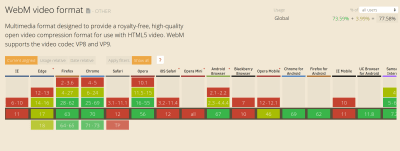
Internet Explorer and Safari are notable browsers without WebM support (Large preview)

However, because the <video> tag supports multiple <source> files, we can serve WebM videos to browsers that support them while falling back to MP4 everywhere else.

Let’s go ahead and convert an animated GIF to both MP4 and WebM. There are several online tools that can help you do this, but many of them use ffmpeg under the hood so we’ll skip the middle man and just use that instead. ffmpeg is a free and open source command line tool that is designed for the processing of video and audio files. It can also be used to convert an animated GIF to video formats.

To find out if you have ffmpeg on your machine, fire up a terminal and run the ffmpeg command. This should display some diagnostic information, otherwise, you’ll need to install it. Installation instructions for Windows, macOS and Linux can be found on this page. Since we’ll be converting to is WebM, you need to make sure that whatever ffmpeg build you install is compiled with libvpx.

Getting workflow just right ain’t an easy task. So are proper estimates. Or alignment among different departments. That’s why we’ve set up “this-is-how-I-work”-sessions — with smart cookies sharing what works well for them. A part of the Smashing Membership, of course.

Explore Smashing Membership ↬

Smashing TV, with live sessions for professional designers and developers.

To follow along with the commands that are included in this article, you can use any animated GIF file lying around on your computer or grab this one which is just over 28MB. Let’s begin by converting a GIF to MP4 in the next section.

Convert GIF To MP4

Open up a terminal instance and navigate to the directory where the test gif is located then run the command below to convert it to an MP4 video file:

ffmpeg -i animated.gif video.mp4

This should output a new video file in the current directory after a few seconds depending on the size of the GIF file you’re converting. The -i flag specifies the path to the input GIF file and the output file is specified afterwards (video.mp4 in this instance). Running this command on my 28MB GIF produces an MP4 file that is just 536KB in size, a 98% reduction in file size with roughly the same visual quality.

But we can go even further than that. ffmpeg has so many options that you can use to regulate the video output even further. One way is to employ an encoding method known as Constant Rate Factor (CRF) to trim the size of the MP4 output even further. Here’s the command you need to run:

ffmpeg -i animated.gif -b:v 0 -crf 25 video.mp4

As you can see, there are a couple of new flags in above command compared to the previous one. -b:v is normally used to limit the output bitrate, but when using CRF mode, it must be set to 0. The -crf flag controls the quality of the video output. It accepts a value between 0 and 51; the lower the value, the higher the video quality and file size.

Running the above command on the test GIF, trims down the video output to just 386KB with no discernable difference in quality. If you want to trim the size even further, you could increase the CRF value. Just keep in mind that higher values will lower the quality of the video file.

Convert GIF To WebM

You can convert your GIF file to WebM by running the command below in the terminal:

ffmpeg -i animated.gif -c vp9 -b:v 0 -crf 41 video.webm

This command is almost the same as the previous one, with the exception of a new -c flag which is used to specify the codec that should be used for this conversion. We are using the vp9 codec which succeeds the vp8 codec.

In addition, I’ve adjusted the CRF value to 41 in this case since CRF values don’t necessarily yield the same quality across video formats. This particular value results in a WebM file that is 16KB smaller than the MP4 with roughly the same visual quality.

Now that we know how to convert animated GIFs to video files, let’s look at how we can imitate their behavior in the browser with the HTML5 <video> tag.

Replace Animated GIFs With Video In The Browser

Making a video act like a GIF on a webpage is not as easy as dropping the file in an <img> tag, but it’s not so difficult either. The major qualities of animated GIFs to keep in mind are as follows:

They play automatically
They loop continuously
They are silent

While you get these qualities by default with GIF files, we can cause a video file to act the exact same way using a handful of attributes. Here’s how you’ll embed a video file to behave like a GIF:

<video autoplay loop muted playsinline src=”video.mp4″></video>

This markup instructs the browser to automatically start the video, loop it continuously, play no sound, and play inline without displaying any video controls. This gives the same experience as an animated GIF but with better performance.

To specify more that once source for a video, you can use the <source> element within the <video> tag like this:

<video autoplay loop muted playsinline>
<source src=”video.webm” type=”video/webm”>
<source src=”video.mp4″ type=”video/mp4″>
</video>

This tells the browser to choose from the provided video files depending on format support. In this case, the WebM video will be downloaded and played if it’s supported, otherwise the MP4 file is used instead.

To make this more robust for older browsers which do not support HTML5 video, you could add some HTML content linking to the original GIF file as a fallback.

<video autoplay loop muted playsinline>
<source src=”video.webm” type=”video/webm”>
<source src=”video.mp4″ type=”video/mp4″>

Your browser does not support HTML5 video.
<a href=”/animated.gif”>Click here to view original GIF</a>
</video>

Or you could just add the GIF file directly in an <img> tag:

<video autoplay loop muted playsinline>
<source src=”video.webm” type=”video/webm”>
<source src=”video.mp4″ type=”video/mp4″>
<img src=”animated.gif”>
</video>

Now that we’ve examined how to emulate animated GIFs in the browser with HTML5 video, let’s consider a few potential drawbacks to doing so in the next section.

Potential Drawbacks

There are a couple of drawbacks you need to consider before adopting HTML5 video as a GIF replacement. It’s clearly not as convenient as simply uploading a GIF to a page and watch it just work everywhere. You need to encode it first, and it may be difficult to implement an automated solution that works well in all scenarios.

The safest thing would be to convert each GIF manually and check the result of the output to ensure a good balance between visual quality and file size. But on large projects, this may not be practical. In that case, it may be better to look to a service like Cloudinary to do the heavy lifting for you.

Another problem is that unlike images, browsers do not preload video content. Because video files can be of any length, they’re often skipped until the main thread is ready to parse their content. This could delay the loading of a video file by several hundreds of milliseconds.

Additionally, there are quite a few restrictions on autoplaying videos especially on mobile. The muted attribute is actually required for videos to autoplay in Chrome for Android and iOS Safari even if the video does not contain an audio track, and where autoplay is disallowed, the user will only see a blank space where the video should have been. An example is Data Saver mode in Chrome for Android where autoplaying videos will not work even if you set up everything correctly.

To account for any of these scenarios, you should consider setting a placeholder image for the video using the poster attribute so that the video area is still populated with meaningful content if the video does not autoplay for some reason. Also consider using the controls attribute which allows the user to initiate playback even if video autoplay is disallowed.

Wrap Up

By replacing animated GIFs with HTML5 video, we can provide awesome GIF-like experiences without the performance and quality drawbacks associated with GIF files. Doing away with animated GIFs is worth serious consideration especially if your site is GIF-heavy.

There are websites already doing this:

Twitter converts animated GIFs to MP4 files on upload
GIF performance was improved on Pinterest by converting them to videos
Imgur, a GIF heavy website, converts all GIF uploads to HTML5 video

Taking the time to convert the GIF files on your site to video can lead to a massive improvement in page load times. Provided your website is not too complex, it is fairly easy to implement and you can be up and running within a very short amount of time.

Smashing Editorial
(ra,dm)

Editorial Design: A Brief Story About Everything

Original Source: http://feedproxy.google.com/~r/abduzeedo/~3/jzk_IQoaFf0/editorial-design-brief-story-about-everything

Editorial Design: A Brief Story About Everything

Editorial Design: A Brief Story About Everything

abduzeedo
Nov 05, 2018

I love checking out old project published on sites like Behance and Dribbble. I think it’s a great testament of good design if they can stand the test of time. There are some areas that are more prone to survive the painful effect of time. Editorial Design is one of them and this project  that Mane Tatoulian is a great example. It was originally published in 2015 and still feels fresh, at least from my point of view.

The subject of the editorial design is, coincidentally, time. And it’s basically a brief story of about everything. Space, time and non-time as Mane mentioned in the post. 

For more information about Mane make sure to check out her website at http://manetatoulian.com/

Editorial design

editorial design


Collective #465

Original Source: http://feedproxy.google.com/~r/tympanus/~3/BjGx1h9Vmzo/

C465_room250

Room 250

A very inspiring article by Haraldur Thorleifsson on the paramount importance of inclusion.

Read it

C465_Hotjar

This content is sponsored via Syndicate Ads
4 ways to uncover the reasons why people leave your website

Why do people leave your website? The answer lies with your ‘Undecided Explorers’!

Read more

C465_404

The 101 Course on Crafting 404 Pages

Shelby Rogers explains why making an effort with a 404 page could better your website’s chances of people coming back despite the inconvenience, and how to track those errors to reduce how often people see it.

Read it

C465_amelia

Building A Game With SVG and JavaScript with Amelia Bellamy-Royds

Amelia Bellamy-Royds walks through a demo of her great book Using SVG with CSS3 and HTML5.

Check it out

C465_webpack

An Annotated webpack 4 Config for Frontend Web Development

Andrew Welch shares a complete real-world production example of a sophisticated web­pack 4 config.

Read it

C465_async

The Evolution of Async JavaScript: From Callbacks, to Promises, to Async/Await

Great article and video on Async JavaScript as part of Tyler McGinnis’ Advanced JavaScript course.

Read it

C465_deoldify

DeOldify

A fantastic Deep Learning based project for colorizing and restoring old images.

Check it out

C465_icons

Eva Icons

Eva Icons is a pack of more than 480 beautifully crafted Open Source icons for common actions and items.

Get it

C465_carrot

#codevember 3/2018 – Flying Carrot

Noel Delgado’s adorable contribution to the #codevember challenge.

Check it out

C465_Gdemo

Glorious Demo

With this library you can create animations to show your code in action.

Check it out

C465_gutenberg

The Guten, the Berg, and the Ugly

Samuel Levy’s witty article where he shares his thoughts on the WordPress Gutenberg editor.

Read it

C465_Waveguide

Waveguide

In case you didn’t know about it yet: Waveguide is a curated design knowledge base with thousands of UI UX patterns, mobile patterns examples, landing page inspiration and more.

Check it out

C465_rebirth

Re:Birth

Thomas Ollivier’s wonderful project that portraits current internet technology as pre-internet technology.

Check it out

C465_scroll

SimpleBar

The cross-browser custom scrollbars library with native scroll got a major update.

Check it out

C465_logos

80s Action Figure Logos

Some great old-school logo inspiration from the 80s compiled by FigureRealm.

Check it out

C465_darkmode

Redesigning your product and website for dark mode

Andy Clarke shares some tips for designing a dark mode version of your product or website to ensure you maintain accessibility and readability.

Read it

C465_prot

Enforcing Accessibility Best Practices with Component PropTypes

Brad Frost writes about how React’s PropTypes and isRequired gives us an opportunity to enforce accessibility best practices.

Read it

C465_gameoff

The 6th annual GitHub game jam has started – get involved and check out our Phaser resources.

Richard Davey reminds us of GitHub’s Game Off challenge and shares some resources on using Phaser for building a game.

Check it out

C465_applemaps

Apple’s New Map

Justin O’Beirne’s essay on how Apple might have just closed the gap with Google’s map.

Read it

C465_lonely

Have you ever been lonely?

Gerard Ferrandez and Angelo Plessas created this artsy dancing robot demo.

Check it out

C465_jam

Algojammer

Algojammer is an experimental, proof-of-concept code editor for writing algorithms in Python. By Chris Knott.

Check it out

C465_faces

Generating custom photo-realistic faces using AI

Shaobo Guan’s fantastic project of controlled image synthesis and editing using a novel method to control the generation process of a unsupervisedly-trained generative model. Check out the repo.

Check it out

C465_infinity

#codevember – 1 – Infinity

Johan Karlsson “Infinity” contribution to the first day of the #codevember challenge.

Check it out

C465_notepad

HTML-Notepad

A WYSIWYG editor for creating and editing formatted texts in HTML files.

Check it out

C465_halloween

Halloween

A fantastic Halloween demo by Karim Maaloul.

Check it out

C465_AnimatedGridPreviews

From Our Blog
Animated Grid Previews

A template where one can switch between little image previews that are scattered around the page. The images animate to a grid once an “explore” link is clicked.

Check it out

Collective #465 was written by Pedro Botelho and published on Codrops.

Statically Compiled Go on Alibaba Cloud Container Service

Original Source: https://www.sitepoint.com/statically-compiled-go-on-alibaba-cloud-container-service/

The third prize of the Alibaba Cloud competition goes to David Banham. His winning entry is a succinct tutorial on statically compiling a Go program, and using Docker to containerize and distribute it.

Alibaba Cloud’s Container Service is a great example of how Docker and Kubernetes are revolutionising the cloud landscape. The curmudgeons will rail that it’s all still just some software running on someone else’s computer, but the transformative difference is that k8s and Docker provide what is effectively a platform-agnostic management API. If you build your DevOps pipelines against k8s you have the lowest possible switching friction between AWS, Google Cloud, Azure and Alibaba. The closer we can get to the dream of write once, run anywhere, the better!

Another tool I love for enhancing software portability is the Go language. Cross compilation in Go is as easy as falling off a log. I develop software on my Linux laptop and in the blink of an eye I can have binaries built for Windows, OSX, WASM, etc! Here’s the Makefile snippet I use to do it:

name = demo

PLATFORMS := linux/amd64 windows/amd64 linux/arm darwin/amd64

temp = $(subst /, ,$@)
os = $(word 1, $(temp))
arch = $(word 2, $(temp))

release:

make -l inner_release

inner_release: $(PLATFORMS)

$(PLATFORMS):
@-mkdir -p ../web/api/clients/$(os)-$(arch)
@-rm ../web/api/clients/$(os)-$(arch)/*
GOOS=$(os) GOARCH=$(arch) go build -o ‘../web/api/clients/$(os)-$(arch)/$(name) .
@chmod +x ../web/api/clients/$(os)-$(arch)/$(name)
@if [ $(os) = windows ]; then mv ../web/api/clients/$(os)-$(arch)/$(name) ../web/api/clients/$(os)-$(arch)/$(name).exe; fi
zip –junk-paths ../web/api/clients/$(os)-$(arch)/$(name)$(os)-$(arch).zip ../web/api/clients/$(os)-$(arch)/*
@if [ $(os) = windows ]; then cp ../web/api/clients/$(os)-$(arch)/$(name).exe ../web/api/clients/$(os)-$(arch)/$(name); fi

Neat! That will get you a tidy little binary that will run on your target operating systems. Even that is overkill if you’re targeting a Docker host like Cloud Container Service. All you need to do there is just GOOS=linux GOARCH=amd64 go build and you’re done! Then, you just need to choose your favorite Linux distribution and build that into the Dockerfile.

What if we wanted to simplify our lives even further, though? What if we could do away with the Linux distribution entirely?

Go supports the compilation of statically linked binaries. That means we can write code that doesn’t rely on any external DLLs at all. Observe this magic Dockerfile:

The post Statically Compiled Go on Alibaba Cloud Container Service appeared first on SitePoint.