How to Conditionally Apply a CSS Class in Vue.js

Original Source: https://www.sitepoint.com/conditionally-applying-css-class-vue-js/

Conditionally Applying a CSS Class in Vue.js

There are times you need to change an element’s CSS classes at runtime. But when changing classes, it’s sometimes best to apply style details conditionally. For example, imagine your view has a pager. Pagers are often used to navigate larger sets of items. When navigating, it can be helpful to show the user the page they’re currently on. The style of the item is conditionally set, based on the current page that’s being viewed.

A pager in this case may look something like this:

Pager

In this example, there are five pages. Only one of these pages is selected at a time. If you built this pager with Bootstrap, the selected page would have a CSS class named active applied. You’d want this class applied only if the page was the currently viewed page. In other words, you’d want to conditionally apply the active CSS class. Luckily, Vue provides a way to conditionally apply a CSS class to an element, which I’m going to demonstrate in this article.

To conditionally apply a CSS class at runtime, you can bind to a JavaScript object. To successfully complete this task, you must complete two steps. First, you must ensure that your CSS class is defined. Then, you create the class bindings in your template. I’m going to explain each of these steps in detail in the rest of this article.

Step 1: Define Your CSS Classes

Imagine, for a moment, that the five page items shown in the image above were defined using the following HTML:

<div id=”myApp”>
<nav aria-label=”Page navigation example”>
<ul class=”pagination”>
<li class=”page-item”><a class=”page-link” href=”#”>1</a></li>
<li class=”page-item”><a class=”page-link” href=”#”>2</a></li>
<li class=”page-item active”><a class=”page-link” href=”#”>3</a></li>
<li class=”page-item”><a class=”page-link” href=”#”>4</a></li>
<li class=”page-item”><a class=”page-link” href=”#”>5</a></li>
</ul>
</nav>
</div>

Notice that each page in this code snippet has a list-item element (<li …). That element references the page-item CSS class. In the code for this article, this class is defined in the Bootstrap CSS framework. However, if it weren’t defined there, it would be your responsibility to ensure that it was defined somewhere. The second CSS class is the one that’s most relevant to this article, though.

The active CSS class is used to identify the currently selected page. For this article, this CSS class is also defined in the Bootstrap CSS. As shown in the snippet above, the active class is only used in the third list item element. As you can probably guess, this is the CSS class that you want to apply conditionally. To do that, you need to add a JavaScript object.

The post How to Conditionally Apply a CSS Class in Vue.js appeared first on SitePoint.

94% Off: Get the Resume Writing & LinkedIn Profile Optimization for Only $9.99

Original Source: http://feedproxy.google.com/~r/Designrfix/~3/YmB5n0gSOGU/94-off-get-the-resume-writing-linkedin-profile-optimization-for-only-9-99

LinkedIn is the biggest social networking site, with over 575 million users worldwide. It’s no secret that recruiters and hiring managers use LinkedIn to find talented candidates. When used strategically, LinkedIn can be a powerful tool to help you advance your career. This is where the Resume Writing & LinkedIn Profile Optimization comes in handy. […]

The post 94% Off: Get the Resume Writing & LinkedIn Profile Optimization for Only $9.99 appeared first on designrfix.com.

Graphic Design for Adidas Predator by Gordon Reid

Original Source: http://feedproxy.google.com/~r/abduzeedo/~3/Y_mCpAzILwo/graphic-design-adidas-predator-gordon-reid

Graphic Design for Adidas Predator by Gordon Reid

abduzeedoMar 25, 2019

Gordon Reid shared a beautiful graphic design project for Adidas and one of their most iconic soccer (football) boots in history, The Predator. Adidas London wanted to create a range of new print, digital and social ads to mark the relaunch of this historic boot along with the launch of two new boots, the X and Nemeziz.

Gordon worked with the strapline for each boot to create illustrated assets for each boot. Each created to compliment the culture, history and design of each of the boots. For Instance, the Predator played on more of a retro, bold and graphic feel, whereas the X artwork played on the enhanced speed element and Nemeziz was all about being agile. Each artwork was brought to life using a bold color palette and strong graphical elements that could be used throughout the advertising.

Graphic Design


12 Bold & Modern Free Fonts

Original Source: http://feedproxy.google.com/~r/1stwebdesigner/~3/1nntoJB-hFM/

Are you looking for strong, memorable fonts that can instantly add some style to your website? Then look no further. Typography is one of the most essential parts of a website’s design, and it’s essential that you get the perfect fonts for your project. These twelve fonts aren’t just striking and elegant – they’re also free. Try them out and see if they can enhance your website.

Peace Sans

Peace Sans

This friendly font is perfect for any website that wants to boldly grab attention while still giving off a warm tone. Peace Sans is all about clean curves and smooth lettering. Plus, it supports glyphs from over seven alphabets, so sites from around the world can make use of it.

AXIS

AXIS

Axis is exactly what you see here – an all caps, simple, and straightforward font. No frills, and no nonsense, just a bold sans serif font. This one would look great in logos, banners, and other branding images. Try it out!

Neoneon

Neoneon

Now this is neat. Here’s an outlined neon typeface that would look just perfect on a poster or banner. With a few Photoshop effects, you could turn this font into a glowing masterpiece!

National Park Typeface

National Park Typeface

Have you ever noticed the distinctive style of signage at national parks? Those signs are carved with a router bit, giving them that unique look. Now you can emulate the style with this font, which comes in four different weights.

Ailerons

Ailerons

Tall and thin, Ailerons is an elegant display font designed for headers, large images, and any project where you need a huge typeface. Each letter design is unique, sleek, and gorgeous.

Cooper Hewitt

Cooper Hewitt

This professional sans serif font feels reminiscent of a modern newspaper’s typeface. Cooper Hewitt was made from scratch, and every curve and line within it is carefully designed. Download it in OpenType, Windows-compatible, or web font version.

Kolikö

Kolikö

Kolikö is a simple and clean typeface, beautifully designed with a lot of friendly energy. It comes with three styles: thin, regular and bold. Your headers will look fantastic no matter which you choose!

Modeka

Modeka

Modeka’s lightweight design and tall, angular appearance somewhat resembles that of technology fonts. But Modeka is versatile – it would look great in a project going for a high-tech vibe, yet in no way feels out of place in nature imagery. See for yourself if Modeka suits your design.

Higher

Higher

This stand-out font will make an instant impression on anyone who sees it! The Higher font is marked by its stretched, elongated letters. Making something bold and artsy? You’ll love it for sure.

Nordic

Nordic

Inspired by Norwegian runes, Nordic comes with two uppercase font faces and three weights per each one. Huge or tiny, Nordic looks great, and you can tell a lot of work went into each painstaking stroke. You have to pay for the full font family, but you can get the alternative regular font for free.

Achi

Achi

Symbol-like, modern, and clean. Achi would look great in fashion and aesthetic projects, or perhaps as an elegant logo. Fonts that break the mold like this are perfect if you want a website that will never be forgotten.

Etna

Etna

Etna is a font that focuses on beauty as well as readability. Many symbols and characters make it compatible with multiple languages, and you can get a coupon code for a license if you want to use this in commercial projects.

Bold Fonts to Make Your Website Distinct

Little is better for branding than great typography that leaves a distinct impression on everyone who visits your site. These big, bold fonts will look great as headers, for short blurbs of text, or on promotional images and banners. Try them out yourself, and let us know which were your favorites – though it might be hard to choose from such a beautiful collection!


The Difference Between Computed Properties, Methods and Watchers in Vue

Original Source: https://www.sitepoint.com/the-difference-between-computed-properties-methods-and-watchers-in-vue/

The Difference Between Computed Properties, Methods and Watchers in Vue

For those starting out learning Vue, there’s a bit of confusion over the difference between methods, computed properties and watchers.

Even though it’s often possible to use each of them to accomplish more or less the same thing, it’s important to know where each outshines the others.

In this quick tip, we’ll look at these three important aspects of a Vue application and their use cases. We’ll do this by building the same search component using each of these three approaches.

Methods

A method is more or less what you’d expect — a function that’s a property of an object. You use methods to react to events which happen in the DOM, or you can call them from elsewhere within your component — for example, from within a computed property or watcher. Methods are used to group common functionality — for example, to handle a form submission, or to build a reusable feature such as making an Ajax request.

You create a method in a Vue instance, inside the methods object:

new Vue({
el: “#app”,
methods: {
handleSubmit() {}
}
})

And when you want to make use of it in your template, you do something like this:

<div id=”app”>
<button @click=”handleSubmit”>
Submit
</button>
</div>

We use the v-on directive to attach the event handler to our DOM element, which can also be abbreviated to an @ sign.

The handleSubmit method will now get called each time the button is clicked. For instances when you want to pass an argument that will be needed in the body of the method, you can do this:

<div id=”app”>
<button @click=”handleSubmit(event)”>
Submit
</button>
</div>

Here we’re passing an event object which, for example, would allow us to prevent the browser’s default action in the case of a form submission.

However, as we’re using a directive to attach the event, we can make use of a modifier to achieve the same thing more elegantly: @click.stop=”handleSubmit”.

Now let’s see an example of using a method to filter a list of data in an array.

In the demo, we want to render a list of data and a search box. The data rendered changes whenever a user enters a value in the search box. The template will look like this:

<div id=”app”>
<h2>Language Search</h2>

<div class=”form-group”>
<input
type=”text”
v-model=”input”
@keyup=”handleSearch”
placeholder=”Enter language”
class=”form-control”
/>
</div>

<ul v-for=”(item, index) in languages” class=”list-group”>
<li class=”list-group-item” :key=”item”>{{ item }}</li>
</ul>
</div>

As you can see, we’re referencing a handleSearch method, which is called every time the user types something into our search field. We need to create the method and data:

new Vue({
el: ‘#app’,
data() {
return {
input: ”,
languages: []
}
},
methods: {
handleSearch() {
this.languages = [
‘JavaScript’,
‘Ruby’,
‘Scala’,
‘Python’,
‘Java’,
‘Kotlin’,
‘Elixir’
].filter(item => item.toLowerCase().includes(this.input.toLowerCase()))
}
},
created() { this.handleSearch() }
})

The handleSearch method uses the value of the input field to update the items that are listed. One thing to note is that within the methods object, there’s no need to reference the method with this.handleSearch (as you’d have to do in React).

See the Pen Vue Methods by SitePoint (@SitePoint) on CodePen.

The post The Difference Between Computed Properties, Methods and Watchers in Vue appeared first on SitePoint.

10 Popular Google Web Font Pairings

Original Source: http://feedproxy.google.com/~r/1stwebdesigner/~3/8cuhEZMC8dk/

Selecting complementary fonts is never an easy task for web designers. Sometimes it’s hard to know where to even begin. If you’re having trouble putting together a good body and header font combo for your website, or just want a little nudge in the right direction, here are ten popular combinations that look amazing together.

Work Sans and Roboto

Work Sans and Roboto

These two fonts get along wonderfully. Work Sans is a font specifically made to be used at large-to-medium sizes. And while its wide letter spacing makes it unsuitable as a body font, it’s perfect for headers. Meanwhile, Roboto was designed to look natural and legible. It’s an extremely popular, practical font, and one that pairs well with Work Sans’ eye-catching but elegant appearance.

Source Serif Pro and Source Sans Pro

Source Serif Pro and Source Sans Pro

Looking for something a little more sophisticated? These two fonts were created in the same project to complement each other. Source Serif Pro will add a dash of style to your headers, while Source Sans Pro, made with user interfaces in mind, offers a streamlined, easy-to-read experience.

Playfair Display and Montserrat

Playfair Display and Montserrat

Playfair Display was made with traditional, late 18th century typefaces in mind. As a display font it looks best in your headers, where it will add a sleek, timeless look to your website. And merged with the Montserrat body font, which was inspired by early 20th century signs in Buenos Aires, you’ll achieve a surprisingly synergistic combination.

Poppins and Raleway

Poppins and Raleway

Poppins is a pleasing geometric font based around circles and curves. It works well as both a header and body font because of its versatile, beautiful design. Raleway, meanwhile, is actually designed as a large size font. Despite this, it works very well as a body font with Poppins. Try it out; you’ll be surprised at this unlikely combo!

Libre Baskerville and Lato

Libre Baskerville and Lato

These two fonts work together because they contrast well. Libre Baskerville is a tall, elegant serif font, while Lato is sans serif, modern, and designed to give off a warm, friendly feeling. Both of them will lend a lot of personality to your site.

Merriweather and Open Sans

Merriweather and Open Sans

The ever-popular Open Sans pairs fantastically with pleasant, friendly Merriweather. The latter’s wide, bold appearance makes it a great header font, while Open Sans’ simple and neutral design will make reading long passages easy on the eyes.

Space Mono and Muli

Space Mono and Muli

Monospace fonts are somewhat unpopular due to their illegibility in body text. However, Space Mono can make a great header, especially if you want to give your site a “technology” feel – perfect for a web developer. Combine with the minimalist Muli and you’ll have stand-out set of fonts.

Spectral and Rubik

Spectral and Rubik

Spectral’s beauty and Rubik’s simple, rounded design come together to make a lovely combo. With Spectral as a display font, visitors will be instantly drawn in by the light, sleek design, and Rubik will keep them there with its smooth look.

Oswald and Noto Sans

Oswald and Noto Sans

Based off of Alternate Gothic fonts, Oswald is tall, bold, and condensed – perfectly suitable for display text. Noto Sans was made specifically for compatibility. It covers over 30 scripts! If your site uses a non-English alphabet, look into this combo.

Ubuntu and Lora

Ubuntu and Lora

This is another font set that works because of contrast. Ubuntu is a versatile sans serif font that looks particularly nice in a large header size, while Lora has a gorgeous calligraphy-like style. Usually such fonts are unsuitable as body text, but Lora is refined enough to be legible while still giving off that distinguished air.

Combining the Best Fonts

Finding fonts that work well together is an art of itself. It’s important that your heading and body fonts are compatible, as choosing the right ones will lead to a more harmonious design. These ten font combos are a great place to start.

And the best part is, with Google Fonts, they’re all free and easy to import into your site. Get started using your favorite combo on your current project right away!


Learnability in UX Design

Original Source: https://www.webdesignerdepot.com/2019/03/learnability-in-ux-design/

Building a learnable website is much tougher than it sounds.

One thinks one’s design is clear and comprehensible; however, a design that might be obvious for you, might be perceived totally different by a user with a different set of experiences. Therefore, the goal is to design a clear user path that visitors can quickly pick up and understand.

Why Learnability Matters

Learnability has a strong correlation with usability. It is vital for users to quickly understand the layout and purpose of an application. Especially for web applications, providing an easy to learn interface is important. It is much more convenient to design an easy to understand mobile app compared with a web application; a mobile screen just doesn’t allow to provide a complex interface or let the user accomplish difficult tasks.

The speed of adoption is not the only criteria why learnability matters. A website that looks familiar and provides an understandable interface will result in a lower bounce rate. This is especially useful for websites that try to boost their conversion rate. A complex design scares users and they will resort to other tools that provide a clear interface. In the end, the goal of every website is to convert an occasional user into a repeated user and engage the user for interaction.

Learnability by Example

We can find loads of examples on the internet where learnability has been applied in the right way. Let’s take a look at the key elements of learnability in design…

Small Hints

A few days ago, I moved to Berlin and I had to fill in a form for calculating the cost for my European health insurance. Unfortunately, the form is only available in German, however, due to the great combination of visuals and text, I could perfectly understand what information they required. This is a great example of how an icon can reflect a possible answer.

Other small hints like a tooltip or default text can give a user an initial idea about how the interface can be used and what options are available. Let’s take the Twitter “Compose new Tweet” modal as an example. The design asks the user to tell what is happening. The initial response of a new user would be to input what just happened into the field. Besides that, when the user hovers one of the icons below the text field, a tooltip will appear telling the user what action the icon allows. In short, no space is wasted on adding text, the design speaks for itself.

Familiarity by Consistency

Google uses its own design system (Material Design) which is increasingly used across all of its products. Therefore, a call-to-action button will be the same across tools. Users who have used Gmail should recognize a lot of the elements when using Google Drive for the first time.

This familiarity eases the adoption process of a new interface as users are able to transfer their mental model of one product onto another. Especially for an older generation who didn’t grow up with computers, this familiarity is important as they tend to avoid change and learning new interfaces.

A mental model represents a person’s thought process for how something works. Mental models are based on incomplete facts, past experiences, and even intuitive perceptions. They help shape actions and behavior, influence what people pay attention to in complicated situations and define how people approach and solve new problems or interfaces.

A snippet from Susan Carey’s 1986 journal article about ‘Cognitive science and science education’.

You can find this familiarity also on blogs, but not that explicit as only certain elements are implicitly required. For example, the hamburger icon indicates a menu is hidden and can be unfolded by clicking the hamburger. Mostly, you’ll find a search icon on the right side of the navigation bar.

Also, the layout across blogs is quite consistent. A blog always consists of a header with clear navigation followed by some featured articles and then the body of the article. We, as users, became familiar with this concept so that a blog with a different layout will look, and feel strange to us.

Evidence of Actions

In addition to making sure actions are comprehensible, it’s also important to make sure the user has evidence of their actions; this helps to reinforce what reaction each operation produces throughout the journey.

To give you a simple example, when completing a form, you are shown a ‘thank you’ or a mail that indicates the completion. For a user, that is clear evidence they have used the interface correctly. Why does this matter? Providing feedback during the learning process helps a user to remember the interface better as he immediately learns what is possible or not. Proper feedback mechanisms can reduce the learning curve quickly and also help the user increase his efficiency while using the tool.

To give an example, instead of solely giving feedback upon submission of a form, let’s provide feedback along the way on a field per field basis. This can be as simple as showing a list of requirements for a password field: whenever the password meets one of the listed requirements, the requirement gets ticked off; when all requirements are met, the input field turns green indicating the user can move on to the next input field.

How to Measure Learnability?

Actually, it is not that difficult to design a solid process for measuring learnability. First of all, a key indicator for learnability is the bounce rate. Therefore, using Google Analytics is crucial to gain insights.

Besides Google Analytics, you can perform tests yourself with random test subjects: Provide an interface to your test subjects and give them five simple tasks to complete. For example, you have an online platform for creating and sending invoices, let your users perform the following tasks:

Create an invoice with one item;
Edit invoice;
Send invoice to receiver;
Track payment for the invoice;
Download completed invoice for personal bookkeeping.

Now, let your test subjects perform these simple tasks five times in a row with each time a day of rest. It is important to measure the time needed for completing each task. A design that provides good learnability capabilities should see an increase in efficiency while repeating tasks. After five repetitions it is normal to see stagnation as the user has reached the limits of efficiency (unless they are superhuman).

Many elements determine the learnability factor. Never take your design for granted, there is always room for optimization. Use these tips in practice and see how you can optimize the conversion rate of your design.


Featured image via Unsplash

Add Realistic Chalk and Sketch Lettering Effects with Sketch’it – only $5!

Source

p img {display:inline-block; margin-right:10px;}
.alignleft {float:left;}
p.showcase {clear:both;}
body#browserfriendly p, body#podcast p, div#emailbody p{margin:0;}

91% Off: Get the Achieve Your Goals Course Pack for Only $49

Original Source: http://feedproxy.google.com/~r/Designrfix/~3/unRLCXyEFRM/91-off-get-the-achieve-your-goals-course-pack-for-only-49

Are your goals seemingly out of reach? Are you feeling a little stuck in your life? Are you frustrated with not being able to figure out what’s keeping you from accomplishing your goals? The Achieve Your Goals Course Pack may be just what you need. Optimize your mind, body, and career with insights from today’s […]

The post 91% Off: Get the Achieve Your Goals Course Pack for Only $49 appeared first on designrfix.com.

10 apps for endless design inspiration

Original Source: http://feedproxy.google.com/~r/CreativeBloq/~3/WD6enNvyCIo/apps-design-inspiration-51515007

 Inspiration is essential for every creative person. If you are in the right mood, it can come from almost anywhere. However, when you feel tired or distracted, your imagination may need additional sources to get inspiration from. 

Having scoured the internet, we've collected a selection of what we think are the best apps to give your inspiration a boost. We've included loads of free apps, and some worth paying a little extra for. So read on to get your creative cogs whirring.

For an extra creative boost, take a look at our articles summing up the best iPad apps for designers, and our pick of the best drawing apps for iPad. 

Brilliant design portfolios to inspire you
01. Creative Live

Creative Live logo

Creative Live delivers classes from world-class creators to get you learning and inspired

From free

'Master your craft, your passion or something new with creative classes taught by the world's best.'

Creative Live streams classes taught by master creators including Grammy award winners, best-selling authors and world-renowned photographers. This app has the potential to be life-changing and we don't say that lightly

With free classes streaming 24/7, you could stay on the sidelines and dip in and out of the impressive free timetable. If you choose to dive in deeper, the 1500+ classes are available on-demand and you have payment options including individual classes (variable) and a monthly subscription ($39).

02. Coolors

Coolors colour palette tool

Find a colour palette in seconds

$1.99/£1.99

Coolors is a super-popular app that does its one thing extremely well: it generates colour palettes. If you're having trouble finding the right aesthetic for your design, simply hit the spacebar to scroll through Coolors' collection of colour palettes. You can then adjust the temperature and hue, and export your palette in a number of different formats.

As well as an iOS app ($1.99/£1.99), you can now use Coolors as a Chrome extension ($1.99/£1.29) or plug it into Photoshop CC or Illustrator CC ($5). It was designed, developed and is maintained by one man – Fabrizio Bianchi – and has amassed over 320,000 users.

A short lesson on colour theory
03. Fabulous

Fabulous app

Develop a healthier lifestyle

Free

Award-winning app Fabulous aims to help you form healthy habits. Use it to increase your energy levels, sleep better, and generally become healthier – all of which are conducive to getting your creative juices flowing. 

While there are lots of apps around that are geared towards forming healthy habits, this one is backed up by actual science (it was incubated in Duke's Behavioral Economics Lab, we're told). Available for iOS or Android.

04. Facebook Local

Facebook Local app

Get out and about

Free

Facebook Local is Facebook's events app. Everyone knows that there's only so much inspiration you can glean from sitting at your desk – getting out and about and interacting with people is a top way to get fresh ideas.

This app includes an interactive map you can use to find events and activities happening near you, and filter them down by time, category, location and more. It also offers recommendations based on what's popular with your friends, so you might discover something new.

05. Oak

Oak - Meditation & Breathing app

Try meditation

Free

Perhaps the best way to fill your mind with wonderful new ideas is to first clear it of any niggles, stresses and worries. Oak is a meditation app based around techniques that have been practiced for centuries. 

It offers guided meditation sessions of different lengths (got a deadline? Perhaps go for the 10-minute option), as well as yogic breathing exercises to help calm you.

06. Windy

$1.99/£1.99

Meditation is great, but nothing beats a good night's sleep for helping focus your mind. Windy masks unwanted noise with high-quality wind sounds recorded in psychoacoustic 3D, accompanied by mesmerising parallax 3D illustrations. 

Featuring natural wind recordings in partnership with Emmy-award winning nature sound recordist Gordon Hempton, it's a cool alternative to a white noise generator. Also great for drowning out annoying colleagues so you can apply yourself to the task at hand.

07. Frax HD

$1.99/£1.99

It's hard to beat the sight of a lovely rendered fractal image, and all the more so when it's animated, allowing you to dive down into it to reveal ever more details. Frax HD does exactly that and more: you can choose different fractals, adjust the texturing, lighting and colour settings, and best of all you can set everything in motion and steer your way through the fractal landscape by tilting your device.

Best viewed on a recent iPhone or iPad Air, it's a psychedelic delight that'll get your inspiration glands firing. 

08. Bicolor

$1.99/£1.99

Bicolor is a perfect choice for those who want to give their brains a workout with a puzzle game, but can't stand the cluttered, frenetic interface that often comes with it. As you'd expect from its name, Bicolor is a game app in only two colours.

Enjoy over 240 puzzles to kickstart your cranial activity. If you have a client who wants to have something unusual, install this app and let the ideas flow into your mind.

09. Monument Valley 2

Monument Valley 2 app

Monument Valley’s Escher-esque world is hard to resist

$4.99/£4.99

The follow-up to ustwo's smash hit from 2014, and featuring the same dreamy aesthetic, Monument Valley 2 is a game with some serious design credentials. In this version, you journey through surreal worlds with a mother and daughter, navigating impossible geometry and optical illusions. 

Take a 10-minute break, explore, and marvel in the incredible design.

10. Inkflow Visual Notebook

Free

One more great app to help you arrange your thoughts and generate a mind-blowing project: Inkflow Visual Notebook combines the feel of pen-and-paper note-taking with the flexibility of digital. 

Take notes within the app, then scale and move your notes about to organise them into a coherent page. It's ideal for brainstorming your next big idea. 

11. Yummly

Yummly app displayed on a phone

Yummly will get you cooking delicious new recipes

Free

An empty stomach is the enemy of a busy mind – focusing on being creative when your stomach is growling for attention is almost impossible. Yummly to the rescue – this popular recipe app displays photos of amazing dishes together with delicious recipes. 

Choose what you want to cook, the app will generate a shopping list with the ingredients, and show the number of calories and the amount of time you'll spend on cooking.

Related articles:

19 free ebooks for designers and artists5 apps that are shaking up the art market10 of the best notebooks for designers 

How to get a career in graphic design: 13 pro tips

Original Source: http://feedproxy.google.com/~r/CreativeBloq/~3/zeWbJ3TgtIA/get-career-graphic-design-1012931

Looking for a career in graphic design? You’re not alone. This popular profession has never been more competitive, and you’ll need to stand out from the crowd if you’re going to make it.

There’s no 'one true path' towards a successful graphic design career, but rather a variety of routes to pursue, none of which are mutually exclusive. It’s about seizing opportunities, working hard, and attacking every project with vigour, passion and determination.

Get Adobe Creative Cloud

Whether you’re a recent graduate, seeking your first job as a junior designer, or are more advanced in your career, but still seeking to climb the ladder, this post contains 14 pieces of expert advice to help you progress as a graphic designer. 

01. Pursue formal study

Student holding folder

A design degree remains the standard way in to the profession

Yes, some people do become graphic designers without the benefit of a formal education. But a university degree remains the most safest and most reliable route into the industry. And it’s not just about getting a job – a thorough grounding in design theory and practice will enable you to do that job well, too.

That said, not everyone can afford to take three years out of the workplace to study. Also it has to be said that some design degrees still leave graduates lacking in many of the basic skills and aptitudes needed in today’s design workplace. 

Both of these factors have led to the rise of short, intensive courses, now offered by the likes of Shillington, Hyper Island, Escape Studios and the new Strohacker Design School. These can get you trained and agency-ready in as little as three months, and are well respected within the industry.

02. Work on your software skills

Person using design software on laptop and tablet

Formal study is about principles, but you’ll probably want some more practical software training too

Most programmes of formal study don’t focus heavily on specific software skills, and for good reason. Academic courses are more about understanding timeless concepts and principles, and developing the broad ability to solve problems. Software packages, in contrast, can change on a month-to-month basis, and it would be difficult for academic institutions to keep up with them even if they wanted to.

It remains a fact, though, that most design job ads demand that you be skilled in specific design tools, most commonly Adobe Photoshop, Illustrator and/or InDesign. The good news is that there are countless ways to get up to speed with these packages, quickly and easily. 

To learn Photoshop, for example, might want to take an structured online course; follow some of the many free Photoshop tutorials available online; or just search YouTube to fill the gaps in your knowledge. 

Whichever way you educate yourself, the important thing is to put what you’ve learned into practice. Make sure you have fully worked up pieces to put in your portfolio and something concrete to discuss at interview.

03. Start freelancing now

Hand drawing ornate letters onto paper

Even if you’ve only just graduated, it’s not too early to take the plunge and start freelancing

Once you’ve graduated from formal study and got up to speed with the relevant software, you’ll probably want to start looking for a job. But while you’re sitting around waiting for replies to your applications, there’s no reason you can’t get started as a freelancer right away. 

Taking on real-world projects will help solidify everything you’ve learned, and start translating your theoretical skills into more meaningful, practical ones. Again, this will give you more to talk about at interviews, and of course, will help feed you while you wait for the chance to earn a proper salary. 

You’ll find advice on how to freelance straight out of education in section one of this article.

04. Work for charity

Charity badges

A rebrand of charity initiative Life Kitchen by hat-trick

Another way to start a network base, add solid work to your portfolio and get noticed is to offer your design skills to charities in your community. Doing good work for a really good cause, close to your heart, will be a reward in itself of course. But such projects could potentially also lead to paid work, in both the non-profit and for-profit sectors. A word of warning though – make sure you're not being taken advantage of with unpaid work. If working for free becomes the norm it's damaging for the whole industry; not just your personal bank balance. 

For more advice on how to bulk out your book, take a look at this guide to how to build up a design portfolio from scratch. 

05. Get an internship

Pentagram homepage

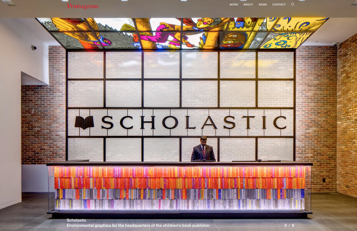
Pentagram is one of many big design studios that offer internships

A placement with a good design studio or at an in-house department can offer invaluable experience that you will draw on throughout your design career. You'll become seasoned in how design organisations are run; have a better understanding about client requests and how workload works. 

With luck (and bear in mind you need to make most of your own luck), you'll get to show your skills and commitment to the company and turn your internship into a full-time job, gain some skills and start your own network.

06. Nurture a network of peers

Two women shaking hands

In the design world, peers should be seen not as rivals, but as a support network

We often perceive our peers as competition instead of supporters or collaborators; but in the design world, it’s the opposite. Here, it really does pay to actively nurture a network of peers. For instance, the project that someone passes on due to a busy schedule or a short budget might be a project that is a good fit for you – and a great piece to add to your portfolio that eventually opens doors to bigger opportunities and new ventures.

07. Contact your heroes

Envelopes stuffed into a mailbox

Writing to your heroes can lead to unexpected opportunities

We all like getting notes from admirers: it lifts the spirits and strengths us as an industry. So why not let your design heroes know that you respect them and their work? 

Making contact with people who you admire can lead to many opportunities. You may even be just what they are looking for at that time. Of course, that won't always happen, so don't get discouraged if the phone doesn't ring immediately. It's always good to send a follow-up material showing your newest work; this keeps recipients interested and reminded of your availability.

08. Create an online presence

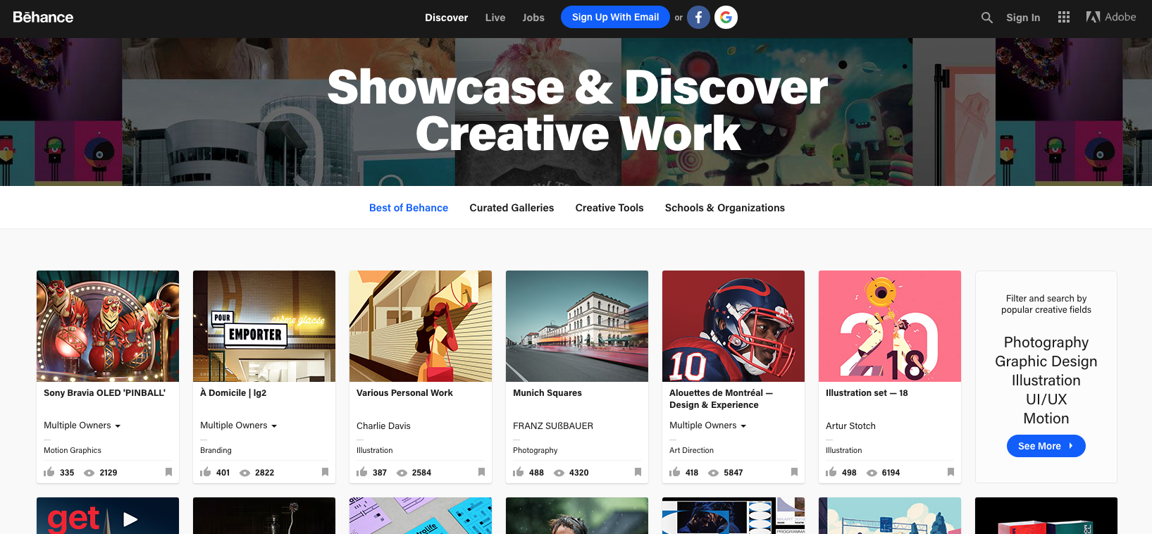
Behance offers an easy way to showcase your work online

An online platform to express yourself – and maintain a constant dialogue with other people interested in you work – is a must. And we're not just talking about a Twitter account or Facebook page. Prospective employers will expect you to have either your own website or, at a minimum, to use an online portfolio service like Behance.

09. Submit work to awards schemes 

D&AD pencils

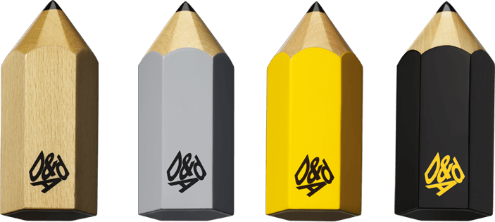
D&AD runs the best known design awards, but there are many other contests to enter too 

Having some accolades under your belt will certainly help you build a reputation and get under the radar of art directors and editors. You might not be D&AD Pencil-level yet, but there are plenty of other awards schemes to try your luck at. It's the kind of thing that might swing the balance in your favour when applying for a job or pitching for work.

10. Start a side project

Creative Market homepage

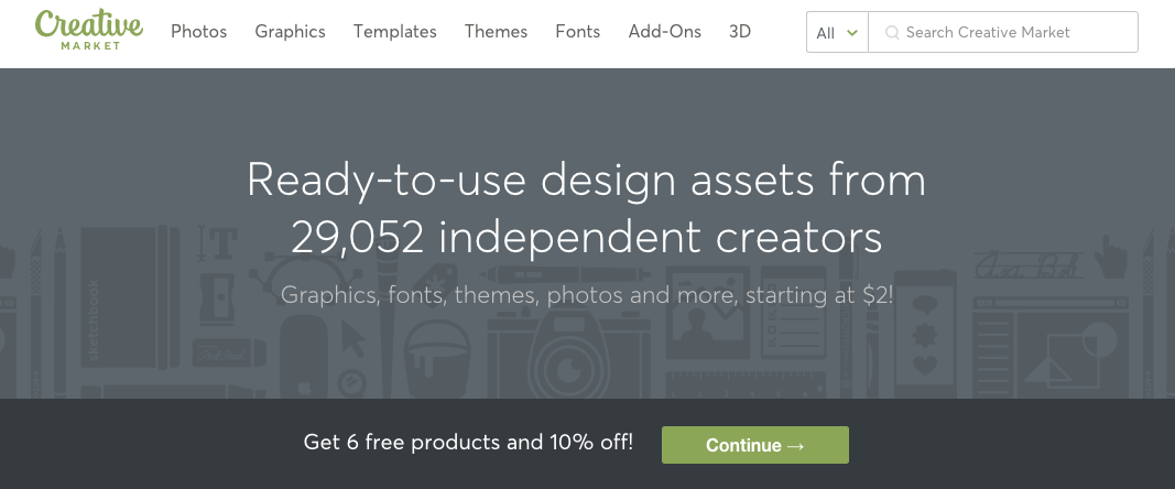
Many designers create their own assets on the side and sell them via sites like Creative Market

If no doors are yet opening, then make your own projects. These could be ebooks, postcards, great pack of free icons, CMS themes, anything you can think off to get you started. 

Doing things on your own is risky but worthwhile. There is certainly merit in creating your own opportunities. The tools to connect with friends, colleagues and like-minded people are available; use them to freely explore your creativity and skills. Today's online culture is changing how the industry operates, so get on board and make it work for you.

11. Join design organisations

AIGA homepage

Getting involved in an organisation like AIGA can help boost your career

Take advantage of the discounts you get while still a student to join design organisations such as AIGA. The benefits of interacting with like-minded people and networking are extremely valuable. 

Participating in design organisations will provide a rich understanding of the field, help you figure out who's who in our industry, and give you the chance to speak to inspiring people. Soak up all the possible knowledge and advice on offer to get noticed and respected by colleagues.

12. Be nice, be bold, be humble

Question mark

Asking polite questions and creating good relationships is key

In the graphic design world, human connections are vital to growth. So being genuinely friendly and interested will absolutely help push forward your career. Quite simply, building relationships and communication is at the core of our profession, so you can't shy away from it.

The secrets of great client relationships
13. Keep going!

Determination is key to success as a graphic designer

One final piece of advice: keep moving forward. Keep up your task of calling, emailing or whatever you do on a constant basis. Don't take rejection personally and discard envy. A rejection today could land you a job tomorrow or a new client further on.

Related articles:

The best laptops for graphic designHow to get into art collegeHow to be a creative director