Creatives stand with the black community in the fight against racism

Original Source: http://feedproxy.google.com/~r/CreativeBloq/~3/P_1EolsMzBg/black-lives-matter-creative-community

As protests in the US continue over the brutal killing of George Floyd by Minneapolis police officers, creatives across the globe are showing solidarity for the Black Lives Matter movement. While some highlight the cause through moving tributes to Floyd, others are harnessing their positions to make positive moves to amplify black people in the creative industries.

In this article, we have examples of both – but must emphasise that this is a starting point. Our commitment to cultivate change will ensure we continue to amplify black voices to help make Creative Bloq and the creative industry as a whole a more inclusive space for black communities. We all need to triple our efforts to support black creatives, starting now. 

Please feel free to get in touch with any suggestions or relevant news – we plan to keep this page regularly updated. Let's start with a list of some very worthy causes that are working right now in this fight.

Where you can donate

Official George Floyd Memorial FundBlack Lives MatterMinnesota Freedom FundShow racism the red card (UK)Resourcing racial justice (UK)
Black Lives Matter: Portfolio reviews

A number of artists and designers have taken to social media to offer support to black artists in the form of portfolio reviews. 

Black Lives Matter: George Floyd tributes

Below are some examples of artists across the world who have responded to the death of George Floyd, producing work in support of Black Lives Matter.


Kinetic Typography with Three.js

Original Source: http://feedproxy.google.com/~r/tympanus/~3/2TbBWbmkE3E/

Kinetic Typography may sound complicated but it’s just the elegant way to say “moving text” and, more specifically, to combine motion with text to create animations.

Imagine text on top of a 3D object, now could you see it moving along the object’s shape? Nice! That’s exactly what we’ll do in this article ? we’ll learn how to move text on a mesh using Three.js and three-bmfont-text.

We’re going to skip a lot of basics, so to get the most from this article we recommend you have some basic knowledge about Three.js, GLSL shaders, and three-bmfont-text.

Basis

The main idea for all these demos is to have a texture with text, use it on a mesh and play with it inside shaders. The simplest way of doing it is to have an image with text and then use it as a texture. But it can be a pain to figure out the correct size to try to display crisp text on the mesh, and later to change whatever text is in the image.

To avoid all these issues, we can generate that texture using code! We create a Render Target (RT) where we can have a scene that has text rendered with three-bmfont-text, and then use it as the texture of a mesh. This way we have more freedom to move, change, or color text. We’ll be taking this route following the next steps:

Set up a RT with the textCreate a mesh and add the RT textureChange the texture inside the fragment shader

To begin, we’ll run everything after the font file and atlas are loaded and ready to be used with three-bmfont-text. We won’t be going over this since I explained it in one of my previous articles.

The structure goes like this:

init() {
// Create geometry of packed glyphs
loadFont(fontFile, (err, font) => {
this.fontGeometry = createGeometry({
font,
text: “ENDLESS”
});

// Load texture containing font glyphs
this.loader = new THREE.TextureLoader();
this.loader.load(fontAtlas, texture => {
this.fontMaterial = new THREE.RawShaderMaterial(
MSDFShader({
map: texture,
side: THREE.DoubleSide,
transparent: true,
negate: false,
color: 0xffffff
})
);

// Methods are called here
});
});
}

Now take a deep breath, grab your tea or coffee, chill, and let’s get started.

Render Target

A Render Target is a texture you can render to. Think of it as a canvas where you can draw whatever is inside and place it wherever you want. Having this flexibility makes the texture dynamic, so we can later add, change, or remove stuff in it.

Let’s set a RT along with a camera and a scene where we’ll place the text.

createRenderTarget() {
// Render Target setup
this.rt = new THREE.WebGLRenderTarget(
window.innerWidth,
window.innerHeight
);

this.rtCamera = new THREE.PerspectiveCamera(45, 1, 0.1, 1000);
this.rtCamera.position.z = 2.5;

this.rtScene = new THREE.Scene();
this.rtScene.background = new THREE.Color(“#000000”);
}

Once we have the RT scene, let’s use the font geometry and material previously created to make the text mesh.

createRenderTarget() {
// Render Target setup
this.rt = new THREE.WebGLRenderTarget(
window.innerWidth,
window.innerHeight
);

this.rtCamera = new THREE.PerspectiveCamera(45, 1, 0.1, 1000);
this.rtCamera.position.z = 2.5;

this.rtScene = new THREE.Scene();
this.rtScene.background = new THREE.Color(“#000000”);

// Create text with font geometry and material
this.text = new THREE.Mesh(this.fontGeometry, this.fontMaterial);

// Adjust text dimensions
this.text.position.set(-0.965, -0.275, 0);
this.text.rotation.set(Math.PI, 0, 0);
this.text.scale.set(0.008, 0.02, 1);

// Add text to RT scene
this.rtScene.add(this.text);

this.scene.add(this.text); // Add to main scene
}

Note that for now, we added the text to the main scene to render it on the screen.

Cool! Let’s make it more interesting and “paste” the scene over a shape next.

Mesh and render texture

For simplicity, we’ll first use as shape a BoxGeometry together with ShaderMaterial to pass custom shaders, time and the render texture uniforms.

createMesh() {
this.geometry = new THREE.BoxGeometry(1, 1, 1);

this.material = new THREE.ShaderMaterial({
vertexShader,
fragmentShader,
uniforms: {
uTime: { value: 0 },
uTexture: { value: this.rt.texture }
}
});

this.mesh = new THREE.Mesh(this.geometry, this.material);

this.scene.add(this.mesh);
}

The vertex shader won’t be doing anything interesting this time; we’ll skip it and focus on the fragment instead, which is showing the colors of the RT texture. It’s inverted for now (1. – texture) to stand out from the background.

varying vec2 vUv;

uniform sampler2D uTexture;

void main() {
vec3 texture = texture2D(uTexture, vUv).rgb;

gl_FragColor = vec4(1. – texture, 1.);
}

Normally, we would just render the main scene directly, but with a RT we have to first render to it before rendering to the screen.

render() {

// Draw Render Target
this.renderer.setRenderTarget(this.rt);
this.renderer.render(this.rtScene, this.rtCamera);
this.renderer.setRenderTarget(null);
this.renderer.render(this.scene, this.camera);
}

And now a box should appear on the screen where each face has the text on it:

Looks alright so far, but what if we could cover more text around the shape?

Repeating the texture

GLSL’s built-in function fract comes handy to make repetition. We’ll use it to repeat the texture coordinates when multiplying them by a scalar so it wraps between 0 and 1.

varying vec2 vUv;

uniform sampler2D uTexture;

void main() {
vec2 repeat = vec2(2., 6.); // 2 columns, 6 rows
vec2 uv = fract(vUv * repeat);

vec3 texture = texture2D(uTexture, uv).rgb;
texture *= vec3(uv.x, uv.y, 1.);

gl_FragColor = vec4(texture, 1.);
}

Notice that we also multiply the texture by the uv components to visualize the modified texture coordinates.

We’re getting there, right? The text should also follow the object’s shape; here’s where time comes in. We need to add it to the texture coordinates, in this case to the x component so it moves horizontally.

varying vec2 vUv;

uniform sampler2D uTexture;
uniform float uTime;

void main() {
float time = uTime * 0.75;
vec2 repeat = vec2(2., 6.);
vec2 uv = fract(vUv * repeat + vec2(-time, 0.));

vec3 texture = texture2D(uTexture, uv).rgb;

gl_FragColor = vec4(texture, 1.);
}

And for a sweet touch, let’s blend the color with the the background.

This is basically the process! RT texture, repetition, and motion. Now that we’ve looked at the mesh for so long, using a BoxGeometry gets kind of boring, doesn’t it? Let’s change it in the next final bonus chapter.

Changing the geometry

As a kid, I loved playing and twisting these tangle toys, perhaps that’s the reason why I find satisfaction with knots and twisted shapes? Let this be an excuse to work with a torus knot geometry.

For the sake of rendering smooth text we’ll exaggerate the amount of tubular segments the knot has.

createMesh() {
this.geometry = new THREE.TorusKnotGeometry(9, 3, 768, 3, 4, 3);


}

Inside the fragment shader, we’ll repeat any number of columns we want just to make sure to leave the same number of rows as the number of radial segments, which is 3.

varying vec2 vUv;

uniform sampler2D uTexture;
uniform float uTime;

void main() {
vec2 repeat = vec2(12., 3.); // 12 columns, 3 rows
vec2 uv = fract(vUv * repeat);

vec3 texture = texture2D(uTexture, uv).rgb;
texture *= vec3(uv.x, uv.y, 1.);

gl_FragColor = vec4(texture, 1.);
}

And here’s our tangled torus knot:

Before adding time to the texture coordinates, I think we can make a fake shadow to give a better sense of depth. For that we’ll need to pass the position coordinates from the vertex shader using a varying.

varying vec2 vUv;
varying vec3 vPos;

void main() {
vUv = uv;
vPos = position;

gl_Position = projectionMatrix * modelViewMatrix * vec4(position, 1.);
}

We now can use the z-coordinates and clamp them between 0 and 1, so the regions of the mesh farther the screen get darker (towards 0), and the closest lighter (towards 1).

varying vec3 vPos;

void main() {
float shadow = clamp(vPos.z / 5., 0., 1.);

gl_FragColor = vec4(vec3(shadow), 1.);
}

See? It sort of looks like white bone:

Now the final step! Multiply the shadow to blend it with the texture, and add time again.

varying vec2 vUv;
varying vec3 vPos;

uniform sampler2D uTexture;
uniform float uTime;

void main() {
float time = uTime * 0.5;
vec2 repeat = -vec2(12., 3.);
vec2 uv = fract(vUv * repeat – vec2(time, 0.));

vec3 texture = texture2D(uTexture, uv).rgb;

float shadow = clamp(vPos.z / 5., 0., 1.);

gl_FragColor = vec4(texture * shadow, 1.);
}

Fresh out of the oven! Look at this sexy torus coming out of the darkness. Internet high five!

We’ve just scratched the surface making repeated tiles of text, but there are many ways to add fun to the mixture. Could you use trigonometry or noise functions? Play with color? Text position? Or even better, do something with the vertex shader. The sky’s the limit! I encourage you to explore this and have fun with it.

Oh! And don’t forget to share it with me on Twitter. If you got any questions or suggestions, let me know.

Hope you learned something new. Till next time!

References and Credits

Three.jsThe Book of Shadersthree-bmfont-textAll Your Html S3E20

The post Kinetic Typography with Three.js appeared first on Codrops.

Click! Here: Meet Our New Smashing Book

Original Source: https://www.smashingmagazine.com/2020/06/encouraging-clicks-book-release/

Click! Here: Meet Our New Smashing Book

Click! Here: Meet Our New Smashing Book

Vitaly Friedman

2020-06-02T12:00:00+00:00
2020-06-02T19:36:16+00:00

You’ve been there before, haven’t you? Perhaps your manager insists on using a dark pattern to trick customers into buying. Or an A/B test has just shown that an annoying pop-up does increase sign-ups. Or maybe you always end up firefighting negative reviews and angry customer inquiries and your calls to action don’t perform well.

Whether we are designers, marketers, entrepreneurs, or product owners, we are all in the same boat. We want to give users a good experience, but we also need them to take action. More often than not, these things are considered to be mutually exclusive, but they don’t have to be.

That’s why we’ve teamed up with Paul Boag to work on Click! How To Encourage Clicks Without Shady Tricks, a detailed guide on how to increase conversion and boost business KPIs without alienating customers along the way. A book that shows how to increase clicks, build trust, loyalty and drive leads while keeping users respected and happy at the same time. Jump to table of contents and download a free PDF excerpt (17.3 MB).

Print + eBook

eBook

Print + eBook

{
“sku”: “click”,
“type”: “Book”,
“price”: “39.00”,

“prices”: [{
“amount”: “39.00”,
“currency”: “USD”,
“items”: [
{“amount”: “29.00”, “type”: “Book”},
{“amount”: “10.00”, “type”: “E-Book”}
]
}, {
“amount”: “39.00”,
“currency”: “EUR”,
“items”: [
{“amount”: “29.00”, “type”: “Book”},
{“amount”: “10.00”, “type”: “E-Book”}
]
}
]
}

$
39.00

Get Print + eBook

Quality hardcover. Free worldwide shipping. 100 days money-back-guarantee.

eBook

{
“sku”: “click”,
“type”: “E-Book”,
“price”: “19.00”,

“prices”: [{
“amount”: “19.00”,
“currency”: “USD”
}, {
“amount”: “19.00”,
“currency”: “EUR”
}
]
}

$
19.00

Free!

Get the eBook

DRM-free, of course.

ePUB, Kindle, PDF.
Included with Smashing Membership.

Get the eBook

Download PDF, ePUB, Kindle.
Thanks for being smashing! ❤️

About The Book

There is no shortage of books on marketing and user experience. But when it comes to bridging the gap between the two, many of us struggle to find the right balance. As businesses, we need to meet out targets — be it with install app prompts, newsletter overlays, or infamous chat widgets. But as designers, we don’t want to end up with a frustrating user experience. We really need both, and we need a strategy to get there.

That’s why we’ve written Click! — a guide with practical strategies for improving conversion and retention while building user’s loyalty and trust. The book explores how to effectively address user concerns, overcome skepticism, and encourage users to act — helping you meet your business targets and KPIs along the way. Whether you are a designer, marketer, entrepreneur or product owner, this book will surely help you avoid hidden costs and drive sales.

Here’s a short video message from Paul Boag, the author of Click!, explaining why he’s written the book and what it’s all about:

By reading this book, you will learn to:

Measure and boost business KPIs effectively,
Build a user-centric sales funnel,
Reduce risks and address objections,
Build trust and overcome skepticism,
Persuade people without alienating them,
Establish a strategy for higher conversion.
Psst! A little surprise shipped with the first 500 books.
Download a free PDF sample (17.3 MB) and get the book right away.

The book features interface design examples that take ethical design principles into account. Large preview.

The cover and chapter illustrations carefully designed by Veerle Pieters.

Table Of Contents

The book is split into 11 chapters. We’ll start by exploring the psychology of decision making and how to measure conversion. Then we’ll build a user-centric sales funnel and address user concerns effectively. Finally, we’ll explore how to encourage users to act without alienating them.

1. Avoid the Dangers of Persuasion

+

Paul begins your journey with a rock-solid business case you can take to management or clients to avoid the more manipulative techniques you see online.

You will learn:

How online choice has empowered the consumer.The hidden marketing costs of manipulation.The dangers of buyers remorse.

2. Measure Conversion Effectively

+

You cannot improve what you are not measuring. That is why, in Paul’s second chapter, he explores how to measure your conversion rate effectively. Only then can you start to improve it.

You will learn:

The dangers of having no metrics or bad ones.How to establish your key performance indicators.What to track and how to track it.

3. Get to Know Your Users

+

If you want to persuade people to act, you need to understand how they think and what they want. To do that you need to carry out at least some user research. In this chapter, Paul introduces you to easy to use techniques that will get the job done with the minimum of investment.

You will learn:

What exactly you need to understand about your audience.How to consolidate all you know about your users.How to carry out lightweight user research.

4. Build a User-Centric Sales Funnel

+

The decision to act doesn’t take place in isolation and is part of the broader user journey. In this chapter, Paul explains how to understand that journey and build a sales funnel that supports the user’s experience, rather than seeking to interrupt it.

You will learn:

What a sales funnel is and how it helps.How to map your customer’s journey.How to build a sales funnel around the user’s journey.

5. Address Objections and Reduce Risks

+

This chapter explores one of the most important aspects of encouraging users to act — addressing their concerns. We’ll see how to identify user’s objections and then overcome them, so reducing the risk of taking action in the minds of users.

You will learn:

How to identify the concerns your audience has about taking action.How to address common concerns.A process for handling any objection users might have.

6. Establish Trust and Overcome Scepticism

+

People will not hand over money or personal information if they do not trust you. To make matters worse users have learned to be sceptical online. In this chapter, you will learn how to build a connection with your audience and help them learn to trust you.

You will learn:

Why trust is essential for improving conversion.
How to build trust through openness and empathy.
The role of social proof and connecting consumers in building trust.

7. Defeat Cognitive Overload

+

In this chapter, you will discover how to reach an audience that is distracted and time-poor. You will learn the importance of not making users think and learn valuable techniques for making acting with you an effortless experience.

You will learn:

What cognitive load is and why it is so dangerous for your conversion rate.Methods for reducing the cognitive load of your websites.Techniques for keeping any interface simple.

8. Overcoming the Problem With Perception

+

Are your users taking away the right message from your website? Do they understand what you offer or that it is relevant to them? It is easy to leave a website without acting because you had the wrong impression. This chapter shows you how to address this genuine danger.

You will learn:

How to position our products and services in a positive light.The role that mental models play in conversion.Techniques for ensuring your content reflects the user’s mindset.

9. Never Stop Testing and Iterating

+

While Click! is packed with great tips and techniques, the real key to success is a programme of ongoing testing and iteration. In this chapter, Paul shows you how to put in place a methodology that will keep your conversion rate growing for years to come.

You will learn:

Techniques for ensuring you are working on the right projects to improve conversion.Ways to test how compelling a design concept is.How to integrate testing into every aspect of your development cycle.

10. Address the Whole Experience

+

While marketers and UX designers have an enormous impact on conversion, they are only a part of the story. That is why in this chapter, we explore how to address the whole user experience and start encouraging colleagues to help improve the conversion rate too.

You will learn:

The role of your developer in improving your conversion rate.How to use other digital channels to improve your website conversion rate.How broader organisational changes can help boost revenue and online leads.

11. Where to Go From Here

+

With a book packed with advice, it can be overwhelming. The book concludes with some practical next steps that you can take, wherever you are on your journey to improve conversion.

You will learn:

Quick wins that can get you started today.Budget testing techniques you can implement immediately.A more ambitious and ongoing approach to optimisation.

Per Axbom“This is a great book on how to practically, and ethically, optimise website conversion rates. Before, I was roughly aware of what CRO was, but now I feel confident to start implementing these techniques in projects. As you would expect, Paul explains all of the concepts in an easy-to-follow and friendly manner.”

— Dave Smyth, Agency Owner

Per Axbom“I picked up a super simple testing idea, and saw a 42% lift in conversion rate. It was surprising to me, so I ran it again to significance with the same result. That equates to about 2.5 million USD/year in revenue at no additional cost. So I’d say I got my money’s worth!”

— Brandon Austin Kinney, Director of Lead Generation

304 pages. The eBook is available (PDF, ePUB, Amazon Kindle) and printed copies are shipping now. For designers, marketers, entrepreneurs and product owners. Written by Paul Boag. Designed by Veerle Pieters.

Print + eBook

eBook

Print + eBook

{
“sku”: “click”,
“type”: “Book”,
“price”: “39.00”,

“prices”: [{
“amount”: “39.00”,
“currency”: “USD”,
“items”: [
{“amount”: “29.00”, “type”: “Book”},
{“amount”: “10.00”, “type”: “E-Book”}
]
}, {
“amount”: “39.00”,
“currency”: “EUR”,
“items”: [
{“amount”: “29.00”, “type”: “Book”},
{“amount”: “10.00”, “type”: “E-Book”}
]
}
]
}

$
39.00

Get Print + eBook

Quality hardcover. Free worldwide shipping. 100 days money-back-guarantee.

eBook

{
“sku”: “click”,
“type”: “E-Book”,
“price”: “19.00”,

“prices”: [{
“amount”: “19.00”,
“currency”: “USD”
}, {
“amount”: “19.00”,
“currency”: “EUR”
}
]
}

$
19.00

Free!

Get the eBook

DRM-free, of course.

ePUB, Kindle, PDF.
Included with Smashing Membership.

Get the eBook

Download PDF, ePUB, Kindle.
Thanks for being smashing! ❤️

<!–

About The Author

Paul is a leader in conversion rate optimisation and user experience design thinking. He has over 25 years experience working with clients such as Doctors Without Borders and PUMA. He is the author of six books and a well respected presenter.

null

–>

About the Author

Trine FalbePaul Boag is a leader in conversion rate optimisation and user experience design thinking. He has over 25 years experience working with clients such as Doctors Without Borders and PUMA. He is the author of six books and a well respected presenter.

Technical Details

ISBN: 978-3-945749-83-8 (print)
Quality hardcover, stitched binding, ribbon page marker.
Free worldwide airmail shipping from Germany. (Check your delivery times). Due to Covid-19 and import restrictions, there could be some delays. But you can start reading the eBook right away.
eBook is available as PDF, ePUB, and Amazon Kindle.
Get the book right away.


A quality hardcover with a bookmark. Designed with love by Veerle Pieters. Photo by Marc Thiele.


A quality hardcover with a bookmark. Designed with love by Veerle Pieters. Photo by Marc Thiele.

Community Matters ❤️

With Click!, we’ve tried to create a very focused handbook with pragmatic solutions to help everyone create a better digital product that doesn’t get abandoned due to the sheer number of pop-ups, install prompt and newsletter box overlays.

There is quite a bit of work to do on the web, but our hope is that with this book, you will be equipped with enough techniques to increase conversion and the number of happy customers.

Producing a book takes quite a bit of time, and we couldn’t pull it off without the support of our wonderful community. A huge shout-out to Smashing Members for their ongoing support in our adventures. As a result, the eBook is and always will be free for Smashing Members. Plus, Members get a friendly discount when purchasing their printed copy.

Stay smashing, and thank you for your ongoing support, everyone!

The Ethical Design Handbook

Print + eBook

eBook

Print + eBook

{
“sku”: “click”,
“type”: “Book”,
“price”: “39.00”,

“prices”: [{
“amount”: “39.00”,
“currency”: “USD”,
“items”: [
{“amount”: “29.00”, “type”: “Book”},
{“amount”: “10.00”, “type”: “E-Book”}
]
}, {
“amount”: “39.00”,
“currency”: “EUR”,
“items”: [
{“amount”: “29.00”, “type”: “Book”},
{“amount”: “10.00”, “type”: “E-Book”}
]
}
]
}

$
39.00

Get Print + eBook

Quality hardcover. Free worldwide shipping. 100 days money-back-guarantee.

eBook

{
“sku”: “click”,
“type”: “E-Book”,
“price”: “19.00”,

“prices”: [{
“amount”: “19.00”,
“currency”: “USD”
}, {
“amount”: “19.00”,
“currency”: “EUR”
}
]
}

$
19.00

Free!

Get the eBook

DRM-free, of course.

ePUB, Kindle, PDF.
Included with Smashing Membership.

Get the eBook

Download PDF, ePUB, Kindle.
Thanks for being smashing! ❤️

More Smashing Books

Promoting best practices and providing you with practical tips to master your daily coding and design challenges has always been (and will be) at the core of everything we do at Smashing.

In the past few years, we were very lucky to have worked together with some talented, caring people from the web community to publish their wealth of experience as printed books that stand the test of time. Trine, Alla and Adam are some of these people. Have you checked out their books already?

Ethical Design HandbookEthical Design Handbook

Add to cart $39

Design SystemsDesign Systems

Add to cart $39

Form Design PatternsForm Design Patterns

Add to cart $39

Brands show support for Black Lives Matter

Original Source: http://feedproxy.google.com/~r/CreativeBloq/~3/AMfFq1eEBxI/brands-black-lives-matter

As anti-racism protests continue across the world in the wake of the death of George Floyd, several brands have spoken out to show support for the Black Lives Matter movement over the last few days.

Many brands are delivering strong statements right now (and it will be interesting to see if they are followed by tangible action). In a minimal, text-based ad, Nike inverted its famous 'Just do it' slogan, urging its followers: 'For once, don't do it. Don't turn your back on racism." Sportswear brand Adidas even put its rivalry with Nike aside to share the message (below). 

Elsewhere, Twitter changed its profile picture to a black version of its logo, as well as opting for a plain-black header photo (below). This echoes the #blackouttuesday movement sweeping across Instagram today, in which countless users have posted a plain-black square in support of Black Lives Matter.

Ice cream brand Ben and Jerry's took to Twitter two days after George Floyd's death, sharing a four year-old news post covering the unrest in Ferguson after the death of Michael Brown, in which the brand expressed its support for the Black Lives Matter movement. 

While it's important for brands to show solidarity, it can be a challenge to avoid looking opportunistic or even tone-deaf – past actions matter, too. Less warmly received was L'Oreal Paris's effort, which saw it proclaim: "Speaking out is worth it". British model and activist Munroe Bergdorf was quick to condemn the post (below), having been dropped from a campaign by the brand after speaking out on racism in 2017.

A global audience is quick to speak out when they judge that a brand is failing to deliver an authentic message, as we saw with McDonald's social distancing logo this March. We have seen before that it can be a challenging tone to strike – take a look at these other examples of big brands trying to be woke and failing – while others get it right.

Read more:

Pop culture creatures become scientific drawings (and we want them all)Lego's comical guide to working from home will brighten your dayCartoons for key workers are a heartwarming delight

28 Chrome Extensions for Better Productivity

Original Source: https://www.hongkiat.com/blog/productivity-chrome-extensions/

There are a number of productivity apps for mobiles and a lot of productivity tools for PCs. But did you know that there are some really amazing Chrome extensions that can take your productivity to…

Visit hongkiat.com for full content.

30 Cool Street Art Around The World

Original Source: https://www.hongkiat.com/blog/cool-street-art/

Art has been changing its appeal to the man on the street. You no longer have to visit museums and art galleries to get a taste of contemporary art. You can easily find wall paintings, graffiti and…

Visit hongkiat.com for full content.

UI Interactions & Animations Roundup #7

Original Source: http://feedproxy.google.com/~r/tympanus/~3/Y0n9HyYXXJw/

A couple of weeks have past and a fresh collection of inspirational UI shots is waiting for you! This time the roundup comes with lots of sophistication in movements and more subtle distortion effects on images and typographic elements. Animated 3D objects give a touch of drama to interfaces; you’ll also see some of those.

Please enjoy this special collection and hopefully it will get your creative juices flowing!

M. Editorial Website Animation

by Zhenya Rynzhuk

Hestia

by Hrvoje Grubisic

The Secret Project — 001

by Aristide Benoist

Format Ikea planner inner page interaction

by Taras Migulko

Otherworldly the Blob in Action

by Efi Kabak

Furniture Ecommerce Website

by tubik

Nº1

by Slava Kornilov

Millie N. Portfolio — Website

by Bastien Allard

Francesco Interactions

by Matthew Hall

GlobeKit Website Refresh – FAQs Transition

by Nainoa Shizuru

Real Estate Landing Page

by Adam Roller

MIX

by Slava Kornilov

M. Editorial Website Loading Animation

by Zhenya Rynzhuk

Havana – Animation

by Tran Mau Tri Tam

Fashion Magazine

by Zinat Farahani

2º Reading

by Dimest

Folio No.01

by Ruslan Siiz

MOBIUS RIING C4D ANIMATION

by 秦能补拙的大表哥

New digs at FishermenLabs.com!

by Fishermen Labs

Reject 001 – A Landing Page

by Quintin Lodge

The post UI Interactions & Animations Roundup #7 appeared first on Codrops.

React Error Handling And Reporting With Error Boundary And Sentry

Original Source: https://www.smashingmagazine.com/2020/06/react-error-handling-reporting-error-boundary-sentry/

React Error Handling And Reporting With Error Boundary And Sentry

React Error Handling And Reporting With Error Boundary And Sentry

Chidi Orji

2020-06-01T12:00:00+00:00
2020-06-01T15:38:02+00:00

In this article, we’ll look at error boundaries in React. We’ll learn what they are and how to use them to deliver a better user experience, even when something breaks in our app. We’ll also learn how to integrate with Sentry for realtime error monitoring.

This tutorial is aimed at React developers of every level who wants to start using error boundaries in their react apps.

The only prerequisite is that you have some familiarity with React class components.

I will be using Yarn as my package manager for this project. You’ll find installation instructions for your specific operating system over here.

What Is An Error Boundary And Why Do We Need It?

A picture, they say, is worth a thousand words. For that reason, I’d like to talk about error boundaries using — you guessed it — pictures.

The illustration below shows the component tree of a simple React app. It has a header, a sidebar on the left, and the main component, all of which is wrapped by a root <App /> component.

An example react component tree

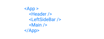
Component tree. (Large preview)

On rendering these components, we arrive at something that looks like the picture below.

Rendered view of previous component tree

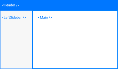
App render. (Large preview)

In an ideal world, we would expect to see the app rendered this way every single time. But, unfortunately, we live in a non-ideal world. Problems, (bugs), can surface in the frontend, backend, developer’s end, and a thousand other ends. The problem could happen in either of our three components above. When this happens, our beautifully crafted app comes crashing down like a house of cards.

React encourages thinking in terms of components. Composing multiple smaller components is better than having a single giant component. Working this way helps us think about our app in simple units. But aside from that won’t it be nice if we could contain any errors that might happen in any of the components? Why should a failure in a single component bring down the whole house?

In the early days of React, this was very much the case. And worse, sometimes you couldn’t even figure out what the problem was. The React repository on Github has some of such notable errors here, here, and here.

React 16 came to the rescue with the concept of an “error boundary”. The idea is simple. Erect a fence around a component to keep any fire in that component from getting out.

The illustration below shows a component tree with an <ErrorBoundary /> component wrapping the <Main /> component. Note that we could certainly wrap the other components in an error boundary if we wanted. We could even wrap the <App /> component in an error boundary.

Component tree with error boundary: An example React component tree with an error boundary component.

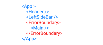
Component tree with error boundary. (Large preview)

The red outline in the below illustration represents the error boundary when the app is rendered.

Rendered view of previous component tree, with error boundary

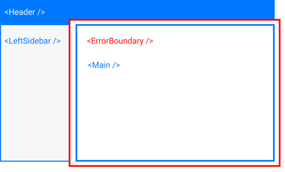
App rendered with error boundary. (Large preview)

As we discussed earlier, this red line keeps any errors that occur in the <Main /> component from spilling out and crashing both the <Header /> and <LeftSideBar /> components. This is why we need an error boundary.

Now that we have a conceptual understanding of an error boundary, let’s now get into the technical aspects.

What Makes A Component An Error Boundary?

As we can see from our component tree, the error boundary itself is a React component. According to the docs,

A class component becomes an error boundary if it defines either (or both) of the lifecycle methods static getDerivedStateFromError() or componentDidCatch().

There are two things to note here. Firstly, only a class component can be used as an error boundary. Even if you’re writing all your components as function, you still have to make use of a class component if you want to have an error boundary. Secondly, it must define either (or both) of static getDerivedStateFromError() or componentDidCatch(). Which one(s) you define depends on what you want to accomplish with your error boundary.

Functions Of An Error Boundary

An error boundary isn’t some dumb wall whose sole purpose in life is to keep a fire in. Error boundaries do actual work. For starters, they catch javascript errors. They can also log those errors, and display a fallback UI. Let’s go over each of these functions one after the other.

Catch JavaScript Errors

When an error is thrown inside a component, the error boundary is the first line of defense. In our last illustration, if an error occurs while rendering the <Main /> component, the error boundary catches this error and prevents it from spreading outwards.

Logs Those Errors

This is entirely optional. You could catch the error without logging it. It is up to you. You can do whatever you want with the errors thrown. Log them, save them, send them somewhere, show them to your users (you really don’t want to do this). It’s up to you.

But to get access to the errors you have to define the componentDidCatch() lifecycle method.

Render A Fallback UI

This, like logging the errors, is entirely optional. But imagine you had some important guests, and the power supply was to go out. I’m sure you don’t want your guests groping in the dark, so you invent a technology to light up the candles instantaneously. Magical, hmm. Well, your users are important guests, and you want to afford them the best experience in all situations.
You can render a fallback UI with static getDerivedStateFromError() after an error has been thrown.

It is important to note that error boundaries do not catch errors for the following situations:

Errors inside event handlers.
Errors in asynchronous code (e.g. setTimeout or requestAnimationFrame callbacks).
Errors that happen when you’re doing some server-side rendering.
Errors are thrown in the error boundary itself (rather than its children). You could have another error boundary catch this error, though.

Working With Error Boundaries

Let’s now dive into our code editor. To follow along, you need to clone the repo.
After cloning the repo, check out the 01-initial-setup branch. Once that is done, run the following commands to start the app.

# install project dependencies
yarn install

# start the server
yarn start

When started, the app renders to what we have in the picture below.

The starter app running in the browser

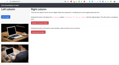
Browser view of starter app. (Large preview)

The app currently has a header and two columns. Clicking on Get images in the left column makes an API call to the URL https://picsum.photos/v2/list?page=0&limit=2 and displays two pictures. On the right column, we have some description texts and two buttons.

When we click the Replace string with object button, we’ll replace the text {"function":"I live to crash"}, which has been stringified, with the plain JavaScript object. This will trigger an error as React does not render plain JavaScript objects. This will cause the whole page to crash and go blank. We’ll have to refresh the page to get back our view.

Try it for yourself.

Now refresh the page and click the Invoke event handler button. You’ll see an error screen popup, with a little X at the top right corner. Clicking on it removes the error screen and shows you the rendered page, without any need to refresh. In this case, React still knows what to display even though an error is thrown in the event handler. In a production environment, this error screen won’t show up at all and the page will remain intact. You can only see that something has gone wrong if you look in the developer console.

A screen to alert us that an error has occurred in an event handler.

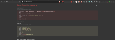
Event handler error alert. (Large preview)

Note: To run the app in production mode requires that you install serve globally. After installing the server, build the app, and start it with the below command.

# build the app for production
yarn build

# serve the app from the build folder
serve -s build

Having seen how React handles two types of errors, (rendering error, and event handler error), let’s now write an error boundary component.

Create a new ErrorBoundary.js file inside the /src folder and let’s build the error boundary component piece by piece.

import React, { Component } from ‘react’;
import PropTypes from ‘prop-types’;

export default class ErrorBoundary extends Component {
state = {
error: ”,
errorInfo: ”,
hasError: false,
};
static getDerivedStateFromError(error) {
return { hasError: true, error };
}
componentDidCatch(error, errorInfo) {
// eslint-disable-next-line no-console
console.log({ error, errorInfo });
this.setState({ errorInfo });
}
render() {
// next code block goes here
}
}
ErrorBoundary.propTypes = {
children: PropTypes.oneOfType([ PropTypes.object, PropTypes.array ]).isRequired,
};

We define both of the two lifecycle methods that make a component an error boundary. Whenever an error occurs inside the error boundary’s child component, both of our lifecycle methods are activated.

static getDerivedStateFromError() receives the error and updates the state variables, error and hasError.
componentDidCatch() receives the error, which represents the error that was thrown and errorInfo which is an object with a componentStack key containing information about which component threw the error. Here we logged the error and also update the state with the errorInfo. It’s totally up to you what you want to do with these two.

Then in the render method, we return this.props.children, which represents whatever component that this error boundary encloses.

Let’s add the final piece of code. Copy the following code and paste it inside the render() method.

const { hasError, errorInfo } = this.state;
if (hasError) {
return (
<div className=”card my-5″>
<div className=”card-header”>
<p>
There was an error in loading this page.{‘ ‘}
<span
style={{ cursor: ‘pointer’, color: ‘#0077FF’ }}
onClick={() => {
window.location.reload();
}}
>
Reload this page
</span>{‘ ‘}
</p>
</div>
<div className=”card-body”>
<details className=”error-details”>
<summary>Click for error details</summary>
{errorInfo && errorInfo.componentStack.toString()}
</details>
</div>
</div>
);
}

In the render() method, we check if hasError is true. If it is, then we render the <div className="card my-5"></div> div, which is our fallback UI. Here, we’re showing information about the error and an option to reload the page. However, in a production environment, it is not advised to show the error to the user. Some other message would be fine.

Let’s now make use of our ErrorBoundary component. Open up App.js, import ErrorBoundary and render ColumnRight inside it.

# import the error boundary
import ErrorBoundary from ‘./ErrorBoundary’;

# wrap the right column with the error boundary
<ErrorBoundary>
<ColumnRight />
</ErrorBoundary>

Now click on Replace string with object. This time, the right column crashes and the fallback UI is displayed. We’re showing a detailed report about where the error happened. We also see the error log in the developer console.

A view of an error boundary showing a fallback UI.

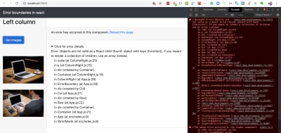
View of error boundary in action. (Large preview)

We can see that everything else remains in place. Click on Get images to confirm that it still works as expected.

At this point, I want to mention that with error boundaries, you can go as granular as you want. This means that you can use as many as necessary. You could even have multiple error boundaries in a single component.

With our current use of Error Boundary, clicking Replace string with object crashes the whole right column. Let’s see how we can improve on this.

Open up src/columns/ColumnRight.js, import ErrorBoundary and render the second <p> block inside it. This is the paragraph that crashes the <ColumnRight /> component.

# import the component
import ErrorBoundary from ‘../ErrorBoundary’;

# render the erring paragraph inside it.
<ErrorBoundary>
<p>
Clicking this button will replace the stringified object,{‘ ‘}
<code>{text}</code>, with the original object. This will result in a
rendering error.
</p>
</ErrorBoundary>

Now click on Replace string with object.

View of app with an improvement on the use of our error boundary.

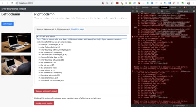
Improved error boundary usage. (Large preview)

This time, we still have most of the page intact. Only the second paragraph is replaced with our fallback UI.

Click around to make sure everything else is working.

If you’d like to check out my code at this point you should check out the 02-create-eb branch.

In case you’re wondering if this whole error boundary thing is cool, let me show you what I captured on Github a few days ago. Look at the red outline.

A view of an error message on Github, with something that looks like an error boundary.

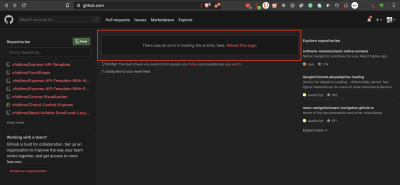
Error screen on Github. (Large preview)

I’m not certain about what is happening here, but it sure looks like an error boundary.

Error boundaries are cool, but we don’t want errors in the first place. So, we need to monitor errors as they occur so we can get a better idea of how to fix them. In this section, we’ll learn how Sentry can help us in that regard.

Integrating With Sentry

As I opened the Sentry homepage while writing this line, I was greeted by this message.

Software errors are inevitable. Chaos is not.
Sentry provides self-hosted and cloud-based error monitoring that helps all software teams discover, triage, and prioritize errors in real-time.

Sentry is a commercial error reporting service. There are many other companies that provide similar services. My choice of Sentry for this article is because it has a free developer plan that lets me log up to 5,000 events per month across all my projects (pricing docs). An event is a crash report (also known as an exception or error). For this tutorial, we will be making use of the free developer plan.

You can integrate Sentry with a lot of web frameworks. Let’s go over the steps to integrate it into our React project.

Visit the Sentry website and create an account or login if you already have one.
Click on Projects in the left navigation. Then, click on Create Project to start a new project.
Under Choose a platform, select React.
Under Set your default alert settings check Alert me on every new issue.
Give your project a name and click Create project. This will create the project and redirect you to the configuration page.

Let’s install the Sentry browser SDK.

# install Sentry
yarn add @sentry/browser

On the configuration page, copy the browser SDK initialization code and paste it into your index.js file.

import * as Sentry from ‘@Sentry/browser’;

# Initialize with Data Source Name (dsn)
Sentry.init({ dsn: ‘dsn-string’ });

And that is enough for Sentry to start sending error alerts. It says in the docs,

Note: On its own, @Sentry/browser will report any uncaught exceptions triggered from your application.

Click on Got it! Take me to the issue stream to proceed to the issues dashboard. Now return to your app in the browser and click on the red buttons to throw some error. You should get email alerts for each error (Sometimes the emails are delayed). Refresh your issues dashboard to see the errors.

Sentry issues dashboard showing list of error events.

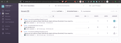
Sentry issues dashboard. (Large preview)

The Sentry dashboard provides a lot of information about the error it receives. You can see information such as a graph of the frequency of occurrence of each error event type. You can also assign each error to a team member. There’s a ton of information. Do take some time to explore them to see what is useful to you.

You can click on each issue to see more detailed information about the error event.

Now let’s use Sentry to report errors that are caught by our error boundary. Open ErrorBoundary.js and update the following pieces of code.

# import Sentry
import * as Sentry from ‘@sentry/browser’

# add eventId to state
state = {
error: ”,
eventId: ”, // add this to state
errorInfo: ”,
hasError: false,
};

# update componentDidCatch
componentDidCatch(error, errorInfo) {
// eslint-disable-next-line no-console
console.log({ error, errorInfo });
Sentry.withScope((scope) => {
scope.setExtras(errorInfo);
const eventId = Sentry.captureException(error);
this.setState({ eventId, errorInfo });
});
}

With this setup, Sentry sends all errors captured by our error boundary to our issue dashboard using the Sentry.captureException method.

Sentry also gives us a tool to collect user feedback. Let’s add the feedback button as part of our fallback UI inside our error boundary.

Open ErrorBoundary.js and add the feedback button just after the div with a className of card-body. You could place this button anywhere you like.

<div className=”card-body”>

</div>

# add the Sentry button
<button
className=”bg-primary text-light”
onClick={() =>
Sentry.showReportDialog({ eventId: this.state.eventId })
}
>
Report feedback
</button>

Now, whenever our fallback UI is rendered, the Report feedback button is displayed. Clicking on this button opens a dialog that the user can fill to provide us with feedback.

Sentry dialog with feedback form

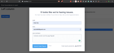
Sentry feedback form. (Large preview)

Go ahead and trigger an error, then, fill and submit the feedback form. Now go to your Sentry dashboard and click on User Feedback in the left navigation. You should see your reported feedback.

Sentry feedback showing list of user feedbacks.

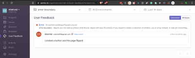
Sentry feedback dashboard. (Large preview)

Currently, we get alerts for every error, even those that happen during development. This tends to clog our issue stream. Let’s only report errors that happen in production.

On the left navigation click on Settings. Underneath the ORGANIZATION menu, click on Projects. In that list, click on your error boundary project. From Project Settings on the lefthand side, click on Inbound Filters. Look for Filter out events coming from localhost and enable it. This is just one of the numerous configurations that are available in Sentry. I encourage you to have a look around to see what might be useful for your project.

If you’d like to take a look at my code, the corresponding branch in my repo is 03-integrate-sentry.

Conclusion

If you haven’t been using error boundaries in your React app, you should immediately add one at the top level of your app. Also, I encourage you to integrate an error reporting service into your project. We’ve seen how easy it is to get started with Sentry for free.

The finished version of the app is hosted on Netlify.

Related Resources

React, Sentry
Error Boundaries
Error Boundaries In React

Smashing Editorial
(ks, ra, yk, il)

Forget the Apple iPhone 12, everyone's talking about the iPhone 13

Original Source: http://feedproxy.google.com/~r/CreativeBloq/~3/08juDo1rnz4/iphone-13-rumours

While the iPhone 12 is still yet to be released, some seem to have forgotten about it already as new leaks today speculate what the iPhone 13 could look like. It might be over a year away from release, but the iPhone 13 is set to feature one camera to rule them all. By which, we mean four. 

According to a regular Apple-leaker by the name of, er, Fudge, the iPhone 13 could contain the first four-camera setup in an iPhone. It could also feature a LiDAR scanner (currently only found in the 2020 iPad Pro), making it a portable AR powerhouse – great for choosing your next sofa.

The iPhone has been a permanent fixture in our round up of the best camera phones, with the 12 looking likely to bump the 11 off the top spot any time now. But if these iPhone 13 camera leaks are anything to go by, its younger sibling won'tlast long in poll position. 

Browse iPhones at Apple.com

But, as we mentioned already, the iPhone 12 isn't even out yet, so let's step back for a second. The iPhone 12 rumours suggest significantly improved cameras over the current iPhone 11, including enhanced autofocus and zoom. It will, however, allegedly contain a mere three cameras. Not only could the iPhone 13 contain a feature a whole extra lens, but two of its cameras could rock massive 64MB sensors. Fudge also shared a rough layout for the device:

While it'll come as no surprise to anybody that the iPhone 13 will feature a better camera than the iPhone 12, it could open up huge possibilities for creatives and photographers on the move. With its countless photo editing apps, the iPhone is already a superb device for photographers, but could the iPhone 13 become the first to rival your DSLR? Time will tell, but our best camera guide is safe from smartphones for now.

Fudge reminds us that, as with all leaks, these should be taken with a huge pinch of salt. But with the rate that smartphone photography has advanced over the last few years, it's easy to get carried away by what the next few years could bring. 

While this is all very exciting, the iPhone 11 Pro's camera is still seriously impressive. If you want the best iPhone camera available right now, check out the best deals below.

Keep reading:

Your Fujifilm camera is now an ultra-HD webcam for video callsYou can now get retro iPhone app icons – and you'll want them all right nowYou won't believe what Apple's next MacBook might look like

How To Create Better Angular Templates With Pug

Original Source: https://www.smashingmagazine.com/2020/05/angular-templates-pug/

How To Create Better Angular Templates With Pug

How To Create Better Angular Templates With Pug

Zara Cooper

2020-05-28T11:00:00+00:00
2020-05-28T17:08:35+00:00

As a developer, I appreciate how Angular apps are structured and the many options the Angular CLI makes available to configure them. Components provide an amazing means to structure views, facilitate code reusability, interpolation, data binding, and other business logic for views.

Angular CLI supports multiple built-in CSS preprocessor options for component styling like Sass/SCSS, LESS, and Stylus. However, when it comes to templates, only two options are available: HTML and SVG. This is in spite of many more efficient options such as Pug, Slim, HAML among others being in existence.

In this article, I’ll cover how you — as an Angular developer — can use Pug to write better templates more efficiently. You’ll learn how to install Pug in your Angular apps and transition existing apps that use HTML to use Pug.

Managing Image Breakpoints

A built-in Angular feature called BreakPoint Observer gives us a powerful interface for dealing with responsive images. Read more about a service that allows us to serve, transform and manage images in the cloud. Learn more →

Pug (formerly known as Jade) is a template engine. This means it’s a tool that generates documents from templates that integrate some specified data. In this case, Pug is used to write templates that are compiled into functions that take in data and render HTML documents.

In addition to providing a more streamlined way to write templates, it offers a number of valuable features that go beyond just template writing like mixins that facilitate code reusability, enable embedding of JavaScript code, provide iterators, conditionals, and so on.

Although HTML is universally used by many and works adequately in templates, it is not DRY and can get pretty difficult to read, write, and maintain especially with larger component templates. That’s where Pug comes in. With Pug, your templates become simpler to write and read and you can extend the functionality of your template as an added bonus. In the rest of this article, I’ll walk you through how to use Pug in your Angular component templates.

Why You Should Use Pug

HTML is fundamentally repetitive. For most elements you have to have an opening and closing tag which is not DRY. Not only do you have to write more with HTML, but you also have to read more. With Pug, there are no opening and closing angle brackets and no closing tags. You are therefore writing and reading a lot less code.

For example, here’s an HTML table:

<table>
<thead>
<tr>
<th>Country</th>
<th>Capital</th>
<th>Population</th>
<th>Currency</th>
</tr>
</thead>
<tbody>
<tr>
<td>Canada</td>
<td>Ottawa</td>
<td>37.59 million</td>
<td>Canadian Dollar</td>
</tr>
<tr>
<td>South Africa</td>
<td>Cape Town, Pretoria, Bloemfontein</td>
<td>57.78 million</td>
<td>South African Rand</td>
</tr>
<tr>
<td>United Kingdom</td>
<td>London</td>
<td>66.65 million</td>
<td>Pound Sterling</td>
</tr>
</tbody>
</table>

This is how that same table looks like in Pug:

table
thead
tr
th Country
th Capital(s)
th Population
th Currency
tbody
tr
td Canada
td Ottawa
td 37.59 million
td Canadian Dollar
tr
td South Africa
td Cape Town, Pretoria, Bloemfontein
td 57.78 million
td South African Rand
tr
td United Kingdom
td London
td 66.65 million
td Pound Sterling

Comparing the two versions of the table, Pug looks a lot cleaner than HTML and has better code readability. Although negligible in this small example, you write seven fewer lines in the Pug table than in the HTML table. As you create more templates over time for a project, you end up cumulatively writing less code with Pug.

Beyond the functionality provided by the Angular template language, Pug extends what you can achieve in your templates. With features (such as mixins, text and attribute interpolation, conditionals, iterators, and so on), you can use Pug to solve problems more simply in contrast to writing whole separate components or import dependencies and set up directives to fulfill a requirement.

Some Features Of Pug

Pug offers a wide range of features but what features you can use depends on how you integrate Pug into your project. Here are a few features you might find useful.

Adding external Pug files to a template using include.

Let’s say, for example, that you’d like to have a more succinct template but do not feel the need to create additional components. You can take out sections from a template and put them in partial templates then include them back into the original template.

For example, in this home page component, the ‘About’ and ‘Services’ section are in external files and are included in the home page component.

//- home.component.pug
h1 Leone and Sons
h2 Photography Studio

include partials/about.partial.pug
include partials/services.partial.pug

//- about.partial.pug
h2 About our business
p Lorem ipsum dolor sit amet, consectetur adipiscing elit, sed do eiusmod tempor incididunt ut labore et dolore magna aliqua. Ut enim ad minim veniam, quis nostrud exercitation ullamco laboris nisi ut aliquip ex ea commodo consequat.

//- services.partial.pug
h2 Services we offer
P Our services include:
ul
li Headshots
li Corporate Event Photography

HTML render of included partial templates example

HTML render of included partial templates example (Large preview)

Reusing code blocks using mixins.

For example, let’s say you wanted to reuse a code block to create some buttons. You’d reuse that block of code using a mixin.

mixin menu-button(text, action)
button.btn.btn-sm.m-1(‘(click)’=action)&attributes(attributes)= text

+menu-button(‘Save’, ‘saveItem()’)(class=”btn-outline-success”)
+menu-button(‘Update’, ‘updateItem()’)(class=”btn-outline-primary”)
+menu-button(‘Delete’, ‘deleteItem()’)(class=”btn-outline-danger”)

HTML render of menu buttons mixin example

HTML render of menu buttons mixin example (Large preview)

Conditionals make it easy to display code blocks and comments based on whether a condition is met or not.

– var day = (new Date()).getDay()

if day == 0
p We’re closed on Sundays
else if day == 6
p We’re open from 9AM to 1PM
else
p We’re open from 9AM to 5PM

HTML render of conditionals example

HTML render of conditionals example (Large preview)

Iterators such as each and while provide iteration functionality.

ul
each item in [‘Eggs’, ‘Milk’, ‘Cheese’]
li= item

ul
while n < 5
li= n++ + ' bottles of milk on the wall'

HTML renders of iterators example

(Large preview)

HTML renders of iterators example

HTML renders of iterators example (Large preview)

Inline JavaScript can be written in Pug templates as demonstrated in the examples above.
Interpolation is possible and extends to tags and attributes.

– var name = ‘Charles’
p Hi! I’m #{name}.

p I’m a #[strong web developer].

a(href=’https://about.me/${name}’) Get to Know Me

HTML render of interpolation example

HTML render of interpolation example (Large preview)

Filters enable the use of other languages in Pug templates.

For example, you can use Markdown in your Pug templates after installing a JSTransformer Markdown module.

:markdown-it
# Charles the Web Developer
![Image of Charles](https://charles.com/profile.png)

## About
Charles has been a web developer for 20 years at **Charles and Co Consulting.**

HTML render of filter example

HTML render of filter example (Large preview)

These are just a few features offered by Pug. You can find a more expansive list of features in Pug’s documentation.

How To Use Pug In An Angular App

For both new and pre-existing apps using Angular CLI 6 and above, you will need to install ng-cli-pug-loader. It’s an Angular CLI loader for Pug templates.

For New Components And Projects

Install ng-cli-pug-loader.

ng add ng-cli-pug-loader

Generate your component according to your preferences.

For example, let’s say we’re generating a home page component:

ng g c home –style css -m app

Change the HTML file extension, .html to a Pug extension, .pug. Since the initial generated file contains HTML, you may choose to delete its contents and start anew with Pug instead. However, HTML can still function in Pug templates so you can leave it as is.
Change the extension of the template to .pug in the component decorator.

@Component({
selector: ‘app-component’,
templateUrl: ‘./home.component.pug’,
styles: [‘./home.component.css’]
})

For Existing Components And Projects

Install ng-cli-pug-loader.

ng add ng-cli-pug-loader

Install the html2pug CLI tool. This tool will help you convert your HTML templates to Pug.

npm install -g html2pug

To convert a HTML file to Pug, run:

html2pug -f -c [Pug file path]

Since we’re working with HTML templates and not complete HTML files, we need to pass the -f to indicate to html2pug that it should not wrap the templates it generates in html and body tags. The -c flag lets html2pug know that attributes of elements should be separated with commas during conversion. I will cover why this is important below.
Change the extension of the template to .pug in the component decorator as described in the For New Components and Projects section.
Run the server to check that there are no problems with how the Pug template is rendered.

If there are problems, use the HTML template as a reference to figure out what could have caused the problem. This could sometimes be an indenting issue or an unquoted attribute, although rare. Once you are satisfied with how the Pug template is rendered, delete the HTML file.

Things To Consider When Migrating From HTML To Pug Templates

You won’t be able to use inline Pug templates with ng-cli-pug-loader. This only renders Pug files and does not render inline templates defined in component decorators. So all existing templates need to be external files. If you have any inline HTML templates, create external HTML files for them and convert them to Pug using html2pug.

Once converted, you may need to fix templates that use binding and attribute directives. ng-cli-pug-loader requires that bound attribute names in Angular be enclosed in single or double quotes or separated by commas. The easiest way to go about this would be to use the -c flag with html2pug. However, this only fixes the issues with elements that have multiple attributes. For elements with single attributes just use quotes.

A lot of the setup described here can be automated using a task runner or a script or a custom Angular schematic for large scale conversions if you choose to create one. If you have a few templates and would like to do an incremental conversion, it would be better to just convert one file at a time.

Angular Template Language Syntax In Pug Templates

For the most part, Angular template language syntax remains unchanged in a Pug template, however, when it comes to binding and some directives (as described above), you need to use quotes and commas since (), [], and [()] interfere with the compilation of Pug templates. Here are a few examples:

//- [src], an attribute binding and [style.border], a style binding are separated using a comma. Use this approach when you have multiple attributes for the element, where one or more is using binding.
img([src]=’itemImageUrl’, [style.border]=’imageBorder’)

//- (click), an event binding needs to be enclosed in either single or double quotes. Use this approach for elements with just one attribute.
button(‘(click)’=’onSave($event)’) Save

Attribute directives like ngClass, ngStyle, and ngModel must be put in quotes. Structural directives like *ngIf, *ngFor, *ngSwitchCase, and *ngSwitchDefault also need to be put in quotes or used with commas. Template reference variables ( e.g. #var ) do not interfere with Pug template compilation and hence do not need quotes or commas. Template expressions surrounded in {{ }} remain unaffected.

Drawbacks And Trade-offs Of Using Pug In Angular Templates

Even though Pug is convenient and improves workflows, there are some drawbacks to using it and some trade-offs that need to be considered when using ng-cli-pug-loader.

Files cannot be included in templates using include unless they end in .partial.pug or .include.pug or are called mixins.pug. In addition to this, template inheritance does not work with ng-cli-pug-loader and as a result, using blocks, prepending, and appending Pug code is not possible despite this being a useful Pug feature.

Pug files have to be created manually as Angular CLI only generates components with HTML templates. You will need to delete the generated HTML file and create a Pug file or just change the HTML file extension, then change the templateUrl in the component decorator. Although this can be automated using a script, a schematic, or a Task Runner, you have to implement the solution.

In larger pre-existing Angular projects, switching from HTML templates to Pug ones involves a lot of work and complexity in some cases. Making the switch will lead to a lot of breaking code that needs to be fixed file by file or automatically using a custom tool. Bindings and some Angular directives in elements need to be quoted or separated with commas.

Developers unfamiliar with Pug have to learn the syntax first before incorporating it into a project. Pug is not just HTML without angle brackets and closing tags and involves a learning curve.

When writing Pug and using its features in Angular templates ng-cli-pug-loader does not give Pug templates access to the component’s properties. As a result, these properties cannot be used as variables, in conditionals, in iterators, and in inline code. Angular directives and template expressions also do not have access to Pug variables. For example, with Pug variables:

//- app.component.pug
– var shoppingList = [‘Eggs’, ‘Milk’, ‘Flour’]

//- will work
ul
each item in shoppingList
li= item

//- will not work because shoppingList is a Pug variable
ul
li(*ngFor=”let item of shoppingList”) {{item}}

Here’s an example with a property of a component:

//- src/app/app.component.ts
export class AppComponent{
shoppingList = [‘Eggs’, ‘Milk’, ‘Flour’];
}

//- app.component.pug

//- will not work because shoppingList is a component property and not a Pug variable
ul
each item in shoppingList
li= item

//- will work because shoppingList is a property of the component
ul
li(*ngFor=”let item of shoppingList”) {{item}}

Lastly, index.html cannot be a Pug template. ng-cli-pug-loader does not support this.

Conclusion

Pug can be an amazing resource to use in Angular apps but it does require some investment to learn and integrate into a new or pre-existing project. If you’re up for the challenge, you can take a look at Pug’s documentation to learn more about its syntax and add it to your projects. Although ng-cli-pug-loader is a great tool, it can be lacking in some areas. To tailor how Pug will work in your project consider creating an Angular schematic that will meet your project’s requirements.

Smashing Editorial
(ra, yk, il)