Original Source: https://www.webdesignerdepot.com/2020/06/proven-free-trial-approaches-for-growing-your-saas/
 If a free trial model is executed well, it can become your new secret weapon for lowering your CAC (Customer Acquisition Cost) and increasing conversion rates. However, that level of success doesn’t come without its fair share of challenges. What if you lose money? How do you avoid freeloaders? Which free trial model should you choose?
If you’re looking to dive deeper into the free trial models that have swept across the SaaS industry, look no further. Here are the 4 top free trial models for SaaS and how to overcome common roadblocks related to them:
1. Full Access Free Trial (No Credit Card Required)
You might’ve heard this explained as an opt-in free trial.
It’s one of the most popular free trial models that exist today. It’s when the customer is given full access to the software for a limited amount of time. Free trial lengths usually range from 7 to 30 days. During this time, the user has time to poke around and check out all the nooks and crannies of the software with no limitations.
A full access free trial can be a great fit if you’re confident in your product and sales funnel. From a user’s perspective, it’s comforting to know that they can try the software before committing to purchasing it. According to data from Totango, there’s more potential for higher end-to-end conversion rates. That means higher free trial conversion, higher paid user conversions, and higher retention rates.
However, beware of freeloaders! If your SaaS product is something someone will only use once or twice, then a full access free trial would give them no reason to upgrade. In this case, a freemium model might be more fitting, which I’ll dive into a bit later.
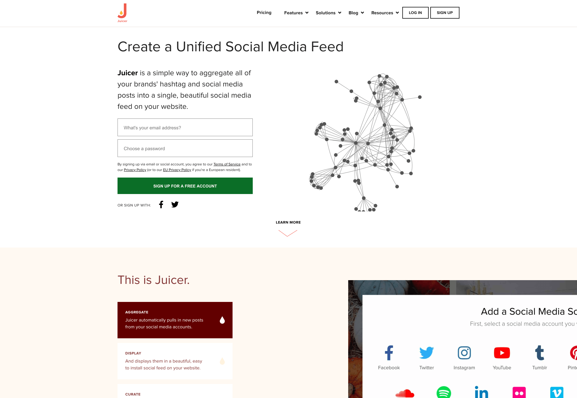
For web designers, an opt-in free trial model is your chance to create a fully seamless registration process. Juicer is a social media aggregator that serves as a great example for an easy free trial conversion. All that’s required to get started is an email and password.
It can be tempting to try and capture all of your customer’s data like their birthday, company name, and reason for signing up, but just remember that each extra step adds friction to the sign up process.
2. Full Access Free Trial (Credit Card Required)
Similar to the previous free trial model, except this one requires a credit card. This is also known as an opt-out free trial.
If your SaaS business is struggling with free trial to paid conversions, it can be tempting to require leads to enter their credit card details before starting their free trial. I get it, but just be aware that it can be a challenge to get free trial conversions if you choose this method.
Trust is a huge factor here. For example, potential leads might not trust a relatively unknown SaaS company with their credit card details. More well known brands or websites that prominently display social trust signals might have better luck in the trust department with new website visitors.
Even social trust signals aren’t likely to be enough, though. Be prepared to invest heavily into inbound marketing if you choose this method. While both the opt-in and opt-out methods will require inbound marketing to be successful, you’ll probably need to spend more time educating your audience first if you want them to give you their credit card details. With the opt-in method, you have a bit more time to educate potential customers once they’ve started their free trial.
Additionally, your marketing communication and user experience has to be on point. If you choose this option, you’ll have to be extremely careful to make the cancellation process as seamless as possible.
3. Live Demo Free Trial
Some SaaS products might not benefit from an opt-in or opt-out free trial. These might include products with complex processes, those that require implementation before the product can be used, the need for training, or any other sort of convoluted process that requires specialised knowledge. Not everyone has time to learn how to use your product, so you may overwhelm users if you allow them to explore your product on their own.
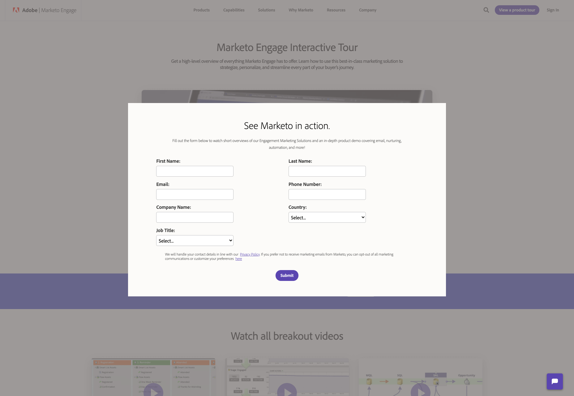
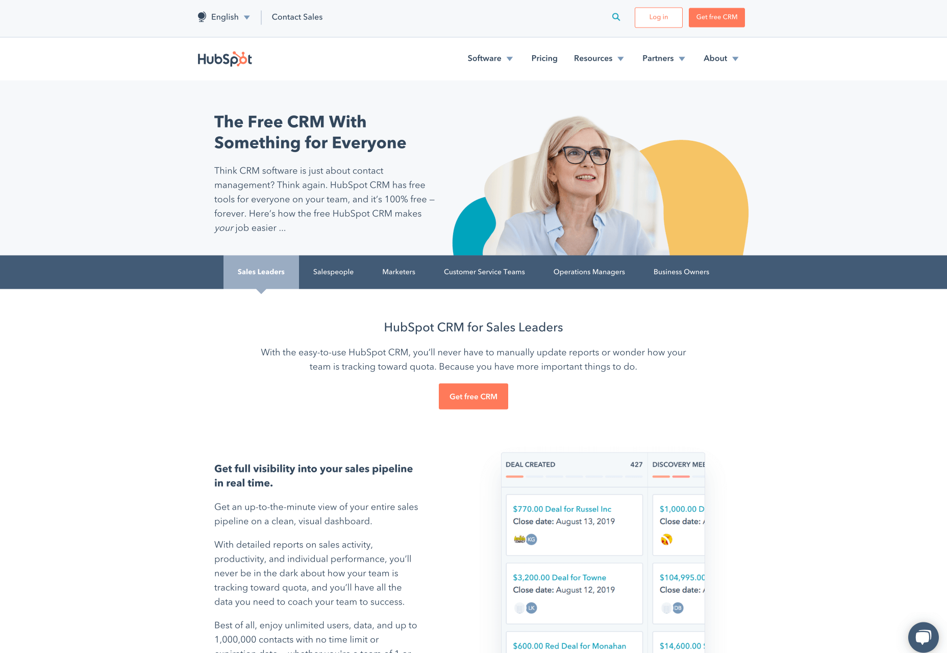
Complicated SaaS products may benefit from a live demo free trial. Companies can offer a free demonstration of the product, like Marketo does. Sometimes a live demo is paired with a “sandbox demo” which allows users to play around in the software in a controlled setting.
Alternatively, companies can offer a choice between a demo and a free trial, like Hubspot. It’s also worth noting that Hubspot features a vast learning center and top-tier support which gives them the flexibility to offer their complicated software as a free trial DIY version.
Along with the live demo or blended demo model, you can offer other ways to engage potential customers with a complex SaaS product. You can try:
Email courses
Explainer videos
Q&A sessions
Webinars
4. Freemium
The freemium model is a great way to mitigate some of the concerns with full access free trials. For example, you can restrict access to certain features if you’re concerned about giving too much value away in a full access free trial. Here are some of the most popular types of freemium models for SaaS:
Limited Features
Limited feature freemium models are what most people are referring to when they say “free forever” models. These types of freemium models offer certain features for free.
Many email marketing platforms offer limited access to their product for free, and Mailchimp does this exceptionally well.
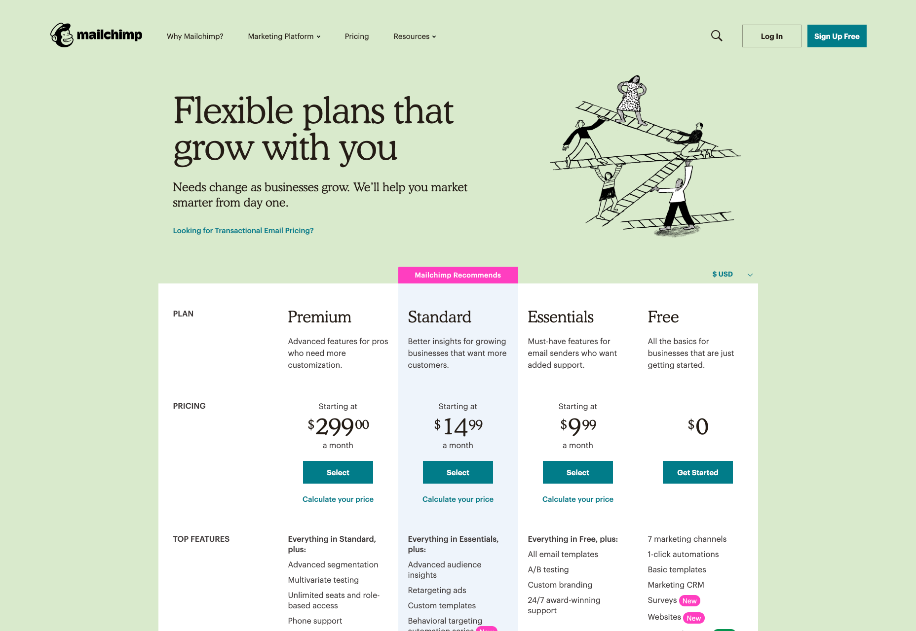
With a quick glance, you can see a free plan is available with a variety of different plans also available for upgrade. If you scroll down their website, you’ll find the features of each plan clearly explained. The logistics of how this works will be different for every business, so you’ll have to decide which features you’ll offer for free.
For example, is your product mainly used by teams? If so, you could consider offering 1 account for free with more accounts available with an upgrade. This allows one core team member to try out your product and report back their findings to their team before making a purchase.
Usage Limitations & Credit Systems
Usage limitations and credit system freemium models are essentially the same. They involve either limiting usage or providing credits for limited usage. It comes down to a difference in customer-facing language. For example:
Usage Limitation: Get 3 Free Audiobooks!
Credit System: Get 9 Free Audiobook Credits (Worth 3 Audiobooks)!
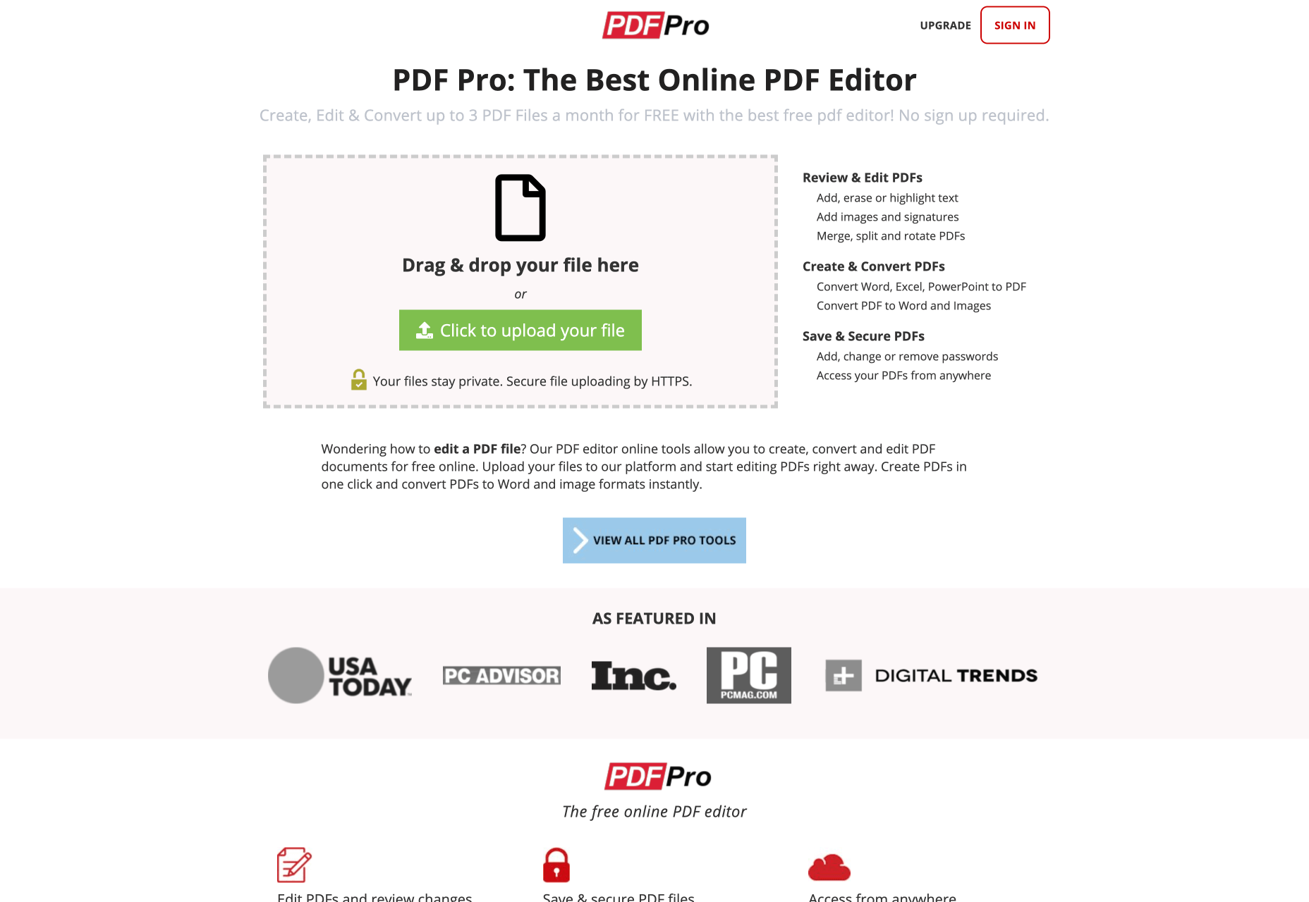
Companies like Dropbox and PDF Pro operate from a usage limitation freemium model. With Dropbox, you get a certain amount of storage space before you have to pay; with PDF Pro, you can create, edit, and/or convert 3 PDF files for free before paying for more.
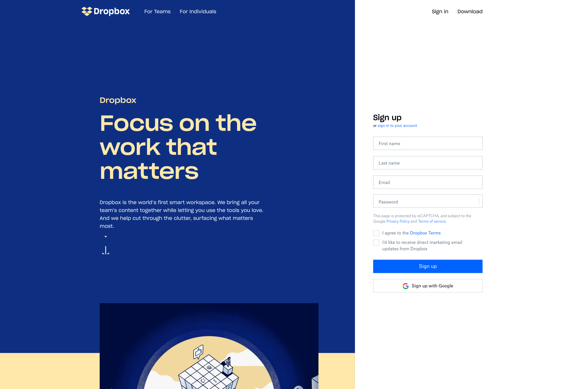
Usage limitation freemium models are generally straightforward and can allow for a great user experience. Just make sure that it’s communicated from the get-go that the user gets a certain amount of access to the product for free, but has to pay for more. Popular buzz terms like “free forever” can attract users, but ultimately lead to wrong assumptions later down the line.
Like the limited feature model, this is a great freemium model for SaaS products that need to strike a delicate balance between giving away too much and too little.
Advertisement Removal
Upgrading to remove ads is a popular freemium model with mobile games, entertainment services, blogs, and news sites. Some upgrades simply involve removing ads from the sidebar so you don’t have to see them. Other upgrades include removing the ads from interrupting the user experience. For example, a game that requires you to watch 30 seconds of an advertisement every 2 minutes would interfere with your experience playing the game.
You’ll have to be especially careful here if you want to ensure a pleasant experience for all users. Readers who visit a news website but are asked to pay in order to view the content might just leave the website and never come back. Mobile game players who are constantly plagued by ads might uninstall the game altogether. As with the rest of the freemium models, you’ll want to strike a balance between free and paid features that’s both fair and enjoyable.
Fully Functional
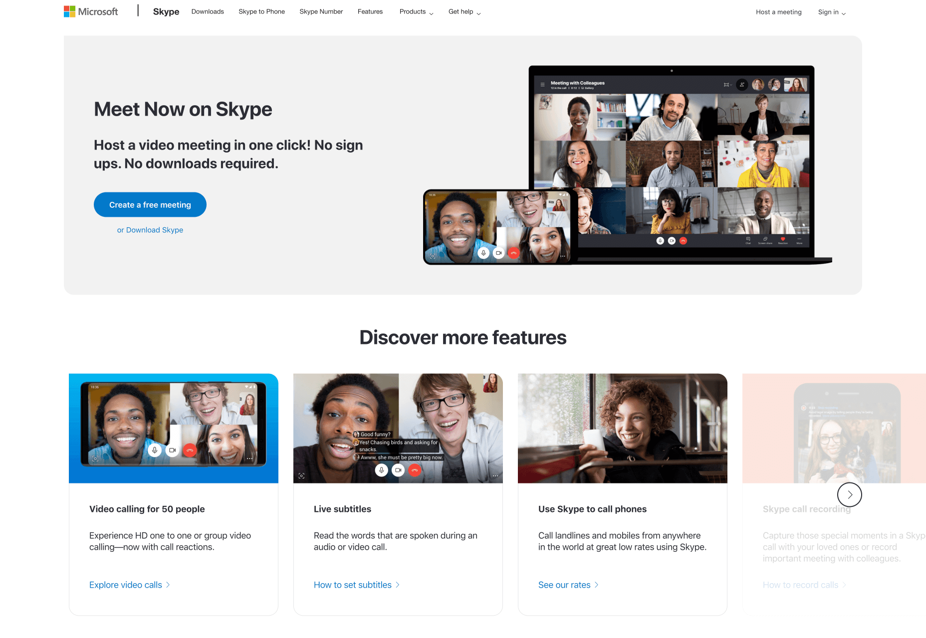
Sometimes companies toe the line between freeware and freemium. A great example of a fully functional freemium product is Skype. The core product is fully functional and requires no upgrade to use its full functionality. However, their business model is built around offering upgrades such as Skype credits and monthly subscriptions. Skype’s add-ons are not upgrades which detract from the main use of their product. Also, their add-ons are not heavily promoted to free users unless they’re looking for extra features.
Don’t feel locked into any of these boxes when it comes to choosing a freemium model for SaaS products. Blend credit systems with limited features. Try pairing opt-in free trials with demos if it makes sense. Feel free to try whatever works for your business.
Common Roadblocks with Free Trial Models
There are multiple ways free trial models can go haywire. Think something along the line of angry customers wanting a refund to a sudden drop in conversion rates. The goal here is to not panic, re-evaluate your situation, and make changes as necessary. Avoid making drastic changes as soon as you encounter the slightest issue. New systems take a while to work out all of the kinks. This is not meant to be one-size-fits-all advice, so test what works for your SaaS business.
Free Trial Users Aren’t Upgrading
There are a variety of reasons why your paid conversions might not be up to snuff. Before you panic, answer these two questions:
Did you ask for the sale?
Did you make it as easy as possible for the sale to happen?
If you answered no to either of those questions, try to remedy these problems before making drastic changes. It’s common to be hesitant to ask directly for an upgrade in fear of coming across pushy or aggressive. Sometimes this even flows over into design elements subconsciously. Things like small “Upgrade” buttons can easily be missed by users. Be bold, but not annoying. Don’t hesitate to let your users know what you offer and how it can help them!
It’s also possible that free trial users simply don’t know the benefits of upgrading. Have the benefits been displayed prominently on relevant web pages or delivered through an email campaign?
It should go without saying that you shouldn’t make it hard for your customers to upgrade. Customers should be able to upgrade in a matter of 2-3 clicks. Unless you’re dealing with a complicated SaaS product that requires a personal sales hand-off or an additional demo, try to keep the process as simple as possible.
Lastly, be aware that it is possible to give away too much value in a free trial. If users don’t see any reason to upgrade, then they won’t. It’s a balancing act between choosing enough to give away to encourage sign ups and keeping enough behind the paywall so that upgrading is worth it.
Too Many Customers Are Demanding a Refund
Again, there are many reasons customers could demand a refund. Maybe you’re targeting the wrong customers or underdelivering what you’ve promised to them.
Another culprit is confusion due to poor communication. Here’s an example:
You’re using an opt-out free trial method. On the 14th day of the free trial, the customer’s card is charged. Unfortunately, your customer was extremely surprised to wake up one morning and find your subscription fee charged to their credit card. Rage ensues. Angry customer support messages are received. No one is happy.
Of course, you’ll always have people that aren’t 100% happy with your service, and that’s okay! However, if you’re using the opt-out model, you’ll want to revisit all of your marketing communications and ensure it’s crystal clear when the customer’s card will be charged and how long they have to cancel if they wish to avoid a charge on their credit card. Emails work great here. So does prominent copy and reminders on the checkout pages and the customer’s account page. You’ll also want to make sure that it’s easy for your customers to cancel. No one wants to jump through hoops and talk to 5 different customer support agents before finally cancelling their account.
Don’t forget that ex-customers can be evangelists of your product too, so make sure every touchpoint is pleasant for your customers.
As a side note, make sure your refund terms are clear beforehand. Will you offer refunds, credits, free services, or no refunds at all? If the words “risk-free” or “guarantee” appear on your website, then be aware that people may associate those words with a refund guarantee.
Free Trial Conversions Are Down
So you bit the bullet and implemented a free trial model…but what happens when no one is signing up for a free trial?
If you have a live demo free trial or freemium model, then consider what’s actually included in your free trial. It might simply be the case that you’re not offering features which are compelling enough to potential users. If you want to find out which features are most sought-after, there are a variety of things you can do:
A quick competitor analysis could give you some insight
Try surveying your email subscribers to ask them for their input
Switch around which features you offer for free
Extend the free trial
Build out more robust inbound marketing campaigns
Ensure the benefits of the product are prominently displayed on the website
Consider a different free trial or freemium model
Which Free Trial Method Should You Choose?
In addition to everything we’ve covered above, here are some additional points to consider when it comes to free trial and freemium models.
Consider Your Product & Current Marketing Campaigns
For example, if your product is complicated and built for enterprise, you might want to consider a live demo model. Look at your customer sales cycles and current campaigns. Do you have the ability to educate potential customers about your product prior to a free trial? What are your product’s strengths and weaknesses? Is it something that people use a couple times and then don’t need anymore or is it solving a recurring need? This will help guide the type of free trial or freemium model you choose.
How Much Would a Stranger Trust Your SaaS Product? Enough to Give You Their Credit Card Information?
What kinds of social trust signals does your website display? Have you been featured in any trusted media? Look at all sorts of things that convey trustworthiness and feature them on the website and marketing materials. Case studies, reviews, and media mentions are all great examples of trust factors. If you can get your hands on relevant video testimonials from happy customers, those are great for sharing on social media.
Can You Handle Change?
As you work out the kinks with a new free trial model, you might need to make changes quickly. Customer communication will also need to be prioritised. Prompt and thoughtful responses to customer complaints can turn a frustrated customer into a happy one. Things like updated copy on your website and testing different email marketing messages might need to be tweaked quickly.
If it takes your company weeks to implement simple changes or they’re lacking in the customer support department, then be aware this can impact the effectiveness of your free trial model.
One last word of advice…realise how valuable your free users are, regardless of their decision to upgrade or not. In fact, Harvard Business Review found that a free user is typically worth 15% to 25% as much as a paid user. Even though they may not pay directly for your product, they pay dividends in the form of referrals if you treat them with care. Keep your customers at the forefront of your mind when creating and designing free trial experiences for your users.
Featured image via Unsplash.
Source
p img {display:inline-block; margin-right:10px;}
.alignleft {float:left;}
p.showcase {clear:both;}
body#browserfriendly p, body#podcast p, div#emailbody p{margin:0;}


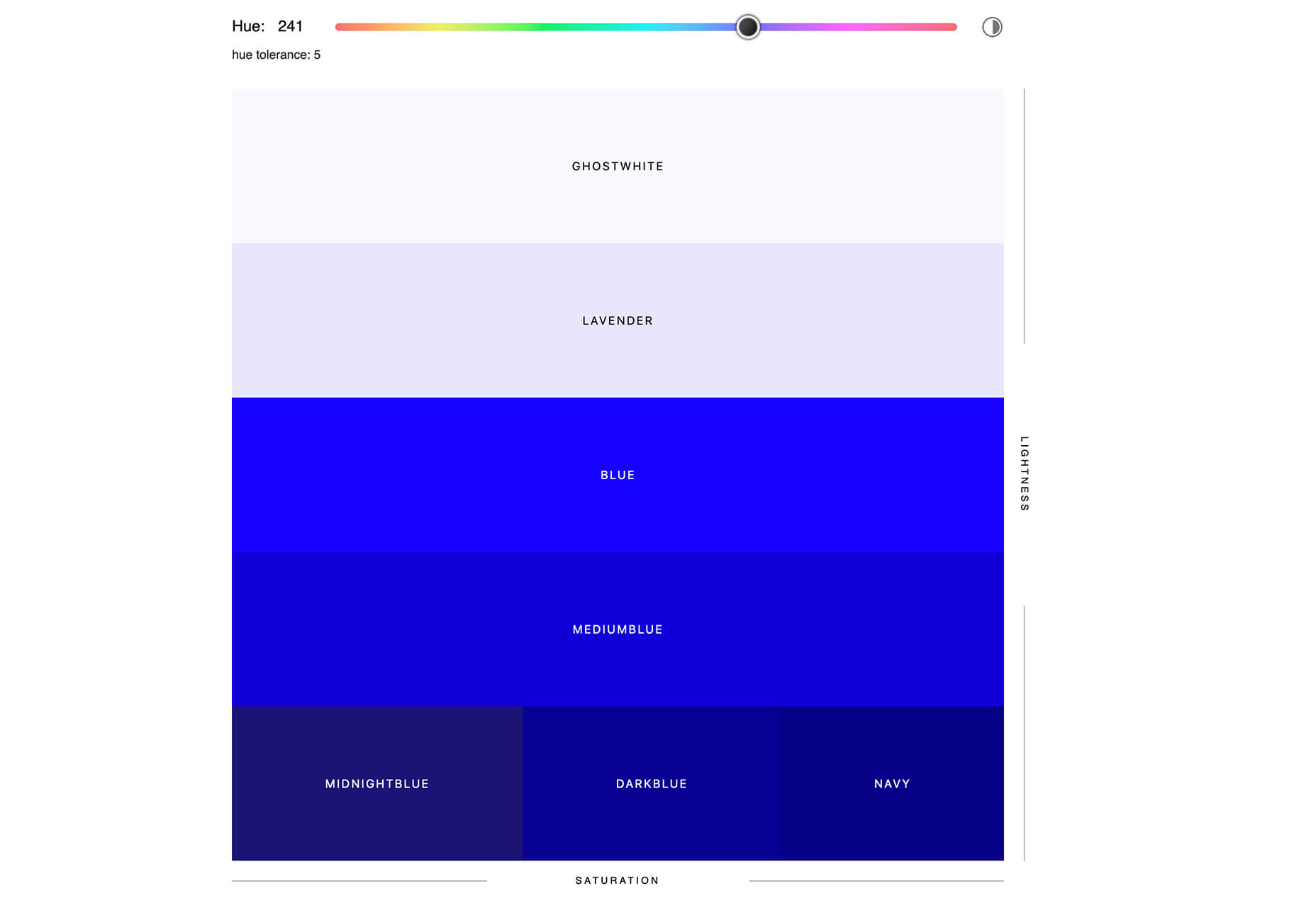
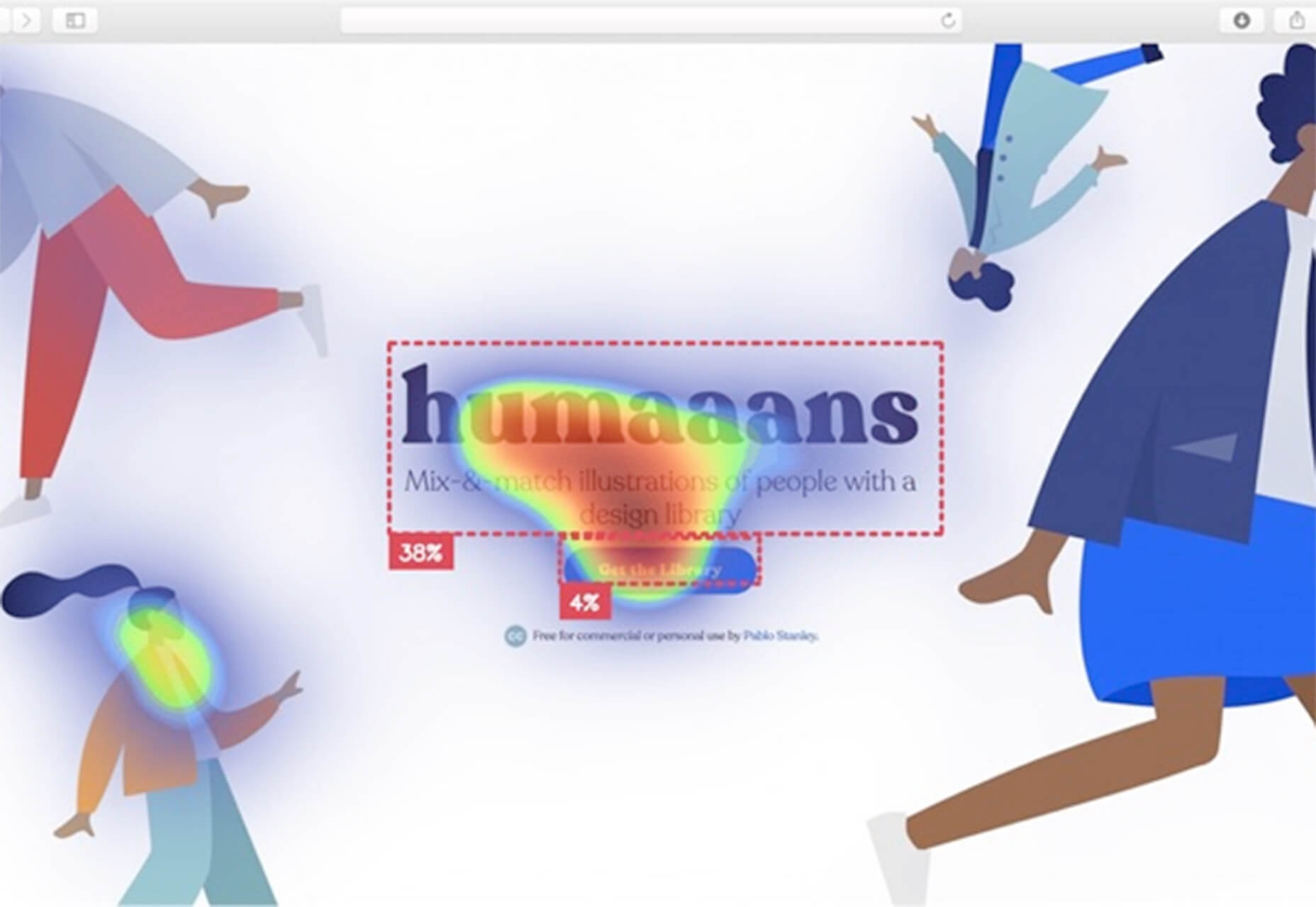
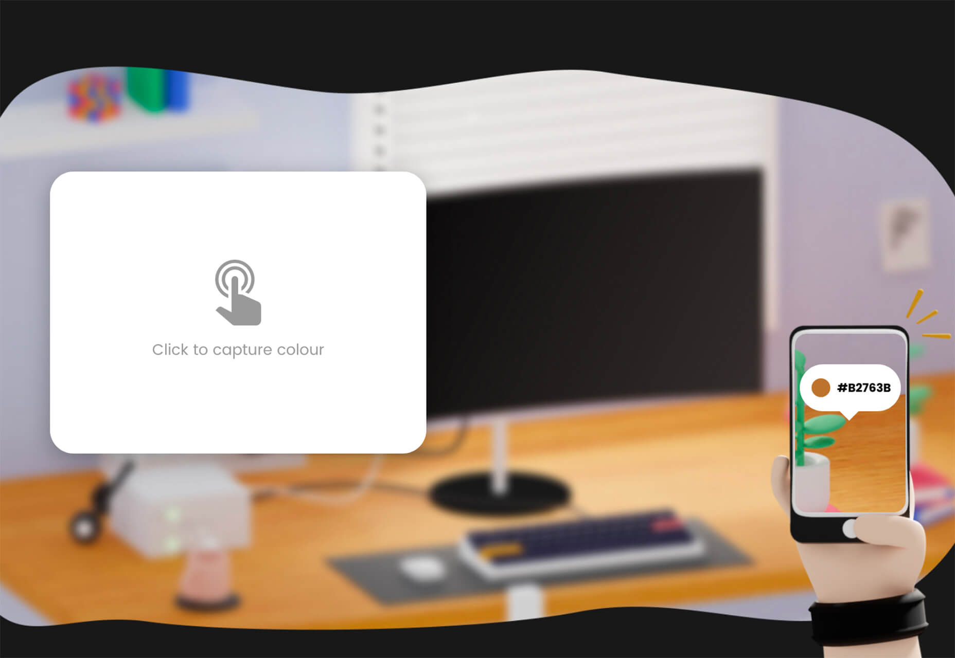
 The best new tools for designers are ones that make your life easier and your workflows faster. You’ll find some of those in this list this month for sure. From tools to help you capture and manage color palettes to AI-powered design analytics to simple animations, there’s something for almost every designer or developer.


 When it comes to creating and launching a website, it’s important to deliver realistic time expectations to the client, and establish the different stages you can bill them for.