Raw Design Inspiration: Hand-picked on Dribbble

Original Source: http://feedproxy.google.com/~r/abduzeedo/~3/LROo5HHoMXI/raw-design-inspiration-hand-picked-dribbble

Raw Design Inspiration: Hand-picked on Dribbble

AoiroStudio07.26.20

We are back with another abdz. ‘Raw Design Inspiration’ No theme, absolutely ‘raw’ inspiration. As you may have been aware, inspiration is one of the biggest fuels in my everyday life. Whatever it is for life and work balance, it comes in many shapes and forms. For me, I do appreciate a good surf on Dribbble. It’s all about how we consume our feeds, I noticed a shift of change from designers on sharing their work on social media platforms like Instagram. I might be an old-timer but I am not too keen on sharing work for likes and shares, I do enjoy the good ‘old’ Dribbble. It’s always gratifying and you usually do find something to spark your mind and inspiration.

The concept of ‘Raw’ is to randomize what inspires me to kick off my week, maybe it could have the same effect on you. This is reasonably an homage to abdz. daily inspiration series. It’s an experiment, and we’ll see how it goes. If you do have a suggestion, you can submit your work.

More on https://dribbble.com

-

By Jona Dinges

By DStudio™

Empty UI gradient color app design empty space empty state mobile ui mobile app ios app ios card ui branding user experience design typography white product design clean ui-ux ux ui

By Yoga Perdana

Zebra Logo animal horse zebra branding logo

By Udhaya Chandran

By Anton Zaderaka

By Craftwork

Boom Illustrations + UI = ? flying cinema4d png startup project elements ui design landing application presentation website web app scene colorful bright illustrations 3d

By MonpixDesign

Food Delivery App mobile fruits fruit food uiux mobile app mobile ui mobile app design ecommerce design app design ecommerce app ecommerce app ux design ui ui design minimal food delivery app

By Asish Sunny

Payment app clean ui trending cards ui credit cash hire freelancer wallet expence income finances web design website dark ui light ui mobile ui clean ux ui

By Lelevien

6833adbf09b00f6ad03a8b09509625e8

By B®andits

Play With Type - B Studio studio minimal branding logo brandits typeface geometric monogram letter typography type play

By Farzan Faruk ?

watchOS 6 Landing Page - Mobile Concept minimal app design applepencil apple ios mockup apple watch design responsive design smartwatch apple watch 2018 trends ui ux website design product web design landing page homepage ecommerce website

By Sèrgi Mi

Mobile Banking graph balance payment pay illustration banking concept bank app kawaii design cards light mobile ui

By catalyst

music instruments... ????????? concert cartoon logo icon illustration player musical trumpet violin piano drum song sing sound electric accoustic guitar microphone intrument music

By Laura Lhuillier ⎪ Arual ☺︎

Bottles collection ? packagingdesign branding moutain forest aquatic jungle adobe dimension bottle mockup bottle design animal kids illustration illustration art illustrator illustration

By MD Mahfuj

Niox | N letter logo design gradient logo modern logo logo design identitydesign website logo mark n letter logo n letter logos logo illustrator identity branding free logo mockup flat creative logo app vector logo process free logo

By David Kovalev ◒

Photos not flat logo branding agency unfold neuomorphism neuomorphic skeumorphism skeumorphic 3d soft soft3d fun flower colorful photo photos iconset icons icon apple

By UI8

Macbook Pro Mockup - 4K Freebie freebie 4k 3d sketch psd mockup apple macbook

By Benjamin Oberemok

Ping-pong logo design icon symbol mark unfold game paddle rackets table tennis tennis ping pong logo concept fun branding logo

By Fabio Sasso

1c124982a41fa19abb12f03f312ac9a5

By Nathan Riley


The best cameras for beginners in 2020

Original Source: http://feedproxy.google.com/~r/CreativeBloq/~3/nugt27eZSlI/best-cameras-for-beginners

The best camera for beginners allow creatives to expand their skills in all sorts of ways. You might be looking to add photography to the services you offer your clients, or find a stylish new way to show off your portfolio. Maybe you want to start vlogging to take your followers behind the scenes of your work – or, hey, perhaps you just want your Insta to pop a little more. There's no shame in that.

Whatever the reason you want to take more pictures, it's best to pick up one of the best cameras for beginners rather than relying on your smartphone. This is because there are certain advantages to cameras that mean they'll always outpace even the latest, most sophisticated smartphone cameras. For more details, jump to what to consider when buying a camera section. 

If you've already got some photography skills, check our our roundup of what we consider the best cameras for all levels to be. And while you're getting kitted out, why not explore our guides to the best memory cards and the best camera bags too.

All of the cameras we've selected for this guide are suited to photography novices, while still offering the capacity to grow with you as you improve. Let's get started.

The best cameras for beginners available now

It’s particularly easy to get up and running with the Nikon D3500. As well as an ‘intelligent’ fully automatic mode, there are wide-ranging scene modes and effects to choose from. More uniquely, there’s a Guide shooting mode, which serves as a kind of interactive photography course. There’s no shortage of quality either, with a high-performance 24.2MP image sensor and processor, a generous ISO (sensitivity) range, speedy 5fps maximum burst rate and a high-resolution LCD screen. 

However, it’s not a touch-sensitive screen and lacks a tilt or pivot facility. Another drawback is that autofocus is relatively slow in live view and movie capture modes but, overall, the D3500 is currently the most appealing beginners’ camera on the market.

The Canon EOS 250D is the first entry-level DSLR to feature 4K movie capture, and it replaces the popular EOS 200D in Canon’s lineup. Indeed, the Dual Pixel CMOS autofocus system for live view and movie modes, inherited from its predecessor, makes the camera particularly good for tracking action when shooting video. The virtually silent autofocus performance of the 18-55mm kit lens is a further bonus.

Not just for video, the 250D is a very accomplished package for stills. It's beginner-friendly with optional Guided User Interface and Creative Assist modes, which work seamlessly with the fully articulated touchscreen. The camera is also well able to grow with you as you learn new skills and techniques, Canon’s excellent Quick menu giving intuitive and instant access to important settings.

One of the most compact and lightweight DSLRs on the market, the 250D is a camera you can take anywhere and everywhere. Our only real criticism is that, in viewfinder-based stills shooting rather than live view mode, the autofocus system is fairly basic. There are only nine AF points and only one of them is cross-type, able to resolve detail in both horizontal and vertical planes.

Fujifilm's mirrorless cameras not only look fantastic, with cool retro styling that has been a hit with photographers for going on a decade now, but they're also some of the best shooters on the market. The Fujifilm X-T200 is one of the newer models, designed for entry-level users who want room to grow their skills and shoot high-quality images and videos. Its upgraded sensor produces a wide dynamic range and pleasingly low noise, and this combines well with Fuji's Film Simulation modes to produce images with real pop.

The X-T200 shoots 4K video in impressive quality, and its articulated touchscreen allows you to get creative with your shooting angles. Having access to the stable of pin-sharp Fujifilm X-mount lenses is also no bad thing, and ensures you'll have plenty of room to grow and explore in your shooting, whatever direction you take it in.

Don't be fooled by the slim dimensions of this compact camera: it's actually an impressive stills-and-video shooting machine, with not only the ability to shoot high-quality Full HD and 4K video, but also to directly livestream it online. Indeed, you might be surprised how many YouTube creators you enjoy shoot a lot of their stuff on the Canon PowerShot G7 X Mark III; it's a popular camera for a reason.

The fast 24-100mm equivalent lens gives you an enormous amount of shooting versatility; no matter the lighting conditions, no matter how distant the subject, you'll probably be able to have a decent crack at capturing it. Video features are also further bolstered by such vital extras as an external mic port, ensuring that your videos will sound as good as they look. The camera feels premium in the hand, and with the LCD that flips around 180 degrees for easy monitoring, you've got a capable machine in all categories.

The best cameras don't have to be digital! Analogue is a great Physical prints of photographs have much more tangible lasting value than digital files, and there's loads of potential for incorporating them into your creative projects. The Polaroid Originals OneStep+ is the best instant-print camera around right now – not only does it produce beautiful square prints in that classic Polaroid style, but it also offers Bluetooth connectivity with a smartphone that give the user access to loads of additional shooting modes like Double Exposure, Light Painting, Noise Trigger and more.

Full of retro charm, the OneStep+ is well-designed and easy to use, with a powerful flash and twin lenses, one for general shooting, the other for portraits and close-ups. It's great value at the price, though bear in mind that film is an ongoing expense, coming in packs of ten that will generally set you back £10-15. Buy in bulk if you can and you'll definitely make some savings.

There have been plenty more cameras released in Sony's a6000 series since this one, so why have we included it? Well, this is a still a fantastic machine in its own right: a fast-shooting, lightweight and dependable mirrorless camera, with an APS-C sensor and a sophisticated autofocus system. A beginning photographer who wants a solid foundation on which to grow and develop their skills will find the a6000 offers all of this and more. Plus, with all the subsequent models that have been released, this camera can now be picked up for an absolute bargain price.

Equipped with a powerful 24.3 APS-C sensor, the Sony a6000 is an E-mount camera, meaning there's a fantastic range of lenses to choose from in addition to the bundled 16-50mm kit lens. This is an ideal choice for those who want to hit the ground running; it doesn't have as many guide modes as other cameras, but if you're prepared to put a little work in, you'll find it to be a rewarding and capable imaging machine.

One of the upsides of Micro Four Thirds mirrorless system cameras is that they tend to be fairly small and lightweight. That’s certainly true of the Olympus E-M10, which is now in its third generation. Although small, it’s impeccably well built and beautifully turned out with classic retro styling. The 14-42mm EZ kit lens is similarly small, with a retractable design that enables compact stowage. 

Even so, it features a built-in motor that enables smooth zooming during video capture. The maximum burst rate for stills is a speedy 8.6fps, although autofocus can be a little slower than in many competing cameras, making it tricky to follow fast-moving action. 4k UHD movie capture is a bonus.

Great for following the action in sports and wildlife photography, the Nikon D5600 has an advanced 39-point autofocus system that boasts auto-area, dynamic-area and 3D-tracking modes. The optional 18-140mm VR kit lens is also particularly suitable for these types of photography, with its 27-210mm ‘effective’ zoom range and competent Vibration Reduction (optical image stabilisation) system. And for when you need to trek into the countryside for shooting wildlife, or stand for long periods at a sporting event, the D5600 won’t weigh you down as it’s one of the lightest and most compact DSLRs on the market. 

The fully articulated touchscreen is an extra bonus, although for live view and video capture, the sensor-based contrast-detection autofocus facility can be painfully slow.

For such a small camera, the Panasonic TZ100 packs in some seriously big specifications and features. It has a 20.1MP 1.0-type sensor that’s physically large for a compact camera, and retains relatively noise-free image quality even at high ISO settings. It also crams in an electronic viewfinder and a high-res, 3.0inch rear screen, plus a 10x zoom lens with an effective range of 25-250mm. 

To keep things steady, there’s optical image stabilisation for stills and 5-axis hybrid stabilisation for video capture. You can also shoot at 4k UHD for both stills and video, with a frame rate of up to 30fps. For full-resolution stills, the burst rate is still speedy at 10fps. 

Clever tricks include ‘post-focus’, which enables you to capture a burst of stills with automatically transitioning focus distances, and select the frame with the ideal focus point afterwards.

Like other ‘tough’ compact cameras on the market, this Olympus Tough TG-5 is designed to take the knocks. It can withstand being submerged in water to a depth of 15 metres, dropped from a height of 2.1 metres and frozen to -10 degrees Celsius. If you’re feeling particularly mean, you can even try crushing it with a 100kg weight, and it’ll still keep on working. 

All in all, it’s a great camera for everything from skiing down mountains to snorkelling in the sea. The maximum burst rate is a similarly action-packed 20fps, and you can also capture 4k UHD movies. The 4x optical zoom lens adds versatility, as do the built-in macro and microscopic modes. To take things even further, a range of optional accessories includes fisheye and telephoto lens converters. While Olympus has since released a Tough TG-6, we'd say this model is the best pick for beginners' offering basically the same package (the new version has an identical sensor and lens; really the only difference is some new modes) for a better price,

The best camera for beginners: What to consider

As mentioned above, cameras will always have certain advantages over smartphones. These include larger sensors, which mean the cameras perform better in low light, as well as massive improvements in the matter of lenses. Whether you're using a DSLR or mirrorless camera that lets you swap lenses depending on the situation, a zoom-equipped compact that can get close to a subject, or even a fixed-focal-length compact that's been engineered for optical perfection, you're guaranteed to have something superior to the lens on the back of your phone. Or the front, for that matter – and thanks to many cameras now having flip-out screens, your selfie game can step up considerably.

Then there's also the fact that cameras can burst-shoot faster for capturing quick-moving subjects, have more sophisticated autofocus systems, and tend to offer higher resolutions that allow you to make larger physical prints of your images. There's no doubt about it – a camera is the way to go!

The best type of camera for beginners 

First, let's look at the different types of camera available for beginners. If your priorities are simplicity and portability, there’s a lot to be said for a small point-and-shoot camera that you can slip into your daily bag or even a spare pocket. These cameras will have a lens fixed on the front, so while you won't be able to use any focal length that isn't specified on the box, most models will offer a respectable zoom range to work with. There will generally also be a built-in flash, and possibly a viewfinder that helps you compose your shots.

A more versatile option is a 'system' camera, which consists of a separate body and interchangeable lenses. Once you're equipped with two or three lenses, you can shoot anything from portraiture and still life, to action sports and wildlife, or sweeping landscapes and architecture, getting great results every time. 

They start small, with mirrorless or compact system cameras. These tend to be portable and offer faster shooting speeds than their larger siblings, DSLRs. However, don't count DSLRs out, as they are able to offer an optical viewfinder that gives you an unadulterated 'through-the-lens' view of what you're shooting. They also tend to be better weather-sealed and equipped with chunkier handgrips for a secure hold.

Also worth considering are instant print cameras! Analogue is back in a big way, and there's something to be said for a camera that doesn't necessitate messing about with memory cards and hard drives, and just spits out an instant physical print. If your creative work is more tactile/physical (perhaps incorporating collage) then this is definitely a viable option. 

Finally, there are also 'tough' cameras, which have smaller sensors than mainstream compacts, but are heavily waterproofed and can survive rough conditions.

But which to pick? Well, it depends on what you need. Do you want something small and portable or hardy and weatherproof? Are you likely to be shooting video as well as stills? Do you see yourself buying more lenses, or would you prefer a single package that does it all? The answers to all these questions will affect which camera is best for you.

Read more:

The best full-frame cameras in 201915 ways to improve your photography skillsThe best monitors for photo editing

20+ Weird And Unusual USB Products

Original Source: https://www.hongkiat.com/blog/weird-and-unusual-usb-products/

That USB port on your PC is not just for connecting USB flash drives or USB data cables. It can also power some mini gadgets. From mug warmers and mini sewing machines to mini washing machines, you…

Visit hongkiat.com for full content.

10 Actionable Instagram Tips and Tricks

Original Source: https://www.hongkiat.com/blog/useful-instagram-tips-tricks/

Instagram is one of the popular social networks for everyone — influencers as well as brands. According to the Pew Research Center, 37% of adults in the US use Instagram with 63% of them using…

Visit hongkiat.com for full content.

Fun & Games by Bullpen

Original Source: http://feedproxy.google.com/~r/abduzeedo/~3/iEQq6exLie0/fun-games-bullpen

Fun & Games by Bullpen

abduzeedo07.22.20

Bullpen, an independent creative studio based in NYC creating engaging content through design & animation, shared an awesome motion design project with us. Fun & Games, is a tongue in cheek look at the games we design and give our children. It’s all fun & games. Until it isn’t. Developed over the course of a year, this piece is inspired after time spent playing with our own children. While we certainly take things to an extreme, we believe there is an underlying truth that is interesting to think about. We hope you enjoy it!

Credits

Direction: Bullpen
Design: Elliot Lim
3D: Aaron Kemnitzer
Music: Lullatone “how I broke my parent’s record player (when I was five)”
Stills

Image may contain: coin


How To Create a Responsive Timeline with Image Thumbnails

Original Source: http://feedproxy.google.com/~r/1stwebdesigner/~3/hky9PFuhQro/

In this tutorial you will learn how to create a responsive timeline for a set of related events you wish to display in a chronological (or reverse chronological) sequence. This can be used to display significant company milestones, news or personal events. I have used personal travel events as an example in this post. Here’s what you will be able to create by the end of this tutorial.

Responsive Timeline - Desktop View

Desktop View


Responsive Timeline - Small Tablets / Mobile Landscape View

Small Tablets / Mobile Landscape View


Responsive Timeline - Mobile Portrait View

Mobile Portrait View


You need to have some basic knowledge of HTML and CSS to follow along. Let’s get started.

Millions of Fonts, Themes, Graphics: Starting at ONLY $16.50 per Month

Web Fonts

Web Fonts
8,000+ Fonts

WordPress Themes

WordPress Themes
1,200+ Themes

Graphic Assets

Graphic Assets
32,000+ Graphics

DOWNLOAD NOW
Envato Elements


Setting up

Create a blank HTML document and name it index.html. Add the basic HTML skeleton. If you use Visual Studio Code, all you need to do is type “!” and hit enter. You will end up with this.

<!DOCTYPE html>
<html lang="en">
<head>
<meta charset="UTF-8">
<meta name="viewport" content="width=device-width, initial-scale=1.0">
<title>Document</title>
</head>
<body>

</body>
</html>

I have used the font ‘Noto Sans’ – with font weights 300 and 700. So add the following line below the title tag to embed this font using Google fonts.

<link href="https://fonts.googleapis.com/css2?family=Noto+Sans:wght@400;700&display=swap" rel="stylesheet">

Create your stylesheet and name it style.css. Link the stylesheet to your HTML document below the Google fonts CDN link using:

<link rel="stylesheet" href="style.css">

The bare bones structure

Let’s first create the timeline structure, and in the next part we will add and style the content.

HTML

Add this to your markup:

<div class="timeline">
<div class="container container-left">
<div class="content"></div>
</div>
<div class="container container-right">
<div class="content"></div>
</div>
<div class="container container-left">
<div class="content"></div>
</div>
</div>

CSS

In style.css, begin with some common styles for all elements:

* {
margin: 0;
padding: 0;
box-sizing: border-box;
}

Add these styles to the body element:

body {
background-color: #EDF2F7;
font-family: ‘Noto Sans’, sans-serif;
font-size: 1em;
color: #4A5568;
}

To the timeline, add the following styles. Let’s restrict the maximum width to 1200px and center the content using margin.

.timeline {
position: relative;
max-width: 1200px; /* Restrict the width on large screens */
margin: 0 auto; /* Center the content */
padding: 30px;
}

Now, we can use the ::after pseudo element to create that actual line in the center for timeline. Add these styles:

.timeline::after {
content: ”;
position: absolute;
width: 6px;
background-color: white;
top: 0;
bottom: 0;
left: 50%;
margin-left: -3px;
box-shadow: 0 4px 6px -1px rgba(0, 0, 0, 0.1);
}

Width of the line is 6px. Hence, we have used left:50% and margin-left: -3px to position the line at the exact center. Read more about centering an element using absolute position.

You will now see a very tiny line at the top of your webpage, vertically centered. As we add some content, this line lengthens.

Let’s style the left and right containers that hold the timeline elements.

.container {
position: relative;
width: 50%;
}
.container-left {
left: 0;
}
.container-right {
left: 50%;
}

You will still not see anything on the web page until we style the .content element within.

.content {
padding: 30px;
background-color: white;
position: relative;
border-radius: 6px;
box-shadow: 0 4px 6px -1px rgba(0, 0, 0, 0.1);
}

You should be able to see this now.

Responsive timeline so far


Our timeline is taking shape. Let’s add those tiny arrow marks pointing to the line using a ::before pseudo element.

.container .content::before {
content: " ";
height: 0;
position: absolute;
top: 40px;
width: 0;
z-index: 1;
border: medium solid white;
right: -10px;
border-width: 10px 0 10px 10px;
border-color: transparent transparent transparent white;
}

This will add all arrow marks pointing to the right, positioned to the right edge of the box. But for the boxes on the right, we need an arrow pointing to the left and positioned to the left. So, change of all this to:

.container .content::before {
content: " ";
height: 0;
position: absolute;
top: 20px;
width: 0;
z-index: 1;
border: medium solid white;
}
.container-left .content::before {
right: -10px;
border-width: 10px 0 10px 10px;
border-color: transparent transparent transparent white;
}
.container-right .content::before {
left: -10px;
border-width: 10px 10px 10px 0;
border-color: transparent white transparent transparent;
}

Read more about how to create these CSS triangles using borders. Of course the output now looks a little odd because the boxes are sticking to the line. Add some padding to the container to space them out.

.container-left {
/* Existing styles here */
padding-right: 70px;
}
.container-right {
/* Existing styles here */
padding-left: 70px;
}

This is perfect.

responsive timeline with arrows


Adding and styling content

Let us first add the images and position them on the “line”.

HTML

Change your markup to this, by adding 3 div elements with background images.

<div class="timeline">
<div class="container container-left">
<div class="image" style="background-image:url(‘https://images.pexels.com/photos/307008/pexels-photo-307008.jpeg?auto=compress&cs=tinysrgb&dpr=2&w=100’)"></div>
<div class="content"></div>
</div>
<div class="container container-right">
<div class="image" style="background-image:url(‘https://images.pexels.com/photos/210012/pexels-photo-210012.jpeg?auto=compress&cs=tinysrgb&dpr=2&w=100’)"></div>
<div class="content"></div>
</div>
<div class="container container-left">
<div class="image" style="background-image:url(‘https://images.pexels.com/photos/2104152/pexels-photo-2104152.jpeg?auto=compress&cs=tinysrgb&dpr=2&w=100’)"></div>
<div class="content"></div>
</div>
</div>

As you can see, I have directly linked 3 images from Pexels. You can choose to include your own.

CSS

Let’s add some size and shape to this image div.

.image {
width:90px;
height:90px;
background-size:cover;
background-position:center;
border:solid 5px #ffffff;
border-radius:50px;
box-shadow: 0 4px 6px -1px rgba(0, 0, 0, 0.1);
}

Now position them centered on the line, appearing next to boxes.

.image {
position: absolute;
}
.container-left .image {
right: 0;
margin-right: -45px;
}
.container-right .image {
left: 0;
margin-left: -45px;
}

But the images appear behind the line! This is easily fixed with some z-index.

.timeline::after {
/* Existing styles here */
z-index: 1;
}
.image {
/* Existing styles here */
z-index: 2;
}

Don’t mind the images overlapping each other right now. It will be fixed when we add some content within the boxes. But if your content is going to be very little, add a minimum height to the container.

.container {
/* Existing styles here */
min-height: 120px;
}

Next, add the actual content.

HTML

Add this markup within each .content block. Change the text as you wish.

<span>July 2020</span>
<h2>Visit to Spain</h2>
<p>
Et hinc magna voluptatum usu, cum veniam graece et. Ius ea scripserit temporibus, pri cu harum tacimates neglegentur. At adipisci incorrupte nam. Cu qui sumo appareat constituto.
</p>

CSS

We need to position the arrow marks such that they align with the center of the image.

.container .content::before {
/* Existing styles here */
top: 35px;
}

Align the text on left side boxes to the right and right side boxes to the left.

.container-left {
/* Existing styles here */
text-align: right;
}
.container-right {
/* Existing styles here */
text-align: left;
}

Now some styles for the actual content.

.content span {
color: #2C7A7B;
font-size: 1.1em;
font-weight: bold;
}
.content h2 {
font-size: 1.8em;
padding-top: 5px;
}
.content p {
line-height: 1.6;
padding-top: 5px;
}

Isn’t this neat? Great! Now resize your browser window to make it smaller, and things start to look messy when the screen size is too small.

Make it responsive

In smaller screens, when there are boxes on both sides of the line, the boxes become too narrow. Time to add some media queries. Let’s add a breakpoint at 767px width and position both the boxes on one side when the screen width is smaller than this width.

@media screen and (max-width: 767px) {
/* Add styles to change the behaviour for screens smaller than 767px width */
}

First, position the line to the left of the page. Add the below styles within the media query:

.timeline::after {
left: 65px;
}

Make the containers full width and position them correctly by overriding the previous styles.

.container {
width: 100%;
padding-left: 100px;
padding-right: 0px;
}
.container-right {
left: 0%;
}
.container-left {
text-align: left;
}

Add some top margin to all the containers, except the first.

.container {
/* Existing styles here */
margin-top: 30px;
}
.container:first-of-type {
margin-top: 0px;
}

Override image styles to position them on the line.

.container .image {
left:-10px;
top: 0px;
margin-left: 0;
margin-right: 0;
}

The arrows on the “left” boxes need to change position and direction.

.container-left .content::before {
left: -10px;
right: auto;
border-width: 10px 10px 10px 0;
border-color: transparent white transparent transparent;
}

This is what we have now:

Timeline responsive view one


Further reduce the screen size and you will notice that on really small screens (less than 400px width), the boxes again get narrow. Which is why, below 480px, let’s push the containers below the image giving them full screen’s width to occupy.

@media screen and (max-width: 480px) {
.container {
padding-left: 0px;
padding-top: 105px;
}
}

To prevent the line from appearing on top of the boxes instead of below, just add a z-index to the container and give a higher value than the “line”.

.container {
/* Existing styles here */
z-index: 3;
}

The only pending thing right now is to position the arrows on top and make them point upwards.

.container .content::before {
left: 25px;
top: -10px;
border: medium solid white;
border-width: 0 10px 10px 10px;
border-color: transparent transparent white transparent;
}

You got it! Resize your browser making it smaller and larger to see how responsive your timeline is. Go ahead and customize it to suit your needs. Just in case you didn’t get this working as expected, download the full source code and feel free to make changes as you wish.


Download Source Code


In Memory of Flash: 1996-2020

Original Source: https://www.webdesignerdepot.com/2020/07/in-memory-of-flash-1996-2020/

We are gathered here today….

Today I write in memory of Adobe Flash (née Macromedia), something that a bunch of people are actually too young to remember. I write this with love, longing, and a palpable sense of relief that it’s all over. I have come to praise Flash, to curse it, and finally to bury it.

We’ve been hearing about the death of Flash for a long time. We know it’s coming. December 2020 has been announced as the official timeframe for removal, but let’s be real about this: it’s dead. It’s super-dead. It’s people-are-selling-Flash-game-archives-on-Steam dead.

That last bit actually makes me happy, because Flash games were a huge part of my childhood, and the archives must be preserved. Before I’d ever heard of video cards, frames per second, and “git gud”, I was whiling away many an hour on disney.com, cartoonnetwork.com, MiniClip, Kongregate, and other sites, looking for games.

I think we’ve established in my previous work that even as a missionary kid, I did not have a social life.

The Internet itself gave me a way to reach out and see beyond my house, my city, and my world, and it was wonderful. Flash was a part of that era when the Internet felt new, fresh, and loaded with potential. Flash never sent anyone abuse, or death threats. Flash was for silly animations, and games that my parent’s computer could just barely handle, after half an hour of downloading.

I even built my first animated navigation menus in Flash, because I didn’t know any better. At all. But those menus looked exactly like the ones I’d designed in Photoshop, so that’s what mattered to me, young as I was.

That was a part of Flash’s charm, really.

What Flash Got Right
Flash Brought Online Multimedia into the Mainstream

Funny story, JavaScript was only about a year old when Flash was released. While HTML5 and JS are the de-facto technologies for getting things done now, Flash was, for many, the better option at launch. JS had inconsistent support across browsers, and didn’t come with a handy application that would let you draw and animate whatever you wanted.

It was (in part) Flash that opened up a world of online business possibilities, that made people realize the Internet had potential rivalling that of television. It brought a wave of financial and social investment that wouldn’t be seen again until the advent of mainstream social networks like MySpace.

The Internet was already big business, but Flash design became an industry unto itself.

Flash Was Responsive

Yeah, Flash websites could be reliably responsive (and still fancy!) before purely HTML-based sites pulled it off. Of course, it was called by other names back then, names like “Liquid Design”, or “Flex Design”. But you could reliably build a website in Flash, and you knew it would look good on everything from 800×600 monitors, to the devastatingly huge 1024×768 screens.

You know, before those darned kids with their “wide screens” took over. Even then, Flash still looked good, even if a bunch of people suddenly had to stop making their sites with a square-ish aspect ratio.

Flash Was Browser-Agnostic

On top of being pseudo-responsive, the plugin-based Flash player was almost guaranteed to work the same in every major browser. Back in a time when Netscape and Internet Explorer didn’t have anything that remotely resembled feature parity, the ability to guarantee a consistent website experience was to be treasured. When FireFox and Chrome came out, with IE lagging further behind, that didn’t change.

While the CSS Working Group and others fought long and hard for the web to become something usable, Flash skated by on its sheer convenience. If your site was built in Flash, you didn’t have to care which browsers supported the <marquee> tag, or whatever other ill-conceived gimmick was new and trendy.

Flash Popularized Streaming Video

Remember when YouTube had a Flash-based video player? Long before YouTube, pretty much every site with video was using Flash to play videos online. It started with some sites I probably shouldn’t mention around the kids, and then everyone was doing it.

Some of my fondest memories are of watching cartoon clips as a teenager. I’d never gotten to watch Gargoyles or Batman: The Animated Series as a young kid, those experience came via the Internet, and yes… Flash. Flash video players brought me Avatar: The Last Airbender, which never ever had a live action adaptation.

Anyway, my point: Flash made online video streaming happen. If you’ve ever loved a Netflix or Prime original show (bring back The Tick!), you can thank Macromedia.

What Flash Got Wrong

Obviously, not everything was rosy and golden. If it was, we’d have never moved on to bigger, better things. Flash had problems that ultimately killed it, giving me the chance, nay, the responsibility of eulogizing one of the Internet’s most important formative technologies.

Firstly, it was buggy and insecure: This is not necessarily a deal-breaker in the tech world, and Microsoft is doing just fine, thank you. Still, as Flash matured and the code-base expanded, the bugs became more pronounced. The fact that it was prone to myriad security issues made it a hard sell to any company that wanted to make money.

Which is, you know, all of them.

Secondly, it was SEO-unfriendly: Here was a more serious problem, sales-wise. While we’re mostly past the era when everyone and their dog was running a shady SEO company, search engines are still the lifeblood of most online businesses. Having a site that Google can’t index is just a no-go. By the time Google had managed to index SWF files, it was already too late.

Thirdly, its performance steadily got worse: With an expanding set of features and code, the Flash plugin just took more and more resources to run. Pair it with Chrome during that browser’s worst RAM-devouring days, and you have a problem.

Then, while desktops were getting more and more powerful just (I assume) to keep up with Flash, Apple went and introduced the iPhone. Flash. Sucked. On. Mobile. Even the vendors that went out of their way to include a Flash implementation on their smartphones almost never did it well.

It was so much of a hassle that when Apple officially dropped Flash support, the entire world said, “Okay, yeah, that’s fair.”

Side note: Flash always sucked on Linux. I’m just saying.

Ashes to Ashes…

Flash was, for its time, a good thing for the Internet as a whole. We’ve outgrown it now, but it would be reckless of us to ignore the good things it brought to the world. Like the creativity of a million amateur animators, and especially that one cartoon called “End of Ze World”.

Goodbye Flash, you sucked. And you were great. Rest in peace. Rest in pieces. Good riddance. I’ll miss you.


Featured image via Fabio Ballasina and Daniel Korpai.

Source

p img {display:inline-block; margin-right:10px;}
.alignleft {float:left;}
p.showcase {clear:both;}
body#browserfriendly p, body#podcast p, div#emailbody p{margin:0;}

Where to buy kids' face masks – plus children's face mask patterns they'll want to wear

Original Source: http://feedproxy.google.com/~r/CreativeBloq/~3/_6QL5P8Z78k/where-to-buy-kids-face-masks

With the ongoing Covid-19 crisis, where to buy kids face masks has become a question on many parent's lips. After recent announcements, face masks for children over the age of two are recommended in many places, and is mandatory when using any public transport in the UK. Even if you're clear on your government's guidelines, knowing exactly where to buy a face mask that your child will actually wear is another matter altogether. That's where we can help, with a list of retailers in the US and UK offering all sorts of designs and patterns that will hopefully make your child wearing a face mask all that bit easier. Below you'll find some quick links to deals that we've spotted, and then some more in-depth deals that we think your little ones will love. 

And for all UK adults – we've also got a guide to help you buy face masks in the UK. 

Where to buy kids' face masks in the US
Disney – Exclusive sets of your favourite Disney characters. $19.99 for fourEtsy – An array of patterned face masks starting from as little as $4Vistaprint – Beautiful $13 prints fitted with Replaceable Nanofilter System  Amazon – A range of friendly, colourful kids' face masks from $4.99Maisonette – Stylish options for $20 (10% off first order over $50)Sanctuary – Five pack of fashionable prints. One size for ages 2–10Walmart – Pack of 24 comfortable sponge masks for under $30Akings – One dollar per mask, shipped in packs of 10, 50 and 100
Where to buy kids' face masks in the UK
Vistaprint – All under £18 and fitted with Replaceable Nanofilter System.Etsy.co.uk – Patterned face masks starting from as little as £2Samuel Johnston – Kids' face masks for £5.99 (10% off first orders)HYPE  – Packs of three with fun patterns (graffiti, tie dye, logos) for £24.99ebay – Loads of cotton kid's face masks from £4 upwards Wowcher – Deals refresh daily, including pack of five for £5 Amazon – Packs of face masks from as little as £2.50
Where to buy kids' face masks in the US: in-depth 
Where to buy kids' face masks in the UK: in-depth 
Where to buy a face mask: quality face coverings in stock now

In the US, the Centres for Disease Control and Prevention (CDC) recommends that children over two should wear face masks when they're in a crowd. And the UK government recommends the use of homemade face masks when people are out and about in enclosed public spaces, such as at the supermarket. It also says that children under two shouldn't use face masks, nor should primary age children who can't get them on and off without assistance. 

Getting your child to wear a face mask may be a different challenge (toddlers, we're looking at you), but hopefully some of the designs featured here will make the prospect of wear a kids face mask a bit more appealing. Or maybe you'll be more successful if you get your kids to make their own. You can sell it as a (supervised) arts and crafts activity – see our guide to how to make a face mask at home. 

Help kids get used to face masks

As we mentioned above, it's all well and good being able to buy a kids' face mask, but getting them to wear it may well present a much bigger challenge. Smaller children, who are too young to understand why they are being asked to wear one, could be particularly tricky. 

There's a number of ways that you can make your child feel more comfortable about wearing a face mask, including:

Make it the norm: Where possible, leave face masks around the house so they become an item they see regularly. Encourage them to practise taking them on and off, and even wear them around the house to get them used to it.Making their own: Let your little ones choose a design or pattern they like, and help them create their own face mask.Encourage creativity: If you've bought a face mask for your child, encourage them to get creative and make it their own. Let them draw or sketch some designs or drawings they want to show off to the world. Play a game: Face masks can be a bit scary-looking if you're small (and big, for that matter), so maybe implementing a face mask in play at home will make it seem a bit less daunting. Promote your child to doctor or nurse of the house, and let them look after you (or maybe their favourite stuffed animal might be better?).

Related articles: 

Where to buy a face mask (for adults)Face mask sewing tutorialDisney launches face masks of popular characters

The Designer’s Guide to Letter-Spacing

Original Source: https://www.webdesignerdepot.com/2020/07/the-designers-guide-to-letter-spacing/

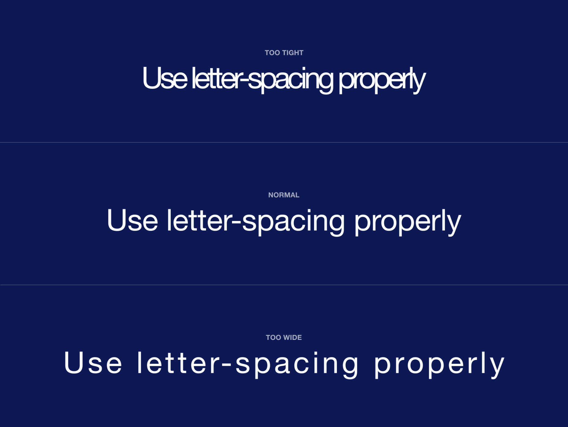
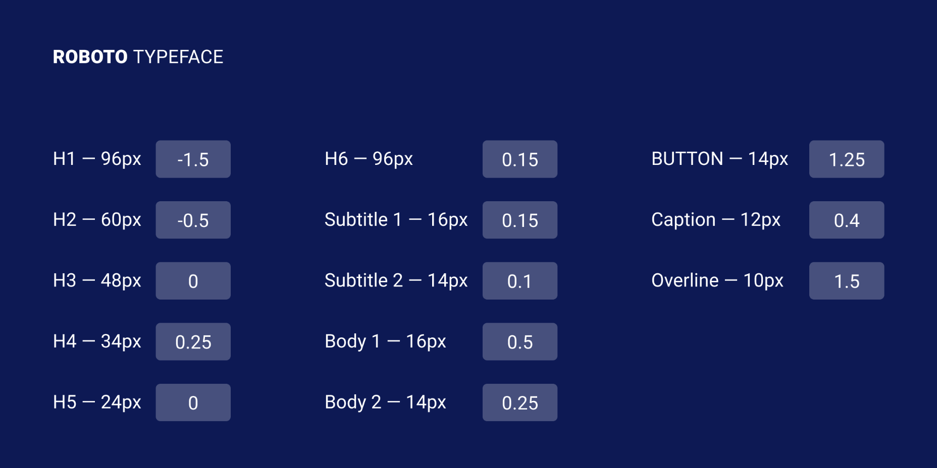
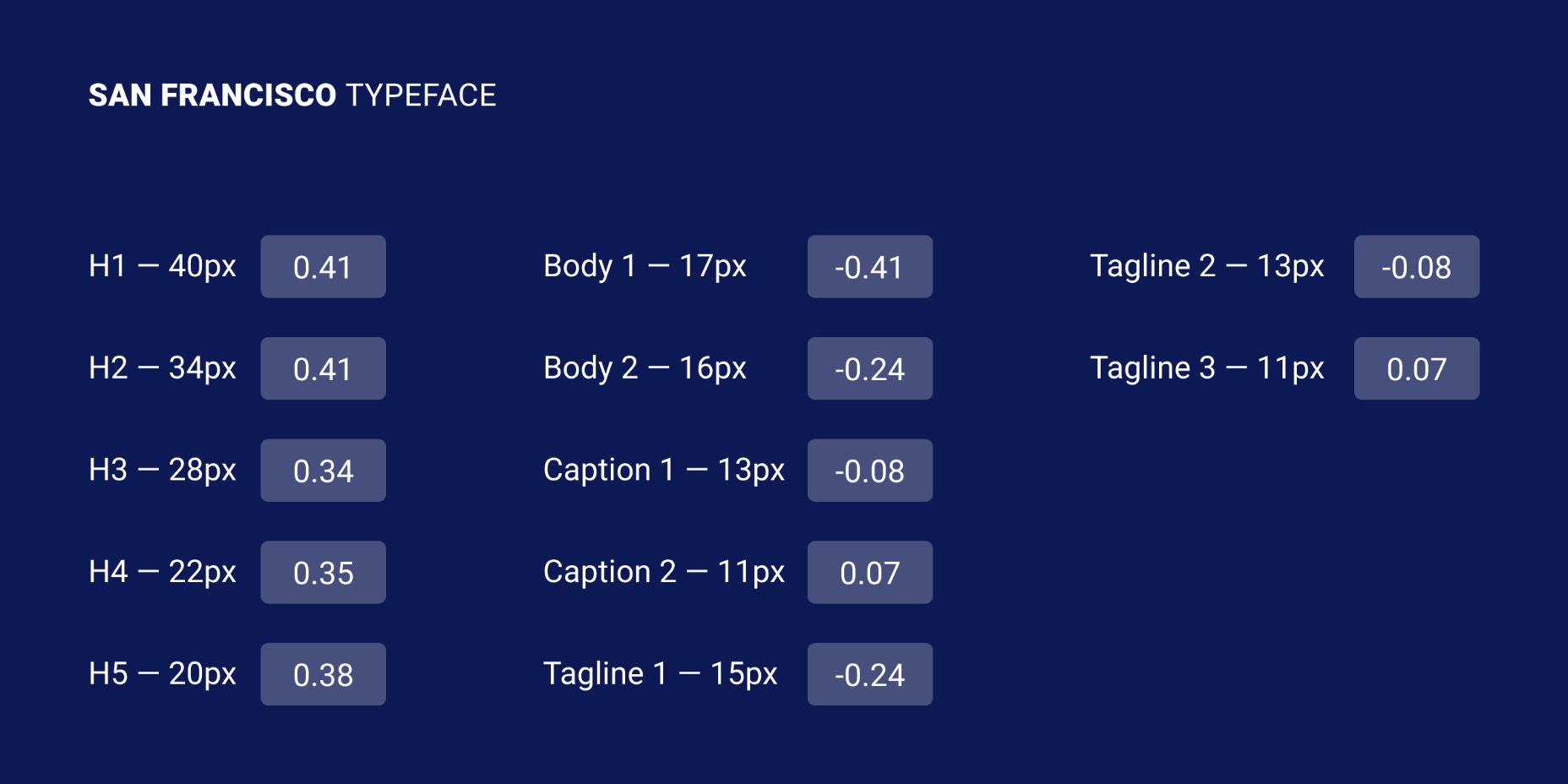
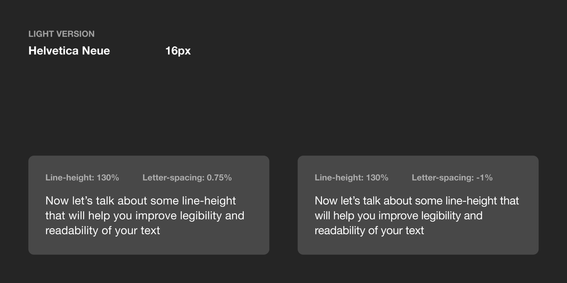
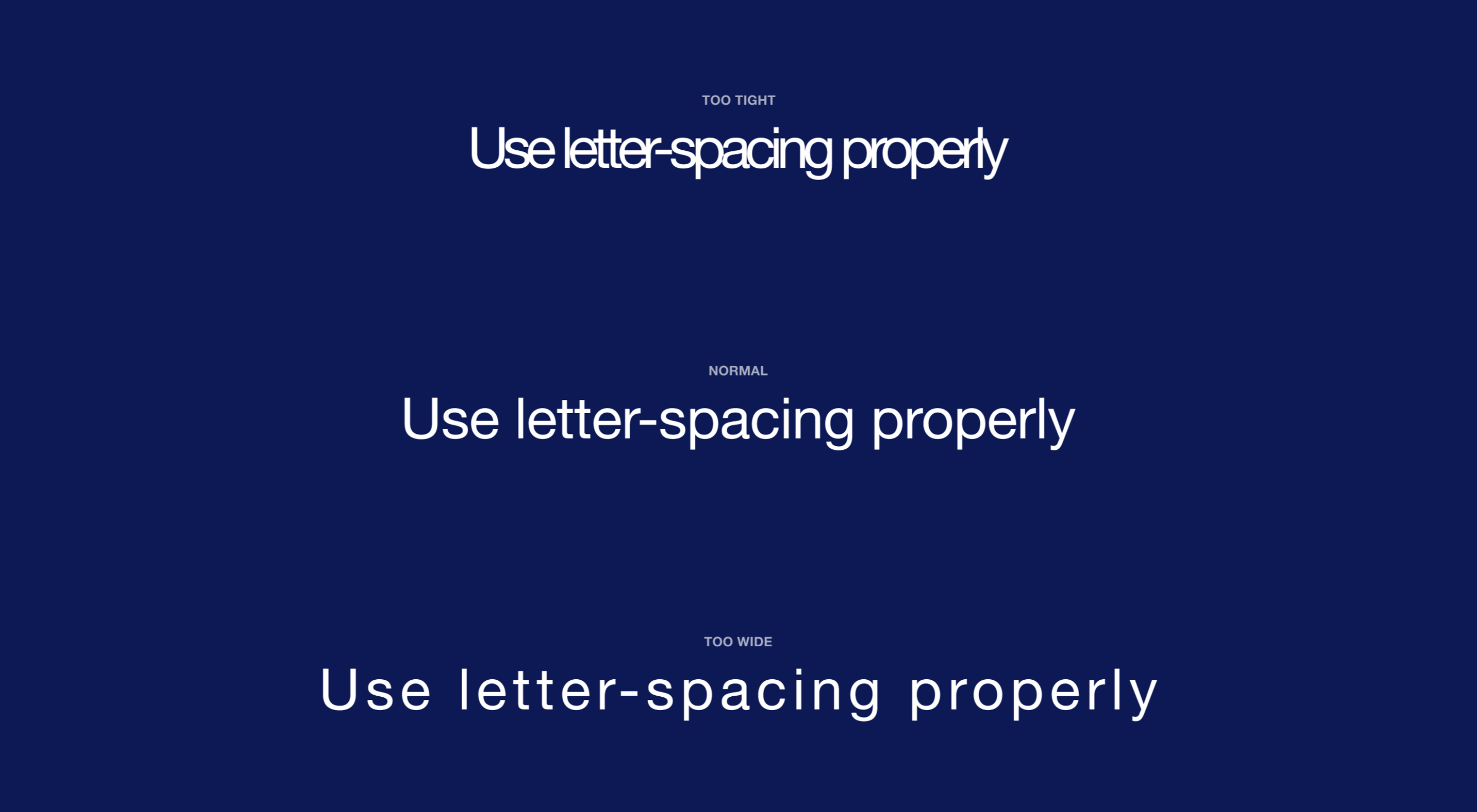
Most of the information we consume happens through reading, so it makes a lot of sense to pay attention to the words when designing. There are many aspects to typography, but one of the things that helped improve the quality of my design was letter-spacing.

Letter-spacing is about adding and removing space between letters. Some people confuse it with kerning, but these two are different; letter-spacing affects the whole line of text, whereas kerning adjusts the space between two individual letters at the time. Kerning is best left to type designers, besides which, unlike letter-spacing there is currently no way to control kerning in CSS.

I believe that practice and a lot of observation will change the way you treat letter-spacing in your work as well.

The Purpose of Letter-Spacing

The main purpose of letter-spacing is to improve the legibility and readability of the text. Words act differently depending on their size, color, and the background they are on. By adjusting letter-spacing to the environment you are working with you will help readers consume your information faster, and more efficiently. The fun part is that they won’t even notice it — that’s the whole point of the job.

Bear in mind that typographers think about letter-spacing and kerning when designing a typeface. It means you don’t have to apply it to all your text, but in order to have an understanding when it’s necessary, you should know some basic principles, and use good typefaces.

How Letter-Spacing Affects Legibility and Readability

The legibility and readability of your text depend on things like line-height, paragraph length, font size, typeface choice, letter-spacing, and much more. Regarding letter-spacing, if you are just getting into typography, the best thing you can do is not overuse it. What I mean by that is simply don’t make the distance between letters too big or too small; even if you think it looks good, people will struggle reading it, and that will ruin their experience.

Letter-Spacing Capital Letters

Capital letters are designed with the intention that they will appear at the beginning of a sentence or proper noun, in combination with lowercase letters. When capital letters are next to each other, the space between them is too tight. So in order to achieve better readability, space needs to be increased. This applies to both large and small font sizes.

Letter-Spacing Headlines

If you are using well designed fonts, you can be sure that they are calibrated well, and you won’t need to make any major adjustments to them. However, the problem with headlines is that at larger scales the space between letters looks unbalanced. It can be fixed by increasing or decreasing the letter-spacing value.

There are no strict rules for letter-spacing — there are a lot of typefaces and all of them require an individual approach — but if you look at how big companies like Google and Apple treat their typefaces, you can find a lot of valuable information there.

Let’s take a look at the “Roboto” and “San Francisco” typefaces (the first one is used in Material Design and the second one in Apple’s ecosystem). Headlines from 20 to 48 pixels have either a positive letter-spacing value or none. If the font size is bigger, letter-spacing becomes negative. These exact numbers are not going to work that well for other typefaces, but after trying different approaches I can state that it’s a common pattern.

I’ve tested several guidelines for letter-spacing and the one that was published by Bazen Agency works for a lot of popular typefaces. It will be a good starting point for you, but you can always apply additional adjustments:

H1 — 96px — -1.5%
H2 — 60px — -0.5%
H3 — 48px — 0%
H4 — 34px — 0.25%
H5 — 24px — 0%
H6 — 20px — 0.15%
Subtitle — 16px — 0.15%

If you happen to design a lot of apps or you’re planning to do that, one thing that helps me is using the default Material Design and Apple guidelines for their typefaces. They are well balanced and it saves a lot of time.

Letter-Spacing Body Text

If you ever read anything about letter-spacing, you’ve probably have seen this popular wisdom from typographer Frederic Goudy: “Anyone who would letter-space lowercase would steal sheep”. (There’s an argument that he was only referring to blackletter fonts.) Some designers took it as a hard rule and now never adjust the letter-spacing of lowercase text.

Based on my practice and by looking at the work of designers I can’t agree with Goudy, because sometimes small changes can make a big difference in how your text performs. Let’s take, for example, condensed fonts. At a small size, the letters are too close to each other, which leads to poor legibility. By increasing letter-spacing by 1.5% you will see that the text is now easier to read.

If we look at my previous example, in the guidelines for “Roboto” and “San Francisco” typefaces, letter-spacing is applied to body text; even though San Francisco has a dedicated “SF Pro Display” for headlines and “SF Pro Text” for body text, letter-spacing is still used to refine them.

There are a lot of different typefaces and a single rule doesn’t apply to all of them. Experiment with letter-spacing and do what seems right to you. There are some simple guidelines that will lead you in the right direction, especially when working with body text:

Keep in Mind Line-Height

If you have a line-height greater than 120%, most likely negative letter-spacing will lead to an unbalanced look to the paragraph. To refine it you would need to either keep it at 0% or only slightly increase it.

Light Text on Dark Background

On a dark background, white text looks overexposed and therefore letters appear too tight. To make it more legible, I would suggest you increasing letter-spacing a small amount.

General Values for Body Text

You can use the following guidelines for body text, which I have tested with several typefaces:

Body 1 — 16px — 0.5%
Body 2 — 14px — 0.25%

Letter-Spacing Captions

Unlike headlines and body text, smaller font sizes don’t have many variations in letter-spacing. It’s a common practice when a font size is lower than 13px to increase the space between letters to make it legible. But there are always exceptions (“SF Pro Text” guidelines suggest using positive letter-spacing only when a font size is 11px or below). Make sure you experiment with settings.

You can use the following values as a starting point and then edit them to what seems right to the typeface of your choice:

Caption — 12px — 0.5%
Overline — 10px — 1.5%

Final Tip

One of the things that helped me improve my skills in typography was looking at other designers and especially type foundries. By decoding their work you might notice some nuances of how they treat typography and it will help you in future projects.

Source

p img {display:inline-block; margin-right:10px;}
.alignleft {float:left;}
p.showcase {clear:both;}
body#browserfriendly p, body#podcast p, div#emailbody p{margin:0;}

Collective #613

Original Source: http://feedproxy.google.com/~r/tympanus/~3/GPg4O2tdytc/

Inspirational Website of the Week: makemepulse

Makemepulse challenges the laws of physics by being razor sharp and smooth as a feather at the same time. Our pick this week.

Get inspired

Our Sponsor
Be: 500+ pre-built websites for ANY kind of project

Now comes with Elementor and dedicated Elementor pre-built websites.

Discover more

Ten modern layouts in one line of CSS

A post by Una Kravets that highlights a few powerful lines of CSS that do some serious heavy lifting and help you build robust modern layouts.

Check it out

Lights and Shadows

Bartosz Ciechanowski’s interactive journey into the world of light and how it interacts with different objects.

Read it

The Cicada Principle, revisited with CSS variables

Lea Verou shows some amazing examples of the Cicada Principle with CSS variables.

Check it out

Accordion Rows in CSS Grid

Eric Meyer shares the way he’s using CSS Grid rows to for more layout flexibility.

Read it

viewBox

A newsletter with tips, demos, articles and a monthly challenge all about the magical world of SVG! By Cassie Evans and Louis Hoebregts.

Check it out

WebGL with Three.js Program

Bruno Simon has started working on a Three.js course and the outline looks very promising.

Check it out

CSS News July 2020

In this article, Rachel Andrew takes a look at some of the interesting CSS features that are making their way into browsers right now.

Read it

Rubik’s Cube

A Rubik’s cube made with Three.js. By Aaron Bird.

Check it out

Knopf.css

A modern, modular, extensible button system designed for both rapid prototyping and production-ready applications.

Check it out

Favicon in Dark Mode

A great CodyHouse video that shows how to change the colors of your favicon when dark mode is enabled.

Check it out

The Comeback of Fun in Visual Design

Michael Flarup writes about the long awaited “swing of the pendulum” in visual design.

Read it

Uncommon CSS Properties

In this article, Ahmad Shadeed goes through some different interesting CSS properties.

Check it out

Lemon.io

Find a perfect freelance match for your project in just 24 hours.

Check it out

CSS collector’s cabinet

Lynn Fisher’s beautiful CSS creation.

Check it out

Always bet on HTML – being misunderstood

Christian Heilmann takes a look at the reasons why people might be less enthused about HTML.

Check it out

Goodbye Squarespace. Hello Eleventy, Tailwind CSS and Netlify!

Sahil Parikh shares his experience with transitioning his blog to a static site generator.

Read it

Bubbles Lamp

A beautiful demo by ilithya.

Check it out

Arched 3D panel

Watch a modern take on an older component Ana Tudor coded some year ago.

Watch it

WordPress Static Site: Benefits, Limits & Tools

A complete guide to getting started with WordPress static site generators.

Read it

Accessible and Keyboard-Friendly Hamburger Menu + Slide Out Navigation

A live demo and tips on building an accessible hamburger menu that’s keyboard-friendly and toggles a slide-out navigation panel.

Check it out

From Our Blog
Exploring Animations for Menu Hover Effects

A couple of ideas for creative menu hover animations with images.

Check it out

The post Collective #613 appeared first on Codrops.