Original Source: https://www.smashingmagazine.com/2020/08/accessibility-chrome-devtools/
Accessibility In Chrome DevTools
Accessibility In Chrome DevTools
Umar Hansa
2020-08-13T07:00:00+00:00
2020-08-13T17:34:35+00:00
I spend a lot of time in DevTools, and in doing so, I’ve come to learn about some of the more ‘hidden’ features in DevTools and would love to share some of them with you in this article — specifically around accessibility.
This article uses Google Chrome since it’s a browser I use and feel comfortable with. That being said, Firefox, Safari, and Edge have all made great strides in their developer tools, and they definitely have some great accessibility-related features of their own.
You might already be familiar with DevTools, but here’s a quick reminder how to inspect an element on a webpage:
Open a webpage you are interested in inspecting, in Google Chrome
Use the shortcut Cmd + Shift + C (Ctrl + Shift + C on Windows)
Your pointer is in Inspect Element mode, go ahead and click an element on the webpage
Just like that, you’ve opened up DevTools and have begun inspecting elements. The different panels correspond to different features, e.g. around JavaScript debugging, performance, and so on.
There are accessibility-related features scattered throughout, so let us explore what they do, where they live, and how to use them.
Contrast Ratio
This is a feature to check whether the inspected text has a satisfactory color contrast against the background color.
Typically, a high level of contrast between the text color and underlying background color means more legible text for users of different abilities. In addition, it helps support users reading your text in a variety of environmental conditions, consider these examples which can impact how a user perceives text legibility:
Looking at a screen while outside with lots of sunlight
A mobile device has lowered its screen brightness all the way down to preserve battery life
“The intent is to provide enough contrast between text and its background so that it can be read by people with moderately low vision.”
— Understanding Success Criterion 1.4.3: Contrast (Minimum)
Using the contrast ratio tool can give us an immediate yes/no answer to the question: does this text meet the minimum contrast standard. Using this tool can help influence the design and color scheme of your website, which can lead to more readable content for users with low vision.
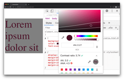
Contrast ratio in the color picker tool (Large preview)
Available in the color picker tool, the contrast ratio feature can inform you on whether a minimum contrast requirement has been met. To access this feature:
Inspect a text element with the DevTools
Find the color property in the Styles pane, and click the small colored square to bring up the color picker tool
Click on the text which says ‘Contrast ratio’ which presents further information on this subject
The three ratios represent:
Your current contrast ratio
The minimum contrast ratio (AA)
The enhanced contrast ratio (AAA)
As an exercise for yourself: drag the circular color picker tool across the color spectrum and observe the points at which the minimum contrast and enhanced contrast ratios are satisfied.
This feature can also be reported to you through a Lighthouse Report, covered in Lighthouse section of this article.
Accessibility Inspector
This refers to a DevTools pane which lets you view various accessibility properties and ARIA information for DOM nodes.
ARIA refers to a collection of properties, typically used in HTML, which in turn makes your website more accessible to individuals of different abilities. It’s absolutely worth using on your own websites, but it does require understanding the fundamentals of web accessibility to ensure you’re using it in a way which will help your users.
For example consider the following piece of HTML:
<p class=”alert” role=”alert”>
That transaction was successful
</p>
An assistive device, such as a screen reader, can use the role="alert" property to announce such information to the user. The Accessibility pane within DevTools can cherry-pick such a property (role) and present it to you, so it’s clear what accessibility-related properties an element has.
Validating the information you see in this pane can help answer the question: “Am I coding accessibility incorrectly”, whether it’s syntactically or structurally, just keep in mind, applying accessibility techniques with the correct syntax, and having an accessible website, are two different things!
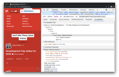
The accessibility pane within the Elements Panel (Large preview)
To start using this, you can open up the Accessibility pane with an inspected element:
Inspect any element on the page, e.g. a hyperlink or search box
Open up the Accessibility pane which is found in the Elements Panel
Bonus tip: rather than having to locate the pane (it’s not open by default), I search for ‘Show Accessibility’ in the Command Menu (Cmd + Shift + P).
You’ll find a bunch of information here, such as:
An accessibility tree (a subset of the DOM tree)
ARIA attributes
Computed accessibility properties (e.g. is something focusable, is it editable, does it pass form validation)
Depending on the inspected element, some of this information may not be applicable, for example, maybe an element legitimately does not need ARIA attributes.
As with most features in DevTools, what you see in this pane is ‘live’ — changes you make in the Elements Panel DOM Tree are reflected back to this pane immediately, making it helpful for correcting a misspelled ARIA attribute for example.
If you’re confident in your use of Accessibility, possibly because you’re using an alternative automated testing tool such as axe, then you may not use this pane very often, and that’s okay.
If you’re interested in learning more while looking at real-world websites, I’ve made a 14-minute video on Accessibility debugging with Chrome DevTools.
Video on Accessibility debugging with Chrome DevTools
Lighthouse
Lighthouse is an automated website checker that can scan for best practices, accessibility, security, and more.
If you’ve done some reading on accessibility theory, and you want to learn how to effectively apply it to your own website, this is a great tool to use since it’s quite literally a point-and-click interface — no installation required. In addition, all of its audits are very instructional, informing you what failed, and why something failed.
Following the suggestions from this tool will almost certainly help improve the accessibility of your site.
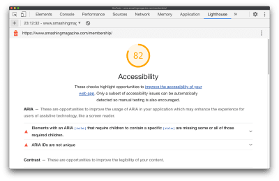
A Lighthouse audit report (Large preview)
While checking for security, general web best practices, performance is helpful. Let’s focus on how to run an accessibility audit in Lighthouse:
Navigate to the Lighthouse panel in DevTools
Uncheck all categories, but keep ‘Accessibility’ checked
Click ‘Generate Report’
In the resulting report, click through the different suggestions to learn more about them
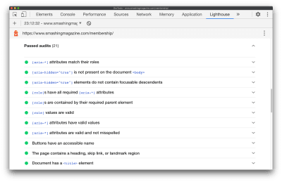
Passed audits are still a good learning opportunity (Large preview)
If you want to learn more about Accessibility (I certainly do!), clicking through failed, but even passed audits are a great way to learn since almost each audit links off to dedicated web developer documentation on the audit itself, and why it’s important.
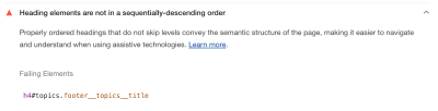
For the most part, the audit documentation pages are extremely succinct and I highly recommend them. Let’s take a look at the audit documentation for ensuring a <title> element is present. It specifies:
How the Lighthouse title audit fails
How to add a title
Tips for creating great titles
Example of a title not to use, along with a title worth using
And in the case of the document title documentation, it only took 300 words to explain those 4 points above.
One interesting thing to note, unlike the Accessibility pane, Lighthouse Audits are very instructional by default, making the Lighthouse panel a great place to visit when you’re just getting started out.
The ‘Learn more’ link opens a new window to well written documentation (Large preview)
As you become more advanced with building accessible pages, you may move away from pre-defined audits and spend more time in the accessibility pane.
“
Emulate Vision Deficiencies
This is a DevTools feature to apply vision deficiencies, such as blurred vision, to the current page.
“Globally, approximately 1 in 12 men (8%) and 1 in 200 women have color vision deficiencies.”
— Accessibility Requirements for People with Low Vision
You’ll want to use this feature to help ensure your website meets the needs of your users. If your website is displaying an important image, you may discover that this image is difficult to comprehend for someone with tritanopia (impaired blue and yellow vision), or is even difficult to comprehend for someone with blurred vision.
“Some low visual acuity can be corrected with glasses, contact lenses, or surgery — and some cannot. Therefore, some people will have blurry vision (low visual acuity) no matter what.”
— Accessibility Requirements for People with Low Vision
For example, in the case of an image, you may find that there is a higher resolution image available for download while emulating blurred vision via DevTools, rather than a user with blurred vision can use and in turn comprehend what the image is showing. This will require some design/UX based problem-solving skills — possibly from you/your colleagues — but it can be the difference between meeting the needs of your users, or not meeting their needs.
?️ Please note: The following image is partially blurred, to demonstrate the ‘Blurred vision’ emulation feature of DevTools.
Blurred vision doesn’t affect colors on the page, but the other deficiencies do (Large preview)
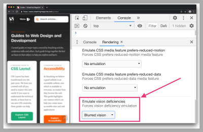
You can try this feature out with the following steps:
Open the Command Menu (Cmd + Shift + P or Ctrl + Shift + P on Windows)
Search for and select ‘Show rendering’
Select a vision deficiency such as ‘Blurred vision’ from the Emulate vision deficiencies section in the Rendering Pane.
Here are a few examples of vision deficiencies you can apply via DevTools:
Blurred vision
Where vision is less precise
Protanopia
Color blindness resulting from insensitivity to red light
Tritanopia
Impaired blue and yellow vision
Emulation features like this will not fully account for subtle differences in how such deficiencies manifest themselves with individuals, let alone the wide range of vision deficiencies out there. That being said, this feature can still help us as web developers with understanding and improving the accessibility of our pages.
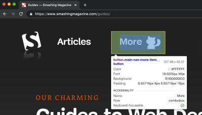
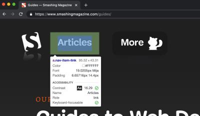
Inspect Element Tooltip
This feature refers to an improved tooltip which now surfaces accessibility-related information when you use the ‘Inspect Element’ feature. It’s a subtle, yet still very important feature since it can inform you of how accessible elements are, at a quick glance.
I say it’s important because in the case of the four other features mentioned in this article, they require intentional action on our part (click the generate report button, navigate to the Accessibility pane, open the color picker tool, and so on). However, for this feature, it surfaces in one of the most common actions of DevTools while inspecting an element.
As a short challenge for yourself, take a look at the following two screenshots. They demonstrate the enhanced DevTools Inspect Element tooltip which now has an accessibility section on there. Can you identify what the properties in that section represent?
(Large preview)
(Large preview)
You may notice that these are the exact same pieces of information we saw earlier — as part of the Contrast Ratio section and the Accessibility Inspector. They’re the same properties but surfaced in a (hopefully) simpler way.
Note: There’s also a “Keyboard-focusable” property in that tooltip (the very last item). This indicates whether or not the item is keyboard accessible. If true, this will typically suggest the element in question can be focussed by tabbing to it.
The way I see it: Inspect Element is an extremely common use case within browser DevTools, so cherry-picking useful accessibility-related properties for the Inspect Element tooltip can serve as a helpful reminder, and prompt us as web developers to investigate further and ensure what we’re building is accessible.
Conclusion
Web developer tooling to improve accessibility has improved rapidly over the years, but sometimes these tools are hidden away or simply undocumented. In this article, we explored some of those features which can hopefully help us when applying accessibility best practices to the websites we build.
Here’s a reminder of what we covered:
Contrast ratio
Check whether the inspected text element has a satisfactory contrast ratio.
Accessibility Inspector
View various accessibility properties and ARIA information.
Lighthouse
A website checker that covers best practices, accessibility, and more.
Emulate vision deficiencies
A tool to apply vision deficiencies (such as blurred vision) to the page.
Inspect Element Tooltip
An improved tooltip which surfaces accessibility-related information.
I make the Dev Tips mailing list if you want to keep up to date with over 200 web development tips! I also post loads of bonus web development resources on my Twitter.
That’s it for now! Thank you for reading.

(ra, il)


 The right typeface can make or break your website. As designers, we will always be naturally drawn towards the premium fonts such as Circular, DIN, or Maison Neue; Before you know it, your website is racking up a font bill larger than your hosting bill.


 Many people dream of a career in web design, but it may actually be more attainable than you think.