This Week In Web Design – August 28, 2020
Original Source: http://feedproxy.google.com/~r/1stwebdesigner/~3/kShm2tzcdrw/
…
Original Source: http://feedproxy.google.com/~r/1stwebdesigner/~3/kShm2tzcdrw/
…
Original Source: https://smashingmagazine.com/2020/09/design-reduced-motion-sensitivities/
CSS has recently added features that allow us to recognize certain user preferences and qualities of the user’s current environment. One of those new features, specifically the prefers-reduced-motion media feature, can be especially useful for designing more inclusive motion on the web.
A few years back, I wrote an article about designing safer web animation for motion sensitivity and the limited options we had at the time to design safe motion on the web. Some things have remained the same since that original article, like the types of motion effects that can be triggering, and the importance of context and user expectations. But what has changed is the existence and support of the prefers-reduced-motion media feature. That makes a big difference in how we can design the motion in our work to be inclusive and accessible.
Why Reduce Motion?
The release of iOS7 back in 2013 sparked a realization throughout the digital design world that some motion on screen — even if it was part of an interface — could have physical consequences for people with motion sensitivities. In the years since then, the major mobile and desktop operating systems have added functionality for people to reduce the amount of motion they encounter in their operating systems.
Articles like “Your Interactive Is Making Me Sick” and “Accessibility For Vestibular Disorders” share first-hand stories of how our design choices, especially around motion, can have physical consequences for those with motion sensitivities. The root causes of these motion sensitivities can vary greatly between individuals. For some, it’s rooted in a vestibular disorder, while for others it might stem from migraines or other factors. What’s triggering can also vary from person to person, or even from day to day for some. The physical symptoms individuals experience as a result of that triggering motion can range from slight dizziness or headaches to nausea or worse.
The design choices we make around animation in our work directly impacts how our work affects people with motion sensitivities. Knowing what kinds of motion are potentially triggering, and how we can mitigate them with our design choices, helps us design experiences that are safe for our audience and won’t cause unintended harm. Animation still absolutely can have a positive impact on our UX efforts, but it’s up to us to make sure we use it responsibly, just like we try to use our other design tools responsibly.
Prefers Reduced Motion On The Web
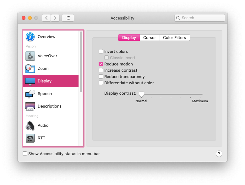
The prefers-reduced-motion media feature now has strong browser support. It’s supported in current versions of Edge, Firefox, Chrome, Safari, Opera, iOS Safari, as well as on Android Browsers and Chrome for Android. The level of support we have today makes it something that you can absolutely use in production. Also, if someone’s browser doesn’t support this feature, nothing bad happens, it will just be ignored and things will carry on as before.

On the development side, we can test for prefers-reduced-motion in the same way that we would use any other media query in CSS or JavaScript to find out if reduced motion has been requested.
In CSS that will look something like this:
@media (prefers-reduced-motion: reduce) {
/* reduced behaviour */
}
And in JavaScript:
let motionQuery = matchMedia(‘(prefers-reduced-motion)’);
const handleReduceMotionChanged = () => {
if (motionQuery.matches) //reduced behaviour;
}
motionQuery.addListener(handleReduceMotionChanged);
handleReduceMotionChanged()
Whichever way you choose to access it, this media query will return one of two values: no-preference (false), or reduce (true). Once retrieved, you can use these values to inform what you display in the browser.
Of the two values that can be returned, the only one we can be sure has been set intentionally is the reduce (true) value. No-preference (false) can mean that the person in question is fine with all types of motion, or it could mean that that preference just hasn’t been set yet. This makes any approach that equates the value of no preference (false) to the person in question opting in to all levels of motion unreliable. Because of this, the better approach is to reduce potentially triggering motion effects when a value of reduce (true) is returned.
For example, here the looping bounce animation is replaced with a fade in animation when reduced motion is requested:
/* A constant bouncing motion effect applied to the title */
h2 {
animation: bouncing 1.5s linear infinite alternate;
}
/* Replace it with a safer effect when prefers-reduced-motion returns true */
@media (prefers-reduced-motion) {
h2 {
animation: fade 0.5s ease-in both;
}
Reduced Motion From The Users’ Perspective
Most major operating systems allow people to set their preferences in their system settings. The exact wording and location of the settings vary, but the preference can be set on iOS, OSX, Windows, and Android operating systems.

The Prefers Reduced Motion Media Feature In Practice
Deciding how to put the prefers-reduced-motion media feature to use is where we have space for creating solutions that best fit the context of our products and content. For most web projects, you’ll want to first identify any potentially triggering motion effects on your site, and then use the prefers-reduced-motion media feature to provide a reduced version of that effect.
Let’s look at each step in more detail.
Identifying Potentially Triggering Motion
To find any potentially triggering motion you might have, go through some typical user flows for your site or product and take a closer look at the motion effects used: Do you have any interactions that have large movements? Any large zooms, spinning effects, or parallax effects? All of those types of animated effects are very likely to be problematic for people with motion sensitivities. In contrast, animated effects like color fades, opacity changes and small changes in scale are unlikely to be problematic. If in doubt, it can’t hurt to add the effect in question to your “to reduce” list to err on the side of caution.
The Web Content Accessibility Guidelines recommend providing a reduced version for any “motion that creates the illusion of movement…that is not essential to the content’s meaning”. I think it’s helpful to see some examples too, especially if you don’t consider yourself to be sensitive to motion on screen. I cover examples of potentially triggering motion in my previous article and this post on the Webkit blog has some too. Chances are, unless your site relies heavily on motion, you’ll end up with a fairly short list of effects to focus on here.
Create A Reduced Motion Version
Next, you want to determine the most appropriate reduced motion condition for these potentially triggering effects. Can the animation easily be adjusted to use a non-motion effect like an opacity fade or crossfade for reduced motion requests? Would pausing the motion or removing the effect entirely for reduced motion preserve the meaning of the content?
The role of the motion in question will be an important factor in deciding what the most appropriate reduced version would be. You don’t want to unintentionally remove content or degrade the overall experience. Here are a few examples of what might work well for the potentially triggering effects you find:
Large Page Transitions
Large page transition effects can likely be replaced with a crossfade effect for a reduced motion mode. The same is usually true for large zooming or spinning transitions that transition between different states or views.
Animated Illustrations
Animated illustrations, on the other hand, might be best replaced with a static version for reduced motion if they are mostly for personality or branding effect. You’ll want to make sure the static version is still meaningful, and the arrangement that has the most meaning may not always be the very beginning or very end of the animation. Adding in functionality to play animated illustrations on demand for reduced motion could also be useful by allowing people to play the animation when they’re ready for it.
Don’t forget to consider the motion in your animated gifs or auto-playing videos here as well. These can also contain potentially triggering motion and would need a reduced version if they do.
Parallax Effects
Parallax effects and exaggerated smooth scrolling effects are universally triggering for folks with motion sensitivities, so those should be significantly reduced or entirely removed for reduced motion. (Every single person I’ve talked to in my research on this has called out parallax specifically as being a problem for them.) Smooth scrolling effects can be replaced with the default browser anchor link behaviour as described here by Eric Bailey. Removing parallax effects for reduced motion is the ideal solution, but make sure to check that all the necessary content is still visible and usable with the parallax removed.
In most cases substituting the potentially triggering effect with a safer effect for reduced motion is the best way to preserve as much of the content’s intent and usability as possible. Luckily, substituting a reduced effect can be pretty straight forward too.
An Example Of Reducing Motion
For example, let’s say I flagged this header animation as potentially triggering when I went through my site. The motion is large enough to create the illusion of motion, so it’s likely to be triggering, and the multiple directions of motion are also likely to be problematic. It’s definitely one I’d put on my list of effects that need a reduced version when reviewing my site.

The Airpods Pro page also responds to reduced motion preferences, but in a very different way because of the content and effects used. Almost all of the motion on the page could be potentially triggering since it has a lot of big zooming movements and parallax-style effects. When reduced motion is requested, all the parallax and large motion effects are removed, but they do more than just pause or remove the animations. The version you see with reduced motion selected has been designed with care to preserve the same content and meaning from the full motion experience. (Here’s a video of The Airpods Pro site both with and without reduced motion selected for reference.)

Add Custom Toggles For Motion-Heavy Experiences
I mentioned above that most “task-based” sites likely have only a handful of animations that might be triggering and need a reduced version. But those aren’t the only kind of web sites out there on the web. Projects that involve a large amount of motion, like sites that are meant more for storytelling or creating an experience might benefit from a slightly different approach.
For projects like these, it would be difficult to make a list of potentially triggering motions and provide a reduced alternative for each because almost all of the motion used could be potentially triggering. Plus, the motion is very much part of the content and its meaning. Designing a reduced motion mode for these types of sites will take a more global approach and more effort to be sure the meaning of your content is preserved even as motion is reduced.
For these highly animated experience sites, providing a visible custom motion toggle is a useful thing to include. This will allow people who may not yet know about the reduced motion setting, or who are experiencing some motion sensitivity at that moment in time, to quickly adjust the experience. A motion toggle provides a way for motion-sensitive folks to participate in your content in a way that won’t make them sick. That’s definitely better for everyone involved than them having to avoid your site entirely.
Context Is A Key Factor
Remember that context also plays a big role here. No one wants to be surprised by large amounts of motion where they don’t expect it. If you’re visiting a site billed as a highly interactive storytelling experience you’ll have very different expectations than when you’re visiting your bank’s web site. Both of those sites certainly could feature large amounts of animation, but it would be an unexpected surprise on the bank site.
Building A Custom Motion Toggle
The idea of a custom toggle is something that I mentioned back in my 2015 article, but today it’s a much more viable option. On today’s web, we can create one with more ease, and even make a smarter toggle than we could have just a few years ago.
Marcy Sutton has a great example of how a modern custom motion toggle could work in this CodePen. (This example is part of her course on making accessible web apps, which is also very much worth checking out.) Her example uses a toggle to remove all motion because it only includes one animation, but this approach can be used to provide reduced motion effects across an entire application or site following the same logic as well.
The key feature of this approach is how nicely Marcy ties it in with modern web technology, i.e. prefers reduced motion and local storage. When using this approach, if someone comes to your site with reduced motion requested, they automatically get the reduced motion version without having to manually activate the toggle as well. And if someone invokes the toggle to reduce motion, that preference will be saved via local storage so they won’t have to repeatedly make this selection every time they visit.

The official Animal Crossing site is a wonderful real-world example of a custom reduce motion toggle combined with the prefers-reduced-motion media feature. It’s one of my favorite examples of handling reduced motion. The design choices they made around how to reduce potentially the triggering motion, while still keeping true to the overall feel of the site and the content, is great. I wrote more about how they pulled it off in this blog post. There are a lot of sites out there whose audience could benefit from a similar approach.
Other Ways To Use Motion Toggles
If you already have a preferences or settings panel, adding a toggle to request reduced motion could be a valuable thing to add to these settings like Twitter does on its site. In this case, there aren’t large amounts of motion immediately presented when visiting the site and there’s already a settings panel, so implementing the toggle as part of the settings preferences fits well. Twitter’s toggle also respects OS-level settings via the preferes reduced motion query and is preset to either on or off based on what the user has set at the OS level. Designing your motion toggle to respect OS settings is definitely a smart approach to implementing them well no matter where the toggle might appear.

Contextual toggles are another approach that could be used to reduce motion on specific animated illustrations or other content areas that appear throughout your site. The Dark Side of The Grid article does this nicely by adding contextual toggle buttons to each animate figure to allow the reader to play the animation when they want to see it, but not have it loop endlessly while they are reading.

Along those same lines, Dave Rupert shared a technique for combining prefers reduced motion with the picture element to show static elements in place of animated gifs when reduced motion has been requested. Chris Coyier took that one step further and suggested presenting a play toggle for those animated gifs based on the same approach. Steve Faulkner’s gif de-animator example could also be a useful approach.
All of these, or something similar, could be good options for mitigating any potentially triggering motion on the web. I bring up these examples for two reasons. The first is to show that there are a number of ways to approach providing reduced motion variations and you have lots of flexibility to find an approach that fits best for your content. And secondly, as time goes on and more folks are building sites with reduced motion options, the more innovative solutions we’ll see shared in the community.
There are many creative ways to add toggles and settings in a way that makes sense for the context of your project. It’s an interesting parallel that we’re seeing more and more web sites include settings panels or options for setting preferences like dark mode. Including an option for reduced motion could be a natural next step.
The More We Use It, The Better It Will Get For Everyone
I think it’s important for us, the people designing and building things for the web, to take advantage of the prefers-reduced-motion media feature to make our work more inclusive. By taking steps to respect motion preferences we make the web safer for more people to use, and that can only be a good thing. We absolutely can be expressive and creative with motion on the web while also being responsible and inclusive.
But the awareness level is still something we need to be, well, aware of. Not everyone who might need reduced motion is aware of the option in their OS settings. Perhaps even fewer people know that it can take effect on content in their browser too since so few websites currently take advantage of it. The more we take advantage of the prefers-reduced-motion media feature, and provide a quality reduced motion experience with it, the more meaningful of a feature it will be for those who need it.
Original Source: https://www.hongkiat.com/blog/40-free-unique-cartoon-and-comic-fonts/
Have you ever feel that traditional fonts are a little too boring and plain for your designs and artworks? Ever wanted to use fonts that are funkier, stylish and fun to look at? Cartoon and comic…
Visit hongkiat.com for full content.
Original Source: http://feedproxy.google.com/~r/tympanus/~3/vF9Y8Q2NROY/

Inspirational Website of the Week: Elias & Valentin
A very fluid experience on another level of sophistication. Our pick this week.
Get inspired

This content is sponsored via Syndicate Ads
Website Behavior Analytics Software
Understand how users are really experiencing your site without drowning in numbers!
Try it free

Component Driven User Interfaces
The Chromatic team made this great resource that explores how modularity is transforming design and front-end development and explains what Component Driven UIs are.
Check it out

Shader Studies: Matrix Effect
Shahriar Shahrabi wrote this break down of the matrix shader effect written by Will Kirby and also implemented a real time matrix Shader in Unity 3D with Triplanar mapping.
Read it

Present
A terminal-based presentation tool with colors and effects.
Check it out

Web Brutalism, Seamfulness, and Notion
A very interesting article on how a tool for sensemaking reconciles two distinct software design ideologies.
Read it

Omatsuri
A great place to find open source browser tools for everyday use.
Check it out

Stitches
A CSS-in-JS library with near-zero runtime, server-side rendering and multi-variant support.
Check it out

Building Website Headers with CSS Flexbox
A very practical tutorial on how to code up responsive flexbox-powered website headers.
Read it

Custom bullets with CSS ::marker
Learn how trivial it has become to customize the color, size or type of number or bullet when using lists.
Read it

CSS ART – Vintage VW Bug
A beautiful VW Bug created with CSS only.
Check it out

An Interesting Explanation of async/await in JavaScript
Learn how to use async/await in JavaScript in this article by Dmitri Pavlutin.
Read it

Proportional Resizing with CSS Variables
A very useful snippet by Ahmad Shadeed on how to proportionally control the dimensions of an element.
Check it out

Is the web getting slower?
Is website performance getting worse overall? The team of DebugBear tries to answer the question.
Check it out

To design and develop an interactive globe
Read about Stripe’s approach to creating a 1:40 million-scale, interactive 3D model of the earth.
Read it

Increment: APIs
This issue of Increment explores all things APIs—from their prehistory to their future, their design and development to their opportunities and impacts.
Check it out

CSS3D Adventure Game
A 3D game rendered entirely in CSS/HTML. Can you escape the dungeon?
Check it out

Flexbox Defense
The Tower Defense game with a twist: all towers must be positioned with CSS Flexbox!
Check it out

Alt text overlay bookmarklet
Christian Heilmann created a bookmarklet to easily test which images have alternative text and what it is.
Check it out

Creating A Custom Scroll Bar In 24 Lines Of CSS
Have you ever encountered a website with a beautiful scrollbar and thought to yourself “wow, I wish I… Tagged with css.
Check it out

CSS Values
A place to search the syntax and all possible values for any valid CSS property.
Check it out

From Our Blog
Diagonal Thumbnail Slideshow Animation
A simple slideshow with tilted thumbnails and large titles that animate when navigating.
Check it out
The post Collective #621 appeared first on Codrops.
Original Source: https://www.webdesignerdepot.com/2020/09/3-essential-design-trends-september-2020/
 A seasonal change is on the horizon and that always has me looking to refresh projects. This month’s design trends provide a few different ways to do that without ripping up your entire website.
Here’s what’s trending in design this month.
Animated Heroes (That Aren’t Video)
Hero headers and screens that feature video animation have been popular for a while, but more website designers are experimenting with other types of full-screen moving graphics.
What’s cool about this trend is that it can take on plenty of different forms and look a lot of different ways, meaning that no two websites are identical in this regard.
The other bonus to this trend is that you can add a full-screen animation to almost any style of design without a complete overhaul of the website. You may need a few small tweaks to create a seamless transition from one screen to the next, but it’s a quick, modern design element that you can deploy rather quickly.
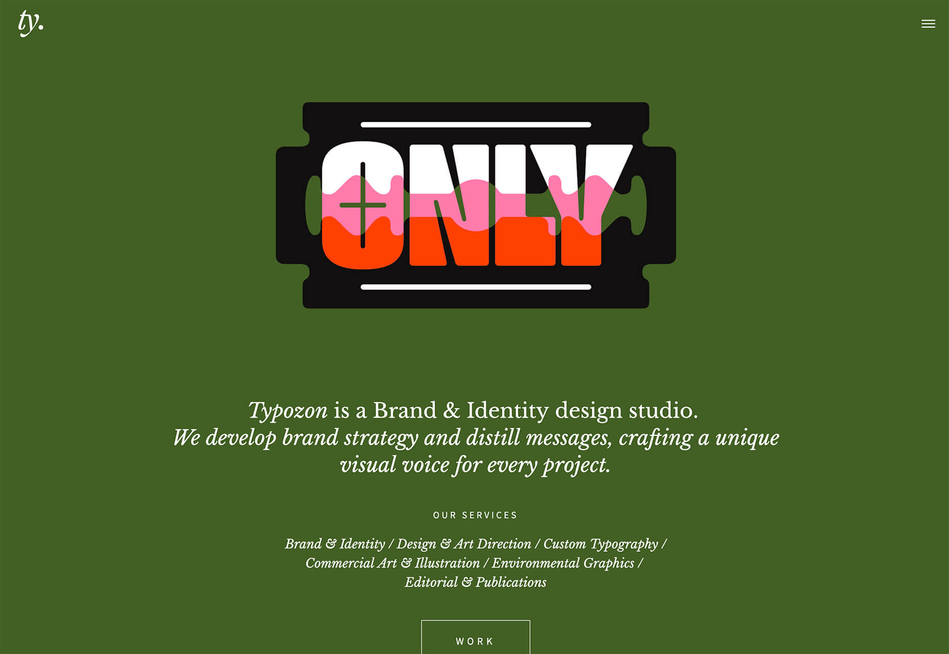
Typozon uses a quick motion graphic with plenty of different brand marks to tell the story of their brand identity work. Admittedly, the animation can get a little dizzying if you look at it too long, but the bright colors on the olive background are attention-getting for sure.
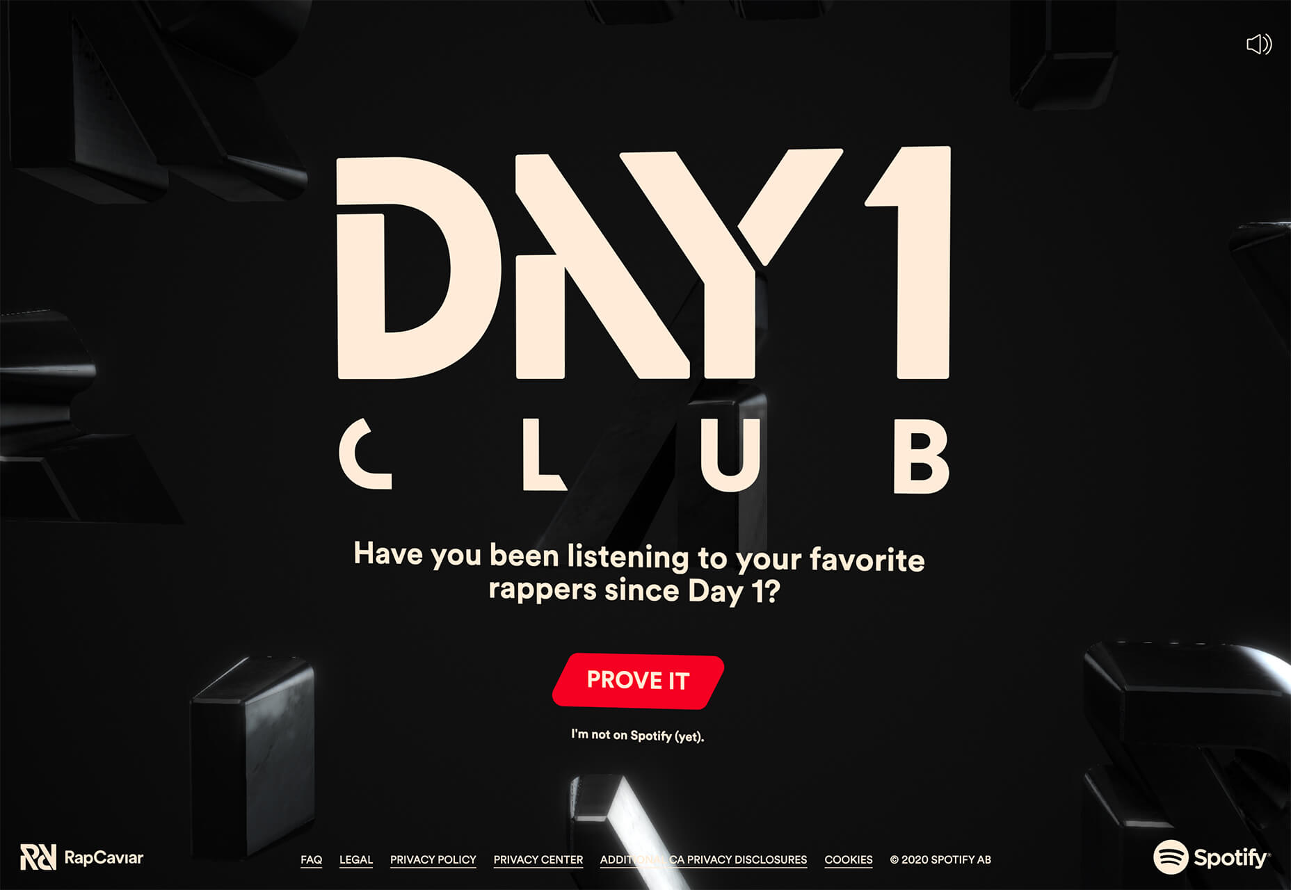
Day 1 Club by Spotify opens with a lot of motion in the setup and then settles into subtle motion behind the primary call to action. Shades of black and soft movement bring everything together and help you focus on the bright red button and text overlay.
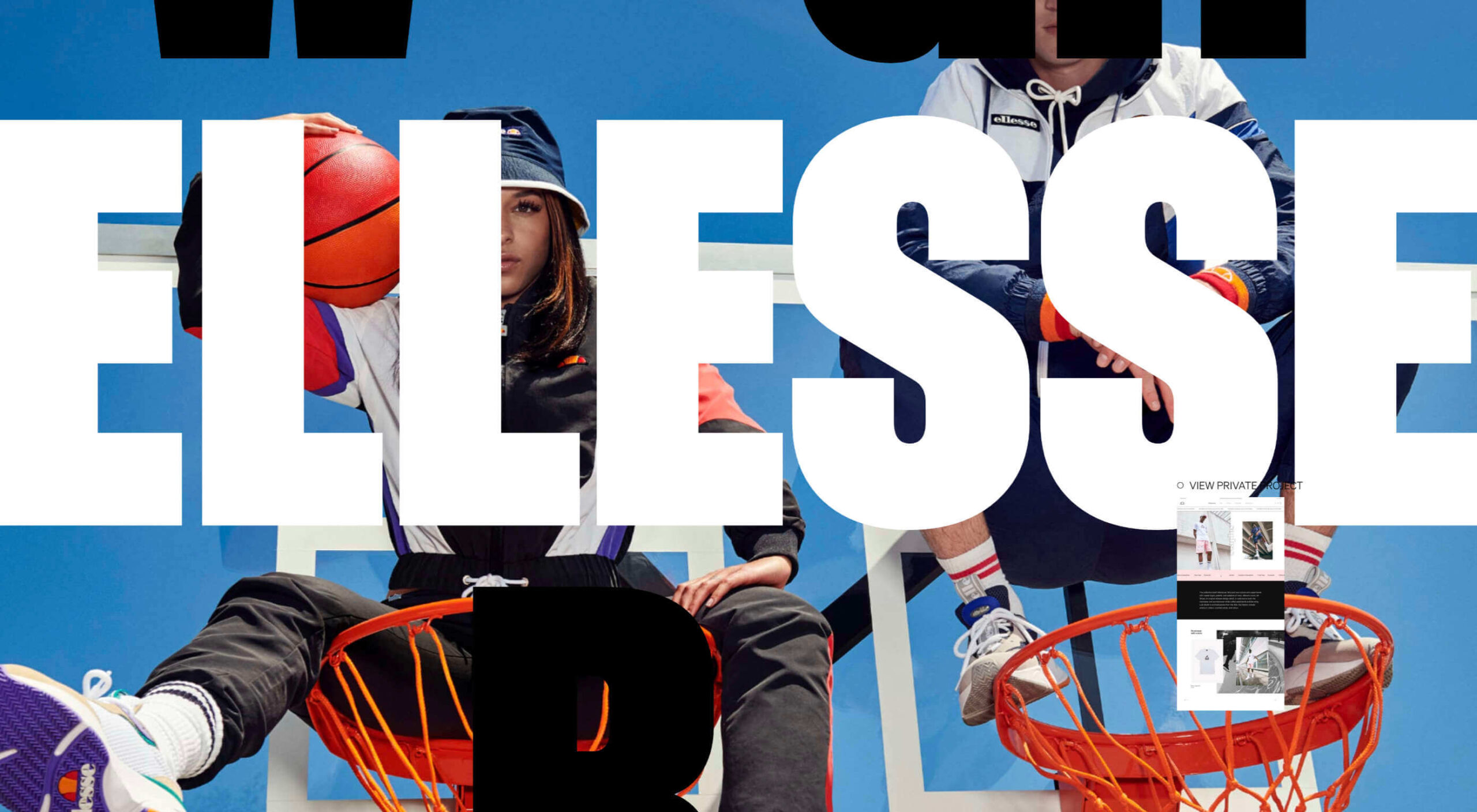
Kieran Baybutt uses multiple animations for this portfolio website. The most interesting might be on the “second screen.” A couple of things are happening here. The words change with mouse movements as does the background image. There’s also a cool hover pointer featuring portfolio elements that’s in constant motion. There’s a lot going on here, but it makes you want to click around.
Animated or Floating Circles
Circles might be one of the hottest design trends of 2020. They are in all kinds of projects and keep evolving in different ways.
Maybe part of the reason is because of the message that designers are trying to convey in these projects. Circles are associated with harmony and protection. They are used to represent unity, community, and commitment. In motion, circles can also spark feelings of motion or movement with speed determining how chaotic (or not) that movement may be.
This month’s iteration of circle trends is animated. Some circles animate in place, while others seem to float in space on the canvas.
The circles in each example have something in common though – they bring you into the design and encourage interaction with it. (That might be why this website design trend is increasing in popularity all the time.)
The circular motion for the UX+ logo actually helps draw the eye away from all the almost overwhelming animation on the left side of the split-screen design. With plenty of white space surrounding it, the constant movement is just enough to pull attention to the logo and then down the screen to important information about the event.

Katch Me uses circles that seem to float over the background video with a soft “bounce” in place. The animation changes when the mouse hovers over each circle with an expanded action and the ability to move the circle in a larger space. The circles here are actually the call-to-action buttons.

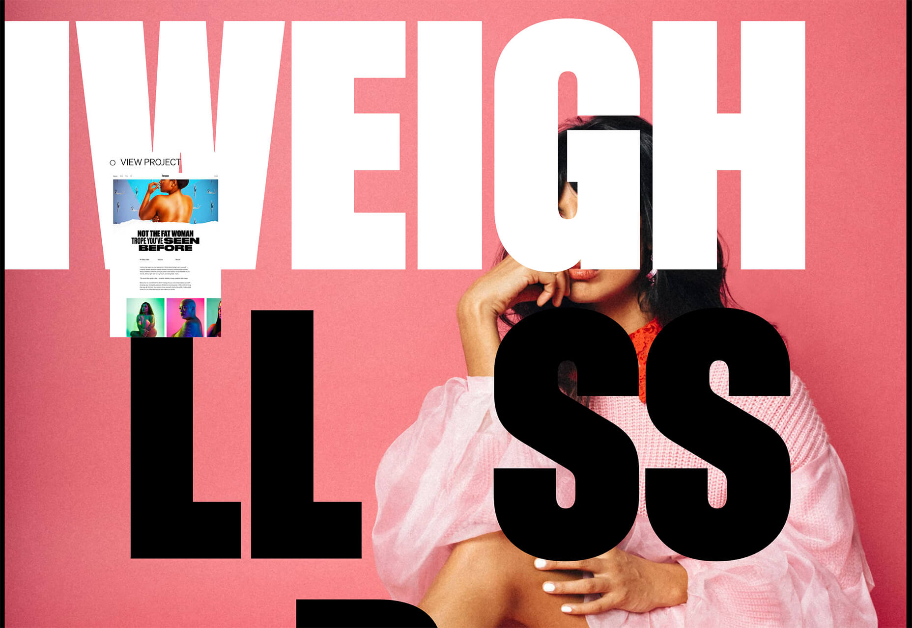
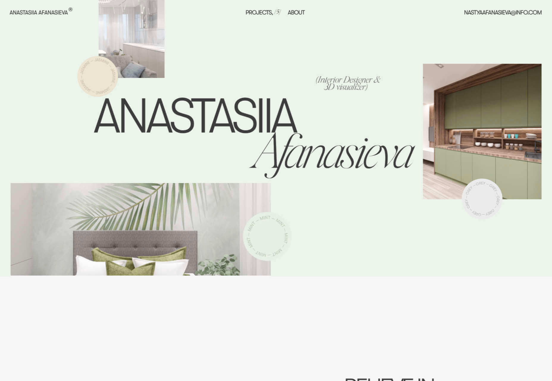
Visually, the circles for Anastasiia Afanasieva’s website look like a mashup of the above examples. There’s a rotating animation for circles that seem to float in space. You have to click through this design though to see the real brilliance in it. Each circle has a hover state that changes the background color of the website (and images in each box) to match the color displayed.
Bright Yellow Coloring
Another website design trend that might be a reflection of the state of the world is in the use of the color yellow. With a global health pandemic, design projects are leaning in to brighter, more cheerful tones to help offset the stress of the world.
For many, yellow can shine just a bit of hope and optimism into gloomier times.
While most of the projects using bright yellow as an eye-popping accent, others are going all in.
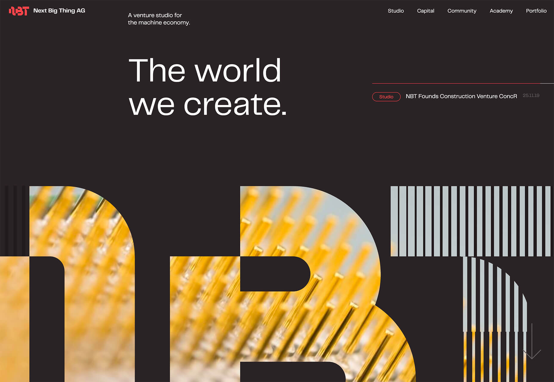
Next Big Thing AG uses yellow imagery inside of oversized cutout lettering (another website design trend this year) on a dark background. Even with the darker overall palette, the design feels bright and enticing. You almost want to dive deeper into the design to see what the image behind the letters is and what else the site contains.
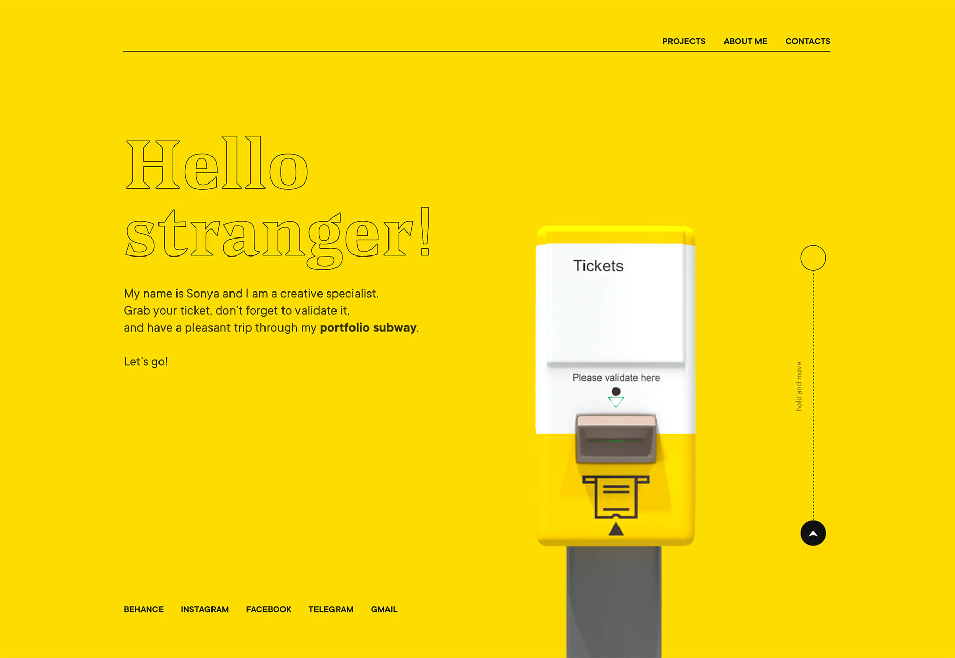
Sonya Mudvex uses a full yellow background on her portfolio homepage to stop visitors in their tracks. The rest of the design features a soft gray background and plenty of yellow accents. In addition to great use of color here, there are plenty of other UX tricks in this design, including some geolocation tools if you interact with the ticket validation graphic on the screen.
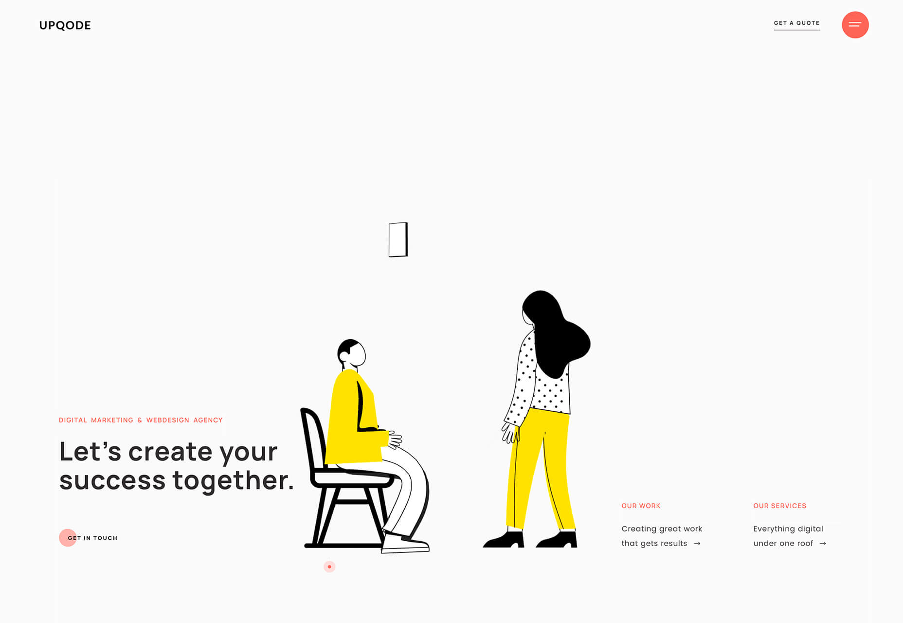
Upqode uses yellow with a peachy color palette to stand out. The illustrated animations are much more lively thanks to bright coloring. The overall color palette is a bit unexpected, and that’s what makes it interesting.
Conclusion
If this month’s website design trends tell you anything, it’s that interactive elements and animation are a growing part of the conversation. Are you already using these techniques in projects? (If not, it is probably time to think about it.)
You can also see how the influence of what’s happening in the world around us impacts design as well. It can counter other emotions to create a better mental space or mirror what’s happening in the world around us.
Source
p img {display:inline-block; margin-right:10px;}
.alignleft {float:left;}
p.showcase {clear:both;}
body#browserfriendly p, body#podcast p, div#emailbody p{margin:0;}
Original Source: http://feedproxy.google.com/~r/1stwebdesigner/~3/7PMus2P4j_4/
…
Original Source: http://feedproxy.google.com/~r/1stwebdesigner/~3/kZD40ys-oDE/
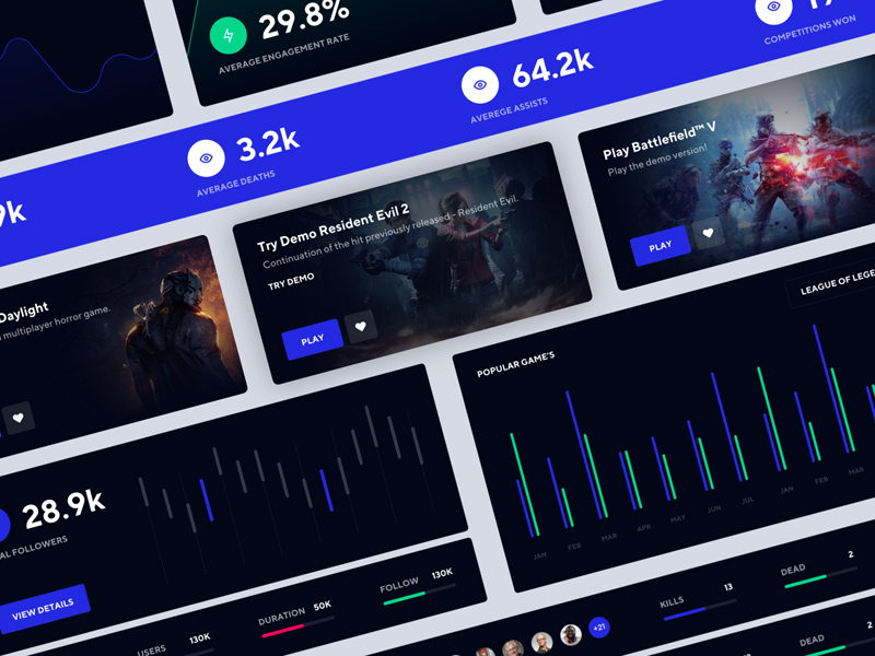
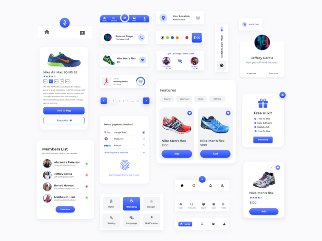
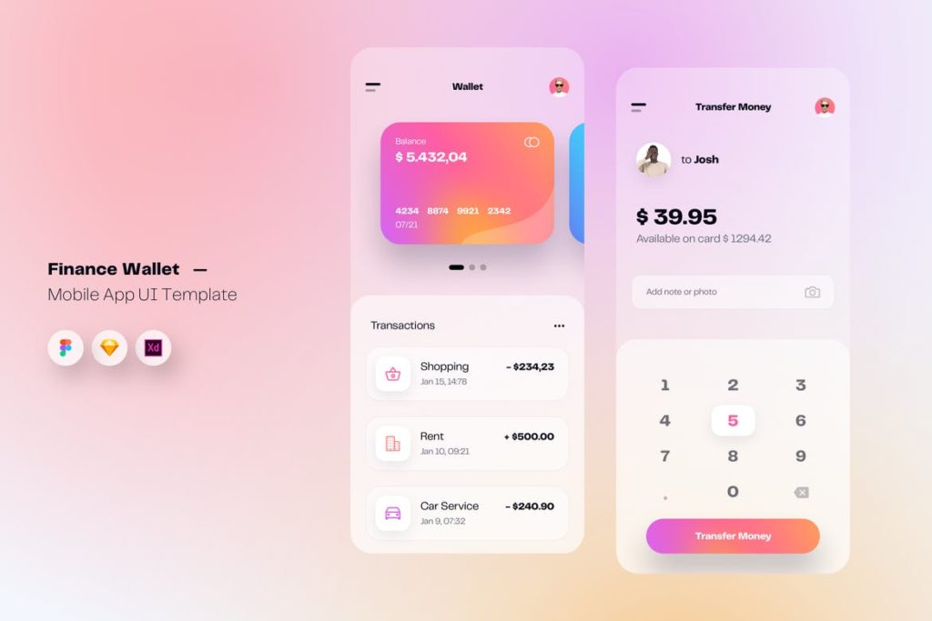
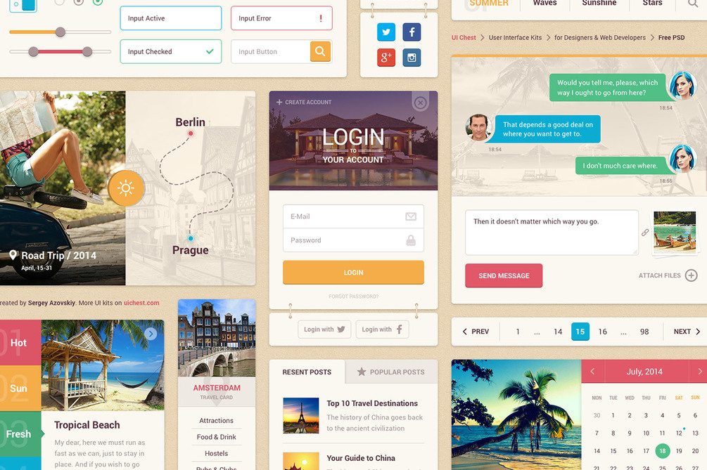
Every web designer and developer can use new UI kits to get their project started, speed up delivery time, or just for inspiration to create their own ideas and mockups. Today we are giving you over 30 of the best free and premium UI kits to choose from, so you don’t have to spend your valuable time searching through the thousands that are available. Use these kits however you see fit for your next or future projects, and be sure to bookmark this page so you can come back and find additional kits to utilize whenever you need them.
UX Designer Toolbox: Unlimited Downloads Starting at $16.50/Month

UX & UI Kits
14,000+ UX & UI Kits
Wireframe Kits
1,100+ Wireframe Kits
Icon Sets
11,000+ Icon Sets
DOWNLOAD NOW
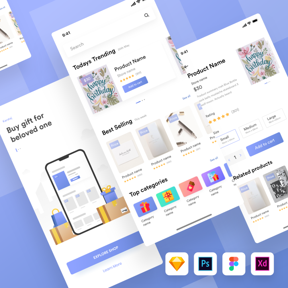
Karamtaj Gift Shop UI Kit (Free)
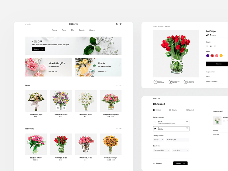
Cassiopeia – Flower Store UI Kit (Free)
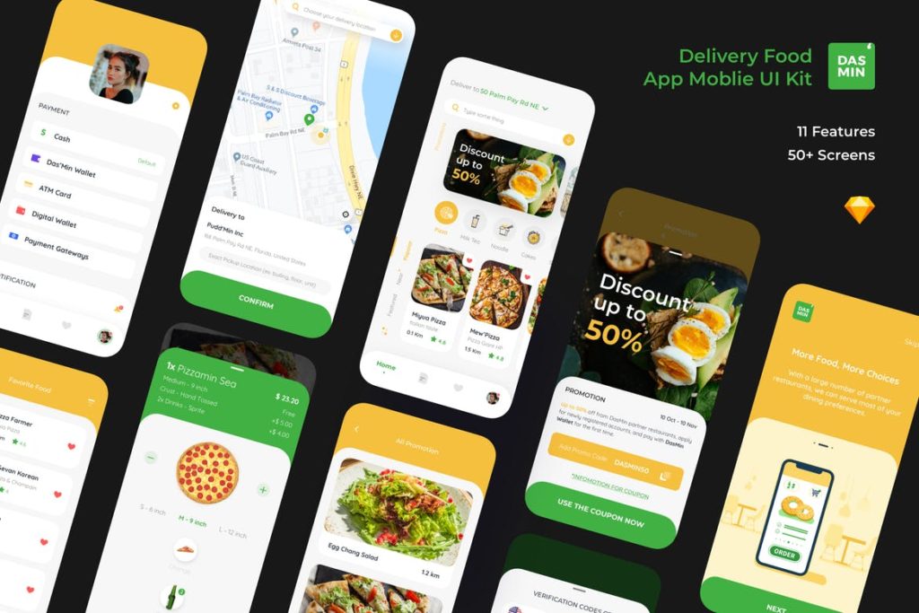
Dasmin Delivery Food App Mobile UI kit (Premium)
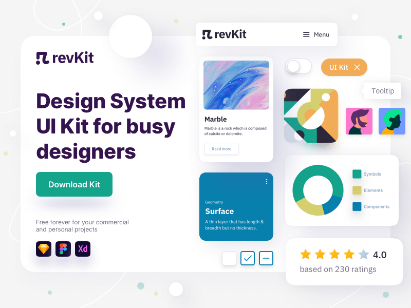
RevKit – Design System UI Kit (Free)
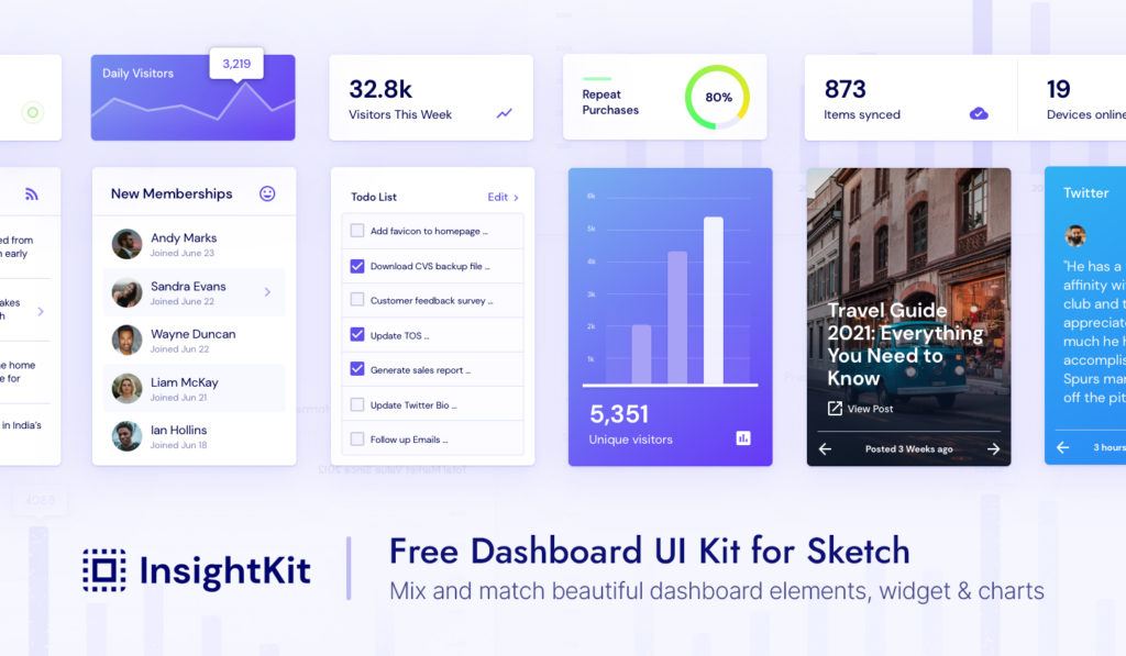
InsightKit – Dashboard UI Kit (Premium)
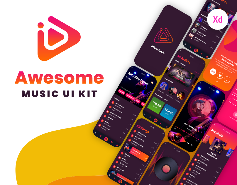
iPlayMusic – A Free Awesome Music App UI Kit (Free)
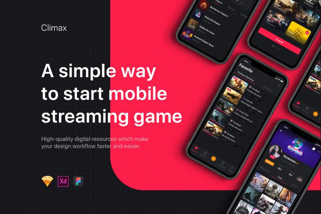
Climax – Live Game Streaming UI Kit (Premium)
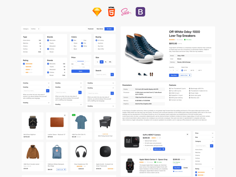
E-commerce UI Kit (Free)
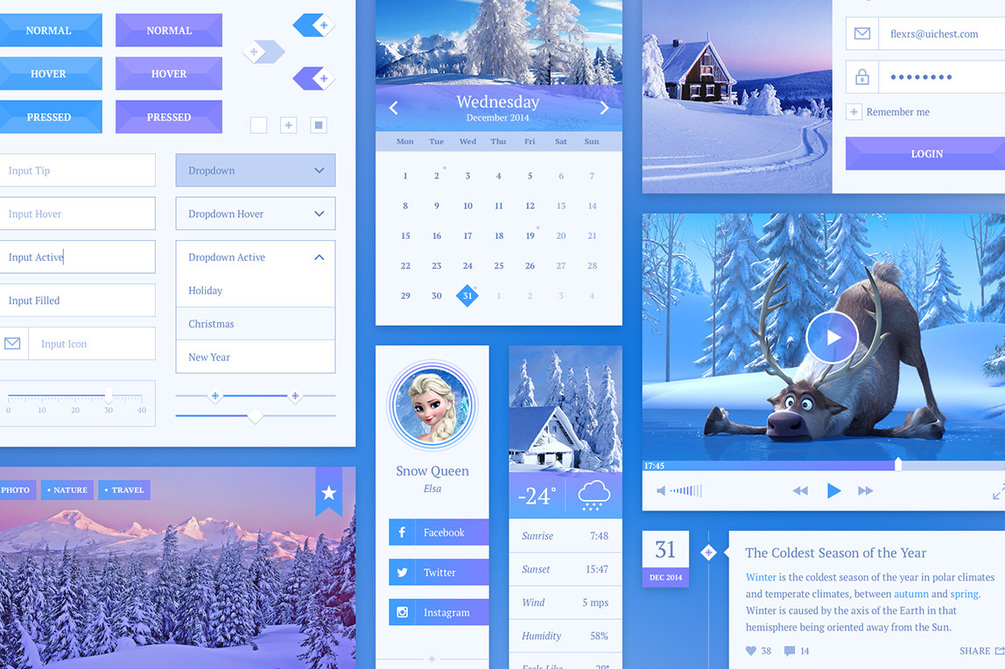
Snowflake UI Kit (Free)
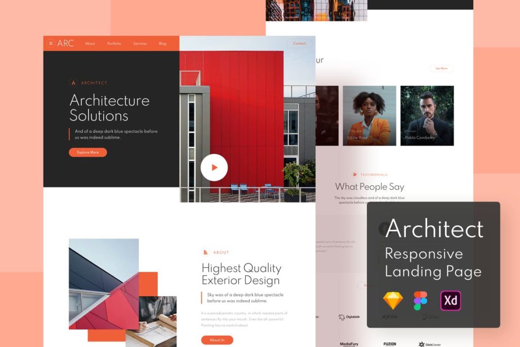
Architect Responsive Landing Page (Premium)
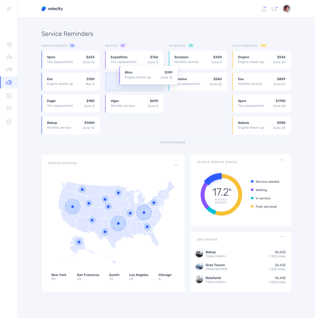
Velocity: A dashboard UI kit with a robust design system (Free)
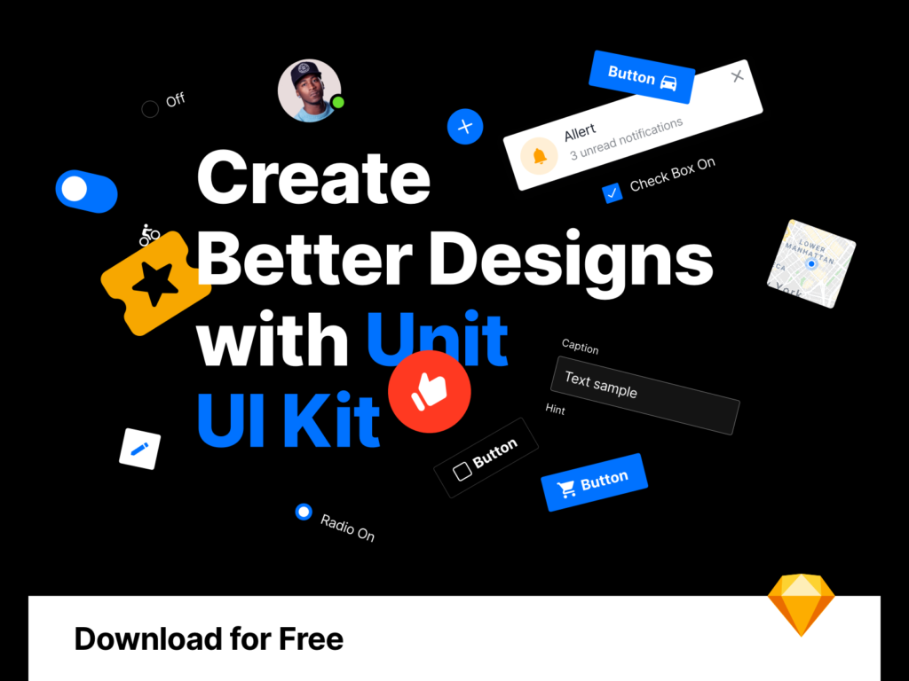
Unit – Free UI Kit (Free)
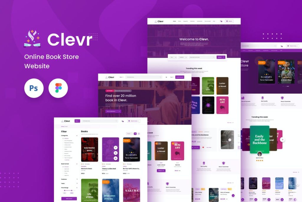
Clevr – Book Store Ecommerce Website Template (Premium)
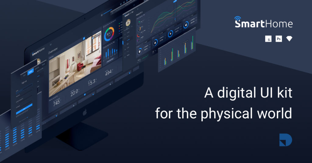
Smart Home—A digital UI Kit for the physical world (Free)
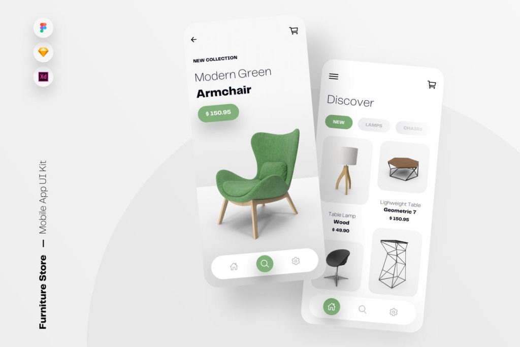
Furniture Store Mobile App UI Kit Template (Premium)
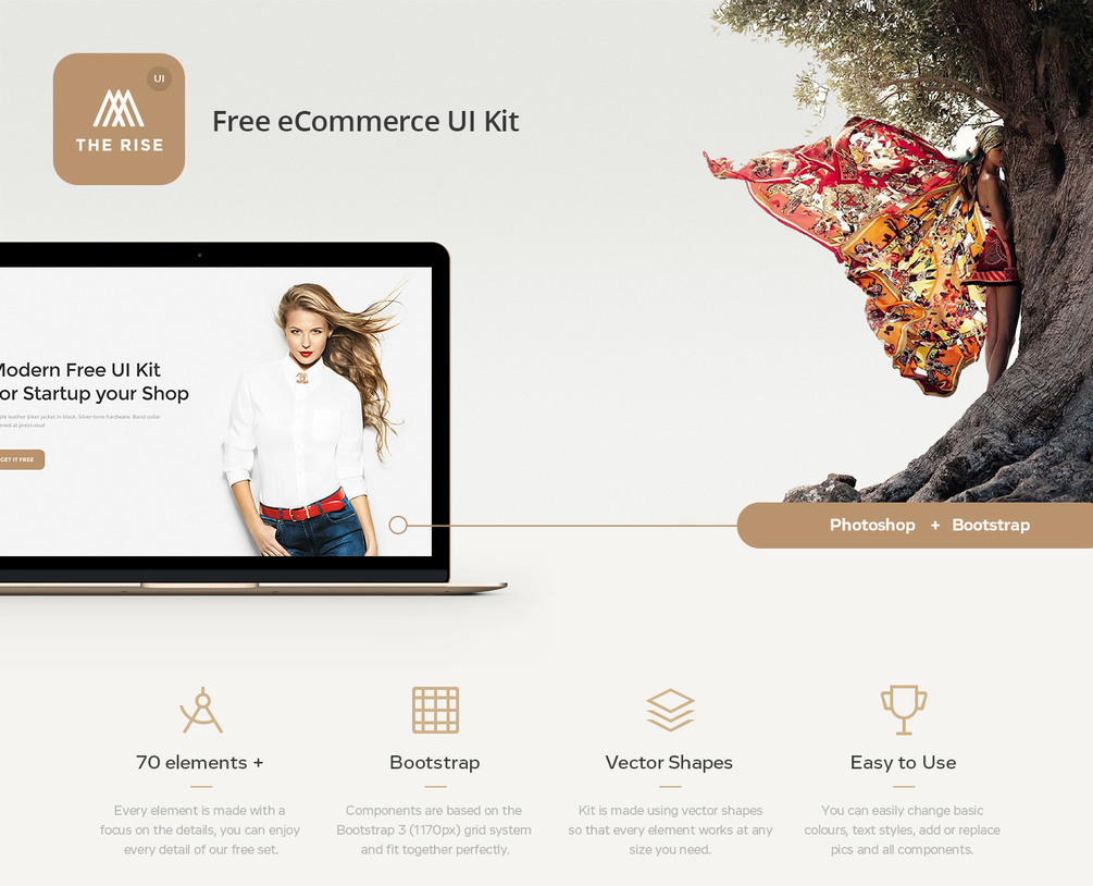
Rise Free eCommerce UI Kit (Free)
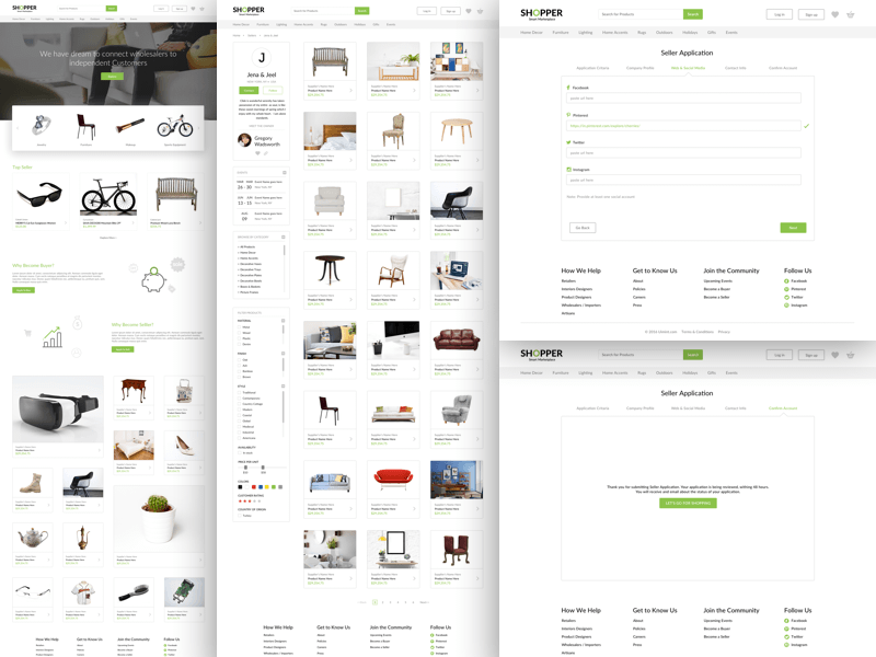
Shopper UI Kit (Free)
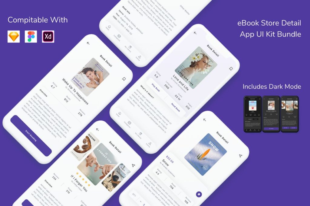
e-Book Store Detail App UI Kit Bundle (Premium)
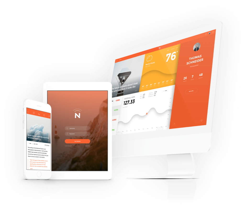
Now: A beautiful cross-platform UI kit (Free)
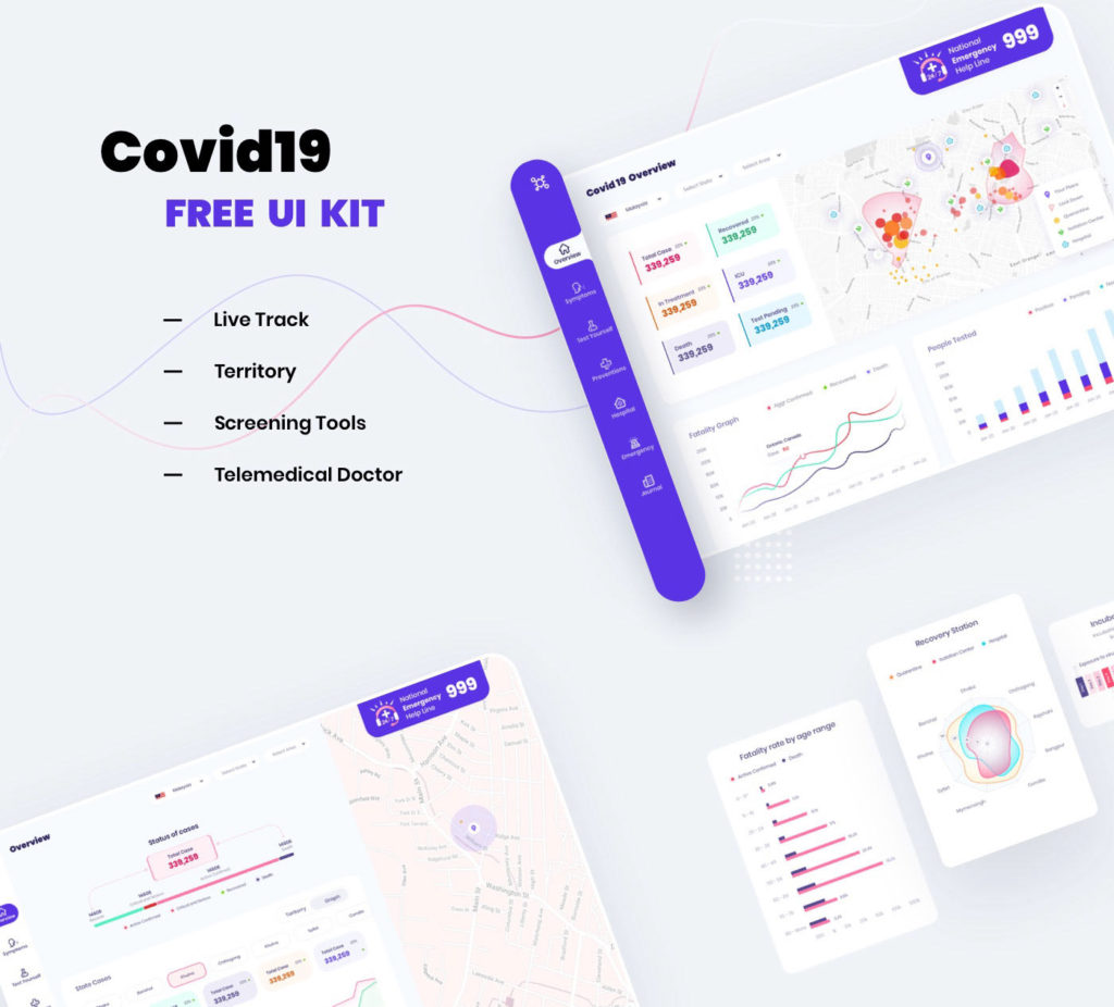
Covid19 UI Kit (Free)
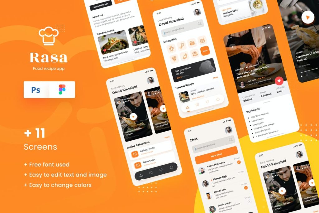
Rasa – Food Recipe iOS App Design UI Template (Premium)
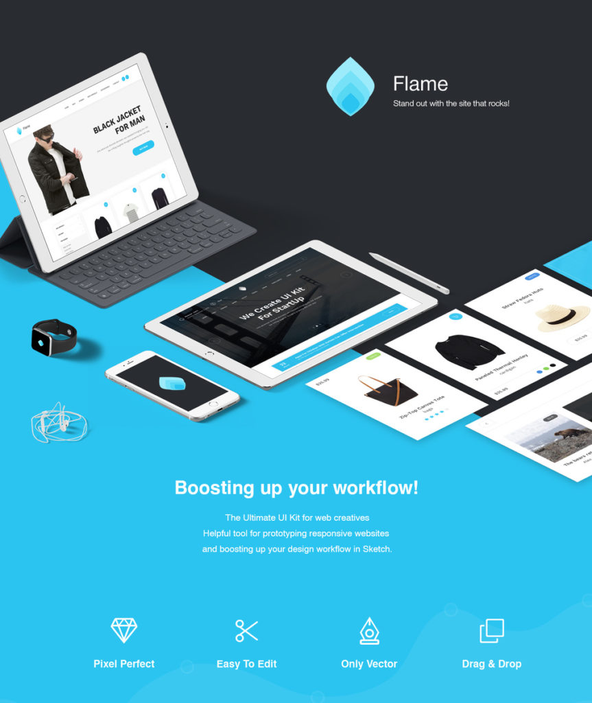
Flame UI Kit for Sketch (Free)
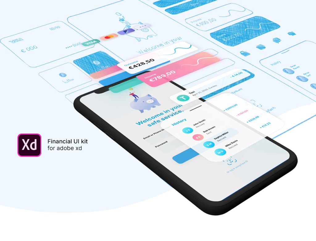
Financial UI Kit for Adobe XD (Free)
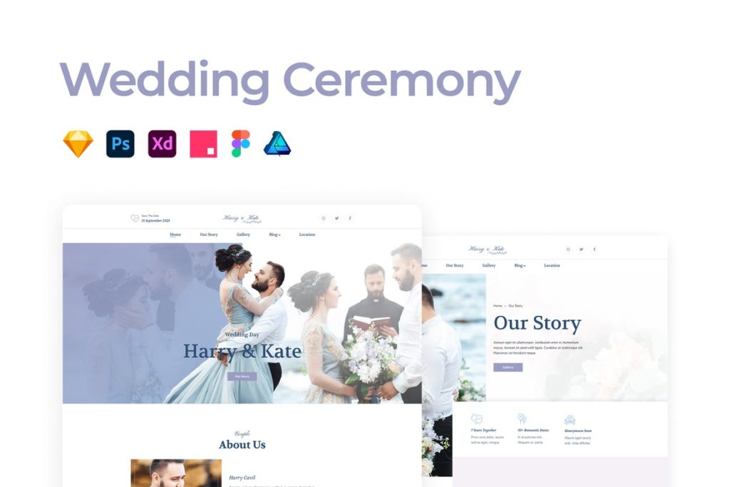
Wedding Ceremony Template (Premium)
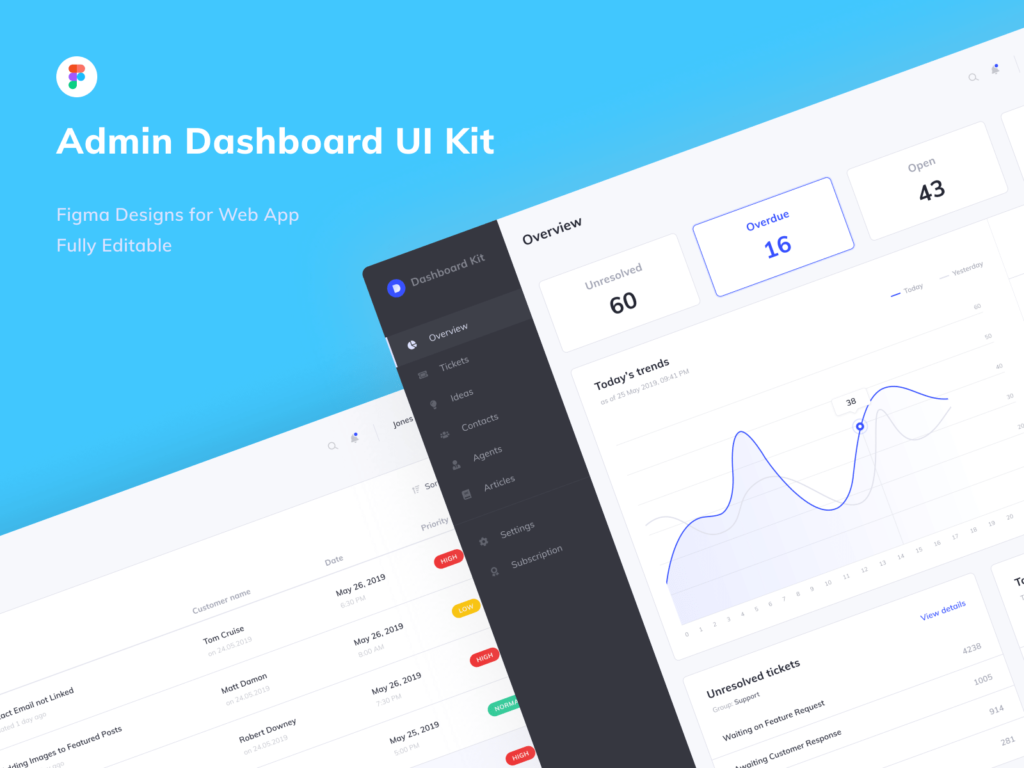
Figma Admin Dashboard UI Kit (Free)
Gaming UI Kit (Free)
Agency Business Landing Page Template (Premium)
Components Free UI Kit (Free)
Wallet & Finance Mobile App UI Kit Template (Premium)
Summer UI Kit (Free)
Original Source: https://www.webdesignerdepot.com/2020/09/5-best-free-courses-and-resources-to-level-up-as-a-web-designer/
 I often see freelancers on social media asking what the secret is to working fewer hours, making more money, and helping new clients to find them. While those things tend to happen the longer you’ve been freelancing, it doesn’t happen without some effort.
If you’re wondering how you can change things so that your business becomes more profitable and easier to manage, education is the key.
But it’s not just mastering new design techniques that will take you to the next level. It’s important to invest your time in a well-rounded education so that you can grow not just as a web designer, but also as a freelancer and business owner.
The good news is that you don’t have to spend a ton of cash on courses or resources. In the following round-up, I’m going to share some of the best free courses to help you level up.
5 Best Free Courses and Resources for Web Designers
Rather than sign up for Udemy, Skillshare and other premium course membership sites, I recommend taking a bootstrapping approach to self-education. I mean, the whole point in learning new skills and strengthening existing ones is so you can run a better business and make more money, right?
Once you have extra funds to throw at premium courses, definitely explore those options. For now, let’s focus on the free courses and resources that’ll help get you to that next level:
1. edX

edX was created by Harvard and MIT in order to provide university-level training and education to anyone, anywhere. While you can’t get certified without paying a few hundred dollars, you can go through entire courses for free.
Courses are offered over a wide range of categories. As a freelance web designer, you’d do well to focus on the following areas:
Design
Learn more than just how to design beautiful interfaces. Learn about the technical side of it, too — things like AI, IoT, and cybersecurity.
Computer Science
Learn web development and coding.
Business & Management
Learn essential business skills like:
Project management
Finance management
Leadership
Marketing and analysis
Communication
Learn things like branding, negotiation, reputation management, and critical thinking.
2. Envato Tuts+
Envato Tuts+ might be best known for its succinct step-by-step design and development tutorials. However, it has a new section of free video courses to take advantage of.
Although you won’t learn any soft skills here, this is a great resource if you want to master the tools of your trade.
Free courses give you a deeper look at tools like:
HTML, CSS, and JavaScript
Adobe’s suite of software
Sketch
WordPress
Video conferencing tools
3. YouTube
YouTube is more than just a place to watch entertaining videos. There are some amazing YouTube channels for web designers at all skill levels.
When choosing a design channel and course to follow, look for ones that are well organized. If they’re just posting videos at random without any rhyme or reason, it’ll be difficult to focus on and master one skill set before moving onto the next.
Here are the channels I recommend you follow:
Flux
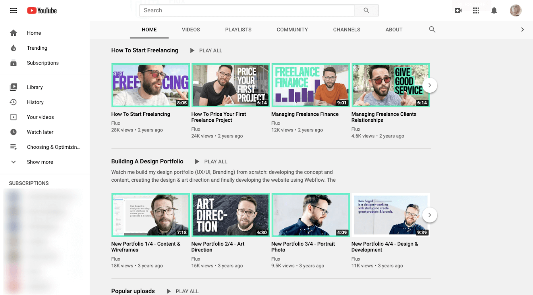
Learn skills related to:
Web design
Getting started as a freelancer
Strengthening your processes
Building your portfolio
Design theory and strategy
CharliMarieTV
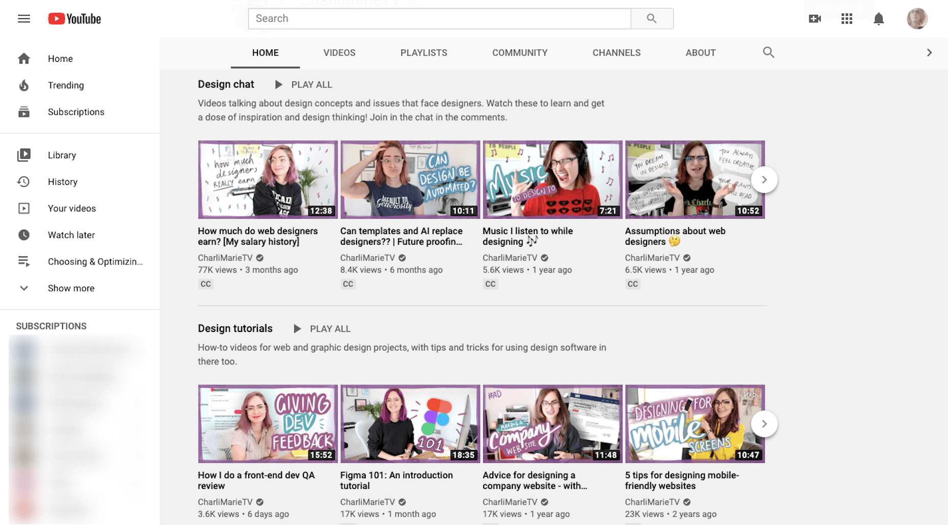
Learn skills related to:
Web design
Building sites with Figma or Webflow
Career paths for designers
Productivity hacks
NNgroup
Learn skills related to UX:
Web design
User psychology
Usability testing
Design thinking
Research and data analysis
Journey mapping
Get access to UX Conference seminars, too
4. Moz Whiteboard Fridays
Even if you don’t offer SEO as a standalone service, it’s important for web designers to understand the role they play in SEO and to stay abreast of the latest and greatest strategies.
If you haven’t tuned in for one of Moz’s Whiteboard Fridays yet, I’d recommend you start now.
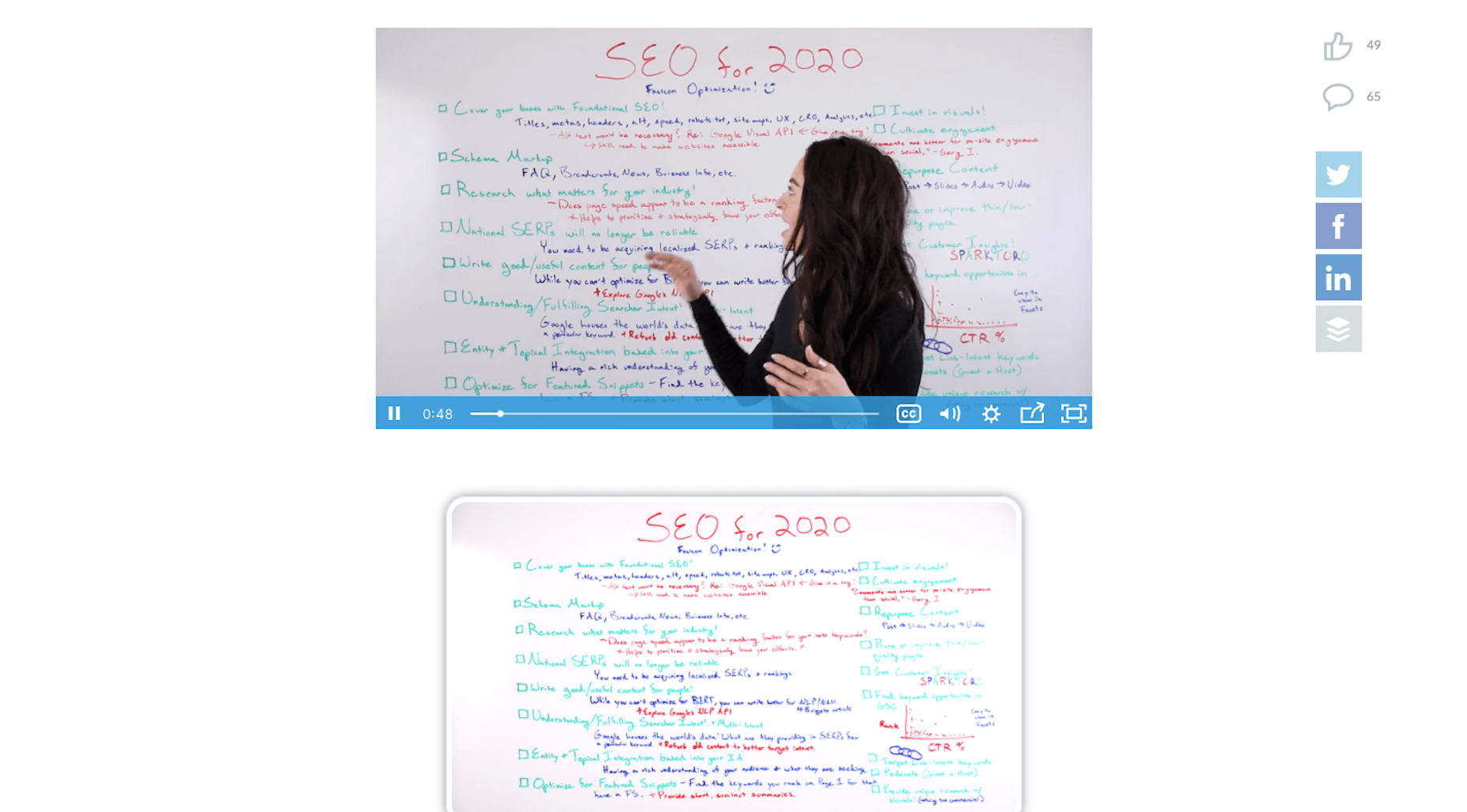
Some of the topics might not be relevant to you (like creating a content strategy). However, there are others you’ll get some great tips from, like the one above that talks about creating great visuals, preparing web pages with tags and schema markup, and optimizing for featured snippets.
5. Nir Eyal – Indistractible
Nir Eyal has made a name for himself over the years as an author and presenter on the subject of human psychology and behavior. His first book (Hooked) examined consumer behavior and how to design around it. His second (Indistractible) turned the focus on us — the doers and creators who build experiences and products for consumers.
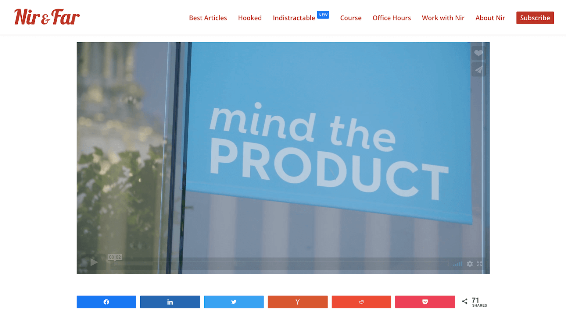
The first of his free resources to explore is this 30-minute presentation on why we’re so easily distracted and how to keep those distractions (and ourselves) from getting in the way.
The second free resource to snag up is the 80-page workbook available on the homepage. Here’s a preview of what it looks like:
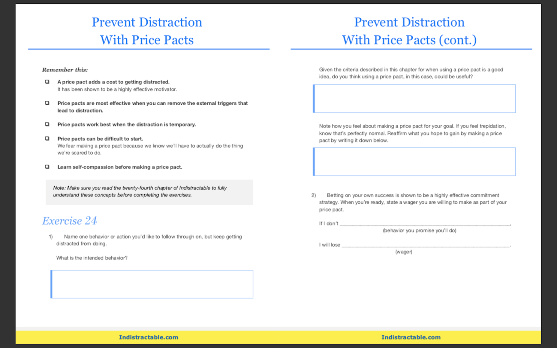
You’ll learn about common distractions, identify those that are specific to you, and then work through exercises to defeat them.
If this is something you’re struggling with, these resources will empower you to make a much-needed change.
BONUS: WebDesigner Depot
Although WebDesigner Depot doesn’t offer video courses, I consider each of the articles contained within this site to be mini-courses of their own. And you’ll learn everything you’ve ever wanted to know about becoming a web designer and growing your freelance business.
Featured image via Unsplash.
Source
p img {display:inline-block; margin-right:10px;}
.alignleft {float:left;}
p.showcase {clear:both;}
body#browserfriendly p, body#podcast p, div#emailbody p{margin:0;}
Original Source: https://www.sitepoint.com/building-microservices-with-deno-reno-postgresql/?utm_source=rss

In this tutorial, we show you how to go about building microservices with Deno, and introduce you to Reno — a thin routing library for Deno. We’ll explore how we can use this newer JavaScript platform to build a microservice that exposes endpoints for acting on a database.
Deno is a JavaScript and TypeScript runtime from Node.js creator Ryan Dahl that aims to address some of the latter technology’s shortcomings, such as simplifying the module path lookup algorithm and more closely aligning the core APIs with their browser-based equivalents. Despite these fundamental differences, the potential applications of Deno and Node.js are mostly identical. One of Node’s core strengths lies in building HTTP services, and the same can be argued for Deno.
Writing HTTP Servers with std/http
Before we introduce a routing library or contemplate our data access layer, it would be useful to step back and build a simple HTTP server with the std/http module, which is part of Deno’s standard library. If you haven’t already, install Deno. In a Unix-type operating system, you can run:
$ curl -fsSL https://deno.land/x/install/install.sh | sh -s v1.3.0
Note that this tutorial has been developed against 1.3.0 (and std 0.65.0 as we’ll see later), but any later 1.x versions you may be using should be compatible. Alternatively, if you’re running an older version of Deno, you can upgrade to 1.3.0 with the deno upgrade command:
deno upgrade –version 1.3.0
You can verify that the expected Deno version has been installed with deno –version.
We’re now in a position to build an HTTP server. Create a directory, within your usual development directory, named deno-hello-http, and open it in your editor. Then, create a file called server.ts, and use the listenAndServe function within std/http to build our server:
import { listenAndServe } from “https://deno.land/std@0.65.0/http/mod.ts”;
const BINDING = “:8000”;
console.log(`Listening on ${BINDING}…`);
await listenAndServe(BINDING, (req) => {
req.respond({ body: “Hello world!” });
});
Developer Experience Protips
If you’re using VS Code, I’d heavily recommend the official Deno extension, which provides support for Deno’s path resolution algorithm. Additionally, you can run deno cache server.ts to install the dependencies and their TypeScript definitions, the latter serving as an invaluable API guide when writing your code.
We can start our server by running deno run –allow-net server.ts in our shell. Note the –allow-net permissions flag, granting our program with network access. Once listening on port 8000, we can target it with a HTTP request:
$ curl -v http://localhost:8000/ ; echo
> GET / HTTP/1.1
> Host: localhost:8000
> User-Agent: curl/7.58.0
> Accept: */*
>
< HTTP/1.1 200 OK
< content-length: 12
<
Hello world!
Great! With a few lines of TypeScript, we’ve been able to implement a simple server. That said, it isn’t particularly well-featured at this point. Given that we consistently serve “Hello world!” from our callback function, the same response will be returned for any endpoint or HTTP method. If we hit a server with POST /add, we’ll receive the same headers and body:
$ curl -v -d ‘{}’ http://localhost:8000/add ; echo
> POST /add HTTP/1.1
> Host: localhost:8000
> User-Agent: curl/7.58.0
> Accept: */*
> Content-Length: 2
> Content-Type: application/x-www-form-urlencoded
>
< HTTP/1.1 200 OK
< content-length: 12
<
Hello world!
We can limit the existing response to GET / by conditionally checking the url and method properties of our callback’s req parameter:
import {
listenAndServe,
ServerRequest,
} from “https://deno.land/std@0.65.0/http/mod.ts”;
const BINDING = “:8000”;
console.log(`Listening on ${BINDING}…`);
function notFound({ method, url }: ServerRequest) {
return {
status: 404,
body: `No route found for ${method} ${url}`,
};
}
await listenAndServe(BINDING, (req) => {
const res = req.method === “GET” && req.url === “/”
? { body: “Hello world” }
: notFound(req);
req.respond(res);
});
If we restart our server, we should observe that GET / works as expected, but any other URL or method will result in a HTTP 404:
$ curl -v -d ‘{}’ http://localhost:8000/add ; echo
> POST /add HTTP/1.1
> Host: localhost:8000
> User-Agent: curl/7.58.0
> Accept: */*
> Content-Length: 2
> Content-Type: application/x-www-form-urlencoded
>
< HTTP/1.1 404 Not Found
< content-length: 28
<
No route found for POST /add
std/http Beyond Simple Services
Bootstrapping trivial HTTP servers with Deno and std/http has proven to be relatively straightforward. How does this approach scale for more complex services?
Let’s consider a /messages endpoint that accepts and returns user-submitted messages. Following a RESTful approach, we can define the behavior of this endpoint and of our service overall:
Continue reading
Building Microservices with Deno, Reno, and PostgreSQL
on SitePoint.
Original Source: http://feedproxy.google.com/~r/tympanus/~3/ikLcNlTo_vM/
The other day I saw this very nice Dribbble shot by Anton Tkachev and couldn’t help but envision it as a slideshow with some large typography. So I went ahead and did a small demo which then turned into an exploration of several animations for the image tiles and the texts.
So the main idea is to animate the tilted thumbnails out of the viewport when navigating to the next or previous slide. While the thumbnails move out, the titles get animated too, in that reveal/unreveal fashion that seems to be quite trendy now. The direction of the motion depends on wether we’re navigating back or forth.
The animations are powered by GreenSock’s GSAP animation library.
I’m totally in love with IvyMode and this demo was just a perfect excuse to use Jan Maack’s typeface again!
The images used in the demos are by generative artist Manolo Ide who offers his artwork for free.
I really hope this gives you a starting point for exploring more effects!
The post Diagonal Thumbnail Slideshow Animation appeared first on Codrops.

