Original Source: https://smashingmagazine.com/2020/11/data-visualization-apexcharts/
ApexCharts is a modern charting library that helps developers to create beautiful and interactive visualizations for web pages with a simple API, while React-ApexCharts is ApexChart’s React integration that allows us to use ApexCharts in our applications. This article will be beneficial to those who need to show complex graphical data to their customers.
Getting Started
First, install the React-ApexCharts component in your React application and import react-apexcharts.
npm i react-apexcharts apexcharts
import ReactApexCharts from ‘react-apexcharts’
The core components of an ApexChart is its configuration object. In the configuration object, we define the series and options properties for a chart. series is the data we want to visualize on the chart. In the series, we define the data and name of the data. The values in the data array will be plotted on the y-axis of the chart. The name of the data will appear when you hover over the chart. You can have a single or multiple data series. In options, we define how we want a chart to look, the features and tools we want to add to a chart and the labels of the x and y axes of a chart. The data we define in the configuration object’s series and options properties is what we then pass to the ReactApexChart component’s series and options props respectively.
Here is a sample of how the components of an ApexChart work together. (We will take a closer look at them later in the article.)
const config = {
series: [1, 2, 3, 4, 5],
options: {
chart: {
toolbar: {
show: true
},
}
}
}
return (
<ReactApexChart options={config.options} series={config.series} type=”polarArea” />
)
When going through the docs, you will notice that the width, height, and type of chart are defined in the options object, like in the code snippet below.
const config = {
series: [44, 55, 13, 43, 22],
chart: {
width: 380,
type: ‘pie’
}
},
This is because the docs were written with vanilla JavaScript application in mind. We are working with React, so we define the width, height, and type by passing them in as props to the ReactApexCharts component. We will see how this works in the next section.
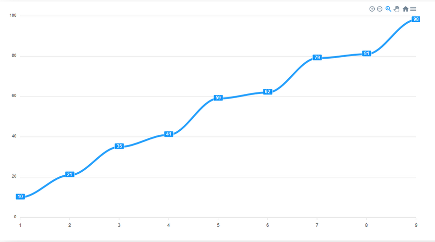
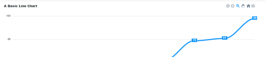
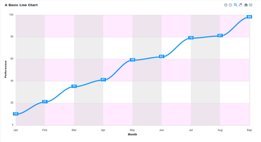
Line Charts
This is a type of chart used to show information that changes over time. We plot a line using several points connected by straight lines. We use Line charts to visualize how a piece of data changes over time. For example, in a financial application, you could use it to show a user how their purchases have increased over some time.
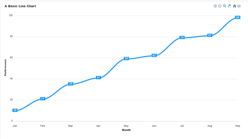
This chart consists of the following components:
Title
This sits on top of the chart and informs the user about what data the chart represents.
Toolbar
The toolbar is at the right-hand corner in the image above. It controls the level of zoom of the chart. You can also export the char through the toolbar.
Axis labels
On the left and right axes, we have the labels for each axis.
Data labels
The data labels are visible at each plot point on the line. They make it easier to view the data on the chart.
We have seen how a line chart looks and its different components. Now let us go through the steps of building one.
We start with series. Here we define the data of the series and its name. Then, we pass the options and series to the ReactApexChart component’s props. We also define the type of chart in the type prop and set it to line.
const config = {
series: [{
name: “Performance”,
data: [10, 21, 35, 41, 59, 62, 79, 81, 98]
}],
options: {}
}
return (
<ReactApexChart options={config.options} series={config.series} type=”line” />
)
The critical part of an ApexChart is its series data. The configurations defined in the options property are optional. Without setting any definitions in options, the data will still be displayed. However, it may not be the most readable chart. If you decide not to set any custom definitions in options, it must still be present as an empty object.
Let’s configure the options of the chart by adding some values to the options object we have in the config object.
In the chart property of the options object, we define the configurations of the chart. Here, we add the toolbar from the chart by setting its show property to true. The toolbar provides us with tools to control the zoom level of the chart and to export the chart in different file formats. The toolbar is visible by default.
options: {
chart: {
toolbar: {
show: true
},
},
}
We can make our chart easier to read by enabling data labels for the chart. To do that, we add the dataLabels property to the options object and set it’s enabled property to true. This makes it easier to interpret the data in the chart.
dataLabels: {
enabled: true
},
By default, the stroke of a line chart is straight. However, we can make it curved. We add the stroke property to options and set to it’s curve to smooth.
stroke: {
curve: “smooth”
}
An important part of any chart is its title. We add a title property to options to give the chart a title.
title: {
text: ‘A Line Chart’,
align: ‘left’
},
We can add labels to the x and y axes of the chart. To do this we add xaxis and yaxis properties to options and there, we define the title for each axis.
xaxis: {
categories: [‘Jan’, ‘Feb’, ‘Mar’, ‘Apr’, ‘May’, ‘Jun’, ‘Jul’, ‘Aug’, ‘Sep’],
title: {
text: ‘Month’
}
},
yaxis: {
title: {
text: ‘Performance’
}
}
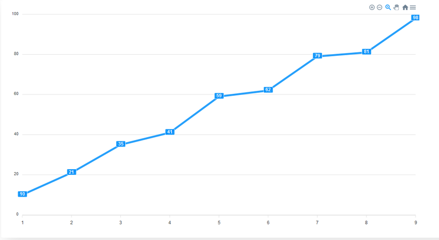
In the end, your code should look like this. With these steps, we’ve not only built a line chart but seen a breakdown of how the options we define can enhance a chart.
import ReactApexCharts from ‘react-ApexCharts’
const config = {
series: [{
name: “Performance”,
data: [10, 21, 35, 41, 59, 62, 79, 81, 98]
}],
options: {
chart: {
toolbar: {
show: true
},
},
dataLabels: {
enabled: true
},
stroke: {
curve: “smooth”
}
title: {
text: ‘A Line Chart’,
align: ‘left’
},
xaxis: {
categories: [‘Jan’, ‘Feb’, ‘Mar’, ‘Apr’, ‘May’, ‘Jun’, ‘Jul’, ‘Aug’, ‘Sep’],
title: {
text: ‘Month’
}
},
yaxis: {
title: {
text: ‘Performance’
}
}
}
}
return (
<ReactApexChart options={config.options} series={config.series} type=”line” />
)
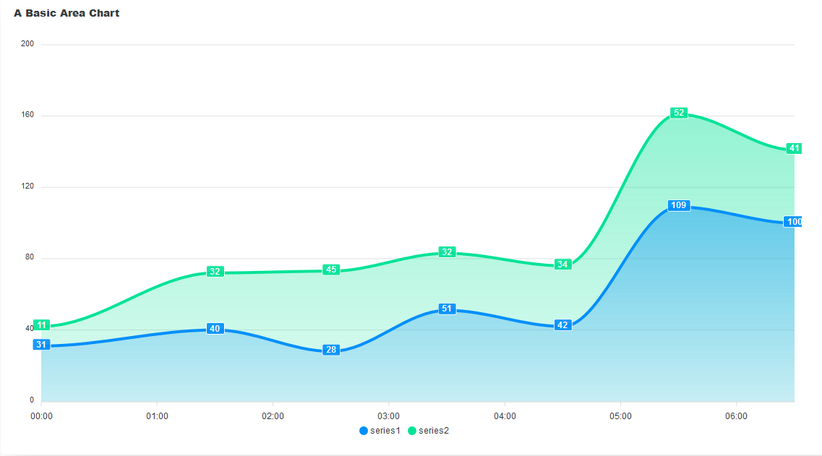
Area Charts
An area chart is like a line chart in terms of how data values are plotted on the chart and connected using line segments. The only difference is that in an area chart, the area plotted by the data points is filled with shades or colors. Like line charts, area charts depict how a piece of data changes over time. However, unlike line charts, they can also visually represent volume. We can use it to show how groups in a series of data intersect. For example, a chart that shows you the volume of users that access your application through different browsers.
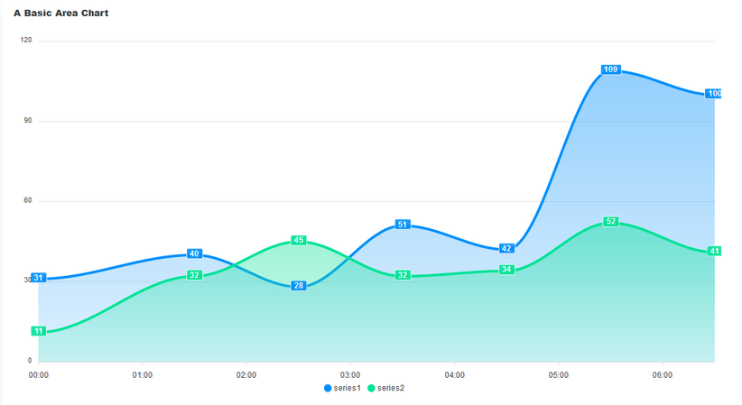
In the image above, we have an example of an area chart. Like the line chart, it has a title, data labels, and axis labels. The shaded portion of the plotted area chart shows the volume in the data. It also shows how the data in series1 intersects with that of series2. Another use case of area charts is in showing the relationship between two or more pieces of data and how they intersect.
Let’s see how to build a stacked area chart and how to add data labels to it.
To make an area chart, we set the chart type to area and the stroke to smooth. This is the default stroke for an area chart.
const config = {
options: {
stroke: {
curve: ‘smooth’
}
}
}
return (
<ReactApexChart options={config.options} series={config.series} type=”area” />
)
To make it a stacked chart, in the chart property of the options object, we set stacked to true.
const config = {
options: {
stroke: {
curve: ‘smooth’
},
chart: {
stacked: true
}
}
return (
<ReactApexChart options={config.options} series={config.series} type=”area” />
)
Bar Charts
We use bar charts to presents data with rectangular bars at heights or lengths proportional to the values they represent. It is best used to compare different categories, like what type of car people have or how many customers a shop has on different days.
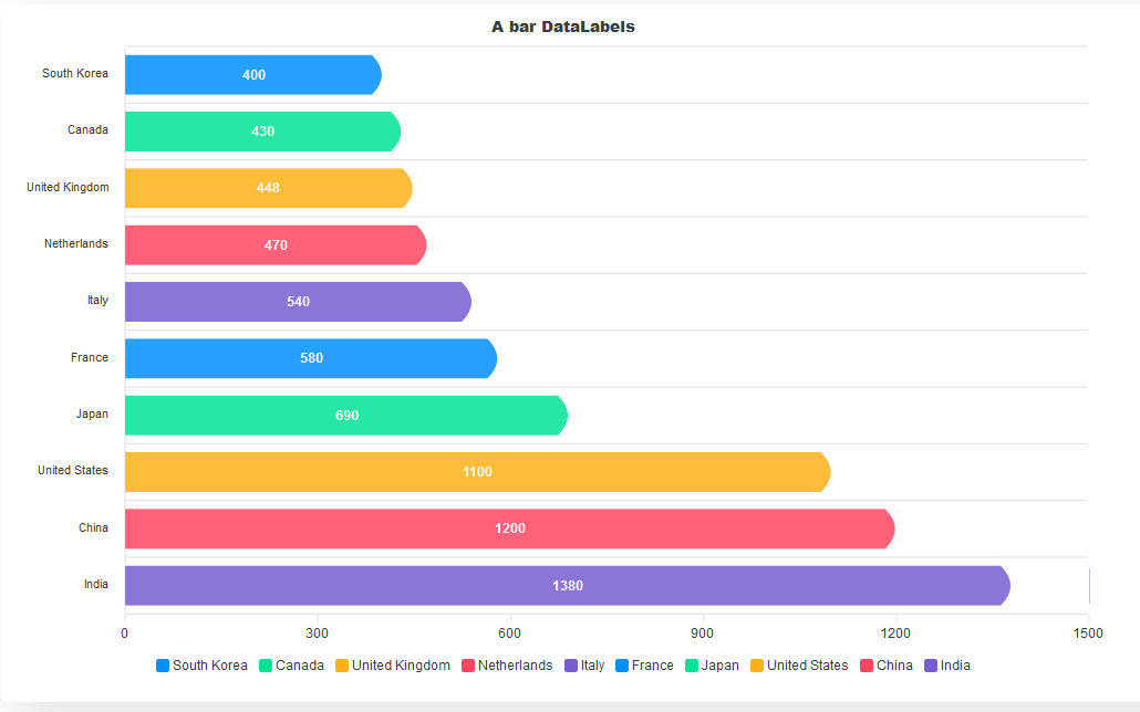
The horizontal bars are the major components of a bar chart. They allow us to easily compare values of different categories with ease.
In building a bar chart, we start by defining the series data for the chart and setting the ReactApexChart component’s type to bar.
const config = {
series: [{
data: [400, 430, 448, 470, 540, 580, 690, 1100, 1200, 1380]
}],
options: {}
}
return (
<ReactApexChart options={config.options} series={config.series} type=”bar” />
)
Let’s add more life and distinction to the bars. By default, bar charts are vertical. To make them horizontal, we define how we want the bars to look in the plotOptions property. We set the horizontal prop to true to make the bars horizontal. We set the position of the dataLabels to bottom. We can also set it to top or center. The distributed prop adds distinction to our bars. Without it, no distinct colors will be applied to the bars, and the legend will not show at the bottom of the chart. We also define the shape of the bars using the startingShape and endingShape properties.
options{
plotOptions: {
bar: {
distributed: true,
horizontal: true,
startingShape: “flat”,
endingShape: “rounded”,
dataLabels: {
position: ‘bottom’,
},
}
},
}
Next, we add the categories, labels, and titles to the chart.
xaxis: {
categories: [‘South Korea’, ‘Canada’, ‘United Kingdom’, ‘Netherlands’, ‘Italy’, ‘France’, ‘Japan’, ‘United States’, ‘China’, ‘India’]
},
title: {
text: ‘A bar Chart’,
align: ‘center’,
},
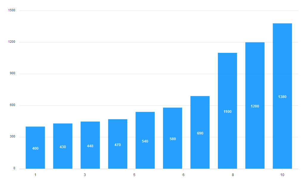
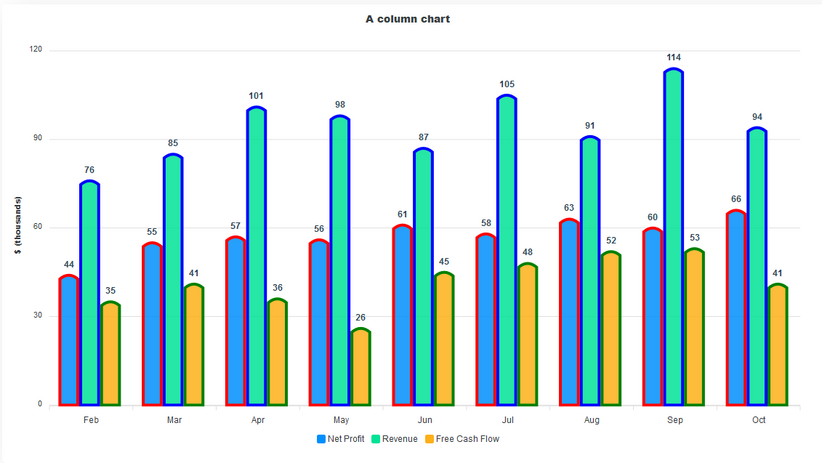
Column Charts
A column chart is a data visualization where each category is represented by a rectangle, with the height of the rectangle being proportional to the plotted values. Like bar charts, column charts are used to compare different categories of data. Column charts are also known as vertical bar charts. To convert the bar chart above to a column chart, all we have to do is set horizontal to false in the plotOptions.
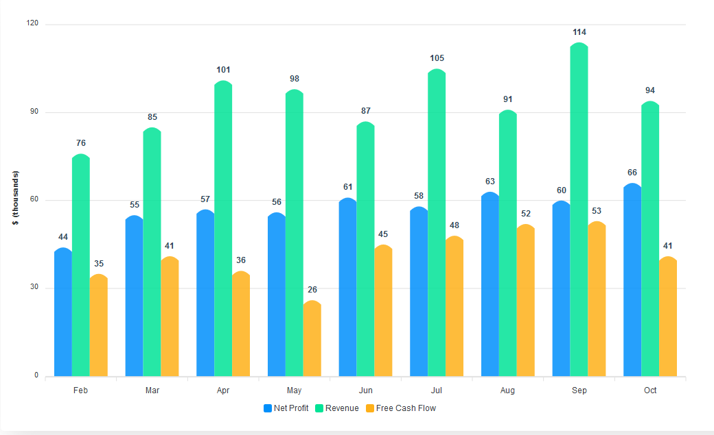
The vertical columns make it easy to interpret the data we visualize. Also, the data labels added to the top of each column increase the readability of the chart.
Let’s look into building a basic column chart and see how we can convert it to a stacked column chart.
As always, we start with the series data and setting the chart type to “bar”.
const config = {
series: [{
name: ‘Net Profit’,
data: [44, 55, 57, 56, 61, 58, 63, 60, 66]
}, {
name: ‘Revenue’,
data: [76, 85, 101, 98, 87, 105, 91, 114, 94]
}, {
name: ‘Free Cash Flow’,
data: [35, 41, 36, 26, 45, 48, 52, 53, 41]
}],
options: {}
}
return (
<ReactApexChart options={config.options} series={config.series} type=”bar” />
)
This is what we get out of the box. However, we can customize it. We define the width and shape of the bars in the plotOptions property. We also set the position of the dataLabel to top.
options: {
plotOptions: {
bar: {
columnWidth: ‘75%’,
endingShape: ‘flat’,
dataLabels: {
position: “top”
},
},
},
}
Next, we define the style and font-size of the data labels and their distance from the graphs. Finally, we add the labels for the x and y axes.
options: {
dataLabels: {
offsetY: -25,
style: {
fontSize: ’12px’,
colors: [“#304758”]
}
},
xaxis: {
categories: [‘Feb’, ‘Mar’, ‘Apr’, ‘May’, ‘Jun’, ‘Jul’, ‘Aug’, ‘Sep’, ‘Oct’],
},
yaxis: {
title: {
text: ‘$ (thousands)’
}
},
}
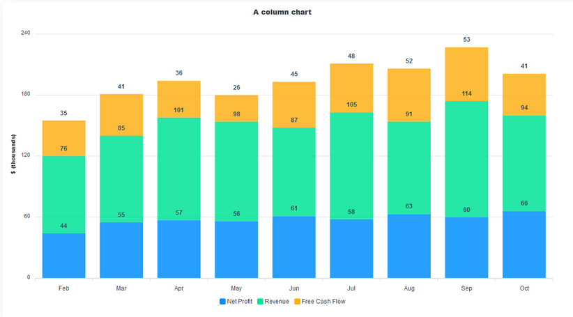
To convert this to a stacked chart, all we have to do is add a stacked property to the chart and set it to true. Also, since we switched to a stacked chart, we’ll change the endingShape of the bars to flat to remove the curves.
options: {
chart: {
stacked: true,
},
plotOptions: {
bar: {
endingShape: ‘flat’,
}
}
}
Pie And Donut Charts
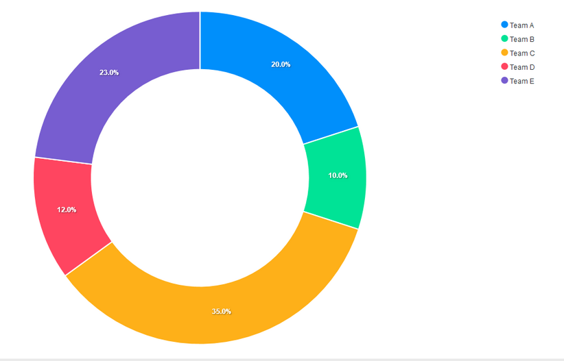
A pie chart is a circular graph that shows individual categories as slices – or percentages – of the whole. The donut chart is a variant of the pie chart, with a hole in its center, and it displays categories as arcs rather than slices. Both make part-to-whole relationships easy to grasp at a glance. Pie charts and donut charts are commonly used to visualize election and census results, revenue by product or division, recycling data, survey responses, budget breakdowns, educational statistics, spending plans, or population segmentation.
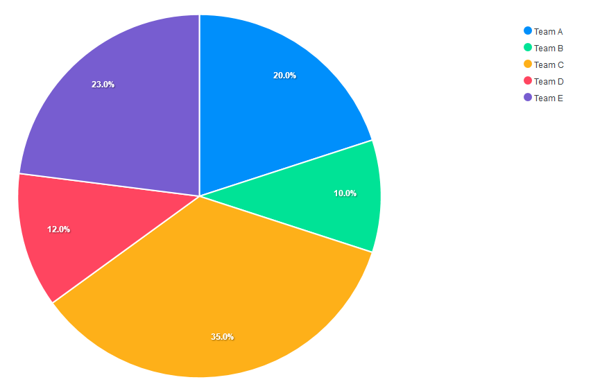
In pie and donut charts, series is calculated in percentages. This means the sum of the values in the series should be 100.
Let’s start by building a pie chart. We set the chart type to pie. We also define the series for the chart and define the labels in the options. The order of the labels corresponds with the values in the series array.
const config = {
series: [20, 10, 35, 12, 23],
options: {
labels: [‘Team A’, ‘Team B’, ‘Team C’, ‘Team D’, ‘Team E’],
}
}
return (
<ReactApexChart options={config.options} series={config.series} type=”pie” />
)
We can control the responsive nature of our charts. To do this, we add a responsive property to the chart’s options. Here we set the max-width breakpoint to 480px. Then, we set the width of the chart to 450px and the position of the legend to bottom. Now, at screen sizes of 480px and below, the legend will appear at the bottom of the chart.
options: {
labels: [‘Team A’, ‘Team B’, ‘Team C’, ‘Team D’, ‘Team E’],
responsive: [{
breakpoint: 480,
options: {
chart: {
width: 450
},
legend: {
position: ‘bottom’
}
}
}]
},
To convert the pie chart to a donut chart, all you have to do is change the component’s type to donut.
<ReactApexChart options={config.options} series={config.series} type=”donut” />
Mixed Charts
Mixed charts allow you to combine two or more chart types into a single chart. You can use mixed charts when the numbers in your data vary widely from data series to data series or when you have mixed type of data (for example, price and volume). Mixed charts make it easy to visualize different data types in the same format simultaneously.
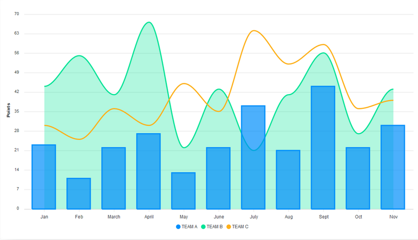
Let’s make a combination of a line, area, and column chart.
We define the series data and the type for each of the charts. For mixed charts, the type of each chart is defined in its series, and not in the ReactApexChart component’s type prop.
const config = {
series: [{
name: ‘TEAM A’,
type: ‘column’,
data: [23, 11, 22, 27, 13, 22, 37, 21, 44, 22, 30]
}, {
name: ‘TEAM B’,
type: ‘area’,
data: [44, 55, 41, 67, 22, 43, 21, 41, 56, 27, 43]
}, {
name: ‘TEAM C’,
type: ‘line’,
data: [30, 25, 36, 30, 45, 35, 64, 52, 59, 36, 39]
}],
options: {}
}
Next, we set the stroke type to smooth and define its width. We pass in an array of values to define the width of each chart. The values in the array correspond to the order of the charts defined in series. We also define the opacity of each chart’s fill. For this, we also pass in an array. This way, we can control the opacity of each chart separately.
Lastly, we add the labels for the x and y axes.
options: {
stroke: {
width: [2,2,4],
curve: ‘smooth’
},
fill: {
opacity: [0.7, 0.3, 1],
},
labels: [‘Jan’, ‘Feb’, ‘March’, ‘April’, ‘May’, ‘June’, ‘July’,
‘Aug’, ‘Sept’, ‘Oct’, ‘Nov’],
yaxis: {
title: {
text: ‘Points’,
},
},
}
Customizing our charts
Apart from changing the color of our charts, we can add some level of customization to them.
We can add grids to our charts and style them. In the grid property, we define the colors for the rows and columns of the chart. Adding grids to your chart can make it easier to understand.
options: {
grid: {
row: {
colors: [‘#f3f3’, ‘transparent’],
opacity: 0.5
},
column: {
colors: [‘#dddddd’, ‘transparent’],
opacity: 0.5
},
},
}
We can adjust the stroke of the charts and define their colors. Let’s do that with the column chart. Each color in the colors array corresponds with the data in the series array.
options: {
stroke: {
show: true,
width: 4,
colors: [‘red’, “blue”, “green” ]
},
}
Conclusion
We have gone through some of the chart types ApexCharts provides and learned how to switch from one chart type to another. We have also seen some ways of customizing the appearance of our charts. There are still many things to discover, so dive into the ApexCharts docs right away.
 · Slider Winemaker Homepage


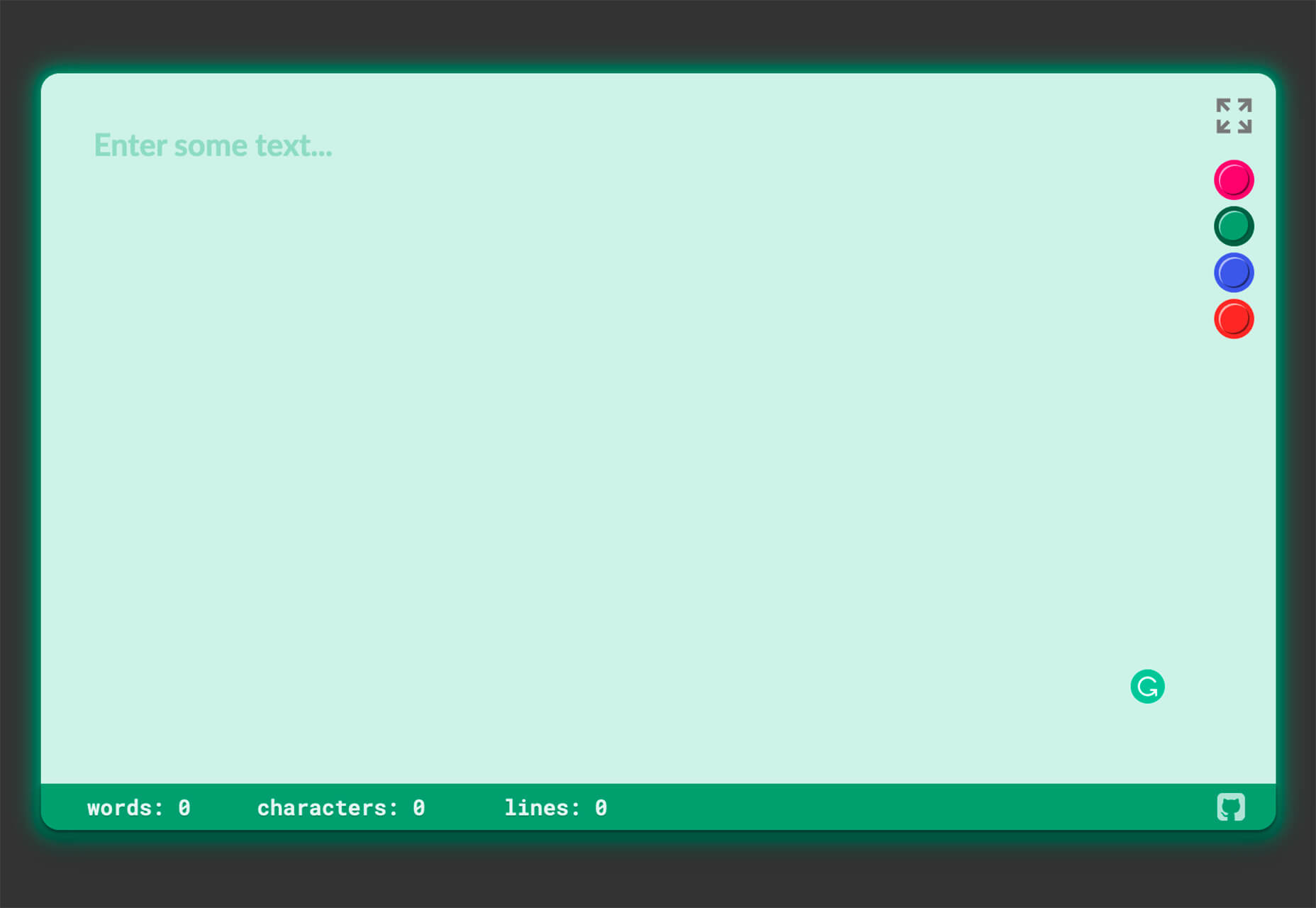
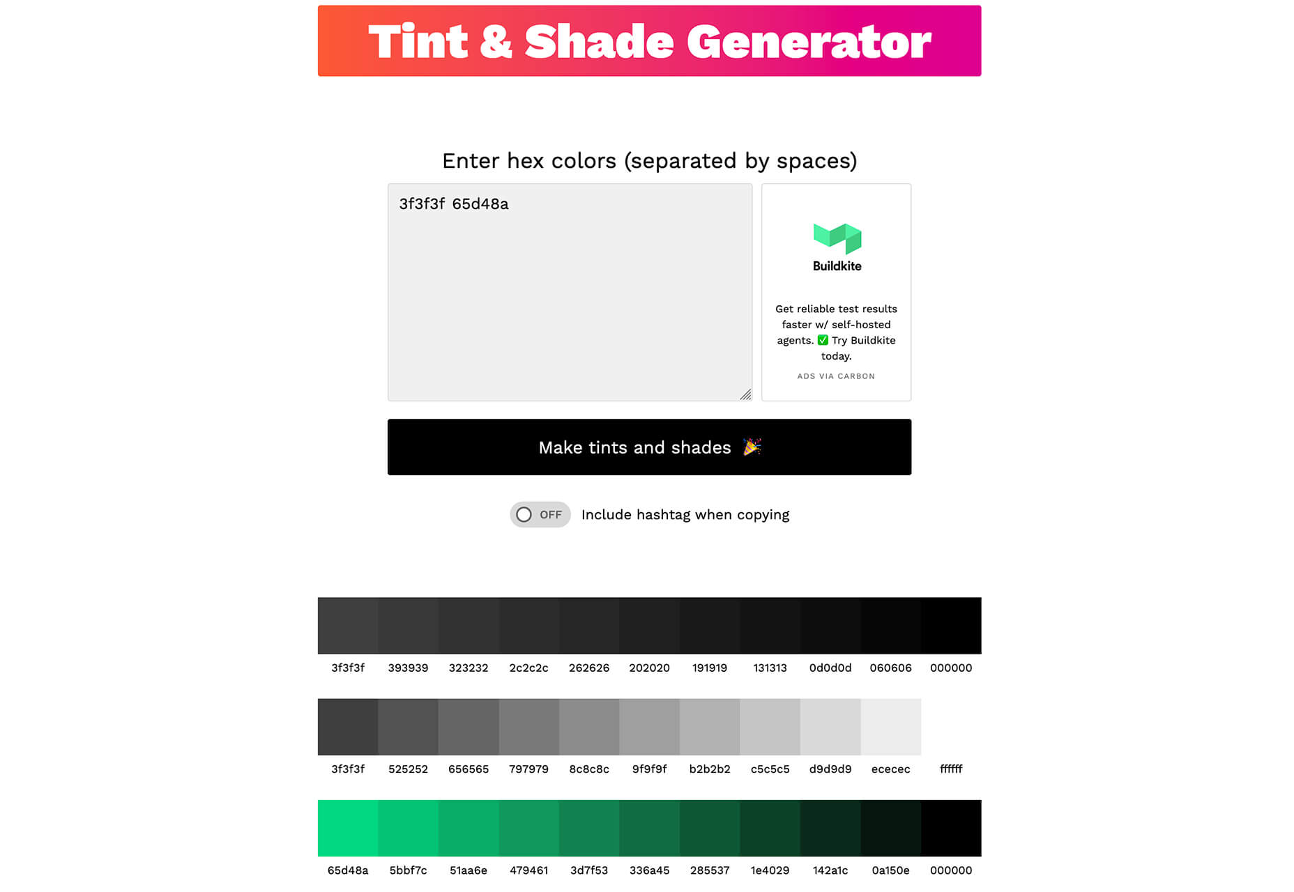
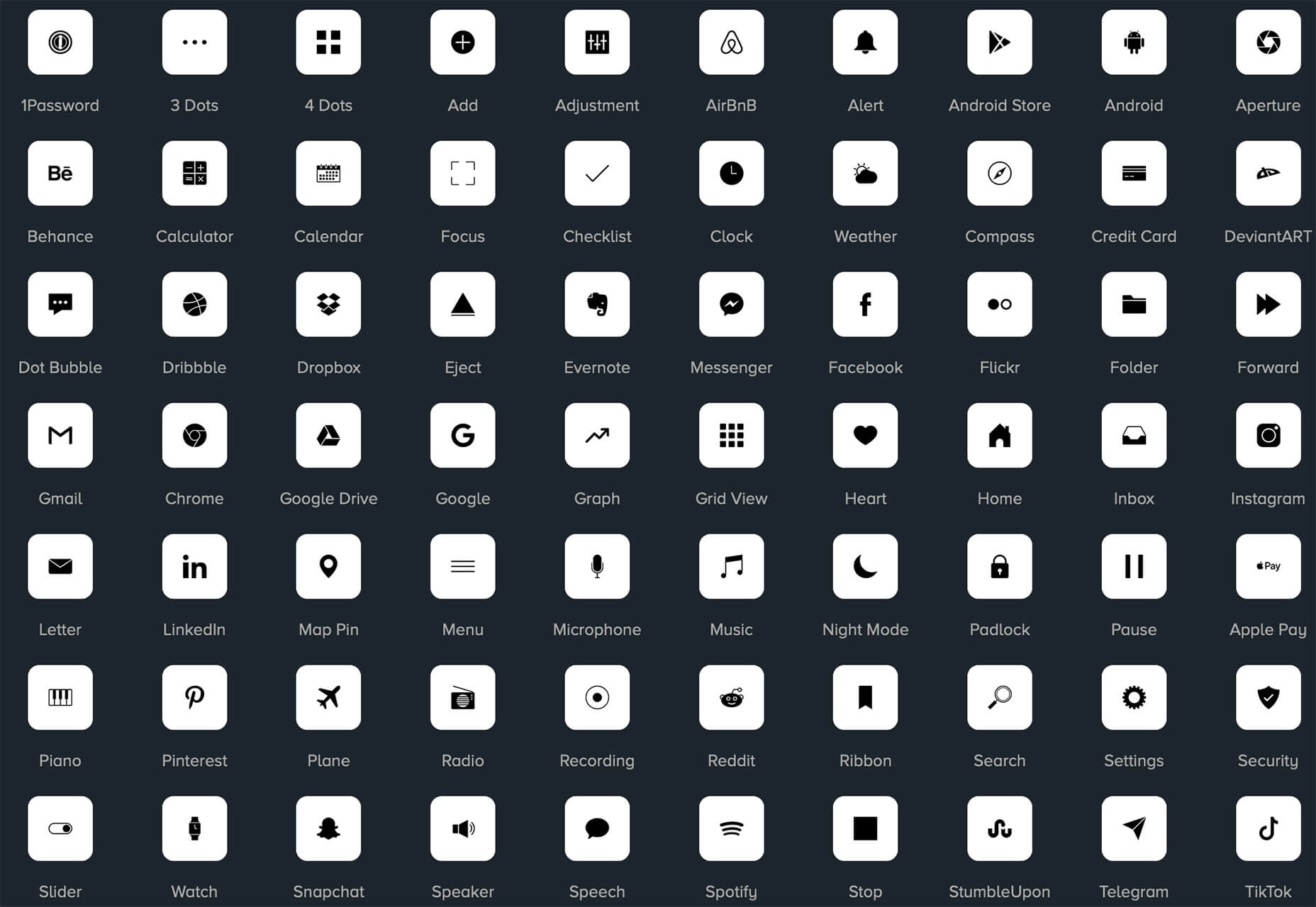
 In the spirit of fall feasts, this month’s collection of tools and resources is a smorgasbord of sorts. You’ll find everything from web tools to icon libraries to animation tools to great free fonts. Let’s dig in.


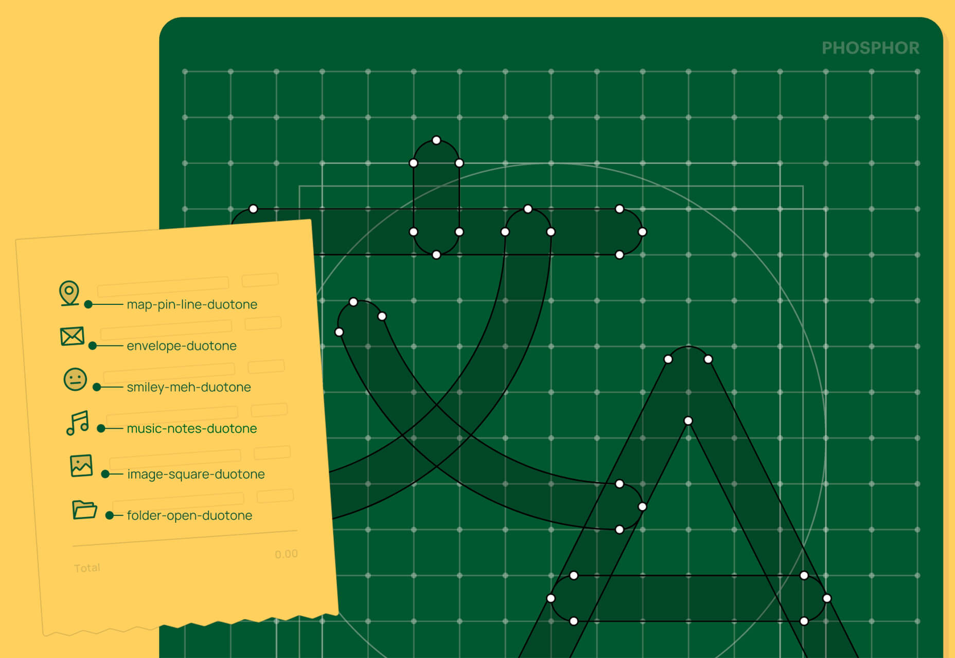
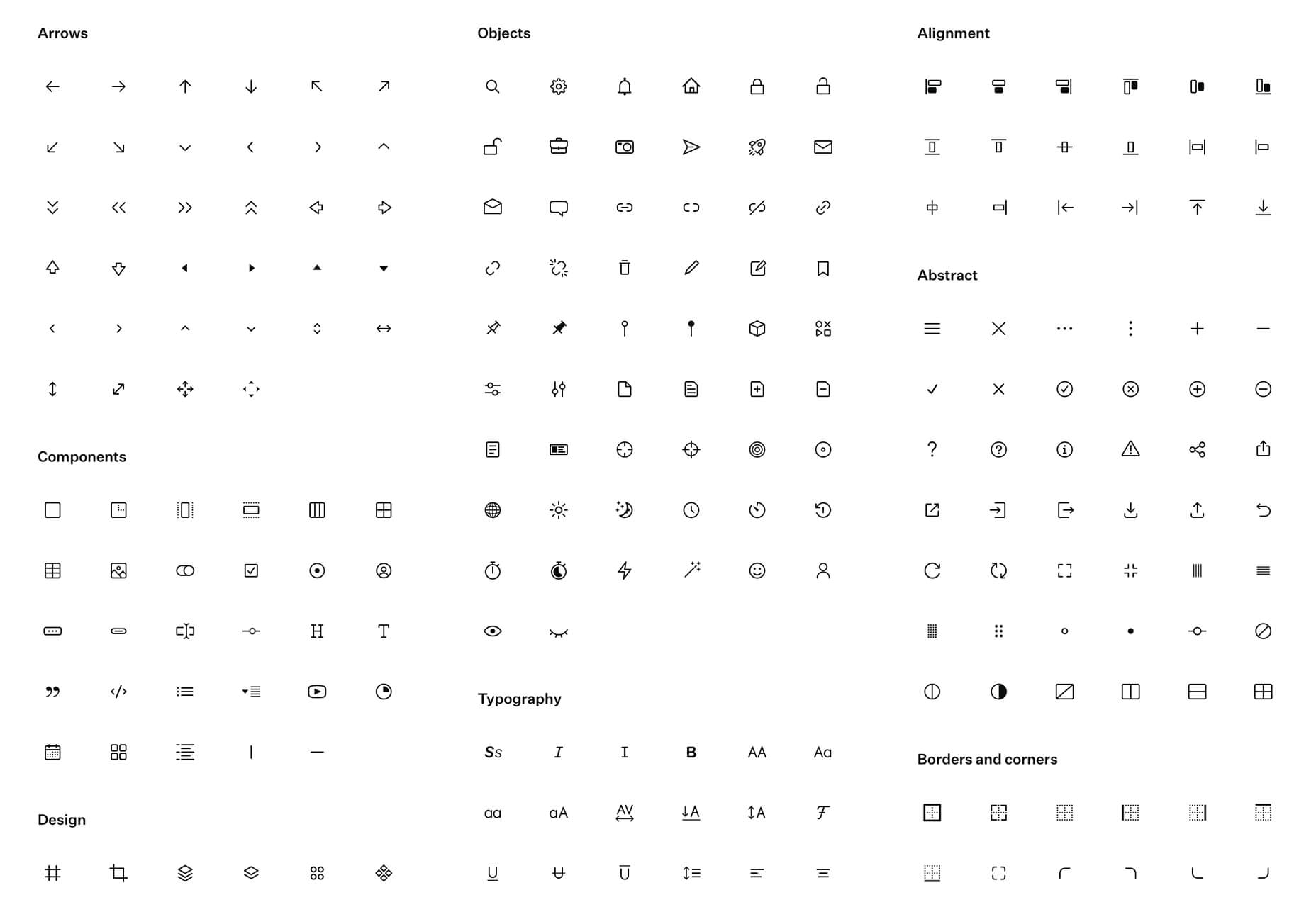