This Week In Web Design – January 22, 2021
Original Source: http://feedproxy.google.com/~r/1stwebdesigner/~3/3TOxSvwrLoE/
…
Original Source: http://feedproxy.google.com/~r/1stwebdesigner/~3/3TOxSvwrLoE/
…
Original Source: https://www.hongkiat.com/blog/wordpress-404-pages-essential-tips-and-tools/
The dreaded 404 page can be a headache for anyone who manages a website. And sometimes figuring out how to handle such errors when using a CMS such as WordPress can be even more challenging….
Visit hongkiat.com for full content.
Original Source: https://www.hongkiat.com/blog/css-object-model-cssom/
A lot happens between the first HTTP request and the final delivery of a web page. Data transmission and the browser’s rendering pipeline require a lot of different technologies, one of them is…
Visit hongkiat.com for full content.
Original Source: https://www.webdesignerdepot.com/2021/02/5-web-design-trends-and-ideas-for-2021/
 One of the few bright spots in 2020 has been the creativity companies and individuals alike have exhibited in dealing with what, at times, seemed to be overwhelming problems.
The world of web design was no different. Designers and agencies had to adapt and implement new color schemes or design new shopping experiences, which made some of the previous design trends not fit for the current design problems.
We’ll take a look at these newest design trends and the rationale behind them. As we do so, we’ll also take a look at some of BeTheme’s 600+ pre-built sites that have already put them to good use.
1. Comforting Color Palettes Lighten the Load
In years past, bolder color schemes were one of the hallmarks of web design trends. Their purpose was to quickly engage a visitor and prompt him or her to respond emotionally.
Given all the drama and turmoil we were subjected to through most of 2020, we’ve come to welcome the use of toned-down colors in marketing instead of the bolder, brasher, and more “in-your-face” color schemes.
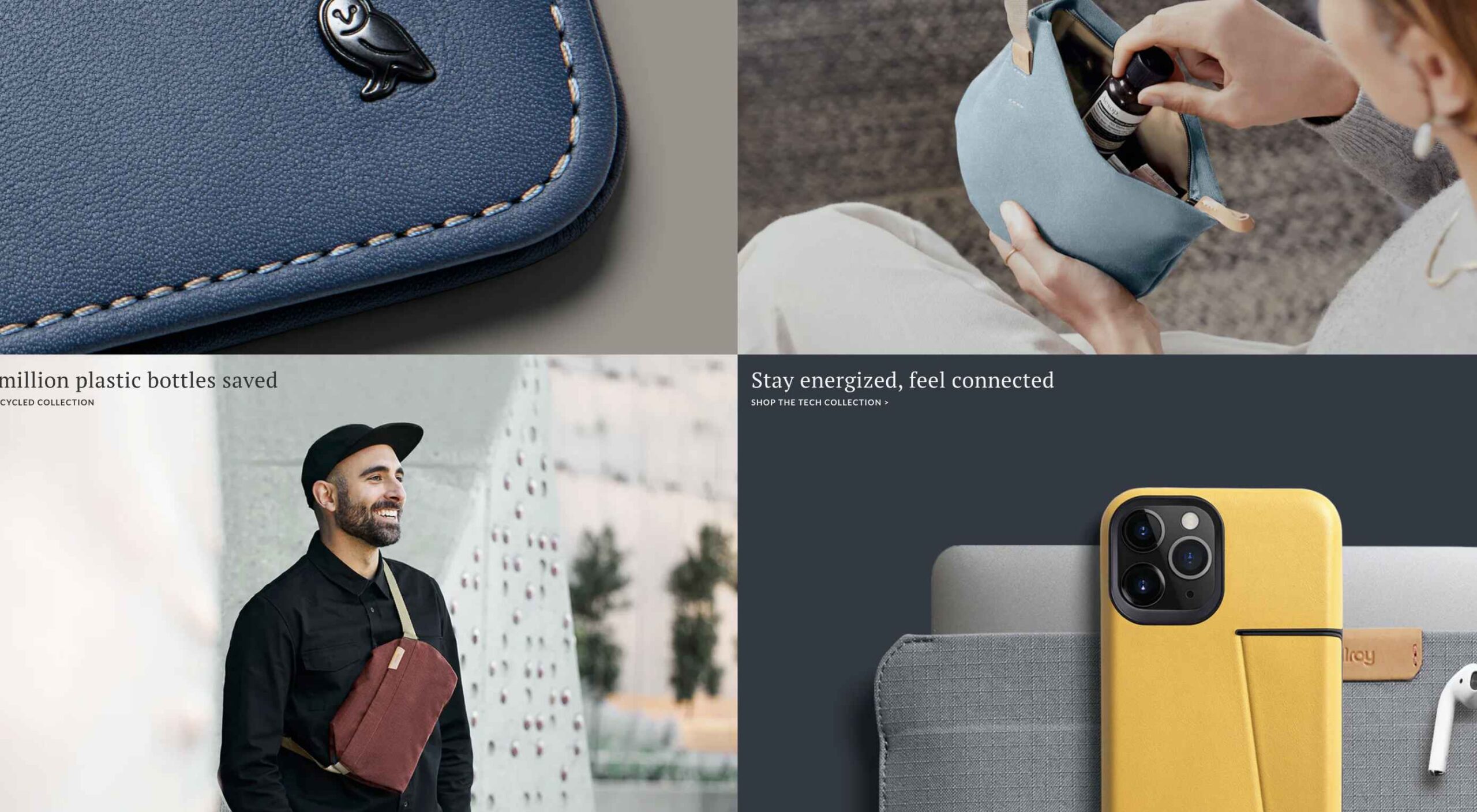
Bellroy’s website puts toned-down colors to good use. This company’s product line of wallets, bags, and the like, are designed to keep people’s belongings organized, safe, and secure. A wild color scheme simply wouldn’t be fitting.
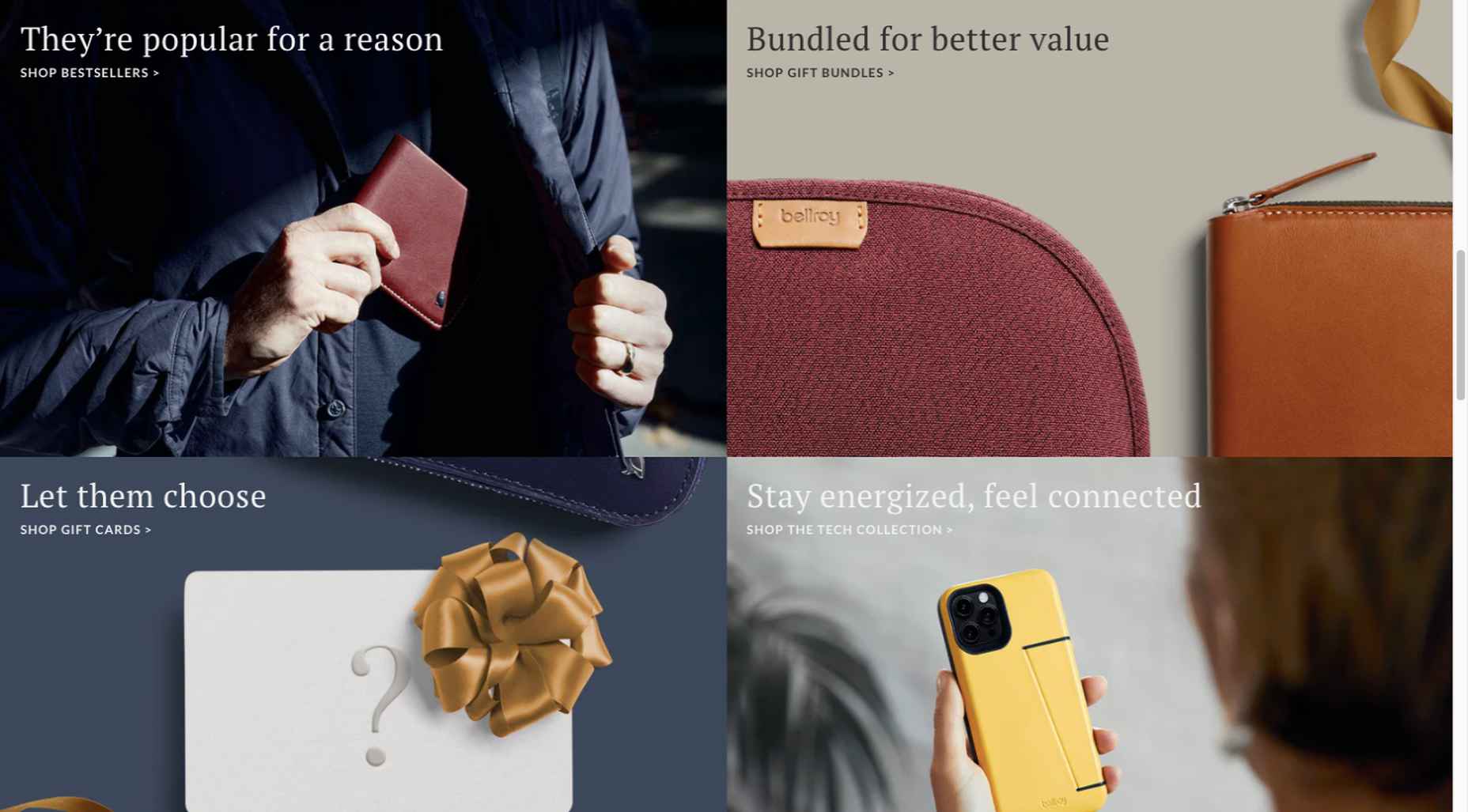
How, then, are brightly-colored products dealt with? Thanks to judicious uses of white space and background photos, this website still emphasizes a toned-down color palette.
The BeSpa pre-built website is another example of a color scheme that almost immediately puts the mind at ease.
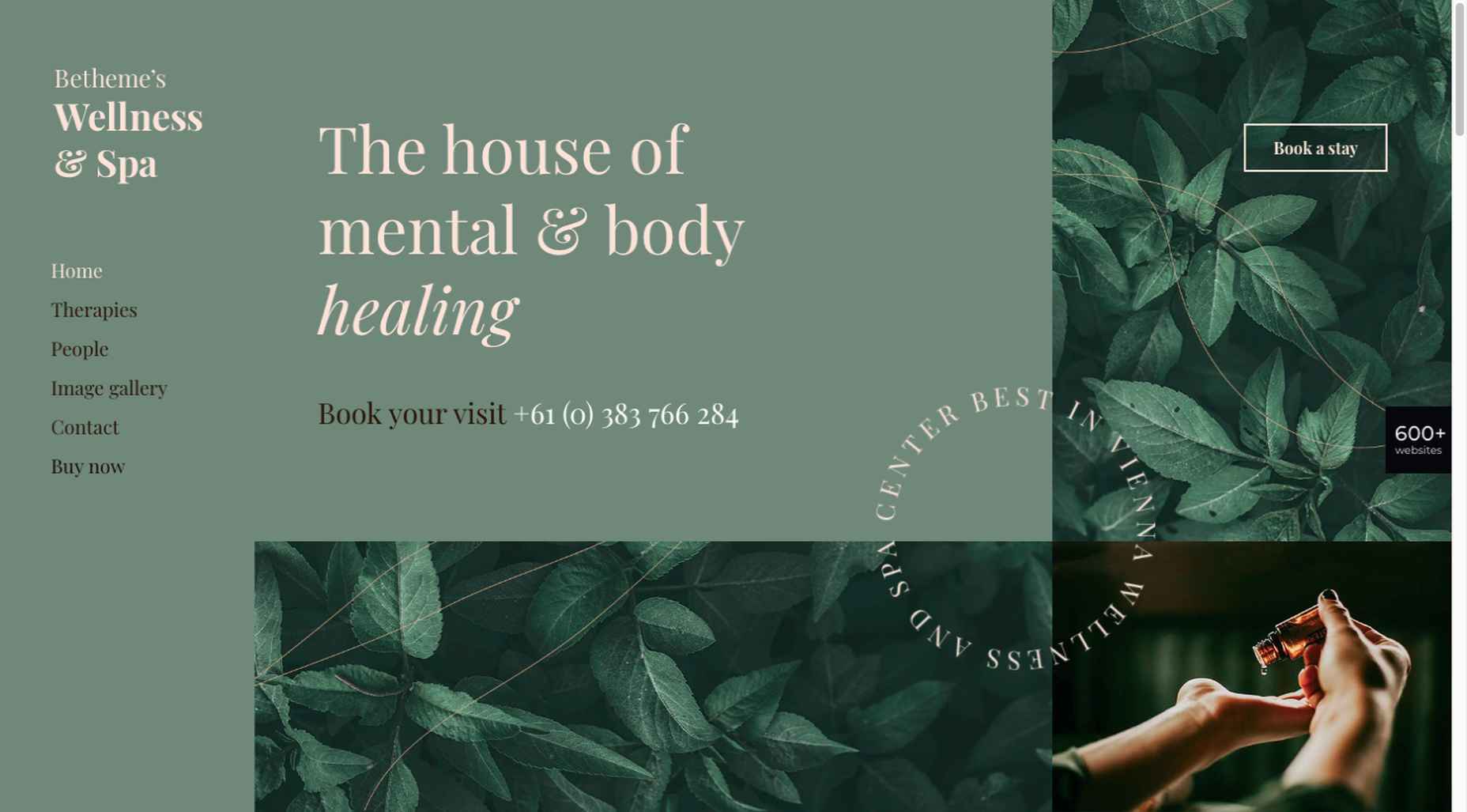
Calm and soothing? Yes.
Boring? Definitely not.
Comfort and security are the emotional drivers in this example.
2. Seamlessly Intermingle and Balance Physical and Digital Imagery
People confined to their homes because of Covid-based restrictions spent many more hours looking at their screens in 2020. Online programming began to take on the appearance of a reality show that blurred the boundaries between the real and the digital.
Whereas web designers tended in the past to rely on either photos or illustrations in their designs, these same designers have started to integrate these blurring effects into their designs, with results that range from amusing and quirky to highly informative.
Check out this example from fashion designer Constance Burke:
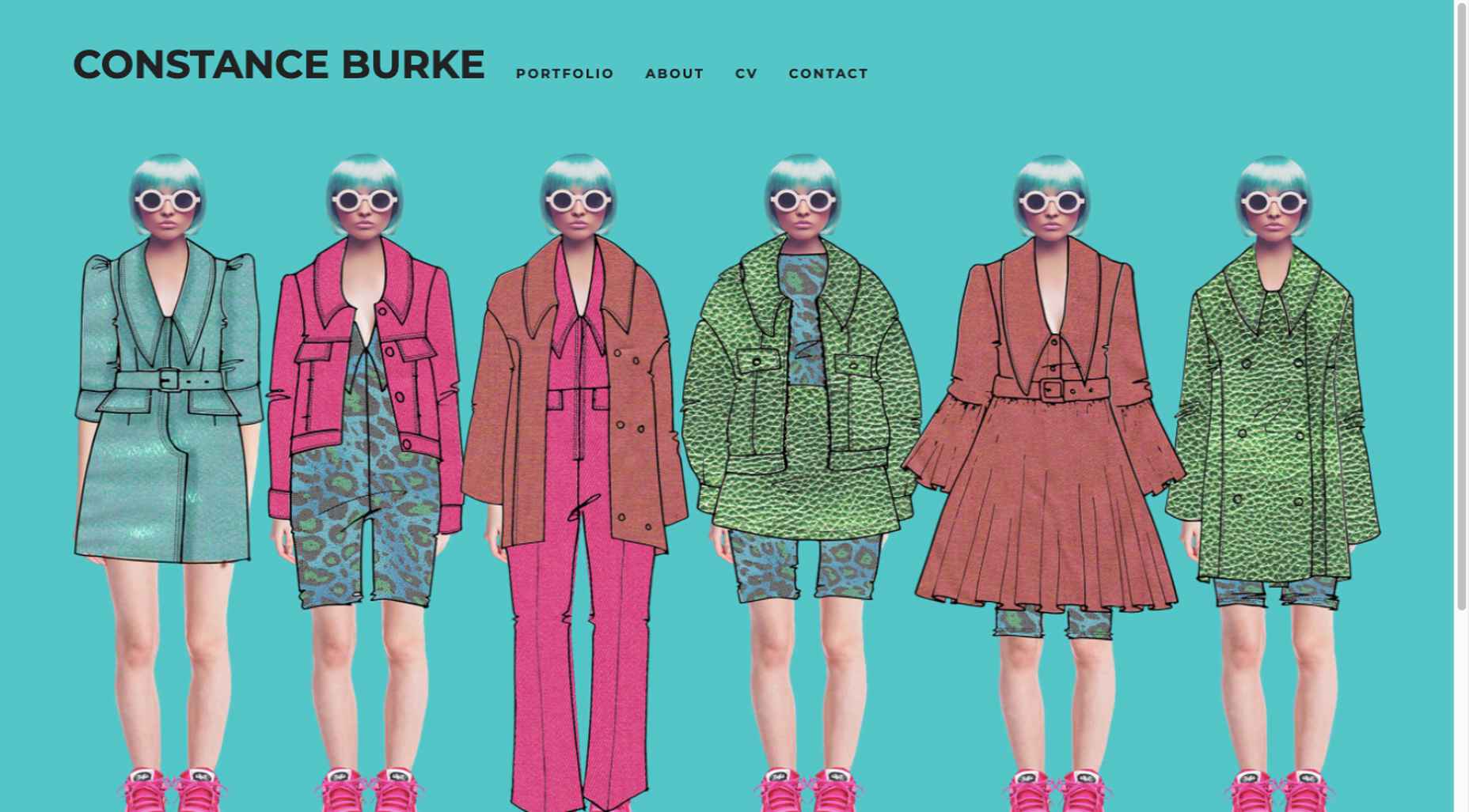
It’s not every day you see real models wearing hand-drawn fashion sketches. But it’s just one example of how the physical can be blended with the digital.
The BeSki pre-built site does the same blending of the two, but in a totally different way:
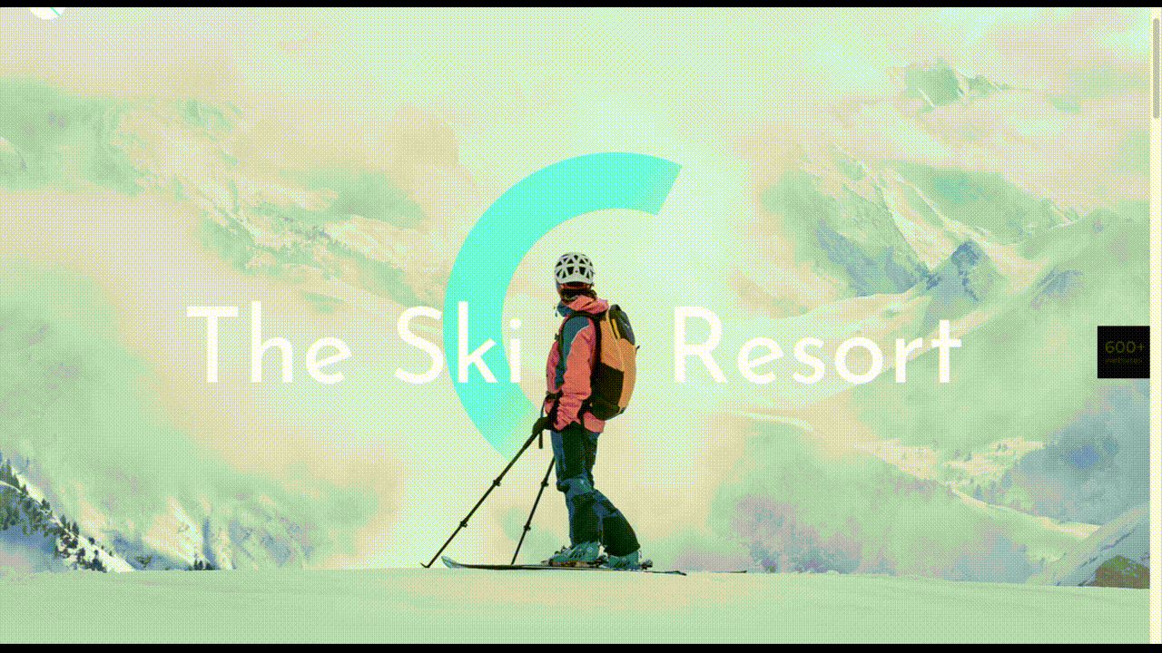
The sections’ designs switch from predominantly physical to largely digital and back again, an excellent approach that provides a maximum amount of useful information.
It’s also worth noting how snowbanks are effectively used to seamlessly transition from one section to the next.
3. Create Well-Organized and Helpful Shopping Experiences
More people spending more time at home has created a surge in online shopping. As a result, many online store owners are now feeling the effects of increased competition.
Consumers look for brands they believe they can trust. At the same time, they want their online shopping experiences to be as quick and painless as possible. They look for (and expect) quick and effective product search capabilities, helpful and effective product displays, one-page product descriptions, and the like.
Walgreen’s product page design is especially well-suited for 2021 ecommerce shoppers:
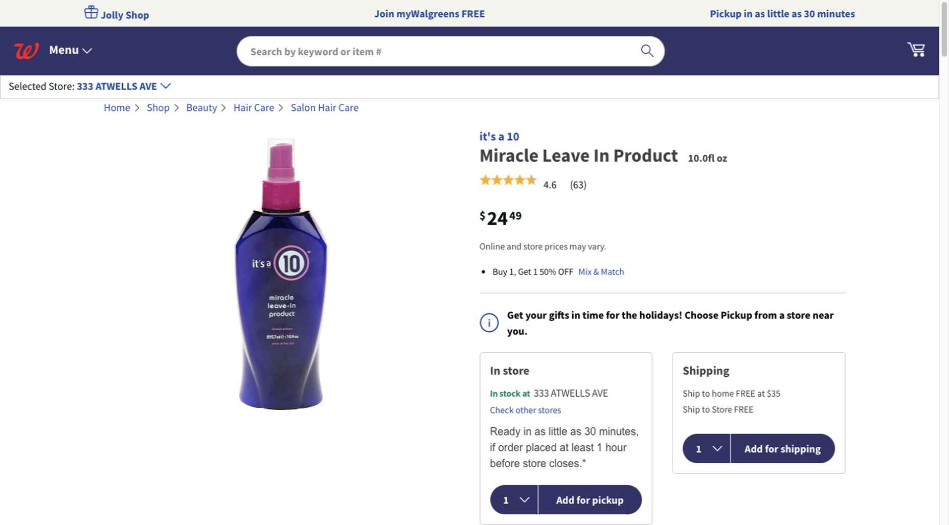
Everything shoppers usually need to know is presented above-the-fold. They can easily proceed to the next step or scroll down for reviews or additional product specifications.
BePestControl’s pre-built website uses a similar product design approach:

In this example, the main selling points are up-front and are kept short and sweet. The shopper can either hit the ‘Add to Cart’ button or look below the button for additional information.
In both examples, a visitor doesn’t have to mull over what step to take next since one of the design objectives is to make the shopping experience as easy and as satisfying as possible.
4. Take Advantage of the Benefits of User-Controlled Video Content
Once upon a time, video content was “the thing” to incorporate in a website. Hero background videos proved to be particularly engaging, and “how-to” videos presented much more useful information than illustrations or blocks of text could.
On the other hand, Auto-play videos, those that started on their own, all too often had a tendency to irritate rather than inform, especially when their content didn’t address a visitor’s immediate concern.
Thanks to Zoom and similar video platforms that came into widespread use in 2020 and to website designs that include video “Play” buttons, users have become much more comfortable with the medium. As an example, Shoppers have been given total control over if or when they want to view a given video.
This is the design approach Payoneer has taken:
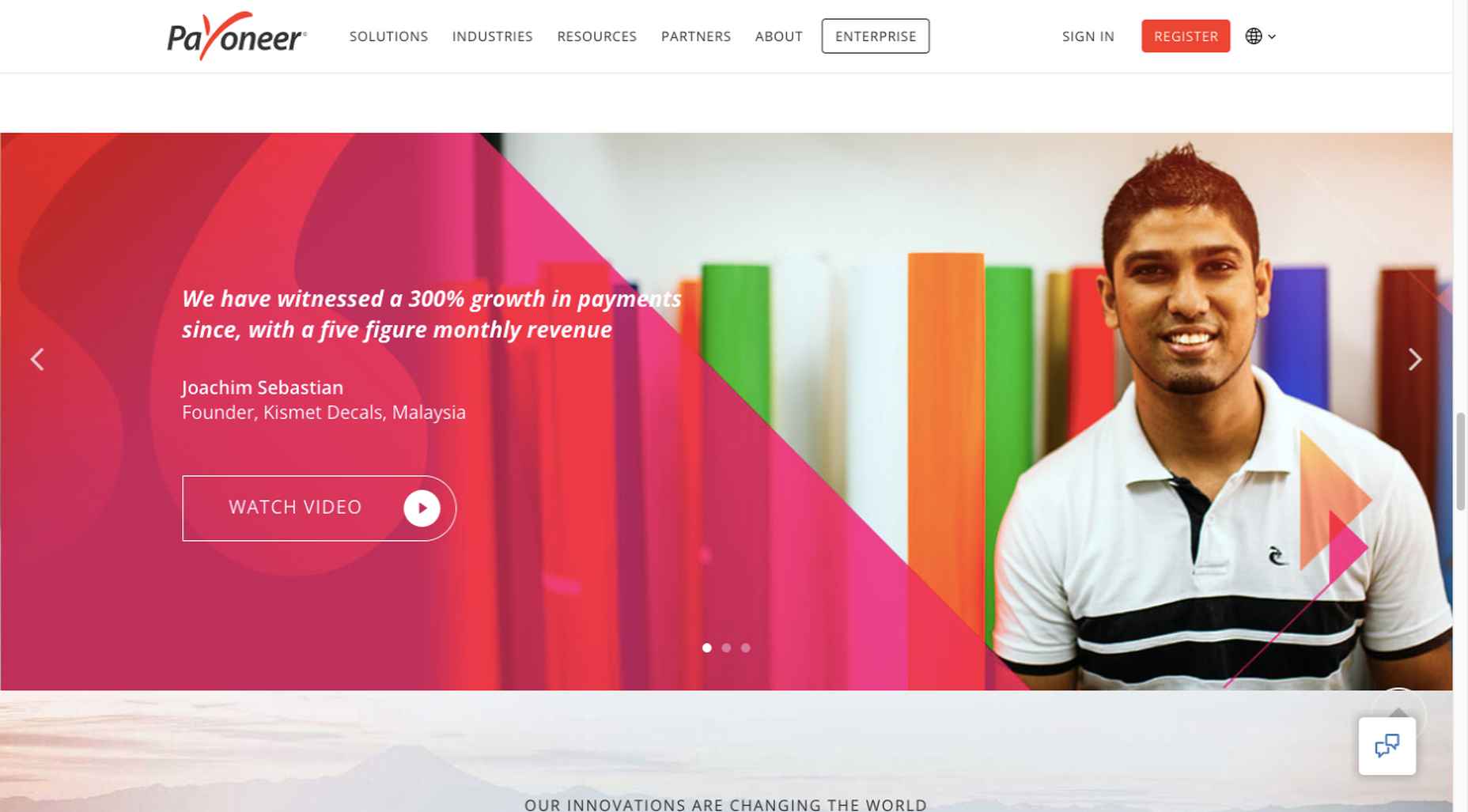
The white “Pay” button is impossible to miss, and while it is designed to encourage a visitor to watch a testimonial, doing so is completely optional.
The BeOptics pre-built website cleverly slips in a video play option as well:
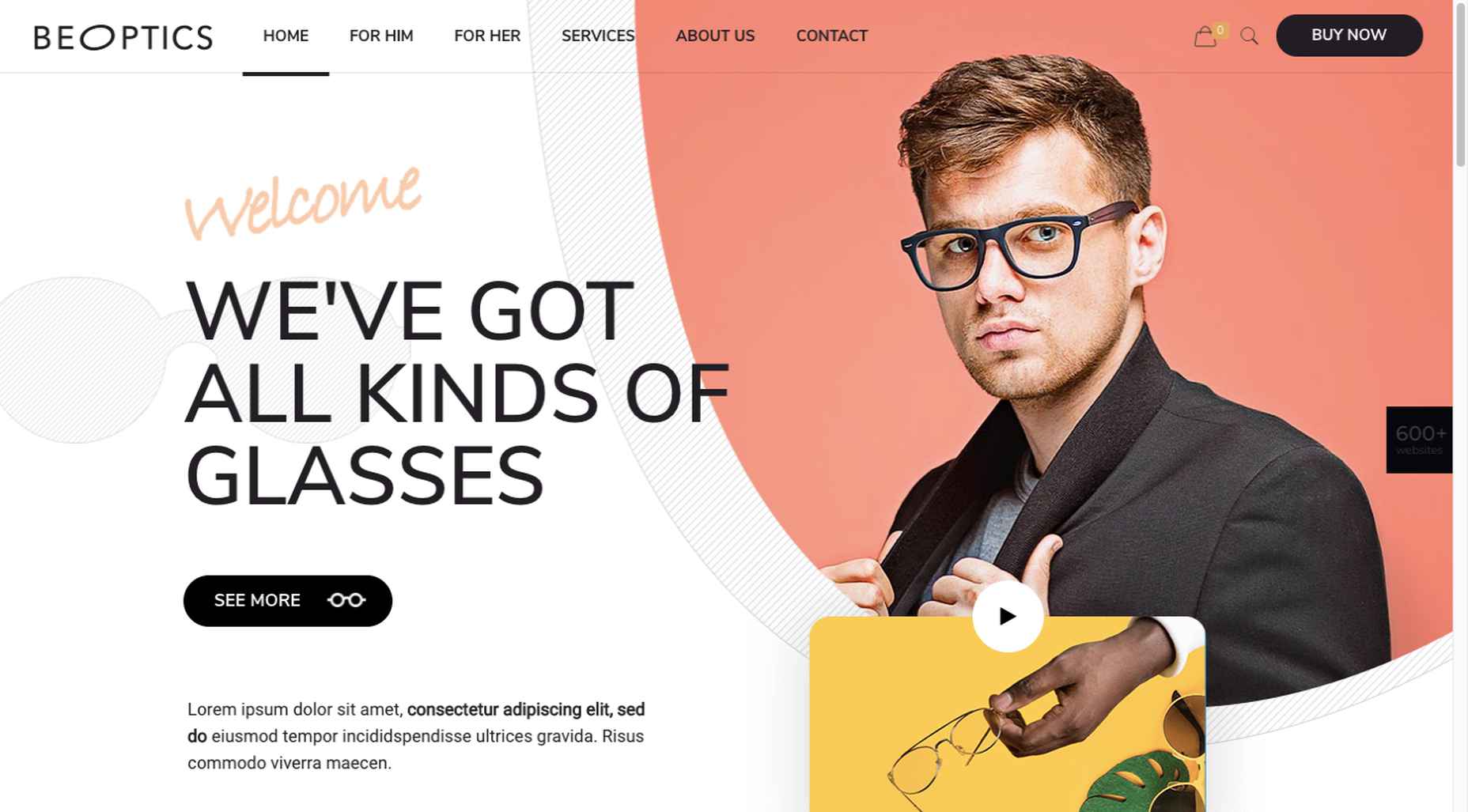
In this example, when visitors hover over the “See More” button, it lets them know that they have the option to watch the video if they want to learn more.
5. Trust Builders Should be Non-Negotiable Web Design Elements
There are various ways in which products are organized or showcased in brick and mortar businesses to instill trust. Helpful and friendly staff also contribute to instilling trust.
Some of these trust-builders are easily incorporated into eCommerce designs. Others, though more difficult to fit in, can usually be satisfactorily addressed.
Digital trust builders can include.
Logos (familiar, whimsical, innovative, engaging)
Portfolios and/or product pages
Customer reviews, product ratings, and client testimonials
Case studies and product or price comparisons
Safety and security seals, e.g., Better Business Bureau, PayPal checkout
Charts, graphs, counters, and other data visualization techniques
Proof of social, charitable, or community-related actions and contributions
Put, trust-building content will beat hard-sell techniques every time, especially if you would like your customer base to include referred and repeat customers.
Omaze, for example, gives people entries for prizes based on their donations while at the same time highlighting the good things it and its donors have brought about.
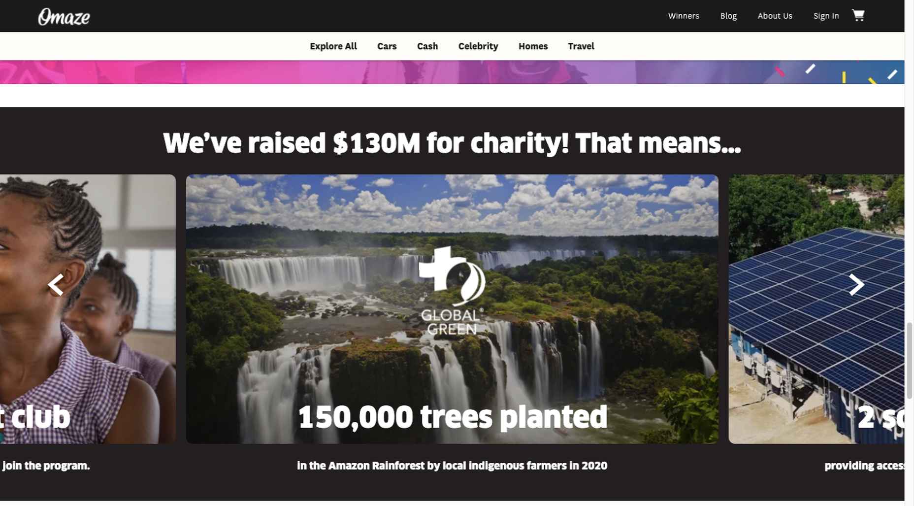
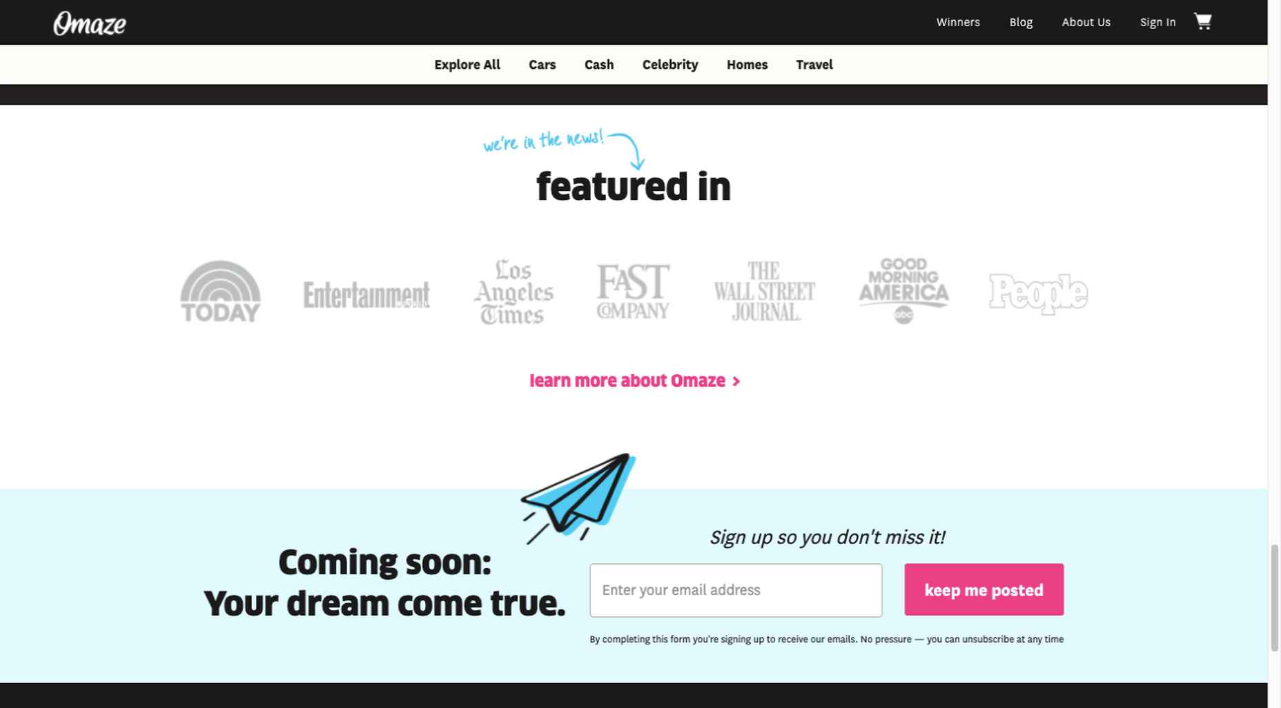
To help build trust, the site devotes space to highlighting publications that have featured Omaze and the work it has done and is doing.
Plus, it puts data visualization and non-profit testimonials into play to give visitors an added insight into what is going on behind the scenes:
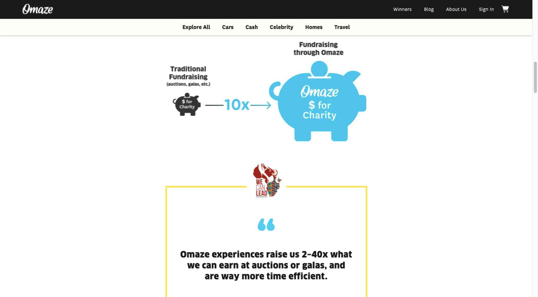
As you can see, it doesn’t have to be difficult to incorporate genuine trust-building content into your website designs.
BePortfolio is a great example of how you might go about doing this for a portfolio site, whether it’s your own or a site for a client:
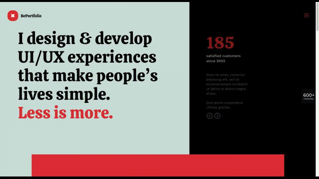
The home page alone has plenty of space for including trust-building content:
A satisfied customer counter
Product usage case studies and testimonial
Portfolio highlights
Client and partnership logos
And it can only get better as a visitor moves through the site, but only if you’ve chosen to make that happen.
Have You Started to Take These New Web Design Trends to Heart?
We’re not suggesting that you throw the baby out with the bathwater, but some trends will need to be discarded to enable you to adjust to a new normal. Other 2020 design trends, like minimalism and headline topography, are likely to remain popular for years to come.
New trends that incorporate calming color palettes, image blending, more efficient eCommerce UX designs, user-controlled video, and trust-building elements should give your customers the feeling of comfort and security they will be seeking in 2021.
If you want to implement some or all of these new trends in your 2021 website designs, BeTheme’s 600+ pre-built sites make doing so an easy task.
[– This is a sponsored post on behalf of BeTheme –]
Source
p img {display:inline-block; margin-right:10px;}
.alignleft {float:left;}
p.showcase {clear:both;}
body#browserfriendly p, body#podcast p, div#emailbody p{margin:0;}
The post 5 Web Design Trends and Ideas for 2021 first appeared on Webdesigner Depot.
Original Source: https://www.hongkiat.com/blog/ww-falling-stars-meteors-wallpapers/
If you are an avid stargazer, you probably own your own telescope or will actually venture to strategic spots around the world to catch a glimpse of the meteor showers that grace the skies in certain…
Visit hongkiat.com for full content.
Original Source: http://feedproxy.google.com/~r/tympanus/~3/tIsYncpnJWs/

Inspirational Website of the Week: CCNCN – Saison 2021
A fresh design with great typography and a daring, addicting click interaction concept. Our pick this week.
Get inspired

Our Sponsor
Blockchain domains are owned, not rented
Blockchain domains are stored by their owners in their wallet like a cryptocurrency, no third party can take them away. Pay once and you own the domain for life, no renewal fees. Get your .crypto or .zil domain now.
Check it out

Creative Good: Why I’m losing faith in UX
Read why Mark Hurst thinks that UX is now “user exploitation”.
Read it

New aspect-ratio CSS property supported in Chromium, Safari Technology Preview, and Firefox Nightly
Maintaining aspect ratio within images and elements is now easier to achieve with the new aspect-ratio CSS property.
Read it

Things You Can Do With CSS Today
Andy Bell looks into masonry layout, :is selector, clamp(), ch and ex units, updated text decoration, and a few other useful CSS properties.
Read it

We Value Your Privacy (At About $0.50): Dark Patterns in UI Copy 2021
Read how shady euphemisms are employed to trick users into handing over personal data, and manipulative descriptions continue to deceive people. By Graeme Fulton.
Read it

SVG Waves
A handy SVG wave generator made by Bereket Semagn.
Check it out

Mutsuacen
A great little tool to create animated and interactive drawings.
Check it out

Fusuma
A tool to create slides from Markdown.
Check it out

Crunk dancer
An amazing music web experiment by Arno Di Nunzio. Made with Three.js and Cannon.
Check it out

Faking container queries with CSS Grid
With CSS Grid and some trickery it’s possible to implement something very close to container queries.
Read it

Le Voyage Azarien
A beautiful immersive journey into a forest made by Joseph Azar.
Check it out

Making GitHub’s new homepage fast and performant
The third article in a five-part series on building GitHub’s new homepage.
Read it

Iconduck
Iconduck lists over 100,000 free open source icons, illustrations and graphics from around the web. They can be used for personal and commercial projects.
Check it out

CSS Polygon Shapes
Tweakable shapes generated with css-doodle and clip-path. By Yuan Chuan.
Check it out

ReacType
If you didn’t know about it yet: ReacType is an open-source application that assists developers in prototyping React applications via a user-friendly drag-and-drop interface.
Check it out

Supercons
A friendly open source React iconset by Lachlan Campbell.
Check it out

How-to: Use the tabindex attribute
Learn why and how to use the tabindex attribute in this article by Eric Bailey.
Read it

Continuous Typography Tester
A prototype of a design tool for continuous typography made by Max Kohler. Read more about it here.
Check it out

Don’t use functions as callbacks unless they’re designed for it
Jake Archibald shows why functions shouldn’t be used as callbacks unless they are designed for it.
Read it

GutenSearch
Find any term in the wast body of Project Gutenberg books.
Check it out

Gaze-controlled keyboard
Write words using your eye movements. Built with Tensorflow.js
Check it out

Skateboard Video Platform
A beautiful UI coded by Aysenur Turk.
Check it out

Droste Creator
Create recursive images with the droste effect using this cool tool. Made by Javier Bórquez.
Check it out

Barebones CSS for Fluid Images
Zach Leatherman’s CSS tip for fluid images.
Check it out

Svelte Kit, the first ‘serverless-first’ framework?
Jasper Moelker tested out Svelte Kit and summarized what he learned.
Read it

Introducing Pika. A free, open-source colour picker app
Learn about Pika, an easy to use, open-source, native colour picker for macOS.
Read it

From Our Blog
How to Code the Traveling Particles Animation from “Volt for Drive”
A coding session where you’ll learn how to implement Volt for Drive’s traveling particles animation with Three.js.
Check it out

From Our Blog
Rotating Loading Animation of 3D Shapes with Three.js
Check it out
The post Collective #647 appeared first on Codrops.
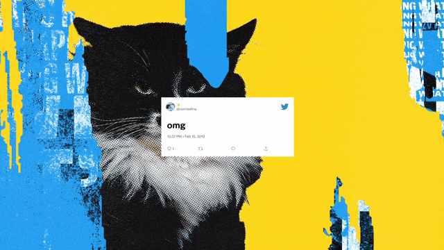
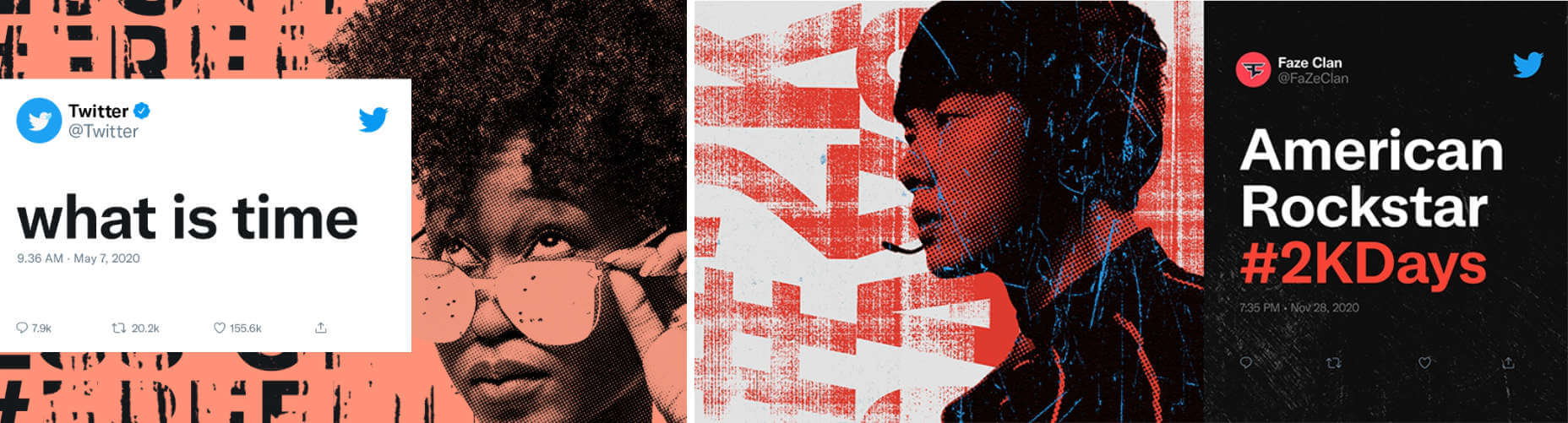
Original Source: https://www.webdesignerdepot.com/2021/02/is-twitter-rebrand-a-glimpse-at-the-future-of-design/
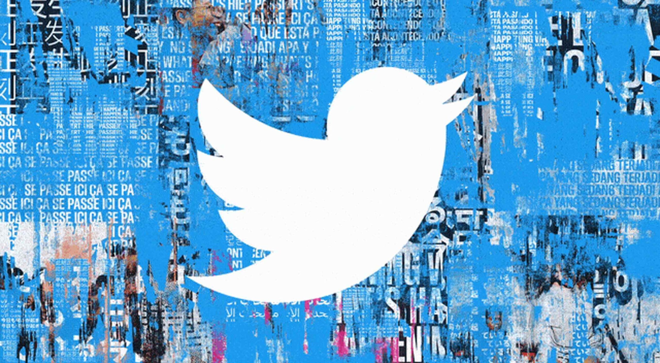 The CMO at Twitter, Leslie Berland, has announced a substantial rebrand intended to reflect the experience of using the site. The move was announced on the platform first and later confirmed on its blog.
Twitter hopes the visual identity will “fully reflect the complexity, fluidity, and power of the conversations today.”
The instantly recognizable bird logomark stays, as does the inoffensive tech-blue. But everything else has been grunged up.
rather than build the system up from each component part or build around a specific element, we embarked upon building a creative design system that’s intentionally imperfect
— Donna Lamar, Global ECD, Twitter
There’s a brand new custom typeface named “Chirp” designed in collaboration with Grilli Type. It mixes features of gothics and grotesques with hipster-friendly quirks and replaces the decidedly corporate Helvetica.
The most visually arresting elements are the print-inspired collages, faux-print effects, and distress marks. It’s a move away from the safe, minimal style that has dominated the design industry for more than a decade.
There are layers of bill posters torn off in pieces revealing text beneath, macroscopic views of people, and an all-pervading effortless cool. Think Paris, on a Sunday morning, circa 1997.

It’s exciting to see a major brand strike out in a new direction, particularly one that isn’t Google-derived. There’s plenty of energy in the new artwork, but it doesn’t escape notice that this is a surface level restyle; the core design remains.
Is this a glimpse of design over the next few years: a braver, irreverent, and decidedly less-corporate style of corporate design? Or, a misstep we’ll all forget as soon as Material Design 3.0 is released?
Source
p img {display:inline-block; margin-right:10px;}
.alignleft {float:left;}
p.showcase {clear:both;}
body#browserfriendly p, body#podcast p, div#emailbody p{margin:0;}
The post Is Twitter Rebrand a Glimpse at the Future of Design? first appeared on Webdesigner Depot.
Original Source: https://smashingmagazine.com/2021/02/things-you-can-do-with-css-today/
CSS is great and getting better all the time. Over recent years, especially, it has evolved really fast, too. Understandably, some of the really handy powers CSS gives you might have slipped you by because of this, so in this article, I’m going to show you some really handy stuff you can do with modern CSS today, and also share some stuff that we can look forward to in the future.
Let’s dig in.
Masonry Layout
Masonry layouts became very popular with Pinterest, Tumblr and Unsplash, and up until recently, we tended to rely on JavaScript to assist with our layout, which is almost never a good idea.
Sure, you can use CSS multicol pretty darn effectively to achieve a masonry layout, but that approach can be problematic with tabbed-focus as it lays content out in columns. This creates a disconnect between the visual layout and the tabbing index.
Fast forward to today (well, very shortly in the future) and a masonry layout is pretty trivial, thanks to an update to CSS Grid. Here’s a complete masonry layout, with gutters, in 6 lines of CSS:
.masonry {
display: grid;
grid-template-columns: repeat(4, 1fr);
grid-template-rows: masonry;
grid-gap: 1rem;
}
The magic is in grid-template-rows set as masonry, which turns it into the “masonry axis”, thus providing the “filled in” layout we’ve all come accustomed to.
Let’s expand on this and explore a quick demo of creating a responsive masonry layout. Using a slightly modified version of the above CSS, we can replace the grid-template-columns line to use this auto grid method instead:
.masonry {
display: grid;
grid-template-columns: repeat(auto-fill, minmax(16rem, 1fr));
grid-template-rows: masonry;
grid-gap: 1rem;
}
The minmax() function allows us to define what the smallest size is for our items, which for us, is 16rem. Then we tell minmax() what the maximum size should be for each item. We declare that as 1fr, which takes 1 portion of the remaining available space.
This definition of grid-template-columns allows our layout to break and stack if it runs out of horizontal space which the masonry axis then automatically sorts our remaining elements for us.
Note: Right now, masonry is only working in Firefox Nightly, or behind a flag, but the grid layout will still work perfectly in non-supporting browsers, making it a decent progressive enhancement target.

You can also read this great article, too.
Resources
Content-visibility on web.dev
Another video explaining what happens under the hood
A handy article with some useful notes to know about content-visibility
Wrapping Up And What’s Coming Up
That’s a pretty cool new CSS, right? There’s loads more arriving soon and loads in the long-term pipeline too. We can look forward to Media Queries Level 5 which let us target the current ambient light level and whether or not the user prefers reduced data.
We’ve also got CSS Nesting in draft, which will give us Sass-like nesting capabilities like this:
.my-element {
background: red;
& p {
background: yellow;
}
}
We’re getting even more control too, with font metrics override descriptors and Cascade Level 5, which introduces layers to the cascade. Prototyping is happening with container queries too!
Lastly, there are some cool new tricks on the horizon, like scroll-linked animations, which will open the door wide-open to a new generation of creative work on the web.
In conclusion, the present and future of CSS are very bright indeed and if you take a pragmatic, progressive approach to your CSS: things will continue to get better and better on your projects too.
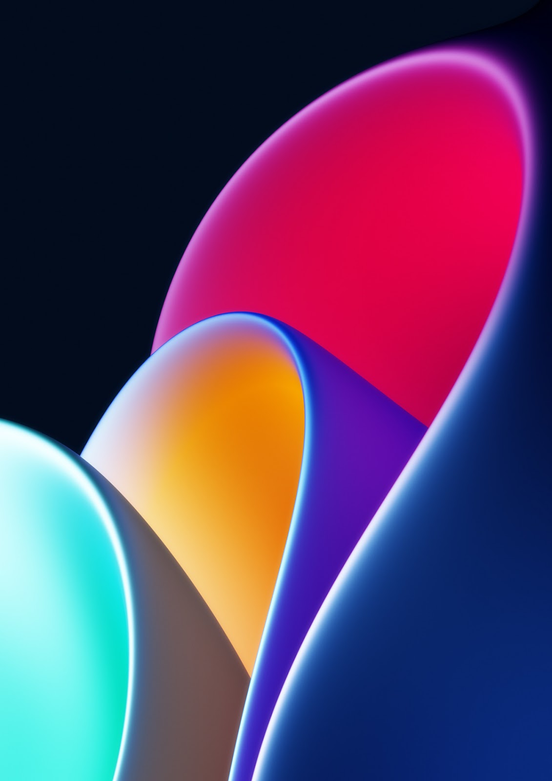
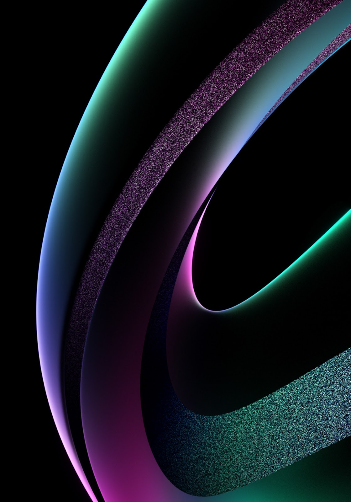
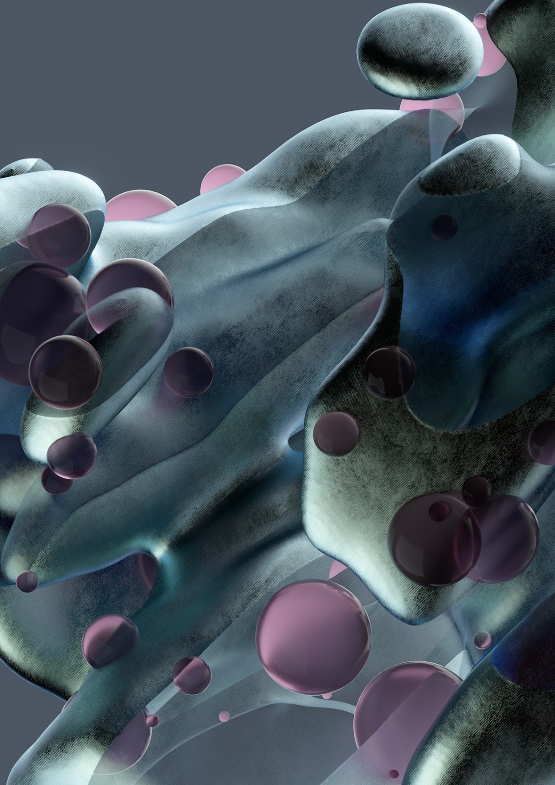
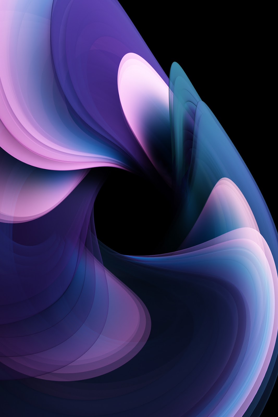
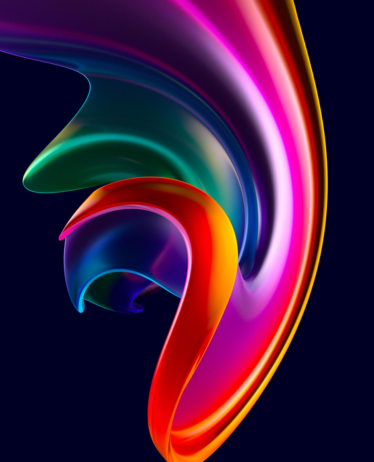
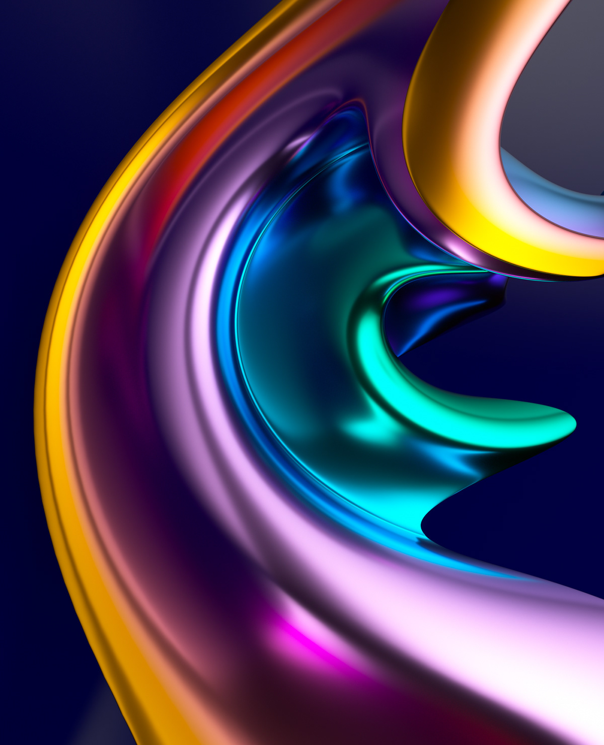
Original Source: http://feedproxy.google.com/~r/abduzeedo/~3/vW_LPS6hzRk/3d-abstract-colorful-shapes
3D Abstract & Colorful Shapes

abduzeedo01.27.21
Danny Ivan shared a set of 3D colorful images created in Maxon Cinema 4D as well as Photoshop. Titled Abstract Shapes 1.0 the collection as the name suggests some abstract forms that look perfect for a wallpaper to be used on your computer or phone. I’d even just print it and frame it on a wall.
Make sure to follow Danny on
Instagram
twitter
Original Source: https://smashingmagazine.com/2021/01/design-developer-friendly-react-code-animaapp/
The promise of seamless design to code translation goes back to the early WYSIWYG page builders. Despite the admirable goal, their biggest flaw (among many) was the horrible code that they generated. Skepticism remains to this day and whenever this idea reappears, the biggest concerns are always related to the quality and maintainability of the code.
This is about to change as new products have made great leaps in the right direction. Their ultimate goal is to automate the design to code process, but not at the cost of code quality. One of these products, Anima, is trying to finally bridge the gap by providing a fully-fledged design to development platform.
What’s Anima?
Anima is a design-to-development tool. It aims to turn the design handoff process into a continuous collaboration. Designers can use Anima to create fully responsive prototypes that look and work exactly like the finished product (no coding required). Developers, in turn, can take these designs and export them into developer-friendly React/HTML code. Instead of coding UI from scratch, they are free to focus on logic and architecture.
It does that with the help of a plugin that connects directly to your design tool and allows you to configure designs and sync them to Anima’s web platform. That’s where the rest of the team can access the prototype, discuss it, and pick useful specs or assets. Aside from the collaboration functionality, it gives developers a headstart thanks to the generated code.
This could make a big difference in the traditional back and forth dance that goes between designers and developers. It keeps everything in one place, in sync, and allows both sides to make changes using either code or design tools.
Installing The Plugin And Setting Up A Project
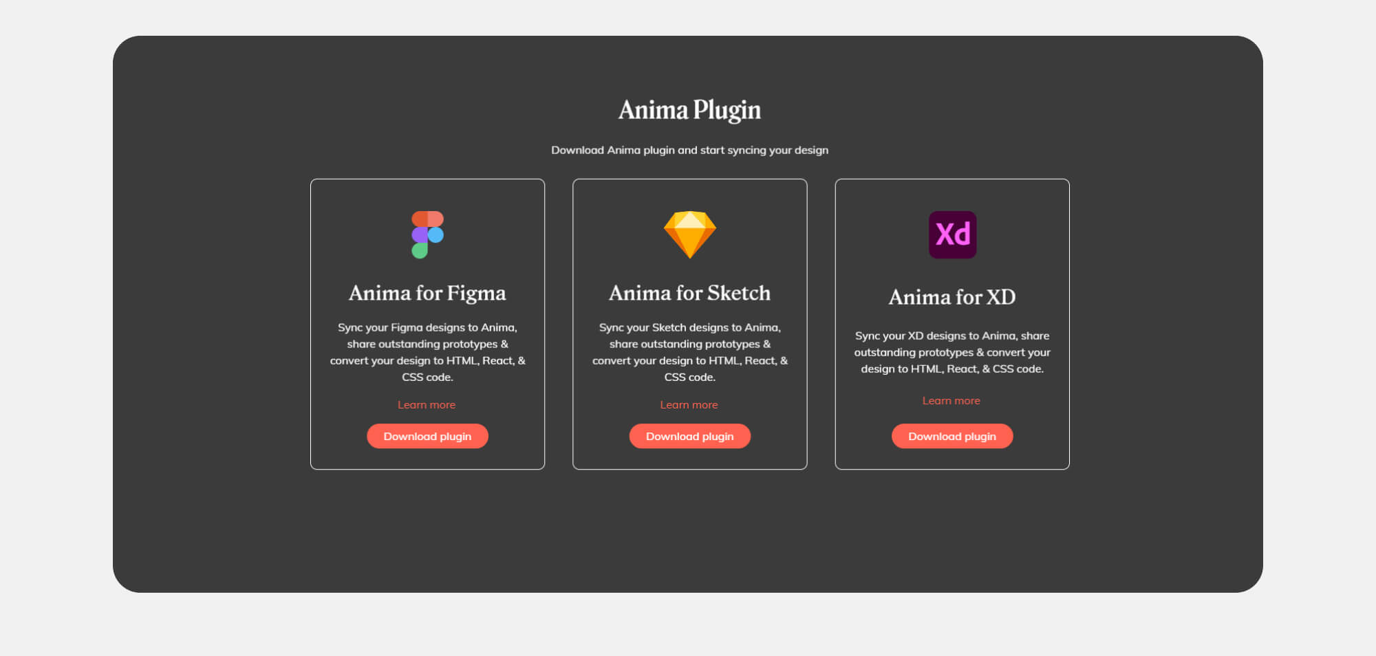
Getting started with Anima is simple. You first need to create an account and then install the plugin. While I’ll be using Figma for this walkthrough, Anima supports all of the major design tools: Sketch, Figma, and Adobe XD.
Anima for Sketch
Anima for Figma
Anima for Adobe XD
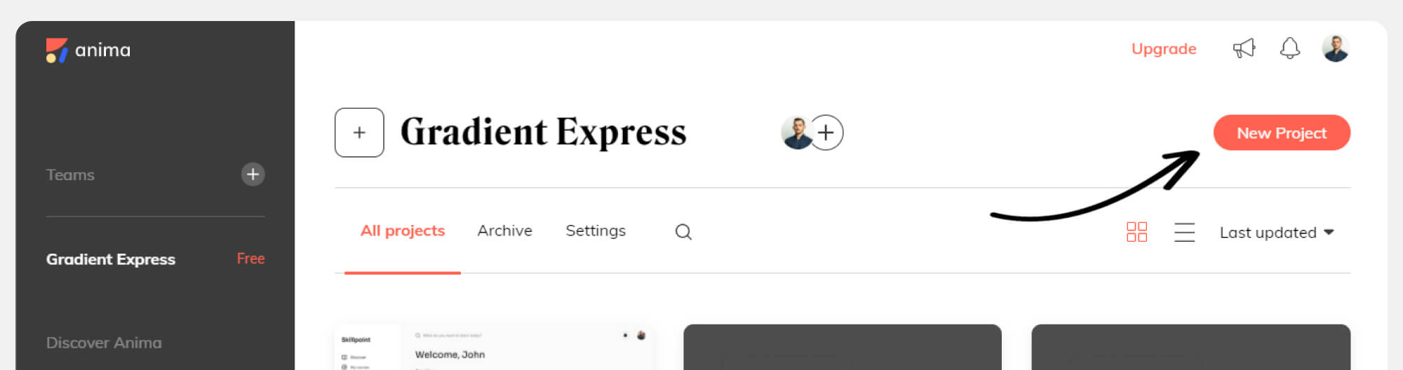
Once this is done, make sure you create a project on Anima’s platform — that’s where our designs will appear when we sync them.
The plugin itself is separated into three main sections, each with a list of options. Most of what we’ll be doing is simply selecting one of those options and then applying a specific layer or frame in Figma.

Creating A Responsive Prototype
For the purpose of the article, we have designed an onboarding experience that will be transformed into an interactive prototype. So far we have prepared screens for the three most common breakpoints and we have linked them together using Figma’s prototyping features.

One of the interesting things we can achieve with Anima is making prototypes that fit all screen sizes. Traditional prototypes made of clickable images are static and often fail under different screen sizes.
To do that, click on “Breakpoints” option and Anima will ask you for the frames that you want to connect. Select all of the frames to add them as breakpoints. Then confirm your selection by clicking on “Done”.
Once you are ready, click on “Preview in browser” to see the result. That’s when Anima will convert your designs into code.
The first thing you’ll notice is that the prototype is now transformed into HTML and CSS. All the content is selectable and reflows as the screen is resized. This is most visible when you select the “Responsive” mode in the prototype previewer and play with different screen sizes.
To achieve smoother transitions, it’s important to use Figma’s constraint features when designing your components. Make sure to also check the box “Use Figma Constraints” in the “Layout” section of the plugin.
Bring Your Designs To Life With Smart Layers
We can take things a little bit further. Since Anima converts designs into code, the possibilities are endless for the things we can add to make our prototype more realistic.
Animations and hover effects would be a great way to make the prototype more alive and to impress stakeholders. Anima offers a variety of options that can be applied to any layer or component. In our case, we’ll select the headline layer, then choose the “Entrance animation” and “Fade In”. In the delay field, we’ll add 0.5.
For each field, we’ll add a glow effect on hover. Select the field layer, then “Hover effect” and choose “Glow”. Repeat the same for the button.
Now that we have applied all the changes, we can see that the prototype starts to feel like a real product.
One of the unique features that Anima offers is the ability to add live fields and forms to prototypes. Since we are designing an onboarding experience, this will actually be really useful for us. Data entry is one of the biggest churn points in any product experience and it’s really hard to test out ideas without taking it into account.
Similar to how we added the previous effects, we now select the field component and choose “Text field”. From there, we’ll have to choose the type of field that we need. If we choose a password field, for example, input will be hidden and Anima will add a show/hide functionality to the field.
As you can see, fields now work as intended. It’s also possible to gather all the data collected from those fields in a spreadsheet. Select the “Continue” button and then click on the “Submit Button” option in Anima. This will open an additional dialog, where we need to check the box “Add to Spreadsheet” and select redirect destinations in case of success or failure.
Next, we’ll add a Lottie animation for our success screen as it will be a great way to make the experience a bit more engaging. For that, we need to add a placeholder layer in the place of the animation, then select it and choose the “Video / GIF / Lottie” option in the plugin.
Then we’ll paste the URL of our Lottie animation and check the boxes of “Autoplay” and “No controls”. In our case, we don’t want to have any video player controls, since this is a success animation.
Apply the changes and open the preview mode to see the results. As you can see, when we fill out the fields and submit the form, we get redirected to our success page, with a looping animation.
Share Designs With The Rest Of The Team
Up until that point, we were working on a draft that was visible only to us. Now it’s time to share it with the rest of the team. The way to do this in the app is by clicking on “Preview in browser”, check how it looks, and if you’re satisfied, continue with “Sync”.
Everyone invited to the project will now have access to the designs and will be able to preview, leave comments, and inspect code.
Developers Can Get Reusable React Code
As mentioned earlier, as developers, we are usually skeptical of tools that generate code, mostly because writing something from scratch is always faster than refactoring something that was poorly written. To avoid this, Anima has adopted some best practices to keep the code clean, reusable, and concise.
When we switch to the “Code” mode, we can hover and inspect elements of our design. Whenever we select an element, we’ll see the generated code underneath. The default view is React, but we can also switch to HTML and CSS. We can also adjust preferences in the syntax and naming conventions.
The classes reuse the names of the layers within your design tool, but both designers and developers can rename the layers, too. Still, it’s important to agree on unified naming conventions that would be clear and straightforward to both designers and developers.
Even if we have left some layers unnamed, developers can actually override them and make changes when necessary. This experience reminds me of Chrome’s Inspect element feature, and all the changes are saved and synced with the project.
If you are using Vue or Angular, it’s expected that Anima will start supporting these frameworks in the near future as well.
Looking Forward
As we can see, the gap between design and code keeps bridging. For those who write code, using such a tool is very practical as it can reduce a lot of repetitive work in frontend. For those who design, it allows prototyping, collaboration and syncing that would be difficult to achieve with sending static images back-and-forth.
What’s already certain is that Anima eliminates a lot of wasteful activities in the hand-off process and allows both designers and developers to focus on what matters: building better products. I look forward to seeing what comes up next in Anima!