Original Source: https://smashingmagazine.com/2021/02/useful-chrome-firefox-devtools-tips-shortcuts/
Out of all the tools available at our fingertips these days, DevTools is probably one of the most advanced ones. Over the years, it has become a tool for debugging, profiling, auditing and even prototyping — all living within the same interface, and always just a keyboard shortcut away. Still, DevTools has plenty of obscure gems and undiscovered treasures, living on the remote fringes of hidden tabs and experimental settings. Let’s fix that.
In this article, let’s dive into some of the useful and obscure features in DevTools. We’ll look into all modern browsers (Chrome, Firefox, Edge, Safari) and look into the useful tools that they provide to us, web developers. We’ll focus on the ones that we use frequently on SmashingMag, and some of the little techniques and strategies that help us fix pesky bugs and write better code.
Creating Browser Profiles
When it comes to profiling a website for performance, or tracking a particular accessibility issue, we’ve been creating separate browser profiles for each task for a while now. We usually work with at least 5 user profiles, each with its own extensions, bookmarks, bookmarklets and features turned on or off. Let’s take a closer look at them.
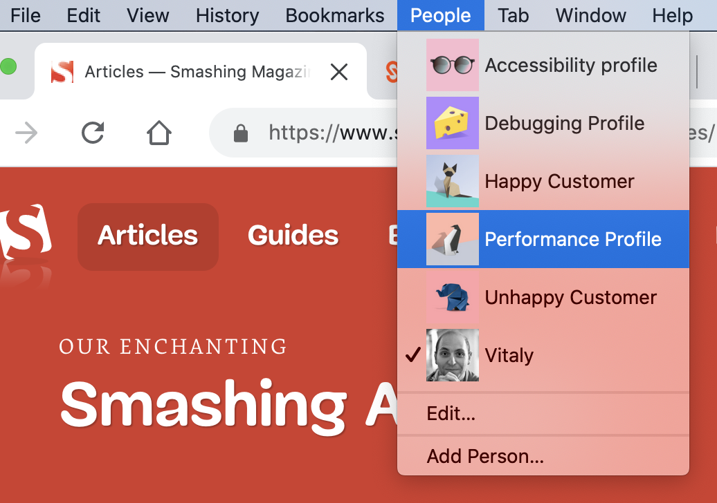
Accessibility profile
A clean browser profile that includes various tools for checking accessibility, e.g. Accessibility Insights, aXe and a11y.css, along with a few other accessibility linters and color vision simulator.
Debugging profile
A profile with a few experimental settings for profiling turned on, as well as an option to automatically open DevTools for every new window, along with a custom diagnostics CSS for quick auditing and profiling.
Performance profile
A clean profile without extensions, with a few special bookmarks for auditing with Lighthouse, RequestMap, a performance diagnostics CSS and a few performance-related links to keep in mind (e.g. resource priority in loading). Always goes well with 4 × CPU throttling and Network throttling (Slow 3G).
Happy customer
Based on the data we have from our analytics, that’s a profile that is close enough to the one that many of our readers (wonderful people like you) will have. It will contain a few popular extensions, common web development extensions, ad-blockers, tab management, Google Docs offline, LastPass, VPN, Browserstack, Grammarly etc. No throttling in use.
Unhappy customer
A profile for a reader on a slow, throttled connection (slow 3G), low memory, poor CPU, with 10 most popular browser extensions on. We usually use this profile to test our heaviest pages to experience the worst possible customer experiences.
Depending on the task at hand, we can jump to one of the dedicated profiles. The actual convenience comes from the simple arrangement that each of the profiles has specific extensions, bookmarklets and browser settings all set and ready to go. So if needed, we can get right to performance debugging or accessibility auditing without any hassle for searching the right extensions.
It probably goes without saying that we do our best to keep each profile clean and uncluttered — that goes for browser extensions as well as browser bookmarks, cookies and cache.
Global Keyboard Shortcuts
Admittedly, with the sheer amount of features available in DevTools, it’s not very surprising that some of them are quite difficult to find between tabs, panels, gear icons and dots. However, there is no need to memorize the place where they are placed. Instead, it’s worth remembering just a couple of useful global keyboard shortcuts — they will help you jump to specific features faster.
Opening the Command Menu (Chrome, Edge)
Being probably one of the most well-known ones, this command actually has two features. Cmd/Ctrl + Shift + P opens a quick autocomplete search for panels, drawers and all the features within DevTools. Cmd/Ctrl + P opens a drawer with all available files used on the current page. If you need to quickly access any DevTools feature, the Command Menu is a quick way to get there — for general drawers, hidden menus or specific features.
Opening DevTools Settings (all modern browsers)
Usually there are plenty of obscure tools and features hidden in the “Settings” panel — from emulated devices to network throttling profiles and experiments. In Chrome, you can click on the gear icon in the right upper corner or use Shift + ?. In Firefox, you can jump to Settings with F1.
Toggle Inspect Element Mode (all modern browsers)
Instead of clicking on an Inspect icon and then focusing on the element you’d like to debug, you can toggle Inspect Element Mode with Cmd/Ctrl + Shift + C.
Toggle the HTML mode (all modern browsers)
While inspecting an element, you might want to change its attributes, e.g. classes or states. Instead of right-clicking on the element and adding values one-by-one, you can toggle the HTML mode on the currently selected element with Fn + F2 (or just F2 on Windows).
Toggle Device mode (all modern browsers)
To jump into the device toolbar mode, e.g. to preview how the mock-up looks like on narrow screens, or trigger a media query debugger, you can use Cmd/Ctrl + Shift + M in Chrome, and Cmd/Ctrl + Opt/Alt + M in Firefox.
There are also plenty of other useful keyboard shortcuts, e.g. for pausing and resuming script execution, and go to matching bracket (for lengthy media queries and JS functions) in the source editor.
You can find a full overview of all keyboard shortcuts on Chrome DevTools Keyboard Shortcuts and Firefox DevTools Keyboard Shortcuts — more often than not, they are quite consistent across modern browsers.
Turn On Experimental Settings
DevTools comes along with a set of experimental settings which aren’t quite recommended for a wide audience, but can indeed be very useful for debugging. A word of caution though: sometimes these settings might freeze Chrome or make it quite sluggish (which is why they are experimental in the first place).
However, with separate profiles in place, you could safely turn on some of these settings for each profile, and then turn them off if necessary. So while we use our regular profiles without experiments turned on for casual browsing, in debugging mode we always pick a dedicated profile first, to squish those bugs just a little bit faster.
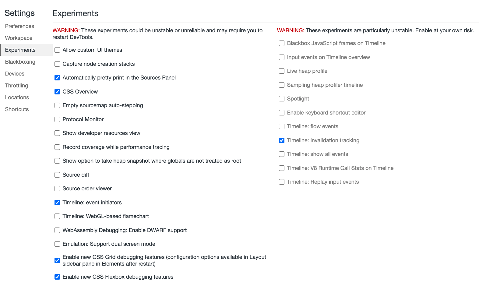
With DevTools open in Chrome, jump to “Settings” (Shift + ? with DevTools open) and find “Experiments” in the sidebar. Obviously, there are plenty of experimental settings available in every DevTools, but the ones mentioned below are just the ones we find quite helpful at our work.
Across the featured listed there, it’s worth turning on “Automatically pretty print in the Source Panel”, which would prettify compressed styles and scripts by default when viewing source. You can also enable CSS Grid debugger and Flexbox debugging for dealing with layout issues. There is also a source diff and a source order viewer that can come in handy.
And for performance audits, you could mark “Timeline: event initiators” and “Timeline: invalidation tracking” that will show in the Performance panel, highlighting scripts that caused expensive operations such as Long Tasks and Style Recalculations. Additionally, in Edge, you can enable composited layers in 3D view.
For a given profile, you can access more hidden features by heading to chrome://flags/ in the browser profile of your choice. for example, that’s where you can turn on latest and experimental JavaScript features, experimental Web Platform features or enable resource loading hints to provide a preview over slow network connections.
In Firefox, jump to Settings with F1. At the bottom of the dock, you can prompt the browser to show browser styles, turn on/off autocomplete CSS, change editor preferences, toggle paint flashing, adjust screenshot behavior and enable source maps (not turned on by default). In Safari, you can find Experimental Settings under “Develop → Experimental Settings”.
Switching Between Dock States (Chrome, Edge, Firefox)
Admittedly, the pane view in DevTools isn’t a particularly big revelation. In the “Styles” tab of the dock, styles appear from top to bottom, ordered by their CSS specificity. However, one little thing we’ve been overlooking a lot for years is a little toggle button :hov placed just above the styles.
It allows you to force an element state (:active, :focus, :focus-within, :hover, :visited and :focus-visible, and most recently :target) on a particular interactive element — e.g. to enforce :focus and :active states on buttons for accessibility checks.
In Firefox, you can change a pseudo-class for a DOM element as you are inspecting it — the feature is available with a right-click on a DOM node.
One thing that always gets in the way though is the position of the dock, which sometimes works better on the right hand side, and sometimes at the bottom — depending on where your bug has invaded your DOM tree.
To quickly switch between dock states, you can use Cmd/Ctrl + Shift + D. One catch to keep in mind is that the shortcut will undock DevTools into a separate window only if DevTools has been in its default position (docked to the right). Otherwise the shortcut will just switch between the default position and the one you’ve changed it to.
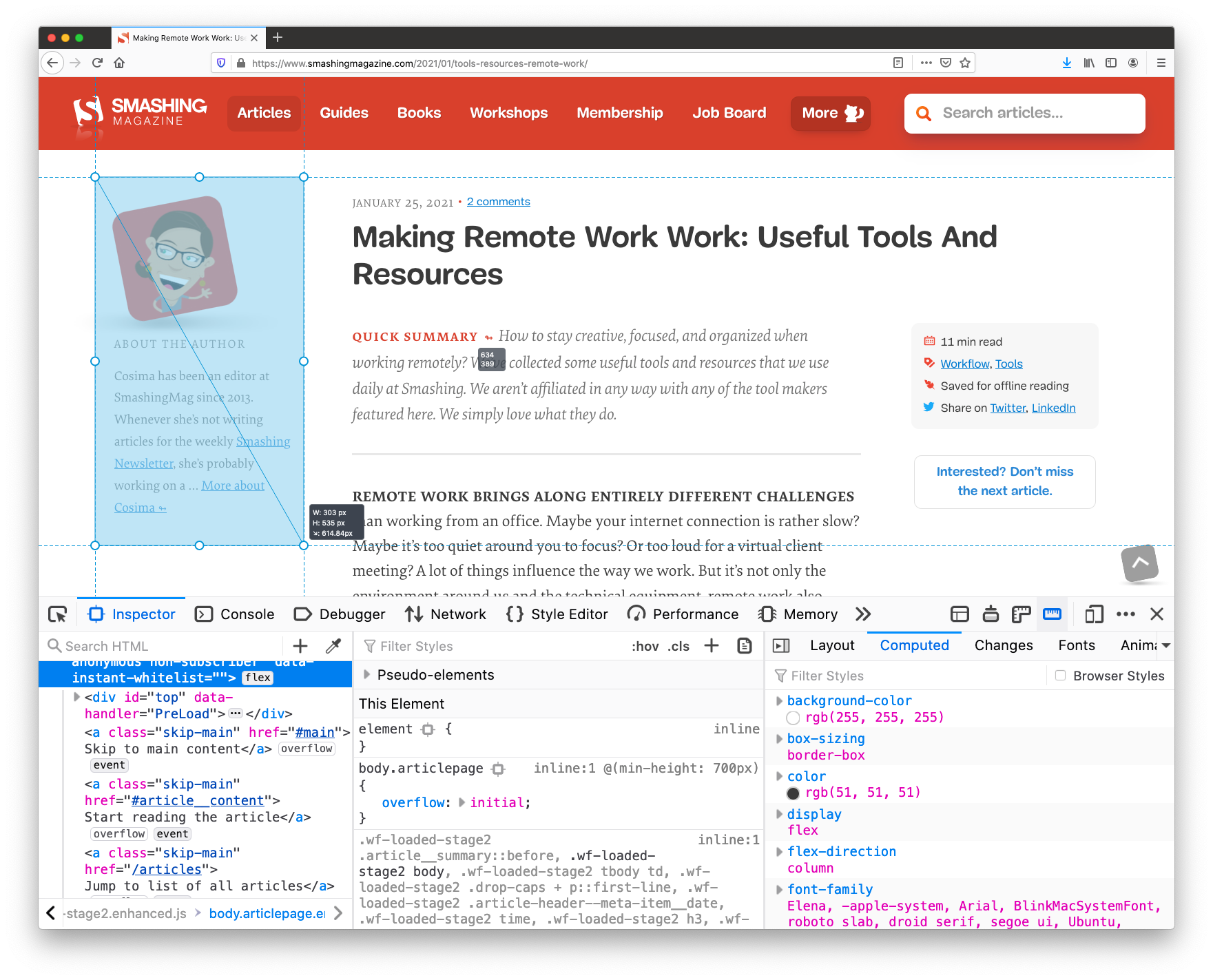
Triple Panes View (Firefox)
While we might be used to a double-pane view, Firefox provides a helpful triple-panes-view by default — it looks slightly differently across different sections. In the Inspector view, alongside HTML and styles you can place layout debugger, show computer styles or track CSS changes — it’s very useful to have quick access to all this information without having to switch between tabs.
Whenever you are editing styles in Firefox, DevTools highlights media queries used across the page, with quick jumps to CSS sections where a breakpoint behavior is defined. All of it is displayed right next to the source code, so no need to search for a specific breakpoint. (Not to mention styles pretty-formatted by default — that’s handy!).
A similar view is also available in Chrome and Edge as well, but it’s available only in the “Elements” panel (sidebar icon in the right upper corner), and so far it shows only computed styles (which is why it’s called “Computed Styles Sidebar”).
Filtering Styles By Property (Firefox)
In general, Firefox DevTools are heavily underrated. Another remarkable feature that Firefox provides is an option to filter all styles by a particular property (indicated with a filter icon). For example, if you notice that some styles are overwritten by other ones scattered somewhere across the stylesheet, you can hide all the definitions that don’t affect that particular property with a quick filter and see where exactly overrides are happening.
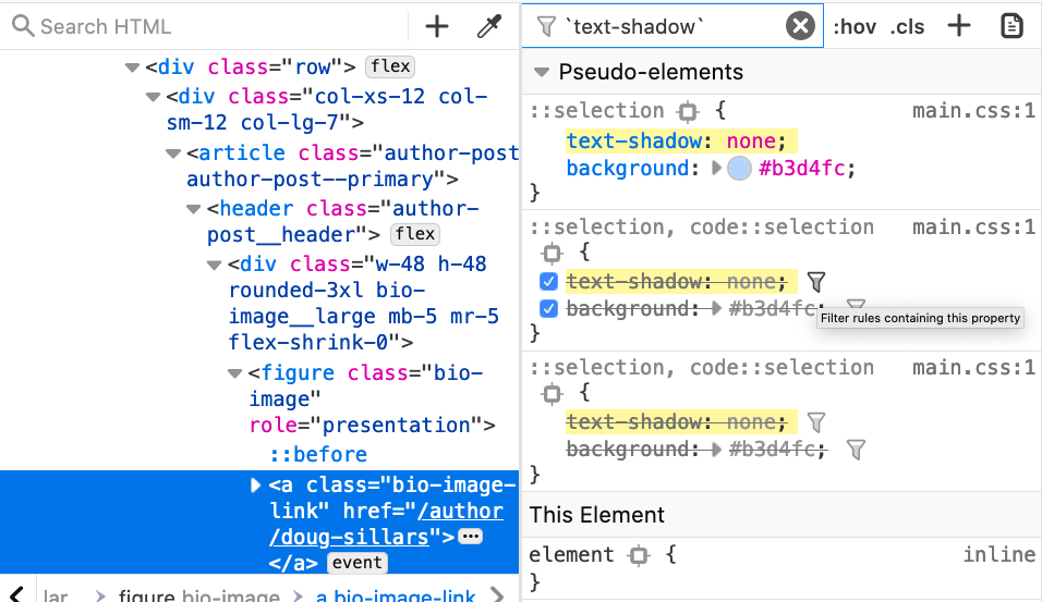
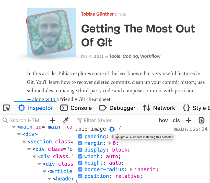
Also, on a given page, you can highlight all instances that match a particular selector. For example, if you notice a bug with a rendering of profile images on dark and light sections of the page, you can highlight all instances of a particular class without manually searching for them or adding extra styles to highlight them. It’s enough to locate the selector in Styles panel and choose a target icon to “highlight all elements matching this selector”.
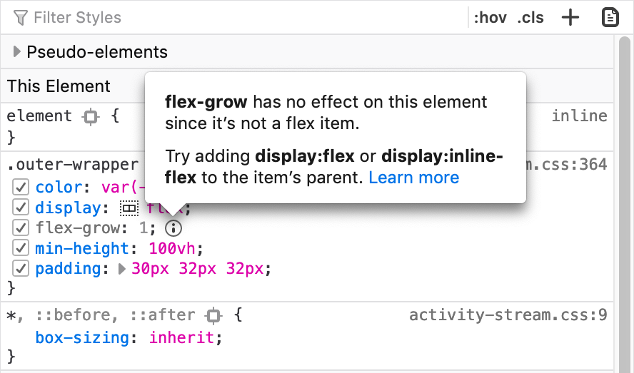
In the “Styles” panel, Firefox also explains which CSS properties aren’t affecting the selected element and why, along with recommendations of what might help to fix the issue or avoid unexpected behavior (the feature is called Inactive CSS).
Another handy feature is that Firefox assigns scroll and overflow badges to elements that are causing the container to overflow or scroll (overflow debugging) — very helpful when you are trying to figure out why a horizontal scrollbar appears all of a sudden, or an element doesn’t behave as expected.
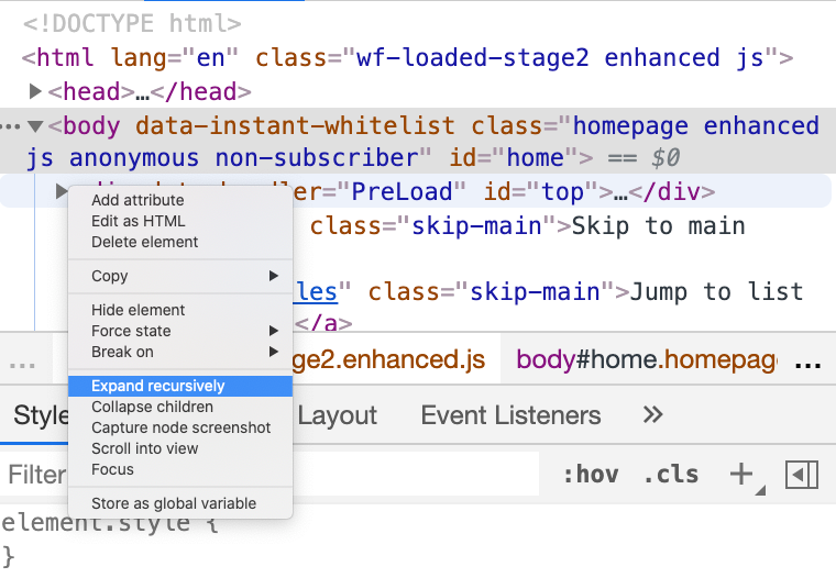
Expanding Nodes Recursively (Chrome, Edge, Firefox)
When inspecting an element with a deeply nested DOM, sometimes it might take a while to traverse down the tree, from one nested node to another. By right-clicking on the arrow on a node, you can choose “Expand recursively” and the currently-selected node (and all of its children) will expand with one single click. Alternatively, you can hold Option (or Ctrl + Alt on Windows) while clicking the arrow icon next to the element’s name.
Gather And Export Code Coverage (Chrome, Edge)
On a given page, much of the CSS and JavaScript might not be used at all, although it will be shipped to the browser. The “Code coverage” panel (Command menu → “Show coverage”) allows you to explore which styles and code aren’t used on a given page. We use code coverage to collect critical CSS for each of the templates used on the site, and doing so manually can be quite tiring.
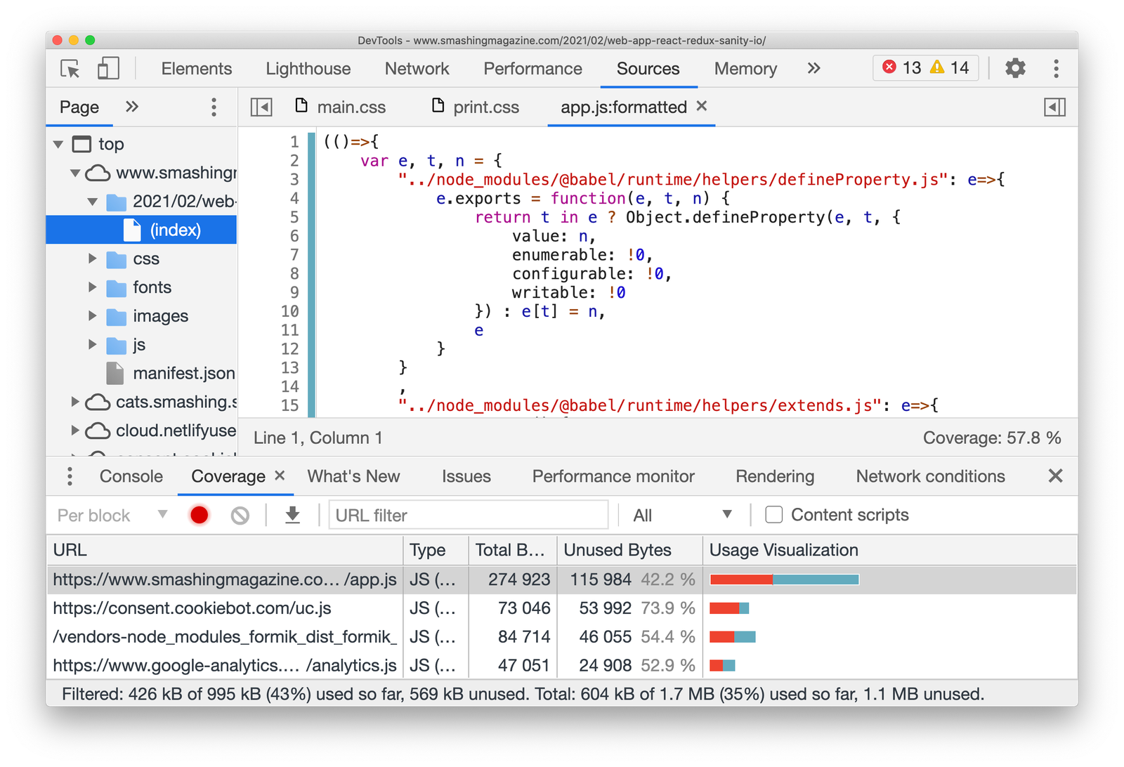
With “Code coverage” in place, going through a couple of scenarios that include a lot of tapping, tabbing and window resizing, we also export coverage data that DevTools collects as JSON (via the export/download icon). On top of that, you could use Puppeteer that also provides an API to collect coverage (but we aren’t there yet).
Media Queries Debugging (Chrome, Edge)
With dozens of media queries in flight for a given page, it can easily become difficult to keep track of the styles being overwritten by other styles scoped within a media query. To find the specific section in your CSS file that might be causing unexpected behavior, we could turn our attention to the media query debugger. By default, it’s hidden away behind the “Settings” cog in the device toolbar, but it’s actually quite helpful when it’s available by default.
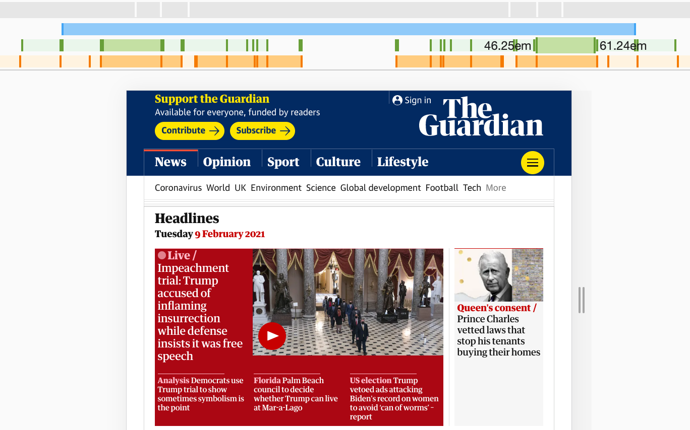
Toggle the device toolbar (responsive mode) with Cmd/Ctrl + Shift + M and choose the three dots in the right upper corner. Then choose “Show media queries”. Now you should be able to see horizontal bars representing the scope of each media query.
They might appear a bit confusing at first, but the way these bars are aligned represents screen width, and is replicated on the left and on the right side of the viewport. The bars closer to the center of the screen are overwritten by the ones further away from the center. The blue bar on the top indicates max-width media queries, the green one min-width and max-width media queries, and orange one stands for only min-width media queries.
For all of the bars, you can track which media queries they contain when hovering over them. You can jump to a specific media query range and inspect layout issues in detail with Styles panel open. By clicking on any position on a bar, you can trigger specific breakpoints, and if you right click on a bar, you can reveal its position in the source code. In fact, you can quickly jump back and forth between media queries, rather than resizing the screen manually and checking the screen width over and and over again.
As a quick side note, you can also specify your custom emulated devices instead of the pre-defined ones — in fact, there are plenty of device presets available already. Plus, you can use the “Sensors” pane to control specific device sensors if needed. Additionally, in Firefox you can enable and disable touch simulation, and define a specific User Agent, e.g. to check how the page behaves with a search engine crawler requesting the page.
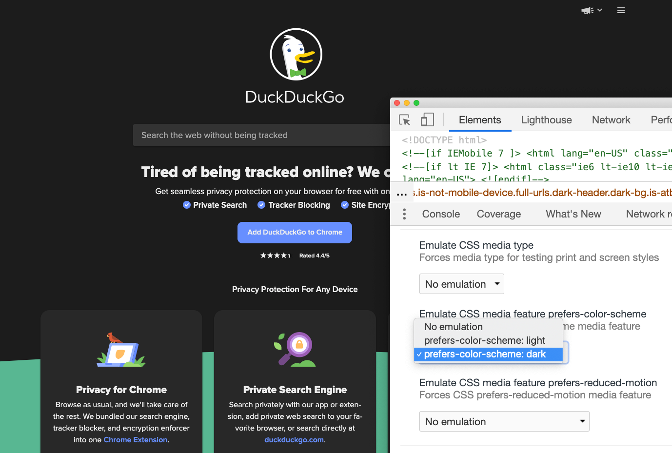
Emulate Preference Media Queries (Chrome, Edge, Firefox)
Additionally to screen size-related media queries, we can also emulate accessibility-specific media queries, e.g. prefers-color-scheme, prefers-reduced-motion and vision deficiencies. To toggle the emulation, head to the Command Control panel (Cmd/Ctrl + Shift + P) and type “Show rendering”. Now, in the settings you can choose a preferred emulation.
(That’s also where you can choose to highlight areas that need to be repainted (“Paint Flashing”), areas that have shifted (“Layout Shift Regions”) and debug scrolling performance issues.)
Talking about emulation: remember how in the past you might have struggled with finding a layout bug for you print stylesheet? In the same panel, you can preview how your print styles work here as well — no need to print a PDF of a random page over and over again to figure out what caused a major rendering issue any more.
Also, in the same panel in Chrome you can add all sorts of rendering debugging features — e.g. paint flashing, layer borders, scrolling performance issues, disabling AVIF and WebP.
As a side note, there is a DevTools toolbar option for “Force Dark Appearance” and a “Force Print Media styles” in Safari, and you can simulate vision deficiencies in the “Accessibility” tab in Firefox. (We’ll talk a bit more about Accessibility later.) In Firefox, the print view is also available above the “Styles” pane in the “Inspect” mode.
Automatically Open DevTools In Each New Tab (Chrome)
With performance audits, we might want to be exploring multiple page at once, and observe how they behave with separate DevTools, without having to wondering which DevTools is responsible for which window. To save a bit of time during debugging, you could create a shortcut with a Terminal command that would open a browser with DevTools automatically opening by default in each new tab.
To achieve that, we need to pass the flag –auto-open-devtools-for-tabs when running a Chrome, Edge-based browser. We run a simple Alfred script to open the Canary browser with the flag when needed (hat tip to Addy) — very useful when you really need it:
/Applications/Google Chrome Canary.app/Contents/MacOS/Google Chrome Canary –auto-open-devtools-for-tabs htps://www.smashingmagazine.com
You can find a very comprehensive overview of all Chrome, Edge command line switches in Peter Beverloo’s guide on Chrome Command Line Switches.
Full Page Screenshots (Chrome, Edge, Firefox)
When selecting an HTML node in the “Elements” pane, you could right-click on the node and prompt the DevTools to create a screenshot of that node, and in the “Responsive mode” you can capture a screenshot of the visible portion of the page or a full size screenshot (three dots in the right upper corner).
To create a full size screenshot a little bit faster, you can also prompt a “Full page screenshot” in the Command Menu (Cmd/Ctrl + Shift + P → “Full page screenshot”). Usually it’s a little bit faster. Just keep in mind that portions of the page that are lazy-loaded or rendered progressively (e.g. with content-visibility) might not show up properly in the screenshot, so you might need to scroll all the way down the page first.
In Firefox, you can generate a screenshot of the visible portion of the page by going to the “Device Toolbar” mode first, then spotting the camera icon in the right upper corner and activating it. Or for a full page screenshot, you’d need to toggle “Take a screenshot of the entire page” in “Settings” first, and then you’ll find the camera icon in the DevTools toolbar.
Rulers For Components (Chrome, Edge, Firefox)
Perhaps you’d like to quickly check the width and height of an image, or an advertising spot. But rather than taking a screenshot, or inspecting element and copy/pasting width and height values, you can use a rules to measure the size of a component. Rules are provided all across modern browsers, but Firefox DevTools also allows you to measure a portion of the page. You can find the measurement tool on the right hand side of DevTools, right next to the “Responsive mode” icon.
Tracking Changes (Chrome, Edge, Firefox)
As you are debugging a particular problem, you might have commented out some lines of code, and probably added some new code that seems to be fixing the problem for good. Your changes now have to be replicated in the actual source files. To do that, there is no need to manually collect all the changes you’ve made all across your files.
In Chrome, toggle “Local Modifications” command when editing the source file. You should see a tracker of changes appearing in the panel below. If it’s collapsed, pull it out by dragging it vertically. The pane highlights changed properties and what exactly has changed, so you can copy-paste modifications right away.
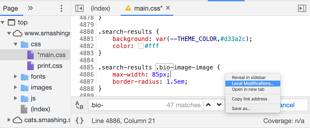
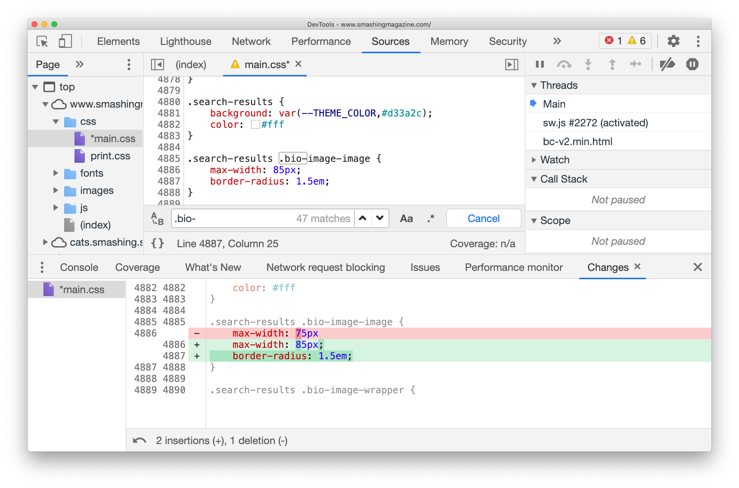
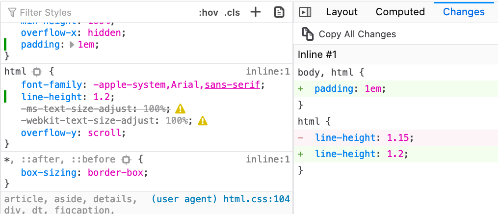
One thing to keep in mind is that it’s probably a good idea to track changes while running your local server — without automatic removal of line breaks and spaces as they would show up as changes as well. This problem doesn’t exist in Firefox, where you can also find a “Changes” pane which does the same thing, along with a friendly button “Copy All Changes”.
Local Overrides (Chrome, Edge)
You might have been in this situation before: you just want to experiment with a few changes, but might be quite afraid to accidentally hit “Refresh” in the browser to lose all the changes made on the page. Perhaps you can’t really run the site locally, or perhaps you just don’t want to run your entire build for some minor local modifications. In such cases, Chrome’s “Local Overrides” can be a godsend.
First, create a folder on your machine where all your local modifications will be stored (local-overrides on Desktop seems like a reasonable name and place for this kind of task). Then head to the “Sources” tab, and choose “Overrides” in the top-left corner of DevTools (it might be hidden behind a double-chevron). Now click on “Select folder for overrides” and choose your freshly created folder — that’s the folder that Chrome will be using to store your local modifications. You’ll need to click “Allow” to grant Chrome permissions to save files to your hard drive.
Now, you can choose any file in the “Sources” panel, right-click anywhere in the code and choose “Save for overrides” with the right-click. That’s a clue for Chrome to create a new file, and store all contents of the file, along with your modifications, to your hard drive. (You might want to click the {} button first to make the code slightly more readable). (Thanks to Trys for the hint!)
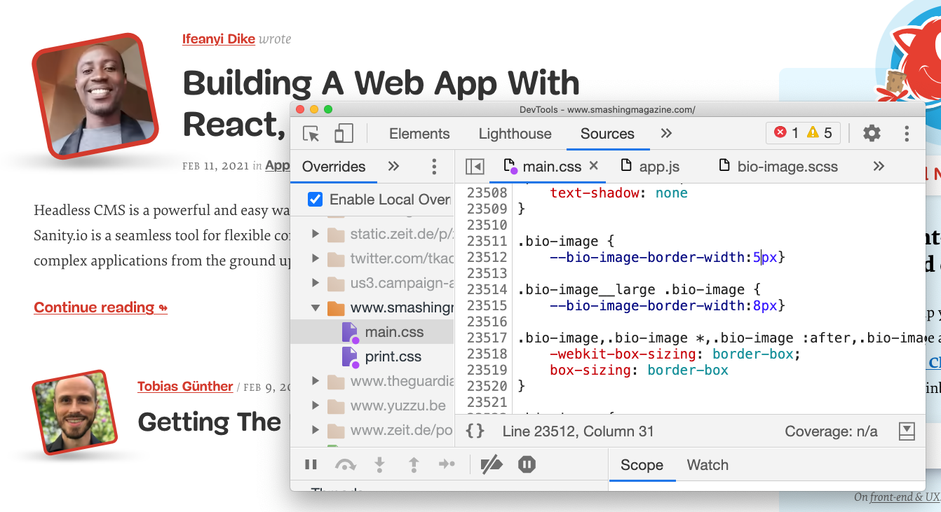
Once you’ve defined your local overrides, Chrome will intercept network requests and use your code instead of the actual response. It will also watch out for modifications made to the file and inject changes into the page automatically, very much as if you had a local development installed with the watch mode on. Any files that are overwritten by local overrides will have a little purple dot next to them in the “Elements” panel.
The best part: now you can open the file in your text editor and make changes from there, while seeing these changes appearing in DevTools as well — and if you need to switch to DevTools to add breakpoints, you can do it from DevTools, make changes to the code, and these changes will be visible in your text editor as well. Almost magic!
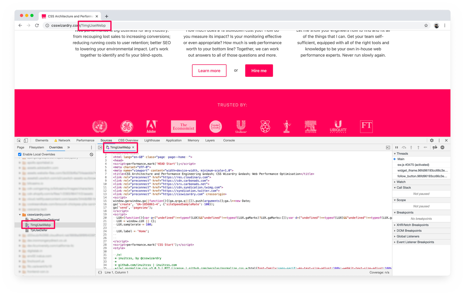
Pro-tip from Harry Roberts: Local Overrides don’t allow you to keep or track versions or variants, but you can attach a query string to the URL and load separate variants of the same page. Extremely useful when editing HTML pages.
Ah, and if you need to disable local overrides again, just check off “Enable Local Overrides” in the same pane — otherwise the styles will overwrite existing styles over and over again, which is something you might not want.
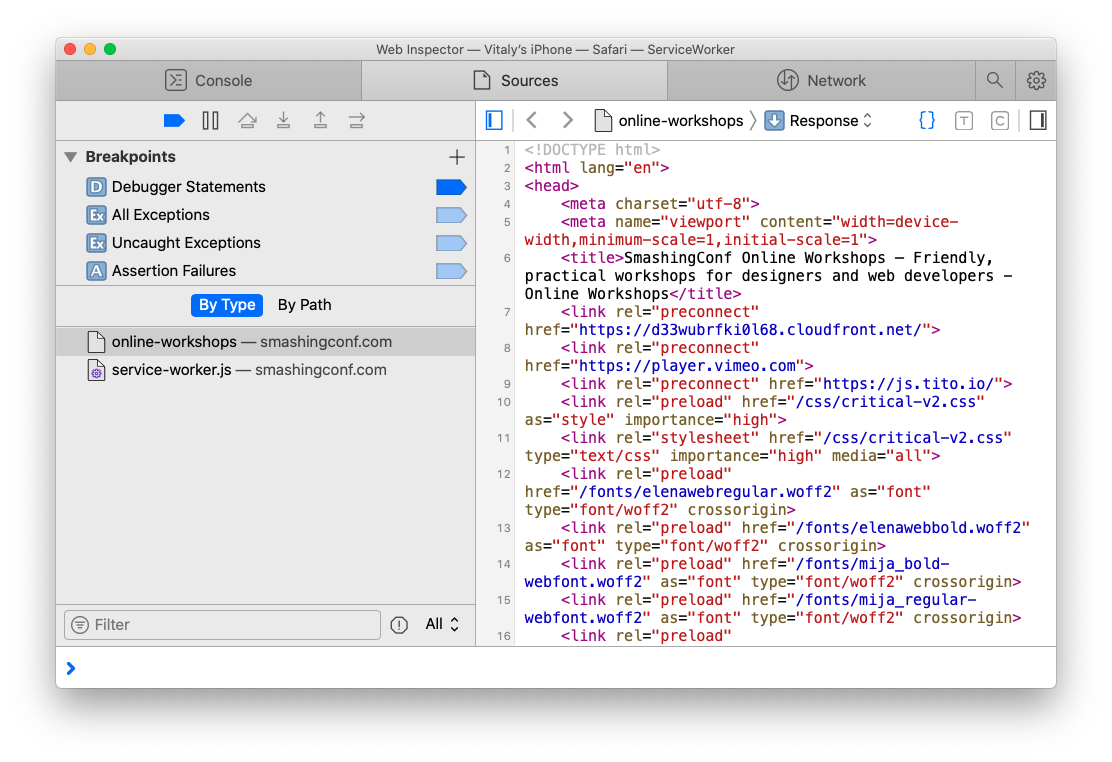
Remote Debugging (Chrome, Safari)
If you need to debug your apps or pages on a mobile phone, you can use a Devtools proxy for iOS devices to debug Chrome on iOS, and also use DevTools to debug Mobile Safari on iOS with Chrome DevTools.
To debug Mobile Safari with Safari Inspector, enable “Web Inspector” in “Settings → Safari → Advanced → Web Inspector” and open the debugger with “Develop” → (Your phone’s name). You should have Safari’s DevTools opening up for you.
For Android devices, open the Developer Options on Android and select “Enable USB Debugging”. On your development machine, you can then discover your mobile device by going to chrome://inspect#devices and choosing your “Remote Target”. You can find plenty of details and instructions on “Get Started With Remote Debugging Android Devices”. That’s also where you can find a dedicated DevTools for Node.js debugging.
Pause Script Execution (Chrome, Edge, Firefox)
When testing critical CSS or debugging JavaScript, you might want to hold on to the state of the DOM before a particular script gets executed or a particular style gets applied. That’s what DOM change breakpoints in DevTools are for.
By right-clicking on the three ominous dots next to the element’s name, you could pick “Break on” subtree modifications (node insertions and removals in the DOM tree rooted at the given node), attribute modifications (e.g. when an attribute is added or removed, or an attribute value changes — e.g. with classes) or node removal.
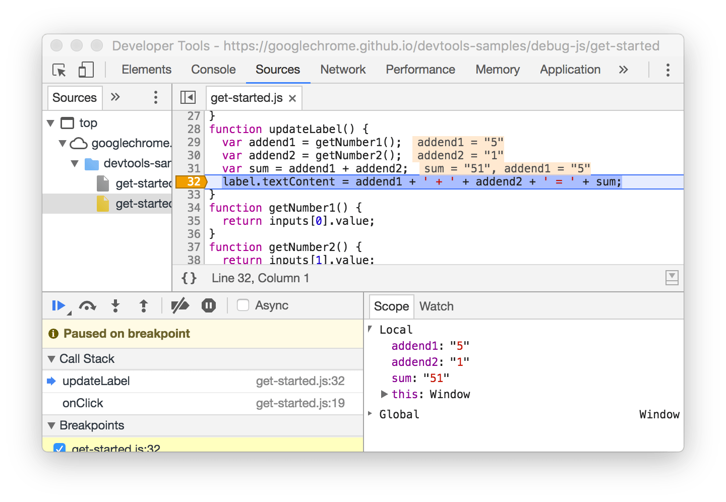
However, you can also use a conditional line-of-code breakpoint when you know the exact region of code that you need to investigate, but you want to pause only when some other condition is true. Plus, not to forget logpoints to output a value in a code snippet without writing console.log over and over again.
Code Snippets (Chrome, Edge)
If you have a couple of code snippets that you use often to track what might have caused the buggy behavior, you can store and access these snippets in the “Snippets” pane. In a way, these JavaScript snippets are similar to bookmarklets, but unlike the latter, you can manage them from the convenience of a dedicated area in DevTools.
Because they are scripts, we can add breakpoints when these scripts are running, or select portion of your code inside “Snippets” and run that particular portion of the code instead of executing the entire snippet.
The “Snippets” pane is located among “Sources”, next to “Local Overrides”. Once you’ve added a snippet, you can run it either by right-clicking and selecting “Run”, or with Cmd/Ctrl + Enter. Of course, each snippet is available from the Command Panel as well.
In general, if you find yourself running a routine task over and over again, there is a good chance that you might want to place it in “Code Snippets” and automate this task with a script. DevTools Snippets includes some useful scripts for cache busting, showing headers and saving objects as .json files from the console, but you could use it to modify the DOM or display any useful information, such as performance marks (which is what we do). Plus, you could also plug in a performance diagnostics CSS to indicate lazy-loaded images, unsized images or synchronous scripts.
Run Custom Automated Tests (Safari)
One of the often forgotten features in Safari DevTools is the option to define and run a series of automated checks. Think of it as a custom-built testing suite, with a series of small tests, which can be fully defined based on the type of audit a developer would like to run. By default, the test suite is focused around accessibility, but you can adjust it as you see fit, e.g. in order to check if there are any sync scripts in the DOM, or if all of the images have a defined width and height attribute, or even if all images are lazy-loaded. (thanks, Nikita!)
Source Maps (Chrome, Edge, Firefox)
When debugging production code, it’s extremely handy to be able to track down the changes to a specific component or module that you use in your code base. To map minified code to source code, we can use source maps. If you generate a source map as a part of your build, you can use source maps while debugging your code in DevTools.
In Chrome, you need to enable source maps for JavaScript and CSS in “Settings”, and then add a folder to “Workspace”. DevTools with then try to infer all mappings automatically and load your source files in addition to your minified ones. You can then read and debug compiled code in its original source. Even better than that: you can still walk through your breakpoints, and all errors, logs and breakpoints will map to the actual code. To build out your source map, Webpack’s Devtool might help.
For Firefox, once the source map is generated, a transformed file has to include a comment that points to the source map. Just make sure that your bundler does the job for you. Once it’s in place, in the source list pane, the original source (.scss or .ts files) will appear, and you can debug it right there.
Clear Service Worker’s Cache And Storage (Chrome, Edge)
When we hit “Hard Refresh” in the browser, the browser will not use anything from the cache when reloading the page. Instead, it will re-fetch all assets from the server, without relying on caching.
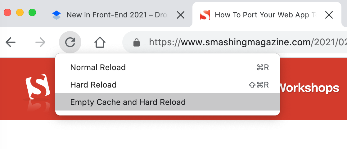
If you right-click the “Refresh” button with DevTools open, you’ll find another option: “Empty Cache and Hard Reload”. The difference is that if the page prompts any dynamic fetches via JavaScript, they might still use the cache. The latter option clears them, too, while the former doesn’t.
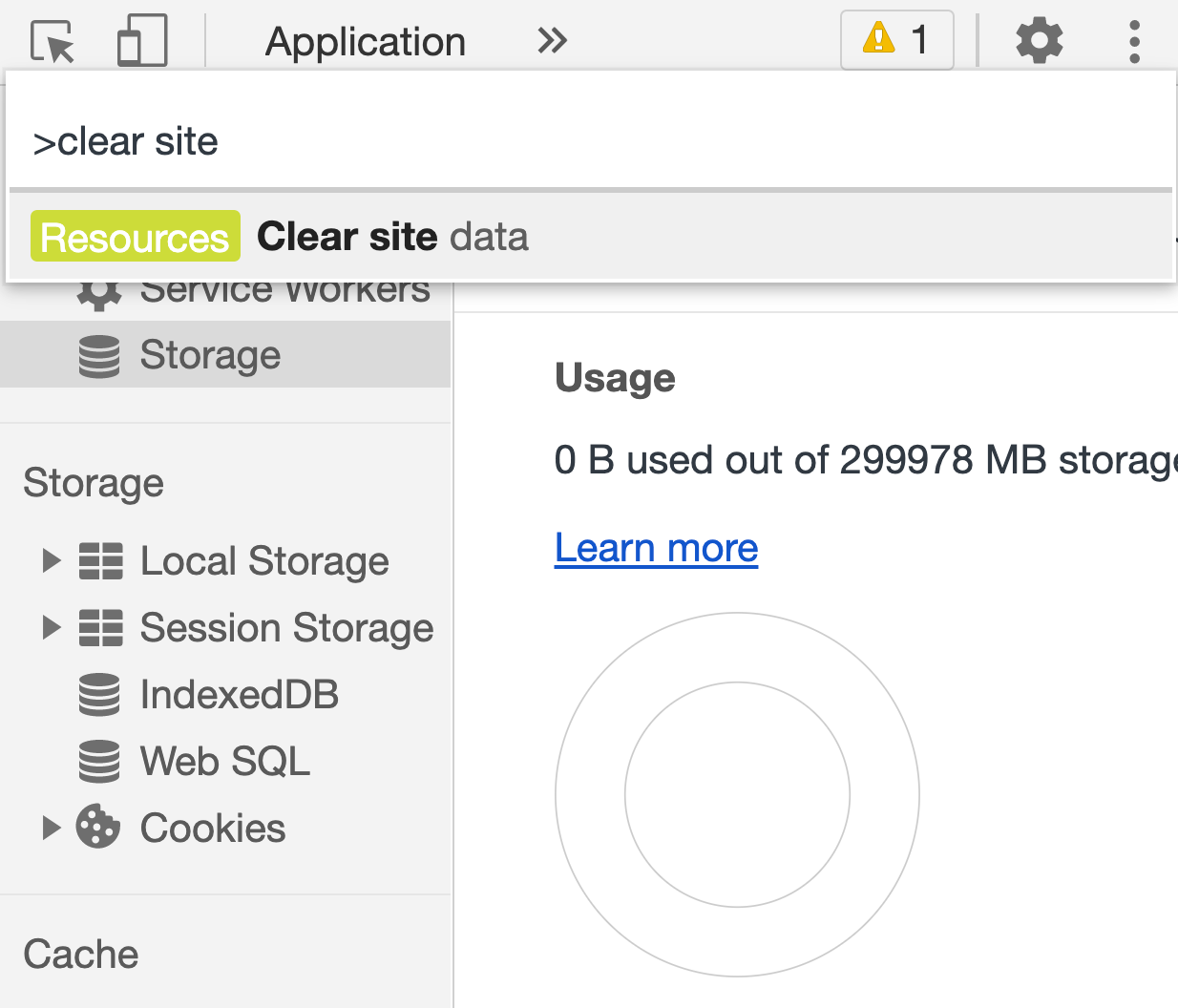
Both of these options, however, don’t clear cookie or service worker’s cache — which you might want to do in some scenarios. Jump to the Command menu (Cmd + Shift + P) and type/autocomplete “Clear site data”. When this option is activated, the browser will clean all of the data (as the name assumes), including the service worker’s cache as well as the unregistering of the service worker. (Alternatively, you can click “Clear Site Data” in the Application panel.)
And if you want to delete only cache or only cookies quickly, you can right-click on any request in the “Network” panel, and choose “Clean browser cache” from there.
In Firefox, you’ll need to head to the “Privacy & Security” panel and find the “Cookies and Site Data” section there.
Filters In The Network Panel (Chrome, Edge, Firefox)
There seems to be not much to explore in the “Network” panel as it basically just shows the list of browser requests (along with server responses) in chronological order. However, there are plenty of obscure little helpers as well.
First of all, with an overview of requests in front of us, we can choose which columns we’d like to see. Right-click on the header of one of the columns and select the ones that you find useful for the task at hand. We always choose the “Priority” column to see in which priorities assets are being requested, and if we need to adjust that order to deliver critical assets faster (based on JavaScript Resource Loading Priorities in Chrome, Edge).
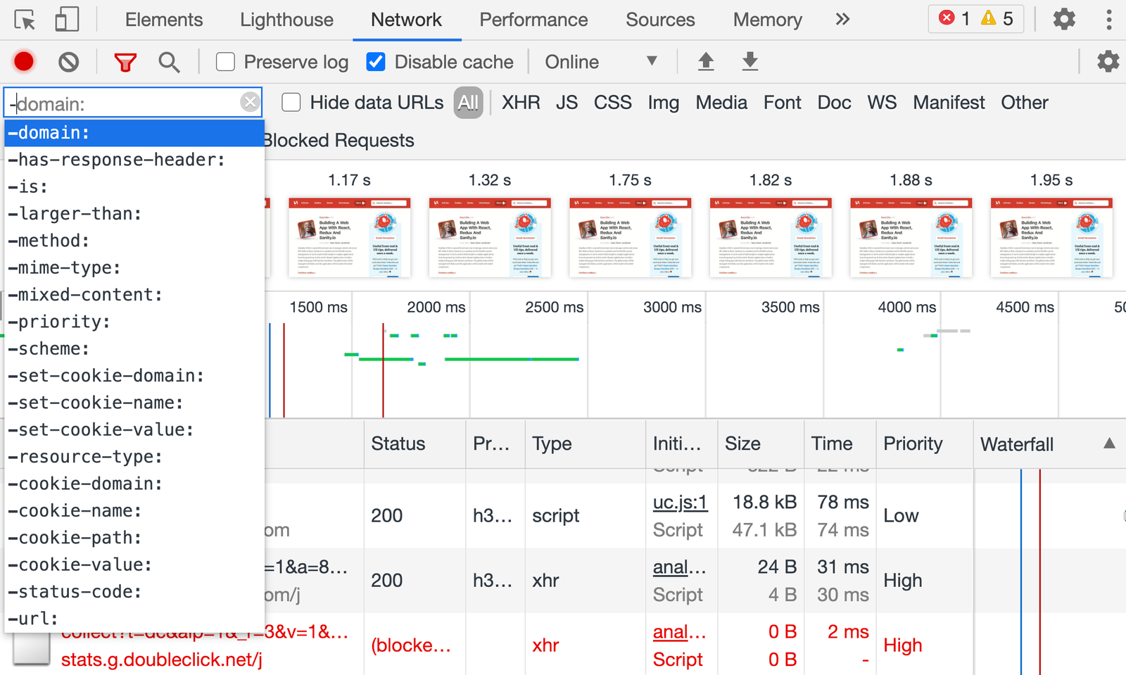
We can also filter requests to find specific ones that might be causing trouble (thanks for the tip, Harry). At the top of the “Network” panel you’ll find an input field, which accepts not only keywords but also commands for filtering. Here are a few examples of the useful ones:
is:from-cache shows all resources that were delivered from the cache,
is:service-worker-initiated, shows only requests prompted by a service worker,
is:running shows all incomplete or unresponsive requests,
larger-than:250k shows all resources that are larger than 250 Kb,
-larger-than:250k shows all resources that aren’t larger than 250 Kb (same size and smaller),
mixed-content:shows all assets that are loaded over HTTP instead of HTTPS,
-has-response-header:Cache-Control highlights assets that don’t have any caching headers,
Obviously we can also search for bad practices like document.write and @import in HTML and CSS, plus we can use regular expressions as well.
All filters can be combined as well, separated by an empty space. You can check a comprehensive list of all filters as well, or just type – in the filters input and get an autocomplete preview of all features (huge thanks to Harry for the tip!).
Check Initiators In The Network Panel (Chrome, Edge)
If you want to quickly check which assets a particular resource has requested, or by which resource an asset was requested, there is a simple way to discover it in DevTools as well. This is especially useful in cases where you might have a couple of third-party scripts that might be calling fourth-party-scripts.
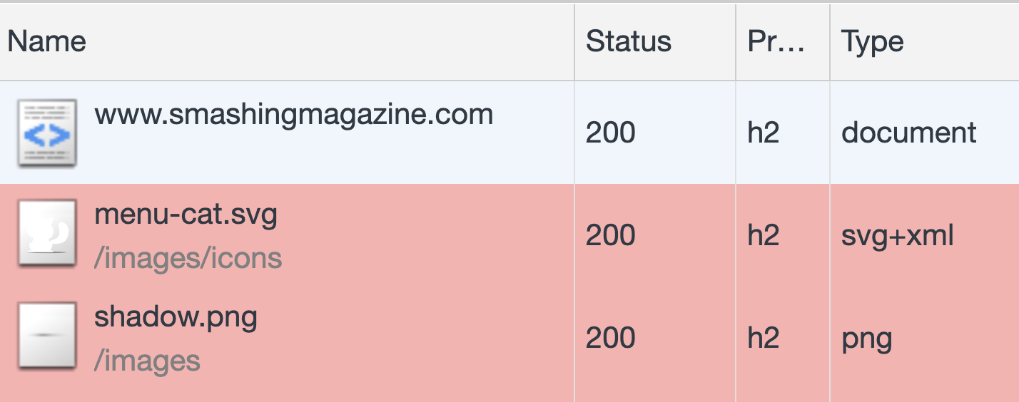
When you are inspecting a request in the “Network” panel, hold Shift while hovering over an element. The pink background color will indicate resources that this element has prompted to download, and the green background color will indicate the initiator that actually prompted the request.
Choose a User Agent (Chrome, Edge, Firefox)
Sometimes you might want to check how the page will render with a different user agent, e.g. to make sure that a Googlebot gets a properly rendered version of the page. By heading to “Network conditions”, you can define the behavior for caching, network throttling and a user agent.
By default, the latter is “automatic” but there are 10 predefined groups, ranging from GoogleBot Desktop and Mobile to Android and UC Browser. You can also define your own user agent if you need to. However, these settings will not remain preserved as you navigate from one tab to another.
In Firefox, you’ll need to head to Firefox’s about:config page and define a general.useragent.override string.
Change Scrolling Behavior In The Performance Panel (Chrome, Edge)
At first glance, the Performance panel might appear quite daunting with its flame charts, plenty of data displayed at once, and quite non-conventional scrolling behavior. By default, regular vertical scrolling acts as zooming into a selected portion of the timeline, but we can change it.
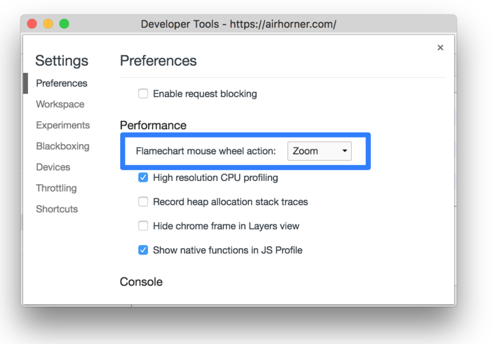
In “Settings”, you can switch “Flamechart mouse wheel action” from “Zoom” to “Scroll” — and voilà, your preferred scrolling will be preserved! But what if you wanted to use both zooming and scrolling though? The key hint there is to hold “Shift” while scrolling to toggle the preferred behavior.
Making Sense Of The Performance Panel (Chrome, Edge)
Remember “Timeline: event initiators” and “Timeline: invalidation tracking” we mentioned in the Experimental settings? These experimental features come in handy in the Performance panel when you are looking for a cause of expensive operations — so-called Long tasks (tasks that take over 50ms to complete). The goal then is to break down Long tasks into shorter tasks, and usually it makes sense to focus on the longest Long tasks first.
Jump to the Performance panel and start profiling with Cmd/Ctrl + Shift + E. After a bit of time needed for refresh and collecting data, those expensive long tasks will show up in the timeline, highlighted with a red rectangle in the right upper corner. Their length indicates how expensive the operation actually is. Tasks have a friendly budget of 50ms to finish, which is why the first 50ms-portion of the task is displayed in solid grey. Whenever you are beyond that budget, the rest of the task is highlighted with red/grey stripes.
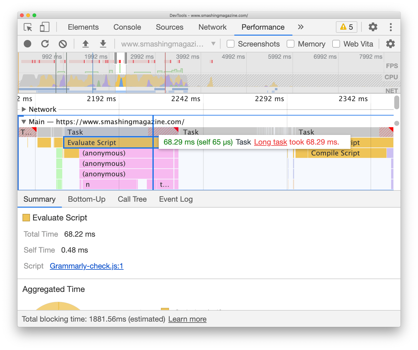
The flame chart is a visualization of what each task consists of. All parts of a task are displayed under the actual tasks, with a yellow background representing scripting. If you click on “Evaluate script” under each of the tasks, you can pull up the “Summary” drawer at the bottom and see which script caused the cost. If you click on the purple bar labeled “Recalculate style”, DevTools will show what exactly has triggered styles invalidation.
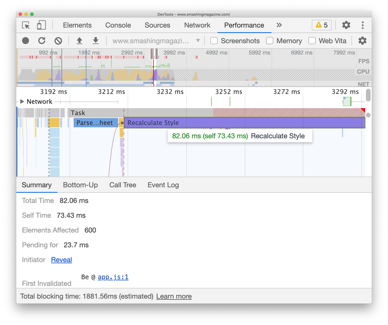
Probably the most underrated feature in DevTools is indeed the “Summary” drawer which would then also show up which elements were affected by style recalculation (so you can jump to them right away) and what has initiated this task in the first place.
Debugging Janky Animations With Layers (Chrome, Edge, Safari)
You just need a couple of animations, perhaps with a little bit of parallax, a sliding navigation or mischievous z-index manipulation, to run into dropping frames and janky animations. The FPS meter from the performance panel (Chrome) will reveal if you are running frames smoothly, but if it isn’t the case, you can explore rendering issues in the “Layers” tab.
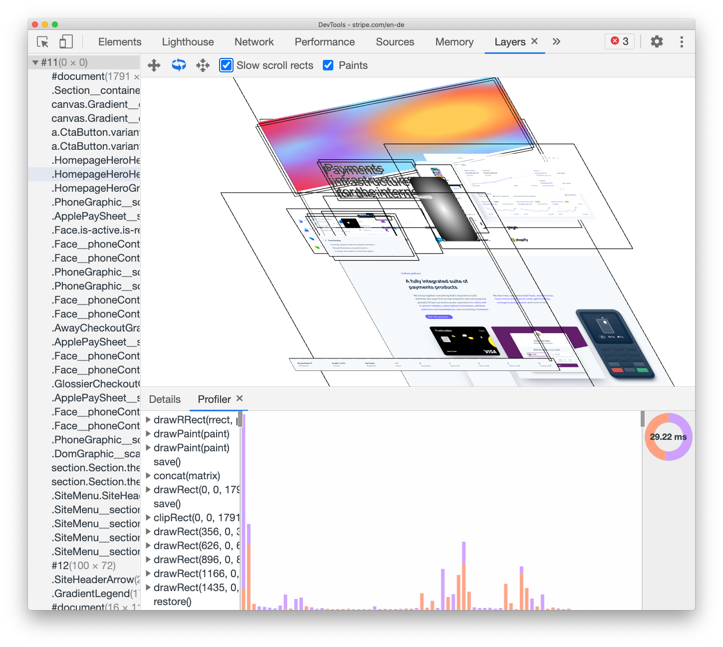
Some of the issues can be easily detected by tracking which of the elements are missing a will-change property, and which ones are using a disproportionate amount of memory. That’s how we spotted a large component that was hidden away off the screen with relative positioning of -1000px off the screen, causing a couple of MB of memory usage. Also, when debugging a canvas issue, keep in mind that Safari has a Canvas Memory Usage debugger.
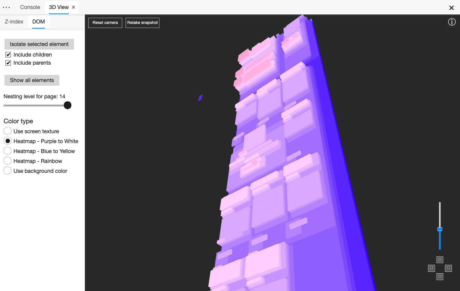
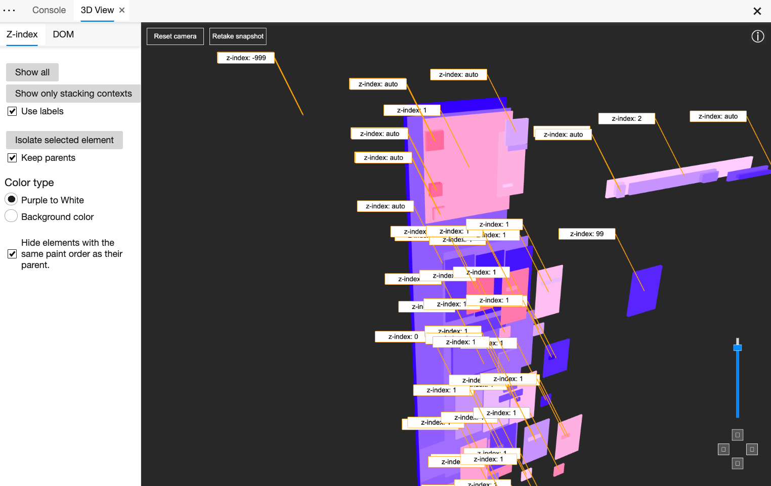
3D View Z-Index Debugger (Edge)
Another helpful tool to track rendering issues and z-index issues is Edge’s 3D View of the DOM (“Settings” → “More tools” → 3D View). The tool provides an interactive visualization of the DOM and z-index layers. You can even choose to view the DOM colored with the actual background colors of the DOM elements or show only stacking contexts.
It really has never been simpler to see how z-index values are distributed across the page, and why overlays or panels don’t appear as expected when triggered.
Better Accessibility Profiling (Chrome, Edge, Firefox)
Wouldn’t it be great to have one-in-all accessibility tool that would provide details and guidance about everything from tab order to ARIA-attributes and screen reader announcements? To get close to that, we’ve set up a dedicated accessibility profile with useful extensions and bookmarklets mentioned at the beginning of the article. However, DevTools provides some useful features out of the box as well.
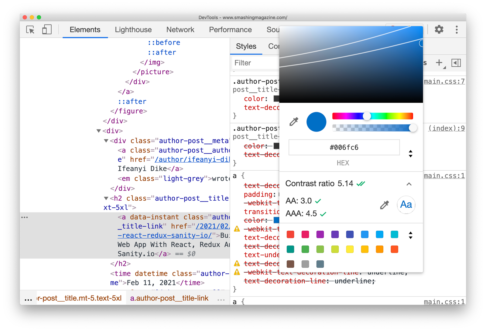
In Chrome and Edge, the “Accessibility” panel shows the accessibility tree, used ARIA attributes and computed properties. When using a color picker, you can check and conveniently adjust the colors to accommodate for a AA/AAA-compliant contrast ratio (along with the ability to switch between HEX, RGB, HSL with Shift + Click on swatch — thanks Ana!).
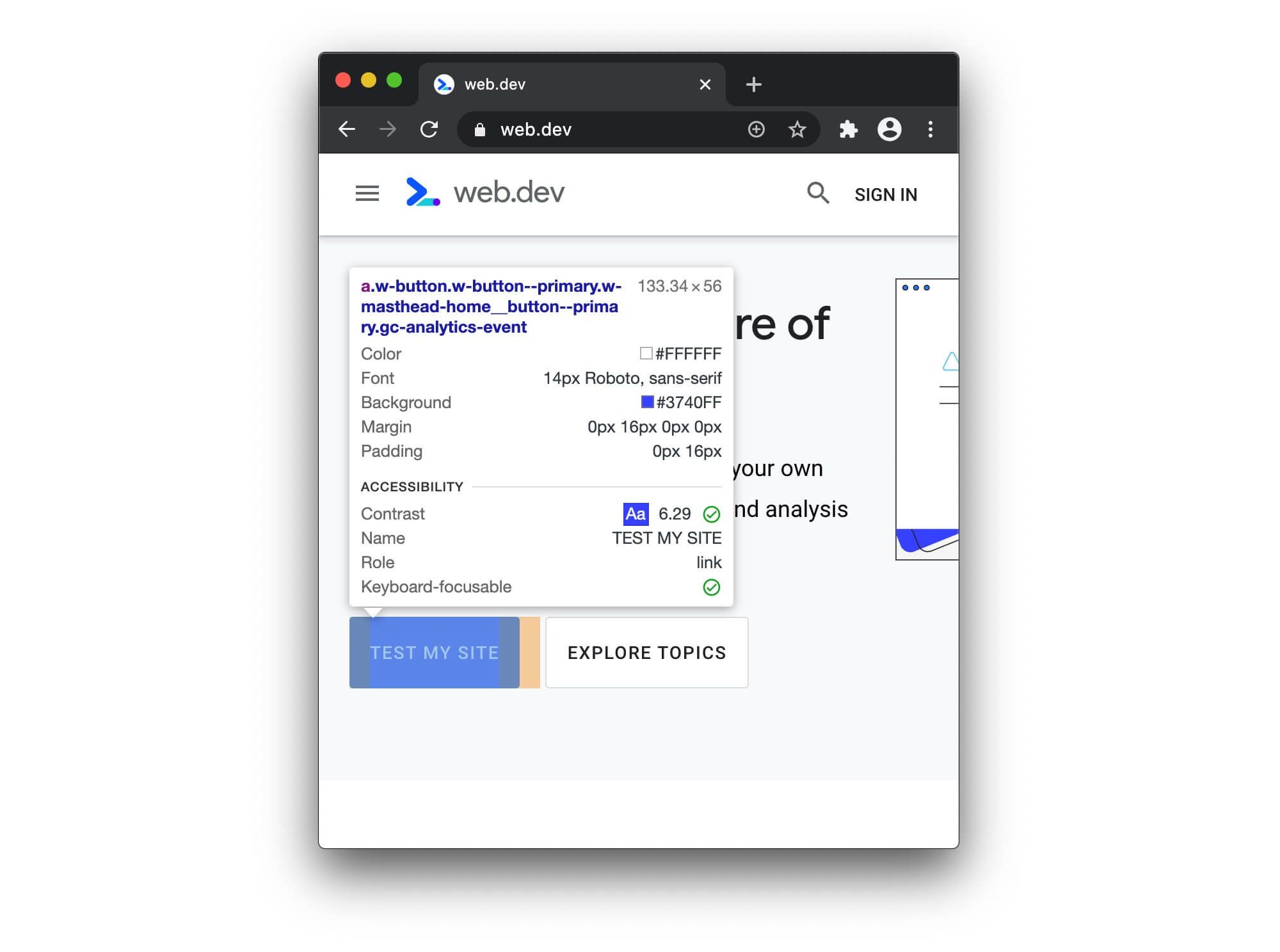
As already mentioned, the “Rendering” panel also allows you to emulate vision deficiencies. Lighthouse audits also include a section with recommendations around the accessibility of the page. Plus, when you inspect an element, accessibility information is appearing in the overview as well.
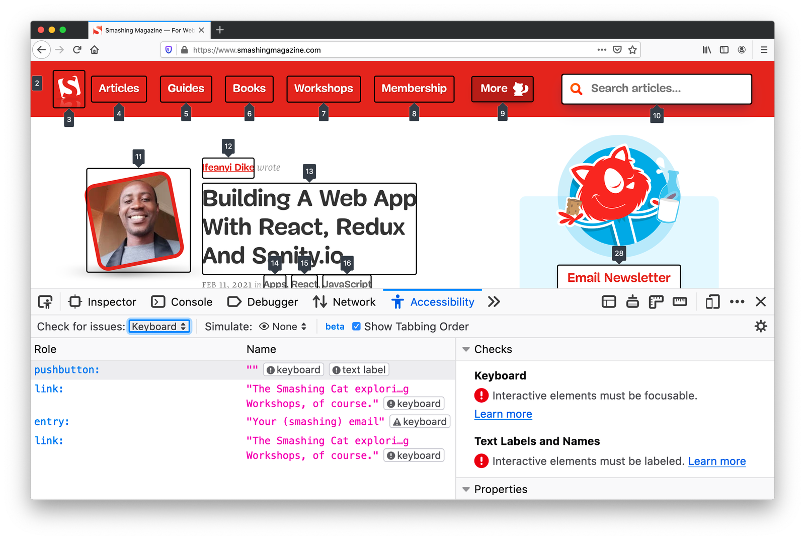
Firefox has advanced accessibility tooling as well. Additionally to the accessibility tree and contrast checker, Firefox DevTools highlights roles and landmarks, along with accessibility recommendations and checks. For example, you can check for contrast issues on the entire page, check if all links are focusable and include focus styling, and review text labels. Plus, you can toggle tabbing order as well.
Additionally, you can install accessibility-focused extensions such as Accessibility Insights, aXe and a11y.css, along with a few other accessibility linters and color vision simulators.
Worth Mentioning
Obviously, there are literally hundreds, and perhaps even thousands, of other useful features available in DevTools. Many of them are quite well-known and don’t need much introduction, but are still worth mentioning.
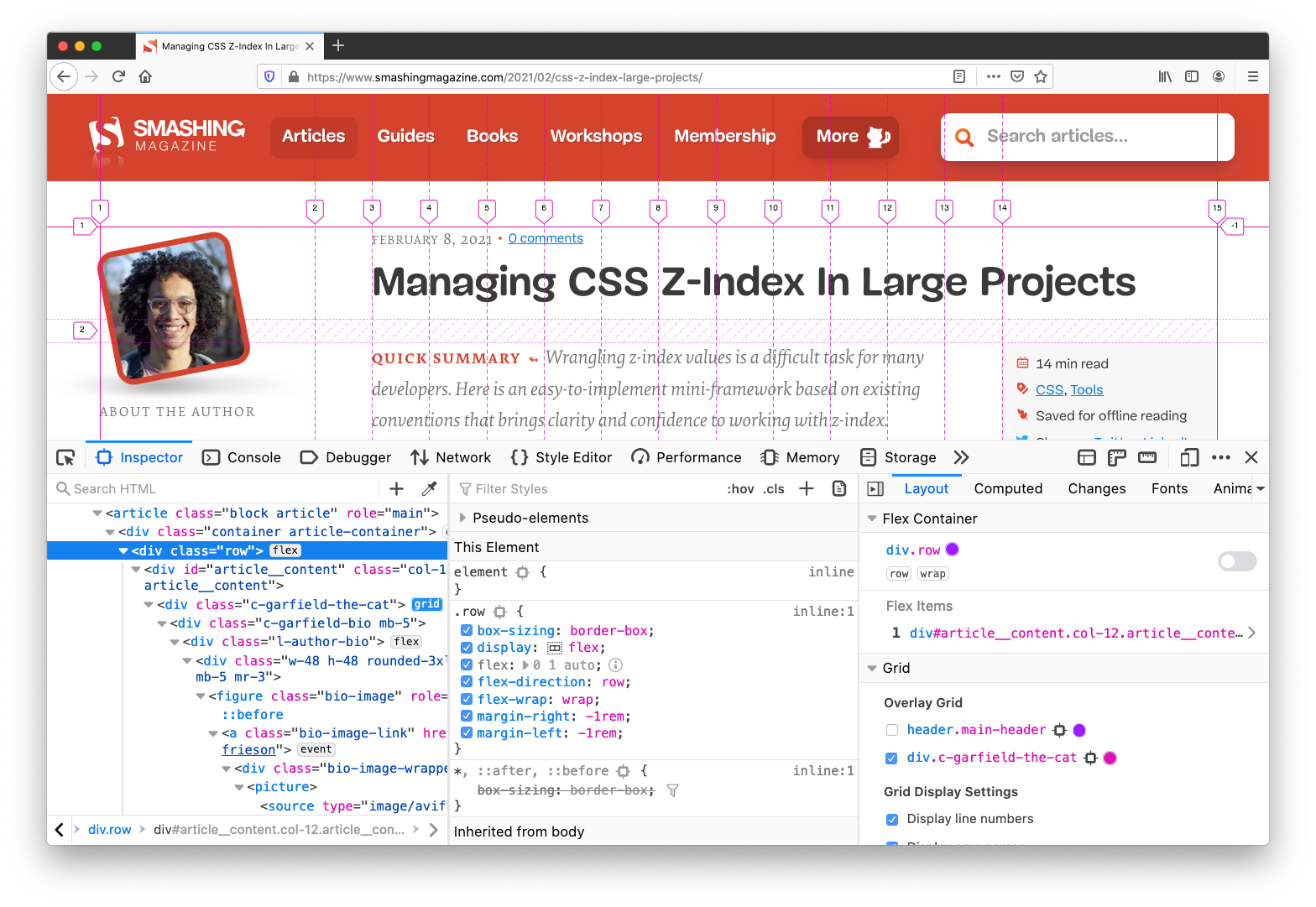
CSS Grid / Flexbox Inspectors (Firefox, Chrome, Edge)
If you have any layout issue related to Grid and Flexbox, you’ll probably find a cause of the problem via DevTools. Grid and Flexbox inspectors are very useful as they show grid overlay and the boundaries of containers, as well as hints on everything from flex-basis to grid-gap.
Live Expressions
If you’ve been running into habit of typing the same JavaScript expression in the console, you could look into automating it with Live Expressions. The feature, available in Chrome, Edge and Firefox, allows you to type an expression once and then pin it to the top of your console, and the value of the live expression will update automatically.
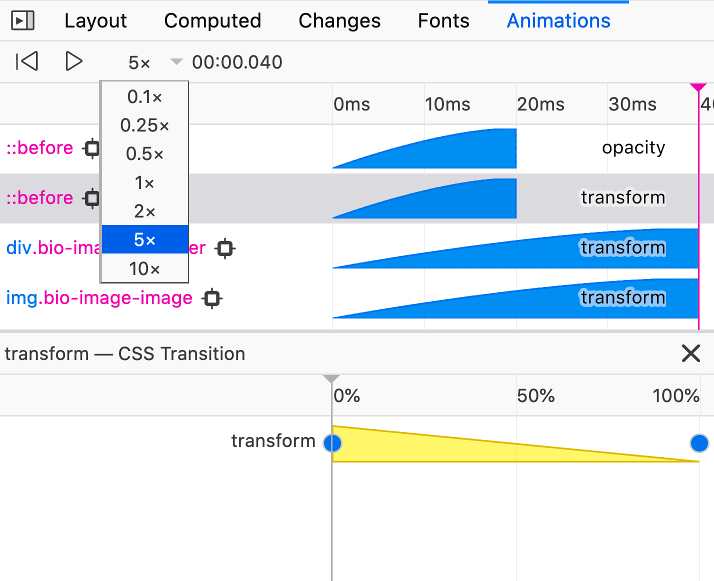
Animations Panel
Firefox has a very handy panel to track issues with animations, including slowing it down and visualizing how an element is changing over time.
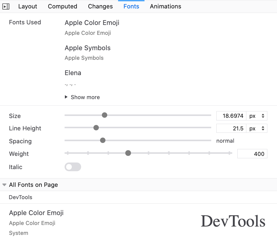
Fonts Panel
Firefox also has a handy “Fonts” panel that’s worth exploring for any kind of font-related issue. We used it quite a lot when trying to match the fallback font against the web font, for example, as you can refine typographic properties with a slider and see impact in action. It also provides text previews when hovering over a font-family in styles.
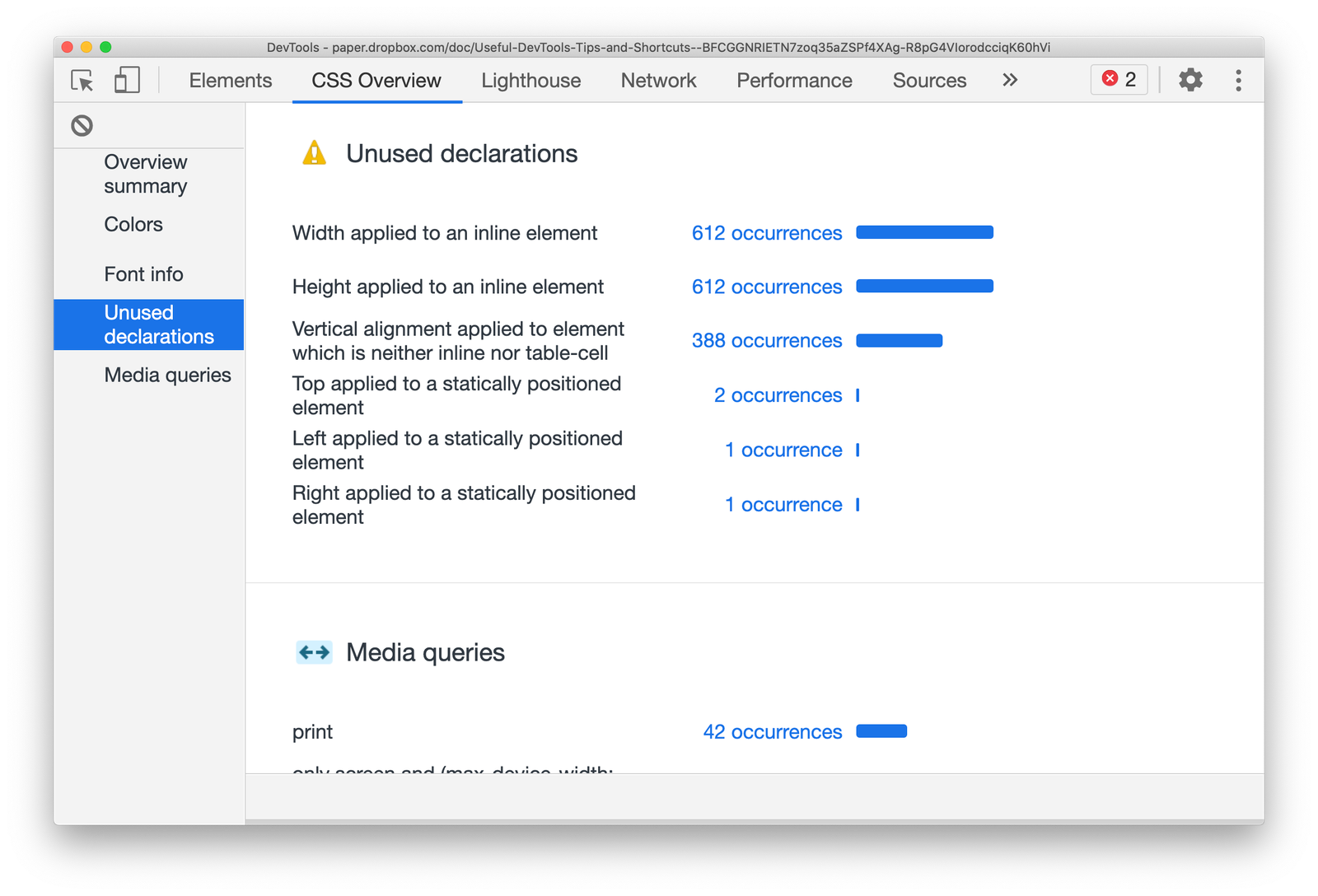
CSS Overview
If you activate the “CSS Overview” in Chrome’s experimental settings, DevTools will add a tab with a comprehensive report of CSS declarations used on a page. It will also list all colors and fonts used, as well as media queries and unused declarations which you can jump to right away.
And That’s A Wrap!
When we set out to prepare this overview, it was supposed to be quite short, featuring just some of the useful features that DevTools provides. It turned out that there are plenty of features that we didn’t know of before we started writing this article — and we were able to stumble upon them with the kind help of wonderful Smashing readers who contributes their experiences on Twitter. Thank you so much for your kind contributions!
Also, a huge thank-you to all contributors of all DevTools across all browsers — we applaud you for your efforts, and your time and effort to make our development experiences better. It matters.
If we missed something valuable, please reply in the comments. And if you found something useful, we hope you’ll be able to apply these little helpers to your workflow right away, and perhaps send a link to this post to a friend or two — perhaps they’ll find it useful. Ah, and don’t forget: you could also debug DevTools with DevTools — just hit Cmd/Ctrl + Shift + I twice in a row. 😉
Now, happy debugging, everyone!