The best tablets with a stylus pen for drawing and note-taking in 2021

Original Source: http://feedproxy.google.com/~r/CreativeBloq/~3/ryW_0n0pJYs/the-best-tablets-with-a-stylus-for-drawing-and-note-taking

Swap your Moleskine for a nifty tablet with a stylus.

25 Free Magazines You Can Download From Apple App Store

Original Source: https://www.hongkiat.com/blog/free-newsstand-magazine-app-store/

Magazines are a good way to keep yourself updated and entertained about your favorite topic. And it makes an even better pastime when you can read your favorite magazine on your mobile device. In…

Visit hongkiat.com for full content.

A Guide To Undoing Mistakes With Git (Part 2)

Original Source: https://smashingmagazine.com/2021/05/undoing-mistakes-git-part2/

In this second part of our series on “Undoing Mistakes with Git”, we’ll bravely look danger in the eye again: I’ve prepared four new doomsday scenarios — including, of course, some clever ways to save our necks! But before we dive in: take a look at the check out previous articles on Git for even more self-rescue methods that help you undo your mistakes with Git!

Let’s go!

Recovering a Deleted Branch Using the Reflog

Have you ever deleted a branch and, shortly after, realized that you shouldn’t have? In the unlikely event that you don’t know this feeling, I can tell you that it’s not a good one. A mixture of sadness and anger creeps up on you, while you think of all the hard work that went into that branch’s commits, all the valuable code that you’ve now lost.

Luckily, there’s a way to bring that branch back from the dead — with the help of a Git tool named “Reflog”. We had used this tool in the first part of our series, but here’s a little refresher: the Reflog is like a journal where Git notes every movement of the HEAD pointer in your local repository. In other, less nerdy words: any time you checkout, commit, merge, rebase, cherry-pick, and so on, a journal entry is created. This makes the Reflog a perfect safety net when things go wrong!

Let’s take a look at a concrete example:

$ git branch
* feature/login
master

We can see that we currently have our branch feature/login checked out. Let’s say that this is the branch we’re going to delete (inadvertently). Before we can do that, however, we need to switch to a different branch because we cannot delete our current HEAD branch!

$ git checkout master
$ git branch -d feature/login

Our valuable feature branch is now gone — and I’ll give you a minute to (a) understand the gravity of our mistake and (b) to mourn a little. After you’ve wiped away the tears, we need to find a way to bring back this branch! Let’s open the Reflog (simply by typing git reflog) and see what it has in store for us:

Here are some comments to help you make sense of the output:

First of all, you need to know that the Reflog sorts its entries chronologically: the newest items are at the top of the list.
The topmost (and therefore newest) item is the git checkout command that we performed before deleting the branch. It’s logged here in the Reflog because it’s one of these “HEAD pointer movements” that the Reflog so dutifully records.
To undo our grave mistake, we can simply return to the state before that — which is also cleanly and clearly recorded in the Reflog!

So let’s try this, by creating a new branch (with the name of our “lost” branch) that starts at this “before” state SHA-1 hash:

$ git branch feature/login 776f8ca

And voila! You’ll be delighted to see that we’ve now restored our seemingly lost branch! ?

If you’re using a Git desktop GUI like “Tower”, you can take a nice shortcut: simply hit CMD + Z on your keyboard to undo the last command — even if you’ve just violently deleted a branch!

Luckily, these types of problems can be easily corrected. Let’s roll up our sleeves and get to work.

The first step is to switch to the correct destination branch and then move the commit overusing the cherry-pick command:

$ git checkout feature/login
$ git cherry-pick 776f8caf

You will now have the commit on the desired branch, where it should have been in the first place. Awesome!

But there’s still one thing left to do: we need to clean up the branch where it accidentally landed at first! The cherry-pick command, so to speak, created a copy of the commit — but the original is still present on our long-running branch:

This means we have to switch back to our long-running branch and use git reset to remove it:

$ git checkout main
$ git reset –hard HEAD~1

As you can see, we’re using the git reset command here to erase the faulty commit. The HEAD~1 parameter tells Git to “go back 1 revision behind HEAD”, effectively erasing the topmost (and in our case: unwanted) commit from the history of that branch.

And voila: the commit is now where it should have been in the first place and our long-running branch is clean — as if our mistake had never happened!

Editing the Message of an Old Commit

It’s all too easy to smuggle a typo into a commit message — and only discover it much later. In such a case, the good old –amend option of git commit cannot be used to fix this problem, because it only works for the very last commit. To correct any commit that is older than that, we have to resort to a Git tool called “Interactive Rebase”.

First, we have to tell Interactive Rebase which part of the commit history we want to edit. This is done by feeding it a commit hash: the parent commit of the one we want to manipulate.

$ git rebase -i 6bcf266b

An editor window will then open up. It contains a list of all commits after the one we provided as a basis for the Interactive Rebase in the command:

Here, it’s important that you don’t follow your first impulse: in this step, we do not edit the commit message, yet. Instead, we only tell Git what kind of manipulation we want to do with which commit(s). Quite conveniently, there’s a list of action keywords noted in the comments at the bottom of this window. For our case, we mark up line #1 with reword (thereby replacing the standard pick).

All that’s left to do in this step is to save and close the editor window. In return, a new editor window will open up that contains the current message of the commit we marked up. And now is finally the time to make our edits!

Here’s the whole process at a glance for you:

This is where fixup comes in. It allows you to still make this correcting band-aid commit. But here comes the magic: it then applies it to the original, broken commit (repairing it that way) and then discards the ugly band-aid commit completely!

We can go through a practical example together! Let’s say that the selected commit here is broken.

Let’s also say that I have prepared changes in a file named error.html that will solve the problem. Here’s the first step we need to make:

$ git add error.html
$ git commit –fixup 2b504bee

We’re creating a new commit, but we’re telling Git this is a special one: it’s a fix for an old commit with the specified SHA-1 hash (2b504bee in this case).

The second step, now, is to start an Interactive Rebase session — because fixup belongs to the big toolset of Interactive Rebase.

$ git rebase -i –autosquash 0023cddd

Two things are worth explaining about this command. First, why did I provide 0023cddd as the revision hash here? Because we need to start our Interactive Rebase session at the parent commit of our broken fellow.

Second, what is the –autosquash option for? It takes a lot of work off our shoulders! In the editor window that now opens, everything is already prepared for us:

Thanks to the –autosquash option, Git has already done the heavy lifting for us:

It marked our little band-aid commit with the fixup action keyword. That way, Git will combine it with the commit directly above and then discard it.
It also reordered the lines accordingly, moving our band-aid commit directly below the commit we want to fix (again: fixup works by combining the marked-up commit with the one above!).

In short: There’s nothing to do for us but close the window!

Let’s take a final look at the end result.

The formerly broken commit is fixed: it now contains the changes we prepared in our band-aid commit.
The ugly band-aid commit itself has been discarded: the commit history is clean and easy to read — as if no mistake had occurred at all.

Knowing How to Undo Mistakes is a Superpower

Congratulations! You are now able to save your neck in many difficult situations! We cannot really avoid these situations: no matter how experienced we are as developers, mistakes are simply part of the job. But now that you know how to deal with them, you can face them with a laid-back heart rate. ?

If you want to learn more about undoing mistakes with Git, I can recommend the free “First Aid Kit for Git”, a series of short videos about exactly this topic.

Have fun making mistakes — and, of course, undoing them with ease!

How to Create an Appointment Scheduling Platform: DIY vs. Plugin vs. Trafft

Original Source: http://feedproxy.google.com/~r/tympanus/~3/qZ3qLwIHePg/

Websites equipped with appointment scheduling tools and booking calendars make everyone’s lives easier. 

For starters, business owners can entrust the often time-consuming and tedious work of scheduling appointments to the website. Customers and prospects, on the other hand, have a faster and more convenient way of booking and managing appointments on their own.

That said, when it comes time to add a booking system to a client’s website, what should you build it with? Is there one option that’s better than another? 

In this post, we’ll weigh the the following options: 

Code it from-scratchUse a pluginUse a business automation platform like Trafft

Comparing booking solution options for websites

You have three options when it comes to implementing a booking solution on a client’s site: 

Do-it-yourself and code the booking platform from scratch.Install a WordPress plugin and do light customizations and configurations.Use Trafft’s feature-rich premium appointment scheduling software.

Let’s see how they compare: 

Cost

DIY

This option might seem like it’s free since you’re the one doing all the work. However, the cost of your time can be tremendous depending on how robust a solution you plan to build. 

For instance, if you’re building a complete scheduling system, you’ll need to account for different services, locations, employees, and time slots. You’ll also have to build out features like payment processing, taxation, invoice generation, SMS reminders, and more. 

Plugin 

There are technically free WordPress plugins that’ll handle this. However, there’s going to be a trade-off in terms of features and control. Even freemium plugins have their limits. 

Trafft 

Trafft is a freemium software. You can use the free plan to do a test run of the platform or to implement basic booking systems for small business clients.    

The premium plans give you access to all the features you need to build the booking system you envisioned for your client… Without having to do the work of building it yourself. You even get to choose which custom features — like group booking, special days, and Zoom integration — are included. 

Setup

DIY 

Out of the three options, this one is going to take the longest, for obvious reasons. Even once you get the hang of building an appointment scheduling system, expect to spend hundreds to thousands of hours on each project. 

Plugin

While plugins might provide seemingly ready-made booking systems, they’re dependent on having a website up and running. 

So, before you even think about working on this, you’ll need to buy a web hosting plan and domain, design the site, and make sure all the themes, plugins, and other modules look good and work well together. What’s more, there’s a ton of maintenance afterwards — managing backups, data security, server uptime, app integration, and much, much more. 

Trafft 

Using Trafft to set up an appointment scheduling system is so easy. You’ll get started the second you enter the platform: 

You can configure the business’s availability, who can manage the booking system, as well as what services can be scheduled. 

Once your account is set up, general settings allow you to refine the rules of appointment scheduling. That way, your client has less to do in terms of reviewing, adjusting, and overall managing their bookings. 

One other thing worth mentioning is that Trafft isn’t dependent on a content management system like WordPress. You have the flexibility of designing a free-standing scheduling platform or you can integrate it with a website. So, you could realistically have this up and running in less than an hour. 

Customization

DIY 

The world is your oyster. However, advanced customization can take quite a while to complete, which means potentially leaving your client without an appointment scheduling platform for weeks or even months.

Plugin 

Free plugins mean limited features, control, and support. As a result of this, an insufficient or lackluster appointment scheduling system could become a liability for your client. 

Freemium plugins offer more control and features, but you still have to conform to what the developer envisioned for the booking system in terms of design and features. 

Trafft 

You’ll have the ability to do light tweaks to the design of your Trafft booking system. Things like colors, fonts, and booking steps can easily be updated for your booking website. 

If you’d prefer to do more customizing, you can use the custom CSS and JavaScript fields to give your platform a more branded style. 

As far as features go, Trafft has accounted for the features and integrations you’d need for the majority of booking systems. After you sign up for Trafft, you’ll soon discover that advanced features have already been set up for you: 

You can easily deactivate the features or integrations you don’t need and then add in the ones that you do. But this’ll at least keep you from having to enable every feature from-scratch.

It’s just as easy to set up integrations like Zoom meetings or PayPal or Stripe payment processing. Enable the integrations, add your account details, and save. 

Automation

DIY 

In addition to building out your booking platform, you’ll have to manually connect the other apps needed to streamline the scheduling process. So, make sure to add the additional time retrieving the API information and hooking them up to your system when considering this option.

Plugin

There are limits to which software you can connect to a WordPress plugin. 

If the app you want to use doesn’t have a built-in integration, you always use IFTTT or Zapier. However, your booking system needs to be compatible with common business software in order for that to happen, so your client may end up having to manually manage these business processes anyway. 

Trafft

Trafft was built to be a business automation platform. So if your client needs a truly streamlined scheduling process, this is going to be your best bet. 

For instance, the appointment booking process takes customers through a series of questions. Like who they want to schedule the appointment or service with:

All of those details get hashed out online. What’s more, once the appointment is booked, notifications go out to both the customer and employee so everyone is kept in the loop about appointments and changes to them. 

Also, with software integrations already built into the Trafft platform, things like collecting payments, managing VAT or other taxes, creating Zoom meeting room, generating invoices, and so on happen automatically. 

Niche Compatibility

DIY

Different business types need different booking solutions. So, the more variety there is in your client base, the more booking systems you’ll have to learn how to build. This’ll only slow things down even further for you. 

Plugin

This is another limitation you’re likely to encounter when using an open source plugin. While some might offer different types of booking calendars, lists, or displays, they’re not always the best option for every niche.

Trafft 

Trafft was built with different industries/niches in mind. For example: 

SalonsHealthcareSports and trainingEducation and consultingAdministrationEvents and entertainmentProfessional servicesPersonal services

When you first sign up for Trafft, one of the first things you’ll be asked is what type of business it’s for. This helps the platform configure the settings for the chosen niche. 

Support

DIY 

If you build it, you’re responsible for supporting, maintaining, and debugging it. 

Plugin

If you’re using a free plugin, you might not get much in the way of support when something goes wrong with it. Even with freemium plugins, there’s no guarantee that the developer will be immediately available to help you troubleshoot an issue. 

The longer you have to wait to get something resolved, the more it’ll cost your clients business.

Trafft

With premium scheduling software like Trafft, support is part of what you pay for. 

To start, Trafft has a self-help Knowledgebase for its users:

Within the app itself, users will also find a live chat form for more immediate questions or issues. 

You can always email them for help as well. 

Bottom line: Premium support is built into a Trafft subscription, so you and your clients will never be stuck with a faulty booking system.

How will you add appointment scheduling to your clients’ sites?

There are clear benefits to each of the options presented here. 

With DIY, you have total control in terms of design, features, and integrations. However, it’s going to be quite costly in terms of the amount of time you have to put into building and supporting it. 

With a WordPress plugin, you have the speed and ease of implementation. However, you’ll have to build your appointment scheduling platform around the limitations of the plugin and the developer’s vision for it.

With the Trafft premium appointment scheduling software, you get the best of both worlds. It’s insanely easy to get a booking platform up and running and you have more control over how it works and looks. What’s more, you can have it in your clients’ hands in no time at all.Having a robust scheduling tool can be a real game-changer for business. If you want to build something that looks professional, is universally user-friendly, and empowers your clients to schedule appointments and start making more money starting tomorrow, Trafft is the logical choice.

The post How to Create an Appointment Scheduling Platform: DIY vs. Plugin vs. Trafft appeared first on Codrops.

20 Best New Websites, May 2021

Original Source: https://www.webdesignerdepot.com/2021/05/20-best-new-websites-may-2021/

This month we have several examples of brutalism used to good effect as a foil to showcase products and/or work. By contrast, at the other end of the scale, we have brands who have chosen to go more of an immersive experience route, using full-screen images, sound, animation, and even VR.

Both are valid approaches, depending on the content. The former tends to work better as a backdrop for artwork, photography, and artisanal craft goods — acting as a virtual gallery space — while the latter is better for consumer goods and experiences, particularly food, drink, and accommodation.

There is, of course, a whole range in between these extremes, and we’ve got that covered too. Enjoy!

Grainne Morton

A simple layout, soft pastel colors, and clear navigation provide an excellent backdrop for Grainne Morton’s handmade jewelry creations.

Gage Hotel

Good photography and a heritage-inspired color scheme give the Gage Hotel’s site a luxury feel.

Tejidos Roca

Tejidos Roca is a fabric manufacturer, and the design of their site uses a circle motif to bring rolls of fabric to mind.

La Passation Synerghetic 2021

Synerghetic is part of the Junior Enterprises Europe scheme – a network of businesses run by students. This year they are not holding the usual handover ceremony, so Synerghetic created this rather fun little digital celebration instead.

Redwood Empire

For Earth Month, Redwood Empire Whiskey has created a microsite promoting a competition styled to match their bottle labels.

Gabriel Cuallado

This site focusing on Spanish photographer Gabriel Cullado’s life and work features some great transitions and good use of horizontal scrolling.

Ombia Studio

In Ombia Studio’s site, atmospheric photographs stand out in a minimal layout. There is a sense of almost gallery curation here.

Headup

Headup uses a pleasing color scheme and geometric graphics to create a welcoming but businesslike approach.

the Figo

Spherical curves and line animations create interest in this site for boutique hotel, the Figo.

Boon Market

Boon Market is about promoting a toxin-free and waste-free lifestyle, and their site reflects this with its use of simple type and soft colors.

Unspoken Agreement

Unspoken Agreement’s website has a quietly confident feel, with clean lines and some pleasing type.

hnst

Another brutalist-inspired design here, but the use of bright red makes it fresh in hnst’s take on the style.

InteriorLAB

Part minimalist, part glossy magazine, InteriorLAB have succeeded in making the simple feel luxurious.

Bowmore Experience

Bowmore has opted for immersive video and visually beautiful images to present their limited-edition Timeless whisky range.

Oly Sheet

There is a slightly old-school start-up feel to Oly Sheet’s website, but it is still appealing with fresh, spring colors and well-organized content.

Aalto University

Aalto University has provided a pretty in-depth tour of its campus here. The navigation is clear, and the information is presented in ideal-sized chunks — enough detail, but not too much at once.

Wisr

Wisr features a Heath Robinson style machine that ‘runs’ as the user scrolls down the page. It provides a bit of interest (no pun intended) to the not very exciting subject of personal loans.

Rudl und Schwarm

Bright colors, cute, but not too cutesy, illustration, some nice scrolling, and transition effects are used really well on Rudl und Schwarm. And it’s got bees; bees are good.

Dr. Maul

This site for Dr. T. Maul manages to take orthodontistry past the usual image of uncomfortable wiring, elastic bands, and ‘train tracks and make it seem just a little more glamorous.

My Drink

There is a slightly vintage feel to this site for My Drink with its cocktail illustration. The blue text on grey is soothing without being bland.

Bonus Site: Imperial Style Guide

And finally not new, but a bonus in honor of May 4th, the Imperial style guide. Well, the Web would get boring if it was serious all the time.

Source

p img {display:inline-block; margin-right:10px;}
.alignleft {float:left;}
p.showcase {clear:both;}
body#browserfriendly p, body#podcast p, div#emailbody p{margin:0;}

The post 20 Best New Websites, May 2021 first appeared on Webdesigner Depot.

CSS Container Queries: Use-Cases And Migration Strategies

Original Source: https://smashingmagazine.com/2021/05/css-container-queries-use-cases-migration-strategies/

When we write media queries for a UI element, we always describe how that element is styled depending on the screen dimensions. This approach works well when the responsiveness of the target element media query should only depend on viewport size. Let’s take a look at the following responsive page layout example.

However, responsive Web Design (RWD) is not limited to a page layout — the individual UI components usually have media queries that can change their style depending on the viewport dimensions.

You might have already noticed a problem with the previous statement — individual UI component layout often does not depend exclusively on the viewport dimensions. Whereas page layout is an element closely tied to viewport dimensions and is one of the topmost elements in HTML, UI components can be used in different contexts and containers. If you think about it, the viewport is just a container, and UI components can be nested within other containers with styles that affect the component’s dimensions and layout.

Even though the same product card component is used in both the top and bottom sections, component styles not only depend on the viewport dimensions but also depend on the context and the container CSS properties (like the grid in the example) where it’s placed.

Of course, we can structure our CSS so we support the style variations for different contexts and containers to address the layout issue manually. In the worst-case scenario, this variation would be added with style override which would lead to code duplication and specificity issues.

.product-card {
/* Default card style */
}

.product-card–narrow {
/* Style variation for narrow viewport and containers */
}

@media screen and (min-width: 569px) {
.product-card–wide {
/* Style variation for wider viewport and containers */
}
}

However, this is more of a workaround for the limitations of media queries rather than a proper solution. When writing media queries for UI elements we are trying to find a “magic” viewport value for a breakpoint when the target element has minimum dimensions where the layout doesn’t break. In short, we are linking a “magical” viewport dimension value to element dimensions value. This value is usually different from than viewport dimension and is prone to bugs when inner container dimensions or layout changes.

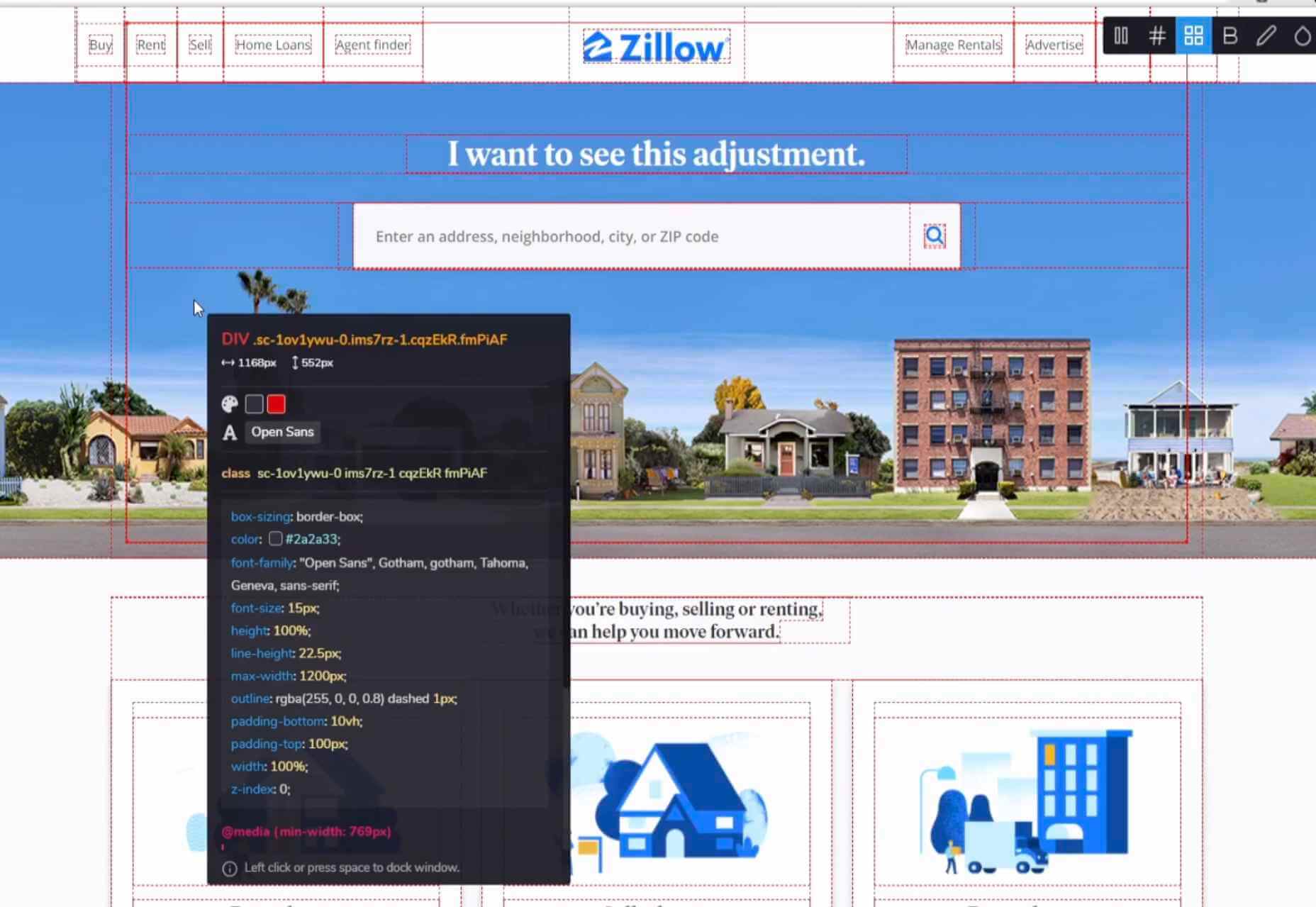
The following example showcases this exact issue — even though a responsive product card element has been implemented and it looks good in a standard use-case, it looks broken if it’s moved to a different container with CSS properties that affect element dimensions. Each additional use-case requires additional CSS code to be added which can lead to duplicated code, code bloat, and code that is difficult to maintain.

In case you are using a browser that doesn’t support container queries, an image showcasing the intended working example will be provided alongside the CodePen demo.

Working With Container Queries

Container queries are not as straightforward as regular media queries. We’ll have to add an extra line of CSS code to our UI element to make container queries work, but there’s a reason for that and we’ll cover that next.

Containment Property

CSS contain property has been added to the majority of modern browsers and has a decent 75% browser support at the time of writing this article. The contain property is mainly used for performance optimization by hinting to the browser which parts (subtrees) of the page can be treated as independent and won’t affect the changes to other elements in a tree. That way, if a change occurs in a single element, the browser will re-render only that part (subtree) instead of the whole page. With contain property values, we can specify which types of containment we want to use — layout, size, or paint.

There are many great articles about the contain property that outline available options and use-cases in much more detail, so I’m going to focus only on properties related to container queries.

What does the CSS contentment property that’s used for optimization have to do with container queries? For container queries to work, the browser needs to know if a change occurs in the element’s children layout that it should re-render only that component. The browser will know to apply the code in the container query to the matching component when the component is rendered or the component’s dimension changes.

We’ll use the layout​ and style​ values for the contain​ property, but we’ll also need an additional value that signals the browser about the axis in which the change will occur.

inline-size
Containment on the inline axis. It’s expected for this value to have significantly more use-cases, so it’s being implemented first.
block-size
Containment on block axis. It’s still in development and is not currently available.

One minor downside of the contain property is that our layout element needs to be a child of a contain element, meaning that we are adding an additional nesting level.

<section>
<article class=”card”>
<div class=”card__wrapper”>
<!– Card content –>
</div>
</article>
</section>

.card {
contain: layout inline-size style;
}

.card__wrapper {
display: grid;
grid-gap: 1.5em;
grid-template-rows: auto auto;
/* … */
}

Notice how we are not adding this value to a more distant parent-like section and keeping the container as close to the affected element as possible.

“Performance is the art of avoiding work and making any work you do as efficient as possible. In many cases, it’s about working with the browser, not against it.”

— “Rendering Performance,” Paul Lewis

That is why we should correctly signal the browser about the change. Wrapping a distant parent element with a contain property can be counter-productive and negatively affect page performance. In worst-case scenarios of misusing the contain property, the layout may even break and the browser won’t render it correctly.

Container Query

After the contain property has been added to the card element wrapper, we can write a container query. We’ve added a contain property to an element with card class, so now we can include any of its child elements in a container query.

Just like with regular media queries, we need to define a query using min-width or max-width properties and nest all selectors inside the block. However, we’ll be using the @container keyword instead of @media to define a container query.

@container (min-width: 568px) {
.card__wrapper {
align-items: center;
grid-gap: 1.5em;
grid-template-rows: auto;
grid-template-columns: 150px auto;
}

.card__image {
min-width: auto;
height: auto;
}
}

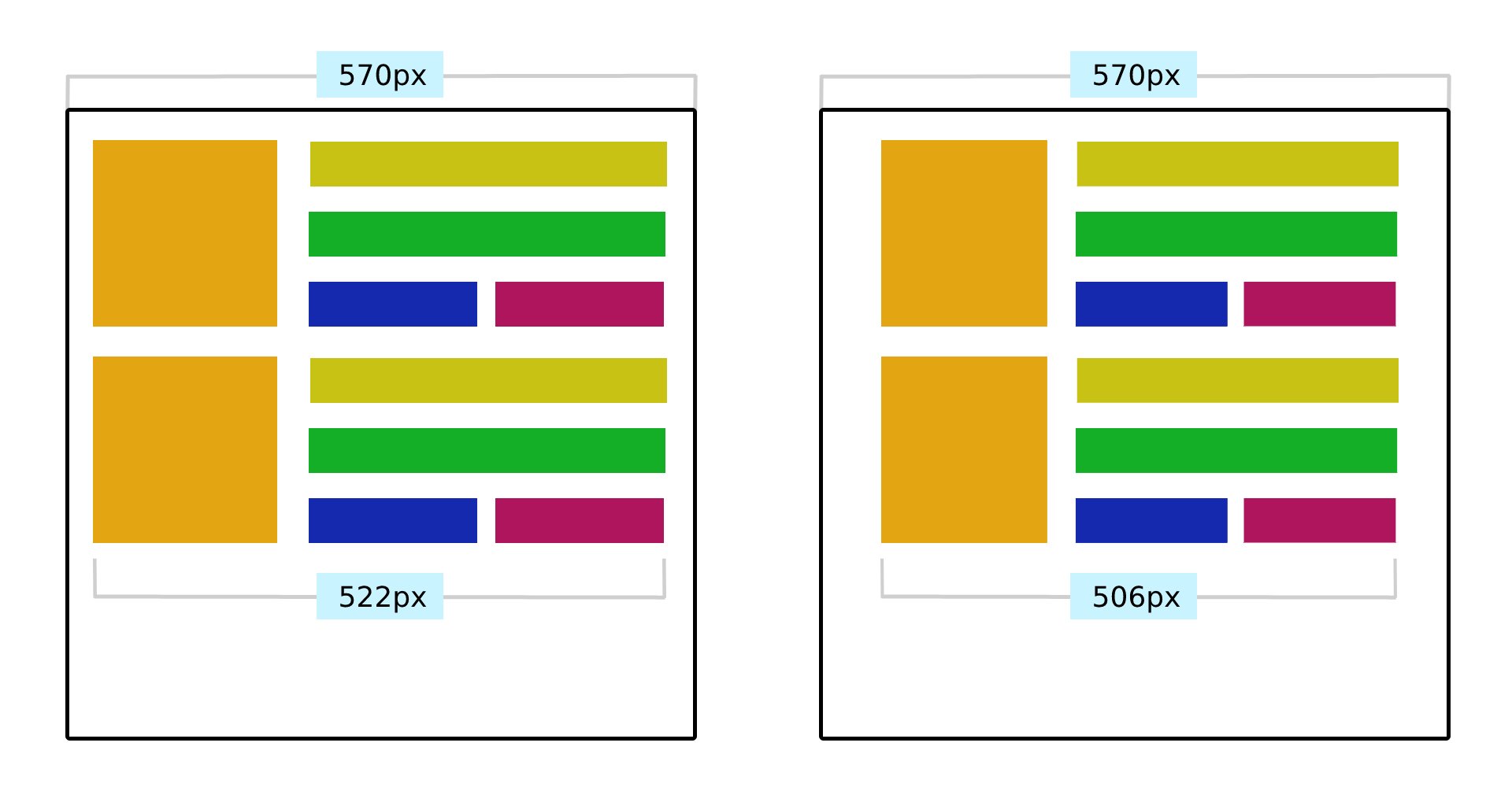
Both card__wrapper and card__image element are children of card element which has the contain property defined. When we replace the regular media queries with container queries, remove the additional CSS classes for narrow containers, and run the CodePen example in a browser that supports container queries, we get the following result.

In this example, we’re not resizing the viewport, but the <section> container element itself that has resize CSS property applied. The component automatically switches between layouts depending on the container dimensions. (Large preview)

See the Pen Product Cards: Container Queries by Adrian Bece.

Please note that container queries currently don’t show up in Chrome developer tools, which makes debugging container queries a bit difficult. It’s expected that the proper debugging support will be added to the browser in the future.

You can see how container queries allow us to create more robust and reusable UI components that can adapt to virtually any container and layout. However, proper browser support for container queries is still far away in the feature. Let’s try and see if we can implement container queries using progressive enhancement.

Progressive Enhancement & Polyfills

Let’s see if we can add a fallback to CSS class variation and media queries. We can use CSS feature queries with the @supports rule to detect available browser features. However, we cannot check for other queries, so we need to add a check for a contain: layout inline-size style value. We’ll have to assume that browsers that do support inline-size property also support container queries.

/* Check if the inline-size value is supported */
@supports (contain: inline-size) {
.card {
contain: layout inline-size style;
}
}

/* If the inline-size value is not supported, use media query fallback */
@supports not (contain: inline-size) {
@media (min-width: 568px) {
/* … */
}
}

/* Browser ignores @container if it’s not supported */
@container (min-width: 568px) {
/* Container query styles */
}

However, this approach might lead to duplicated styles as the same styles are being applied both by container query and the media query. If you decide to implement container queries with progressive enhancement, you’d want to use a CSS pre-processor like SASS or a post-processor like PostCSS to avoid duplicating blocks of code and use CSS mixins or another approach instead.

See the Pen Product Cards: Container Queries with progressive enhancement by Adrian Bece.

Since this container query spec is still in an experimental phase, it’s important to keep in mind that the spec or implementation is prone to change in future releases.

Alternatively, you can use polyfills to provide a reliable fallback. There are two JavaScript polyfills I’d like to highlight, which currently seem to be actively maintained and provide necessary container query features:

cqfill by Jonathan Neal
JavaScript polyfill for CSS and PostCSS
react-container-query by Chris Garcia
Custom hook and component for React

Migrating From Media Queries To Container Queries

If you decide to implement container queries on an existing project that uses media queries, you’ll need to refactor HTML and CSS code. I’ve found this to be the fastest and most straightforward way of adding container queries while providing a reliable fallback to media queries. Let’s take a look at the previous card example.

<section>
<div class=”card__wrapper card__wrapper–wide”>
<!– Wide card content –>
</div>
</section>

/* … */

<aside>
<div class=”card__wrapper”>
<!– Narrow card content –>
</div>
</aside>

.card__wrapper {
display: grid;
grid-gap: 1.5em;
grid-template-rows: auto auto;
/* … */
}

.card__image {
/* … */
}

@media screen and (min-width: 568px) {
.card__wrapper–wide {
align-items: center;
grid-gap: 1.5em;
grid-template-rows: auto;
grid-template-columns: 150px auto;
}

.card__image {
/* … */
}
}

First, wrap the root HTML element that has a media query applied to it with an element that has the contain property.

<section>
<article class=”card”>
<div class=”card__wrapper”>
<!– Card content –>
</div>
</article>
</section>

@supports (contain: inline-size) {
.card {
contain: layout inline-size style;
}
}

Next, wrap a media query in a feature query and add a container query.

@supports not (contain: inline-size) {
@media (min-width: 568px) {
.card__wrapper–wide {
/* … */
}

.card__image {
/* … */
}
}
}

@container (min-width: 568px) {
.card__wrapper {
/* Same code as .card__wrapper–wide in media query */
}

.card__image {
/* Same code as .card__image in media query */
}
}

Although this method results in some code bloat and duplicated code, by using SASS or PostCSS you can avoid duplicating development code, so the CSS source code remains maintainable.

Once container queries receive proper browser support, you might want to consider removing @supports not (contain: inline-size) code blocks and continue supporting container queries exclusively.

Stephanie Eckles has recently published a great article on container queries covering various migration strategies. I recommend checking it out for more information on the topic.

Use-Case Scenarios

As we’ve seen from the previous examples, container queries are best used for highly reusable components with a layout that depends on the available container space and that can be used in various contexts and added to different containers on the page.

Other examples include (examples require a browser that supports container queries):

Modular components like cards, form elements, banners, etc.
Adaptable layouts
Pagination with different functionalities for mobile and desktop
Fun experiments with CSS resize

Conclusion

Once the spec has been implemented and widely supported in browsers, container queries might become a game-changing feature. It will allow developers to write queries on component level, moving the queries closer to the related components, instead of using the distant and barely-related viewport media queries. This will result in more robust, reusable, and maintainable components that will be able to adapt to various use-cases, layouts, and containers.

As it stands, container queries are still in an early, experimental phase and the implementation is prone to change. If you want to start using container queries in your projects today, you’ll need to add them using progressive enhancement with feature detection or use a JavaScript polyfill. Both cases will result in some overhead in the code, so if you decide to use container queries in this early phase, make sure to plan for refactoring the code once the feature becomes widely supported.

References

“Container Queries: A Quick Start Guide” by David A. Herron
“Say Hello To CSS Container Queries,” Ahmad Shadeed
“CSS Containment In Chrome 52,” Paul Lewis
“Helping Browsers Optimize With The CSS Contain Property,” Rachel Andrew
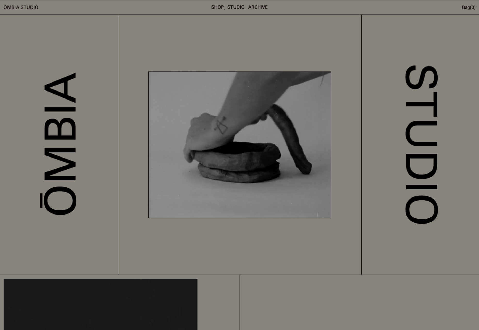
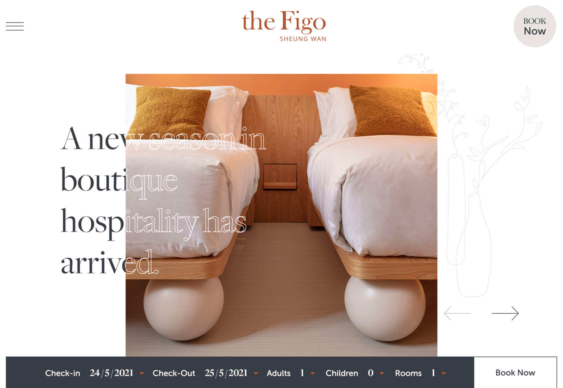
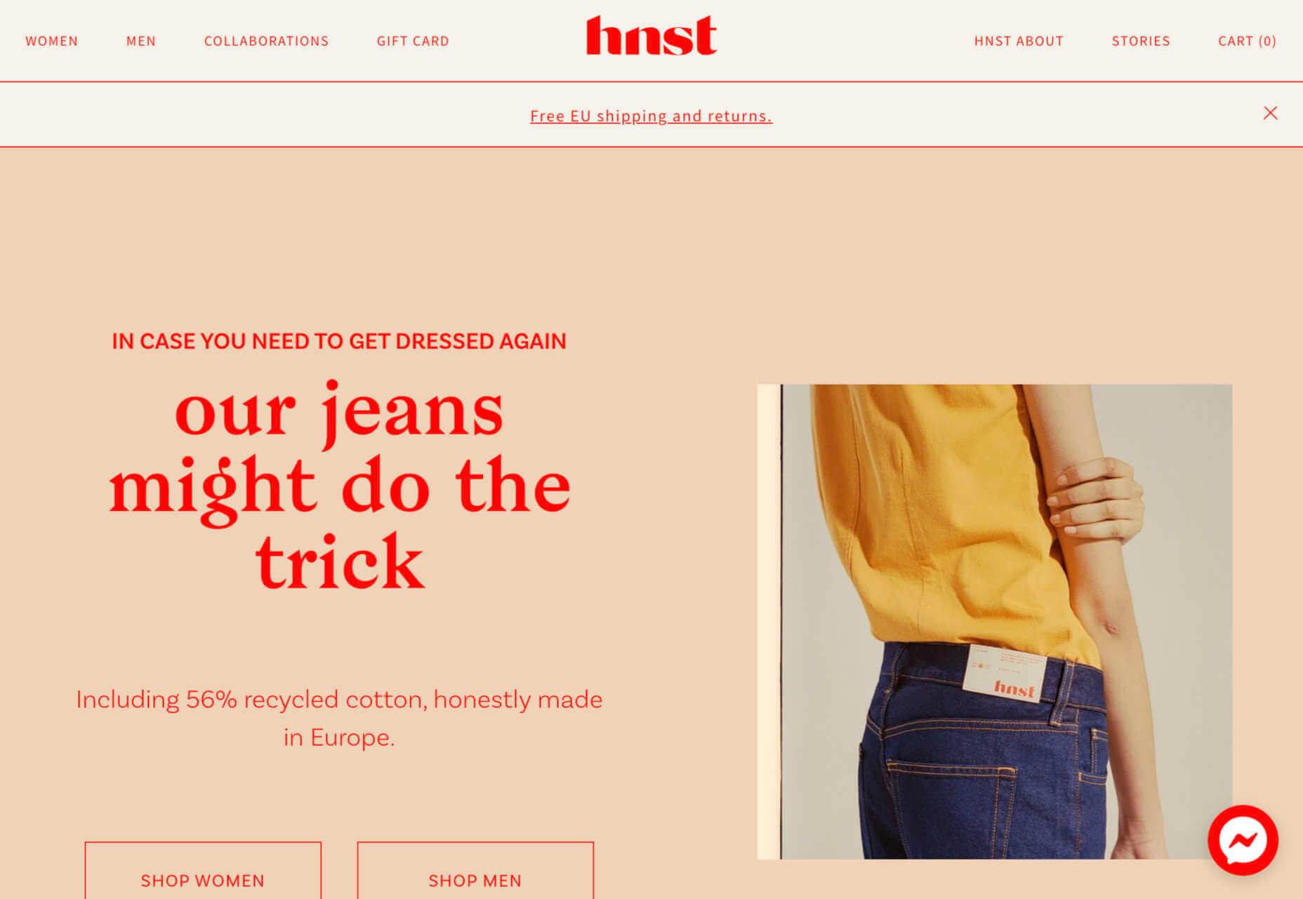
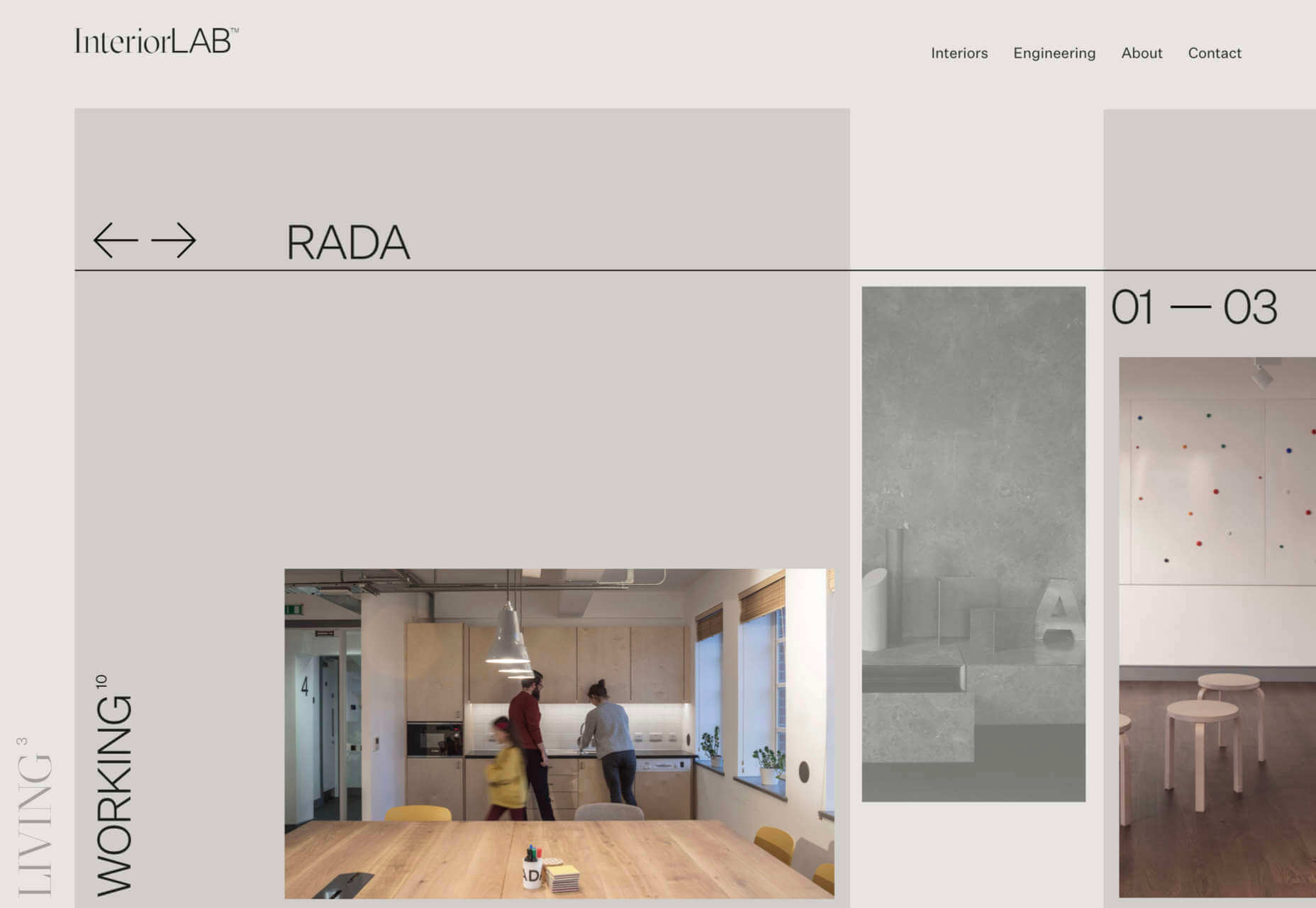
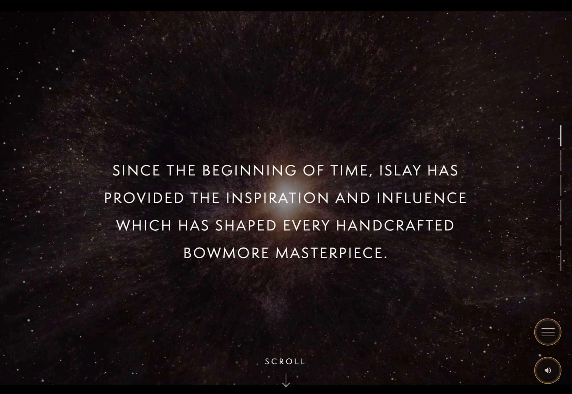
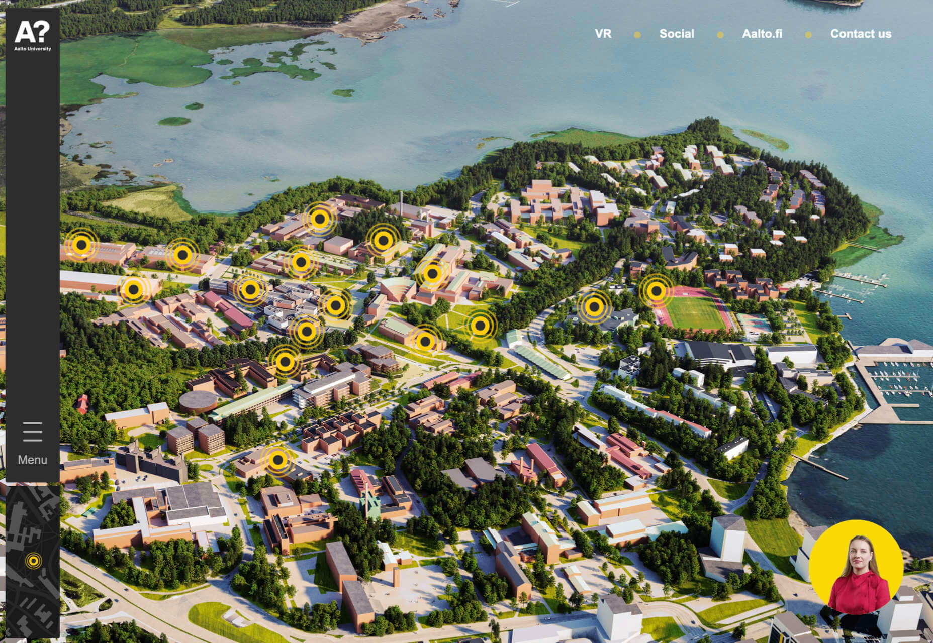
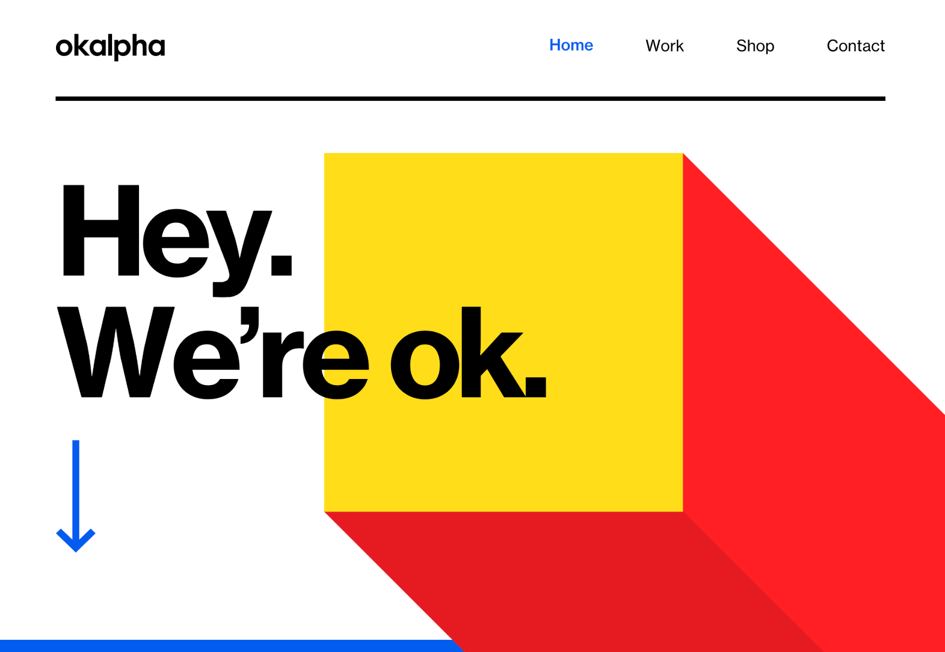
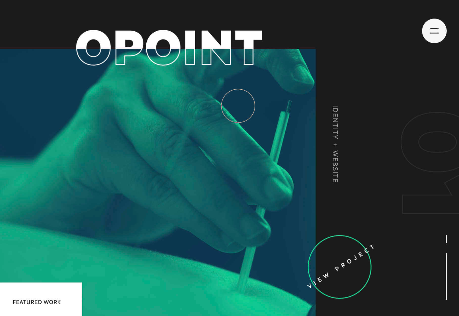
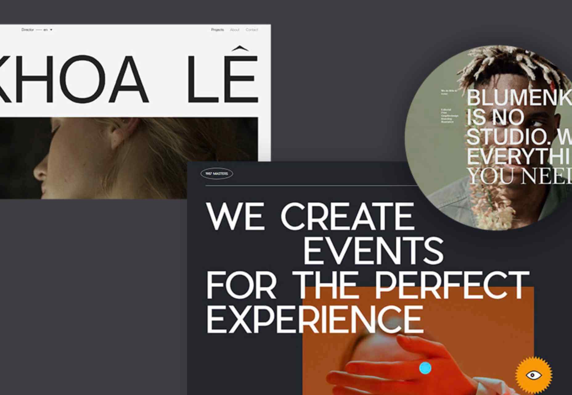
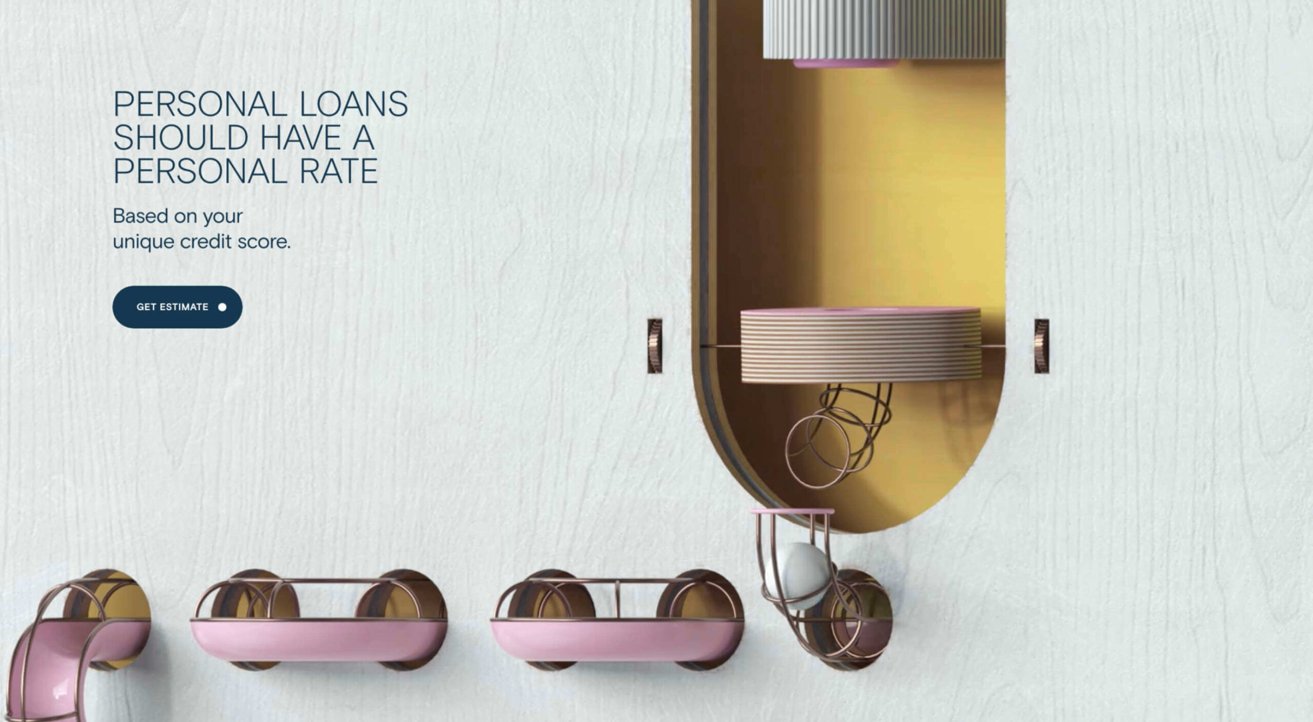
6 Ways Parallax Still Works in 2021 

Original Source: https://www.webdesignerdepot.com/2021/05/6-ways-parallax-still-works-in-2021/

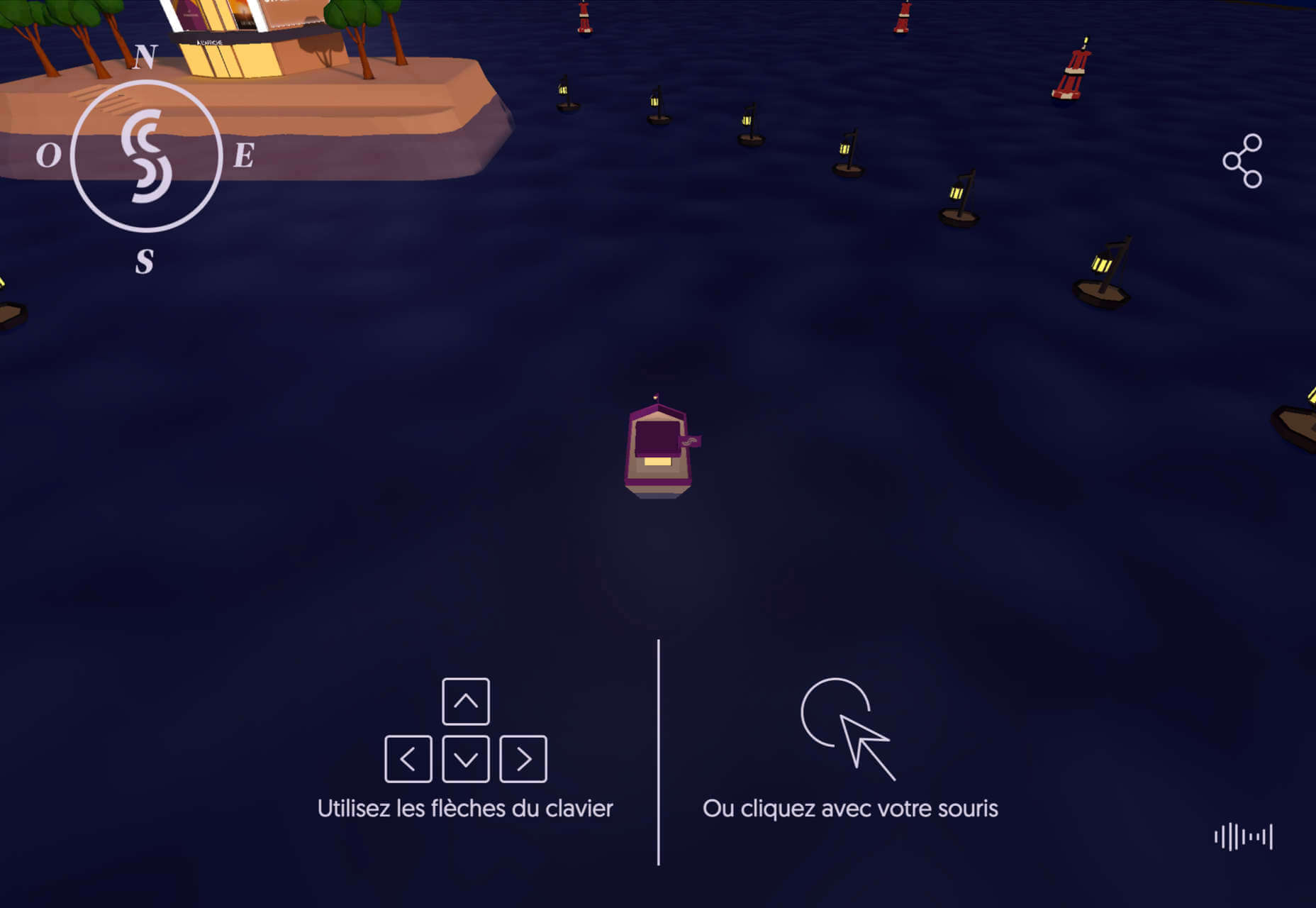
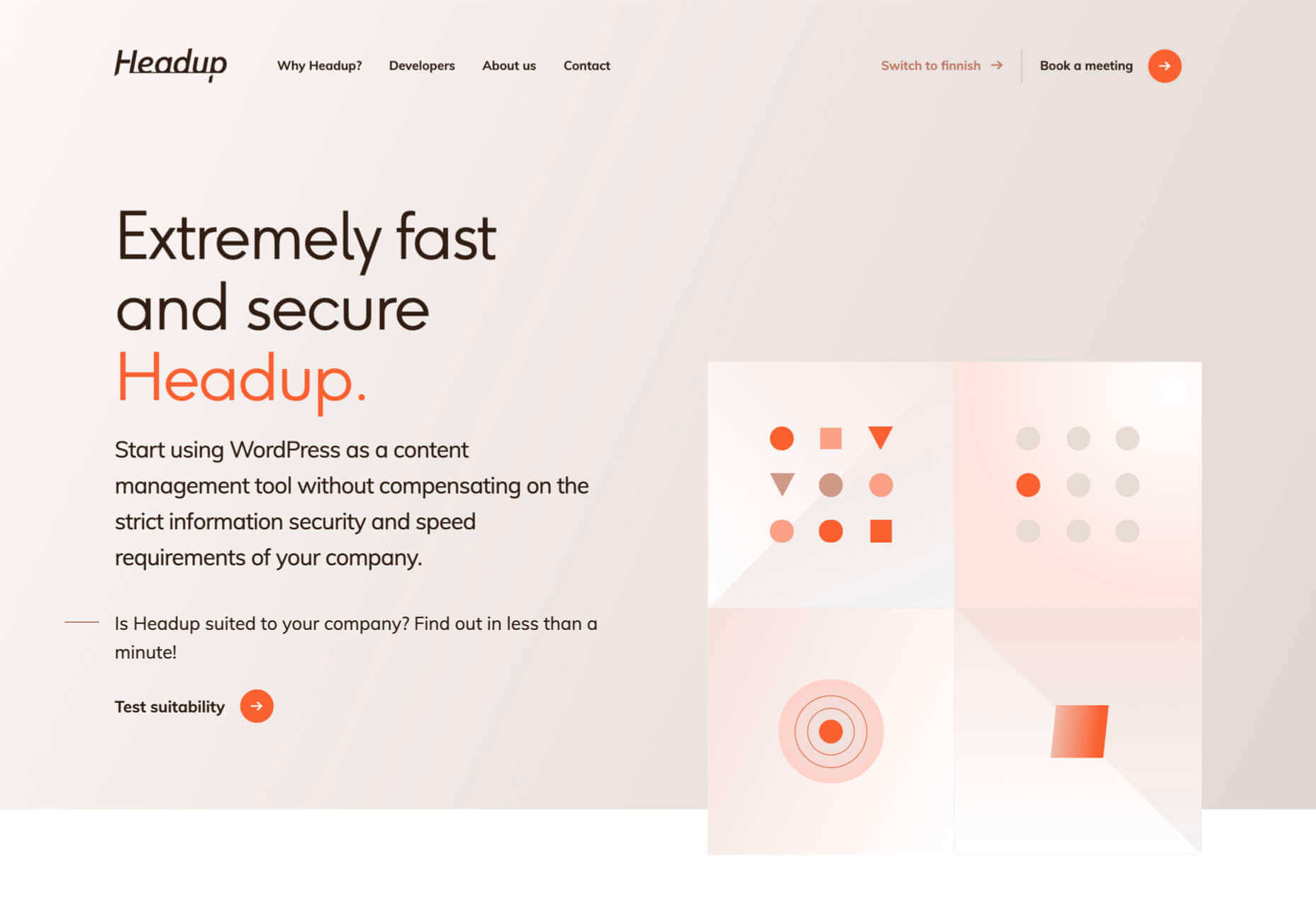
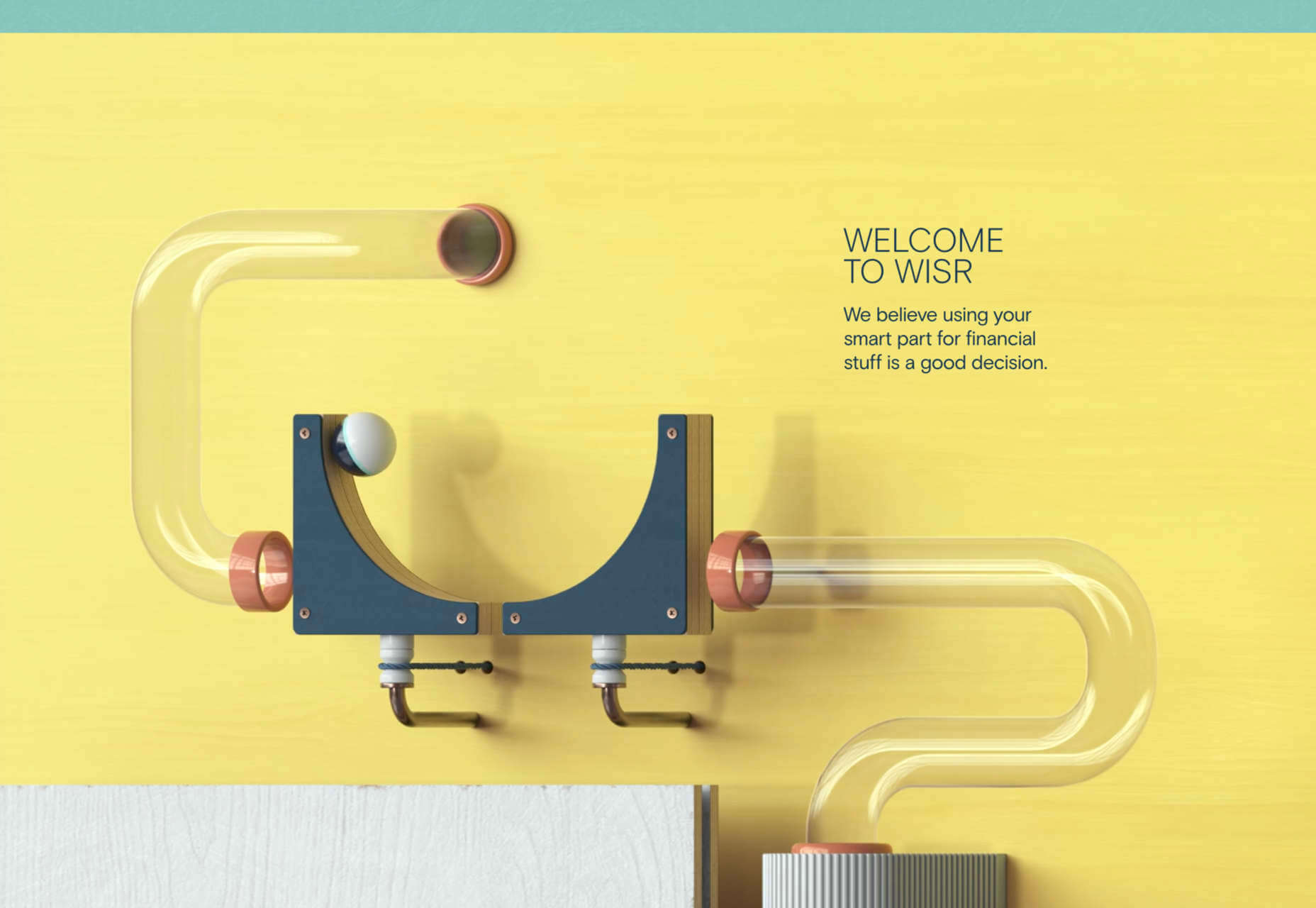
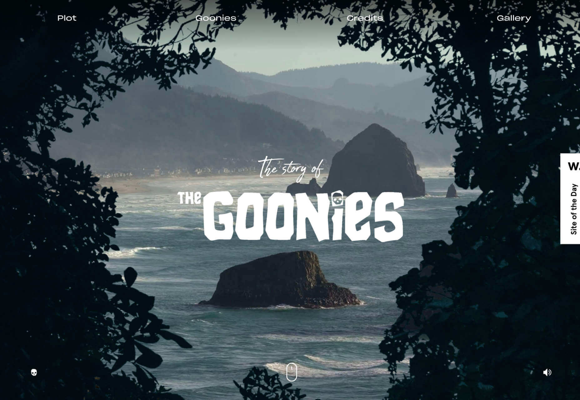
Parallax is a term that is applied loosely and frequently in the world of web design. As a trend, it has been popular and unpopular in equal measures for some time. However, it’s still one of the most valuable tools for animation in the digital world.

Parallax creates an illusion of depth when scrolling, a timeless effect that still has lots of value in the web design world.

Sure, parallax has its issues, from problems with usability, to concerns with mobile responsivity — but it’s also an interesting way to make a website stand out when done correctly.

Let’s take a closer look at some of the ways that parallax scrolling still works in 2021…

1. Parallax Tells A Story

Let’s start simple. 

One of the most effective ways to use parallax scrolling in the modern age is to tell a story. Today’s consumers want to have an emotional connection with the brands they buy from – now more than ever. Five years ago, studies showed that around 80% of customers want brands to tell stories, and that trend remains consistent to this day.

In the age of digital consumerism, where people can’t get to know a company in person through face-to-face interactions with its salespeople, companies need new ways to connect with their clients. Telling brand-driven stories is a way to highlight that your company is more than just a faceless entity – it’s something with real soul. 

Let’s look at the “Recap After Use” website, a portfolio belonging to the innovative Louie Sellers. This website showcases Louie’s skills with attention-grabbing visuals, including a parallax animation that makes it looks like Louie is drawing the page as you scroll through it.

This is the kind of exceptional animation that makes parallax scrolling more compelling. The animation isn’t there to make a visual difference to the page – it tells you something more about the person behind the website and what they can do.

2. Parallax Increases Website Visit Times

If a website effectively tells a story with parallax animation, you can also bet that’s going to keep customers or readers on a page for longer. Reducing bounce rate by increasing engagement is one of the main goals of any web designer. (Bounce rates, of course, refer to the percentage of site visitors that hit the back button after just seeing the first page of your website.)

While some people argue that parallax websites can hurt your SEO rankings if they slow down your site, there’s also the argument that the lack of a visually engaging page can harm SEO. Bounce rates drag down your ranking and make it harder to get audience attention. 

A parallax animation that tells a story and engages your audience through carefully delivered information is a great way to keep people around – even just for a little longer than usual. For instance, if you check out Alex Dram’s portfolio page here, you’ll see several shapes coming together during the parallax scrolling animation.

The shapes merge to tell a story about the visual experiences that Alex can create for customers. It’s a way to draw the eye and connect with the viewer without just writing about what you do through text. 

3. Parallax Develops Credibility

There’s a reason why both examples of parallax scrolling we’ve looked at so far are from creative portfolios. Parallax scrolling, with its excellent storytelling capabilities, is great for demonstrating your credibility as a digital expert. Basically, it’s a version of “showing” and not “telling” customers about your skills. 

You can tell someone that you know how to use tricky techniques like parallax animation correctly, but they’re less likely to believe you that way. If you can show that you have the skills to create something amazing, that’s more engaging. 

The OK Alpha team is a great company to reference when it comes to sensational design. This company seems to always be on the cutting edge of the latest trends, whether it’s bold typography or bright colors. To add to the impact of their website, the company has combined parallax effects into the mix to make everything more immersive as you scroll. 

This is a beautiful example of how companies in the design landscape can use techniques like parallax scrolling to show what they’re capable of. 

4. Parallax Makes Information More Fun

Most of us are naturally visual learners. We like to consume information in a way that’s refreshingly eye-catching and attractive. That’s why visual content generally earns more social shares and attention than written content. With parallax scrolling, companies that want to deliver valuable information and educational content to their audience can do so effectively.

Rather than just scrolling through a page and seeing lots of text, your customers can see images and graphs come to life alongside the blocks of text they’re reading. It’s like adding video demonstrations next to a textbook to help people better understand what they’re reading about. 

Look at the Web Design and Art History microsite from Webflow as an example. The company wants you to understand how web design and art have evolved over the years, but it doesn’t want to deliver that information in a boring format. The bright graphics and parallax animation work together to give you a more contextual, meaningful experience.

5. Parallax Replicates Another Medium

What if you could remind someone of their experience when reading a book or watching a video while telling them about a video or a novel? Parallax scrolling and animation can help with that. It’s a way of making your website feel like a video presentation or slideshow without the added components of implementing video players into your back end. 

Parallax scrolling also has another slight benefit over a standard video-based website. On a website that uses a video for a background, the video often plays automatically. This means that your visitors can’t control how quickly the video plays. 

On the other hand, parallax animations driven by scrolling action allow your customer to collect information at a pace that suits them. Take a look at the Story of the Goonies website, for instance. This stunning parallax site introduces you to the details you need to know about the movie in a way that makes it feel like the intro to a film.

The great thing about the parallax on this site is that the slow video-style design also gives you a dose of nostalgia – which ties in perfectly with the movie. 

6. Parallax Is More Memorable

What’s the main reason any designer does anything special to a website? To make it stand out, of course. Web design is all about conveying the unique essence of a brand, business, or entity in a way that’s going to make that client unforgettable. Although parallax isn’t as novel as it once was, it can still be a way to make your site stand out – if it’s used correctly. 

The key to success with parallax scrolling for memorability is making it smart. The layout needs to feel simple and intuitive. Everything needs to work well together, from the lightly shifting font to the various parallax effects that work together to draw the viewer’s eye (and attention). 

A great example comes from Jomor Design – another designer with a portfolio that really grabs your focus from the first second. The layout is beautifully done, with plenty of mini moments for engagement and interactions throughout. As you scroll through the site, you get a better idea of what the designer is all about. The little moments of animation make the whole experience so much more memorable. 

When your site is more memorable and engaging than that of your competition, you can drive many major benefits for your brand, including an improved bounce rate.

What To Remember When Using Parallax

Parallax is just like any other design technique. There are ways you can do it wonderfully, which engage and delight your audience. However, there are also a lot of areas where you can easily go wrong. When using any design element, the main thing to remember is that the primary focus should always be your users’ experiences. Parallax shouldn’t just be a way to show off your design knowledge. It’s just another feature that you can use to create an amazing website. 

Remember that user experience and visual appeal need to work perfectly together for parallax to work. If scrolling through the page is practically impossible for people on a mobile device, then you’re not going to get the results you want. If it’s difficult to take in the message you’re trying to send because the content is moving too quickly, again, your users will suffer. 

Remember the following tips:

Simple is better: Reduce the amount of content and visual elements on your page whenever you can. The less information there is to capture your customer’s attention, the less likely it is that you’re going to end up with a problem. 
Compress file sizes: Make sure that you’re not reducing the speed of your website by creating a huge single page with tons of high-quality images. You’re going to need to use the smallest possible file sizes. 
Check responsiveness: Make sure that the parallax effect works just as well on your smartphone or tablet as it would on a desktop. As more people move their browsing experiences into their palms, you can’t afford to ignore responsivity. 
Find the “wow”: Look at these examples of parallax websites. Every one stands out because it does something special with the scrolling effect. If you’re going to be using this strategy with your website, you need to make sure it’s worth the effort. Don’t just follow the same guidelines as everything else. Find the idea that’s going to make people take notice.

Source

p img {display:inline-block; margin-right:10px;}
.alignleft {float:left;}
p.showcase {clear:both;}
body#browserfriendly p, body#podcast p, div#emailbody p{margin:0;}

The post 6 Ways Parallax Still Works in 2021  first appeared on Webdesigner Depot.

Apple FINALLY fixes the iPhone's most annoying flaw (kind of)

Original Source: http://feedproxy.google.com/~r/CreativeBloq/~3/BYLQEwmdPkM/apple-finally-fixes-the-iphones-most-annoying-flaw-kind-of

Great news – but there’s a catch.

Popular Design News of the Week: May 10 2021 – May 16, 2021

Original Source: https://www.webdesignerdepot.com/2021/05/popular-design-news-of-the-week-may-10-2021-may-16-2021/

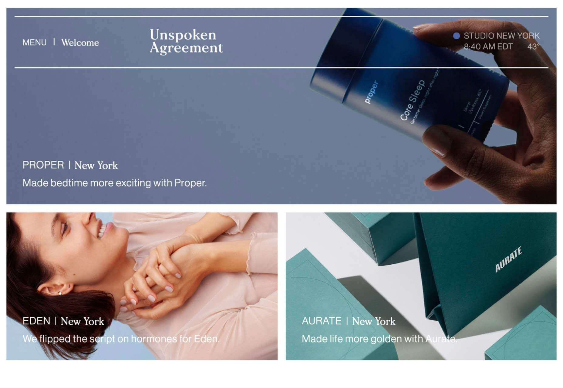
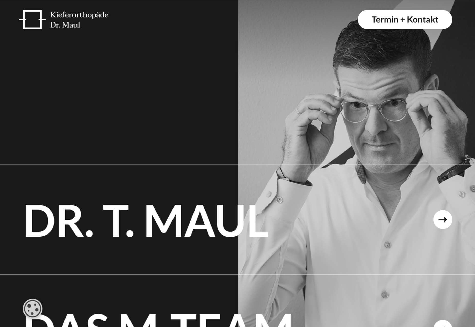
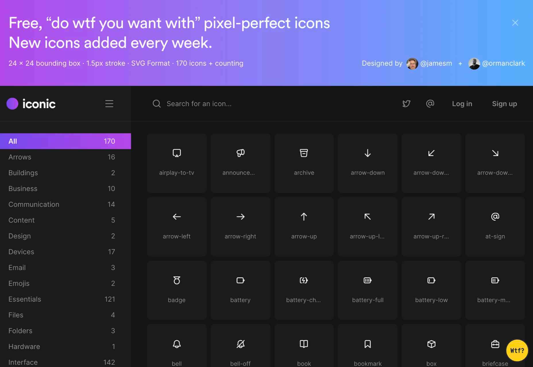
Each day design fans submit incredible industry stories to our sister-site, Webdesigner News. Our colleagues sift through it, selecting the very best stories from the design, UX, tech, and development worlds and posting them live on the site.

The best way to keep up with the most important stories for web professionals is to subscribe to Webdesigner News or check out the site regularly. However, in case you missed a day this week, here’s a handy compilation of the top curated stories from the last seven days. Enjoy!

Little Smashing Stories

All-In-One Browser Extension For Web Development

26 Exciting New Tools For Designers, May 2021

10+ CSS Wave Animation Examples

Speeding Up Development Process with Bootstrap 5

Desqk: Set Your Creative Life Free

Facebook Cover Maker

Just Use Email

A to Z of Figma: Tips & Tricks!

Free, “Do WTF You Want With” Pixel-Perfect Icons

The Use of Uppercase Sans Serif Typography in Modern Web Design

Yes, You Need A Design Process

CSS Hell

Codewell: Improve Your HTML And CSS Skills

Dashboard for Tailwind CSS

Source

p img {display:inline-block; margin-right:10px;}
.alignleft {float:left;}
p.showcase {clear:both;}
body#browserfriendly p, body#podcast p, div#emailbody p{margin:0;}

The post Popular Design News of the Week: May 10 2021 – May 16, 2021 first appeared on Webdesigner Depot.

UX Design Doesn’t End With Your Website

Original Source: https://www.webdesignerdepot.com/2021/05/ux-design-doesnt-end-with-your-website/

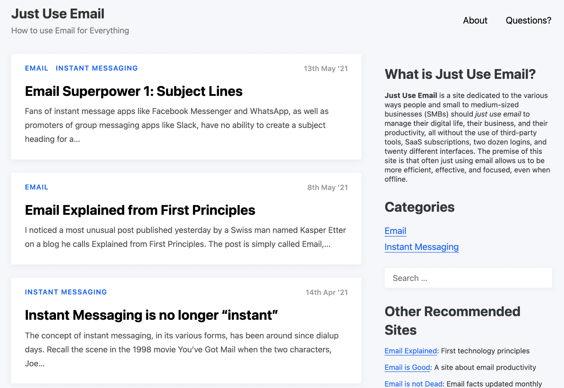
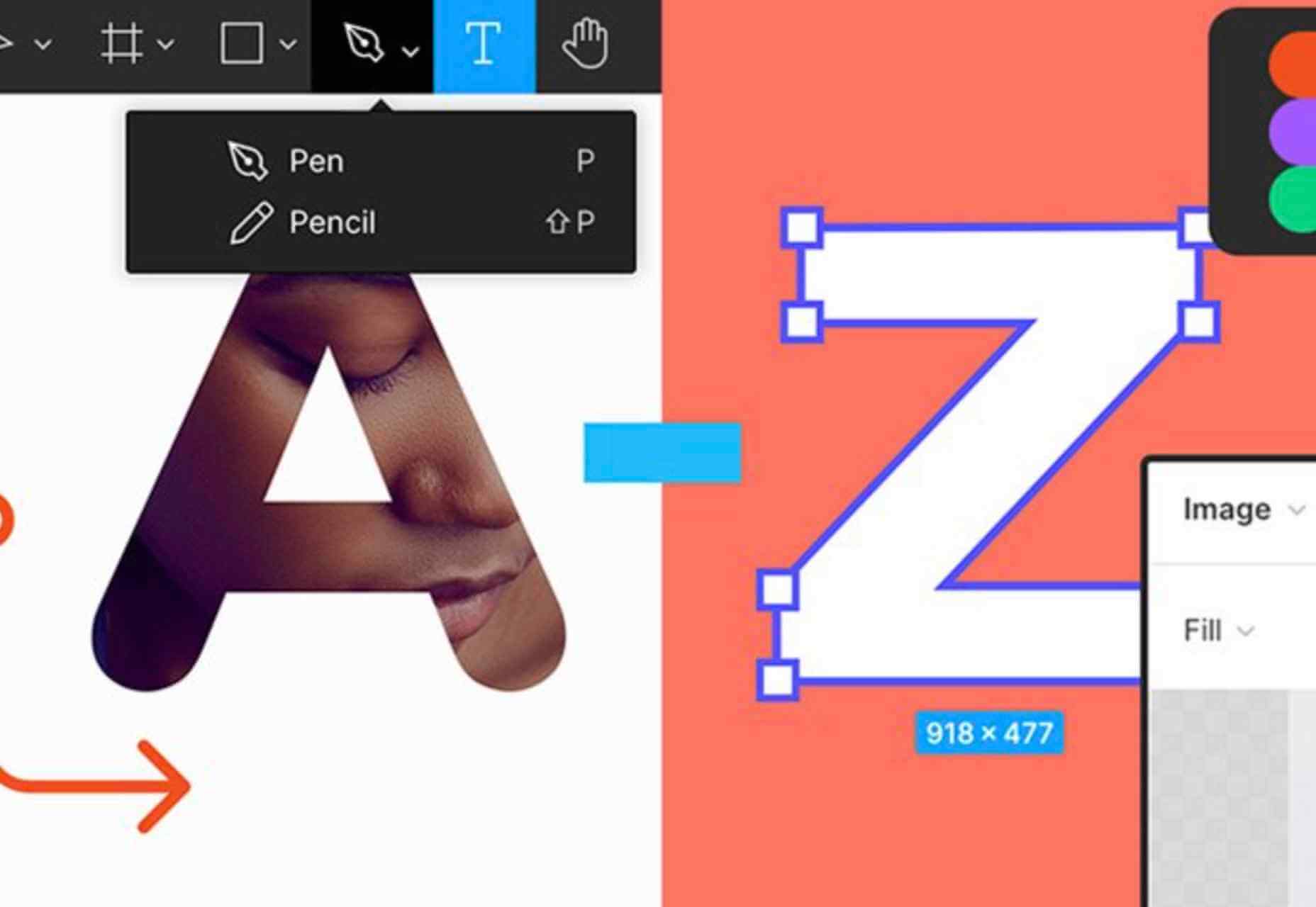
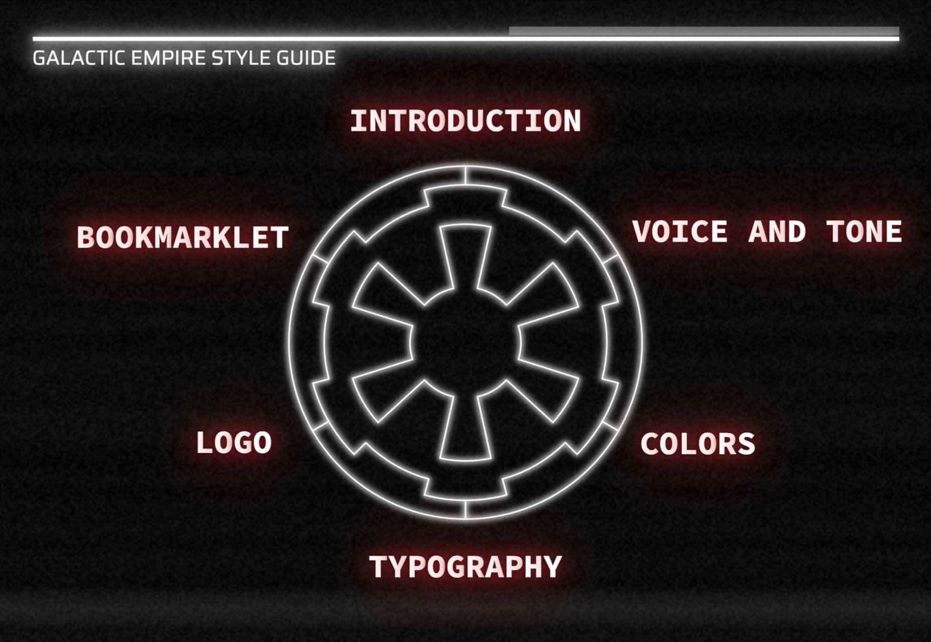
User experience design is something that most of us associate with websites. But why isn’t it something we extend beyond the website?

Here’s why I ask this:

As a consumer, it’s so rare that your only interaction with a brand is through its website. Take an ecommerce site, for example. You buy a product from it, and then what happens?

You get a confirmation email;
You get another email when the package ships;
You might get another email or SMS notification when the package is delivered;
You retrieve the package and open it;
You open up your purchase and use it.

These are all an extension of that initial user experience on the site. If there’s just one hiccup along the way, it could easily erode the trust and happiness you felt after quickly finding and buying what you needed on the site.

So, what I’d like to do today is look at 10 areas where UX design should extend beyond the website to ensure that the frictionless experience started there remains untarnished.

Extending UX Design Beyond the Website

As a web designer, you might be thinking that this part of the user experience doesn’t fall under the umbrella of your responsibilities. And you may be right about that.

For brands to truly be successful and profitable, someone needs to carefully examine the bigger picture and ensure that the user experience is flawless no matter how far away from the site it is. At the very least, you should share the UX research and strategy you do for a client’s site so their team can ensure it carries over to other areas of the business.

Here are some things to think about:

1. Mobile App

It’s not uncommon for websites to have mobile app counterparts these days. The layout doesn’t need to be identical since mobile users tend to behave differently than those on desktop.

That said, an app shouldn’t force users accustomed to the desktop experience to re-learn how to navigate or engage with the brand. So, the branding, UI design, speed, security, and navigation all need to be on par with what’s already been established in terms of usability.

2. Email

Most websites have a direct connection to email. For example, blog newsletters, purchase confirmation emails, and lead generation follow-ups all start on the website.

Consumers are well aware that when they hand over their email address, they will receive an email in return. In many cases, those emails are welcomed when they’re done right. But if something feels off, that bridge could easily burn between brand and consumer.

To preserve the UX, emails should come with the following:

The same branding and visual style as the website;
A personalized subject line, greeting, or offer;
Consistent messaging as the site, especially when it comes to the CTA.

Another thing to remember is that email isn’t the time to inject dark patterns into the experience. So, the “Unsubscribe” option should be in an easy-to-spot area and a sharply contrasting font color.

3. Social Media

Social media is another channel that’s commonly connected to a website. While you can’t control the aesthetics of social media websites themselves, the visuals and messaging in posts need to be on-brand.

That means that things like memes and emojis — which are popular means of communication on social — should only be used if they’re normally part of the brand identity. If not, you’ll need to find other ways to communicate engagingly.

Another part of the user experience to think about is customer support. Social media is a lot like going into a store. If someone has an issue with what they bought or the service they received, there will be many people around to witness the complaint. Social media only amplifies that — so the quality of customer care needs to be consistent with how the brand handles it everywhere else.

4. SMS

Not every brand will need to be connected to customers via text messaging. eCommerce companies, news sites, and personal services providers likely will, though.

However a brand uses SMS, the same UX guidelines apply here as they do across all other channels:

Keep messages concise;
Make sure they’re relevant and valuable;
Use branded messaging and design;
Don’t abuse the privilege and send too many;
Make it easy to opt out.

Basically, if you can’t make it a valuable extension of the brand’s offering, don’t use it.

5. Phone

Any website that publishes its phone number should expect to receive calls from prospects and customers. While there’s nothing to design here visually, the experience of getting on the phone with a company should be consistent with what they experience elsewhere.

One way to do this is to design an easy-to-follow routing system. It should be simple for callers to figure out which number to choose. What’s more, there should be no endless loops. If a caller has exhausted the options, they should be immediately directed to a representative.

Another way to ensure consistency is to adhere to a script — that goes for call centers for enterprises as well as the local lawyer’s office. Every caller should be greeted with the same tone and handled in the same manner (depending on the situation, of course).

6. Ads

There are a lot of places where brands can advertise these days:

Google search;
Social media;
Ad networks;
TV;
Radio;
Podcasts;
Blogs;
Billboards;
Direct mail.

When designing an ad campaign, there should be consistent messaging, aesthetics (when relevant), and CTAs presented. If branding isn’t consistent from ad to ad, there may be a delay in consumers recognizing the brand or its offer. Or, worse, not recognizing it at all.

7. Packaging

For brands that sell products, you have to think about how the packaging will impact the user experience. There are two types of packages to consider, too.

The first is the product’s own packaging. Branding should be clear as day and consistent with the site they bought it from.

It should also be easy to open. There’s nothing more frustrating than finally getting your purchase, only to realize you need tools to get it out of the packaging.

You also have to think about packaging for products that get shipped.

The product should fit well within the packaging. A too-roomy package will feel downright wasteful. So will excessive bubble wrap and paper filler.

Having a shipping label present in the package is also important. If the website makes it easy to make a purchase, the package should offer a convenient way to return the product if they’re not happy.

8. Product

The product itself has to align with the expectations set by the website.

Take the example of a SaaS. You’ve built an awesome landing page and mobile app store page to promote it. It looks great, it loads fast, and it’s easy to get around. But if the SaaS itself is ugly, disorganized, slow, or otherwise just clunky, all of the work you did to market it will end up being just false advertising.

So, make sure the expectations set before and during purchase naturally carry over to the experience with the product.

9. Business Exterior

For brick-and-mortar companies, the business’s exterior matters just as much as what happens inside it.

The most obvious thing to focus on is the aesthetics of the building. Does it look attractive? Is it in a safe area? Is there clear signage around it? Is it easy to find?

But you also have to think about user experiences that take place outside of the building. For example, there’s now a rise in curbside pickup. There are tons of things that can affect how happy the customer is with the experience — like if the pickup area is hard to find, there are never enough spots or the associates who deliver the orders always seem to be in a foul mood.

The business’s exterior should always set a good impression for what takes place inside.

10. Business Interior

Here are some things to think about when it comes to “designing” business interiors for a good UX:

Decor;
Layout;
Signage;
Furnishings;
Product discoverability;
Availability (of products or people);
Quality of customer service;
Checkout process.

It doesn’t matter what the company does — whether it’s a large retailer like Walmart or your own freelance design business. If a business’s establishment doesn’t look good, operate flawlessly, or provide a good person-to-person experience, it’s going to be very hard to get people to return.

So, all those things you do to design a streamlined website journey should be applied to a bricks-and-mortar business’s interior.

Wrapping Up

Depending on the types of companies you build sites for, some of the channels and suggestions above might not be relevant. Hopefully, this has got you thinking about other ways you (and your clients) can extend the UX design and strategy from the website.

If you can maintain the high-quality user experience from channel to channel, your clients’ brands will get more business, grow their profitability, and see a rise in loyalty, too.


Featured image via Pexels.

Source

p img {display:inline-block; margin-right:10px;}
.alignleft {float:left;}
p.showcase {clear:both;}
body#browserfriendly p, body#podcast p, div#emailbody p{margin:0;}

The post UX Design Doesn’t End With Your Website first appeared on Webdesigner Depot.