Original Source: https://www.smashingmagazine.com/2018/05/how-do-you-know-website-success/
How Do You Know Your Website Is A Success?
How Do You Know Your Website Is A Success?
Nick Babich
2018-05-29T16:30:32+02:00
2018-06-04T11:19:00+00:00
(This article is kindly sponsored by Adobe.) We live in a world where just about every business has an online presence. Let’s say you want to reach out to a business — what would be the first thing you would do? Well, you would probably look up their website to search for answers to your questions or simply any contact details you can find. With no doubt, the first impression of any website is now more important than ever.
There are more than 1.8 billion websites on the Internet right now, and the number is growing. The increase of the competition brings a great interest in examining the factors of success of a website. While no one will argue that it’s essential to have a successful website, it’s still not easy to understand what exactly success means and how to actually measure it.
Define What Site Success Means To You
Set A Global Goal
Finding the answers to questions such as “What are our goals?” and “What do we want to achieve with this website?” should be the first thing to do when starting a new project. Skipping a stage of defining global goals and moving directly to the design stage is a pretty common mistake among many product teams. Without knowing exactly what you want to achieve, your chances of making a positive impact with your website will be poor.
Every website needs a well-defined product strategy. A strategy sets the tone for all of the activities, and it gives a context that helps in making design decisions. When you have a solid understanding of what you expect to get out of your site, it helps you to work towards that goal.
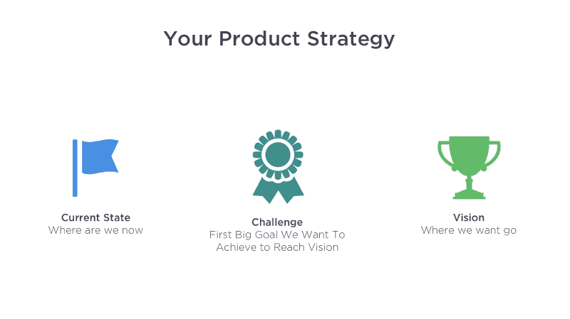 Product strategy is a combination of achievable goals and visions that work together to align the team around desirable outcomes for both the business and your users. (Image credit: Melissa Perri) (Large preview)
Here are a few tips that help you set a goal:
Tie the purpose to business goals.
The website’s purpose should serve to support the company’s mission and make the business more effective in achieving that mission.
Make it specific.
Instead of saying something like “I want to have a strong online presence,” consider this instead: “Our website should be a place where users submit requests for our services. Our goal is to have 50% of our orders submitted online, not over the phone.”
Conduct competitor research.
List sites of your competitors which you find successful, and try to pinpoint why they are successful.
Strive To Create User-Focused Experience
Because visitors ultimately determine the success of a website, they should be in the spotlight during site’s development. As Dieter Rams says:
“You cannot understand good design if you do not understand people; design is made for people.”
Thus, start with gathering this understanding:
Portrait your ideal users.
Try to understand what content they might need/want, their browsing habits (how they prefer to interact with a website) and the level of their technical competence. This knowledge will help you appeal to them better.
Think about the goal of your visitors.
Put yourself in the shoes of your visitor. What do you want them to get done? Place an order? Reach you for a quote? Become a member? Drive the design from the user’s goals and tasks.* *Ideally, each page you design should have a goal for your users.
Create user journey map.
If you have an existing site, you can figure out typical ways people use it by creating user journey maps.
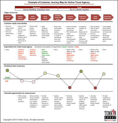
User journey map. (Image credit: Temkin Group)
8 Essential Characteristics Of Website Design That Influence Its Success
In this section, we aren’t going to discuss design implementation details (e.g. where a logo should be placed). We’ll be focusing on the main principles and approaches for effective web design. These principles will be reviewed from the angle of the first impression. It’s essential to focus on great user experience during the first-time visit. Generally, the better the first impression, the better the chance that users will stay for longer. But if the first impression is negative, it might make users want to avoid interacting with your product for years.
And how do we leave a good first impression? Good design. First impressions are 94% design related. While it’s impossible to define one-fits-all design decisions that will guarantee a successful site, it is still possible to focus on factors that are able to create a great first impression: the quality of content, usability, and visual aesthetics.
1. High-Quality Content
The copy used on your website is just as important as the website’s design; it’s the reason why people visit your website. More than 95 percent of information on the web is in the form of written language. Even if your site is beautifully designed, it’s no more than an empty frame without good content. A good website has both great design and great content.
“Content precedes design. Design in the absence of content is not design, it’s decoration.”
— Jeffrey Zeldman
Match Users’ Expectations
Provide information your users expect to see. For example, if you design a website for a chain of restaurants, most visitors will expect to find the restaurants’ menus as well as maps that show where each restaurant is located.
Content That Builds Trust
Trust is what creates a persuasive power; trust makes the user believe in your products or services. That’s why it so important to build a sense of trust on your website. For example, if you design a website that will offer services, you should include content that will bolster a visitor’s confidence in those offerings. A simple way to accomplish this is to provide social proofs — put some testimonials on your site.
One great example is Basecamp. The company lists feedback from its clients together with a data statistic that reinforces the power of the social proof.
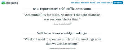
Basecamp pairs testimonials with research findings to create an ultimate persuasive effect.
Focus On Microcopy
Microcopy is the tiny words we use in user interfaces. These might be field or button labels, or description for forms and other UI objects. Right microcopy can influence business profits. But in order to write good microcopy, it’s essential to understand user’s intentions and emotions.
During the Google I/O 2017, Maggie Stanphill explained the possible business value of writing good microcopy. After the Google team changed ‘Book a room’ to ‘Check availability’ in the Hotel search on Google, the engagement rate increased by 17%. This happened because the first version of microcopy (‘Book a room’) was too committal for that stage of the user journey. Users didn’t want to book a room; they wanted to explore all available options (date range as well as prices).

Good microcopy is human-oriented. In this example, ‘Check availability’ meets the user where they are in their mindset.
Text Is Optimized For Scanning
It’s necessary to adjust content to users’ browsing habits. It’s a well-known fact that users don’t read online, they scan. When a new visitor approaches a web page, the first thing s/he does is tries to do is to scan the page and divide the content into digestible pieces of information. By scanning through key parts of the page, they are trying to determine if the content is relevant to their needs.
Here are a few tips on how to format your content to make it easy to scan:
Avoid long blocks of text without images.
With a huge probability, such content will be skipped. Use headings, paragraphs, or bullet points to break up a text.
Optimize layouts for natural scanning patterns.
Eye tracking studies have identified that people scan pages in an “F” pattern. We read the first few lines, but then they start skipping down the page, caching only parts of the message. For this reason, it’s important to keep your text frontloaded — put the most important concepts first, so our eyes catch those important words as we track down.
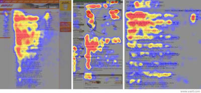
Users don’t read, they scan. This heatmap shows where people’s focal points land. Effectively designed websites work with a reader’s natural behavior. (Image credit: Useit)
Quick design tip: You can measure your readability score using a tool called Webpagefx.
Avoid Distraction
The human eye can instantly recognize moving objects. Moving objects such as animated banners or video advertising can capture users’ attention. An abundance of such content can lead to annoying and distracting experience. Thus, put an emphasis on a site with minimal distractions.
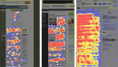
Heatmaps from eye-tracking studies: The areas where users looked the most are colored red; the yellow areas indicate fewer views. Green boxes are used to highlight the advertisements. (Image credit: NNGroup)
Contact Information
Make it easy for people to reach you. This requirement sounds pretty obvious; still, it’s quite a typical situation for first-time visitors to have to hunt for contact information. Don’t let that happen. Make a phone number, email, address and a contact form easily accessible.
Quick design tip: When designing your site, don’t make email or phone number a part of an image. Phone number/email should be in plain text so that users can copy this information.
Relevant Images And Videos In High Quality
Studies have proven that people are majorly visual learners. Most people are able to understand and grasp concepts far better when they are delivered in visual way.
Remember the old saying, “A picture is worth a thousand words”? It’s relevant to web design. A simple way to increase visual appeal is to provide high-quality imagery or video content.
One great example is Tesla which doesn’t tell the benefits of its car but rather shows a quick video that makes it clear what it feels like to drive a Tesla:
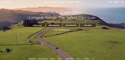
Tesla uses a principle ‘show, don’t tell’ when demonstrating the benefits of using cars.
2. Simple Interactions
According to Hubspot survey, 76% of respondents mentioned ease of use as the most important characteristic of a website. That’s why the “Keep It Simple” principle (KIS) should play a primary role in the process of web design.
Cut Out The Noise
Cluttering a user interface overloads your user with too much information — every added button, image, and line of text makes the screen more complicated. Cutting out the clutter on a website will make the primary message more easily understood by visitors. Include only the elements that are most important for communication, and use enough whitespace. It will help to reduce the cognitive load for the visitors and will make it easier to perceive the information presented on the screen.
Quick design tip: Put more visual weight on important elements. Make important elements such as call-to-action buttons or login forms focal points so visitors see them right away. You can emphasize elements using different sizes or colors.
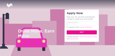
Lyft makes the most important information on a page (the call-to-action button) stand out.
Strong Visual Hierarchy
The better visual hierarchy your create, the easier your content will be perceived by users (Simon’s law). A grid layout allows you to organize information in a way that makes it easier for visitors to read and comprehend information presented on the page. Using grids makes it much easier to create a layout that feels balanced.

Use a grid layout when designing web experiences. Using grids in Adobe XD.
Good Navigation
Good navigation is one of the most important aspects of website usability. Even the most beautifully designed website will be useless if users aren’t able to find their way around.
When developing navigation for your website, think about what pages are most likely to be important to visitors, and how they will move from one page to another. Follow users’ expectations — create a predictable navigation structure and place it where users expect to see it.
Quick design tip: Reduce the total number of actions required for users to reach the destination. Try to follow the Three-click rule which means creating a structure that will enable users to find the information they are looking for within three clicks.
Recognizable Design Patterns
Design patterns are designer’s best friends. When designing your site, it’s worth remembering that users spend most of their time on other sites. Every time the user has to learn how something new works, it creates friction. By using recognizable conventions, you can reduce the learning curve. Recognizable UI patterns eventually help users to parse complicated tasks easily. Thus, when you follow users’ expectations and create a familiar experience (e.g. place UI elements in places where users expect to find them), site visitors can use their previous knowledge and act through intuition. This helps reduce the learning curve and the need to figure out how things work.
3. Fast Loading Time
As technology enables faster experiences, users’ willingness to wait has decreased. Slow loading time is one of the main reasons visitors leave websites. A typical user will only wait for a few seconds for your page to load. If nothing happens during this time, they will consider the site to be too slow, and will most likely navigate away to a competitor’s site.
Slow loading not only creates a lousy impression on users, but it also affects site’s search engine ranking, as slow-loading pages are reduced in rank in Google’s Search engine.
Test Your Website
There are tools available that allow you to test website performance. One of them is Google’s Test My Site which gives you an actionable report on how to speed up and improve your site. WebPage Test is another helpful tool which allows you to run a free website speed test from multiple locations around the globe, using real browsers (Internet Explorer and Chrome) at real consumer connection speeds.
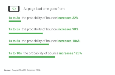
The slower your website is, the higher your bounce rate will be. (Image credit: Luke W.)
Find What Is Causing The Slow Loading Time, And Fix The Problem
If slow loading is a typical situation for your website, try to find out what causes the problem and solve it. Typically, page load times are affected by:
Visual elements (images and animations).
HD images and smooth animation can only create good UX when they don’t affect loading time. Consider reading the article Image Optimization for tips on image optimization.
Custom fonts.
Like any other asset, it takes some time to download a custom font (and it takes more time if the font is located on a 3rd party service).
Business logic.
Whether or not a solution you’ve developed is optimized for fast loading time. There are a lot of things developers can do to minimize the loading time. For example, it’s possible to use file compression and decompression to improve the performance of а website.
Technical infrastructure.
An infrastructure is a place where you host your websites. It includes both hardware and software components as well as internet bandwidth.
Create A Perception Of Speed
If you can’t improve the actual performance of your website, you can try to create a perception of speed — how fast something feels is often more important than how fast it actually is. Employing a technique of skeleton screens can help you with that. A skeleton layout is a version of your page that displays while content is being loaded. Skeletons give the impression of speed — that something is happening more quickly than it really is and improve perceived load time.
 This real estate website reuses some of the data from search results page (the image of the building and basic description) while the detailed information is loading. This creates a sense of immediate response even when some time required to load the data. (Image credit: Owen Campbell-Moore) (Large preview)
Check out this Codepen example of skeleton effect in pure CSS. It uses a pulsation effect to give users a feeling that website is alive and content is loading:
See the Pen Skeleton Screen with CSS by Razvan Caliman (@oslego) on CodePen.
4. Feeling A Sense Of Control
A sense of control remains one of the basic usability heuristics for user interface design. Effective interfaces instill a sense of control in their users.
Good Error Handling
To err is human. Errors occur when people engage with user interfaces. Sometimes, they happen because users make mistakes. Sometimes, they happen because a website fails. Whatever the cause, these errors and how they are handled, have a significant impact on the user experience. Bad error handling paired with useless error messages can fill users with frustration and can lead them to abandon your website. When errors occur, it’s essential to create effective error messages.
Make your website sound human even. Each error message your website display should be clear, clean, and useful.
Designers can use a tactic called design for failure in which you try to anticipate the places users might face problems and plan for such cases. Whereas implementing the ideal user journey is the end goal, the complexities of an individual user’s experience are rarely so cut and dried. Recognizing potential pain points and preparing for it using tools like failure mapping for error recovery helps to ensure that you’re putting forth the best experience you can for the majority of your users.
No Aggressive Pushers
We all know that feeling. You visit a new website, the content on the page seems to be interesting. You begin to read it and just when you are halfway through the text, you are suddenly interrupted by a huge overlay asking you to either subscribe to a newsletter or take advantage of an offer. In most cases, your immediate reaction will be either to close the overlay or to close the entire page, the overlay along with it.
Aggressive pushers such as pop-ups with promotional content will put most people on the defensive. According to the NN Group, pop-ups are the most hated web experience ever.
 Aggressive pushers create bad user experience. (Image credit: Vitaly Dulenko) (Large preview)
Don’t Autoplay Video With Sound
When users arrive on a page, they don’t expect that it will play any sound. Most users don’t use headphones and will be stressed because they’ll need to figure out how to turn the sound off. In most cases, users will leave the website as soon as it plays. Thus, if you use autoplay video content on your site, set audio to off by default, with the option to turn it on.
5. Good Visual Appearance
Does an attractive design lead to more conversion? While there’s no direct connection between attractive design and conversion, visual appearance might increase chances for conversion. As Steven Bradley says:
“Human beings have an attractiveness bias; we perceive beautiful things as being better, regardless of whether they actually are better. All else being equal, we prefer beautiful things, and we believe beautiful things function better. As in nature, function can follow form.”
Capitalize On Trends
Just like with any other area of design, web design is constantly changing. Design trends come and go, and its necessary to be sure that your design doesn’t look dated. Familiarize yourself with latest trends and try to keep your design up to date by tuning your design.
Awwwards and Behance are great places which will help you be familiar with the latest trends.
Avoid Generic Stock Photos
Many corporate websites are notorious for using generic stock photos to build a sense of trust. Such photos rarely hold useful information. Usability tests show that generic photos and other decorative graphic elements don’t add any value to the design and more often impair rather than improve the user experience. Eye-tracking studies show that users usually overlook stock images.

An example of a stock photo
6. Design Is Accessible To All Groups Of Users
You can’t call your design successful if your audience has trouble using it. There’s a direct connection between bad UX and inaccessibility. One typical example of design decisions that often create terrible UX for the sake of beauty is using light grey text on light backgrounds. The example below was taken from one of the most popular powerful platforms for creating websites. Even a person with normal vision will struggle to read a text on this page, and there’s a huge possibility that a visually impaired person wouldn’t be able to read it at all.
Insufficient color contrast paired with small font size create readability issues.
The website you design should be accessible to all groups of users including blind, disabled or the elderly. Be sure to check WCAG documents and WUHCAG’s checklist.
7. Memorable Design
Taking into account the fact that almost all business have an online presence today — no matter what product or service you offer online — there are many other websites offering exactly what you do (perhaps even with the same benefits). It’s essential to set your website apart from the competition by crafting really memorable design.
Barbara Fredrickson and Daniel Kahneman proposed a psychological heuristic called the “peak-end rule” which dictates the way our brain works with information. The peak-end rule states that people judge an experience based mainly on how they felt at its peak (i.e., its most intense point) and at its end, rather than based on the total sum or average of every moment of the experience. The effect occurs regardless of whether the experience is pleasant or unpleasant. In other words, when we remember experiences, we tend to recall not entire experience but only key events that happened. That’s why it’s essential to create a spark that will stay in a user’s memory for a long time.
Color
Color hugely influences on what people remember, and how vividly they remember it. Selective use of color can trigger the memory and be that one added element that ensures your brand stays memorable and recognizable.
For example, when we think about Spotify, we usually think about vibrant colors. The service uses color as a brand and experience differentiator:

Spotify plays with colors to create a memorable experience.
Illustrations
Illustrations are a versatile tool useful in creating a unique design. From small icons to large hand-drawn hero sketches, illustrations bring a sense of fine craftsmanship in digital experience.
A straightforward way of using illustrations in web design is to tailor them to your messaging.
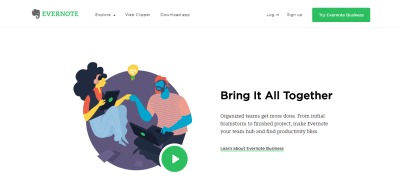
Illustrations can be a great supplement of the text copy. (Image credit: Evernote)
Using brand mascots in web design is another great example when illustrations can create a memorable experience. Mascots become the elements of identity and inter-connector between the user and the product.

By pairing illustrations with jokes, Smashing Magazine has developed a distinct design style that makes them memorable for anyone who aware of the brand.
Brand Consistency
Consistency is arguably the key rule to a successful brand. Inconsistency brings a huge problem — users won’t picture a specific thing when they think about a brand, and, as a result, it can quickly become forgettable. That’s why the website’s design should be consistent with your brand. Make sure that basic brand attributes such as brand colors, fonts, logos, and slogans are used consistently on the website.
Quick design tip: An excellent way to boost your ability to maintain a consistent brand design is through a style guide. Prepare it once and use it for each product you design.
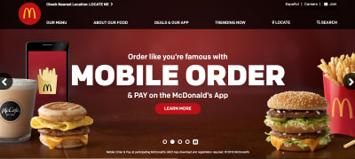
McDonald’s website design is consistent with its brand.
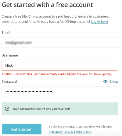
Humor
Make your experiences fun, so people remember them. One good example is Mailchimp, a service used to schedule and deploy email campaigns. The company fulfills a fairly technical niche, but by using humor it transforms this dry task into an inviting experience. Mailchimp uses a mascot called Freddie von Chimpenheimer. Freddie often cracks jokes, and humor is an effective way to connect with people. This positive attitude will often lead to people sharing and even advocating for the product with their friends.

Freddie, the cartoon mascot of MailChimp, is a great emotional carrier for humor.
 Mailchimp adds small and delightful surprises throughout the user journey and makes sending emails a lot more fun. (Large preview)
8. Design Is Optimized For Mobile
Just a decade ago, designing for the web meant designing for a desktop, now it means designing for mobile and desktop. Mobile phones and tablets are driving an increasing amount of web traffic, and the numbers are only going to grow. In 2018, more than 50 percent of all website traffic worldwide was generated through mobile phones.
Prioritize Content And Features
Optimizing web design for mobile is a lot more than just making your design responsive. It’s about content and feature prioritization. Taking medium limitations into account, the goal is to show only what your users need in this medium.
Focus on refining the experience around your core objectives. Know what the core purpose of your app is — analyze which features of your app are used the most and put the most effort into making that experience intuitive.
Measure Success
After we’ve defined what makes a site successful, it’s time to understand how to measure the success. Measuring a site’s success requires an in-depth look at the analytics and data. As the first step in the process of measuring usage data, it’s essential to define right metrics. Metrics will make it clear whether your design decision is working or not. There are two groups of metrics — marketing metrics and UX metrics. Both groups of metrics are essential to a site’s success.
Marketing Metrics
Acquisition
Acquisition includes information about site’s visitors — how many people visit your site and how do they find it. Acquisition metrics include:
Number of gross visits.
This is the most basic acquisition metric that you can track. It gives you a good baseline on how your site is doing, but it won’t tell you much without other metrics. For example, an increasing number of visitors does not necessarily mean success, because those visitors might not be relevant to your business goals.
Channels.
As well as knowing your top-level traffic numbers (number of gross visits), you should also know where your traffic is coming from. If you use Google Analytics, it organizes acquired website traffic into a few broad categories such as Direct, Organic Search, Referral, Social. These groupings allow you to immediately segment your traffic source and identify specific patterns of behavior for each source.
Points of entrance.
An entrance shows you what page people started their session on. You might think this would be the home page, when in fact that’s rarely the case, especially with referral and social traffic. If you go to the Behavior section of Google Analytics, you’ll be able to see your best-performing pages regarding traffic volume. Knowing what pages bring the most traffic is hugely important because it gives you reliable information on what content attracts people.
Engagement
Engagement measures the amount of time visitors stay on your website, as well as how many pages they visit. Engagement metrics help UX teams understand how much attention visitors give to a website.
Engagement metrics include:
Time spent on your site.
Time visitors spend on site is often equated with engagement. Generally, the more time users spend on the site, the more valuable it’s for them. However, there might be an exception to this rule. For example, users might spend more time on a site because it’s hard to complete a specific task (e.g., find the information they need).
Total number of pages visited during user session.
Generally, the more pages people visited, the better. However, it can also be an indicator of dissatisfaction – if people have to visit dozens of pages to find what they’re looking for, that often leads to unhappiness.
Bounce rate.
The bounce rate (reported as a %) enables you to track how many people visit only one page before leaving your site. Naturally, you want this percentage to be as low as possible. There are some factors which could contribute to a high bounce rate. Generally, a high percentage could point to the lack of relevant content or usability issues. But of course, this rule has exceptions. For example, a visitor may have come to your site just to find contact information about your company. Once they had your phone number or address, there was no need to visit another page.
Quick tips:
Create a list of top 10 pages visitors are most engaged with. The pages that users are spending most time may help you determine if your goals are in-line with the goals of users.
Track exit pages. It’s essential not only to track how a user gets to your site but also how they leave it. This metric is different than a bounce rate in that it tracks visitors who visited multiple pages (bounce rate is a single page metric). If a particular page has a high exit rate, it might be an indication of a problem.
Retention
There are two types of website visitors: first-time visitors and returning visitors. Retention is the percentage of return visitors — people who continue visiting your website within a specific time frame. When a team measures retention, it becomes much easier to distinguish new users from returning users, and, as a result, see how quickly user base is growing or stabilizing.
Retention can be distilled from the percentage of new sessions. By comparing the percentage of new sessions vs. returning visitors, you can determine if your website is attracting new visitors and whether it offers enough value so people return to it.
Conversion
The majority of websites have a goal of getting visitors to convert (take action), whether it is to purchase an item or sign up for a newsletter. That’s why conversion is the metric that everyone cares about the most. Aim to maximize the number of people who convert (e.g., buy something after they come to your site). Obviously, the higher the conversion rate, the better your website is doing.
A conversion rate can tell you a lot about the quality of your traffic. For example, having a low conversion rate while having a lot of unique visits can be an indication that you are attracting the wrong traffic.
Here are a few tips for measuring conversion:
It’s always better to select easy-to-measure activities. For example, it might be something as simple as contact form submissions. Contact form submissions can be a great indicator of your site’s success — if users prompt an inquiry this is a great indication that your site has engaged them.
For larger sites, it’s good to have many different conversion goals on one site. For example, an eCommerce store might have three conversion goals — a product purchase, a subscriber to an email list, a social share.
Pirate Metrics (AARRR Framework)
As you can see, there are a lot of metrics that can be used. But how do you figure out which metrics to implement and track?
In the attempt to simplify the task of selecting right metrics, Dave McClure created a framework called AARRR. This framework uses a customer lifecycle as a foundation (the idea that visitors go from being a first-time visitor to a returning visitor), and tracks users through a conversion funnel over time. The life cycle consists of 5 steps:
Acquisition
Users come to the site from various channels.
Activation
Users enjoy their first visit (happy user experience).
Retention
Users come back and visit the site multiple times
Referral
Users like the product enough to refer it to others.
Revenue
Users conduct some type of monetization behavior.
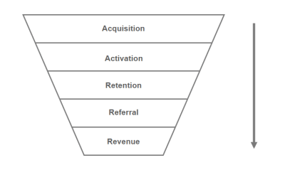
Pirate metrics can help you determine where you should focus on optimizing your marketing funnel.
User Experience Metrics
While marketing metrics define the success of a product based on the conversion, user experience metrics focus on the quality of interaction with a product. Focusing on business goals does not necessarily lead to a better user experience. UX metrics can complement marketing metrics by concentrating on the critical aspects of user experience.
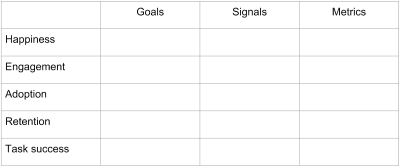
The Quality Of User Experience (HEART Framework)
When it comes to measuring user experience, it’s always hard to define specific metrics. Of course, there are high-level UX metrics that correlate with the success of user experiences such as usability, engagement, and conversion. But it might be hard to define metrics that will be relevant to a particular product. In the attempt to simplify this task, the Google team created a framework called HEART. This framework is intended to help designers focus on the product they create, and the user experience it provides. HEART uses some metrics that we already mentioned in the marketing section, but from a different angle.
Happiness
Measures of user attitudes: satisfaction, perceived ease of use, net-promoter score. This metric can be collected via survey.
Engagement
Level of user involvement. Engagement is typically measured as depth of interaction over some time period. For example, the number of visits per user per month.
Adoption
Gaining new users of a product or feature. For example, the number of users who tried new product features in the last week.
Retention
The rate at which existing users are returning. For example, for a web service this might be the number of active users remaining present over time. For e-commerce website, this might be the number of repeat purchases.
Task Success
This category is most applicable to areas of your product that are task-focused. It includes behavior metrics such as efficiency (e.g. time to complete a task), effectiveness (e.g. percent of tasks completed), and error rate. For example, for e-commerce website this might be the number of search result success.
The HEART framework is very flexible — it can be applied to a specific feature or a whole product. It’s important to mention that you don’t need to collect metrics in all of HEART categories — you should choose only the most important for your particular project. It’s possible to choose metrics by following a process of Goals-Signals-Metrics.
The Goals-Signals-Metrics Process
The Goals-Signals-Metrics process helps you to identify meaningful metrics you’ll actually use.
Google HEART framework and Goals-Signals-Metrics process
The process of selecting metrics you can implement and track starts with goals. To define a goal, you need to focus on knowing what determines success. This is where the HEART categories will be particularly useful. For example, if you create a news site you might set a goal in the engagement category; the aim would be to have users enjoy the articles they read, and to keep them browsing to discover more articles from different categories.
Here are two tips that will help you define better goal:
*Don’t define your goals in terms of your existing metrics. *It’s a common pitfall when a team defines goals based on information it has. As a result, a goal might sound as something like ‘We need to increase traffic to our site.’ Yes, everyone wants to have more visitors, but does more visitors will move you towards your goal? Not necessary.
Work with team and stakeholders to identify the goals. You may not realize that different members of your team have different ideas about the goals of your project. Identifying goals early on in design process provides an opportunity to build consensus about where you are headed. Make sure that everyone on the team understands the proposed solution in sufficient detail.
After identifying your goals, you need to think about what user actions will result in progress toward these goals. These actions are your signals. There are usually a large number of potentially useful signals for a particular goal. Once you have identified some potential signals, you may need to do research or analysis to choose the ones that are most relevant. If we circle back to our example with a news site, an engagement signal for it might be the number of articles users read on the site.
Here are a few tips:
Consider how easy or difficult is to track each signal. It’s preferable to focus on signals that can be monitored automatically (e.g. your product can log the relevant information so you can use it for further analysis).
Try to choose signals that are sensitive to changes in your design. This way you will be able to analyze the data you have to understand whether the design changes benefit your users or not.
Don’t ignore negative signals. Identifying signals for possible missteps (e.g. number of errors during particular interaction) can help you reveal pain points in your product.
Once you’ve chosen signals, you can refine them into metrics you’ll track over time. In our news site engagement example, we might implement “how long users spend reading news” as “the average number of minutes spent reading news per user per day.”
Prioritize your metrics.
Focus on tracking the metrics related to your top goals.
Don’t add metrics for sake of adding metrics.
Avoid the temptation to add “interesting stats” to the list of metrics. Always ask yourself whether you will actually use these numbers to help you make a decision.
The metrics you track should be tied back to design decisions.
When you see a change, you should be absolutely clear on what has caused that change.
What Can Influence Success
Follow TETO Principle
How to make sure that website meets user’s expectations? You can’t just assume that it does — you need to test your design to see how users engage with it. Testing can reveal much more than how usable a site is — it can also demonstrate the users’ emotional response to the design. That’s why TETO-principle (test early, test often) should be applied to every web design project.
Don’t expect to build a perfect product right from the first attempt.
Product design is an ongoing journey for both you and your users. That means that you design something, test it, rework it and then test it again.
Use comparative testing to find the best solution for your users.
If you have multiple solutions to a particular problem and not sure what solution works best for your product, you can use A/B testing to validate it. Compare what users do in one scenario vs. another, and see which design is the most effective.
Collect qualitative feedback.
All measurable data that we’ve talked about in previous sections can tell you a lot of answers on “*how many*” questions. But this data won’t tell you why people interact in a way they do. Facing readability issues, hesitation when filling out a payment form, using search because site’s navigation is really hard to deal with — all of these types of details are critical to understanding the user experience. They might be a reason why people abandon a process and leave the site. It’s possible to find answers to why questions by observing and interviewing your users.
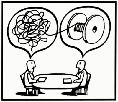
User interview (Illustration by Igor Kopelnitsky)
Data-Informed, Not Data-Driven Design
When product teams collect data, they usually follow either data-driven or data-informed design process. The latter is more preferable. Design shouldn’t be driven by data, it should be informed by data.
Don’t Be Obsessed Over Numbers
A lot of metrics get reported simply because they are flowing in from analytics tool. While it’s tempting to report a lot of different things and hope that this will make your report more valuable, in reality, this usually leads to more complex reports that are hard to read.
Don’t Fall Into The Trap Of Complete Redesign
All too often design teams try to introduce a complete rework for a solution which they believe will result in more successful web experience. Jared Spool calls major product redesign a Flip-the-Switch strategy — “the most ineffective way to get major changes into a design.” In the article, “ The Quiet Death of the Major Re-Launch,” he shares a story on the eBay redesign — and it’s a great reminder of why users don’t like dramatic changes. A complete redesign that brings new visual and interaction design might be too much change and have an adverse effect.
If you have an existing website, instead of investing in a large scale redesign focus on subtle evolution, make small and incremental changes that can (over time) improve conversions without visitors even noticing that changes have been made.
Conclusion
So, how do you know that your website is a success? As a product creator, you must first define what success means to you. For that, it’s always important to have a big picture in mind of what it is that you want to achieve.
The next step would be to focus on metrics. Metrics will show you how a site changes over time. They will help you fill in the blanks between what has happened and why.
Recommended Reading
“A Comprehensive Guide To Web Design,” Nick Babich, Smashing Magazine
“Choosing The Right Metrics For User Experience,” Pamela Pavliscak, UXmatters
“How To Choose The Right UX metrics For Your Product,” Kerry Rodden, Medium
“Startup Metrics For Pirates,” Dave McClure, SlideShare, LinkedIn
This article is part of the UX design series sponsored by Adobe. Adobe XD tool is made for a fast and fluid UX design process, as it lets you go from idea to prototype faster. Design, prototype and share — all in one app. You can check out more inspiring projects created with Adobe XD on Behance, and also sign up for the Adobe experience design newsletter to stay updated and informed on the latest trends and insights for UX/UI design.

(ra, il)


