Original Source: http://feedproxy.google.com/~r/CreativeBloq/~3/IYp_AG04qp8/20-amazing-free-google-web-fonts
Looking to start your next digital project? Be it a website, app or other screen-based venture, there’s an abundance of high-quality and (best of all) free web fonts out there. Let’s take a look at some of the best options. You’ll find them all, and many more, at fonts.google.com.
For a wider range of options, take a look at our round-up of the greatest free web fonts.
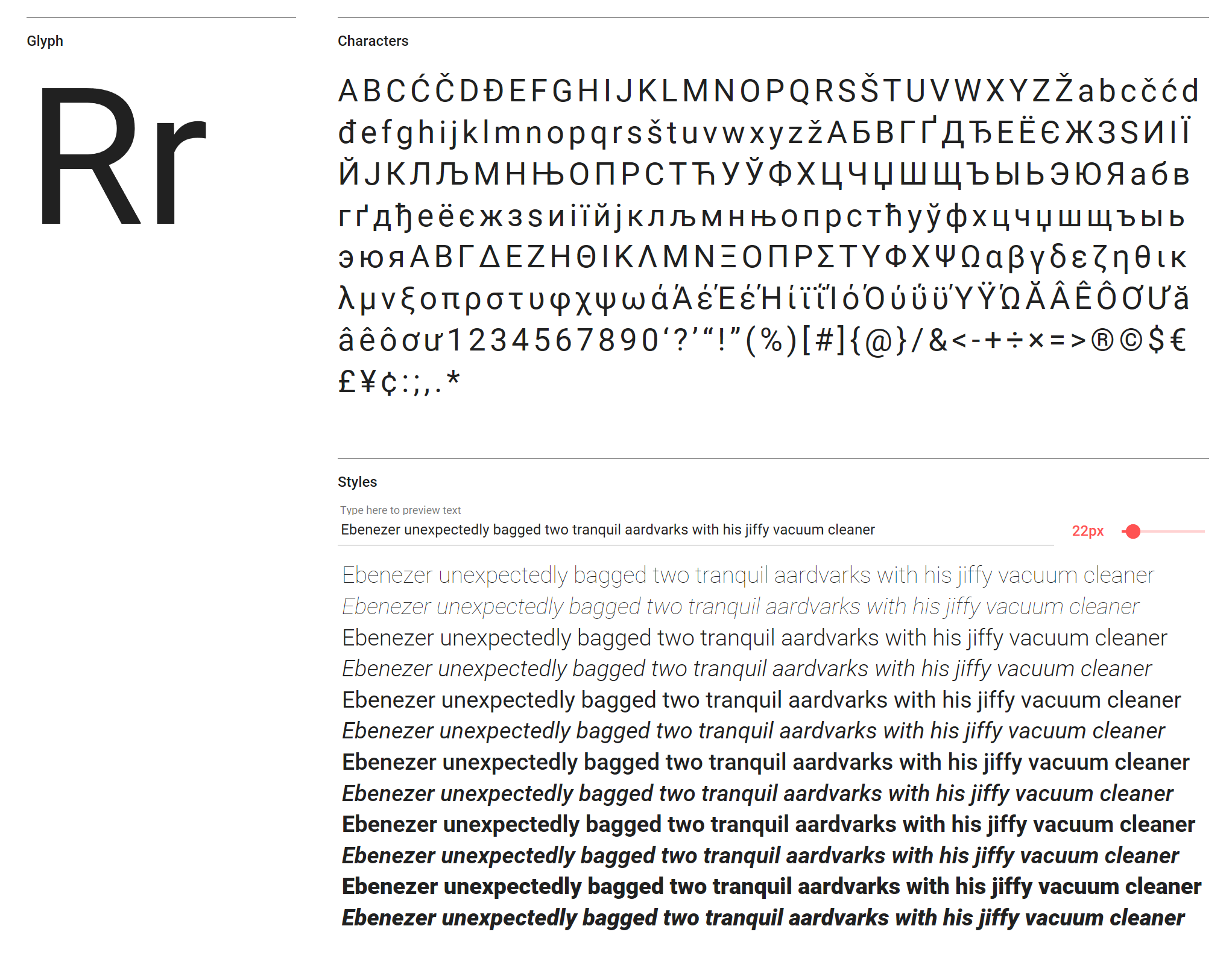
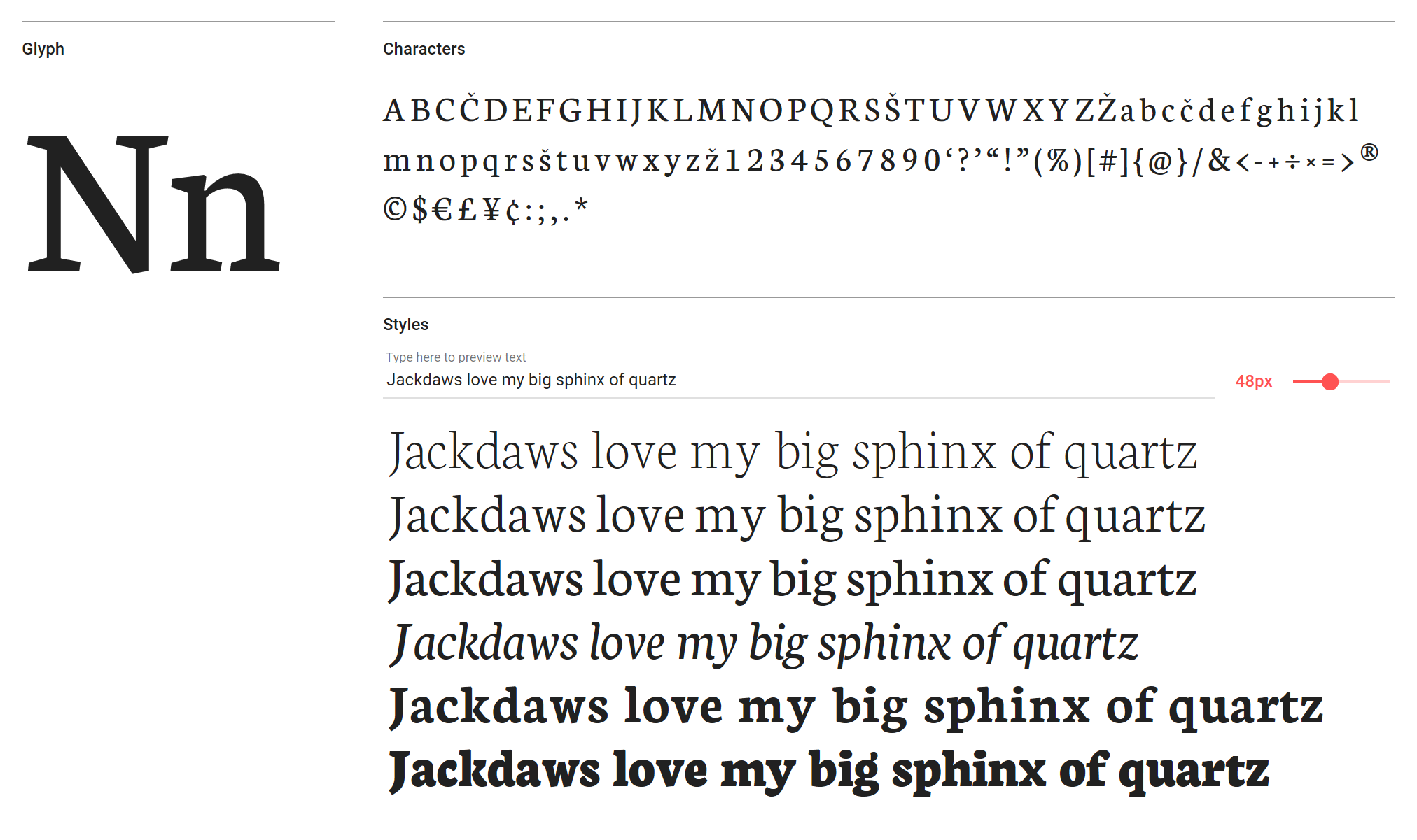
01. Spectral
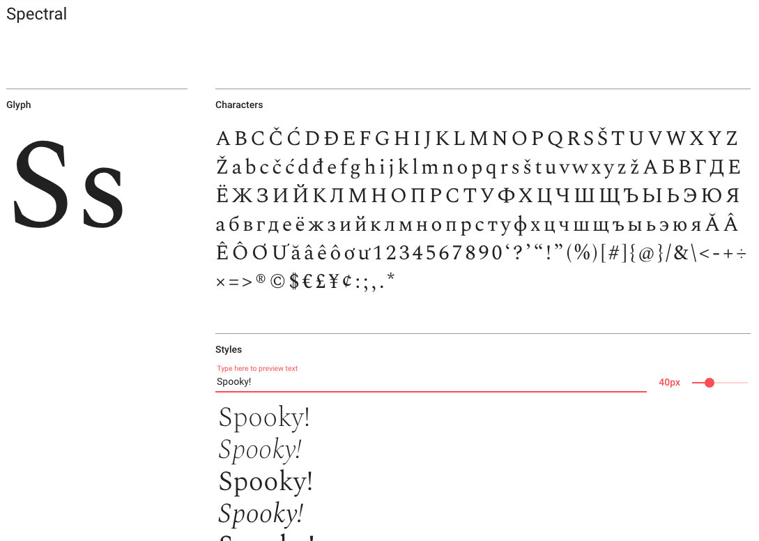
Spectral comes in seven weights for all your typographical moods
Commissioned by Google Fonts for use in Google Docs, Sheets and Slides, but suitable for any project, Spectral is a versatile serif face created by Production Type in Paris that's available with seven weights of Roman and Italic, from Extra-Light through to Extra-Bold, with small caps included. Inspired by six centuries of French-type design, it's designed to look good on-screen, making even the most text-heavy pages easier to read.
02. Bubblegum Sans
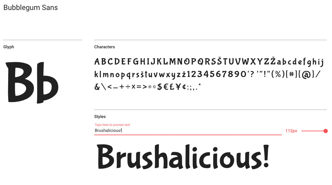
For friendly type that really pops, give Bubblegum Sans a go
Relentlessly upbeat with friendly brushed glyphs, Bubblegum Sans is a big and bouncy font designed by Angel Koziupa of Sudtipos and produced by Ale Paul. It's something of a 21st century tribute to the sort of lettering you'd see in 1930s advertising, with, we reckon, just a hint of Dr Seuss madcap charm.
03. Anton
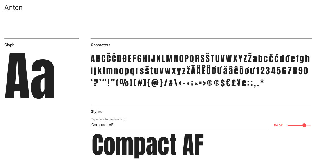
Step away from the Impact!
If you're after an eye-catching sans serif display font, it's terribly easy to go for the ubiquitous Impact, especially if you don't have Compacta Bold to hand, but if you want something a little more suitable for modern use then Vernon Adams' Anton is a smart pick. Anton has been reworked from traditional advertising sans serifs, then digitised and reshaped for use as a webfont, with the counters opened up and the stems optimised for use on-screen.
04. Rubik
Rubik features subtle, rounded corners
A sans-serif family with five weights – Light, Regular, Medium, Bold and Black, all with italics – Rubik has subtle, rounded corners and is ideal for both body copy and headlines. It was designed by Philipp Hubert and Sebastian Fischer at Hubert and Fischer.
05. Monoton
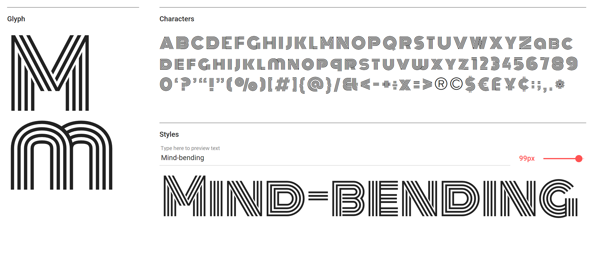
Monoton is a contemporary take on metalpress fonts
A display font (recommended to be used above 30pt) much in the style of Alex Trochut, Monoton is a contemporary take on metalpress fonts, is another font designed by Vernon Adams. It's perfect for a quirky headline on your site – as the estimated 320,000 websites it has been used on proves. Pair it with a modern serif for a contemporary yet classic feel.
06. Karla
Karla comes in Regular and Bold, along with italics
Karla is a grotesque sans-serif typeface in Regular and Bold (along with italics) with some rather nice quirks – check out the subtle, curved descenders on the ‘q’ and ‘y’, for instance. Designed by Jonny Pinhorn, it's equally appealing at over 40pt right down to body copy sizes. It supports Latin and Tamil scripts.
07. Baloo
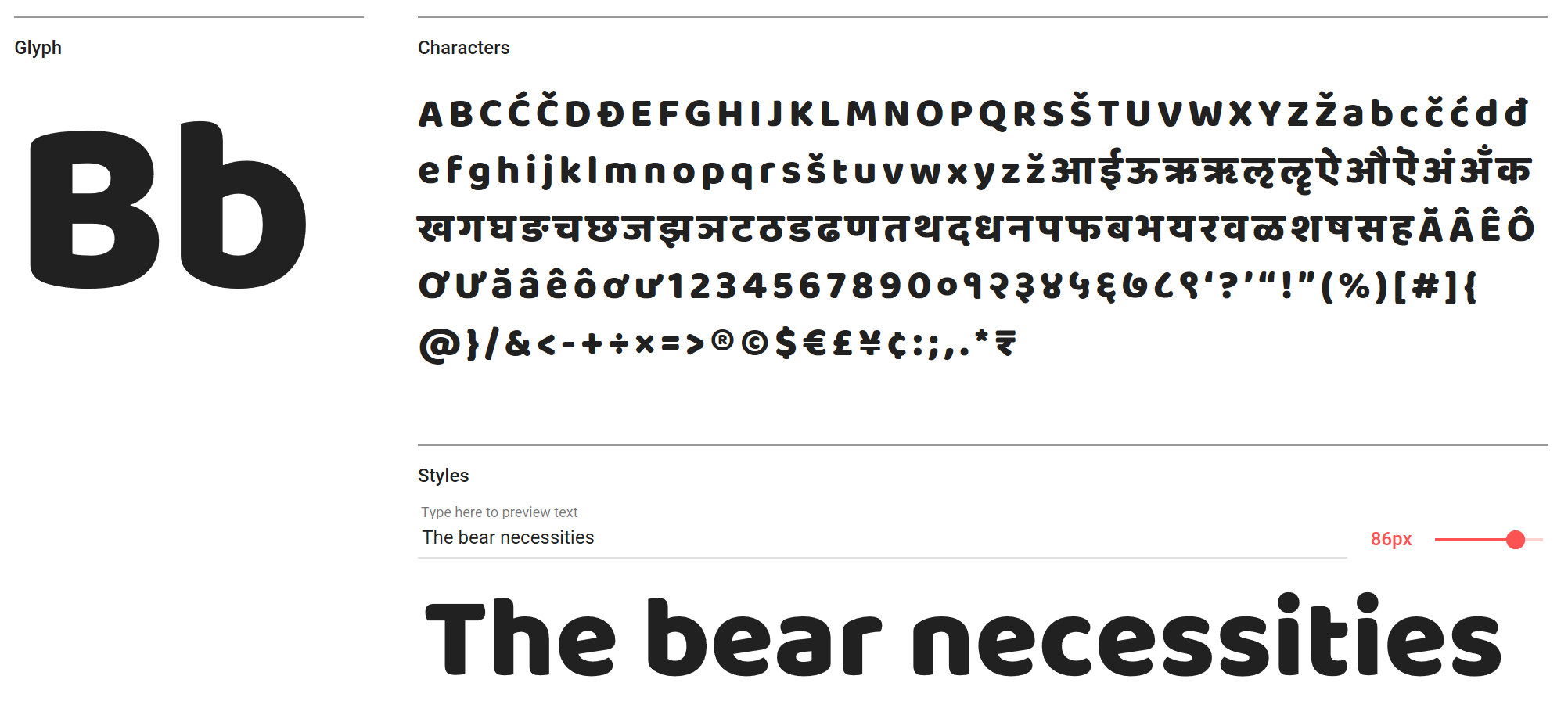
You can use Baloo in nine Indian scripts, if you so wish
According to its Google Fonts description, Baloo is "a perfect blend of pointy paws in a coat of fur". While we're not sure it's quite that animalistic, we think it's an intriguing rounded display face, that’s also available in nine Indian scripts along with a Latin counterpart. It's versatile and, well, rather beautiful.
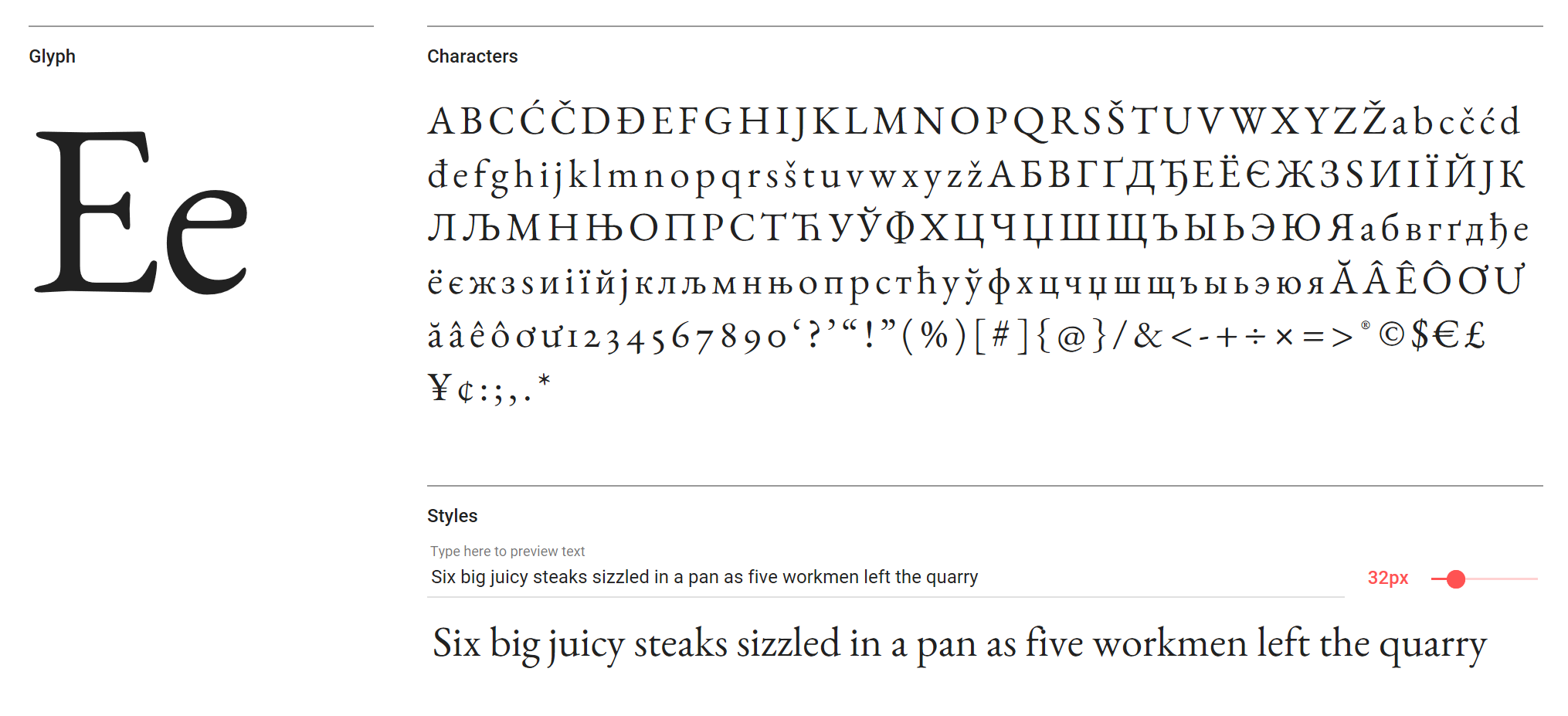
08. Neuton
Neuton is a versatile, Dutch-style face
Neuton is hugely versatile Dutch-inspired face by designer Brian Zick. It's a little like Times in structure, with its large height, short extenders, and compact width and is perfect for body copy. It's available in Extra-Light, Light, Regular, Regular Italic, Bold and Extra Bold.
09. Alegreya SC
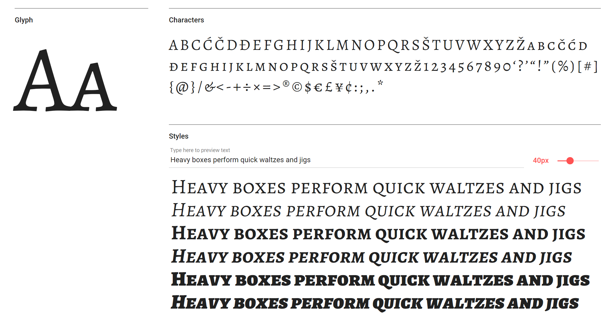
This all-caps face creates impact for headlines
If you’re looking for an all-caps typeface for a bit of impact in your headlines or supporting text, Alegreya SC may be just the ticket. Pair it with the rest of the Alegreya family for elegant consistency across your screen projects.
10. Lilita One
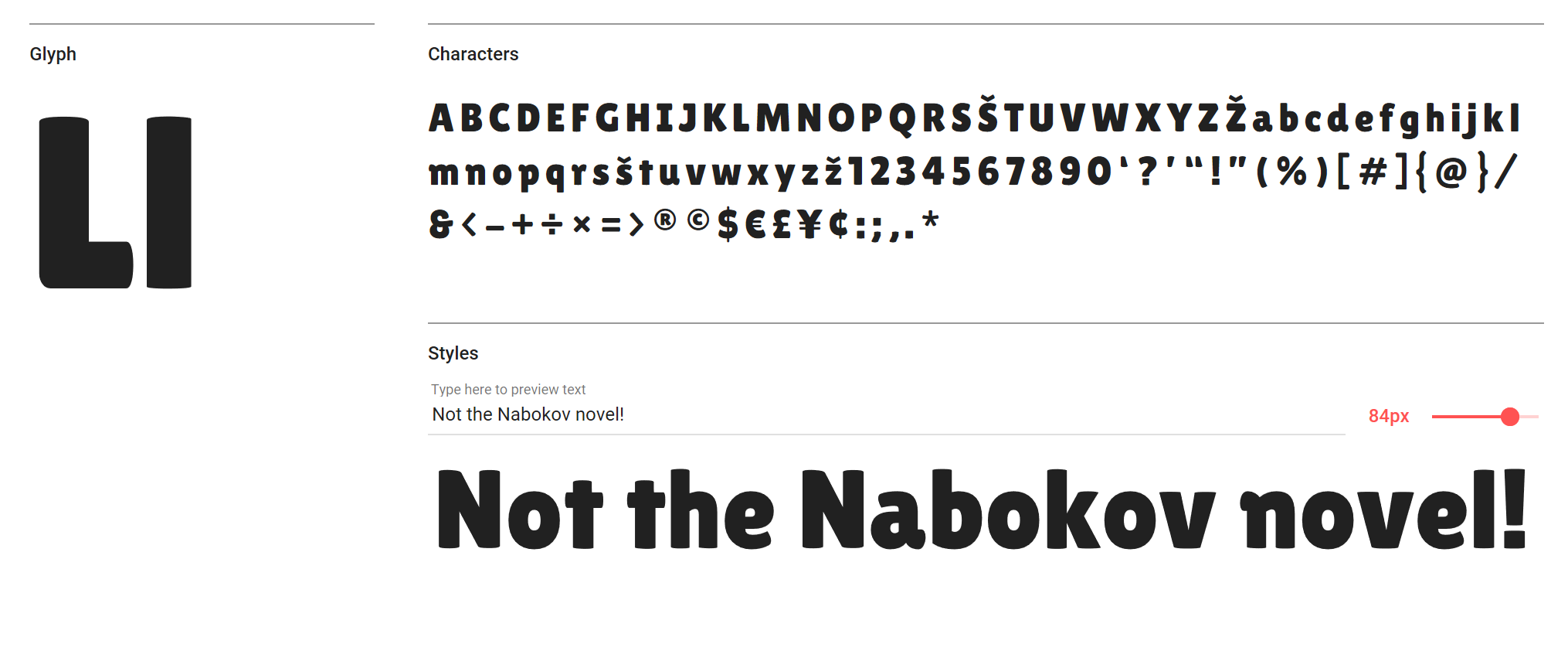
Use Lilita One at 40pt or over for maximum impact
A little bit condensed, a little bit rounded, and a little bit quirky in its rounded terminals and soft appearance, Lilita One is a fun display font for headlines and shorter text (perhaps navigational elements). It's best used at 40pt and above, we reckon.
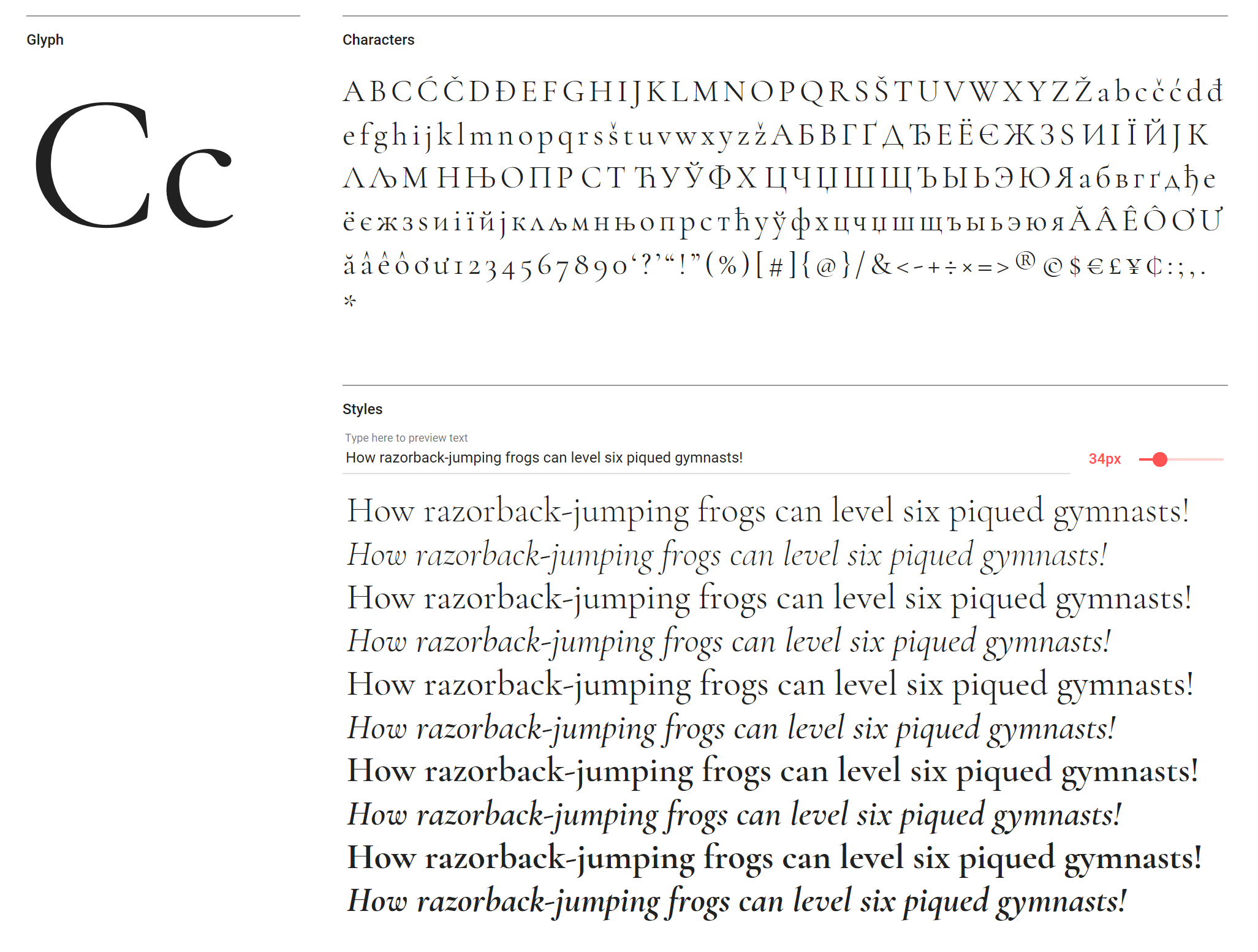
11. EB Garamond
Worth checking out, even though it’s currently only available in Regular
EB Garamond is an open source revival of Claud Garamond’s classic typeface from the mid-16th century, and we can’t really explain it in any more detail. A sublime and elegant body font, even if it is only available in Regular at this point. It’s worth checking out Cormorant Garamond, as well.
12. Lora

Lora is ideal for large chunks of body text
Available in Regular, Regular Italic, Bold and Bold Italic, Lora is a serif font particularly suited to reams of body text. Google says "the overall typographic voice of Lora perfectly conveys the mood of a modern-day story, or an art essay". We particularly like the way the stem flows into the tittle on the lowercase ‘i’ in Regular Italic.
Next page: more great Google web fonts
13. Space Mono
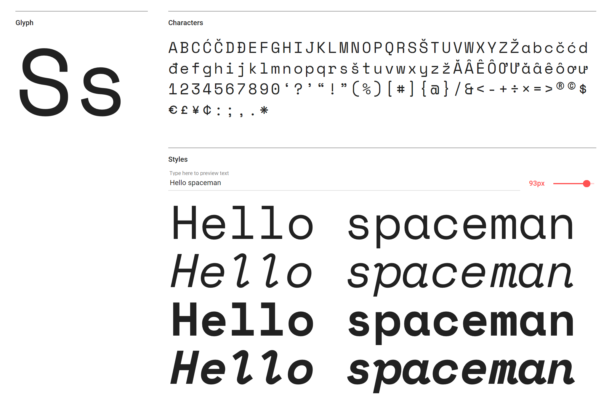
This sci-fi-style face comes in Regular and Bold versions
Geometric fuses with grotesque in this sci-fi-esque design. A fixed-width family in Regular and Bold (with italics – Regular Italic being our favourite, thanks to its wonderful descenders and serifs), Space Mono is one cool display face. As well as in headlines, use the Regular weight sparingly for short passages of text.
14. Kaushan Script
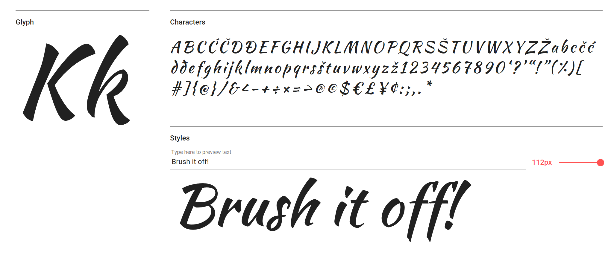
This calligraphic font purposefully avoids typographic perfection
The calligraphic, energetic Kaushan is a script font that deliberately avoids typographic perfection, with slight variation in angles between verticals in characters and uneven positioning along the baseline. For a script font it’s very readable, even at small sizes – but of course we’d only recommend it for headlines, used in moderation.
15. Julius Sans One
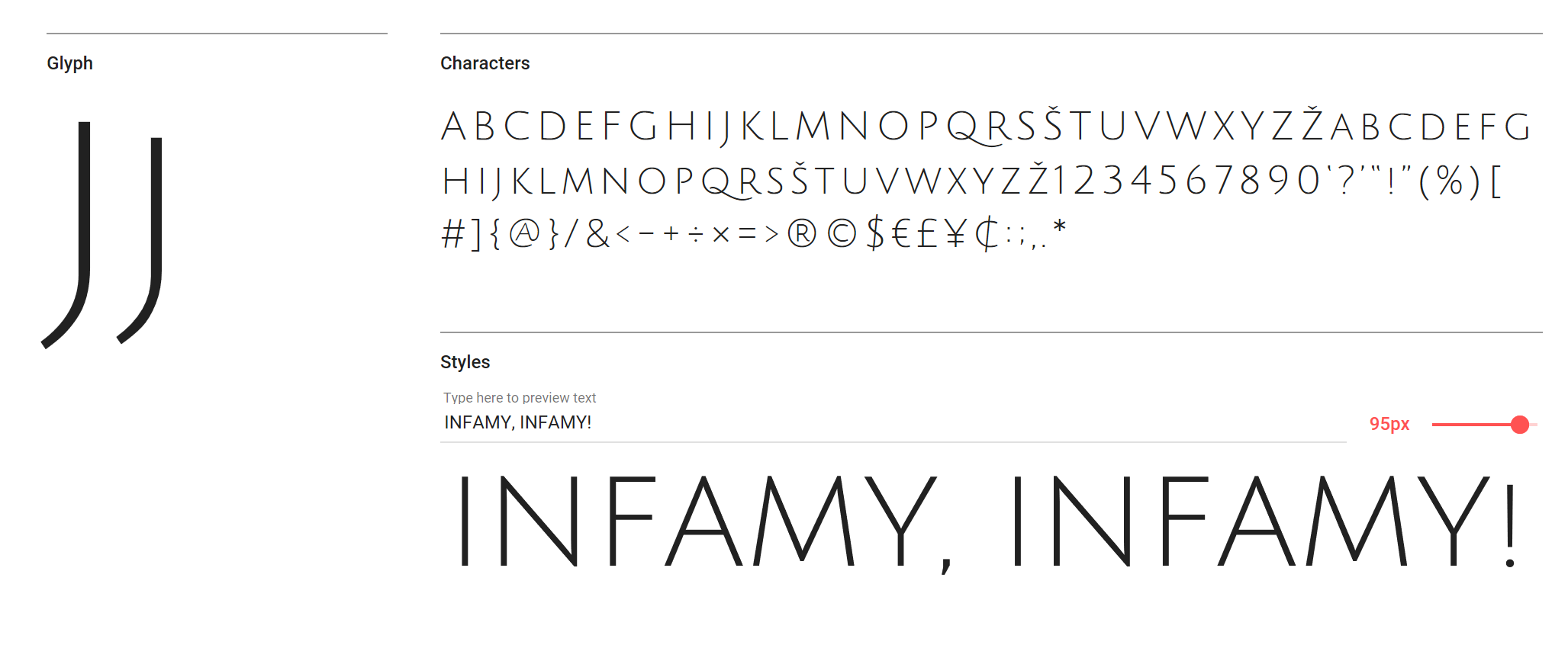
Try Julius Sans One for subtle headlines that still make an impact
There's more than a hint of Roman here, with a modern twist to some of the legs, making Julius Sans One a thin display font perfect for subtle, yet still impactful, headlines. Pair it with the likes of Lato Light, maybe, for a refined, low-key style.
16. Courgette
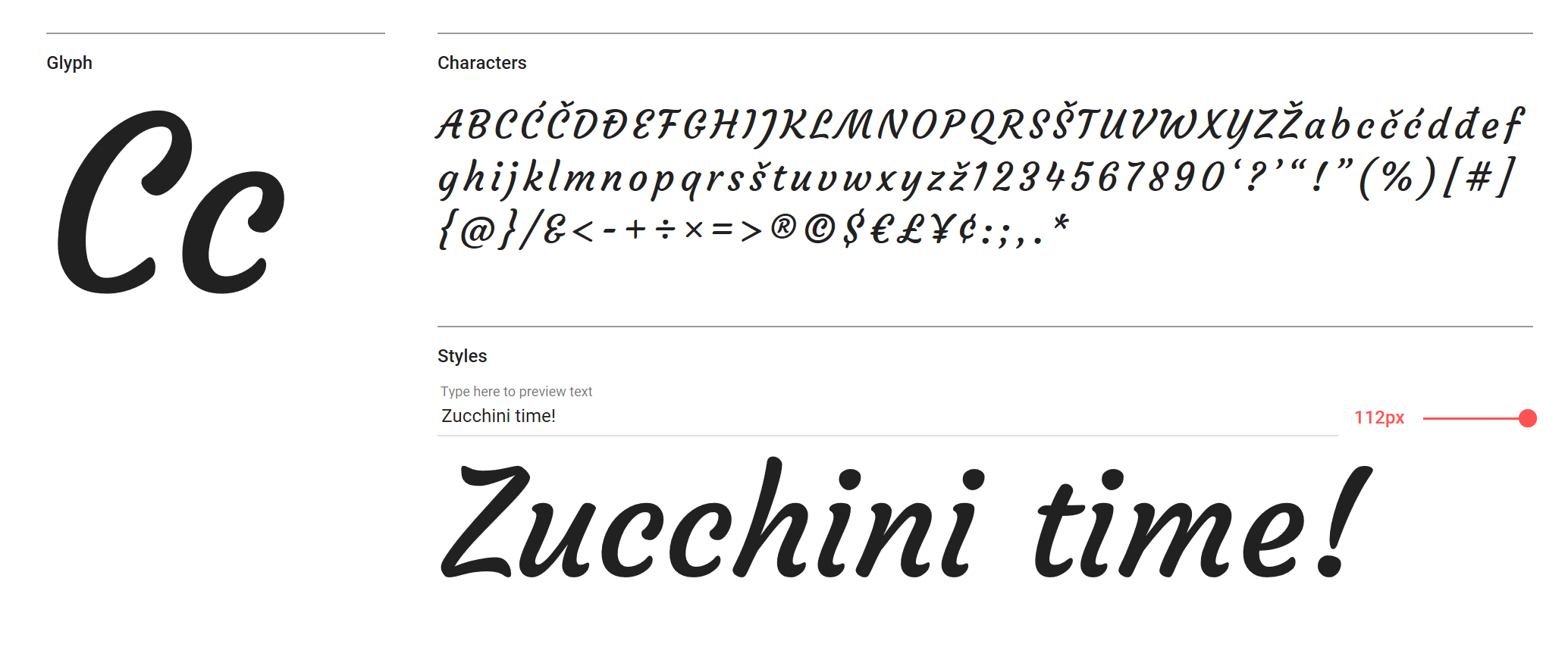
Use this medium-contrast italic-only font larger than 40pt
A brush script with flourishing impact, Courgette is a medium-contrast italic-only font. Yes, you’ll want to use it larger than 40pt, but it was designed so that the low stroke contrast can even work in body text (although we’d suggest you are cautious if you take that advice).
17. Wire One
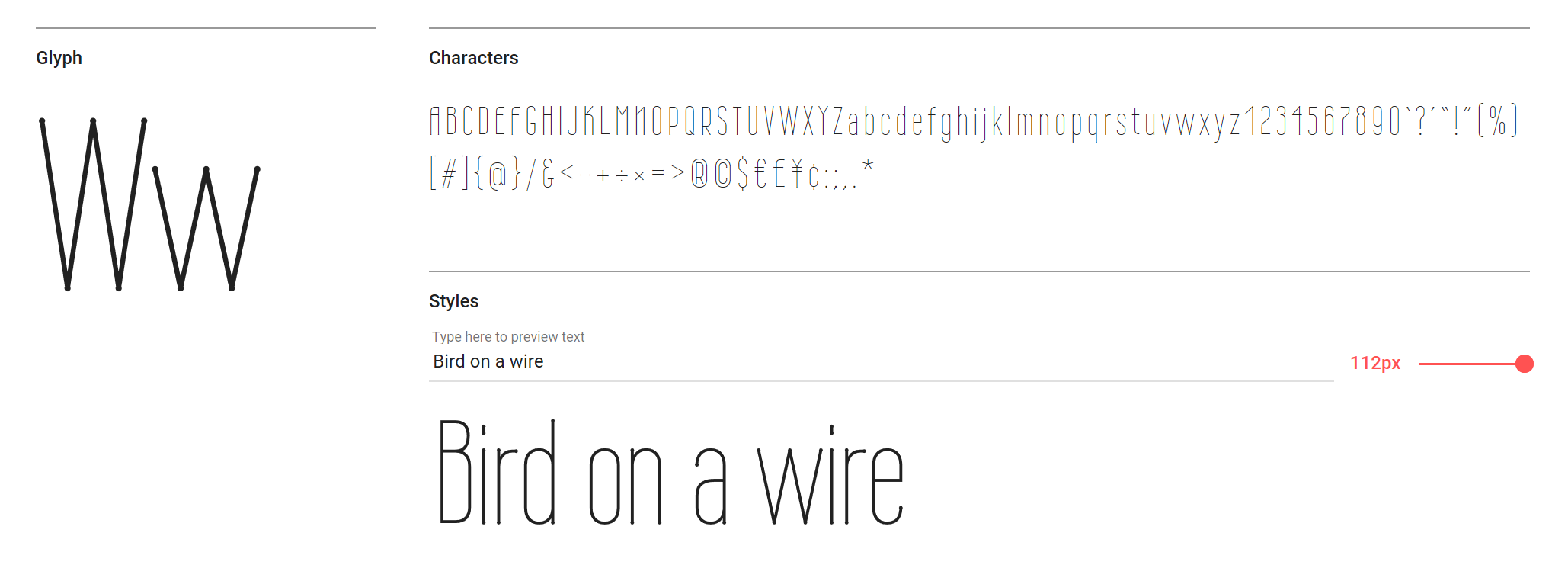
This condensed sans is sharp and stylish
Wire One is so thin you’re not going to want to use it at anything below 12pt – and even that may be pushing legibility. It’s a lovely condensed sans, nonetheless, and its minuscule dot terminals are quite beautiful.
18. Cormorant
Cormorant was inspired by Claude Garamond
This is one behemoth of a free typeface. It comprises Roman, Italic, Infant, Infant Italic, Garamond, Garamond Italic, Upright Cursive, Small Caps, and Unicase; and five weights – Light, Regular, Medium, SemiBold and Bold. You could easily build a whole style around this Claude Garamond-inspired number.
19. Righteous
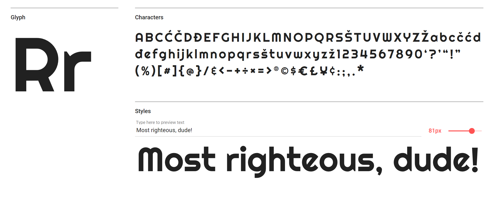
Righteous’ lowercase ‘e’ will divide opinion
There’s a touch of avant-garde in this display font, inspired by the capital letterforms from the deco posters of Hungarian artist Robert Berény for Modiano. While the lowercase ‘e’ may be a little sharp for some, it’s without doubt an arresting font when used at large point sizes.
20. Bungee Shade
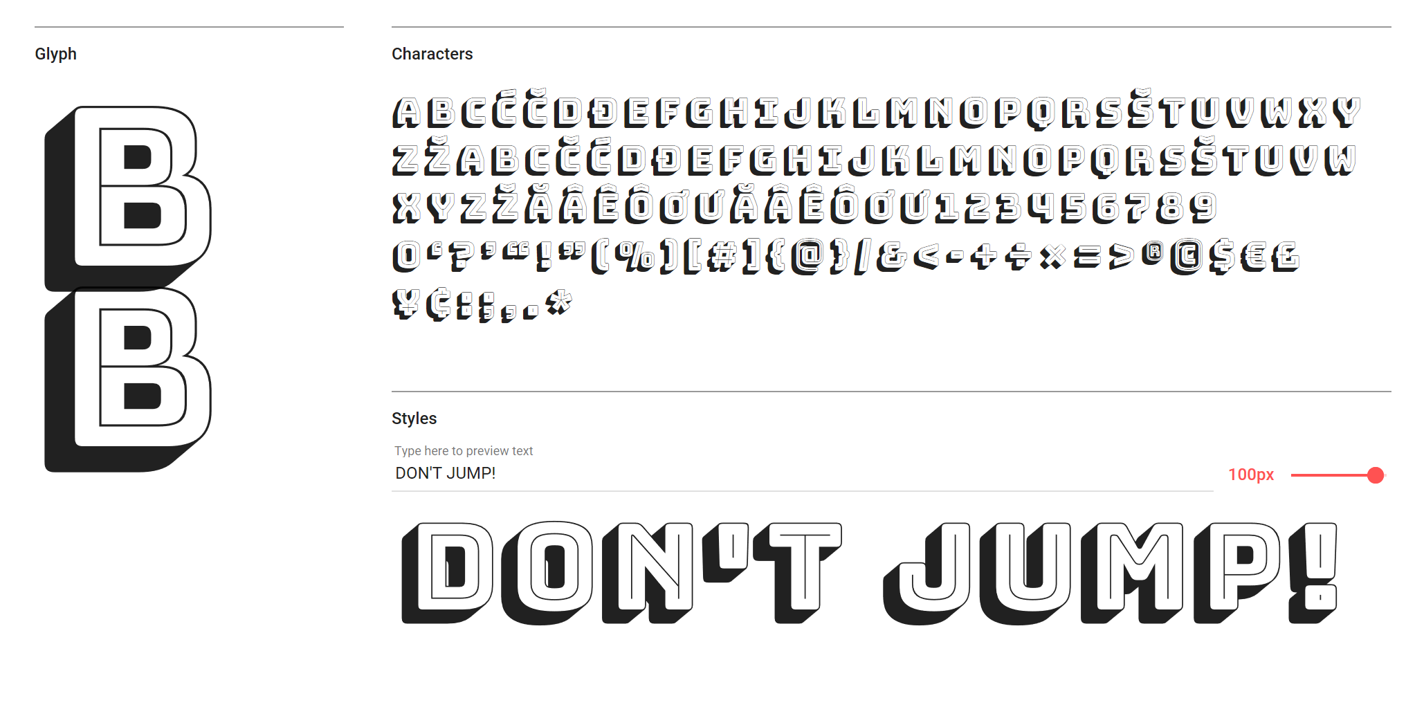
Bungee celebrates urban signage
If you want ultimate impact with your headlines – and even a start for your graphic projects – Bungee Shade is a great shout. Bungee is a celebration of urban signage, and Shade is just one of five variants. Check out the regular Bungee for a less extravagant, yet still impactful display font (and Bungee Inline for a lovely reversal of Shade).
21. Amatic SC
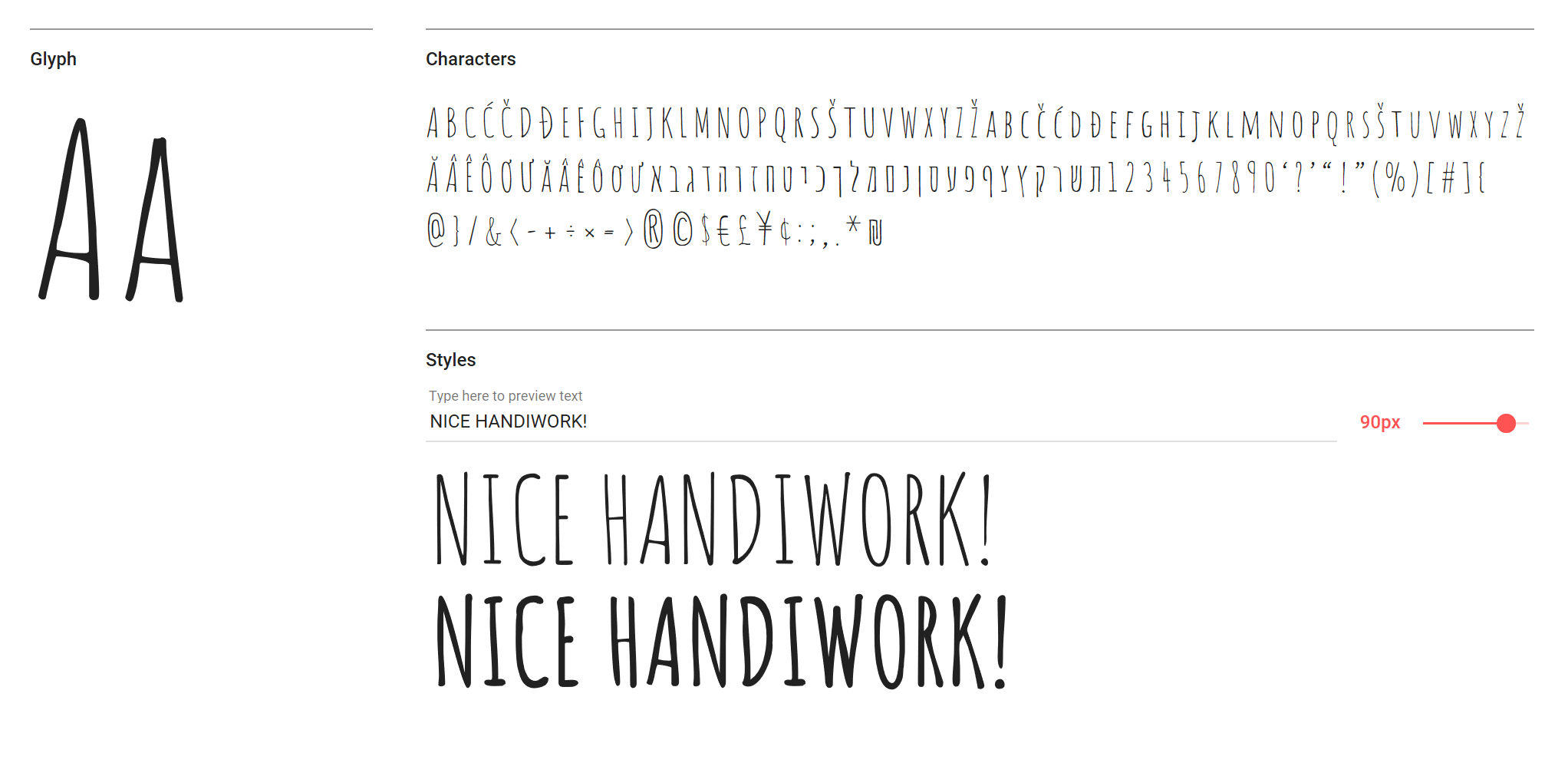
Open source face Amatic SC has a hand-drawn aesthetic
‘Hand-drawn’ and ‘web fonts’ don’t often go together in the same sentence, but Amatic SC (small caps) is undoubtedly one of the better open source offerings out there. Use it sparingly in both headlines and shorter measures of text for a crafty feel.
22. Roboto
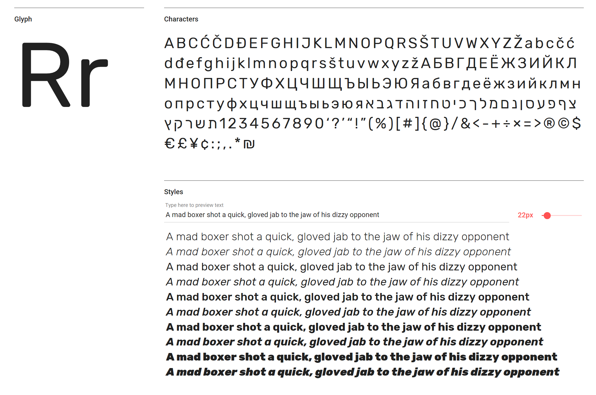
Roboto is used on over 16 million sites worldwide
Roboto is one of the most common open source web fonts out there (used on over 16,000,000 sites worldwide), and for good reason. It's a surprisingly rhythmic sans that can be used alongside Roboto Condensed and Roboto Slab for a consistent, contemporary style.
23. Arvo
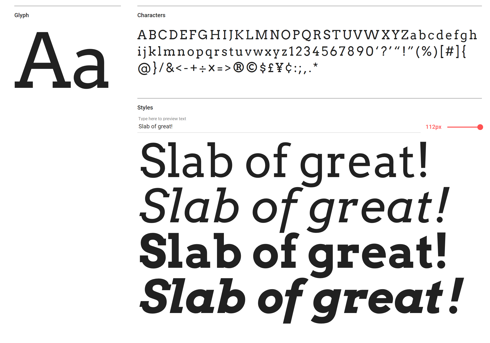
Geometric slab Arvo works as well in print as it does on screen
A geometric slab, Arvo is equally at home in print as it is on screen – as long as you’re using it for headlines, that is. Arvo is hugely legible at any size over 30pt, and – particularly in the Bold weight – a font that will stop your viewers in their tracks.
Related articles:
50 best free fonts for designers4 modern brands flying the flag for script fontsThe rules of responsive web typography