Entries by admin

5 Steps to Installing WordPress with LEMP on Alibaba Cloud

Original Source: https://www.sitepoint.com/5-steps-to-installing-wordpress-with-lemp-on-alibaba-cloud/

This article was created in partnership with Alibaba Cloud. Thank you for supporting the partners who make SitePoint possible.

WordPress is one of the most popular content management systems (CMS) in the market, owing to the fact that it is completely free to use and extremely versatile. Typically, you would deploy WordPress on a LAMP stack, regardless of the type of website, as WordPress is based on MySQL and PHP.

In this article however, we will discover how to deploy a WordPress website on a LEMP stack. We have chosen NGINX as our web server instead of the more popular Apache because it is much faster, more scalable and secure for a single site.

By completing the steps in this article, you should expect a fresh WordPress site running on an Alibaba Cloud Elastic Compute Service (ECS) instance, running a highly performant LEMP Stack.

This article assumes that you already have an account on Alibaba Cloud. If you don't have one yet, just sign up and enjoy the $300 new user free credit.

Step 1: Provision and Secure an Ubuntu 16.04 Server

In the first step, we will create an Alibaba Cloud ECS instance running Ubuntu 16.04. This step is pretty straightforward, it mostly involves purchasing an ECS instance from the Alibaba Cloud console, selecting your preferred configurations, and running some Linux commands.

However, to improve security, we will also be securing the server by creating a superuser and disabling root login. We will then configure the Ubuntu UFW (Uncomplicated FireWall) on the server.

Read the detailed steps here.

This provides a versatile foundation upon which we will complete our LEMP stack, which we will do in the next step.

Step 2: Completing the LEMP Stack

In this step, we will complete a modern LEMP stack for our WordPress website. Specifically, we will be setting up our LEMP stack with a highly-performant combination of NGINX, MariaDB, and PHP7. This setup is widely regarded as the optimum foundation for a modern WordPress site.

Read the detailed steps here.

At present, we can only visit our site by entering the server IP address in a web browser, so we will fix that in the next step by configuring a domain name to serve our site, and securing everything with an SSL certificate. After that, we will move on to installing WordPress on our LEMP stack.

Step 3: Configuring a Domain and Let's Encrypt SSL

In the third step, we will run through Domain Management for our site, adding DNS records, and installing a Let’s Encrypt SSL certificate. In the previous two steps, we provisioned and secured our Ubuntu 16.04 server installation, and then completed the LEMP stack with NGINX, MariaDB, and PHP7. However, we will need to configure a domain to make our server publicly accessible. Additionally, we will secure our WordPress site with an SSL certificate so it can only be accessed via HTTPS.

Read the detailed steps here.

Your ECS instance should now have a secured and highly performant LEMP stack installed, with a domain configured, and a secure SSL certificate protecting visitors' information.

Step 4: Installing WordPress on Your Alibaba Cloud ECS Instance

In the fourth step, we will be installing WordPress via both by using wget/curl and the WordPress Command Line (WP-CLI). This is where you have a decision to make, as this tutorial is going to show you two different ways to install WordPress.

Continue reading %5 Steps to Installing WordPress with LEMP on Alibaba Cloud%

Collective #416

Original Source: http://feedproxy.google.com/~r/tympanus/~3/FG5PVrVKyE8/

C416_WOTW

Inspirational Website of the Week: Hypergiant

An awesome retro design with a great flow and nice details. Our pick this week.

Get inspired

C416_mobilitymodernization

Our Sponsor
Want Enterprise Mobile Auth Simplified?

With 5 minutes and a few bits of config, you can build an app connected to OpenID, Active Directory, OAuth2 or SAML.

Learn more

C416_customprop

A Strategy Guide To CSS Custom Properties

A fantastic guide for getting the most out of CSS Custom Properties by Michael Riethmuller.

Read it

C416_cereal

Working Type

A case study that shows how a new typeface was introduced to Airbnb’s UI.

Read it

C416_yourown

Build your own X

A repo that collects all kinds of “build your own” tutorials. By Daniel Stefanovic.

Check it out

C416_lash

Free Font: Lash

Mehmet Reha Tugcu designed this display font with a distressed look.

Get it

C416_language

12 Languages Icon Set

A lovely set of language character vector icons designed by Max Panchyk.

Get it

C416_crypto

Crypto App iOS UI Kit

A crypto currency management app UI kit designed by Kishore.

Get it

C416_screely

Screely

Screely instantly turns your screenshot or design into a beautiful image.

Check it out

C416_smarthome

Visualizing Your Smart Home Data with the Web of Things

James Hobin shows how to do a great mashup app for visualizing smart home data.

Read it

C416_reactcomp

Building Reusable React Components

How to build reusable components in React along with some of the best practices to follow.

Read it

C416_thermo

Smart Home Temperature Slider

A thermometer concept for a smart home by Chris Gannon.

Check it out

C416_bash

Safe ways to do things in bash

Some valuable advice on how to do things safely in bash and avoid common pitfalls.

Read it

C416_resptables

Responsive tables, revisited

Lea Verou explores text-shadow and element() for responsive tables without duplicating content.

Read it

C416_pattern

Wallpaper Generator

A tileable pattern generator with different options made by Tim Severien.

Check it out

C416_backdrop

The backdrop-filter CSS property

Robin Rendle takes a look at the magical backdrop-filter property and shows what can be done with it.

Read it

C416_EasyToggle

Easy Toggle State

A tiny JavaScript library to easily toggle the state of any HTML element and its targets.

Check it out

C416_dumbreact

Dumb React

Dumb React is a collection of React components used to create a static (dumb) website screen. By Brad Frost.

Check it out

C416_backward

The Slow Death of Internet Explorer and the Future of Progressive Enhancement

An article by Oliver Williams where he argues that we shouldn’t break the backward compatibility of the web.

Check it out

C416_Rotcircles

Rotating Circles with Canvas2D

Yoichi Kobayashi created this nice canvas demo.

Check it out

C416_vuetemplate

Compile Vue.js templates on the Fly with v-runtime-template

Alex Jover Morales introduces v-runtime-template, a Vue component that makes it easy to compile and interpret a Vue.js template at runtime by using a v-html-like API.

Read it

C416_boilerplate

Naperg

A boilerplate for a fullstack GraphQL app with React and Prisma including authentication.

Get it

C416_abster

Free Font: Abster

A great looking minimal font designed by Rachel Manch.

Read it

Collective #416 was written by Pedro Botelho and published on Codrops.

11 best video game character designs

Original Source: http://feedproxy.google.com/~r/CreativeBloq/~3/zsQAT6Hasl8/10-best-character-designs-games-21619313

The world of games is full of weird and wonderful characters. Everyone has a favourite video game character, right? From Lara Croft to Master Chief, there's arguably no better way to immerse yourself in a game than with the perfect protagonist (or a cracking baddie).

Here are 11 of the best video game character designs and why they're still winning the show. The following creations combine impressive 3D art skills and some clever character design touches.

01. Trico – The Last Guardian

Taking care of Trico can be a real test of your patience, but it’s worth the effort

While your character in Fumito Ueda's The Last Guardian is an unnamed boy, the star of the show is Trico, a giant baby half-bird half-mammal creature that you're trying to guide to safety. Immensely powerful yet ungainly, vulnerable and easily spooked, Trico takes a lot of looking after and can veer wildly between completely adorable and utterly infuriating.

Trico can be encouraged to perform certain actions, but it's like herding a ten-ton kitten; he has his own personality and it's often at odds with the tasks you're trying to accomplish, driving you to distraction but ultimately making success feel all the more rewarding.

02. Abe – Oddworld

Abe was created by Oddworld co-founder Lorne Lanning in 1997

When we're first introduced to Abe, his comical appearance and dim-witted voice make him seem wilfully unprepared for his mission. Undeniable funny, cunning and sneaky, this surprising juxtaposition of appearance to abilities is what gives the player the drive to take Mudokon Pops off the menu for good.

03. Lara Croft – Rise of the Tomb Raider

Best character designs in games

Lara Croft has become an iconic character since she first appeared in the 1996 video game Tomb Raider

Lara Croft is a refreshing step away from the male-centric character design in the original Tomb Raider but still keeps the universal truths that make her iconic. She would be nothing without her gymnastic abilities and utility belt.

04. Alyx Vance – Half-life 2 

Best character designs in games: Alyx Vance

The 2004 design of Alyx was based on the looks of actress Jamil Mullen

Based on the looks of actress Jamil Mullen, the design of Alyx was impressively uncanny. Similar to the evolution of Lara Croft, Alyx as a character is well written and individualistic rather than gender centric.

05. Vaas Montenegro – Far Cry 3 

Best character designs in games: Vaas Montenegro

Vaas is a guy you wouldn’t want to mess with

Surrounded by drugs, guns and paradise has made this 2012 character slightly insane. Although he is never seen directly in the game, his cut scenes are some of the best acted and most memorable. Couple that with the great first person camera work, he really was a fantastic example of a guy you wouldn't want to mess with.

06. GlaDOS – Portal series

Best character designs in games: GlaDOS

Genetic Lifeform and Disk Operating System is a fictional artificially intelligent computer system from 2007

All she wants to do is carry on testing. She doesn’t see it as a bad thing and can’t understand why you, the test subject, doesn’t want to stay locked up in a research facility until the end of time. You can’t help feeling sorry for her whilst listening to her lie and deceive to keep you there. Plus there is cake… So that’s a bonus.

07. Master Chief and Cortana – Halo series

Best character designs in games: Master Chief and Cortana

Cortana and Master Chief’s continuously developing relationship that makes them some of gaming’s most iconic characters

Halo (2001) was the game that defined the early days of Microsoft's Xbox, and has continued to do so since. The story is only as good as its characters, and Bungie created two classic figures – Master Chief, the Spartan soldier leading the battle against the Covenant Armada, and Cortana, the sharp witted artificial intelligence that guides the Chief through the games. 

It's their banter and continuously developing relationship that makes them some of gaming's most iconic characters.

08. Joel and Ellie – The Last of Us 

Best character designs in games: Joel and Ellie - The Last of Us

The relationship between Joel and Ellie is extremely well executed

This game (2013) has some the best characterisation in a video game or in any media, the relationship between Joel and Ellie is so well executed that this game is about as close to playing a movie as you can get. 

Ellie in particular was designed to remain close to the player and to echo their experience in the game's world. The design also built to foster a relationship between Ellie and Joel, as she was created to lead him to cover when needed, whilst he naturally puts his arm around her, creating a relationship between the two.

09. Prince of Persia – The Sands of Time 

Best character designs in games: Prince of Persia

The Prince’s amazing agility forces players to utilise new ways to get around
From $7.99/From £3.96

The Sands of Time (2003) featured some great animation and characterisation that felt and looked like a cool cartoon. This was especially highlighted with the Prince's amazing agility in the game, forcing the player to utilise new ways to get from point to point.

10. Ida and Ro – Monument Valley 2 

Ida and her mum’s designs are simple, but very effective

The original Monument Valley charmed us with its interactions between Ida and the Totem, and while Totem makes an appearance in the more recent Monument Valley 2, this outing focuses more on the relationship between Ida and her mother, Ro, who teaches her daughter how to navigate the game's strange worlds and gives the game plenty of new emotional beats.

11. Mario – Super Mario Bros 

A list of top gaming characters just wouldn’t be complete without Mario

We couldn't talk about video game characters without mentioning Mario. Designed to make it easy for new players to understand the game, Mario's character was engineered to engage and excite fans in the game, using subtle design attributes to achieve this. For example, making Mario small so that he can then become big which left players feel more content.

Mario has been through many iterations since he first graced our computer screens in 1981, but the original 8-bit version remains our firm favourite.

Related articles:

How to choose the right drawing toolsHow to improve your character drawingDesign a playable avatar for a video game

Modern Distributed App Deployment with Kubernetes & MongoDB Atlas

Original Source: https://www.sitepoint.com/modern-distributed-app-deployment-with-kubernetes-mongodb-atlas/

This article was originally published on mongoDB. Thank you for supporting the partners who make SitePoint possible.

Storytelling is one of the parts of being a Developer Advocate that I enjoy. Sometimes the stories are about the special moments when the team comes together to keep a system running or build it faster. But there are less than glorious tales to be told about the software deployments I’ve been involved in. And for situations where we needed to deploy several times a day, now we are talking nightmares.

For some time, I worked at a company that believed that deploying to production several times a day was ideal for project velocity. Our team was working to ensure that advertising software across our media platform was always being updated and released. One of the issues was a lack of real automation in the process of applying new code to our application servers.

What both ops and development teams had in common was a desire for improved ease and agility around application and configuration deployments. In this article, I’ll present some of my experiences and cover how MongoDB Atlas and Kubernetes can be leveraged together to simplify the process of deploying and managing applications and their underlying dependencies.

Let’s talk about how a typical software deployment unfolded:

The developer would send in a ticket asking for the deployment
The developer and I would agree upon a time to deploy the latest software revision
We would modify an existing bash script with the appropriate git repository version info
We’d need to manually back up the old deployment
We’d need to manually create a backup of our current database
We’d watch the bash script perform this “Deploy” on about six servers in parallel
Wave a dead chicken over my keyboard

Some of these deployments would fail, requiring a return to the previous version of the application code. This process to “rollback” to a prior version would involve me manually copying the repository to the older version, performing manual database restores, and finally confirming with the team that used this system that all was working properly. It was a real mess and I really wasn’t in a position to change it.

I eventually moved into a position which gave me greater visibility into what other teams of developers, specifically those in the open source space, were doing for software deployments. I noticed that — surprise! — people were no longer interested in doing the same work over and over again.

Developers and their supporting ops teams have been given keys to a whole new world in the last few years by utilizing containers and automation platforms. Rather than doing manual work required to produce the environment that your app will live in, you can deploy applications quickly thanks to tools like Kubernetes.

What’s Kubernetes?

Kubernetes is an open-source system for automating deployment, scaling, and management of containerized applications. Kubernetes can help reduce the amount of work your team will have to do when deploying your application. Along with MongoDB Atlas, you can build scalable and resilient applications that stand up to high traffic or can easily be scaled down to reduce costs. Kubernetes runs just about anywhere and can use almost any infrastructure. If you’re using a public cloud, a hybrid cloud or even a bare metal solution, you can leverage Kubernetes to quickly deploy and scale your applications.

The Google Kubernetes Engine is built into the Google Cloud Platform and helps you quickly deploy your containerized applications.

For the purposes of this tutorial, I will upload our image to GCP and then deploy to a Kubernetes cluster so I can quickly scale up or down our application as needed. When I create new versions of our app or make incremental changes, I can simply create a new image and deploy again with Kubernetes.

Why Atlas with Kubernetes?

By using these tools together for your MongoDB Application, you can quickly produce and deploy applications without worrying much about infrastructure management. Atlas provides you with a persistent data-store for your application data without the need to manage the actual database software, replication, upgrades, or monitoring. All of these features are delivered out of the box, allowing you to build and then deploy quickly.

In this tutorial, I will build a MongoDB Atlas cluster where our data will live for a simple Node.js application. I will then turn the app and configuration data for Atlas into a container-ready image with Docker.

MongoDB Atlas is available across most regions on GCP so no matter where your application lives, you can keep your data close by (or distributed) across the cloud.

Figure 1: MongoDB Atlas runs in most GCP regions

Requirements

To follow along with this tutorial, users will need some of the following requirements to get started:

Google Cloud Platform Account (billing enabled or credits)
MongoDB Atlas Account (M10+ dedicated cluster)
Docker
Node.js
Kubernetes
Git

First, I will download the repository for the code I will use. In this case, it’s a basic record keeping app using MongoDB, Express, React, and Node (MERN).

Continue reading %Modern Distributed App Deployment with Kubernetes & MongoDB Atlas%

Take Control of WordPress with New Elementor Pro 2.0

Original Source: https://www.webdesignerdepot.com/2018/05/take-control-of-wordpress-with-new-elementor-pro-2-0/

Elementor 2.0 is an innovative approach to site building in WordPress that lets you customize any part of your site, with absolutely zero coding knowledge.

A plugin rather than a theme, this flexible approach means that you can use Elementor 2.0 to manage your site design, and unlike some WordPress site builders, you won’t be tied to a particular theme; Elementor 2.0 works with almost any WordPress theme from any vendor, as well as custom themes.

Build everything on your WordPress site exactly as you want it, without having to switch themes to find the right functionality, or pay a developer’s fees to personalize your template.

A Comprehensive Site Builder

There are dozens of different theme builders that will allow you to change the layout of your static content, but they nearly all tie you to fundamental elements of the theme, such as the header, or footer. Elementor 2.0 is designed to free you from that restriction by enabling the customization of those hard-to-change elements such as your header.

Using intuitive tools that enable you to build your site in a familiar WYSIWYG style, Elementor 2.0 is one of the simplest ways to make these changes, all the while confident that the code underpinning your design is robust and properly implemented.

All of this functionality was available before, but reserved for those coders who knew how to drill into the WordPress codebase. Elementor 2.0 puts the power to customize your site in your hands.

Intuitive Workflow

Elementor 2.0 has been crafted for speed. To make changes, simply install the plugin and you’ll find the Elementor option added to your dashboard menu, and you can now create new templates at will. Everything works instantly, giving you control of your site in a few clicks.

To speed up the editing process Elementor 2.0 features theme element widgets, such as an author box, a site logo, or a featured image; these and other elements can be combined to rapidly develop real-world WordPress solutions. To build templates, either start with one of the pre-designed options and customize it to suit your site, or build entirely from scratch.

All of Elementor 2.0’s code is fully responsive, meaning that you can create a design and be confident that it will look exactly as you intend on any device. You can even create premium features like a sticky header—an essential component of modern UX—so that your menu will follow users up and down the screen as they scroll.

To see your design live, all you have to do it click the ‘publish’ button and choose the conditions under which your new element should appear.

Conditional Elements

One of the features of Elementor 2.0 that we like the most is the conditional option: Once you’ve finished designing an element for your site, you can choose the conditions under which it will be displayed.

Let’s say for example that you want to design two headers: one for your main site, and one for your blog; Elementor 2.0 allows you to create them both and set them so that they will appear on the right pages; even when you’re creating repetitive UI elements you can apply them intelligently.

Create different footers for your site and blog, or a unique footer for your contact page, or even different designs for personal blog posts and professional blog posts. The biggest benefit to conditional elements is that you retain control of what elements appear when.

Design Dynamic Content

Many pages on your site, your home page for example, are static pages. Your blog posts however—the part of your site that WordPress really excels at creating—are dynamic. Dynamic pages pull content in from your database, so you can’t always be sure what that content will be.

The challenge this creates is that while static pages can easily be previewed in your WordPress dashboard, dynamic pages cannot, and each dynamic post could significantly affect your design. Elementor 2.0 solves this issue with an innovative preview option that really should be built into the WordPress core: With Elementor 2.0 you can choose which post content to preview a page with, giving you an unprecedented overview of your design right in the dashboard.

As well as elegantly handling static pages and dynamic posts, Elementor 2.0 allows you to create archives like category pages and search results, even a custom 404 error page; all the control you need to manage a modern WordPress site.

Conclusion

You shouldn’t have to choose between the freedom to switch themes and the ability to modify your site; with Elementor 2.0 you don’t have to.

Fresh to the market, Elementor 2.0 is a significant advancement in the control WordPress developers have, enabling them to edit almost any theme with ease, and with absolutely zero coding knowledge.

Not only is Elementor 2.0 a boost to creativity, but it’s a boon to timetables too. Delivering site-wide changes in a fraction of the time it would take to hand-code them could give you the competitive edge you need.

With a unique visual approach to theme building, Elementor 2.0 opens up new possibilities for WordPress professionals.


[– This is a sponsored post on behalf of Elementor –]

Add Realistic Chalk and Sketch Lettering Effects with Sketch’it – only $5!

Source

p img {display:inline-block; margin-right:10px;}
.alignleft {float:left;}
p.showcase {clear:both;}
body#browserfriendly p, body#podcast p, div#emailbody p{margin:0;}

9 A11y Tips for Global Accessibility Awareness Day

Original Source: https://www.webdesignerdepot.com/2018/05/9-a11y-tips-for-global-accessibility-awareness-day/

The 17th May 2018 is Global Accessibility Awareness day, which makes today the ideal time to consider how inclusive our experiences are for those users who may be disabled, differently-abled, or temporarily inconvenienced.

2017 was a big year for website accessibility lawsuits. Seyfarth and Shaw reported that, by year’s end, there were 814 ADA Title III federal lawsuits filed against websites in the United States alone. Perhaps the most well-known of these cases was Juan Carlos Gil v. Winn-Dixie Stores, Inc.

The blind plaintiff, Mr Gil, alleged that certain parts of the website essential to the shopping experience (like the store locator tool and coupon generator) could not be accessed by his JAWS screen reader. The reason why this case made such waves in the news is: one, because it was the first of its kind to go to federal court; and, two, because Winn-Dixie lost the case (as well as a lot of money and part of its reputation in the process).

While Mr. Gil wasn’t trying to purchase anything from the Winn-Dixie site, per se, this does still bring up an important question about what types of businesses are required by law to make their sites accessible.

So, let’s explore what it means to have an accessible website and which kinds of websites should take heed. Later, we’ll look at 9 recommendations posed by the Website Accessibility Initiative on how to ensure your site abides by the rules of accessibility.

What is Website Accessibility?

Website accessibility isn’t a difficult concept to understand. It simply means that a website is equipped to deliver an experience to all users, regardless of any disability or impairment they might have. And it’s not just about being able to see, read, or understand the content either; users need to be able to navigate through websites and complete transactions just like everyone else.

You may be surprised by the kinds of impairments that are affected by a lack of accessibility. Here are some of the broader categories:

Visual
Auditory
Cognitive
Physical (think of someone with a broken arm or hand)
Geographic (for instance, users living in areas with limited bandwidth)

Website accessibility aims to address any limitations that may prevent the general public from being able to use a website that was explicitly built for public consumption.

Who Should Abide by Website Accessibility Rules?

The Winn-Dixie lawsuit was a big deal. It demonstrated that you don’t have to explicitly sell any goods or services online in order to be required by law to provide a fully accessible experience to all users. What ultimately matters is whether or not a website falls under the category of providing “public accommodation” as defined by the Americans with Disabilities Act.

In the case of Winn-Dixie, the judge ruled against the grocery store chain because the lack of website accessibility consequently affected the in-store experience. But that’s not always the case.

In another case from the United States, Andrews v. Blick Art Materials, LLC, Blick attempted to argue that, because it only sold art supplies online, that it did not technically fall under the “place of public accommodation” rule defined by the ADA. The judge, however, threw out their argument with the understanding that any business that deals with the public—either in person or online—should be held accountable for providing an accessible website.

If you’re designing websites for businesses or individuals that intend on offering a service or selling a product to the public, then website accessibility needs to be a part of your workflow starting now.

That said, it’s important to note that this will likely be a more common request you receive from clients based in the United States. While there are other countries where web accessibility laws have been established, most of them pertain to government and other public sector websites. While we wait for these laws to be revamped to account for more stringent web accessibility laws, it might still be a good idea to adopt the following tips into your workflow.

Design and Development Tips for Website Accessibility

Below, you will find web design and development tips from W3C and the Website Accessibility Initiative (WAI) on how to build websites that better accommodate impaired users.

1. Use Proper Tagging

Using header tags in text is helpful for a number of reasons. For one, the visual hierarchy of enlarged and stylized text makes it easier to understand content. But it also serves an important purpose in accessibility as the title tag and subsequent header tags of a page inform impaired individuals when they arrive at key points.

2. Write Descriptive Code

Some users rely on markup to figure out what is on the screen. So you will need to use markup that provides some context for what they’re seeing on screen. This should include things like the language attribute.

3. Be Careful with Color

Pay attention to color choice as well, especially as it pertains to text. When there’s a lower contrast between the text and background–usually with lighter fonts against white backgrounds or daker fonts with dark backgrounds—it can be too difficult for users to read.

Rely on strong indicators like underlining, animation on hover, large call-to-action buttons, and high contrast text.

The Senior Living website does a great job with high-contrast text (and also large text).

4. Use Big Text

Use a font size that can be reasonably read from any and all devices or screen sizes. Beyond that, you may also want to integrate with a tool that enables users to increase the font size if it isn’t large enough for their needs.

5. Make It Keyboard Accessible

Some visitors will access your site using a keyboard.

If interactive elements (like the menu) are not tabbable or keyboard accessible, you’re going to have serious problems.

The Consumer Reports site is tab accessible.

6. Create Ultra Clear Forms

Contact forms are an important element in websites.

Without them, you would have to rely on in-person or telephonic conversions (which just isn’t going to fly with a modern audience). So, pay extra special attention to these. Here are some tips:

Provide instructions on how to fill out the form.
Include descriptive and clear labels for each field.
Make form fields tabbable in the order in which they appear.
Use big, bold error messages with exclamation points, shading, or warning symbols, to indicate problems to your users.
Do not use CAPTCHA.

The AARP website has a well-labeled and easy to populate contact form.

7. Add Supportive Text

In order to ensure that everyone can consume your visual content, add supportive text.

For images, use alt-text that describes the photo as well as captions.
For videos, add a transcript below or active captions within it.
For podcasts and other audio, include a corresponding transcript.

Also, be sure to give users control over any of this media that auto-plays, including video, audio clips, and image sliders.

Freakonomics includes transcripts of each of its podcasts.

8. Use Abundant White Space

It may be difficult for some disabled individuals to focus on what’s most important if pages are cluttered. Use abundant white space to frame the most important parts of your site while also providing enough breathing room for them to comfortably view your content.

9. Include Orientation Cues

Another way in which you can guide users through a site is by including orientation cues. Of course, navigation is an important part of this.

You can also add breadcrumbs as well as strong UI elements that draw users down through the page. If all else fails, add a search bar to the top so they can instantly look for what they need.

Nordstrom uses abundant navigational cues.

Wrapping Up

All in all, I would say that enabling a site for website accessibility is beneficial for all parties. Your site’s ability to deliver a consistently high-quality experience for all users will lead to higher times on page, lower bounce rates, and, ideally, greater conversion rates. This, in turn, will give your site a more favorable ranking in search… and who doesn’t want that?

Add Realistic Chalk and Sketch Lettering Effects with Sketch’it – only $5!

Source

p img {display:inline-block; margin-right:10px;}
.alignleft {float:left;}
p.showcase {clear:both;}
body#browserfriendly p, body#podcast p, div#emailbody p{margin:0;}

Using Angular Augury to Debug Your Code

Original Source: https://www.sitepoint.com/angular-augury-debug-code/

Augury is an open-source tool allowing developers to profile and debug Angular 2 and 4 applications.

Modern web browsers provide developer consoles to inspect various elements on the page, which is really handy when trying to debug markup, styles, and scripts. However, this console isn’t enough to debug Angular applications that usually have lots of components, events, attributes, and a separate routing system.

Augury is a tool designed specifically for Angular apps. It’s an open-source debugging and profiling tool for Angular 2+ applications.

Augury is just a Chrome extension that’s quite simple to use, so you won’t need to spend hours and hours learning how to utilize this tool. We’re going to build a sample Angular app and then see Augury in action by exploring various parts of our project. So, let’s get started!

Hello, Augury!

Augury visualizes your app’s structure in a form of a tree, showing how components and their dependencies relate to each other. It also allows you to inspect properties of your objects and change them on the fly. On top of that, you can easily view the source code of a specific component, insert breakpoints as needed, work with events, and more. Lastly, you can browse the application’s routing system, as well as view the full list of all utilized modules.

Augury is only available as a Chrome extension (there’s no Firefox support yet, unfortunately) and installing it is as simple as going to this page and pressing the Install button. After that, you may open the developer tools by pressing Ctrl + Shift + I (Windows/Linux) or Cmd + Opt + I (macOS). You’ll note that a new tab called Augury has appeared. After switching to this tab, you’ll either see the application’s structure or the phrase “This application is not an Angular application”. I’ve noticed that sometimes it may be required to re-open the Developer Console in order for Augury to analyze the page properly, so watch out.

Now that we have Augury installed, let’s proceed to the next section and prepare the sample application that we’ll use as a playground!

Building a Sample App

In order to see Augury in action, we need something to debug, right? In this section, I’m going to quickly guide you through the process of creating a very simple application (loosely based on the sample app from the Angular’s official tutorial) listing some users and allowing you to edit them. Alternatively, you may grab the source code from my GitHub repo.

Before getting started, install Angular CLI on your machine if you don’t have it yet:

npm install -g @angular/cli

Next, create the skeleton of our new project:

ng new sitepoint-augury

Change the application’s title by tweaking the src/app/app.component.ts file:

// …

export class AppComponent {
title = ‘Augury Demo’;
}

Tweak the src/app/app.component.html by removing all the links to documentation added automatically by code generator and add an <app-users></app-users> line:

<div style=”text-align:center”>
<h1>
Welcome to {{ title }}!
</h1>
</div>

<app-users></app-users>

Of course, we need a User component, so generate it now by running:

ng generate component users

Change the src/app/users/user.component.ts file in the following way:

import { Component, OnInit } from ‘@angular/core’;
import { User } from ‘./user.model’; // <— 1
import { UserService } from ‘./user.service’; // <— 2

@Component({
selector: ‘app-users’,
templateUrl: ‘./users.component.html’,
styleUrls: [‘./users.component.css’]
})
export class UsersComponent implements OnInit {
users: User[];

selectedUser: User;

onSelect(user: User): void { // <— 3
this.selectedUser = user;
}

constructor(private userService: UserService) { } // <— 4

ngOnInit() {
this.getUsers(); // <— 5
}

getUsers(): void { // <— 6
this.users = this.userService.getUsers();
}

}

Main things to note here:

We are importing a User model that will be created in a moment.
We’re also importing a UserService. It will simply return a list of hardcoded users, but let’s pretend they’re being fetched from some remote location.
We’re allowing the users to be selected by clicking on them. The currently selected user is stored in a separate selectedUser attribute.
Hook up the userService using the dependency injection mechanism.
Load the list of users once the component is initialized.
In order to get users, we’re utilizing our userService.

That’s pretty much it for this component.

Next, let’s create a model in a src/app/users/user.model.ts file. Each user is going to have an ID, a first and a last name:

export class User {
id: number;
first: string;
last: string;
}

Nothing complex.

Now let’s proceed to the UserService that’s going to be defined in the app/src/users/user.service.ts file:

import { Injectable } from ‘@angular/core’;
import { User } from ‘./user.model’;

@Injectable()
export class UserService {

constructor() { }

getUsers(): User[] {
return [
{
id: 1,
first: ‘John’,
last: ‘Doe’
},
{
id: 2,
first: ‘Margaret’,
last: ‘Brown’
}
]
}
}

The getUsers method simply returns an array of users with hardcoded data.

Now let’s display our users with the help of ngFor. Also, we’re going to add a click event listener and fire onSelect whenever a user is clicked on. When this happens, a form to edit the chosen user should be displayed (which is going to be done with the help of ngIf). Modify the src/app/users/user.component.html file like this:

<div *ngFor=”let user of users” (click)=”onSelect(user)”
[class.selected]=”user === selectedUser”>
<p>{{user.last}}, {{user.first}} (ID: {{user.id}})</p>
</div>

<div *ngIf=”selectedUser”>
<h3>Edit</h3>
<label for=”first”>First</label>
<input [(ngModel)]=”selectedUser.first” placeholder=”First name” id=”first”>

<label for=”last”>Last</label>
<input [(ngModel)]=”selectedUser.last” placeholder=”Last name” id=”last”>
</div>

We’re assigning a .selected CSS class to the chosen user, so let’s add some simple styling for it inside the src/app/users/user.component.css file:

.selected {
font-weight: bold;
}

Lastly, we have to import FormsModule and UserService inside the src/app/app.module.ts file:

import { BrowserModule } from ‘@angular/platform-browser’;
import { NgModule } from ‘@angular/core’;
import { FormsModule } from ‘@angular/forms’; // <—
import { UserService } from ‘./users/user.service’; // <—

import { AppComponent } from ‘./app.component’;
import { UsersComponent } from ‘./users/users.component’;

FormsModule should be listed in the imports section in the app.module.ts, whereas UserService goes to the providers:

@NgModule({
declarations: [
AppComponent,
UsersComponent
],
imports: [
BrowserModule,
FormsModule // <—
],
providers: [
UserService // <—
],
bootstrap: [AppComponent]
})

That’s it! Our sample application is finished, and you can open it by running the following command:

ng serve –open

Continue reading %Using Angular Augury to Debug Your Code%

Lessons Learned While Developing WordPress Plugins

Original Source: https://www.smashingmagazine.com/2018/05/developing-wordpress-plugins/

Lessons Learned While Developing WordPress Plugins

Lessons Learned While Developing WordPress Plugins

Jakub Mikita

2018-05-24T13:30:28+02:00
2018-05-25T12:14:08+00:00

Every WordPress plugin developer struggles with tough problems and code that’s difficult to maintain. We spend late nights supporting our users and tear out our hair when an upgrade breaks our plugin. Let me show you how to make it easier.

In this article, I’ll share my five years of experience developing WordPress plugins. The first plugin I wrote was a simple marketing plugin. It displayed a call to action (CTA) button with Google’s search phrase. Since then, I’ve written another 11 free plugins, and I maintain almost all of them. I’ve written around 40 plugins for my clients, from really small ones to one that have been maintained for over a year now.

Measuring Performance With Heatmaps

Heatmaps can show you the exact spots that receive the most engagement on a given page. Find out why they’re so efficient for your marketing goals and how they can be integrated with your WordPress site. Read article →

Good development and support lead to more downloads. More downloads mean more money and a better reputation. This article will show you the lessons I’ve learned and the mistakes I’ve made, so that you can improve your plugin development.

Getting workflow just right ain’t an easy task. So are proper estimates. Or alignment among different departments. That’s why we’ve set up “this-is-how-I-work”-sessions — with smart cookies sharing what works well for them. A part of the Smashing Membership, of course.

Explore features →

Smashing TV, with live sessions for professional designers and developers.

1. Solve A Problem

If your plugin doesn’t solve a problem, it won’t get downloaded. It’s as simple as that.

Take the Advanced Cron Manager plugin (8,000+ active installations). It helps WordPress users who are having a hard time debugging their cron. The plugin was written out of a need — I needed something to help myself. I didn’t need to market this one, because people already needed it. It scratched their itch.

On the other hand, there’s the Bug — fly on the screen plugin (70+ active installations). It randomly simulates a fly on the screen. It doesn’t really solve a problem, so it’s not going to have a huge audience. It was a fun plugin to develop, though.

Focus on a problem. When people don’t see their SEO performing well, they install an SEO plugin. When people want to speed up their website, they install a caching plugin. When people can’t find a solution to their problem, then they find a developer who writes a solution for them.

As David Hehenberger attests in his article about writing a successful plugin, need is a key factor in the WordPress user’s decision of whether to install a particular plugin.

If you have an opportunity to solve someone’s problem, take a chance.

2. Support Your Product

“3 out of 5 Americans would try a new brand or company for a better service experience. 7 out of 10 said they were willing to spend more with companies they believe provide excellent service.”

— Nykki Yeager

Don’t neglect your support. Don’t treat it like a must, but more like an opportunity.

Good-quality support is critical in order for your plugin to grow. Even a plugin with the best code will get some support tickets. The more people who use your plugin, the more tickets you’ll get. A better user experience will get you fewer tickets, but you will never reach inbox 0.

Every time someone posts a message in a support forum, I get an email notification immediately, and I respond as soon as I can. It pays off. The vast majority of my good reviews were earned because of the support. This is a side effect: Good support often translates to 5-star reviews.

When you provide excellent support, people start to trust you and your product. And a plugin is a product, even if it’s completely free and open-source.

Good support is more complex than about writing a short answer once a day. When your plugin gains traction, you’ll get several tickets per day. It’s a lot easier to manage if you’re proactive and answer customers’ questions before they even ask.

Here’s a list of some actions you can take:

Create an FAQ section in your repository.

Pin the “Before you ask” thread at the top of your support forum, highlighting the troubleshooting tips and FAQ.

Make sure your plugin is simple to use and that users know what they should do after they install it. UX is important.

Analyze the support questions and fix the pain points. Set up a board where people can vote for the features they want.

Create a video showing how the plugin works, and add it to your plugin’s main page in the WordPress.org repository.

It doesn’t really matter what software you use to support your product. The WordPress.org’s official support forum works just as well as email or your own support system. I use WordPress.org’s forum for the free plugins and my own system for the premium plugins.

3. Don’t Use Composer

Composer is package-manager software. A repository of packages is hosted on packagist.org, and you can easily download them to your project. It’s like NPM or Bower for PHP. Managing your third-party packages the way Composer does is a good practice, but don’t use it in your WordPress project.

I know, I dropped a bomb. Let me explain.

Composer is great software. I use it myself, but not in public WordPress projects. The problem lies in conflicts. WordPress doesn’t have any global package manager, so each and every plugin has to load dependencies of their own. When two plugins load the same dependency, it causes a fatal error.

There isn’t really an ideal solution to this problem, but Composer makes it worse. You can bundle the dependency in your source manually and always check whether you are safe to load it.

Composer’s issue with WordPress plugins is still not solved, and there won’t be any viable solution to this problem in the near future. The problem was raised many years ago, and, as you can read in WP Tavern’s article, many developers are trying to solve it, without any luck.

The best you can do is to make sure that the conditions and environment are good to run your code.

4. Reasonably Support Old PHP Versions

Don’t support very old versions of PHP, like 5.2. The security issues and maintenance aren’t worth it, and you’re not going to earn more installations from those older versions.

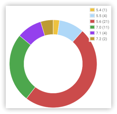
The Notification plugin’s usage on PHP versions from May 2018. (Large preview)

Go with PHP 5.6 as a minimal requirement, even though official support will be dropped by the end of 2018. WordPress itself requires PHP 7.2.

There’s a movement that discourages support of legacy PHP versions. The Yoast team released the Whip library, which you can include in your plugin and which displays to your users important information about their PHP version and why they should upgrade.

Tell your users which versions you do support, and make sure their website doesn’t break after your plugin is installed on too low a version.

5. Focus On Quality Code

Writing good code is tough in the beginning. It takes time to learn the “SOLID” principles and design patterns and to change old coding habits.

It once took me three days to display a simple string in WordPress, when I decided to rewrite one of my plugins using better coding practices. It was frustrating knowing that it should have taken 30 minutes. Switching my mindset was painful but worth it.

Why was it so hard? Because you start writing code that seems at first to be overkill and not very intuitive. I kept asking myself, “Is this really needed?” For example, you have to separate the logic into different classes and make sure each is responsible for a single thing. You also have to separate classes for the translation, custom post type registration, assets management, form handlers, etc. Then, you compose the bigger structures out of the simple small objects. That’s called dependency injection. That’s very different from having “front end” and “admin” classes, where you cram all your code.

The other counterintuitive practice was to keep all actions and filters outside of the constructor method. This way, you’re not invoking any actions while creating the objects, which is very helpful for unit testing. You also have better control over which methods are executed and when. I wish I knew this before I wrote a project with an infinite loop caused by the actions in the constructor methods. Those kinds of bugs are hard to trace and hard to fix. The project had to be refactored.

The above are but a few examples, but you should get to know the SOLID principles. These are valid for any system and any coding language.

When you follow all of the best practices, you reach the point where every new feature just fits in. You don’t have to tweak anything or make any exceptions to the existing code. It’s amazing. Instead of getting more complex, your code just gets more advanced, without losing flexibility.

Also, format your code properly, and make sure every member of your team follows a standard. Standards will make your code predictable and easier to read and test. WordPress has its own standards, which you can implement in your projects.

6. Test Your Plugin Ahead Of Time

I learned this lesson the hard way. Lack of testing led me to release a new version of a plugin with a fatal error. Twice. Both times, I got a 1-star rating, which I couldn’t turn into a positive review.

You can test manually or automatically. Travis CI is a continuous testing product that integrates with GitHub. I’ve built a really simple test suite for my Notification plugin that just checks whether the plugin can boot properly on every PHP version. This way, I can be sure the plugin is error-free, and I don’t have to pay much attention to testing it in every environment.

Each automated test takes a fraction of a second. 100 automated tests will take about 10 minutes to complete, whereas manual testing needs about 2 minutes for each case.

The more time you invest in testing your plugin up front, the more it will save you in the long run.

To get started with automated testing, you can use the WP-CLI \`wp scaffold plugin-test\` command, which installs all of the configuration you need.

7. Document Your Work

It’s a cliche that developers don’t like to write documentation. It’s the most boring part of the development process, but a little goes a long way.

Write self-documenting code. Pay attention to variable, function and class names. Don’t make any complicated structures, like cascades that can’t be read easily.

Another way to document code is to use the “doc block”, which is a comment for every file, function and class. If you write how the function works and what it does, it will be so much easier to understand when you need to debug it six months from now. WordPress Coding Standards covers this part by forcing you to write the doc blocks.

Using both techniques will save you the time of writing the documentation, but the code documentation is not going to be read by everyone.

For the end user, you have to write high-quality, short and easy-to-read articles explaining how the system works and how to use it. Videos are even better; many people prefer to watch a short tutorial than read an article. They are not going to look at the code, so make their lives easier. Good documentation also reduces support tickets.

Conclusion

These seven rules have helped me develop good-quality products, which are starting to be a core business at BracketSpace. I hope they’ll help you in your journey with WordPress plugins as well.

Let me know in the comments what your golden development rule is or whether you’ve found any of the above particularly helpful.

Smashing Editorial
(il, ra, yk)

How to excel at everything

Original Source: http://feedproxy.google.com/~r/CreativeBloq/~3/hesNXZlK2a8/how-to-excel-at-everything

Product design, packaging design, branding and book publishing are all well-established disciplines, filled with plenty of specialist, single-focus agencies. So for a relatively small studio to excel in all of them at once is rather impressive, but Here Design has managed it.

East London agency Here is also notable in the male-dominated realm of creative directors in that two of its three co-founders are women. Driven by a shared passion for creativity in all its forms, Caz Hildebrand, Kate Marlow and Mark Paton continue to fly the flag for multidisciplinary design. We asked Paton and Marlow to tell us more…

How was Here Design founded?

Mark Paton: We didn’t have a written ethos, or any precise definition of what to do. We just shared a broad interest in food and drink, and sharing knowledge. Caz wanted to do furniture design; Kate was interested in textiles; I was doing other things. Initially it was about sharing infrastructure. We had an accountant in common, and just wanted a nice, creative environment to work in. It was really unstructured.

Kate Marlow: It was 12 years ago now. We left our respective jobs: Mark and I were in branding; Caz in publishing, in book design. We wanted to work together in a small environment, designing for brands we believed in. 

As Mark says, there was no master plan, no big idea. We got on well, and had a shared ethos about what good ideas were, and how to articulate them.

How did the studio evolve?

MP: It’s been super-organic, and a huge learning curve: we’ve had to learn about all of decisions we should have made at the beginning. Early on, we pitched to rebrand an organic food shop, and surprisingly we won. That suddenly gave us a body of work that we were working on together, which crystallised the nature of the studio and how we could share our experience. 

KM: As it went on, we got more jobs in than we could cope with just three of us. So, we slowly employed people to help us and it grew very, very slowly. For a very long time, we did all our own project management, finance, everything. We were the receptionists too.We learnt what we could and couldn’t do very well. Thankfully we now have experts in areas like finance, and a head of studio. They do a much better job than we ever did.

Here has published several books including a playful book on punctuation entitled This is Me, Full Stop

How have you structured the agency?

MP: This year we’ve employed a new tier of designer in the studio: design associates. We have four now, each with a portfolio of clients.

We’ve struggled a bit to create a structure without being very hierarchical. We don’t buy into certain job titles. For us, it was important to create our own definition. T

he design associates will take more of a lead on certain projects, while the partners focus on developing the business, thinking about new sectors, and also some smaller projects. It may seem a bit counter-intuitive, but we still want to design, so are happy to pick up speculative work that’d be a burden for the studio to do.

Here’s rebrand of Barcardi taps into the brand’s rich heritage

Have you struggled to stay hands-on?

KM: No, in fact we’ve probably struggled to be hands off. We need to learn to do that more, so the other designers can work their way up. 

We’re passionate about all our projects, and as partners we lead teams and are really collaborative with the design associates and senior designers, right through to the juniors. 

How have you stayed multi-disciplinary?

MP: We have had conversations about whether we need to specialise, but I think part of what makes Here interesting is that we work on such different topics. We very pragmatically believe that if a designer works across a book, a pack, an identity and a digital application, they will become a better designer. 

Here translated the physical geography of the streets around adidas Originals stores into architectural models

How do you choose who works on a project?

KM: Sometimes, one of us is just a really good fit for a client. That might be based on personality, or previous experience – or it might be that one of us actually hasn’t got much experience in that field, and that’s what we find exciting. They could come up with things you wouldn’t necessarily think to do, because they don’t know that genre so well. 

Do you work with external collaborators?

MP: A lot is done in-house. At college you didn’t have the option to commission someone: you had to get your paints out and do it. We advocate the guys having a go, but there are instances where it’s beyond us, so we commission out. But the lion’s share of illustration, for instance, is done in-house.

It’s partly a cultural choice: it’s nice to have people making marks and creating images. It makes for a richer experience.

Here created a beautiful wooden display box for Balvenie whisky 

How do you attract and retain the right talent?

MP: From the moment we started in Caz’s kitchen, we recognised the importance of the moments that weren’t designed. Making lunch together was a bonding experience, which sounds a bit cheesy, but it was important. 

We came from quite ordered environments, and wanted it to feel more homely and casual. When we were lucky enough to design this space, a creative kitchen was the first thing we set up. On a Friday, everyone tries to have lunch together and different people cook. 

The strength of the studio is the people within it. It’s not really us as partners – we are not necessarily the embodiment of the company. We’re just kind of trying to create a way of working that everyone can benefit from. 

Recognising people and allowing them to flourish –almost autonomously – is another thing that happens here that maybe doesn’t elsewhere. A junior designer can come in, be given a live project and see it through. We review things democratically too, so there’s an opportunity for everyone to speak up. I think that openness, and the fact that the opportunities are quite apparent and quite quick, makes people stick around. A lot of people have been here for a long time – we’re very lucky.   

This article originally appeared in issue 277 of Computer Arts magazine, the world's best-selling design magazine. Buy issue 277 or subscribe to Computer Arts.

Related articles:

How to build a global reputation overnightWhen to use humour in brandingThe designer's guide to illustration