Collective #689

Original Source: https://tympanus.net/codrops/collective/collective-689/

Codrops Collective 689 item image

Inspirational Website of the Week: Baillat Studio

A slick and bold design with sharp typography and interesting layouts. Our pick this week.

Get inspired

Codrops Collective 687 image

Our Sponsor
Black Friday is Coming

Over $1,000,000 worth of free prizes, free bonus gifts, dozens of exclusive discounts and perks from our partners, and our biggest discount ever on Divi memberships and upgrades (plus tons of discounts in the Divi Marketplace)!

Check it out

Codrops Collective 689 item image

How JavaScript engines achieve great performance

Robin Heggelund Hansen takes a closer look at a few techniques that different JavaScript engines use to achieve good runtime performance.

Read it

Codrops Collective 689 item image

Expo Map

An amazing interactive WebGL 3D replica of the expo site in Dubai.

Check it out

Codrops Collective 689 item image

Modern CSS Reset

A tour of Josh W Comeau’s custom CSS reset.

Read it

Codrops Collective 689 item image

Tiny UI Toggle

Toggle the state of a UI element to easily create components e.g. collapse, accordion, tabs, dropdown, dialog/modal.

Check it out

Codrops Collective 689 item image

Parallax Powered by CSS Custom Properties

A great tutorial by Jhey Tompkins on how to use custom properties to control a parallax effect.

Read it

Codrops Collective 689 item image

emojimix

A fun tool that lets you combine two emojis into one.

Check it out

Codrops Collective 689 item image

SVGcode: a PWA to convert raster images to SVG vector graphics

Learn about SVGcode, a Progressive Web App that lets you convert raster images like JPG, PNG, GIF, WebP, AVIF, etc. to vector graphics in SVG format.

Check it out

Codrops Collective 689 item image

How to build stunning 3D scenes with React Three Fiber

This article shows you how to create breathtaking 3D animations using React Three Fiber (R3F).

Check it out

Codrops Collective 689 item image

Dynamic Color Manipulation with CSS Relative Colors

Jim Nielsen explains why he’s so excited about dynamic color manipulation with CSS relative colors.

Check it out

Codrops Collective 689 item image

AppFlowy.IO

AppFlowy is an open source alternative to Notion where you are in charge of your
data and customizations.

Check it out

Codrops Collective 689 item image

BgRem

An AI powered video background removal tool.

Check it out

Codrops Collective 689 item image

Cross-fading any two DOM elements is currently impossible

A really interesting article by Jake Archibald on a tricky problem: cross-fading two elements.

Read it

Codrops Collective 689 item image

State of CSS 2021

Philip Jägenstedt gives an overview of the State of CSS 2021 survey results and how they will influence priorities in 2022.

Check it out

Codrops Collective 689 item image

Tamagui

In case you didn’t know about it: Universal React design systems that optimize for native and web.

Check it out

Codrops Collective 689 item image

Caffeine

A very basic REST service for JSON data – enough for prototyping and MVPs.

Check it out

Codrops Collective 689 item image

How not to write property tests in JavaScript

James Sinclair explores the question “how do we keep ourselves from over-specifying or writing unnecessary tests?”

Read it

Codrops Collective 689 item image

Backgrounds

In this “Learn CSS!” module you’ll learn how you can style backgrounds of boxes using CSS.

Check it out

Codrops Collective 689 item image

Let’s not send developers to the accessibility tree tool

Christian Heilmann’s overview of accessibility information in the browser that can be used and understood by developers.

Read it

Codrops Collective 689 item image

Marvin

Marvin is a fun Slackbot that doesn’t like any of your ideas.

Check it out

Codrops Collective 689 item image

Letting users tick a ‘none’ checkbox

Learn how adding a ‘none’ option to checkboxes can solve several issues.

Read it

Codrops Collective 689 item image

Puzzle Panda

Puzzle Panda lets you play jigsaw puzzles online for free. With touch support.

Check it out

Codrops Collective 689 item image

Blog Page Accessibility Deep Dive

Abbey Perini performs an accessibility audit to her portfolio and shares her insight in this series of articles.

Read it

Codrops Collective 689 item image

From Our Blog
Ripple Effect on a Texture with Three.js

A coding session that deconstructs the ripple effect seen on homunculus.jp.

Check it out

The post Collective #689 appeared first on Codrops.

Abstract Compositions — Graphic Design Inspiration

Original Source: https://abduzeedo.com/abstract-compositions-graphic-design-inspiration

Abstract Compositions — Graphic Design Inspiration

abduzeedo1124—21

Metric72 / is an art director based in Barcelona, Spain with an incredible portfolio mixing graphic design, motion design and typography. I am a fan of the style, especially the usage of gradients and colors overall. It feels a bit like the Flash sites in late 90s early 2000s and I love it.

Image may contain: screenshotImage may contain: sky, astronomy and starImage may contain: screenshot and clock

For more information make sure to check out Metric72 / on Behance.

A Showcase Of Lovely Little Websites

Original Source: https://smashingmagazine.com/2021/11/showcase-lovely-little-websites/

A map that blends past and present, a musical time machine bringing back distant memories, or an interactive graphic novel pulling you deeper and deeper into a powerful story — sometimes you come across a lovely little website that, well, instantly conquers your heart. It doesn’t necessarily have to be overly useful or practical. Instead, its true value shines in the experience you get from it. It might leave you with your jaw dropped, with a smile on your face, surprised, excited, or inspired.

In this post, we collected lovely little sites like these, found in the remote corners of the web. They are perfect for a short coffee break or whenever you’re up for a little bit of diversion. We hope you’ll enjoy them. Oh, and if you’ve come across a website that you feel is too good to keep to yourself, please don’t hesitate to share it in the comments below. We’d love to hear about it!

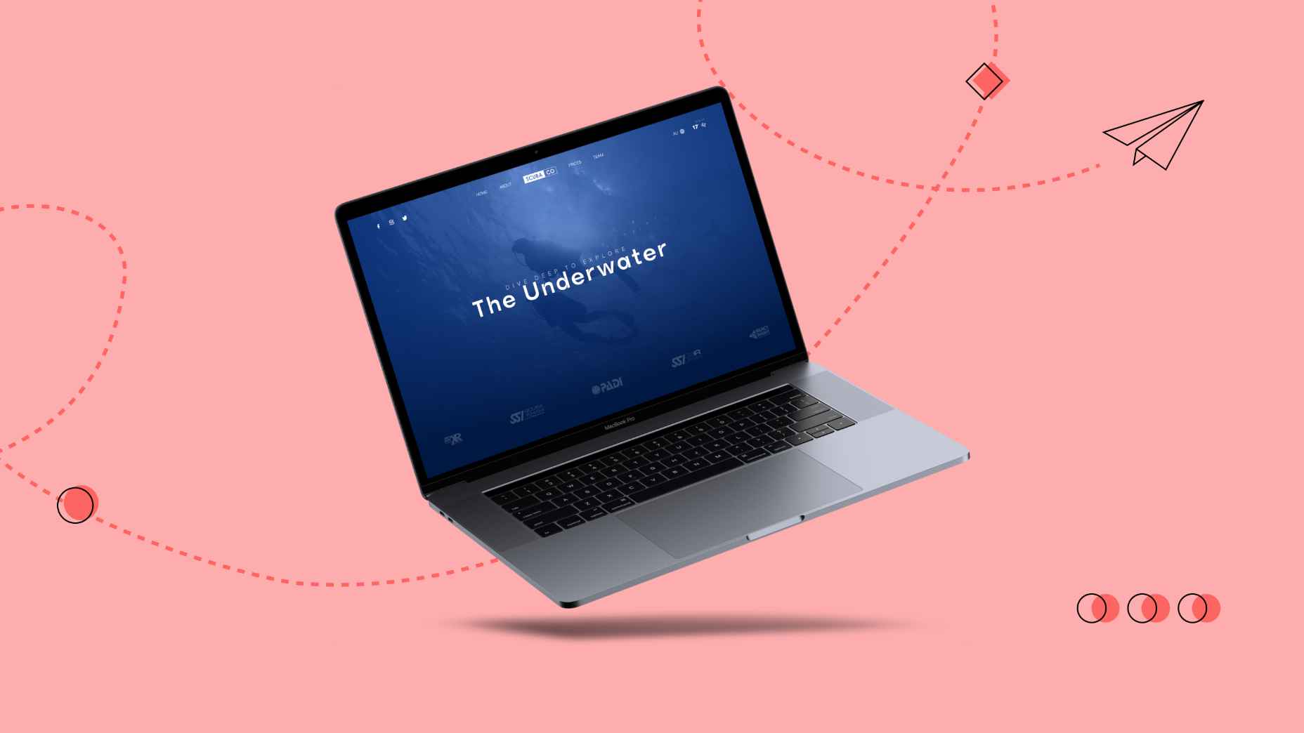
Plant Guides, From A To Z

Every office, and that includes home office as well, is better off with a lovely selection of beautiful plants. But which plants are easier to deal with for some of us who tend to be forgetful? Which ones require more care, and if so, what does it usually involve?

How Many Plants is a wonderful resource that covers all these questions well. It provides a thorough overview of all popular plants, sorted alphabetically and by care difficulty. You can even filter out plants based on their features (size, format, placement), plant type (traits, origins, pet-friendly) and leaf look (shape and surface). A great reference site to keep nearby.

Covid Art Museum

Of course, design isn’t quite like art. While design tries to solve a particular problem, art makes us think and feel — provoking us and questioning the status quo. But art can also bring around new perspectives and change in times when it’s so much needed.

The Covid Art Museum is a growing online exhibition of art born during Covid-19 quarantine, now with 238 contributions by people from all around the world. Often it’s an attempt to cope with the world around us, and perhaps take a slightly different perspective of how the changed world changed our perception of the world and our lives.

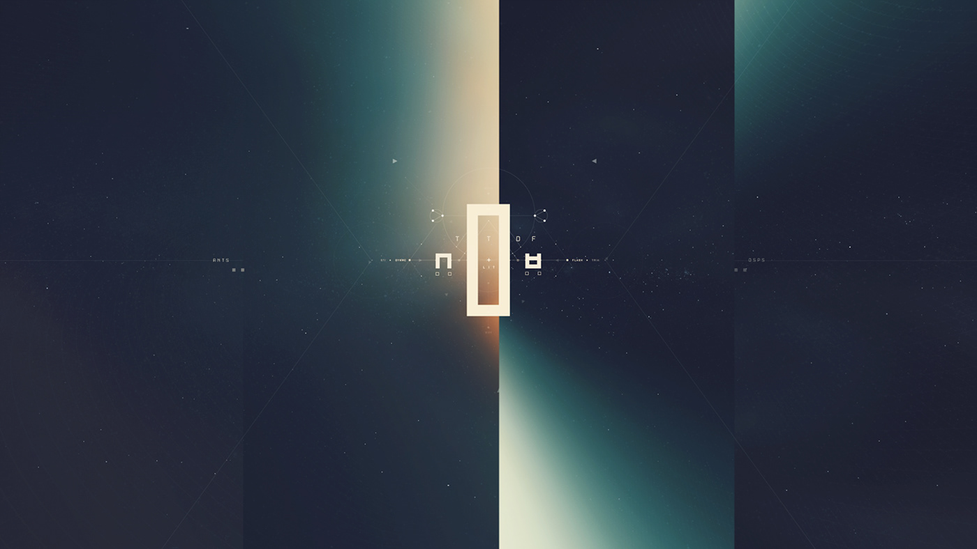
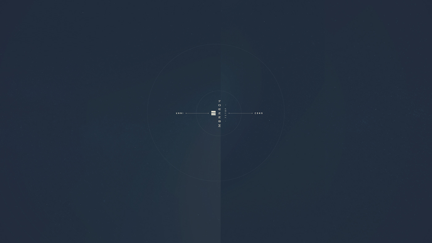
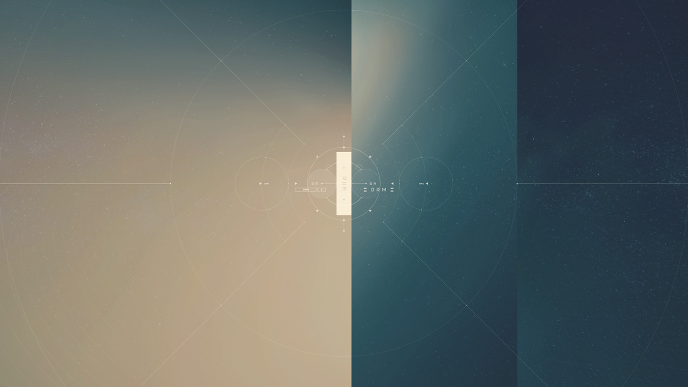
Museum Of Annoying Experiences

How often do you feel frustrated these days? How often do you open a browser window just to find yourself stuck identifying fire hydrants and understanding confusing sentences? Or perhaps calling a customer support service just to be put on hold for half an hour (at best)?

The Museum of Annoying Experiences takes us on a journey to the year 3000 when bad customer service is nothing but a distant memory, only observable in the exhibits that show how things used to be in the past (well, today) when most interactions were incredibly annoying. Each exhibit is interactive and playful, taking a fun look at frustrations around us. Who knows: hopefully in the year 3000, all these annoying experiences will indeed be distant.

The Musical Time Machine

It’s still quite difficult to travel back in time, but fortunately, we can do so online. What if you wanted to listen to the pop charts extravaganza from the US back in 1955 or Uzbekistan in 1932? Well, Radiooooo has got your back (well, you might need to sign up for a free basic plan first).

The website is a collection of songs collected over decades and now searchable, with filters by genre, speed, country, and time period. In fact, you can search by slow for chilling, fast for dancing, and weird music for bugging out — indeed, there is something for everyone! And if you want to go fancy, there is a shuffle mode, with songs picked by the curators.

UX Misconceptions And Laws

When we design experiences on the web, usually we rely on things that worked well in the past. Of course, we don’t know for sure how well our solutions worked, and we don’t know if they’d perform well next time around. But out of our experiences views emerge, and then as they find ground, they become more established over time. And sometimes, this is exactly how misconceptions appear.

“10 misconceptions on UX” highlights common views and data around infinite scrolling, making everything accessible from the homepage, original design, mobile-first and user interviews, among others. Admittedly, the creators of the site are quite opinionated, and you might disagree with some statements, but the website is fun to play with, and there are dozens of random fun facts to explore as well.

Also, if you’d like to deep-dive into common principles and heuristics of UX, Jon Yablonski has collected dozens of Laws of UX in his beautiful website, featuring everything from Hick’s Law and Law of Common Region to Tesler’s Law and Zeigarnik Effect. Wonderful resources worth keeping close!

The Timeline Of The Web

The web has been going through quite a few changes over the last three decades. You might remember Perl 5, Firebug, Backbone.js, and the end of Flash, but very often most things we’ve experienced on the web appear quite blurry, as they were changing so quickly.

In The History of the Web, Jay Hoffman, with illustrations by Katerina Limpitsouni, celebrates the most important events in the web’s young history. It’s an evolving timeline that charts the events on a timeline, with useful resources and links to follow-up and review. A lovely little project to keep bookmarked.

Sounds To Help You Focus

Staying focused might easily be one of the biggest challenges when you need to get work done. If you’re working from home and are missing the familiar office sounds, I Miss The Office brings some office atmosphere into your home office — with virtual colleagues who produce typical sounds like typing, squeaking chairs, or the occasional bubbling of the watercooler.

The Boat: A Powerful Piece Of Storytelling

Some stories are so dense, so intense, that they capture you and don’t let you go. “The Boat” is such a story. Based on the short story by Nam Le, “The Boat” combines animation, audio, and ink and charcoal drawings into a powerful, interactive graphic novel.

The story told is the one of Mai, a girl whose parents send her alone on a boat to Australia after the Vietnam War. And, well, the storytelling experience really is exceptional. Each little element, each thoroughly applied animation contributes to creating an atmosphere that reflects the fear, despair, but also the hope that is linked to the escape. Take some time and see for yourself. It’s worth it.

Interactive Timeline… In Dots!

Dots, dots, and even more dots. But these are not just any ordinary dots. Every dot is a historic event, so you can just imagine how the whole picture looks like if you step back and take a look at Histography. This impressive interactive timeline spans across 14 billion years of history, from the Big Bang to the 2010s. What started out as a simple project in the Bezalel Academy of Arts and Design by Ronel Mor, has now turned out to be a leading example of what creative timelines can actually look like.

All of the historical events shown in the interface have been drawn from Wikipedia and new recorded events are added on a daily basis. Not only does it allow you to skip between decades to millions of years, but you can also choose to watch a variety of events which have happened in a particular period or target a specific event in time.

Designing A Galaxy Far Far Away

Take 22 Illustrator files that measure 1024 × 465152 px combined, put in 1000 hours of work, and add the story of Star Wars Episode IV. What you’ll get is a project that will make your jaw drop: SWANH. Brought to life by illustrator and graphic novelist Martin Panchaud, SWANH tells the whole story of “Star Wars: A New Hope” in a huge infographic that requires 403.5ft (123m) of scrolling to get from top to bottom. And, well, it’s worth it.

Made up of 157 images, the sheer dimensions of the piece are impressive, and so is the love to detail that Martin Panchaud put into creating the Star Wars universe. But SWANH is more than eye candy for Star Wars lovers. It’s also an experiment that wants to create a contrast to what we usually expect on the web: quickly understandable contexts and short stories. Brilliant.

Design Facts That You Didn’t Know About

Humankind has always created, however, the design craft as we know and practice it today is a rather young discipline. But that doesn’t mean it doesn’t have a lot of stories to tell. The project Design Facts by writer and art director Shane Bzok reveals them by serving bite-sized pieces of design history that you probably haven’t heard of yet.

Did you know, for example, that the logo for the Spanish lollipop company Chupa Chups was designed by Salvador Dali in 1969? That the Adobe founders named their company after a creek that ran behind the house of one of the founders? Or that the logo of the Chanel brand with its interlocking C’s originally adorned the building of a French vineyard and that Coco Chanel was granted permission by the vineyard owner to use it for her brand in the early 20’s? These are only three of the more than 130 surprising and informative design facts that Shane Bzok has collected. Perfect to squeeze into a short coffee break.

The Beauty Of Vintage Control Panels

An old phone with a dial plate, a tape deck with a grid of buttons, an electricity control room with hundreds of bulbs — vintage electronics have a fascinating charm to them. In praise of all those dials, toggles and buttons that made and shaped the tech design of the past century, Stephen Coles and Norman Hathaway dedicated a Tumblog solely to vintage control panels.

As you’ll see, browsing the collection feels like opening a time capsule. Apart from car dashboards and tech magazine covers of the 80s that still seem (fairly) familiar, you’ll find gems like four-buttoned remote controls from the 40s or retro-futuristic concepts, among them a smartwatch from the 80s that is essentially a shrunken PC worn on the wrist. A fun journey through the history of interface design. Leaves us with the question what people will think about our state-of-the-art gadgets and UIs in 50 years from now.

Little Moments Of Happiness

Did you ever cool off a lion with a fan? It might sound weird, but, well, we did. And what can we say? The lion loved it! The refreshing breeze made his mane dance and brought a big smile to his face. Don’t believe it? Well, go ahead, and try for yourself.

The lion is part of the WebGL project named “Moments of Happiness”, which was brought to life by EPIC Agency. He and five of his animal friends — a sneezing dragon, a playful cat, a paranoid bird, a valorous rabbit and a mighty fish — are bound to put a smile to your face, too, as you interact with them. To breathe life into the odd yet lovable bunch, the experiments use Three.js and the GSAP Library. If you want to take a closer look under the hood, the source codes are available on Codepen. Watch out, though: They are not fully optimized and might not work in some browsers or devices.

Monochromatic Eye Candy

Who doesn’t love some good eye candy? If you need some fresh inspiration, be sure to stop by the Tumblr of The Afrix. Curated by designer Tom Wysocki, the Tumblr resembles a well-balanced exhibition of opposites — black and white, strict geometry and fluent, organic shapes — joining up to build a harmonious whole.

Among the works, you’ll find actual designs for portfolio websites and detailed illustrations, but also rather abstract and seemingly random digital experiments. It’s that mix of the unforeseen that makes the showcase so refreshing despite its monochromatic color palette. Beautiful works of art with a mysterious touch.

An Alphabetical Adventure

“A” is for “Albert”, “B” is for “Bounce”, “C” for “Cowabunga”. If you have no idea what all of this is about, well, no worries, we’ll tell you: it’s the beginning of a very special piece of eye candy. Brought to life by design agency Studio Lovelock, “A Is For Albert” explores the moments of happiness — and the little mishaps — that life with kids brings along — with an animated alphabet.

Each letter from A to Z tells the story of how Albert, a blonde little boy, explores the world in his own cute yet chaotic (and seen from his parents’ perspective sometimes maybe even a bit annoying) way. He decorates the livingroom wallpaper with his brush artworks, for example, and shows his love for the family cat by hugging it a bit too tight. Simple geometric shapes and a soft color palette are everything the project needs to breathe life into Albert’s (and his parents’) everyday adventures and make us smile.

Blending Past And Present

Maps can do more than help us find the way. They are witnesses of their time and, when we look at old maps, it’s like taking a trip back into long forgotten days. Now imagine that you had a magic spyglass that could show you what your neighborhood looked like 100 years ago. You’d only need to get out a recent map, hover your spyglass over it, and see what has changed.

Well, actually, that’s possible. The National Library of Scotland provides a browser-based tool that lets you jump between the same area on a recent and a vintage map just looking through a (digital) spyglass. The service works for maps of Great Britain, Scotland, England, and Wales. A fantastic way to see the world (and maybe even your neighborhood) from a different perspective.

Do You Have The Design Eye?

So, you think no-one is better than you when it comes to assessing if something is centered or slightly off? Well, then here’s a challenge for you: It’s Centred That. The little game created by the folks at the UX design and web development studio Supremo takes your design eye to the ultimate test: You’re presented with shapes and need to decide if the dot is placed in the center. But beware, what sounds easy, is actually harder than you’d think. Will you make it through all 10 levels?

Patterns In Islamic Art

The Islamic world has brought forth an incredibly rich heritage of architectural decoration, a heritage that deserves to be better known and that has a lot to offer not only to art historians, as David Wade points out. To make the beauty accessible to everyone, he started Pattern in Islamic Art, a showcase of more than 4,000 images of patterns and other design features drawn from this artistic tradition. No matter if you are up for some eye candy or want to investigate the underlying construction of the complex geometries, the site is a real treasure chest.

Print Design Inspiration From The Past

Typography, layout, color, patterns — vintage magazines provide an endless source of inspiration. If you’re up for some eye candy, the folks at Present & Correct have collected a selection of print design goodies over time.

Among them are covers from the East German design magazine Form + Zweck which was published between 1956 and 1990, just like covers of Switzerland’s oldest typographic journal Typographische Monatsblätter. The Japanese magazine Industrial Art News with its bold and vibrant cover art is also part of the collection. For some more contemporary inspiration, be sure to also check out the site of the Japanese IDEA magazine where you can peek inside past issues and even browse them by keyword. Eye candy to get lost in.

A Curated Gallery Of Patterns

When bold colors meet subtle palettes, organic curves appear next to sharp-edged geometric forms, and minimalist designs face playful artworks, inspiration isn’t far. If you’re up for a surprise bag of inspiration, Pattern Collect is for you. The site curates beautifully illustrated patterns created by designers from across the globe.

You can browse the showcase by tag and, if you like an artwork, a link takes you to the original on Dribbble or Behance where you can learn more about the illustrator and their work. Who knows, maybe this will even turn out to be the opportunity to find creative talent to work with on an upcoming project?

A Trip Back To The Early-Days Of Computing

You’re in the mood for some tech nostalgia? Well, then PCjs will be your kind of thing. The open-source project revives the times when computers came with a monochrome display and ran on 4.77Mhz and 64KB of RAM. And the best: It’s no showcase, but you can actually interact with the machines right in your browser. The simulations of the Original IBM PC from 1981 and the OSI Challenger 1P from 1978 were written entirely in JavaScript and require no additional plugins — no Java, no Flash.

The pre-configured machines are ready to run BASIC, DOS, Windows 1.01, and assorted non-DOS software, and, if that’s not enough control for you yet, you can even build your own PC. The goal of the project is to help people understand how these early computers worked and to make it easy to experiment with them. It also provides a platform for running and analyzing older software. Now that’s really a trip down the memory lane.

A Rainbow Of Cover Artwork

By pairing hex color values with album cover art of 2020, you’ll have the foundation for a very special project: Album Colors Of The Year. It arranges some of last year’s album releases by color to create a rainbow of cover artwork.

Lady Gaga’s album “Chromatica”, for instance, is a case of #ed4c73, Suuns’ “Fiction” shines in #e489b3, and Avalon Emerson’s “DJ-Kicks” screams #f8bb04. In times when album covers often live rather unnoticed in the corner of our smartphone screens, it is nice to see their artwork in the center of attention for a change. A great place to seek fresh inspiration — or just discovering some new tunes to get you through a lengthy coding session.

Teletext Time Travel

Do you remember the times when you switched to the teletext for the weather forecast or the sports results? The loud colors on the black background, pixel art graphics, and flashing text? (Well, you might not, and it’s perfectly fine!) The Teletext Museum is the perfect place to revive these memories or discover them (if you live outside Europe, for example).

If we didn’t have the web, most of us would still be teletext designers and developers since essentially each teletext page is a box with content in it. Sounds familiar? Well, the gallery with images from teletext services from around the world illustrates how the interface design has evolved over time and a timeline gives you more information on what exactly changed and how.

If you ever wanted to take on the role of a teletext designer, well, you can do that, too. Jason Robertson who recovers old teletext data from VHS cassettes in a complicated and time-consuming process provides a plethora of teletext pages from the 80’s and 90’s. Some of them can be edited right in the browser. The process needs some getting used to, but it’s definitely a fun trip back in time.

The Lives Of Famous Painters

When we hear names like Picasso, Dalí, or Miró, we immediately remember some of their paintings. But what do we actually know about the artists behind the masterpieces? About their lives and love, the events that shaped them and their works? To visualize painter’s lives, information designer Giorgia Lupi and her team at Accurat teamed up with illustrator Michaela Buttignol. The result of the collaboration is a stunning series of minimalist infographics that boil the biographies of ten famous painters down to their cornerstones.

The visualizations depict key moments — births, deaths, love affairs, marriages, children, travels — but also interesting tidbits such as astrological sign, left/right handedness as well as connections and influences. By picking up the characteristic colors and other stylistic preferences of each artist, the designs also reflect the painters’ styles. A fun way to dive deeper into the history of art. If you’d like to learn more about creating engaging infographics like this one, you should also check out Giorgia Lupi’s article on the aesthetics of data narratives.

The Museum Of The World

The Rosetta Stone, the Parthenon sculptures, Egyptian mummies — all of them cornerstones of human culture which can be admired in the British Museum today. Comprising more than 2,000,000 years of human history, its collection is exceptional and one of the largest of its kind. To make that cultural heritage accessible to more people from all over the world, the British Museum has partnered up with Google. The result: the Museum Of The World.

The WebGL-powered desktop experience explores connections between the world’s cultures by showcasing exhibits that shaped human history. As you travel deeper into the history of mankind with each scroll, you can browse the artefacts according to type and area of origin — no matter where in the world they might be located. Stunning.

Bringing Imaginations To Life

Guess what happens if 100 kids draw monsters and 100 illustrators bring those imaginations to life? Probably something hilarious and very refreshing. Katherine Johnson did just that: She invites Elementary students to draw monsters, and once their creations have taken shape, she works with illustrators to bring them to life in their unique artistic styles.

The ultimate goal of The Monster Project as the project is called is to help children recognize the value of their ideas and make them feel excited about the creative potential of their own minds. At the moment, the site features over 100 monsters created by over 100 artists from all over the world. Now, are you feeling inspired already?

Popular Design News of the Week: November 15, 2021 – November 21, 2021

Original Source: https://www.webdesignerdepot.com/2021/11/popular-design-news-of-the-week-november-15-2021-november-21-2021/

Every day design fans submit incredible industry stories to our sister-site, Webdesigner News. Our colleagues sift through it, selecting the very best stories from the design, UX, tech, and development worlds and posting them live on the site.

The best way to keep up with the most important stories for web professionals is to subscribe to Webdesigner News or check out the site regularly. However, in case you missed a day this week, here’s a handy compilation of the top curated stories from the last seven days. Enjoy!

The 9 Best XAMPP Alternatives for Hosting your Website Locally

Exciting New Tools for Designers, November 2021

Why Developers are so Divided Over WordPress

Step-by-Step Guide: How to Design a Website Homepage

How to Build F and Z-Patterns Using HTML and CSS

UX Design Psychology Tricks for Design Excellence

What if Phones were Actually Designed for Hands?

Dddoodle – Collection of Fun Hand-Drawn Illustrations in SVG Format

Layout Patterns – Collection of Layout Patterns Built Using CSS

22 Impressive Web Design Concepts for Various Business Objectives

Source

p img {display:inline-block; margin-right:10px;}
.alignleft {float:left;}
p.showcase {clear:both;}
body#browserfriendly p, body#podcast p, div#emailbody p{margin:0;}

The post Popular Design News of the Week: November 15, 2021 – November 21, 2021 first appeared on Webdesigner Depot.

Creative Problem Solving for UX Designers

Original Source: https://www.webdesignerdepot.com/2021/11/creative-problem-solving-for-ux-designers/

It’s normal to pull up sharp in front of a problem; after all, if there was a known solution, it wouldn’t be a problem. But knowing that it’s normal, doesn’t make encountering problems any less frustrating. So how do we avoid sitting in front of a UX problem for hours, achieving nothing?

That’s what creative problem solving is all about.

In this post, we’ll explore creative problem solving, and how it can help you as a UX designer. Then we’ll analyze how you can solve UX problems in a few, easy-to-remember steps. By the end of this article, you’ll have all the tips you need for UX problem-solving.

What is Creative Problem Solving?

Creative problem solving is a term developed by Alex Osborn, the founder of the Creative Education Foundation. In a nutshell, this term is about overcoming challenges in our work lives through innovative solutions. But, of course, such solutions vary by profession.

For UX designers, creative problem solving is about solving UX problems with efficient tactics, that work. And that’s precisely why UX problem solving is so essential because following a specific method can help us avoid getting stuck.

Whether you are a newbie or an experienced designer, you are probably focused on projects that require you to solve problems. If you have never had a problem before, you must be a superhero; for us mere mortals, here are the steps we need to follow to solve a UX problem:

UX Problem Solving in 5 Easy Steps

Delivering a great UX solution is influenced by two key parameters: user research and creative problem-solving. Suppose you have done your user research and are currently looking for an original solution to a problem. In this case, the methodology below will be handy:

1. Identify the UX Problem

I know this may sound obvious, but think about it. How many times have we lost days because we didn’t identify the real problem? If you are solving the wrong problem, it does not matter if your solution is original and innovative.

That’s why the first thing you need to do is think about the problem. Ask yourself what the real problem is, and then get to work solving it. Identifying the problem may take some time, but it will prove beneficial to your project in the long run.

2. Clarify the UX Problem

Now that you have identified the UX problem, it’s time to demystify it. In this step, you could create a user journey plan. It does not have to be perfect; some low-fidelity sketches are more than enough.

Set a timer and start visualizing your solution on paper. Remember, sketching is not about perfection or fine details. Once you have created a customer journey you are happy with, it’s time to move on to the next step.

3. Use Analytics

UX design isn’t about design per se. It’s also about numbers and data. This is why analytics are critical to UX problem-solving. Once you have gathered some data from users and competitors, it’s time to create patterns. This will help you better understand the problem and change your drafts accordingly.

Numbers and data alone can help you a lot if you combine them with an original idea. However, facts alone are not enough, and your original story will not be compelling without them. So what’s better than combining them?

4. Use Your Feedback

So you have come up with an innovative solution to the UX problem. You have successfully combined this idea with essential data. Unfortunately, your work is not yet done. 

The next step is equally important. Once you have polished your ideas, you should share them with colleagues and/or customers.

It’s not easy to get feedback for your UX mapping, but it’s very constructive and will ultimately make you a better designer.

5. Solve the Problem

The last step is also the most fun. Once you have listened to people’s feedback, you can redesign your original solution. Then you are just one step away from solving the UX problem. Now it’s time to digitally redesign your idea.

This is the step where fine details matter. Creating a high-fidelity wireframe is not easy, but most UX designers have the knowledge and tools to get it done.

UX Problem Solving: Useful Tips and Tricks
Be Methodical

In my opinion, this is the most useful tip when it comes to UX problem-solving. You do not always have to be in a hurry. In the early stages of a project, try not to get distracted by other problems. Focus on finding the real problem.

Once you are sure you have found it, you can move on to finding the best solution. Then move on to the next step and so on. It becomes clear that being methodical is a brilliant tactic.

UX Problem Solving is All about the Ecosystem

UX problem solving is not about fine details. So try to care less about the design and more about the ecosystem you want to create. That will help you gather all the data you need, from user opinions to analytics.

Low-Fidelity vs. High-Fidelity Wireframes

Starting with sketches and low-fidelity wireframes is a brilliant thing to do. Whenever I have tried to start a project directly with high-fidelity wireframes, I have gotten bogged down in details.

For this reason, pen and paper should be your best friends in UX problem-solving. Sketches help you explore different approaches and get the feedback you need.

Explore Different Tools/Approaches

When it comes to solving a UX problem, there is usually one efficient solution. But that is not always the case. In most cases, we have to consider different alternatives and identify more than one critical interaction.

For this reason, feedback is also crucial for UX problem-solving. Your colleagues and customers will help you find the best method. Try to accept criticism and be open when listening to feedback. This way, you will ensure that you will find the best possible solution.

Wrap Up

Solving a UX problem is not easy. However, if you identify the real problem and illustrate different approaches, you will be on the right track. Also, do not neglect to use the data and feedback you collect. The more tools you have in hand, the better UX designer you will be.


Featured image via Unsplash.

Source

p img {display:inline-block; margin-right:10px;}
.alignleft {float:left;}
p.showcase {clear:both;}
body#browserfriendly p, body#podcast p, div#emailbody p{margin:0;}

The post Creative Problem Solving for UX Designers first appeared on Webdesigner Depot.

15 Websites to Send Anonymous Emails

Original Source: https://www.hongkiat.com/blog/anonymous-email-providers/

The first question to answer here is why go for anonymous email when there are plenty of premium featured and free email services such as Gmail, Outlook and Yahoo! Mail available? Well, privacy and…

Visit hongkiat.com for full content.

Conceptual minimalist lighting collection — Industrial Design

Original Source: https://abduzeedo.com/conceptual-minimalist-lighting-collection-industrial-design

Conceptual minimalist lighting collection — Industrial Design
Conceptual minimalist lighting collection

abduzeedo1117—21

Dimi Litz shared a beautiful minimalist light collection inspired by the research of parallels between the Bauhaus movement and Constructivism. Untangling the tangle of historical threads reached the art of Kazimir Malevich where it became the starting point of a revolution of form, color and their relationship.

Suprematism is based on philosophic treatise with the main idea of search for the essential reality. Author denies serving the shape and color of secondary images and takes the characters off the canvas. — ”I was impressed. The simplicity and the accuracy of the artistic technique was exceptionally clear. I felt that I must transfer this idea to the world of material objects.”

Dot, ray, line, circle, triangle and square became the basis shapes. The shapes required a first-rate implementation in the material. Natural materials are the most noble and emphasize the philosophy of the collection. Steel and brass were complete with hand picked white marble and black granite.

The most difficult stage was bringing the design to perfection and optimizing production. We spent over 8 months making it as good as it has to be. Step  by step we cut off every false detail and made the idea shine.”

Credits

Dimi Litz – art direction, product design
Dmitry Beznosov – product design
Maksim Arbuzov – set design
Dmitry Saveliev – render
Anton Volodin – render
About atris

Atris is a lighting design studio from Russia.

Their passion for design and art came together in their projects. They strive to create designs that are closely related to the world of creativity and art in all its manifestations. — ”We hope to bring art into interiors and people’s lives because we believe that art is the key that opens the doors of elegance and sophistication in hearts.”

For more information make sure to check out atris.design  

How To Speed Up Your Bootstrap Development Process

Original Source: https://www.webdesignerdepot.com/2021/11/how-to-speed-up-your-bootstrap-development-process/

Currently, Bootstrap is among the most popular frameworks in the developer community. One of the most straightforward solutions for front-end development methods available, Bootstrap allows users to access convenient CSS and HTML components for forms, typography, sliders, navigation, and everything else you might need.

Bootstrap is naturally a pretty fast development solution, as it allows you to access everything you need to create your app in a straightforward environment. You can access premade classes, kits, and themes right out of the box and speed up your development without compromising on performance.

Still, this doesn’t mean there aren’t plenty of ways to enhance the speed of your Bootstrap strategy from time to time. So today, we’re going to look at some of the things you can do to speed up the development of your Bootstrap app.

Make The Most of the Tools Available

Let’s start with the basics: One of the things that makes Bootstrap so effective as a development tool is the ability to access specific tools and services to make building more efficient. The more you leverage these features, the better you’ll be at designing amazing apps quickly. 

For instance, a Task Runner is a fantastic addition to a Bootstrap development strategy. With these tools, you can automate tasks like compiling code or moving code from Typescript to JavaScript. In addition, many developers use these tools when they configure a job that runs every time a specific file is modified, so they don’t have to manually recompile all the time.

The most popular Task Runners available right now are Grunt JS and Gulp JS. Gulp is based on Node.jS, while Grunt works in line with its templating environment. 

Other helpful tools you can check out to accelerate your development process include Sass or Syntactically Awesome Style Sheets – a pre-processor scripting language compiled into CSS so that you can create better stylesheets with minimal effort. In addition, the Sass technology reduces the need for repetition by extending CSS through various methods like inline imports, variable, and nested maps. This means you can implement changes a lot quicker and take more risks in your designs.

Tools like BrowserSync JS will synchronize your browser testing process by performing as a middle man between your browser and server. Using this tool, you shouldn’t have to hit the refresh button on the browser over and over when editing your code to see updates.

Get Comfortable with Scaffolding and Kits

Bootstrap’s front-end framework relies heavily on the grid system within the technology, packed with features to help developers structure a responsive layout. Because of this grid system, it’s easier to scaffold responsive designs before you do any coding. This way, you get ahead of the coding process and better insight into where content should go. 

Bootstrap’s grid system is pretty flexible so that you can define a set of rows divided according to each of the sections in your site or app. The best part is that each column can adjust to suit the template perfectly. 

You can speed up your development process even more by simply accessing existing themes and UI kits from the Bootstrap ecosystem. 

Bootstrap kits are UI kits consisting of a collection of flexible, attractive, and easy-to-use Bootstrap-based components and assets. You can easily plug your solution into your website and customize it based on your required design output. UI components might include things like input forms, widgets, navigation menus, and testimonials. A few options include:

Pixel: A free Bootstrap 5 UI kit with over 80 coded UI components, example pages, and more to help you design and build a website that makes sense for your projects. 
Fabrx: A comprehensive Bootstrap 5 kit with access to more than 500 responsive components, 250+ wireframes, and a host of ready-made templates. This comes seamlessly coded with CSS and HTML.
Material Design: One of the most popular open-source UI kits based on Bootstrap 5, this solution makes it easy to create material design-based components with CSS, JS, and HTML. There are more than 700 UI components already available within the kit. 

Experiment with Bootstrap Themes

Like Bootstrap UI kits, Bootstrap themes are a ready-to-use bundle of JavaScript, HTML, and CSS code complete with UI components, style components, and page layouts. Usually, these themes are designed for a specific kind of app or website. However, everything is generally created for you, for the most part, so that you can modify elements with your requirements later. 

While Bootstrap UI kits give you multiple pieces of coding and technology you can use in your development and how you like, Bootstrap themes are intended to be plug-and-play solutions. You modify a few components and resources, and you’re ready to publish. 

Bootstrap has its own selection of themes available, though most are available for a premium cost, so it’s worth checking out what you get in advance. One good option is the Admin and Dashboard template designed for creating applications for tracking things like analytics and website information. 

The theme here comes with access to all of your crucial bootstrap components, as well as Brite charts, Apex charts, multiple widgets, and icons. A few alternatives to try include:

Space: A free Bootstrap 5 multi-purpose theme with access to a creative, clean, and high-quality design with three different homepage variations, more than 100 UI elements, and a fully responsive layout. 
Massive: A multi-purpose CSS, HTML, and JavaScript theme featuring a trending and creative design, built entirely with Bootstrap 5, as well as the Sass ecosystem. 
Front: A multi-purpose premium responsive template. You’ll get six pre-built demos, 16 landing pages, and a host of other different page types to sort through.

Use a Bootstrap Builder

Most developers prefer to code their application or website entirely from scratch with Bootstrap – mainly since it’s easy to do. However, there’s also a faster alternative route you can consider too. For instance, using a Bootstrap builder or studio will turn the design process from a hard-code configuration into a more visual and straightforward process. 

Page builders come in many shapes and sizes, designed for both the web and desktop. Popular options like the Bootstrap studio come with drag-and-drop functionality for grid-based content, component creation, and access to quick-add components. 

Another bonus of using a builder is you can usually expect to have the latest version of Bootstrap available, so you don’t have to update constantly. For example, some of the newest page builders offering access to Bootstrap 5 include:

Start-up: A simple bootstrap-based builder, Start-up allows designers and developers to create websites, applications, and landing pages with drag-and-drop functionality. The solution is compatible with all Retina devices and has easy exporting. 
Boostrap Build: This is a simple and effective bootstrap application for prototyping and designing all kinds of Bootstrap themes and templates. There are tons of theming capabilities built-in, as well as live preview, color picker, variable search, and size adjuster. 
Mobirise: A free and straightforward bootstrap builder, this solution focuses on building various Bootstrap websites. 

Keep Learning

Bootstrap, like many development and design tools today, is constantly evolving. As new versions and components continue to emerge, it’s essential to be confident with the options you have for your website, application, or whatever else you might be making. 

It is exhausting to continuously check out the latest tutorials and posts on the official Bootstrap website; it is much easier to get things done when you know how everything works. The good news is that many of the courses and guidelines available on the web today are free to use. For example, you can get a crash course for beginners on Bootstrap 5 or find a collection of some of the most popular crash courses here.

It’s also worth keeping an eye on the latest news released by the Bootstrap team, so you can get an idea of any new features or functionality you might need to learn as you’re working on your builds. If you’re using the tools we mentioned above, like Sass, make sure you check out the latest updates for those, too – many of the tools available for Bootstrap will get updates too. 

If you’re feeling really in the dark about your new Bootstrap features, you can check out sites like Udemy, which offer step-by-step guides for beginners.  Though the entire course does have a fee attached to it, you’ll learn how to build various projects within Bootstrap, which could make you more efficient at development later. 

As you’re learning how to master Bootstrap development, try not to pile too much on your plate at once. If you decide to work with the precompiled download package for Bootstrap, it’s worth accessing only the specific aspects of the library you need at any given time. 

Start by using simple tools like bootstrap-reboot.min.css for a simple CSS reset for your project, or access the easy-to-use grid system at bootstrap-grid.min.css. You don’t necessarily need to access and learn all the frameworks at once.

Remember the Basics

Finally, all aspects of Bootstrap development get a lot easier when you start thinking about becoming a better coder. Apart from the above points, optimizing a website in any landscape still means incorporating the right front-end performance techniques you would access for any website. 

Although focusing on getting the UX right with your bootstrap build might add more time to your development process initially, it also means you’re less likely to have to come back to your website and make changes in the future. This should mean that you can spend less time developing your project overall and more time optimizing the experience.

For instance, you should still:

Use lean JavaScript and CSS: Remember, every character in your code will contribute to the final weight of your webpage. Clean and concise JS and CSS can be difficult to master, but it’s something you need to strive for in most of your projects. Good CSS practices will usually involve getting rid of unused selectors where possible and duplicate code, overly nested rules, and disorganized content. Style guides can often be helpful here. You can also access features like JS Lint and CSS lint to clean up your code too. 
Minify your JS and CSS code: An essential step in optimizing your website is limiting the number of HTTP requests a website makes to render the content. Each trip to the server and back takes more time, harming user experience. Minifying the document will help you to keep file sizes small and reduce HTTP requests. 
Reduce image sizes: The weightiest part of your website is usually the image files. However, video and audio files will also play their role. Make sure you’re always using the right image or file type for each job and squeeze extra bytes from your images wherever you can with compression too. 

While it’s great to get a development project done quickly, don’t mistake rushing through and forgetting essential elements that influence the impact of your project. You still want your project to work perfectly – even if you’re developing it quickly. 

Speeding Up Development with Bootstrap

Bootstrap is a fantastic, fast-paced solution for developing all kinds of incredible websites, applications, and projects. However, learning how to use all the features and components of your Bootstrap environment correctly can ensure you’re more likely to speed up the development process. The tips above will allow you to discover all the benefits of the Bootstrap front-end framework. 

Remember, try to find the right balance between speeding up your development process, and maintaining a high level of quality. Time saved on initial development won’t do much good if you have to come back and make additional fixes later. So focus on getting things right the first time, but use tools and templates to help you whenever you can. The more you work on Bootstrap, the better your projects will become. 

Source

p img {display:inline-block; margin-right:10px;}
.alignleft {float:left;}
p.showcase {clear:both;}
body#browserfriendly p, body#podcast p, div#emailbody p{margin:0;}

The post How To Speed Up Your Bootstrap Development Process first appeared on Webdesigner Depot.

How to Draw a House

Original Source: https://designrfix.com/blog/how-to-draw-a-house

There are several meanings associated with houses. One can envisage them as places where one may live or imagine that one day one will reside there. Seeing houses every day is a common occurrence, and it is easy to imagine how it would feel to design and build your own home. It’s hard to draw…

The post How to Draw a House appeared first on .

Dell XPS 13 down to $650 in unmissable Black Friday deal

Original Source: https://www.creativebloq.com/news/dell-xps-13-bf-deal

Save $300 on this powerhouse of a laptop.