Clarus Via Motion Design

Original Source: http://feedproxy.google.com/~r/abduzeedo/~3/AbTBVD61haU/clarus-motion-design

Clarus Via Motion Design

abduzeedo11.19.20

Anxo Vizcaíno shared a 3D and motion design project titled Clarus Via. Clarus (latin for light, clear) Via (latin for way, path) is a short story about light, an exploration of its behaviors and its capacity to create space and time. It’s also about being born, exploring, understanding and finding. Thierry Urbain’s work has been a great source of inspiration, along with wonderful architecture works around the world.

“Architecture is the arrangement of light”. Antoni Gaudí
“The light that goes out dazzles more than the one that comes on”. Roberto Juarroz

Stills 

Credits

Visuals: Anxo Vizcaíno    
Audio: UUNNOO.xyz


Fresh Resources for Web Designers and Developers (November 2020)

Original Source: https://www.hongkiat.com/blog/designers-developers-monthly-11-2020/

We are almost at the end of 2020. Many things unprecedented have happened this year, but it does not stop us to share fresh resources for our fellow developers. In this round of the series,…

Visit hongkiat.com for full content.

Coding the Golden Spiral City from the Creative Cruise Website with Pixi.js

Original Source: http://feedproxy.google.com/~r/tympanus/~3/EGJTNTKnR-I/

Editor’s note: We want to share more of the web dev and design community directly here on Codrops, so we’re very happy to start featuring Yuriy’s newest live coding sessions!

In this live stream of ALL YOUR HTML, we’ll be diving into the code for the beautiful golden spiral city on the website of Creative Cruise that was made by the folks of Superhero Cheesecake. There will be some Fibonacci spiral making using the Pixi.js library and a little bit of math.

This coding session was streamed live on November 15, 2020.

Original website: Creative Cruise

Developers of original website: Superhero Cheesecake

Support: https://www.patreon.com/allyourhtml

Setup: https://gist.github.com/akella/a19954…

The post Coding the Golden Spiral City from the Creative Cruise Website with Pixi.js appeared first on Codrops.

UI Interactions & Animations Roundup #12

Original Source: http://feedproxy.google.com/~r/tympanus/~3/SZzEfMeoD1U/

It’s time to share a new roundup of UI interaction and animation concepts with you! We’ve collected some fresh and super-hot shots that will give you an idea of current trends and some good motion inspiration. Check out those awesome icon animations, playful text warps and fun 3D rotations—they are super trendy these days!

Glasses

by Ruslan Siiz

TAKASHO debut

by Boro | Egor Gajduk

Ocean agency – home page load and scroll

by Juraj Molnár

Icons 3D

by Outcrowd

Marqeta Homepage

by Clay: UI/UX Design Agency

Berlin Music Awards

by Viacheslav Olianishyn

Header slider idea

by Hrvoje Grubisic

ORE Contact Page Animation

by Zhenya Rynzhuk

Inside intro animation

by Gil

Animated Icons for Maslo Mobile App

by Igor Pavlinski

Wine + Peace™ · Slider Winemaker Homepage

by Pierre-Jean Doumenjou

Uniform Wares. Watch website WIP design

by Daniel Montgomery

makemepulse website – Landing page focus

by Louis Ansa

Photography Contest Website Interactions

by tubik

ORE Image Grid Animation

by Zhenya Rynzhuk

Avalanche

by Advanced Team

W/2 – Interaction

by Anton Pecheritsa

Brand Experience

by Francesco Zagami

Endplan – Logo Animation

by Michaela Fiasova

Beginnings – Collections Slider

by Tom Anderson

The post UI Interactions & Animations Roundup #12 appeared first on Codrops.

What’s New In Vue 3?

Original Source: https://smashingmagazine.com/2020/11/new-vue3-update/

With the release of Vue 3, developers have to make the upgrade from Vue 2 as it comes with a handful of new features that are super helpful in building easy-to-read and maintainable components and improved ways to structure our application in Vue. We’re going to be taking a look at some of these features in this article.

At the end of this tutorial, the readers will;

Know about provide / inject and how to use it.
Have a basic understanding of Teleport and how to use it.
Know about Fragments and how to go about using them.
Know about the changes made to the Global Vue API.
Know about the changes made to the Events API.

This article is aimed at those that have a proper understanding of Vue 2.x. You can find all the code used in this example in GitHub.

provide / inject

In Vue 2.x, we had props that made it easy to pass data (string, arrays, objects, etc) from a parent component directly to its children component. But during development, we often found instances where we needed to pass data from the parent component to a deeply nested component which was more difficult to do with props. This resulted in the use of Vuex Store, Event Hub, and sometimes passing data through the deeply nested components. Let’s look at a simple app;

It is important to note that Vue 2.2.0 also came with provide / inject which was not recommended to use in generic application code.

# parentComponent.vue

<template>
<div class=”home”>
<img alt=”Vue logo” src=”../assets/logo.png” />
<HelloWorld msg=”Vue 3 is liveeeee!” :color=”color” />
<select name=”color” id=”color” v-model=”color”>
<option value=”” disabled selected> Select a color</option>
<option :value=”color” v-for=”(color, index) in colors” :key=”index”>{{
color
}}</option></select
>
</div>
</template>
<script>
import HelloWorld from “@/components/HelloWorld.vue”;
export default {
name: “Home”,
components: {
HelloWorld,
},
data() {
return {
color: “”,
colors: [“red”, “blue”, “green”],
};
},
};
</script>

# childComponent.vue

<template>
<div class=”hello”>
<h1>{{ msg }}</h1>
<color-selector :color=”color”></color-selector>
</div>
</template>
<script>
import colorSelector from “@/components/colorComponent.vue”;
export default {
name: “HelloWorld”,
components: {
colorSelector,
},
props: {
msg: String,
color: String,
},
};
</script>
<!– Add “scoped” attribute to limit CSS to this component only –>
<style scoped>
h3 {
margin: 40px 0 0;
}
ul {
list-style-type: none;
padding: 0;
}
li {
display: inline-block;
margin: 0 10px;
}
a {
color: #42b983;
}
</style>

# colorComponent.vue

<template>
<p :class=”[color]”>This is an example of deeply nested props!</p>
</template>
<script>
export default {
props: {
color: String,
},
};
</script>
<style>
.blue {
color: blue;
}
.red {
color: red;
}
.green {
color: green;
}
</style>

Here, we have a landing page with a dropdown containing a list of colors and we’re passing the selected color to childComponent.vue as a prop. This child component also has a msg prop that accepts a text to display in the template section. Finally, this component has a child component (colorComponent.vue) that accepts a color prop from the parent component which is used in determining the class for the text in this component. This is an example of passing data through all the components.

But with Vue 3, we can do this in a cleaner and short way using the new Provide and inject pair. As the name implies, we use provide as either a function or an object to make data available from a parent component to any of its nested component regardless of how deeply nested such a component is. We make use of the object form when passing hard-coded values to provide like this;

# parentComponent.vue

<template>
<div class=”home”>
<img alt=”Vue logo” src=”../assets/logo.png” />
<HelloWorld msg=”Vue 3 is liveeeee!” :color=”color” />
<select name=”color” id=”color” v-model=”color”>
<option value=”” disabled selected> Select a color</option>
<option :value=”color” v-for=”(color, index) in colors” :key=”index”>{{
color
}}</option></select
>
</div>
</template>
<script>
import HelloWorld from “@/components/HelloWorld.vue”;
export default {
name: “Home”,
components: {
HelloWorld,
},
data() {
return {
colors: [“red”, “blue”, “green”],
};
},
provide: {
color: ‘blue’
}
};
</script>

But for instances where you need to pass a component instance property to provide, we use the function mode so this is possible;

# parentComponent.vue

<template>
<div class=”home”>
<img alt=”Vue logo” src=”../assets/logo.png” />
<HelloWorld msg=”Vue 3 is liveeeee!” />
<select name=”color” id=”color” v-model=”selectedColor”>
<option value=”” disabled selected> Select a color</option>
<option :value=”color” v-for=”(color, index) in colors” :key=”index”>{{
color
}}</option></select
>
</div>
</template>
<script>
import HelloWorld from “@/components/HelloWorld.vue”;
export default {
name: “Home”,
components: {
HelloWorld,
},
data() {
return {
selectedColor: “blue”,
colors: [“red”, “blue”, “green”],
};
},
provide() {
return {
color: this.selectedColor,
};
},
};
</script>

Since we don’t need the color props in both the childComponent.vue and colorComponent.vue, we’re getting rid of it. The good thing about using provide is that the parent component does not need to know which component needs the property it is providing.

To make use of this in the component that needs it in this case, colorComponent.vue we do this;

# colorComponent.vue

<template>
<p :class=”[color]”>This is an example of deeply nested props!</p>
</template>
<script>
export default {
inject: [“color”],
};
</script>
<style>
.blue {
color: blue;
}
.red {
color: red;
}
.green {
color: green;
}
</style>

Here, we use inject which takes in an array of the required variables the component needs. In this case, we only need the color property so we only pass that. After that, we can use the color the same way we use it when using props.

We might notice that if we try to select a new color using the dropdown, the color does not update in colorComponent.vue and this is because by default the properties in provide are not reactive. To Fix that, we make use of computed method.

# parentComponent.vue

<template>
<div class=”home”>
<img alt=”Vue logo” src=”../assets/logo.png” />
<HelloWorld msg=”Vue 3 is liveeeee!” />
<select name=”color” id=”color” v-model=”selectedColor”>
<option value=”” disabled selected> Select a color</option>
<option :value=”color” v-for=”(color, index) in colors” :key=”index”>{{
color
}}</option></select
>
</div>
</template>
<script>
import HelloWorld from “@/components/HelloWorld.vue”;
import { computed } from “vue”;
export default {
name: “Home”,
components: {
HelloWorld,
},
data() {
return {
selectedColor: “”,
todos: [“Feed a cat”, “Buy tickets”],
colors: [“red”, “blue”, “green”],
};
},
provide() {
return {
color: computed(() => this.selectedColor),
};
},
};
</script>

Here, we import computed and pass our selectedColor so that it can be reactive and update as the user selects a different color. When you pass a variable to the computed method it returns an object which has a value. This property holds the value of your variable so for this example, we would have to update colorComponent.vue to look like this;

# colorComponent.vue

<template>
<p :class=”[color.value]”>This is an example of deeply nested props!</p>
</template>
<script>
export default {
inject: [“color”],
};
</script>
<style>
.blue {
color: blue;
}
.red {
color: red;
}
.green {
color: green;
}
</style>

Here, we change color to color.value to represent the change after making color reactive using the computed method. At this point, the class of the text in this component would always change whenever selectedColor changes in the parent component.

Teleport

There are instances where we create components and place them in one part of our application because of the logic the app uses but are intended to be displayed in another part of our application. A common example of this would be a modal or a popup that is meant to display and cover the whole screen. While we can create a workaround for this using CSS’s position property on such elements, with Vue 3, we can also do using using Teleport.

Teleport allows us to take a component out of its original position in a document, from the default #app container Vue apps are wrapped in and move it to any existing element on the page it’s being used. A good example would be using Teleport to move an header component from inside the #app div to an header It is important to note that you can only Teleport to elements that are existing outside of the Vue DOM.

The Teleport component accepts two props that determine the behavior of this component and they are;

to
This prop accepts either a class name, an id, an element or a data-* attribute. We can also make this value dynamic by passing a :to prop as opposed to to and change the Teleport element dynamically.
:disabled
This prop accepts a Boolean and can be used to toggle the Teleport feature on an element or component. This can be useful for dynamically changing the position of an element.

An ideal example of using Teleport looks like this;

# index.html**

<!DOCTYPE html>
<html lang=”en”>
<head>
<meta charset=”utf-8″ />
<meta http-equiv=”X-UA-Compatible” content=”IE=edge” />
<meta name=”viewport” content=”width=device-width,initial-scale=1.0″ />
<link rel=”icon” href=”<%= BASE_URL %>favicon.ico” />
<title>
<%= htmlWebpackPlugin.options.title %>
</title>
</head>
<!– add container to teleport to –>
<header class=”header”></header>
<body>
<noscript>
<strong
>We’re sorry but <%= htmlWebpackPlugin.options.title %> doesn’t work
properly without JavaScript enabled. Please enable it to
continue.</strong
>
</noscript>
<div id=”app”></div>
<!– built files will be auto injected –>
</body>
</html>

In the default index.html file in your Vue app, we add an header element because we want to Teleport our header component to that point in our app. We also added a class to this element for styling and for easy referencing in our Teleport component.
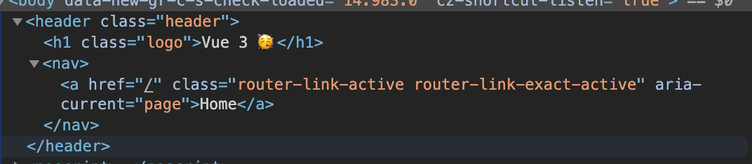
# Header.vue**

<template>
<teleport to=”header”>
<h1 class=”logo”>Vue 3 ?</h1>
<nav>
<router-link to=”/”>Home</router-link>
</nav>
</teleport>
</template>
<script>
export default {
name: “app-header”,
};
</script>
<style>
.header {
display: flex;
align-items: center;
justify-content: center;
}
.logo {
margin-right: 20px;
}
</style>

Here, we create the header component and add a logo with a link to the homepage on our app. We also add the Teleport component and give the to prop a value of header because we want this component to render inside this element. Finally, we import this component into our app;

# App.vue

<template>
<router-view />
<app-header></app-header>
</template>
<script>
import appHeader from “@/components/Header.vue”;
export default {
components: {
appHeader,
},
};
</script>

In this file, we import the header component and place it in the template so it can be visible in our app.

Now if we inspect the element of our app, we would notice that our header component is inside the headerelement;

Fragments

With Vue 2.x, it was impossible to have multiple root elements in the template of your file and as a workaround, developers started wrapping all elements in a parent element. While this doesn’t look like a serious issue, there are instances where developers want to render a component without a container wrapping around such elements but have to make do with that.

With Vue 3, a new feature called Fragments was introduced and this feature allows developers to have multiple elements in their root template file. So with Vue 2.x, this is how an input field container component would look like;

# inputComponent.vue

<template>
<div>
<label :for=”label”>label</label>
<input :type=”type” :id=”label” :name=”label” />
</div>
</template>
<script>
export default {
name: “inputField”,
props: {
label: {
type: String,
required: true,
},
type: {
type: String,
required: true,
},
},
};
</script>
<style></style>

Here, we have a simple form element component that accepts two props, label and type, and the template section of this component is wrapped in a div. This is not necessarily an issue but if you want the label and input field to be directly inside your form element. With Vue 3, developers can easily rewrite this component to look like this;

# inputComponent.vue

<template class=”testingss”>
<label :for=”label”>{{ label }}</label>
<input :type=”type” :id=”label” :name=”label” />
</template>

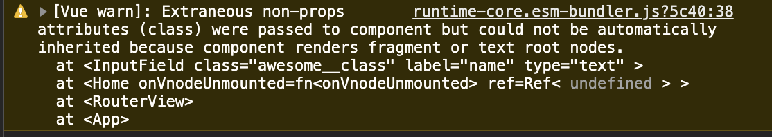
With a single root node, attributes are always attributed to the root node and they are also known as Non-Prop Attributes. They are events or attributes passed to a component that do not have corresponding properties defined in props or emits. Examples of such attributes are class and id. It is, however, required to explicitly define which of the elements in a multi-root node component should be attributed to.

Here’s what this means using the inputComponent.vue from above;

When adding class to this component in the parent component, it must be specified which component would this class be attributed to otherwise the attribute has no effect.

<template>
<div class=”home”>
<div>
<input-component
class=”awesome__class”
label=”name”
type=”text”
></input-component>
</div>
</div>
</template>
<style>
.awesome__class {
border: 1px solid red;
}
</style>

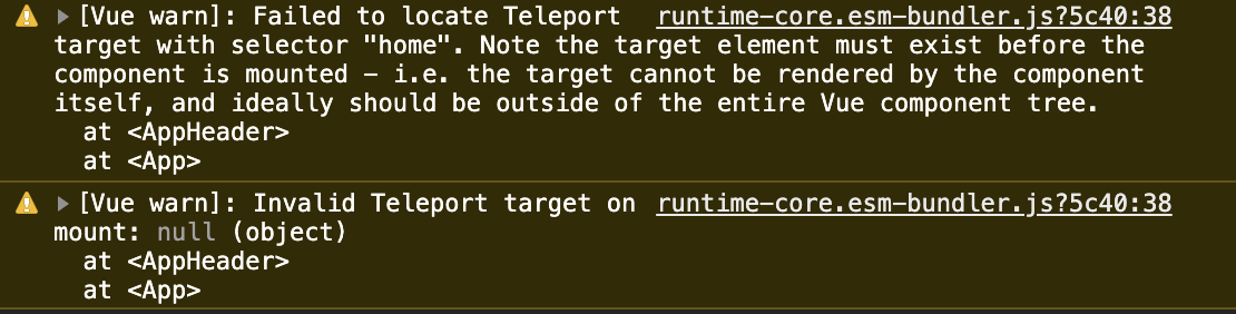
When you do something like this without defining where the attributes should be attributed to, you get this warning in your console;

And the border has no effect on the component;

To fix this, add a v-bind=”$attrs” on the element you want such attributes to be distributed to;

<template>
<label :for=”label” v-bind=”$attrs”>{{ label }}</label>
<input :type=”type” :id=”label” :name=”label” />
</template>

Here, we’re telling Vue that we want the attributes to be distributed to the label element which means we want the awesome__class to be applied to it. Now, if we inspect our element in the browser we would see that the class has now been added to label and hence a border is now around the label.

Global API

It was not uncommon to see Vue.component or Vue.use in main.js file of a Vue application. These types of methods are known are Global APIs and there are quite a number of them in Vue 2.x. One of the challenges of this method is that it makes it impossible to isolate certain functionalities to one instance of your app (if you have more than one instance in your app) without it affecting other apps because they are all mounted on Vue. This is what I mean;

Vue.directive(‘focus’, {
inserted: el => el.focus()
})

Vue.mixin({
/* … */
})

const app1 = new Vue({ el: ‘#app-1’ })
const app2 = new Vue({ el: ‘#app-2’ })

For the above code, it is impossible to state that the Vue Directive be associated with app1 and the Mixin with app2 but instead, they’re both available in the two apps.

Vue 3 comes with a new Global API in an attempt to fix this type of problem with the introduction of createApp. This method returns a new instance of a Vue app. An app instance exposes a subset of the current global APIs. With this, all APIs (component, mixin, directive, use, etc) that mutate Vue from Vue 2.x are now going to be moved to individual app instances and now, each instance of your Vue app can have functionalities that are unique to them without affecting other existing apps.

Now, the above code can be rewritten as;

const app1 = createApp({})
const app2 = createApp({})
app1.directive(‘focus’, {
inserted: el => el.focus()
})
app2.mixin({
/* … */
})

It is however possible to create functionalities that you want to be share among all your apps and this can be done by using a factory function.

Events API

One of the most common ways developers adopted for passing data among components that don’t have a parent to child relationship other than using the Vuex Store is the use of Event Bus. One of the reasons why this method is common is because of how easy it is to get started with it;

# eventBus.js

const eventBus = new Vue()

export default eventBus;

After this, the next thing would be to import this file into main.js to make it globally available in our app or to import it in files that you need it;

# main.js

import eventBus from ‘eventBus’
Vue.prototype.$eventBus = eventBus

Now, you can emit events and listen for emitted events like this;

this.$eventBus.$on(‘say-hello’, alertMe)
this.$eventBus.$emit(‘pass-message’, ‘Event Bus says Hi’)

There is a lot of Vue codebase that is filled with code like this. However, with Vue 3, it would be impossible to do because $on, $off, and $once have all been removed but $emit is still available because it is required for children component to emit events to their parent components. An alternative to this would be using provide / inject or any of the recommended third-party libraries.

Conclusion

In this article, we have covered how you can pass data around from a parent component down to a deeply nested child component using the provide / inject pair. We have also looked at how we can reposition and transfer components from one point in our app to another. Another thing we looked at is the multi-root node component and how to ensure we distribute attributes so they work properly. Finally, we also covered the changes to the Events API and Global API.

Further Resources

“JavaScript Factory Functions with ES6+,” Eric Elliott, Medium
“Using Event Bus to Share Props Between Vue Components,” Kingsley Silas, CSS-Tricks
Using Multiple Teleports On The Same Target, Vue.js Docs
Non-Prop Attributes, Vue.js Docs
Working With Reactivity, Vue.js Docs
teleport, Vue.js Docs
Fragments, Vue.js Docs
2.x Syntax, Vue.js Docs

Creating A Continuous Integration Test Workflow Using GitHub Actions

Original Source: https://smashingmagazine.com/2020/11/continuous-integration-test-workflow-gitHub-actions/

When contributing to projects on version control platforms like GitHub and Bitbucket, the convention is that there is the main branch containing the functional codebase. Then, there are other branches in which several developers can work on copies of the main to either add a new feature, fix a bug, and so on. It makes a lot of sense because it becomes easier to monitor the kind of effect the incoming changes will have on the existing code. If there is any error, it can easily be traced and fixed before integrating the changes into the main branch. It can be time-consuming to go through every single line of code manually looking for errors or bugs — even for a small project. That is where continuous integration comes in.

What Is Continuous Integration (CI)?
“Continuous integration (CI) is the practice of automating the integration of code changes from multiple contributors into a single software project.”

— Atlassian.com

The general idea behind continuous integration (CI) is to ensure changes made to the project do not “break the build,” that is, ruin the existing code base. Implementing continuous integration in your project, depending on how you set up your workflow, would create a build whenever anyone makes changes to the repository.

So, What Is A Build?

A build — in this context — is the compilation of source code into an executable format. If it is successful, it means the incoming changes will not negatively impact the codebase, and they are good to go. However, if the build fails, the changes will have to be reevaluated. That is why it is advisable to make changes to a project by working on a copy of the project on a different branch before incorporating it into the main codebase. This way, if the build breaks, it would be easier to figure out where the error is coming from, and it also does not affect your main source code.

“The earlier you catch defects, the cheaper they are to fix.”

— David Farley, Continuous Delivery: Reliable Software Releases through Build, Test, and Deployment Automation

There are several tools available to help with creating continuous integration for your project. These include Jenkins, TravisCI, CircleCI, GitLab CI, GitHub Actions, etc. For this tutorial, I will be making use of GitHub Actions.

GitHub Actions For Continuous Integration

CI Actions is a fairly new feature on GitHub and enables the creation of workflows that automatically run your project’s build and tests. A workflow contains one or more jobs that can be activated when an event occurs. This event could be a push to any of the branches on the repo or the creation of a pull request. I will explain these terms in detail as we proceed.

Let’s Get Started!
Prerequisites

This is a tutorial for beginners so I will mostly talk about GitHub Actions CI on a surface level. Readers should already be familiar with creating a Node JS REST API using the PostgreSQL database, Sequelize ORM, and writing tests with Mocha and Chai.

You should also have the following installed on your machine:

NodeJS,
PostgreSQL,
NPM,
VSCode (or any editor and terminal of your choice).

I will make use of a REST API I already created called countries-info-api. It’s a simple api with no role-based authorizations (as at the time of writing this tutorial). This means anyone can add, delete, and/or update a country’s details. Each country will have an id (auto-generated UUID), name, capital, and population. To achieve this, I made use of Node js, express js framework, and Postgresql for the database.

I will briefly explain how I set up the server, database before I begin with writing the tests for test coverage and the workflow file for continuous integration.

You can clone the countries-info-api repo to follow through or create your own API.

Technology used: Node Js, NPM (a package manager for Javascript), Postgresql database, sequelize ORM, Babel.

Setting Up The Server

Before setting up the server, I installed some dependencies from npm.

npm install express dotenv cors

npm install –save-dev @babel/core @babel/cli @babel/preset-env nodemon

I am using the express framework and writing in the ES6 format, so I’ll need Babeljs to compile my code. You can read the official documentation to know more about how it works and how to configure it for your project. Nodemon will detect any changes made to the code and automatically restart the server.

Note: Npm packages installed using the –save-dev flag are only required during the development stages and are seen under devDependencies in the package.json file.

I added the following to my index.js file:

import express from “express”;
import bodyParser from “body-parser”;
import cors from “cors”;
import “dotenv/config”;

const app = express();
const port = process.env.PORT;

app.use(bodyParser.json());

app.use(bodyParser.urlencoded({ extended: true }));

app.use(cors());

app.get(“/”, (req, res) => {
res.send({message: “Welcome to the homepage!”})
})

app.listen(port, () => {
console.log(`Server is running on ${port}…`)
})

This sets up our api to run on whatever is assigned to the PORT variable in the .env file. This is also where we will be declaring variables that we don’t want others to easily have access to. The dotenv npm package loads our environment variables from .env.

Now when I run npm run start in my terminal, I get this:

As you can see, our server is up and running. Yay!

This link http://127.0.0.1:your_port_number/ in your web browser should return the welcome message. That is, as long as the server is running.

Next up, Database and Models.

I created the country model using Sequelize and I connected to my Postgres database. Sequelize is an ORM for Nodejs. A major advantage is that it saves us the time of writing raw SQL queries.

Since we are using Postgresql, the database can be created via the psql command line using the CREATE DATABASE database_name command. This can also be done on your terminal, but I prefer PSQL Shell.

In the env file, we will set up the connection string of our database, following this format below.

TEST_DATABASE_URL = postgres://<db_username>:<db_password>@127.0.0.1:5432/<database_name>

For my model, I followed this sequelize tutorial. It is easy to follow and explains everything about setting up Sequelize.

Next, I will write tests for the model I just created and set up the coverage on Coverall.

Writing Tests And Reporting Coverage

Why write tests? Personally, I believe that writing tests help you as a developer to better understand how your software is expected to perform in the hands of your user because it is a brainstorming process. It also helps you discover bugs on time.

Tests:

There are different software testing methods, however, For this tutorial, I made use of unit and end-to-end testing.

I wrote my tests using the Mocha test framework and the Chai assertion library. I also installed sequelize-test-helpers to help test the model I created using sequelize.define.

Test coverage:

It is advisable to check your test coverage because the result shows whether our test cases are actually covering the code and also how much code is used when we run our test cases.

I used Istanbul (a test coverage tool), nyc (Instabul’s CLI client), and Coveralls.

According to the docs, Istanbul instruments your ES5 and ES2015+ JavaScript code with line counters, so that you can track how well your unit-tests exercise your codebase.

In my package.json file, the test script runs the tests and generates a report.

{
“scripts”: {
“test”: “nyc –reporter=lcov –reporter=text mocha -r @babel/register ./src/test/index.js”
}
}

In the process, it will create a .nyc_output folder containing the raw coverage information and a coverage folder containing the coverage report files. Both files are not necessary on my repo so I placed them in the .gitignore file.

Now that we have generated a report, we have to send it to Coveralls. One cool thing about Coveralls (and other coverage tools, I assume) is how it reports your test coverage. The coverage is broken down on a file by file basis and you can see the relevant coverage, covered and missed lines, and what changed in the build coverage.

To get started, install the coveralls npm package. You also need to sign in to coveralls and add the repo to it.

Then set up coveralls for your javascript project by creating a coveralls.yml file in your root directory. This file will hold your repo-token gotten from the settings section for your repo on coveralls.

Another script needed in the package.json file is the coverage scripts. This script will come in handy when we are creating a build via Actions.

{
“scripts”: {
“coverage”: “nyc npm run test && nyc report –reporter=text-lcov –reporter=lcov | node ./node_modules/coveralls/bin/coveralls.js –verbose”
}
}

Basically, it will run the tests, get the report, and send it to coveralls for analysis.

Now to the main point of this tutorial.

Create Node JS Workflow File

At this point, we have set up the necessary jobs we will be running in our GitHub Action. (Wondering what “jobs” mean? Keep reading.)

GitHub has made it easy to create the workflow file by providing a starter template. As seen on the Actions page, there are several workflow templates serving different purposes. For this tutorial, we will use the Node.js workflow (which GitHub already kindly suggested).

You can edit the file directly on GitHub but I will manually create the file on my local repo. The folder .github/workflows containing the node.js.yml file will be in the root directory.

This file already contains some basic commands and the first comment explains what they do.

# This workflow will do a clean install of node dependencies, build the source code and run tests across different versions of node

I will make some changes to it so that in addition to the above comment, it also runs coverage.

My .node.js.yml file:

name: NodeJS CI
on: [“push”]
jobs:
build:
name: Build
runs-on: windows-latest
strategy:
matrix:
node-version: [12.x, 14.x]

steps:
– uses: actions/checkout@v2
– name: Use Node.js ${{ matrix.node-version }}
uses: actions/setup-node@v1
with:
node-version: ${{ matrix.node-version }}
– run: npm install
– run: npm run build –if-present
– run: npm run coverage

– name: Coveralls
uses: coverallsapp/github-action@master
env:
COVERALLS_REPO_TOKEN: ${{ secrets.COVERALLS_REPO_TOKEN }}
COVERALLS_GIT_BRANCH: ${{ github.ref }}
with:
github-token: ${{ secrets.GITHUB_TOKEN }}

What does this mean?

Let’s break it down.

name
This would be the name of your workflow (NodeJS CI) or job (build) and GitHub will display it on your repository’s actions page.
on
This is the event that triggers the workflow. That line in my file is basically telling GitHub to trigger the workflow whenever a push is made to my repo.
jobs
A workflow can contain at least one or more jobs and each job runs in an environment specified by runs-on. In the file sample above, there is just one job that runs the build and also runs coverage, and it runs in a windows environment. I can also separate it into two different jobs like this:

Updated Node.yml file

name: NodeJS CI
on: [push]
jobs:
build:
name: Build
runs-on: windows-latest
strategy:
matrix:
node-version: [12.x, 14.x]

steps:
– uses: actions/checkout@v2
– name: Use Node.js ${{ matrix.node-version }}
uses: actions/setup-node@v1
with:
node-version: ${{ matrix.node-version }}
– run: npm install
– run: npm run build –if-present
– run: npm run test

coverage:
name: Coveralls
runs-on: windows-latest
strategy:
matrix:
node-version: [12.x, 14.x]

steps:
– uses: coverallsapp/github-action@master
env:
COVERALLS_REPO_TOKEN: ${{ secrets.COVERALLS_REPO_TOKEN }}
with:
github-token: ${{ secrets.GITHUB_TOKEN }}

env
This contains the environment variables that are available to all or specific jobs and steps in the workflow. In the coverage job, you can see that the environment variables have been “hidden”. They can be found in your repo’s secrets page under settings.
steps
This basically is a list of the steps to be taken when running that job.
The build job does a number of things:
It uses a checkout action (v2 signifies the version) that literally checks-out your repository so that it is accessible by your workflow;
It uses a setup-node action that sets up the node environment to be used;
It runs install, build and test scripts found in our package.json file.

coverage
This uses a coverallsapp action that posts your test suite’s LCOV coverage data to coveralls.io for analysis.

I initially made a push to my feat-add-controllers-and-route branch and forgot to add the repo_token from Coveralls to my .coveralls.yml file, so I got the error you can see on line 132.

Bad response: 422 {“message”:”Couldn’t find a repository matching this job.”,”error”:true}

Once I added the repo_token, my build was able to run successfully. Without this token, coveralls would not be able to properly report my test coverage analysis. Good thing our GitHub Actions CI pointed out the error before it got pushed to the main branch.

N.B: These were taken before I separated the job into two jobs. Also, I was able to see the coverage summary-and error message-on my terminal because I added the –verbose flag at the end of my coverage script

Conclusion

We can see how to set up continuous integration for our projects and also integrate test coverage using the Actions made available by GitHub. There are so many other ways this can be adjusted to fit the needs of your project. Although the sample repo used in this tutorial is a really minor project, you can see how essential continuous integration is even in a bigger project. Now that my jobs have run successfully, I am confident merging the branch with my main branch. I would still advise that you also read through the results of the steps after every run to see that it is completely successful.

Exciting New Tools for Designers, November 2020

Original Source: https://www.webdesignerdepot.com/2020/11/exciting-new-tools-for-designers-november-2020/

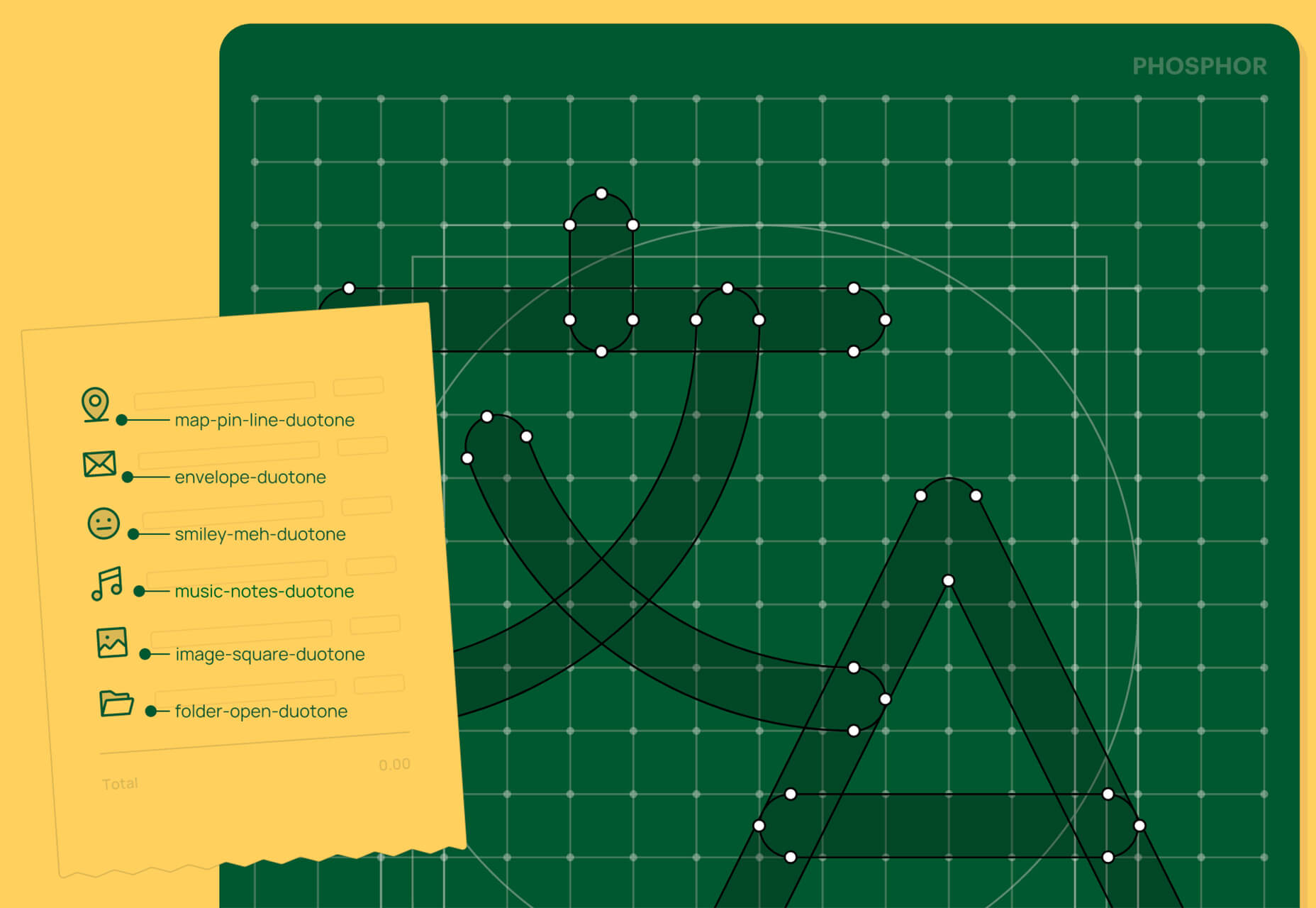
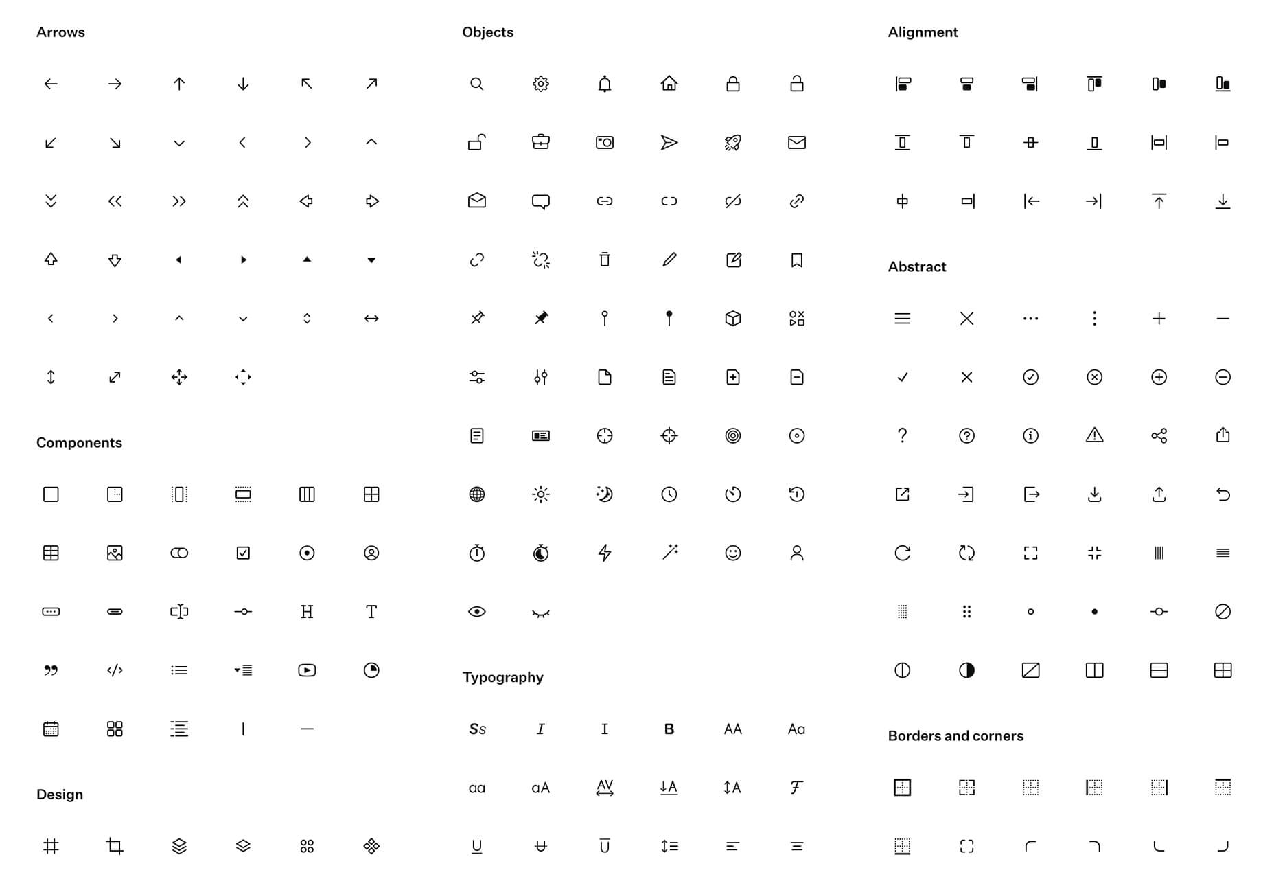
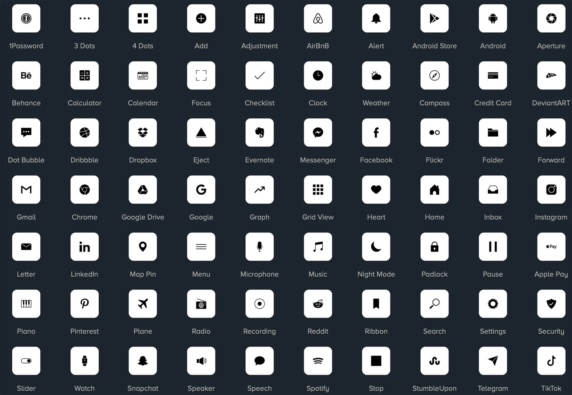
In the spirit of fall feasts, this month’s collection of tools and resources is a smorgasbord of sorts. You’ll find everything from web tools to icon libraries to animation tools to great free fonts. Let’s dig in.

Here’s what new for designers this month.

The Good Line-Height

The Good Line-Height is the tool you won’t be able to live without after using it a few times. The tool calculates the ideal line-height for every text size in a typographic scale so that everything always fits the baseline grid. Set the font size, multiplier, and grid row height to get started.

Link-to-QR

Link-to-QR makes creating quick codes a breeze. Paste in your link and the tool creates an immediate QR code that you can download or share. Pick a color and transparency, plus size, and you are done.

Quarkly

Quarkly allows you to create websites and web apps both using a mouse and typing code – you get all the pros of responsive editing, but can also open the code editor at any time and manually edit anything and it all synchronizes. The tool is built for design control and is in beta.

UnSpam.email

Unspam.email is an online spam tester tool for emails. Improve deliverability with the free email tester. The service analyzes the main aspects of an email and returns a spam score and predicts results with a heat map of your email newsletter.

Filmstrip

Filmstrip allows you to create or import keyframe animations, make adjustments, and export them for web playback. It’s a quick and easy tool for modern web animation.

CSS Background Patterns

CSS Background Patterns is packed with groovy designs that you can adjust and turn into just the right background for your web project. Set the colors, opacity, and spacing; then pick a pattern; preview it right on the screen; and then snag the CSS. You can also submit your own patterns.

Neonpad

Neonpad is a simple – but fun – plain text editor in neon colors. Switch hues for a different writing experience. Use it small or expand to full browser size.

Link Hover Animation

Link Hover Animation is a nifty twist on a hover state. The animation draws a circle around the link!

Tint and Shade Generator

Tint and Shade Generator helps you make the most of any hex color. Start with a base color palette and use it to generate complementary colors for gradients, borders, backgrounds, or shadows.

Pure CSS Product Card

Pure CSS Product Card by Adam Kuhn is a lovely example of an e-commerce design that you can learn from. The card is appealing and functional.

Free Favicon Maker

Free Favicon Maker allows you to create a simple SVG or PNG favicon in a few clicks. You can set a style that includes a letter or emoji, font and size, color, and edge type and you are ready to snag the HTML or download the SVG or PNG file.

Ultimate Free iOS Icon Pack

The Ultimate Free iOS Icon Pack is a collection of 100 minimal icons in an Apple style. With black and white version of each icon and original PSD files, you can create sleek icons for your iPhone screen in minutes. And it’s completely free! No email address or registration required.

Phosphor Icon Family

Phosphor is a flexible icon family for all the things you need icons for including diagrams and presentations. There are plenty of arrows, chats, circles, clocks, office elements, lists, business logos, and more. Everything is in a line style, filled, or with duotone color. Everything is free but donations are accepted.

3,000 Hands

3,000 Hands is a kit of hands that includes plenty of gestures and style in six skin tones and with 10 angles of every gesture. They have a 3D-ish shape and are in an easy to use PNG format. This kit has everything you need from a set of hand icons.

Radix Icons

Radix Icons is a set of 15px by 15px icons for tiny spaces. They are in a line style and are available in a variety of formats including Figma, Sketch, iconJar, SVG, npm installation, or GitHub.

Deepnote

Deepnote is a new kind of data science notebook. It is Jupyter-compatible with real-time collaboration and running in the cloud and designed for data science teams.

ZzFXM Tiny JavaScript Music Generator

ZzFXM is a tiny JavaScript function that generates stereo music tracks from patterns of note and instrument data. Instrument samples are created using a modified version of the super-tiny ZzFX sound generator by Frank Force. It is designed for size-limited productions.

Image Tiles Scroll Animation

Image Tiles Scroll Animation is a different type of scrolling pattern using Locomotive Scroll. The grid creates a smooth animation in a fun and modern style.

Bubbles

Bubbles is a Chrome extension that allows you to collaborate by clicking anywhere on your screen and then dropping a comment to start a conversation with anyone. This is a nice option for work from home teams.

Tyrus

Tyrus is a toolkit from the design team at Airbnb to help illustrators make the most out of their design businesses. It is broken into sections to help you with design briefs, originality, deadlines, and feedback.

PatchGirl

PatchGirl is an automated QA tool for developers. You can combine SQL and HTTP queries to build any possible state of your database.

Apparel

Apparel is a beautiful premium typeface family with plenty of versatility in a modern serif style. It is a contemporary, classy, and fresh serif typeface with a laid-back. Its medium-large x-height makes it ideal for headlines and brand identity design.

Christmas Story

Christmas Story is a nice solution if you are already starting to think ahead to holiday projects or cards. The long swashes and tails are elaborate and fun.

Nafta

Nafta is a fun handwriting style font that has a marker-style stroke. It’s a modern take on the popular Sharpie font. It includes all uppercase letters.

Safira

Safira is a wide and modern sans with ligatures and a stylish feel. The rounded ball terminals are especially elegant.

Shine Brighter Sans

Shine Brighter Sans is a super-thin sans-serif with a light attitude. The limited character set combined with its light weight is best for display use.

Source

p img {display:inline-block; margin-right:10px;}
.alignleft {float:left;}
p.showcase {clear:both;}
body#browserfriendly p, body#podcast p, div#emailbody p{margin:0;}

Guide To Freelance Web Design Business For College Students

Original Source: http://feedproxy.google.com/~r/Designrfix/~3/t2_NTFk3j2Y/guide-to-freelance-web-design-business-for-college-students

Description: A web designer is now one of the most popular freelance jobs that lets you organize your schedule in the most convenient way.  How to start web design business in college Many college students (if not all of them) work part-time to cover their expenses, pay off the loans, and pay for writing services […]

The post Guide To Freelance Web Design Business For College Students appeared first on designrfix.com.

40+ Creative Progress Bar Designs, Vol. 2

Original Source: https://www.hongkiat.com/blog/progress-bar-designs/

Progress bars play a great role in offering an honest and efficient user interface. I’d rather prefer to monitor the progress of a task through a progress bar than to wait and look at the blank…

Visit hongkiat.com for full content.