Original Source: https://www.smashingmagazine.com/2020/07/monthly-roundup-07-2020/
Bringing You The Best Of Smashing
Bringing You The Best Of Smashing
Iris Lješnjanin
2020-07-17T11:00:00+00:00
2020-07-17T20:34:15+00:00
Well, I guess we can all agree that this year has been quite something. We’ve all been challenged in one way or the other, and the new normal is not quite the old normal. Still, the overriding emphasis remains on safety and everyone’s wellbeing, as well as the importance on sharing thoughts and feelings on creative wellness within the community.
Unfortunately, the effects of COVID-19 are still so wide-reaching throughout the world, so that the Smashing team has had to make big changes to our plans this year. As Rachel Andrew, editor-of-chief of Smashing Magazine, nicely puts it:
“The pandemic has made life unpredictable and scary for many people. At Smashing, we’ve had to very quickly figure out new ways of delivering great content — in a way that supports the business but also our speakers and workshop leaders. We have been encouraged by the enthusiasm from the community, the messages of support, and the willingness to try these new formats.”
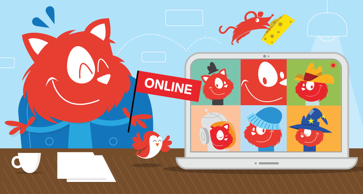
On that note, we have decided to take all 2020 dates online. We hope to see you there!
August 20–21
SmashingConf Live
Tell me more →
September 7–8
SmashingConf Freiburg
Tell me more →
October 13–14
SmashingConf Austin
Tell me more →
November 10–11
SmashingConf San Francisco
Tell me more →
We’re able to do these all these wonderful things because of your support, and we truly and sincerely appreciate it.
Interactive Workshops To Help You Boost Your Skills
With online workshops, we aim to give you the same experience and access to experts as in an in-person workshop, without needing to leave your desk. So you can learn at your own pace, in your own time, and follow interactive exercises along the way.
We’ve done our best to provide you with a mix of both design- and frontend-related workshops:
July 28–29
Designing For Emotion
Aarron Walter
Design
August 6–14
Web Application Security
Scott Helme
Front-end
August 17–31
Behavioral Design
Susan and Guthrie Weinschenk
Design
Aug. 19 – Sept. 3
Front-End Testing
Umar Hansa
Front-end
Aug. 20 – Sept. 4
Designing For A Global Audience
Yiying Lu
Design
September 1–16
Jamstack!
Jason Lengstorf
Front-end
September 10–11
The CSS Layout Masterclass
Rachel Andrew
Front-end
Sept. 17 – Oct. 2
Vue.js: The Practical Guide
Natalia Tepluhina
Front-end
Sept. 22 – Oct. 6
Smart Interface Design Patterns, 2020 Edition
Vitaly Friedman
Design & UX
 Attending a Smashing online event means that you’ll be taking part in live sessions, Q&As, discussion zones, challenges, and so much more! See all schedules and events →
Sit Back, Relax, And Tune In!
The Smashing Podcast is the perfect way to take a little bit of Smashing along with you on your morning commute, when working out at the gym, or just washing the dishes. Every two weeks, Drew McLellan talks to design and development experts about their work on the web. You can subscribe in your favorite app to get new episodes as soon as they’re ready.
1. What Is Art Direction?
2. What’s So Great About Freelancing?
3. What Are Design Tokens?
4. What Are Inclusive Components?
5. What Are Variable Fonts?
6. What Are Micro-Frontends?
7. What Is A Government Design System?
8. What’s New In Microsoft Edge?
9. How Can I Work With UI Frameworks?
10. What Is Ethical Design?
11. What Is Sourcebit?
12. What Is Conversion Optimization?
13. What Is Online Privacy?
14. How Can I Run Online Workshops?
15. How Can I Build An App In 10 Days?
16. How Can I Optimize My Home Workspace?
17. What’s New In Drupal 9?
18. How Can I Learn React?
19. What Is CUBE CSS?
20. What Is Gatsby?
Is there a topic that you’d love to hear and learn more about? Or perhaps you or someone you know would like to talk about a web- and design-related topic that is dear to your hearts? We’d love to hear from you! Feel free to reach out to us on Twitter and we’ll do our best to get back to you as soon as possible.
 Catching up with what’s new in the web industry doesn’t mean you have to be tied up to a chair and desk! Do as Topple the Cat does it: grab your headphones and stretch those legs! You can subscribe and tune in anytime with any of your favorite apps.
Our Most Recent Addition To The Smashing Bookshelf
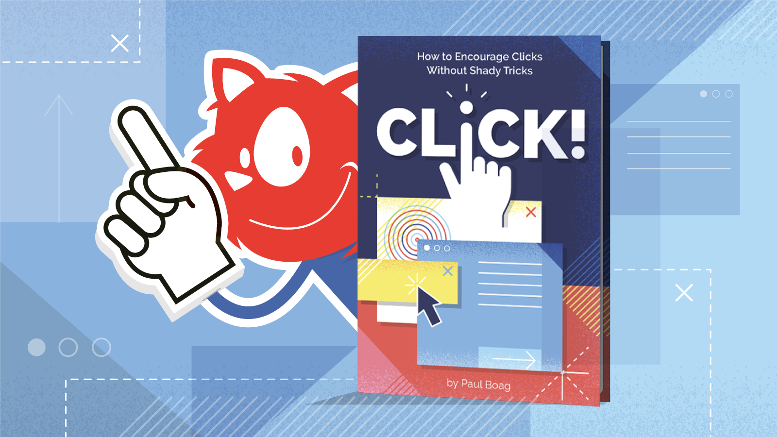
We shipped the first copies of Click! How to Encourage Clicks Without Shady Tricks a few weeks ago, and if you pre-ordered a copy of the book, you must have received a personal note from the author himself, Paul Boag. It was fun to follow the reactions pop up on social media — Ari Stiles shared some tweets in her recent post.
Click! comes along at a time when many of us need a creative “nudge.” The book inspires us to think differently about our routines for building online sites and services—what works, and what doesn’t. You can jump to the table of contents, or if you’d like to take a peek first, you can download a free PDF excerpt right away (17.3 MB). Happy reading!
Print + eBook
eBook
Print + eBook
{
“sku”: “click”,
“type”: “Book”,
“price”: “39.00”,
“prices”: [{
“amount”: “39.00”,
“currency”: “USD”,
“items”: [
{“amount”: “29.00”, “type”: “Book”},
{“amount”: “10.00”, “type”: “E-Book”}
]
}, {
“amount”: “39.00”,
“currency”: “EUR”,
“items”: [
{“amount”: “29.00”, “type”: “Book”},
{“amount”: “10.00”, “type”: “E-Book”}
]
}
]
}
$
39.00
Get Print + eBook
Quality hardcover. Free worldwide shipping. 100 days money-back-guarantee.
eBook
{
“sku”: “click”,
“type”: “E-Book”,
“price”: “19.00”,
“prices”: [{
“amount”: “19.00”,
“currency”: “USD”
}, {
“amount”: “19.00”,
“currency”: “EUR”
}
]
}
$
19.00
Free!
Get the eBook
DRM-free, of course.
ePUB, Kindle, PDF.
Included with Smashing Membership.
Get the eBook
Download PDF, ePUB, Kindle.
Thanks for being smashing! ❤️
Trending Topics On Smashing Magazine
As you may already know, we aim to publish a new article every single day that is dedicated to various topics current in the web industry. Here are some that our readers enjoyed most and have recommended further:
“CSS News July 2020,” Rachel Andrew
“An Introduction To React’s Context API,” Yusuff Faruq
“How To Pass Data Between Components In Vue.js,” Matt Maribojoc
“Setting Height And Width On Images Is Important Again,” Barry Pollard
“Differences Between Static Generated Sites And Server-Side Rendered Apps,” Timi Omoyeni
Best Picks From Our Newsletter
We’ll be honest: Every second week, we struggle with keeping the Smashing Newsletter issues at a moderate length — there are just so many talented folks out there working on brilliant projects! Kudos to everyone involved!
Interested in sponsoring? Feel free to check out our partnership options and get in touch with the team anytime — they’ll be sure to get back to you right away.
P.S. A huge thank you to Cosima Mielke for writing and preparing these posts!
Free Fonts With Personality
Typography is a powerful communication tool, a way to express ideas, and a trigger for creativity. Based on this understanding, the Argentinian-based type foundry Rostype creates fonts that are free to use for anyone, in personal and commercial projects.

There are currently 15 fonts available, and each one of them shines with a unique personality. Some are designed with a special focus on readability, others are the perfect display typefaces, made to stand out, some are retro-inspired, others more futuristic and dynamic. There’s even a typeface inspired by the coronavirus lockdown. A treasure chest if you’re looking for a typeface that is a bit more distinctive.
The Making Of A Typeface
It’s always insightful to sneak a peek behind the scenes of how other design teams work and think. Chris Bettig, Design Director at YouTube, now shares an interesting case study on how he and his team created YouTube Sans, a tailor-made font that doubles as a brand ambassador.

Before the new typeface made its appearance, YouTube used the iconic play button and a modified version of Alternate Gothic for the wordmark. However, as Chris Bettig explains, there was no clear typographical guidance. Designed to work across the entire range of YouTube’s products and reflecting the platform’s worldview as well as the community of creators who use it, YouTube Sans changed that. For more insights into how the font came to life and the challenges the design team faced along the way, be sure to check out the case study.
Dealing With Browser Font Rendering Inconsistencies
We all know those moments when a bug literally bugs us but we can’t seem to figure out how to solve it. Stephanie Stimac recently came across such an issue: When she opened her personal website in Safari, she noticed how drastically different the title of her page was rendering compared to other browsers. It appeared much bolder than expected.

To find the reason for these rendering inconsistencies, Stephanie started to dissect differences between the user agent style sheet and the computed CSS properties and soon found herself far down the rabbit hole, comparing the confusing behavior with Chrome, Firefox, and Edge. There’s no simple answer to the question which browser is actually handling the styling correctly, but after running a number of tests, Stephanie found out how to prevent the browser from deciding how to bold font-weights: you need to explicitly define the font weight with numerical values. A small detail that makes a significant difference.
Continuous Performance Measurements Made Easy
When launching a website, it’s common to run performance tests to ensure the site is fast and follows best practices. But how do we keep it fast as soon as deploys are happening every day? Speedlify is Zach Leatherman’s answer to this question.

Speedlify is a static site published as an open-source repository that uses Lighthouse and Axe to continuously measure performance and publish the performance statistics — at most once an hour and automatically once a day. You can run it manually, locally on your computer and check in the data to your repo, or, if you’re using Netlify, it can run entirely self-contained. A great way to keep performance always in sight.
The Anatomy Of A Push Notification
Push notifications were first introduced on iOS back in 2009, web push followed five years later. Today, they are supported across a lot of platforms and browsers — from iOS and Android to Amazon Echo, Windows, Chrome, Safari, Firefox, Edge, and more. Each one of these platforms is a bit different, though, making it complicated for designers to wrap their heads around what exactly goes into a push notification.

A useful reminder comes from Lee Munroe. He summarized how many lines of text you need on which platform, requirements for images, if there are character restrictions, and other details that can be hard to remember. The overview also comes in handy to assess what your notification will look like on operating systems you don’t have access to. One for the bookmarks.
Editing Keyframe Animations Live
When you’re creating animations, it’s always helpful to see the animation in action as you tweak it. Unfortunately, that also involves a lot of switching back and forth between your text editor and the browser. Mitch Samuels was tired of doing that, so he built a tool to save him time: Keyframes.app.

The tool lets you create a CSS keyframe animation with a visual timeline editor. You can add steps to a timeline, use the simple UI to adjust the CSS properties you want your target element to have at each step, and the animated preview will update live. Once you’re happy with the result, you can copy the CSS and use it in your project right away. Keyframe.app is also available as a Chrome extension. A real timesaver.
Determining The Best Build Tool For Your Project
Build tools aim to make the lives of developers easier by streamlining workflows and codifying best practices. However, picking the right build tool for a project can be a challenge. To help you make a more informed decision, folks from the Google Chrome developer relations team built Tooling.Report.

Based on a suite of tests to assess how well a build tool adheres to best practices, Tooling.Report gives you an overview of various bundlers and the features they support. It’s not only a quick way to determine the best tool for a project but also a reference for incorporating best practices into existing codebases — with the long-term goal of improving all build tools and, thus, the health of the web.
Turning A Flat Image Into A Folded Poster
Some coding experiments leave even the most experienced developers in awe. And even if it’s something you won’t be using every day, it’s always inspiring to see fellow developers think outside the box and explore what’s possible with web technologies. The folded poster effect that Lynn Fisher created with pure CSS is such an experiment.

With a bit of CSS, Lynn makes your average image look like a folded poster. With paper creases running over the image horizontally and vertically and a background shadow that gives the poster a 3D effect. A cool little project that beautifully shows what can be achieved with CSS.
Striking A Balance Between Native And Custom Select Elements
How do you build a styled select element that is not only styled on the outside but on the inside, too? In her article “Striking a Balance Between Native and Custom Select Elements”, Sandrina Pereira shares her attempt to create a good-looking, accessible select that benefits from as many native features as possible.

The idea is to make the select “hybrid”, which means that it’s both a native <select> and a styled alternate select in one design pattern. Users of assistive technology will get a native <select> element, but when a mouse is being used, the approach relies on a styled version that is made to function as a select element. Clever!
Hybrid Positioning With CSS Variables And max()
Some ideas require you to think outside the box and explore new paths to make them happen. Imagine this example: You want to have a page navigation on the side, right under the header when it’s scrolled all the way to the top. It is supposed to scroll with the page when the header is out of view and stay at the top for the rest of the scrolling. That’s exactly what Lea Verou wanted to achieve in a recent project.

You might say, that’s a case of position: sticky, but there’s a more finely-tuned approach to getting the job done, as Lea shows. Without any JavaScript. Her solution relies on CSS variables and the new max() function that lets you apply min/max constraints to CSS properties. A fallback helps in browsers that don’t support max() yet. Clever!
Stories From The Dark Side Of The Web
Hackers, data breaches, shadow government activities, cybercrime, hacktivism — a lot is going on on the dark side of the web. But who are the people behind these activities? And what’s their “mission”? Jack Rhysider dedicated a podcast to the stories that happen on the hidden parts of the network: Darknet Diaries.

No matter if it’s the story of a gambler who finds a bug in a video poker machine that lets him win excessive amounts of money, the story of a penetration tester breaking into buildings, or a nation state hacking into a company within another nation, the Darknet Diaries is full of gripping insights into a secret world. The podcast adheres to journalistic standards by fact-checking and ethical sourcing of information, and while all of this is great entertainment, it also aims at explaining the culture around cybersecurity to make listeners more responsive, informed citizens of their digital lives. Be sure to tune in.

Smashing Newsletter
Every second Tuesday, we send a newsletter with useful techniques on front-end and UX. Subscribe and get Smart Interface Design Checklists PDF in your inbox.
Your (smashing) email
Subscribe →
Front-end, design and UX. Sent 2× a month.
You can always unsubscribe with just one click.

(cm, vf, ra)
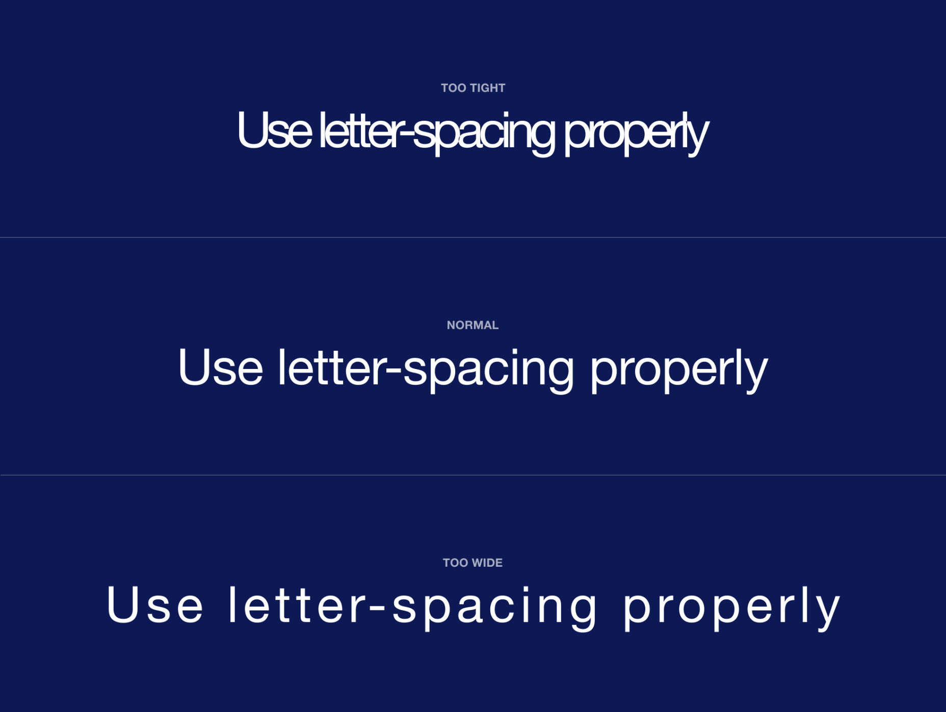
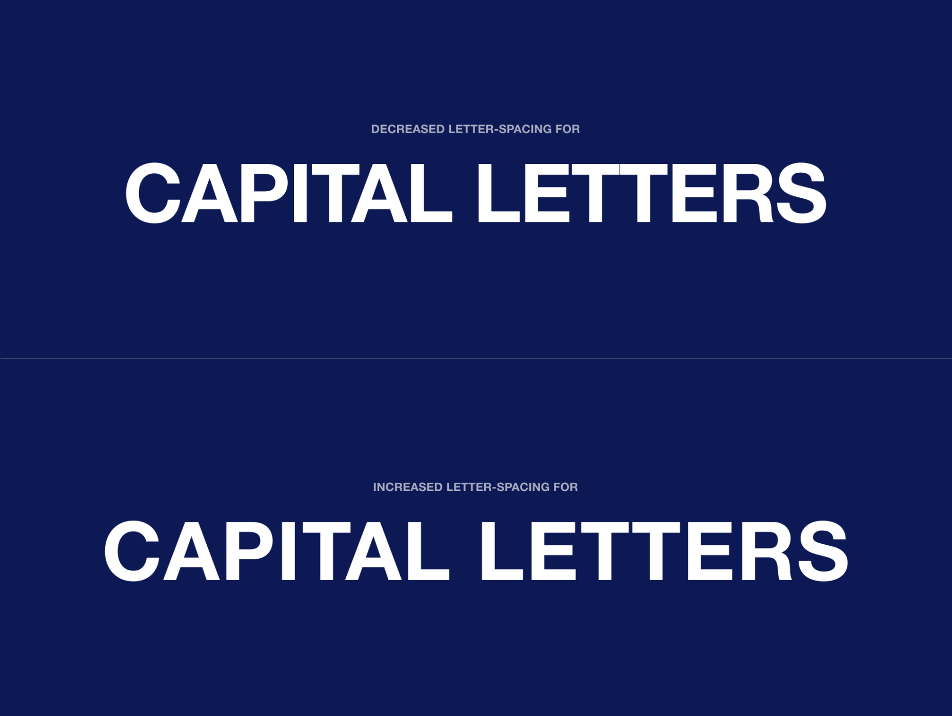
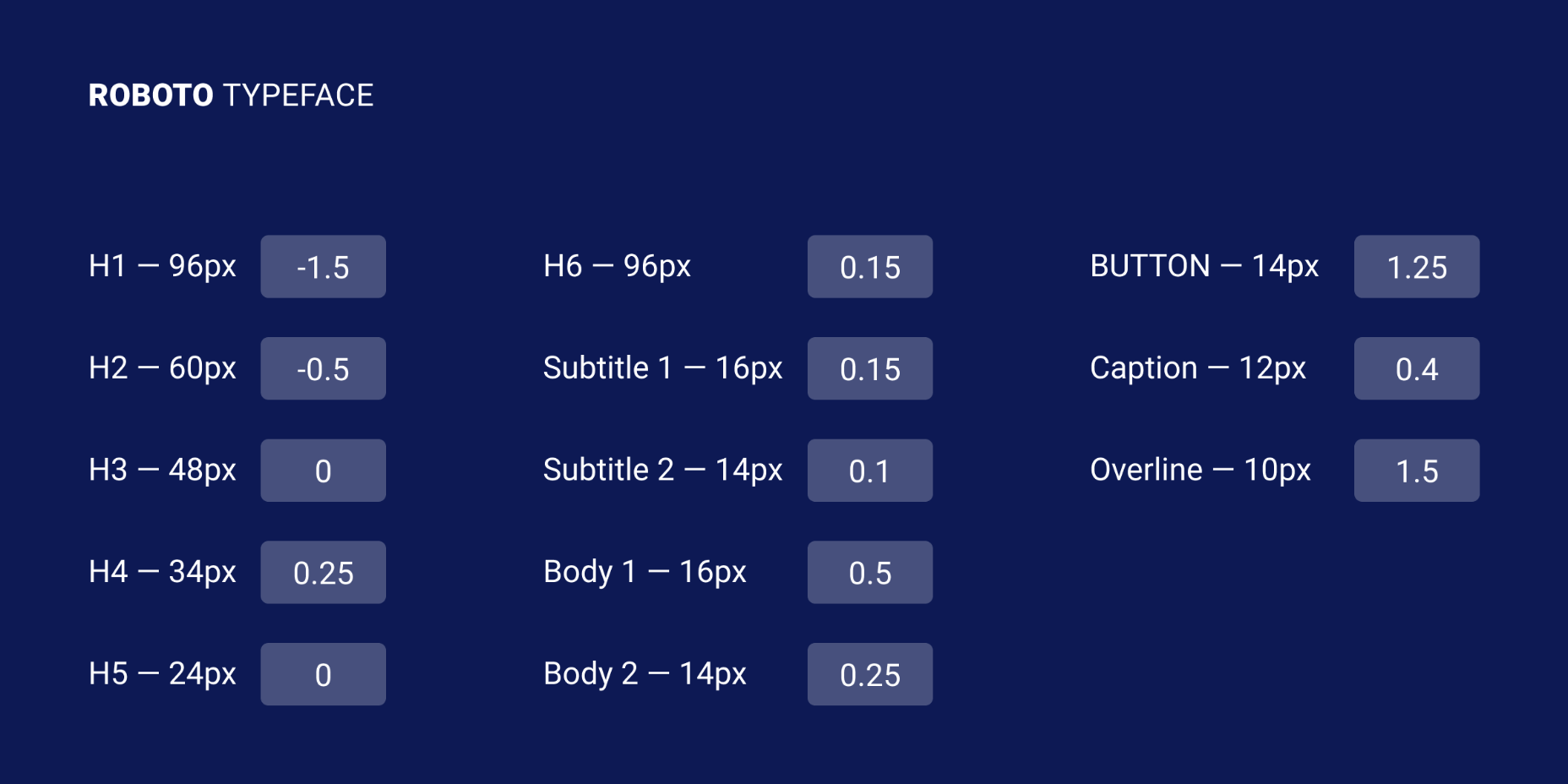
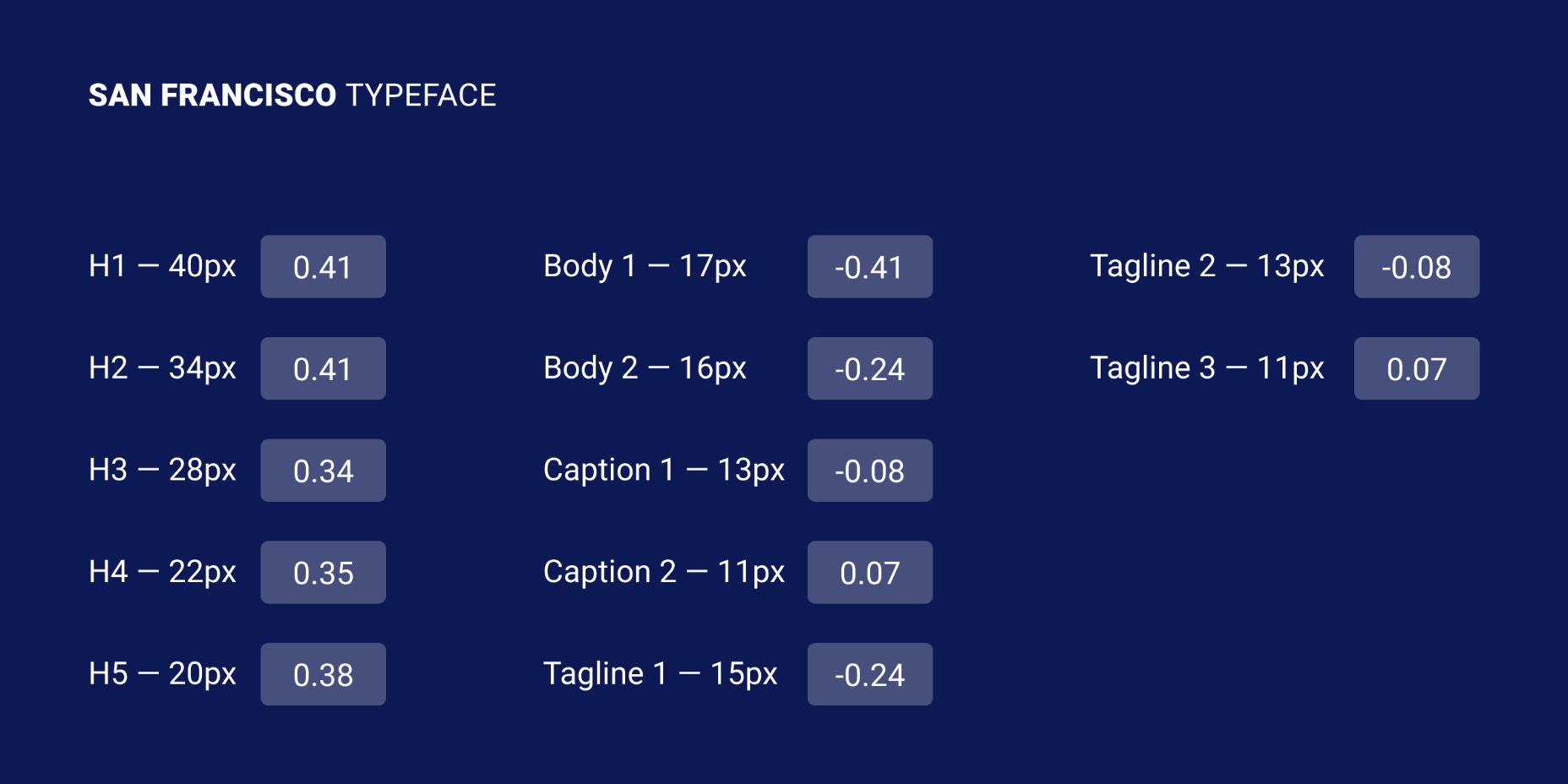
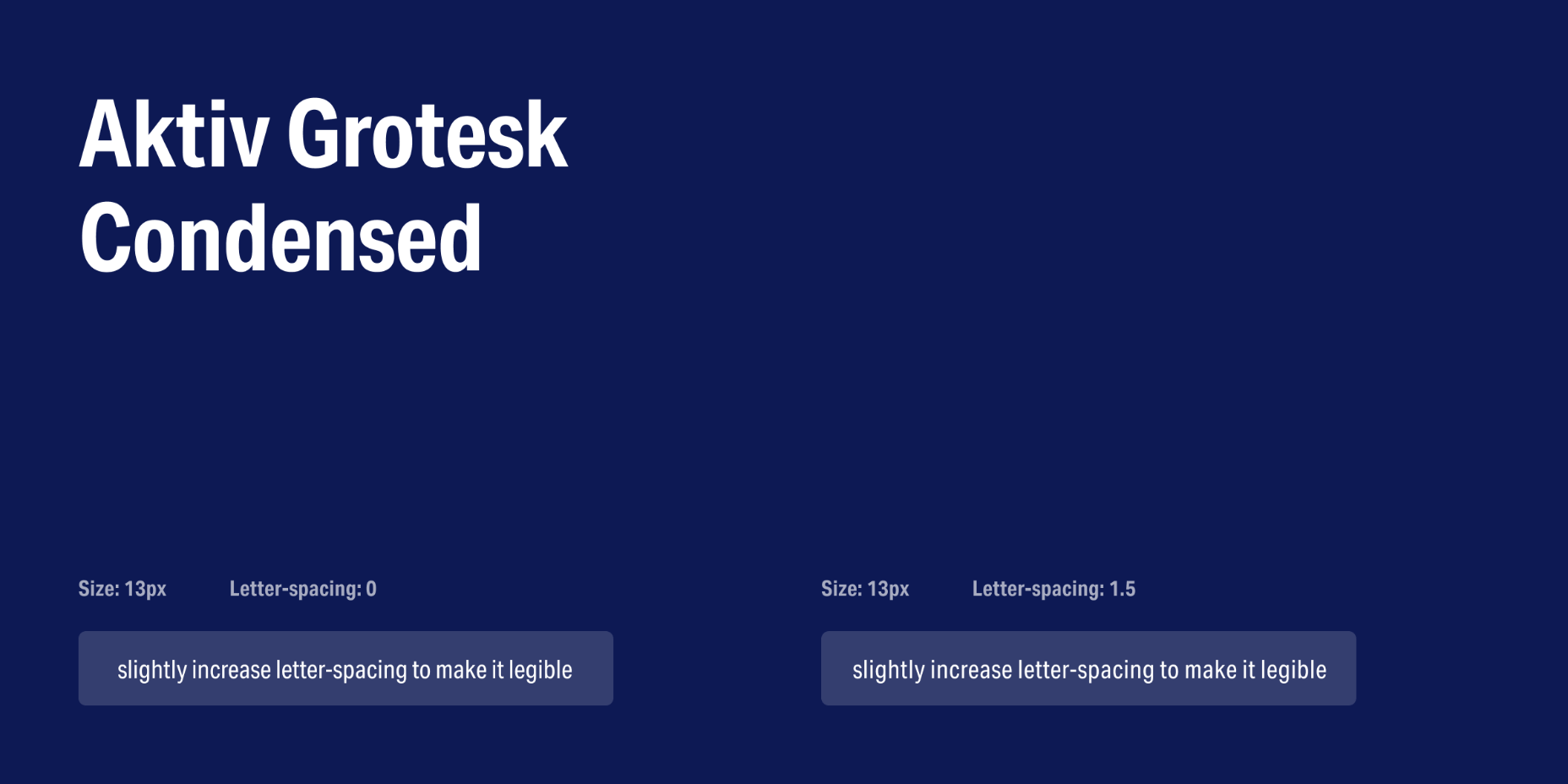
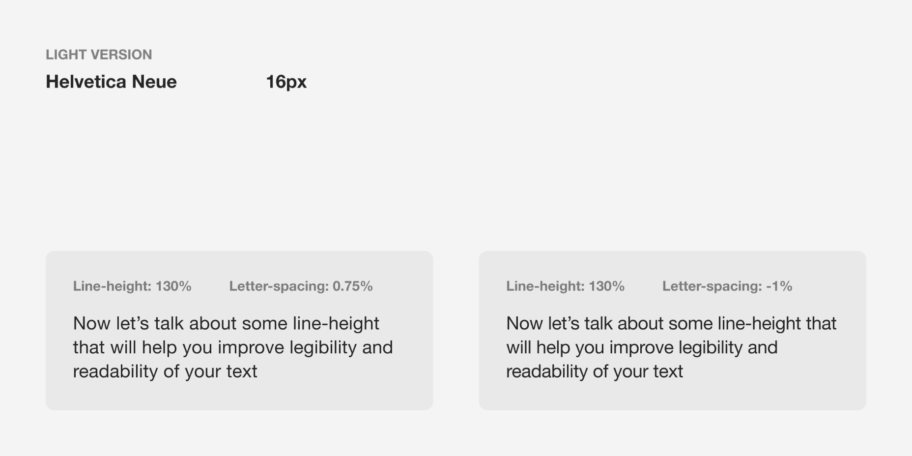
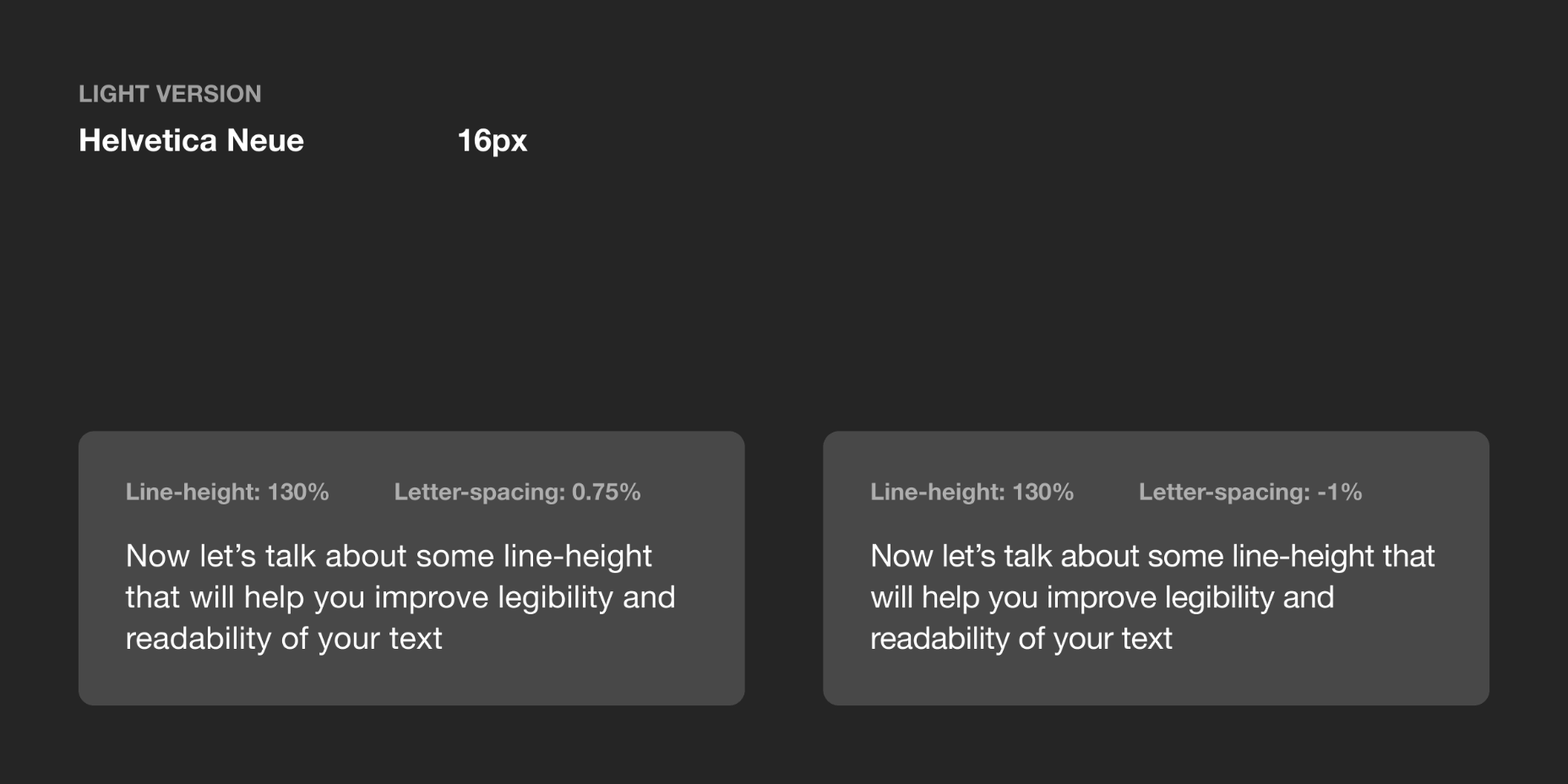
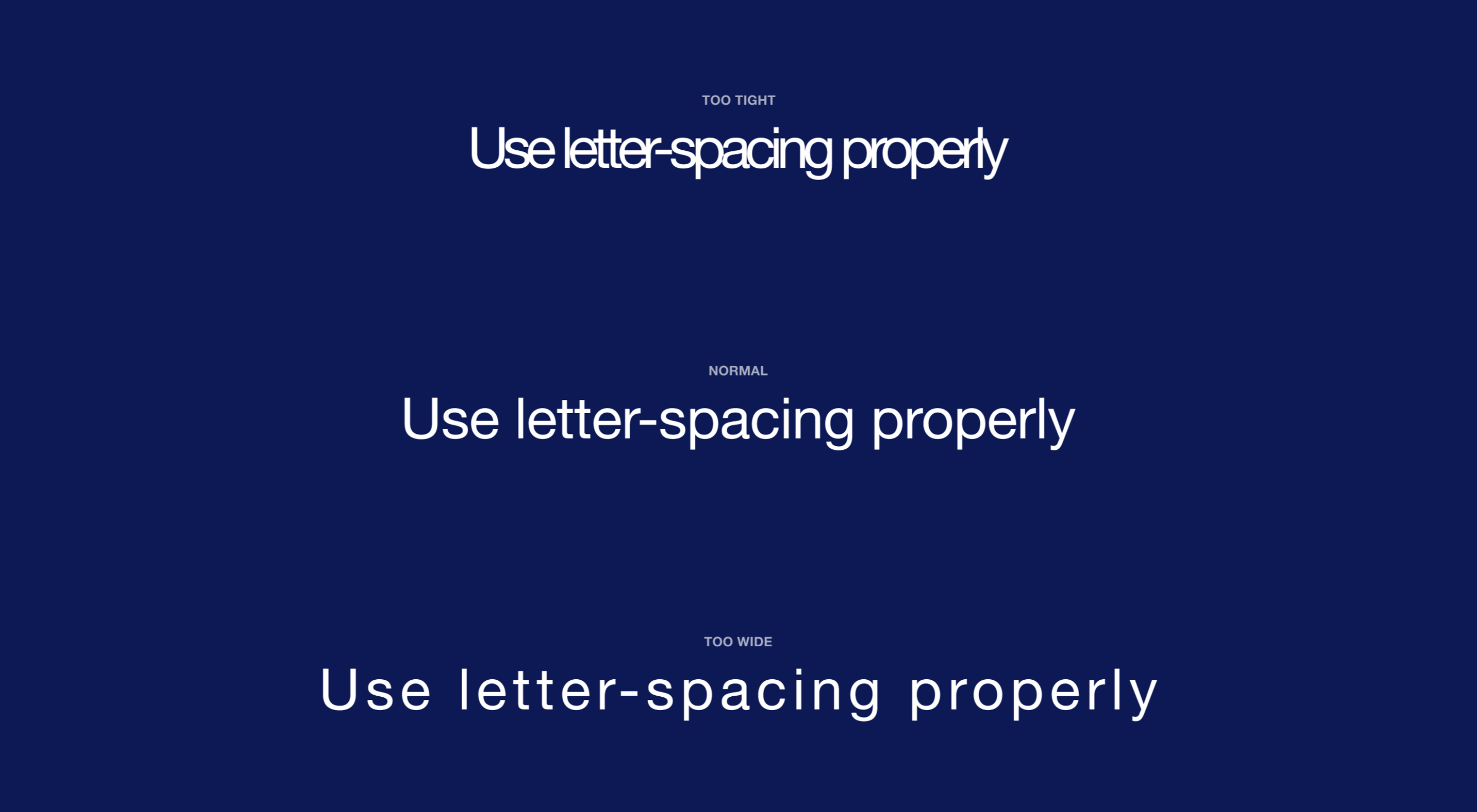 Most of the information we consume happens through reading, so it makes a lot of sense to pay attention to the words when designing. There are many aspects to typography, but one of the things that helped improve the quality of my design was letter-spacing.
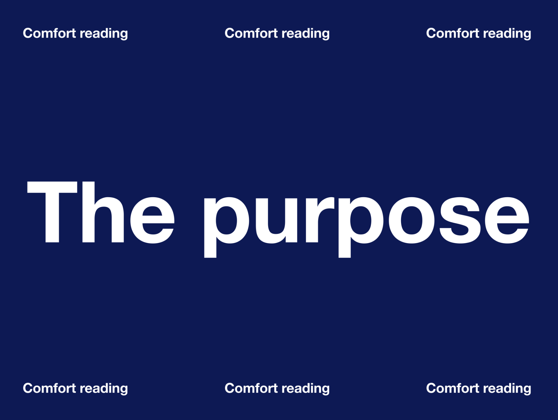


 Every week users submit a lot of interesting stuff on our sister site Webdesigner News, highlighting great content from around the web that can be of interest to web designers.