Create A Responsive Dashboard With Angular Material And ng2-Charts

Original Source: https://www.smashingmagazine.com/2020/07/responsive-dashboard-angular-material-ng2-charts-schematics/

Create A Responsive Dashboard With Angular Material And ng2-Charts

Create A Responsive Dashboard With Angular Material And ng2-Charts

Zara Cooper

2020-07-27T10:00:00+00:00
2020-07-27T17:34:36+00:00

Creating a dashboard from scratch is often pretty complicated. You have to create tools to collect data on items of interest. Once collected this data has to be presented in an easy to understand and meaningful way to your users. It involves intricate planning of what data to include and how to display it effectively. Once you have a plan, implementing the design is a massive task especially since it involves building multiple components.

With Angular Material and ng2-charts, you can take advantage of schematics to cut down the effort and time you may spend building a dashboard. Angular Material ships with a number of schematics that you could use to generate a dashboard. Similarly, ng2-charts provides schematics for generating multiple chart components. In this article, I’ll illustrate how to use both ng2-charts and Angular Material to set up a dashboard fairly quickly.

An Example

To illustrate how to build a dashboard, we’ll take the example of an online store selling leather goods like bags, wallets, key holders, and so on. The store owner would like to track information such as where customers come from to their online store, how their products sell, how traffic sources relate to sales, among other things.

We’ll build a dashboard to display this information and help the store owner analyze it. The dashboard will contain four small summary cards, four different kinds of charts, and a table listing most recent orders made. The four summary cards will display information such as total revenue from sales, average order value, the total number of orders, and number of returning customers. The charts will display the number of units sold for each product, sales by traffic source, online store sessions over time, and sales for the week.

Prerequisites

To follow along, you’ll need to have Angular CLI installed. If you do not have it installed, you can find out how to get it at cli.angular.io. If you’re not starting from a pre-existing Angular project, you need to generate one by running ng new <your project name>. For instance, to create an admin panel for the aforementioned store, we’ll run:

ng new store-admin-panel

Your project also needs to have routes configured for it. If you’re starting from a new app, select yes when prompted on whether to add an Angular Routing module during your project setup above.

Add Angular Material And Ng2-Charts To Your Project

Angular Material ships with various schematics for generating a variety of useful components like address books, trees, tables, navigation, and so on. To add Angular Material to your project, run:

ng add @angular/material

Pick a theme from the options provided in subsequent prompts. Next, you’ll be prompted to choose whether to add Angular Material typography styles and browser animations. You do not need these and could just respond no.

Next, you’ll need to install ng2-charts. ng2-charts requires charts.js as a dependency. To install ng2-charts run:

npm install ng2-charts –save

Then install charts.js:

npm install chart.js –save

To access the charts, add the ChartsModule to the AppModule’s imports.

import { ChartsModule } from ‘ng2-charts’;

@NgModule({
imports: [

ChartsModule,

]
})

Lastly, install ng2-charts schematics as a dev dependency because they do not ship with ng2-charts by default.

npm install –save-dev ng2-charts-schematics

Generating A Navigation Component

First off, we’ll need to add a navigation component to help users maneuver through the app comfortably. The navigation should contain links to the dashboard and other pages that will be part of the admin panel. Angular material provides a schematic that generates a navigation component. We’ll name this component nav. Adding a side nav to the application is accomplished by running:

ng generate @angular/material:navigation nav

To link other routes in the navigation, use the routerLink directive and change the page name in the toolbar depending on what route a user is on.

// nav.component.ts

menuItems = [‘dashboard’, ’sales’, ‘orders’, ‘customers’, ‘products’];

<!–nav.component.html–>

<mat-nav-list>
<a *ngFor=”let item of menuItems” mat-list-item [routerLink]=”‘/’+item”> {{item | titlecase}} </a>

To see this component, add it to app.component.html.

<!–app.component.html–>
<app-nav></app-nav>

This is what the NavComponent looks like.

Navigation component

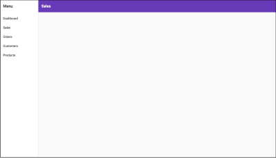
Navigation component (Large preview)

Since the nav will be displayed alongside other components, adding a router-outlet to it would help switch between the other different components. In the nav.component.html template, just after the closing </mat-toolbar>, replace the <!– Add Content Here –> comment with <router-outlet></router-outlet>.

<!–nav.component.html–>
<mat-sidenav-container>

<mat-sidenav-content>
<mat-toolbar>

</mat-toolbar>
<router-outlet></router-outlet>
</mat-sidenav-content>
</mat-sidenav-container>

In the screenshots that follow in this article, this nav component will be omitted to better highlight the dashboard we’ll be generating for the sake of the tutorial. If you’re following along while building this dashboard, the nav will still appear as pictured above in your browser with the dashboard within it.

Generate The Dashboard

The most important part of the dashboard is its layout. It needs to hold all the components mentioned earlier and be responsive when displayed on different devices. To generate the dashboard layout, you’ll need to run the @angular/material:dashboard schematic. It will generate a responsive dashboard component. Pass the preferred name for your dashboard to the schematic. In this instance, let’s name it dash.

ng generate @angular/material:dashboard dash

To view the newly generated dashboard within the nav component, add a route for it to the router.

// app-routing.module.ts
import { DashComponent } from ‘./dash/dash.component’;

const routes: Routes = [{ path: ‘dashboard’, component: DashComponent }];

@NgModule({
imports: [RouterModule.forRoot(routes)],
exports: [RouterModule]
})

Once done, to see the results, run npm start and head on over to localhost:4200/dashboard. You should see this:

generated dashboard component

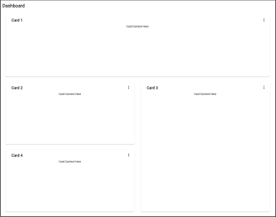
Generated dashboard component (Large preview)

The schematic generates four cards in the template and displays them in a responsive grid. The Angular Material CDK uses the Layout package to style this responsive card grid. The BreakpointObserver utility of the Layout package assesses media queries and makes UI changes based on them. There are various breakpoints available but within the generated component, only two categories are catered for. The Breakpoints.Handset and other queries that do not match it. The Layout package specifies 14 breakpoint states that you can use to customize the responsiveness of your dashboard.

// dashboard.component.js

cards = this.breakpointObserver.observe(Breakpoints.Handset).pipe(
map(({ matches }) => {
if (matches) {

}

})
);

Going back to the dashboard, since four summary cards, four charts, and a table will be on the dashboard, we need nine cards in total. Breakpoints.Handset and Breakpoints.Tablet matches will display in a one-column grid where:

The four summary cards will span one row.
The charts will span two rows.
The table will span four rows.

Non-Breakpoints.Handset and non-Breakpoints.Tablet matches will display in four columns where:

The four summary cards will span one row and one column.
The charts will span two rows and two columns.
The table will span four rows and four columns.

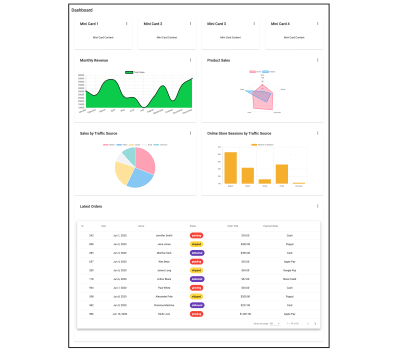
It should look something like the screenshot below in non-Breakpoints.Handset and non-Breakpoints.Tablet matches. On Breakpoints.Handset and Breakpoints.Tablet matches, everything will just display in one column.

dashboard component with additional cards

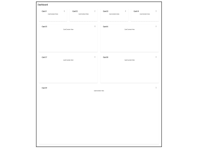
Dashboard component with additional cards (Large preview)

Create A Card Component

In the dashboard component, all the cards are generated through iteration. To prevent repetition, when adding all the new components, we’ll create a reusable card component. The card component will accept a title as input and use ng-content to dynamically add the rest of the content. To create the card component, run:

ng g c card -m app –style css

From the dashboard component template, we’ll just take the markup enclosed within the <mat-card> tag and place it In the card template:

<!–card.component.html–>
<mat-card class=”dashboard-card”>
<mat-card-header>
<mat-card-title>
{{title}}
<button mat-icon-button class=”more-button” [matMenuTriggerFor]=”menu” aria-label=”Toggle menu”>
<mat-icon>more_vert</mat-icon>
</button>
<mat-menu #menu=”matMenu” xPosition=”before”>
<button mat-menu-item>Expand</button>
<button mat-menu-item>Remove</button>
</mat-menu>
</mat-card-title>
</mat-card-header>
<mat-card-content class=”dashboard-card-content”>
<ng-content></ng-content>
</mat-card-content>
</mat-card>

To add the title as input to the card:

// card.component.ts
import { Component, Input } from ‘@angular/core’;

export class CardComponent{
@Input() title: string;


}

To style the card:

/*card.component.css*/
.more-button {
position: absolute;
top: 5px;
right: 10px;
}

.dashboard-card {
position: absolute;
top: 15px;
left: 15px;
right: 15px;
bottom: 15px;
}

.dashboard-card-content {
text-align: center;
flex-grow: 1;
display: flex;
flex-direction: column;
align-items: center;
max-height: 100%;
justify-content: center;
align-items: stretch;
}

mat-card {
display: flex;
flex-direction: column;
}

Adding Cards To The Dashboard

Since the dashboard elements will be added individually and not through iteration, the dashboard component needs to be modified to account for this. In dashboard.component.ts, remove the cards property and replace it with a cardLayout property instead. The cardLayout variable will define the number of columns for the material grid list and how many rows and columns each of the dashboard cards will span. Breakpoints.Handset and Breakpoints.Tablet query matches will display in 1 column and those that do not match will display in 4 columns.

// dashboard.component.js

cardLayout = this.breakpointObserver.observe(Breakpoints.Handset).pipe(
map(({ matches }) => {
if (matches) {
return {
columns: 1,
miniCard: { cols: 1, rows: 1 },
chart: { cols: 1, rows: 2 },
table: { cols: 1, rows: 4 },
};
}

return {
columns: 4,
miniCard: { cols: 1, rows: 1 },
chart: { cols: 2, rows: 2 },
table: { cols: 4, rows: 4 },
};
})
);

In the dash.component.html template, replace the colspan and rowspan values of mat-grid-tile elements and the cols property of the mat-grid-list element.

<!–dash.component.html–>
<div class=”grid-container”>
<h1 class=”mat-h1″>Dashboard</h1>
<mat-grid-list cols=”{{ ( cardLayout | async )?.columns }}” rowHeight=”200px”>
<!–Mini Cards–>
<mat-grid-tile *ngFor=”let i of [1, 2, 3, 4]” [colspan]=”( cardLayout | async )?.miniCard.cols”
[rowspan]=”( cardLayout | async )?.miniCard.rows”>
<app-card title=”Card {{i}}”><div>Mini Card Content Here</div></app-card>
</mat-grid-tile>
<!–Charts–>
<mat-grid-tile *ngFor=”let i of [5, 6, 7, 8]” [colspan]=”( cardLayout | async )?.chart.cols”
[rowspan]=”( cardLayout | async )?.chart.rows”>
<app-card title=”Card {{i}}”><div>Chart Content Here</div></app-card>
</mat-grid-tile>
<!–Table–>
<mat-grid-tile [colspan]=”( cardLayout | async )?.table.cols” [rowspan]=”( cardLayout | async )?.table.rows”>
<app-card title=”Card 9″><div>Table Content Here</div></app-card>
</mat-grid-tile>
</mat-grid-list>
</div>

The dashboard will end up looking exactly like the most recent screenshot linked above.

Generating The Charts

The four charts that we need for the dashboard are:

A radar chart of products by unit sold.
A pie chart of sales by traffic source.
A bar chart of online store sessions.
A line chart of sales across the year.

Similar to creating the dashboard, generating chart components involves running a schematic. Using the ng2-charts schematics, generate the four different charts. We’ll place them in a folder called charts. Run ng generate ng2-charts-schematics:<chart type> <chart name>.

ng generate ng2-charts-schematics:radar charts/product-sales-chart
ng generate ng2-charts-schematics:pie charts/sales-traffic-chart
ng generate ng2-charts-schematics:line charts/annual-sales-chart
ng generate ng2-charts-schematics:bar charts/store-sessions-chart

After running these commands, all four chart components are generated and are populated with sample data ready for display. Depending on what data you’d like to show, pick charts that most suit your data visualization needs. For each of the charts generated above, add the chartContainer class to the divs that enclose the canvas element in the chart templates.

<div class=”chartContainer”>
<canvas baseChart width=”400″ height=”400″>

Next, add this styling to styles.css so that they could be accessible to all the chart components.

/*styles.css*/

.chartContainer canvas {
max-height: 250px;
width: auto;
}

.chartContainer{
height: 100%;
display: flex;
flex-direction: column;
align-items: center;
justify-content: center;
}

Adding Data To The Charts

The generated chart components come with sample data already plugged in. If you have pre-existing services that provide your own data, you can add this data from them to the chart components. The charts take labels for the x-axis, data or data sets, a chart type, colors, a legend as well as other customization options. To provide the data and labels to the charts, create a service that will fetch data from a source of your choice and return it in a form that the charts accept. For instance, the AnnualSalesChartComponent receives its dataset and labels from the SalesService’s getSalesByMonth method which returns an array of sales for each month for the current year. You can find this service here and data it returns here. Inject the service as a private property to the AnnualSalesChartComponent constructor. Call the method that returns the required chart data from the service within the ngOnInit lifecycle hook.

// annual-sales-chart.component.ts
import { SalesService } from ’src/app/sales/sales.service’;

export class AnnualSalesChartComponent implements OnInit {
public salesChartData: ChartDataSets[] = [
{ data: [], label: ‘Total Sales’ },
];

public salesChartLabels: Label[] = [];

constructor(private salesService: SalesService) { }
ngOnInit() {
this.salesService.getSalesByMonth().subscribe({
next: salesItems => {
salesItems.forEach(li => {
this.salesChartData[0].data.push(li.revenue);
this.salesChartLabels.push(li.month);
});
},

});
}
}

Adding Charts To The Dashboard

The next step involves adding the charts to the dashboard, in dash.component.html. Here’s what that looks like:

<!–dash.component.html–>

<!–Charts–>
<mat-grid-tile [colspan]=”( cardLayout | async )?.chart.cols” [rowspan]=”( cardLayout | async )?.chart.rows”>
<app-card title=”Monthly Revenue”>
<app-annual-sale-chart></app-annual-sale-chart>
</app-card>
</mat-grid-tile>
<mat-grid-tile [colspan]=”( cardLayout | async )?.chart.cols” [rowspan]=”( cardLayout | async )?.chart.rows”>
<app-card title=”Product Sales”>
<app-product-sales-chart></app-product-sales-chart>
</app-card>
</mat-grid-tile>
<mat-grid-tile [colspan]=”( cardLayout | async )?.chart.cols” [rowspan]=”( cardLayout | async )?.chart.rows”>
<app-card title=”Sales by Traffic Source”>
<app-sales-traffic-chart></app-sales-traffic-chart>
</app-card>
</mat-grid-tile>
<mat-grid-tile [colspan]=”( cardLayout | async )?.chart.cols” [rowspan]=”( cardLayout | async )?.chart.rows”>
<app-card title=”Online Store Sessions by Traffic Source”>
<app-store-sessions-chart></app-store-sessions-chart>
</app-card>
</mat-grid-tile>

This is what the resultant responsive dashboard looks like.

dashboard with charts

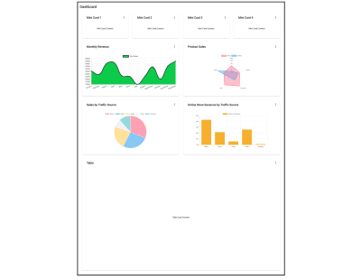
Dashboard with charts (Large preview)

Generating A Table

We’ll add an orders table to give the shop owner an overview of the most recent orders placed and their status. To generate the orders table component, run the schematic:

ng generate @angular/material:table orders-table

This will generate a table component that will look like this.

table generated by Angular Material schematic

Table generated by Angular Material schematic (Large preview)

Tables with many columns may be difficult to make responsive for handset and tablet views. When adding the table to a card, make it horizontally scrollable so that all the data can be viewed properly and is not obstructed. You can do this by adding the styling below to your table component:

<!–table.component.html–>
<div class=”mat-elevation-z8 small-table”>
<table mat-table class=”full-width-table” matSort aria-label=”Elements”>

/*table.component.css*/

.small-table{
overflow-x: scroll !important;
}

To add the table to the dash component:

<!– dashboard.component.html>

<mat-grid-tile [colspan]=”( cardLayout | async )?.table.cols” [rowspan]=”( cardLayout | async )?.table.rows”>
<app-card title=”Latest Orders”>
<app-orders-table></app-orders-table>
</app-card>
</mat-grid-tile>

Adding Data To The Table

Like with charts, you can add data to the table in the ngOnInit method from a service. Additionally, you will need to modify your table’s generated data source to consume data from the service. To start off, inject the service in the table’s class constructor. Let’s take the example of a table listing the latest orders for this dashboard. To get data for the table, let’s inject the OrderService in the OrdersTableComponent constructor, change the MatTable type assertion of the table view child, and amend the list of displayed columns to reflect an order interface. If you’re interested in the data being added to the table, you can find it here. The last thing involves getting the total length of the data items available to be used to set the total in the table’s <mat-paginator>.

// orders-table.component.ts
import { OrderService } from ‘../orders.service’;
import { Order } from ‘../order’;

export class OrdersTableComponent implements AfterViewInit, OnInit {

@ViewChild(MatTable) table: MatTable;
dataLength: number;

displayedColumns = [
“id”,
“date”,
“name”,
“status”,
“orderTotal”,
“paymentMode”,
];

constructor(private orderService: OrderService){}

ngOnInit() {
this.datasource = new OrdersTableDataSource(this.orderService);
this.orderService.getOrderCount().subscribe({
next: orderCount => {
this.dataLength = orderCount;
},

});
}

}

Next, we’ll need to modify the OrdersTableDataSource class to accept the OrderService as a parameter in its constructor. We’ll have to modify its connect and destroy methods as well. The connect method connects the data source to the table and updates the table when new data items are emitted from the stream it returns, in this case, an orders array observable. The dataMutations constant combines the first data load, pagination, and sorting events into one stream for the table to consume. Pagination and sorting are handled by the OrderService server-side. So we need to pass the offset and page size from paginator and the active sort field and sort direction of the sort property to the getOrders method of the OrderService. The disconnect method should be used to close any connections made and release resources held up in the connect method.

// orders-table.datasource.ts

export class OrdersTableDataSource extends DataSource<Order> {
paginator: MatPaginator;
sort: MatSort;

constructor(private orderService: OrderService) {
super();
}

connect(): Observable<Order[]> {
const dataMutations = [
of(‘Initial load’),
this.paginator.page,
this.sort.sortChange
];

return merge(…dataMutations).pipe(mergeMap(() => {
return this.orderService.getOrders(
this.paginator.pageIndex * this.paginator.pageSize,
this.paginator.pageSize,
this.sort.active,
this.sort.direction
);
}));
}

disconnect() {}
}

In the orders table template, insert the new columns and bind the length property of <mat-paginator> to the dataLength property. For the status column, use a <mat-chip> element for better visualization of the order status. To have access to <mat-chip>, add the MatChipsModule as an import to AppModule.

<!– orders-table.component.html –>
<div class=”mat-elevation-z8″>
<table mat-table class=”full-width-table” matSort aria-label=”Elements”>
<!– Id Column –>
<ng-container matColumnDef=”id”>
<th mat-header-cell *matHeaderCellDef mat-sort-header>Id</th>
<td mat-cell *matCellDef=”let row”>{{row.id}}</td>
</ng-container>

<!– Date Column –>
<ng-container matColumnDef=”date”>
<th mat-header-cell *matHeaderCellDef mat-sort-header>Date</th>
<td mat-cell *matCellDef=”let row”>{{row.date | date }}</td>
</ng-container>

<!– Name Column –>
<ng-container matColumnDef=”name”>
<th mat-header-cell *matHeaderCellDef mat-sort-header>Name</th>
<td mat-cell *matCellDef=”let row”>{{row.name}}</td>
</ng-container>

<!– Order Total Column –>
<ng-container matColumnDef=”orderTotal”>
<th mat-header-cell *matHeaderCellDef mat-sort-header>Order Total</th>
<td mat-cell *matCellDef=”let row”>{{row.orderTotal | currency}}</td>
</ng-container>

<!– Payment Mode Column –>
<ng-container matColumnDef=”paymentMode”>
<th mat-header-cell *matHeaderCellDef mat-sort-header>Payment Mode</th>
<td mat-cell *matCellDef=”let row”>{{row.paymentMode}}</td>
</ng-container>

<!– Status Column –>
<ng-container matColumnDef=”status”>
<th mat-header-cell *matHeaderCellDef mat-sort-header>Status</th>
<td mat-cell *matCellDef=”let row”>
<mat-chip-list>
<mat-chip color=”{{ row.status == ‘delivered’ ? ‘primary’ : ( row.status == ’shipped’ ? ‘accent’ : ‘warn’ ) }}” selected>
{{row.status}}
</mat-chip>
</mat-chip-list>
</td>
</ng-container>

<tr mat-header-row *matHeaderRowDef=”displayedColumns”></tr>
<tr mat-row *matRowDef=”let row; columns: displayedColumns;”></tr>
</table>

<mat-paginator #paginator [length]=”dataLength” [pageIndex]=”0″ [pageSize]=”5″ [pageSizeOptions]=”[5, 10, 15, 20]”>
</mat-paginator>
</div>

Once data has been added to the table, this is what the dashboard will look like:

dashboard with charts and table

Dashboard with charts and table (Large preview)

Creating A Mini Card Component

All that’s left to complete the dashboard is to populate the four small cards that sit at the top. Having smaller summary cards as part of the dashboard makes it easy to highlight brief pieces of information that do not need whole charts or tables. In this example, the four mini cards will display total sales, average order value, the total number of orders, and the number of returning customers that visited the store for the day. This is just an example. These mini cards cannot be generated like with the navigation, dashboard layout, charts, and the table. They have no schematics. Below we’ll briefly go through how to create them. Although we’re going to add data specific to the example, you can add whatever you want to them or decide to do away with them altogether. To start off, generate the mini-card component, run:

ng g c mini-card -m app –style css

You can find the template for the component linked here and its styling here. This component has eight input properties that you can find out how to add here. To get data to the mini card components, inject the service that provides data to them in the DashComponent constructor. Assign data received from the service to a property of the DashComponent. In this instance, we’ll get data from the StoreSummaryService and assign it to the miniCardData property. Here’s how:

// dash.component.ts
export class DashComponent implements OnInit{

miniCardData: StoreSummary[];

constructor(private breakpointObserver: BreakpointObserver, private summaryService: StoreSummaryService) {}

ngOnInit() {
this.summaryService.getStoreSummary().subscribe({
next: summaryData => {
this.miniCardData = summaryData;
}
});
}
}

To add the mini-cards to the dash component and have them populated with data from the service:

<!–dash.component.html–>

<!–Mini Cards–>
<mat-grid-tile *ngFor=”let mc of miniCardData” [colspan]=”( cardLayout | async )?.miniCard.cols”
[rowspan]=”( cardLayout | async )?.miniCard.rows”>
<app-mini-card [title]=”mc.title” [textValue]=”mc.textValue” [value]=”mc.value” [color]=”mc.color” [percentValue]=”mc.percentValue”></app-mini-card>
</mat-grid-tile>

The screenshot below is what the dashboard will look like with the mini cards populated.

dashboard with charts, tables, and mini-cards

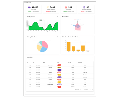
Dashboard with charts, tables, and mini-cards. (Large preview)

Putting All Together

In the end, the dashboard component template should contain:

<!– dashboard.component.html –>
<div class=”grid-container”>
<h1 class=”mat-h1″>Dashboard</h1>
<mat-grid-list cols=”{{ ( cardLayout | async )?.columns }}” rowHeight=”200px”>
<!–Mini Cards–>
<mat-grid-tile *ngFor=”let mc of miniCardData” [colspan]=”( cardLayout | async )?.miniCard.cols”
[rowspan]=”( cardLayout | async )?.miniCard.rows”>
<app-mini-card [icon]=”mc.icon” [title]=”mc.title” [value]=”mc.value” [color]=”mc.color” [isIncrease]=”mc.isIncrease” duration=”since last month” [percentValue]=”mc.percentValue” [isCurrency]=”mc. isCurrency”></app-mini-card>
</mat-grid-tile>
<!–Charts–>
<mat-grid-tile [colspan]=”( cardLayout | async )?.chart.cols” [rowspan]=”( cardLayout | async )?.chart.rows”>
<app-card title=”Monthly Revenue”>
<app-annual-sale-chart></app-annual-sale-chart>
</app-card>
</mat-grid-tile>
<mat-grid-tile [colspan]=”( cardLayout | async )?.chart.cols” [rowspan]=”( cardLayout | async )?.chart.rows”>
<app-card title=”Product Sales”>
<app-product-sales-chart></app-product-sales-chart>
</app-card>
</mat-grid-tile>
<mat-grid-tile [colspan]=”( cardLayout | async )?.chart.cols” [rowspan]=”( cardLayout | async )?.chart.rows”>
<app-card title=”Sales by Traffic Source”>
<app-sales-traffic-chart></app-sales-traffic-chart>
</app-card>
</mat-grid-tile>
<mat-grid-tile [colspan]=”( cardLayout | async )?.chart.cols” [rowspan]=”( cardLayout | async )?.chart.rows”>
<app-card title=”Online Store Sessions by Traffic Source”>
<app-store-sessions-chart></app-store-sessions-chart>
</app-card>
</mat-grid-tile>
<!–Table–>
<mat-grid-tile [colspan]=”( cardLayout | async )?.table.cols” [rowspan]=”( cardLayout | async )?.table.rows”>
<app-card title=”Latest Orders”>
<app-orders-table></app-orders-table>
</app-card>
</mat-grid-tile>
</mat-grid-list>
</div>

Here’s what the resultant dashboard contains.

completed dashboard

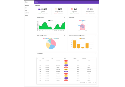
Completed dashboard (Large preview)

Conclusion

Creating dashboards involves a fair amount of work and planning. A way to make building them faster is to use the various schematics provided by Angular Material and ng2-charts. With these schematics, running a command will generate a wholly complete component and can result in having a dashboard up and running fairly quickly. This leaves you a lot more time to focus on creating data services and adding them to your dashboard components.

If you want to learn more about some of the schematics provided by Angular Material, visit material.angular.io, and for those provided by ng2-charts, visit their site linked here.

Smashing Editorial
(ra, yk, il)

Popular Design News of the Week: July 20, 2020 – July 26, 2020

Original Source: https://www.webdesignerdepot.com/2020/07/popular-design-news-of-the-week-july-20-2020-july-26-2020/

Every week users submit a lot of interesting stuff on our sister site Webdesigner News, highlighting great content from around the web that can be of interest to web designers.

The best way to keep track of all the great stories and news being posted is simply to check out the Webdesigner News site, however, in case you missed some here’s a quick and useful compilation of the most popular designer news that we curated from the past week.

4 Design Patterns that Violate “Back” Button Expectations


We Designed Something that Couldn’t Work


Appydev – Best Hand Picked Tools


Dark Mode for all the Things


15 Amazing Lego Re-Imagined Star Wars Scenes


37 SEO Tips all Web Designers Should Know


Medium is not the Home for your Ideas


How to Start Designing in Figma


Recursive Google Font


8 Popular UI Design Trends on Dribbble in 2020


Teenyicons — Tiny Minimal 1px Icons


Stripe: Building a Developer Cult


Fast Design will Kill your Product


How to Create a Strong Visual Identity for Digital Products


How to Create a Responsive Timeline with Image Thumbnails


Reploy – Instant, Shareable Previews of your Product


Wavium – Start a Blog and Newsletter in Under 5 Minutes


Can a Rebranding Make BMW Immune?


Webwaste


9 Epic Logo Designs Inspired by Famous Fictional Places


Create a Stunning Infographic with these 9 Tips and Tricks


How to Create a Web Design Portfolio with no Job Experience


5 Essential UX Design Principles that Great Designers Embrace


I Don’t Want to Be a Founder and I Don’t Think You do Either


Stop Worrying About People Stealing your Ideas


Want more? No problem! Keep track of top design news from around the web with Webdesigner News.

Source

p img {display:inline-block; margin-right:10px;}
.alignleft {float:left;}
p.showcase {clear:both;}
body#browserfriendly p, body#podcast p, div#emailbody p{margin:0;}

Raw Design Inspiration: Hand-picked on Dribbble

Original Source: http://feedproxy.google.com/~r/abduzeedo/~3/LROo5HHoMXI/raw-design-inspiration-hand-picked-dribbble

Raw Design Inspiration: Hand-picked on Dribbble

AoiroStudio07.26.20

We are back with another abdz. ‘Raw Design Inspiration’ No theme, absolutely ‘raw’ inspiration. As you may have been aware, inspiration is one of the biggest fuels in my everyday life. Whatever it is for life and work balance, it comes in many shapes and forms. For me, I do appreciate a good surf on Dribbble. It’s all about how we consume our feeds, I noticed a shift of change from designers on sharing their work on social media platforms like Instagram. I might be an old-timer but I am not too keen on sharing work for likes and shares, I do enjoy the good ‘old’ Dribbble. It’s always gratifying and you usually do find something to spark your mind and inspiration.

The concept of ‘Raw’ is to randomize what inspires me to kick off my week, maybe it could have the same effect on you. This is reasonably an homage to abdz. daily inspiration series. It’s an experiment, and we’ll see how it goes. If you do have a suggestion, you can submit your work.

More on https://dribbble.com

-

By Jona Dinges

By DStudio™

Empty UI gradient color app design empty space empty state mobile ui mobile app ios app ios card ui branding user experience design typography white product design clean ui-ux ux ui

By Yoga Perdana

Zebra Logo animal horse zebra branding logo

By Udhaya Chandran

By Anton Zaderaka

By Craftwork

Boom Illustrations + UI = ? flying cinema4d png startup project elements ui design landing application presentation website web app scene colorful bright illustrations 3d

By MonpixDesign

Food Delivery App mobile fruits fruit food uiux mobile app mobile ui mobile app design ecommerce design app design ecommerce app ecommerce app ux design ui ui design minimal food delivery app

By Asish Sunny

Payment app clean ui trending cards ui credit cash hire freelancer wallet expence income finances web design website dark ui light ui mobile ui clean ux ui

By Lelevien

6833adbf09b00f6ad03a8b09509625e8

By B®andits

Play With Type - B Studio studio minimal branding logo brandits typeface geometric monogram letter typography type play

By Farzan Faruk ?

watchOS 6 Landing Page - Mobile Concept minimal app design applepencil apple ios mockup apple watch design responsive design smartwatch apple watch 2018 trends ui ux website design product web design landing page homepage ecommerce website

By Sèrgi Mi

Mobile Banking graph balance payment pay illustration banking concept bank app kawaii design cards light mobile ui

By catalyst

music instruments... ????????? concert cartoon logo icon illustration player musical trumpet violin piano drum song sing sound electric accoustic guitar microphone intrument music

By Laura Lhuillier ⎪ Arual ☺︎

Bottles collection ? packagingdesign branding moutain forest aquatic jungle adobe dimension bottle mockup bottle design animal kids illustration illustration art illustrator illustration

By MD Mahfuj

Niox | N letter logo design gradient logo modern logo logo design identitydesign website logo mark n letter logo n letter logos logo illustrator identity branding free logo mockup flat creative logo app vector logo process free logo

By David Kovalev ◒

Photos not flat logo branding agency unfold neuomorphism neuomorphic skeumorphism skeumorphic 3d soft soft3d fun flower colorful photo photos iconset icons icon apple

By UI8

Macbook Pro Mockup - 4K Freebie freebie 4k 3d sketch psd mockup apple macbook

By Benjamin Oberemok

Ping-pong logo design icon symbol mark unfold game paddle rackets table tennis tennis ping pong logo concept fun branding logo

By Fabio Sasso

1c124982a41fa19abb12f03f312ac9a5

By Nathan Riley


The best cameras for beginners in 2020

Original Source: http://feedproxy.google.com/~r/CreativeBloq/~3/nugt27eZSlI/best-cameras-for-beginners

The best camera for beginners allow creatives to expand their skills in all sorts of ways. You might be looking to add photography to the services you offer your clients, or find a stylish new way to show off your portfolio. Maybe you want to start vlogging to take your followers behind the scenes of your work – or, hey, perhaps you just want your Insta to pop a little more. There's no shame in that.

Whatever the reason you want to take more pictures, it's best to pick up one of the best cameras for beginners rather than relying on your smartphone. This is because there are certain advantages to cameras that mean they'll always outpace even the latest, most sophisticated smartphone cameras. For more details, jump to what to consider when buying a camera section. 

If you've already got some photography skills, check our our roundup of what we consider the best cameras for all levels to be. And while you're getting kitted out, why not explore our guides to the best memory cards and the best camera bags too.

All of the cameras we've selected for this guide are suited to photography novices, while still offering the capacity to grow with you as you improve. Let's get started.

The best cameras for beginners available now

It’s particularly easy to get up and running with the Nikon D3500. As well as an ‘intelligent’ fully automatic mode, there are wide-ranging scene modes and effects to choose from. More uniquely, there’s a Guide shooting mode, which serves as a kind of interactive photography course. There’s no shortage of quality either, with a high-performance 24.2MP image sensor and processor, a generous ISO (sensitivity) range, speedy 5fps maximum burst rate and a high-resolution LCD screen. 

However, it’s not a touch-sensitive screen and lacks a tilt or pivot facility. Another drawback is that autofocus is relatively slow in live view and movie capture modes but, overall, the D3500 is currently the most appealing beginners’ camera on the market.

The Canon EOS 250D is the first entry-level DSLR to feature 4K movie capture, and it replaces the popular EOS 200D in Canon’s lineup. Indeed, the Dual Pixel CMOS autofocus system for live view and movie modes, inherited from its predecessor, makes the camera particularly good for tracking action when shooting video. The virtually silent autofocus performance of the 18-55mm kit lens is a further bonus.

Not just for video, the 250D is a very accomplished package for stills. It's beginner-friendly with optional Guided User Interface and Creative Assist modes, which work seamlessly with the fully articulated touchscreen. The camera is also well able to grow with you as you learn new skills and techniques, Canon’s excellent Quick menu giving intuitive and instant access to important settings.

One of the most compact and lightweight DSLRs on the market, the 250D is a camera you can take anywhere and everywhere. Our only real criticism is that, in viewfinder-based stills shooting rather than live view mode, the autofocus system is fairly basic. There are only nine AF points and only one of them is cross-type, able to resolve detail in both horizontal and vertical planes.

Fujifilm's mirrorless cameras not only look fantastic, with cool retro styling that has been a hit with photographers for going on a decade now, but they're also some of the best shooters on the market. The Fujifilm X-T200 is one of the newer models, designed for entry-level users who want room to grow their skills and shoot high-quality images and videos. Its upgraded sensor produces a wide dynamic range and pleasingly low noise, and this combines well with Fuji's Film Simulation modes to produce images with real pop.

The X-T200 shoots 4K video in impressive quality, and its articulated touchscreen allows you to get creative with your shooting angles. Having access to the stable of pin-sharp Fujifilm X-mount lenses is also no bad thing, and ensures you'll have plenty of room to grow and explore in your shooting, whatever direction you take it in.

Don't be fooled by the slim dimensions of this compact camera: it's actually an impressive stills-and-video shooting machine, with not only the ability to shoot high-quality Full HD and 4K video, but also to directly livestream it online. Indeed, you might be surprised how many YouTube creators you enjoy shoot a lot of their stuff on the Canon PowerShot G7 X Mark III; it's a popular camera for a reason.

The fast 24-100mm equivalent lens gives you an enormous amount of shooting versatility; no matter the lighting conditions, no matter how distant the subject, you'll probably be able to have a decent crack at capturing it. Video features are also further bolstered by such vital extras as an external mic port, ensuring that your videos will sound as good as they look. The camera feels premium in the hand, and with the LCD that flips around 180 degrees for easy monitoring, you've got a capable machine in all categories.

The best cameras don't have to be digital! Analogue is a great Physical prints of photographs have much more tangible lasting value than digital files, and there's loads of potential for incorporating them into your creative projects. The Polaroid Originals OneStep+ is the best instant-print camera around right now – not only does it produce beautiful square prints in that classic Polaroid style, but it also offers Bluetooth connectivity with a smartphone that give the user access to loads of additional shooting modes like Double Exposure, Light Painting, Noise Trigger and more.

Full of retro charm, the OneStep+ is well-designed and easy to use, with a powerful flash and twin lenses, one for general shooting, the other for portraits and close-ups. It's great value at the price, though bear in mind that film is an ongoing expense, coming in packs of ten that will generally set you back £10-15. Buy in bulk if you can and you'll definitely make some savings.

There have been plenty more cameras released in Sony's a6000 series since this one, so why have we included it? Well, this is a still a fantastic machine in its own right: a fast-shooting, lightweight and dependable mirrorless camera, with an APS-C sensor and a sophisticated autofocus system. A beginning photographer who wants a solid foundation on which to grow and develop their skills will find the a6000 offers all of this and more. Plus, with all the subsequent models that have been released, this camera can now be picked up for an absolute bargain price.

Equipped with a powerful 24.3 APS-C sensor, the Sony a6000 is an E-mount camera, meaning there's a fantastic range of lenses to choose from in addition to the bundled 16-50mm kit lens. This is an ideal choice for those who want to hit the ground running; it doesn't have as many guide modes as other cameras, but if you're prepared to put a little work in, you'll find it to be a rewarding and capable imaging machine.

One of the upsides of Micro Four Thirds mirrorless system cameras is that they tend to be fairly small and lightweight. That’s certainly true of the Olympus E-M10, which is now in its third generation. Although small, it’s impeccably well built and beautifully turned out with classic retro styling. The 14-42mm EZ kit lens is similarly small, with a retractable design that enables compact stowage. 

Even so, it features a built-in motor that enables smooth zooming during video capture. The maximum burst rate for stills is a speedy 8.6fps, although autofocus can be a little slower than in many competing cameras, making it tricky to follow fast-moving action. 4k UHD movie capture is a bonus.

Great for following the action in sports and wildlife photography, the Nikon D5600 has an advanced 39-point autofocus system that boasts auto-area, dynamic-area and 3D-tracking modes. The optional 18-140mm VR kit lens is also particularly suitable for these types of photography, with its 27-210mm ‘effective’ zoom range and competent Vibration Reduction (optical image stabilisation) system. And for when you need to trek into the countryside for shooting wildlife, or stand for long periods at a sporting event, the D5600 won’t weigh you down as it’s one of the lightest and most compact DSLRs on the market. 

The fully articulated touchscreen is an extra bonus, although for live view and video capture, the sensor-based contrast-detection autofocus facility can be painfully slow.

For such a small camera, the Panasonic TZ100 packs in some seriously big specifications and features. It has a 20.1MP 1.0-type sensor that’s physically large for a compact camera, and retains relatively noise-free image quality even at high ISO settings. It also crams in an electronic viewfinder and a high-res, 3.0inch rear screen, plus a 10x zoom lens with an effective range of 25-250mm. 

To keep things steady, there’s optical image stabilisation for stills and 5-axis hybrid stabilisation for video capture. You can also shoot at 4k UHD for both stills and video, with a frame rate of up to 30fps. For full-resolution stills, the burst rate is still speedy at 10fps. 

Clever tricks include ‘post-focus’, which enables you to capture a burst of stills with automatically transitioning focus distances, and select the frame with the ideal focus point afterwards.

Like other ‘tough’ compact cameras on the market, this Olympus Tough TG-5 is designed to take the knocks. It can withstand being submerged in water to a depth of 15 metres, dropped from a height of 2.1 metres and frozen to -10 degrees Celsius. If you’re feeling particularly mean, you can even try crushing it with a 100kg weight, and it’ll still keep on working. 

All in all, it’s a great camera for everything from skiing down mountains to snorkelling in the sea. The maximum burst rate is a similarly action-packed 20fps, and you can also capture 4k UHD movies. The 4x optical zoom lens adds versatility, as do the built-in macro and microscopic modes. To take things even further, a range of optional accessories includes fisheye and telephoto lens converters. While Olympus has since released a Tough TG-6, we'd say this model is the best pick for beginners' offering basically the same package (the new version has an identical sensor and lens; really the only difference is some new modes) for a better price,

The best camera for beginners: What to consider

As mentioned above, cameras will always have certain advantages over smartphones. These include larger sensors, which mean the cameras perform better in low light, as well as massive improvements in the matter of lenses. Whether you're using a DSLR or mirrorless camera that lets you swap lenses depending on the situation, a zoom-equipped compact that can get close to a subject, or even a fixed-focal-length compact that's been engineered for optical perfection, you're guaranteed to have something superior to the lens on the back of your phone. Or the front, for that matter – and thanks to many cameras now having flip-out screens, your selfie game can step up considerably.

Then there's also the fact that cameras can burst-shoot faster for capturing quick-moving subjects, have more sophisticated autofocus systems, and tend to offer higher resolutions that allow you to make larger physical prints of your images. There's no doubt about it – a camera is the way to go!

The best type of camera for beginners 

First, let's look at the different types of camera available for beginners. If your priorities are simplicity and portability, there’s a lot to be said for a small point-and-shoot camera that you can slip into your daily bag or even a spare pocket. These cameras will have a lens fixed on the front, so while you won't be able to use any focal length that isn't specified on the box, most models will offer a respectable zoom range to work with. There will generally also be a built-in flash, and possibly a viewfinder that helps you compose your shots.

A more versatile option is a 'system' camera, which consists of a separate body and interchangeable lenses. Once you're equipped with two or three lenses, you can shoot anything from portraiture and still life, to action sports and wildlife, or sweeping landscapes and architecture, getting great results every time. 

They start small, with mirrorless or compact system cameras. These tend to be portable and offer faster shooting speeds than their larger siblings, DSLRs. However, don't count DSLRs out, as they are able to offer an optical viewfinder that gives you an unadulterated 'through-the-lens' view of what you're shooting. They also tend to be better weather-sealed and equipped with chunkier handgrips for a secure hold.

Also worth considering are instant print cameras! Analogue is back in a big way, and there's something to be said for a camera that doesn't necessitate messing about with memory cards and hard drives, and just spits out an instant physical print. If your creative work is more tactile/physical (perhaps incorporating collage) then this is definitely a viable option. 

Finally, there are also 'tough' cameras, which have smaller sensors than mainstream compacts, but are heavily waterproofed and can survive rough conditions.

But which to pick? Well, it depends on what you need. Do you want something small and portable or hardy and weatherproof? Are you likely to be shooting video as well as stills? Do you see yourself buying more lenses, or would you prefer a single package that does it all? The answers to all these questions will affect which camera is best for you.

Read more:

The best full-frame cameras in 201915 ways to improve your photography skillsThe best monitors for photo editing

20+ Weird And Unusual USB Products

Original Source: https://www.hongkiat.com/blog/weird-and-unusual-usb-products/

That USB port on your PC is not just for connecting USB flash drives or USB data cables. It can also power some mini gadgets. From mug warmers and mini sewing machines to mini washing machines, you…

Visit hongkiat.com for full content.

10 Actionable Instagram Tips and Tricks

Original Source: https://www.hongkiat.com/blog/useful-instagram-tips-tricks/

Instagram is one of the popular social networks for everyone — influencers as well as brands. According to the Pew Research Center, 37% of adults in the US use Instagram with 63% of them using…

Visit hongkiat.com for full content.

Fun & Games by Bullpen

Original Source: http://feedproxy.google.com/~r/abduzeedo/~3/iEQq6exLie0/fun-games-bullpen

Fun & Games by Bullpen

abduzeedo07.22.20

Bullpen, an independent creative studio based in NYC creating engaging content through design & animation, shared an awesome motion design project with us. Fun & Games, is a tongue in cheek look at the games we design and give our children. It’s all fun & games. Until it isn’t. Developed over the course of a year, this piece is inspired after time spent playing with our own children. While we certainly take things to an extreme, we believe there is an underlying truth that is interesting to think about. We hope you enjoy it!

Credits

Direction: Bullpen
Design: Elliot Lim
3D: Aaron Kemnitzer
Music: Lullatone “how I broke my parent’s record player (when I was five)”
Stills

Image may contain: coin


How To Create a Responsive Timeline with Image Thumbnails

Original Source: http://feedproxy.google.com/~r/1stwebdesigner/~3/hky9PFuhQro/

In this tutorial you will learn how to create a responsive timeline for a set of related events you wish to display in a chronological (or reverse chronological) sequence. This can be used to display significant company milestones, news or personal events. I have used personal travel events as an example in this post. Here’s what you will be able to create by the end of this tutorial.

Responsive Timeline - Desktop View

Desktop View


Responsive Timeline - Small Tablets / Mobile Landscape View

Small Tablets / Mobile Landscape View


Responsive Timeline - Mobile Portrait View

Mobile Portrait View


You need to have some basic knowledge of HTML and CSS to follow along. Let’s get started.

Millions of Fonts, Themes, Graphics: Starting at ONLY $16.50 per Month

Web Fonts

Web Fonts
8,000+ Fonts

WordPress Themes

WordPress Themes
1,200+ Themes

Graphic Assets

Graphic Assets
32,000+ Graphics

DOWNLOAD NOW
Envato Elements


Setting up

Create a blank HTML document and name it index.html. Add the basic HTML skeleton. If you use Visual Studio Code, all you need to do is type “!” and hit enter. You will end up with this.

<!DOCTYPE html>
<html lang="en">
<head>
<meta charset="UTF-8">
<meta name="viewport" content="width=device-width, initial-scale=1.0">
<title>Document</title>
</head>
<body>

</body>
</html>

I have used the font ‘Noto Sans’ – with font weights 300 and 700. So add the following line below the title tag to embed this font using Google fonts.

<link href="https://fonts.googleapis.com/css2?family=Noto+Sans:wght@400;700&display=swap" rel="stylesheet">

Create your stylesheet and name it style.css. Link the stylesheet to your HTML document below the Google fonts CDN link using:

<link rel="stylesheet" href="style.css">

The bare bones structure

Let’s first create the timeline structure, and in the next part we will add and style the content.

HTML

Add this to your markup:

<div class="timeline">
<div class="container container-left">
<div class="content"></div>
</div>
<div class="container container-right">
<div class="content"></div>
</div>
<div class="container container-left">
<div class="content"></div>
</div>
</div>

CSS

In style.css, begin with some common styles for all elements:

* {
margin: 0;
padding: 0;
box-sizing: border-box;
}

Add these styles to the body element:

body {
background-color: #EDF2F7;
font-family: ‘Noto Sans’, sans-serif;
font-size: 1em;
color: #4A5568;
}

To the timeline, add the following styles. Let’s restrict the maximum width to 1200px and center the content using margin.

.timeline {
position: relative;
max-width: 1200px; /* Restrict the width on large screens */
margin: 0 auto; /* Center the content */
padding: 30px;
}

Now, we can use the ::after pseudo element to create that actual line in the center for timeline. Add these styles:

.timeline::after {
content: ”;
position: absolute;
width: 6px;
background-color: white;
top: 0;
bottom: 0;
left: 50%;
margin-left: -3px;
box-shadow: 0 4px 6px -1px rgba(0, 0, 0, 0.1);
}

Width of the line is 6px. Hence, we have used left:50% and margin-left: -3px to position the line at the exact center. Read more about centering an element using absolute position.

You will now see a very tiny line at the top of your webpage, vertically centered. As we add some content, this line lengthens.

Let’s style the left and right containers that hold the timeline elements.

.container {
position: relative;
width: 50%;
}
.container-left {
left: 0;
}
.container-right {
left: 50%;
}

You will still not see anything on the web page until we style the .content element within.

.content {
padding: 30px;
background-color: white;
position: relative;
border-radius: 6px;
box-shadow: 0 4px 6px -1px rgba(0, 0, 0, 0.1);
}

You should be able to see this now.

Responsive timeline so far


Our timeline is taking shape. Let’s add those tiny arrow marks pointing to the line using a ::before pseudo element.

.container .content::before {
content: " ";
height: 0;
position: absolute;
top: 40px;
width: 0;
z-index: 1;
border: medium solid white;
right: -10px;
border-width: 10px 0 10px 10px;
border-color: transparent transparent transparent white;
}

This will add all arrow marks pointing to the right, positioned to the right edge of the box. But for the boxes on the right, we need an arrow pointing to the left and positioned to the left. So, change of all this to:

.container .content::before {
content: " ";
height: 0;
position: absolute;
top: 20px;
width: 0;
z-index: 1;
border: medium solid white;
}
.container-left .content::before {
right: -10px;
border-width: 10px 0 10px 10px;
border-color: transparent transparent transparent white;
}
.container-right .content::before {
left: -10px;
border-width: 10px 10px 10px 0;
border-color: transparent white transparent transparent;
}

Read more about how to create these CSS triangles using borders. Of course the output now looks a little odd because the boxes are sticking to the line. Add some padding to the container to space them out.

.container-left {
/* Existing styles here */
padding-right: 70px;
}
.container-right {
/* Existing styles here */
padding-left: 70px;
}

This is perfect.

responsive timeline with arrows


Adding and styling content

Let us first add the images and position them on the “line”.

HTML

Change your markup to this, by adding 3 div elements with background images.

<div class="timeline">
<div class="container container-left">
<div class="image" style="background-image:url(‘https://images.pexels.com/photos/307008/pexels-photo-307008.jpeg?auto=compress&cs=tinysrgb&dpr=2&w=100’)"></div>
<div class="content"></div>
</div>
<div class="container container-right">
<div class="image" style="background-image:url(‘https://images.pexels.com/photos/210012/pexels-photo-210012.jpeg?auto=compress&cs=tinysrgb&dpr=2&w=100’)"></div>
<div class="content"></div>
</div>
<div class="container container-left">
<div class="image" style="background-image:url(‘https://images.pexels.com/photos/2104152/pexels-photo-2104152.jpeg?auto=compress&cs=tinysrgb&dpr=2&w=100’)"></div>
<div class="content"></div>
</div>
</div>

As you can see, I have directly linked 3 images from Pexels. You can choose to include your own.

CSS

Let’s add some size and shape to this image div.

.image {
width:90px;
height:90px;
background-size:cover;
background-position:center;
border:solid 5px #ffffff;
border-radius:50px;
box-shadow: 0 4px 6px -1px rgba(0, 0, 0, 0.1);
}

Now position them centered on the line, appearing next to boxes.

.image {
position: absolute;
}
.container-left .image {
right: 0;
margin-right: -45px;
}
.container-right .image {
left: 0;
margin-left: -45px;
}

But the images appear behind the line! This is easily fixed with some z-index.

.timeline::after {
/* Existing styles here */
z-index: 1;
}
.image {
/* Existing styles here */
z-index: 2;
}

Don’t mind the images overlapping each other right now. It will be fixed when we add some content within the boxes. But if your content is going to be very little, add a minimum height to the container.

.container {
/* Existing styles here */
min-height: 120px;
}

Next, add the actual content.

HTML

Add this markup within each .content block. Change the text as you wish.

<span>July 2020</span>
<h2>Visit to Spain</h2>
<p>
Et hinc magna voluptatum usu, cum veniam graece et. Ius ea scripserit temporibus, pri cu harum tacimates neglegentur. At adipisci incorrupte nam. Cu qui sumo appareat constituto.
</p>

CSS

We need to position the arrow marks such that they align with the center of the image.

.container .content::before {
/* Existing styles here */
top: 35px;
}

Align the text on left side boxes to the right and right side boxes to the left.

.container-left {
/* Existing styles here */
text-align: right;
}
.container-right {
/* Existing styles here */
text-align: left;
}

Now some styles for the actual content.

.content span {
color: #2C7A7B;
font-size: 1.1em;
font-weight: bold;
}
.content h2 {
font-size: 1.8em;
padding-top: 5px;
}
.content p {
line-height: 1.6;
padding-top: 5px;
}

Isn’t this neat? Great! Now resize your browser window to make it smaller, and things start to look messy when the screen size is too small.

Make it responsive

In smaller screens, when there are boxes on both sides of the line, the boxes become too narrow. Time to add some media queries. Let’s add a breakpoint at 767px width and position both the boxes on one side when the screen width is smaller than this width.

@media screen and (max-width: 767px) {
/* Add styles to change the behaviour for screens smaller than 767px width */
}

First, position the line to the left of the page. Add the below styles within the media query:

.timeline::after {
left: 65px;
}

Make the containers full width and position them correctly by overriding the previous styles.

.container {
width: 100%;
padding-left: 100px;
padding-right: 0px;
}
.container-right {
left: 0%;
}
.container-left {
text-align: left;
}

Add some top margin to all the containers, except the first.

.container {
/* Existing styles here */
margin-top: 30px;
}
.container:first-of-type {
margin-top: 0px;
}

Override image styles to position them on the line.

.container .image {
left:-10px;
top: 0px;
margin-left: 0;
margin-right: 0;
}

The arrows on the “left” boxes need to change position and direction.

.container-left .content::before {
left: -10px;
right: auto;
border-width: 10px 10px 10px 0;
border-color: transparent white transparent transparent;
}

This is what we have now:

Timeline responsive view one


Further reduce the screen size and you will notice that on really small screens (less than 400px width), the boxes again get narrow. Which is why, below 480px, let’s push the containers below the image giving them full screen’s width to occupy.

@media screen and (max-width: 480px) {
.container {
padding-left: 0px;
padding-top: 105px;
}
}

To prevent the line from appearing on top of the boxes instead of below, just add a z-index to the container and give a higher value than the “line”.

.container {
/* Existing styles here */
z-index: 3;
}

The only pending thing right now is to position the arrows on top and make them point upwards.

.container .content::before {
left: 25px;
top: -10px;
border: medium solid white;
border-width: 0 10px 10px 10px;
border-color: transparent transparent white transparent;
}

You got it! Resize your browser making it smaller and larger to see how responsive your timeline is. Go ahead and customize it to suit your needs. Just in case you didn’t get this working as expected, download the full source code and feel free to make changes as you wish.


Download Source Code


In Memory of Flash: 1996-2020

Original Source: https://www.webdesignerdepot.com/2020/07/in-memory-of-flash-1996-2020/

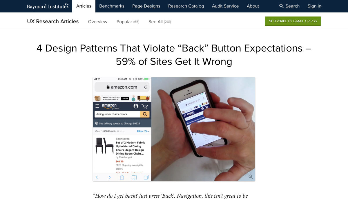
We are gathered here today….

Today I write in memory of Adobe Flash (née Macromedia), something that a bunch of people are actually too young to remember. I write this with love, longing, and a palpable sense of relief that it’s all over. I have come to praise Flash, to curse it, and finally to bury it.

We’ve been hearing about the death of Flash for a long time. We know it’s coming. December 2020 has been announced as the official timeframe for removal, but let’s be real about this: it’s dead. It’s super-dead. It’s people-are-selling-Flash-game-archives-on-Steam dead.

That last bit actually makes me happy, because Flash games were a huge part of my childhood, and the archives must be preserved. Before I’d ever heard of video cards, frames per second, and “git gud”, I was whiling away many an hour on disney.com, cartoonnetwork.com, MiniClip, Kongregate, and other sites, looking for games.

I think we’ve established in my previous work that even as a missionary kid, I did not have a social life.

The Internet itself gave me a way to reach out and see beyond my house, my city, and my world, and it was wonderful. Flash was a part of that era when the Internet felt new, fresh, and loaded with potential. Flash never sent anyone abuse, or death threats. Flash was for silly animations, and games that my parent’s computer could just barely handle, after half an hour of downloading.

I even built my first animated navigation menus in Flash, because I didn’t know any better. At all. But those menus looked exactly like the ones I’d designed in Photoshop, so that’s what mattered to me, young as I was.

That was a part of Flash’s charm, really.

What Flash Got Right
Flash Brought Online Multimedia into the Mainstream

Funny story, JavaScript was only about a year old when Flash was released. While HTML5 and JS are the de-facto technologies for getting things done now, Flash was, for many, the better option at launch. JS had inconsistent support across browsers, and didn’t come with a handy application that would let you draw and animate whatever you wanted.

It was (in part) Flash that opened up a world of online business possibilities, that made people realize the Internet had potential rivalling that of television. It brought a wave of financial and social investment that wouldn’t be seen again until the advent of mainstream social networks like MySpace.

The Internet was already big business, but Flash design became an industry unto itself.

Flash Was Responsive

Yeah, Flash websites could be reliably responsive (and still fancy!) before purely HTML-based sites pulled it off. Of course, it was called by other names back then, names like “Liquid Design”, or “Flex Design”. But you could reliably build a website in Flash, and you knew it would look good on everything from 800×600 monitors, to the devastatingly huge 1024×768 screens.

You know, before those darned kids with their “wide screens” took over. Even then, Flash still looked good, even if a bunch of people suddenly had to stop making their sites with a square-ish aspect ratio.

Flash Was Browser-Agnostic

On top of being pseudo-responsive, the plugin-based Flash player was almost guaranteed to work the same in every major browser. Back in a time when Netscape and Internet Explorer didn’t have anything that remotely resembled feature parity, the ability to guarantee a consistent website experience was to be treasured. When FireFox and Chrome came out, with IE lagging further behind, that didn’t change.

While the CSS Working Group and others fought long and hard for the web to become something usable, Flash skated by on its sheer convenience. If your site was built in Flash, you didn’t have to care which browsers supported the <marquee> tag, or whatever other ill-conceived gimmick was new and trendy.

Flash Popularized Streaming Video

Remember when YouTube had a Flash-based video player? Long before YouTube, pretty much every site with video was using Flash to play videos online. It started with some sites I probably shouldn’t mention around the kids, and then everyone was doing it.

Some of my fondest memories are of watching cartoon clips as a teenager. I’d never gotten to watch Gargoyles or Batman: The Animated Series as a young kid, those experience came via the Internet, and yes… Flash. Flash video players brought me Avatar: The Last Airbender, which never ever had a live action adaptation.

Anyway, my point: Flash made online video streaming happen. If you’ve ever loved a Netflix or Prime original show (bring back The Tick!), you can thank Macromedia.

What Flash Got Wrong

Obviously, not everything was rosy and golden. If it was, we’d have never moved on to bigger, better things. Flash had problems that ultimately killed it, giving me the chance, nay, the responsibility of eulogizing one of the Internet’s most important formative technologies.

Firstly, it was buggy and insecure: This is not necessarily a deal-breaker in the tech world, and Microsoft is doing just fine, thank you. Still, as Flash matured and the code-base expanded, the bugs became more pronounced. The fact that it was prone to myriad security issues made it a hard sell to any company that wanted to make money.

Which is, you know, all of them.

Secondly, it was SEO-unfriendly: Here was a more serious problem, sales-wise. While we’re mostly past the era when everyone and their dog was running a shady SEO company, search engines are still the lifeblood of most online businesses. Having a site that Google can’t index is just a no-go. By the time Google had managed to index SWF files, it was already too late.

Thirdly, its performance steadily got worse: With an expanding set of features and code, the Flash plugin just took more and more resources to run. Pair it with Chrome during that browser’s worst RAM-devouring days, and you have a problem.

Then, while desktops were getting more and more powerful just (I assume) to keep up with Flash, Apple went and introduced the iPhone. Flash. Sucked. On. Mobile. Even the vendors that went out of their way to include a Flash implementation on their smartphones almost never did it well.

It was so much of a hassle that when Apple officially dropped Flash support, the entire world said, “Okay, yeah, that’s fair.”

Side note: Flash always sucked on Linux. I’m just saying.

Ashes to Ashes…

Flash was, for its time, a good thing for the Internet as a whole. We’ve outgrown it now, but it would be reckless of us to ignore the good things it brought to the world. Like the creativity of a million amateur animators, and especially that one cartoon called “End of Ze World”.

Goodbye Flash, you sucked. And you were great. Rest in peace. Rest in pieces. Good riddance. I’ll miss you.


Featured image via Fabio Ballasina and Daniel Korpai.

Source

p img {display:inline-block; margin-right:10px;}
.alignleft {float:left;}
p.showcase {clear:both;}
body#browserfriendly p, body#podcast p, div#emailbody p{margin:0;}

Where to buy kids' face masks – plus children's face mask patterns they'll want to wear

Original Source: http://feedproxy.google.com/~r/CreativeBloq/~3/_6QL5P8Z78k/where-to-buy-kids-face-masks

With the ongoing Covid-19 crisis, where to buy kids face masks has become a question on many parent's lips. After recent announcements, face masks for children over the age of two are recommended in many places, and is mandatory when using any public transport in the UK. Even if you're clear on your government's guidelines, knowing exactly where to buy a face mask that your child will actually wear is another matter altogether. That's where we can help, with a list of retailers in the US and UK offering all sorts of designs and patterns that will hopefully make your child wearing a face mask all that bit easier. Below you'll find some quick links to deals that we've spotted, and then some more in-depth deals that we think your little ones will love. 

And for all UK adults – we've also got a guide to help you buy face masks in the UK. 

Where to buy kids' face masks in the US
Disney – Exclusive sets of your favourite Disney characters. $19.99 for fourEtsy – An array of patterned face masks starting from as little as $4Vistaprint – Beautiful $13 prints fitted with Replaceable Nanofilter System  Amazon – A range of friendly, colourful kids' face masks from $4.99Maisonette – Stylish options for $20 (10% off first order over $50)Sanctuary – Five pack of fashionable prints. One size for ages 2–10Walmart – Pack of 24 comfortable sponge masks for under $30Akings – One dollar per mask, shipped in packs of 10, 50 and 100
Where to buy kids' face masks in the UK
Vistaprint – All under £18 and fitted with Replaceable Nanofilter System.Etsy.co.uk – Patterned face masks starting from as little as £2Samuel Johnston – Kids' face masks for £5.99 (10% off first orders)HYPE  – Packs of three with fun patterns (graffiti, tie dye, logos) for £24.99ebay – Loads of cotton kid's face masks from £4 upwards Wowcher – Deals refresh daily, including pack of five for £5 Amazon – Packs of face masks from as little as £2.50
Where to buy kids' face masks in the US: in-depth 
Where to buy kids' face masks in the UK: in-depth 
Where to buy a face mask: quality face coverings in stock now

In the US, the Centres for Disease Control and Prevention (CDC) recommends that children over two should wear face masks when they're in a crowd. And the UK government recommends the use of homemade face masks when people are out and about in enclosed public spaces, such as at the supermarket. It also says that children under two shouldn't use face masks, nor should primary age children who can't get them on and off without assistance. 

Getting your child to wear a face mask may be a different challenge (toddlers, we're looking at you), but hopefully some of the designs featured here will make the prospect of wear a kids face mask a bit more appealing. Or maybe you'll be more successful if you get your kids to make their own. You can sell it as a (supervised) arts and crafts activity – see our guide to how to make a face mask at home. 

Help kids get used to face masks

As we mentioned above, it's all well and good being able to buy a kids' face mask, but getting them to wear it may well present a much bigger challenge. Smaller children, who are too young to understand why they are being asked to wear one, could be particularly tricky. 

There's a number of ways that you can make your child feel more comfortable about wearing a face mask, including:

Make it the norm: Where possible, leave face masks around the house so they become an item they see regularly. Encourage them to practise taking them on and off, and even wear them around the house to get them used to it.Making their own: Let your little ones choose a design or pattern they like, and help them create their own face mask.Encourage creativity: If you've bought a face mask for your child, encourage them to get creative and make it their own. Let them draw or sketch some designs or drawings they want to show off to the world. Play a game: Face masks can be a bit scary-looking if you're small (and big, for that matter), so maybe implementing a face mask in play at home will make it seem a bit less daunting. Promote your child to doctor or nurse of the house, and let them look after you (or maybe their favourite stuffed animal might be better?).

Related articles: 

Where to buy a face mask (for adults)Face mask sewing tutorialDisney launches face masks of popular characters