Introducing Alpine.js: A Tiny JavaScript Framework

Original Source: https://www.smashingmagazine.com/2020/03/introduction-alpinejs-javascript-framework/

Introducing Alpine.js: A Tiny JavaScript Framework

Introducing Alpine.js: A Tiny JavaScript Framework

Phil Smith

2020-03-05T11:30:00+00:00
2020-03-05T21:09:09+00:00

Like most developers, I have a bad tendency to over-complicate my workflow, especially if there’s some new hotness on the horizon. Why use CSS when you can use CSS-in-JS? Why use Grunt when you can use Gulp? Why use Gulp when you can use Webpack? Why use a traditional CMS when you can go headless? Every so often though, the new-hotness makes life simpler.

Recently, the rise of utility based tools like Tailwind CSS have done this for CSS, and now Alpine.js promises something similar for JavaScript.

In this article, we’re going to take a closer look at Alpine.js and how it can replace JQuery or larger JavaScript libraries to build interactive websites. If you regularly build sites that require a sprinkling on Javascript to alter the UI based on some user interaction, then this article is for you.

Throughout the article, I refer to Vue.js, but don’t worry if you have no experience of Vue — that is not required. In fact, part of what makes Alpine.js great is that you barely need to know any JavaScript at all.

Now, let’s get started.

What Is Alpine.js?

According to project author Caleb Porzio:

“Alpine.js offers you the reactive and declarative nature of big frameworks like Vue or React at a much lower cost. You get to keep your DOM, and sprinkle in behavior as you see fit.”

Let’s unpack that a bit.

Let’s consider a basic UI pattern like Tabs. Our ultimate goal is that when a user clicks on a tab, the tab contents displays. If we come from a PHP background, we could easily achieve this server side. But the page refresh on every tab click isn’t very ‘reactive’.

To create a better experience over the years, developers have reached for jQuery and/or Bootstrap. In that situation, we create an event listener on the tab, and when a user clicks, the event fires and we tell the browser what to do.

See the Pen Showing / hiding with jQuery by Phil on CodePen.

See the Pen Showing / hiding with jQuery by Phil on CodePen.

That works. But this style of coding where we tell the browser exactly what to do (imperative coding) quickly gets us in a mess. Imagine if we wanted to disable the button after it has been clicked, or wanted to change the background color of the page. We’d quickly get into some serious spaghetti code.

Developers have solved this issue by reaching for frameworks like Vue, Angular and React. These frameworks allow us to write cleaner code by utilizing the virtual DOM: a kind of mirror of the UI stored in the browser memory. The result is that when you ‘hide’ a DOM element (like a tab) in one of these frameworks; it doesn’t add a display:none; style attribute, but instead it literally disappears from the ‘real’ DOM.

This allows us to write more declarative code that is cleaner and easier to read. But this is at a cost. Typically, the bundle size of these frameworks is large and for those coming from a jQuery background, the learning curve feels incredibly steep. Especially when all you want to do is toggle tabs! And that is where Alpine.js steps in.

Like Vue and React, Alpine.js allows us to write declarative code but it uses the “real” DOM; amending the contents and attributes of the same nodes that you and I might edit when we crack open a text editor or dev-tools. As a result, you can lose the filesize, wizardry and cognitive-load of larger framework but retain the declarative programming methodology. And you get this with no bundler, no build process and no script tag. Just load 6kb of Alpine.js and you’re away!

Alpine.js

JQuery

Vue.js

React + React DOM

Coding style

Declarative

Imperative

Declarative

Declarative

Requires bundler

No

No

No

Yes

Filesize (GZipped, minified)

6.4kb

30kb

32kb

5kb + 36kb

Dev-Tools

No

No

Yes

Yes

When Should I Reach For Alpine?

For me, Alpine’s strength is in the ease of DOM manipulation. Think of those things you used out of the box with Bootstrap, Alpine.js is great for them. Examples would be:

Showing and hiding DOM nodes under certain conditions,
Binding user input,
Listening for events and altering the UI accordingly,
Appending classes.

You can also use Alpine.js for templating if your data is available in JSON, but let’s save that for another day.

When Should I Look Elsewhere?

If you’re fetching data, or need to carry out additional functions like validation or storing data, you should probably look elsewhere. Larger frameworks also come with dev-tools which can be invaluable when building larger UIs.

From jQuery To Vue To Alpine

Two years ago, Sarah Drasner posted an article on Smashing Magazine, “Replacing jQuery With Vue.js: No Build Step Necessary,” about how Vue could replace jQuery for many projects. That article started me on a journey which led me to use Vue almost every time I build a user interface. Today, we are going to recreate some of her examples with Alpine, which should illustrate its advantages over both jQuery and Vue in certain use cases.

Alpine’s syntax is almost entirely lifted from Vue.js. In total, there are 13 directives. We’ll cover most of them in the following examples.

Getting Started

Like Vue and jQuery, no build process is required. Unlike Vue, Alpine it initializes itself, so there’s no need to create a new instance. Just load Alpine and you’re good to go.

<script src=”https://cdn.jsdelivr.net/gh/alpinejs/alpine@v1.9.4/dist/alpine.js” defer></script>

The scope of any given component is declared using the x-data directive. This kicks things off and sets some default values if required:

<div x-data=”{ foo: ‘bar’ }”>…</div>

Capturing User Inputs

See section in Sarah Drasner’s article →

x-model allow us to keep any input element in sync with the values set using x-data. In the following example, we set the name value to an empty string (within the form tag). Using x-model, we bind this value to the input field. By using x-text, we inject the value into the innerText of the paragraph element.

See the Pen Capturing user input with Alpine.js by Phil on CodePen.

See the Pen Capturing user input with Alpine.js by Phil on CodePen.

This highlights the key differences with Alpine.js and both jQuery and Vue.js.

Updating the paragraph tag in jQuery would require us to listen for specific events (keyup?), explicitly identify the node we wish to update and the changes we wish to make. Alpine’s syntax on the other hand, just specifies what should happen. This is what is meant by declarative programming.

Updating the paragraph in Vue while simple, would require a new script tag:

new Vue({ el: ‘#app’, data: { name: ” } });

While this might not seem like the end of the world, it highlights the first major gain with Alpine. There is no context-switching. Everything is done right there in the HTML — no need for any additional JavaScript.

Click Events, Boolean Attributes And Toggling Classes

See section in Sarah Drasner’s article →

Like with Vue, : serves as a shorthand for x-bind (which binds attributes) and @ is shorthand for x-on (which indicates that Alpine should listen for events).

In the following example, we instantiate a new component using x-data, and set the default value of show to be false. When the button is clicked, we toggle the value of show. When this value is true, we instruct Alpine to append the aria-expanded attribute.

x-bind works differently for classes: we pass in object where the key is the class-name (active in our case) and the value is a boolean expression (show).

See the Pen Click Events, Boolean Attributes and Toggling Classes with Alpine.js by Phil on CodePen.

See the Pen Click Events, Boolean Attributes and Toggling Classes with Alpine.js by Phil on CodePen.

Hiding And Showing

See section in Sarah Drasner’s article →

The syntax showing and hiding is almost identical to Vue.

See the Pen Showing / hiding with Alpine.js by Phil on CodePen.

See the Pen Showing / hiding with Alpine.js by Phil on CodePen.

This will set a given DOM node to display:none. If you need to remove a DOM element completely, x-if can be used. However, because Alpine.js doesn’t use the Virtual DOM, x-if can only be used on a <template></template> (tag that wraps the element you wish to hide).

Magic Properties

In addition to the above directives, three Magic Properties provide some additional functionality. All of these will be familiar to anyone working in Vue.js.

$el fetches the root component (the thing with the x-data attribute);
$refs allows you to grab a DOM element;
$nextTick ensures expressions are only executed once Alpine has done its thing;
$event can be used to capture a nature browser event.

See the Pen Magic Properties by Phil on CodePen.

See the Pen Magic Properties by Phil on CodePen.

Let’s Build Something Useful

It’s time to build something for the real world. In the interests of brevity I’m going to use Bootstrap for styles, but use Alpine.js for all the JavaScript. The page we’re building is a simple landing page with a contact form displayed inside a modal that submits to some form handler and displays a nice success message. Just the sort of thing a client might ask for and expect pronto!

Initial view of the demo app

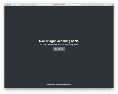
Initial view (Large preview)

View of the demo app with modal open

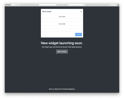
Modal open (Large preview)

View of the demo app with success message displaying

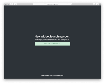
Success message (Large preview)

Note: You can view the original markup here.

To make this work, we could add jQuery and Bootstrap.js, but that is quite a bit of overhead for not a lot of functionality. We could probably write it in Vanilla JS, but who wants to do that? Let’s make it work with Alpine.js instead.

First, let’s set a scope and some initial values:

<body class=”text-center text-white bg-dark h-100 d-flex flex-column” x-data=”{ showModal: false, name: ”, email: ”, success: false }”>

Now, let’s make our button set the showModal value to true:

<button class=”btn btn-lg btn-secondary” @click=”showModal = true” >Get in touch</button>

When showModal is true, we need to display the modal and add some classes:

<div class=”modal fade text-dark” :class=”{ ‘show d-block’: showModal }” x-show=”showModal” role=”dialog”>

Let’s bind the input values to Alpine:

<input type=”text” class=”form-control” name=”name” x-model=”name” >
<input type=”email” class=”form-control” name=”email” x-model=”email” >

And disable the ‘Submit’ button, until those values are set:

<button type=”button” class=”btn btn-primary” :disabled=”!name || !email”>Submit</button>

Finally, let’s send data to some kind of asynchronous function, and hide the modal when we’re done:

<button type=”button” class=”btn btn-primary” :disabled=”!name || !email” @click=”submitForm({name: name, email: email}).then(() => {showModal = false; success= true;})”>Submit</button>

And that’s about it!

See the Pen Something useful built with Alpine.js by Phil on CodePen.

See the Pen Something useful built with Alpine.js by Phil on CodePen.

Just Enough JavaScript

When building websites, I’m increasingly trying to ask myself what would be “just enough JavaScript”? When building a sophisticated web application, that might well be React. But when building a marketing site, or something similar, Alpine.js feels like enough. (And even if it’s not, given the similar syntax, switching to Vue.js takes no time at all).

It’s incredibly easy to use (especially if you’ve never used VueJS). It’s tiny (< 6kb gzipped). And it means no more context switching between HTML and JavaScript files.

There are more advanced features that aren’t included in this article and Caleb is constantly adding new features. If you want to find out more, take a look at the official docs on Github.

Smashing Editorial
(ra, il)

How to Optimize Your YouTube SEO

Original Source: http://feedproxy.google.com/~r/Designrfix/~3/jhl9bdls2zU/how-to-optimize-your-youtube-seo

Video marketing has absolutely exploded in the last few years and for good reason. Most people prefer to consume information via video rather than read a lengthy blog post. YouTube has over 1 Billion users and has become the third-largest search engine so if it’s the best place for you to publish your videos. In […]

The post How to Optimize Your YouTube SEO appeared first on designrfix.com.

How to design the perfect sticker for your brand

Original Source: http://feedproxy.google.com/~r/Designrfix/~3/LuebWSaeoQQ/how-to-design-the-perfect-sticker-for-your-brand

Stickers are one of the many tools you can use to increase brand awareness. They’re cost-effective and get your name out there – wherever you want. To make the perfect sticker for your brand, you need to think about what it’s for, and where it’s going to be used. Then you can figure out the […]

The post How to design the perfect sticker for your brand appeared first on designrfix.com.

Introduction to Utility-first CSS for Web Developer

Original Source: https://www.hongkiat.com/blog/utility-first-css-for-developers/

CSS is an easy language to learn (and to implement) for creating a beautiful website. However, when it comes to implementing CSS at scale, it’s not that simple. For large scale websites and…

Visit hongkiat.com for full content.

Twitter tests Fleets – its new disappearing Stories

Original Source: http://feedproxy.google.com/~r/CreativeBloq/~3/mKScGYmRc50/twitter-fleets

Twitter has started testing its own version of Stories – Fleets. These fleeting tweets disappear after 24 hours, bringing Twitter in line with other apps that have a disappearing Story feature – namely Snapchat, Facebook and Instagram. Fleets will be primarily text-based, but can include videos, GIFs or photos.

The feature is currently being tested in Brazil and may be rolled out across the rest of the world depending on user feedback. Unlike with normal tweets, users won't be able to retweet, like or comment on a Fleet, although they will be able to send a DM or emoji. Twitter hopes that those who normally feel that tweeting is too public feel more comfortable with Fleeting (we're not sure it's a capitalised verb yet, but we'll go with it).

On the day after the announcement, Fleets are already trending on Twitter, but perhaps not in the way Twitter anticipated. The hashtag #RIPTwitter has taken off, with people posting various savage memes about how they don't want Twitter Stories. We can't say yet just how fleeting this anger will be. 

For a social media trick that's available right now, read our post on how to change the font in your Instagram bio.

Do we really need Twitter Stories (sorry, we mean, Fleets)? Well, the answer is of course, no. But that doesn't mean that Fleets won't take off, and we do love the name. However, Fleets may end up being one of those features that most people basically ignore – a bit like Instagram TV or Facebook Watch (yes, we had to look that one up), and not at all like Instagram Dark Mode, which everyone seems to love.

From a content creator's point of view, Fleets will either be another way to reach your audience, or another way for your audience to ignore you. The addition of Fleets could also mean that people will stop scrolling through other users' Twitter feeds in an attempt to find something racist, or offensive to call them out on. Might there be an increase in screenshots, perhaps?

All potentially offensive views – okay, all views – can now have their own disappearing platform, just like they do on other social media networks. We can only imagine what politicians will do with these Fleets if they do eventually roll out across the globe. Just imagine the press briefings. 

You can read the blog announcement from Twitter here (in Portuguese).

Read more:

10 must-know Instagram tips for creativesDisney character 3D fossils are strangely adorableEverybody hates new Twitter

Design for Browser Inconsistency With Lambdatest

Original Source: https://www.webdesignerdepot.com/2020/03/design-for-browser-inconsistency-with-lambdatest/

When the web was young, a 56k connection was fast, CSS was new, and Flash was but a glint in Macromedia’s eye, there was a phrase that graced half of all splash screens: Best viewed in IE6.

You see, back in the early 00s, the web was a lot less competitive. It was perfectly possible to ignore 40% of your users and still turn a profit. In fact, given the expense of maintaining a different codebase for every browser, it was often financially inviable to build for more than a single browser.

front-end code still renders very differently in different browsers

Over the years, the web became far more competitive, and developers serious about building profitable sites looked for ways to code sites for a wider audience; web standards began to emerge.

It’s difficult to envisage how we would have coped with the exponential growth of the mobile web without the backbone of web standards. However, web standards have fed the misconception that browsers display code consistently; The truth is that front-end code still renders very differently in different browsers.

Why Aren’t Browsers Consistent?

Despite near-industry wide commitment to web standards, browsers still render web pages very differently. There are a few reasons for this:

Evolving Web Standards

Releasing a new feature of CSS3, HTML5, and especially ECMAScript takes a long time. From initial proposal to recommendation there are hundreds of revisions and amendments.

The problem is that early-adopters frequently find themselves going to production with an out-dated version of the specification.

Take CSS’s Flexbox, which enjoys excellent support across all major browsers, officially, even IE; Unfortunately Microsoft coded in an older version of the specification and anyone who still needs to support IE will find they need to run backwards compatible code.

Scope for Interpretation

Web standards deliberately leave a lot of scope for interpretation. There are numerous properties that are rendered differently because the specification refers to a default setting, without defining that default.

While is may be frustrating, there’s a solid reason for this flexibility: Compare a select element on macOS’s Safari browser, with the same select on iOS’ Safari browser; Not only is the select styled differently — as it would be on Edge, or Chrome — it’s an entirely different UI element!

Bugs, Legacy Code, and Hacks

Like all coders, the engineers that build browsers aren’t perfect. They work with the same pressures, deadlines, and marketing departments that the rest of us contend with. The result is patchy code that’s often buggy, especially in edge cases.

There’s a classic browser bug that only appears in Chrome: Input fields with placeholder text, rotated 180 degrees on the Y axis, unexpectedly override the backface-visibility property. The reason? Somewhere down the line, someone working on Chrome’s engine (probably in an effort to speed up rendering) chose to toggle visibility instead of detecting the current current state.

Designing for Inconsistency

We’re lucky that the browser wars are far behind us. But for the reasons listed above, developers must embrace the fact that in subtle, but unmistakable ways, browsers are inconsistent.

Naturally, websites don’t need to look the same on every browser and device — one of the reasons that there are multiple browsers is that different users have different preferences — but a site must function, and be familiar (especially across mobile and desktop) however the user chooses to access it.

One way of testing sites is to buy 10–20 computers, and 20–30 mobile devices, install multiple browsers onto each one, and painstakingly test on each one, every time you tweak your code.

The smarter way is to use a cross-browser testing app like Lambdatest.

Designing with Lambdatest

Lambdatest is a SaaS that enables testing on a huge range of devices from the comfort of your development machine. You don’t need any special equipment, just log into the site for a range of different testing options:

Cross Browser Testing

Lambdatest lets you perform live, and interactive testing across over 2000 different browsers installed on numerous devices. These aren’t simulators, they’re real browser instances that you access remotely.

Through an intuitive UI you can navigate through the top browsers on macOS, iOS, Windows, and Android. Compare inconsistencies, and even use the screenshot and video options to record problem areas as buggy.

This manual approach to testing is flexible, and ideal for checking individual components of your build. It’s great for checking that bug-fixes are fully resolved. But for really comprehensive testing a manual test is too labor intensive, for that Lambdatest provides automated testing.

Automated Testing

Where Lambdatest really comes into its own is with automated testing. Automation allows you to test your design against up to 2000+ browser implementations. Simply select your OS and the browsers you want to test on, run the automated screenshot process, and review the results in your dashboard.

For ongoing testing during development you probably only want to compare your target browsers, but for any build milestones it’s worth testing as comprehensively as possible.

Using the restful API you can automate logs, test metadata, and hunt down bugs at world-record pace, saving you time, money, and reputation.

Third-Party Integration

As well as manual testing, and automation, Lambdatest also integrates with a wide range of third-party tools including Jira, GitLab, and Trello. This means you can test your site thoroughly, without ever leaving the safety of your existing workflow.

There are also a Chrome extension, and a WordPress plugin. Both allow you to take a screenshot of your site, on 2000+ browsers, with a single click either in your browser, or in the WordPress admin panel.

Smart Comparison Testing

Perhaps the feature we like the best, is the Smart UI testing feature. What this innovative feature does is automatically detect when something’s gone wrong. It’s great for designers and developers working remotely, who don’t have a colleague’s fresh pair of eyes to borrow to check changes.

Simply pull up one of the screenshots from Lambdatest’s automated testing to use as a baseline, then run the Smart Comparison Testing tool, and it will flag up any notable differences.

It’s a fantastic tool for when you’re rapidly fixing bugs, and need to double-check your fix didn’t break something else. Given that the vast majority of bugs in code are introduced when hacking around browser inconsistencies, it’s always wise to check that the solutions you introduce aren’t bringing with them a host of all-new problems.

Why Choose Lambdatest

The number of different browsers and devices you need to test on, just to cover the more popular brands on the market, is prohibitively expensive for most teams. Not to mention the constant demand to keep updating. Lambdatest eliminates this cost and brings comprehensive testing within reach of every web professional. Without the cross-browser testing that Lambdatest enables, it’s all but impossible to design and build a modern website.

What we love about Lambdatest is that it’s a flexible way to work comprehensive and reliable testing into your existing workflow. There are other apps that allow you to test across different browsers, but they typically force a new way of working on you, Lambdatest doesn’t.

You can try Lambdatest for free by taking advantage of the freemium plan that gives you 6 x 10 minutes of testing, 10 sessions of screenshots, and 10 sessions of responsive tests. Once you’re happy that Lambdatest is right for you and your team, plans start at just $15/month.


[– This is a sponsored post on behalf of Lambdatest –]

Source

p img {display:inline-block; margin-right:10px;}
.alignleft {float:left;}
p.showcase {clear:both;}
body#browserfriendly p, body#podcast p, div#emailbody p{margin:0;}

The Objective of a Profitable Email Marketing Campaign

Original Source: http://feedproxy.google.com/~r/Designrfix/~3/WotKyDi9X0Q/the-objective-of-a-profitable-email-marketing-campaign

Email marketers are in a never-ending quest to send emails that have a great impact and produce tremendous results. They tirelessly design the excellent message and fine-tune tactics for breaking through inbox clutter. Then they scrutinize results for ideas on how to improve in the next round.  However, no matter how much is learned in […]

The post The Objective of a Profitable Email Marketing Campaign appeared first on designrfix.com.

Superstar artist Loish reveals why making 'bad art' matters

Original Source: http://feedproxy.google.com/~r/CreativeBloq/~3/DUJmI52s9Dw/loish-interview

Loish is a Dutch artist, illustrator and animator based in Utrecht, but it’s probably more accurate to describe her as a phenomenon. Over 15 years working as an artist, she’s steadily built up an immense online following, from sharing her early work on oekaki boards, then Deviant Art and finally Instagram, where she now has 1.8million followers. And a visit to Vertex last Friday showed exactly how passionate that following can be, as hoards of adoring fans queued up to meet her after her talk.

Loish remained gracious and smiling throughout, and it’s that generosity of spirit, combined with her amazing talent, that makes Loish a huge draw at events worldwide. She’s recently taken her relationship with her fans to the next level by launching on Patreon, allowing herself to step back from client work and focus more on crafting the personal work, which she describes as "colourful girly art". Yet her career hasn't all been plain sailing, as our interview revealed…

For practical tips on creating your own art, see our how to draw tutorials, or our sketching tips.

Girl with green dreadlocks holding fish

Being funded by Patreon has allowed Loish to focus more on her personal art 

You said that at school, people told you you couldn’t be an artist. Why do you think they were so discouraging?  

I had very encouraging art teachers, but they didn’t get overly involved. They really wanted you to figure it out yourself. I think my parents were similar, they wanted me to figure what I liked to do for myself. I come from a family where there aren’t a lot of creative people. I have an aunt who's dabbled in drawing, but that's about it. My parents also didn’t go to college, they went straight into work, so they didn’t know a lot about what that would look like. And I also didn’t know about the industry. 

You eventually began working as a commercial illustrator. When did you realise that you’d "made it"?

There was a point when I realised I’d become financially stable. As a freelancer, your income fluctuates every year. So I always thought when I had a good year financially, this is not going to last. I always thought the bubble would burst. But finally I realised, "Oh wow, my income isn’t going to go down, it’s remained stable". It was a really big thing for me. 

You've recently launched on Patreon. What took you so long?

I’ve known about Patreon for a long time, and so many people have told me to try it. But I didn’t want to go there. I wanted to keep doing what I’m doing, which was to keep using social media to get in touch with clients and do client work. I always felt that client work was a safe path.

With Patreon, I felt like I wouldn’t have the time. And also, working with clients is very transactional. I make something, for the fee we agree on, and I get the fee. It's a proper business relationship, which always felt safer to me than asking people, 'Will you support me?' Who knows if they’ll be happy? Patreon is highly personal, which to me felt intimidating.

When I decided to take the plunge, it helped that I could ask for a small contribution, $5, so I didn’t have to make an insane amount of stuff. For that small amount, it felt less intrusive on my life, so that worked for me.

Also read: How to get more from Patreon

Dark-skinned girl with bright white hair

Loish says she’s her own harshest critic

You've now got over 1,200 patrons. What’s the feedback been like so far?

I’ve had super-positive feedback. Everyone is super-happy and they say it exceeds their expectations. This has been a pattern for me: I’m always overestimating what’s expected of me, because I’m the hardest on myself. So now I need to recognise that people like it, it’s okay.

Visit Loish's Patreon page here

What’s the balance in your workload now?

I try to schedule my Patreon work in the same way as client work. So every month I have two weeks set aside for Patreon: making art, and I’m also getting into making process videos. And alongside that I speak at events, and do some client work.

Patreon allows you to draw or paint whatever you want. How do you decide what to create?

I absorb inspiration from around me. So I see drawings, or scenery, I take photos, and I see little things around me that spark an idea for a painting or a drawing. And I have a pictures board where I collect inspirational material. So if I don't have any ideas, I’ll just go look at what’s there. 

Sometimes I’ll sit down and make a bunch of rough digital paintings in one sitting, get those ideas out. Often, a colour will be an inspirational factor. Like, I saw this colour combination or I saw this sunset and it had an impact, it evoked a mood that I want to recreate. And so I’ll make three or four rough paintings and gradually finish them off. 

I don’t really come up with stories, I just think about moods, and what I call ‘creative spark bubbles’, where I look at something and it sparks a feeling and I think I want to draw something. The painting may turn out quite different, because I have an intuitive workflow, but that spark is what gets me started. 

How many of your drawings end up in the trash?

I almost always finish them. I feel like everything has value. So even if it’s not my best drawing, I’m not going to completely leave it. Maybe somebody else will, maybe it will resonate with others in a way it doesn’t with me. It’s a step in my process. When I feel frustrated with my art, that’s also a really important part. It’s an opportunity to think: which skill am I missing right now? Why is this frustrating me? What is the way I’m going to get past this? 

So I always try to finish it and take a lesson out of it. I’m not really someone who wants it to be perfect. And I won’t go and take something out of my portfolio. I want to keep it all there so people can see it.

Girl with long flowing hair in front of red flower

Loish is considering a third art book, and wants it to contain a self-help element

Across the last 15 years, how much of your work have you kept?

I’ve kept all of my art, well as much as I've been able to, including all the old pixel-ly stuff. I think it’s really important to share that. Because that’s what I was missing when I was in high school. I was looking at all these artists that I admired and thinking: 'Where do they come from? How did they get to that stage?' 

I drew Powerpuff Girls, I drew really bad fan art, and it’s often kind of embarrassing to look back on, but it needs to be shown. Every artist has that; every artist goes through a stage where they don’t know what they’re doing, and they’re absorbing styles and ideas, and I want people to see that. 

How do you plan to develop your art in the future?

I’m going with the flow in my career. That’s the reason my early stuff works and allowed me to develop; I didn’t know where it was going to lead. If you know that what you’re doing will have an impact 20 years from now, you’ll do it with a lot more anxiety. So I try to keep things as open as I can. 

For instance, I don’t know what will happen with social media. Are there going to be new platforms? Are we all going to be living in VR? So I always advise artists: don’t put all your eggs in one basket. Create a brand, a style, an identity that you can translate into whatever context. 

We love your books. Any more on the horizon?

Yes, I’m thinking about doing a third in the series. In The Art of Loish, I really tried to put my voice in there: you know, 'This is how I think, this is what I’m about.' And people who bought it felt they really connected with me. So it became a really important way for me to connect with my fans. 

The first one was quite easy because it’s just ‘Art of’. Like, who am I as an artist? But now I’m starting to think what can I add. So I’m having to go deeper. I’m really into the psychology of drawing, so I’m thinking about how do you maintain a positive mindset? How do you make an exciting art blog? What do you do to maintain your mental health? Because drawing is like looking in a mirror: you always see your own flaws, and they can be really tough, and drag you down. 

So I see it as super-important to maintain your mental health, and keep a positive attitude. Having that healthy balance of forcing yourself to grow but also enjoying it. Because it’s okay. I always felt guilty for enjoying it, and that psychological aspect is something I really want to share. I want to have a self-help theme to the book, while it still being an art book. So that will be a real challenge, to get that balance right. 

Don't miss out on Vertex 2021: register your interest today

Read more:

8 mind-boggling facts about the making of Toy Story 4How to get a job at ILMTop Marvel concept artist shares 6 tips for success

Why Are We Talking About CSS4?

Original Source: https://www.smashingmagazine.com/2020/03/css4-pros-cons-discussion/

Why Are We Talking About CSS4?

Why Are We Talking About CSS4?

Rachel Andrew

2020-03-04T11:30:00+00:00
2020-03-04T13:07:05+00:00

There has been some discussion recently about whether there should be a CSS4, as in a defined “next version” of CSS. In this article, I take a look at the discussions around this, the pros and cons of creating a feature release for CSS, and the potential problems in deciding what goes into it.

I’m using the term CSS4 as that is how the discussion was started, and not attempting to discuss what the naming should actually be, should this approach be taken forward. Bikeshedding naming is an excellent distraction from the discussion of whether we should do this at all, so I will use CSS4 as a placeholder for the version of CSS we are proposing to define, and CSS5 for the next one along the line.

The Issue

A discussion around whether we should define a CSS4 has been raised in the community, and Jen Simmons then raised a CSS Working Group issue which neatly rounds up some of that existing debate. Outside of the actual issue that we are discussing, it is fantastic to see so many people who are not part of the CSS WG replying on this thread, and I hope that having commented once, people will be happy to come and comment on some of our other issues.

In order to understand why there is no CSS4, we need to look at a little bit of web platform history. The initial versions of CSS were as a single, monolithic specification. These specifications contained every possible CSS property and value. This worked well as there wasn’t a lot of CSS to detail. CSS1 mostly covered features for formatting text documents, additional features and clarifications were added to CSS2 and CSS2.1 however CSS was still a relatively small specification.

CSS3

At the point the CSS Working Group began work on CSS3, it was decided to split the big spec into modules. These modules would each cover part of CSS. Not all of CSS was immediately placed into a new module. Many things remained defined in CSS2.1 as there were no changes or additions to them. For this reason, you will still find links to the CSS2 specification in modern modules, if the thing that is being referenced is still defined in CSS2. However, any new CSS is created in separate modules. This modularization continues today as new CSS is being created. For example, several of the features that make up the Box Alignment specification initially started life in the Flexbox spec. Once it became apparent that they could apply to other layout methods such as Grid Layout, they were moved into a new module to be defined for that other method too.

We stopped referring to new specifications as CSS3 Specifications, partly because it didn’t make a lot of sense. The way that modules are versioned is that the modules which were a progression of CSS2, for example Selectors, became a Level 3 module. Brand new CSS, for example CSS Grid Layout, did not exist at all in CSS2 and so start life as a Level 1 module. Some of those initial modules are now at Level 4 or even Level 5. Therefore, calling all new CSS CSS3 doesn’t map to the level numbers anymore, and is potentially rather confusing.

Specification Maturity Levels

In addition to specification levels, each individual level goes through a staged process from the initial draft to becoming a W3C Recommendation, the steps in the process are referred to as Maturity Levels. A W3C Recommendation is what you might think of as a “web standard”, however many of the things we use daily in our work are defined in specifications that are not at that maturity level yet. You can see the list of specifications and their status on the CSS WG Current Work page.

Explaining The Missing CSS4

Many of us involved with the process saw the confusion about CSS3 or the apparent lack of progress to CSS4 and began to write articles, post videos, and try to help people understand a bit about how the process actually worked. That said, while it was important to share this information so that people teaching CSS would explain it correctly, I am not sure how much this information matters to the average web developer. What level a specification is at, or the internal W3C process of specification maturity, is far less important to a web developer than the issue of what CSS can actually be used in browsers.

“There Is No Such Thing As CSS4,” Tab Atkins-Bittner
“Why There Is No CSS4: Explaining CSS Levels,” Rachel Andrew
“Where Is CSS4? When Is It Coming Out?,” Layout Land (video)

What Are The Benefits Of Versioning CSS?

Looking through the responses to the issue, and the discussion around the web, there are certainly some potential benefits of having a clear version number for CSS.

As a writer of books and a producer of educational materials, I would probably benefit from CSS version numbers. It’s an excuse to publish an updated book that covers the latest and greatest version of CSS. On the other side of that, it is a way for the purchasers of books and courses to be sure that what they are buying is reasonably up to date – although the publishing date is arguably a better indication of that than anything else.

One thing we did lose by moving away from a version number of all of CSS, was the ability to do something like the Acid Test. The Acid 1 Test tested for support of CSS1, Acid 2 for support of CSS2.1. These tests were reasonably well known and seen as a good benchmark for browser support of web standards. A version 3 test was developed, however, it tested for a range of features and was less tightly tied to the Level 3 CSS Modules than previous tests had been to CSS1 and 2.1. A definite line drawn around a set of features would allow for user agents to declare their level of support for those features.

Some commenters on the issue have mentioned that a version would allow them to push for dropping of older browser versions because they “don’t support CSS4”.

“[…] perhaps CSS4 could help to push their mindset towards a more secure and better web. During pitch meeting, it’s hard to tell them we can’t support IE10 because we want CSS Variables and Grid Layout. Stakeholders do not know and do not care. They just want to support as many browsers as they could (very typical FOMO mindset) and they have the dollars to throw.

However, if we could tell them we can’t support IE10 because it doesn’t have the latest CSS4 technology and throw them the “Are you sure you want your newly created website to be behind your competitors because of that?” question, that might ponder them (of course, on top of the fact that IE10 is completely obsolete and vulnerable).”

There is an argument that defining a version gives developers a clear set of things to learn. In opening the issue on the CSS WG Jen Simmons said,

“I see a lot of resistance to learning the CSS that came after CSS3. People are tired and overwhelmed. They feel like they’ll never learn it all, never catch up, so why try, or why try now? If the CSSWG can draw a line around the never-ending pile of new, and say ‘Here, this. This part is ready. This part is done. This part is what you should take the time to learn. You can do this. It’s not infinite.’ I believe that will help tremendously.”

What Are The Problems Of Versioning CSS?

The first issue is that any collection of “ready for the primetime” CSS, is not as straightforward as selecting a set of specifications. Many specifications are partially implemented, with great support for some properties and none for others. There are features which many web developers would see as mature, sat in specifications still at Working Draft status alongside features which are still being debated and clarified in the Working Group.

If we take Multiple-column Layout as an example. The majority of properties have had widespread browser implementation for many years. However, the column-span property has only recently been implemented in Firefox, and there are a number of features that have recently been clarified, such as column-fill.

We could decide to ignore specifications altogether and look at properties. That isn’t straightforward either due to the fact that we have partial implementations across layout methods. The Box Alignment Properties are an excellent example. These are defined for all layout methods, where the property makes sense in that layout method. However support for Box Alignment is currently only seen in Grid and Flexbox. Therefore is justify-self, which is defined for block-level boxes, absolutely-positioned boxes, and grid items stable? Yes in a Grid context, no in a Block Layout context.

Box Sizing is another area, we have support for the intrinsic sizing value fit-content() in CSS Grid Layout for track sizing, yet not as a value for width. Then, none of the intrinsic sizing keywords are implemented for flex-basis by browsers other than Firefox.

Finally, if we return to multicol, many of the problems people have with multicol are nothing to do with the properties themselves, but are to do with poor support of fragmentation across browsers. This makes multicol seem to behave badly despite there being excellent support of the various properties. Disentangling all of these dependencies to come up with a set of features is going to be quite a difficult job.

CSS Is Not Just For Web Browsers

As I and one other commenter have mentioned, CSS is not just for web browsers. There are a whole raft of user agents that take CSS and HTML and output printed documents by way of creating a print-ready PDF. They typically have excellent support for the Paged Media specification, fragmentation and so on. However, they often lag behind browsers in terms of implementing newer CSS, for example Grid Layout. How do they fit into CSS4?

People Expect A Feature Release To Include Currently Non-Existent Features

Something interesting that has happened in the discussion on the issue, is that a number of people have commented saying that their expectations of a CSS4 are that it would contain certain features that are not yet part of CSS at all. Joshua Lindquist, in his excellent roundup of the comments notes that,

“When discussing authors that do not keep up with the latest developments, I think this approach will be simple to understand. Everything will feel like it’s brand new to them, even though some of these features, like Grid and Flexbox, have been in browsers for years.

But anyone who does keep up will likely be confused about why there is a ‘new’ specification full of things that are actually old.”

Who Would Decide What Makes The Cut?

Given the fact that the features that would make up CSS4 are not completely straightforward, someone is going to have to make the decision as to what is included.

The CSS Working Group has criteria for stability via the Maturity Levels already discussed. Once a spec has two implementations of each feature it can progress from Candidate Recommendation Status to become a Recommendation. However, as detailed above, it can take some time for that to happen, and while we are waiting for some features in a spec to have implementations, other may have widespread and stable browser support. If we were to say that CSS4 was only those specifications that were at Recommendation Status it would include:

CSS Color Level 3
CSS Namespaces
Selectors Level 3
CSS Level 2 Revision 1
Media Queries
CSS Style Attributes
CSS Fonts Level 3
CSS Writing Modes Level 3
CSS Basic User Interface Level 3
CSS Containment Level 1

So, no Grid, Flexbox, Box Alignment, and many more specifications that most of us are using.

If we are going to define a version of CSS, that is separate to the existing specification levels and maturity that we already have as part of the W3C process, then there needs to be a group with the time and resources to work on this. That group not only needs to define CSS4, but needs to do that as part of developing a framework to make these decisions this time, and for the next n versions of CSS. Otherwise, we will be having this discussion again in another two years, about the fact that no-one has shipped CSS5. I don’t believe the CSS Working Group is the right venue for that, even if only that there is other work that the WG needs to be doing to actually develop and define new CSS. There are already more jobs to be done than we have time to do. In addition, having another consideration when working on specifications will make decisions around each spec harder. Currently, we have situations where parts of a spec are marked as at-risk if their inclusion might prevent the spec from progressing to a Recommendation. It was for this reason that subgrid was bumped to Level 2 of Grid. If we have this additional level of abstraction, which doesn’t really fit into the process, will this just be another thing to consider and thus delay work on specifications?

What Problem Are We Trying To Solve?

In many of the responses to this issue, web developers brought up browser support as being key to what should be included in a CSS4, and I think that the issue we face is less one of CSS versioning and more of web developers being clear as to which collection of features should generally be considered usable in their projects.

“One of the advantages of a CSS4 approach is that it signals two things. First, that there’s a significant bundle of new CSS features that have been developed after CSS3 and which are ready for use and second, that they are ready for use. Not experimental or implemented by Chrome but no one else, but ready for broad adoption.”

— Rick Gregory

The fact that browser support comes up so frequently in this discussion makes me wonder if a better place to be defining this would be somewhere like MDN. MDN is already contributed to by all browser vendors, it already has support data for these features in a way that allows us to see partial implementations of things like Box Alignment. MDN is the documentation for the web platform, so we could sidestep the issue of print implementations, or any other implementations of CSS, scoping the feature set to the web alone.

I remain unconvinced that a CSS4, or whatever we choose to call a version of CSS, will actually make any difference to the perception of CSS outside of a relatively small community. Nor do I think it will help to solve the problems that web developers have in terms of convincing their bosses and clients to upgrade browsers. If Microsoft, who provides the software, is telling companies to upgrade and companies are not upgrading, I fail to see what the carrot of supporting CSS4 will do. And, I’ve been doing this a long time and know that back when we did have versions of CSS, people still didn’t upgrade their browsers. However, I think it will make it easier to talk about a particular chunk of functionality in a less abstract way, but I think that it needs to happen outside of the CSS Working Group and the specification process, and be based on what is usable as opposed to what is well specified.

“However, I must agree with several others that major marketing versions only have meaning in a compatibility situation. If we announce that CSS5 is finally here, it must mean all major browsers have full or near-full support.

Without this compatibility condition met, I think some developers will be cynical, and return to feature or module based thinking, the current status quo.”

— Ferdy Christant

What Do You Think?

I wanted to bring the discussion to Smashing Magazine as I think that many of our readers won’t have noticed this discussion. I’d be interested in what you think. Are there ways in which declaring a version of CSS would help you, that I haven’t mentioned here? Would checking to see what was in this version be something you would do, or would you be more inclined to check Can I Use, or MDN to find out what is supported? Do you think the average web developer cares about this stuff? Let us know in the comments, post to the original issue, or join the new Community Group set up to discuss this.

Smashing Editorial
(il)

Awesome Demos Roundup #14

Original Source: http://feedproxy.google.com/~r/tympanus/~3/afgBmfRBCCo/

These past few weeks we’ve collected some really nice web experiments: from Shader magic to SVG filter trickery, interactive poetry and particle madness — there’s something for every creative coder’s heart.

We hope you enjoy this collection and find it inspiring!

Stacking Cards Effect

by Claudia Romano

Bouncing Balls

by Meto Trajkovski

Starfields GLShader

by Paul J Karlik

verlet

by Kitasenju Design

Spring pagination

by Mikael Ainalem

Turbulence

by Janxalot

Flight

by Mat Sz

ThreeJS Maths of Heart

by TheFrost

Calm Spikes

by Anna the Scavenger

Editable Neumorphic Text

by Adam Kuhn

Care Bear NEEDS Love (mousedown/touchstart)

by Jhey Tompkins

Curl Simulation

by Daniel Velasquez

Banksy – Valentine’s Day

by David Fitzgibbon

Wavy Color Cube

by Ryan Mulligan

intimacy

by Thibaud Goiffon

What’s behind ?

by Kevin Levron

threejs-nuxt-sample

by Misaki Nakano

The Three Graces (React App)

by Paul Henschel

Wind field – How To

by Louis Hoebregts

Pure CSS Claw Crane

by Jon Kantner

void-merge-2048

by Arthur

Corgo’s with Jason

by Mandy Michael

Pixel Dust

by Paul Neave

Pure CSS Responsive Browser Template

by Adam Marsden

Random, Cos and Sin

by Kevin Levron

Diagonal Layouts in 2020

by Nils Binder

r3f cannon instanced physics

by Paul Henschel

Liquid Grid

by by Kevin Levron

Memphis Beauty

by Anna the Scavenger

Tower Time

by Adrian Rampy

shader moire

by masuwa

Isometric City w/ Airplane

by Adam Kuhn

Awesome Demos Roundup #14 was written by Mary Lou and published on Codrops.