How To Decide Which PWA Elements Should Stick
Original Source: https://www.smashingmagazine.com/2020/01/mobile-pwa-sticky-bars-elements/
How To Decide Which PWA Elements Should Stick
How To Decide Which PWA Elements Should Stick
Suzanne Scacca
2020-01-02T12:30:00+00:00
2020-01-02T22:08:46+00:00
As the number of website visitors and shoppers grows on mobile, it’s important to consider how small additions to your design will encourage them to do more than just research and browse. One of the elements I think mobile designers — for PWAs and mobile websites — need to do more with is the sticky bar.
What exactly do I mean by “more”? Well, I mean using the fixed navigation bar at the top or bottom of a mobile site for more than just navigation or branding.
Today, I’m going to show you some creative uses for sticky elements in mobile design, so you can help more of your visitors to take action.
Sticky Element Inspiration For Mobile Design
Think about the main challenge we face when it comes to mobile. While users are more than willing to take their first steps on a website or PWA from their mobile devices, conversion often happens on desktop (if they remember to do it at all).
When used properly, fixed elements can encourage more mobile visitors to take action right where they are. And this works for all kinds of websites.
1. Make the Top Sticky Bar Useful
The sticky bar at the top of your mobile site shouldn’t just be there for branding.
That said, I get that it can be tricky using that space when the logo may end up comprising a good chunk of that space. But if you design it thin enough, you can stack another banner beside it. Just make sure it’s useful.
The Lancome PWA is an interesting example because it simultaneously does this well and poorly:
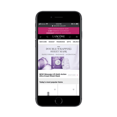
Lancome has three sticky bars at the top of its PWA. (Source: Lancome) (Large preview)
There are three sticky bars at the top of the PWA:
A banner promoting a special offer,
A standard navigation bar,
A secondary navigation bar with shop categories.
The two navigation bars are great. Together, they don’t take up too much space and they make it much easier for users to find what they’re looking for and to complete their purchases. However, that promotional banner is not very well executed.
For starters, it’s too big and demands too much attention. Secondly, there’s no way to dismiss the message. It just stays there, stuck to the top of the PWA, no matter where the visitor goes.
If you’re going to use a sticky bar to promote an offer — no matter its size — give your users the option to move it out of the way if it’s irrelevant or if they’ve already collected the pertinent details from it.
George.com is another e-commerce web app that takes advantage of the top sticky bar. This one, however, doesn’t waste the space with distracting elements.
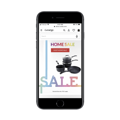
George.com uses a standard navigation bar and sticky search bar on its PWA. (Source: George.com) (Large preview)
On the home page, George.com attaches a sticky and voice-enabled search bar to the top of the page. This is great as it caters to a number of visitor types:
Visitors that prefer to use the standard navigation from the menu.
Visitors that prefer to type a quick search to the exact item they need.
Visitors that want to use their voice to search for something.
It checks off all the boxes.
In addition to providing a great search experience for its store, George.com also customizes this sticky element as visitors go deeper into the site:
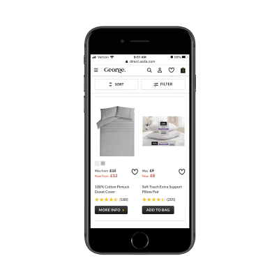
George.com provides shoppers with a sticky Sort and Filter bar. (Source: George.com) (Large preview)
As shoppers peruse product pages, the sticky search bar becomes a Sort and Filter bar that follows them down the page. For big online stores, this is a useful tool so mobile users don’t have to scroll all the way to the top to adjust their search results.
The top sticky bar isn’t just useful for e-commerce stores as you’ll see in the rest of the examples in this article. However, when it comes to mobile, there’s a greater opportunity for e-commerce sites to pack extra value into this space, so take advantage of it.
2. Add a Bottom Navigation Bar with Quick-Tap Actions
Okay, so we’ve established what makes for a good sticky top bar. But what about a bottom bar? Is it even necessary?
One of the benefits of designing a PWA instead of a mobile site is that we can give it the top and bottom wrapper. But it’s not always needed. I’d say as a general rule of thumb to include a bottom bar when there are commonly used actions you want users to have easy access to.
Let’s start with an example that’s a mix of the good and the eh: Twitter.
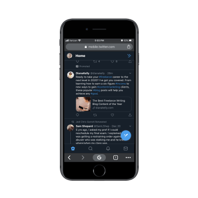
Twitter places its sticky navigation bar on the bottom of the PWA. (Source: Twitter) (Large preview)
Twitter has chosen a different placement for its navigation bar. While the sticky bar at the top provides a place to access user settings, the bottom is for:
Visiting one’s news feed;
Searching for posts, people, hashtags, etc.;
Checking on notifications and direct messages.
For a social media app, this design makes a lot of sense. It’s not as though users are going to spend much time updating their settings, so why not put it out of the thumb zone and keep the regularly used elements within reach?
The issue I take with Twitter’s sticky elements is the click-to-tweet button (the big blue button in the bottom-left). While it’s not high enough to cover content being read at the top of the page, it does cover part of it down below.
It’s awfully reminiscent of those floating social icons that used to cover content on mobile. You don’t really see that anymore and I think it was for that exact reason.
If you’re thinking about adding a free-standing sticky element of your own to your site, make sure it doesn’t cover any content. Twitter may be able to get away with it, but your brand might not.
As for other examples of bottom bars, let’s turn our attention to the Weather Channel PWA:
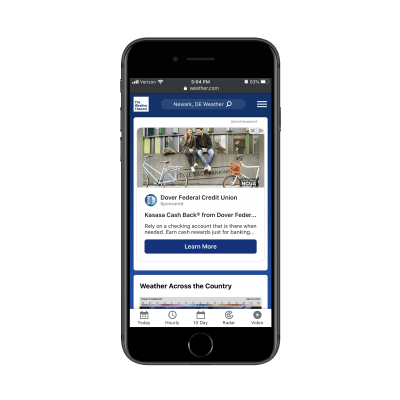
The Weather Channel PWA uses both a sticky top and bottom bar. (Source: Weather Channel) (Large preview)
What’s nice about the top bar, in particular, is that it prioritizes the user experience instead of its own branding. Once a visitor enters their location, the rest of the site’s content is personalized, which is great.
As for the bottom navigation, Weather Channel has done a really nice job with this. Similar to how Twitter places commonly used buttons in its bottom bar, the same idea is present here. After all, it’s not as though Weather Channel visitors are coming to the site to read about Dover Federal Credit Union. They want to get precise predictions for upcoming weather.
Now, the two examples above show you how to use the bottom navigation bar as a permanent fixture on a mobile site. But you can also use it as a custom feature on your internal pages as job search site The Muse does:
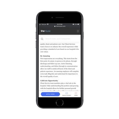
The Muse uses a sticky bar to shortcut various actions visitors might want to take. (Source: The Muse) (Large preview)
This bottom sticky bar appears only on job listings pages. Notice how it doesn’t just say “Apply”.
I’m willing to bet The Muse designer spent time studying its user journey and how frequently job seekers actually apply for a position the first time they see it. By including “Email Myself” and “Save” buttons in this action bar, it addresses the fact that job seekers might need time to mull the decision over or to prepare the application before filling it out.
So, while you can certainly use a sticky bottom bar as a type of secondary navigation for commonly-clicked pages, I’d also suggest looking at it the way The Muse has: by designing a sticky bar that’s tailor-made for your own user’s journey.
3. Simplify Order Customization with Sticky Elements
Remember the days when you’d have to call up your local restaurant to place an order for delivery or when, gulp, you had to actually visit a store to buy something? Online ordering is an amazing thing — but it could be even better if we set up our mobile sites and PWAs the right way for it.
Again, I want to start with an example that kinda gets it right.
This is the PWA for MINI USA:
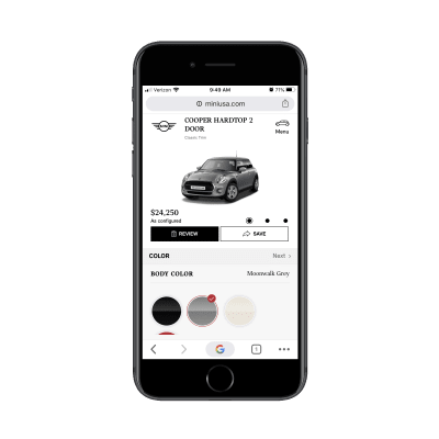
Users customize their Mini Cooper on a page with an oversized sticky element. (Source: MINI USA) (Large preview)
This is what users go through when they want to customize their car before purchasing. Looking at it from this screenshot, it looks nice. You can see the car in its customized state along with the updated price.
However, that entire section — down to the “Review” and “Save” buttons — is fixed. That means that all customization takes place on about a third to a quarter of the screen down below. It’s not an easy customization experience, to say the least.
While the customization screen needs some work, it’s the final Review screen that is done nicely:
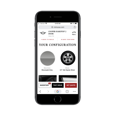
The MINI USA Review page adds a sticky action bar to the bottom. (Source: MINI USA) (Large preview)
Here the top bar has gone back to a normal size while a new action bar has been added to the bottom. This is similar to what The Muse does to streamline the next steps with job applicants. In this case, MINI gives potential customers the ability to choose one of a number of options, even if they don’t lead to an immediate sale.
There are other types of PWAs and mobile sites that can and should simplify the online ordering process. Like MINI, Uber Eats uses custom sticky elements to help users put together their orders.
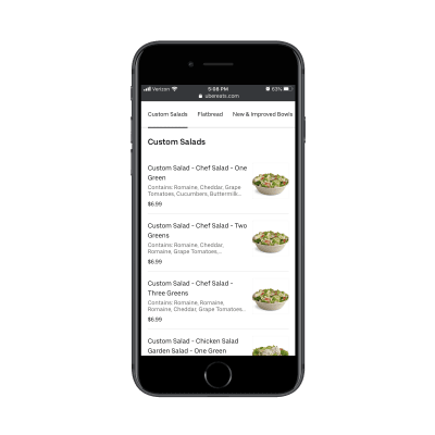
Uber Eats includes a top menu navigation bar in its PWA. (Source: Uber Eats) (Large preview)
When a user has selected a restaurant to order from, a sticky menu bar appears at the top of the page. This is especially useful for lengthy menus as well as to help users quickly navigate to the kind of food they’re jonesing for.
Assuming the user has found an item they want, the next page removes the top sticky bar and adds an “Add to Order” button/bar instead.
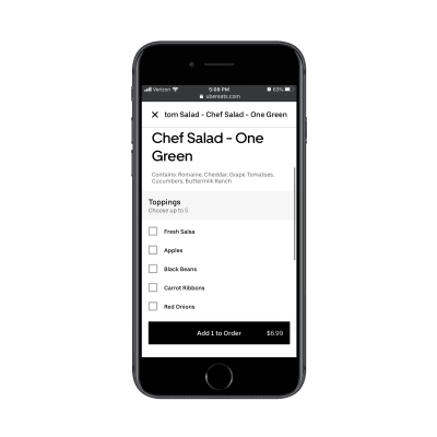
Uber Eats places an “Add to Order” button at the bottom of its web app. (Source: Uber Eats) (Large preview)
This way, the distraction of other menu categories is gone and now the user only has to focus on customizing the selected item before placing it in the cart.
Again, what this comes down to is being able to predict your users’ steps before they even get there. You can use either the top or bottom navigation to aid in this process, but it’s best to place initial steps in a sticky top bar and later steps at the bottom as they near conversion.
4. Display “Sidebar” Widgets On Digital Publications
Without a sidebar on mobile, you might try to tuck the widgets that would otherwise be there at the bottom of your content. But unless you know that your content is going to be read all the way through and that visitors will keep scrolling for more, there’s no guarantee they’ll see anything you put down there.
So, when it makes sense to do so, use sticky bars to add only the most essential sidebar-esque content.
Let’s take Inc., for example.
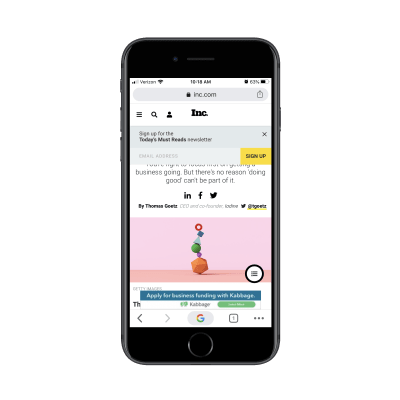
Inc.’s PWA comes with a sticky subscription bar, banner ad and secondary hamburger menu. (Source: Inc.) (Large preview)
There are three sticky elements that appear around Inc.’s articles:
A subscription form (which can be dismissed),
A banner ad (which cannot),
A floating hamburger menu.
The first two elements are fine since at least one of them is dismissible. However, the floating hamburger menu is problematic since it covers part of the content. Considering this is a content-centric site, it’s probably not a good idea to cover any part of the page.
The only way we might be able to excuse the placement of this fixed element is if it were to add extra value to the content. However, all it does is give readers more articles to read:
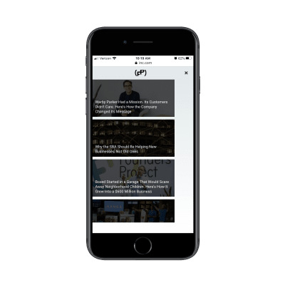
Inc.’s floating hamburger menu contains more articles to read. (Source: Inc.) (Large preview)
The goal on any content website is to get visitors to actually read the content. But if you’re presenting them with other options straight away, you’re only giving them more content to get distracted by.
The concept of this floating menu is a good one, but the execution isn’t great. I’d recommend displaying it as visitors get at least 75% of the way down the page. That way, it only comes into view when they should be looking for related content to read.
As for publications that get the sticky elements right, look for ones that keep it simple.
The New Yorker, for instance, does a nice job of using the sticky navigation bar and a darker, less distracting bottom bar to promote its subscriptions:
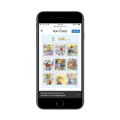
The New Yorker uses sticky bars to promote its paid subscriptions. (Source: The New Yorker) (Large preview)
If it’s important to you to get subscribers for your publication — especially paid ones — this is a good way to make use of the fixed bars on mobile.
If, instead, you’re more focused on getting the word out about your content, then a sticky bar like the one The Billings Gazette uses would be better:
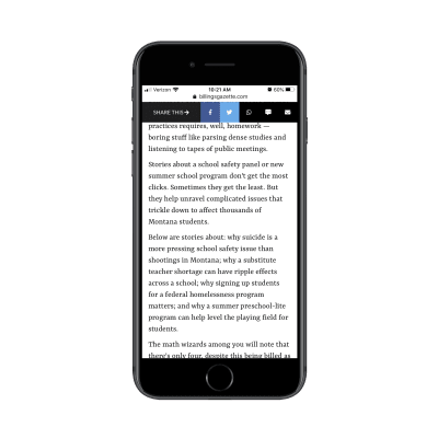
The Billings Gazette prioritizes sharing over subscribing of its content. (Source: The Billings Gazette) (Large preview)
This is really well done. Social media sharing options are limited to the ones that make the most sense for mobile users. The same goes for the other share options here: WhatsApp, text, and email. When clicked, the corresponding app opens, so readers don’t have to use their browser sharing options or copy-and-paste the link.
In all honesty, I’m not sure it should be an either/or. I think you could use the top bar to promote your subscription so long as it’s easy to dismiss. Then, the bottom bar could be used for sharing links. Just make sure one of the bars moves out of the way so you can maximize the reading space.
Wrapping Up
Bottom line? It’s time to start using your sticky mobile elements for more than just storage of a logo, hamburger menu or search bar.
As we’ve seen here today, the key is to figure out what your users need most from you. Then, use your sticky elements to build a shortcut that makes a difference in their experience.
(ra, yk, il)