Original Source: https://www.smashingmagazine.com/2019/12/design-profitable-sales-funnels-mobile/
How To Design Profitable Sales Funnels On Mobile
How To Design Profitable Sales Funnels On Mobile
Suzanne Scacca
2019-12-06T11:00:00+00:00
2019-12-06T15:07:36+00:00
A sales funnel is a set of invisible steps you lay before visitors that takes them from the point of entry to the desired action. There are three stages in a sales funnel:
Top of the funnel (TOF),
Middle of the funnel (MOF),
Bottom of the funnel (BOF).
Why do we call these three stages a funnel? Because, together, they form a funnel-like shape:
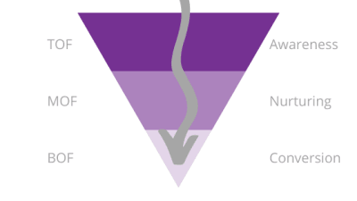
A sales funnel and its three key stages: top-of-funnel, middle-of-funnel, bottom-of-funnel marketing. (Large preview)
At the top are all the people who enter your website or PWA. At the bottom are those who’ve bought something. The reason it tapers off is because your funnel sheds visitors and leads along the way who aren’t a good fit.
This process actually occurs with or without your help. (It’s just more effective if you take the time to carefully construct it.) Open Google Analytics and locate the tab called “Users Flow” under “Audience” or “Behavior Flow” under “Behavior”.
You’ll see something like this:

An example of using Google Analytics to chart the natural flow of visitors through a website. (Source: Google Analytics) (Large preview)
In this particular user flow, we’re looking at how traffic from various mediums (e.g. organic search, third party referrals, social media) moves through the website.
The shape isn’t as explicit as a funnel, but you can see that’s exactly what’s happening with the numbers. There were 4500 sessions to start. By the second interaction, only 143 remained.
By actually designing your sales funnels, though, you can improve your results and make them more predictable. You’ll do this by driving the right kind of leads into your website, laying down a clear set of steps for them to take and, hopefully, maximizing the number of them that convert.
To do this, you’ll need to understand what’s going on in the minds of your leads at every part of the funnel and then design an experience that caters to that exact mindset.
Let’s look at some examples.
Designing For Top Of The Funnel
Someone discovers your website or brand on Google, through a social media post or from a personal referral. So, they visit the website on a fact-finding mission.
TOF marketing is all about discovery. You want to take visitors from:
Sounds interesting.
To:
This is promising! I should [subscribe to the newsletter/like them on Facebook/grab this free downloadable].
Here is an example of how you might build out the Awareness part of the funnel:
Step 1: Show Up in the Right Places
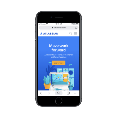
Your sales funnel doesn’t begin on your website or app. It begins in places like Google search results, like this example for the Atlassian enterprise software company:

This is the first step of the TOF funnel: a Google search result for Atlassian. (Source: Atlassian) (Large preview)
In order for visitors to enter the funnel, you have to increase the exposure of your brand in places like:
Organic Google search results,
Social media posts,
Review site recommendations,
Content like blog posts and podcasts.
You can also use paid search and social ads to boost brand awareness, but be careful. As this WordStream infographic demonstrates:
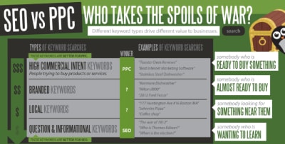
The WordStream infographic shows how different keywords perform better in SEO vs. PPC placements. (Source: WordStream infographic) (Large preview)
Paid placements are much more attractive to consumers who are ready to buy (i.e. at the bottom of the funnel). Top of the funnel consumers, however, are simply on a fact-finding mission, which is why you’d be best off finding organic placements (in search and elsewhere) to put in front of them.
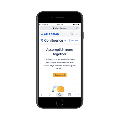
Step 2: Help Them Learn More
Once visitors enter your website, you want to make it as easy as possible for them to get the information they need. On mobile, that means giving them a shortcut above the fold:
The Atlassian home page invites visitors to ‘Learn more’. (Source: Atlassian) (Large preview)
There’s nothing complicated about what the CTA button is asking visitors to do. No pressure to buy. No snarkiness or attitude. Just a straight-forward, “Let us help you discover our products.”
Step 3: Give Them a Little Room
It’s not as though Atlassian is some unknown brand. It’s the developer of products like Jira, Trello, and Bitbucket. And, yet, its first step is to invite visitors to take time to learn more. More websites would be better off if it had as welcoming of an approach.
The next step in this process gives visitors the time and space to research Atlassian’s products:

Atlassian encourages visitors to take time learning about all of the software available. (Source: Atlassian) (Large preview)
There are no pesky pop-ups on this page to distract visitors from the list of products. There are no ads or banners drawing attention to special offers or anything like that. There aren’t even any “Buy Now” buttons. Each product description is followed by a “Learn more” button.
This is perfect for the business owner or CTO who simply wants to gather up facts on software options before making any buying decisions.
Step 4: Make a Connection
Because these are top-of-funnel visitors, there’s no way you’re going to get them to convert on the spot — especially for enterprise software. So, your best bet is to throw a soft pitch their way.
In the case of Atlassian, it offers a free trial:
Atlassian doesn’t push TOF visitors to buy right away. A free trial is offered instead. (Source: Atlassian) (Large preview)
No credit card is required at this time. This is simply about letting prospective users learn even more about the product without the pressure of a price tag.
If you have a product that they can discover first-hand, this is a great way to earn the trust of TOF consumers and fast-track them to conversion.
If you don’t have a product that can be tested, that’s fine. There are other ways to help your users learn more and stay connected through email. A lead magnet like a downloadable checklist or ebook is one way to do it. A subscription to your blog is another. Or you might just invite them to follow you on social.
However you make that connection, make sure you’re only asking for the bare minimum:
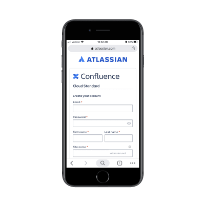
Atlassian free trial form asks for only required user data. (Source: Atlassian) (Large preview)
If you’re thinking of going the route of a lead magnet, read this guide for tips on designing the lead gen landing page.
Designing For Middle Of The Funnel
For businesses with shorter sales cycles (i.e. ones with less complicated and cheaper products), this part of the funnel doesn’t usually exist. For those that do need it (like service providers and SaaS companies), though, it’s a critical part of the sales process.
We’ve already established that leads that get to this stage are interested since they shared their email address or connected with you in some other manner. Now, it’s your job to feed them with free value and insights so they go from:
This is promising!
To:
This is exactly what I’ve been looking for.
MOF marketing is all about building relationships and nurturing trust while you give your prospects time to consider whether the purchase is worth it.
Here is an example of how you might build out the Nurturing part of the funnel:
Step 1: Keep in Touch
Your website has successfully educated visitors enough to become interested leads. Now, you have to actually do something with that connection.
If they subscribed by email, started a free trial or downloaded a lead magnet, they should begin receiving email communications.
If they followed your brand on social, then they should start seeing your posts on a regular basis.
Just keep in mind that these messages shouldn’t be about the hard sell. At this stage, all you’re doing is providing extra value and building trust in the process. If you contact them at the right frequency and with the right kind of content, though, they’ll eventually get to a point where there’s no doubt in their minds that they want to buy from you.
For example, I was on Google recently looking for “spas near Providence” (where I’m moving to early next year). I always book a spa session for my birthday and was just curious what kind of options I’d be working with.
In my Google Maps results, I discovered The Bodhi Spa. It had great reviews, it was close to where I was moving and it had the kind of spa services I was interested in. So, I figured, why not click and learn more?
I was happy with what I saw, so I decided to follow them on Instagram so they could stay top-of-mind until I move to Providence. This is the exact thing you want to happen with your TOF prospects.
And the way the spa continues to stay in touch is the exact thing you (or whoever handles the marketing for the website you built) should be doing in the MOF:
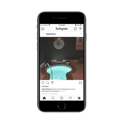
A recent Instagram post from The Bodhi Spa. (Source: The Bodhi Spa) (Large preview)
What’s great about this example is that the spa doesn’t overdo it. They only post once every week or two — just enough to keep followers (and interested prospects) engaged:

The Bodhi Spa posts enticing photos on Instagram every week or two. (Source: The Bodhi Spa) (Large preview)
Another nice tip you can leverage from this example is how the posts are written.
Sure, the Instagram page is meant to be promotional. However, the posts themselves aren’t written in a sales-centric tone. For instance, the last post that went up simply says:
Gimme some #happyhormones #plungepool #bodhispa #heatupcooldownrelaxrepeat
The enticing image and the relaxed message work well for MOF marketing. It’s like, “Hey, we’re here whenever you’re ready.” And, for my own purposes, that’s perfect. As an interested prospect, I’m glad I’ll have these kinds of updates to remind me to book a session once I’m in town.
Step 2: Always Include Your Link
When you get close to the bottom of the funnel, your links should go deeper into the site. For instance, let’s say you were to run a Google ad for a specific product or sale. The link in that ad wouldn’t go to your home page. It would go to a targeted landing page that would shortcut the whole process.
MOF prospects aren’t at that stage yet, so you should still send them to your home page or some other top-level page on your website (just not a navigation-less landing page).
The Bodhi Spa, for example, points all Instagram visitors to its home page:
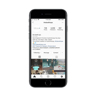
The Bodhi Spa includes a link to its home page on Instagram. (Source: The Bodhi Spa) (Large preview)
Most newsletters and email communications will do the same, with a link at the very top or bottom of the email pointing to the home page.
Just make sure the link you send them to naturally directs them through the middle-of-funnel steps.
Step 3: Point Them in the Right Direction
For longer sales cycles, make sure your website is fully prepared to provide answers to interested prospects — both directly and indirectly.
As far as the direct approach goes, a contact form and live chat would be useful. You should exhaust the indirect options before you go too crazy with setting up contact channels though.
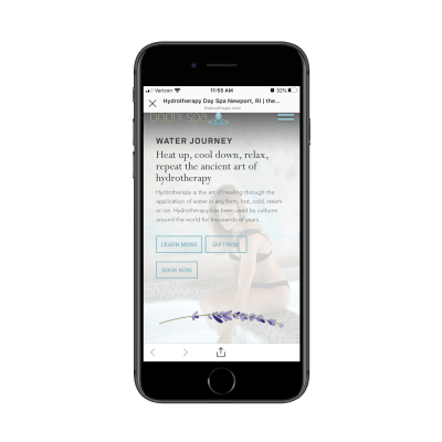
As far as the indirect approach goes, your website should be like a self-guided journey. That way, when they land on the home page, it’s clear which directions they can go in:
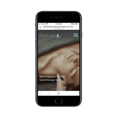
The home page of The Bodhi Spa has a ‘Begin Your Journey’ button. (Source: The Bodhi Spa) (Large preview)
The home page gives visitors two ways to go:
Begin your journey,
Or access the menu.
Now, as a first-time visitor at the top of the funnel, the prospective customer likely scrolled through the home page to look for an opportunity to quickly learn more:
The home page of The Bodhi Spa PWA points visitors to ‘Learn More’. (Source: The Bodhi Spa) (Large preview)
As a return visitor, however, this part of the home page opens up a new pathway that they likely hadn’t considered the first time around: “Book Now”. Even the order in which the buttons appears suggests that that’s the order in which visitors should interact with them.
That said, MOF prospects aren’t necessarily ready to buy on a second, third or even fourth visit. While they’re not in the initial “Is this worth it?” discovery phase, they’re still trying to gather all the facts and make up their mind.
(And if they are sold on your offer that quickly, that’s great! You have the button there, ready for them to click.)
Step 4: Reinforce Your Value
Even though this is a mobile website (or PWA) where content should be kept to a minimum, it’s important to include all details that will make-or-break their decision to buy. Don’t stuff them into the home page or a single services or products page though.
Lay it out in your navigation like this:
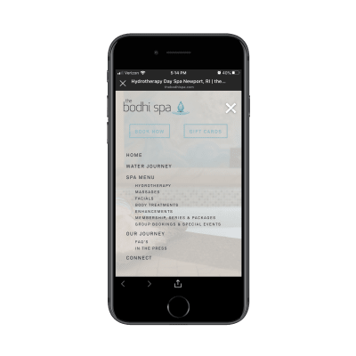
The Bodhi Spa has a dedicated page for each of its services and its company story. (Source: The Bodhi Spa) (Large preview)
At first glance, you might not think this website has that much information since the home page is so straight and to the point. However, this navigation digs deep into the spa’s offerings along with the company’s story.
Also, take note of the FAQs included under “Our Journey”. That’s a great touch. If you know that prospects tend to come to you with the same questions, don’t make them use the “Connect” or “Contact” page to fill out a form. It not only clogs up your inbox with questions, but it forces them to do extra work.
Make your website do most of the work instead.
And if it’s not prepared to answer all of the questions and ease all of their doubts, then it’s time to revisit the structure, content and design of your site. The MOF is the trickiest part of the sales funnel. If you can successfully bring prospects back to the site from your mobile marketing efforts, don’t let it go to waste.
Designing For Bottom Of The Funnel
Okay, so your prospects know what you’re offering and they’re ready to buy. All they need is one last push through a seamless and effortless checkout so that they go from:
This is exactly what I’ve been looking for.
To:
Where’s my credit card?
Here is an example of how you might build out the Conversion part of the funnel:
Step 1: Make Your Offer Clear
If your website were a flesh-and-blood salesperson, this is the point of the call or meeting where they’d ask, “Can I have your business?” There’s no point in beating around the bush on your website or your marketing either.
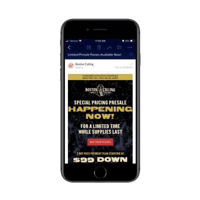
For MOF visitors who’ve finished checking up on you and your offering, you’ll want to boldly make your offer where they’ll easily see it, just as the Boston Calling Music Festival does:

The Boston Calling Music Festival website clearly and boldly published its tickets. (Source: Boston Calling Music Festival) (Large preview)
For TOF visitors who don’t need much convincing or nurturing, you can directly post your offer to them over email or social media:
An email for tickets to the Boston Calling Music Festival. (Source: Boston Calling Music Festival) (Large preview)
Just make sure your sales funnel can be truncated into TOF and BOF in that case.
For something like a concert where the offer is clear-cut, going this route would be fine. However, think about something like a professional conference or retreat where tickets run upwards of $1000 and the cost of travel adds even more weight to that total. If you’re asking for a huge commitment of time, money or effort from your customers, don’t skip the MOF marketing steps.
Once you’re in this stage, though, you can put aside all of that education you did earlier. All you need to do now is sell, so make sure the “Buy” button is as clear as day wherever you put it.
Step 2: Summarize Their Purchase in the Cart
Whether customers are putting products into a shopping cart, purchasing tickets to an event or signing up for your SaaS, it’s a good idea to quickly remind them of what they’re about to buy before you hop into checkout.
On the Cart page, provide a summary like this:

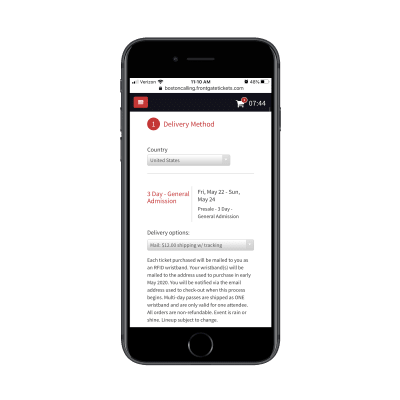
The Boston Calling tickets page reminds visitors what they’re buying before they check out. (Source: Boston Calling Music Festival) (Large preview)
The Cart page makes sure that buyers fully understand what it is they’re buying. That way, they don’t go through checkout, only to realize at the email confirmation stage that they bought something they can’t use or on dates they’re unavailable. This’ll reduce the numbers of emails, calls or refund requests you have to handle post-sale.
Step 3: Streamline Checkout
Last but not least, make it easy for your customers to get through checkout.
The first thing to do is simplify the sign-in/sign-up process:
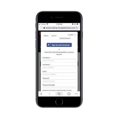
The Boston Calling Music Festival website provides multiple options to sign in or up for tickets. (Source: Boston Calling Music Festival) (Large preview)
Customers can sign in with an existing account or they can sign up for a new one. And the sign-up process has two options as well:
Create an account with Facebook,
Create an account from-scratch.
You can’t see it here, but the form is enabled with autofill technology, which made filling it out lightning-fast.
The rest of the checkout process should be as easy to get through. One way to do this is by using dropdowns with the most popular options already selected (when it makes sense). That’ll save customers time having to manually enter their data:
Boston Calling auto-fills some checkout fields to speed up the process. (Source: Boston Calling Music Festival) (Large preview)
That said, even the most streamlined of checkout processes can get tiresome if there’s a lot of data to collect. But Boston Calling does a nice job of this, always giving customers a look at how many more steps are to come:

The Boston Calling checkout process clearly lays out each step of the process. (Source: Boston Calling Music Festival) (Large preview)
Even though there are four steps customers have to complete to get their music festival tickets, the last two steps are easy. Secure Ticket provides information on how their tickets are protected in case of inclement weather, disaster or some other reason for cancellation. And the last one is a final check to ensure they purchased the right ticket and are ready to submit their payment information.
It’s a beautiful system from start to finish and ensures that as many interested concert-goers book their tickets as possible.
Wrapping Up
Building a sales funnel into a website can be a huge relief for the people who run it. That’s because a carefully designed pathway can usher your visitors from the point of entry to conversion without much oversight or intervention from you at all.
Aside from some email or social marketing along the way (which can be automated), the rest of the work is done by your website to convert the best-fit customers. Plus, by building your sales funnels for mobile, you’ll ensure that you’ve created the most efficient pathways for your visitors regardless of which device they’re on.

(ra, yk, il)
 As you are shopping this month for others, why not find a few goodies for yourself? Our roundup of new tools and resources is packed with usable items. And most are free, so there’s no shame in trying out something for yourself. Here’s what’s new for designers this month.


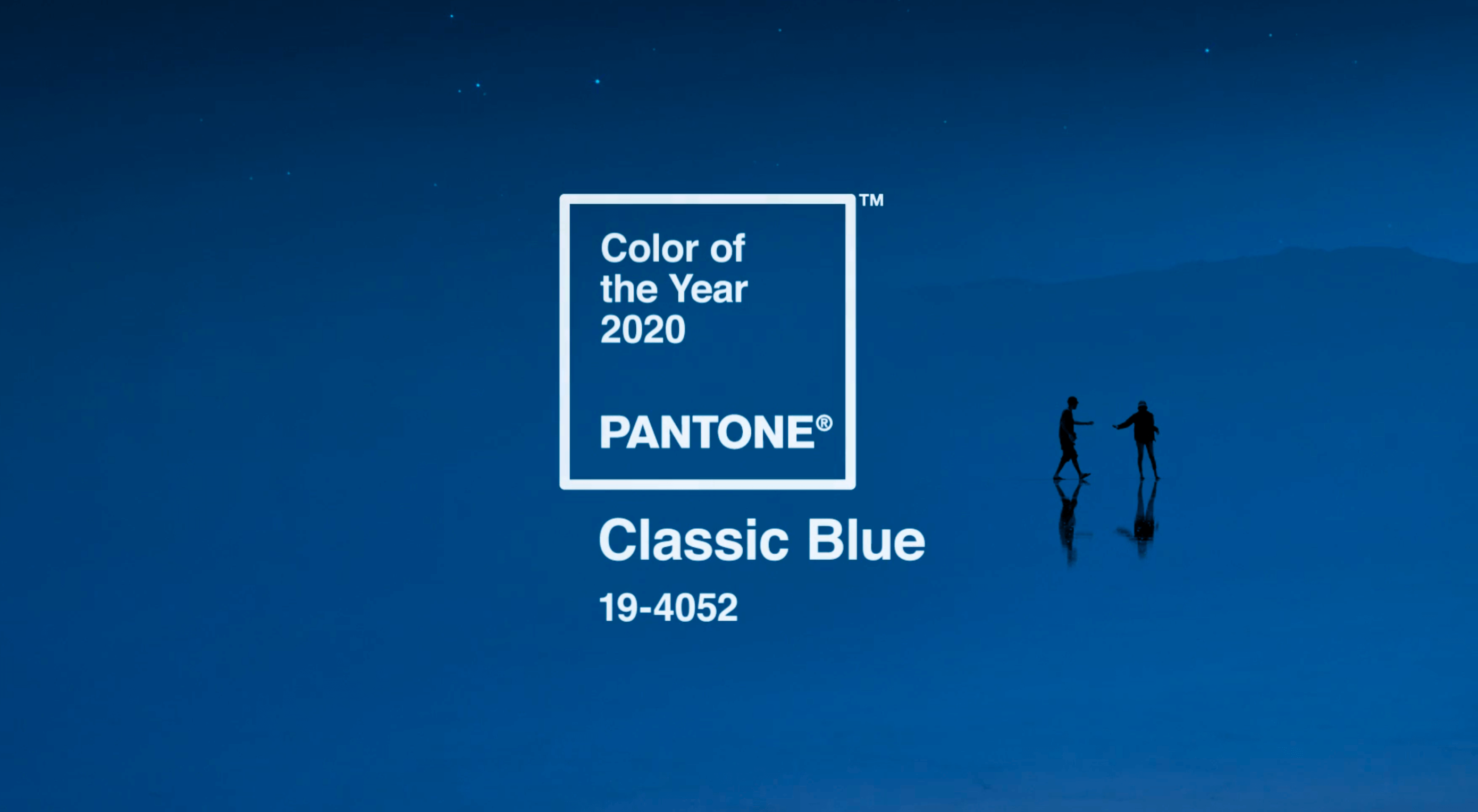 Each year, at this time, Pantone nominates a color — or colors, in the case of 2016 — to represent humanity’s hopes and aspirations for the coming year.
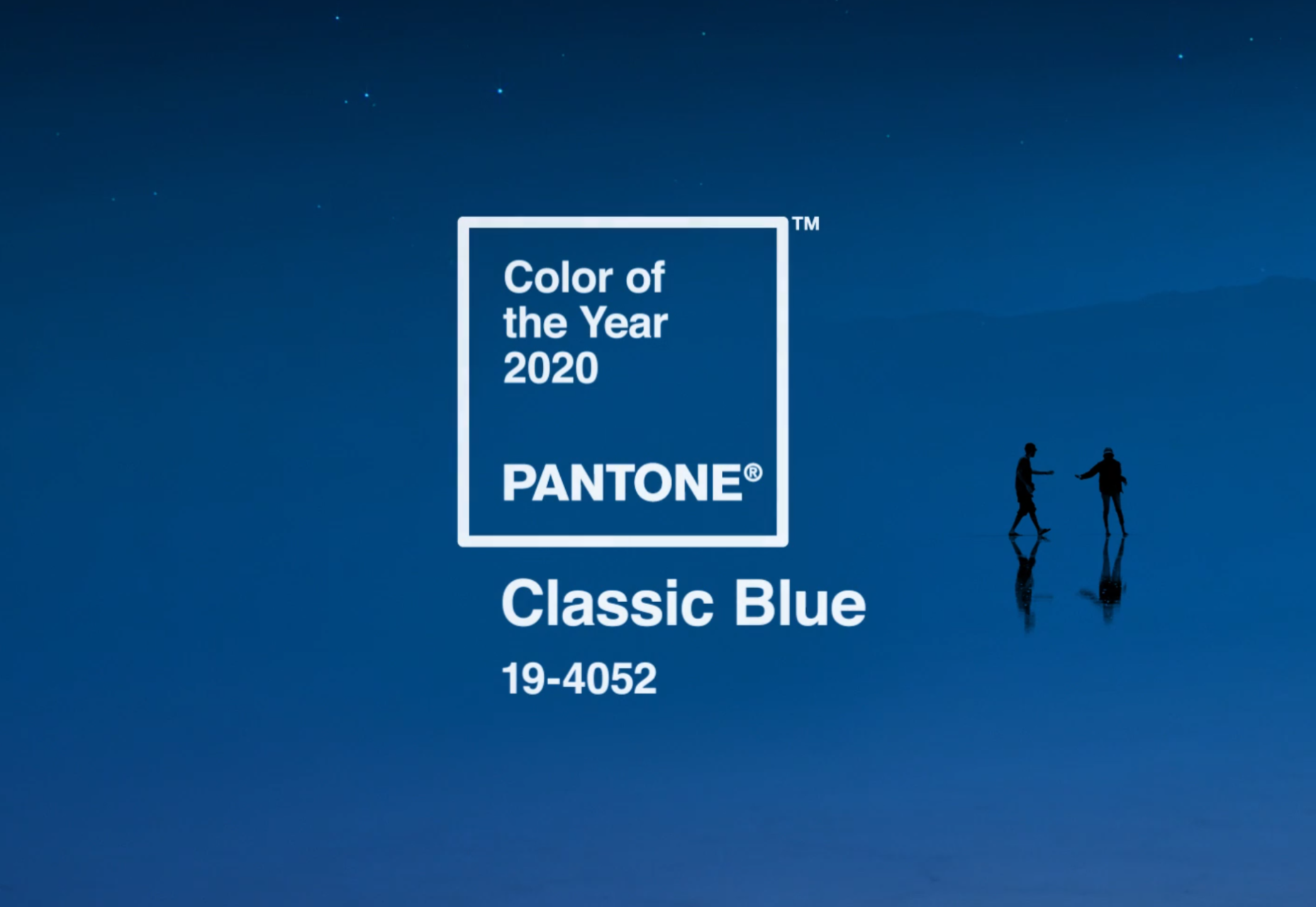


 The finished multiplayer game, synchronized across multiple clients. (Large preview)
 All orbs are populated dynamically, using the template orb (Large preview)
