30+ Tumblr Tips Tricks, and Tools (2019)

Original Source: https://www.hongkiat.com/blog/tumblr-tips-tricks-tools/

Tumblr has been one of the most famous social media platforms and the 450 million blogs and 167 billion posts (Dec, 2018 stats) will vouch for its popularity. You can either create your own blog on…

Visit hongkiat.com for full content.

40+ Photoshop Tutorials to Put Your Skills to The Test

Original Source: https://www.hongkiat.com/blog/photoshop-tutorials-to-put-your-skills-to-test/

Either you’re looking to brush up your Photoshop skills or there are some new image manipulating techniques in Photoshop you want to learn, there is an abundance of tutorials available online….

Visit hongkiat.com for full content.

Monthly Web Development Update 1/2019: Rethinking Habits And Finding Custom Solutions

Original Source: https://www.smashingmagazine.com/2019/01/monthly-web-development-update-1-2019/

Monthly Web Development Update 1/2019: Rethinking Habits And Finding Custom Solutions

Monthly Web Development Update 1/2019: Rethinking Habits And Finding Custom Solutions

Anselm Hannemann

2019-01-18T12:40:24+01:00
2019-01-18T21:18:05+00:00

What could be better than starting the new year with some new experiments? Today I figured it was time to rethink JavaScript tooling in one of my projects. And since we wrote everything in plain ECMAScript modules already, I thought it would be easy to serve them natively now and remove all the build and transpilation steps. Until I realized that — although we wrote most code ourselves — we have a couple of third-party dependencies in there and, of course, not all of them are ECMAScript modules. So for now, I have to give up my plans to remove all the build steps and continue to bundle and transpile things, but I’ll try to figure out a better solution to modernize and simplify our tooling setup while providing a smaller bundle to our users.

Another experiment: Just a few weeks ago I had to build a simple “go to the top of the page” button for a website. I used requestAnimationFrame and similar stuff to optimize event handling, but today I found a way nicer and more efficient solution that uses IntersectionObserver to toggle the button on the viewport. You will find that article in the JavaScript section below. The reason I wanted to share these little stories is because I believe that the most important thing is that we review our habits and current solutions and see whether there are better, newer, simpler ideas that could improve a product. Keep playing, keep researching, and be sure to rethink existing systems from time to time.

News

Joseph Medley shows us the deprecations and removals in Chrome 72, which include blocking popups during page unload via window.open, HTTP-Based Public Key Pinning, and deprecation of TLS 1.0 and TLS 1.1.

UI/UX

What Jesse Weaver is writing about here doesn’t sound like big news, but he shows how quickly we’re tempted to adopt a product strategy that works for others for our own products. Jesse shares why that’s not a good idea and why you should always try to find your own, custom solutions.

Web Performance

Jack Lenox explores how heavily website performance affects our planet’s climate and the effect which performance has for your visitors — beyond better load times.
Tim Kadlec explains why performance is an ethical point as it can include or exclude people, increase or reduce waste of energy, network traffic, and time.

JavaScript

How do we provide a “back to top” button? Well, here’s a very performance-oriented, efficient approach that uses an Intersection Observer to show and hide the button.
Ackermann Yuriy describes how we can use FIDO2 and the Web Authentication API to log in users without passwords.
Chrome is currently working on an API called getInstalledRelatedApps that lets you detect if a user has your native app installed. This could be useful to not show them the app banners by default anymore or to let them open a specific product feature in the app directly from your website.
Harry Wolff shows how we can use React.lazy and suspense to split up the code in JavaScript apps. This is important to reduce the original load size of the application bundle and can make a huge difference for the performance and UX of a website.

Infographic showing how authentication and verification work without a password

Passwordless authentication? The WebAuthn API makes it possible. (Image credit)

CSS

Una Kravets wrote a great piece on using Houdini and the Paint API for CSS. She demonstrates it at the example of a customized text-decoration underline style that isn’t available in standard CSS.
Eric Portis explains the concept of the intrinsicsize HTML attribute that will — hopefully soon — help us provide jank-free image loads in browsers by hinting the expected dimensions of the images to the browser before it has parsed them.
Scott Jehl updated the open-source custom appearance select module, and in this blog post he describes how we can style select today.
Chris Coyier summarized how to style a web component and decide whether we want it to inherit global styles or start from scratch.

An example text with randomly generated underlines.

Una Kravet’s “super underline” example uses randomly generated underlines for each element. Made possible with Houdini and the Paint API. (Image credit)

Work & Life

“Feeling a sense of accomplishment is an important part of our sense of self-worth. Beating up on yourself because you think you could have accomplished more can dent your confidence and self-esteem and leave you feeling depleted at the end of the day.” Lisa Evans shares what we can do to avoid falling into that trap.
Itamar Turner-Trauring shares his thoughts on how to get a job with a good work-life balance when you’re competing against people who are willing to work long hours.
Is it a good idea to provide healthcare and treatment based on digital products like apps? And if so, what are the requirements, the standards for this? How can we ensure this is done ethically correct? How do we set the limits, the privacy boundaries, how far do we allow companies to go with experiments here? Would personalized content be fine? Is it okay to share data collected from our devices with healthcare providers or insurances? These are questions we will have to ask ourselves and find an individual answer for.
This article about how Millenials became the burnout generation hit me hard this week. I see myself in this group of people described as “Millenials” (I do think it affects way more people than just the 20-year-olds) and I could relate to so many of the struggles mentioned in there that I now think that these problems are bigger than I ever imagined. They will affect society, politics, each individual on our planet. Given that fact, it’s crazy to hear that most people today will answer that they don’t have a friend they could talk to about their fears and anything else that disturbs them while two decades ago the average answer was still around five. Let’s assure our friends that we’re there for them and that they can talk to us about tough things. 2019 should be a year in which we — in our circle of influence — make it great to live in a human community where we can think with excitement and happiness about our friends, neighbors, and people we work with or talk to on the Internet.
We all try to accommodate so many things at the same time: being successful and productive at work, at home, with our children, in our relationships, doing sports, mastering our finances, and some hobbies. But we blindly ignore that it’s impossible to manage all that on the same level at the same time. We feel regret when we don’t get everything done in a specific timeframe such as at the end of a calendar year. Shawn Blanc argues that we should celebrate what we did do instead of feeling guilty for what we didn’t do.

Going Beyond…

There are words, and then there are words. Many of us know how harmful “just” can be as a word, how prescriptive, how passively aggressive it is. Tobias Tom challenges whether “should” is a useful word by examining the implicit and the result of using it in our daily language. Why “should” can be harmful to you and to what you want to achieve.
“We all know what we stand for. The trick is to state our values clearly — and to stand by them,” says Ben Werdmuller and points out how important it is to think about your very own red line that you don’t want to cross regardless of external pressure you might face or money you might get for it.
Exciting news for climate improvement this week: A team of arborists has successfully cloned and grown saplings from the stumps of some of the world’s oldest and largest coast redwoods, some of which were 3,000 years old and measured 35 feet in diameter when they were cut down in the 19th and 20th centuries. Earlier this month, 75 of the cloned saplings were planted at the Presidio National Park in San Francisco. What makes this so special is the fact that these ancient trees can sequester 250 tons of carbon dioxide from the atmosphere over their lives, compared to 1 ton for an average tree.
The ongoing technological development and strive to build new services that automate more and more things make it even more critical to emphasize human connection. Companies that show no effort in improving things for their clients, their employees, or the environment will begin to struggle soon, Ryan Paugh says.
We usually don’t expect much nice news about technology inventions from the car industry and their willingness to share it with others. But Toyota now has decided to share their automated safety system ‘Guardian’ with competitors. It uses self-driving technology to keep cars from crashing. “We will not keep it proprietary to ourselves only. But we will offer it in some way to others, whether that’s through licensing or actual whole systems,” says Gill Pratt from the company.

Thank you for reading! I’m happy to be back with this new edition of my Web Development Update in 2019 and grateful for all your ongoing support. It makes me happy to hear that so many people find this resource helpful. So if you enjoyed it, please feel free to share it with people you know, give me feedback, or support it with a small amount of money. —Anselm

Smashing Editorial
(cm)

How to Migrate to Gulp.js 4.0

Original Source: https://www.sitepoint.com/how-to-migrate-to-gulp-4/

Despite competition from webpack and Parcel, Gulp.js remains one of the most popular JavaScript task runners. Gulp.js is configured using code which makes it a versatile, general-purpose option. As well as the usual transpiling, bundling and live reloading, Gulp.js could analyze a database, render a static site, push a Git commit, and post a Slack message with a single command.

For an introduction to Gulp, take a look at the following:

An Introduction to Gulp.js
How to Use Gulp.js to Automate Your CSS Tasks
Develop WordPress Themes Faster with Gulp

Gulp.js 4.0

Gulp.js 3.x has been the default for around half a decade. Until recently, npm install gulp would have installed 3.9.1 — the version referenced in the tutorials above.

Gulp.js 4.0 has been available throughout that time, but had to be explicitly installed with npm install gulp@next. This was partly owing to ongoing development and because Gulp.js 4 gulpfile.js configuration files are not compatible with those developed for version 3.

On December 10, 2018, Gulp.js 4.0 was announced as the default and published to npm. Anyone using npm install gulp on a new project will receive version 4.

Is it Necessary to Migrate to Gulp.js 4?

No. Gulp.js 3 has been deprecated and is unlikely to receive further updates, but it can still be used. Existing projects won’t update unless the version is explicitly changed in the dependencies section of package.json. For example:

“dependencies”: {
“gulp”: “^4.0.0”
}

You an also install Gulp.js 3 in new projects using:

npm install gulp@^3.9.1

It’s possibly best to stick with Gulp.js 3.x if you have a particularly complex, mission-critical build system.

However, existing Gulp.js plugins should be compatible and most gulpfile.js configurations can be migrated in an hour or two. There are several benefits to upgrading, which will become apparent throughout this tutorial.

Upgrade to Gulp.js 4.0

Update your package.json dependencies as shown above, then run npm install to upgrade. You can also update the command-line interface using npm i gulp-cli -g, although this hasn’t changed at the time of writing.

To check the installation, enter gulp -v at the command line:

$ gulp -v
[15:15:04] CLI version 2.0.1
[15:15:04] Local version 4.0.0

Migrating gulpfile.js

Running any task is now likely to raise scary-looking errors. For example:

AssertionError [ERR_ASSERTION]: Task function must be specified
at Gulp.set [as _setTask] (/node_modules/undertaker/lib/set-task.js:10:3)
at Gulp.task (/node_modules/undertaker/lib/task.js:13:8)
at /gulpfile.js:102:8
at Object.<anonymous> (/gulpfile.js:146:3)
at Module._compile (internal/modules/cjs/loader.js:688:30)
at Object.Module._extensions..js (internal/modules/cjs/loader.js:699:10)
at Module.load (internal/modules/cjs/loader.js:598:32)
at tryModuleLoad (internal/modules/cjs/loader.js:537:12)
at Function.Module._load (internal/modules/cjs/loader.js:529:3)
at Module.require (internal/modules/cjs/loader.js:636:17)
at require (internal/modules/cjs/helpers.js:20:18)
at execute (/gulp-cli/lib/versioned/^4.0.0/index.js:36:18)
at Liftoff.handleArguments (/gulp-cli/index.js:175:63)
at Liftoff.execute (/gulp-cli/node_modules/liftoff/index.js:203:12)
at module.exports (/gulp-cli/node_modules/flagged-respawn/index.js:51:3)
at Liftoff.<anonymous> (/gulp-cli/node_modules/liftoff/index.js:195:5)

It’s daunting, but you can ignore everything except the first reference of gulpfile.js, which shows the line where an error was encountered (102 in this example).

Fortunately, most of these errors are caused by the same type of problem. The following sections use the CSS tasks tutorial code as an example. The code is available on GitHub and provides the original Gulp.js 3 gulpfile.js and the migrated Gulp.js 4 equivalent.

The post How to Migrate to Gulp.js 4.0 appeared first on SitePoint.

11 Inspirational Designer Portfolios For 2019

Original Source: http://feedproxy.google.com/~r/1stwebdesigner/~3/CwkL30labtI/

For web and graphic designers, it’s important to nail that portfolio, instantly convincing anyone who visits that you’re the one for the job. With the new year rolling around, it might just be time for a fresh redesign.

There are so many amazing portfolios out there to draw inspiration from. If you’d like to explore and learn from the work of your fellow designers, you’re going to love this list. These are the portfolios that get it right!

We Ain’t Plastic

We Ain't Plastic

We Ain’t Plastic definitely leaves its mark. Its subtle effects, animations and images all come together to create a website that was obviously crafted with love. It also gets right to the point, careful not to overload you with too much information.

Melanie Daveid

Melanie Daveid

This beautiful one-page portfolio proves that simple-but-strong design is often the best way to go. The perfectly elegant animations are the most memorable part of this website, alongside the dynamic layout.

Steve Mengin

Steve Mengin

Stylish and well put together, navigating this portfolio is no less than delightful. Every animation looks great, and though many navigation elements are fairly unique, getting around is very intuitive thanks to fantastic UI design.

Gal Shir

Gal Shir

Fun animations and colorful images quickly bring this site to life. You won’t be able to stop scrolling, stopping to see each animated image. And a pretty parallax effect brings the site to a satisfying end.

Portfolio of Nathan Riley

Portfolio of Nathan Riley

This dark, modern website is filled with all sorts of fun little details, animations and browser interactions. Discovering them all is a joy. You know this is a designer who loves his job. Click to see the projects and you’ll get some interesting behind-the-scenes info on design choices, too!

Jack Jeznach

Jack Jeznach

Everything about this website indicates excellency at both style and skill. There’s so much attention to detail that it’s astounding. As you navigate the well laid-out portfolio you’ll be constantly driven to keep exploring and learning more about the developer.

Weightshift

Weightshift

What’s better than a collection of case studies so nicely presented? Scroll through the clean, brightly colored website and check out the examples to see a short demonstration of the company’s past work!

Timothy Achumba

Timothy Achumba

This portfolio uses a pleasant block-based layout that’s easy to navigate on any device. Images are the focal point, taking up a majority of the screen. What text there is tells you exactly what you need to know.

Friends

Friends

Here’s one reminiscent of a business card: Sophisticated, beautiful and simply but carefully designed. There are plenty of case studies to learn more about the company and its methods. Nothing is better than understanding your designer’s goals and processes.

Baptiste Ringot

Baptiste Ringot

This is a portfolio made with readability and ease of navigation in mind. There’s a lot of content and past work, but text is frequently broken up by interesting images of past design projects. It’s simple to navigate the sections. And the slight change of background color as you scroll is a nice touch.

Youandigraphics

Youandigraphics

A beautiful palette, unique layout, and cute art and animations certainly make this a standout website. Looking at this portfolio, you know the designer truly has an artist’s eye.

Amazing Portfolios by Designers

There’s nothing more inspiring than a skilled web designer’s portfolio. Experts and innovators are always pushing the limits of what a website should be capable of, with portfolios that skillfully display their mastery in design.

Which portfolio was your favorite? There’re just too many awesome ones to choose from!


Top 5 Free Web Statistics Tools

Original Source: https://www.hongkiat.com/blog/top-14-free-web-statistics-tools/

Either you own a website or a blog, it cannot be a one-way process where you just keep posting stuff and don’t pay heed to how the users are reacting to it. Therefore, it is important to keep…

Visit hongkiat.com for full content.

Build a better personal brand

Original Source: http://feedproxy.google.com/~r/CreativeBloq/~3/jtfH3Oy3KUQ/build-a-better-personal-brand

Browsing the portfolio websites of design studios and freelance creatives, you can easily play a successful game of bingo. 'About' pages brim with words like 'meaningful', 'impact', 'stories' and 'difference', and you'll be striking white-walled offices, brainstorm scribbles, bikes and plants from your scorecard like nobody's business. 

It shows that even creatives who craft the most thought-provoking, disruptive and provocative work for their clients can be a bit – we hate to say it – unadventurous when it comes to presenting themselves to the world. 

34 brilliant design portfolios to inspire you

But whether you've just started out or currently run a decades-old studio with a zillion employees, it's never too late for a bit of self-love. Not only will it make sure your work is getting the presentation – and explanation – it needs, but rethinking your own brand can be a trajectory-changing experience that helps you recalibrate and prepare for the future.

01. Define your vision

Double Standards' website

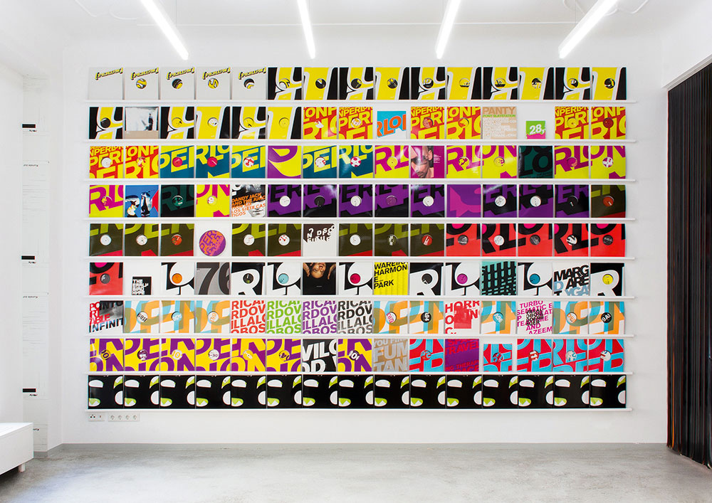
Double Standards’ website features pictures of its Berlin studio and adjacent art space

Whether you're creating a new company or having a spring clean, the temptation might be to go straight to the visuals – images are what designers do best, after all. But Ansel Neckles, co-founder of platform Let's Be Brief who works with brands and creative entrepreneurs to refine their positioning, suggests taking several large steps back. 

"Try to establish what you're trying to achieve in a broader holistic sense – a vision for your work," says Neckles. "From working out what you want to achieve you'll find a natural alignment with the folks that are working in those spaces and the clients that fit with that vision."

This sense of vision, says Chris Rehberger, founder of Berlin studio Double Standards – whose bold typographic-led rebrands have been sought by everyone from orchestras to Lacoste – should hinge on your motivations for getting up and going to work. 

"Dig down deep, ask yourself why you're doing it," says Rehberger, "If you want to do it for stardom that's okay, but communicate that." If that feels too complex, reframe the question to ask where you'd like to be in five years. "It's combining these two poles, where you're coming from and where you want to go," Rehberger adds, "Somewhere in between you find yourself."

5 essential rules of self promotion
02. Align with your clients 

As well as working out what you want to do and why you do it, working out who you want to do it for may also help bring focus to your brand. "Knowing you want to work for Nike is good, but everyone will say that," says Neckles, using an example that often comes up when he's coaching. "Knowing why you want to work for Nike is better." 

The strength of Nike's brand, Neckles explains, is in inspiring motivation in their customer base. "If I'm working as an art director at an agency – which I did for many years – I want to find someone's work that supplements the concepts I've developed," says Neckles. "If you're not about betterment through activity and proactivity, or people don't take that feeling away from your work, there's no way Nike will want to align with you."

Unpicking what potential clients are like, to see whether they match your own approach, is key to pitching for work. "You can then talk about the alignment of your brands rather than 'I make nice posters or I'm really good at typography', which may also be true," adds Neckles.

03. Promote your personality

Hattie Stewart's website

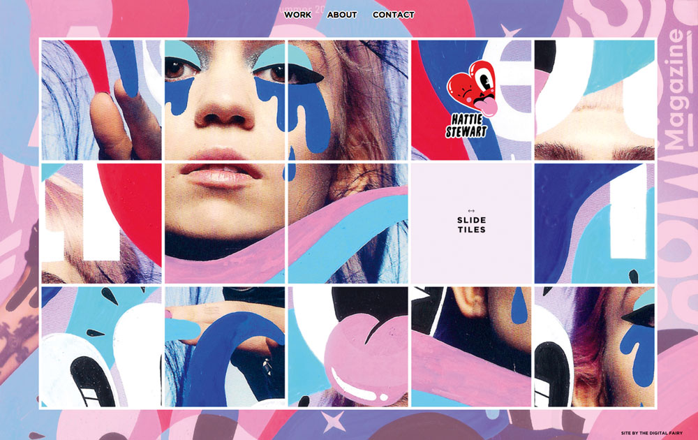
Hattie Stewart’s site features a sliding puzzle for visitors

Whether you're developing identity systems for FTSE giants or you specialise in the most niche comic styles, reflecting your work in your personal brand – and its most obvious representation, your website – is essential.

For example, illustrator Hattie Stewart, who specialises in cheeky flower-filled defacements of celebrities, allows her website visitors to remix her illustrations as a digital sliding puzzle in a similar style to her own re-workings. Manchester-based designer Craig Oldham's site features a playful soundboard – reflective of Oldham's humour, but also of his status as a disruptor who is willing to do things differently. 

04. Consider your logo

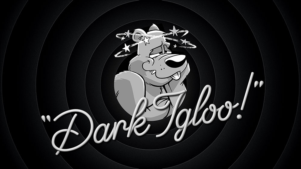
When US design studio Dark Igloo first started working on its own logo, it decided on a mash-up of the state flags of its two founders Dave Franzese and Mark Richard Miller (whose first names combined also produced the 'Dark'). 

Although the state insignia says little about Dark Igloo's current work – which includes motion-heavy branding for Giphy and Miami-inspired art direction for Converse – its treatment of this logo and mascot does. A grizzly bear with 10 stars circling its head, the logo soon morphed into a cartoon character which the studio uses on its site, its lighters-cum-business cards and as its social media avatars.

"It has a dazed personality, joyous and following the bliss," says Miller. Whether he's scrolling through an iPad on Dark Igloo's blog page or laden with swag in the shop, the bear is an anchor across the hectic site. It's fun, nostalgic and showcases the animation skills that Dark Igloo has in buckets. 

Coupled with a surreal landing page and a contacts section that you can play as a racer game, self-initiated projects such as Dark Igloo's ad for an '80s megamix board game that never existed (complete with wizard and dry ice) show prospective clients exactly the feel and ambitious scope of the work Dark Igloo could do for them.

05. Extend your personality through social media

For New York designer Wade Jeffree, the idea of performance is a key facet of his personal visual identity, often appearing in his own work as a way of playing out design ideas or aesthetics. "It's a combination of time, discipline and being critical that has led me to where I am now," says Jeffree of his distinctively surreal and funny vision. 

Just as with Dark Igloo, it's clear from the consistency of his social feeds that Jeffree lives and breathes his personal brand,  expressing himself through colour, awkward angles and weird props – something essential for its longevity. "You also need to be honest with yourself about what you enjoy making – so those things can get better."

Whether you're part of a studio or a solo practitioner, collaborating with a copywriter, fellow designer or developer is a sure-fire way to get some much needed perspective on your personal brand. When Gabriella Marcella redeveloped the website for her print studio Risotto, the advice and skills of developer and motion graphics expert Brendan Bennett was invaluable. 

"It's simultaneously easy and hard being your own client," admits Marcella. "Working with Brendan has been essential to ensuring decisions are challenged and thought-through. It was one big puzzle that was exciting to solve."

06. Nail the text

Dark Igloo's bear mascot

Dark Igloo’s bear mascot is a mash-up of the state flags of its two founders

Although visual branding comes easily to most designers, expressing personality verbally might not be so straightforward. When working with designers and other businesses to help them talk about what they do, copywriter Roshni Goyate starts with a spot of homework: asking participants to bring in an example of brand language from outside their industry that's stood out to them. 

"We go through what is happening in those pieces, what kind of language is being used, and analyse what the brand could have said and why they said what they did," says Goyate. Untangling other brands' verbal communications allows you to see some of the choices at work, and make your own. 

The next step is a series of writing exercises that ask designers to describe what they do in their job to their grandma or to an eight-year-old child. "It's about getting them to step away from using jargon and established ways of communicating what they do, and show their personality instead," she adds.

07. Find the hook

The first impression, Goyate says, counts as much as the 'About' page. "Imagine that the person reading your site has no time at all – which is all of us – but you want them to understand what you do from the first line that they read. With design studios, it's about being provocative or being brave and finding that hook that sets you apart from others."

Goyate also recommends weaving information around a website through interesting labelling, so readers aren't overwhelmed with lots of information all at once. The most important thing is consistency – on your site, in publications and especially on social media. "It's just as important as your visual language," says Goyate. "You wouldn't use different logos on different pieces of collateral or different colours. In the same way, your brand language should be one watertight personality that you're communicating."

Whereas Double Standard's brand language is clipped and conceptually driven, Dark Igloo's is equally as playful as its visual identity. "I think we want there to be a level of entertainment in it, even in the writing." For example, instead of telling readers to click the link to see more about Giphy, they opt for "Ditch water polo practice and fill a powerade bottle with vodka with Giphy to see the rest." The pair also devised the tagline 'Dark Igloo is a company that specialises'.

"We never say what we specialise in," explains Franzese. "We could be puppeteers one month, animators the next, and branding experts the month after that. Come to us with the brains and we'll figure out the execution with you."

Next page: Present your work through the right lens, and three more tips

08. Present your work through the right lens

Studio Output

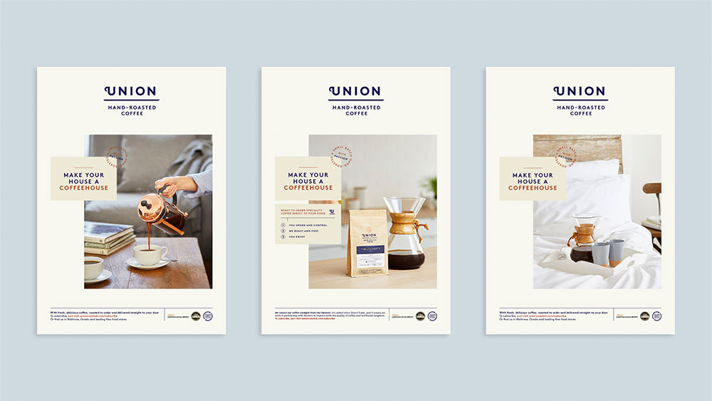
Studio Output reshaped its strategy into one of solving problems for its clients, such as Union Hand-Roasted Coffee

With its 15th anniversary in sight, a couple of years ago, London-based design practice Studio Output worked with a consultant (and former client) to identify how it could reshape its internal positioning. The result was a dramatic new strategy that recalibrated all its projects through the lens of problem-solving. 

Its identity for Union Hand-Roasted Coffee is headlined as 'Supporting scale-up of a fast-growing business' for example, and its branding of Viber 'Driving user acquisition and retention in a congested market'. "The biggest issue for clients is they're going to have a big problem you need them to solve," says Studio Output's client services director Gemma Ballinger. "If you can show that quite succinctly through other work, then it's going to resonate with them."

The repositioning also involved updating the questions that the Studio Output team ask clients in order to ensure the team has solid KPIs to work towards, and by which they can assess their effectiveness at the end of a project. This set of questions was distilled to a skeleton version, which was then used as a script for their website landing page's showreel. 

How to build a thriving studio

Many studios – from ustwo to Made Thought to ILoveDust  – greet visitors to their sites with a film featuring their best projects. Whereas ILoveDust's is moody and atmospheric, ustwo prioritises its R&D model. "If clients are really short on time, it might be all they need to see," adds Ballinger.  

Whether to show sketches, research or opinion pieces is another key factor when defining your brand. Dark Igloo is keen to show the development of its projects, an approach shared by motion specialists ManvsMachine and Universal Everything. 

"Usually the bottom half of the project on our site is behind-the-scenes imagery," says Miller. "That's not just to show you that this can be done on a small scale, but it also represents that we pride ourselves on having fun sets and making things that don't feel like work."

But don't panic if presenting work is not an option. Dark Igloo didn't show any projects for its first three years and freelance designer Craig Jackson, whose clients include Google, BBC, Apple and HSBC, still doesn't. "It was getting really hard to actually show the work due to NDAs so I thought it was time to take things offline for a bit to see what happens," says Jackson. Luckily it was a risk worth taking, with the added bonus that it allows Jackson to handpick work for every project. "The general mystique of it all also seems to go down really well."

09. Consider 'brand in the hand'

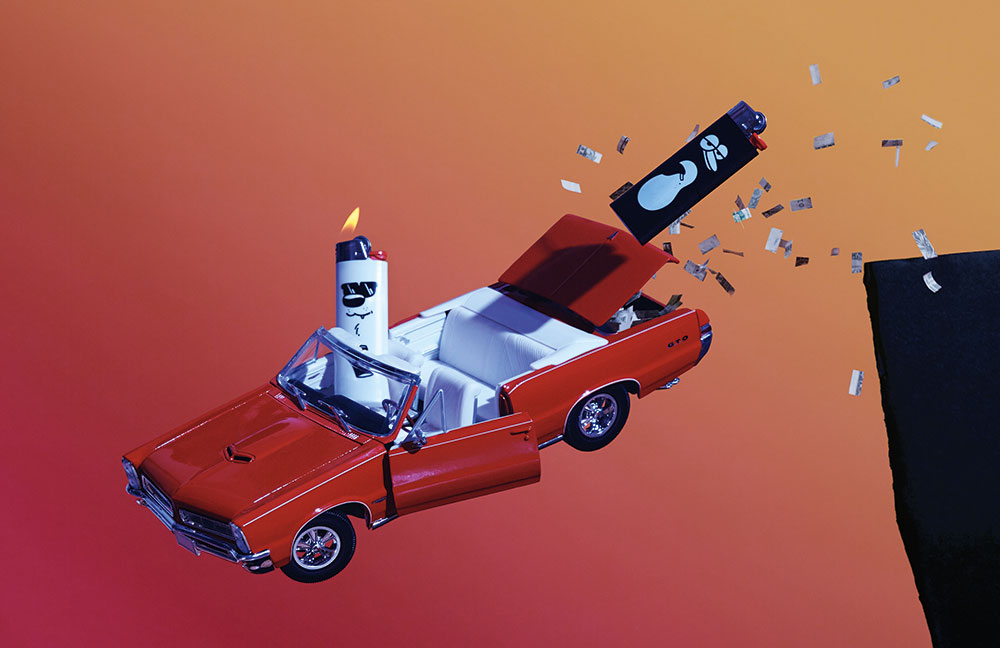
Knowing their lighters were always being pinched, the Dark Igloo team turned them into business cards

Just as Dark Igloo's '80s TV-inspired landing page presents the studio as inventive and fun-loving, its brand is similarly thoughtful when entering the physical realm. Instead of business cards, the duo make lighters to give to potential clients and collaborators. 

"People would always take ours," shrugs Miller. "When we added the characters people started going crazy. You would bump into someone that you hadn't seen in 10 months, and maybe they didn't remember you exactly, but they definitely still had that lighter. It was an incredible touch-point." 

When it first started out, Dark Igloo gave any client taking on a major project with them badges based on a patch that the crew of the Nostromo wore in the film Alien. "It was to show we were going on a journey together," says Franzese. 

Similarly the studio wooed potential clients by sending them lighters inside boxes that were inspired by old Sega packaging and featuring its Contacts page game. "Put ultimate care and craft into something you'd want yourself and share it with someone as a gift," Franzese adds.

The same is certainly true of Double Standards' foray into branded products. Its calendar – which is sold through its online shop, as well as distributed to collaborators – began as something sleek and functional for the studio, and was soon requested by a visiting client. Now, making them is an annual tradition. "Every November I get the first email asking when the new calendar is out," laughs Double Standards' Chris Rehberger.

Similarly, the necessity to create other functional products for projects, and the subsequent interest on Facebook, inspired the studio to design a lamp and table, both now stocked in one of Berlin's coolest concept stores, Andreas Murkudis. Double Standards even opened a physical shop in October.

Even though it operates in a very different landscape, Studio Output also suggests creating something useful when sending mailers. To celebrate its 15th anniversary, the studio gave prospective clients a brainstorming pack complete with branded notebooks, Sharpies, Post-it Notes and a set of thought-starter postcards. 

These featured Studio Output projects on one side and related advice on how to do things such as write briefs on the other. "We do find that things we send physically – because people don't get them much any more – do have a good impact," says Ballinger. "You've just got to make sure you follow it up properly." 

This article was originally published in Computer Arts – the world's leading design magazine. Subscribe to Computer Arts here.

Related articles:

Promote your brand with content marketingTraditional branding is dead21 outstanding uses of colour in branding

3 Tips for Creating a Effective User Flow

Original Source: https://www.webdesignerdepot.com/2019/01/3-tips-for-creating-a-effective-user-flow/

The purpose of almost every web design is to entice customers into buying your products, or subscribing to your services. However, your website can’t accomplish that goal without providing a superior user experience, which is largely defined by a great user flow.

User flow refers to a series of steps that will help your prospects interact with your website without any distractions or hindrances. Thus, it improves your conversion funnel and reduces the bounce rate. The better the user flow is, the higher the sales conversions will be.

However, designing a great user flow is easier said than done. It is a complicated process that involves creating and evaluating different stages. However, if you keep a few things in mind, you can enable a superior user flow quickly.

1. Know Thy Customers

When you build a user flow, the first thing you should think about is your customers. In-depth understanding of the target audience is fundamental to creating a well-defined user flow. If you know what solutions they expect from you, designing a suitable user flow is a lot easier. It will allow you to design a perspective similar to your users, resulting in higher conversions. This is why you need to create user personas as well as map out customer journey of your prospects.

Creating Buyer Personas

You can think of user personas as a set of characteristics that define the majority of your potential users. These are not fictional guesses. Naturally, creating buyer personas involves a lot of qualitative and quantitative research. You need to study and recognize behavior patterns, goals, skills, attitudes, and background information about your customers.

Collect as much information about your users as possible

Collect as much information about your users as possible. Make sure your user persona focuses on the present. You must know how the users are interacting with your product right now, and not speculate on how they will do so in the future.

You should also tie every characteristic of your buyer persona to real data. You can create more than one persona. In such a case, however, you will need to prioritize them as the primary (most relevant) and secondary personas. You will also need to design different user flows for each persona.

Mapping User Journeys

The next critical aspect of knowing your customers is mapping their journey. A user journey is a timeline of user actions that will show you different touch points between the customers and your website. It allows you to understand how users interact with your site and what you can do to improve this engagement. For example, you may be able to find that removing or realigning a particular stage from the journey can improve your conversions.

It usually consists of personas, timelines, touch points, and engagement channels. Detailed customer personas will allow you to identify the trigger points or problems of your consumers. The timeline determines how long the journey will take, while touch points are the stages where users will interact or take specific actions such as registering for your email list.

Engagement channels are nothing but various ways to interact with your customers such as sending promotional emails, text messaging or online chatting. However, a customer journey map will largely depend on your market niche and customer personas.

Identify the Entry Points

In addition to the user personas and buyer journey, you also need to know the various entry points. Entry points are the way your potential customers reach your website. Usually, they will get to your site through one of the following entry points.

Directly typing the web address of your site.
Through social media sites such as Facebook and Instagram. They will click on the links provided in your promotional content to reach your site.
Through organic search (or pay-per-click ads if you are running a PPC campaign) by typing the search queries in search engines such as Google or Bing.
Through advertisements and referrals on other websites, online forums, and blogging sites.
Via email links sent in your promotional emails or monthly newsletters.

Knowing these entry points is crucial because they will affect your user flow. For example, a user coming to your site by clicking a link in a promotional email is likely to be a recurring customer. This user is more interested in availing a specific offer mentioned in the email rather than exploring your site.

On the other hand, someone coming through organic search or social media promotion is more likely to be a first-time visitor. So, they will browse your site for a while and try to find out more about your business before taking any action. They will have a longer user flow with several micro-interactions compared to a returning customer.

2. Avoid Overwhelming Users with Too Much Content

In their attempt to engage users, UX designers often end up creating user flows that are overflowing with content. Unfortunately, this creates the opposite effect. Overwhelming content or features are more likely to distract or frustrate users, resulting in increased bounce rate.

Scrape off Excess Content

Whether it is excessive content or UI elements, you need to minimize as many visual distractions as possible. They are not only unnecessary, but also unattractive. So, make sure to remove all the excessive content, graphics, animations, flashy text, and flickering logos. In other words, you need to embrace simplicity.

If possible, go for a minimalist design. Most static and service-oriented websites can use a minimalist approach to design simple, yet remarkably attractive user flows for their websites. Create site layouts with only the essential elements. Use a balanced mix of images, text and other features that compliment your user flow.

Shorten the Number of Features and Options

A minimalist design also works for various features or options on your website. You need to minimize the features or choices on your site. Too many choices can lead to decision paralysis. Always make sure to provide clear-cut choices that will lead to a specific action.

The easiest way to make that happen is to create the right Calls-To-Action (CTAs) and place them suitably on your site. For example, if the primary goal is to increase your email list, your CTA should focus on asking your prospects to share their email ID with you. You can tempt them with a discount coupon for their next purchase or entice them with a monthly newsletter.

3. Create and Test Your Prototypes

Once you have a firm outline for the user flow, it is time to create different prototypes and test them. A prototype is the tangible variant of your site’s user flow. It will allow you to troubleshoot potential issues before the actual design is built, saving time and money.

Test Your Prototype with Real Users

It is always better to test your user flow prototype with real users. You can use a small group of your target audience (that matches your buyer persona) for testing. Create as many prototypes as you need. Ask this group to check out your prototype and find out what actions they take. Encourage them to provide honest feedback.

It is always better to test your user flow prototype with real users

Once you have their feedback, try to address the bottlenecks and areas of frustration using A/B testing. You can provide more than one alternative to fix a specific issue. A/B testing will help you choose the best possible solution with certainty.

Of course, getting real customers involved in prototype testing is expensive. However, consider this as an investment in building a website with high sales conversions. Alternatively, you can also hire a UX expert to find out potential issues with your existing user flow. It will be less expensive, but may not be as comprehensive as testing with real customers.

Keep Optimizing

Creating a user flow is an ongoing process. Consumers will use new entry points, your competitors will incorporate better user flow elements, and the web will also keep evolving. You will also need to keep optimizing your user flow regularly to stay relevant to these changes.

You can ask your user the following questions:

What do they love about your site? Is there something unique that encourages them to keep coming back?
Which is the most attractive feature of your site and why?
Which part of the site do they find unattractive?
What else would they recommend your website should have?
Finally, how will they rate their user experience (or shopping experience)?

Take this feedback into account when updating your user flow. For example, you can try to change the unattractive elements on your site based on the customer feedback and see if the changes can improve your sales.

Parting Words

User flow and user experience are closely interlinked. If you improve user flow, user experience is also elevated. But, before you set out to design the user flow, make sure to go through these three points. They will help you to prepare for a major user flow overhaul of your website. Once you know what needs to be built, nothing can stop you from attracting your prospects.


Featured image via Unsplash.

Add Realistic Chalk and Sketch Lettering Effects with Sketch’it – only $5!

Source

p img {display:inline-block; margin-right:10px;}
.alignleft {float:left;}
p.showcase {clear:both;}
body#browserfriendly p, body#podcast p, div#emailbody p{margin:0;}

How Improving Website Performance Can Help Save The Planet

Original Source: https://www.smashingmagazine.com/2019/01/save-planet-improving-website-performance/

How Improving Website Performance Can Help Save The Planet

How Improving Website Performance Can Help Save The Planet

Jack Lenox

2019-01-15T13:30:32+01:00
2019-01-16T07:54:18+00:00

You may not think about it often, but the Internet uses a colossal amount of electricity. This electricity needs to be produced somewhere. In most countries, this means the burning of fossil fuels. This, in turn, means that the Internet’s carbon footprint has grown to the point where it may have eclipsed global air travel, and this makes the Internet the largest coal-fired machine on Earth.

The Mozilla Internet Health Report 2018 states that — especially as the Internet expands into new territory — “sustainability should be a bigger priority.” But as it stands, websites are growing ever more obese, which means that the energy demand of the Internet is continuing to grow exponentially.

All the while, the impacts of climate change grow worse and more numerous with each passing year. The vast majority of climate scientists attribute the increasing ferocity and frequency of extreme weather events around the world to climate change, which they largely attribute to human activity. While some question the science, even the world’s largest oil companies now accept it, and concede that their business models need to change.

Every country on Earth (with the exception of the US), is signed up to the Paris Climate Agreement. Although the US controversially pulled out, many of America’s most influential individuals, cities, states, and companies — representing more than half the US population and economy — have retained their commitment to the agreement by way of the America’s Pledge initiative.

Front-end is messy and complicated these days. That’s why we publish articles, printed books and webinars with useful techniques to improve your work. Even better: Smashing Membership with a growing selection of front-end & UX goodies. So you get your work done, better and faster.

Explore Smashing Membership ↬

Smashing Cat, just preparing to do some magic stuff.

As web developers, it’s understandable to feel that this is not an issue over which we have any influence, but this isn’t true. Many efforts are afoot to improve the situation on the web. The Green Web Foundation maintains an ever-growing database of web hosts who are either wholly powered by renewable energy or are at least committed to being carbon neutral. In 2013, A List Apart published Sustainable Web Design by James Christie. For the last three years, the SustainableUX conference has seen experts in web sustainability sharing their knowledge across an array of web-based disciplines.

Since 2009, Greenpeace has been putting pressure on big Internet companies to clean up their energy mix by way of their Clicking Clean campaign. Partly as a result of this campaign, Google announced last year that for the first time it had purchased enough renewable energy to match 100% of its global consumption for operations.

So, apart from powering servers with renewable energy, what else can web developers do about climate change?

“You Can’t Manage What You Can’t Measure”

Perhaps the biggest win when it comes to making websites more sustainable is that performance, user experience and sustainability are all neatly intertwined. The key metric for measuring the sustainability of a digital product is its energy usage. This includes the work done by the server, the client and the intermediary communications networks that transmit data between the two.

With that in mind, perhaps the first thing to consider is how do we measure the energy usage of our website? This is actually a trickier undertaking than you might imagine, and it’s difficult to get precise data here. There are, however, some good fallbacks which we can use that demonstrate energy usage. These include data transfer (i.e. how much data does the browser have to download to display your website) and resource usage of the hardware serving and receiving the website. An obvious metric here is CPU usage, but memory usage and other forms of data storage also play their part.

Data transfer is one thing that we can measure quite easily. All of the major browsers provide developer tools that allow us to measure network activity. In this screenshot below, for example, we can see that loading the Smashing Magazine website for the first time incurs just under a megabyte of data transfer. Firefox’s developer tools actually provide us with two numbers: the first is the uncompressed size of the files that have been transferred, and the latter is the compressed size.

SmashingMag - Firefox Developer Edition

(Large preview)

The most common tool for compressing assets as they travel across the network is gzip, so the difference between those two numbers is typically a result of gzip’s work. This latter number represents how much data has actually been transmitted and is the one to keep an eye on.

Note: There are plenty of other tools that provide us with a metric for data transfer including the much revered WebPagetest.

For measuring CPU usage, Chrome provides us with a granular Task Manager that shows the memory footprint, CPU usage and network activity of individual tabs. For the more adventurous/technical, the top (table of processes) command provides similar metrics on most Unix-like operating systems such as macOS and Ubuntu. Generally speaking, we can also run the top command on any server to which we have shell access.

Fortunately, there are efforts such as WebsiteCarbon and Ecograder that seek to translate these metrics into a specific CO2 figure (in the case of WebsiteCarbon) or a score (in the case of Ecograder).

Sustainable Web Design

Now we know how to measure the impact of our site, it’s time to think about how we can optimize things to make it more sustainable, more performant, and generally a better experience to use.

There are some existing works we can draw on to help us here. In 2016, O’Reilly published “Designing For Sustainability” by Tim Frick. In this book, Tim takes us on a tour of the whys and hows of sustainable design. But we can also draw on a wealth of existing ideas, conference talks and articles which — while not having an explicit focus on sustainability — have a huge overlap with the philosophy of sustainable web design. Particularly good examples here are Brad Frost’s side-project, “Death To Bullshit”, Heydon Pickering’s articles and talks about writing less damn code, and Adam Silver’s blog post, “Designing For Actual Performance.”

If we’re doing a complete redesign of a website, or starting a new one from scratch, we can start with some really high-level questions here. For example, what actually deserves or needs to be on a homepage? And more specifically, what value does each element on a homepage bring? As Heydon Pickering puts it:

“The most performant, accessible and easily maintainable feature of a website is the one that you don’t make in the first place.”

I work on the WordPress.com VIP team, so in this vein, I decided to challenge myself by putting together a minimalist WordPress theme to see how far I could take the techniques of sustainable web design. The result is a theme called Susty, and it can be seen in action on the accompanying website I put together: sustywp.com. In that particular example, the website is delivered in just over 6KB of data transfer, which feels good given that the median website is about 1.5MB.

So, what did I do? Well, I’ll tell you.

Reduce Network Requests

As I have outlined above, network requests are something we can easily measure, so they make for a good starting point. In putting Susty together, I noticed there were a number of HTTP requests going on that didn’t appear to be necessary. For example, WordPress bundles some CSS and JavaScript that detects the usage of emojis and makes sure they don’t appear as illegal characters. There’s nothing inherently wrong with this, but if you aren’t planning to use emojis, or you’re happy and confident that the various system defaults will have you covered, you can prevent these from loading.

This represents a relatively meager saving, but by establishing a philosophy of pruning unwanted code and requests from our pages, we can make much more significant performance improvements. For example:

Are we loading the whole of jQuery for some basic DOM operations?
Could we achieve the same ends with pure JavaScript? You can read about more advanced dead code elimination (aka tree shaking) in this post for Google by Jeremy Wagner.
Do we have a carousel of images?
Do we really need all those images? Are they significantly enhancing the user experience? Or could we reduce it to just one, strong image? Or even randomly show one of a selection of images, to give a sense of dynamism to returning users? By the way, the research that has been done here shows that most users neither like nor engage with carousels.
If we are using a lot of images, would we benefit from providing our images using the WebP format for those browsers that support it?
For the longest time, WebP’s support has been frustratingly limited. But with Firefox due to begin support for it in version 65 (due in January 2019), it’s only a matter of time before remaining stragglers like Safari catch up.
Are we loading hundreds of kilobytes of web fonts?
Are we using all of the web fonts that we’re loading? Do we even need web fonts? Most devices these days have a stack of half-decent fonts, could we just specify a list of fonts we’d like to see arranged by preference? If we must use web fonts, we should make sure our fonts are as performant as is reasonably possible.
Are we embedding YouTube videos?
An embedded YouTube video typically adds about a megabyte of data transfer before anyone even interacts with it. If only a fraction of our users are actually going to sit and watch the embedded video on our website, could we just link to it instead?

Scrutinise Everything

In this vein, we can also interrogate every aspect of our pages. What really deserves to be there? Does our sidebar add any real value, or have we just put one there because convention dictates that websites have sidebars? So, we’ve added one and filled it with crap.

With Susty, I’ve experimented with the somewhat unorthodox approach of relegating the navigation to its own page. This allows me to have pages that are stripped down to literally the bare essentials, with additional content only being loaded at the user’s explicit request. Susty is so lightweight and so fast that I realized through some user research (aka my partner) that the loading of the menu didn’t really feel like a new page, so I decided to make it look like an overlay, with a cross to dismiss that actually just takes you back to the previous page.

As well as helping me to create pleasingly lightweight pages, the relegated navigation also removes the need for any fancy hide/reveal code for showing it. At this point, I’d like to make it clear that Susty is an example of taking sustainable web design techniques to an extreme (I’m not suggesting it’s an archetype of a good website).

Write CSS Like Your Grandmother

When it comes to serious performance enhancement, we should bear in mind that literally every character of code counts. Every character represents a byte, and even after they’ve been compressed by gzip, they’re still taking up weight. CSS is a domain where we often see a lot of bloat. Fortunately, there are a growing number of increasingly complex tools that can help you weed out unused CSS. This fantastic post by Sarah Dayan outlines how she reduced her CSS bundle from 259KB to 9KB!

If we’re starting from scratch, perhaps we should think more deeply about how we write CSS in the first place. Heydon Pickering wrote an excellent post about how we can write CSS in a way that plays to the strengths of how the syntax was designed, and how this can help developers prevent repetition. Heydon also points out how much wastage goes on with excessive usage of divs and classes — both in HTML and CSS.

What Are You Analyzing?

It seems to have become more-or-less ubiquitous on the web for everyone to analyze what their website’s visitors do via tools like Google Analytics, KISSmetrics, Piwik, etc. While I have no doubt that there are legitimate use cases, do we really need analytics on every website? I, for one, have typically added Google Analytics to every site I manage as a matter of course. But it dawned on me relatively recently that for most of the websites in question, this has been an almost completely pointless endeavor: “Oh, six people came to this post via Facebook today.” Who cares?

Unless you really need it, and you’re going to analyze and act upon the data, just ditch analytics and find a better way to spend your time than gawping at the mundanity of how many people visited website X today.

As well as adding to your page weight, usage of something like Google Analytics raises ethical questions around the data you’re collecting on your users on Google’s behalf, i.e. there’s a reason Google provides you with Analytics for free.

Let’s Not Forget The Basics

There’s so much information around these days about the following, but we should never get complacent and forget about them. Alongside everything above, we absolutely should always minify HTML, CSS, and JavaScript, and concatenate where appropriate. We should also compress all images to ensure they are as small as possible, use the right formats in the right settings, and use progressive rendering.

Server-Side Performance

So far, our focus has been almost entirely on the front-end, but a lot of this is made irrelevant if we don’t also optimize things on the server-side. I’ve already mentioned it a couple of times, but we should absolutely enable gzip compression at all times.

We should make serving our website as easy for our server as possible. I predominantly use Nginx, and I have a particular fondness for FastCGI cache and have found it to be especially efficient. If you have shell access to your own server, here’s a post that explains how to configure it. There are less technical options if you don’t have (or don’t want) as much control over your server. A particular favorite in the WordPress space is WP Super Cache.

We should use HTTP2 over HTTPS. Using HTTPS opens up a world of new web technologies like service workers that allow us to treat the network itself as a nice-to-have. If you want to learn more about this, I highly recommend Jeremy Keith’s new book, “Going Offline.”

Note: You also may want to investigate Google’s PageSpeed Module, available for both Apache and Nginx.

Finally, the biggest impact we can have here is to host our websites in data centers powered by renewable energy. In the UK, I can highly recommend Krystal and Kualo in terms of companies with which I directly host my sites. (For a full directory of green web hosts, check out The Green Web Foundation.)

In Conclusion

I hope I have convinced you that it’s worth putting in the effort to make our websites more sustainable. Especially given that in the process we also make our websites:

More performant,
More user-friendly,
More accessible,
More server-friendly,
Better optimized for search engines.

A response that some people have to the idea of sustainable web design — which is not unreasonable — is that it seems to be a very small concession to the environmental cause. Of course, how much of an impact you can have depends on how busy the websites are that you work on. But as well as helping the web become a bit more environmentally friendly, sustainable web design is fundamentally best practice web design.

It’s also worth thinking about offsetting the carbon emissions that you can’t avoid. Carbon offsetting is sometimes derided, and with good cause. The main problem with offsetting is that typically the term over which carbon will be offset is quite long. For example, with tree planting, the figure given for an amount of carbon sequestering is typically based over a 100-year period. So, in terms of reducing carbon emissions now, it’s not really a solution. But it is better than nothing.

The motto of myclimate is to do your best, and offset the rest. I have written a blog post about rolling your own carbon offset scheme. I also highly recommend the 1% For The Planet initiative. Finally, if you are a business owner and would like to join an alliance of companies that want to see better social, environmental and economic justice, check out the Certified B Corporation scheme.

Smashing Editorial
(ra, il)

Grow Your Design Business with Lead Magnets

Original Source: https://www.webdesignerdepot.com/2019/01/grow-your-design-business-with-lead-magnets/

All of the work you do to grow your web design business requires an investment of time and energy. And if you do this song-and-dance routine for long enough, you’re bound to become exhausted by it all.

So, how do you stop doing so much without losing momentum?

Productivity tools help quite a bit as do templates — be they for managing projects, clients, or  to streamline your design work. In other words, anything you can do to automate, delegate, or outsource work completely can reduce how much work you have to do without cutting too much into your profits.

But then there are still those pesky business management activities that require your involvement. Proposal development. Invoicing. Client onboarding. Marketing. And, on top of all that, you have to look for new clients.

Or do you?

If you’re not familiar with lead magnets and how they can improve your client search efforts, it’s time you became acquainted with them.

What Are Lead Magnets?

As a web designer, you instill trust in your clients by providing a quality service. But have you ever thought about how you could turn trust into a profitable long-term relationship with clients?

Lead magnets are one of the best ways to do this.

In summary, a lead magnet is something that you give away for free on your website, that is immensely valuable to clients. In exchange, you get their email address.

Why Would Web Designers Want to Use Lead Magnets?

If you’re feeling overworked and wishing there were an easier way to grow your web design business, pay close attention to these five benefits:

It’s easy for designers. Because you’re already equipped with a great set of design skills, creating lead magnets will be easy for you (unlike other professionals who usually have to pay others to do it for them).
It’s passive lead generation. Hunting for clients online is time-intensive and tedious. Lead magnets lure prospective clients to your site and help sell them on your services.
List building is automated. You know you need to stay in touch with prospects by email if you want to foster them to conversion. With a lead magnet, you don’t have to deal with the hassle of creating your lead list. Everything is automated.
It makes your business memorable. You’re now not just the guy or gal who designed that amazing website for Company X. You’re the full-fledged web design business that provided a prospective client with a valuable tool that improves how they do business.
The ROI is huge. A lead magnet is something you only have to create once. Aside from promoting it on your marketing channels, you don’t have to do any other work.

Why Would Prospects Be Willing to Give You Their Email?

A lead magnet has to have real value attached to it, as you’ll soon see. Because of this, the people who encounter them understand and accept the trade off.

Look, it takes some effort to unsubscribe from email lists you don’t want to be on. Most people won’t put themselves through this if they don’t believe the communication is worth it — which is good! It means you’ve already done some of the work in convincing them of your value as a design expert.

Now you need to use their contact information and convince them to pay for your services.

How Can Web Designers Use Lead Magnets?

Here are some real examples from designers, agencies, and others in this space that make good use of lead magnets:

Informational Content

As a web designer, you might not be too keen on having to write anything. That said, ebooks are an effective way to generate leads on a website.

Web marketing solutions company Bizzuka has examples of these all over their website.

As you can see, it’s appended to the end of a related blog post. It then drives visitors to a landing page with more information and a simple form.

But if you’re really not comfortable or confident in writing an ebook, and don’t want to pay someone to do it for you, think about filming a video or developing an infographic. Just make sure it’s full of valuable information they’ll be dying to get their hands on.

Educational Content

For those of you that enjoy educating others, this could be a good one for you. You’ll just need to find a way to make this relevant to what you do and how you serve clients.

Web Design Journey has a neat example.

As their target audience is web designers and developers, they’ve produced an email course that reveals valuable insights gleaned over nearly two decades of working in the industry.

Again, if you want to avoid any writing, you could always create your own video course and then gate it off with a landing page and form. Or you could publish a webinar (live or pre-recorded) that offers highly targeted educational content.

Design Templates

It’s up to you to decide what type of design templates would be the most valuable to your prospective client base. Realistically, these templates will be things like:

Icon sets
Email designs
Infographic wireframes
Presentation shells
Social media kits

Basically, focus on the smaller marketing bits that require a designer’s touch and that they won’t be able to handle on their own. Once they realize how helpful those were, they’ll come to you for web design assistance.

If you’re looking for inspiration on how to promote this type of lead magnet, take WebDesignerDepot’s lead:

Visitors get to see the awesome lead magnet for themselves, but can only gain access to editable files through a form.

Audits

When you first started designing websites for clients, you probably offered consultation and auditing services for free. But you recognize that time equals money, so why give away valuable advice for free and run the risk of them taking your tips to the competition?

A safe way to do this is to turn your audits into lead magnets. This way, you at least get their email address, so you can follow up post-delivery and work on convincing them to work with you through that direct channel.

Lounge Lizard has found a neat way to do this.

When visitors take a peek under their list of Services, they find “Free Website Audit” at the bottom of the list. They’re then taken to the simplest of landing pages:

Lounge Lizard proves that they’re not out to waste anyone’s time. There’s no big sales pitch and no need to ask for excessive information. Just “what’s your domain and how can we contact you”, and that’s it!

Wrapping Up

Before you do anything else, make sure you have an impressive-looking website that attracts visitors. And also get yourself on social media channels like Twitter. Lead magnets don’t usually take too long to make, but you don’t want to waste time building one if you don’t have a reliable place to house it or strategies in place to promote it.


Featured image via DepositPhotos.

Add Realistic Chalk and Sketch Lettering Effects with Sketch’it – only $5!

Source

p img {display:inline-block; margin-right:10px;}
.alignleft {float:left;}
p.showcase {clear:both;}
body#browserfriendly p, body#podcast p, div#emailbody p{margin:0;}