Buildings Wave Animation with Three.js

Original Source: http://feedproxy.google.com/~r/tympanus/~3/qxwRZJKr2kU/

This tutorial is going to demonstrate how to build a wave animation effect for a grid of building models using three.js and TweenMax (GSAP).

Attention: This tutorial assumes you already have a some understanding of how three.js works.
If you are not familiar, I highly recommend checking out the official documentation and examples .


Inspiration

Source: View
by: Baran Kahyaoglu


Core Concept

The idea is to create a grid of random buildings, that reveal based on their distance towards the camera. The motion we are trying to get is like a wave passing through, and the farthest elements will be fading out in the fog.

side-view

We also modify the scale of each building in order to create some visual randomness.

Getting started

First we have to create the markup for our demo. It’s a very simple boilerplate since all the code will be running inside a canvas element:

<html lang=”en”>
<head>
<meta charset=”UTF-8″>
<meta name=”viewport” content=”width=device-width, initial-scale=1.0″>
<meta http-equiv=”X-UA-Compatible” content=”ie=edge”>
<meta name=”target” content=”all”>
<meta http-equiv=”cleartype” content=”on”>
<meta name=”apple-mobile-web-app-capable” content=”yes”>
<meta name=”mobile-web-app-capable” content=”yes”>
<title>Buildings Wave</title>
<script src=”https://cdnjs.cloudflare.com/ajax/libs/three.js/100/three.min.js”>></script&gt
<script src=”https://Threejs.org/examples/js//loaders/OBJLoader.js” &gt</script&gt
<script src=”https://Threejs.org/examples/js/controls/OrbitControls.js”&gt</script&gt
<script src=”https://cdnjs.cloudflare.com/ajax/libs/gsap/1.20.3/TweenMax.min.js”&gt</script&gt
</head>
<body>
</body>
</html>

Basic CSS Styles
html, body {
margin: 0;
padding: 0;
background-color: #fff;
color: #fff;
box-sizing: border-box;
overflow: hidden;
}

canvas {
width: 100%;
height: 100%;
}

Initial setup of the 3D world

We create a function called init inside our main class. All subsequent methods will be added inside this method.

init() {
this.group = new THREE.Object3D();
this.gridSize = 40;
this.buildings = [];
this.fogConfig = {
color: ‘#fff’,
near: 1,
far: 138
};
}

Creating our 3D scene
createScene() {
this.scene = new THREE.Scene();

this.renderer = new THREE.WebGLRenderer({ antialias: true, alpha: true });
this.renderer.setSize(window.innerWidth, window.innerHeight);

this.renderer.shadowMap.enabled = true;
this.renderer.shadowMap.type = THREE.PCFSoftShadowMap;

document.body.appendChild(this.renderer.domElement);

// this is the line that will give us the nice foggy effect on the scene
this.scene.fog = new THREE.Fog(this.fogConfig.color, this.fogConfig.near, this.fogConfig.far);
}

Camera

Let’s add a camera for to scene:

createCamera() {
const width = window.innerWidth;
const height = window.innerHeight;

this.camera = new THREE.PerspectiveCamera(20, width / height, 1, 1000);

// set the distance our camera will have from the grid
// this will give us a nice frontal view with a little perspective
this.camera.position.set(3, 16, 111);

this.scene.add(this.camera);
}

Ground

Now we need to add a shape to serve as the scene’s ground

addFloor() {
const width = 200;
const height = 200;
const planeGeometry = new THREE.PlaneGeometry(width, height);

// all materials can be changed according to your taste and needs
const planeMaterial = new THREE.MeshStandardMaterial({
color: ‘#fff’,
metalness: 0,
emissive: ‘#000000’,
roughness: 0,
});

const plane = new THREE.Mesh(planeGeometry, planeMaterial);

planeGeometry.rotateX(- Math.PI / 2);

plane.position.y = 0;

this.scene.add(plane);
}

Load 3D models

Before we can build the grid, we have to load our models.

models

loadModels(path, onLoadComplete) {
const loader = new THREE.OBJLoader();

loader.load(path, onLoadComplete);
}

onLoadModelsComplete(model) {
// our buildings.obj file contains many models
// so we have to traverse them to do some initial setup

this.models = […model.children].map((model) => {
// since we don’t control how the model was exported
// we need to scale them down because they are very big

// scale model down
const scale = .01;
model.scale.set(scale, scale, scale);

// position it under the ground
model.position.set(0, -14, 0);

// allow them to emit and receive shadow
model.receiveShadow = true;
model.castShadow = true;

return model;
});

// our list of models are now setup
}

Ambient Light
addAmbientLight() {
const ambientLight = new THREE.AmbientLight(‘#fff’);

this.scene.add(ambientLight);
}

Grid Setup

Now we are going to place those models in a grid layout.

initialgrid

createGrid() {
// define general bounding box of the model
const boxSize = 3;

// define the min and max values we want to scale
const max = .009;
const min = .001;

const meshParams = {
color: ‘#fff’,
metalness: .58,
emissive: ‘#000000’,
roughness: .18,
};

// create our material outside the loop so it performs better
const material = new THREE.MeshPhysicalMaterial(meshParams);

for (let i = 0; i < this.gridSize; i++) {
for (let j = 0; j < this.gridSize; j++) {

// for every iteration we pull out a random model from our models list and clone it
const building = this.getRandomBuiding().clone();

building.material = material;

building.scale.y = Math.random() * (max – min + .01);

building.position.x = (i * boxSize);
building.position.z = (j * boxSize);

// add each model inside a group object so we can move them easily
this.group.add(building);

// store a reference inside a list so we can reuse it later on
this.buildings.push(building);
}
}

this.scene.add(this.group);

// center our group of models in the scene
this.group.position.set(-this.gridSize – 10, 1, -this.gridSize – 10);
}

Spot Light

We also add a SpotLight to the scene for a nice light effect.

spot-light

addSpotLight() {
const light = { color: ‘#fff’, x: 100, y: 150, z: 100 };
const spotLight = new THREE.SpotLight(light.color, 1);

spotLight.position.set(light.x, light.y, light.z);
spotLight.castShadow = true;

this.scene.add(spotLight);
}

Point Lights

Let’s add some point lights.

point-lights

addPointLight(params) {
// sample params
// {
// color: ‘#00ff00’,
// intensity: 4,
// position: {
// x: 18,
// y: 22,
// z: -9,
// }
// };

const pointLight = new THREE.PointLight(params.color, params.intensity);

pointLight.position.set(params.position.x, params.position.y, params.position.z);

this.scene.add(pointLight);
}

Sort Models

Before we animate the models into the scene, we want to sort them according to their z distance to the camera.

sortBuildingsByDistance() {
this.buildings.sort((a, b) => {
if (a.position.z > b.position.z) {
return 1;
}

if (a.position.z < b.position.z) {
return -1;
}

return 0;
}).reverse();
}

Animate Models

This is the function where we go through our buildings list and animate them. We define the duration and the delay of the animation based on their position in the list.

showBuildings() {
this.sortBuildingsByDistance();

this.buildings.map((building, index) => {
TweenMax.to(building.position, .3 + (index / 350), { y: 1, ease: Power3.easeOut, delay: index / 350 });
});
}

Here is how a variation with camera rotation looks like:
https://tympanus.net/codrops/wp-content/uploads/2019/01/variation.mp4

Credits

Models by Backlog Studio. Check out their Instagram.

Buildings Wave Animation with Three.js was written by Ion D. Filho and published on Codrops.

What’s Really Behind Most UX Issues

Original Source: https://www.sitepoint.com/whats-behind-most-ux-issues/

What’s Really Behind Most UX Issues

Let’s start with this premise:

The vast majority of UX defects don’t come from a lack of skill or talent or technique or process.

They don’t exist because there are no UXers or Designers on staff. They don’t exist because nobody “gets” the idea of good UX or UI design.

They don’t, in my experience, exist because people don’t know what they’re doing.

That certainly happens, to be sure. But in the last five years of my nearly three-decade career in particular, it’s exceedingly rare.

Instead, what I’ve seen is that UX and design issues that are present in software products — sites, apps, systems — come directly from misalignment of individual intent. And there are three flavors of this: personal, organizational and political.

And in the interest of being even more mysterious and cryptic, I’ll say this: while I’m sure you’ve heard that you should focus on and uncover that intent, I say it’s a hell of a lot deeper than that.

In fact, the most mission-critical thing that needs to happen in project planning is the one thing that’s almost never discussed. You don’t read about it in articles or blog posts. You don’t see it in videos or online courses or keynote speeches.

In fact, virtually no one talks about it at all.

Which, of course, is why you and I, dear reader, are here together now. To share a story.

I worked with a client several years ago, and my experience with them taught me a lesson I’ve never forgotten — and never will.

That lesson came, like most things, the hard way.

The client was a 2.8-billion-dollar organization, at the top of its industry. Basically, they served as in-house fulfillment for nearly every piece of personalized, printed collateral investors receive from just about any and every investment organization you can think of. They owned 85% of that market.

But being that big also meant that they were unbelievably sloooooooooooooow — slow to adapt to change, to the pace of technology, to the growing demand by end-consumers to research and manage their investments themselves.

So the company’s clients — the Merrill Lynches and TD Ameritrades and Edward Jones of the world — had been screaming for an online, self-service portal solution from my client for well over a year … and they had nothing to offer but promises of “we’re working on it.”

By the time I got to them, several of their biggest clients had become tired of waiting; they cancelled their million-dollar contracts and began developing their own solutions for their customers. So big, big money was being lost on a steady basis.

In digging to find out why they weren’t able to at least roll out a solid MVP for clients, I learned that the stumbling block was a disconnected workflow made up of several legacy systems and an unreal amount of human intervention. Add in a shocking lack of consistency across processes and practices and a willingness to jump and deliver different flavors of custom functionality for every client, and you’ve got a recipe for chaos.

Every single job was, in essence, a custom project, with very little repeatable efficiency.

Fast-forward: after several months, we developed a recommendation for replacing these cobbled-together systems and processes with Adobe Livecycle, which, at the time, had the processing/automation power and the tight integration they needed between the print and digital worlds. So I and four other people dotted i’s and crossed t’s and presented comprehensive recommendations and budgets.

And were met with complete and total hostility from stakeholders most closely connected to customer fulfillment.

I’m not talking about full-blown screaming matches, argument or pushback. More like a deep, dangerously simmering silent treatment.

The post What’s Really Behind Most UX Issues appeared first on SitePoint.

Complete Guide to Using WebP Image Format

Original Source: https://www.hongkiat.com/blog/webp-guide/

WebP, or unofficially pronounced as weppy, is an image format introduced by Google Developers around 5 years ago. if you are a web designer, or a developer who strives to reduce and optimize your…

Visit hongkiat.com for full content.

How to Tell If Vue.js Is the Right Framework for Your Next Project

Original Source: https://www.sitepoint.com/vue-right-framework/

How To Tell If Vue.js Is the Right Framework for Your Next Project

Vue.js grew from a one-man project to a JavaScript framework everyone’s talking about. You’ve heard about it from your front-end colleagues and during conferences. You’ve probably read multiple comparisons between Vue, React, and Angular. And you’ve probably also noticed that Vue outranks React in terms of GitHub stars.

All that’s made you wonder whether Vue.js is the right framework for your next project? Well, let’s explore the possibilities and limitations of Vue to give you a high-level look at the framework and make your decision a little easier.

Please note that this piece will draw strongly on Monterail’s experience with Vue and other JavaScript frameworks. As a software development company, we’ve delivered around thirty Vue-based projects, and we strongly evangelize it among developers and businesses with initiatives like State of Vue.js and Vue Newsletter.

Let’s dive in.

Vue.js Overview

Back in 2014, the first public version of Vue.js was released. Its template syntax — similar to AngularJS — and a component-based architecture — similar to what React offered — made it approachable to JS devs at the time. Vue.js really took off only a year later, when it was discovered by the Laravel (popular PHP framework) community.

A few years later, it now records the highest satisfaction rating among all JS frameworks (91.2%), according to State of JS data. More and more devs report having heard of it and the wish to use it in the future. Companies like IBM, GitLab, and Adobe have already adopted Vue for their products.

According to Evan You, the creator of Vue:

The original goal was to “scratch my own itch,” to create a frontend library that I would enjoy using myself.

And apparently he and the whole Community managed to accomplish this mission. But what is so special about Vue that makes programmers want to use it?

This is what the project’s official website says:

Vue (pronounced /vjuː/, like view) is a progressive framework for building user interfaces. Unlike other monolithic frameworks, Vue is designed from the ground up to be incrementally adoptable. The core library is focused on the view layer only, and is easy to pick up and integrate with other libraries or existing projects.

There it is! Progressive and easy to pick up and integrate. But is that enough to make it your primary choice?

The Business Perspective on Vue

At Monterail, we believe that it should not make a substantial difference to a JavaScript programmer which framework or library is chosen for an app’s front end. Building blazing fast, beautiful, and maintainable products is not trivial at all, but if something is feasible, it’s feasible with any modern JS framework.

Yet, we love Vue.js and recommend it to our clients in most cases. That’s because Vue is great for a number of reasons. Let’s explore them.

When Your App Is Full of Animations and Interactive Elements

Vue offers a truly elegant and flexible API — not just for composable architecture for the front end, but also for seamless transitions between views. Transitions and animations enhance user experience, smoothing changes between states. Human brains love movement, so it’s an important part of modern websites and apps. Animating is key when we need to grab user attention, when we want to keep the user on our website for a longer stretch, or simply to make our product more fun.

The release of Vue 2.0 has introduced a lot more flexibility with regard to transitions. We now have more granular access to the transition hooks — which, in turn, makes it possible to leverage third-party libraries and deliver on complex animations while still using Vue at the core. That means there are tons of different ways of doing animations in Vue. All you need to do is apply a custom attribute and add some CSS magic. Vue provides us with <transition> and <transition-group> components already built in and based on CSS animations, allowing for both CSS and JS hooks. It also integrates easily with non-HTML elements — like SVG, for example.

In our portfolio, we have this really great example of a project with many different transitions, where we used Vue.js in tandem with Nuxt. We managed to deliver a beautiful UI for Easyship that was 37% more performant than their AngularJS version. Vue’s incredible possibilities in terms of transitions also make it a good choice for marketing campaign websites. Airbnb’s “Until we all belong” is another great example — an award-winning campaign delivered in six weeks, written completely with Vue.js.

The post How to Tell If Vue.js Is the Right Framework for Your Next Project appeared first on SitePoint.

Develop an Android App with React Native & Publish on Google Play

Original Source: https://www.sitepoint.com/develop-an-android-app-with-react-native-publish-on-google-play/

Long-scroll mobile illustration

This article was originally published on the Okta developer blog. Thank you for supporting the partners who make SitePoint possible.

As mobile app usage is expected to continue to grow, now is as good a time as any to get into the market. Android is by far the most popular OS worldwide and the dominant way to get Android apps to phone users is the Google Play Store. In this tutorial, you’ll build a React Native app and I’ll walk you through everything from how to pick a design, as well as setting up your React Native environment, tips for getting the most out of your editor, and publishing it on Google Play.

This is what the eventual app will look like:

Final Result

For this tutorial, I checked out Karan Goel’s Mega Project List for project inspiration. You’ll be building the Prime Factorization problem which takes a number and returns its prime factors.

Determine Interface Theming for Your React Native App

Outside of application logic, UI and theming decisions are some of the most important that you’ll make for your app This includes the controls like dropdowns and buttons, as well as the layout on the screen. Since we are using a React-based technology, we’re going to use Styled Components which is a popular, light-weight approach to theming React applications (and it also works great on React Native). There’s an entire page listing components and component-systems based on Styled Components. In this tutorial, you’ll be using Styled Components to build up components yourself.

Set Up Your Android Production Environment

In order to build the eventual APK (the format of the app you’ll upload to the store), you need to install Android Studio. Once done make sure you have SDK version 27 as this is what React Native uses.

Install the JDK

You also need to make sure you have a recent Java Development Kit installed (like version 8). The installation differs depending on your platform. You can use Oracle’s Java SDK or use SDKMAN to install other options, like OpenJDK.

Add the React Native CLI and Initialize the Skeleton

Next, you should install the React Native Command Line Interface. For this, you should make sure you have Node installed which varies depending on your operating system. (I am using version 8.12.0).

npm install -g react-native-cli@2.0.1

You should have a command react-native available to you, which includes the init option.

react-native init prime_components

This will create the prime_components directory and put a React Native project inside, with a runnable skeleton. Change to the directory, connect your Android phone or run an emulator (after having installed Android Studio), and run the project.

NOTE: If Android Studio prompts you to open a project before you can create an emulator, you can point to the prime_components/android directory.

cd prime_components
react-native run-android

Welcome to React Native

To see the output you’ll upload to the Play Store, go to android/app/build/outputs/apk/debug. You should see an app-debug.apk that is around 8MB in size.

Reduce the Output Size of Your Android App

You want to make sure your users have the smallest download possible. It’s already quite small (around 8MB) because you’re using the command line (something like Expo produces 25MB for even basic apps) but we can reduce it further. Go to android/app/build.gradle and change the following variables to be true:

def enableSeparateBuildPerCPUArchitecture = true
def enableProguardInReleaseBuilds = true

You’ll also have to remove the ndk section of defaultConfig to removing the conflicting configuration in ndk abiFilters error:

ndk {
abiFilters “armeabi-v7a”, “x86”
}

Now after re-running react-native run-android you should see two (much smaller – between 4MB and 5MB) APKs in the output directory.

Add Linting to Your React Native App

Writing any JavaScript (like React) requires tools to ensure you haven’t made any obvious mistakes which can be a big help for beginners. The most common of these is ESLint which can be plugged right into your project and editor.

First, add the linter using NPM:

npm install -D eslint@5.9.0 babel-eslint@10.0.1

One common set of plugins is Airbnb’s configuration so add those too:

npm install -D eslint-config-airbnb@17.1.0 eslint-plugin-jsx-a11y@6.1.2 eslint-plugin-react@7.11.1 eslint-plugin-import@2.14.0

Now put the following into .eslintrc.js (you’ll need to create this file):

module.exports = {
‘extends’: ‘airbnb’,
‘parser’: ‘babel-eslint’,
‘env’: {
‘jest’: true,
},
‘rules’: {
‘no-use-before-define’: ‘off’,
‘react/jsx-filename-extension’: ‘off’,
‘react/prop-types’: ‘off’,
‘comma-dangle’: ‘off’
},
‘globals’: {
“fetch”: false
}
}

Now you just need to add the plugins to your editor. For Sublime there’s ESLint which gives you an output of errors (or issues) with CTRL + ALT + e (Cmd + Option + e on Mac). There also one for VSCode.

ESLint

A lot of these errors can be fixed automatically using the eslint –fix command which you can run from your editor with the ESLint Fix package.

Add Styled Components for React Native

React and React Native build interfaces using web technologies, i.e. HTML, CSS, and JavaScript. One very popular library to use with React (and React Native) is Styled Components which clean up how one adds CSS to your components.

For example, take a look at the following code, taken from the React Native sample app (which is what you get with react-init):

export default class App extends Component<Props> {
render() {
return (
<View style={styles.container}>
<Text style={styles.welcome}>Welcome to React Native!</Text>
<Text style={styles.instructions}>To get started, edit App.js</Text>
<Text style={styles.instructions}>{instructions}</Text>
</View>
);
}
}

const styles = StyleSheet.create({
container: {
flex: 1,
justifyContent: ‘center’,
alignItems: ‘center’,
backgroundColor: ‘#F5FCFF’,
},
welcome: {
fontSize: 20,
textAlign: ‘center’,
margin: 10,
},
instructions: {
textAlign: ‘center’,
color: ‘#333333’,
marginBottom: 5,
},
});

You declare your DOM elements (View, Text), linking them to styles, and then create the stylesheet later.

With Styled Components you would do the following:

const Container = styled.View`
flex: 1;
justify-content: center;
align-items: center;
background-color: #F5FCFF;
`;

const Welcome = styled.Text`
fontSize: 20;
text-align: center;
margin: 10;
`;

const Instructions = styled.Text`
text-align: center;
color: #333333;
margin-bottom: 5;
`;

export default class App extends Component<Props> {
render() {
return (
<Container>
<Welcome>Welcome to React Native!</Welcome>
<Instructions>To get started, edit App.js</Instructions>
</Container>
);
}
}

It’s both cleaner and more portable (CSS names don’t clash, etc.).

To install it, run npm install styled-components@4.1.1 from the root directory.

Add Custom Fonts to Your React Native App

To get a custom font like Racing Sans One into your application you first need to download the ttf and put it into assets/fonts (you will need to create this directory). Then add the following to your package.json:

“rnpm”: {
“assets”: [
“./assets/fonts/”
]
}

Finally run react-native link from the command line. You should now see your font inside of android/app/src/main/assets/fonts. You should be able to use it now. Create a components folder and put the following inside of components/Header.js:

import styled from ‘styled-components/native’;

export default styled.Text`
color: black;
font-family: RacingSansOne-Regular;
font-size: 32px;
margin-top: 120px;
background-color: transparent;
text-align: center;
`;

Then, import this into your App.js and add <Heading>Welcome</Heading> above the Text nodes:

import Header from ‘./components/Header’;

export default class App extends Component<Props> {
render() {
return (
<View style={styles.container}>
<Header>Welcome</Header>
<Text style={styles.welcome}>Welcome to React Native!</Text>
<Text style={styles.instructions}>To get started, edit App.js</Text>
<Text style={styles.instructions}>{instructions}</Text>
</View>
);
}
}

And you should get a nicely formatted header:

Custom fonts

Adjust Your App to be Fullscreen on Android

To get your app to not show the title bar, go to android/app/src/main/res/values/styled.xml and add the following inside the <styles> element:

<item name=”android:windowFullscreen”>true</item>

Now when you re-run you should see the navigation bar is gone.

Create the Android App Components

It can take a long time to decide on a final design, with layout, colors, and fonts. This is often an iterative process. Here you’ll go through how to build up the final result you saw at the start – which was inspired by related online tutorials and styling examples – but remember that it takes time to get to something you like.

Change App.js to the following:

import React from ‘react’;
import { Container, Header, Input, Keypad, ButtonRow } from ‘./components’;

const App = () => (
<Container>
<Header>Prime Components</Header>
<Input>123456</Input>
<Keypad>
<ButtonRow keys={[‘1′,’2′,’3’]} />
<ButtonRow keys={[‘4′,’5′,’6’]} />
<ButtonRow keys={[‘7′,’8′,’9’]} />
<ButtonRow keys={[‘0′,’Clear’,’Go’]} />
</Keypad>
</Container>
);

export default App;

You can see here how clean things are with Styled Components. We have a header, an input and a keypad (all names you choose) all surrounded by a container. No superfluous information. The styling happens in the components.

Create the components directory. Inside components/index.js put the following:

export { default as Input } from ‘./Input’;
export { default as Container } from ‘./Container’;
export { default as Header } from ‘./Header’;
export { default as Keypad } from ‘./Keypad’;
export { default as Button } from ‘./Button’;
export { default as ButtonRow } from ‘./ButtonRow’;

This is just a convenience module that allows for the importing as in App.js, i.e. ` import { Container, Header, Input, Keypad, ButtonRow } from ‘./components’;`. Otherwise, you’d have to import each component on a separate line.

Put this into components/Container.js: (Note: you must use capital letters for your components in React Native!)

import styled from ‘styled-components/native’;

export default Container = styled.View`
flex: 1;
`;

Very simple: you are extending a View component and assigning a flex value of one (which in this context means “take up everything”).

components/Header.js:

import styled from ‘styled-components/native’;

export default Header = styled.Text`
flex: 1.5;
font-size: 80px;
font-family: Chathura-ExtraBold;
background-color: rgb(29, 31, 33);
color: gold;
text-align: center;
`;

Also, a styled text component, with large, centered fonts, a gold color, and grey background. Make sure you install the Chathura font from Google Fonts as before!

components/Input.js:

import styled from ‘styled-components/native’;

export default Input = styled.Text`
flex: 2;
text-align: right;
font-family: Audiowide-Regular;
text-align-vertical: center;
font-size: 70;
color: firebrick;
background-color: gold;
`;

Similar to before except now with the Audiowide-Regular font (also available from Google Fonts).

components/Keypad.js:

import styled from ‘styled-components/native’;

export default Keypad = styled.View`
flex: 6;
background-color: rgb(29, 31, 33);
padding-top: 10px;
padding-bottom: 10px;
`;

Also just a styled view (essentially a container like a <div> in HTML).

components/ButtonRow.js:

import React from ‘react’;
import styled from ‘styled-components/native’;
import { Button } from ‘.’;

const RowBox = styled.View`
flex: 1;
flex-direction: row;
`;

export default ButtonRow = ({keys}) => (
<RowBox>
{ /* https://stackoverflow.com/a/32157488 */ }
{keys.map(key => (
<Button text={key} key={key} />
))}
</RowBox>
);

Here, things get complicated. You are importing a Button from the current directory (which you’ll create in a second), creating a component called RowBox which is not exported, and then ButtonRow is defined having a React property called keys.

Then you are mapping each key to a button component. This is a clean way of looping through an array as with for each and using the value to set both the text and key attributes (you must set a key attribute to make the DOM object unique!). You’ll be using the text to render the button.

components/Button.js:

import React from ‘react’;
import styled from ‘styled-components/native’;

/* https://kylewbanks.com/blog/react-native-tutorial-part-2-designing-a-calculator */

/* https://github.com/styled-components/styled-components/issues/149 */
const ButtonBox = styled.TouchableHighlight.attrs({
underlayColor: ‘#193441’,
})`
flex: 1;
align-items: center;
justify-content: center;
background-color: rgb(39, 41, 43);
border-radius: 10px;
margin: 5px;
`;

const ButtonText = styled.Text`
font-size: 30;
font-family: Orbitron-Bold;
color: ${props => props.text==”Go” ? “green” : “orange”};
`;

handleButtonPress = (value) => {

};

export default Button = ({text}) => (
<ButtonBox onPress={() => handleButtonPress()}>
<ButtonText text={text}>{text}</ButtonText>
</ButtonBox>
);

This is the last component. You start by creating a ButtonBox which just acts as a container over the whole button. It is using TouchableHighlight which is a React Native component that will change color when touched. The styling is normal except for the underlay color (the color you see when touching) since this needs to be hacked to work in Styled Components.

The post Develop an Android App with React Native & Publish on Google Play appeared first on SitePoint.

94% off Modern Copywriting Course: Writing Copy That Sells in 2019

Original Source: http://feedproxy.google.com/~r/Designrfix/~3/Rs9aCAG_hsM/94-off-modern-copywriting-course-writing-copy-that-sells-in-2019

Raise your hands if this sounds familiar. You are too busy that you don’t have time to site and write. You know you have a story to tell, but you’re not a great writer. You’ve spent countless hours on your visuals. By the time you get around to writing copy for your website, your words […]

The post 94% off Modern Copywriting Course: Writing Copy That Sells in 2019 appeared first on designrfix.com.

The best drawing tablet: our pick of the best graphics tablets in 2019

Original Source: http://feedproxy.google.com/~r/CreativeBloq/~3/YaWZ6nyOeLo/best-drawing-tablet

Forget the days when you only had one or two drawing tablets to choose from – now, designers and creatives are spoilt for choice, with a huge range of different types of tablets and displays that covers all imaginable needs and wants. 

From dedicated graphic specialists like Wacom and Huion to tech giants like Apple and Samsung, loads of companies are getting in on the action – and that means that when it comes to choice, creatives have never had it so good. So what's the best drawing tablet you can get? We're here to help.

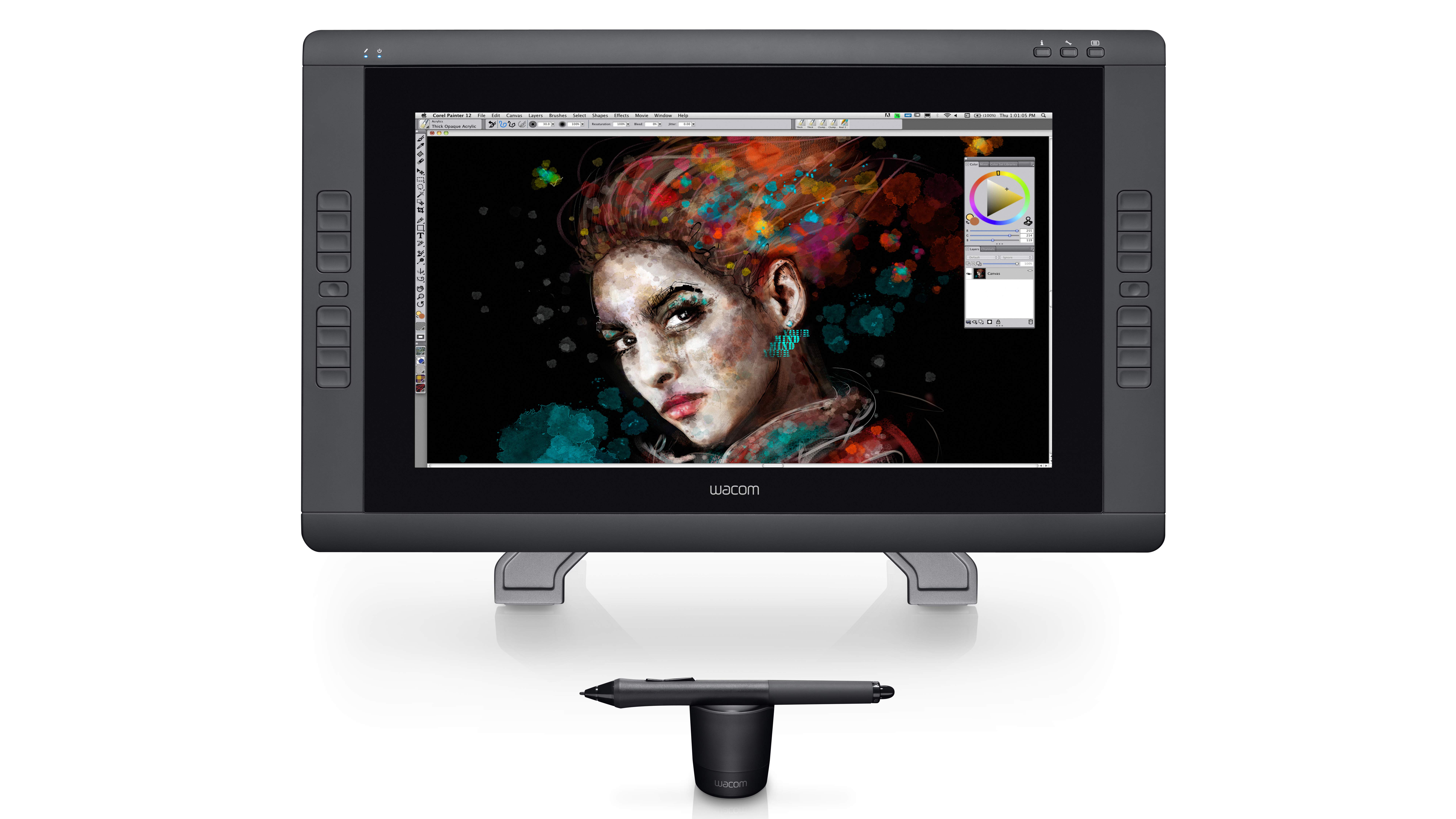
Right now, the very best drawing tablet you can buy is the Wacom Cintiq 22HD touch pen display. But it also has serious competition in the form of Apple’s latest iPad Pro 12.9, released in November 2018 and boasting some serious processing power. 

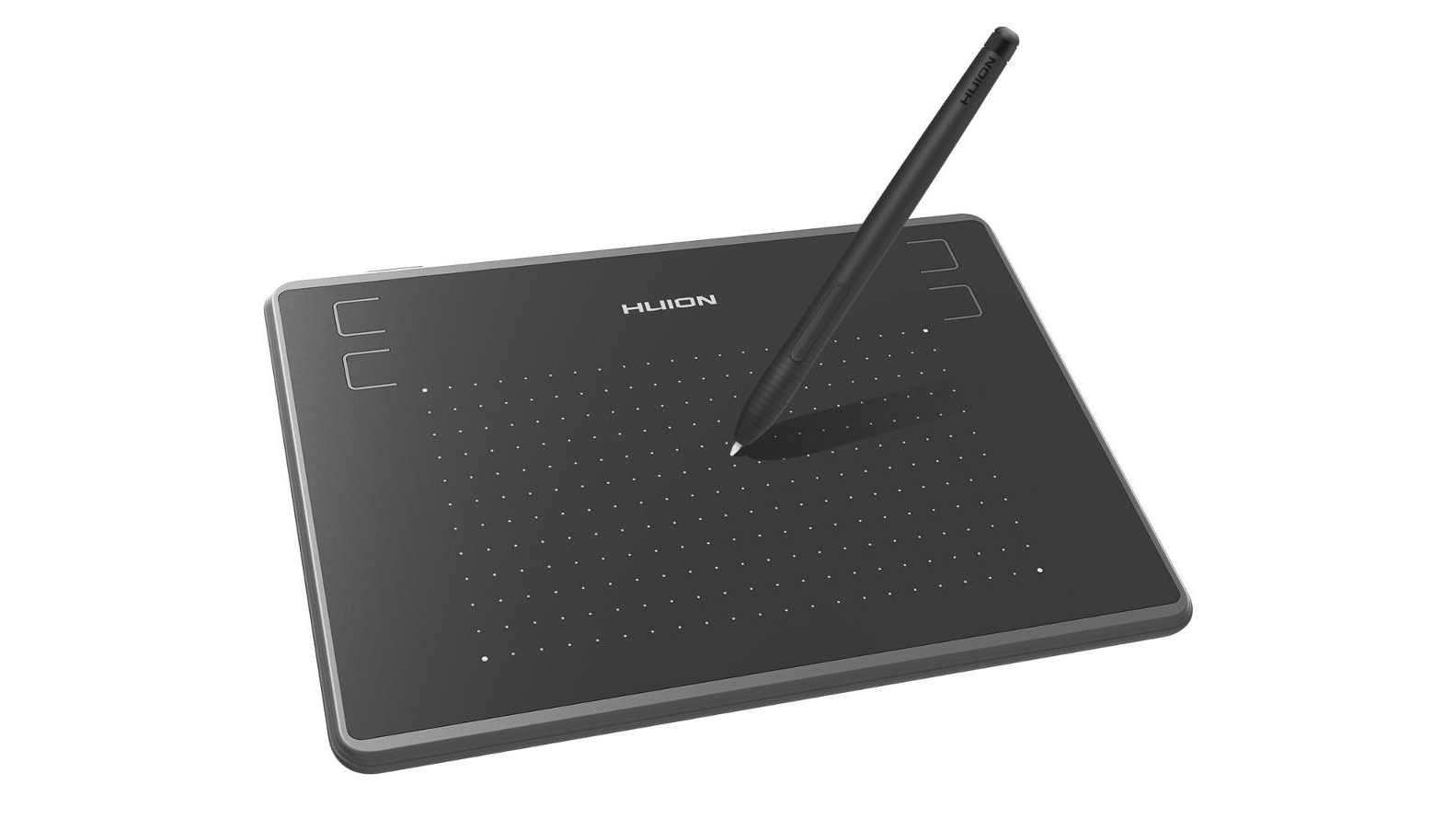
Of course, both of these tablets involve a significant cash outlay, so if you’re on a stricter budget then it’s worth looking at some of the more wallet-friendly options out there such as the Huion H430P. Ultimately though, determining the right drawing tablet for you is going to depend entirely on how you intend to use it. (Scroll down to see our full list of recommendations.

If you're new to drawing tablets, it's worth pointing out that there are three different categories to be aware of. Each takes a different approach to the central challenge of helping you draw on your Windows PC or Mac as if you were drawing on paper. 

Graphics tablets, which you draw directly onto with a stylusPressure-sensitive pen displays, which are hooked up to a monitorTablet computers, which can be adapted for drawing with an app

You can read a more detailed explanation below.

With this covered, let's look at the options. Read on to find the best drawing tablet for your specific needs and budget – and the best prices.

The best drawing tablet in 2019  

Probably the most desirable drawing tablet on the market, the Wacom Cintiq 22HD touch enables you to draw direct onto its screen. It's generously sized so you can go large with your brush strokes, but the stylus is sensitive enough to cope with your most subtle expressions, too. The stand takes some getting used to, but enables you to switch between a near-flat configuration for drawing and an upright position for when you want to use the Cintiq 22HD touch as a regular monitor.

The best cheap drawing tablet 

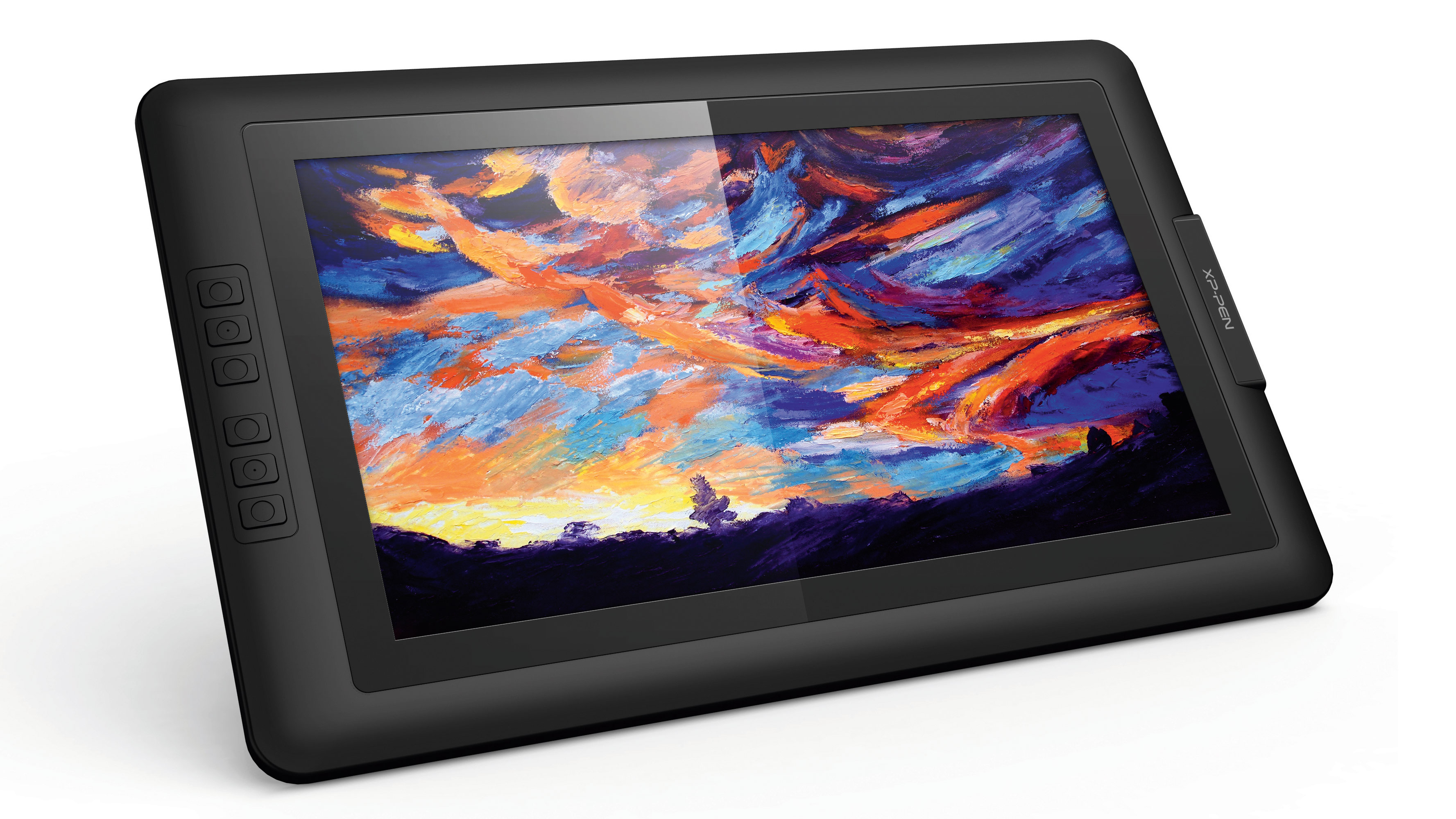
All the basics you could want from a pen display are covered by the XP-Pen Artist 15.6: a reasonably sized drawing area, a comfortable pen with plenty of sensitivity levels, and a good screen. You don’t get quite the attention to detail or the advanced ecosystem of extras that Wacom provides, and the offset between the stylus tip and the on-screen cursor takes some getting used to, but this remains a pen display that can transform your digital creativity without breaking the bank.

The best graphics tablets

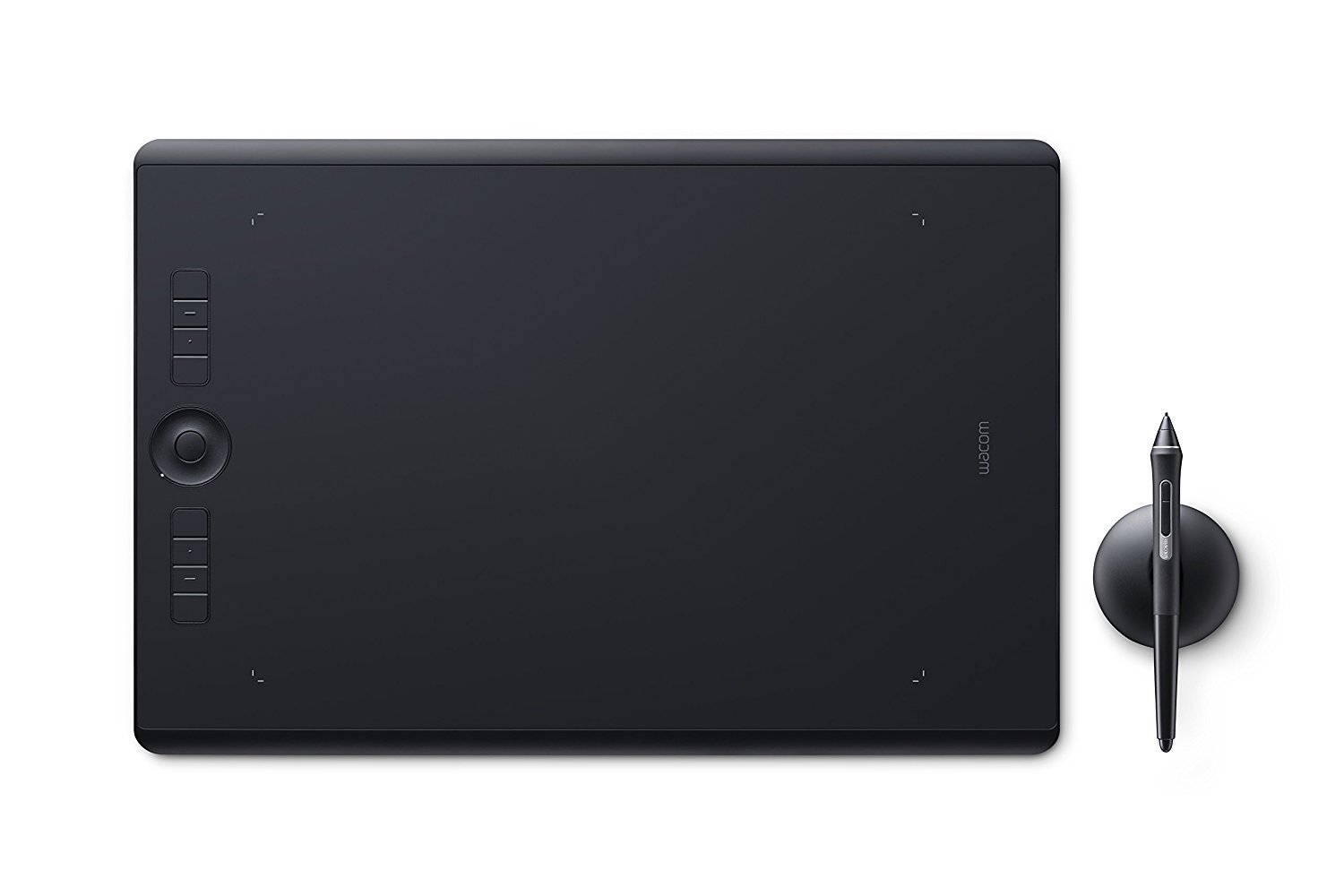
When you’re creating artwork, you want room to sketch freely and a pen that feels as close as possible to the paper equivalent. You’ll find both in the Wacom Intuos Pro graphics tablet: it's one of the purest drawing experiences you can get from a digital device. The pen provides over 8,000 levels of pressure sensitivity and a drawing area that – while it’s not the biggest available – gives you more than the area of a magazine to play inside. All this is supported by Wacom’s broad ecosystem of alternative pens and Texture Sheets to give your drawing surface a distinctive feel.

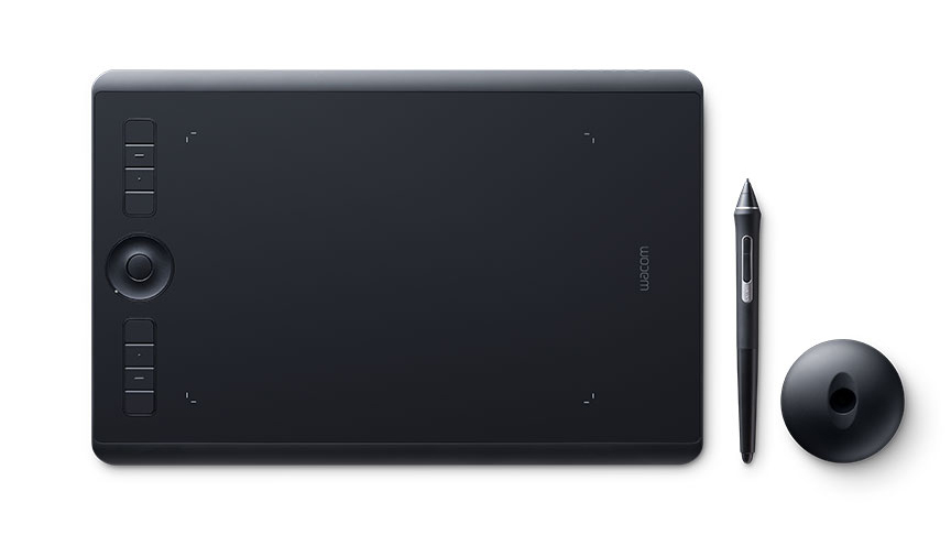
Designers don’t typically require the range of movement that illustrators demand, making this smaller edition of the Wacom Intuos Pro graphics tablet just the job. As well as the drawing area, eight shortcut keys and a Touch Ring give you access to your most-used commands and tools, so you don’t have to keep flipping between your tablet and your keyboard while you’re focusing on iterating a concept. The Intuos Pro also supports multi-touch fingertip gestures, making it easy for you pan and zoom around your current document.

The best drawing tablet for beginners

If you’re not sure whether a drawing tablet is something you’ll use regularly enough to justify the cost, the H430P gives you all the basics without requiring an big investment. The drawing area is small, yes, but the pen is sensitive enough to give you a true sense of the creative benefits drawing tablets can bring. It may not take long before you outgrow this tablet, but it’s a very affordable way to get started.

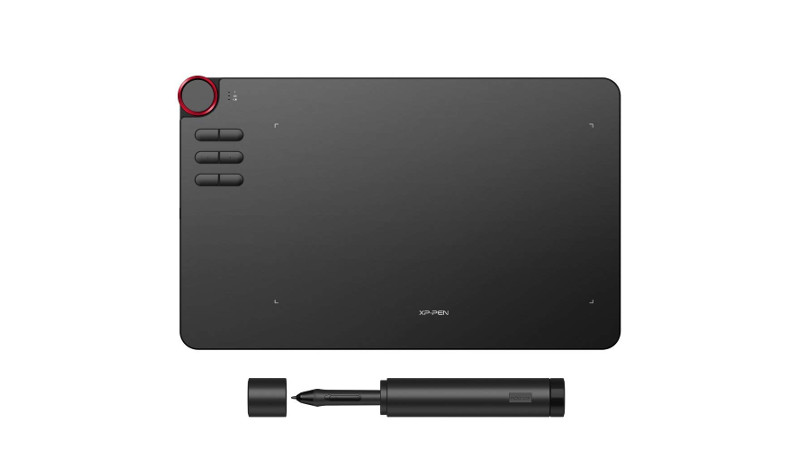
XP-Pen's Deco tablets blend style with functionality. This matt black, ultra-sleek model doesn't only look good, but also feels good to use, thanks to its well-made pen and generous drawing area. It's well-designed in a workflow sense too, with customisable Express keys and a multi-functional dial in the top corner that allows you to set things up exactly how you want them, so you can spend less time fiddling and more time drawing. Drawbacks? Well, you could be justified in worrying that at 8mm, the Deco 03 is a little too slim, to the point where a moment's carelessness might cause damage to it. If that doesn't worry you, this is a great buy for a good price.

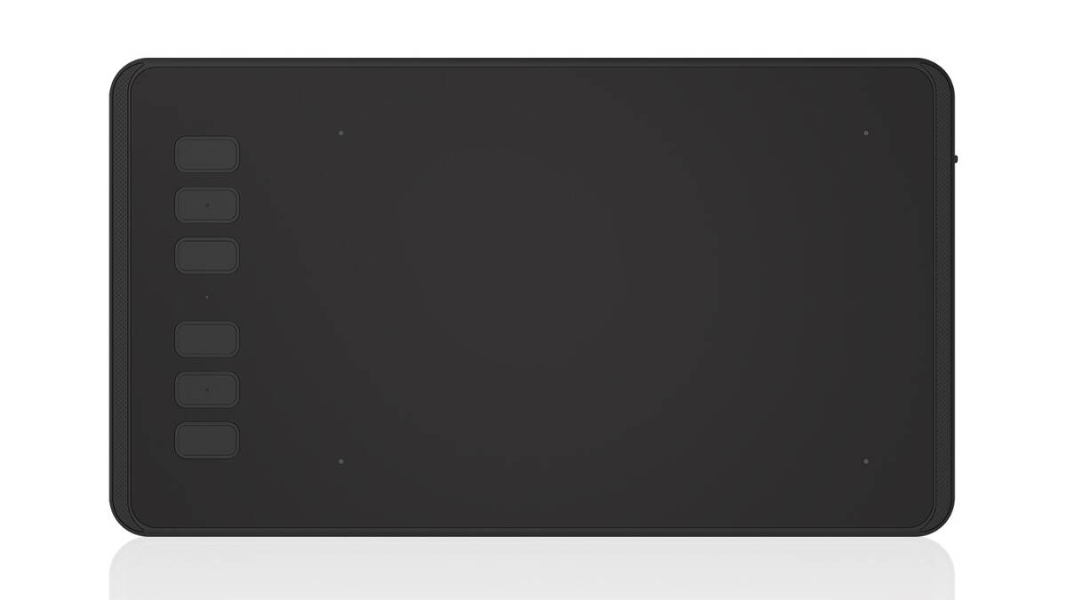
The second Huion drawing tablet on our list is the H640P, which boasts a comfortable drawing experience in a convenient size for travel. If you work between studios or like to draw from a laptop on the move, you’ll need a drawing tablet like this that packs away handily – but still lets you draw with expression. The Huion H640P measures just 10.2 x 5.8 inches and is no thicker than a smartphone, but offers a set of shortcut keys as well as its drawing area.

The best tablet PC for drawing

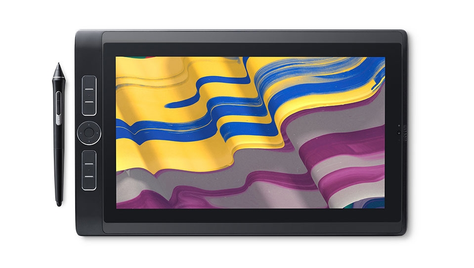
If you have the budget, the MobileStudio offers everything you could want in a drawing tablet. With a choice of Intel Core processors and solid-state drive storage capacities, it’s a fully fledged Windows computer. But it also benefits from the same technology Wacom brings to its Cintiq pen display range, making the MobileStudio a pleasure to draw with. And if you want, you can even tether it to the more powerful PC or Mac in your studio with the optional Wacom Link. A 16in MobileStudio is also available.

Also read: Wacom MobileStudio Pro review

The best Windows tablet for drawing

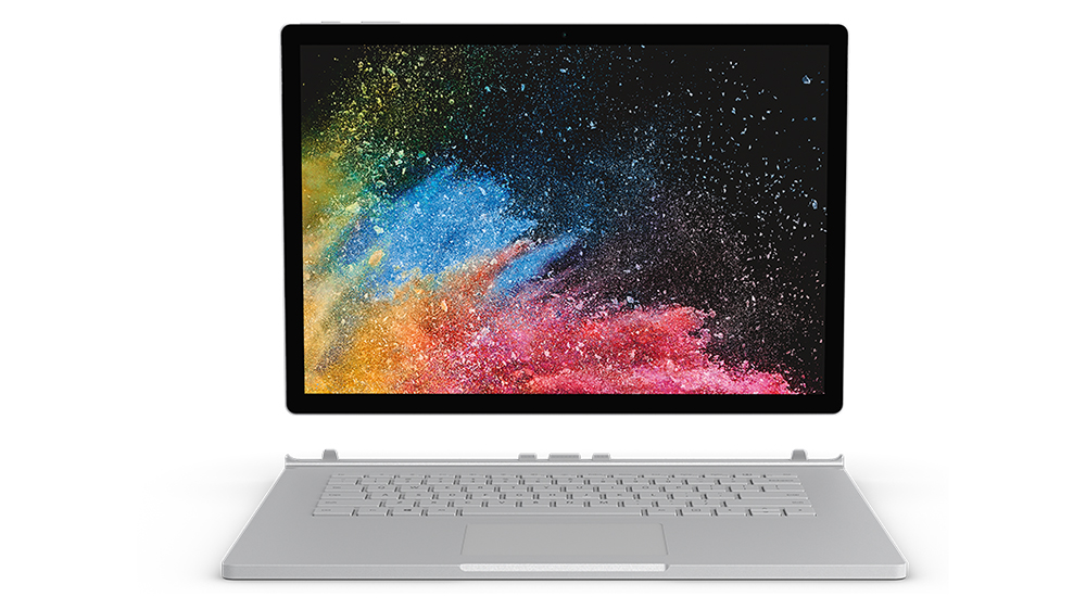
The Surface Book 2 delivers true versatility for the designer on the go. You can use it as a regular laptop, then twist the screen to turn it into a flat tablet with a touch-sensitive screen. For drawing, you need to add the optional Surface Pen, which provides a respectable 4,096 levels of pressure sensitivity. You don’t get the deep drawing experience of the Wacom MobileStudio, but you do get a device that keeps up with your needs wherever you are and whatever you’re doing.

Also read: Microsoft Surface Book 2 review

The best iOS tablet for drawing

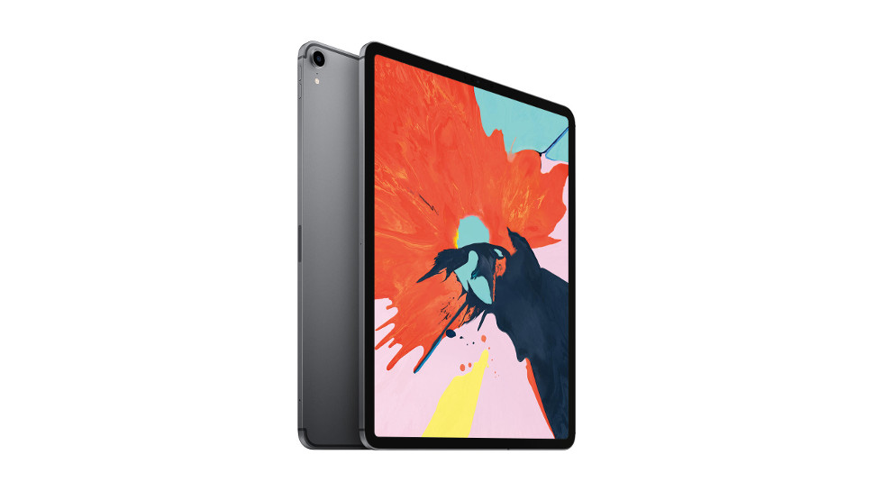
The latest in Apple’s series of high-performance tablets, the iPad Pro 12.9 offers a significant performance upgrade over its predecessor, as well as a reduced bezel (screen-to-edge distance) and the removal of the home button – the device is practically all screen. That luxurious LCD Liquid Retina, True Tone screen offers ‘Xbox One S-level graphics’, making it a beautiful surface on which to draw your projects, a process that has become easier than ever thanks to the reworked Apple Pencil 2 released alongside the tablet. The Pencil now offers magnetic docking and new workflow-improving shortcuts, such as double-tapping to switch modes. The new internal processors also mean the iPad Pro is faster than ever before, and even the high-storage versions offer fast read/write speeds for smooth file transfers.

The best Android tablet for drawing

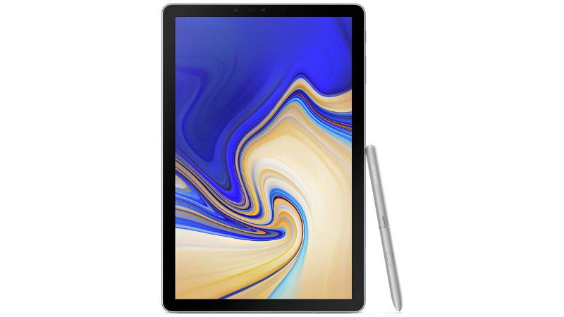
It's always a treat when you don't have to pay extra for the stylus, and the Samsung Galaxy Tab S4 comes with its pen already in the box – an extremely welcome touch, especially given that this is the most expensive Android tablet yet, at a price on par with the iPad Pro. Just as with Samsung's previous tablets, the drawing experience is smooth and satisfying; you'll find yourself gliding away in no time. There is a decent range of drawing apps and programs available for Android as well, though iOS still has the slight edge in this regard. Samsung's Dex software, designed to emulate a computer desktop, means the tablet is also useful for general productivity. A great all-purpose option, albeit an expensive one.

Also read: TechRadar’s Samsung Galaxy Tab S4 review

It's hard to know what's more exciting about the GAOMON PD1560, the gloriously large 16:9 drawing surface or the intelligent pen with 8,192 levels of pressure sensitivity. If you can't think of a better way to spend a day than holed up in the studio creating gorgeous digital paintings then this is a terrific buy. It's easy to set up just the way you want it, with 10 shortcut keys that can be customised to streamline your workflow. However, if you like to create on the move then this isn't the one for you, given that it weighs more than 1.5kg and lacks the wireless functionality of some of the sleeker tablets available.

The best drawing tablet accessories
What are the different types of drawing tablet? 

Broadly speaking, there are three main types of drawing tablet…

Need a recap? Here are the best drawing tablets, graphics tablets and tablet computers of 2018…

Don't miss:

The best laptops for photo editingThe best Wacom tablet deals60 amazing Adobe Illustrator tutorials

Learn how to use WordPress for just $49.99

Original Source: http://feedproxy.google.com/~r/CreativeBloq/~3/lEkp4HP6eC0/learn-how-to-use-wordpress-for-just-dollar4999

WordPress is an incredibly popular CMS – and with good reason. You might think that to get the best out of WordPress, you need to need to spend thousands of dollars on coding classes. But with WordPress Build & Host Bundle: Lifetime Subscription, you'll quickly learn how to navigate the platform and build custom WordPress websites without ever having to write a single line of code.

Plus, with this bundle, you'll also enjoy hosting for life with cPanel support, email, and a lot of other useful features you'll need if you run your own websites.

This bundle can be yours for the low price of just $49.99 – that's a massive 94 per cent off the regular price.

Related articles:

40 brilliant WordPress tutorialsHow to choose the right CMS10 great WordPress plugins for designers

A Guide to Writing Your First Software Documentation

Original Source: https://www.sitepoint.com/writing-software-documentation/

A Guide to Writing Your First Software Documentation

As a developer, your pride and joy is your code. It’s readable, it meets DRY principles, it reflects best practices, and the end product is a great tool that solves some kind of problem for its target users. However, no matter how much work you’ve put into your code, if your software comes with no documentation, or you write documentation as an afterthought and treat it with little importance, it’s likely users will find little joy in working with it, and eventually opt for a different, more user-friendly product.

In this article, you’ll find a number of practical guiding principles to get you up and running with writing your first software documentation.

Why Documentation Is Important

In reference to your software, Mike Pope has a fitting saying that goes like this: If it isn’t documented, it doesn’t exist.

Why’s that? Well, just to take my personal experience as an example, I was browsing the Web looking for new JavaScript animation libraries to try out and I came across one with a description of its features that I really liked. However, there was no documentation, not even a Getting Started section, but just a bare-bones API page with almost no explanations or examples. Do you think I ended up using that library? Of course, I didn’t. I got so frustrated with it that I moved on to something that made more sense to me.

To the question of why good JavaScript libraries fail, Nicholos Zakas gives the following answer:

Lack of documentation. No matter how wonderful your library is and how intelligent its design, if you’re the only one who understands it, it doesn’t do any good. Documentation means not just autogenerated API references, but also annotated examples and in-depth tutorials. You need all three to make sure your library can be easily adopted.

Another important reason why your software docs are crucially important is that they serve as a communication tool between your present self and your future self, and also between your present self and other developers who eventually might find themselves working on your software. Even if you write readable and commented code, this doesn’t necessarily mean it will still be clear to you in six months’ time why you wrote a function, or any other piece of your code for that matter, the way you did.

Documentation allows you to transfer the why behind code. Much in the same way code comments explain the why, and not the how, documentation serves the same purpose. — A Beginner’s Guide to Writing Documentation

Surely, you want people to use your code and also to be able eventually to update it and improve on it. These are all contributing factors to the growth of a supporting community behind your product, which is important for it to gain robustness, maturity, and success.

It’ll be mighty hard to accomplish all this if your software doesn’t have great docs to go with it.

Who Software Documentation Is For

When writing anything, make sure it’s clear in your mind who your audience is. Docs are no exception to this rule. Doing so clarifies in your head the problems your audience is likely to face, the familiarity it’s likely to have with your product or the prerequisites for using your product. This information is crucial to the way you create the content and the language you use.

There are two kinds of documentation this article is not concerned with:

User manuals. For instance, my sister might decide to use WordPress for publishing her own blog. She’s not a developer, but she’s heard that non-devs can get their blog up and running in no time with WordPress. Now she’ll be needing instructions on how to download and configure the software on her server, how to write, publish, and update her posts, how to add images to a post, etc. In other words, she’ll need a user manual.
Project documentation. This kind of documentation has more to do with the project than with the software itself, although some of its content could go in a project’s Readme file. To continue with the WordPress example, after getting lots of practice with WordPress, I might decide I’d like to add a feature to the software or fix a bug or two. In this case I’ll need to know things like changelogs, conventions and best practices, contribution policies, how to participate in team discussions relevant to the task at hand, etc.

The kind of documentation I’ve got in mind here is mainly aimed at developers who have different levels of familiarity with your software and need to use it in their projects. For instance, if I’m creating a WordPress theme, then I’ll need to know how to get started, how to include style sheets and JavaScript documents, how to communicate with the database to display posts, etc.

What to Include in Your Documentation

A popular approach is Readme Driven Development, championed by Tom Preston-Werner. It consists of writing the Readme document before you even start writing any code. This document is an introduction to your software and usually includes:

an explanation of what your software does and what problem it solves
an example illustrating the circumstances in which your code would normally be used
links to the code and bugs tracker
FAQs and ways to ask for support
instructions on how to install your software
license information

However, in my view, having a solid documentation that can really help developers who use your software/library should go well beyond the classical Readme file. Following Daniele Procida, I suggest you include the following items in your documentation material for a great user experience.

The post A Guide to Writing Your First Software Documentation appeared first on SitePoint.

Simple Ways to Keep Your WordPress Site Secure

Original Source: http://feedproxy.google.com/~r/1stwebdesigner/~3/vCflQnAq6Q0/

When we think of web security, we often envision a giant server farm teeming with IT professionals along with developers who pore over every bit of code. Then too, we think of high-profile breaches that leak private data and negatively impact the economy.

Yet, web security should be of concern to everyone who works on or owns a site. That’s especially so when you’re using a popular platform such as WordPress. Why? Because we are all sitting targets.

Whether your site boasts millions of visitors or only a handful, bots and other malicious actors are hammering away. They’re attempting brute force attacks on logins, adding poisonous code to legitimate files and other assorted mayhem.

And, while we can’t necessarily account for every possibility, there are things we can do to mitigate the risk. Even better is that it’s not hard to do!

With that, here are some simple steps you can take to make your WordPress website more secure.

Understand WordPress User Roles and Capabilities

If you build sites for clients, it’s important to realize that not everyone needs the same level of access to the back end. Administrator accounts are great in that they provide total control over settings and plugins. But in the wrong hands they can be dangerous.

The developers behind WordPress understand this, and that’s why they’ve created various user roles. Each role (Administrator, Editor, Author, Contributor and Subscriber are the defaults) comes with their own set of capabilities. The lower the user role, the fewer capabilities that user will have.

So, for clients who won’t necessarily need to install plugins or touch other sensitive settings, an Editor account is perfect for them. They have all the power they need to manage content, while still being walled-off from potentially harmful items. Even if they do need occasional access to other things, they can use an administrator account when appropriate.

Just to be clear, we’re not necessarily worried about our clients doing harmful things (although, an adventurous one could do some unintended damage). Rather, it’s the possibility of that user’s account being compromised. If that were to happen, a lower user role won’t have the same impact as an administrator.

If the default roles don’t quite match up with your needs, you also have the option to create your own. This could be used to, for example, allow users access to only a specific post type. It allows for more fine-grain control of who can access what.

As an aside, it’s also a good idea to create separate user accounts for each person who needs to access the back end. This simplifies account maintenance, as you can just remove individual accounts as people come and go from the organization. Plus, the less you share your passwords, the better!

A key going into a lock.

Install a Security Plugin

Sure, you may spend a ton of time online. But you can’t be there to watch over your website 24/7. Therefore, it makes sense to employ tools that will keep a look out on your behalf.

There are a number of security plugins that can handle the job. The free versions of Wordfence, iThemes Security or All In One WP Security & Firewall can offer huge benefits. They can do things like lock out IP addresses, stop brute force login attempts and scan your site for existing malware or security holes. Some will even email you when a problem is found or your install is outdated.

If you manage several websites, a security plugin offers a great way to stay on top of these issues. However, they’re also useful for those times when you hand off a site to your clients as well. Clients who aren’t very security-conscious will have that extra set of eyes that will keep them well-informed.

It’s worth mentioning that there are more plugins available than mentioned above. And each one has its own strengths. The one you choose should fit your basic security needs and refrain from slowing down your site too much. Performance is especially an issue on lower end hosting platforms and should be a consideration.

Of course, these plugins aren’t cure-alls for security. You still need to employ other best practices. But they are great at catching the low-hanging fruit that make up the majority of threats to your site.

Security menu item within WordPress.

Use Common Sense

By now, everyone should know that they should be using unique, hard-to-guess passwords. But still, so many of us take shortcuts because it’s easier.

So much of security is actually using your own common sense and encouraging others to do the same. Sometimes, that requires a tiny bit of extra work – but it’s well worth the effort. Here are a few examples:

Install an SSL Certificate

Having SSL enabled will encrypt user communications with your site (on the front and back ends). With web browsers now calling out sites that don’t use SSL, having a certificate is also darn-near mandatory to defend your reputation. And with many hosts offering either free or cheap options, you have zero excuse for not adding one.

Be Cautious with Plugins

Not all plugins are created equally. Before you install and activate one, be sure to do some research. Look at its release history, support forums and user reviews. You’ll get a better sense of how well-maintained it is and whether it’s worth using. And, look for installed plugins that haven’t been updated in a while. They could be a weak point in your security.

Stay Current

Not only should your entire WordPress install (including plugins and themes) be kept up-to-date, but your hosting environment should do the same. Ensure that you’re running a supported version of PHP and other required software. If you’re unsure, ask your host for more information.

Maintain Current Backups

We all cross our fingers and hope something bad doesn’t happen. But if it does, it’s much easier to restore a safe backup! You’ll especially want to have multiple current copies of your site’s database and the /wp-content/ folder.

Lightbulb on a desk.

Stay Alert

If it seems like security threats are only getting more numerous and complex, it’s because they are! While WordPress itself is well-written and secure, it does have the biggest target on its back of any CMS. That means we need to remain alert and develop good habits.

It doesn’t need to be so difficult. The steps outlined above won’t take much time, but can literally make the difference between your website being hacked or not. That in itself is reason enough to put in the extra effort.