Image Trail Effects

Original Source: http://feedproxy.google.com/~r/tympanus/~3/100PMCI_uB4/

Today we’d like to share a fun mouse interaction effect with you that we found on the VLNC Studio website. The idea is to follow the mouse and show a trail of random images. It’s a kind of brutalist effect and there are various possibilities when it comes to showing and hiding the images. So we compiled a set of demos that explores different animations.

The animations are powered by TweenMax.

Attention: Note that the demos are experimental and that we use modern CSS properties that might not be supported in older browsers.

The main idea is to show the images quickly so that a trail forms along the movement of the mouse.

ImageTrailEffects_01

While there’s different ways to show the images, there’s also lots of room to play with the effects that make them disappear.

ImageTrailEffects_02

Demo 3 shows how we can make the images “drop” when they disappear:

ImageTrailEffects_03

We can also add a bit of a squeeze, too:

ImageTrailEffects_04

The last demo explores setting the size of the image to be fullscreen and restricting the movement to the sides only:

ImageTrailEffects_05

This effect is inspired by Ricky Michiels website.

Here’s a short GIF that shows the effect of demo 2 where we scale the images up and fade them out:

ImageTrailEffects.2019-08-07 11_22_55

We hope you enjoy these demos and find them useful.

References and Credits

TweenMax by Greensock
imagesLoaded by Dave DeSandro
Images from Unsplash.com

Image Trail Effects was written by Mary Lou and published on Codrops.

How to Set Up a Vue Development Environment

Original Source: https://www.sitepoint.com/vue-development-environment/?utm_source=rss

Setting Up a Vue Development Environment

If you’re going to do any serious amount of work with Vue, it’ll pay dividends in the long run to invest some time in setting up your coding environment. A powerful editor and a few well-chosen tools will make you more productive and ultimately a happier developer.

In this post, I’m going to demonstrate how to configure VS Code to work with Vue. I’m going to show how to use ESLint and Prettier to lint and format your code and how to use Vue’s browser tools to take a peek at what’s going on under the hood in a Vue app. When you’ve finished reading, you’ll have a working development environment set up and will be ready to start coding Vue apps like a boss.

Let’s get to it!

Want to learn Vue.js from the ground up? This article is an extract from our Premium library. Get an entire collection of Vue books covering fundamentals, projects, tips and tools & more with SitePoint Premium. Join now for just $9/month.

Installing and Setting Up Your Editor

I said that I was going to be using VS Code for this tutorial, but I’m afraid I lied. I’m actually going to be using VSCodium, which is an open-source fork of VS Code without the Microsoft branding, telemetry and licensing. The project is under active development and I’d encourage you to check it out.

It doesn’t matter which editor you use to follow along; both are available for Linux, Mac and Windows. You can download the latest release of VSCodium here, or download the latest release of VSCode here and install it in the correct way for your operating system.

Throughout the rest of this guide, for the sake of consistency, I’ll refer to the editor as VS Code.

Add the Vetur Extension

When you fire up the editor, you’ll notice a set of five icons in a toolbar on the left-hand side of the window. If you click the bottom of these icons (the square one), a search bar will open up that enables you to search the VS Code Marketplace. Type “vue” into the search bar and you should see dozens of extensions listed, each claiming to do something slightly different.

The post How to Set Up a Vue Development Environment appeared first on SitePoint.

Spruce Up Your Projects With These 19 Nature Fonts

Original Source: http://feedproxy.google.com/~r/1stwebdesigner/~3/zNfK_GizE-o/

Are you on the hunt for some gorgeous decorative nature fonts to spruce up your website or design project? Nothing is better than a well-made font to complete the look. If you’re going for a flower or nature theme, these are just the thing.

You may prefer a fancy typeface with lots of decorations, or one that more subtly embodies a natural aesthetic. No matter what you’re looking for, there’s a beautiful font here that will suit your needs. Some like Into the Wild and Bouquet Flower go all out with the design, and others like Northern Passage and Autumn Leaves simply look earthy or rustic.

Take a look at this selection of nineteen wild nature fonts, and see what gems we’ve collected for yourself.

UNLIMITED DOWNLOADS: 400,000+ Fonts & Design Assets

DOWNLOAD NOW

The Golden Leaves by Innire

Example of The Golden Leaves by Innire

Peomy Extended

Example of Peomy Extended

Flash by George Williams

Example of Flash by George Williams

Autumn Embrace Floral Font by anmark

Example of Autumn Embrace Floral Font by anmark

Earth Elements Typeface by Anna Ivanir

Example of Earth Elements Typeface by Anna Ivanir

Curly Fleur Caps by Lime

Example of Curly Fleur Caps by Lime

One Two Trees by CloutierFontes

Example of One Two Trees by CloutierFontes

Lemon Grass Script by Mellow Design Lab

Example of Lemon Grass Script by Mellow Design Lab

Pinebrick Typeface

Example of Pinebrick Typeface

Tortoise and Deer by Emma Make

Example of Tortoise and Deer by Emma Make

VTKS Flowers in Our Soul by Douglas Vitkauskas

Example of VTKS Flowers in Our Soul by Douglas Vitkauskas

Bouqet Flower & Watercolor by bloomxxvi

Example of Bouqet Flower & Watercolor by bloomxxvi

Amelie Floral Display Font by Alisovna

Example of Amelie Floral Display Font by Alisovna

Northern Passage

Example of Northern Passage

Camp Fire by Typographer Mediengestaltung

Example of Camp Fire by Typographer Mediengestaltung

Forest Camp by Opus Nigrum

Example of Forest Camp by Opus Nigrum

Forests Layered Font by Zeppelin Graphics

Example of Forests Layered Font by Zeppelin Graphics

Autumn Leaves by madeDeduk

Example of Autumn Leaves by madeDeduk

Into the Wild – Double Exposure Font by Cosmic Store

Example of Into the Wild - Double Exposure Font by Cosmic Store

Try These Nature-Inspired Fonts

Flower and nature fonts are great for decoration all year round. Spring, summer, fall, or winter, remind people of the great outdoors by including a font with a lot of character. Any site with an outdoorsy theme would look that much more amazing with one of these quality typefaces.

There’s a lot of variety in this list, so finding a fitting font should be a snap. Whether you love simple typefaces or extravagant ones, try a nature font from the collection and see how it looks in your design.


Writing Modes And CSS Layout

Original Source: https://www.smashingmagazine.com/2019/08/writing-modes-layout/

Writing Modes And CSS Layout

Writing Modes And CSS Layout

Rachel Andrew

2019-08-06T14:00:00+02:00
2019-08-06T12:07:02+00:00

In this article I am going to take a look at the CSS writing-mode property. However this is not an article about the practical or creative application of this property. Instead, I want to demonstrate why understanding writing modes is so important, even to those of us who rarely need to change the writing mode of a page or component. The support of multiple writing modes is key to the way that our new layout methods of Flexbox and Grid Layout have been designed. Understanding this can unlock a better understanding of how these layout methods work.

What Are Writing Modes?

The writing mode of a document or a component refers to the direction that text flows. In CSS, to work with writing modes we use the writing-mode property. This property can take the following values:

horizontal-tb
vertical-rl
vertical-lr
sideways-rl
sideways-lr

If you are reading this article on Smashing Magazine in English then the writing mode of this document is horizontal-tb, or Horizontal Top To Bottom. In English sentences are written horizontally, the first letter of each line starting on the left.

A language such as Arabic also has a horizontal-tb writing mode. It is written horizontally, top to bottom, however Arabic script is written right to left, and so sentences in Arabic start on the right.

Chinese, Japanese and Korean are written vertically, with the first character of the first sentence being top right. Following sentences being added to the left. Therefore the writing mode used is vertical-rl. A vertical writing mode running from right to left.

Mongolian is also written vertically, but from left to right. Therefore, should you want to typeset Mongolian script you would use the writing mode vertical-lr.

The other two values of writing-mode are designed more for creative purposes than for typesetting vertical scripts. Using sideways-lr and sideways-rl turns text sideways – even characters normally written vertically and upright. The values unfortunately are only supported in Firefox at the moment. The following CodePen shows all of the different values of writing-mode, you will need to use Firefox if you want to see the sideways-* ones in action.

See the Pen [Writing Mode demo](https://codepen.io/rachelandrew/pen/dxVVRj) by Rachel Andrew.

See the Pen Writing Mode demo by Rachel Andrew.

Writing Modes can be used when creating a document that uses a language written using that writing mode. They can also be used creatively, for example to set a heading vertically down the side of some content. In this article however, I want to take a look at the impact that supporting vertical languages, and the possibility of vertical text, has on CSS layout, and across CSS in general.

Before I do so, if you are interested in the use of writing modes for vertical text, here are some useful resources.

The W3C Internationalization site has a wealth of useful information. Read about RTL scripts and vertical text.
Jen Simmons wrote an excellent article about CSS Writing Modes which also includes several examples from print of these modes in use.
Thoughts on the world and our writing systems – Chen Hui Jing
Vertical Typesetting With Writing Mode revisited – Chen Hui Jing
The writing-mode property on MDN

The Block And Inline Dimensions

When we change the writing mode of a document, what we are doing is switching the direction of the block flow. Therefore it quickly becomes very useful for us to understand what is meant by block and inline.

One of the first things we learn about CSS is that some elements are block elements, for example a paragraph. These elements display one after the other in the block direction. Inline elements, such as a word in a sentence display one after the other in the inline direction. Working in a horizontal writing mode, we become used to the fact that the block dimension runs top to bottom vertically, and the inline dimension left to right horizontally.

As block and inline elements relate to the writing mode of our document however, the inline dimension is horizontal only if we are in a horizontal writing mode. It doesn’t relate to width, but instead to inline size. The block dimension is only vertical when in a horizontal writing mode. Therefore it doesn’t relate to height, but to block size.

Logical, Flow-relative Properties

These terms, inline size and block size are also used as the names of new CSS properties designed to reflect our new writing mode aware world. If, in a horizontal writing mode you use the property inline-size instead of width, it will act in exactly the same way as width – until you switch the writing mode of your component. If you use width that will always be a physical dimension, it will always be the size of the component horizontally. If you use inline-size, that will be the size in the inline dimension, as the below example shows.

See the Pen [width vs. inline-size](https://codepen.io/rachelandrew/pen/RXLLyd) by Rachel Andrew.

See the Pen width vs. inline-size by Rachel Andrew.

The same is true for height. The height property will always be the size vertically. It relates to how tall the item is. The block-size property however gives the size in the block dimension, vertically if we are in a horizontal writing mode and horizontal in a vertical one.

As I described in my article “Understanding Logical Properties And Values”, there are mappings for all of the physical properties, those which are tied to the dimensions of the screen. Once you start to think about it, so much of CSS is specified in relation to the physical layout of a screen. We set positioning, margins, padding and borders using top, right, bottom, and left. We float things left and right. Sometimes tying things to the physical dimension will be what we want, however increasingly we are thinking about our layouts without reference to physical location. The Logical Properties and Values specification rolls out this writing mode agnostic way of working right across CSS.

Writing Modes, Grid and Flexbox

When our new layout methods landed on the scene, they brought with them an agnostic way of looking at the writing mode of the component being laid out as a flex or grid layout. For the first time people were being asked to think about start and end, rather than left and right, top and bottom.

When I first started to present on the subject of CSS Grid, my early presentations were a rundown of all of the properties in the specification. I mentioned that the grid-area property could be used to set all four lines to place a grid item. The order of those lines was not however the familiar top, right, bottom and left we use to set all four margins. Instead, we need to use top, left, bottom, right – the reverse of that order! Until I understood the connection between grid and writing modes, this seemed a very odd decision. I came to realise that what we are doing is setting both start lines, then both end lines. Using top, right, bottom and left would work fine if we were in a horizontal writing mode, turn the grid on its side however and that makes no sense. If we use grid-area: 1 / 2 / 3 / 5; as in the pen below the lines are set as follows:

grid-row-start: 1; – block start
grid-column-start: 2 – inline start
grid-row-end: 3 – block end
grid-column-end: 5 – inline end

See the Pen [grid-area](https://codepen.io/rachelandrew/pen/zgEEQW) by Rachel Andrew.

See the Pen grid-area by Rachel Andrew.

Flexbox Rows And Columns

If you use flexbox, and add display: flex to a container, your items will display as a row as the intial value of the flex-direction property is row. A row will follow the inline dimension of the writing mode in use. Therefore if your writing mode is horizontal-tb a row runs horizontally. If the text direction of the current script is left to right then items will line up starting from the left, if it is right to left they will line up starting on the right.

Use a vertical writing mode however, such as vertical-rl and flex-direction: row will cause the items to lay out vertically, as the inline direction is vertical. In this next CodePen all of the examples have flex-direction: row, only the writing mode or direction has changed.

See the Pen [flex-direction: row](https://codepen.io/rachelandrew/pen/XvezrE) by Rachel Andrew.

See the Pen flex-direction: row by Rachel Andrew.

Add flex-direction: column, and the items layout in the block dimension of your writing mode. In a horizontal writing mode the block dimension is top to bottom, so a column is vertical. With a writing mode of vertical-rl a column is horizontal. As with the previous example, the only difference between the below flex layouts, is the writing mode being used.

See the Pen [flex-direction: column](https://codepen.io/rachelandrew/pen/RXLjbX) by Rachel Andrew.

See the Pen flex-direction: column by Rachel Andrew.

Grid Auto-placement

When using auto-placement in grid, you will see similar behavior to that in flex layout. Grid items auto-place according to the writing mode of the document. The default is to place items in rows, which will be the inline direction – horizontally in a horizontal writing mode and vertically in a vertical one.

See the Pen [Grid auto-placement row](https://codepen.io/rachelandrew/pen/eqGeYV) by Rachel Andrew.

See the Pen Grid auto-placement row by Rachel Andrew.

Try changing the flow of items to column as in the example below. The items will now flow in the block dimension – vertically in a horizontal writing mode and horizontally in a vertical one.

See the Pen [Grid auto-placement column](https://codepen.io/rachelandrew/pen/xvXPby) by Rachel Andrew.

See the Pen Grid auto-placement column by Rachel Andrew.

Grid Line-placed Placement

Line-based placement also respects writing mode. The lines of our grid start at 1, both for rows and columns. If we position an item from column line 1 to column line 3, and are in a horizontal writing mode with a left to right direction, that item will stretch from the left-most column line across two grid tracks horizontally. Thus spanning two columns.

Change the writing mode to vertical-rl and column line 1 will be at the top of the grid, the item spanning two tracks vertically. Still spanning two columns, but the columns are now running horizontally.

See the Pen [Margins: adjacent siblings](https://codepen.io/rachelandrew/pen/mNBqEy) by Rachel Andrew.

See the Pen Margins: adjacent siblings by Rachel Andrew.

Alignment In Grid And Flexbox

One of the first places many people will have come into contact with the way Flexbox dealt with writing modes, would be when aligning items in a flex layout. If we take the flex-direction: row example above, and use the justify-content property to align all of the items to flex-end the items move to the end of their row. This means that in a horizontal writing mode with left to right direct the items all move to the right, as the end of that row is on the right. If the direction is right to left they all move to the left.

In the vertical writing mode they move to the bottom, assuming there is space for them to do so. I have set an inline-size on the components in this example to ensure that we have spare space in our flex containers to see the alignment in action.

Alignment is a little easier to understand in grid layout, as we always have the two axes to play with. Grid is two-dimensional, those two dimensions are block and inline. Therefore, you can remember one rule if you want to know whether to use the properties that begin with align- or those which begin with justify-. In grid layout the align- properties:- align-content, align-items, align-self are used to do block axis alignment. In a horizontal writing mode that means vertically, and in a vertical writing mode horizontally.

Once again we don’t use left and right or top and bottom, as we want our grid layout to work in exactly the same way no matter what the writing mode. So we align using start and end. If we align to start on the block dimension, that will be top when in horizontal-tb, but will be right when in vertical-rl. Take a look in the example below, the alignment values are identical in both grids, the only difference is the writing mode used.

See the Pen [Margins: adjacent siblings](https://codepen.io/rachelandrew/pen/jgGaML) by Rachel Andrew.

See the Pen Margins: adjacent siblings by Rachel Andrew.

The properties justify-content, justify-items,justify-self are always used for inline alignment in grid layout. That will be horizontal in a horizontal writing mode and vertical in a vertical writing mode.

See the Pen [Margins: adjacent siblings](https://codepen.io/rachelandrew/pen/RXLjpP) by Rachel Andrew.

See the Pen Margins: adjacent siblings by Rachel Andrew.

Flexbox alignment is complicated somewhat by the fact that the main axis can be switched from row to column. Therefore in flexbox we need to think about the alignment method as main axis versus cross axis. The align- properties are used on the cross axis. On the main axis all you have is justify-content due to the fact that in flexbox we deal with items as a group. On the cross axis you can use align-content in cases where you have multiple flex lines AND space in the flex container to space them out. You can also use align-items and align-self to move the flex items on the cross axis in relationship to each other and their flex line.

See the Pen [Flexbox alignment](https://codepen.io/rachelandrew/pen/YmrExP) by Rachel Andrew.

See the Pen Flexbox alignment by Rachel Andrew.

For more on alignment in CSS layout see my previous Smashing Magazine articles:

How To Align Things In CSS
Everything You Need To Know About Alignment In Flexbox

Writing Mode Awareness And Older CSS

Not all of CSS has fully caught up with this flow-relative, writing mode agnostic way of working. The places where it has not start to stand out as unusual the more you think of things in terms of block and inline, start and end. For example in multi-column layout we specify column-width, which really means column inline-size, as it isn’t mapped to the physical width when working in a vertical writing mode.

See the Pen [Multicol and writing-mode](https://codepen.io/rachelandrew/pen/pMWdLL) by Rachel Andrew.

See the Pen Multicol and writing-mode by Rachel Andrew.

As you can see, writing modes underpin much of what we do in CSS, even if we never use a writing mode other than horizontal-tb.

I find it incredibly helpful to think about CSS layout in this writing mode agnostic way. While it is perhaps a little early to be switching all of our properties and values to logical ones, we are already in a flow-relative world when dealing with new layout methods. Having your mental model be one of block and inline, start and end, rather than tied to the four corners of your screen, clarifies many of the things we come across when using flexbox and grid.

Smashing Editorial
(ra)

Tour de France rebrands and drops the 'le'

Original Source: http://feedproxy.google.com/~r/CreativeBloq/~3/DM-e4FCn_bM/tour-de-france-rebrand

Le Tour de France is now just Tour de France, according to its new logo. A new bright yellow version of the cycling race's logo was used throughout this year's competition. 

And yes, we know, we're a little late to the party, but in all fairness, the competition itself seemed to unveil the new logo and identity with little fanfare, and we were too busy watching Wimbledon/reading our guide to logo design to notice. 

The new logo (designer unknown) sticks with the same scrawly font as before, but with subtle differences to the previous logo, created by Joel Guenoun in 2002. The 'o' is now a full circle – which makes sense as it looks more like a wheel than before, the 'u' is less squished in and therefore easier to read, the 'r', or cyclist, is now slightly easier to read too, and there are subtle changes to the letters in the word 'France', which overall add to legibility. 

Tour de France

The new logo is trademarked, in case you didn’t know

The 'de' in the logo has also moved, making the logo less likely to be read as 'Le de Tour France'. And of course, the 'le' has gone altogether. This is perhaps the most interesting move in terms of the letters, because the competition is still known as LeTour, even on its own Twitter feed. Was it because the organisers were fed up of people who don't speak French butchering the 'le'? Or was it simply to make the logo neater and easier to place? The designer has also added a 'TM' to the logo, which feels a little unnecessary. 

Tour de France

The previous Tour de France logo, complete with a ‘le’

You can see the new logo in action on @LeTour's Twitter feed, below. 

The colour palette is also notable. The use of bright yellow, although a little garish, does make sense for Tour de France. The yellow jersey (maillot jaune) is worn by the leader of the race at each stage, and by the winner at the end. And while the previous logo was a sort of nod to this, its circle was more of an orangey hue. This logo matches the jersey much more. 

See more about the yellow jersey in the video below. 

The dazzling yellow as the wheel/sun of the logo, as well as across the identity in general also reflects the summery feel to the competition, and many will already associate the race with long hot days. 

And while those who weren't keen on the previous logo will have hoped the logo would change more significantly, we're just pleased that the 'hidden rider' is still present in the logo. The enlarged 'u' does break this design up a bit, but we think the rider is easier to see now. Although that's perhaps because we can't 'unsee' it. 


20 Best New Portfolios, August 2019

Original Source: https://www.webdesignerdepot.com/2019/08/20-best-new-portfolios-august-2019/

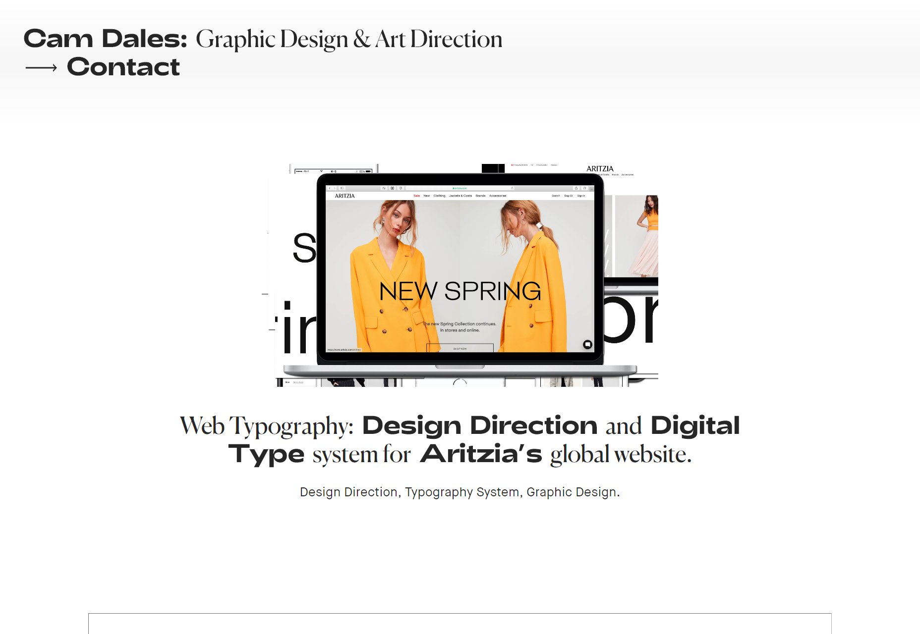
It’s August, which means the rain is finally slowing down, and I have a chance to get my roof fixed. While I wait here under a literal tarp-fort that I hung up in my office, I thought I might as well compile some of the best recent portfolios for you all to look at.

We have a mix of sites this month, both colorful and, shall we say, color-minimalist. We’ve got more than a few specimens of one-column layouts, and some superb CSS Grid-based affairs. Enjoy.

Note: I’m judging these sites by how good they look to me. If they’re creative and original, or classic but really well-done, it’s all good to me. Sometimes, UX and accessibility suffer. For example, many of these sites depend on JavaScript to display their content at all; this is a Bad Idea™, kids. If you find an idea you like and want to adapt to your own site, remember to implement it responsibly.

Mike Harrison

Mike Harrison’s portfolio is all about “big”: big text, big pictures, and a great big “M” that all fill up big screens (and yes, the small ones too). It’s dead simple, eye-catching, and might have a little bit of a blue thing going on. (It’s subtle, but it’s there [/sarcasm])

I sure would like it if the logo mark in the header took you back to the home page, like most sites do, but otherwise we have a solid (blue) first site for this list.

Platform: WordPress

Rules Creative

Who needs a power-point-style site when there’s actual 3D graphics to be had? Rules Creative uses both 3D and pseudo-3D effects combined with some light brutalism(?) to create a brash, but lovely-looking site. And it’s the first site this month to use yellow effectively, so it gets bonus points from me.

They could use a bit more contrast for the navigation menu at the bottom, perhaps, but it’s otherwise great.

Platform: Contentful

PWNK Digital

PWNK Digital brings more 3D WebGL graphics, a whole lot of pink, and a cyberpunk aesthetic, which makes their logotype alone very clever. The rest of the site is brilliantly atmospheric, whether you’re browsing through their work or their social feeds. It’s a great showcase of what can be achieved with WebGL and 3D graphics on the web in general.

Platform: Static Site (I think)

Caleb Barclay

Caleb Barclay’s site has that monospaced-type and thin borders look that was everywhere for a while. Combined with the pastels and grays, along with some light animation, the whole things is pleasant to browse through while listening to piano covers of ‘90s pop hits. I know that’s a bit specific, but it’s true.

It’s also another great example of what the Webflow platform can do. I do still prefer custom coding my sites, but man, the drag and drop builders are getting better.

Platform: Webflow

Zomorrodi Associates

The site for Zomorrodi Associates is a sleek, monochromatic design that makes excellent use of mild animation, for the most part, but hits you with a couple of big ones in just the right places. I kind of love the “broken” effect that they’re applied to a couple of elements, including their logo.

Platform: WordPress

Brightscout

Brightscout’s portfolio uses clean type, tons of futuristic vector illustrations, and a general aesthetic that I sort of remember seeing from the better designers on DeviantArt right as Web 2.0 was slowing down. Don’t get me wrong, I love it, and I love the way their using the green tones. If just using green made a company eco-friendly, these guys could have fixed the rainforest already.

Platform: WordPress

Rootsy

Rootsy has more pastels and grays to look at, but it’s mostly a brighter design. It’s also got a layout that works fantastically on larger screens, which I always like to see. As one-page portfolios go, this one feels downright elegant and sophisticated, while still managing to feel a bit techy.

Platform: Static Site

Kervin Tan

Kervin Tan’s portfolio has a lovely background animation, a good dark layout, and generally just looks pretty. Go look at the pretty thing.

Platform: Static Site

Isaac Powell

By contrast, Isaac Powell’s website is a lot brighter, though also very pretty. Go look at the other pretty thing. Well, I’ll admit that their approach to case studies is also pretty solid. They still let the images do most of the talking, but there’s a enough text to give you a feel for how they approach problems.

Platform: Statis Site

Ashley Sheekey

Ashley Sheekey’s portfolio looks less like a classic website, and more like a very elegant database. Nerd that I am, this does it for me. There’s something about that typography, grid-based organization, and the use of filters that just makes me happy.

Besides, when you have as much work to show off as Ashley does, filters just make sense. Someone please hold me down and tell me my own site doesn’t need filters. Oh, and do click on the “About” page, because I wasn’t kidding about that typography.

Platform: Static Site (I think)

Netbluez

Netbluez’ portfolio is modern, colorful, and it has lovely illustrations to boot. This one-pager keeps things mostly pretty simple, but then, I’m never going to get over how much my inner five-year-old likes space stuff. I love my minimalism, but I also like seeing designers go nuts with the illustration and graphics.

Platform: Static Site

Wesley van ’t Hart

This portfolio, well… I’ve seen a lot of minimalism in my admittedly limited time, but not many go for this much white space unless they have no content to speak of. Here, the white space is embraced, loved, and very well-used to frame a simple—but by no means empty—portfolio.

Platform: Static Site

Guillame Colombel

Guillame Colombel’s portfolio goes for the slideshow on the home page as their primary method of showing off their work. In general, animation is used to show off the images, and keep things looking fancy. And well, it does look fancy.

Platform: Static Site

EVERGIB

Want to see what CSS Grid can do for you? Look no further than the layout over at EVERGIB, with its print-like feel, and generally great use of white space. It’s a simple site, but simplicity is hard, and I get excited for the future of the web every time I see something this well-built.

Platform: WordPress

Stereo

Stereo is a site with smooth animation, a beautiful palette, and gorgeous type. It is a bit odd though, to have the navigation menu on the home page scrolling across the screen marquee-style (you can drag it manually, too, to get the link you want). It’s not an approach I’d recommend to everyone, but it’s certainly striking… and usable enough for short menus.

Plus, they managed to work memes into their actual website design in a way that made sense and amused me. I’m genuinely impressed with that.

Platform: WordPress

Christian Coan

Christian Coan’s portfolio is another one that leans hard into the use of yellow, but the real star of the show is that typography. I’m not sure I would have put the actual work all the way at the bottom, myself, but this one-pager is just that pretty.

Platform: Static Site

Kev Adamson

Not gonna lie, I am in love with Kev Adamson’s site for nostalgia reasons. It’s a bit ’90s, a bit early 2000s, and all built with more modern development techniques. I’m never going to say that we should all go back to skeuomorphism, but maybe some of us could, sometimes. This Kev person certainly can, I think.

Plus, they’re an illustrator. The aesthetic totally works.

Platform: Custom CMS

Cam Dales

Cam Dales’ portfolio is a fine example of both highly modern minimalism, and one-column layouts. It stands as a reminder that sometimes, when you’ve got very simple content, there’s no need to over complicate your design.

Platform: Cargo Collective, Backdrop

Studio 313

Studio 313 is coming in hot with a modern aesthetic, fantastic type, gradients, and A PUG WITH SUNGLASSES IT’S SO CUTE I WANT HIM BUT THEY HAVE SO MANY HEALTH PROBLEMS… and I have cats anyway. They’d go full Garfield on that poor thing.

It could use a bit more text contrast in places, but overall this site has quirky personal touches all over it, while still maintaining a professional image. That’s an approach I can respect.

Platform: WordPress

Kévin Chassagne

Kévin Chassagne’s portfolio is living (or at least functioning) proof that you can have and elegant, fancy website with great-looking animation, that also works without JavaScript. Sure, you don’t see the fancy ripples in the background, but everything important and functional still functions.

Sure, it’s a one-page portfolio with links to external sites, but my point stands. Content can load without JS. Oh, and I should probably mention that the site has fairly sold typography, and that I adore the color scheme. In this age of digital screens, it’s literally easy on the eyes.

Platform: Static Site

And you know what? If I’m honest, a part of me will really miss this tarp fort when it’s gone. It’s a fort. In my grown up office. Everyone should have one.

Source

p img {display:inline-block; margin-right:10px;}
.alignleft {float:left;}
p.showcase {clear:both;}
body#browserfriendly p, body#podcast p, div#emailbody p{margin:0;}

Collective #537

Original Source: http://feedproxy.google.com/~r/tympanus/~3/0Ax2VhJTyAA/

C537_WOTW

Inspirational Website of the Week: Drink Cann

A refreshing and colorful design with a bubbly motif. Our pick this week.

Get inspired

C357_tania

Writing a Simple MVC App in Plain JavaScript

A tutorial by Tania Rascia where she shows how to write an MVC app in plain JavaScript using the model-view-controller architectural pattern.

Read it

Screen-Shot-2019-08-01-at-14.24.38

I Used The Web For A Day On A 50 MB Budget

Chris Ashton puts himself in the shoes of someone on a tight data budget and offers practical tips for reducing our websites’ data footprint.

Read it

C537_divi

Our Sponsor
The Ultimate WordPress Page Builder

You’ve never built a WordPress website like this before. Divi is more than just a WordPress theme, it’s a completely new website building platform that replaces the standard WordPress post editor with a vastly superior visual editor.

Try it

C537_darkweb

The Real Dark Web

A refreshing read by Charlie Owen on the “boring” majority of the web dev world.

Read it

C537_aicomponents

Components AI

An experimental platform for exploring generative design systems. You can cycle through generated designs one or many at a time until you find something inspiring.

Check it out

C537_access

Truths about digital accessibility

Some things to keep in mind when creating, maintaining, or evaluating accessible technology. By Eric Bailey.

Read it

C537_ocean

Deep sea (Chrome only)

Yuan Chuan made this wonderful demo of an animated abstract underwater scene.

Check it out

C537_planet

Planet

Nadieh Bremer shares a magnificent project that visualizes how Planet’s satellites create a full image of Earth’s landmass in one single day. Read more about it in this tweet.

Check it out

C537_offmainthread

React + Redux + Comlink = Off-main-thread

Surma investigates if and how React and Redux workings can be go off the main thread.

Read it

C537_glasssvg

Making a Realistic Glass Effect with SVG

A tutorial by David Fitzgibbon on how to make a creative glass effect with SVG.

Read it

C537_webglmonth

WebGL Month summary

Andrei Lesnitsky summarizes all tutorials he wrote in the past month for learning WebGL from scratch.

Check it out

C537_newsletters

The Best Newsletters to Subscribe to for a Frontend Developer

Brian Rinaldi shares a list of newsletters relevant for frontend developers.

Check it out

C537_kit

Aurora web elements for Adobe XD and Sketch

The Aurora UI kit is a free set of 24 web screens with a modern design.

Get it

C537_github

A Message to GitHub

A repo that raises awareness on GitHub’s banning of Iranian and other users from sanctioned countries.

Check it out

C537_cassie

Creating my logo animation

Cassie Evans explains how she created the slick SVG path animation of her logo.

Read it

C537_vue

What I Like About Vue

Dave Rupert shares a list of things that make him enjoy Vue.

Read it

C537_speech

Verby

A tool for creating and downloading natural voices as mp3 audio files.

Check it out

C537_firefox

New CSS Features in Firefox 68

Rachel Andrew introduces all the exciting CSS features released with the new Firefox.

Read it

C537_imperial

Imperial Star Destroyer animated in 3D using only CSS

An impressive CSS only demo made by Hai Le.

Check it out

C537_mascot

Figuring out CSS animation properties with a magic kittencorn

Chen Hui Jing writes about how the mascot for SingaporeCSS was brought to life with CSS animations.

Read it

C537_csscustom

Using CSS Custom attributes generated by JavaScript as a handover mechanism

Chris Heilmann writes about CSS Custom Properties and shows how to only use JavaScript to read a value and leave the rest to CSS.

Read it

Collective #537 was written by Pedro Botelho and published on Codrops.

SitePoint Premium New Releases: Smashing 6 + GraphQL & React Native

Original Source: https://www.sitepoint.com/sitepoint-premium-new-releases-smashing-6-graphql-react-native/?utm_source=rss

We’re working hard to keep you on the cutting edge of your field with SitePoint Premium. We’ve got plenty of new books to check out in the library — let us introduce you to them.

Smashing Book 6: New Frontiers In Web Design

It’s about time to finally make sense of all the front-end and UX madness. Meet Smashing Book 6, with everything you need to know about web design. From design systems to accessible single-page apps, CSS Custom Properties, CSS Grid, Service Workers, performance patterns, AR/VR, conversational UIs and responsive art direction.

➤ Read Smashing Book 6: New Frontiers In Web Design.

Working with GraphQL and React Native

In this tutorial, we’re going to demostrate the power of GraphQL in a React Native setting by creating a simple coffee bean comparison app. So that you can focus on all of the great things GraphQL has to offer, Jamie has put together the base template for the application using Expo.

➤ Read Working with GraphQL and React Native.

And More to Come…

We’re releasing new content on SitePoint Premium regularly, so we’ll be back next week with the latest updates. And don’t forget: if you haven’t checked out our offering yet, take our library for a spin.

The post SitePoint Premium New Releases: Smashing 6 + GraphQL & React Native appeared first on SitePoint.

Mr Mac Book discredits the MacBook in new Microsoft ad

Original Source: http://feedproxy.google.com/~r/CreativeBloq/~3/yKNL7jq3Up0/mac-book-ad

As far as rival businesses go, companies don't get much more competitive than Microsoft and Apple. The two have form when it comes to making fun of each other in their marketing, remember those "I'm a Mac, he's a PC" ads? But Microsoft is making things personal in its latest advert, which sees someone called Mac Book explain why the Surface Laptop 2 is superior to the MacBook Air.

To be fair, choosing between the two devices is difficult. If you're in the market for a new laptop, why not check out the best Microsoft Surface deals, or our guide to the best MacBook Pro alternatives. These will help you to make your mind up, and you might even grab a bargain.

As for the campaign, it's a cheeky move on Microsoft's part. In the advert (below), the computer company has enlisted the promotional skills of an Australian man whose actual, real name is Mackenzie Book to help sell the strengths of the Surface Laptop 2.

A snarky voice over asks Mac Book a series of questions about which device performs better. Unsurprisingly, he points out that the Surface Laptop 2 lasts longer and performs better than the MacBook Air. If you look carefully, you'll also see that he barely even interacts with the Apple device.

It's a clever campaign, and we can only imagine Microsoft's excitement when they discovered that Mackenzie Book was happy to get involved. It's also handy that he apparently seems to prefer the Microsoft device. It would be pretty awkward if he mouthed off about how much he admires the strength of Apple and the way it works with photo editing apps.

We'd forgive you for thinking that Microsoft could've just made up this Mackenzie Book character for its promotional needs. But given the stilted delivery of lines like "you should get a surface. Trust me, I'm Mac Book", we're willing to bet that this a real guy who happens to have an on-brand Apple name.

Related articles:

The best laptops for graphic designThe best laptops for video editingThe best drawing tablet for illustrators and artists

Simplify The Handoff From Sketch To Visual Studio Code With Indigo.Design

Original Source: https://www.smashingmagazine.com/2019/07/handoff-sketch-indigo-design/

Simplify The Handoff From Sketch To Visual Studio Code With Indigo.Design

Simplify The Handoff From Sketch To Visual Studio Code With Indigo.Design

Suzanne Scacca

2019-07-31T14:00:00+02:00
2019-07-31T21:35:22+00:00

(This is a sponsored article.) If you think about it, software teams are a lot like sports teams. While each team member works towards the same exact goal, the role they play and the actions they take are vastly different from one another.

Which is why it’s crucial to have a seamless way of moving the ball from one team member to another.

Unfortunately, the handoff that takes place within software teams isn’t naturally as smooth as what you see on the sports field. And one of the primary reasons for this is the different systems and approaches used to build products.

Designers create pixel-perfect UIs in Sketch, only to have to translate them into a language that developers can use when they build apps in the Visual Studio Code IDE. Without a seamless way to move product designs through the pipeline, these inefficiencies lead to expensive reworks and debugging after an app has been shuttled from designer to developer.

Needless to say, a solution to the Sketch-to-IDE handoff problem has been a long time coming. It’s not that software teams don’t know how to collaborate or communicate well with one another. It’s just that their disparate systems and strategies make the transition from one team to another clunky, time-consuming and error-ridden.

Today, we’re going to look at why this happens and how your agency can fix the problem with two plugins and a prototyping cloud platform from Indigo.Design.

Where Does the Designer-Developer Handoff Go Wrong?

First, what we should really ask is:

Why is the designer-developer handoff such a problem?

Nick Babich recently wrote about how designers go to great lengths to create digital solutions that are perfectly measured and consistently crafted. But design systems don’t fluently translate to development systems.

The more the designer does to an interface, the more they have to actually communicate to a developer. So, it’s not enough to hand over a Sketch design file and leave the developer to run with it. Designers have to provide design specs that explain how all the moving pieces need to be laid out, spaced, styled, colored, engaged with and so on.

It’s been the only way to ensure that an app ends up pixel-perfect in the end. Even then, it still requires a lot of implementation on the part of the developer once they’re inside their IDE.

As you can imagine, this whole process takes a designer a lot of time to do. But without design specs, developers end up having to play a risky guessing game.

Not only that, developers aren’t typically in the habit of coding with HTML and CSS, which is tedious work and only represents the UI. There’s a lot more code behind the scenes that makes a web app work and not all developers are adept at or interested in learning to write the UI markup. When they’re forced into this position, the steep learning curve adds more time to projects and the resulting reworks and debugging sends costs spiraling out of control.

So, really, the designer-developer handoff has become a matter of whose time can we afford to waste?

Is it the designer who has to redline everything so the developer knows how to turn the design into reality?

Or:

Is it the developer who has to look at a design, manually measure everything on the screen and hope they get all the specifications right just by eyeballing it?

No one wins in either scenario. And you’re going to eat away at your profit margins in the process.

There may be some agencies who believe that forcing designers and developers to work in the same platform is the best solution. That way, there’s no need to do all of this translation or interpretation during the handoff from Sketch to Visual Studio Code. But that often results in stifled creativity on the part of the designer or a hampered ability to build effective software solutions on the part of the developer.

So, what’s the answer?

Improve The Designer-Developer Handoff With Indigo.Design

It’s not like Indigo.Design is the first platform to try to solve handoff issues for software teams. InVision and Zeplin have both offered up their own solutions.

Each of these platforms have made visual specifications more accessible for developers while consequently improving the efficiency of designer-developer teams. Specifically:

Designers don’t need to mark up the UI anymore as the platforms handle the redlines.
Developers can manually extract the design specs without the designers’ help.

That said, with platforms like InVision and Zeplin, developers still have to inspect each element and manually code it based on the extracted specs. These platforms also have yet to create a seamless bridge between Sketch and Visual Studio Code.

So, if designers and developers want to work as efficiently as possible with one another, Indigo.Design has developed an answer to their problem:

Step 1: Design in Sketch

There’s really only one thing about this phase that has to change for the designer. The app, pages and flow will still be designed as usual within Sketch, using components from the Indigo.Design UI Kit.

An app built in Sketch

An example of what your app might look like in Sketch. (Source: Sketch) (Large preview)

However, there’s no longer any need to compile redlines or specs for the app anymore. Indigo.Design takes care of it for you.

In order to leverage this, your designer has to ditch whatever prototyping system they were using before. With this new streamlined and error-free system, your designer can easily push their designs into the cloud using the Indigo.Design plugin.

This can be accessed under the Plugins menu > Indigo.Design > Publish Prototype:

Indigo.Design plugin

The Indigo.Design plugin simplifies the publication of prototypes. (Source: Sketch) (Large preview)

There’s no need for the designer to export files and upload into another system for clients to review or developers to work with. They get to stay right where they are to publish the prototype.

Indigo.Design cloud link

All it takes is one link to move clients, developers and others into the Indigo.Design cloud. (Source: Indigo.Design) (Large preview)

It takes only about a minute to complete the process, too. The designer is then given a link to the cloud which they can share with clients and others to review and comment on the prototype.

Step 2: Work in the Indigo.Design Cloud

To get others into the cloud is easy. The link provided will take them into the experience cloud where the design can be reviewed:

Indigo.Design app prototype

An example of how an app prototype looks in Indigo.Design. (Source: Indigo.Design) (Large preview)

It’s easy to leave comments on top of the design, too. All users have to do is open the Comments panel, drop a pin and attach their comment to it:

Indigo.Design prototype comments

How to leave comments on prototypes in Indigo.Design. (Source: Indigo.Design) (Large preview)

There’s more to this collaboration software than that though. The prototype can also be edited from the cloud.

To access this, the designer, developer and anyone else with group access will locate the project from the prototype library:

Indigo.Design prototype editor access

Access to the prototype editor in Indigo.Design. (Source: Indigo.Design) (Large preview)

Click “Edit Prototype” to enter the Indigo.Design editor:

Indigo.Design editor

An example of how prototypes appear in the Indigo.Design editor. (Source: Indigo.Design) (Large preview)

Once a screen is selected, the designer can add a hotspot to create a new interaction in the app.

Indigo.Design prototype editing

Adding a new interaction to a prototype in Indigo.Design. (Source: Indigo.Design) (Large preview)

You can also use the Indigo.Design editor to inspect the specifications of the app UI:

Indigo.Design relative spacing measurements

Measuring relative spacing of an app UI in Indigo.Design. (Source: Indigo.Design) (Large preview)

Hovering over an element reveals relative spacing specs. Clicking on an element reveals much more detail:

Indigo.Design design specs

Indigo.Design reveals all specs of the UI in its editor. (Source: Indigo.Design) (Large preview)

The developer can also edit or copy the cleanly written and outputted CSS from this panel, too. (Though they shouldn’t have to, as I’ll explain in the next step.)

See what I mean about saving designers time in generating specs? By simply pushing this design into the Indigo.Design cloud, the specs are automatically generated.

Step 3: Build in Visual Studio Code

Now, let’s say your design is good enough to go into development. The moving of an Indigo.Design prototype to Visual Studio Code is just as easy as the move from Sketch was.

Retrieve the original cloud link provided by the Indigo.Design plugin in Sketch. If you don’t have it anymore, that’s fine. You can retrieve it from the libraries screen in Indigo.Design:

Indigo.Design prototype link

Where to retrieve your Indigo.Design prototype link. (Source: Indigo.Design) (Large preview)

All the developer has to do now is install the Indigo.Design Code Generator extension. This is what enables Visual Studio Code to talk directly to Indigo.Design to retrieve the prototype.

Once the extension is set up, the developer will do the following:

Visual Studio Code extension

How to launch the Indigo.Design Code Generator in Visual Studio Code. (Source: Visual Studio Code) (Large preview)

Open the app shell that’s already been developed. Then, launch the Indigo.Design Code Generator. This is where you’ll enter the cloud link:

Indigo.Design Code Generator extension

Enter your prototype link into the Indigo.Design Code Generator extension. (Source: Visual Studio Code) (Large preview)

This will reveal a pop-up with the app designs that live in the cloud as well as the individual components they’re comprised of.

Indigo.Design generate code assets

Developers control which components they want to generate code assets for. (Source: Visual Studio Code) (Large preview)

The developer has the option to generate code for all components of the app or to go component-by-component, checking only the ones they need. This is especially helpful if an app is in progress and the developer only needs to import new components into VSC.

By clicking “Generate Code Assets”, the selected components will be added into Angular as readable and semantic HTML and CSS.

The developer now has less to worry about in terms of rebuilding styles or configuring other specs. Instead, they can spend their time building business functionality and really refining the product.

A Note About This Process

It’s important to point out that this Sketch – cloud – Visual Studio Code workflow doesn’t just work with the first iteration of a design. Developers can build while designers work through feedback with clients or usability studies with users — something Indigo.Design has accounted for.

So, let’s say the designer moved a login form UI through Indigo.Design and the developer generated the code to get things moving.

While working on the form, the developer implemented some authentication code in the TypeScript file.

In the meantime, though, the designer received a message from the client, letting them know that a new Universal Login with Google needed to be implemented. Which means the UX has to change.

When the update is ready and the prototype sync’ed to Indigo.Design, the designer messages the developer to let them know about the changes. So, the developer launches the Visual Studio Code Generator once more. However, when regenerating the login screen, they select “Do Not Override” on the TypeScript file. This way, they can preserve the code they wrote while simultaneously importing the new HTML and CSS.

The developer can then make any necessary adjustments based on the updated design.

Wrap-Up

Indigo.Design has effectively created an efficient and bug-free handoff for designers working in Sketch and developers working in Visual Studio Code.

Designers don’t waste time designing in one platform and prototyping in another, drawing up design specs or dealing with file exports. Developers don’t waste time trying to re-create the design intent from a static file.

As Jason Beres, the Senior VP of Product Development for Indigo.Design, said:

With Indigo.Design code generation, all of these bugs are 100% avoided. Not only is the spirit of the design maintained, but pixel-perfect HTML and CSS is created so the developer isn’t in the unfortunate position of having to manually match the design.

And by working out the technical kinks in the designer-developer workflows and handoff, your agency will greatly reduce the cost of reworks and debugging. You’ll also boost profits by providing your software team with a more efficient and quicker way to get apps through the process and in pixel-perfect condition.

Smashing Editorial
(yk,ra)