Performing iOS Animations On Views With UIKit And UIView

Original Source: https://www.smashingmagazine.com/2019/11/performing-ios-animations-views-uikit-uiview/

Performing iOS Animations On Views With UIKit And UIView

Performing iOS Animations On Views With UIKit And UIView

Saravanan V

2019-11-20T11:00:00+00:00
2019-11-20T17:35:47+00:00

I have been an iOS developer for over a decade now and have rarely seen articles that consolidate all possible ways to perform animations in iOS. This article aims to be a primer on iOS animations with the intent of exhaustively covering the different ways of doing the same.

Given the extensiveness of the topic, we would cover each part succinctly at a fairly high level. The goal is to educate the reader with a set of choices to add animations to his/ her iOS app.

Before we start off with topics related to iOS, let us take a brief look at animation speed.

Animating At 60FPS

Generally in videos, each frame is represented by an image and the frame rate determines the number of images flipped in the sequence. This is termed as ‘frames per second’ or FPS.

FPS determines the number of still images flipped within a second, which literally means that the more the number of images/ frames, more details/ information are displayed in the video. This holds true for animations as well.

FPS is typically used to determine the quality of animations. There is a popular opinion that any good animation should run at 60fps or higher — anything less than 60fps would feel a bit off.

Do you want to see the difference between 30FPS and 60FPS? Check this!

Did you notice the difference? Human eyes can definitely feel the jitter at lower fps. Hence, it is always a good practice to make sure that any animation you create, adheres to the ground rule of running at 60FPS or higher. This makes it feel more realistic and alive.

Having looked at FPS, let’s now delve into the different core iOS frameworks that provide us a way to perform animations.

Core Frameworks

In this section, we will touch upon the frameworks in the iOS SDK which can be used for creating view animations. We will do a quick walk through each of them, explaining their feature set with a relevant example.

UIKit/ UIView Animations

UIView is the base class for any view that displays content in iOS apps.

UIKit, the framework that gives us UIView, already provides us some basic animation functions which make it convenient for developers to achieve more by doing less.

The API, UIView.animate, is the easiest way to animate views since any view’s properties can be easily animated by providing the property values in the block-based syntax.

In UIKit animations, it is recommended to modify only the animatable properties of UIVIew else there will be repercussions where the animations might cause the view to end up in an unexpected state.

animation(withDuration: animations: completion)

This method takes in the animation duration, a set of view’s animatable property changes that need to be animated. The completion block gives a callback when the view is done with performing the animation.

Almost any kind of animation like moving, scaling, rotating, fading, etc. on a view can be achieved with this single API.

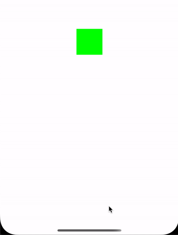
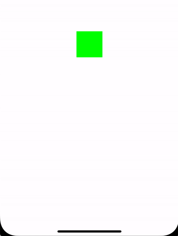
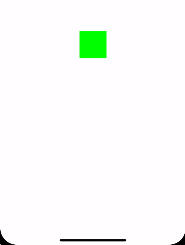
Now, consider that you want to animate a button size change or you want a particular view to zoom into the screen. This is how we can do it using the UIView.animate API:

let newButtonWidth: CGFloat = 60

UIView.animate(withDuration: 2.0) { //1
self.button.frame = CGRect(x: 0, y: 0, width: newButtonWidth, height: newButtonWidth) //2
self.button.center = self.view.center //3
}

Here’s what we are doing here:

We call the UIView.animate method with a duration value passed to it that represents how long the animation, described inside the block, should run.
We set the new frame of the button that should represent the final state of the animation.
We set the button center with its superview’s center so that it remains at the center of the screen.

The above block of animation code should trigger the animation of the button’s frame changing from current frame:

Width = 0, Height = 0

To the final frame:

Width = Height = newButtonWidth

And here’s what the animation would look like:

animateWithDuration:delay:usingSpringWithDamping:initialSpringVelocity:options:animations:completion

This method is like an extension of the animate method where you can do everything that you can perform in the prior API with some physics behaviors added to the view animations.

For example, if you want to achieve spring damping effects in the animation that we have done above, then this is how the code would look like:

let newButtonWidth: CGFloat = 60
UIView.animate(withDuration: 1.0, //1
delay: 0.0, //2
usingSpringWithDamping: 0.3, //3
initialSpringVelocity: 1, //4
options: UIView.AnimationOptions.curveEaseInOut, //5
animations: ({ //6
self.button.frame = CGRect(x: 0, y: 0, width: newButtonWidth, height: newButtonWidth)
self.button.center = self.view.center
}), completion: nil)

Here’s the set of parameters we use:

duration
Represents the duration of the animation determining how long the block of code should run.
delay
Represents the initial delay that we want to have before the start of the animation.
SpringWithDamping
Represents the value of the springy effect that we want the view to behave. The value must be between 0 to 1. The lower the value, the higher the spring oscillation.
velocity
Represents the speed at which the animation should start.
options
Type of animation curve that you want to apply to your view animation.
Finally, the block of code where we set the frame of the button that needs to be animated. It is the same as the previous animation.

And here’s what the animation would look like with the above animation configuration:

UIViewPropertyAnimator

For a bit more control over animations, UIViewPropertyAnimator comes handy where it provides us a way to pause and resume animations. You can have custom timing and have your animation to be interactive and interruptible. This is very much helpful when performing animations that are also interactable with user actions.

The classic ‘Slide to Unlock’ gesture and the player view dismiss/ expand animation (in the Music app) are examples of interactive and interruptible animations. You can start moving a view with your finger, then release it and the view will go back to its original position. Alternatively, you can catch the view during the animation and continue dragging it with your finger.

Following is a simple example of how we could achieve the animation using UIViewPropertyAnimator:

let newButtonWidth: CGFloat = 60
let animator = UIViewPropertyAnimator(duration:0.3, curve: .linear) { //1
self.button.frame = CGRect(x: 0, y: 0, width: newButtonWidth, height: newButtonWidth)
self.button.center = self.view.center
}
animator.startAnimation() //2

Here’s what we are doing:

We call the UIViewProperty API by passing the duration and the animation curve.
Unlike both the above UIView.animate API’s, the animation won’t start unless you specify it by yourself i.e. you’re in full control of the complete animation process/ flow.

Now, let’s say that you want even more control over the animations. For example, you want to design and control each and every frame in the animation. There’s another API for that, animateKeyframes. But before we delve into it, let’s quickly look at what a frame is, in an animation.

What Is A frame?

A collection of the view’s frame changes/ transitions, from the start state to the final state, is defined as animation and each position of the view during the animation is called as a frame.

animateKeyframes

This API provides a way to design the animation in such a way that you can define multiple animations with different timings and transitions. Post this, the API simply integrates all the animations into one seamless experience.

Let’s say that we want to move our button on the screen in a random fashion. Let’s see how we can use the keyframe animation API to do so.

UIView.animateKeyframes(withDuration: 5, //1
delay: 0, //2
options: .calculationModeLinear, //3
animations: { //4
UIView.addKeyframe( //5
withRelativeStartTime: 0.25, //6
relativeDuration: 0.25) { //7
self.button.center = CGPoint(x: self.view.bounds.midX, y: self.view.bounds.maxY) //8
}

UIView.addKeyframe(withRelativeStartTime: 0.5, relativeDuration: 0.25) {
self.button.center = CGPoint(x: self.view.bounds.width, y: start.y)
}

UIView.addKeyframe(withRelativeStartTime: 0.75, relativeDuration: 0.25) {
self.button.center = start
}
})

Here’s the breakdown:

duration
Call the API by passing in the duration of the animation.
delay
Initial delay duration of the animation.
options
The type of animation curve that you want to apply to your view animation.
animations
Block that takes all keyframe animations designed by the developer/ user.
addKeyFrame
Call the API to design each and every animation. In our case, we have defined each move of the button. We can have as many such animations as we need, added to the block.
relativeStartTime
Defines the start time of the animation in the collection of the animation block.
relativeDuration
Defines the overall duration of this specific animation.
center
In our case, we simply change the center property of the button to move the button around the screen.

And this is how the final animations looks like:

CoreAnimation

Any UIKit based animation is internally translated into core animations. Thus, the Core Animation framework acts as a backing layer or backbone for any UIKit animation. Hence, all UIKit animation APIs are nothing but encapsulated layers of the core animation APIs in an easily consumable or convenient fashion.

UIKit animation APIs don’t provide much control over animations that have been performed over a view since they are used mostly for animatable properties of the view. Hence in such cases, where you intend to have control over every frame of the animation, it is better to use the underlying core animation APIs directly. Alternatively, both the UIView animations and core animations can be used in conjunction as well.

UIView + Core Animation

Let’s see how we can recreate the same button change animation along with specifying the timing curve using the UIView and Core Animation APIs.

We can use CATransaction’s timing functions, which lets you specify and control the animation curve.

Let’s look at an example of a button size change animation with its corner radius utilizing the CATransaction’s timing function and a combination of UIView animations:

let oldValue = button.frame.width/2
let newButtonWidth: CGFloat = 60

/* Do Animations */
CATransaction.begin() //1
CATransaction.setAnimationDuration(2.0) //2
CATransaction.setAnimationTimingFunction(CAMediaTimingFunction(name: CAMediaTimingFunctionName.easeInEaseOut)) //3

// View animations //4
UIView.animate(withDuration: 1.0) {
self.button.frame = CGRect(x: 0, y: 0, width: newButtonWidth, height: newButtonWidth)
self.button.center = self.view.center
}

// Layer animations
let cornerAnimation = CABasicAnimation(keyPath: #keyPath(CALayer.cornerRadius)) //5
cornerAnimation.fromValue = oldValue //6
cornerAnimation.toValue = newButtonWidth/2 //7

button.layer.cornerRadius = newButtonWidth/2 //8
button.layer.add(cornerAnimation, forKey: #keyPath(CALayer.cornerRadius)) //9

CATransaction.commit() //10

Here’s the breakdown:

begin
Represents the start of the animation code block.
duration
Overall animation duration.
curve
Represents the timing curve that needs to be applied to the animation.
UIView.animate
Our first animation to change the frame of the button.
CABasicAnimation
We create the CABasicAnimation object by referring the cornerRadius of the button as the keypath since that’s what we want to animate. Similarly, if you want to have granular level control over the keyframe animations, then you can use the CAKeyframeAnimation class.
fromValue
Represents the starting value of the animation, i.e. the initial cornerRadius value of the button from where the animation must start off.
toValue
Represents the final value of the animation, i.e. the final cornerRadius value of the button where the animation must end.
cornerRadius
We must set the cornerRadius property of the button with the final value of the animation else the button’s cornerRadius value will get auto-reverted to its initial value after the animation completes.
addAnimation
We attach the animation object that contains the configuration of the entire animation process to the layer by representing the Keypath for which the animation needs to be performed.
commit
Represents the end of the animation code block and starts off the animation.

This is how the final animation would look like:

This blog is a great read to help create more advanced animations as it neatly walks you through most of the Core Animation framework APIs with instructions guiding you through every step of the way.

UIKitDynamics

UIKit Dynamics is the physics engine for UIKit which enables you to add any physics behaviors like collision, gravity, push, snap, etc, to the UIKit controls.

UIKitDynamicAnimator

This is the admin class of the UIKit Dynamics framework that regulates all animations triggered by any given UI control.

UIKitDynamicBehavior

It enables you to add any physics behavior to an animator which then enables it to perform on the view attached to it.

Different kinds of behaviors for UIKitDynamics include:

UIAttachmentBehavior
UICollisionBehavior
UIFieldBehavior
UIGravityBehavior
UIPushBehavior
UISnapBehavior

The architecture of UIKitDynamics looks something like this. Note that Items 1 to 5 can be replaced with a single view.

Let us apply some physics behavior to our button. We will see how to apply gravity to the button so that it gives us a feeling of dealing with a real object.

var dynamicAnimator : UIDynamicAnimator!
var gravityBehavior : UIGravityBehavior!

dynamicAnimator = UIDynamicAnimator(referenceView: self.view) //1

gravityBehavior = UIGravityBehavior(items: [button]) //2
dynamicAnimator.addBehavior(gravityBehavior) //3

Here’s the breakdown:

UIKitDynamicAnimator
We have created a UIKitDynamicAnimator object which acts as an orchestrator for performing animations. We have also passed the superview of our button as the reference view.
UIGravityBehavior
We have created a UIGravityBehavior object and pass our button into the array elements on which this behavior is injected.
addBehavior
We have added the gravity object to the animator.

This should create an animation as shown below:

Notice how the button falls off from the center (its original position) of the screen to the bottom and beyond.

We should tell the animator to consider the bottom of the screen to be the ground. This is where UICollisionBehavior comes into picture.

var dynamicAnimator : UIDynamicAnimator!
var gravityBehavior : UIGravityBehavior!
var collisionBehavior : UICollisionBehavior!

dynamicAnimator = UIDynamicAnimator(referenceView: self.view) //1

gravityBehavior = UIGravityBehavior(items: [button]) //2
dynamicAnimator.addBehavior(gravityBehavior) //3

collisionBehavior = UICollisionBehavior(items: [button]) //4
collisionBehavior.translatesReferenceBoundsIntoBoundary = true //5
dynamicAnimator.addBehavior(collisionBehavior) //6

UICollisionBehavior
We have created a UICollisionBehavior object and passed along the button so that the behavior is added to the element.
translatesReferenceBoundsIntoBoundary
Enabling this property tells the animator to take the reference views boundary as the end, which is the bottom of the screen in our case.
addBehavior
We have added collision behavior to the animator here.

Now, our button should hit the ground and stand still as shown below:

That’s pretty neat, isn’t it?

Now, let us try adding a bouncing effect so that our object feels more real. To do that, we will use the UIDynamicItemBehavior class.

var dynamicAnimator : UIDynamicAnimator!
var gravityBehavior : UIGravityBehavior!
var collisionBehavior : UICollisionBehavior!
var bouncingBehavior : UIDynamicItemBehavior!

dynamicAnimator = UIDynamicAnimator(referenceView: self.view) //1

gravityBehavior = UIGravityBehavior(items: [button]) //2
dynamicAnimator.addBehavior(gravityBehavior) //3

collisionBehavior = UICollisionBehavior(items: [button]) //4
collisionBehavior.translatesReferenceBoundsIntoBoundary = true //5
dynamicAnimator.addBehavior(collisionBehavior) //6

//Adding the bounce effect
bouncingBehavior = UIDynamicItemBehavior(items: [button]) //7
bouncingBehavior.elasticity = 0.75 //8
dynamicAnimator.addBehavior(bouncingBehavior) //9

UIDynamicItemBehavior
We have created a UIDynamicItemBehavior object and pass along the button so that the behavior is added to the element.
elasticity
Value must be between 0-1, it represents the elasticity i.e. the number of times the object must bounce on and off the ground when it is hit. This is where the magic happens — by tweaking this property, you can differentiate between different kinds of objects like balls, bottles, hard-objects and so on.
addBehavior
We have added collision behavior to the animator here.

Now, our button should bounce when it hits the ground as shown below:

This repo is quite helpful and shows all UIKitDynamics behaviors in action. It also provides source code to play around with each behavior. That, in my opinion, should serve as an extensive list of ways to perform iOS animations on views!

In the next section, we will take a brief look into the tools that will aid us in measuring the performance of animations. I would also recommend you to look at ways to optimize your Xcode build since it will save a huge amount of your development time.

Performance Tuning

In this section, we will look at ways to measure and tune the performance of iOS animations. As an iOS developer, you might have already used Xcode Instruments like Memory Leaks and Allocations for measuring the performance of the overall app. Similarly, there are instruments that can be used to measure the performance of animations.

Core Animation Instrument

Try the Core Animation instrument and you should be able to see the FPS that your app screen delivers. This is a great way to measure the performance/ speed of any animation rendered in your iOS app.

Drawing

FPS is vastly lowered in the app that displays heavy content like images with effects like shadows. In such cases, instead of assigning the Image directly to the UIImageView’s image property, try to draw the image separately in a context using Core Graphics APIs. This overly reduces the image display time by performing the image decompression logic asynchronously when done in a separate thread instead of the main thread.

Rasterization

Rasterization is a process used to cache complex layer information so that these views aren’t redrawn whenever they’re rendered. Redrawing of views is the major cause of the reduction in FPS and hence, it is best to apply rasterization on views that are going to be reused several times.

Wrapping Up

To conclude, I have also summed up a list of useful resources for iOS animations. You may find this very handy when working on iOS animations. Additionally, you may also find this set of design tools helpful as a (design) step before delving into animations.

I hope I have been able to cover as many topics as possible surrounding iOS animations. If there is anything I may have missed out in this article, please let me know in the comments section below and I would be glad to make the addition!

Smashing Editorial
(dm, yk, il)

Amazing Illustration Work of Mercedes Bazan

Original Source: http://feedproxy.google.com/~r/abduzeedo/~3/GOtwRIUcHOo/amazing-illustration-work-mercedes-bazan

Amazing Illustration Work of Mercedes Bazan

abduzeedoNov 15, 2019

I recently came back from a trip to Japan, it was my first time there and I was blown away by the culture, especially the visuals. I was familiar with the aesthetics from video-games and mangas, however seeing some of the contrasts of peaceful and minimal to chaotic and colorful is incredible in person. The reason I’m bringing this up is because I was reading this interview with James White and he mentioned Mercedes Bazan as an illustrator he admires. James is one of my favorite people so I had to check out and of course he was right, again. So here we are, featuring the amazing work of Mercedes Bazan

Illustration


Strategies for Using Automated Translation Effectively on Your Website

Original Source: http://feedproxy.google.com/~r/Designrfix/~3/szUw5UPgrWU/strategies-for-using-automated-translation-effectively-on-your-website

Do you need to implement automated translation into your business? Worry no more. This article explores relevant aspects to consider before adopting the automated translation to your business. Communication is a crucial interaction tool. It plays a significant role in the socio-economic dimension. To go global, you need to translate your business in a manner […]

The post Strategies for Using Automated Translation Effectively on Your Website appeared first on designrfix.com.

4 Actionable Tips for Making Website Photos Better

Original Source: http://feedproxy.google.com/~r/Designrfix/~3/84e5kCGLAf0/4-actionable-tips-for-making-website-photos-better

First impressions carry just as much weight in the digital world as they do in the physical one. The way your site visually captivates its visitors usually translates into bigger profit and success. And what could be more important for the good looks of your website if not the pictures you choose to decorate it? […]

The post 4 Actionable Tips for Making Website Photos Better appeared first on designrfix.com.

The New Features of GSAP 3

Original Source: http://feedproxy.google.com/~r/tympanus/~3/ylk06b17RKA/

In this article we will explore many of the new features available from GSAP 3. The GreenSock animation library is a JavaScript library many front-end developers turn to because it can be easy to get started and you can create powerful animations with a lot of control. Now with GSAP 3 getting started with GreenSock is even easier.

Some of the new features we will cover in this article are:

GreenSock’s smaller file size
A Simplified API which offers a newer syntax
Defaults in timelines
Easier to use with build tools and bundlers
Advanced stagger everywhere!
Keyframes
MotionPath and MotionPath plugin
use of Relative “>” and “<” position prefix in place of labels in Timelines
The new “effects” extensibility
Utility methods

…and more!

GreenSock’s smaller file size

First and foremost the GreenSock library is now even smaller. It still packs all the amazing features I love, plus more (50+ more to be exact). But it is now about half the size! We will see some of the reasons below like the new simplified API but at its core GSAP was completely rebuilt as modern ES modules.

A Simplified API

With the new version of GreenSock we no longer have to decide whether we want to use TweenMax, TweenLite, TimelineMax, or TimelineLite. Now, everything is in a single simplified API so instead of code that looks like this:

TweenMax.to(‘.box’, 1, {
scale: 0.5,
y: 20,
ease: Elastic.easeOut.config( 1, 0.3)
})

We can write this instead:

gsap.to(“.box1”,{
duration: 1,
scale: 0.5,
y: 20 // or you can now write translateY: 20,
ease: “elastic(1, 0.3)”,
});

Creating Timelines is easier too. Instead of using new TimelineMax() or new TimelineLite() to create a timeline, you now just use gsap.timeline() (simpler for chaining).

Here is an example of the first syntax change. Note that the old syntax still works in GSAP 3 for backward compatibility. According to GreenSock, most legacy code still works great.

See the Pen GreenSock New vs Old syntax by Christina Gorton (@cgorton) on CodePen.dark

Duration

Previously, the animation’s duration was defined as its own parameter directly after the target element. Like this:

TweenMax.to(‘.box’, 1, {})

With the new version, duration is defined in the same vars object as the rest of the properties you animate and therefore is more explicit.

gsap.to(“.box”,{
duration: 2,
});

This adds several benefits such as improved readability. After working with and teaching GSAP for a while now, I agree that having an explicit duration property is helpful for anyone new to GreenSock and those of us who are more experienced. This isn’t the only thing the new API improves though. The other benefits will become more obvious when we look at defaults in timelines and the new Keyframes.

Defaults in timelines

This new feature of GSAP is really wonderful for anyone who creates longer animations with gsap.timeline(). In the past when I would create long animations I would have to add the same properties like ease, duration, and more to each element I was animating in a timeline. Now with defaults I can define default properties that will be used for all elements that are animated unless I specify otherwise. This can greatly decrease the amount of code you are writing for each timeline animation.

Let’s take a look at an example:

This Pen shows a couple of the new features in GSAP 3 but for now we will focus on the defaults property.

See the Pen Quidditch motionPath by Christina Gorton (@cgorton) on CodePen.dark

I use defaults in a few places in this pen but one timeline in particular shows off its power. At the beginning of this timeline I set defaults for the duration, ease, yoyo, repeat, and the autoAlpha property. Now instead of writing the same properties for each tween I can write it one time.

const moving = () => {
let tl = new gsap.timeline({
defaults: {
duration: .02,
ease: “back(1.4)”,
yoyo: true,
repeat: 1,
autoAlpha: 1
}
})
tl.to(‘.wing1’,{})
.to(‘.wing2’,{})
.to(‘.wing3’,{})

return tl;
}

Without the defaults my code for this timeline would look like this:

const moving = () => {
let tl = gsap.timeline()

tl.to(‘.wing1’,{
duration: .02,
ease: “back(1.4)”,
yoyo: true,
repeat: 1,
autoAlpha: 1
})
.to(‘.wing2’,{
duration: .02,
ease: “back(1.4)”,
yoyo: true,
repeat: 1,
autoAlpha: 1
})
.to(‘.wing3’,{
duration: .02,
ease: “back(1.4)”,
yoyo: true,
repeat: 1,
autoAlpha: 1
})

return tl;
}

That is around a 10 line difference in code!

Use of Relative > and < position prefix in place of labels in Timelines

This is another cool feature to help with your timeline animations. Typically when creating a timeline I create labels that I then use to add delays or set the position of my Tweens.

As an example I would use tl.add() to add a label then add it to my tween along with the amount of delay I want to use relative to that label.

The way I previously used labels would look something like this:

gsap.timeline()
.add(“s”)
.to(“.box1″, { … }, “s”)
.to(“.box2″, { … }, “s”)
.to(“.box3″, { … }, “s+=0.8″)
.to(“.box4”, { … }, “s+=0.8”);

See an example here.

With > and < you no longer need to add a label.

From the GreenSock docs:

“Think of them like pointers – “” points to the end (of the most recently-added animation).”

“<" references the most recently-added animation's START time
“>” references the most recently-added animation’s END time

So now a timeline could look more like this:

gsap.timeline()
.to(“.box1″, { … })
.to(“.box2″, { … }, “<")
.to(“.box3", { … }, "<0.8")
.to(“.box4", { … }, "<”);

And you can offset things with numbers like I do in this example:

See the Pen MotionPath GreenSock v3 by Christina Gorton (@cgorton) on CodePen.dark

Stagger all the things

Previously in GSAP to stagger animations you had to define it at the beginning of a tween with either a staggerTo(), staggerFrom(), or staggerFromTo() method. In GSAP 3 this is no longer the case. You can simply define your stagger in the vars object like this:

tl.to(“.needle”,{
scale: 1,
delay:0.5,
stagger: 0.5 //simple stagger of 0.5 seconds
},”start+=1″)

…or for a more advanced stagger you can add extra properties like this:

tl.to(“.needle”,{
scale: 1,
delay:0.5,
stagger: {
amount: 0.5, // the total amount of time (in seconds) that gets split up among all the staggers.
from: “center” // the position in the array from which the stagger will emanate
}
},”start+=1″)

This animation uses staggers in several places. like the needles. Check out all the staggers in this pen:

See the Pen Cute Cactus stagger by Christina Gorton (@cgorton) on CodePen.dark


Easier to use with build tools and bundlers

When I have worked on Vue or React projects in the past working with GreenSock could be a little bit tricky depending on the features I wanted to use.

For example in this Codesandbox I had to import in TweenMax, TimelineMax and any ease that I wanted to use.

import { TweenMax, TimelineMax, Elastic, Back} from “gsap”;

Now with GSAP 3 my import looks like this:

import gsap from “gsap”;

You no longer have to add named imports for each feature since they are now in one simplified API. You may still need to import extra plugins for special animation features like morphing, scrollTo, motion paths, etc.

Keyframes

If you have ever worked with CSS animations then keyframes will be familiar to you.

So what are keyframes for in GreenSock?

In the past if you wanted to animate the same set of targets to different states sequentially (like “move over, then up, then spin”), you would need to create a new tween for each part of the sequence. The new keyframes feature lets us do that in one Tween!

With This property you can pass an array of keyframes in the same vars objects where you typically define properties to animate and the animations will be nicely sequenced. You can also add delays that will either add gaps (positive delay) or overlaps (negative delay).

Check out this example to see the keyframes syntax and the use of delays to overlap and add gaps in the animation.

See the Pen GreenSock Keyframes by Christina Gorton (@cgorton) on CodePen.dark

MotionPath and MotionPath helper plugin

One of the features I am most excited about is MotionPathPlugin and the MotionPathHelper. In the past I used MorphSVGPlugin.pathDataToBezier to animate objects along a path. Here is an example of that plugin:

See the Pen MorphSVGPlugin.pathDataToBezier with StaggerTo and Timeline by Christina Gorton (@cgorton) on CodePen.dark

But the MotionPathPlugin makes it even easier to animate objects along a path. You can create a path for your elements in two ways:

With an SVG path you create
Or with manual points you define in your JavaScript

The previous Quidditch pen I shared uses MotionPathPlugin in several places. First you need to register it like this:

//register the plugin
gsap.registerPlugin(MotionPathPlugin);

Note: the MotionPathHelper plugin is a premium feature of GreenSock and is available to Club GreenSock members but you can try it out for free on CodePen.

I used an SVG editor to create the paths in the Quidditch animation and then I was able to tweak them directly in the browser with the MotionPathHelper! The code needed to add the MotionPathHelper is this

MotionPathHelper.create(element)

Screen Shot 2019-11-13 at 4.52.09 PM

I then clicked “COPY MOTION PATH” and saved the results in variables that get passed to my animation(s).

Paths created with the MotionPathPlugin helper
const path = “M-493.14983,-113.51116 C-380.07417,-87.16916 -266.9985,-60.82716 -153.92283,-34.48516 -12.11783,-77.91982 129.68717,-121.35449 271.49217,-164.78916 203.45853,-70.96417 186.21594,-72.24109 90.84294,-69.64709 “,
path2 =”M86.19294,-70.86509 C64.53494,-36.48609 45.53694,-13.87709 -8.66106,-8.17509 -23.66506,-40.23009 -30.84506,-44.94009 -30.21406,-88.73909 6.79594,-123.26109 54.23713,-91.33418 89.94877,-68.52617 83.65113,-3.48218 111.21194,-17.94209 114.05694,18.45191 164.08394,33.81091 172.43213,34.87082 217.26913,22.87582 220.68213,-118.72918 95.09713,-364.56718 98.52813,-506.18118 “,
path3 = “M-82.69499,-40.08529 C-7.94199,18.80104 66.81101,77.68738 141.56401,136.57371 238.08201,95.81004 334.60001,55.04638 431.11801,14.28271 “,
path4 = “M126.51311,118.06986 C29.76678,41.59186 -66.97956,-34.88614 -163.72589,-111.36414 -250.07922,-59.10714 -336.43256,-6.85014 -422.78589,45.40686 “;
Example of a path passed in to animation
const hover = (rider, path) => {
let tl = new gsap.timeline();
tl.to(rider, {
duration: 1,
ease: “rider”,
motionPath:{
path: path,
}
})
return tl
}

In this timeline I set up arguments for the rider and the path so I could make it reusable. I add which rider and which path I want the rider to follow in my master timeline.

.add(hover(“#cho”, path3),’start+=0.1′)
.add(hover(“#harry”, path4),’start+=0.1′)

If you want to see the paths and play around with the helper plugin you can uncomment the code at the bottom of the JavaScript file in this pen:

See the Pen Quidditch motionPath by Christina Gorton (@cgorton) on CodePen.dark

Or, in this pen you can check out the path the wand is animating on:

See the Pen MotionPath GreenSock v3 by Christina Gorton (@cgorton) on CodePen.dark

Effects

According the the GreenSock Docs:

Effects make it easy for anyone to author custom animation code wrapped in a function (which accepts targets and a config object) and then associate it with a specific name so that it can be called anytime with new targets and configurations

So if you create and register an effect you reuse it throughout your codebase.

In this example I created a simple effect that makes the target “grow”. I create the effect once and can now apply it to any element I want to animate. In this case I apply it to all the elements with the class “.box”

See the Pen GreenSock Effects by Christina Gorton (@cgorton) on CodePen.dark

Utility methods

Lastly, I’ll cover the utility methods which I have yet to explore extensively but they are touted as a way to help save you time and accomplish various tasks that are common with animation.

For example, you can feed any two similarly-typed values (numbers, colors, complex strings, arrays, even multi-property objects) into the gsap.utils.interpolate() method along with a progress value between 0 and 1 (where 0.5 is halfway) and it’ll return the interpolated value accordingly. Or select a random() value within an array or within a specific range, optionally snapping to whatever increment you want.

Most of the 15 utility methods that can be used separately, combined, or plugged directly into animations. Check out the docs for details.

Below I set up one simple example using the distribute() utility which:

Distributes an amount across the elements in an array according to various configuration options. Internally, it’s what advanced staggers use, but you can apply it for any value. It essentially assigns values based on the element’s position in the array (or in a grid)

See the Pen GreenSock Utility Methods by Christina Gorton (@cgorton) on CodePen.dark

For an even more impressive example check out Craig Roblewsky’s pen that uses the distribute() and wrap() utility methods along with several other GSAP 3 features like MotionPathPlugin:

See the Pen MotionPath Distribute GSAP 3.0 by Craig Roblewsky (@PointC) on CodePen.dark

That wraps up the features we wanted to cover in this article. For the full list of changes and features check out this page and the GreenSock docs. If you’d like to know what old v2 code isn’t compatible with v3, see GreenSock’s list. But there’s not much as GSAP 3 is surprisingly backward-compatible given all the improvements and changes.

References

All of the Pens from this article can be found in this collection.

For more examples check out GreenSock’s Showcase and Featured GSAP 3 Pens collection.

The New Features of GSAP 3 was written by Christina Gorton and published on Codrops.

10 Beautifully Clean Websites with Minimalist Designs

Original Source: http://feedproxy.google.com/~r/1stwebdesigner/~3/pGsA_SmH7iY/

Minimalism is always in. The universally appealing, clean web design trend has dominated the internet for many years, and will certainly continue for many years to come. While there’s plenty of bright, flashy, experimental web design emerging as well, nothing beats simplistic, clean, and beautiful.

Looking for some inspiration for your own designs? We’ve collected these elegant, minimalistic web designs for you today. Take a look at these websites and their own spins on the trend.

UNLIMITED DOWNLOADS: Email, admin, landing page & website templates

DOWNLOAD NOW

Pitch

Example of Pitch

Pitch opens with a unique full screen intro that scrolls out and transitions into the rest of the site content. It uses clean, white design as a base but builds on it with plenty of colorful and lively animations. This is a great example of what you can do with a simple white base and a little creativity.

Hello Monday

Example of Hello Monday

Great animation has the power to make a simple website vivid and memorable. The intro animation alone will capture your eye, and all the beautiful transitions and hover effects round it out perfectly. This is the perfect portfolio for a branding company: one that leaves a lasting impact.

OpenAI

Example of OpenAI

Clean doesn’t have to mean boring. OpenAI uses vivid images and a gorgeous gradient background while still being efficient and elegant. Scrolling transitions to white to give you a break from the rich colors, and blog pages blend a simple background with interactive elements and bright images to keep things fresh.

Outline

Example of Outline

Check out this website if you’re aiming for minimalism and elegance balanced against vivid imagery. It introduces itself with a simple animated header, then drops you into softly scrolling sliders and bold full screen design. Product pages are intensely colorful with crisp HD pictures, and that same elegant aesthetic.

StoryCode

Example of StoryCode

A little innovation is all it takes to make a simple, clean UI interesting. StoryCode opens with a cool scroll animation that pulls away to reveal their branding tagline. The three-color palette of orange, black, and white provides consistency and contrast in this design.

Jamie McLellan

Example of Jamie McLellan

You’ll definitely remember this designer’s name, as it hovers boldly behind his project images. Click a picture to see its project page, and again to zoom in closer. The whole site is in black and white barring images, but the unique UI does more than enough to make it appealing.

Okalpha

Example of Okalpha

Minimalism doesn’t just mean a white background or a subtle two-toned palette. Okalpha goes all out, starting out with just a pop of color before plunging right into the bright, cartoonish hues. This definitely isn’t an easy aesthetic to pull off, but this site does it by consistently using only three bright colors to balance the intensity.

Good On You

Example of Good On You

If you’re going for a more sophisticated, muted design, look here for inspiration. This fashion website uses pale browns and blues, with each carefully picked image having just the right intensity of color to accent them.

Mozilla Dot Design

Example of Mozilla Dot Design

Clean design is all about the UI, and Mozilla Dot Design does it right with a bold and image-focused appearance. Its palette is striking and multi-toned, but it uses it to great effect on every single page.

Bold

Example of Bold

Bold uses fresh and professional design to create a stunning aesthetic. The site opens to black and white tones, with a crisp video that also begins in a monochromatic palette. The middle of the page is filled with bright and beautiful colors, before transitioning back into black and white as it reaches the footer. It’s an awesome effect and great for branding.

A Fresh Take on Minimalism

Minimalism is definitely a style can be overdone, but with a unique little twist, you can breathe life into this popular trend. Take note of how each of these websites include a fresh new spin on things. A pop of color, an intriguing intro, a beautiful scrolling animation – add your own touch to it, and your site will stand out.


Collective #565

Original Source: http://feedproxy.google.com/~r/tympanus/~3/tqpR4CweorQ/

Screen-Shot-2019-11-14-at-17.02.03

Inspirational Website of the Week: Bruno Arizio

An outstanding design with some very engaging and elegant interactions. Our pick this week.

Get inspired

C565_clubhouse

This content is sponsored via Thought Leaders
Clubhouse.io: PM tool that’s easy on the eyes

Try the modern project management software that’s super fast and a joy to use. All core features are free for up to 10 users.

Try it in Dark Mode

C565_2019

The 2019 Web Almanac

The Web Almanac is an annual state of the web report combining the expertise of the web community with the data and trends of the HTTP Archive.

Check it out

C565_una

Next-generation web styling

Adam Argyle and Una Kravets cover 20 new and upcoming CSS features in this talk at the Chrome Dev Summit 2019. Check out the demos here.

Watch it

C565_drawweb

Let’s Get Graphic: A Few Ways To Draw On The Web

A great overview by Max Pekarsky on the pros and cons of different techniques to draw on the web.

Read it

C565_bruno

Bruno Simon — Portfolio (case study)

Bruno Simon explains how he built his innovative gameplay-based portfolio.

Read it

C565_designpatterns

Design Patterns in JavaScript

Ankita Masand’s excellent article on design patterns and their crucial role in building applications.

Read it

C565_toolingsurvey

The Front-End Tooling Survey 2019 Results

View the results from the 2019 Front-End Tooling Survey where more than 3,000 developers answered 27 questions covering a wide range of front-end tools and methodologies.

Check it out

C565_gauges

Gauges

Amelia Wattenberger coded up a gauge example from Fullstack D3’s Dashboard Design chapter as a React component.

Check it out

C565_codesandboxci

Announcing CodeSandbox CI and all-new Embeds

Learn about CodeSandbox CI, a free continuous integration service for open source library maintainers.

Read it

C565_surma

The main thread is overworked & underpaid

Surma’s excellent presentation on off-main-thread architecture at this year’s Chrome Dev Summit.

Watch it

C565_replaceall

String.prototype.replaceAll

Learn about the String#replaceAll method that provides a straightforward mechanism to perform global substring replacements.

Read it

C565_sketch60

Sketch 60 — your design system starts here

Sketch 60 introduces some important new features that not only make it easier to work together, but also speed up the process of creating, sharing, using and maintaining design systems.

Read it

C565_pokemon

Pokéfolio

The wonderful portfolio of Ash, a Pokémon trainer.

Check it out

C565_htmlhell

HTMHell – Markup from hell

A devilish collection of bad practices in HTML, copied from real websites.

Check it out

C565_font

Free Font: Reborn

A beautiful decorative display font by Attractype free for a subscription.

Get it

C565_innerwolf

My Inner Wolf

An eclectic visual composition of our inner worlds: a project on absence epilepsy seizures by Moniker in collaboration with Maartje Nevejan.

Check it out

C565_gsap3collection

GSAP 3 Playground

A fantastic collection of GSAP 3 demos by Pete Barr.

Check it out

C565_cloth

GPGPU cloth simulation

Guilherme Avila made his amazing Three.js GPGPU cloth simulation code public.

Check it out

C565_metrics

web.dev Metrics

A place where you can find all the latest performance metrics and best practices from Google.

Check it out

C565_active

UI Case study: state styles of card component with accessibility in mind

Nana Jeon’s case study on hover, focus and active states on the example of a card component.

Read it

C565_island

Race Car Island

Another beautiful example of GSAP 3 magic. By Steve Gardner.

Check it out

C565_logos

Video Game Console Logos

A wonderful collection of nostalgic video game console logos by Reagan Ray.

Check it out

C565_lighttrails

From Our Blog
High-speed Light Trails in Three.js

A creative coding exploration into how to recreate a high-speed lights effect in real-time using Three.js.

Read it

Collective #565 was written by Pedro Botelho and published on Codrops.

How TypeScript Makes You a Better JavaScript Developer

Original Source: https://www.sitepoint.com/typescript-better-javascript-developer/?utm_source=rss

TypeScript

What do Airbnb, Google, Lyft and Asana have in common? They’ve all migrated several codebases to TypeScript.

Whether it is eating healthier, exercising, or sleeping more, our humans love self-improvement. The same applies to our careers. If someone shared tips for improving as a programmer, your ears would perk.

In this article, the goal is to be that someone. We know TypeScript will make you a better JavaScript developer for several reasons. You’ll feel confident when writing code. Fewer errors will appear in your production code. It will be easier to refactor code. You’ll write fewer tests (yay!). And overall, you’ll have a better coding experience in your editor.

What Even Is TypeScript?

TypeScript is a compiled language. You write TypeScript and it compiles to JavaScript. Essentially, you’re writing JavaScript, but with a type system. JavaScript developers should have a seamless transition because the languages are the same, except for a few quirks.

Here’s a basic example of a function in both JavaScript and TypeScript:

function helloFromSitePoint(name) {
return `Hello, ${name} from SitePoint!`
}

function helloFromSitePoint(name: string) {
return `Hello, ${name} from SitePoint!`
}

Notice how the two are almost identical. The difference is the type annotation on the “name” parameter in TypeScript. This tells the compiler, “Hey, make sure when someone calls this function, they only pass in a string.” We won’t go into much depth but this example should illustrate the bare minimal of TypeScript.

How Will TypeScript Make Me Better?

TypeScript will improve your skills as a JavaScript developer by:

giving you more confidence,
catching errors before they hit production,
making it easier to refactor code,
saving you time from writing tests,
providing you with a better coding experience.

Let’s explore each of these a bit deeper.

The post How TypeScript Makes You a Better JavaScript Developer appeared first on SitePoint.

Elegant Branding Work for Red Circle by Oddone

Original Source: http://feedproxy.google.com/~r/abduzeedo/~3/1bluCgly0LE/elegant-branding-work-red-circle-oddone

Elegant Branding Work for Red Circle by Oddone

abduzeedoNov 13, 2019

My old friend Roger Oddone has been quiet for a long time and now I understand why, he’s been working on some killer branding projects and the latest one is for RedCircle, a platform designed to empower the podcaster community to grow, earn money and be heard through free podcast hosting and a cross-promotional marketplace.

Oddone and brand strategist, Caren Williams, worked together with the San Francisco-based startup to define its strategic brand platform and visual identity system. Drawing inspiration from a microphone, sound waves and a red recording icon, the visual identity was designed to be flexible and to convey a sense of sophistication, contemporaneity, and boldness.​​​​​​​

Branding

Credits

Visual identity system: Roger Oddone
Brand strategy: Caren Williams​​​​​​​

For more information make sure to check out Roger’s website and follow Oddone on Instagram


Premium Flat Business Icon Sets

Original Source: http://feedproxy.google.com/~r/1stwebdesigner/~3/rNd7ju_dnCM/

In the market for some high-quality icons to add to your business website, app, or infographic? Little graphics like these can go a long way in enhancing a design. They fill out the boring white space with visual appeal, and overall make your project look a lot more professional.

But even if they’re small, designing hundreds of little icons like this can take a long time. These minimalistic icons will fit into almost any kind of project. There’s no reason to waste hours meticulously creating tiny icons when there are thousands available online. Try some of these premium and free sets and add them to your project to instantly make it look a lot more interesting.

UNLIMITED DOWNLOADS: 1,500,000+ Icons & Design Assets

DOWNLOAD NOW

Ultraviolet: 60 Business Icons

Example of Ultraviolet: 60 Business Icons

Free Ecommerce Icon Pack

Example of Free Ecommerce Icon Pack

Business Collection Icon Pack

Example of Business Collection Icon Pack

Referral Business Icons

Example of Referral Business Icons

30 Isometric Icon Set

Example of 30 Isometric Icon Set

Smashicons: 80 Material Office Icons

Example of Smashicons: 80 Material Office Icons

Business and office icons set

Example of Business and office icons set

120 Business and Finance Pixel Perfect Icons

Example of 120 Business and Finance Pixel Perfect Icons

Capitalist Icons – Free Sample

Example of Capitalist Icons – Free Sample

Thin Line Business Icons

Example of Thin Line Business Icons

Graph Icon Pack

Example of Graph Icon Pack

Magicons: 100 Business Icons

Example of Magicons: 100 Business Icons

Seo Icons Icon Pack

Example of Seo Icons Icon Pack

Smashicons: 170 Retro Business Icons

Example of Smashicons: 170 Retro Business Icons

Minimalist Business Icons

The great thing about flat, minimalistic icons is that they look great in almost any situation. Their simplicity pairs well with many styles. And since vector icons are small but scalable, you can pop them into uninteresting white space to make it look more interesting, or even scale them up and make them the centerpiece of your graphics.

Whether you go with free or paid icon packs, there are thousands of them online. If you’re short on time, you should definitely download a few instead of wasting time making your own graphics. Enhancing your project with beautiful flat icons is just a few clicks away, so don’t hesitate to test out one of these packs.