Harry Styles' new site will give you a personalised compliment

Original Source: http://feedproxy.google.com/~r/CreativeBloq/~3/t3h9H8uAL9g/harry-styles-dykwya-site

Do You Know Who You Are? Well – do you? If not, there's only one place you should be heading, and that is Harry Styles' new website. Type your name in, and you'll get a personalised message from the 1D teenybopper heartthrob turned flamboyant soloist (or perhaps his marketing team). The message is rounded off with TPWK ('Treat people with kindness' – one of Styles' trademark phrases), Love H (Harry).

You can see some of the Creative Bloq team's messages below. We think they're very accurate, although one of our freelancers got 'You're a bit needy, but it's OK', which he was less pleased with. He declined to screengrab. 

Visit the site yourself for your own personalised message, and find out a deep truth about yourself that you never knew. 

The site is entitled DYKWYA (Do You Know Who You Are? – HS sure loves an acronym), and speculation is raging amongst fans that it's a sign a new album is about to drop. It forms part of a wider campaign that began with some cryptic billboard advertising – a number of signs bearing the message 'Do You Know Who You Are? TPWK' began popping up. 

There was also this thought-provoking Tweet. 

So while we're partly writing this because it's Friday and it's a bit of fun, the campaign is actually pretty smart. The absence of overt branding, coupled with a drip-feed of cryptic information is a great promotional strategy that makes the most of the truly fanatical nature of Styles' fans. (Rosie would like to point out that she does not know enough about Harry Styles to say whether or not she's a fan. But that's probably because she's just so intellectual.)

Read more: 

VW 'fixes' iconic Beatles album coverLife comes at you fast with these hilarious Spotify adsThe surprising story behind the Joker logo

A Guide To New And Experimental CSS DevTools In Firefox

Original Source: https://www.smashingmagazine.com/2019/10/guide-new-experimental-css-devtools-firefox/

A Guide To New And Experimental CSS DevTools In Firefox

A Guide To New And Experimental CSS DevTools In Firefox

Victoria Wang

2019-10-10T14:30:59+02:00
2019-10-10T14:36:30+00:00

Over the last few years, our team at Firefox has been working on new CSS tools that address both cutting-edge techniques and age-old frustrations. We’re the Layout Tools team, a subset of Firefox Developer Tools, and our quest is to improve the modern web design workflow.

The web has seen an incredible evolution in the last decade: new HTML/CSS features, browser improvements, and design techniques. Our team is devoted to building tools that match that innovation so that designers and developers can harness more of the efficiency and creativity that’s now possible.

In this guide, we’ll share an overview of our seven new tools, with stories from the design process and practical steps for trying out each tool.

Editorial Design Patterns

By naming lines when setting up our CSS Grid layouts, we can tap into some interesting and useful features of Grid — features that become even more powerful when we introduce subgrids. Read related article →

1. Grid Inspector

It all started three years ago when our CSS layout expert and dev advocate, Jen Simmons, worked with members of Firefox DevTools to build a tool that would aid users in examining CSS Grid layouts.

As one of the most powerful new features of the modern web, CSS Grid had quickly gained decent browser adoption, but it still had low website adoption. There’s a steep learning curve, and you still need fallbacks for certain browsers. Thus, part of our goal was to help popularize Grid by giving developers a more hands-on way to learn it.

An example of the Grid Inspector displaying an outline of the grid layout

Grid Inspector (Large preview)

The core of the tool is a grid outline, overlaid on the page, which helps devs visualize how the grid is positioning their elements, and how the layout changes when they tweak their styles. We added numbered labels to identify each grid line, the ability to view up to three grids at once, and color customization for the overlays. Recently, we also added support for subgrid, a brand new CSS specification implemented in Firefox and hopefully in more browsers soon.

Grid Inspector was an inspiration for all the tools that followed. It was even an inspiration for a new team: Layout Tools! Formed in late 2017, we’re spread across four time zones and collaborate with many others in Mozilla, like our rendering engine developers and the good folks at MDN.

Try Out The Grid Inspector

In Firefox, visit our Grid example site.
Open the Inspector with Cmd + Shift + C.
Turn on Grid overlay via one of three ways:

Layout Panel:
In the Grid section, check the checkbox next to .content.grid-content;
Markup View:
Toggle the “grid” badge next to <div class=”content grid-content”>;
Rules View:
Click the 
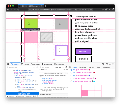
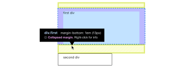
button next to display:grid; inside #page-intro .grid-content;

Experiment with the Grid Inspector:

Change the purple overlay color to red;
Toggle “Line numbers” or “Extend lines infinitely”;
Turn on more grid overlays;
See what happens when you disable grid-gap: 15px in Rules.

Since Grid, we’ve been seeking to expand on the possibilities of what a browser CSS tool can be.

2. Shape Path Editor

The next project we worked on was the Shape Path Editor: our first visual editing tool.

CSS Shapes allows you to define shapes for text to flow around: a circle, a triangle, or a many-sided polygon. It can be used with the clip-path property which allows you to trim elements to any of those same shapes. These two techniques together open the possibility for some very unique graphic design-inspired layouts.

However, creating these sometimes complex shapes can be difficult. Typing all of the coordinates manually and using the right CSS units is error-prone and far removed from the creative mindset that Shapes allows. Therefore, we made a tool that allows you to edit your code by directly clicking and dragging shapes on the page.

This type of feature—visual editing—was new for us and browser tools in general. It’s an example of how we can go beyond inspecting and debugging and into the realm of design.

Try Out The Shape Path Editor

In Firefox, visit this page on the An Event Apart website.
Open the Inspector with Cmd + Shift + C and select the first circular image.
In Rules, click on the icon next to the shape-outside property.
On the page, click on the points of the shape and see what happens when you drag to make the shape huge or tiny. Change it to a size that looks good to you.

Visual editing is an example of how we can go beyond inspecting and debugging and into the realm of design.

3. Fonts Editor

For years, we’ve had a Fonts panel in Firefox that shows an informative list of all the fonts used in a website. In continuing our theme of designing in the browser, we decided to turn this into a Font Editor for fine-tuning a font’s properties.

An example of the Fonts Editor index of fonts and variable fonts editing

Fonts Editor (Large preview)

A driving force behind this project was our goal to support Variable Fonts at the same time that the Firefox rendering engine team was adding support for it. Variable Fonts gives font designers a way to offer fine-grained variations along axes, like weight, within one font file. It also supports custom axes, which give both font creators and web designers an amazing amount of flexibility. Our tool automatically detects these custom axes and gives you a way to adjust and visualize them. This would otherwise require specialized websites like Axis-Praxis.

Additionally, we added a feature that provides the ability to hover over a font name to highlight where that particular font is being used on the page. This is helpful because the way browsers select the font used to render a piece of text can be complex and depend on one’s computer. Some characters may be unexpectedly swapped out for a different font due to font subsetting.

Try Out The Fonts Editor

In Firefox, visit this variable fonts demo site.
Open the Inspector with Cmd + Shift + C and select the word “variable” in the title (the element’s selector is .title__variable-web__variable).
In the third pane of the Inspector, navigate to the Fonts panel:

Hover over the font name Output Sans Regular to see what gets highlighted;
Try out the weight and slant sliders;
Take a look at the preset font variations in the Instances dropdown menu.

4. Flexbox Inspector

Our Grid, Shapes, and Variable Fonts tools can together power some very advanced graphic design on the web, but they’re still somewhat cutting-edge based on browser support. (They’re almost there, but still require fallbacks.) We didn’t want to work only on new features—we were drawn to the problems that most web developers face on a daily basis.

So we started work on the Flexbox Inspector. Design-wise, this has been our most ambitious project, and it sprouted some new user research strategies for our team.

Like Grid, CSS Flexbox has a fairly steep learning curve when you first get started. It takes time to really understand it, and many of us resort to trial and error to achieve the layouts we want. At the beginning of the project, our team wasn’t even sure if we understood Flexbox ourselves, and we didn’t know what the main challenges were. So we leveled up our understanding, and we ran a survey to discover what people needed the most when it came to Flexbox.

The results had a big effect on our plans, making the case for complicated visualizations like grow/shrink and min/max. We continued working with the community throughout the project by incorporating feedback into evolving visual prototypes and Nightly builds.

The tool includes two major parts: a highlighter that works much like the Grid Inspector’s, and a detailed Flexbox tool inside the Inspector. The core of the tool is a flex item diagram with sizing info.

An example of the flex item diagram and sizing table

Flex item diagram and sizing (Large preview)

With help from Gecko layout engineers, we were able to show the step-by-step size decisions of the rendering engine to give users a full picture of why and how a flex item ended up with a certain size.

Note: Learn the full story of our design process in “Designing the Flexbox Inspector”.

Try Out The Flexbox Inspector

In Firefox, visit Mozilla’s Bugzilla.
Open the Inspector with Cmd + Shift + C and select the element div.inner (just inside the header bar).
Turn on the Flexbox overlay via one of three ways:

Layout Panel:
In the Flex Container section, turn on the switch;
Markup View:
Toggle the “flex” badge next to <div class=”inner”>;
Rules View:
Click the button next to display:flex.

Use the Flex Container panel to navigate to a Flex Item called nav#header-nav.

Note the sizes shown in the diagram and size chart;
Increase and decrease your browser’s width and see how the diagram changes.

Interlude: Doubling Down on Research

As a small team with no formal user research support, we’ve often resorted to design-by-dogfooding: basing our opinions on our own experiences in using the tools. But after our success with the Flexbox survey, we knew we wanted to be better at collecting data to guide us. We ran a new survey to help inform our next steps.

We crowdsourced a list of the 20 biggest challenges faced by web devs and asked our community to rank them using a max-diff format.

When we found that the big winner of the challenges was CSS Layout Debugging, we ran a follow-up survey on specific CSS bugs to discover the biggest pain points. We supplemented these surveys with user interviews and user testing.

We also asked folks to rank their frustrations with browser developer tools. The clear top issue was moving CSS changes back to the editor. This became our next project.

5. Changes Panel

The difficulty in transferring one’s work from a browser developer tool to the editor is one of those age-old issues that we all just got used to. We were excited to make a simple and immediately usable solution.

An example of the diff view provided by the Changes Panel

Changes Panel (Large preview)

Edge and Chrome DevTools came out with variants of this tool first. Ours is focused on assisting a wide range of CSS workflows: Launch DevTools, change any styles you want, and then export your changes by either copying the full set of changes (for collaboration) or just one changed rule (for pasting into code).

This improves the robustness of the entire workflow, including our other layout tools. And this is just a start: We know accidental refreshing and navigation from the page is a big source of data loss, so a way to bring persistence to the tool will be an important next step.

Try Out The Changes Panel

In Firefox, navigate to any website.
Open the Inspector with Cmd + Shift + C and select an element.
Make some changes to the CSS:

Modify styles in the Rules pane;
Adjust fonts in the Fonts pane.

In the right pane of the Inspector, navigate to the Changes tab and do the following:

Click Copy All Changes, then paste it in a text editor to view the output;
Hover over the selector name and click Copy Rule, then paste it to view the output.

6. Inactive CSS

Our Inactive CSS feature solves one of the top issues from our layout debugging survey on specific CSS bugs:

“Why is this CSS property not doing anything?”

Design-wise, this feature is very simple—it grays out CSS that doesn’t affect the page, and shows a tooltip to explain why the property doesn’t have an effect. But we know this can boost efficiency and cut down on frustration. We were bolstered by research from Sarah Lim and her colleagues who built a similar tool. In their studies, they found that novice developers were 50% faster at building with CSS when they used a tool that allowed them to ignore irrelevant code.

An example of an inactive CSS tooltip warning

Inactive CSS tooltip (Large preview)

In a way, this is our favorite kind of feature: A low-hanging UX fruit that barely registers as a feature, but improves the whole workflow without really needing to be discovered or learned.

Inactive CSS launches in Firefox 70 but can be used now in prerelease versions of Firefox, including Developer Edition, Beta, and Nightly.

Try Out Inactive CSS

Download Firefox Developer Edition;
Open Firefox and navigate to wikipedia.org;
Open the Inspector with Cmd + Shift + C and select the center content area, called central-featured;
Note the grayed out vertical-align declaration;
Hover over the info icon, and click “Learn more” if you’re interested.

7. Accessibility Panel

Along the way we’ve had accessibility features developed by a separate team that’s mostly one person — Yura Zenevich, this year with his intern Maliha Islam.

Together they’ve turned the new Accessibility panel in Firefox into a powerful inspection and auditing tool. Besides displaying the accessibility tree and properties, you can now run different types of checks on a page. So far the checks include color contrast, text labels, and keyboard focus styling.

An example of the Accessibility Panel’s auditing feature

Auditing in the Accessibility Panel (Large preview)

Now in Nightly, you can try the new color blindness simulator which harnesses our upcoming WebRender tech.

Try Out The Accessibility Panel

Download Firefox Developer Edition;
Navigate to meetup.com;
In the developer tools, navigate to the Accessibility tab, and click the “Turn on Accessibility Features” button;
Click the drop-down menu next to “Check for issues” and select “All Issues”;
Take a look at the various contrast, keyboard, and text label issues, and click the “Learn more” links if you’re interested.

Next Up

We’re currently hard at work on a browser compatibility tool that uses information from MDN to show browser-specific issues for a selected element. You can follow along on GitHub to learn more.

The Future

We’re committed to supporting the modern web, and that means continuously changing and growing.

New specifications get implemented by browser vendors all the time. Guidelines and best practices around progressive enhancement, responsiveness, and accessibility evolve constantly. Us tool makers need to keep evolving too.

And what of the long-lived, ever-present problems in creating the web? What everyday user interfaces need to be rethought? These are some of the questions that keep us going!

What about a better way to navigate the DOM tree of a page? That part of DevTools has gone essentially unchanged since the Firebug days.

We’ve been experimenting with features like back and forward buttons that would ease navigation between recently visited elements.

A more dramatic change we’re discussing is adding a compact DOM view that uses a syntax similar to HTML templating engines. The focus would be on the most common use case—navigating to CSS—rather than viewing/editing the source.

A mockup of the simplified HTML Outline View

HTML Outline View (Large preview)

We’ve also been thinking about a better element selector. We know how it can be more productive to work inside the page, with less jumping back and forth into DevTools. We could make the element selector more powerful and more persistent. Perhaps it could select whitespace on a page and tell you what causes that space, or it could shed light on the relationships between different elements.

A mockup of element overlay with collapsed margin

Visual Element Selector (Large preview)

These are just two of the many ideas we hope to explore further with the help of the community.

We Need Your Input!

We want to keep making awesome tools that make your life easier as a developer or designer.

Here’s an easy way to help: Download Firefox Developer Edition and try using it for some of your work next week.

Then, tell us what you think by taking our 1-page survey.

We’re always interested in hearing ideas for improvements, particularly any low-hanging fruit that could save us all from some regular frustration. We do our work in the open, so you can follow along and chime in. We’ll keep you updated at @FirefoxDevTools.

Thanks to Patrick Brosset for his contributions to this article.

Smashing Editorial
(dm, il)

Is Emerging AI Too Smart to Design for Me and You?

Original Source: https://www.webdesignerdepot.com/2019/10/is-emerging-ai-too-smart-to-design-for-me-and-you/

Currently, the answer is a resounding, “What? No… why would you even ask?” But this article isn’t about current AIs. True artificial intelligence is a long, long way off; and frankly, if we run face-first into the singularity, I doubt that our digital progeny will be interested in building interfaces for us.

Learning algorithms are getting a lot smarter, and the number of things we can do with them is rapidly expanding. Current implementations have massive flaws: facial recognition produces an uncomfortable number of false positives; AI-based recruiting means that resumes have to be built around keywords; YouTube’s algorithm is a dumpster fire. But the overall trend is toward smarter and smarter AI.

But can that AI ever design for regular people? Let’s get speculative, baby!

The Big Problem for AI Designers

I mean, can regular people even truly design things for other people? Well yes, but we collectively get it wrong about as often as we get it right. If we can instill in an AI a very cynical view of our human cognitive abilities, then we can probably teach them to design for us.

If we can instill in an AI a very cynical view of our human cognitive abilities, then we can probably teach them to design for us

It’s not because “people are dummies, hurr hurr”, although that’s a part of the issue. Mostly, though, our cognitive and reasoning skills just get impaired all the time, by dozens of different things. The human brain is a marvel in pretty much every sense of the word. We don’t currently have computers with anything like the brain’s capacity for adaptation, and few server warehouses that even approach the brain’s estimated.. well… capacity (as in storage) at least not according to the higher estimates.

The problem with our brains is that they’re being used by every part of our body, all the time. Then bits of them are constantly dying off and being reborn. And then the rest is being used to worry about things you did ten years ago, so you don’t have to worry so much about what’s going on right now.

Compared to computers, even people who don’t have ADHD are easily distracted.

AI, on the other hand, is focused like a laser. You tell it to look for keywords, and it finds them. You tell it to look for x, y, and z, and adapt itself based on what it finds, and it will do that. That’s one reason why Microsoft’s AI, Tay, got real racist, real fast, when exposed to Twitter.

Set an AI to find the “Buy” button on a web page, and so long as it has somewhat flexible criteria of what constitutes a “Buy” button, it will probably find that button quickly. Set the world’s smartest human to perform the same task, and they just might get lost on the way because they don’t navigate through raw code, keywords in hand, like a bot does. They might get distracted by a shiny ad, a knock at the door, or the existential dread that they usually manage to ignore.

Bringing real people to the point of sale, or at least to the point of your website, is a bit like herding cats, even at the best of times. Teaching an AI to provide multiple paths to multiple objectives, which objectives to prioritize, and how to do it without alienating the human users is a complex endeavor to say the least. It would literally have to be programmed to account for the fact that, for the species that invented computers, sometimes we’re not all that bright, or logical, or efficient, or focused, or driven… you get the picture.

Even the best of us have many moments of intellectual prowess that can be most charitably described as “interesting”. Uncharitable descriptions of those moments may contain lots of four-letter words.

The Project Specs

So we have to teach an AI all of the things that humans have been doing for millennia: We have to teach them about what humans consider beautiful, and how to adapt to those constantly-changing aesthetic standards. We have to teach them to be efficient, but not so efficient that it makes people uncomfortable. We have to teach them to account for our distractibility, our sense of whimsy, and every other factor that we can possibly imagine.

even the most accomplished anthropologists would never claim to understand the whole human experience

Someone even posited that we might have to train them to “think dumber” in order to design for us. I personally think it’s going to be a lot more complex than that. We’re going to have to train AIs in one discipline that we’ve had trouble teaching to people: empathy.

Designer AIs of the future—if we want them to be as good as or better than us—aren’t just going to have to factor in all the potential issues we can think of; we’ll have to teach them to recognize new and unfamiliar human circumstances (and sometimes new and unfamiliar human failings) in order to adapt and design a workaround. We can’t possibly train them in the worldwide human experience. For one, that experience keeps changing, and two, even the most accomplished anthropologists would never claim to understand the whole human experience.

Some of the more arrogant programmers might make that claim, but we’ll just keep them locked up in Silicon Valley where they belong.

Conclusion

Given the complexity of the task, I’d argue that we either have to be content with template-based AI-made designs that never get better than “decent”. Or, we have to invent a full-on artificial consciousness, and hope that we have something they want that we can provide in return for the best UIs this world has ever seen.

But honestly, that almost seems like a waste of a good killbot.


Featured image via Unsplash.

Source

p img {display:inline-block; margin-right:10px;}
.alignleft {float:left;}
p.showcase {clear:both;}
body#browserfriendly p, body#podcast p, div#emailbody p{margin:0;}

Ways to Improve Communication with Your Clients

Original Source: http://feedproxy.google.com/~r/1stwebdesigner/~3/yiZlflsZ93s/

Communication may just be the most overlooked ingredient in building a great website. I’d argue that it’s just as important as awesome design and development skills.

Without it, the final product is going to suffer. The site may look nice enough, but is it on target with regards to branding and messaging? Will the functionality match up with your client’s intended goals?

Despite its importance, communication is also one of the hardest skills to learn. In addition, it’s a two-way street. Even if you’re gifted in this area, your client may not be.

Let’s explore some ways to improve the dialogue with clients and better ensure a successful project.

Reach Out

One thing to realize about your clients is that they often have busy schedules. In other words, dealing with their current or future website is just one of many things on their to-do list.

As the old saying goes, the squeaky wheel gets the grease. This means that people tend to deal with whatever situation is right in front of them in that very moment. If your website project isn’t in their immediate line of sight, then it’s probably going to stay on the back burner.

To avoid a project that hangs in the air indefinitely, it’s up to you to reach out to clients. Check in on the status of that content you’re waiting for, or the example sites they were supposed to send. Offer your help and to answer any questions they might have.

Taking this little bit of initiative can kickstart the process of actually getting things done.

A person typing on a laptop computer.

Dig for Details

It can be difficult to gain an understanding of what a client really wants. They may sometimes give vague instructions or be otherwise noncommittal when it comes to the look and features of their site.

This can be quite frustrating as you are left to guess the best path forward. It can also lead to a seemingly unending cycle of revisions and, once again, a stagnating project.

You may even get the impression that this person is being hard to deal with. However, that’s most likely not the case. It may just be that they really aren’t sure what they want or are having trouble explaining it.

This is another instance where being assertive can help. Ask probing questions, provide either-or scenarios and try to make the discussion a productive one.

It’s important to remember that this is a process and that things aren’t always clear from the get-go. Sometimes, it requires peeling back a few layers before we can find that solid foundation for moving forward.

Women sitting at a table.

Keep Clients Updated

Another key element in communicating with clients is keeping them abreast of progress. After all, they’re investing a good bit of money into their website. It’s only natural to want to know where things stand.

This can be a bit of a delicate balance for designers. You don’t want to overwhelm your clients with constant updates. Yet you don’t want to underwhelm them when there just hasn’t been much progress.

Depending on the scope and timeline of the project, usually a weekly update is enough. And, even if you’re struggling with a specific aspect of things, it’s okay to share that as part of your status report.

Things such as technical roadblocks or even an unexpectedly busy schedule are bound to happen along the way. Most people are pretty understanding about it, so long as you let them know. Rather, it’s the uncertainty that comes with a lack of communication that is more likely to spark a less-than-kind reaction.

Man talking on a phone.

Create Opportunities with Mass Communication

While so much of client communication is person-to-person, there are other opportunities to stay in touch. By taking advantage of available tools, you can get your message out to highly-targeted groups.

Social media is a big one these days. And it can actually be a good place to talk to clients – albeit in a more generalized way. Use it to let them know about articles and tools that may be of interest.

Sure, your feeds may be followed by non-clients as well. However, that can be a positive. By sharing worthwhile information, you become a trusted source. And trust is key for turning prospects into paying customers.

The other mass communication tool is the good old email newsletter. This is still a great forum to share ideas. And, unlike social media, it’s easy to target clients or even a subset of them.

Even better is that clients can respond directly to your mailing, starting what could be a real conversation. At the very least, it’s a solid way to keep them in the loop.

One bit of advice: Avoid making flat-out sales pitches. They’re already your clients, they’ve already purchased something from you. Make sure that whatever you post or send out is of some genuine value.

Social media icons on a tablet screen.

Better Projects, Better Relationships

Effectively communicating with your clients isn’t so much about being perfect. Rather, it’s about making the effort to better understand who they are. The goal is to find out what they’re hoping to achieve and then devise a plan to help them do so.

The end result is a project that accurately reflects their wants and needs. That, in turn, will help you build a solid, lasting relationship.

Just think, if you are able to regularly accomplish this feat, you’ll have loyal clients and be set up for long-term success. It’s a winning formula that both you and your clients will benefit from.


Lūnigo, all digital insurer illustrations for UI

Original Source: http://feedproxy.google.com/~r/abduzeedo/~3/ER8_9Z9ZpeU/lunigo-all-digital-insurer-illustrations-ui

Lūnigo, all digital insurer illustrations for UI

AoiroStudioOct 09, 2019

In product design, especially when building a digital product and/or platform. Aside from building a design system, progressing into an organization collaboration, stepping a design language to the stakeholder’s table and more. We often forget little things like illustrations, yeah that old thing! To be knowledge, it’s a great way to express different kinds of things. Whatever it is an icon, transcending a vision of a feature, on-boarding or just giving a polished look to your product. I think it’s really important to include this mindset in the design process. We are featuring the ‘all digital insurer’ illustration series titled: ‘Lūnigo’ by DHNN Creative Agency.

Iūnigo, the first all digital insurer from Argentina worked with DHNN developing the brand illustrated and digital assets to be displayed into their digital platforms.

Branding
Lūnigo, all digital insurer illustrations for UILūnigo, all digital insurer illustrations for UILūnigo, all digital insurer illustrations for UILūnigo, all digital insurer illustrations for UILūnigo, all digital insurer illustrations for UILūnigo, all digital insurer illustrations for UILūnigo, all digital insurer illustrations for UILūnigo, all digital insurer illustrations for UILūnigo, all digital insurer illustrations for UILūnigo, all digital insurer illustrations for UILūnigo, all digital insurer illustrations for UILūnigo, all digital insurer illustrations for UI
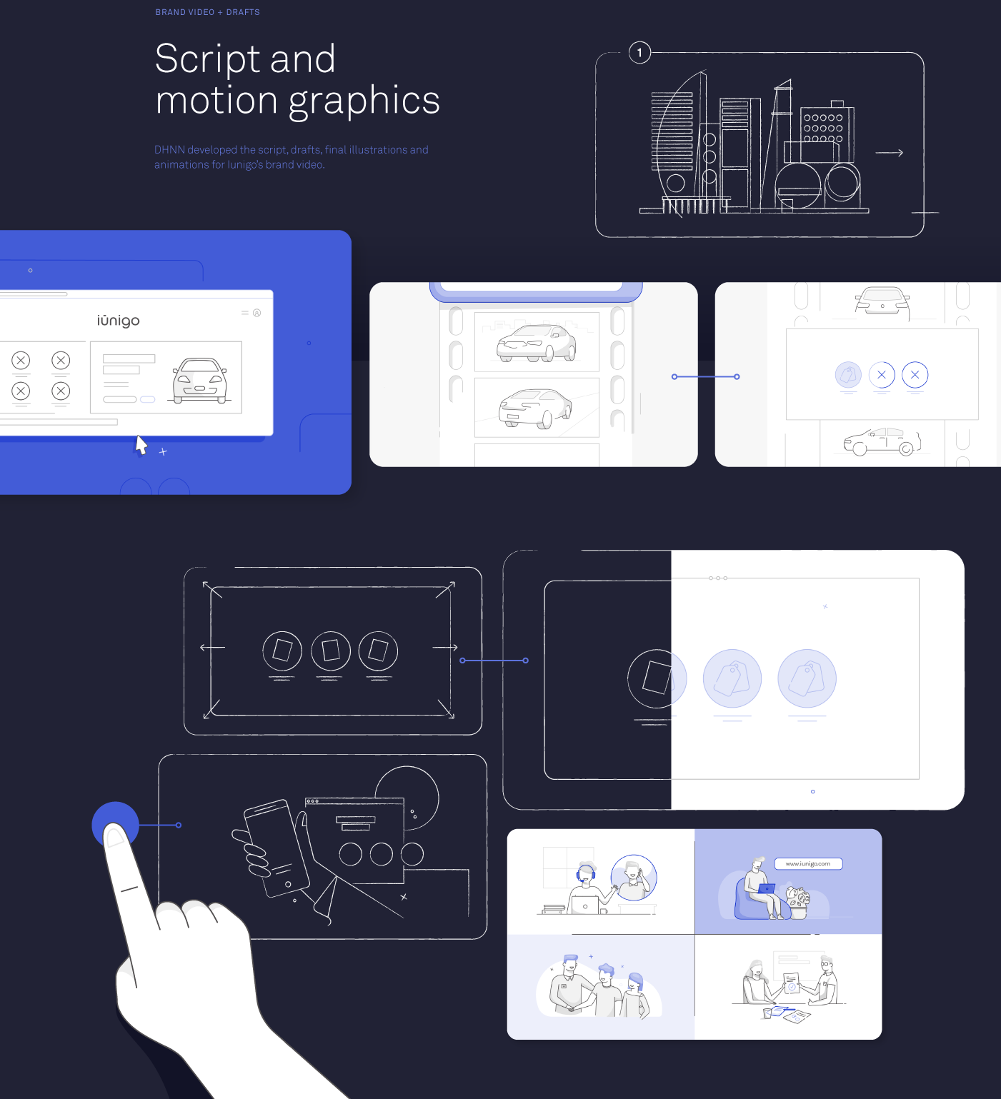
By DHNN Creative Agency

About DHNN Creative Agency

DHNN is a creative agency from Miami, Florida. Their work is a wide range of digital experiences with UI/UX, branding, rebranding, VR and more. Make sure to check out their Behance.

Studio Site
Behance


Creating a Water-like Distortion Effect with Three.js

Original Source: http://feedproxy.google.com/~r/tympanus/~3/6vUN32q0wsA/

In this tutorial we’re going to build a water-like effect with a bit of basic math, a canvas, and postprocessing. No fluid simulation, GPGPU, or any of that complicated stuff. We’re going to draw pretty circles in a canvas, and distort the scene with the result.

We recommend that you get familiar with the basics of Three.js because we’ll omit some of the setup. But don’t worry, most of the tutorial will deal with good old JavaScript and the canvas API. Feel free to chime in if you don’t feel too confident on the Three.js parts.

The effect is divided into two main parts:

Capturing and drawing the ripples to a canvas

Displacing the rendered scene with postprocessing

Let’s start with updating and drawing the ripples since that’s what constitutes the core of the effect.

Making the ripples

The first idea that comes to mind is to use the current mouse position as a uniform and then simply displace the scene and call it a day. But that would mean only having one ripple that always remains at the mouse’s position. We want something more interesting, so we want many independent ripples moving at different positions. For that we’ll need to keep track of each one of them.

We’re going to create a WaterTexture class to manage everything related to the ripples:

Capture every mouse movement as a new ripple in an array.

Draw the ripples to a canvas

Erase the ripples when their lifespan is over

Move the ripples using their initial momentum

For now, let’s begin coding by creating our main App class.

import { WaterTexture } from ‘./WaterTexture’;
class App{
constructor(){
this.waterTexture = new WaterTexture({ debug: true });

this.tick = this.tick.bind(this);
this.init();
}
init(){
this.tick();
}
tick(){
this.waterTexture.update();
requestAnimationFrame(this.tick);
}
}
const myApp = new App();

Let’s create our ripple manager WaterTexture with a teeny-tiny 64px canvas.

export class WaterTexture{
constructor(options) {
this.size = 64;
this.radius = this.size * 0.1;
this.width = this.height = this.size;
if (options.debug) {
this.width = window.innerWidth;
this.height = window.innerHeight;
this.radius = this.width * 0.05;
}

this.initTexture();
if(options.debug) document.body.append(this.canvas);
}
// Initialize our canvas
initTexture() {
this.canvas = document.createElement(“canvas”);
this.canvas.id = “WaterTexture”;
this.canvas.width = this.width;
this.canvas.height = this.height;
this.ctx = this.canvas.getContext(“2d”);
this.clear();

}
clear() {
this.ctx.fillStyle = “black”;
this.ctx.fillRect(0, 0, this.canvas.width, this.canvas.height);
}
update(){}
}

Note that for development purposes there is a debug option to mount the canvas to the DOM and give it a bigger size. In the end result we won’t be using this option.

Now we can go ahead and start adding some of the logic to make our ripples work:

On constructor() add

this.points array to keep all our ripples
this.radius for the max-radius of a ripple
this.maxAge for the max-age of a ripple

On Update(),

clear the canvas
sing happy birthday to each ripple, and remove those older than this.maxAge
draw each ripple

Create AddPoint(), which is going to take a normalized position and add a new point to the array.

class WaterTexture(){
constructor(){
this.size = 64;
this.radius = this.size * 0.1;

this.points = [];
this.maxAge = 64;

}

addPoint(point){
this.points.push({ x: point.x, y: point.y, age: 0 });
}
update(){
this.clear();
this.points.forEach(point => {
point.age += 1;
if(point.age > this.maxAge){
this.points.splice(i, 1);
}
})
this.points.forEach(point => {
this.drawPoint(point);
})
}
}

Note that AddPoint() receives normalized values, from 0 to 1. If the canvas happens to resize, we can use the normalized points to draw using the correct size.

Let’s create drawPoint(point) to start drawing the ripples: Convert the normalized point coordinates into canvas coordinates. Then, draw a happy little circle:

class WaterTexture(){

drawPoint(point) {
// Convert normalized position into canvas coordinates
let pos = {
x: point.x * this.width,
y: point.y * this.height
}
const radius = this.radius;

this.ctx.beginPath();
this.ctx.arc(pos.x, pos.y, radius, 0, Math.PI * 2);
this.ctx.fill();
}
}

For our ripples to have a strong push at the center and a weak force at the edges, we’ll make our circle a Radial Gradient, which looses transparency as it moves to the edges.

Radial Gradients create a dithering-like effect when a lot of them overlap. It looks stylish but not as smooth as what we want it to look like.

To make our ripples smooth, we’ll use the circle’s shadow instead of using the circle itself. Shadows give us the gradient-like result without the dithering-like effect. The difference is in the way shadows are painted to the canvas.

Since we only want to see the shadow and not the flat-colored circle, we’ll give the shadow a high offset. And we’ll move the circle in the opposite direction.

As the ripple gets older, we’ll reduce it’s opacity until it disappears:

export class WaterTexture(){

drawPoint(point) {

const ctx = this.ctx;
// Lower the opacity as it gets older
let intensity = 1.;
intensity = 1. – point.age / this.maxAge;

let color = “255,255,255”;

let offset = this.width * 5.;
// 1. Give the shadow a high offset.
ctx.shadowOffsetX = offset;
ctx.shadowOffsetY = offset;
ctx.shadowBlur = radius * 1;
ctx.shadowColor = `rgba(${color},${0.2 * intensity})`;

this.ctx.beginPath();
this.ctx.fillStyle = “rgba(255,0,0,1)”;
// 2. Move the circle to the other direction of the offset
this.ctx.arc(pos.x – offset, pos.y – offset, radius, 0, Math.PI * 2);
this.ctx.fill();
}
}

To introduce interactivity, we’ll add the mousemove event listener to app class and send the normalized mouse position to WaterTexture.

import { WaterTexture } from ‘./WaterTexture’;
class App {

init(){
window.addEventListener(‘mousemove’, this.onMouseMove.bind(this));
this.tick();
}
onMouseMove(ev){
const point = {
x: ev.clientX/ window.innerWidth,
y: ev.clientY/ window.innerHeight,
}
this.waterTexture.addPoint(point);
}
}

Great, now we’ve created a disappearing trail of ripples. Now, let’s give them some momentum!

Momentum

To give momentum to a ripple, we need its direction and force. Whenever we create a new ripple, we’ll compare its position with the last ripple. Then we’ll calculate its unit vector and force.

On every update, we’ll update the ripples’ positions with their unit vector and position. And as they get older we’ll move them slower and slower until they retire or go live on a farm. Whatever happens first.

export lass WaterTexture{

constructor(){

this.last = null;
}
addPoint(point){
let force = 0;
let vx = 0;
let vy = 0;
const last = this.last;
if(last){
const relativeX = point.x – last.x;
const relativeY = point.y – last.y;
// Distance formula
const distanceSquared = relativeX * relativeX + relativeY * relativeY;
const distance = Math.sqrt(distanceSquared);
// Calculate Unit Vector
vx = relativeX / distance;
vy = relativeY / distance;

force = Math.min(distanceSquared * 10000,1.);
}

this.last = {
x: point.x,
y: point.y
}
this.points.push({ x: point.x, y: point.y, age: 0, force, vx, vy });
}

update(){
this.clear();
let agePart = 1. / this.maxAge;
this.points.forEach((point,i) => {
let slowAsOlder = (1.- point.age / this.maxAge)
let force = point.force * agePart * slowAsOlder;
point.x += point.vx * force;
point.y += point.vy * force;
point.age += 1;
if(point.age > this.maxAge){
this.points.splice(i, 1);
}
})
this.points.forEach(point => {
this.drawPoint(point);
})
}
}

Note that instead of using the last ripple in the array, we use a dedicated this.last. This way, our ripples always have a point of reference to calculate their force and unit vector.

Let’s fine-tune the intensity with some easings. Instead of just decreasing until it’s removed, we’ll make it increase at the start and then decrease:

const easeOutSine = (t, b, c, d) => {
return c * Math.sin((t / d) * (Math.PI / 2)) + b;
};

const easeOutQuad = (t, b, c, d) => {
t /= d;
return -c * t * (t – 2) + b;
};

export class WaterTexture(){
drawPoint(point){

let intensity = 1.;
if (point.age < this.maxAge * 0.3) {
intensity = easeOutSine(point.age / (this.maxAge * 0.3), 0, 1, 1);
} else {
intensity = easeOutQuad(
1 – (point.age – this.maxAge * 0.3) / (this.maxAge * 0.7),
0,
1,
1
);
}
intensity *= point.force;

}
}

Now we’re finished with creating and updating the ripples. It’s looking amazing.

But how do we use what we have painted to the canvas to distort our final scene?

Canvas as a texture

Let’s use the canvas as a texture, hence the name WaterTexture. We are going to draw our ripples on the canvas, and use it as a texture in a postprocessing shader.

First, let’s make a texture using our canvas and refresh/update that texture at the end of every update:

import * as THREE from ‘three’
class WaterTexture(){
initTexture(){

this.texture = new THREE.Texture(this.canvas);
}
update(){

this.texture.needsUpdate = true;
}
}

By creating a texture of our canvas, we can sample our canvas like we would with any other texture. But how is this useful to us? Our ripples are just white spots on the canvas.

In the distortion shader, we’re going to need the direction and intensity of the distortion for each pixel. If you recall, we already have the direction and force of each ripple. But how do we communicate that to the shader?

Encoding data in the color channels

Instead of thinking of the canvas as a place where we draw happy little clouds, we are going to think about the canvas’ color channels as places to store our data and read them later on our vertex shader.

In the Red and Green channels, we’ll store the unit vector of the ripple. In the Blue channel, we’ll store the intensity of the ripple.

Since RGB channels range from 0 to 255, we need to send our data that range to normalize it. So, we’ll transform the unit vector range (-1 to 1) and the intensity range (0 to 1) into 0 to 255.

class WaterEffect {
drawPoint(point){

// Insert data to color channels
// RG = Unit vector
let red = ((point.vx + 1) / 2) * 255;
let green = ((point.vy + 1) / 2) * 255;
// B = Unit vector
let blue = intensity * 255;
let color = `${red}, ${green}, ${blue}`;

let offset = this.size * 5;
ctx.shadowOffsetX = offset;
ctx.shadowOffsetY = offset;
ctx.shadowBlur = radius * 1;
ctx.shadowColor = `rgba(${color},${0.2 * intensity})`;

this.ctx.beginPath();
this.ctx.fillStyle = “rgba(255,0,0,1)”;
this.ctx.arc(pos.x – offset, pos.y – offset, radius, 0, Math.PI * 2);
this.ctx.fill();
}
}

Note: Remember how we painted the canvas black? When our shader reads that pixel, it’s going to apply a distortion of 0, only distorting where our ripples are painting.

Look at the pretty color our beautiful data gives the ripples now!

With that, we’re finished with the ripples. Next, we’ll create our scene and apply the distortion to the result.

Creating a basic Three.js scene

For this effect, it doesn’t matter what we render. So, we’ll only have a single plane to showcase the effect. But feel free to create an awesome-looking scene and share it with us in the comments!

Since we’re done with WaterTexture, don’t forget to turn the debug option to false.

import * as THREE from “three”;
import { WaterTexture } from ‘./WaterTexture’;

class App {
constructor(){
this.waterTexture = new WaterTexture({ debug: false });

this.renderer = new THREE.WebGLRenderer({
antialias: false
});
this.renderer.setSize(window.innerWidth, window.innerHeight);
this.renderer.setPixelRatio(window.devicePixelRatio);
document.body.append(this.renderer.domElement);

this.camera = new THREE.PerspectiveCamera(
45,
window.innerWidth / window.innerHeight,
0.1,
10000
);
this.camera.position.z = 50;

this.touchTexture = new TouchTexture();

this.tick = this.tick.bind(this);
this.onMouseMove = this.onMouseMove.bind(this);

this.init();

}
addPlane(){
let geometry = new THREE.PlaneBufferGeometry(5,5,1,1);
let material = new THREE.MeshNormalMaterial();
let mesh = new THREE.Mesh(geometry, material);

window.addEventListener(“mousemove”, this.onMouseMove);
this.scene.add(mesh);
}
init(){
this.addPlane();
this.tick();
}
render(){
this.renderer.render(this.scene, this.camera);
}
tick(){
this.render();
this.waterTexture.update();
requrestAnimationFrame(this.tick);
}
}
Applying the distortion to the rendered scene

We are going to use postprocessing to apply the water-like effect to our render.

Postprocessing allows you to add effects or filters after (post) your scene is rendered (processing). Like any kind of image effect or filter you might see on snapchat or Instagram, there is a lot of cool stuff you can do with postprocessing.

For our case, we’ll render our scene normally with a RenderPass, and apply the effect on top of it with a custom EffectPass.

Let’s render our scene with postprocessing’s EffectComposer instead of the Three.js renderer.

Note that EffectComposer works by going through its passes on each render. It doesn’t render anything unless it has a pass for it. We need to add the render of our scene using a RenderPass:

import { EffectComposer, RenderPass } from ‘postprocessing’
class App{
constructor(){

this.composer = new EffectComposer(this.renderer);
this.clock = new THREE.Clock();

}
initComposer(){
const renderPass = new RenderPass(this.scene, this.camera);

this.composer.addPass(renderPass);
}
init(){
this.initComposer();

}
render(){
this.composer.render(this.clock.getDelta());
}
}

Things should look about the same. But now we start adding custom postprocessing effects.

We are going to create the WaterEffect class that extends postprocessing’s Effect. It is going to receive the canvas texture in the constructor and make it a uniform in its fragment shader.

In the fragment shader, we’ll distort the UVs using postprocessing’s function mainUv using our canvas texture. Postprocessing is then going to take these UVs and sample our regular scene distorted.

Although we’ll only use postprocessing’s mainUv function, there are a lot of interesting functions you can use. I recommend you check out the wiki for more information!

Since we already have the unit vector and intensity, we only need to multiply them together. But since the texture values are normalized we need to convert our unit vector from a range of 1 to 0, into a range of -1 to 0:

import * as THREE from “three”;
import { Effect } from “postprocessing”;

export class WaterEffect extends Effect {
constructor(texture) {
super(“WaterEffect”, fragment, {
uniforms: new Map([[“uTexture”, new THREE.Uniform(texture)]])
});
}
}
export default WaterEffect;

const fragment = `
uniform sampler2D uTexture;
#define PI 3.14159265359

void mainUv(inout vec2 uv) {
vec4 tex = texture2D(uTexture, uv);
// Convert normalized values into regular unit vector
float vx = -(tex.r *2. – 1.);
float vy = -(tex.g *2. – 1.);
// Normalized intensity works just fine for intensity
float intensity = tex.b;
float maxAmplitude = 0.2;
uv.x += vx * intensity * maxAmplitude;
uv.y += vy * intensity * maxAmplitude;
}
`;

We’ll then instantiate WaterEffect with our canvas texture and add it as an EffectPass after our RenderPass. Then we’ll make sure our composer only renders the last effect to the screen:

import { WaterEffect } from ‘./WaterEffect’
import { EffectPass } from ‘postprocessing’
class App{

initComposer() {
const renderPass = new RenderPass(this.scene, this.camera);
this.waterEffect = new WaterEffect( this.touchTexture.texture);

const waterPass = new EffectPass(this.camera, this.waterEffect);

renderPass.renderToScreen = false;
waterPass.renderToScreen = true;
this.composer.addPass(renderPass);
this.composer.addPass(waterPass);
}
}

And here we have the final result!

An awesome and fun effect to play with!

Conclusion

Through this article, we’ve created ripples, encoded their data into the color channels and used it in a postprocessing effect to distort our render.

That’s a lot of complicated-sounding words! Great work, pat yourself on the back or reach out on Twitter and I’ll do it for you ?

But there’s still a lot more to explore:

Drawing the ripples with a hollow circle

Giving the ripples an actual radial-gradient

Expanding the ripples as they get older

Or using the canvas as a texture technique to create interactive particles as in Bruno’s article.

We hope you enjoyed this tutorial and had a fun time making ripples. If you have any questions, don’t hesitate to comment below or on Twitter!

Creating a Water-like Distortion Effect with Three.js was written by Daniel Velasquez and published on Codrops.

macOS Catalina: 5 Things Web Developers & Designers Should Know

Original Source: https://www.sitepoint.com/macos-catalina-5-things-web-developers-designers-should-know/?utm_source=rss

macOS Catalina is here and available for download, and you’ve no doubt heard all about the breakup of iTunes and the new consumer-oriented entertainment apps shipping with the system.

But what do developers, designers, and other tech professionals need to know? We run through the key points.

32-bit Support Ends with Catalina

Are you relying on some older, obscure native app for a specific function, as so many developers and designers do? Your Catalina update could throw you a wildcard: it’s the first macOS release that drops support for 32-bit apps.

During the setup process, you’ll be given a list of installed apps that will no longer open after the update. If you want to keep using that tool, it’s time to hit up the developer for a long-overdue update… or stay on Mojave for a while longer yet.

A Cross-Platform Catalyst

Mojave brought iOS ports of the News, Stocks, Voice Memos and Home apps to macOS. In Catalina, Apple is opening the tools that enabled these ports up to developers under the name of Catalyst.

While this doesn’t directly affect web development work, it does make iOS a more attractive native development platform, which may inform your future platform choices. And if Apple’s plan to reinvigorate stale macOS third-party app development with some of the action from iOS works, you could incorporate better productivity and development apps into your workflow in the near future.

For now, Catalyst is available to developers of iPad apps — we expect that to broaden in the future.

Voice Control

Catalina offers accessibility improvements in the form of improved Voice Control for those who have difficulty seeing, or using keyboards and mice.

Of course, developers should ensure that their apps work as well as they can with this tool, because it’s the right thing to do.

Developers are known for their love of keyboard shortcut mastery, but no doubt the ability to create custom commands has inspired determined lifehackers. What if you never had to take your cursor or eyes off of VS Code to run other frequent workflows?

We look forward to seeing what the community comes up with.

Screen Time

Do you waste too much time using your computer for mindless entertainment, forcing you to stay up late making up the time productively?

Or are you a workaholic who just can’t find the will to shut off and disconnect?

If you’re like most of us in the industry, you’re a mix of the two. Catalina introduces a variant of the Screen Time app that’s been on iOS for a couple of years now.

Screen Time for macOS provides you with visual analytics that help you understand the way you’re spending time on your device, which can often lead to some unexpected epiphanies. It also lets you schedule downtime, forcing you off the computer and into the real world at the right time.

As with iOS, you can also set time limits for specific apps, and there are some ways to moderate your web content usage without outright blocking your web browser from opening.

Sidecar: The Most Expensive Secondary Display You’ll Ever Own

For developers, designers, and all other web professionals, the real headline feature of Catalina is Sidecar. Sidecar turns your iPad into a secondary display for your Mac, and it’s really easy to enable (provided you have the requisite tablet, which is not included with the operating system update).

The best reason to use Sidecar over a standard display is Apple Pencil integration. Designers will love the ability to draw directly on the screen when using Sketch and Illustrator without switching devices all the time. You can even mirror your Mac’s screen if you’d like an unobstructed view of what you’re sketching on one side.

Most of us will use Sidecar as a place to dump Slack or a terminal window, but in any case, it’s clear it’ll be the most beneficial update for many of us.

How’d You Go?

Let us know how you went with the upgrade, and what you’ve enjoyed most so far. We always recommend waiting a few days for the bugs to shake out — especially with Apple’s recent track record — but initial reports suggest the release version is pretty solid after all.

The post macOS Catalina: 5 Things Web Developers & Designers Should Know appeared first on SitePoint.

The best art easels in 2019

Original Source: http://feedproxy.google.com/~r/CreativeBloq/~3/GH64HBtuDCc/the-best-art-easels-in-2019

Once you've found the best art easel for you, you'll probably spend hours at it, so it’s very important to invest in one that will suit your needs and be comfortable. There are several things to bear in mind when deciding what type to buy, as an art easel is one of the most important art supplies in your toolbox (see our guide to more essential art supplies). 

Space could be a consideration – you may need to be able to pack away your setup at the end of each session, meaning you'll be looking for a foldaway or lightweight small easel you can carry with you. Or, you might be looking for a more solid studio easel that will be a more permanent fixture in your space, and last you a lifetime. Or perhaps you're looking for an art easel for the child or small person in your life. 

A quality art easel can be a fairly considerable investment so it’s worth taking some time to think about your needs before you begin. This guide will help you navigate some of the options available to fledgling artists and help you find the best art easel for you. And never fear if your budget isn't massive, as we've got the best art easels for a range of price points.

Looking for more art supplies? Also check our post on the best pencils and the best sketchbooks. It's also worth keeping an eye on the best Black Friday deals.

art easel: Basic Studio Easel Mabef M/09

Mabef easels are designed for quality and longevity. I have personally owned a number of Mabef designs for over 25 years and they’re all still going strong. Made from stain-resistant oiled beech wood, the finishing on these Basic Studio Easel Mabef easels is beautiful and well worth the investment. The M/09 model is a great starting point for the serious studio artist on a budget. Although it doesn’t have some of the frills of other models, the M/09 is a solid model that will stand the test of time and will prove a good studio work-horse for the burgeoning professional studio.

art easel: Heavy Duty Large H-frame Studio Easel

This heavy duty studio easels a great mid-point for a lot of artists’ needs. It’s not from a big name but the overall functionality certainly makes up any difference. An Atworth H-frame easel will give you a more stable easel to work on, and, although it’s not collapsable, the wheels make it easy to move around the studio as needed. You can also convert it into a horizontal easel, which gives you a wealth of options when it comes to your medium, too. Convertible easels are perfect for watercolour painting or just as extra table space.

art easel: Mini Easel

Some table easels come as a box with ample storage to save space, which can seems like a good option at first. The stumbling block of these designs is their lack of adjustability. If you’re working at a table then you need to be able to adjust the baseline of your canvas, that’s to say, how high the bottom of your canvas is from the table. That's where this Mini Easel really comes into its own. The adjustability of this easel enables you to work at your own height, which will save you a lot of discomfort in the long run.

art easel: Melissa & Doug Deluxe Wooden Standing Art Easel

When it comes to your child’s creativity you don’t want to instal limitations so versatility is the key word. Melissa & Doug have built themselves a name as one of the top suppliers of kids' creative kit over the past 30 years so they must be doing something right. This multi-use easel by Melissa & Doug is easy to assemble, folds away easily for storage and includes a dry-erase board, chalkboard, locking paper-roll holder, child-safe paper cutter, four easy-clip grips and two large plastic trays that can be removed for easy cleaning. Hours of messy fun guaranteed.

art easel: Melissa & Doug Deluxe Double-Sided Tabletop Easel

Younger children won’t stand for long at an easel, and will often be tempted to push their easel over, so a table easel can be a better option, and table easels can also be set up on the floor to make them even more accessible. A table-top easel from a trusted name like Melissa & Doug such as this double-sided tabletop easel is a great option for those younger Picassos. Its built-in paper roll, reversible design and sturdy wooden construction make this a great option that’s designed to inspire hours of fun.

art easel:

If you’re looking to kit yourself or someone else out with a full artistic kit including an easel then the 111 Piece All Media Art Studio Paint Set from Daler Rowney could be a good place to start. Now, most of this kit is student grade or below, but it’s enough to get most people started off with a host of mediums and is a good place to build upon. The kit includes one aluminium easel, one carrying case, one eraser, one pencil pouch, a stretched canvas, mixing palette, pencil sharpener, one set of travel watercolours, colouring pencils, oil pastels, acrylics, brushes and much more. 

art easel:

This  Ktaxon Tripod Easel Stand with drawer is made of high quality beech. If you’re tight for space, or just don’t want your paint left out for little fingers or paws, then the addition of the drawer at the base of this easel is a huge plus. This adjustable easel makes a handsome addition to your home or studio and is also a great way to display your work to visiting friends and family when not in use. If you’re looking for an easel for part-time use at home, this is a great choice.

Read more:

Pixel art: 34 retro examplesEssential art supplies for paintingThe best sketchbooks available now

Exciting New Tools for Designers, October 2019

Original Source: https://www.webdesignerdepot.com/2019/10/exciting-new-tools-for-designers-october-2019/

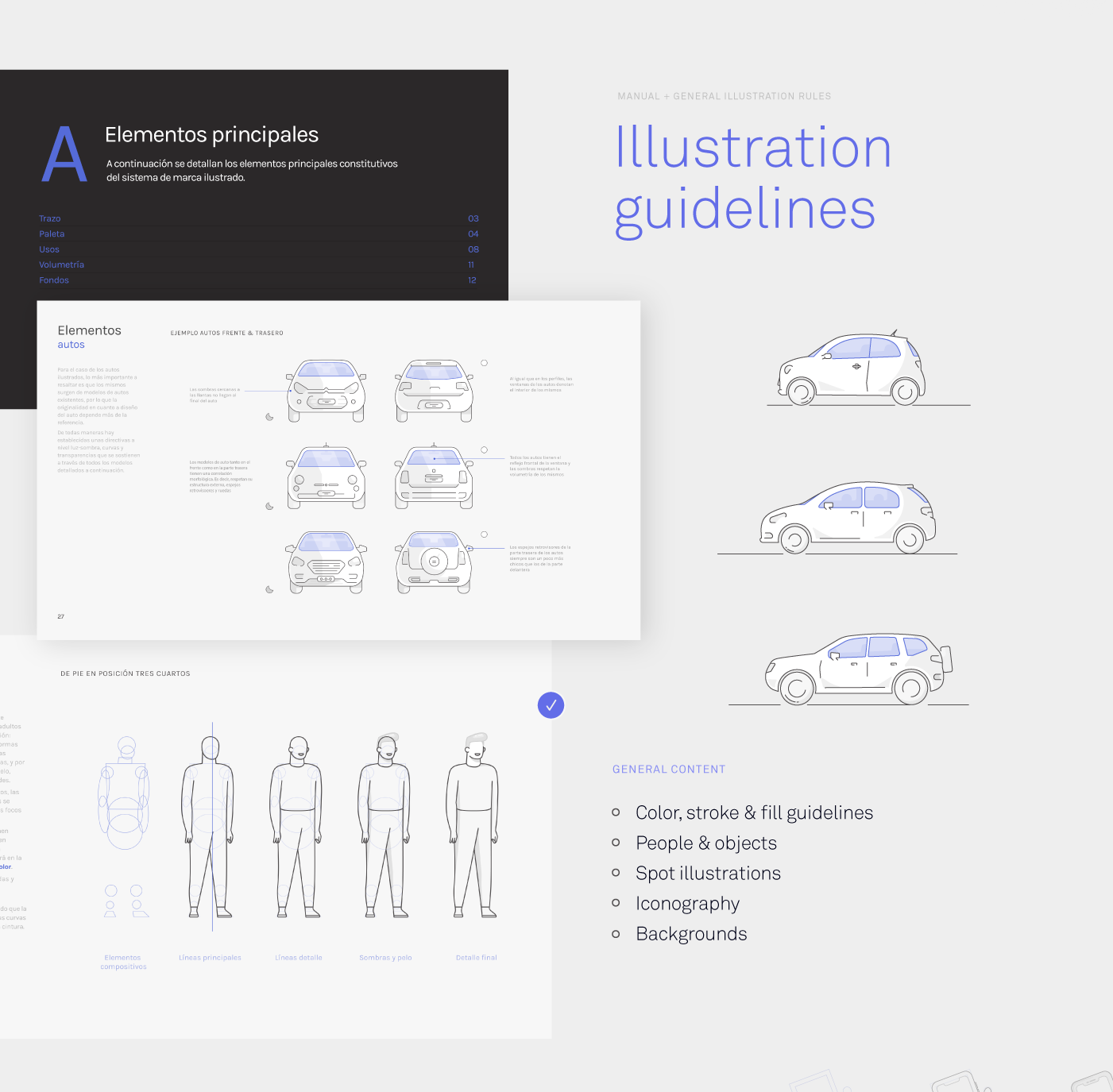
It’s already time to start thinking about all the seasonal design elements that you will use for the rest of the year. That might be icons or illustrations or fonts. We have a few new elements this month that might fit the bill, as well as learning tools and inspiration. Here’s what new for designers this month.

UIPrint

UIPrint is a set of sketching templates for devices that you can print out to create with a pen (because some of us love to draw mocks and ideas in meetings). The current collection includes more than 10 printable wireframes and sketchpads. Grab prints for devices you use most of download the whole set and get printing.

Haptics

Haptics provides developers with a quick and easy way to see what the different haptic feedback is like on supported iPhone & Apple Watch models. Available only in the iTunes store and requires iOS 13.0+.

HTTP Mock

HTTP Mock allows you to intercept and view all of your HTTP (and HTTPS) mock endpoints or entire servers and rewrite, redirect, or inject errors.

Art of Symbols

Art of Symbols is a project published by Emotive Brand that takes a look at the root the design and meanings of common icons and symbols. The project was originally published day by day as an Instagram project, but has been compiled into a website that’s super informative and fun to look at.

Smoother & Sharper Shadows

Smoother & Sharper Shadows is a tutorial that will help you clean up the look of drop shadows using the box-shadow CSS property. You can get more control over the look of shadows for more polished designs.

Copy Monkey

CopyMonkey uses machine learning to mimic your handwriting style like a monkey. There’s not a lot of work value in this one, but it is a lot of fun to play with.

CTRL+Z

CTRL+Z is a fun interactive flyer that can provide a source of inspiration. Click and drag to see just how this flyer for an upcoming art installation works.

Shape

Shape lets you customize the style, colors and border of more than 1,000 static and animated icons and illustrations. Export to React, SVG and Lottie. The tool also includes UI templates to help you use icon collections.

Winning Icons

Winning Icons is a set of 50 vectors that celebrate achievement. With medals and celebratory icons in three styles, this collection is made for winning. The set is available in SVG and JPG format.

Sketch Devices

Devices is an updated set of modern device mockups for Sketch by the team at Facebook Design. From the design team: “Facebook supports a diverse audience around the world and an equally diverse set of devices. To emphasize that in our design mocks, we redrew a range of devices to show the global diversity of the people using our products. Each device comes with a bitmap of the device (with and without shadows) and the original Sketch file for that device.”

Animated Icons

Animated Icons is a collection of fun line icons with interesting animations for something a little extra in your projects. Download the JSON for Lottie, GIF, or After Effects formats. Pick and choose icons or download them all.

Fresh Folk

Fresh Folk is an interesting collection of illustrations of people, places, and objects to enhance design projects. You can use illustrations as mix and match characters and scene elements to create almost custom illustrations from the library.

Where to Put Buttons on Forms

What’s the perfect placement for a button on a form? Well, it depends on what information is in the form. This great explanation/tutorial by Adam Silver can help you think about the logic behind button placements and make your forms more user-friendly.

Mozilla Developer Video Shorts

The team at Mozilla Developer has launched a new video series packed with demos and tools that teach web technologies. You can find the first few videos on their website or follow the channel on YouTube for new videos when they post.

Fliplet

Fliplet is a “prefab” no-code app editor that helps you build all kinds of different apps without coding. It uses a library of open source components, or you can create your own. The core feature base includes everything you need to get started with an app build.

Quickmetrics

Quickmetrics is a dashboard-based data collection and sharing tool. Track all kinds of data including signups, response times, or almost anything.

Deep Work Stats

Deep Work is a productivity tool that helps you see how you’re actually spending time on the job. It scans your calendar and computer time to determine how much time you have for deep work and shallow work, how much time you spend in meetings, and how you compare to co-workers and globally.

Bridamount

Bridamount is a handwriting style typeface with a fun set of special characters. (And it’s free for commercial use as well.) It includes a full upper- and lowercase character set.

Cascadia Code

Cascadia Code is a monospaced font that’s still in development. You can modify it using glyphs and FontTools. It includes programming ligatures and is designed to enhance the modern look and feel of the Windows Terminal.

Dealerplate California

Dealerplate Cailfornia is a funky typeface that mimics the letterforms on license plates. This is one state in the font set that features 17 fonts.

Krisha

Krisha is a display font with an all caps character set and funky smooth lines for letterforms. It’s big and bold and one of those few free fonts that’s also available for commercial use.

Mallie

Mallie is modern, fusion font with multilingual support. It’s a very versatile font that would make for a fun brand design.

Santa Claus

It’s not too early to start planning Christmas designs. This comic style font, Santa Claus, could be just the right element. It makes for an interesting uppercase only display.

Scarekrowz

Just for Halloween is Scarekrowz, a funky spooky typeface for the season. The font includes just 94 characters, but could make for a fun, seasonal display.

Source

p img {display:inline-block; margin-right:10px;}
.alignleft {float:left;}
p.showcase {clear:both;}
body#browserfriendly p, body#podcast p, div#emailbody p{margin:0;}

40+ Motivational Quotes for Creatives

Original Source: http://feedproxy.google.com/~r/1stwebdesigner/~3/g-KZEFB4RP4/

Sometimes we all need a little motivation. The road to creating something great can be tough. There are many twists and turns, failures, trials and tribulations. We all grow a little weary.

The goal of this article is to reinvigorate your creativity with empowering quotes from creators, inventors, and entrepreneurs of all backgrounds.

These quotes vary in nature. Some apply to work ethic, some for inspiration and determination, and others are just great phrases to live by. Get inspired with these quotes for creators below and then get creating!

View more inspirational articles on 1stwebdesigner →

A bridge crossing over water.

Your Web Designer Toolbox
Unlimited Downloads: 500,000+ Web Templates, Icon Sets, Themes & Design Assets


DOWNLOAD NOW

Be Inspired to Create

“…If one advances confidently in the direction of his dreams, and endeavors to live the life which he has imagined, he will meet with a success unexpected in common hours…If you have built castles in the air, your work need not be lost; that is where they should be. Now put the foundations under them.” – Henry David Thoreau

“To know your life purpose is to connect with a higher power.” – Shannon L. Alder

“Inspiration exists, but it has to find you working.” – Pablo Picasso

“Success is not the key to happiness. Happiness is the key to success. If you love what you are doing, you will be successful.” – Albert Schweitzer

“It’s never too late to be who you might have been.” – George Eliot

“If you cannot do great things, do small things in a great way.” – Napoleon Hill

A person holding a small plant.

“With the advent of spring and beginning of the new harvest season the creators of abundance, our peasants, come out to the fields to sow with good aspirations and hopes.” – Islom Karimov

“To dare is to lose one’s footing momentarily. To not dare is to lose oneself.” – Soren Kierkegaard

“Success is going from failure to failure without losing enthusiasm.” – Winston Churchill

“The other side of every fear is a freedom.” – Marilyn Ferguson

“Opportunity is missed by most because it is dressed in overalls and looks like work.” – Thomas Edison

“Problems cannot be solved at the same level of awareness that created them.” – Albert Einstein

“A creative man is motivated by the desire to achieve, not by the desire to beat others.” – Ayn Rand

“What we see depends mainly on what we look for.” – John Lubbock

A rocky coastline.

“Whether you think that you can, or that you can’t, you are usually right.” – Henry Ford

“I always prefer to believe the best of everybody; it saves so much trouble.”  – Rudyard Kipling

“You don’t need money to be creative. The ghetto builds champions every day.” – DJ Snake

“The most dangerous idea is silencing people.” – Naval Ravikant

“A busy calendar and a busy mind will destroy your ability to do great things in this world. If you want to be able to do great things, whether you’re a musician, or whether you’re an entrepreneur, or whether you’re an investor, you need free time and you need a free mind.” – Naval Ravikant

“The cure for boredom is curiosity. There is no cure for curiosity.” – Dorothy Parker

“Go into yourself. Find out the reason that commands you to write; see whether it has spread its roots into the very depths of your heart; confess to yourself whether you would have to die if you were forbidden to write.” – Rainer Maria Rilke

“So go on, get angry. But keep your mouth shut and go do your work.” – Austin Kleon

“Somewhere, something incredible is waiting to be known.” – Carl Sagan

A mountain on a starry night.

“The world always seems brighter when you’ve just made something that wasn’t there before.” – Neil Gaiman

“We don’t make mistakes, just happy little accidents.” – Bob Ross

“Many prefer not to exercise their imaginations at all. They choose to remain comfortably within the bounds of their own experience, never troubling to wonder how it would feel to have been born other than they are.” – J.K. Rowling

“A new idea is delicate. It can be killed by a sneer or a yawn; it can be stabbed to death by a quip and worried to death by a frown on the right man’s brow.” – Charles Brower

“Remember the two benefits of failure. First, if you do fail, you learn what doesn’t work; and second, the failure gives you the opportunity to try a new approach.” – Roger Von Oech

“I’m convinced that about half of what separates successful entrepreneurs from the non-successful ones is pure perseverance.” – Steve Jobs

“Anxiety is the handmaiden of creativity.” – T. S. Eliot

Waves crashing on a beach.

“You can’t use up creativity the more you use the more you have.” – Maya Angelou

“There is only one of you in all time. This expression is unique and if you block it, it will never exist through any other medium and it will be lost.” – Martha Graham

“Creative people are curious, flexible, persistent, and independent, with a tremendous spirit of adventure and a love of play.” – Henri Matisse

“Curiosity about life in all of its aspects, I think, is still the secret of great creative people.” – Leo Burnett

“You can’t wait for inspiration, you have to go after it with a club.” – Jack London

“To raise new questions, new possibilities, to regard old problems from a new angle, requires creative imagination and marks real advance in science.” – Albert Einstein

“The essential part of creativity is not being afraid to fail.” – Edwin H. Land

“Creative activity could be described as a type of learning process where teacher and pupil are located in the same individual.” – Arthur Koestler

“Don’t think. Thinking is the enemy of creativity. It’s self-conscious, and anything self-conscious is lousy. You can’t try to do things. You simply must do things.” – Ray Bradbury

“Blessed are the curious, for they shall have adventures.” – L. Drachman

“In the beginner’s mind there are many possibilities, but in the expert’s mind there are few.” – Shunryu Suzuki

A young girl looks off into the distance.

Quotes That Will Make You Think…

For this last section, we’re featuring just a few more quotes for creators that are less motivational and moreso thought-provoking.

“We call ourselves creators and we just copy.” – Lauryn Hill

“The most regretful people on earth are those who felt the call to creative work, who felt their own creative power restive and uprising, and gave to it neither power nor time.” – Mary Oliver

“If you’re creating anything at all, it’s really dangerous to care about what people think.” – Kristen Wiig

“Great is the human who has not lost his childlike heart.” – Mencius (Meng-Tse)

“When Alexander the Great visited Diogenes and asked whether he could do anything for the famed teacher, Diogenes replied: “Only stand out of my light.” Perhaps some day we shall know how to heighten creativity. Until then, one of the best things we can do for creative men and women is to stand out of their light.” – John W. Gardner

“Don’t worry about people stealing your ideas. If your ideas are any good, you’ll have to ram them down people’s throats.” – Howard Aiken

“Some men look at things the way they are and ask why? I dream of things that are not and ask why not?” – Robert Kennedy

Words of Wisdom

Which quote stood out the most to you? We hope you use these motivational and thought-provoking words to boost your creativity and make the world a more beautiful place. You can do it!