Original Source: https://www.smashingmagazine.com/2019/08/handling-unused-css-sass-performance/
Handling Unused CSS In SASS To Improve Performance
Handling Unused CSS In SASS To Improve Performance
Luke Harrison
2019-08-09T12:30:59+02:00
2019-08-09T17:37:05+00:00
In modern front-end development, developers should aim to write CSS which is scalable and maintainable. Otherwise, they risk losing control over specifics such as the cascade and selector specificity as the codebase grows and more developers contribute.
One way this can be achieved is through the use of methodologies such as Object-Oriented CSS (OOCSS), which rather than organizing CSS around page context, encourages separating structure (grid systems, spacing, widths, etc.) from decoration (fonts, brand, colors, etc.).
So CSS class names such as:
.blog-right-column
.latest_topics_list
.job-vacancy-ad
Are replaced with more reusable alternatives, which apply the same CSS styles, but aren’t tied to any particular context:
.col-md-4
.list-group
.card
This approach is commonly implemented with the help of a SASS framework such as Bootstrap, Foundation, or increasingly more often, a bespoke framework which can be shaped to better fit the project.
So now we’re using CSS classes cherry-picked from a framework of patterns, UI components and utility classes. The below example illustrates a common grid system built using Bootstrap, which stacks vertically, then once the md breakpoint is reached, switches to a 3 column layout.
<div class=”container”>
<div class=”row”>
<div class=”col-12 col-md-4″>Column 1</div>
<div class=”col-12 col-md-4″>Column 2</div>
<div class=”col-12 col-md-4″>Column 3</div>
</div>
</div>
Programmatically generated classes such as .col-12 and .col-md-4 are used here to create this pattern. But what about .col-1 through .col-11, .col-lg-4, .col-md-6 or .col-sm-12? These are all examples of classes which will be included in the compiled CSS stylesheet, downloaded and parsed by the browser, despite not being in use.
In this article, we’ll start by exploring the impact unused CSS can have on page load speeds. We’ll then touch upon some existing solution for removing it from stylesheets, following up with my own SASS oriented solution.
Measuring The Impact Of Unused CSS Classes
Whilst I adore Sheffield United, the mighty blades, their website’s CSS is bundled into a single 568kb minified file, which comes to 105kb even when gzipped. That seems like a lot.

This is Sheffield United’s website, my local Football team (that’s Soccer for you lot over in the colonies ??). (Large preview)
Shall we see how much of this CSS is actually used by on their homepage? A quick Google search reveals plenty of online tools up to the job, but I prefer to use the coverage tool in Chrome, which can be run straight from Chrome’s DevTools. Let’s give it a whirl.
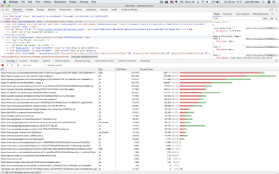
The quickest way to access the coverage tool in Developer Tools is to use the keyboard shortcut Control+Shift+P or Command+Shift+P (Mac) to open the command menu. In it, type coverage, and select the ‘Show Coverage’ option. (Large preview)
The results show that only 30kb of CSS from the 568kb stylesheet is used by the homepage, with the remaining 538kb relating to the styles required for the rest of the website. This means a whopping 94.8% of the CSS is unused.
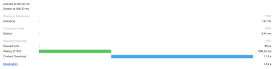
You can see timings like these for any asset in Chrome in Developer Tools via Network -> Click on your asset -> Timing tab. (Large preview)
CSS is part of a webpage’s critical rendering path, which involves all the different steps a browser must complete before it can begin page render. This makes CSS a render-blocking asset.
So with this in mind, when loading Sheffield United’s website using a good 3G connection, it takes a whole 1.15s before the CSS is downloaded and page rendering can begin. This is a problem.
Google has recognized this as well. When running a Lighthouse audit, online or via your browser, any potential load time and filesize savings which could be made by removing unused CSS are highlighted.
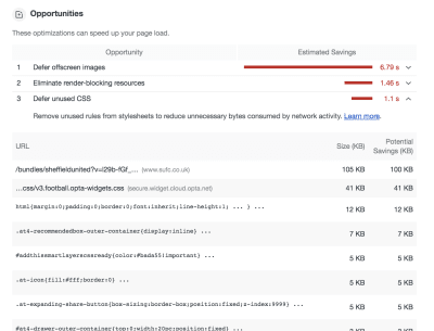
In Chrome (and Chromium Edge), you can right Google Lighthouse audits by clicking on the Audit tab in developer tools. (Large preview)
Existing Solutions
The goal is to determine which CSS classes aren’t required and remove them from the stylesheet. Existing solutions are available which attempt to automate this process. They can typically be used via a Node.js build script, or via task runners such as Gulp. These include:
UNCSS
PurifyCSS
PurgeCSS
These generally work in a similar way:
On bulld, the website is accessed via a headless browser (Eg: puppeteer) or DOM emulation (Eg: jsdom).
Based on the page’s HTML elements, any unused CSS is identified.
This is removed from the stylesheet, leaving only what is needed.
Whilst these automated tools are perfectly valid and I’ve used many of them across a number of commercial projects successfully, I’ve encountered a few drawbacks along the way which are worth sharing:
If class names contain special characters such as ‘@’ or ‘/’, these may not be recognized without writing some custom code. I use BEM-IT by Harry Roberts, which involves structuring class names with responsive suffixes like: u-width-6/12@lg, so I’ve hit this issue before.
If the website uses automated deployment, it can slow down the build process, especially if you have lots of pages and lots of CSS.
Knowledge about these tools needs to be shared across the team, otherwise there may be confusion and frustration when CSS is mysteriously absent in production stylesheets.
If your website has many 3rd party scripts running, sometimes when opened in a headless browser, these don’t play nicely and can cause errors with the filtering process. So typically you have to write custom code to exclude any 3rd party scripts when a headless browser is detected, which depending on your setup, may be tricky.
Generally, these kind of tools are complicated and introduce a lot of extra dependencies to the build process. As is the case with all 3rd party dependencies, this means relying on somebody else’s code.
With these points in mind, I posed myself a question:
Using just SASS, is it possible to better handle the SASS we compile so any unused CSS can be excluded, without resorting to just crudely deleting the source classes in the SASS outright?
Spoiler alert: The answer is yes. Here’s what I’ve come up with.
SASS Oriented Solution
The solution needs to provide a quick and easy way to cherry-pick what SASS ought to be compiled, whilst being simple enough that it doesn’t add any more complexity to the development process or prevent developers from taking advantage of things like programmatically generated CSS classes.
To get started, there’s a repo with build scripts and a few sample styles which you can clone from here.
Tip: If you get stuck, you can always cross-reference with the completed version on master branch.
cd into the repo, run npm install and then npm run build to compile any SASS into CSS as required. This should create a 55kb css file in the dist directory.
If you then open /dist/index.html in your web browser, you should see a fairly standard component, which on click expands to reveal some content. You can also view this here, where real network conditions will be applied, so you can run your own tests.
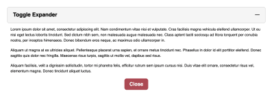
We’ll use this expander UI component as our test subject when developing the SASS-oriented solution for handling unused CSS. (Large preview)
Filtering At The Partials Level
In a typical SCSS setup, you’re likely going to have a single manifest file (eg: main.scss in the repo), or one per page (eg: index.scss, products.scss, contact.scss) where framework partials are imported. Following OOCSS principles, those imports may look something like this:
Example 1
/*
Undecorated design patterns
*/
@import ‘objects/box’;
@import ‘objects/container’;
@import ‘objects/layout’;
/*
UI components
*/
@import ‘components/button’;
@import ‘components/expander’;
@import ‘components/typography’;
/*
Highly specific helper classes
*/
@import ‘utilities/alignments’;
@import ‘utilities/widths’;
If any of these partials aren’t in use, then the natural way of filtering this unused CSS would be to just disable the import, which would prevent it from being compiled.
For example, if only using the expander component, the manifest would typically look like the below:
Example 2
/*
Undecorated design patterns
*/
// @import ‘objects/box’;
// @import ‘objects/container’;
// @import ‘objects/layout’;
/*
UI components
*/
// @import ‘components/button’;
@import ‘components/expander’;
// @import ‘components/typography’;
/*
Highly specific helper classes
*/
// @import ‘utilities/alignments’;
// @import ‘utilities/widths’;
However, as per OOCSS, we’re separating decoration from structure to allow for maximum reusability, so it’s possible the expander could require CSS from other objects, component or utility classes to render correctly. Unless the developer is aware of these relationships by inspecting the HTML, they may not know to import these partials, so not all of the required classes would be compiled.
In the repo, if you look at the expander’s HTML in dist/index.html, this appears to be the case. It uses styles from the box and layout objects, the typography component, and width and alignment utilities.
dist/index.html
<div class=”c-expander”>
<div class=”o-box o-box–spacing-small c-expander__trigger c-expander__header” tabindex=”0″>
<div class=”o-layout o-layout–fit u-flex-middle”>
<div class=”o-layout__item u-width-grow”>
<h2 class=”c-type-echo”>Toggle Expander</h2>
</div>
<div class=”o-layout__item u-width-shrink”>
<div class=”c-expander__header-icon”></div>
</div>
</div>
</div>
<div class=”c-expander__content”>
<div class=”o-box o-box–spacing-small”>
Lorum ipsum
<p class=”u-align-center”>
<button class=”c-expander__trigger c-button”>Close</button>
</p>
</div>
</div>
</div>
Let’s tackle this problem waiting to happen by making these relationships official within the SASS itself, so once a component is imported, any dependencies will also be imported automatically. This way, the developer no longer has the extra overhead of having to audit the HTML to learn what else they need to import.
Programmatic Imports Map
For this dependency system to work, rather than simply commenting in @import statements in the manifest file, SASS logic will need to dictate if partials will be compiled or not.
In src/scss/settings, create a new partial called _imports.scss, @import it in settings/_core.scss, and then create the following SCSS map:
src/scss/settings/_core.scss
@import ‘breakpoints’;
@import ‘spacing’;
@import ‘imports’;
src/scss/settings/_imports.scss
$imports: (
object: (
‘box’,
‘container’,
‘layout’
),
component: (
‘button’,
‘expander’,
‘typography’
),
utility: (
‘alignments’,
‘widths’
)
);
This map will have the same role as the import manifest back in example 1.
Example 4
$imports: (
object: (
//’box’,
//’container’,
//’layout’
),
component: (
//’button’,
‘expander’,
//’typography’
),
utility: (
//’alignments’,
//’widths’
)
);
It should behave like a standard set of @imports would, in that if certain partials are commented out (like the above), then that code shouldn’t be compiled on build.
But as we’re wanting to import dependencies automatically, we should also be able to ignore this map under the right circumstances.
Render Mixin
Let’s start to add some SASS logic. Create _render.scss in src/scss/tools, and then add its @import to tools/_core.scss.
In the file, create an empty mixin called render().
src/scss/tools/_render.scss
@mixin render() {
}
In the mixin, we need to write SASS which does the following:
render()
“Hey there $imports, fine weather isn’t it? Say, do you have the container object in your map?”
$imports
false
render()
“That’s a shame, looks like its won’t be compiled then. How about the button component?”
$imports
true
render()
“Nice! That’s the button being compiled then. Say hi to the wife for me.”
In SASS, this translates to the following:
src/scss/tools/_render.scss
@mixin render($name, $layer) {
@if(index(map-get($imports, $layer), $name)) {
@content;
}
}
Basically, check if the partial is included in the $imports variable, and if so, render it using SASS’s @content directive, which allows us to pass a content block into the mixin.
We would use it like so:
Example 5
@include render(‘button’, ‘component’) {
.c-button {
// styles et al
}
// any other class declarations
}
Before using this mixin, there’s a small improvement which we can make to it. The layer name (object, component, utility, etc.) is something we can safely predict, so we have an opportunity to streamline things a little.
Before the render mixin declaration, create a variable called $layer, and remove the identically named variable from the mixins parameters. Like so:
src/scss/tools/_render.scss
$layer: null !default;
@mixin render($name) {
@if(index(map-get($imports, $layer), $name)) {
@content;
}
}
Now, in the _core.scss partials where objects, components and utility @imports are located, redeclare these variables to the following values; representing the type of CSS classes being imported.
src/scss/objects/_core.scss
$layer: ‘object’;
@import ‘box’;
@import ‘container’;
@import ‘layout’;
src/scss/components/_core.scss
$layer: ‘component’;
@import ‘button’;
@import ‘expander’;
@import ‘typography’;
src/scss/utilities/_core.scss
$layer: ‘utility’;
@import ‘alignments’;
@import ‘widths’;
This way, when we use the render() mixin, all we have to do is declare the partial name.
Wrap the render() mixin around each object, component and utility class declaration, as per the below. This will give you one render mixin usage per partial.
For example:
src/scss/objects/_layout.scss
@include render(‘button’) {
.c-button {
// styles et al
}
// any other class declarations
}
src/scss/components/_button.scss
@include render(‘button’) {
.c-button {
// styles et al
}
// any other class declarations
}
Note: For utilities/_widths.scss, wrapping the render() function around the entire partial will error on compile, as in SASS you can’t nest mixin declarations within mixin calls. Instead, just wrap the render() mixin around the create-widths() calls, like below:
@include render(‘widths’) {
// GENERATE STANDARD WIDTHS
//———————————————————————
// Example: .u-width-1/3
@include create-widths($utility-widths-sets);
// GENERATE RESPONSIVE WIDTHS
//———————————————————————
// Create responsive variants using settings.breakpoints
// Changes width when breakpoint is hit
// Example: .u-width-1/3@md
@each $bp-name, $bp-value in $mq-breakpoints {
@include mq(#{$bp-name}) {
@include create-widths($utility-widths-sets, @, #{$bp-name});
}
}
// End render
}
With this in place, on build, only the partials referenced in $imports will be compiled.
Mix and match what components are commented out in $imports and run npm run build in the terminal to give it a try.
Dependencies Map
Now we’re programmatically importing partials, we can start to implement the dependency logic.
In src/scss/settings, create a new partial called _dependencies.scss, @import it in settings/_core.scss, but make sure it’s after _imports.scss. Then in it, create the following SCSS map:
src/scss/settings/_dependencies.scss
$dependencies: (
expander: (
object: (
‘box’,
‘layout’
),
component: (
‘button’,
‘typography’
),
utility: (
‘alignments’,
‘widths’
)
)
);
Here, we declare dependencies for the expander component as it requires styles from other partials to render correctly, as seen in dist/index.html.
Using this list, we can write logic which would mean these dependencies would always be compiled along with their dependent components, no matter the state of the $imports variable.
Below $dependencies, create a mixin called dependency-setup(). In here, we’ll do the following actions:
1. Loop through the dependencies map.
@mixin dependency-setup() {
@each $componentKey, $componentValue in $dependencies {
}
}
2. If the component can be found in $imports, loop through its list of dependencies.
@mixin dependency-setup() {
$components: map-get($imports, component);
@each $componentKey, $componentValue in $dependencies {
@if(index($components, $componentKey)) {
@each $layerKey, $layerValue in $componentValue {
}
}
}
}
3. If the dependency isn’t in $imports, add it.
@mixin dependency-setup() {
$components: map-get($imports, component);
@each $componentKey, $componentValue in $dependencies {
@if(index($components, $componentKey)) {
@each $layerKey, $layerValue in $componentValue {
@each $partKey, $partValue in $layerValue {
@if not index(map-get($imports, $layerKey), $partKey) {
$imports: map-merge($imports, (
$layerKey: append(map-get($imports, $layerKey), ‘#{$partKey}’)
)) !global;
}
}
}
}
}
}
Including the !global flag tells SASS to look for the $imports variable in the global scope, rather than the mixin’s local scope.
4. Then it’s just a matter of calling the mixin.
@mixin dependency-setup() {
…
}
@include dependency-setup();
So what we have now is an enhanced partial import system, where if a component is imported, a developer doesn’t then have to manually import each of its various dependency partials as well.
Configure the $imports variable so only the expander component is imported and then run npm run build. You should see in the compiled CSS the expander classes along with all of its dependencies.
However, this doesn’t really bring anything new to the table in terms of filtering out unused CSS, as the same amount of SASS is still being imported, programmatic or not. Let’s improve on this.
Improved Dependency Importing
A component may require only a single class from a dependency, so to then go on and import all of that dependency’s classes just leads to the same unnecessary bloat we’re trying to avoid.
We can refine the system to allow for more granular filtering on a class by class basis, to make sure components are compiled with only the dependency classes they require.
With most design patterns, decorated or not, there exists a minimum amount of classes which need to be present in the stylesheet for the pattern to display correctly.
For class names using an established naming convention such as BEM, typically the “Block” and “Element” named classes are required as a minimum, with “Modifiers” typically being optional.
Note: Utility classes wouldn’t typically follow the BEM route, as they’re isolated in nature due to their narrow focus.
For example, take a look at this media object, which is probably the most well-known example of object-oriented CSS:
<div class=”o-media o-media–spacing-small”>
<div class=”o-media__image”>
<img src=”url” alt=”Image”>
</div>
<div class=”o-media__text”>
Oh!
</div>
</div>
If a component has this set as a dependency, it makes sense to always compile .o-media, .o-media__image and .o-media__text, as that’s the minimum amount of CSS required to make the pattern work. However with .o-media–spacing-small being an optional modifier, it ought to only be compiled if we explicitly say so, as its usage may not be consistent across all media object instances.
We’ll modify the structure of the $dependencies map to allow us to import these optional classes, whilst including a way to import only the block and element in case no modifiers are required.
To get started, check the expander HTML in dist/index.html and make a note of any dependency classes in use. Record these in the $dependencies map, as per below:
src/scss/settings/_dependencies.scss
$dependencies: (
expander: (
object: (
box: (
‘o-box–spacing-small’
),
layout: (
‘o-layout–fit’
)
),
component: (
button: true,
typography: (
‘c-type-echo’,
)
),
utility: (
alignments: (
‘u-flex-middle’,
‘u-align-center’
),
widths: (
‘u-width-grow’,
‘u-width-shrink’
)
)
)
);
Where a value is set to true, we’ll translate this into “Only compile block and element level classes, no modifiers!”.
The next step involves creating a whitelist variable to store these classes, and any other (non-dependency) classes we wish to manually import. In /src/scss/settings/imports.scss, after $imports, create a new SASS list called $global-filter.
src/scss/settings/_imports.scss
$global-filter: ();
The basic premise behind $global-filter is that any classes stored here will be compiled on build as long as the partial they belong to is imported via $imports.
These class names could be added programmatically if they’re a component dependency, or could be added manually when the variable is declared, like in the example below:
Global filter example
$global-filter: (
‘o-box–spacing-regular@md’,
‘u-align-center’,
‘u-width-6/12@lg’
);
Next, we need to add a bit more logic to the @dependency-setup mixin, so any classes referenced in $dependencies are automatically added to our $global-filter whitelist.
Below this block:
src/scss/settings/_dependencies.scss
@if not index(map-get($imports, $layerKey), $partKey) {
}
…add the following snippet.
src/scss/settings/_dependencies.scss
@each $class in $partValue {
$global-filter: append($global-filter, ‘#{$class}’, ‘comma’) !global;
}
This loops through any dependency classes and adds them to the $global-filter whitelist.
At this point, if you add a @debug statement below the dependency-setup() mixin to print out the contents of $global-filter in the terminal:
@debug $global-filter;
…you should see something like this on build:
DEBUG: “o-box–spacing-small”, “o-layout–fit”, “c-box–rounded”, “true”, “true”, “u-flex-middle”, “u-align-center”, “u-width-grow”, “u-width-shrink”
Now we’ve got a class whitelist, we need to enforce this across all of the different object, component and utility partials.
Create a new partial called _filter.scss in src/scss/tools and add an @import to tools layer’s _core.scss file.
In this new partial, we’ll create a mixin called filter(). We’ll use this to apply logic which means classes will only be compiled if included in the $global-filter variable.
Starting off simple, create a mixin which accepts a single parameter — the $class which the filter controls. Next, if the $class is included in the $global-filter whitelist, allow it to be compiled.
src/scss/tools/_filter.scss
@mixin filter($class) {
@if(index($global-filter, $class)) {
@content;
}
}
In a partial, we would wrap the mixin around an optional class, like so:
@include filter(‘o-myobject–modifier’) {
.o-myobject–modifier {
color: yellow;
}
}
This means the .o-myobject–modifier class would only be compiled if its included in $global-filter, which can either be set directly, or indirectly through what’s set in $dependencies.
Go through the repo and apply the filter() mixin to all optional modifier classes across object and component layers. When handling the typography component or the utilities layer, as each class is independent from the next, it’d make sense to make them all optional, so we can then just enable classes as we need them.
Here’s a few examples:
src/scss/objects/_layout.scss
@include filter(‘o-layout__item–fit-height’) {
.o-layout__item–fit-height {
align-self: stretch;
}
}
src/scss/utilities/_alignments.scss
// Changes alignment when breakpoint is hit
// Example: .u-align-left@md
@each $bp-name, $bp-value in $mq-breakpoints {
@include mq(#{$bp-name}) {
@include filter(‘u-align-left@#{$bp-name}’) {
.u-align-left@#{$bp-name} {
text-align: left !important;
}
}
@include filter(‘u-align-center@#{$bp-name}’) {
.u-align-center@#{$bp-name} {
text-align: center !important;
}
}
@include filter(‘u-align-right@#{$bp-name}’) {
.u-align-right@#{$bp-name} {
text-align: right !important;
}
}
}
}
Note: When adding the responsive suffix classnames to the filter() mixin, you don’t have to escape the ‘@’ symbol with a ”.
During this process, whilst applying the filter() mixin to partials, you may (or may not) have noticed a few things.
Grouped Classes
Some classes in the codebase are grouped together and share the same styles, for example:
src/scss/objects/_box.scss
.o-box–spacing-disable-left,
.o-box–spacing-horizontal {
padding-left: 0;
}
As the filter only accepts a single class, it doesn’t account for the possibility that one style declaration block may be for more than one class.
To account for this, we’ll expand the filter() mixin so in addition to a single class, it’s able to accept a SASS arglist containing many classes. Like so:
src/scss/objects/_box.scss
@include filter(‘o-box–spacing-disable-left’, ‘o-box–spacing-horizontal’) {
.o-box–spacing-disable-left,
.o-box–spacing-horizontal {
padding-left: 0;
}
}
So we need to tell the filter() mixin that if either of these classes are in the $global-filter, you are allowed to compile the classes.
This will involve additional logic to type check the mixin’s $class argument, responding with a loop if an arglist is passed to check if each item is in the $global-filter variable.
src/scss/tools/_filter.scss
@mixin filter($class…) {
@if(type-of($class) == ‘arglist’) {
@each $item in $class {
@if(index($global-filter, $item)) {
@content;
}
}
}
@else if(index($global-filter, $class)) {
@content;
}
}
Then it’s just a matter of going back to the following partials to correctly apply the filter() mixin:
objects/_box.scss
objects/_layout.scss
utilities/_alignments.scss
At this point, go back to $imports and enable just the expander component. In the compiled stylesheet, besides the styles from the generic and elements layers, you should only see the following:
The block and element classes belonging to the expander component, but not its modifier.
The block and element classes belonging to the expander’s dependencies.
Any modifier classes belonging to the expander’s dependencies which are explicitly declared in the $dependencies variable.
Theoretically, if you decided you wanted to include more classes in the compiled stylesheet, such as the expander components modifier, it’s just a matter of adding it to the $global-filter variable at the point of declaration, or appending it at some other point in the codebase (As long as it’s before the point where the modifier itself is declared).
Enabling Everything
So we now have a pretty complete system, which lets you import objects, components and utilities down to the individual classes within these partials.
During development, for whatever reason, you may just want to enable everything in one go. To allow for this, we’ll create a new variable called $enable-all-classes, and then add in some additional logic so if this is set to true, everything is compiled no matter the state of the $imports and $global-filter variables.
First, declare the variable in our main manifest file:
src/scss/main.scss
$enable-all-classes: false;
@import ‘settings/core’;
@import ‘tools/core’;
@import ‘generic/core’;
@import ‘elements/core’;
@import ‘objects/core’;
@import ‘components/core’;
@import ‘utilities/core’;
Then we just need to make a few minor edits to our filter() and render() mixins to add some override logic for when the $enable-all-classes variable is set to true.
First up, the filter() mixin. Before any existing checks, we’ll add an @if statement to see if $enable-all-classes is set to true, and if so, render the @content, no questions asked.
src/scss/tools/_filter.scss
@mixin filter($class…) {
@if($enable-all-classes) {
@content;
}
@else if(type-of($class) == ‘arglist’) {
@each $item in $class {
@if(index($global-filter, $item)) {
@content;
}
}
}
@else if(index($global-filter, $class)) {
@content;
}
}
Next in the render() mixin, we just need to do a check to see if the $enable-all-classes variable is truthy, and if so, skip any further checks.
src/scss/tools/_render.scss
$layer: null !default;
@mixin render($name) {
@if($enable-all-classes or index(map-get($imports, $layer), $name)) {
@content;
}
}
So now, if you were to set the $enable-all-classes variable to true and rebuild, every optional class would be compiled, saving you quite a bit of time in the process.
Comparisons
To see what type of gains this technique is giving us, let’s run some comparisons and see what the filesize differences are.
To make sure the comparison is a fair one, we ought to add the box and container objects in $imports, and then add the box’s o-box–spacing-regular modifier to the $global-filter, like so:
src/scss/settings/_imports.scss
$imports: (
object: (
‘box’,
‘container’
// ‘layout’
),
component: (
// ‘button’,
‘expander’
// ‘typography’
),
utility: (
// ‘alignments’,
// ‘widths’
)
);
$global-filter: (
‘o-box–spacing-regular’
);
This makes sure styles for the expander’s parent elements are being compiled like they would be if there were no filtering taking place.
Original vs Filtered Stylesheets
Let’s compare the original stylesheet with all classes compiled, against the filtered stylesheet where only CSS required by the expander component has been compiled.
Standard
Stylesheet
Size (kb)
Size (gzip)
Original
54.6kb
6.98kb
Filtered
15.34kb (72% smaller)
4.91kb (29% smaller)
Original: https://webdevluke.github.io/handlingunusedcss/dist/index2.html
Filtered: https://webdevluke.github.io/handlingunusedcss/dist/index.html
You may think that the gzip percentage savings mean this isn’t worth the effort, as there’s not much difference between the original and filtered stylesheets.
It’s worth highlighting that gzip compression works better with larger and more repetitive files. Because the filtered stylesheet is the only proof-of-concept, and only contains CSS for the expander component, there isn’t as much to compress as there would be in a real-life project.
If we were to scale up each stylesheet by a factor of 10 to sizes more typical of a website’s CSS bundle size, the difference in gzip file sizes are much more impressive.
10x Size
Stylesheet
Size (kb)
Size (gzip)
Original (10x)
892.07kb
75.70kb
Filtered (10x)
209.45kb (77% smaller)
19.47kb (74% smaller)
Filtered Stylesheet vs UNCSS
Here’s a comparison between the filtered stylesheet and a stylesheet which has been run through the UNCSS tool.
Filtered vs UNCSS
Stylesheet
Size (kb)
Size (gzip)
Filtered
15.34kb
4.91kb
UNCSS
12.89kb (16% smaller)
4.25kb (13% smaller)
The UNCSS tool wins here marginally, as it’s filtering out CSS in the generic and elements directories.
It’s possible that on a real website, with a larger variety of HTML elements in use, the difference between the 2 methods would be negligible.
Wrapping Up
So we’ve seen how — using just SASS — you are able to gain more control over what CSS classes are being compiled on build. This reduces the amount of unused CSS in the final stylesheet and speeds up the critical rendering path.
At the start of the article, I listed some drawbacks of existing solutions such as UNCSS. It’s only fair to critique this SASS-oriented solution in the same way, so all the facts are on the table before you decide which approach is better for you:
Pros
No additional dependencies required, so you don’t have to rely on somebody else’s code.
Less build time required than Node.js based alternatives, as you don’t have to run headless browsers to audit your code. This is especially useful with continuous integration as you may be less likely to see a queue of builds.
Results in similar file size when compared to automated tools.
Out of the box, you have complete control over what code is being filtered, regardless of how those CSS classes are used in your code. With Node.js based alternatives, you often have to maintain a separate whitelist so CSS classes belonging to dynamically injected HTML aren’t filtered out.
Cons
The SASS-oriented solution is definitely more hands-on, in the sense that you have to keep on top of the $imports and $global-filter variables. Beyond the initial setup, the Node.js alternatives we’ve looked at are largely automated.
If you add CSS classes to $global-filter and then later remove them from your HTML, you need to remember to update the variable, otherwise you’ll be compiling CSS you don’t need. With large projects being worked on by multiple devs at any one time, this may not be easy to manage unless you properly plan for it.
I wouldn’t recommend bolting this system onto any existing CSS codebase, as you’d have to spend quite a bit of time piecing together dependencies and applying the render() mixin to a LOT of classes. It’s a system much easier to implement with new builds, where you don’t have existing code to contend with.
Hopefully you’ve found this as interesting to read as I’ve found it interesting to put together. If you have any suggestions, ideas to improve this approach, or want to point out some fatal flaw that I’ve missed entirely, be sure to post in the comments below.

(dm, yk, il)
 Some of the new tools in this month’s roundup are designed for productivity and getting ahead, from a tool that converts text to speech to a font that’s made for the winter holidays. That’s the whole point of new tools – to make our design lives that much easier. Here’s what’s new for designers this month.